Blog
September 20th, 2016
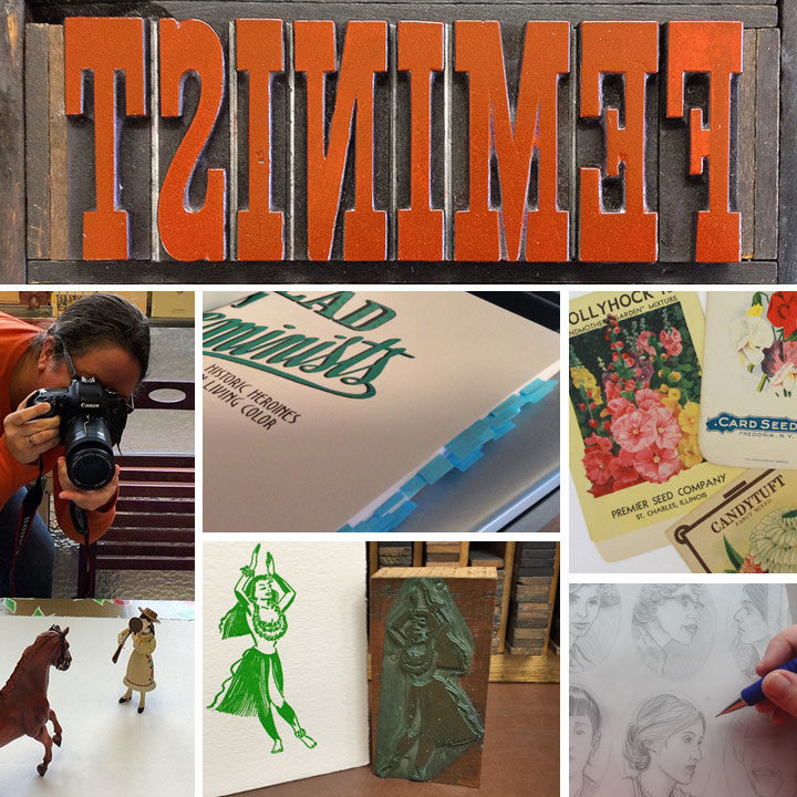
Our book is not the only thing coming out on October 11—we’ll also be releasing our 24th broadside. We can’t spill the coffee beans yet, but here’s a step-by-step glimpse of the process. As you can see, there were a lot of steps involved, from detailed illustration to some tricky acrobatics on press. We think the finished product will be well worth the wait!
September 14th, 2016
Jessica and I were so immersed in the process behind our book for so long that it still feels weird that the final product is almost here. Yet here we are, just under a month away from our release date! We have a metric ton of events planned in the next few months, with more being added all the time. And since releasing a book is a bit different than releasing a broadside, we’re already getting lots of questions about how this is all going to work. Here are the ones we’re hearing the most so far:
Where should I buy my copy? Should I wait until the release date?
You can preorder the book now from your favorite bookseller. Large or small, brick-and-mortar or virtual, indie or corporate, they can all get our book into your hands, and we have links to the book on both large and indie retailers over on our book page. Here’s the thing, though: preordering your copy really does help. Preorders can help retailers foresee how popular a book is going to be—the more preorders there are, the more they’ll stock when the book comes out. And more stock raises the book’s ranking, making the title more visible and searchable on retailer websites. It helps spread the word for us and introduces our book to a wider audience. So if you’re so inclined, preordering now will help ensure we get a good head start.
Would you rather I buy it from you and Jessica directly?
Thank you for thinking of us, and wanting to support us directly! In the end, though, we’ve decided that we will only be selling the book ourselves at certain local, in-person events. Events where we will sell the book ourselves include:
• Tacoma Studio Tours, October 15-16
• Our exhibit opening at Seattle’s School of Visual Concepts, October 29
• Our Portland Lit Crawl event, November 3
• Our artist talk at the University of Puget Sound Library, November 8
• Our library talks in University Place (December 14) and Lacey (December 15)
• And by request/appointment for Seattle/Tacoma-area folks (you can always contact us if you want to do this)
If you want your copy shipped somewhere, your best bet is to order from your favorite bookseller. And since many of our other events are being hosted by bookstores and galleries, those folks will handle sales at those events. Here’s where you can find an up-to-date list of all our events so far.
What if I want a signed copy? If I’m not local, can I still get one?
Absolutely! Our local bookstore, King’s Books, is offering signed copies, which you can preorder on their website. They can ship anywhere in the world—all you need to do is specify that you want a signed copy in the “order comments” box when you place your order. Also, please specify if you want your book simply signed, or if you want it personalized to a specific name.
I am local, and I want to celebrate! Are you having a book release party?
You betcha! We’re having our official release party at King’s Books in Tacoma, on Tuesday, October 11 at 7 pm. And it’s a costume party! Come dressed as your favorite dead feminist and celebrate with us.
I’m a retailer, and I want to carry your book in my store. Do I purchase copies from you?
Retailers can buy wholesale copies direct from Penguin Random House, who is distributing the book. You’ll need to set up a retail account with them first, but from there bulk orders are easy. To get started, call 800.733.3000 or email csorders [AT] penguinrandomhouse [DOT] com.
Since the book is coming out, does that mean the letterpress broadside series is ending?
Not at all. Actually, our 24th and newest broadside will appear both in person and in the book concurrently. So that means we’re keeping it under wraps until the book comes out, but we’ll have some sneak peeks to show you in the next few weeks. And if you’re local, you’ll be able to see the print in person at Studio Tour on October 15-16, or at our upcoming exhibits in Seattle and Portland.
A young writer at one of 826CHI, a writing center we supported with our Warning Signs broadside. Photo courtesy of 826CHI.
And that brings us to some other great news we wanted to share with you. As you might already know, previously when we have released letterpress broadsides, we have also made donations to nonprofits that align with the issues we highlight with each print. With the book and broadside #24 about to come out, we’re starting a new chapter by inaugurating the Dead Feminists Fund.
In honor of the power of women’s work, the Dead Feminists Fund supports nonprofits that empower girls and women to create change in their own communities. Like our book, funding is organized under a series of Action Verbs (“Make,” “Grow,” “Lead,” “Tell,” etc.), which translate to micro grant categories. Each year the Fund will support nonprofits with micro grants in one of our Action categories.
The Dead Feminists Fund is a component fund of the Greater Tacoma Community Foundation, which manages, administers and invests in over 400 charitable funds, right from our home community of Tacoma. Being under the auspices of the GTCF allows donations made directly to the Dead Feminists Fund to be tax-deductible, and provides the proper legal framework to protect both our donors and our grant recipients.
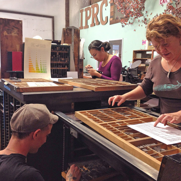
Artists typesetting at the Independent Publishing Resource Center, an organization we supported with our Paper Chase broadside. Photo by Caitlin Harris.
We seeded the Dead Feminists Fund with a large percentage of our book advance, and we will continue to donate a portion of our future broadside proceeds to supporting the Fund. Best of all, thanks to the generosity of Sasquatch Books, a portion of the sales of our book will also be contributed to the Fund. We’re especially grateful to Sasquatch because as an indie regional publisher, they understand the importance of giving back to one’s community, and how small gifts can make a big impact. And Sasquatch also knows the importance of supporting women and girls—after all, the team of editors, designers and marketing folks who have worked with us on our book with us are all women. If that’s not girl power, I don’t know what is.
If you’d like to support the Fund directly, you can make a tax-deductible donation directly through the Greater Tacoma Community Foundation website. (At that link, scroll down to find the Dead Feminists Fund in the alphabetical list.)
As always, thank you so much for your support of our series over the last eight years—we can’t wait to share the next chapter with you.
Save
Save
September 7th, 2016
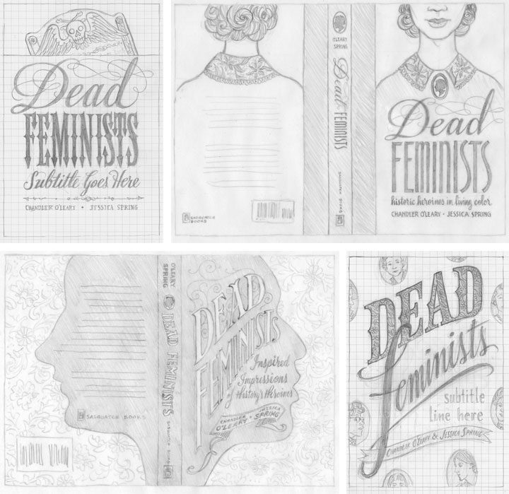
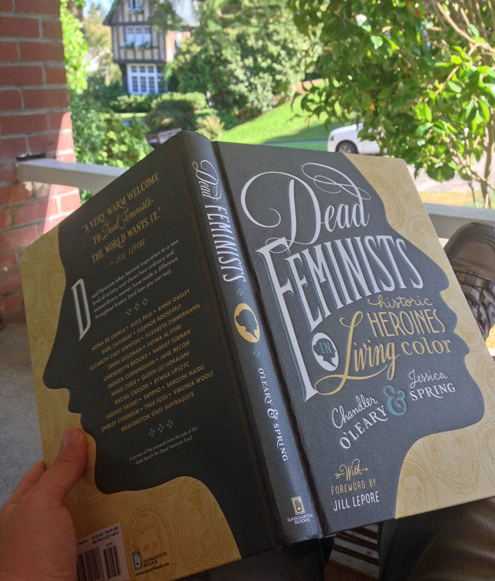
It’s hard to believe we’re only five weeks out from the release of our book! A few advance reader copies are making their way around to media outlets already, and several people have asked us how we came up with the cover design. Since getting to the finished cover was quite a process, we thought we’d show you a bit of the winding path that got us here.
When Sasquatch Books first signed us as authors, they offered us the chance to design, illustrate and hand-letter the cover. Needless to say we jumped at it. But designing a book cover can be very different than designing other things—the stakes are higher, for one thing. In some ways, it’s more of a science than an art: a good cover can have a lot of sway in terms of book sales, so it has to be as eye-catching, informative and readable as possible. So to make sure we got it right, it was a hugely collaborative process—not just between Jessica and me, but also with the publisher, the art director, our editors, the sales team, and lots of other people we never even met in person.
Jessica and I started brainstorming and sketching cover ideas way back in November of last year; above are a few of the concepts we sent along. We had a lot of feedback that large, legible type was key, so that was a good starting point. We also had to be really careful about the hierarchy of type. We had to make sure “Feminists” caught the eye first, followed by “Dead,” then the subhead, then the byline, etc. Later, when we got the happy news that Jill Lepore would be writing the foreword to our book, that added another level to our type hierarchy. In addition to all of this, we wanted to give the Sasquatch team plenty of options, so we tried to make each concept distinct from the others. Right away the clear favorite was the one in the lower right corner, so that was the concept we took to the next level.
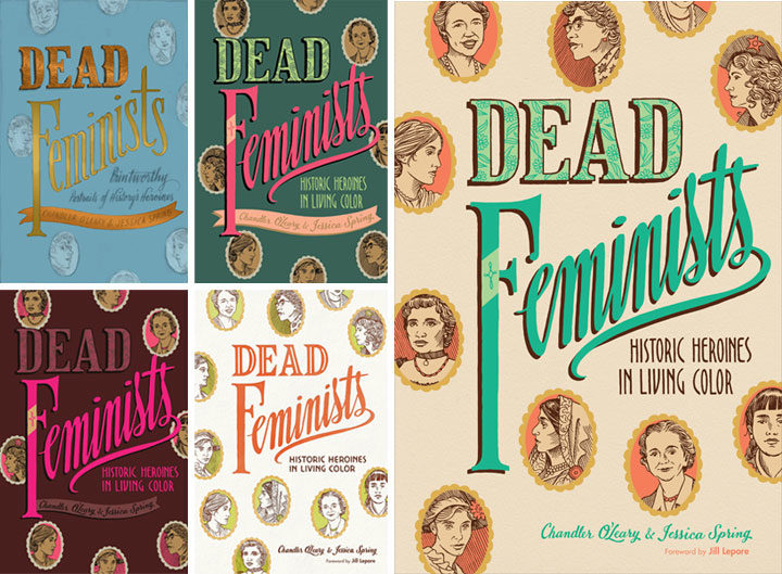
Then came a long parade of versions in color. We worked closely with Sasquatch’s art director and lead designer, Anna Goldstein, to try to catch that elusive unicorn that is a cover that works. I’d mock something up and send it to Anna; she’d mock something else up and send it back to us; rinse and repeat. Each time it felt like we were getting closer, but every time it felt like something subtle was missing. So we made a million little tweaks, to color, to lettering, to texture, to contrast, to composition, to kerning, etc. Each time one of us would have what seemed like a great idea, and each time the result was lacking somehow. I don’t even remember how long we stayed in this holding pattern. (Normally I keep all the iterations of a design carefully numbered in chronological order, but at some point I just lost track. I gave up and labeled that file “VERSION WHATEVER.” It makes me laugh every time I see it.) Everybody was frustrated: the elusive unicorn had transformed into the Holy Grail.
And then I think we all finally conceded that small tweaks were never going to get us there. We needed something to change in a big way, and we needed to scrap much of the work we’d done thus far. This is a really hard thing to admit to oneself—that maybe one’s brilliant idea wasn’t so brilliant after all. But the finished product is more important than anybody’s ego, and no matter how good a kernal of an idea might be, it’s not worth bringing down the whole design over it.
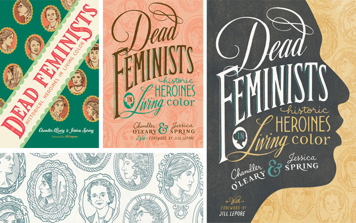
So we quite literally went back to the drawing board. I knocked together a few more pencil sketches, and we asked the whole team again what elements they thought were essential. A lot of people responded to the little cameo portraits of the various historical figures, so we came up with the idea to use them as more of an overall pattern (that’s the green cover on the left, above). Then our editors gave us the feedback that maybe the cover should be more like the style of our broadsides, with bold lettering in many different styles. Anna added the suggestion of making those cameo portraits more of a faint pattern than a major focal point, and then the lightbulb seemed to go on at last. That peach version in the center, I think, was what I put together next. Jessica and I could see that the most recent advice was on the right track, but we were still worried it wouldn’t stand out when seen on a display shelf with a hundred other books. Our editor asked us if we had any ideas for how to make it pop, and in wild desperation I fished out one of our earliest pencil sketches (above), the one with the face in silhouette, and gave it another look. What didn’t seem to work in sketch form suddenly felt like the missing ingredient when paired with the cameo pattern and the bold lettering. We sent a version back to Anna, and she gave it that antique texture and the gold-grey-and-teal color scheme you see here. And that was it—it was like she’d flipped a switch, and voilà: finished cover.
Over the course of eight years of printing our broadsides, Jessica and I had grown accustomed to just doing whatever we want in terms of design and content. With small editions to print, and nobody to please but ourselves, the stakes were low—and there was always plenty of room for experimentation. This book has been an entirely different animal, and I think designing the cover has been a perfect metaphor for the whole process. Writing a 40,000-word manuscript about history and feminism was never something we thought we could do, but with the incredible help of our editors, we got there. Likewise, designing the container for that content was a massive group effort—so major props and big thanks to Anna for sticking with us. Getting to the finish line required stepping way beyond our comfort zone—and more importantly, it took the whole team. We couldn’t have done it alone, and that’s a good thing, because both book and cover are the better for it.
Save
August 30th, 2016
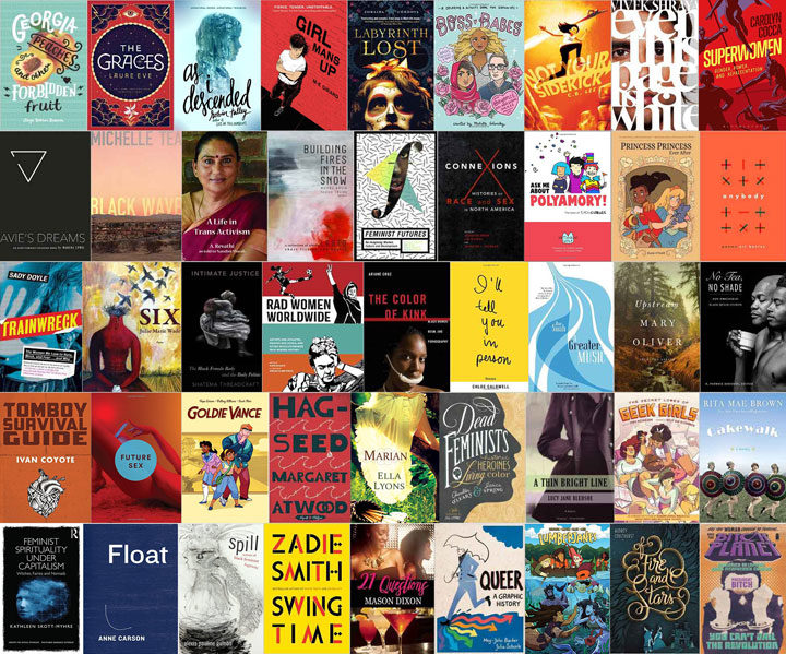
Jessica and I just found out that Dead Feminists: Historical Heroines in Living Color has been included in Autostraddle’s roundup of feminist books coming out this fall, and we couldn’t be more thrilled! Also…we’re a bit intimidated, because it’s a bit mind-boggling to appear on a list that also includes Margaret Atwood, Roxane Gay, Zadie Smith and others. Most of all, though, it’s incredibly inspiring to be in the company of so many talented women writers.
Speaking of hanging out with women writers, in November we get to team up with another feminist duo (who are also included on Autostraddle’s list) for a joint author event at Powell’s Books in Portland! Kate Schatz and Miriam Klein Stahl, the respective author and illustrator of Rad American Women from A to Z, have a new book coming out on September 27, entitled Rad Women Worldwide. Kate was kind enough to say some super nice things about our book:
“Dead Feminists offers well-researched and meticulously illustrated insight into some of America’s inspiring historic heroines—but it also goes way beyond that. This book is a profound and super-smart look at feminist craft, creation, and collaboration, and reminds us that what goes on behind the scenes can be just as powerful as the finished product. I am so grateful to Chandler and Jessica for allowing us into their radical world.”
We’re excited to read and pore over Kate and Miriam’s new book when it comes out, and even more excited to meet them in person for the Powell’s event. Here are the details:
Special joint Dead Feminists & Rad Women author event
Thursday, November 3, 2016, 7:30 pm
Powell’s Books on Hawthorne
3723 SE Hawthorne Blvd, Portland, OR
And as always, you can find all our book-related signings, talks and shows on the events page.
August 25th, 2016
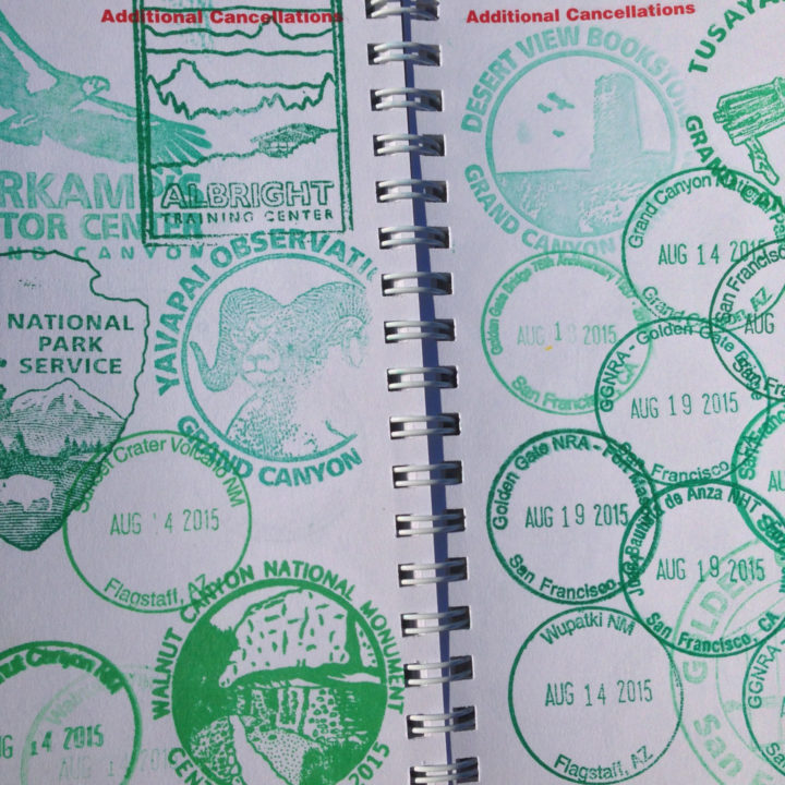
I don’t know about you, but on this, the National Park Service centennial, this millennial is paging through her big fat stack of stamped pages, proof of a lifetime of national parks love. Apparently I like to cram that ink into every nook and cranny of my passport—but that’s good, because I’m trying to leave room for many more to come. Happy 100th birthday, NPS—here’s to many more!
August 5th, 2016
It’s weird. Jessica and I have been working on this thing for two years now—imagining, planning, dreaming, drawing, writing, drafting, rewriting, editing, designing, redesigning, lettering, illustrating, editing again, photographing, curating, gathering, fact-checking, editing some more. But even though we did all of that, and for so long, only now does it actually feel like it’s really happening. Because now I’m sitting here with the actual book in my hands. We just received our advance copies, and for quite a while all I could think was, “It’s real.”
There are still two months to go before the book is real to everybody else, as well, but in the meantime we have a whole lot of snippets, sneak peeks and behind-the-scenes stuff to share. But if you’re champing at the bit like we are, you can pre-order your copy now.
July 13th, 2016
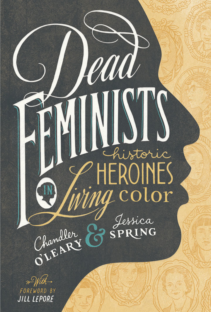
Jessica and I are on pins and needles this week, as advance reader copies of our book will be arriving any day now. So while we wait to get our hands on the real thing, we figured now was a good time to share the cover of the book with you! I got to do the illustration and lettering on this puppy, and I can’t tell you how excited I am to see it in person. Getting to this point was a long, long process (and a story that’s worth sharing, so we’ll get to that another day), and it feels good to hear that people are already responding favorably to the design.
We’re pleased to announce that the book is now available for preorder (it’ll be hitting stores on Tuesday, October 11). You can find more info and preorder links to lots of retailers on our book page. And if you’re a shop owner interested in carrying our book in your store, you can find all the info on bulk ordering direct from the publisher inside my wholesale catalog.
More details soon!
June 26th, 2016
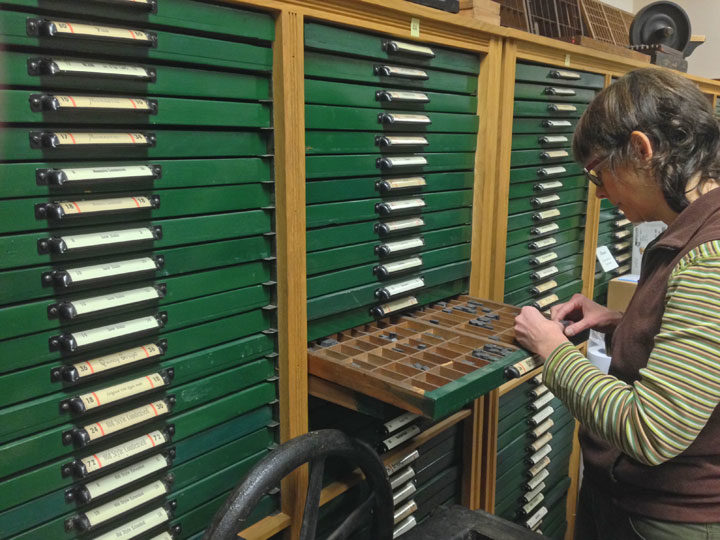
I shot this photo of Jessica typesetting at the Thorniley Collection of Type last year, where she and I were asked to help inventory and appraise the collection (a dream-job moment that I promise to tell you about sometime!).
And then today I came across this short documentary, about the very last edition of the New York Times that was printed from linotype. The year was 1978, and the newspaper was mothballing all its hot-type equipment in order to adopt the brand new, cutting-edge, cold-type technology of phototypesetting. (Phototypesetting was in turn mothballed about 15 years later, when desktop publishing—design software, computer fonts, etc.—hit the mainstream.) If you’re at all interested in printing and have a half hour, I highly recommend the film, as it’s fascinating.
I loved seeing my professional ancestors at work in the film, but I had to laugh, because it struck me that my own career has been a bit, well, backwards.
I got my BFA in the early aughts; much of my design coursework focused on current print technology: design software, digital typography, etc. (Though of course, I was ornery and insisted on including hand-lettering, which was deeply unpopular at the time, in almost everything I did.)
My first industry job, however, was a throwback: I was a production designer doing paste-up at an offset printer that still did phototypesetting. This wasn’t all that long ago: by then that technology was a total dinosaur. At the time they were one of the last presses in the whole country still relying on those processes. The video above demonstrates the paste-up process, but basically the job description is what it sounds like. We took little bits of printed text and photos and, using razor blades and hot wax, pasted them onto a collaged layout that was then photographed and turned into a printing plate. I got to spend my days in a quiet room lit only by light tables, with three other girls who were as introverted as I. I can still smell the wax whenever I think of it—I loved that job, and I loved that smell.
A year or so later I got a job as a graphic designer at a firm, so I guess in that sense I went “forward” in time. But that same month I also got into letterpress printing—proof that my personal tastes were still decidedly cattywampus. I basically did what the printers at the New York Times did in reverse order, trading my cold-type skills in for hand-set hot metal.
And now, while I still keep a finger in both the letterpress (thanks to my collaboration with Jessica) and digital pies, overall I’ve kind of moved backwards in time again. Now I mostly spend my days with the really old-school equipment of paintbrushes and pencils.
And that’s just fine with me. Who says progress has to go only in one direction?
June 16th, 2016
If you’re looking to bring a little sketching into your life, or you attended last month’s sketch outing and want a little training, you can learn the basics with me in July!
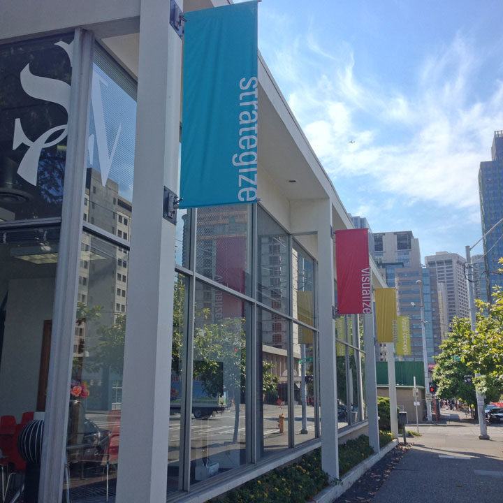
I’ll be teaching my one-day urban sketching workshop again at Seattle’s School of Visual Concepts on July 16—I only teach this workshop at most once a year, so if you’ve been wanting to get some drawing skills under your belt, this is your chance!
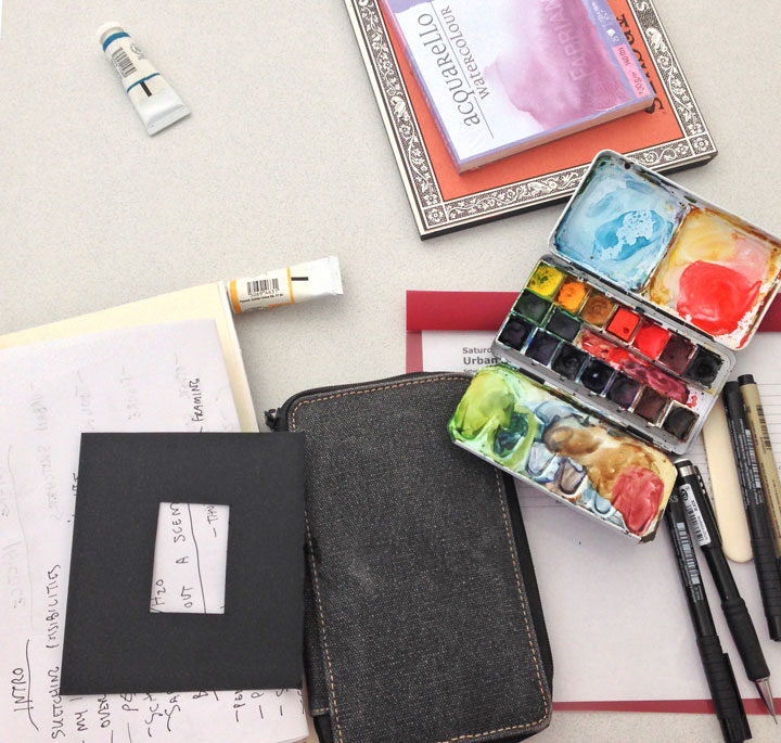
In the class you’ll get a crash course in everything you need to get you on your feet and sketching. We’ll cover travel-friendly materials, tricks for setting the scene, finding inspiration on-the-go, and all kinds of drawing, watercolor, perspective and composition techniques.
And of course, you’ll get plenty of hands-on experience with the chance to get out there and draw in the wild.
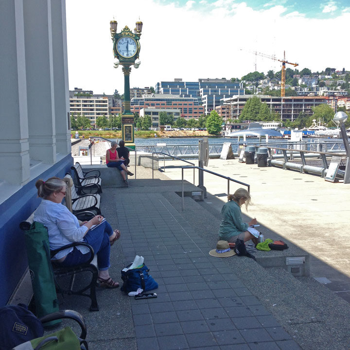
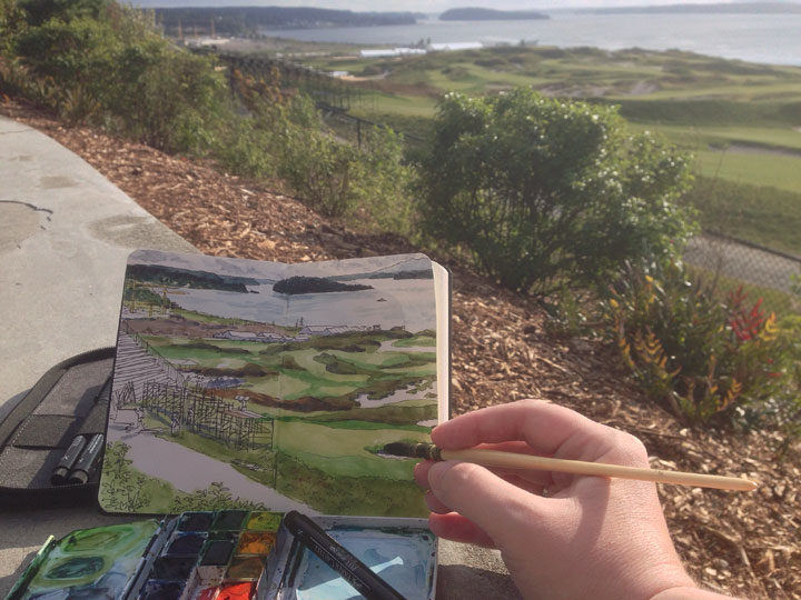
My favorite thing about teaching sketching workshops is seeing my students learn from each other. We’re all basically drawing the same thing, but since everyone has a different style, point of view and level of experience, the finished results are wildly varied.
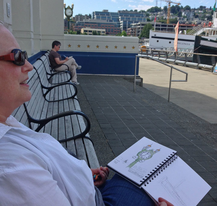
Last year we all walked to South Lake Union Park, and I loved seeing what everyone chose to focus on in their sketchbooks.
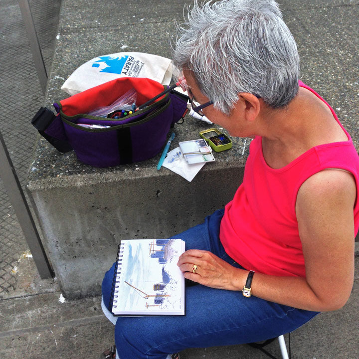
We had both beginners and veterans among us that day, and everyone completed at least one full-color sketch (several went to town and came back with a whole handful of drawings!).
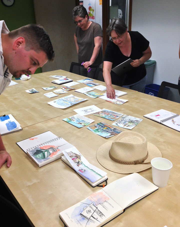
The really fun part is the end of class, where we all got together and shared our drawings. No two were even remotely alike, but all were completely gorgeous!
So if you want a fun kickstart to your new life as an urban sketcher, join us! Here are the details:
Urban Sketching: Learning on Foot
Saturday, July 16, 2016
School of Visual Concepts
2300 7th Avenue, Suite B, Seattle, WA
BYO sketching materials (a list of suggested materials will be sent when you sign up)
More info and registration here!
(Use the code GIVE_SMALL at checkout for a $25 discount!)
Note: unless it’s pouring rain, we’ll be sketching outdoors. Please dress accordingly, and plan to be on your feet! Bring lots of drinking water (and snacks if you need them), layered clothing, sunscreen, a protective hat, and good walking shoes. Last year it was 100°F outside, but thanks to everyone being prepared and smart about the heat, we still had a great time!
Save
May 30th, 2016
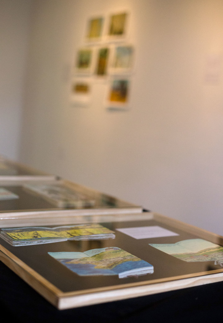
Photo by Shawn H. Nichols, taken at Artist Trust on Tour: Tacoma
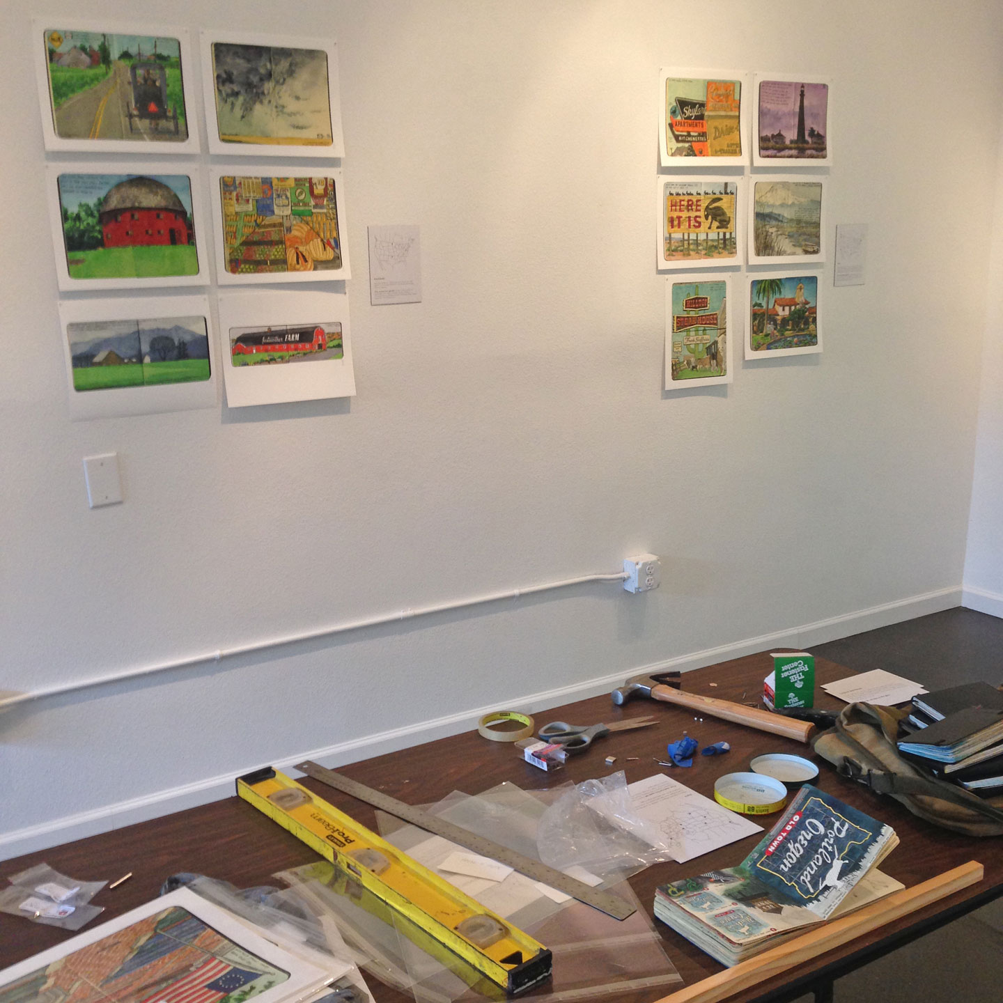
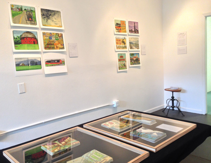
If you happen to be in or passing through Tacoma soon, I’ve got a new show of sketchbook drawings up right now, at the brand new Feast Arts Center on Hilltop.
Like the way I do it on my travel blog, the images in the exhibit are arranged thematically rather than chronologically—this made curating the show something of a challenge, since I have frillions of drawings to choose from. So I did a practice run on my living room floor, with a notebook in hand to jot everything down (seems fitting!).

That ended up being a really good idea, because pre-arranging everything beforehand made the installation of the show much, much easier. All I had to do was measure and level everything, rather than try to make any aesthetic decisions on the fly. Still, you can see from the above photo that hanging a show is always a big, big mess—no matter how prepared I am ahead of time. Everything is total chaos until the last possible moment!
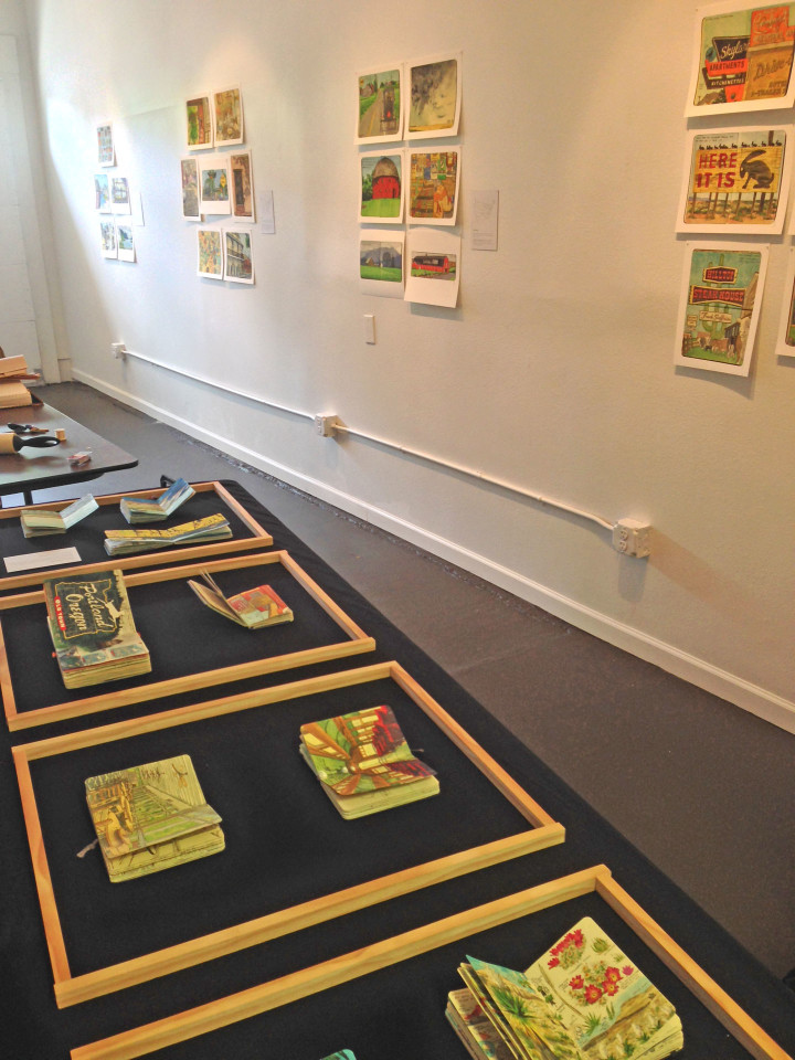
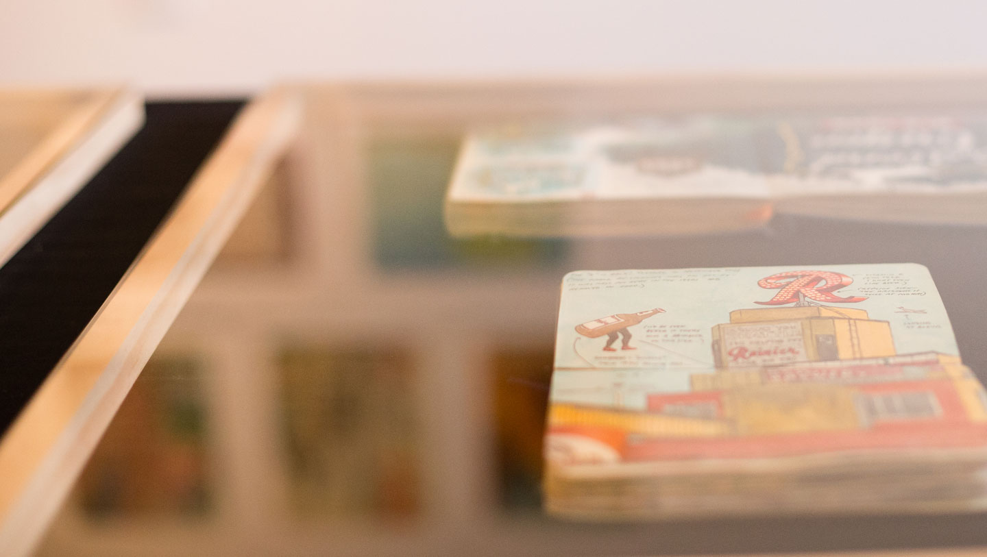
The show consists of ten original sketchbooks, paired with reproduction prints hung on the walls of the gallery. Displaying original sketchbooks is always another challenge, since it’s only possible to show one page at a time, and the books are delicate enough that they can’t stand up to constant handling during the show. But the folks who run Feast, Todd Jannausch and Chandler Woodfin (yes, there are two Chandlers involved here!), had the great idea of displaying the books in unobtrusive, handmade glass tabletop cases.
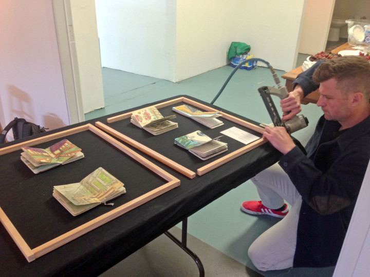
Here’s Todd putting one of them together—
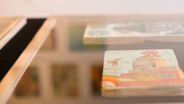
the end result is sleek and professional, and it made it easy for me to come in and turn the pages of each sketchbook once a week or so, to change things up during the show’s run and give folks the chance to see multiple pages over time.

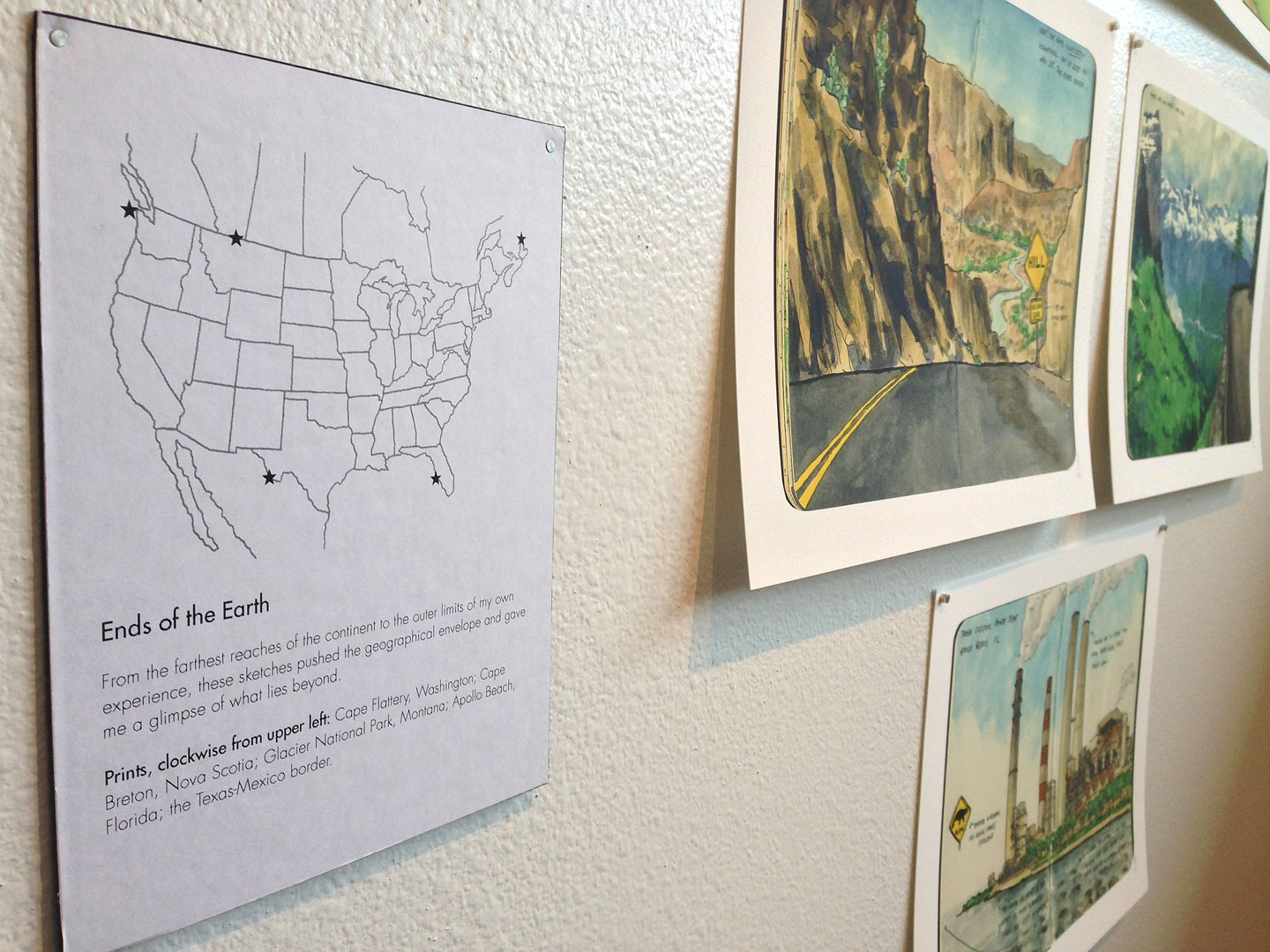
These little map cards tie everything together, providing a little context behind the drawings and explaining my rationale for the themes I chose for the prints.
I’m so pleased with how the show came together—this has quickly become my very favorite solo show. So major thanks to Todd and Chandler for making it happen and handling the logistics!
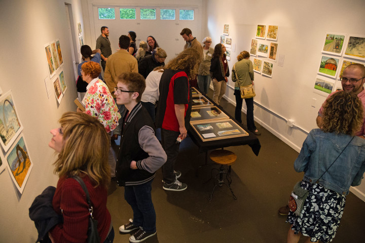
Photo by Shawn H. Nichols, taken at Artist Trust on Tour: Tacoma
As an added bonus, the folks at Artist Trust, a statewide arts organization, hosted an event to tie in with my exhibit opening. Since Artist Trust recently funded me with an artist grant to continue my sketchbook work, they asked me to speak about my process at the opening. I brought my very first travel sketchbook with me, and it was great to talk shop with the crowd that showed up that night!
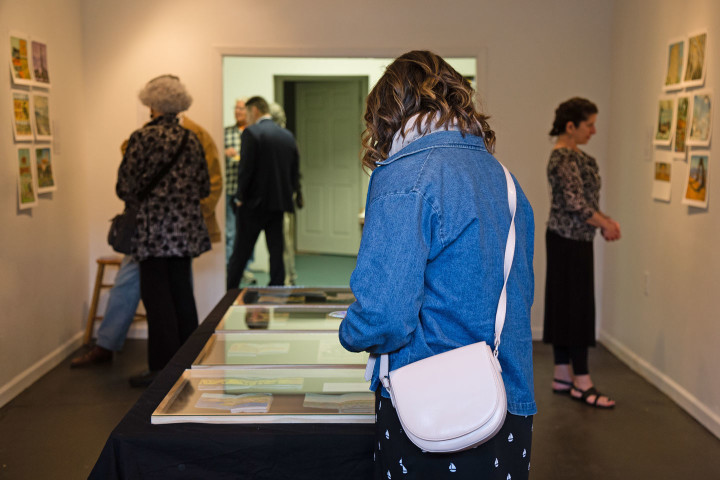
Photo by Shawn H. Nichols, taken at Artist Trust on Tour: Tacoma
The show closes on Sunday, June 12—here are all the details, if you’re looking to visit:
Jaunt + Jot: a solo sketchbook exhibition by Chandler O’Leary
May 19 through June 12, 2016
Feast Arts Center, 1402 S. 11th St., Tacoma, WA
Open Saturdays 12 to 4, Sundays 9 to 1, or by appointment
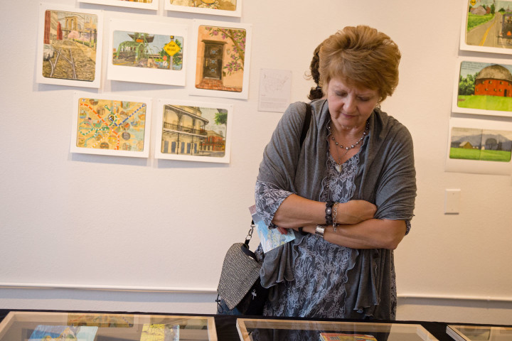
Photo by Shawn H. Nichols, taken at Artist Trust on Tour: Tacoma
Or if you’d like to try your hand sketching yourself, Feast, Urban Sketchers-Tacoma and I are hosting a special ad-hoc sketch outing this Sunday, June 5, as part of Feast’s Sunday Coffee series! The event is free and open to anyone who would like to try their hand at urban sketching—no prior experience is necessary, and all you need to bring are your own sketch materials (paper or sketchbook, pen or pencil, watercolors, or whatever you like to use).
Here’s how it works: Feast Arts Center will open at 9 am on Sunday, so visitors can see the exhibit. Anyone interested in sketching will gather at 10 am at Feast for a quick meet-and-greet. We will then split up and sketch around the Hilltop neighborhood; you can choose to stick around Feast, or wander farther afield and sketch whatever strikes your fancy. Some people sketch in groups, others go off by themselves. Then we’ll all meet back at Feast at 12:30 for an informal show-and-tell of our sketches. This part is completely optional (so if you’re nervous about showing your drawings, you don’t have to!), but it’s always fun to see everybody’s different styles, materials and points of view. Feast will remain open until 1 pm. Here are those details again, in digest version:
Ad-hoc Sketch Outing, sponsored by Urban Sketchers-Tacoma
Sunday, June 5, 2016
Feast Arts Center (open 9 to 1)
1402 S. 11th St. Tacoma, WA
1. Meet at Feast by 10 am
2. Sketch in and around Hilltop
3. Show & tell at Feast at 12:30
Please note that this is not a class or workshop, so neither I nor any Urban Sketchers members will be offering instruction. But this is a great opportunity to meet other sketch artists and find inspiration. People tell me all the time that they’d love to try sketching, but aren’t sure where to start. This is a great way to get your feet wet amongst friends—so don’t be shy! Grab your pencils, and we’ll see you this Sunday!
Creation of this work was made possible in part by Artist Trust Grants for Artist Projects. Special thanks to Artist Trust, Feast Arts Center, School of Visual Concepts, and Urban Sketchers-Tacoma.
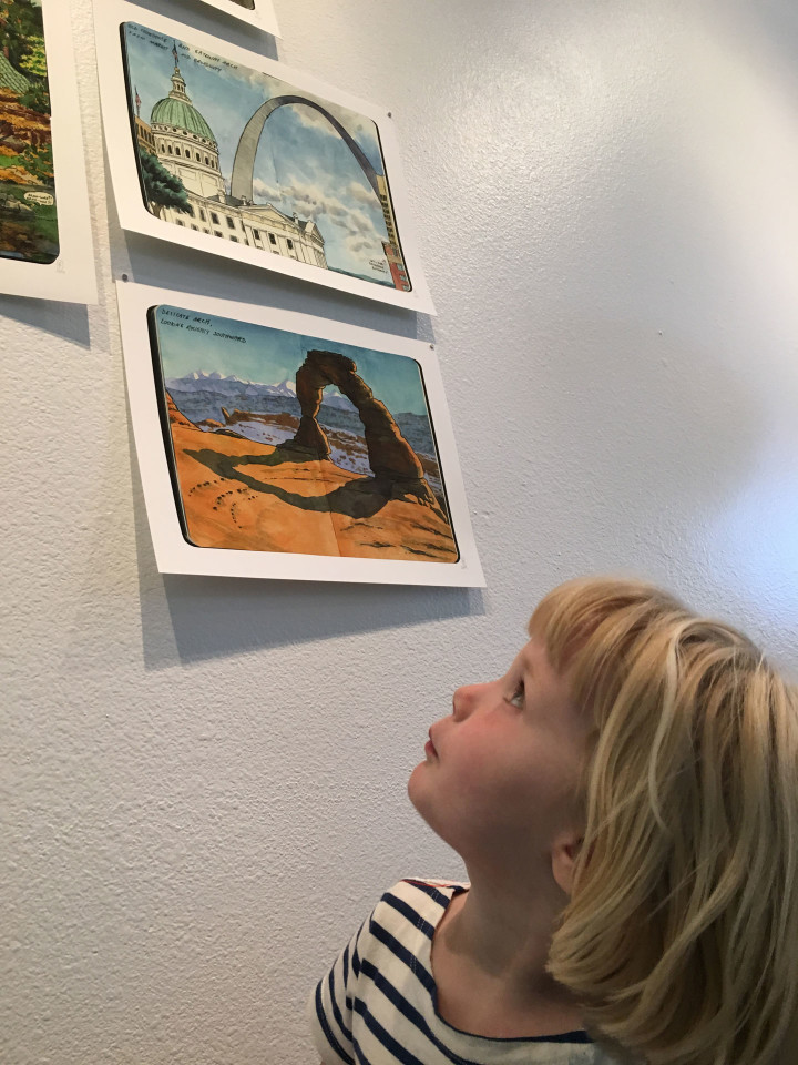
Photo by Mary Holste.