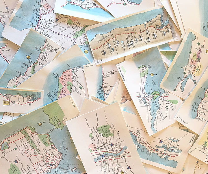
My second book, The Best Coast: A Road Trip Atlas, is out in the world and available at last! This illustrated travel guide is a celebration of the West Coast’s historic highways—perfect for both the avid traveler and the armchair explorer. Chock-full of unusual facts, hidden history, and Americana, The Best Coast is an offbeat road trip guide that tells the story of the diversity and depth that created the West Coast we know and love today—both the ever-changing present and vestiges of the past for those who slow down to look. A labor of love more than two years in the making, The Best Coast: A Road Trip Atlas contains over 400 full-color illustrations inspired by my sketchbook drawings created on my many road trips up and down the coast, as well as 99 hand-drawn maps and hundreds of hand-drawn lettering vignettes and illustrated icons.
The Best Coast: A Road Trip Atlas (Illustrated Adventures Along the West Coast’s Historic Highways) Published by Sasquatch Books ISBN 978-1-63217-174-0 Paperback, 224 pages Release date: April 9, 2019
My amazing local bookstore, King’s Books, can ship a signed copy anywhere in the world! Simply place your order online (either in the previous link or by clicking the King’s logo above), and in the “order comments” box mention that you want a signed copy, and whether or not you want the book personalized to a specific name.
Looking to buy a signed copy directly from me?
I will also be stocking and selling signed copies of the book, but because I don’t really have the infrastructure to store huge quantities of books and ship them all over the place, I’ve made the decision to only sell books myself to local customers (either at local events or direct from my studio when folks can pick up their copy in person), and leave the long-distance orders to King’s Books. This has worked really well with my previous book, and it helps support both King’s and my own business! You can find a list of my upcoming events here, or if you’d like to contact me to arrange pick-up, you can find my contact info here.
Thank you for all your support, and happy reading!
In exactly one week, The Best Coast will be here! To celebrate the book’s publication, we’ll be holding the big launch party at my amazing local bookstore, King’s Books. I’ll be giving brief remarks about the process behind the book, showing some of my original paintings, and of course, signing books! We’ll also have a drawing for prizes, including signed books, art prints and other goodies. Here’s the skinny:
Best Coast launch party
Wednesday, April 10, 2019 7 pm, free! King’s Books 218 St. Helens Ave, Tacoma, WA More info about the event here
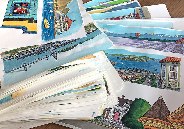
In the meantime (or if you’re not local), check out the latest Miss Adventure podcast, where Mary and I talk about the process behind The Best Coast. We get into some of the nitty-gritty details of creating the book, including some of crazy stats behind this thing: like the fact that there are over 400 full-color illustrations in the book, 99 hand-drawn maps, over 100 hand-lettered type treatments, and well over 100 illustrated icons. (That pile of illustrations above, cut out of giant Moleskine books, is more than six inches thick!)
Coming up later this week, I’ll be featured on the We Art Tacoma podcast as well, where I chat about the book with host Erik Hanberg, along with musings on ten+ years of being a working artist in Tacoma, and how the arts community here has grown and changed over the years.
And one last thing: there’s also just one week left to get in on our Instagram photo contest, where you can win a signed copy of the book! You can read all about it on my IG post here; you have until 11:59 pm on Tuesday, April 9 to post your photos.
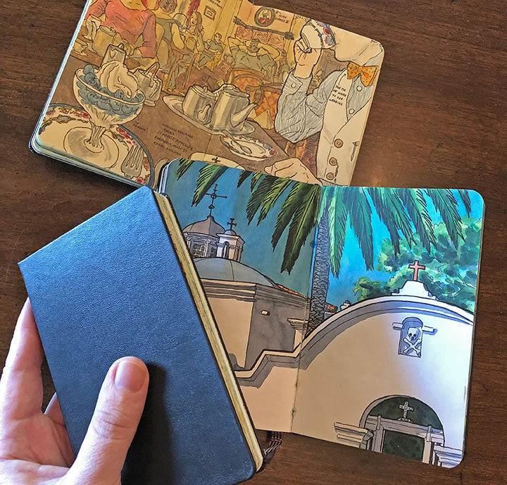
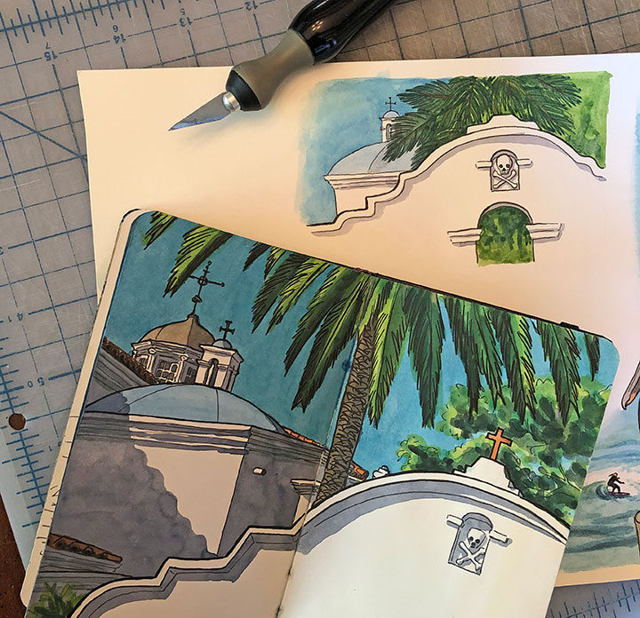
When I was putting together my book proposal for The Best Coast (and later when I started the process of building the book itself), I imagined its illustrations to be an extension of my sketchbook drawings. After all, I’ve spent so many years documenting my travels in my sketchbooks that they’ve become an integral part of how I think, how I see the world.
But while the sketchbook is an ideal medium for capturing images out in the field…
…it didn’t lend itself very well to the finished illustrations that appear in the book. For one thing, I had to design each page spread around the text of the book; the amount and proportion of real estate allotted for each illustration was entirely dependent on the text content and length. For another, my travel sketches usually span an entire page spread in the sketchbook; things like gutters (the center fold) and book stitching would be distracting if they were reproduced in The Best Coast. And besides, the sketchbooks I use are pocket-sized—not exactly ideal for large, full-spread book illustrations.
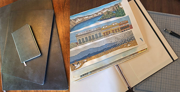
Still, I wanted to preserve the overall look and feel of my sketchbook drawings in my book illustrations. Not only was that style of drawing what I was largely known for as an artist, but I also just loved the quality of the line work and watercolor in those little sketchbooks, and wanted to reproduce it as closely as I could. The sketchbooks I most often use are the Moleskine brand—the paper inside is actually terrible for watercolor (not a material I’d recommend for beginning watercolorists!), something akin to painting on a manila folder. But I’d been working with that paper for so many years that I knew how to wrangle it, and I also knew that if I chose some other paper for my book illustrations, I’d have to master a different learning curve to achieve results I was happy with.
Luckily, I did a little research, and discovered that Moleskine makes the exact same sketchbooks I use in much larger sizes! So I bought a bunch of them and carefully cut the pages out of the binding.
And just like that, I had the exact same paper I was used to working with, on a much larger scale (and without those page gutters to worry about). I could just spread out in my studio and get to work without any interruption.
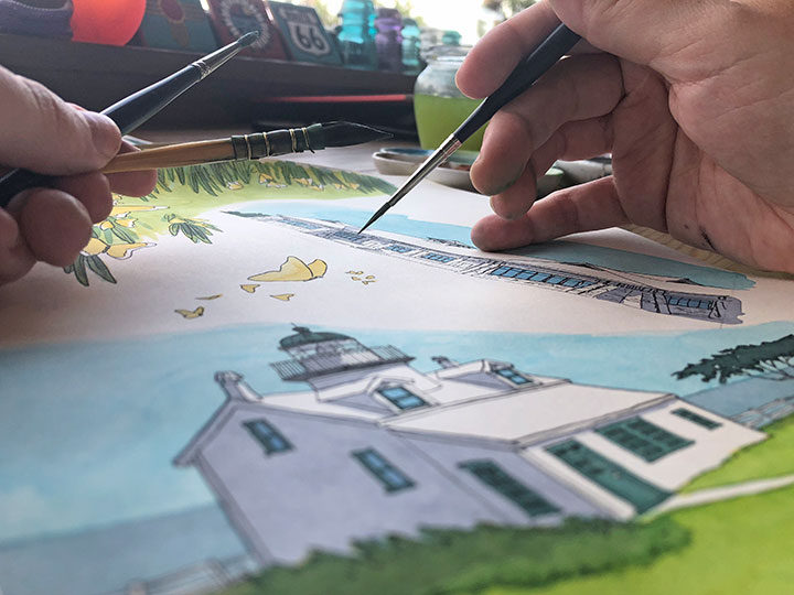
Some of the illustrations in my book are straightforward re-workings of my sketchbook drawings, while others are new and completely different. But it felt so good to work with the same materials that I take out with me into the field—that made it easy to transport myself back to the time and place where I got to capture each location in person. As a result, The Best Coast is every bit of an extension of myself as my sketchbooks are.
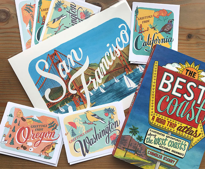
Over the years, I’ve amassed zillions of travel photos and created tons of sketchbook drawings, which then served as inspiration for the illustrations in my new book, The Best Coast. And now, Sasquatch Books and I want to see your Best Coast photos! Post your best, most hilarious, or most awkward West Coast road trip photos on Instagram, and the best three will win prizes!
Here’s how it works: post your photos to Instagram using the hashtags #bestcoastchandler and #contest AND tagging@sasquatchbooks. The photos have to be yours (either ones you shot yourself, or your vintage family photos, NOT rando photos you found on the internet!), and they have to depict somewhere on the West Coast (WA/OR/CA), but beyond that, it’s up to you.
Maybe it’s a picture of little-kid you with your grandpa in front of a Paul Bunyan statue. Maybe it’s a photo from an old family road trip when your mom made everyone in your family wear matching fanny packs. Maybe it shows a historic landmark you visited long ago, that’s no longer standing today. Or maybe it’s just a lovely photo you took at a national park, or your favorite beach photo, etc.
You can post your pictures through April 9, the publication date for The Best Coast; after that I’ll choose the three best photos, and on April 12 I’ll contact the winners via DM to get your shipping address (contest open to winners with US addresses only, sorry!). I’ll also repost the three winning photos to my Instagram account and blog once the winners confirm their addresses.
The prizes: The Grand Prize winner will receive a signed copy of The Best Coast plus a bundle of my art goodies (a 9 x 12 West Coast travel print and a box set of 6 assorted West Coaststate cards). Two runner-up winners will each receive a signed copy of the book. Prizes will be mailed via USPS in April, as soon as the winners confirm their addresses.
The fine print: NO PURCHASE NECESSARY. Enter between March 18, 2019 and April 9, 2019. Open to US residents, 18 and older. Void where prohibited or restricted by law. See official rules for full details. Contest sponsored by Sasquatch Books.
Best of luck! I can’t wait to see what y’all come up with.
Since today is #WorldBookDay, I thought I’d share a behind-the-scenes look at the process behind the cover design of my new book. And just like any part of bringing a book to life, creating the cover is a careful, detailed, and often lengthy process.
Designing a book cover is more of a science than an art—because the design has to be extremely hard-working, every part of the design has to be well thought out and carefully considered. Since it has to be eye-catching in every setting (at thumbnail size in a catalog, on a bookstore shelf amongst a slew of other titles, etc.) everything from subject matter to typography/legibility to color scheme is important. That’s a lot of responsibility to place on one image!
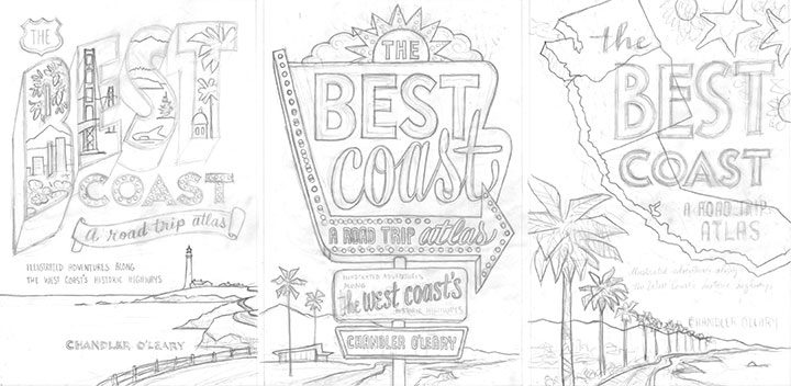
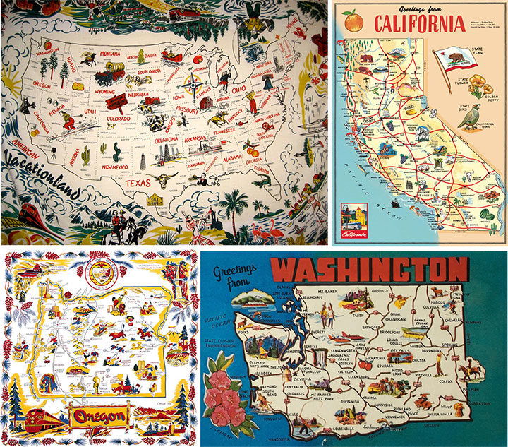
Thankfully, I had a lot of vintage inspiration to…well, draw from, as a starting point. Because the book encompasses many vintage roadside attractions and other historic icons, it made sense to reference vintage travel ephemera, at least in one of the three sketch concepts I developed for the editorial and design team at Sasquatch.
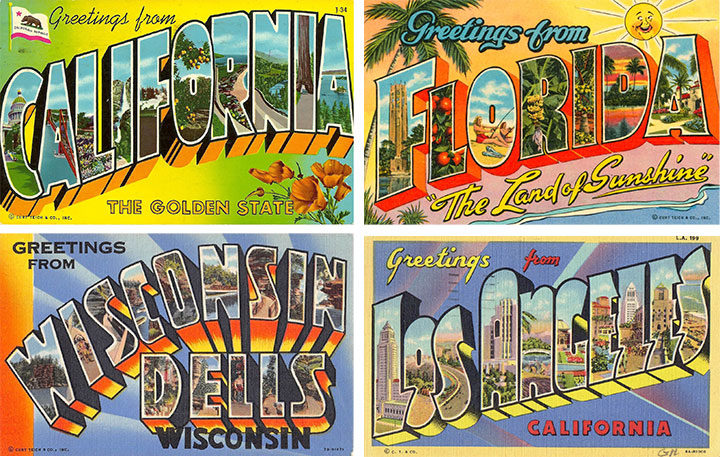
For the first concept (the one on the left in the above trio of sketches), I used vintage travel postcards as a starting point. We’ve all seen these things—they were absolutely ubiquitous for decades, and it’s easy to see why they’re so iconic.
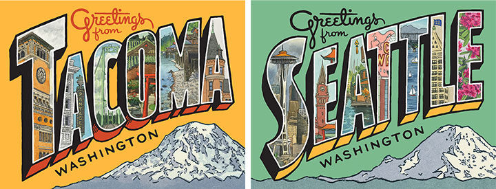
I’ve even referenced them in my own work in the past—these are some greeting cards I created recently, combining original lettering with a mish-mash of some of my older sketchbook drawings.
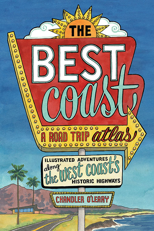
For the second cover concept, I created a faux neon sign, based on the many, many examples I’ve seen and sketched on my road trips over the years. Thankfully, so many of these old signs are still around today that their unique “Googie” design style is still instantly recognizable to viewers of all ages.
And finally, I wanted to create a cover concept that at least gave a passing nod to another staple of vintage travel ephemera: the souvenir map. I have a major soft spot for these things (as well as a big personal collection of map postcards and even midcentury map tablecloths—as anyone who has ever attended Studio Tour will have seen!), and have referenced them over and over again in my work. And after all, this book is an atlas—there are nearly a hundred maps inside, so it made sense to at least try one on the cover. In the end, I kept the map part of my third cover sketch super simple, but the thought process behind it was still there.
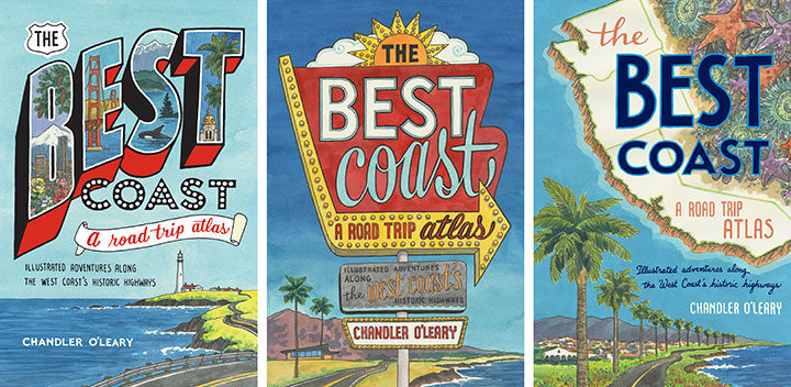
Here are the three full-color cover concepts I sent to Sasquatch. And the winner was chosen pretty unanimously—everyone was drawn to the neon sign concept (including me!). The weird thing, though, was that unlike the cover process for Dead Feminists, this book cover went from zero to finished in record time. I was bracing myself for an endless number of revisions, color tweaks and do-overs, because that’s what it took last time to arrive at the right cover. So imagine my surprise when the Sasquatch team got back to me and said that they’d shown it to everyone from design to marketing to sales, and they’d all agreed that we’d pretty much hit it out of the park on the first try!
So that was it—I made a few tiny tweaks to the lettering of the subhead, and a few subtle color changes, and Bob’s your uncle. With Dead Feminists, we were still revising the cover right up until the book went to press. This time it was the other way around: the cover was done months ahead of time, and the book itself was being tweaked and edited until the last possible second. But that’s another story for another day…
While I’ve hinted at this several times on social media, and even shown some snippets of my process along the way, mostly I’ve been sitting on my hands lately, trying my best to keep mum while I wait for time to tick by. And now the waiting is almost over, and it’s time for the big reveal of my new book!
At long last, The Best Coast: A Road Trip Atlasis almost here! This book—an entirely illustrated travel guide to the West Coast—has been a labor of love for me, spanning more than two years of work on the book itself and a solid decade of research, road trips and travel sketching. And now we’re just a little over a month away from the publication date on April 9!
I’ll be sharing a lot more here and over at Drawn the Road Again (after today, different content in each place) in the days and weeks to come: behind-the-scenes process images, stories and sketches behind the locations featured in the book, a social media photo contest (with prizes!), and much more. And if you’re local, we’ll be throwing the official launch party right here in Tacoma:
Best Coast launch party Wednesday, April 10, 2019 7 pm, free! King’s Books 218 St. Helens Ave, Tacoma, WA
P.S. Because people always ask me, yes, preordering—as opposed to waiting until the book comes out—makes a huge difference. Books with strong preorder sales get better promotion from both the publisher and retailers, get a better ranking on huge sites like Amazon (and thus better exposure), and reach a wider audience of both customers and press outlets. So every preorder counts, and is like an extra boost of support, both for me and for your favorite retailer.
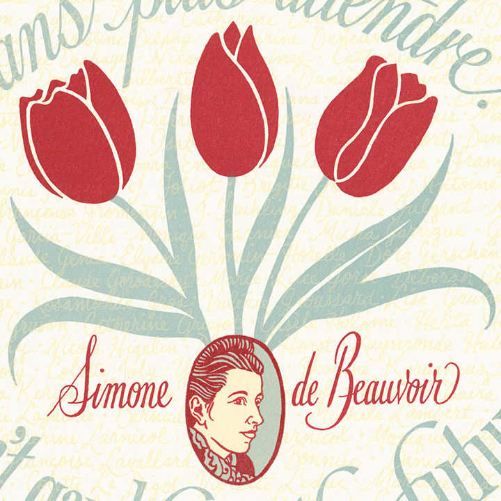
This year we have been following current events with increasing dismay—lately it seems like women are embattled on every front. At the heart of every struggle are women telling their stories, testifying en masse to uncover and combat abuse, inequality, and the erosion of our civil rights. What is shocking is just how many women coming forward it takes for our testimonies to be taken seriously. Women have learned time and time again that we must band together, seeking justice in numbers. So for our newest Dead Feminists broadside, we turned to Simone de Beauvoir, who shepherded hundreds of women together to speak up for the rights of all:
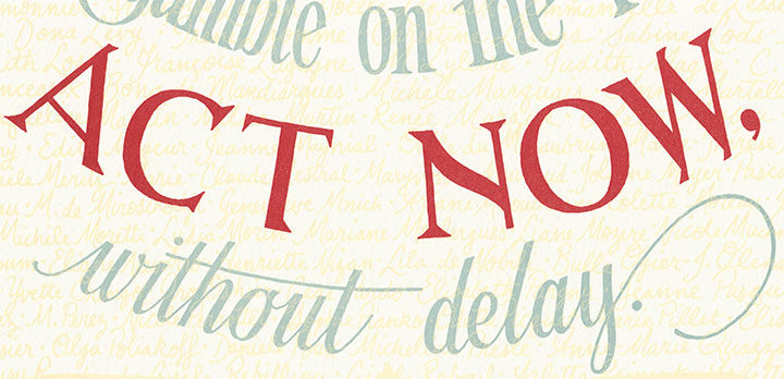
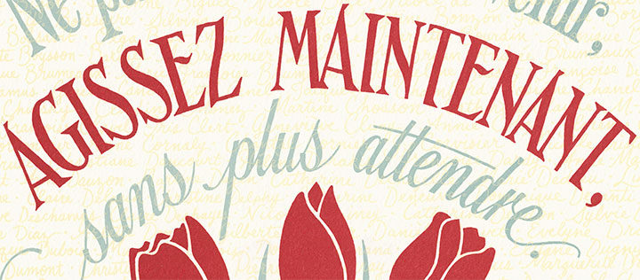
Ne pariez pas sur l’avenir, agissez maintenant, sans plus attendre. (Don’t gamble on the future, act now, without delay.)
Simone de Beauvoir was a complex, controversial, even problematic figure all her life. Hesitant to call herself a philosopher, she nevertheless was an influential member of the French existentialist movement. Her many essays and books examined the very idea of self, particularly that of women in light of society’s expectations and constraints. She contended that women are as capable of choice as men, and that when women take responsibility for themselves and the world, they can choose their own freedom. Her tumultuous personal life, which made her as infamous as her writings, embodied this staunch belief in freedom of choice. Unwilling ever to marry or even set up a joint household with anyone, de Beauvoir maintained a 51-year partnership with Jean-Paul Sartre as well as numerous affairs with both men and women. Her insistence on intrapersonal, educational and economic independence flew in the face of what she called society’s “othering” of women through stereotypes and the myth of the feminine mystique.
In the 1970s, de Beauvoir finally “came out” publicly as a feminist, and used her platform to advocate for reproductive rights for French women. In 1971 she wrote a manifesto calling for the legalization of abortion, and published it in a prominent magazine. She knew that simply calling for change wouldn’t be enough to tip the scales—nor would simply sharing her own story in the process. So she gathered together hundreds of other women who were willing to come forward and testify that they, too, had undergone illegal abortions. These women signed the Manifeste des 343, in full knowledge that they might risk persecution (or even prosecution) for speaking up. American women soon followed, when 53 others — including Billie Jean King, Gloria Steinem and Judy Collins—told their own abortion stories in Ms. magazine. Today there are projects like Lindy West’s Shout Your Abortion, where contemporary women of all ages speak the hard truths that society is often unwilling to hear. Beyond their personal choices, what these women have in common is the knowledge that it takes reaching critical mass before societal change will come.
This has all happened before in other public spheres, and unfortunately, it will all happen again. And that’s because almost all of us know on an instinctual level that as far as society is concerned, one woman’s testimony is garbage. When we come forward to report assault or abuse, we are at best patronized or disbelieved—at worst vilified, doxxed, threatened, sued, attacked, even murdered. When we remain silent, we are criticized for not reporting, for not protecting future victims. There is no winning this terrible game, so we seek safety—and credibility—in numbers. In 1991 a group of 1600 Black women took out a full-page ad in the New York Times, lending their names and support for Anita Hill as she testified against then-Supreme Court nominee Clarence Thomas. This year 1600 men did the same for Dr. Christine Blasey Ford, as she gave sworn testimony against Brett Kavanaugh. Both Thomas and Kavanaugh were confirmed to lifetime Court appointments—Dr. Blasey Ford is still living in hiding to protect her family from the constant threats she receives. As of November 2018, 499 gymnasts have come forward to accuse sports doctor Larry Nassar of sexual abuse—it took more than 20 years of reporting to the authorities by at least 100 of these victims (several of them pictured above) before the case finally went to trial. Sixty accusers and one male comedian speaking out were required to bring Bill Cosby to justice. At least as many women have come forward to accuse Harvey Weinstein; it is yet to be determined whether he’ll stand trial for the allegations against him. (Even Simone de Beauvoir found herself on the other side of the witness stand, when several of her former female students came forward and accused her of seducing them while they were still minors.) And when it comes to legislation for women’s rights, it takes much more than a village—it takes all of us speaking with one voice.
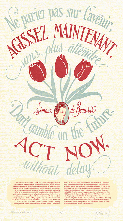
In light of these and countless other stories, our 28th broadside, Liberté, Egalité, Sororité, is layered with meaning. To symbolize the sheer number of women it takes to speak out before our testimonies are taken seriously, every name from the Manifeste des 343 shines through Simone de Beauvoir’s translucent quote. These names are cut off by the edges of the paper, signifying the disbelief and contempt women face when they come forward. In the center of the design is a trio of red tulips, as a nod to Margaret Atwood’s book The Handmaid’s Tale, which teems with floral metaphors of femininity, fertility, death and control.
To help fight the erosion of reproductive rights and protect Roe, we are donating a portion of our proceeds to Center for Reproductive Rights, via an Action Grant from the Dead Feminists Fund. The Center for Reproductive Rights uses the power of law to advance reproductive rights as fundamental human rights around the world.
Liberté, Egalité, Sororité: No. 28 in the Dead Feminists series Edition size: 173 Poster size: 10 x 18 inches
Printed from hand-drawn lettering and illustrations on an antique Vandercook Universal One press, on archival, 100% rag (cotton) paper. Each piece is numbered and signed by both artists.
Colophon reads: Simone de Beauvoir (1908 – 1986) was born to a bourgeois Parisian family who lost their fortune just after World War I. With upward mobility via marriage no longer an option, de Beauvoir focused on her education in order to earn an independent living. In 1928 she became the ninth woman to earn a degree from the Sorbonne, completing a thesis in philosophy. After an early teaching career (which ended once her relationships with underage female students came to light), de Beauvoir devoted her time to writing. Her numerous affairs with other writers also influenced her (and their) work, most notably her 51-year partnership with fellow existentialist Jean-Paul Sartre. In her landmark 1949 book Le Deuxième Sexe (The Second Sex), she declared, “One is not born but becomes a woman,” defining arbitrary societal gender constructs as the source of women’s oppression.
In 1971 de Beauvoir wrote and signed the Manifeste des 343, published in the French weekly magazine Le Nouvel Observateur. This petition of prominent women who underwent illegal abortions called for free access to contraception and the legalization of abortion. Despite attacks by the media—who dubbed the signers 343 salopes (sluts)—the document inspired 331 American doctors to publish a similar manifesto ahead of the 1973 Roe v. Wade Supreme Court decision. In 1975 France followed suit with the passage of the “Veil Law” which legalized abortion.
Illustrated by Chandler O’Leary and printed by Jessica Spring, honoring the brave women who come forward despite personal threats, testifying to secure and protect the rights of all. 173 copies were printed by hand at Springtide Press in Tacoma.
Special thanks to our friends Rebecca Wilkin and Gilles Brocard for their French translation assistance!
I don’t know about you, but on this, the National Park Service centennial, this millennial is paging through her big fat stack of stamped pages, proof of a lifetime of national parks love. Apparently I like to cram that ink into every nook and cranny of my passport—but that’s good, because I’m trying to leave room for many more to come. Happy 100th birthday, NPS—here’s to many more!
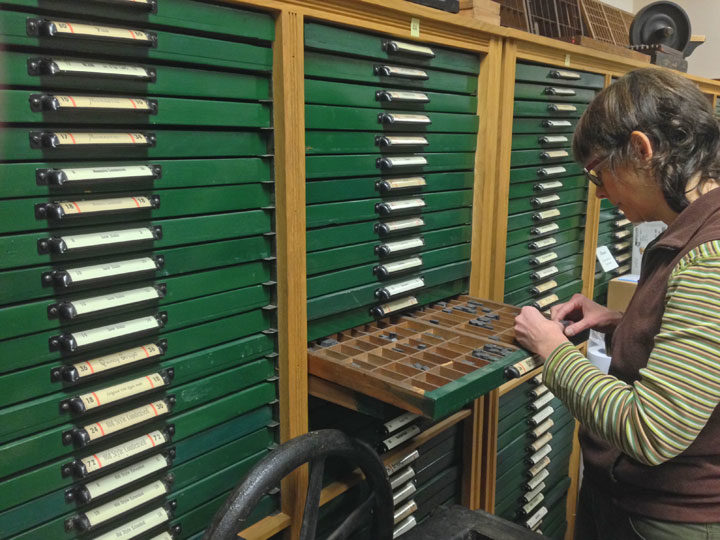
I shot this photo of Jessica typesetting at the Thorniley Collection of Type last year, where she and I were asked to help inventory and appraise the collection (a dream-job moment that I promise to tell you about sometime!).
And then today I came across this short documentary, about the very last edition of the New York Times that was printed from linotype. The year was 1978, and the newspaper was mothballing all its hot-type equipment in order to adopt the brand new, cutting-edge, cold-type technology of phototypesetting. (Phototypesetting was in turn mothballed about 15 years later, when desktop publishing—design software, computer fonts, etc.—hit the mainstream.) If you’re at all interested in printing and have a half hour, I highly recommend the film, as it’s fascinating.
I loved seeing my professional ancestors at work in the film, but I had to laugh, because it struck me that my own career has been a bit, well, backwards.
I got my BFA in the early aughts; much of my design coursework focused on current print technology: design software, digital typography, etc. (Though of course, I was ornery and insisted on including hand-lettering, which was deeply unpopular at the time, in almost everything I did.)
My first industry job, however, was a throwback: I was a production designer doing paste-up at an offset printer that still did phototypesetting. This wasn’t all that long ago: by then that technology was a total dinosaur. At the time they were one of the last presses in the whole country still relying on those processes. The video above demonstrates the paste-up process, but basically the job description is what it sounds like. We took little bits of printed text and photos and, using razor blades and hot wax, pasted them onto a collaged layout that was then photographed and turned into a printing plate. I got to spend my days in a quiet room lit only by light tables, with three other girls who were as introverted as I. I can still smell the wax whenever I think of it—I loved that job, and I loved that smell.
A year or so later I got a job as a graphic designer at a firm, so I guess in that sense I went “forward” in time. But that same month I also got into letterpress printing—proof that my personal tastes were still decidedly cattywampus. I basically did what the printers at the New York Times did in reverse order, trading my cold-type skills in for hand-set hot metal.
And now, while I still keep a finger in both the letterpress (thanks to my collaboration with Jessica) and digital pies, overall I’ve kind of moved backwards in time again. Now I mostly spend my days with the really old-school equipment of paintbrushes and pencils.
And that’s just fine with me. Who says progress has to go only in one direction?
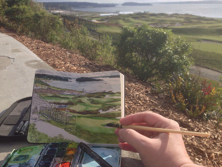
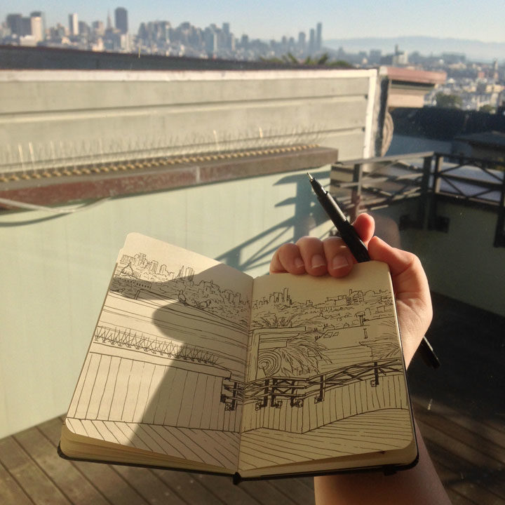
If you’re looking to bring a little sketching into your life, or you attended last month’s sketch outing and want a little training, you can learn the basics with me in July!
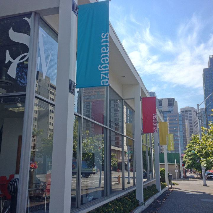
I’ll be teaching my one-day urban sketching workshop again at Seattle’s School of Visual Concepts on July 16—I only teach this workshop at most once a year, so if you’ve been wanting to get some drawing skills under your belt, this is your chance!
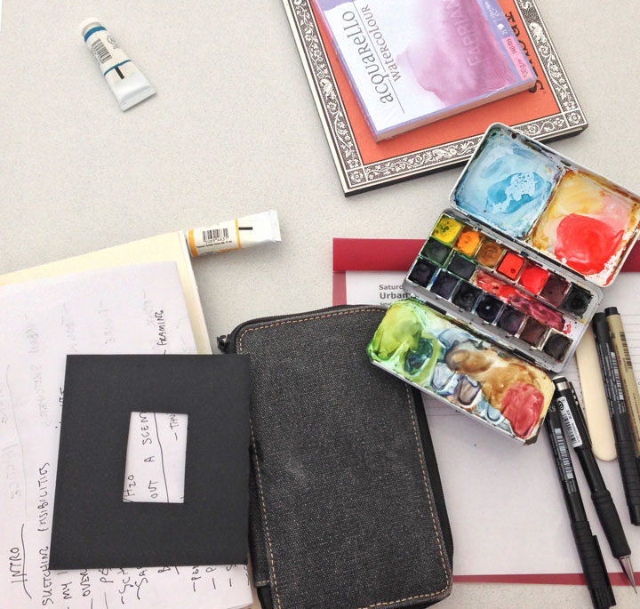
In the class you’ll get a crash course in everything you need to get you on your feet and sketching. We’ll cover travel-friendly materials, tricks for setting the scene, finding inspiration on-the-go, and all kinds of drawing, watercolor, perspective and composition techniques.
And of course, you’ll get plenty of hands-on experience with the chance to get out there and draw in the wild.
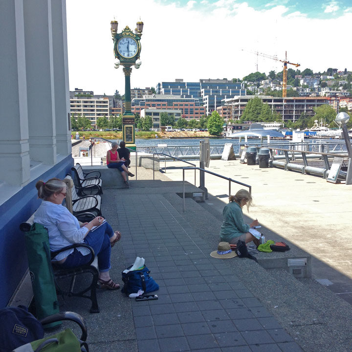
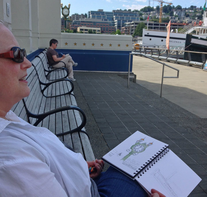
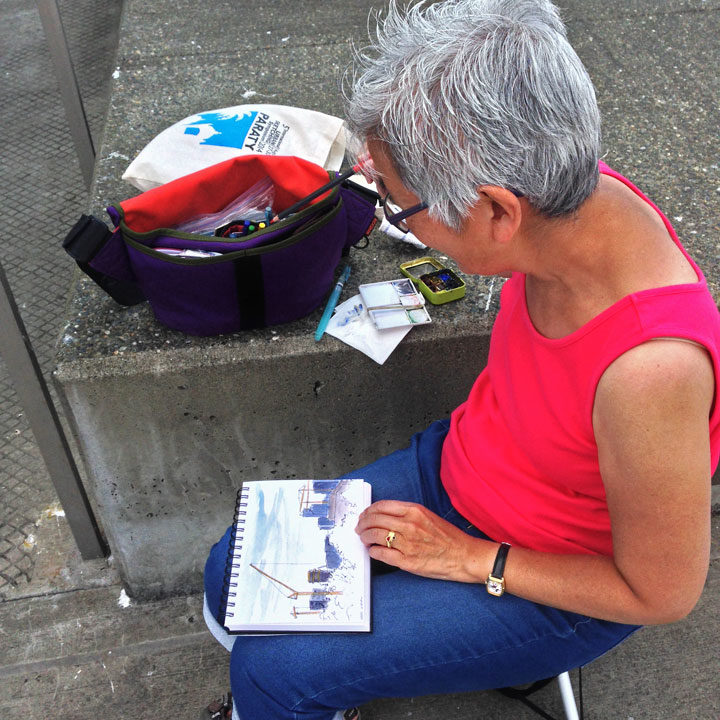
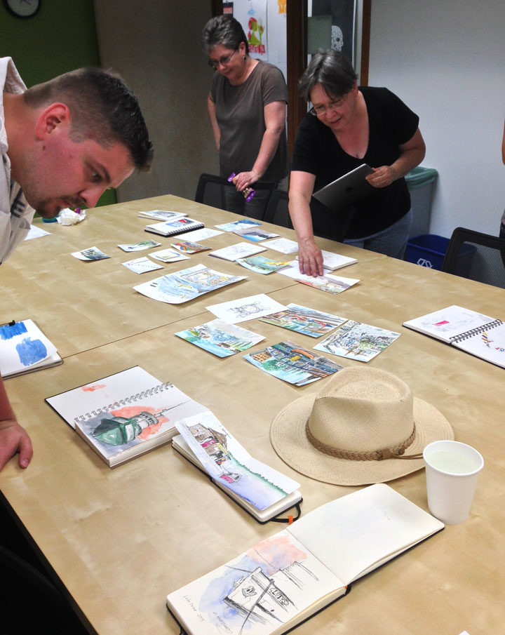
My favorite thing about teaching sketching workshops is seeing my students learn from each other. We’re all basically drawing the same thing, but since everyone has a different style, point of view and level of experience, the finished results are wildly varied.
Last year we all walked to South Lake Union Park, and I loved seeing what everyone chose to focus on in their sketchbooks.
We had both beginners and veterans among us that day, and everyone completed at least one full-color sketch (several went to town and came back with a whole handful of drawings!).
The really fun part is the end of class, where we all got together and shared our drawings. No two were even remotely alike, but all were completely gorgeous!
So if you want a fun kickstart to your new life as an urban sketcher, join us! Here are the details:
Urban Sketching: Learning on Foot
Saturday, July 16, 2016
School of Visual Concepts
2300 7th Avenue, Suite B, Seattle, WA
BYO sketching materials (a list of suggested materials will be sent when you sign up) More info and registration here!
(Use the code GIVE_SMALL at checkout for a $25 discount!)
Note: unless it’s pouring rain, we’ll be sketching outdoors. Please dress accordingly, and plan to be on your feet! Bring lots of drinking water (and snacks if you need them), layered clothing, sunscreen, a protective hat, and good walking shoes. Last year it was 100°F outside, but thanks to everyone being prepared and smart about the heat, we still had a great time!