Come, Come

This blog might be brand new, but I should probably bring you up to speed on a project that isn’t. Starting last fall, right before the 2008 Presidential Election, my friend and fellow letterpress printer Jessica Spring asked me if I wanted to collaborate on a political broadside (basically, a letterpress version of a poster) together. We both felt like this was an important event, and a moment in history, and we wanted to make some sort of contribution to the artistic record. Jessica said she had a historical quote that would be fun to typeset, and asked if I could do a quick illustration of a pair of spectacles to go with it. She thought it’d be fun to make the glasses look like the famous eyewear of a certain Alaskan VP candidate (who can see Russia from her house!)—her plan was to use her impressive collection of wood and metal type to hand-set the quote into the design.
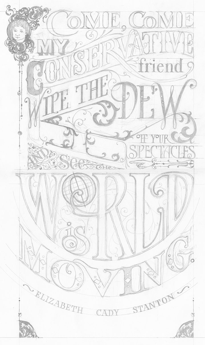
Well, she probably shouldn’t have left me alone with my pencils, because I got a little carried away, and drew not just the glasses, but the whole quote around them, too:
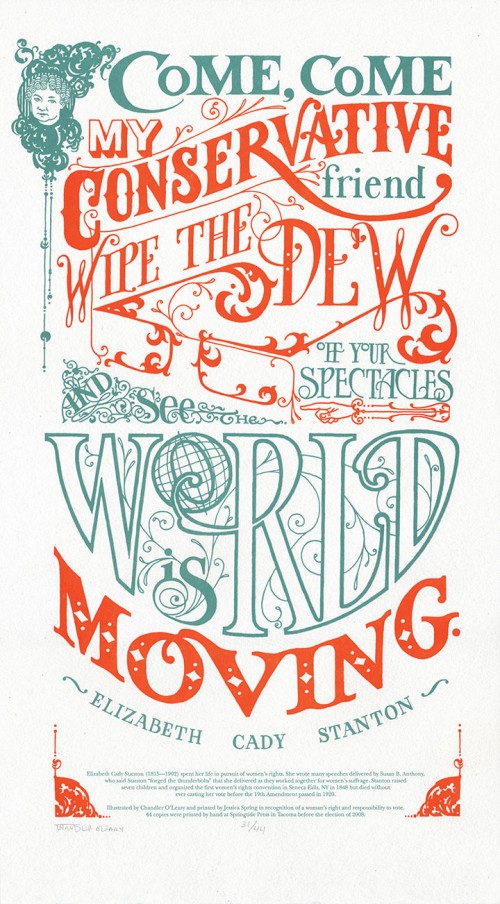
Come, come my conservative friend, wipe the dew off your spectacles and see the world is moving. — Elizabeth Cady Stanton
I did this because I wanted the piece to be something more than simply a jab at a political personality. I wanted it to be beautiful in its own right, something that might do justice to Stanton’s words, and that would be longer-lasting than a momentary visual pun. Besides, Stanton put up one of the most important fights in American history: women’s suffrage. In this country with with a voter turnout rate of less than two-thirds, I wanted to do my small part to get women everywhere, regardless of political stripe, to the polls. And then, as it always does, my fingers started itching to draw my own letterforms. After all, for as much as I love hand-setting type, one of the reasons I’m a letterer is because I’m continually frustrated by the finite number of typefaces available in wood and metal. Not that I’m happy with choosing among the thousands and thousands of digital font families out there, either. Let’s just say I’m picky. So I made up my mind to letter the whole thing by hand, and not to tell Jessica until the sketch was done.
Bless her heart, she went along with the idea. We scrapped the idea of setting vintage type and printed the image using a modern material called photopolymer plates (more on that another day). And then we put the broadside into our online shop, and sent out an email to our little mailing list to let them know we’d made something new.
Three days later, the entire edition of prints was sold out. We were floored! Neither of us had ever experienced this kind of clamoring for our work before—we’d both sold out editions before, but not this quickly. People started emailing us and asking if we were going to do more posters. After reading that, we kind of looked at each other and said, “Why not?”
And the Dead Feminists series was born.
(More on the series another day: first, let’s get to the details about the broadside itself:)
• • • • • • • • • • • • • • • • • • • • • • • • • • • • • • • • • • • • • • • • • • • • • • • • • • • • • • • • • • • •
Come, Come: No. 1 in the Dead Feminists series
Edition size: 44 prints
Poster size: 10 x 18 inches
Printed on an antique Vandercook Universal One press, on archival, 100% rag (cotton) paper. Each piece is numbered and signed by both artists.
Colophon reads:
Elizabeth Cady Stanton (1815 – 1902) spent her life in pursuit of women’s rights. She wrote many speeches delivered by Susan B. Anthony, who said Stanton “forged the thunderbolts” that she delivered as they worked together for women’s suffrage. Stanton raised seven children and organized the first women’s rights convention in Seneca Falls, NY in 1848 but died without ever casting her vote before the 19th Amendment passed in 1920.
Poster is sold out. Reproduction postcards available in the Dead Feminists shop!
![Chandler O'Leary [logo]](https://chandleroleary.com/wp-content/themes/chandleroleary/images/logo.png)
