Continuum
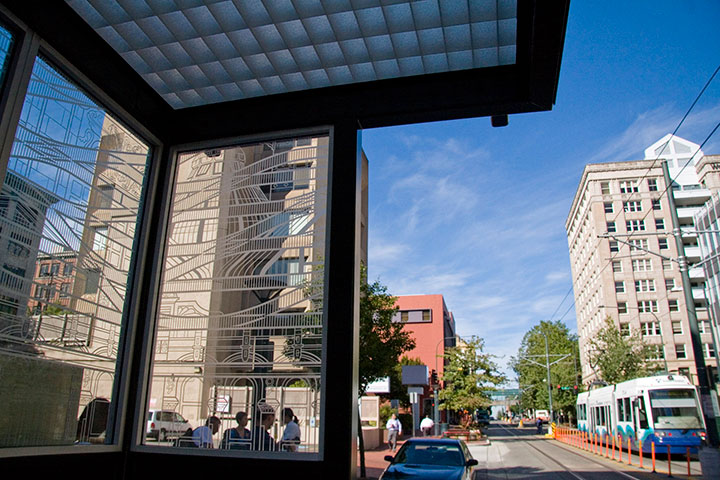
This is rather old news now, but as it took such a long time to complete, and as it isn’t exactly going anywhere, being hot off the press doesn’t matter so much. Last year I was commissioned to do a piece of public artwork here in Tacoma, and as of a few months ago, the Commerce Street light rail station is up and running.
I’ve done several temporary and permanent public pieces before, but this was my first commission for a durable materials project—and by that I mean materials that can be expected to last many decades with minimal maintenance (metal, stone, concrete, ceramics, glass, etc.). Interestingly, painted murals are not considered durable; they require all kinds of upkeep, and have an average life expectancy of only five to ten years.
The Commerce Street Station project called for a design for etched glass. Now, as you’re well aware, I’m no glass artist—it’s a little weird to think of a letterpress printer doing glass work. But that’s the beauty of the public art realm: instead of one artist tackling every aspect of a project, there’s a whole team of people involved, each focused on his or her particular strengths. I was responsible for the design, and industrial fabricators took care of the actual glass-etching part. So what my part boiled down to was a process nearly identical to what I do for any letterpress print: a hand-drawn illustration, converted into a computer file for production. Realizing that created a huge mental shift for me, and suddenly made the prospect of wearing a Public Artist hat way less intimidating.
If you’ve ever stood in a shelter waiting for a bus or train, you’ve probably seen an etched glass design. Usually it’s an abstract pattern to discourage graffiti, or in the Pacific Northwest, often something outdoorsy or salmon-themed. So I figured that territory was well covered. Instead, I focused on the rails themselves. The railroad is possibly the single most significant aspect of Tacoma’s history; it is truly the backbone of our city. In 1873, Tacoma was chosen over Seattle as the terminus of the Northern Pacific Railroad. Without the resultant growth and industry that resulted from the railroad hub, Tacoma might still be a tiny fishing hamlet, rather than a bustling port.
For decades, industrial and passenger rail travel was our pride and joy. Along with the goods and people moving along the NP Railroad line, Tacoma was also criss-crossed with streetcar lines, providing efficient and comprehensive public transportation. During the Great Depression, however, the cost of maintaining the streetcar lines became too heavy a burden. The system was dismantled in 1938, and private automobiles became the dominant mode of transportation. This story is by no means unique — passenger rail fell out of favor all over the country, and today, public rail transit is only the norm in our largest cities.
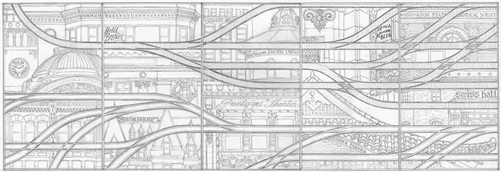
To me, our small (but expanding) light rail line is a ray of hope for a progressive future, a return to a more sustainable system, and a chance to highlight Tacoma’s history. So for Continuum, I designed a brace of parallel rail lines. The top line is a set of traditional railroad tracks, beginning as a single thread and branching outward—symbolizing Tacoma’s beginnings and expansion. The bottom tracks are grooved-rail embedded tram tracks—exactly the type you see in both old streetcar lines and modern light rail paths. As the traditional tracks branch outward, the tram tracks converge into a single path, just as our lone light rail line is the last vestige of the old streetcar network.
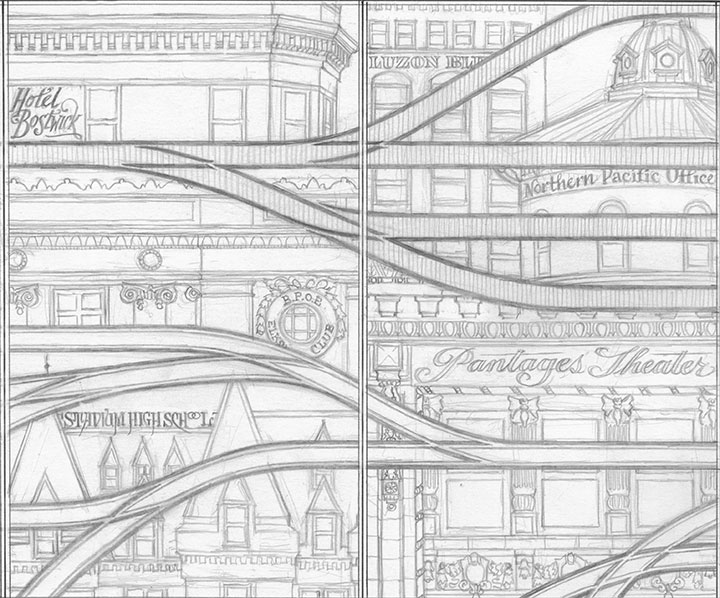
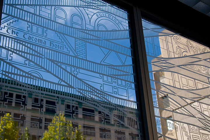
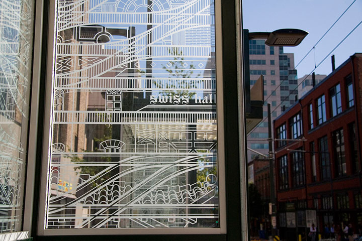
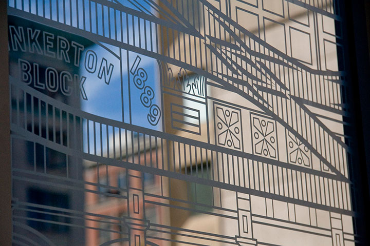
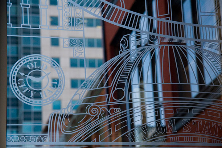
Tacoma’s architecture sprouted and developed right alongside the railroad, as a result of our industrial growth. So instead of surrounding the tracks with a white-noise pattern of ballast, like you’d see around real tracks, I designed an illustrated amalgam of our most iconic buildings. Some are still with us; others are long gone (can you spot the Luzon Building above?). Every structure represented exists either along a historic streetcar or other track line, or has some connection with the railroad.
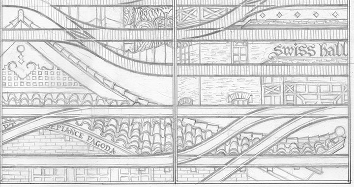
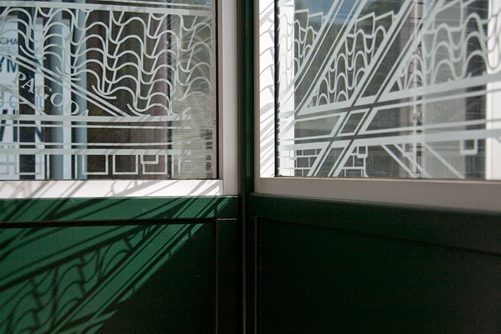
While I was working on the initial design, a teenage arsonist set fire to the historic Pt. Defiance Pagoda. Suddenly it didn’t seem to be enough for the city merely to preserve the architecture—I felt the need to create my own record of as many buildings as I could.
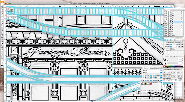
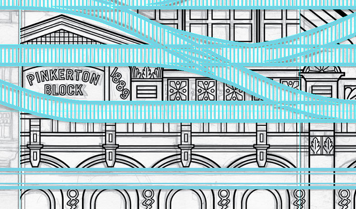
My pencil drawings weren’t finished enough to send to the fabricator—I needed to bridge the gap between my pencil and their equipment. To get the artwork to the point where it could be etched into glass, I needed to convert it to a specific file format called vector graphics. Now, digital photos are made up of pixels: a grid of tiny dots that determine how large a size an image can be blown up to be. The more pixels per square inch, the larger you can make the photo. Vector art doesn’t work like that. Without getting in over my head in explaining this, vector graphics are made of math.
(Which is super cool, really.)
The shapes are determined by geometric points, lines and proportions, rather than pixels. So that means you can blow the artwork up to any mammoth size, or shrink it as small as you please, and you’ll never lose detail or image quality. This makes the vector format A) awesome; and B) ideal for translating extremely intricate work into industrial materials. All I had to do was fire up Adobe Illustrator, and get to work converting the artwork.
This took days. And days. And days.
It’s funny that people tend to see computer programs as shortcuts or “cheats,” but in the end, any good piece of digital artwork requires a level of craftsmanship—exactly the way a handmade object does. Illustrator has lots of labor-saving tools if you know where to look, but the ones that are designed to fully automate the conversion from a scanned drawing to a vector file aren’t always ideal. For this particular project, the only way to do it right was to suck it up and spend ungodly hours redrawing the thing “manually” within the program. I had to rely on all my artist chops just as much for file production as I do for any artist book or watercolor painting. I easily spent as much time converting the design to vector format as I did drawing it by hand, but it’s important to have a flawless file—lots of expensive production steps are dependent upon that file being free of glitches or stray marks.
As an aside, one night that I stayed up (very) late working on the file happened to be the night of the Royal Wedding. To provide some background noise (in order to stay sane), I streamed the event in a little window on the corner of my screen while I worked. So now, whenever I see the finished glass panels I think of ridiculously ornate English hats, and the Queen in her vanilla Jello pudding-colored suit. Pavlov would have a field day with me.
Right-hand photo courtesy of City of Tacoma
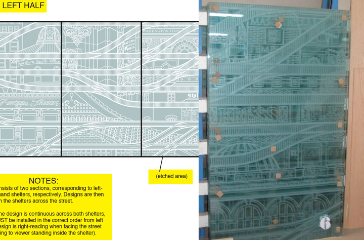
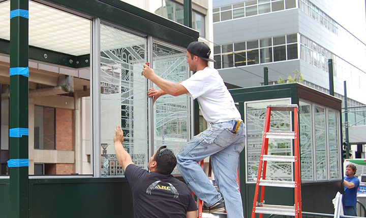
Anyway, next I sent the finished files to the fabricator. Using the points plotted in the file, and a digital mockup I threw together with my production notes, they were able to cut the design out of a masking material, which they attached to the glass. Then the sand-blasted the glass panels. Where there were holes cut through, the sand made contact and etched the glass; everything protected by the mask stayed shiny and transparent. The finished result is a clean, precise replica of my design.
Photo courtesy of City of Tacoma
The tricky part was making sure they installed all ten panels in the correct order; otherwise the connecting track lines wouldn’t make sense. Thanks to the big fat numbers they stuck to each panel, though, everything worked out just fine.
It’s fun to stand inside the finished shelter, and see the stylized buildings contrast with real ones. And when you’re not paying close attention to the details, the illustrations recede into a sort of geometric pattern.
For those who are paying attention, my hope is that this little illustrated city will encourage viewers to notice the real city around them—preferably with an eye toward preservation and innovation.
Attentiveness has its own little reward, too. If you happen to be there when direct sunlight hits the glass, the etched lines project onto every surface. (Tacoma looks good on you.)
In the end, I just wanted to take the dull routine of waiting for a train, and turn it into something beautiful—even if only for a moment.
I’m always saying things like, “If I ran the world…”, usually followed by some crazy idea for transforming every mundane thing in life into something a little more meaningful. I love the thought that on one tiny patch of real estate, I really did get to run the world, and make things exactly the way I imagined they could be. Many thanks to Amy McBride and the City of Tacoma for giving me free rein.
![Chandler O'Leary [logo]](https://chandleroleary.com/wp-content/themes/chandleroleary/images/logo.png)
Absolutely gorgeous! By far my newest favorite piece of yours. I hope they last for many, many years undamaged, and that I’ll get to see them in person sometime!
you amaze me…. truly amaze me… even more than corgis on stilts.
So fabulous! What a wonderful way to leave your mark.