Cover to cover (to cover)
It’s hard to believe we’re only five weeks out from the release of our book! A few advance reader copies are making their way around to media outlets already, and several people have asked us how we came up with the cover design. Since getting to the finished cover was quite a process, we thought we’d show you a bit of the winding path that got us here.
When Sasquatch Books first signed us as authors, they offered us the chance to design, illustrate and hand-letter the cover. Needless to say we jumped at it. But designing a book cover can be very different than designing other things—the stakes are higher, for one thing. In some ways, it’s more of a science than an art: a good cover can have a lot of sway in terms of book sales, so it has to be as eye-catching, informative and readable as possible. So to make sure we got it right, it was a hugely collaborative process—not just between Jessica and me, but also with the publisher, the art director, our editors, the sales team, and lots of other people we never even met in person.
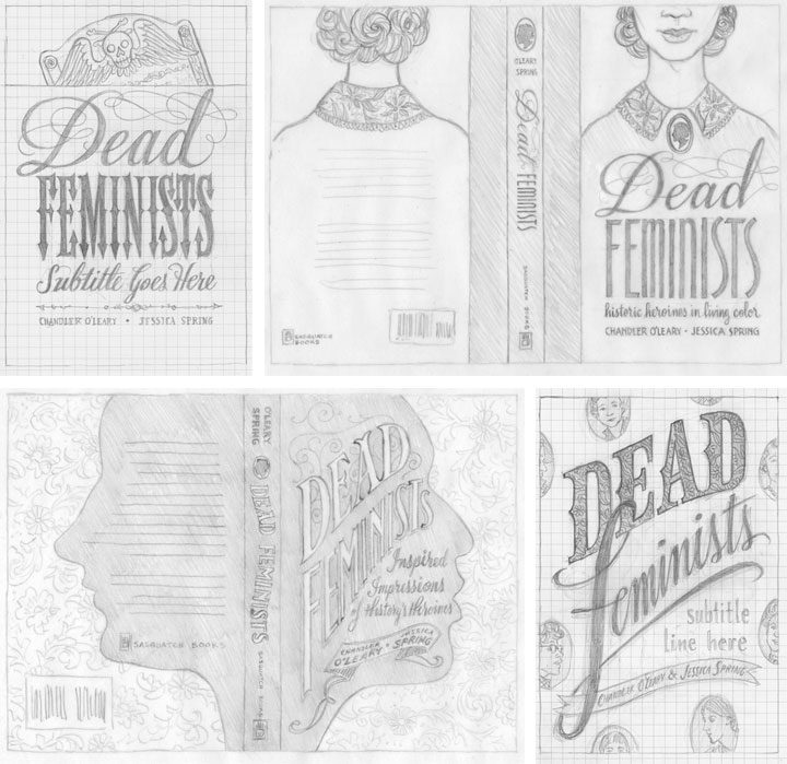
Jessica and I started brainstorming and sketching cover ideas way back in November of last year; above are a few of the concepts we sent along. We had a lot of feedback that large, legible type was key, so that was a good starting point. We also had to be really careful about the hierarchy of type. We had to make sure “Feminists” caught the eye first, followed by “Dead,” then the subhead, then the byline, etc. Later, when we got the happy news that Jill Lepore would be writing the foreword to our book, that added another level to our type hierarchy. In addition to all of this, we wanted to give the Sasquatch team plenty of options, so we tried to make each concept distinct from the others. Right away the clear favorite was the one in the lower right corner, so that was the concept we took to the next level.
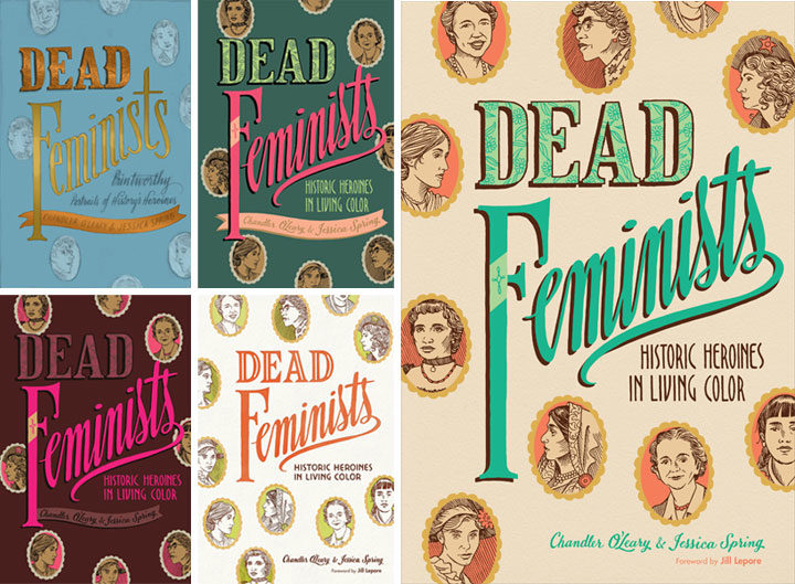
Then came a long parade of versions in color. We worked closely with Sasquatch’s art director and lead designer, Anna Goldstein, to try to catch that elusive unicorn that is a cover that works. I’d mock something up and send it to Anna; she’d mock something else up and send it back to us; rinse and repeat. Each time it felt like we were getting closer, but every time it felt like something subtle was missing. So we made a million little tweaks, to color, to lettering, to texture, to contrast, to composition, to kerning, etc. Each time one of us would have what seemed like a great idea, and each time the result was lacking somehow. I don’t even remember how long we stayed in this holding pattern. (Normally I keep all the iterations of a design carefully numbered in chronological order, but at some point I just lost track. I gave up and labeled that file “VERSION WHATEVER.” It makes me laugh every time I see it.) Everybody was frustrated: the elusive unicorn had transformed into the Holy Grail.
And then I think we all finally conceded that small tweaks were never going to get us there. We needed something to change in a big way, and we needed to scrap much of the work we’d done thus far. This is a really hard thing to admit to oneself—that maybe one’s brilliant idea wasn’t so brilliant after all. But the finished product is more important than anybody’s ego, and no matter how good a kernal of an idea might be, it’s not worth bringing down the whole design over it.
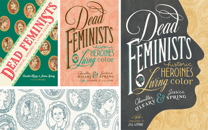
So we quite literally went back to the drawing board. I knocked together a few more pencil sketches, and we asked the whole team again what elements they thought were essential. A lot of people responded to the little cameo portraits of the various historical figures, so we came up with the idea to use them as more of an overall pattern (that’s the green cover on the left, above). Then our editors gave us the feedback that maybe the cover should be more like the style of our broadsides, with bold lettering in many different styles. Anna added the suggestion of making those cameo portraits more of a faint pattern than a major focal point, and then the lightbulb seemed to go on at last. That peach version in the center, I think, was what I put together next. Jessica and I could see that the most recent advice was on the right track, but we were still worried it wouldn’t stand out when seen on a display shelf with a hundred other books. Our editor asked us if we had any ideas for how to make it pop, and in wild desperation I fished out one of our earliest pencil sketches (above), the one with the face in silhouette, and gave it another look. What didn’t seem to work in sketch form suddenly felt like the missing ingredient when paired with the cameo pattern and the bold lettering. We sent a version back to Anna, and she gave it that antique texture and the gold-grey-and-teal color scheme you see here. And that was it—it was like she’d flipped a switch, and voilà: finished cover.
Over the course of eight years of printing our broadsides, Jessica and I had grown accustomed to just doing whatever we want in terms of design and content. With small editions to print, and nobody to please but ourselves, the stakes were low—and there was always plenty of room for experimentation. This book has been an entirely different animal, and I think designing the cover has been a perfect metaphor for the whole process. Writing a 40,000-word manuscript about history and feminism was never something we thought we could do, but with the incredible help of our editors, we got there. Likewise, designing the container for that content was a massive group effort—so major props and big thanks to Anna for sticking with us. Getting to the finish line required stepping way beyond our comfort zone—and more importantly, it took the whole team. We couldn’t have done it alone, and that’s a good thing, because both book and cover are the better for it.