Hedge trimmings
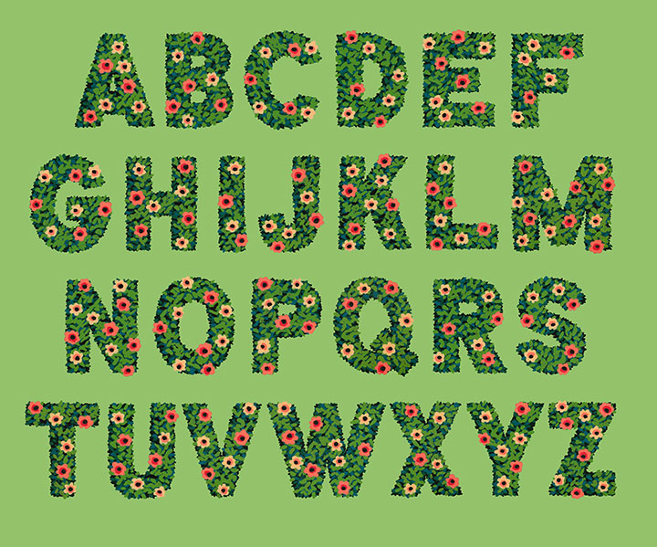
Look! I made an alphabet!
It’s funny—I almost never design an entire alphabet. In general, lettering projects just don’t really work like that. Most of the time, a letterer(erer) designs only the letterforms required for the word or phrase they’re lettering. That’s really the best way to create letter styles (which are not the same as fonts!) that really fit what the text is trying to “say.” You’re not designing an alphabet and then making it work for a bit of text—you’re taking that bit of text and giving it a voice.
But this time, I did things differently. I wanted to create some botanical lettering, but I wasn’t sure what I wanted to use it for—so I went whole hog and started with the entire alphabet.
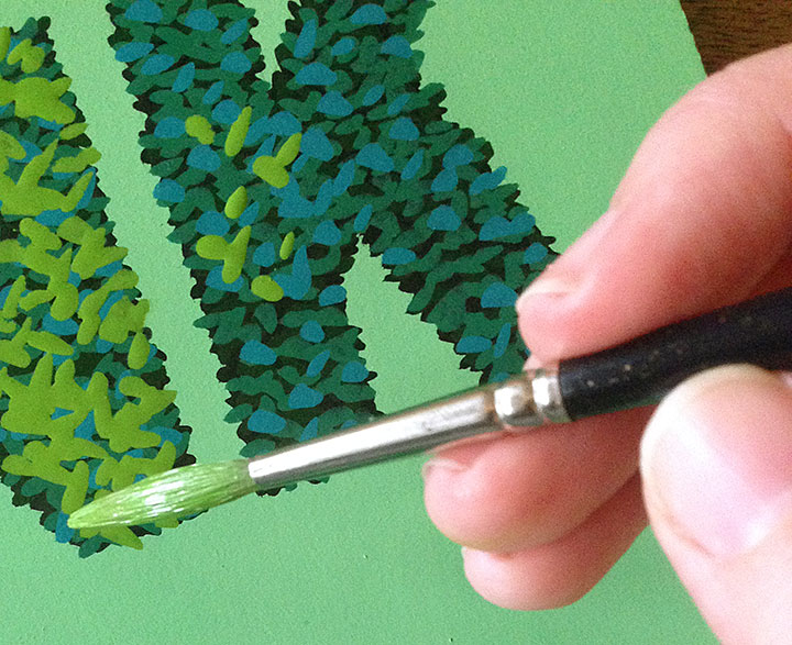
Lately I’ve been doing a lot of work with a new (to me) medium: acrylic ink. It’s what I used to create the You’ll Like Tacoma and Love Birds series. What I love about acrylic ink is that unlike watercolor, it’s opaque—and infinitely easier to wrangle than the more traditional opaque medium of gouache.
When you work with watercolor alone, you have to start with the lightest colors first, and build up darker ones in layers. Whites are the white of your paper, and once you add pigment to an area, you can never return back to that pristine white. It teaches you to think in a subtractive sense, where you sort of “cordon off” the areas you want to stay white, and carefully build everything else up around them. I love working with watercolor, but it takes years and years of practice to feel proficient at it, and it’s not a medium that’s forgiving of mistakes.
I find opaque media to be far more freeing, and the look more crisp. (I also like to combine acrylic ink with watercolor in the same painting—the best of both worlds!) But what I love best about it is that I don’t have to work from light-to-dark—I can go in reverse! Many of the mid-century illustrators I admire (Mary Blair, Eyvind Earle, Walt Peregoy, Ralph Hulett, etc.) painted with opaque media, so I looked at a lot of landscape paintings done for animation backgrounds for clues on technique. That’s when I figured it out: dark-to-light, not light-to-dark.
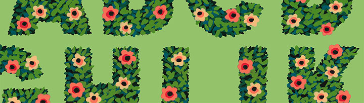
For my alphabet, I started with a black hedge silhouette, and added leaves (above) in increasingly lighter greens and blues. I think by the end there were 9 or 10 layers of paint in the finished lettering.
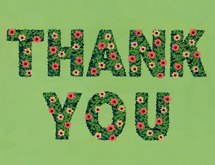
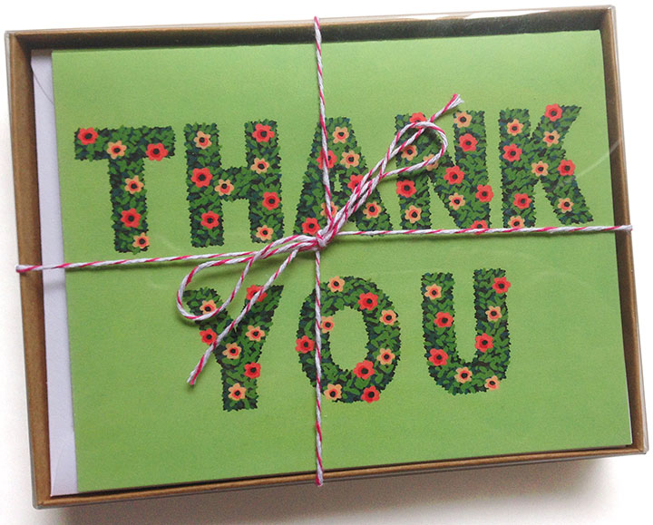
I was so grateful for the epiphanies Earle and Hulett had given me that suddenly, what I wanted to do with the alphabet became clear: thank-you cards!
To hedge my bets (sorry) I’ve packaged them up both individually and in pretty little box sets of 8. You can find yours in the shop!