Sketchbook building blocks
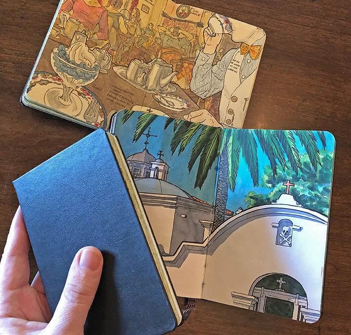
When I was putting together my book proposal for The Best Coast (and later when I started the process of building the book itself), I imagined its illustrations to be an extension of my sketchbook drawings. After all, I’ve spent so many years documenting my travels in my sketchbooks that they’ve become an integral part of how I think, how I see the world.
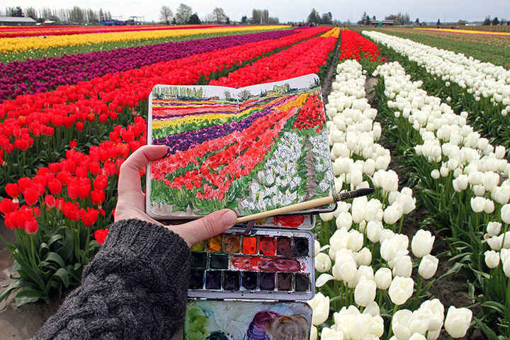
But while the sketchbook is an ideal medium for capturing images out in the field…

…it didn’t lend itself very well to the finished illustrations that appear in the book. For one thing, I had to design each page spread around the text of the book; the amount and proportion of real estate allotted for each illustration was entirely dependent on the text content and length. For another, my travel sketches usually span an entire page spread in the sketchbook; things like gutters (the center fold) and book stitching would be distracting if they were reproduced in The Best Coast. And besides, the sketchbooks I use are pocket-sized—not exactly ideal for large, full-spread book illustrations.
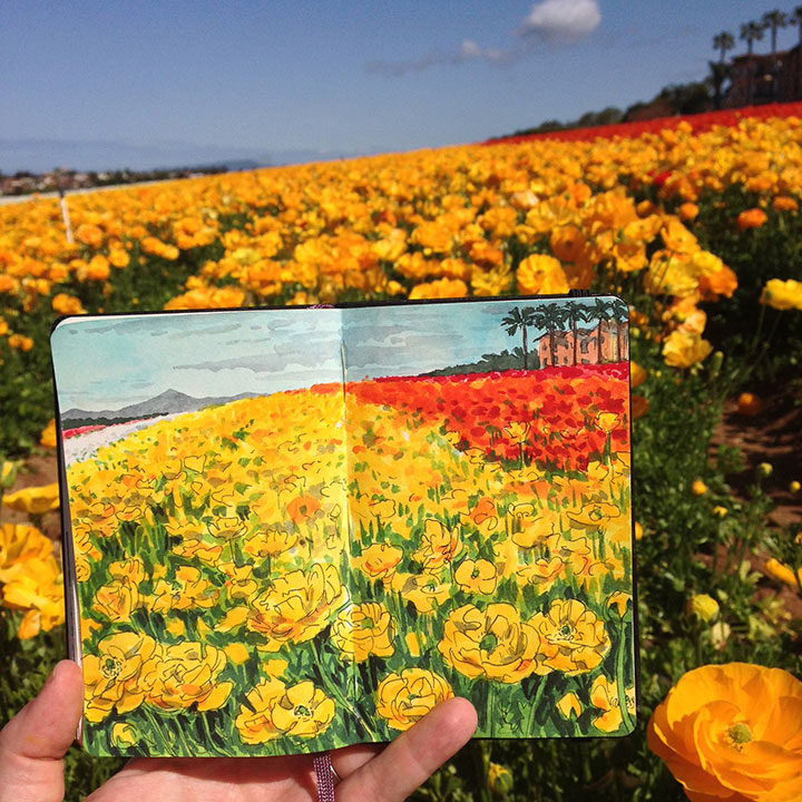
Still, I wanted to preserve the overall look and feel of my sketchbook drawings in my book illustrations. Not only was that style of drawing what I was largely known for as an artist, but I also just loved the quality of the line work and watercolor in those little sketchbooks, and wanted to reproduce it as closely as I could. The sketchbooks I most often use are the Moleskine brand—the paper inside is actually terrible for watercolor (not a material I’d recommend for beginning watercolorists!), something akin to painting on a manila folder. But I’d been working with that paper for so many years that I knew how to wrangle it, and I also knew that if I chose some other paper for my book illustrations, I’d have to master a different learning curve to achieve results I was happy with.
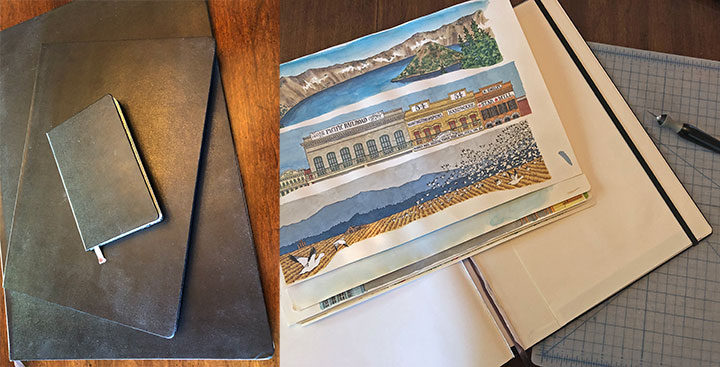
Luckily, I did a little research, and discovered that Moleskine makes the exact same sketchbooks I use in much larger sizes! So I bought a bunch of them and carefully cut the pages out of the binding.
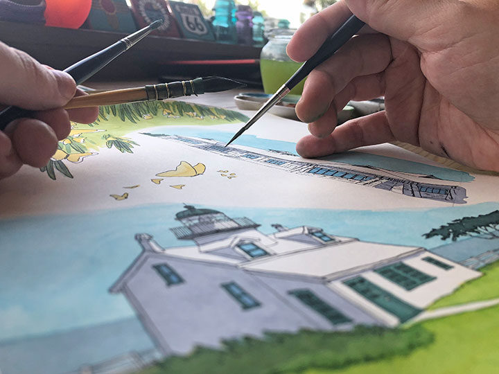
And just like that, I had the exact same paper I was used to working with, on a much larger scale (and without those page gutters to worry about). I could just spread out in my studio and get to work without any interruption.
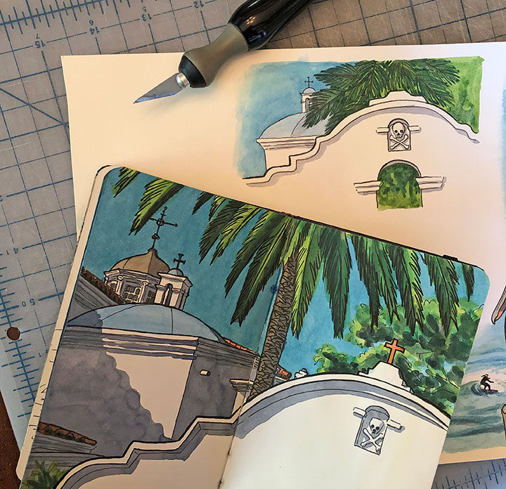
Some of the illustrations in my book are straightforward re-workings of my sketchbook drawings, while others are new and completely different. But it felt so good to work with the same materials that I take out with me into the field—that made it easy to transport myself back to the time and place where I got to capture each location in person. As a result, The Best Coast is every bit of an extension of myself as my sketchbooks are.
![Chandler O'Leary [logo]](https://chandleroleary.com/wp-content/themes/chandleroleary/images/logo.png)