Since today is #WorldBookDay, I thought I’d share a behind-the-scenes look at the process behind the cover design of my new book. And just like any part of bringing a book to life, creating the cover is a careful, detailed, and often lengthy process.
Designing a book cover is more of a science than an art—because the design has to be extremely hard-working, every part of the design has to be well thought out and carefully considered. Since it has to be eye-catching in every setting (at thumbnail size in a catalog, on a bookstore shelf amongst a slew of other titles, etc.) everything from subject matter to typography/legibility to color scheme is important. That’s a lot of responsibility to place on one image!
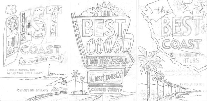
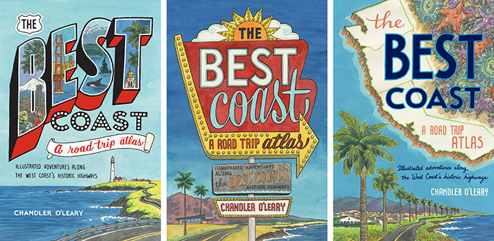
Thankfully, I had a lot of vintage inspiration to…well, draw from, as a starting point. Because the book encompasses many vintage roadside attractions and other historic icons, it made sense to reference vintage travel ephemera, at least in one of the three sketch concepts I developed for the editorial and design team at Sasquatch.
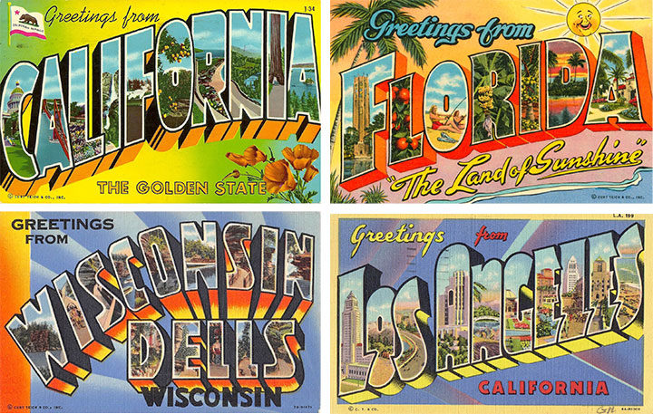
For the first concept (the one on the left in the above trio of sketches), I used vintage travel postcards as a starting point. We’ve all seen these things—they were absolutely ubiquitous for decades, and it’s easy to see why they’re so iconic.
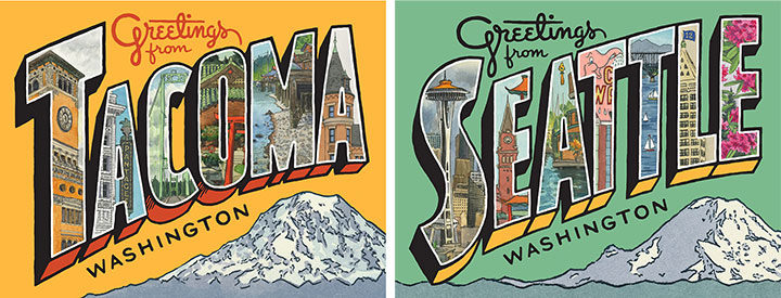
I’ve even referenced them in my own work in the past—these are some greeting cards I created recently, combining original lettering with a mish-mash of some of my older sketchbook drawings.
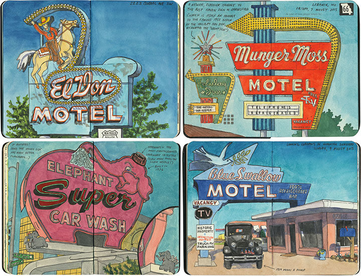
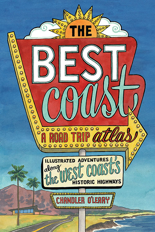
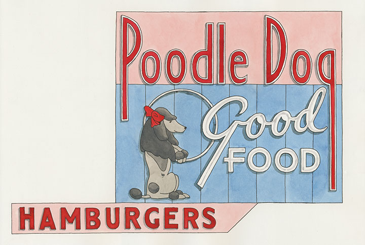
For the second cover concept, I created a faux neon sign, based on the many, many examples I’ve seen and sketched on my road trips over the years. Thankfully, so many of these old signs are still around today that their unique “Googie” design style is still instantly recognizable to viewers of all ages.
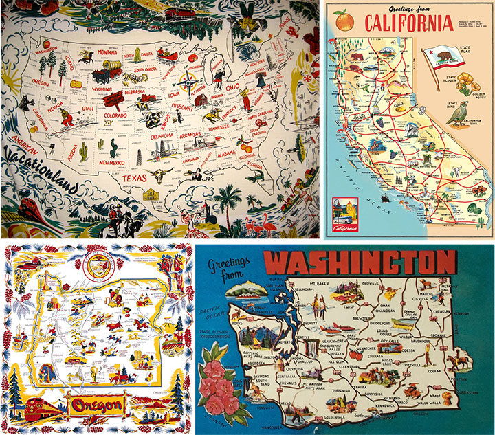
And finally, I wanted to create a cover concept that at least gave a passing nod to another staple of vintage travel ephemera: the souvenir map. I have a major soft spot for these things (as well as a big personal collection of map postcards and even midcentury map tablecloths—as anyone who has ever attended Studio Tour will have seen!), and have referenced them over and over again in my work. And after all, this book is an atlas—there are nearly a hundred maps inside, so it made sense to at least try one on the cover. In the end, I kept the map part of my third cover sketch super simple, but the thought process behind it was still there.
Here are the three full-color cover concepts I sent to Sasquatch. And the winner was chosen pretty unanimously—everyone was drawn to the neon sign concept (including me!). The weird thing, though, was that unlike the cover process for Dead Feminists, this book cover went from zero to finished in record time. I was bracing myself for an endless number of revisions, color tweaks and do-overs, because that’s what it took last time to arrive at the right cover. So imagine my surprise when the Sasquatch team got back to me and said that they’d shown it to everyone from design to marketing to sales, and they’d all agreed that we’d pretty much hit it out of the park on the first try!
So that was it—I made a few tiny tweaks to the lettering of the subhead, and a few subtle color changes, and Bob’s your uncle. With Dead Feminists, we were still revising the cover right up until the book went to press. This time it was the other way around: the cover was done months ahead of time, and the book itself was being tweaked and edited until the last possible second. But that’s another story for another day…
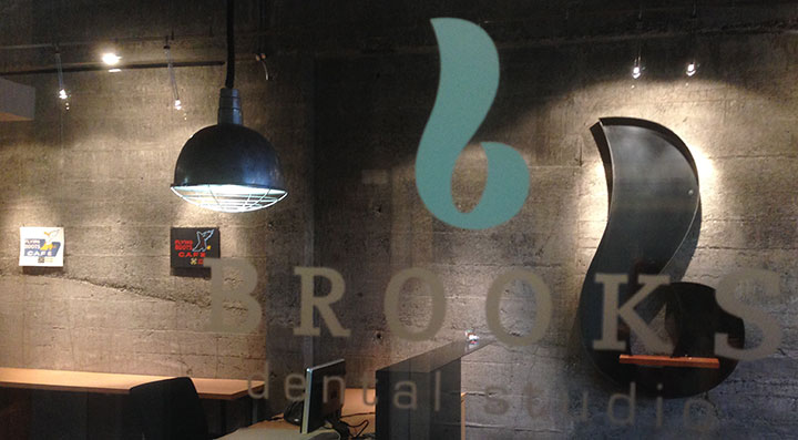
If you’re local, this is the last week to catch my You’ll Like Tacoma Show on display. So head on downtown to Brooks Dental before the lights turn out!
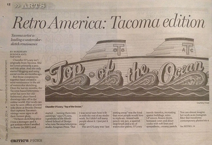
I woke up this morning to find a big article about my You’ll Like Tacoma exhibit in the News Tribune! Huge thanks to Rosemary Ponnekanti for interviewing me and for the kind review of my show!
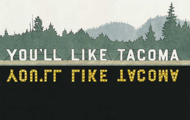
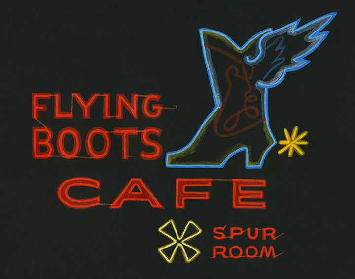
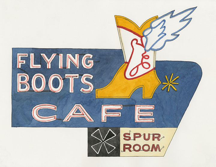
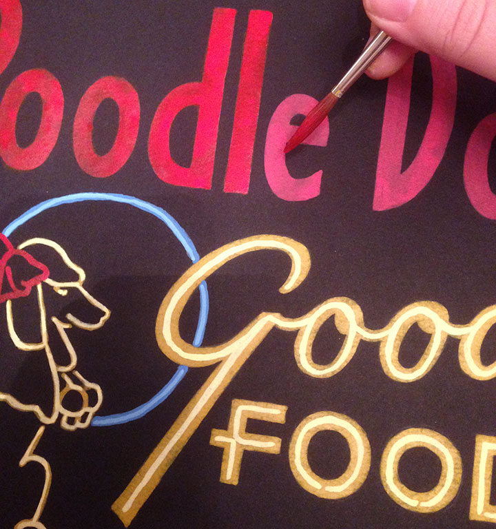
The Pacific Northwest is a treasure trove of vintage neon typography, preserved into the modern landscape of our cities. Despite the best preservation efforts, however, there are still many examples that have long since passed into history. These ghosts of Tacoma are the ones I’ve chosen to resurrect for my You’ll Like Tacoma series of paintings. Some photographic records still remain, so from among them I’ve chosen my favorite signs to recreate in living color—each one of these is hand-painted with acrylic ink on black paper. My entire body of reference material is in black-and-white, though, so while I have done my best to represent color accurately, a fair amount of artistic license has been necessary. Since neon signs fascinate me equally by day and by night, I’ve depicted these as paired diptychs.
I’ll start with the first set, above. This “You’ll Like Tacoma” beacon is an early example of electric signage. The sign ran as an advertisement (touted as “the longest shoreline electric sign in the world”) during the 1909 Alaska Yukon Pacific Exposition in Seattle, in hopes of getting out-of-state visitors to move to Tacoma. Its exact location is unknown, but the sign was erected along a shoreline—most likely along Lake Washington, near the AYP Exposition site (now University of Washington). The sign pre-dates the advent of neon technology in the U.S. (French neon tubes were first introduced in California in 1923), so it’s likely the sign was lit with a series of white bulbs.
Located on South 38th Street in Tacoma’s Lincoln District, the Flying Boots was a popular tavern for 75 years, until it closed its doors just last year. The bar’s days ended on a sour note when patrons looted the place for mementos on its last day in business.
The Flying Boots was purchased in December 2013, and reopened just this past April as a country-themed sports bar—complete with restored sign.
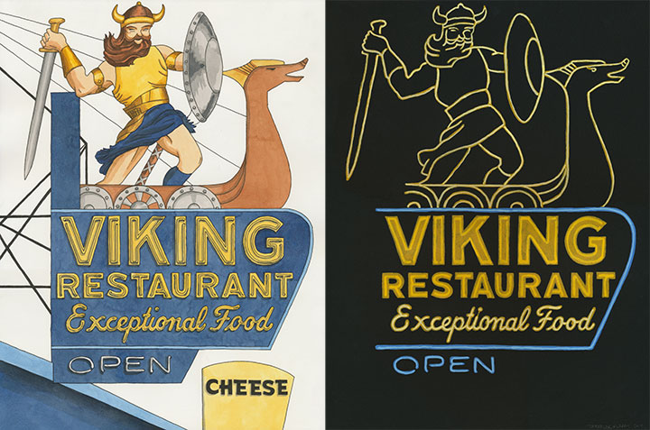
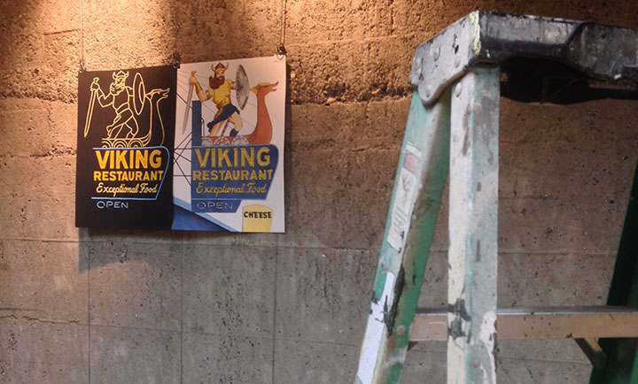
Okay, this guy was my favorite, and not just for the viking in short skirt. I mean, come on: “Cheese!” Any sign that just randomly screams “Cheese” is a winner in my book.
Anyway, this midcentury icon was formerly known as the Viking Smorgasbord, and specialized in Scandinavian-American food. The Viking once stood at 9702 South Tacoma Way (along former Highway 99—the West Coast’s answer to Route 66)—on a lot now home to a modern (and totally depressing) strip mall.
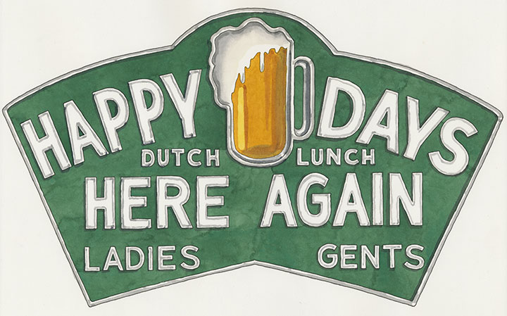
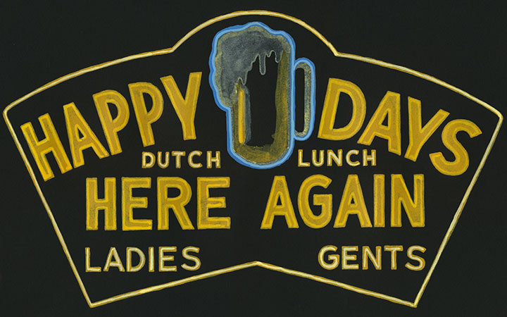
The Happy Days was one of many taverns to call Tacoma home over the years, though this one appears to have been rather short-lived. Located at 1302 Broadway, this place had its heyday in the 1930s.
What I love about this one is that it’s sort of the 1930s equivalent to what a hipster establishment might do today—the whole place is one huge pop culture reference. The name is a nod to the famous Depression-era song, while the proudly-displayed beer mug celebrates the end of Prohibition—which at the time had been newly repealed.
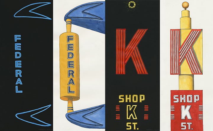
Both the giant Federal Bakery rolling pin and the “Shop K Street” sign occupied the same block in Tacoma—though that stretch of K Street has been renamed Martin Luther King, Jr. Way. Oh, how I wish I could have been a customer of the Federal Bakery—the place was open for almost 100 years. (I missed it by a decade, though.) That whole block, sadly, was demolished in 1998 to make way for a Rite Aid pharmacy—which is now sitting empty. (I can’t even drive past that corner—it makes me too angry.)
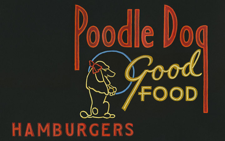
Of all the establishments represented in this series, the Poodle Dog is the only one still in business today, without changing hands. The Fife restaurant has been a fixture along old Highway 99 for decades.
Though while the Poodle Dog recently celebrated 80 years in operation, you’d find that my illustration no longer matches its living counterpart. The original midcentury sign is long gone, replaced by a modern (and not nearly as good) facsimile.
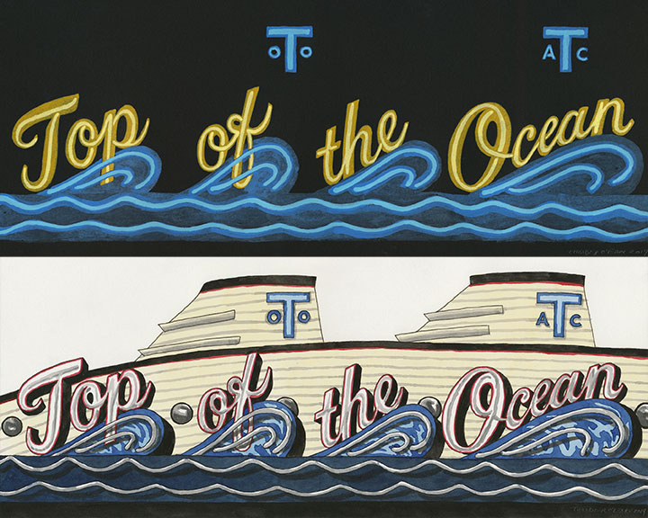
I saved the best for last—every Tacoman, whether they were alive to see the real thing or not, knows about the Top of the Ocean. It’s easily our most famous ghost—and one of our saddest stories (rivaled maybe only by the Luzon).
Tacoma’s hottest restaurant and nightclub, nicknamed “the Top,” opened in 1946. The theme restaurant resembled an ocean liner, constructed on piers along the Ruston Way waterfront in Old Town (if you click that link and look closely, you’ll find another Top of the Ocean homage I made…). It boasted a sunken dining room, dance floor and music stage, a floating dock to accommodate up to 20 yachts, and even seaplane taxi service on Sundays. The building was destroyed by arson in 1977, the crime committed by a mentally disabled man hired by the mob. (Yes, the mob. You can’t make this stuff up!) A memorial stands in its former location, now a public boardwalk.
For me, the whole point of creating this series was to provide some sort of reminder of how much our city—and every city, really—has changed over time. I barely scratched the surface with my research. I chose eight signs, but there were easily dozens more I passed up—and who knows how many have slipped through the cracks, with no old photographs to prove they existed? To me, each one of these signs is a wonder of graphic design and typography, made by talented but unsung artists, who never signed their names to their work. If I can do my small part to bring them back into the world, even only in effigy—well, I feel like that’s time well spent.
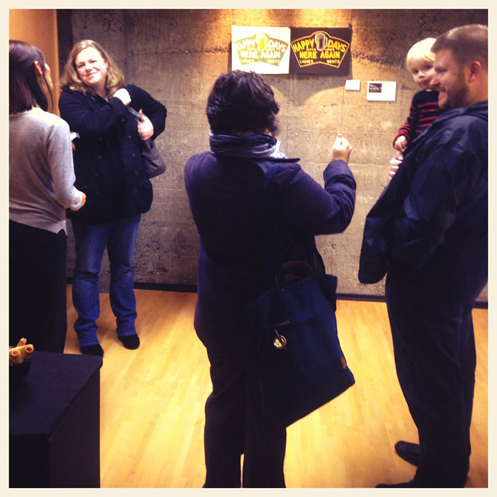
Many thanks to everyone who braved the cold to come to the You’ll Like Tacoma opening last night! As always, I forgot to take photos—the only one I managed to snag was this crummy phone snap. But we had a great turnout of folks of all ages (“kids from 1 to 92…”), and lots of shared stories from people who remember these old neon signs. I’ll post each piece in the exhibit here soon—stay tuned!
It’s the new year—time to hang some new artwork. I’m pleased to announce that I’ve got a new solo exhibit opening this Thursday!
The show is in the most unlikely of places: a dentist’s office. I kid you not. But Dr. Jamie Brooks (we all call her Dr. Jamie) is no ordinary dentist, and her space is no ordinary clinic—it’s an absolutely stunning piece of modern interior architecture, and twice a year she adorns it with new work by regional artists. Dr. Jamie really understands the value of adding art to the mix of our everyday lives, and has turned a utilitarian space into something really special—and supporting local artists while she’s at it.
Once the show opens and local folks get the chance to see it first, I’ll post all the images here—but for now, here’s a little taste. Each of the 16 illustrations in the exhibit is a hand-lettered homage to Tacoma’s blazing neon history, told through iconic signage of days past. The images are arranged as day-and-night diptychs, painted on white and black paper, respectively.
So if you find yourself in the Northwest in the coming months, be sure to stop by!
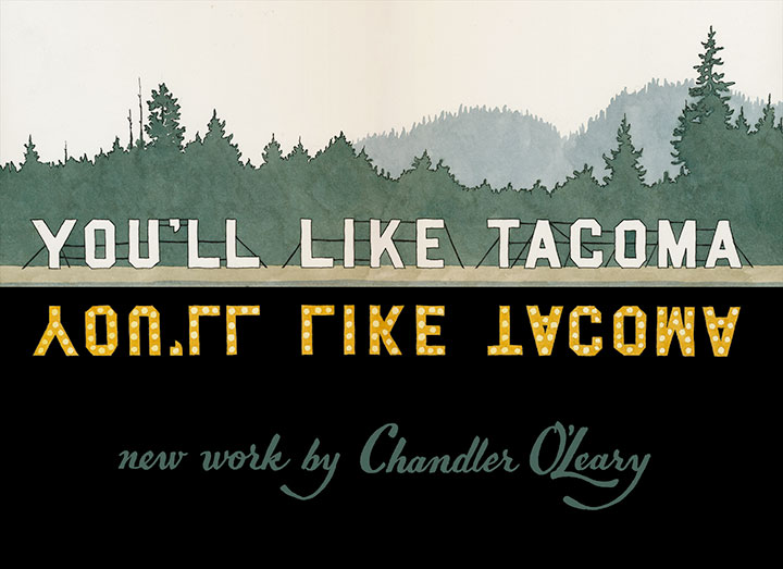
You’ll Like Tacoma: a solo exhibit
On display through June 30, 2014
Opening reception Thursday, January 16, 5 to 7 pm
Brooks Dental Studio
732 Broadway, Tacoma, WA 98402
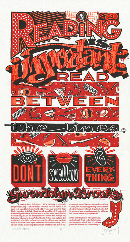
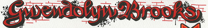
In honor of Black History Month, and of the might of the written word, our newest Dead Feminist is powerhouse poet Gwendolyn Brooks. Without further ado, I’ll hand over my pen to her:
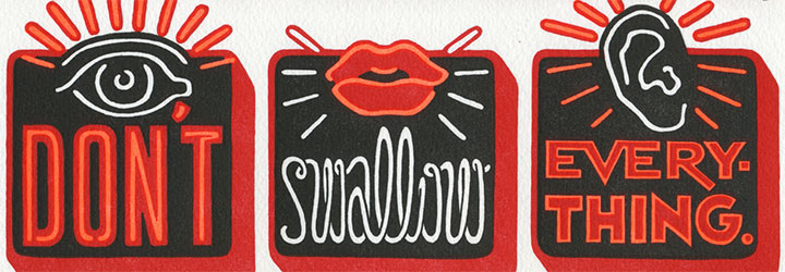
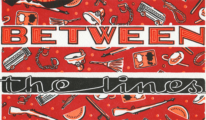
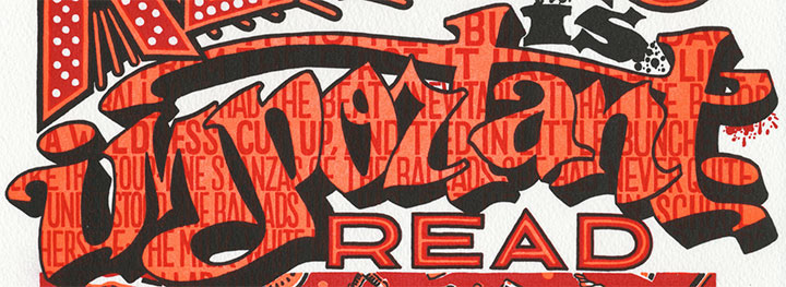
Reading is important. Read between the lines. Don’t swallow everything.
I guess we’re done with the knitting needles and home canning for now; time to don the boxing gloves. This was a tough one, and we almost didn’t have the gall to go through with it. But Gwendolyn Brooks was never one to pull a punch; she faced and shed light on the most uncomfortable truths with bravery and eloquence. And there seem to be an awful lot of uncomfortable truths floating around lately; like a certain congressperson’s assertion that our nation’s founding fathers ended slavery, or the fact that no matter how many African American Presidents we elect, racism isn’t dead. (Don’t believe me? Even my most cursory historical research brought up all sorts of fresh, modern hatred. Try it for yourself and do an online image search for “watermelon stereotype”—if you can stomach it. Just keep an airsick bag handy, because it ain’t pretty.)
So in tribute to Brooks’s courage, Warning Signs is a riot of color and fluorescent ink, glowing like an urban beacon. Flashing neon and spattered graffiti confront us, sounding the alarm with every word. Beneath the fluorescent current runs a blood-red repeating calico pattern of violence and cruelty—a tapestry that forms the unfortunate warp to the weft of our past and present.
And as an undercurrent to the undercurrent, behind the graffiti reads the first stanza of Brooks’s poem, “A Bronzeville Mother Loiters in Mississippi. Meanwhile, a Mississippi Mother Burns Bacon.” The poem grapples with the brutal 1955 murder of 14-year-old Emmett Till, and weaves a tale of remorse and confusion from the perspective of Carolyn Bryant, the white woman whose accusations that Till flirted with her provoked her husband to abduct and kill the boy. But we didn’t choose the poem for its subject matter, per se—we chose it for the articulate beauty with which Brooks tells the story. It’s still a punch to the gut, but when she knocks you flat you see some awfully pretty stars.
A portion of the proceeds from Warning Signs will be donated to 826CHI, a non-profit Chicago writing and tutoring center. 826CHI is dedicated to supporting the writing skills of students ages 6 to 18, and to helping teachers inspire their students to write—their mission is to “strengthen each student’s power to express ideas effectively, creatively, confidently, and in his or her individual voice.” We think Ms. Brooks would approve.
Warning Signs: No. 11 in the Dead Feminists series
Edition size: 113
Poster size: 10 x 18 inches
Printed on an antique Vandercook Universal One press, on archival, 100% rag paper. Each piece is numbered and signed by both artists.
Colophon reads:
Gwendolyn Tamika Elizabeth Brooks (1917 – 2000) grew up in Bronzeville, a neighborhood on Chicago’s South Side where she “wrote about what I saw and heard on the street.” Brooks published her first poem at age 13, and by 17 was a regular contributor to Chicago Defender’s poetry column. Her first book, A Street in Bronzeville, was published in 1945, bringing critical acclaim and a Guggenheim Fellowship. In 1950 she became the first African American to win a Pulitzer Prize for her second book, Annie Allen. After attending a Black Writer’s Conference at Fisk University in 1967, Brooks said she “rediscovered her blackness,” reflected through In The Mecca, a book-length poem about a mother’s search for her child lost in a Chicago housing project. Her work became leaner, more sharply focused, and she committed to publish only with independent African-American presses. Declaring “I want to write poems that will be non-compromising,” Brooks continued to confront issues of race, gender and class.
As a teacher, poet laureate of Illinois and as poetry consultant to the Library of Congress, Brooks encouraged young poets through school visits and inner-city readings, bringing poetry to the people she spent her life writing about. She sponsored and hosted numerous literary awards, often with her own funds, committed to the idea that “poetry is life distilled.”
UPDATE: poster is sold out. Reproduction postcards available in the Dead Feminists shop!