Blog
November 9th, 2010
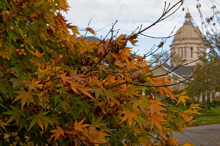
I woke up this morning after the first full night’s sleep in over a month, and celebrated by breaking the recent routine of studio-studio-studio entirely. I ignored the computer, bundled up, and headed down to the state capitol in Oly for a once-in-a-century party.

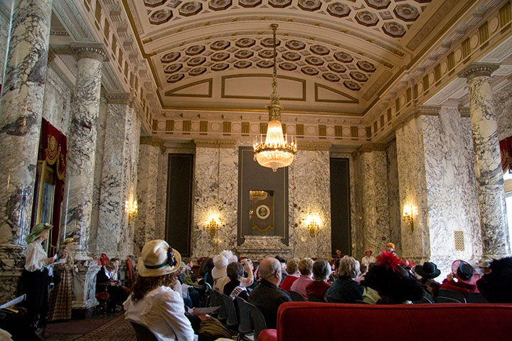
One hundred years ago today, the state of Washington approved an amendment to the state constitution granting women the right to vote.

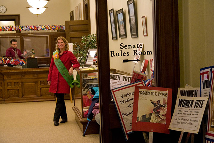
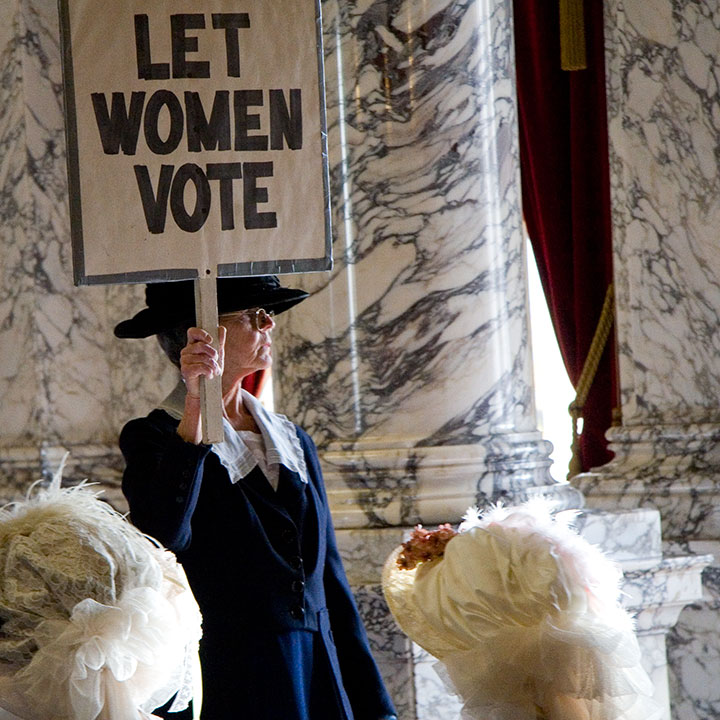
To celebrate the occasion, the capitol rotunda played host to the Centennial Day of Jubilation. Forget collaborating on Jell-o recipes; I think even May and Emma would have agreed on how cool an idea this was.

Everyone in the Rotunda got in on the action. The Lieutenant Governor’s office, here, was transformed into a picket line,

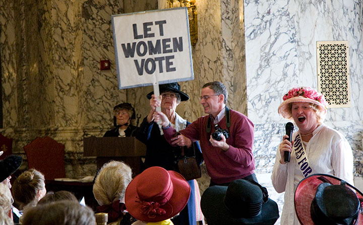
while reenactors turned the foyer into a debate chamber.

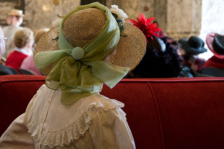
And upstairs, in the Reception Room, a feisty demonstrator channeled the spirit of the suffragists—

and did her best to drag the audience into the past with her.

It’s too bad I don’t own any Edwardian clothing—I felt a bit underdressed for the occasion.

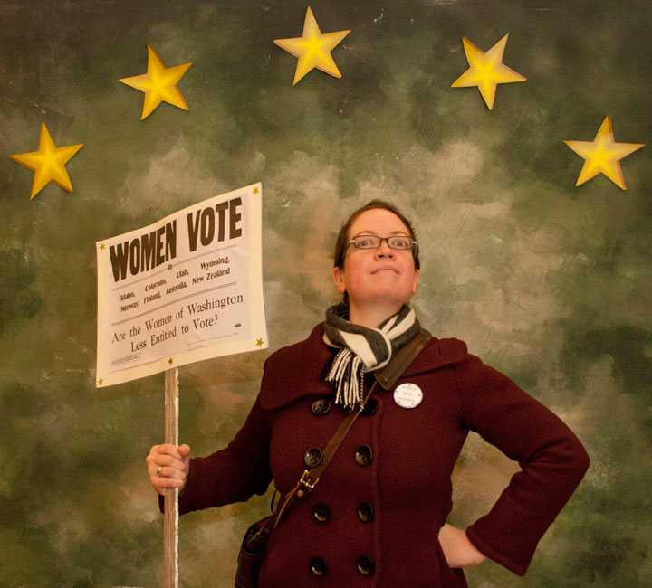
Still, I managed to channel my inner suffragist, even without the corset and bustle.

And on my twenty-first century overcoat, I found a way to wear a little pride. In my head I did a little thank-you salute to all the Washington suffragists of old. Ladies, we couldn’t celebrate without you.
November 5th, 2010

Photos by Sarah Christianson
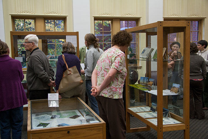
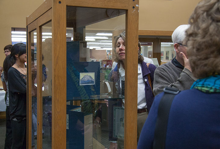
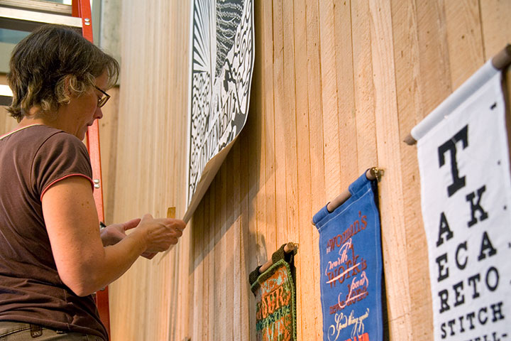
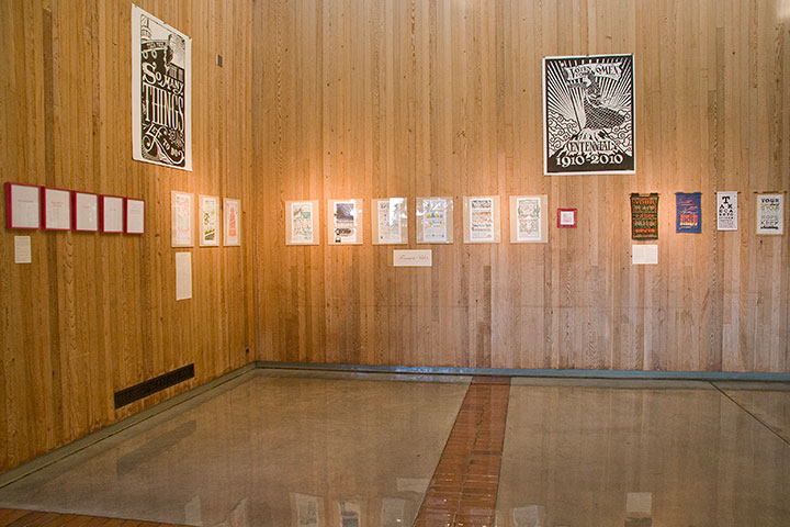
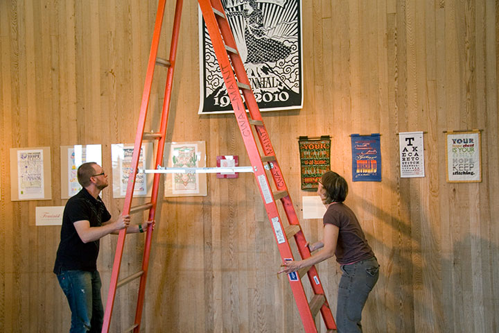
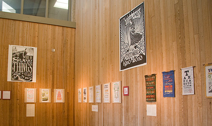
The show is all set up,

and the book is officially out in the world.

Many thanks to the enormous crowd of folks who descended upon the opening last night—and to my amazing friend Sarah Christianson for providing every kind of emotional and practical support I can think of.

October 22nd, 2010

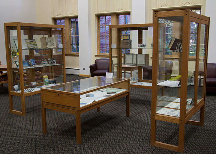
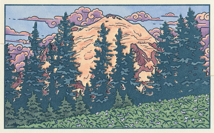
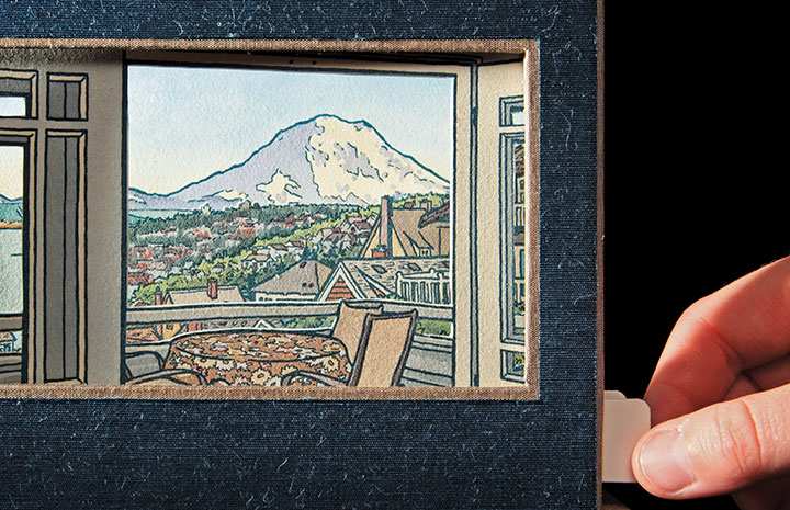
It’s getting harder and harder to keep the secret these days—the Rainier book is almost done, and I’m just dying to show you. But I don’t want to ruin the surprise for T-town, so I’m going to keep it under my hat for just a little longer. But after over two years of being under wraps, the book is gussying it up and stepping out for a solo exhibition. Here’s a brief description of what you’ll see:
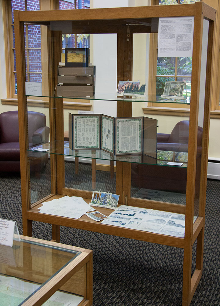
Local Conditions, an interactive artist book, captures the changing faces of Mt. Rainier. Explore the 100 Views—or create one of your own—to discover a mountain both immortal and impermanent.
The book contains 120 image flats and a viewing box; by combining and layering the flats, the reader can create literally millions of scenes. Images are illustrated and compiled from data collected in person, on location, over the course of two years. Letterpress printed, watercolored, and hand-bound in an edition of 26 books. Sponsored by the Tacoma Arts Commission.
Exhibit runs November 4 through January 21
Collins Memorial Library, University of Puget Sound, Tacoma, WA
Opening reception: Thursday, November 4, 4:30 to 6:30 p.m.
Artist talk (sponsored by the Book Arts Guild): Thursday, November 11, 7 p.m., Room 020

Photo by Sarah Christianson
If you miss the exhibition opening, I’ll have some of the process materials from the book out for perusal at this year’s Studio Tour—as well as the brand new Dead Feminist broadside! (Look for it online in early November.) So be sure to stop by!
Saturday and Sunday, November 6 and 7
Open 10 am to 4 pm.
More information, maps, addresses and directions can be found here.
See you then!
October 16th, 2010

By now you’ve figured out that I have a thing for stitched lettering; and since I’ve already rambled on ad nauseum in the last post, I can keep this one a little shorter.
And anyway, I somehow neglected to take any process photos for two of these. Oops.

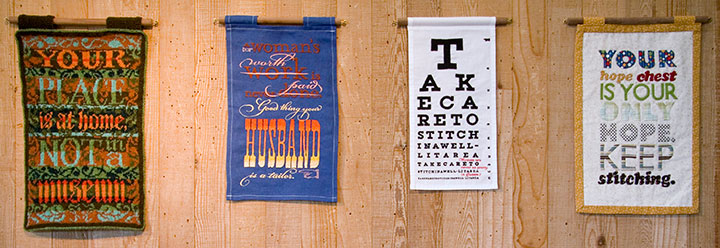
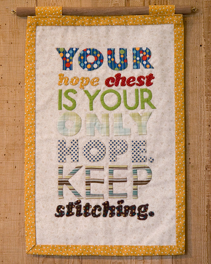
The knitted broadside was such a success that I decided to try branching out into other textile media. For Broadside No. 4, I took a shot at appliqué—something I’d never done before. Hand-sewing all those fiddly little pieces of fabric ended up being just as daunting as cutting a steek.
The hard work was oddly fitting for the concept: historically, a traditional wedding trousseau would have been sewn by a girl or young woman, in hopes of one day becoming a married woman with a home of her own. By the time she reached young adulthood, a woman would have spent years creating dozens of hand-sewn garments, household linens and other useful textiles, all gathered and stored in her “hope chest,” awaiting the day she would become a bride.

The thing is, back in the days when women couldn’t vote, or own property, or head a household, marriage was a woman’s only shot at independence or social status. (Hence the snark.)

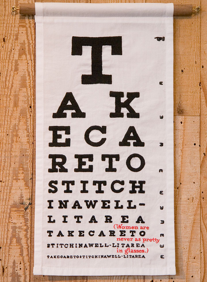
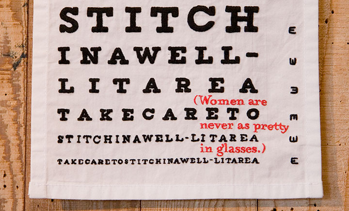
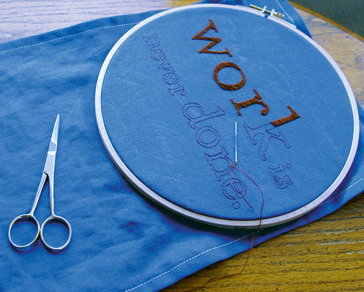
For the others, I turned to the original, old-school ancestor of fabric paint: embroidery. The method fit the madness this time, too, as I spent what seemed like a century hunched over and squinting, hand-stitching an eye chart…

…complete with something to read between the lines.
This one gets personal. As a glasses-wearing gal myself, I happen to disagree with the statement—but I’ve actually heard these very words spoken by a woman. She wasn’t wearing glasses.

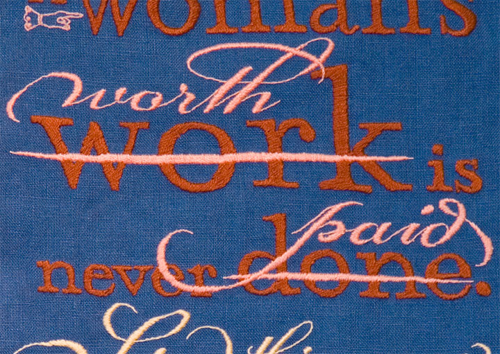
Last of all, I got to thinking about how men who sew for a living are called tailors—and women who do the same are called seamstresses. And how the two terms don’t quite add up to the same meaning.

Despite what the scornful quipping of the text might indicate, I had the most gleeful fun with this one. Unlike knitting, which confines the designer to a grid, or appliqué, which can only push the detailing so far, embroidery has almost limitless possibilities. So I went nuts with the tails and ligatures and dingbats, simply because I could. I love that about embroidery—it’s as flexible as I need it to be, and as fluid and crisp as the printed page.

All that was required was the patience to work each letter by hand. But it didn’t feel like patience—it felt like meditation.

It’s surprising how easy it is for embroidery to mimic letterpress. And watching “wood” type pop up from the fabric, rather than punch into paper, is a mighty satisfying sight.

Uppity notions aside (no pun intended), the Women’s Work broadsides are a fun way to slow down and take a break from what I normally do in the studio. But as I wrap up each one, I find myself hankering to get back into the print shop. By comparison, setting type and drawing letters suddenly seems like speedy work!
October 11th, 2010

While I’ve been hiding away, wrangling my 900-pound gorilla, Jessica has been cooking up something pretty great.

Thanks to her hard work and the wonderful Brian Hutcheson‘s invitation, we are pleased as punch to announce our first-ever dual exhibition!
Feminist Wiles: Jessica Spring and Chandler O’Leary
Now through November 5
Ted Sanford Gallery, Charles Wright Academy
7723 Chambers Creek Rd. W
Tacoma, Washington
Open 8 to 5, Monday through Friday
It seems weird that after more than two years of collaborating, giving lectures and printing in the street, we’ve never had an honest-to-goodness show together.

But when Brian offered us a cavernous space, his help with installation, and the chance to indoctrinate the innocent introduce our series to the kids at Charles Wright—well, we’d be nuts to pass that up.

For the first time, all nine (and-a-half) Dead Feminist broadsides to date, plus our two steamroller gals, are on display together.

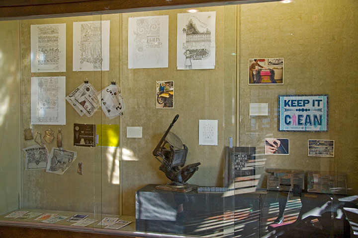
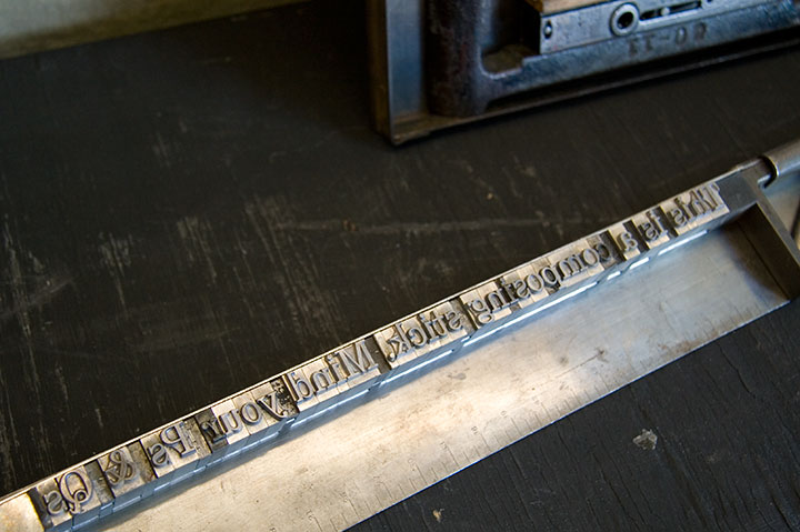
We also have a little mini-exhibit about our process,

and lots of little goodies to introduce people to letterpress.

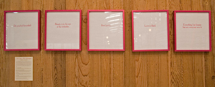
Jessica and I have rounded out the collection with solo work that complements the theme of the show. Jessica’s half consists of Do You Feel Beautiful?, a series of broadsides featuring famous aphorisms on beauty. Here’s the thing that blows my mind into tiny pieces every time I think of it: the quotes are letterpress printed on the pages of a Braille edition of Seventeen magazine. Whoa.
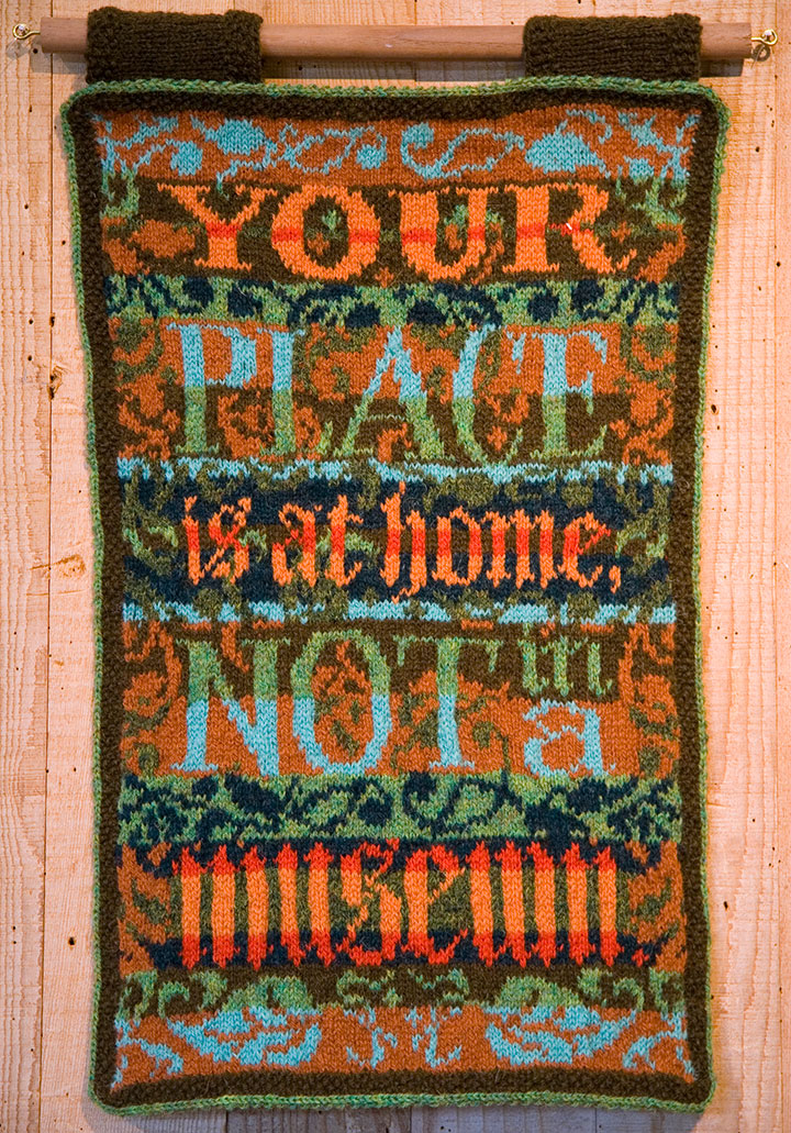
I contributed Women’s Work, an ongoing series of broadsides created in hand-sewn textiles rather than my usual letterpress.
Now, I get a ton of questions about these things whenever I show them, so I thought I’d outline the ideas and process behind them here.

The Tailor first sparked the idea for the series; as you know, he makes his own clothing (hence the nickname). This is a feat that never ceases to amaze me, and I’m not the only one—he gets a lot of comments, usually along the lines of “Wow, you made that?” He’s always a little surprised by these comments, because where he grew up, a lot of people (including his family) wore homemade clothing. That got me thinking, though. The people who do all that sewing in the Tailor’s hometown are women—mothers, grandmothers, sisters, daughters, wives. We’re all surrounded and preceded by generations of women who sew clothing, or knit sweaters, or draft patterns from scratch, without any rave reviews—or any comment at all. But every male knitter or quilter I’ve known, every rare and wonderful man who ever picked up a needle, is either looked at like he’s nuts, or treated with reverent awe. It strikes me as a little strange that depending on who made it, and who’s looking at it, a pair of pants can be a work of art—and an actual work of art can be completely ignored.
If you go further back, like, I dunno, throughout the entirety of human history—you’ll find that both men and women have been responsible for creating textile goods in nearly every culture on earth. Yet in almost every case, when men made textiles it was as part of some sort of guild craft or other professional setting. When women made textiles, it was as part of the home front. This is true in every part of the globe, in pretty much every era, going back to the advent of textile technology.
No matter who does the stitching, there’s an enormous amount of technical skill and design sensibility required to make a garment or textile object. So instead of creating divisions and pigeonholes—instead of separating into Art and Not Art, into Man-made and Woman-made, what if we started seeing the inherent worth in the objects themselves? And what happens when we take a handmade textile and stick it in a gallery? Does its perception change?
Based on what I’ve seen so far with these broadsides, I’d say it does. It’s been an interesting experiment, for sure.
So the Women’s Work series is a bit of an indictment of the double standard, and while the snark is aimed at a wider target, I wrote them as if I were speaking to a woman. Each one is completely made/knitted/sewn/pieced/embroidered/etc. by hand, from design to pattern to construction. The text reads in the voice of a disapproving female role model (or the insidious voice inside our own heads)—in the tone of the backhanded compliment, the cheerful put-down. Each is also designed in the style of a traditional letterpress broadside, to put the typography within the context of an art form centered around mass communication.

This guy requires a little more of an explanation for folks who aren’t already into wool.

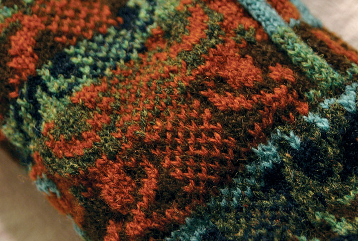
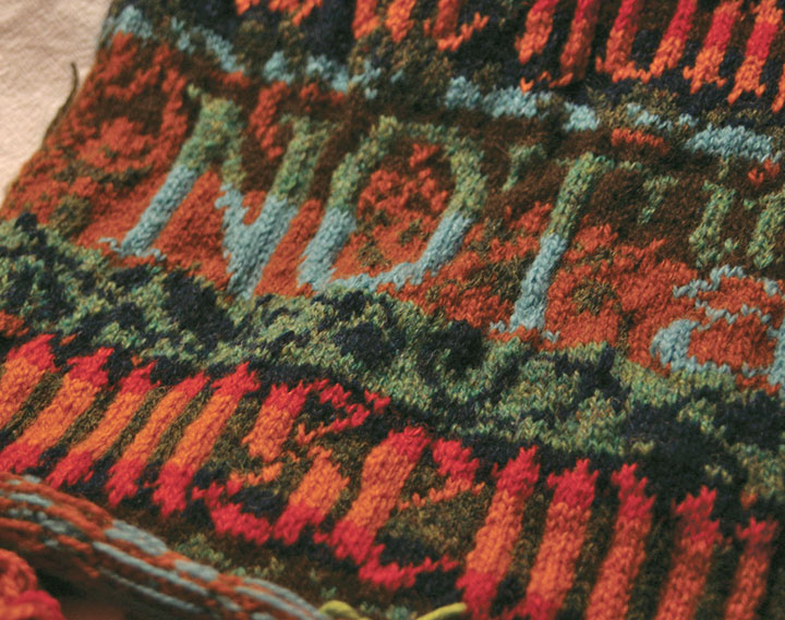
This piece, made almost three years ago now, is hand-knitted with Shetland wool, using the traditional Fair Isle knitting technique. Fair Isle—a method practiced since the nineteenth century on the tiny island of the same name, halfway between Scotland and Norway—is a tricky, rather ingenious thing. Traditional Fair Isle pieces are knit with two colors of yarn at the same time; the resulting fabric is durable, extremely warm, and great for any chilly, foggy, wet climate (like, hello, here). Beyond its über-practicality, Fair Isle knitting is simply gorgeous (take a gander at Google). By nature the double-thick fabric is dense and flat, making it an ideal ground for complex patterns and designs—it’s the perfect mix of function and fancy.

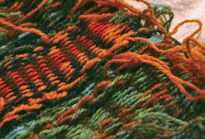
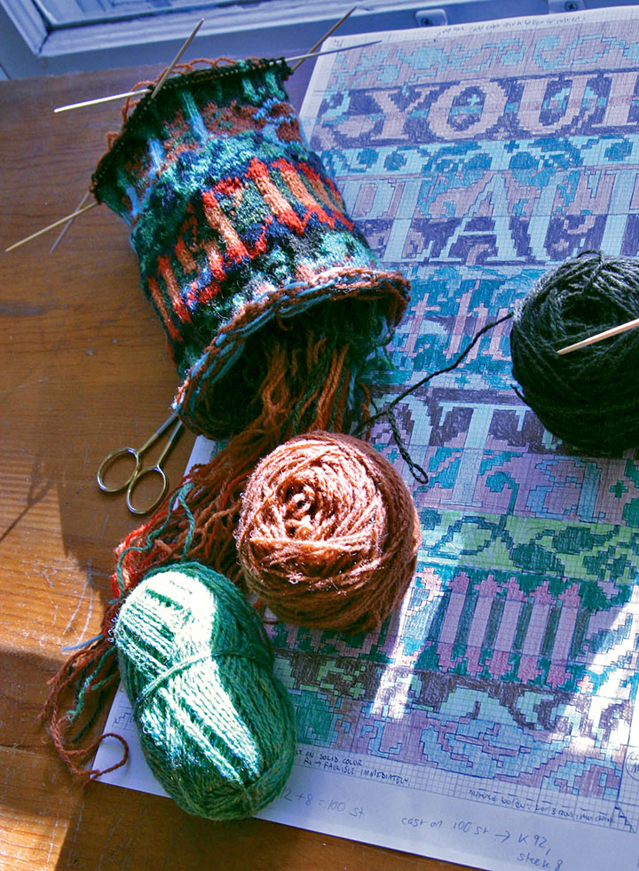
Here’s how it works: even though the piece is knitted with two different colors of yarn at once, only one strand at a time ever passes through the needles. The unused strand of yarn is carried loosely, or “floated,” behind the work—which creates a reversed-out image of the design on the back of the piece. It’s the floats that give structure to the fabric, and make it so cozy-warm.
If you were to create a plain ol’ piece of ordinary knitting, you’d proceed from one end to the other of a row, flip the piece over, and work back the other direction. Rinse and repeat. If you tried that with a piece of Fair Isle knitting, working the “wrong” side would be extremely difficult, since the floats would now be facing you and covering your stitches. Now comes the tricky, smarty-pants part. Flat Fair Isle pieces are first knitted up into a big round tube, and then cut to lie flat. When you knit in the round, you never encounter the wrong side of the work. You just spiral around and around on the right side, happily knitting away and floating the unused color behind you as you go.

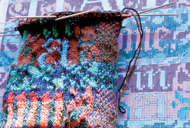
So in this case, once I had drafted my design into a gridded stitch pattern, I just pretended I was knitting one really big sleeve (or a neck warmer for a giraffe) with really teeny needles.
Ah, but remember the operative words above: you have to cut the piece to finish it. I had never done this before, and let me tell you, there’s an awful, terrifying finality to the idea. Torn sweaters unravel. Snagged socks fall apart. Who in their right mind would cut a piece of knitting on purpose? And even if you could do it, what happens if you make a mistake? Once you make that cut, you’re done.

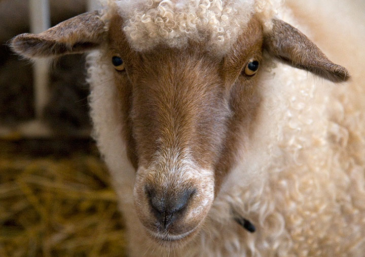
This is where the true brilliance of the technique hit me like a ton of bricks. The Scotswomen of Fair Isle are a breed apart—and so are their sheep. Shetland wool, the material traditionally used in Fair Isle knitting, has a magical property that makes this crazy notion work: each wool fiber is covered with microscopic scales that attach to one another. Because the wool sticks to itself, the stitches become slightly matted as you knit. So following the Fair Isle method, you work a little buffer zone called a steek (see the checkerboard strip above?) into your design, and then cut right down the center of the steek. If you use trusty Shetland wool, your stitches won’t unravel when you cut them.
At least, that was the theory. I didn’t quite believe it at the time. But I’d come this far—I didn’t want to lose faith. (If you’re looking to try Fair Isle knitting yourself, I find a glass of wine helps.) So I took a steadying swig, held my breath, and cut.

And then I exhaled. And blinked. I had a flat piece. Gingerly I tested the cut edge—and was amazed. Even with a fair bit of tugging, the stitches refused to unravel.
I will never question a Scotswoman again.
My favorite thing about all of this, beyond the magic of Fair Isle itself, is that knitting really lends itself well to letterforms. Even though the pattern is drafted out on a grid, the forgiving nature of knitted stitches turns every square on the grid into a slightly curved, irregular shape. So when you zoom out and look at the piece from a distance, those grid “pixels” turn into nice little serifs, curves and curlicues.
The rest of the broadsides in the series are made using other types of needlework (more on that in the next post), but the knitted piece is still my favorite. I think I need another dose of that Fair Isle magic in my life—maybe next year you’ll find me up to my knees in wool again.
(Read about the rest of the “Women’s Work” broadsides in part two.)

October 4th, 2010

Somehow I’ve managed to tear myself away from the massive pile of drawings a couple of times in the past two weeks—once for a quick trip to the wonderful Olympia Farmers Market to pick up a few things. (Look, fractal geometry!)

Okay, maybe “few” is stretching the truth a bit, since one of those items was fifty pounds of organic romas, destined for tomato sauce. These babies are a month late, and we’re lucky to have them at all. It’s been a dismal summer for tomato growers here—but hey, it’s nice to have that one last bit of summer when you can get it.

The other time was for a little taste of the winter to come—at the Oregon Flock & Fiber Festival. The place had me dreaming of winter silence and warm, woolly sweaters.
Maybe if we hurry up and can those tomatoes, sweater weather will come faster!
September 22nd, 2010

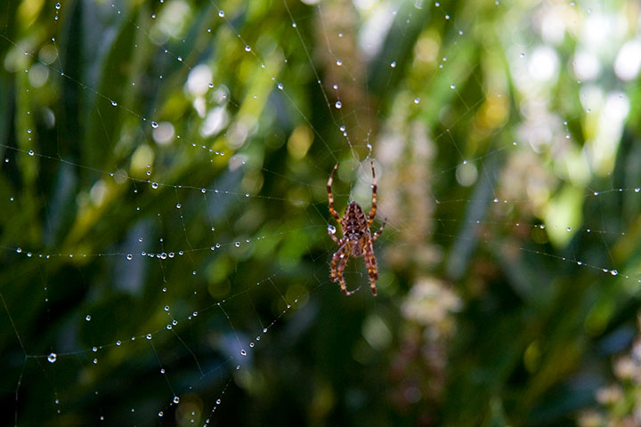
I don’t need the calendar to tell me that fall has arrived. For one thing, the enormous garden spiders are back, guarding our house and reveling in the rain that’s come early this year.
For another, when the sun finally came out, and the skies cleared, the air was suddenly crisper, thinner, fragile in its warmth.

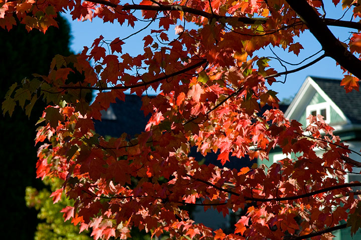
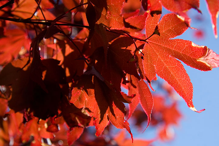
And the trees—

the trees.
I blinked, and it was autumn.

Good thing I was paying attention. I don’t want to miss it.
Happy fall, everyone!
September 15th, 2010

Lately I’ve spent nearly every waking minute of each day with my face an inch away from the drafting table.
Let’s step back, and stretch out a bit.

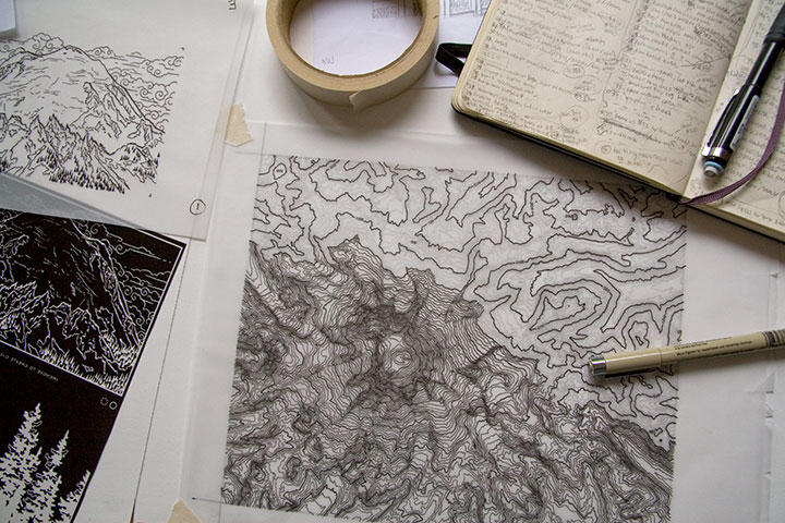
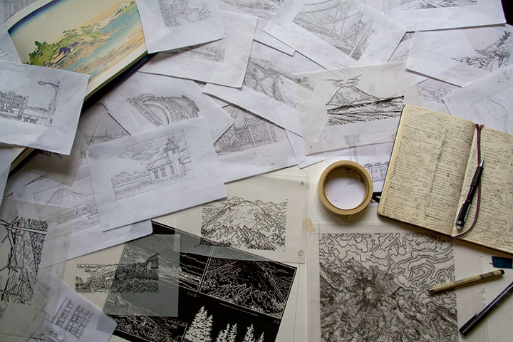
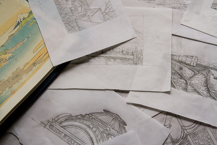
My studio is often a sea of papers—an occupational hazard—but these days the swells have consisted of pencil snapshots for my Mt. Rainier book. Dozens, and dozens, and dozens of them.
Time is ticking down, counting closer and closer to zero, and there are still many miles to cover before the clock strikes deadline. Yet suddenly, things are starting to come together. It won’t be long until I can share something that makes sense—something that looks more like a book, and less like a pile of drawings. I promise that you’ll be among the first to see it when I do.

But if I go missing for long stretches at a time—well, you know where to find me.
September 8th, 2010

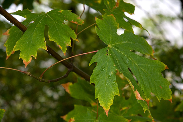
Judging by the chilly rain that’s suddenly arrived, the rapidly diminishing daylight and the maples that are already starting to turn, summer is officially over. But maybe it’s all those years I spent going to the Minnesota State Fair, because the end of summer has always got me dreaming of still-hot days and fried food on a stick—and I find myself handing out metaphorical blue and red ribbons to the winners of nonexistent competitions.

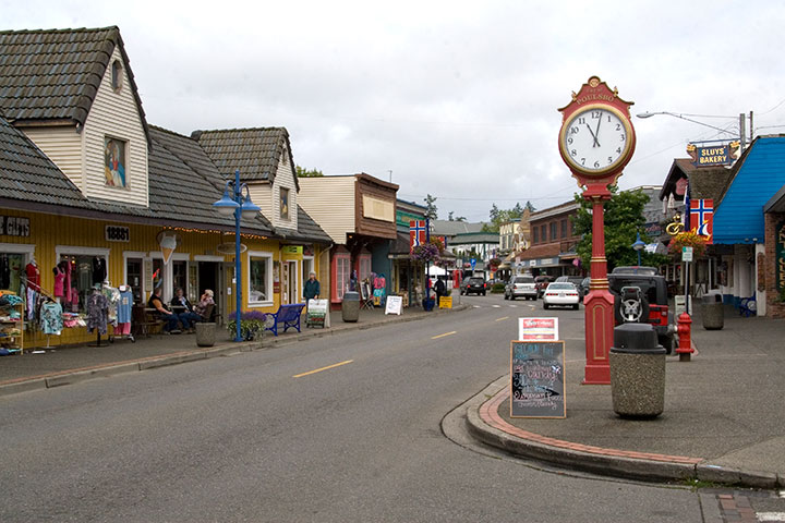
Take, for example, yesterday morning, when I had to return some library books to the Kitsap Regional Library. Since I could visit any library in the system to do it, I picked a branch in a town I had never yet visited: Poulsbo (pronounced “Paul’s Boh”).
To kill a few minutes before the library opened, I parked the car next to a waterfront park, and took a stroll along the boardwalk that extended toward the center of town. I have no idea what I was expecting to find at the end of the boardwalk—

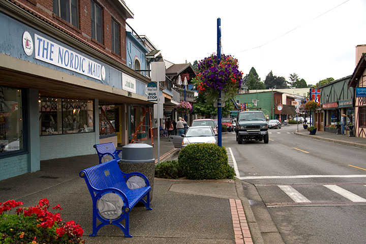
but it certainly wasn’t anything quite this adorable.

Tucked away on a fjordy arm of the Sound, Poulsbo was settled in the 1880s by Scandinavian immigrants (the ones who didn’t stay in Minnesota to start up the State Fair, that is).

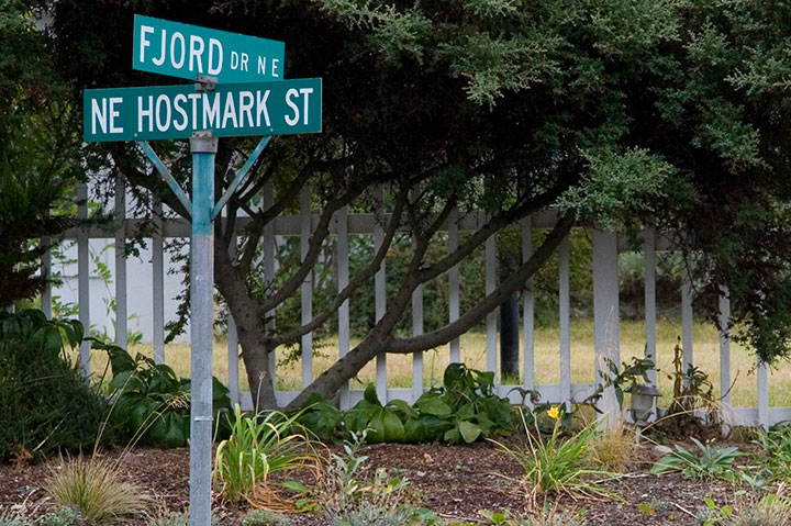
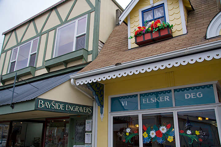
And it’s been a little piece of Norway ever since. In fact, Norwegian was the primary language here until World War II; and even yesterday, I swear on my own grave that I overheard a conversation in Norwegian. Hey, I didn’t live in both Minnesota and North Dakota for nothing—my friend Bridget would be proud of me for picking out all the “jeg“s and “er“s and “av“s she taught me long ago.

So Poulsbo gets a blue ribbon for charm and gratuitous outdoor use of Norsk.

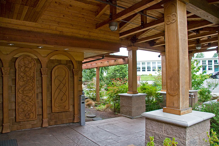
Eventually I remembered what I was there for in the first place—and then, when I laid eyes on the carved pillars and intricate paneling, I had to make sure I had written down the correct address. I think it’s safe to say that Poulsbo has also netted the Most Beautiful Library ribbon—

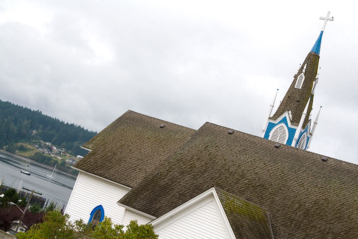
aaaand another blue for Cutest-as-a-Button church steeple.

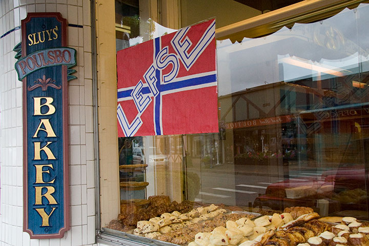
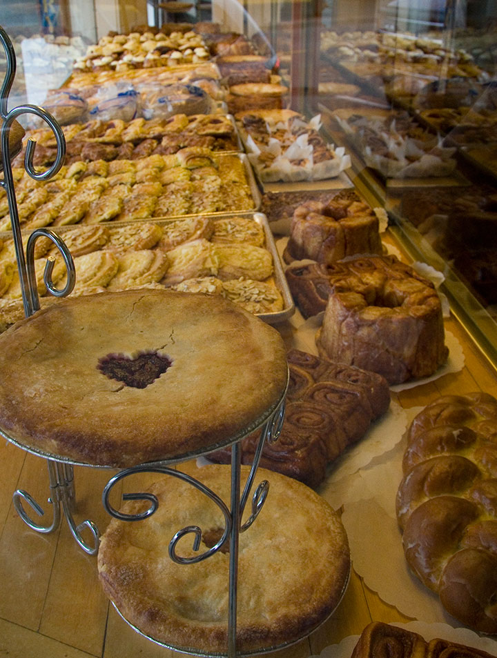
Before I headed for home, I walked the rest of Front Street—and stopped dead when I saw this sign. I don’t have a drop of Norwegian blood in my veins, but I do know my way around a Norse bakery.

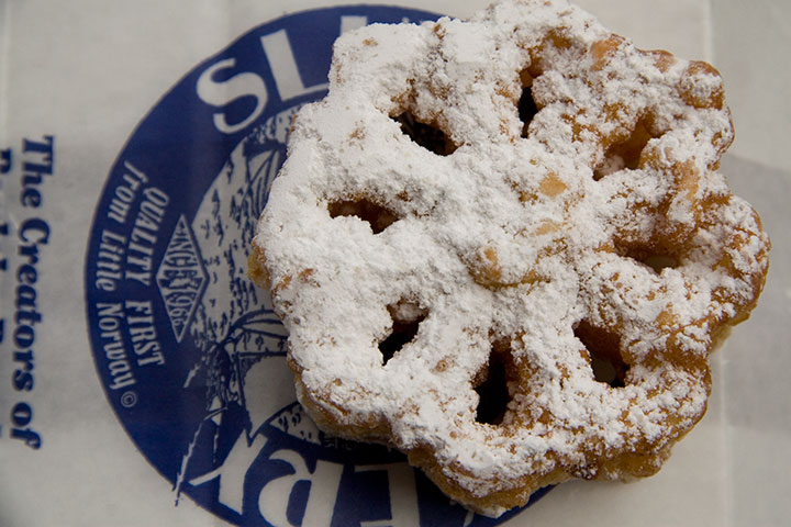
Lefse wasn’t on the menu that day, but I did find the perfect treat for my State Fair state of mind. Oh, yes. Another blue ribbon.
What can I say? Poulsbo knows the ways to my heart.

September 3rd, 2010

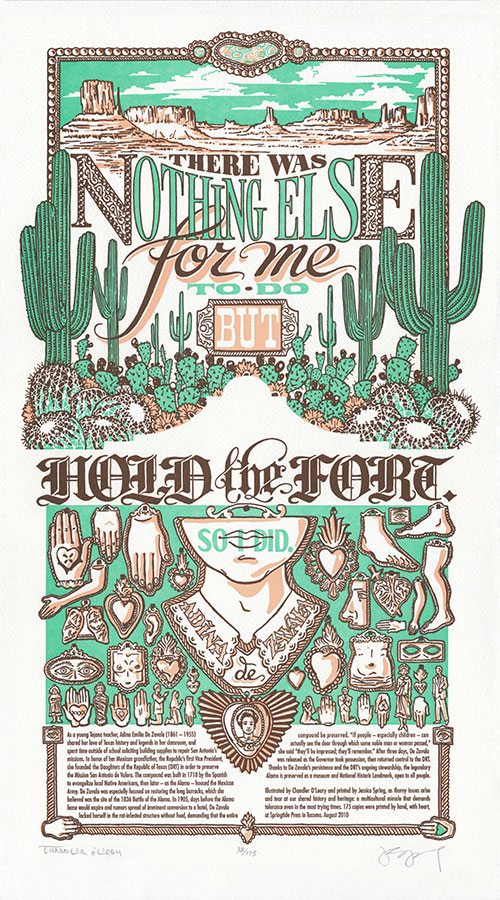
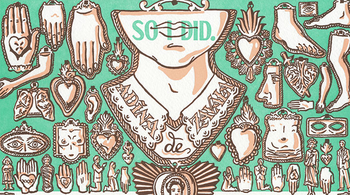
As autumn approaches and the inevitable rainy season knocks at our doors, Jessica and I are dreaming of the sunny skies of Arizona—where the not-so-sunny SB 1070, the state’s contentious new immigration reform bill, was signed into law earlier this year. At every turn, controversy pricks underfoot and looms overhead—with no easy, clear-cut answers in sight. So for our newest Dead Feminist broadside, we decided to challenge the controversy face-to-face-to-hand-to-heart with the words of Tejana activist Adina De Zavala:
There was nothing else for me to do but hold the fort. So I did.
In complete contrast with our last broadside, we had a short n’ sweet quote to work with this time—which gave me every reason and all kinds of room to go completely nuts with the imagery. I think my subconscious had a hand in steering us toward Adina and her quote, because I suddenly had the chance to explore a whole slew of filed-away themes and images that I had never been able to work into a piece before. My brain was swimming with ideas, and I found myself cackling out loud at the prospect of finally getting the chance to put so many of my favorite things into one crazy illustration. Green skies! Monument Valley! Mexican blackletter! Milagros! Cactus-spine fractal geometry! Mwa ha ha!
Ahem. I should probably back up the train a bit and give you the whole nerdy spiel.

On a Mission teems with icons of both the American Southwest and Mexican folk culture. A desert landscape—framed with metallic scrollwork and crazy-lace agate cabochons— stretches to the horizon, while saguaro sentinels tower over a tangled mess of prickly pears and barrel cacti. That was the easy part—thorny issue? Check.
The hard part was putting in all of our nebulous and conflicted feelings about the Alamo (represented here as an absence of imagery; a silhouette of negative space) and the topic at hand. So for answers I looked to Mexican folk art—so prominent on both sides of the Border, and so beautifully expressive, layered in history and meaning.

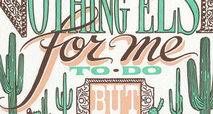
The text itself helped us get right to the point about that. The typography is influenced both by the American Old West and modern-day Mexico—particularly the latter. Mexico’s strong tradition of hand-lettering survives today, particularly in the form of hand-painted signs and advertisements. Inspiration ranged from the fluid folksiness of drop-shadowed cursive script—

—to the proud refinement of blackletter, a hold-out of the early Spanish colonial printers that has evolved to attain near-sacred importance in Mexican and Mexican-American popular culture. As we were conscious of our desire to “reclaim” some of the connotations behind the Alamo, blackletter provided the perfect weight and cultural twist to the phrase “Hold the fort.”

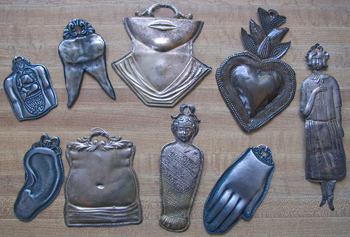
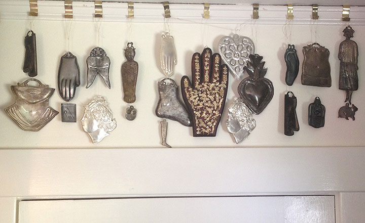
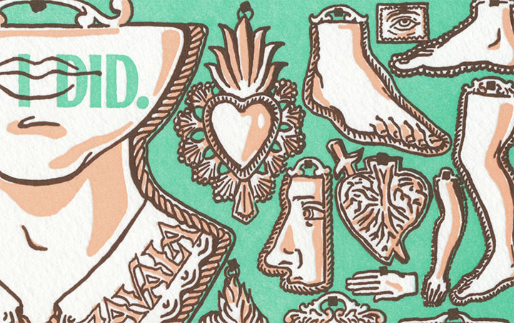
And then there’s my favorite part of the whole project: strewn all over the lower half of the illustration is a collection of milagros. Literally translated to “miracles,” milagros are small, stamped-metal votives that are typically hung in the shrines and churches of many Catholic countries—offered up in thanks for prayers answered and blessings received.

On my lifetime list of All-around Best Things Ever, milagros are very near the top—as evidenced by the growing collection in my studio. When I lived in Rome (where they are called ex votos), I used to pick them up on Sunday-mornings at the Porta Portese flea market for next to nothing. Ever since then, they’ve popped up in my work every now and then.
Well, now they get to be the stars of the show. If the Alamo were still the mission I picture in my head, the walls would be covered, floor to ceiling, with milagros. And since Adina herself has become a bit of a legend for her place in the Alamo’s history, illustrated devotionals adorn her name and portrait like pinned hopes.

It may seem strange to get so giddily excited about illustrating such a serious topic, but somewhere along the way I realized that it’s that excitement over the positive that has given me perspective on the issue at hand. That what we think of as the “American” Southwest is so iconic and so dear to us because of the peoples with whom we share it. That the Southwest wouldn’t be what it is without its link to hundreds of years of both native and newcomer culture—just as America wouldn’t be America without immigration and cultural diversity. That keeping our multicultural vibrance alive is what makes us whole.
So in that spirit, a portion of the proceeds from On a Mission will be donated to the Northwest Immigrant Rights Project, a non-profit organization dedicated to promoting justice and legal rights for immigrants and refugees from more than 100 countries around the world.
I don’t know if any of this stuff crossed Adina De Zavala’s mind while she camped out inside the Alamo. She was just an individual who fought to keep an old, rotting building standing—and the place was a controversial symbol, even then (it certainly still is today). But she knew that the controversy was part of the legend of the place, and part of our heritage. And she knew the value of preserving that heritage for everyone’s benefit, without exception—so she held the fort. I think she deserves a few milagros on our wall for that.
• • • • • • • • • • • • • • • • • • • • • • • • • • • • • • • • • • • • • • • • • • • • • • • • • • • • • • • • • • • •
On a Mission: No. 9 in the Dead Feminists series
Edition size: 175
Poster size: 10 x 18 inches
Printed on an antique Vandercook Universal One press, on archival, 100% rag paper. Each piece is signed by both artists.
Colophon reads:
As a young Tejana teacher, Adina Emilia De Zavala (1861 – 1955) shared her love of Texas history and legends in her classroom, and spent time outside of school soliciting building supplies to repair San Antonio’s missions. In honor of her Mexican grandfather, the Republic’s first Vice President, she founded the Daughters of the Republic of Texas (DRT) in order to preserve the Mission San Antonio de Valero. The compound was built in 1718 by the Spanish to evangelize local Native Americans, then later—as the Alamo—housed the Mexican Army. De Zavala was especially focused on restoring the long barracks, which she believed was the site of the 1836 Battle of the Alamo. In 1905, days before the Alamo lease would expire and rumors spread of imminent conversion to a hotel, De Zavala locked herself in the rat-infested structure without food, demanding that the entire compound be preserved. “If people—especially children—can actually see the door through which some noble man or woman passed,” she said, “they’ll be impressed; they’ll remember.” After three days, De Zavala was released as the Governor took possession, then returned control to the DRT. Thanks to De Zavala’s persistence and the DRT’s ongoing stewardship, the legendary Alamo is preserved as a museum and National Historic Landmark, open to all people.
Illustrated by Chandler O’Leary and printed by Jessica Spring, as thorny issues arise and tear at our shared history and heritage: a multicultural miracle that demands tolerance even in the most trying times. 175 copies were printed by hand, with heart, at Springtide Press in Tacoma. August 2010

UPDATE: poster is sold out. Reproduction postcards available in the Dead Feminists shop!

![Chandler O'Leary [logo]](https://chandleroleary.com/wp-content/themes/chandleroleary/images/logo.png)

