Blog
May 25th, 2012
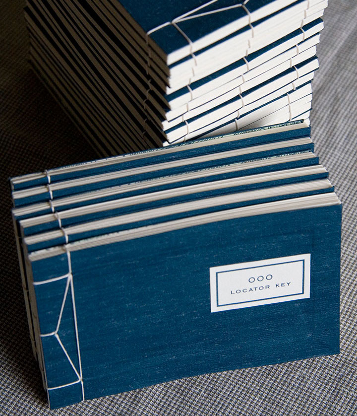
Speaking of keeping busy, looks like I’m not the only one who’s been working on my Local Conditions book. The kind folks at Stanford University put together a little video demonstrating how book works. So now, instead of having to explain it step-by-step, and hope for the best, I can actually show you in real time. Take a gander:
And if you happen to be in the Bay Area, you can see the book for yourself at the San Francisco Center for the Book. From now through August 31, Local Conditions is on display as part of the exhibition Exploding the Codex. The show highlights unusual and unexpected structures by over forty artists—pieces that blow the lid off of the standard definition of what a book can be. I’m sad not to be able to get there myself before the show closes, but if you’re in the area, stop by on June 15 for the opening reception—and tell ’em hello from me.
May 20th, 2012

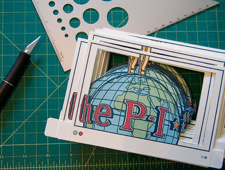
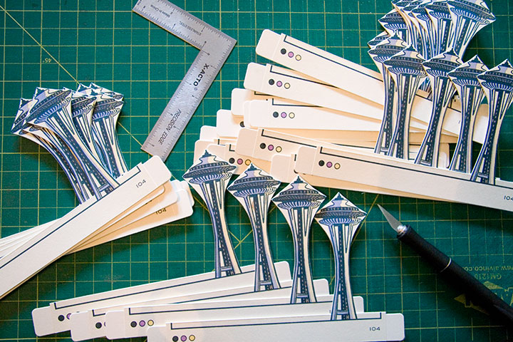
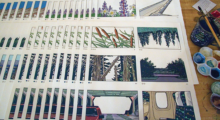
Now that I’m back in town, I’ve got deadlines. Lots of them.
Like, hundreds and hundreds. Each one shaped like a little P-I Globe, a little Space Needle, or any number of things.
You get the idea.

April 9th, 2012

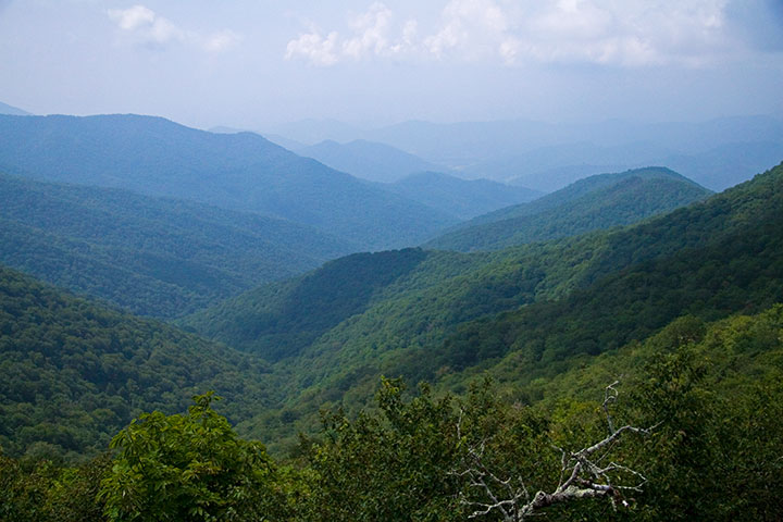
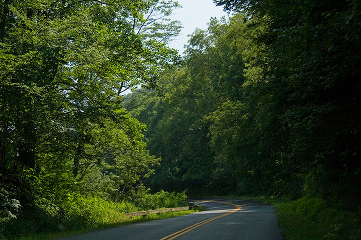
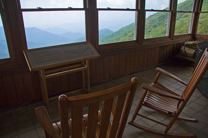
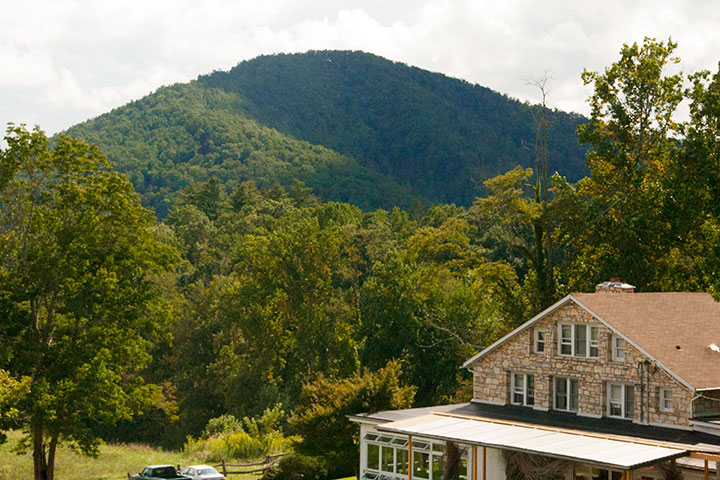
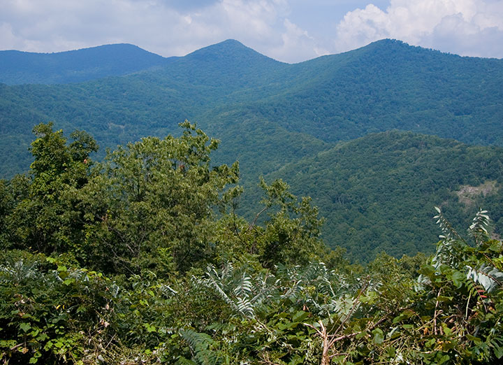
When Jessica and I were in North Carolina last summer, we had just enough sightseeing time to squeeze in a short trip along the aptly-named Blue Ridge Parkway.

Between the dappled sunlight,

the lush Southern greenery,

and the unexpected splashes of color,

we were enchanted in an instant.
(I, for one, was tempted to do a little Katniss Everdeen impression—just run away from it all and head for the hills.)

It wasn’t hard to imagine sitting down and breaking out the paper and paints, with all that blue haze as inspiration.

The folks at the nearby Penland School of Craft certainly agree. Since Lucy Morgan founded it in 1929, Penland has become a national center for craft education. Widely respected for its preservation of handcraft traditions, Penland is centered on total-immersion study and both traditional and experimental techniques. Settled in a quiet pocket of the Blue Ridge Mountains, it’s an inspiring setting for focused work. Thanks to its reputation and location, the school attracts some of the country’s best artists and fine craftspeople to study and teach in the Penland studios.
So you can imagine how thrilled and honored Jessica and I were when they asked us to come and teach a letterpress workshop there this summer.
We’ll be teaching a one-week printing intensive, and doing our very best to turn the printshop upside down. This ain’t your grandpa’s letterpress. Here are the details:
Letterpress: Old Dog, New Tricks
A printmaking intensive with Chandler O’Leary and Jessica Spring
Penland School of Crafts, Penland, NC
Summer Session 7: Aug. 26 to Sept. 1, 2012

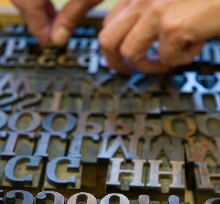
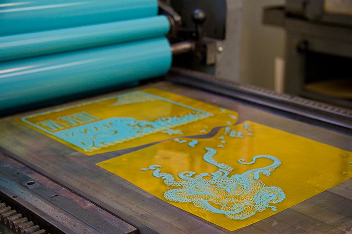
In the class, we’ll work with both hand-set type (don’t worry, we won’t monkey with any linotype machines…) and photopolymer plates to produce editioned prints that combine the two techniques.

We’re going to get pretty technical, pretty fast, but don’t worry—the workshop is open to all levels of experience. That way we can bring letterpress newbies up to speed quickly, and give more experienced printers the chance to go nuts and geek out with us.

“Unnatural Light” by Jessica Spring
You’ll be doing some death-defying typesetting by hand, using Jessica’s acrobatic techniques,

On a Mission Dead Feminist print
and I’ll teach you the ropes of designing for photopolymer, so you can throw a three-ring hand-drawn circus into the mix.

So get thee to the mountains and join us! Registration is open now, but don’t wait too long—the class is capped at 12 students.
See you in North Carolina! Save me some grits, will you?
April 4th, 2012

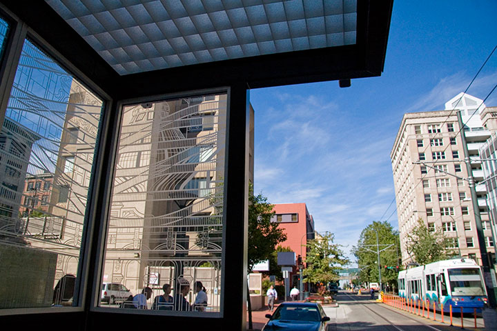
This is rather old news now, but as it took such a long time to complete, and as it isn’t exactly going anywhere, being hot off the press doesn’t matter so much. Last year I was commissioned to do a piece of public artwork here in Tacoma, and as of a few months ago, the Commerce Street light rail station is up and running.
I’ve done several temporary and permanent public pieces before, but this was my first commission for a durable materials project—and by that I mean materials that can be expected to last many decades with minimal maintenance (metal, stone, concrete, ceramics, glass, etc.). Interestingly, painted murals are not considered durable; they require all kinds of upkeep, and have an average life expectancy of only five to ten years.
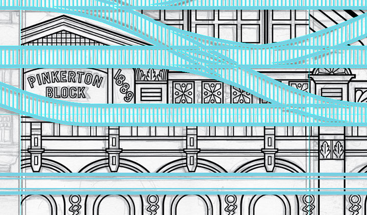
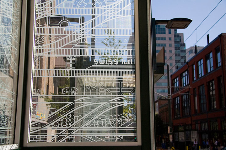
The Commerce Street Station project called for a design for etched glass. Now, as you’re well aware, I’m no glass artist—it’s a little weird to think of a letterpress printer doing glass work. But that’s the beauty of the public art realm: instead of one artist tackling every aspect of a project, there’s a whole team of people involved, each focused on his or her particular strengths. I was responsible for the design, and industrial fabricators took care of the actual glass-etching part. So what my part boiled down to was a process nearly identical to what I do for any letterpress print: a hand-drawn illustration, converted into a computer file for production. Realizing that created a huge mental shift for me, and suddenly made the prospect of wearing a Public Artist hat way less intimidating.

If you’ve ever stood in a shelter waiting for a bus or train, you’ve probably seen an etched glass design. Usually it’s an abstract pattern to discourage graffiti, or in the Pacific Northwest, often something outdoorsy or salmon-themed. So I figured that territory was well covered. Instead, I focused on the rails themselves. The railroad is possibly the single most significant aspect of Tacoma’s history; it is truly the backbone of our city. In 1873, Tacoma was chosen over Seattle as the terminus of the Northern Pacific Railroad. Without the resultant growth and industry that resulted from the railroad hub, Tacoma might still be a tiny fishing hamlet, rather than a bustling port.
For decades, industrial and passenger rail travel was our pride and joy. Along with the goods and people moving along the NP Railroad line, Tacoma was also criss-crossed with streetcar lines, providing efficient and comprehensive public transportation. During the Great Depression, however, the cost of maintaining the streetcar lines became too heavy a burden. The system was dismantled in 1938, and private automobiles became the dominant mode of transportation. This story is by no means unique — passenger rail fell out of favor all over the country, and today, public rail transit is only the norm in our largest cities.

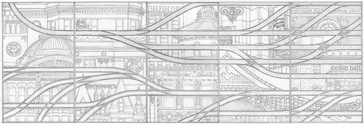
To me, our small (but expanding) light rail line is a ray of hope for a progressive future, a return to a more sustainable system, and a chance to highlight Tacoma’s history. So for Continuum, I designed a brace of parallel rail lines. The top line is a set of traditional railroad tracks, beginning as a single thread and branching outward—symbolizing Tacoma’s beginnings and expansion. The bottom tracks are grooved-rail embedded tram tracks—exactly the type you see in both old streetcar lines and modern light rail paths. As the traditional tracks branch outward, the tram tracks converge into a single path, just as our lone light rail line is the last vestige of the old streetcar network.
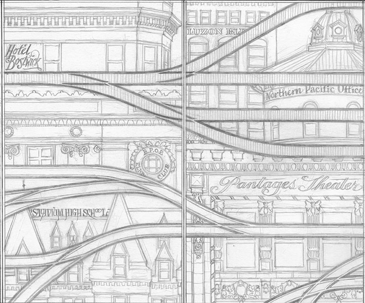
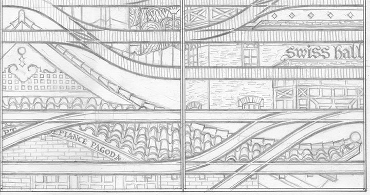
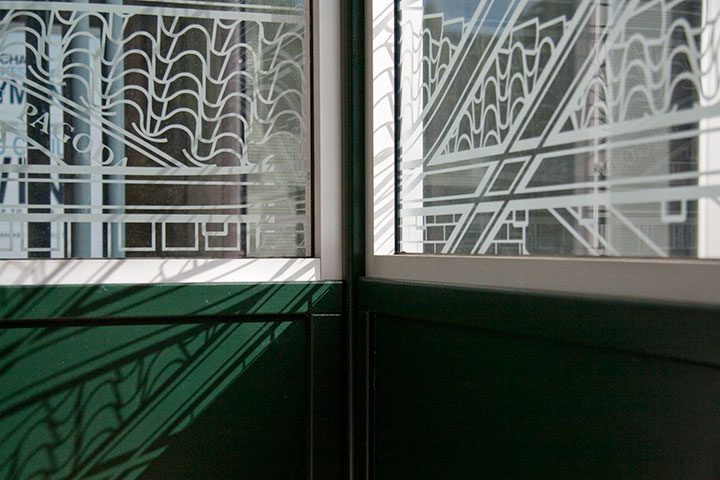
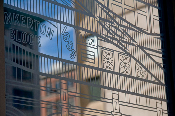
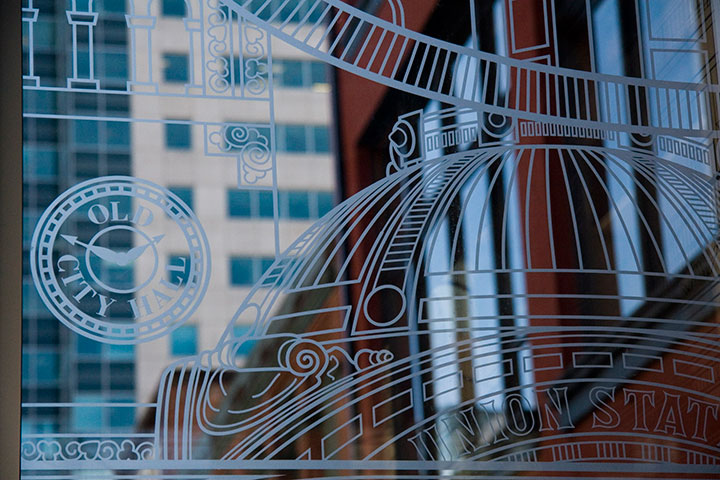
Tacoma’s architecture sprouted and developed right alongside the railroad, as a result of our industrial growth. So instead of surrounding the tracks with a white-noise pattern of ballast, like you’d see around real tracks, I designed an illustrated amalgam of our most iconic buildings. Some are still with us; others are long gone (can you spot the Luzon Building above?). Every structure represented exists either along a historic streetcar or other track line, or has some connection with the railroad.

While I was working on the initial design, a teenage arsonist set fire to the historic Pt. Defiance Pagoda. Suddenly it didn’t seem to be enough for the city merely to preserve the architecture—I felt the need to create my own record of as many buildings as I could.

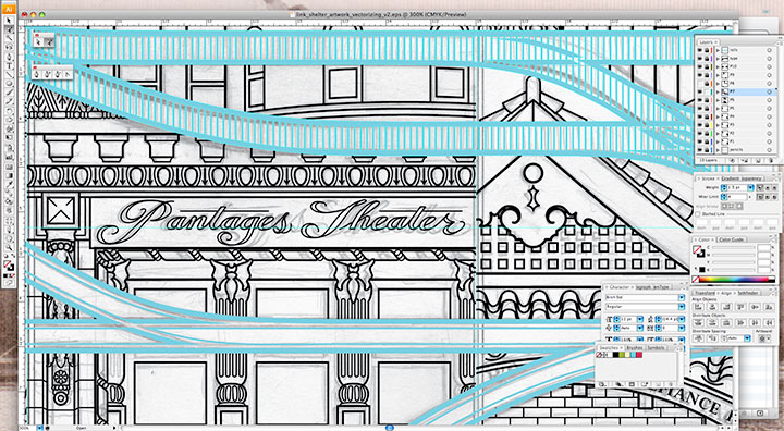
My pencil drawings weren’t finished enough to send to the fabricator—I needed to bridge the gap between my pencil and their equipment. To get the artwork to the point where it could be etched into glass, I needed to convert it to a specific file format called vector graphics. Now, digital photos are made up of pixels: a grid of tiny dots that determine how large a size an image can be blown up to be. The more pixels per square inch, the larger you can make the photo. Vector art doesn’t work like that. Without getting in over my head in explaining this, vector graphics are made of math.
(Which is super cool, really.)
The shapes are determined by geometric points, lines and proportions, rather than pixels. So that means you can blow the artwork up to any mammoth size, or shrink it as small as you please, and you’ll never lose detail or image quality. This makes the vector format A) awesome; and B) ideal for translating extremely intricate work into industrial materials. All I had to do was fire up Adobe Illustrator, and get to work converting the artwork.
This took days. And days. And days.

It’s funny that people tend to see computer programs as shortcuts or “cheats,” but in the end, any good piece of digital artwork requires a level of craftsmanship—exactly the way a handmade object does. Illustrator has lots of labor-saving tools if you know where to look, but the ones that are designed to fully automate the conversion from a scanned drawing to a vector file aren’t always ideal. For this particular project, the only way to do it right was to suck it up and spend ungodly hours redrawing the thing “manually” within the program. I had to rely on all my artist chops just as much for file production as I do for any artist book or watercolor painting. I easily spent as much time converting the design to vector format as I did drawing it by hand, but it’s important to have a flawless file—lots of expensive production steps are dependent upon that file being free of glitches or stray marks.
As an aside, one night that I stayed up (very) late working on the file happened to be the night of the Royal Wedding. To provide some background noise (in order to stay sane), I streamed the event in a little window on the corner of my screen while I worked. So now, whenever I see the finished glass panels I think of ridiculously ornate English hats, and the Queen in her vanilla Jello pudding-colored suit. Pavlov would have a field day with me.

Right-hand photo courtesy of City of Tacoma
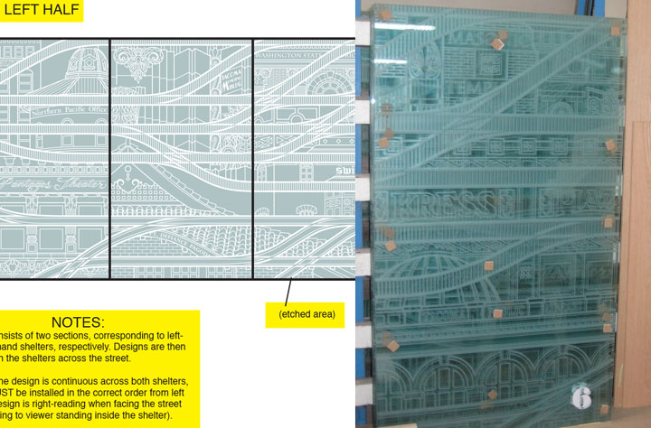
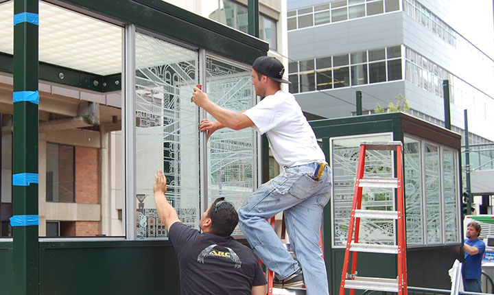
Anyway, next I sent the finished files to the fabricator. Using the points plotted in the file, and a digital mockup I threw together with my production notes, they were able to cut the design out of a masking material, which they attached to the glass. Then the sand-blasted the glass panels. Where there were holes cut through, the sand made contact and etched the glass; everything protected by the mask stayed shiny and transparent. The finished result is a clean, precise replica of my design.

Photo courtesy of City of Tacoma
The tricky part was making sure they installed all ten panels in the correct order; otherwise the connecting track lines wouldn’t make sense. Thanks to the big fat numbers they stuck to each panel, though, everything worked out just fine.

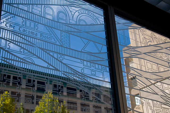
It’s fun to stand inside the finished shelter, and see the stylized buildings contrast with real ones. And when you’re not paying close attention to the details, the illustrations recede into a sort of geometric pattern.

For those who are paying attention, my hope is that this little illustrated city will encourage viewers to notice the real city around them—preferably with an eye toward preservation and innovation.

Attentiveness has its own little reward, too. If you happen to be there when direct sunlight hits the glass, the etched lines project onto every surface. (Tacoma looks good on you.)

In the end, I just wanted to take the dull routine of waiting for a train, and turn it into something beautiful—even if only for a moment.
I’m always saying things like, “If I ran the world…”, usually followed by some crazy idea for transforming every mundane thing in life into something a little more meaningful. I love the thought that on one tiny patch of real estate, I really did get to run the world, and make things exactly the way I imagined they could be. Many thanks to Amy McBride and the City of Tacoma for giving me free rein.

November 30th, 2011

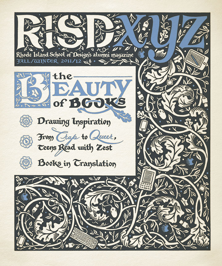
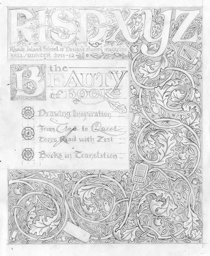
This fall my alma mater asked me to illustrate the cover of its alumni magazine. Since the issue’s theme was the spectrum that books occupy these days (from hand-bound artist books to e-readers), it was right up my alley.

As usual (see above, I’m nuts), everything is completely hand-drawn, including the magazine’s masthead. (Major thanks to my editor at RISD for having faith in me on that one—and not sending the Brand Police after me for monkeying with the logo!) I wanted the design to be reminiscent of illuminated manuscripts and their younger printed cousins designed by William Morris. If you look closely, though, there’s a twist:

Tech gadgets, ripe on the vine.
(Sorry, William.)
November 15th, 2011

It’s hard to ignore the news of protests, ahem, occupying the attention of cities around the world—of the many and diverse thousands of people unified under one simple, yet infinitely faceted mantra. As members of the, well, vast majority of folks without any real political or financial clout in the world, Jessica and I can get behind their message—but that’s not so much the point. What really amazes us is that with a little tenacity and strength in numbers, the powerless can suddenly become very powerful, indeed.
It made us think of a woman who, despite having a famous sibling, would have disappeared into obscurity but for the simple act of picking up a pen.
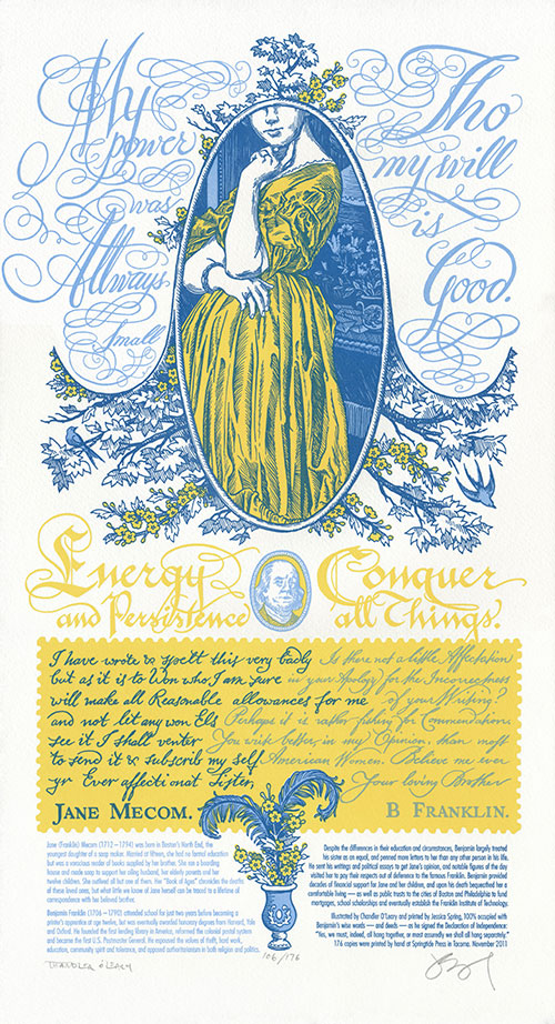
My power was allways small tho my will is good. —Jane Mecom
Jane’s eminent brother, on the other hand, had a little more faith:
Energy and persistence conquer all things. —Benjamin Franklin
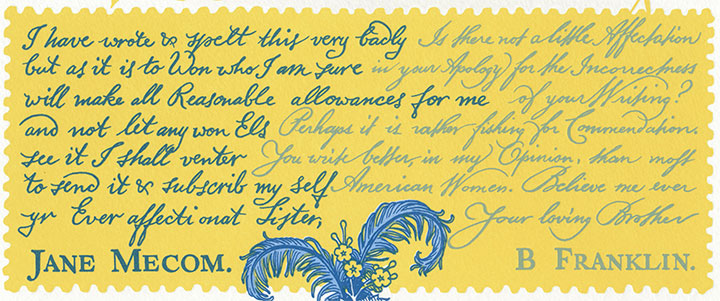
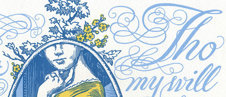
Jane had both energy and persistence in spades—although we marvel at how she managed it, with twelve kids, a family business and a house perpetually full of boarders to occupy her attention. Yet of Benjamin’s sixteen siblings, Jane is the only one whose story has survived the 200+ years since her death—and all because she committed her thoughts to paper. So in honor of Ben and Jane’s relationship, and in solidarity with those who find the strength to speak up, we present our first dual Dead Feminist broadside, Signed, Sealed, Soapbox.
Since this is also our first print that features a cameo from a male Dead Feminist (nope, you don’t have to be female to be a feminist), we thought it deserved a little something extra. So we set it up like a conversation—or in this case, a written correspondence. Besides, there was just so much historical ground to cover—even condensing the information to a blog post is a challenge, let alone plucking two sentences from a lifetime of dialogue. (If you haven’t already guessed, this post is a long one. Grab a cuppa if you dare to settle in!)

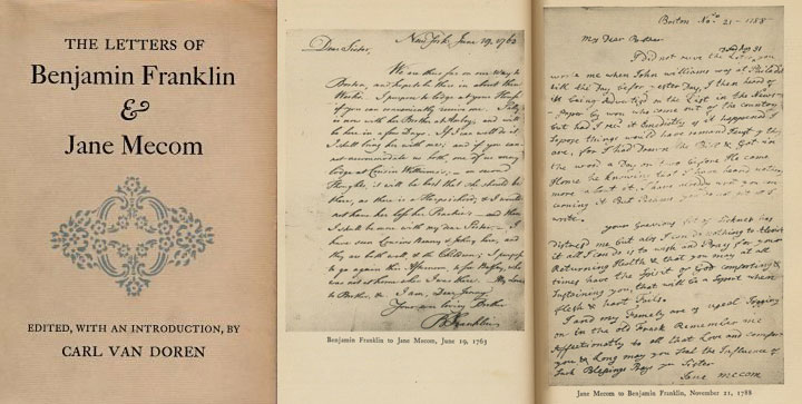
What first sent us down the Jane Mecom rabbit hole was an article about her in the New York Times, written by Jill Lepore. Lepore’s words sent me searching for more information, and I found it buried in the stacks of my local public library. I uncovered an obscure tome: The Letters of Benjamin Franklin and Jane Mecom, by Carl van Doren. The book chronicles their entire surviving correspondence—98 letters in all, printed in full. I was a little worried that the writing style of the day would make even skimming for quotes a chore—but in truth, I couldn’t put it down. It was like peering into the lives of any two ordinary people who happened to care for each other very much. There’s humor, and worried advice, and gossip, and gentle sarcasm, and the occasional scolding (usually on Jane’s part) when one or the other let too much time pass between letters. Most of all, there’s love—it’s there on every page. After all of that, we couldn’t just limit the broadside to a couple of one-liners. So the quotes are accompanied by excerpts from their actual letters, each calligraphed as closely as possible to Ben and Jane’s actual handwriting. Even the spelling errors and colonial-era grammar are intact; we figured it was better not to mess with history.

Jane’s excerpted letter:
I have wrote & spelt this very badly but as it is to Won who I am sure will make all Reasonable allowances for me and will not let any won Els see it I shall venter to send it & subscrib my Self yr Ever affectionat Sister, Jane Mecom.
Ben’s reply:
Is there not a little Affectation in your Apology for the Incorrectness of your Writing? Perhaps it is rather fishing for Commendation. You write better, in my Opinion, than most American Women. Believe me ever Your loving Brother, B. Franklin.
There are few Founding Fathers more famous than Ben Franklin, but Jane was somewhat of a mystery. What we do know is that she had a very different life than her illustrious brother. Thanks to the simple fact of having been born female, her youth was spent having babies rather than obtaining an education. Her life was marked with misfortune, poverty and the deaths of nearly everyone she loved. Yet through it all she craved knowledge, and read everything she could get her hands on. She was a skilled craftsperson, making the famed Franklin Crown Soap and teaching the trade to others. And she followed her brother’s career with pride—and he supported her in return, both financially and emotionally.

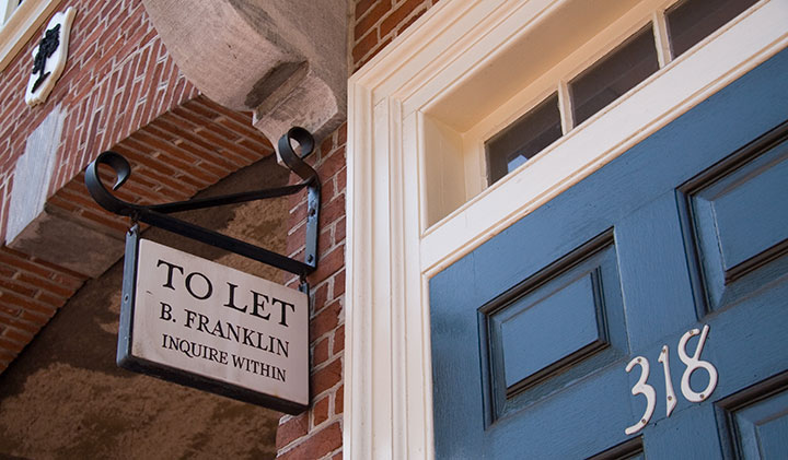
The Tailor and I spent time in both Boston and Philadelphia this summer—ye olde stomping grounds for Doctor Franklin. I had the library book of letters with me on the trip, so their words lent an interesting depth to our wanderings.

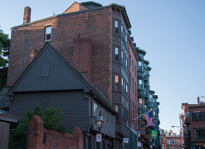
Boston is one of my hometowns, so it was there that I did the most digging. And it turned out that digging was necessary. Ben’s presence is everywhere in Philly, but in Boston, with so many Revolutionary War heroes to honor there, the Franklin family’s presence is far more subtle. And Jane? Well, she’s almost nowhere to be found.
Almost.

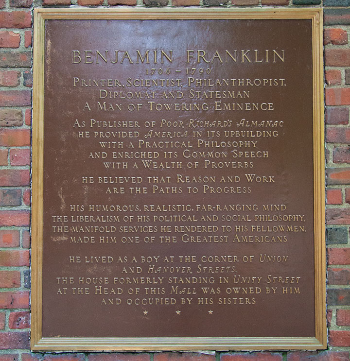
This plaque is all that’s left of the house where Jane spent all her life. It was knocked down to make room for a memorial to Paul Revere. The plaque does mention her briefly, but not by name. Another hazard of being female in the eighteenth century, I suppose.
But Jane lived through the Revolutionary war—in fact, as a resident of the North End, her home was right in the thick of it. In 1775 she fled the British-occupied city and took refuge with friends near Providence, Rhode Island. There, Ben came to rescue her. He took her to Philadelphia, where she spent a year with him before returning to a liberated Boston. While that year was full of turmoil and uncertainty for the citizens of the new United States, 1776 was quite possibly the best year of Jane’s life. For the first time in ages, she could bask in her beloved brother’s company—and he made time for her despite being busy with other things (you know, like founding our country)—and as the honored guest she was largely free from work and family duty.
As far as I can tell, it was also the last time she ever laid eyes on him. Visiting at all was a rare treat—between Ben’s high-profile career and the then-formidable distance between Boston and Philadelphia, it was impossible for them to visit one another more than a handful of times in their entire lives. And since it would have taken weeks for a letter to cross five colonies, and months to traverse the ocean to reach Ben in France, it’s a wonder they remained as close as they did all their lives. Lends a whole new meaning to “snail mail,” doesn’t it?

Signed, Sealed, Soapbox is illustrated with the sweeping curves of ornate penmanship and the detailed linework of colonial engravings. A faux-bois forest of branches and flowers resembles the printed toile fabrics of the day. The swoops and swirls of the calligraphy rest in stately Wedgwood blue (complimented by a telltale vase at the bottom!), while Ben and Jane’s correspondence occupies a buttery yellow letter edged like a vintage postage stamp.
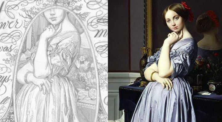
And though there is no surviving likeness of Jane Mecom, she deserves so much more than the portrait of a Jane Doe. Instead, she is made in the image of The Comtesse d’Haussonville by French painter Jean-Auguste-Dominique Ingres.

Ben was the best big brother Jane could have asked for. So in honor of his positive influence, we’ll be donating a portion of our proceeds to the Puget Sound chapter of Big Brothers, Big Sisters—an organization dedicated to providing children facing adversity with mentor relationships that change their lives for the better, forever.
• • • • • • • • • • • • • • • • • • • • • • • • • • • • • • • • • • • • • • • • • • • • • • • • • • • • • • • • • • • •
Signed, Sealed, Soapbox: No. 14 in the Dead Feminists series
Edition size: 176
Poster size: 10 x 18 inches
Printed on an antique Vandercook Universal One press, on archival, 100% rag (cotton) paper. Each piece is numbered and signed by both artists.
Colophon reads:
Jane (Franklin) Mecom (1712 – 1794) was born in Boston’s North End, the youngest daughter of a soap maker. Married at fifteen, she had no formal education but was a voracious reader of books supplied by her brother. She ran a boarding house and made soap to support her ailing husband, her elderly parents and her twelve children. She outlived all but one of them. Her “Book of Ages” chronicles the deaths of these loved ones, but what little we know of Jane herself can be traced to a lifetime of correspondence with her beloved brother.
Benjamin Franklin (1706 – 1790) attended school for just two years before becoming a printer’s apprentice at age twelve, but was eventually awarded honorary degrees from Harvard, Yale and Oxford. He founded the first lending library in America, reformed the colonial postal system and became the first U.S. Postmaster General. He espoused the values of thrift, hard work, education, community spirit and tolerance, and opposed authoritarianism in both religion and politics.
Despite the differences in their education and circumstances, Benjamin largely treated his sister as an equal, and penned more letters to her than any other person in his life. He sent his writings and political essays to get Jane’s opinion, and notable figures of the day visited her to pay their respects out of deference to the famous Franklin. Benjamin provided decades of financial support for Jane and her children, and upon his death bequeathed her a comfortable living — as well as public trusts to the cities of Boston and Philadelphia to fund mortgages, school scholarships and eventually establish the Franklin Institute of Technology.
Illustrated by Chandler O’Leary and printed by Jessica Spring, 100% occupied with Benjamin’s wise words — and deeds — as he signed the Declaration of Independence: “Yes, we must, indeed, all hang together, or most assuredly we shall all hang separately.”
Available now in our new Dead Feminists shop!

November 7th, 2011

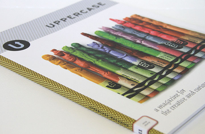
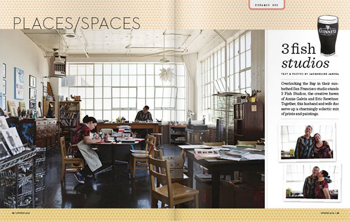
Every three months my all-time favorite magazine, Uppercase, arrives in my mailbox, and productivity in the studio comes to a screeching halt while I drool over each gorgeous page. I’ve been a subscriber since almost the very beginning (if only I could get my paws on those first two sold-out issues!), and impossibly, every new issue is even lovelier than the one before.

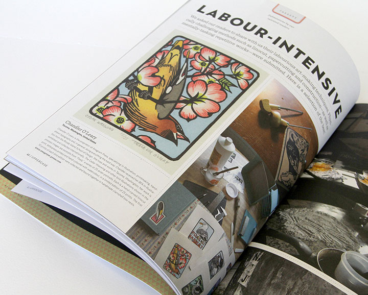
So you can imagine my giddy delight to be included in the latest installment. They had a submissions call for a feature on “labor-intensive illustration,” which was so squarely up my alley that I had to laugh at myself. But I never imagined my little birds would actually be accepted—let alone given a full page. A letterpress colleague received her copy a day or two ahead of me and tipped me off, and I swear I did a little dance around the room.

UPPERCASE is the brainchild of a gallery by the same name in Calgary, Alberta. The magazine is tailor-made for anyone with a creative soul; every page is devoted to sharing visual inspiration, shedding light on obscure or vintage art and design work, and detailing the work lives and creative spaces of people who do what they love for a living.
The whole thing is a perfect mix of vintage nostalgia and cutting-edge design, all wrapped up in a sumptuously printed package. If only everything in the world had this much thought and craft behind it.

But my favorite—I mean, favourite—parts of the magazine are the recurring features. There’s an abecedary in every issue, each with a different theme (which does my bookish heart good), as well as a series of collections of vintage objects: bottle caps, cereal boxes, even alarm clocks and fishing lures.
This magazine is truly a thing of beauty, and I hope it’s around for me to keep my subscription going for many years—and issues—to come.
October 7th, 2011

To hear the ancient Mayans tell it, I’d best hurry up with my unfinished projects—because time is running out.
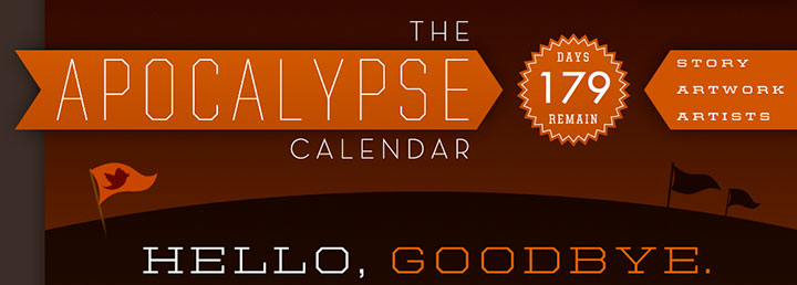
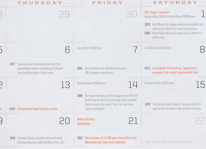
Putting the veracity of such tales aside, this prophecy stuff sounds like a fun illustration topic. So my good friend and old-tyme RISD buddy Thomas Quinn had the ingenious idea to count down our remaining days in style by designing and curating a 2012 Apocalypse Calendar, featuring a different artist for each month. The result of all his hard work (read: herding cats) is a fabulous collection of artwork, a beautifully designed finished product (great job, T.Q.!)—and possibly a niggling sense of dread as the days count down.

Oh, and here’s a sneak peek of the December page in the calendar—look closely and you’ll see the End Times already conveniently marked for you. Thanks for the heads-up, Mayans!
Besides the added bonus of working alongside both old friends and rock-star artists I’ve admired for years, I loved the fact that Tommy let me interpret the theme however I pleased. Rather than going down the illustrated path of mass carnage or Biblical archetypes (I figured those topics would be well covered by the other folks), I decided to time-travel back to my favorite mass-hysterical era, the 1950s.

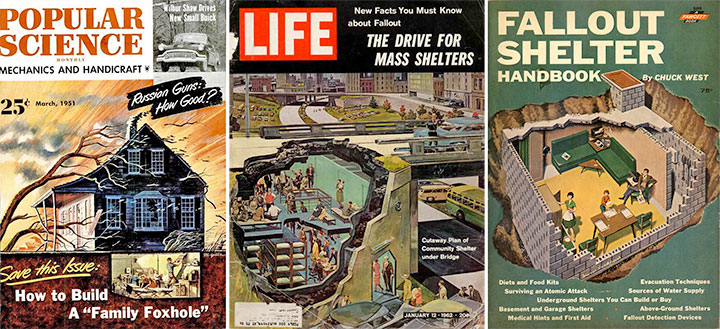
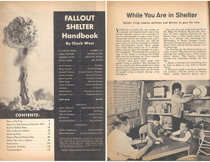
I did a little research, and dug up a whole bunch of vintage advice on how to survive the end of the world—including a handbook on how to build a fallout shelter, and how to keep yourself amused once you’re in there.

This thing just cracked me up. It has all kinds of “expert” wisdom (like how to fend off the roving bands of contaminated neighbors who will inevitably stop by to borrow a cup of sugar) and cheery photos of housewives preparing dinner with a can opener while dear ol’ Dad bonds with the kids.

Which, of course, reminded me of my other favorite relic from the 50s: illustrated cookbooks. Talk about a goldmine! Everybody from uncredited production interns to the late, great Charley Harper did a cookbook back in the day. The fact that these illustrators were often limited to cheap, two-color printing actually made for surprisingly innovative and beautiful results.
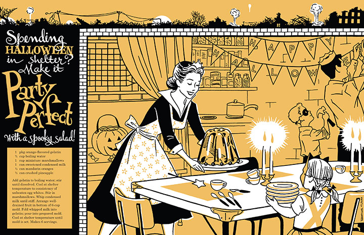
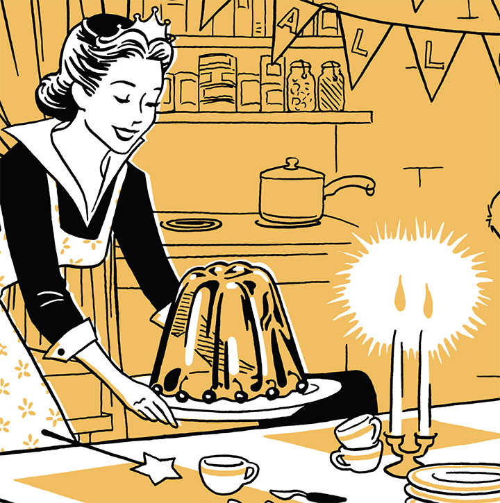
And of course, as you already know, I am completely fascinated by the sheer number of terrifying Jell-o recipes and ill-advised casseroles that crop up in old cookbooks. And since that got me thinking all sorts of wonderfully twisted things about housewives at the End Times, and how Jell-o can probably survive a nuclear holocaust, I decided to combine the two.

So here’s my contribution to the calendar: how to bury your head in the sand, in style. I asked Tommy for October, since it’s my birthday month, and he was kind enough to oblige. So I went nuts with the pumpkin orange and threw a Halloween party.

Complete with absurd salad recipe (that you could actually make, but I wouldn’t advise it), shelter decorating hints—

—and just a little untold destruction, for garnish.

Illustration by Jay Ryan
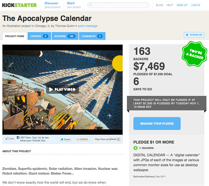
We decided that spiffy, large-format, high-quality offset printing is the best way to show off the artwork, so we’ve set up a Kickstarter project to fund the thing. (We even put together a nifty and hilarious video!) Kickstarter is a fairly new phenomenon, and it’s proven to be a wonderful resource for artists, especially—and since the Kickstarter logo uses the same font as the Dunkin Donuts logo, it makes my designer’s lizard brain happy.
Kickstarter works the way an NPR pledge drive does—you get various gifts in return for your support amount. Twenty bucks will buy you a calendar, and there are a bunch of goodies available at other pledge levels, like signed calendars, original art, and even the ability to make the artist of your choice do your bidding and draw your apocalyptic portrait. (Yes, you read that right.) If we meet our goal, we’ll be shipping calendars in December.
Now, the tricky thing about Kickstarter is that it’s an all-or-nothing kind of thing. If we don’t make our set funding goal by the time the clock runs out, the apocalypse will come early we don’t get any of the moolah pledged so far. So pretty please, do us a huge favor by doing your annual calendar shopping a wee bit early—you can make your pledge here.
After all, if the Mayans have their facts straight, this is the last calendar you’ll ever need to buy, right?
October 5th, 2011

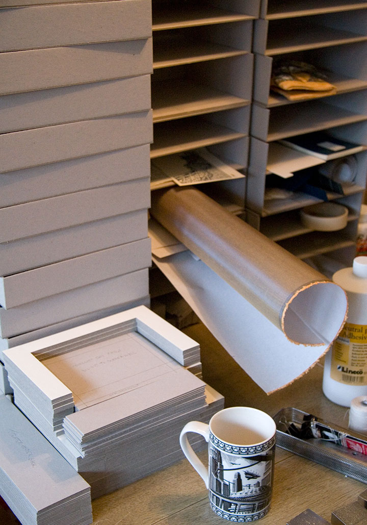
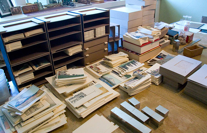
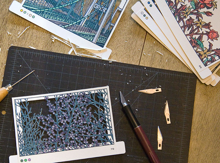
Just wanted to give you a peek at what the studio looks like these days. I try not to think about it too hard, because I officially unveiled the thing almost a year ago, but I’m still working on my book.

Big dang pile of box parts; coffee cup for scale.
You see, it’s one thing to get the prototype done for the exhibition, but when you’re making an edition of books, that means you have to finish all the rest of the copies, too.

Obviously, I have my work cut out for me.

October 1st, 2011

It’s hard to think of a better weekend activity than taking a quick trip to San Francisco.

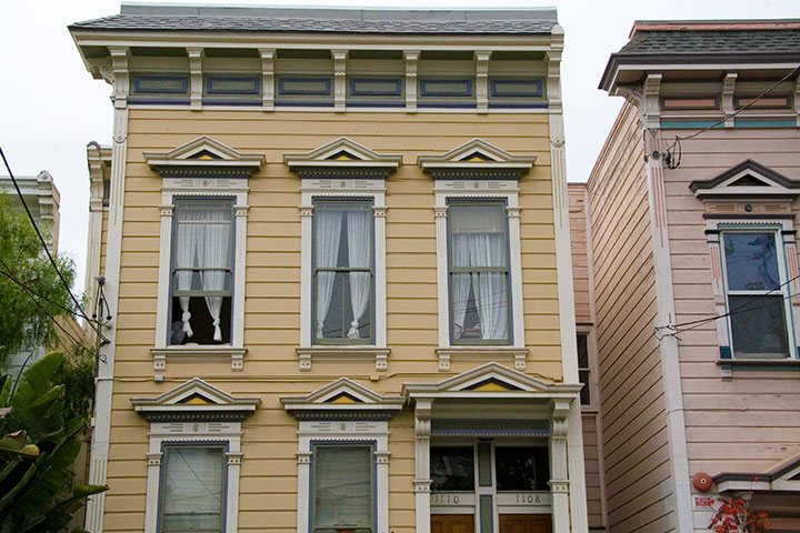
First of all, Jessica and I got to visit the lovely Sarah and Jesse, who live here—

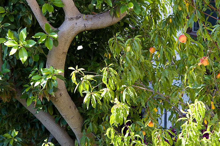
and whose back yard contains this.

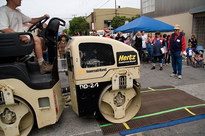
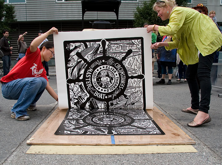
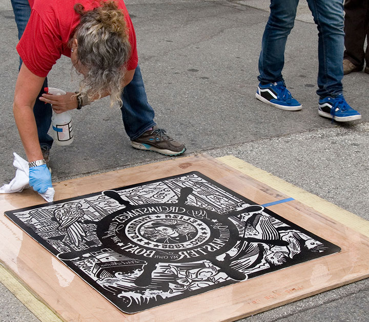
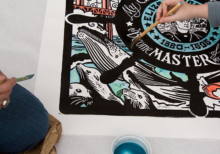
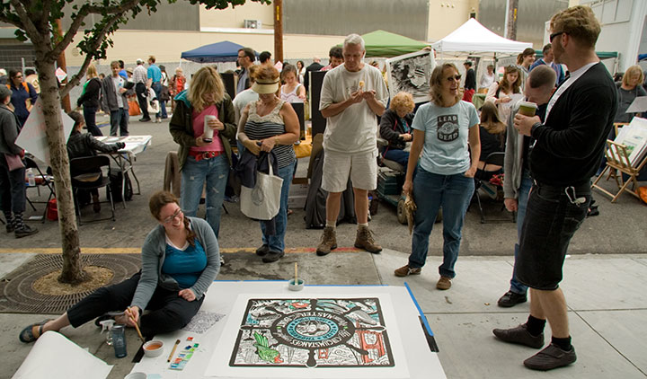
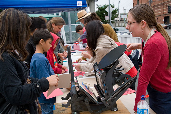
And then we got to raise a fantastic ruckus and make guerrilla street art with a whole bunch of people looking on.

SFCB’s got this thing down to a science. Between the small army of volunteers who took care of the inking and registration (line-up),

and their probably-patented methods for keeping street schmutz off the prints, the results were impressive. In fact, this is my fourth steamroller print (and Jessica’s fifth), and I’ve never seen one turn out this well before.

Photos of us by Jesse Mullan
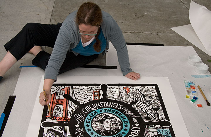
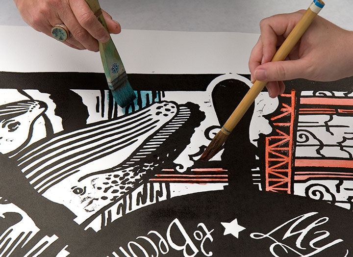
Besides, we really needed to keep our hands clean this time, because we upped our personal ante and just plunked ourselves down on the sidewalk for a bit of on-the-fly hand-coloring (though avoiding the very wet ink felt kind of like playing Twister).

That turned out to be the perfect tag-team job, actually. I do a lot of hand-coloring when I print, as you know, but never anything this big—

having two sets of hands to blend colors and two sets of eyes to look for missed spots was definitely the way to go.

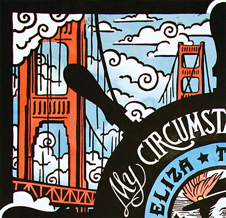
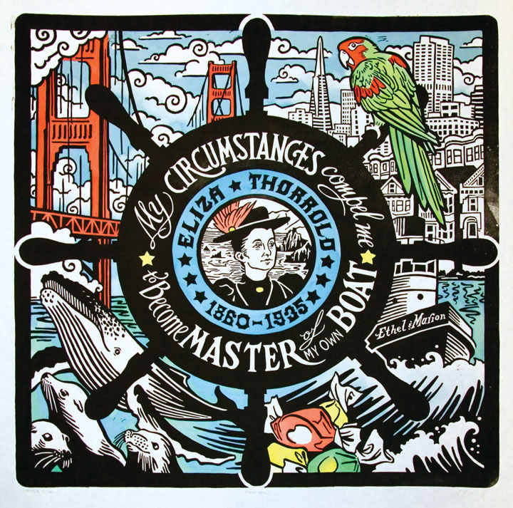
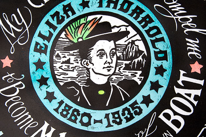
So thar she blows. Let me introduce you to Eliza Thorrold, and our latest honorary Dead Feminist print, Even Keel. Eliza was the first licensed female tugboat master on San Francisco Bay. After Charles, her husband who piloted the Ethel & Marion before her, died an untimely death, she fought for and received her operator’s license to continue their tug business in his stead and provide for her family. Her quote says it all: “My circumstances compel me to become master of my own boat.” Hear, hear, Eliza.
After she left the high seas and entered retirement as a landlubber, she became master of her own taffy pull by opening a successful ice cream and candy shop with her son. Hence all that salt water taffy. And as if the nautical sweet-shop theme weren’t enough, we couldn’t resist throwing in all our favorite things about San Francisco. So go hunting around the image, and see what you turn up. Then, on your next trip to the City by the Bay, learn more about Eliza’s life (and those of other women mariners) at San Francisco Maritime National Historical Park.

So, yeah. It might not fit the traditional idea of a productive weekend, but it’ll do. We came away with new friends, blue fingertips and a whole lot of ideas to make our own humble little steamroller party better.

Many thanks to all the staff and volunteers of the San Francisco Center for the Book, who made the day a smashing success—

and to all the kindred spirits who lent a whole bunch of helping hands. Like the super-nice TSA employee who took such great care of our linoleum block and didn’t bat an eye that we had to bring something so huge and bizarre onto an airplane. Like Sarah, who manned our table; and Jesse, who shot most of the photos; and the huge, huggable posse of Jessica’s extended family, who helped schlep things and kept us company and bought us beignets. And especially Jessica’s ten-year-old niece, Luciana, who basically designed our table arrangement. ‘Ciani, you’re one awesome ragazza.
And of course, to Eliza—thanks for standing proud at the helm.


![Chandler O'Leary [logo]](https://chandleroleary.com/wp-content/themes/chandleroleary/images/logo.png)
