Blog
October 22nd, 2010
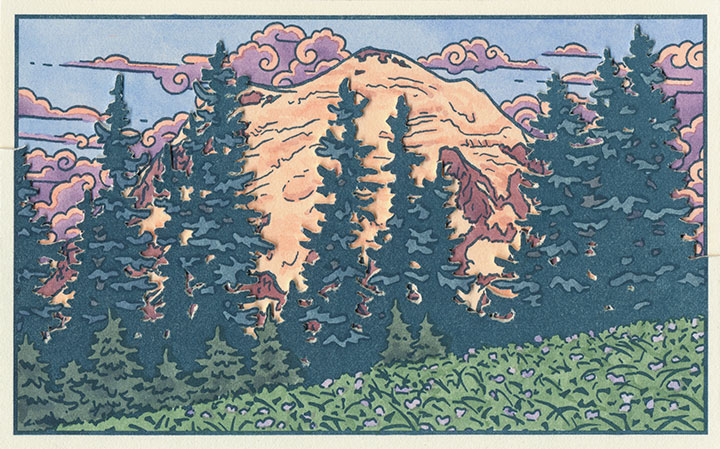
It’s getting harder and harder to keep the secret these days—the Rainier book is almost done, and I’m just dying to show you. But I don’t want to ruin the surprise for T-town, so I’m going to keep it under my hat for just a little longer. But after over two years of being under wraps, the book is gussying it up and stepping out for a solo exhibition. Here’s a brief description of what you’ll see:
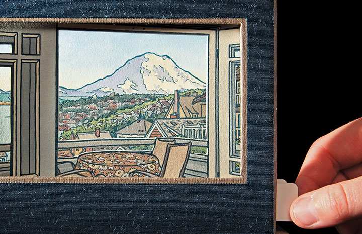
Local Conditions, an interactive artist book, captures the changing faces of Mt. Rainier. Explore the 100 Views—or create one of your own—to discover a mountain both immortal and impermanent.
The book contains 120 image flats and a viewing box; by combining and layering the flats, the reader can create literally millions of scenes. Images are illustrated and compiled from data collected in person, on location, over the course of two years. Letterpress printed, watercolored, and hand-bound in an edition of 26 books. Sponsored by the Tacoma Arts Commission.
Exhibit runs November 4 through January 21
Collins Memorial Library, University of Puget Sound, Tacoma, WA
Opening reception: Thursday, November 4, 4:30 to 6:30 p.m.
Artist talk (sponsored by the Book Arts Guild): Thursday, November 11, 7 p.m., Room 020

Photo by Sarah Christianson
If you miss the exhibition opening, I’ll have some of the process materials from the book out for perusal at this year’s Studio Tour—as well as the brand new Dead Feminist broadside! (Look for it online in early November.) So be sure to stop by!
Saturday and Sunday, November 6 and 7
Open 10 am to 4 pm.
More information, maps, addresses and directions can be found here.
See you then!
October 16th, 2010

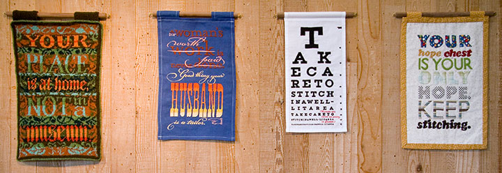
By now you’ve figured out that I have a thing for stitched lettering; and since I’ve already rambled on ad nauseum in the last post, I can keep this one a little shorter.
And anyway, I somehow neglected to take any process photos for two of these. Oops.

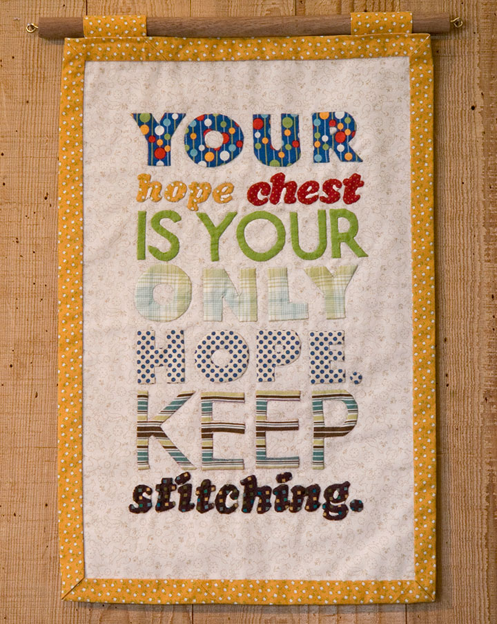
The knitted broadside was such a success that I decided to try branching out into other textile media. For Broadside No. 4, I took a shot at appliqué—something I’d never done before. Hand-sewing all those fiddly little pieces of fabric ended up being just as daunting as cutting a steek.
The hard work was oddly fitting for the concept: historically, a traditional wedding trousseau would have been sewn by a girl or young woman, in hopes of one day becoming a married woman with a home of her own. By the time she reached young adulthood, a woman would have spent years creating dozens of hand-sewn garments, household linens and other useful textiles, all gathered and stored in her “hope chest,” awaiting the day she would become a bride.

The thing is, back in the days when women couldn’t vote, or own property, or head a household, marriage was a woman’s only shot at independence or social status. (Hence the snark.)

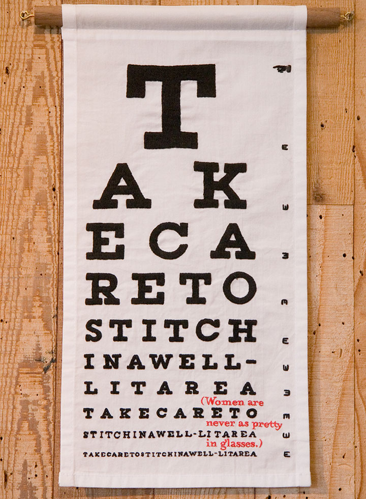
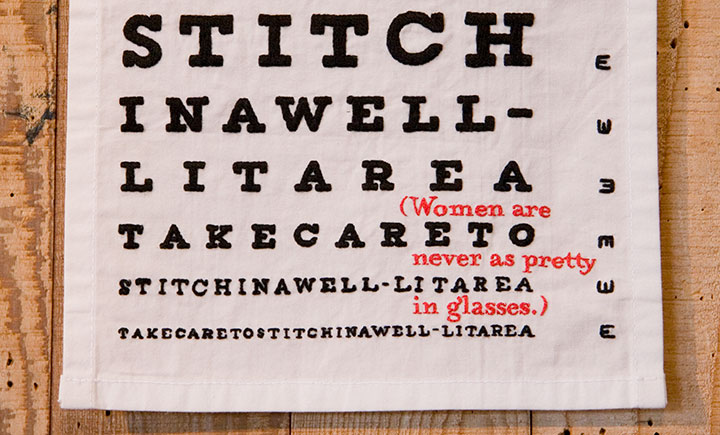
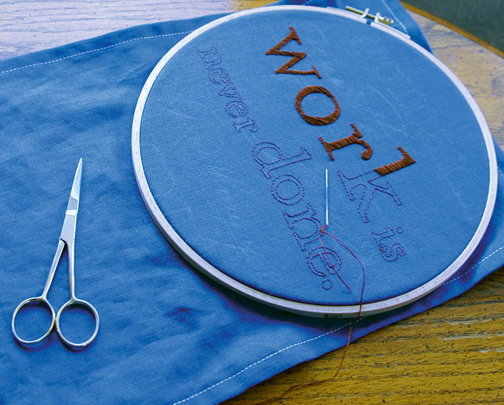
For the others, I turned to the original, old-school ancestor of fabric paint: embroidery. The method fit the madness this time, too, as I spent what seemed like a century hunched over and squinting, hand-stitching an eye chart…

…complete with something to read between the lines.
This one gets personal. As a glasses-wearing gal myself, I happen to disagree with the statement—but I’ve actually heard these very words spoken by a woman. She wasn’t wearing glasses.

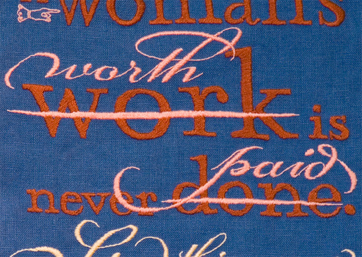
Last of all, I got to thinking about how men who sew for a living are called tailors—and women who do the same are called seamstresses. And how the two terms don’t quite add up to the same meaning.

Despite what the scornful quipping of the text might indicate, I had the most gleeful fun with this one. Unlike knitting, which confines the designer to a grid, or appliqué, which can only push the detailing so far, embroidery has almost limitless possibilities. So I went nuts with the tails and ligatures and dingbats, simply because I could. I love that about embroidery—it’s as flexible as I need it to be, and as fluid and crisp as the printed page.

All that was required was the patience to work each letter by hand. But it didn’t feel like patience—it felt like meditation.

It’s surprising how easy it is for embroidery to mimic letterpress. And watching “wood” type pop up from the fabric, rather than punch into paper, is a mighty satisfying sight.

Uppity notions aside (no pun intended), the Women’s Work broadsides are a fun way to slow down and take a break from what I normally do in the studio. But as I wrap up each one, I find myself hankering to get back into the print shop. By comparison, setting type and drawing letters suddenly seems like speedy work!
October 11th, 2010

While I’ve been hiding away, wrangling my 900-pound gorilla, Jessica has been cooking up something pretty great.

Thanks to her hard work and the wonderful Brian Hutcheson‘s invitation, we are pleased as punch to announce our first-ever dual exhibition!
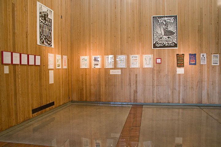
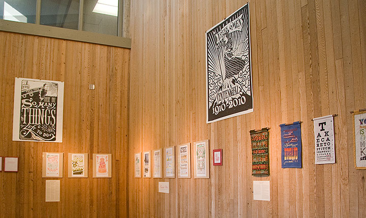
Feminist Wiles: Jessica Spring and Chandler O’Leary
Now through November 5
Ted Sanford Gallery, Charles Wright Academy
7723 Chambers Creek Rd. W
Tacoma, Washington
Open 8 to 5, Monday through Friday
It seems weird that after more than two years of collaborating, giving lectures and printing in the street, we’ve never had an honest-to-goodness show together.

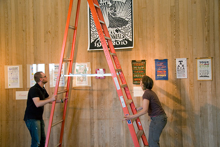
But when Brian offered us a cavernous space, his help with installation, and the chance to indoctrinate the innocent introduce our series to the kids at Charles Wright—well, we’d be nuts to pass that up.

For the first time, all nine (and-a-half) Dead Feminist broadsides to date, plus our two steamroller gals, are on display together.

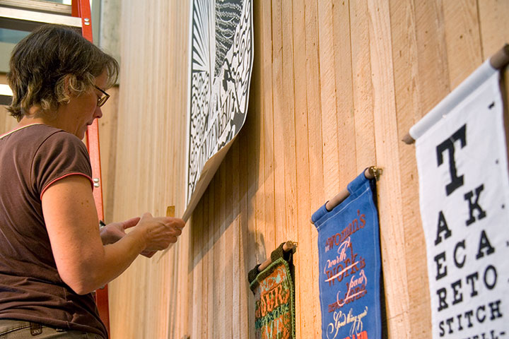
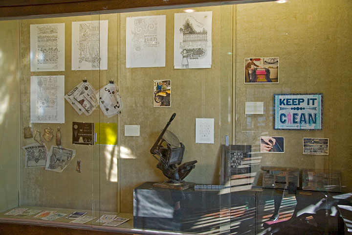
We also have a little mini-exhibit about our process,

and lots of little goodies to introduce people to letterpress.

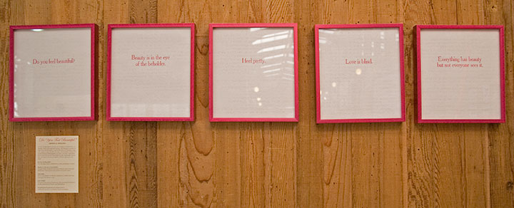
Jessica and I have rounded out the collection with solo work that complements the theme of the show. Jessica’s half consists of Do You Feel Beautiful?, a series of broadsides featuring famous aphorisms on beauty. Here’s the thing that blows my mind into tiny pieces every time I think of it: the quotes are letterpress printed on the pages of a Braille edition of Seventeen magazine. Whoa.
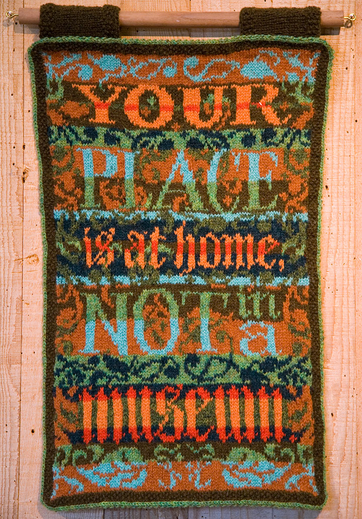
I contributed Women’s Work, an ongoing series of broadsides created in hand-sewn textiles rather than my usual letterpress.
Now, I get a ton of questions about these things whenever I show them, so I thought I’d outline the ideas and process behind them here.

The Tailor first sparked the idea for the series; as you know, he makes his own clothing (hence the nickname). This is a feat that never ceases to amaze me, and I’m not the only one—he gets a lot of comments, usually along the lines of “Wow, you made that?” He’s always a little surprised by these comments, because where he grew up, a lot of people (including his family) wore homemade clothing. That got me thinking, though. The people who do all that sewing in the Tailor’s hometown are women—mothers, grandmothers, sisters, daughters, wives. We’re all surrounded and preceded by generations of women who sew clothing, or knit sweaters, or draft patterns from scratch, without any rave reviews—or any comment at all. But every male knitter or quilter I’ve known, every rare and wonderful man who ever picked up a needle, is either looked at like he’s nuts, or treated with reverent awe. It strikes me as a little strange that depending on who made it, and who’s looking at it, a pair of pants can be a work of art—and an actual work of art can be completely ignored.
If you go further back, like, I dunno, throughout the entirety of human history—you’ll find that both men and women have been responsible for creating textile goods in nearly every culture on earth. Yet in almost every case, when men made textiles it was as part of some sort of guild craft or other professional setting. When women made textiles, it was as part of the home front. This is true in every part of the globe, in pretty much every era, going back to the advent of textile technology.
No matter who does the stitching, there’s an enormous amount of technical skill and design sensibility required to make a garment or textile object. So instead of creating divisions and pigeonholes—instead of separating into Art and Not Art, into Man-made and Woman-made, what if we started seeing the inherent worth in the objects themselves? And what happens when we take a handmade textile and stick it in a gallery? Does its perception change?
Based on what I’ve seen so far with these broadsides, I’d say it does. It’s been an interesting experiment, for sure.
So the Women’s Work series is a bit of an indictment of the double standard, and while the snark is aimed at a wider target, I wrote them as if I were speaking to a woman. Each one is completely made/knitted/sewn/pieced/embroidered/etc. by hand, from design to pattern to construction. The text reads in the voice of a disapproving female role model (or the insidious voice inside our own heads)—in the tone of the backhanded compliment, the cheerful put-down. Each is also designed in the style of a traditional letterpress broadside, to put the typography within the context of an art form centered around mass communication.

This guy requires a little more of an explanation for folks who aren’t already into wool.

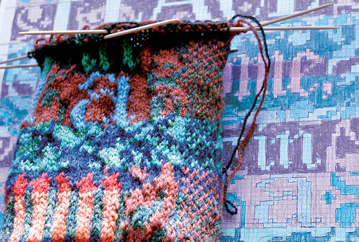
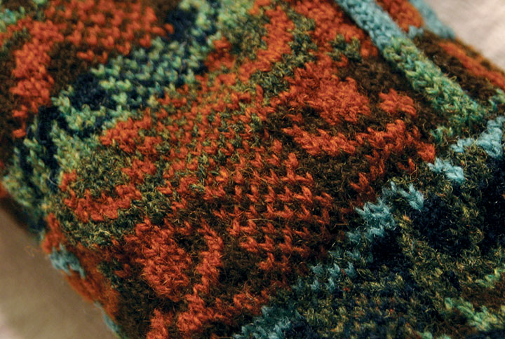
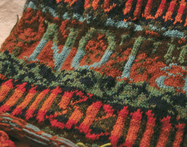
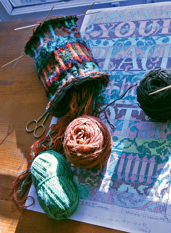
This piece, made almost three years ago now, is hand-knitted with Shetland wool, using the traditional Fair Isle knitting technique. Fair Isle—a method practiced since the nineteenth century on the tiny island of the same name, halfway between Scotland and Norway—is a tricky, rather ingenious thing. Traditional Fair Isle pieces are knit with two colors of yarn at the same time; the resulting fabric is durable, extremely warm, and great for any chilly, foggy, wet climate (like, hello, here). Beyond its über-practicality, Fair Isle knitting is simply gorgeous (take a gander at Google). By nature the double-thick fabric is dense and flat, making it an ideal ground for complex patterns and designs—it’s the perfect mix of function and fancy.

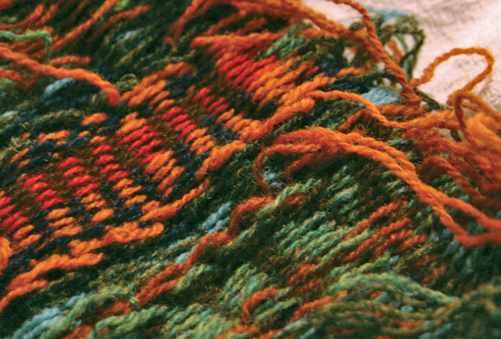
Here’s how it works: even though the piece is knitted with two different colors of yarn at once, only one strand at a time ever passes through the needles. The unused strand of yarn is carried loosely, or “floated,” behind the work—which creates a reversed-out image of the design on the back of the piece. It’s the floats that give structure to the fabric, and make it so cozy-warm.
If you were to create a plain ol’ piece of ordinary knitting, you’d proceed from one end to the other of a row, flip the piece over, and work back the other direction. Rinse and repeat. If you tried that with a piece of Fair Isle knitting, working the “wrong” side would be extremely difficult, since the floats would now be facing you and covering your stitches. Now comes the tricky, smarty-pants part. Flat Fair Isle pieces are first knitted up into a big round tube, and then cut to lie flat. When you knit in the round, you never encounter the wrong side of the work. You just spiral around and around on the right side, happily knitting away and floating the unused color behind you as you go.

So in this case, once I had drafted my design into a gridded stitch pattern, I just pretended I was knitting one really big sleeve (or a neck warmer for a giraffe) with really teeny needles.
Ah, but remember the operative words above: you have to cut the piece to finish it. I had never done this before, and let me tell you, there’s an awful, terrifying finality to the idea. Torn sweaters unravel. Snagged socks fall apart. Who in their right mind would cut a piece of knitting on purpose? And even if you could do it, what happens if you make a mistake? Once you make that cut, you’re done.

This is where the true brilliance of the technique hit me like a ton of bricks. The Scotswomen of Fair Isle are a breed apart—and so are their sheep. Shetland wool, the material traditionally used in Fair Isle knitting, has a magical property that makes this crazy notion work: each wool fiber is covered with microscopic scales that attach to one another. Because the wool sticks to itself, the stitches become slightly matted as you knit. So following the Fair Isle method, you work a little buffer zone called a steek (see the checkerboard strip above?) into your design, and then cut right down the center of the steek. If you use trusty Shetland wool, your stitches won’t unravel when you cut them.
At least, that was the theory. I didn’t quite believe it at the time. But I’d come this far—I didn’t want to lose faith. (If you’re looking to try Fair Isle knitting yourself, I find a glass of wine helps.) So I took a steadying swig, held my breath, and cut.

And then I exhaled. And blinked. I had a flat piece. Gingerly I tested the cut edge—and was amazed. Even with a fair bit of tugging, the stitches refused to unravel.
I will never question a Scotswoman again.
My favorite thing about all of this, beyond the magic of Fair Isle itself, is that knitting really lends itself well to letterforms. Even though the pattern is drafted out on a grid, the forgiving nature of knitted stitches turns every square on the grid into a slightly curved, irregular shape. So when you zoom out and look at the piece from a distance, those grid “pixels” turn into nice little serifs, curves and curlicues.
The rest of the broadsides in the series are made using other types of needlework (more on that in the next post), but the knitted piece is still my favorite. I think I need another dose of that Fair Isle magic in my life—maybe next year you’ll find me up to my knees in wool again.
(Read about the rest of the “Women’s Work” broadsides in part two.)

September 15th, 2010

Lately I’ve spent nearly every waking minute of each day with my face an inch away from the drafting table.
Let’s step back, and stretch out a bit.

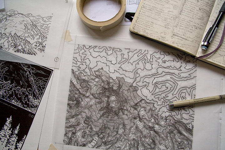
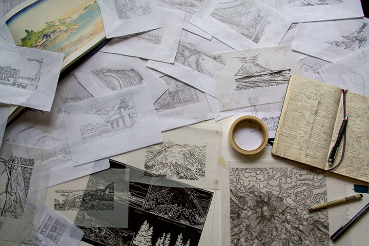
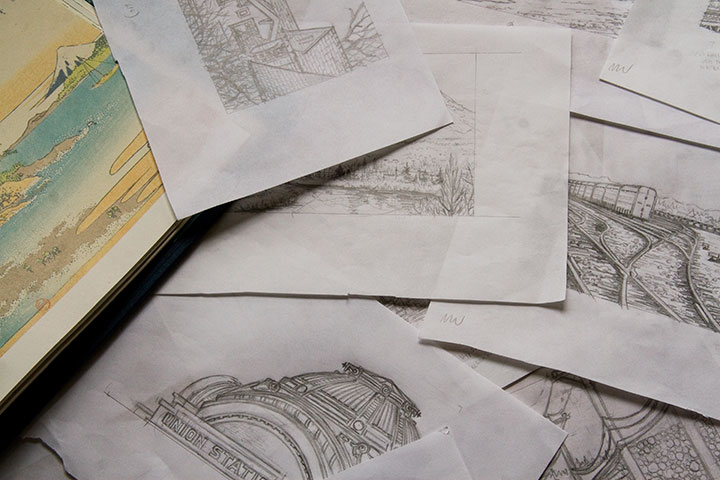
My studio is often a sea of papers—an occupational hazard—but these days the swells have consisted of pencil snapshots for my Mt. Rainier book. Dozens, and dozens, and dozens of them.
Time is ticking down, counting closer and closer to zero, and there are still many miles to cover before the clock strikes deadline. Yet suddenly, things are starting to come together. It won’t be long until I can share something that makes sense—something that looks more like a book, and less like a pile of drawings. I promise that you’ll be among the first to see it when I do.

But if I go missing for long stretches at a time—well, you know where to find me.
August 31st, 2010

At the Wayzgoose on Saturday (thanks to the hundreds of folks who showed up!), Jessica and I had a little teaser for the next Dead Feminist print set up at our table—I figured it wouldn’t be fair if I didn’t also share it online.

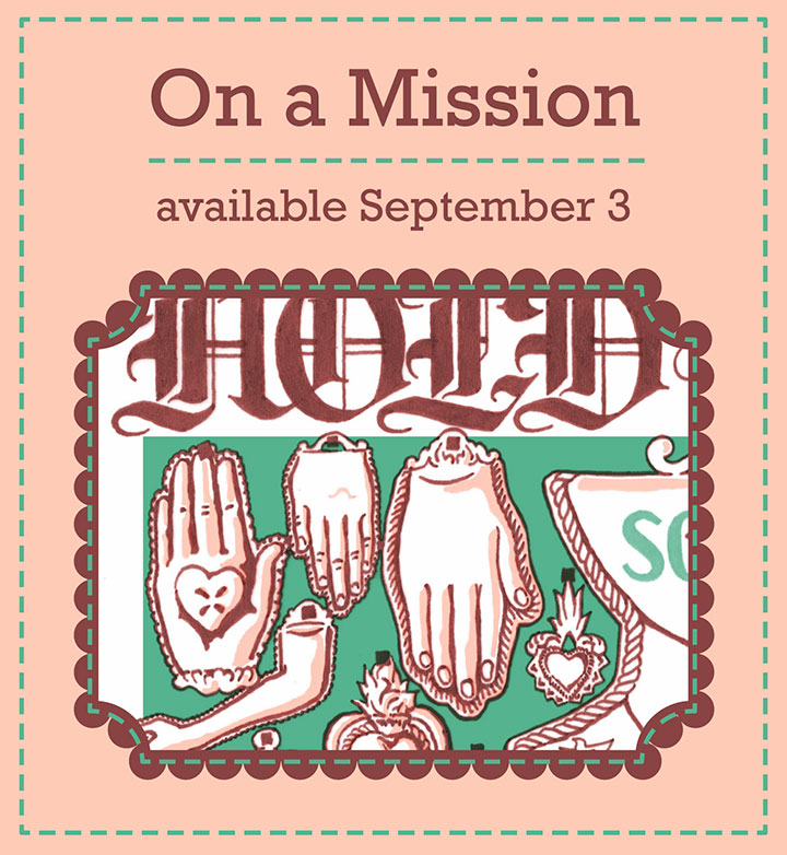
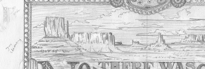
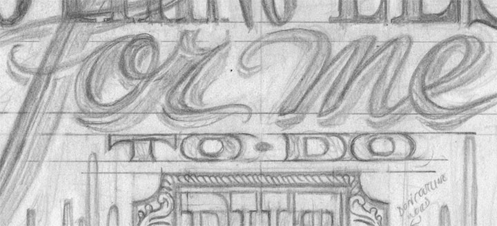
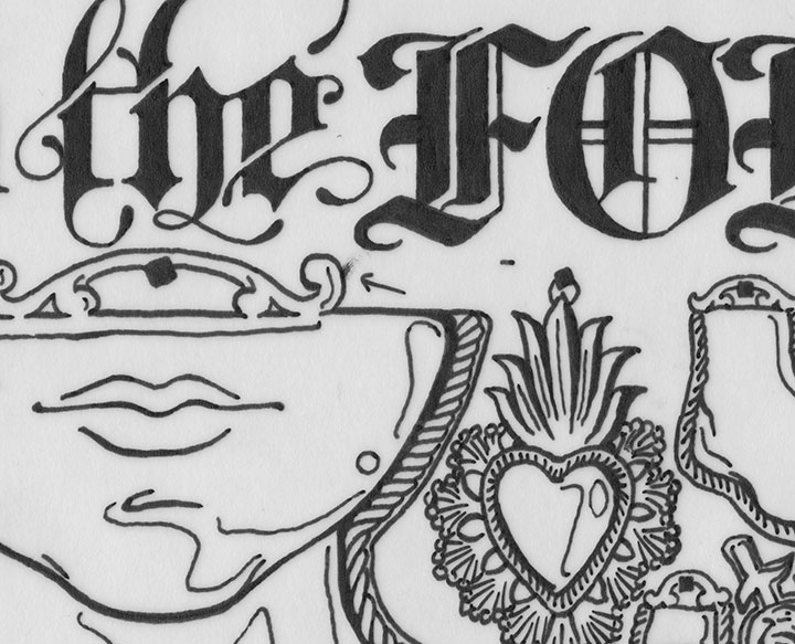
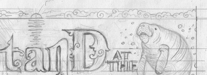
I’m not going to say much, so as not to spoil the surprise, but I thought I’d drop a few clues by way of my messy drawings—

warts and all. As you can see by all the smudges and arrows, doin’ it by hand is hardly a perfect process,

but I wouldn’t have it any other way.
On a Mission is on press as I speak, inching closer to the finish line every moment. Look for it here on Friday—see you then!
August 11th, 2010

I’ve been sitting on this post for months now—it’s just that after spending so much time hunched over this project, I needed some time off from even thinking about it. But now I’m ready to talk birds again.

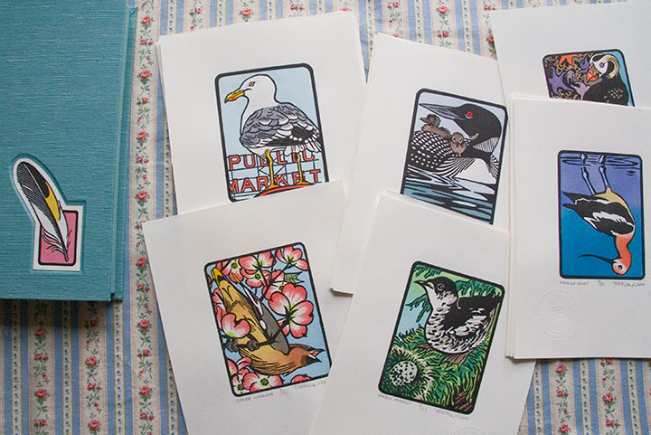
From left: Cedar Waxwing; Steller’s Jay; American Avocet; Purple Martin; Tufted Puffin
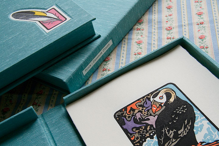
Eighteen months, twenty-five birds, six hundred twenty-five individual prints and ten box sets later, my little Flock is finished.

Mountain Quail; American Bittern; Long-billed Curlew; Hooded Merganser; Laysan Albatross

Barn Owl; American Kestrel; Eurasian Coot; Anna’s Hummingbird; Herring Gull
It’s a little crazy to see these all together, like, well, birds on a wire. Each one has been broken down into its own little assembly line for so long that I forget sometimes to see them as a set.

Western Tanager; Lazuli Bunting; Northern Flicker; Bullock’s Oriole; Belted Kingfisher

Common Loon; Marbled Murrelet; Northern Shoveler; Harlequin Duck; Brown Pelican
As you can see, what’s represented here is a pretty broad cross-section of Washington birds. There are so many bird species ’round these parts, in fact, that I almost didn’t know where to start—and narrowing the choices down to twenty-five was by far the most difficult task.

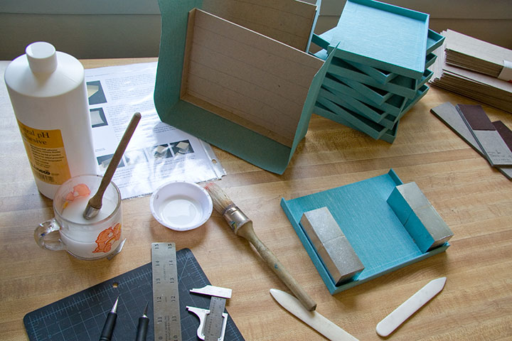
Wait. I take that back. The hardest part was keeping the glue off of the pricey imported Japanese book cloth (glue plus cloth equals death—or at least wailing, gnashing of teeth, and starting all over from the beginning).

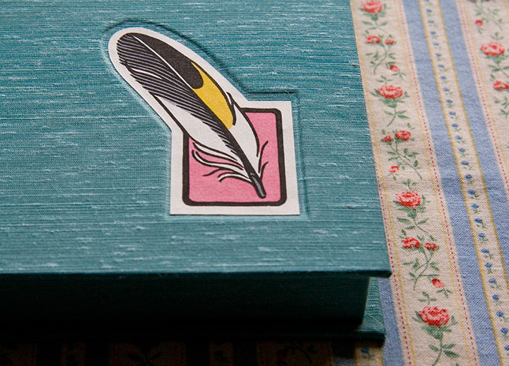
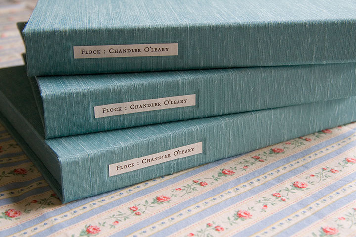
You see, it seemed silly to have a set of prints with nothing to house it. My inner book artist took over (thanks to Jessica’s tricksy enabling), and insisted on encasing the first ten sets of the edition in handmade clamshell boxes.

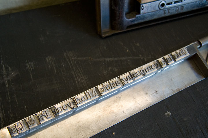
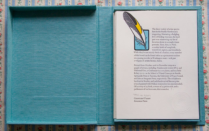
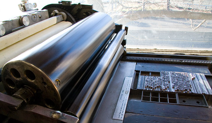
Even though the results are always worth it, I don’t have much love for making boxes—what I do love is printing the colophon. A colophon (or in today’s hardbound novels, the “note on the text”) is an essential element in any artist’s book; this is where the artist steps outside the book’s content and talks about the making of the book itself. For this I decided to go back to my letterpress roots, and hand-set the text in metal type.

While I’m rarely able to fit hand-setting into my projects these days (a drawback to all the lettering I’ve been doing), it’s still my favorite method of getting a block of text onto a page. And this beloved Bembo, cast locally at Stern & Faye, is so beautifully spaced and balanced that it’s a dream to set and a pleasure to read.


Here’s what it says:
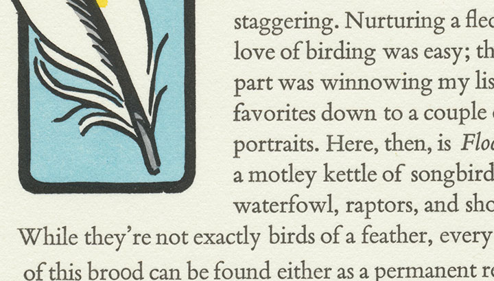
The sheer variety of avian species here in the Pacific Northwest is staggering. Nurturing a fledgling love of birding was easy; the hard part was winnowing my list of favorites down to a couple dozen portraits. Here, then, is Flock, a motley kettle of songbirds, waterfowl, raptors, and shorebirds. While they’re not exactly birds of a feather, every member of this brood can be found either as a permanent resident or a passing traveler in Washington state—with just a wingtip of artistic license, that is.
Printed from October 2008 to December 2009 on a gaggle of presses, including Vandercook models SP15 and Universal One, a Craftsman 6.5 x 10 platen, and my little Kelsey 3 x 5—at the School of Visual Concepts in Seattle, Springtide Press in Tacoma, the University of Puget Sound, and here at Anagram Press, respectively. The colophon is hand-set in Bembo, and each hand-carved linocut print is hand-painted with Pelikan watercolor (no pun intended). Of a covey of 25 birds, a tweet of 25 prints each, and a parliament of ten box nests, this is number [2].

Okay, so maybe I went a bit overboard on the avian puns. It’s just that the thought of getting my hands dirty on type drawers again had me all twitterpated.
And I have a fluttering feeling that there might be even more birds in my future—one of these days, anyway.

June 3rd, 2010

The next print in our Dead Feminists series will be making its in-person debut on Tuesday—these few snippets might give you a clue as to our latest theme. Jessica and I will be doing our dog-and-pony show at the Gig Harbor branch of the Pierce County Library; if you’ve missed our previous lectures, come check it out! If you have seen seen it, you’ll already know our schtick, but you’ll still get to see the new piece first! As always, you can also get up to speed by reading about our process here.
Pressing Matters: local letterpress artists combine craft with history
Tuesday, June 8, 2010
7:00 p.m., free!
Gig Harbor Branch, Pierce County Library
4424 Point Fosdick Drive NW, Gig Harbor, WA

We’re a month late with the new broadside for a couple of reasons. The longest (4 months!) and most annoying delay came from the fact that we’ve had to switch to a different paper. I know that sounds silly, but the paper industry is very volatile, and if you’ve ever used a type of paper that you love, only to have it be discontinued (or worse, the company goes out of business), you’ll know how frustrating it can be to find a reasonable facsimile. I guess we should have seen this one coming—the paper we’ve been using is not only extremely unusual (made from recycled clothing!), but it’s also made by a tiny, independent paper company. It’s a long story, but the short version is that the paper is now perpetually on back-order, and we had begun to notice quality issues. So! We’ve finally found a very good, high-quality replacement, and while it doesn’t quite have the Cool Factor of the other stuff, we certainly have a lot less to worry about.

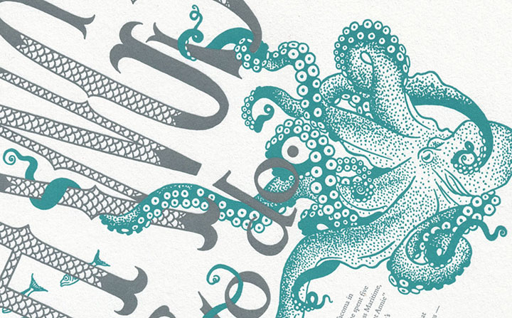
The broadside will appear online (both here and in the shop) on Wednesday, so stay tuned for more information. And in the meantime, in case you’re debating whether it’s worth the Sturdy Gertie bridge toll to attend the talk, you can say hello to the giant octopus* on the way!

*I just learned that one of the world’s largest species of octopus lives in the Tacoma Narrows, right under the bridge—a fact that completely made my week, and that I’ve obviously been dying to work in to a blog post.
April 18th, 2010

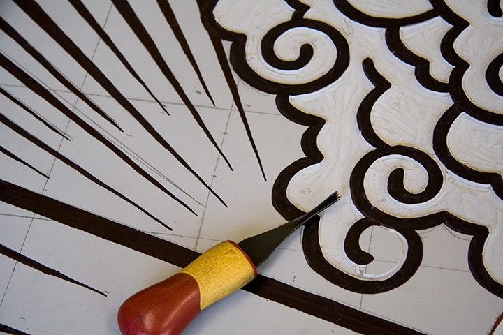
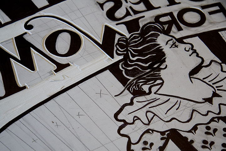
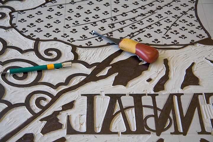
Jessica and I are carving like mad this week, getting ready for some quality steamroller time.

Next Sunday, April 25, is the sixth-annual Wayzgoose at King’s Books, right here in Tacoma. This year promises to be the biggest hullabaloo yet, with letterpress magnetic poetry, B.Y.O. t-shirt printing, papermaking demos, artist tables, and the star of the show: steamroller printing! Last year over 500 people came to check it out, despite a torrential downpour—and this year, the weather just might promise to behave, so we’re bracing for a mob. There’s a reason for the crowds: this is a heckuva lot of fun. Here’s the skinny:
6th Annual Wayzgoose!
Sunday, April 25, 2010
Noon to 4 pm
Free!
King’s Books
218 St. Helens Ave., Tacoma

Eight artists and artist-teams will be printing gigantic three-by-four-foot linocuts in the street, including Jessica and me—we’ll be adding another unofficial Dead Feminist to our roster. (Take a gander at our last steamroller print here.) This is just a sneak peek; stop by next Sunday to see this block in action.
See you there!
April 12th, 2010

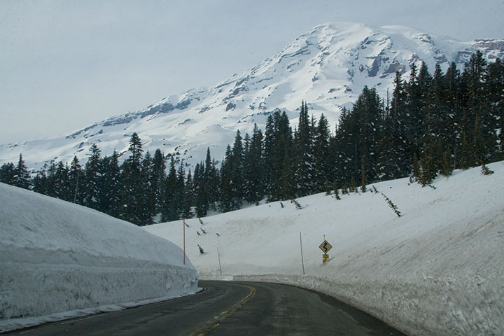
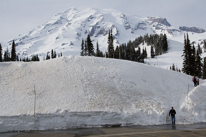
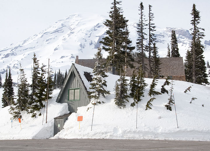
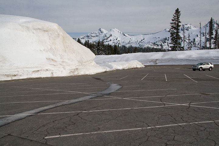
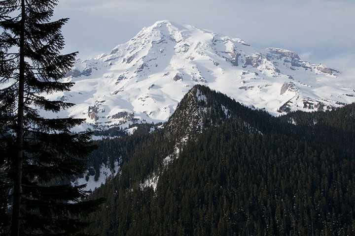
The sun came out yesterday afternoon, and Mt. Rainier peeked out from behind the clouds. On a whim I tossed my camera into the car and bolted to Paradise, where I had been hoping for one more research shot for my book: Rainier in the snow.


Well, I certainly got my wish.

An hour and a half later I was standing in the cold, at the highest point on the southern park road, and the furthest one can go before the snow melts at the end of June and the rest of the park opens.

I looked over at one of the few cars around me, and was absurdly reminded of all those winters I spent in North Dakota (minus the mountains, of course).

It was nice to think that if I wanted snow, I could come and get it whenever I wanted—without having to shovel my way out of it.
February 13th, 2010


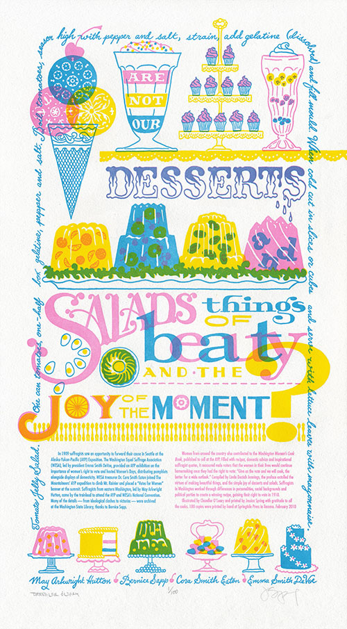
This year marks the 100th anniversary of women’s suffrage in Washington—a feat only made possible by the collaborative efforts of many dedicated people of every walk of life and political stripe. In this spirit, we present our seventh broadside in the Dead Feminists series, Just Desserts.

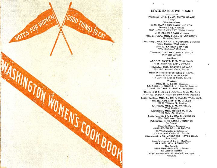
Through our research at the Washington State Library, we discovered that our state’s suffrage movement had many leaders, rather than one prominent figurehead. We also learned that there was so much head-butting, personality-clashing and partisan in-fighting going on within the organizations involved (Mesdames Hutton and DeVoe, I’m looking at you!) that it would be impossible to tell the whole story in one letterpress poster. So instead of quoting a single historical feminist, we cited a collaborative publication—the Washington Women’s Cook Book, published in 1908-1909 for the Alaska-Yukon-Pacific Exposition—and featured four women symbolic of the movement: May Arkwright Hutton, Bernice Sapp, Cora Smith Eaton, and Emma Smith DeVoe. The quote:
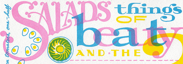
“Are not our desserts and salads things of beauty and the joy of the moment?”
The book was a clever piece of propaganda that operated on the principle that the way to a man’s heart—or vote—is through his stomach. All those jellied centerpieces and whimsical soufflés must have done the trick—the following year, women got the vote.

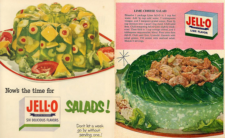
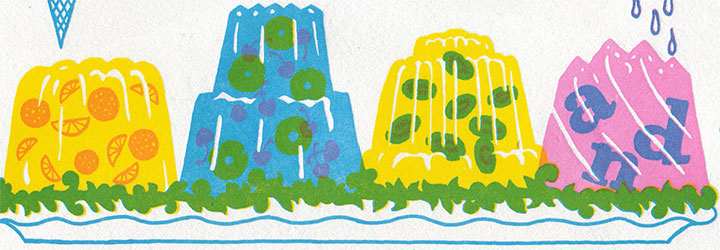
And for my part, the quote turned me into an almost-literal kid in a candy store; the design was just begging for elaborate confections and candy-coated typography. At first, though, I was turned off by the idea of having to draw salads (I wanted more ice cream!), until Jessica read off a litany of aspic salad and gelatin dessert recipes from the book. That’s when the light bulb turned on: Jell-o salad! The decade-plus I spent in the Midwest was about to serve me well.

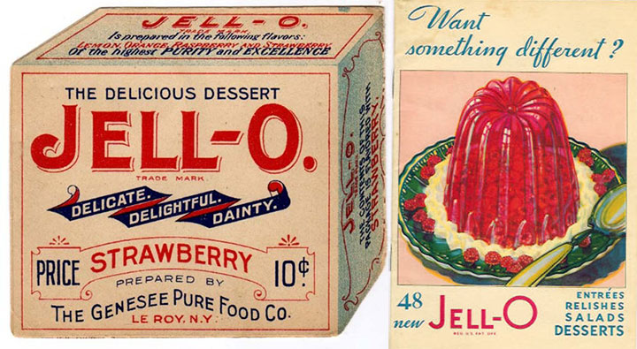
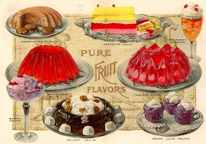
Turns out that Jell-o fit right into the turn-of-the-century theme: molded gelatin desserts were a Victorian favorite, and the name “Jell-o” was first coined in 1897 (and if you look carefully, the “J” from the original Jell-o box makes a cameo in the print). There seemed to be no end of antique recipes, advertisements and illustrations at my disposal.

I might be horrified by the idea of eating gelatin salads, but drawing them was the most fun I’ve had in a long, long time. Zooey and I each spent hours researching vintage Jell-o molds—probably more for the pure fascination than for the value of the reference material.
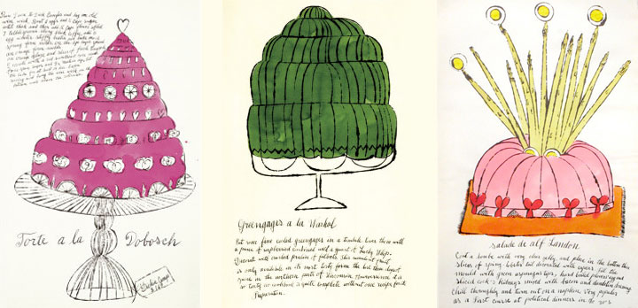
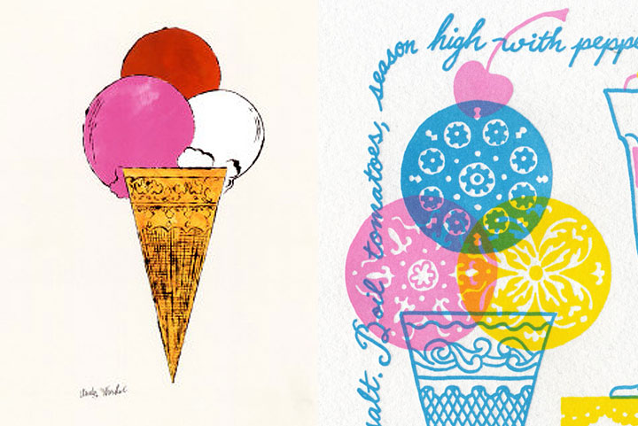
For the sweets portion of our little menu, I turned to an old favorite for inspiration: Andy Warhol.

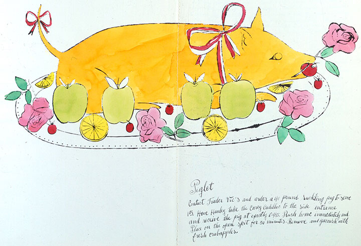
Forget what you know about Campbell’s soup cans or Elvis portraits; Andy got his start as an illustrator specializing in fashion and food. In 1959 he illustrated a spoof cookbook called Wild Raspberries (it’s been on my shelf since high school, and I finally found a direct use for it!), filled with ridiculous “gourmet” recipes for things like “A&P Surprise” (those of you in New England will get that one) and “Seared Roebuck.”

The illustrations are fantastic (and the polar opposite of my style), but the thing that really drew me in was the lettering. Andy had his mother, Julia Warhola, write all of the text of his early illustrations in her shaky, school-girl script. Mrs. Warhola spoke little to no English, and simply copied her son’s notes letter-for-letter, so the text in Wild Raspberries has charming errors and misspellings throughout.

I loved the down-to-earth quality of Mrs. Warhola’s cursive, so I wrote a recipe from the Washington Women’s Cook Book along the border of the broadside in a similar hand (though to warn you, it’s a recipe I wouldn’t recommend trying!).

And of course, I couldn’t do without a little ice cream homage.

Like The Curie Cure, this piece is printed in three colors—although the three we chose let us create many more. Our color scheme allowed us to print in a similar fashion to commercial printing, where a minimum of colors (CMYK—cyan, magenta, yellow, black) are layered to create a full-color image. Our layering of translucent pink, blue and yellow ink allowed us to create a full rainbow and a convincing depiction of foreign objects floating in jelly.

Heaps of thanks to everyone who came to our talk at the State Library the other night, despite lousy weather and rush-hour traffic—we had a tremendous turnout, and a huge show of support for our state’s oldest cultural institution.
One more thing: three cheers for the incredible staff at the Washington State Library (many of whom are among those whose jobs have been cut and will end very soon) who made our talk and this very piece possible. Because we couldn’t have done it without them, we have donated a portion of our proceeds to support the State Library’s collections.
After all, it’s about preserving (in jelly?) that joy of the moment for everyone to share, right?
• • • • • • • • • • • • • • • • • • • • • • • • • • • • • • • • • • • • • • • • • • • • • • • • • • • • • • • • • • • •
Just Desserts: No. 7 in the Dead Feminists series
Edition size: 100
Poster size: 10 x 18 inches
Printed on an antique Vandercook Universal One press, each piece is printed on archival, 100% rag, recycled paper, and signed by both artists.
Colophon reads:
In 1909 suffragists saw an opportunity to forward their cause in Seattle at the Alaska-Yukon-Pacific (AYP) Exposition. The Washington Equal Suffrage Association (WESA), led by president Emma Smith DeVoe, provided an AYP exhibition on the importance of women’s right to vote and hosted Women’s Days, distributing pamphlets alongside displays of domesticity. WESA treasurer Dr. Cora Smith Eaton, joined The Mountaineers’ AYP expedition to climb Mt. Rainier and placed a “Votes for Women” banner at the summit. Suffragists from eastern Washington, led by May Arkwright Hutton, came by the trainload to attend the AYP and WESA’s National Convention. Many of the details—from ideological clashes to victories—were archived at the Washington State Library, thanks to Bernice Sapp.
Women from around the country also contributed to the Washington Women’s Cook Book, published to sell at the AYP. Filled with recipes, domestic advice and inspirational suffragist quotes, it reassured male voters that the women in their lives would continue homemaking once they had the right to vote: “Give us the vote and we will cook, the better for a wide outlook.” Compiled by Linda Deziah Jennings, the preface extolled the virtues of making beautiful things, and the simple joy of desserts and salads. Suffragists in Washington worked through differences in personalities, social backgrounds and political parties to create a winning recipe, gaining their right to vote in 1910.
Illustrated by Chandler O’Leary and printed by Jessica Spring with gratitude to allthe cooks. 100 copies were printed by hand at Springtide Press in Tacoma. February 2010
UPDATE: poster is sold out. Reproduction postcards available in the Dead Feminists shop!


![Chandler O'Leary [logo]](https://chandleroleary.com/wp-content/themes/chandleroleary/images/logo.png)
