Blog
November 12th, 2013
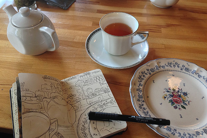
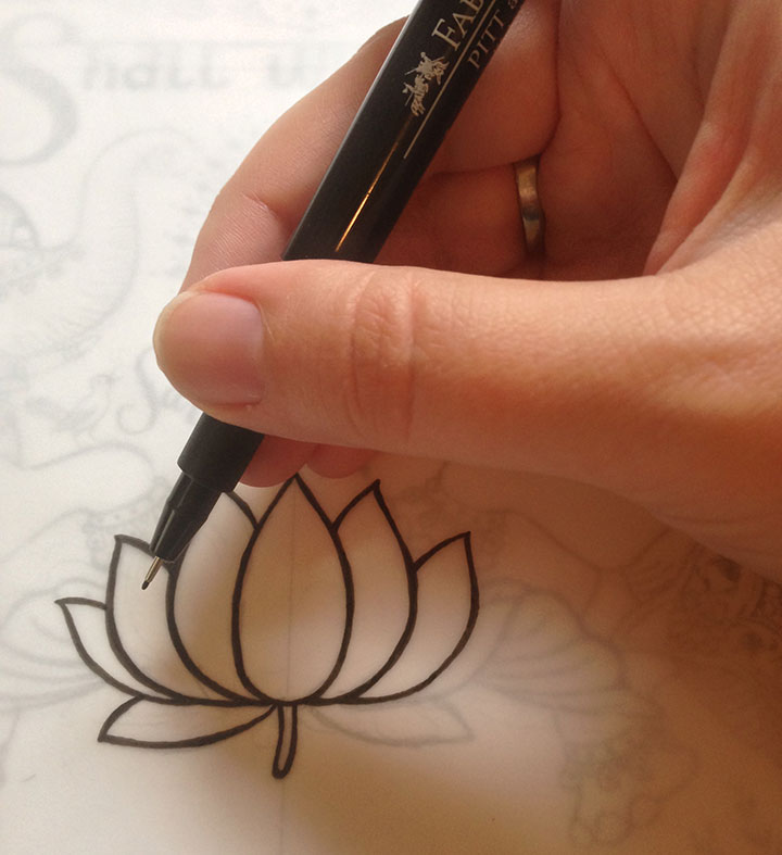
Every so often the Tailor and I rack up a list of errands to run down in Portland. So we pick a Saturday and hit the road early. But before we tackle our list of stops to make, we always start our visit with a quiet cuppa somewhere. Since Portland is chock-a-block with fantastic bakeries and coffee shops, we try to hit a different place every time. This weekend it was the French bakery, St. Jack—and some quality time with the ol’ sketchbook.
November 5th, 2013

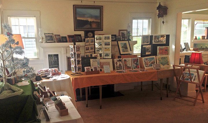
Every year I tell myself I’ll actually take photos during Studio Tour—and every year we get a bigger crowd, and I get all wrapped up in talking to people, and somehow the camera just sits forgotten in a corner. But at least I managed to take a couple of quick snaps of how it looked before we opened! We had our biggest group yet this year—over 150 people, many of them new faces! So an enormous thank you to everyone stopped by or sent me encouraging social media messages throughout the weekend—I can’t tell you how much it means to me to be a part of this amazing community.

October 21st, 2013

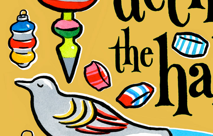
When you’re an illustrator, you have to start celebrating (or at least gearing up for) every holiday months in advance. So that means I’ve got Christmas music stuck in my head already. That’s okay, though, because it means I’m churning out new work for the holiday season! And I’m having an extra fun time this time year, because I’m trying some new things, in a little bit of a different style.
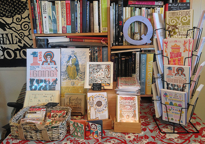
If you’re local, you can be the first to grab the new crop of goodies (including brand new illustrations from the Drawn the Road project, and the new Red Deck of the Tacoma Playing Cards) at this year’s city-wide Studio Tour circuit, held during the first weekend in November. I’ll be open both Saturday and Sunday, as usual—more info and maps/directions here.
If you’re not local, look for the big blog-reveal of all the new holiday goodies on Black Friday. Stay tuned!
September 10th, 2013

As the school year begins again and the pace of life quickens, the easy pace of summer has made way for a season of bustling, planning, and dreaming of times ahead. Yet worldwide, over and over again, the plans and dreams of so many women and girls are cut short by violence. In light of recent high-profile crimes halfway around the world, Jessica and I though it was high time we spoke up. This time we drew inspiration from the Nightingale of India:
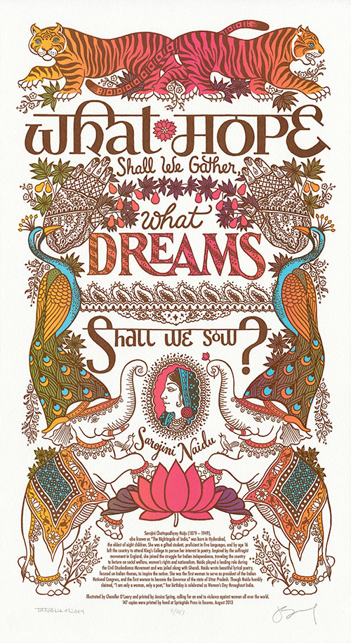
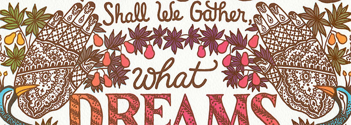
What hope shall we gather, what dreams shall we sow? — Sarojini Naidu
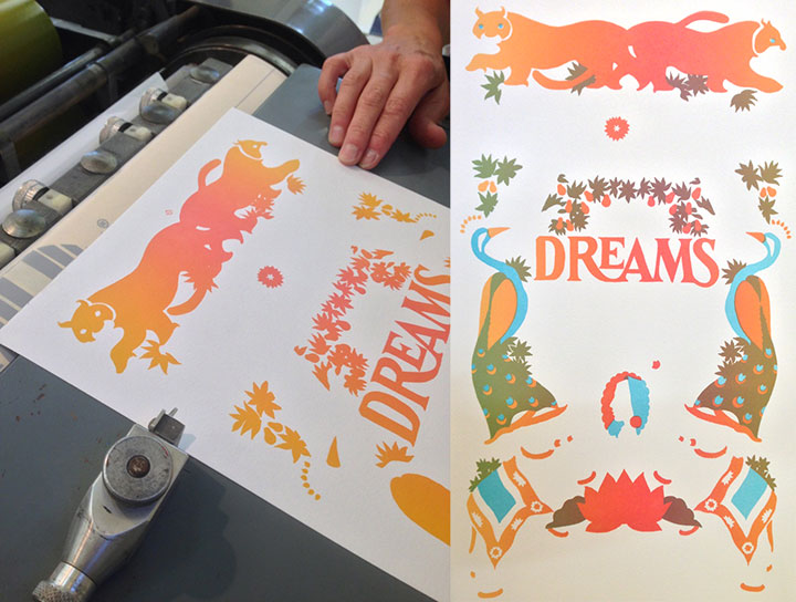
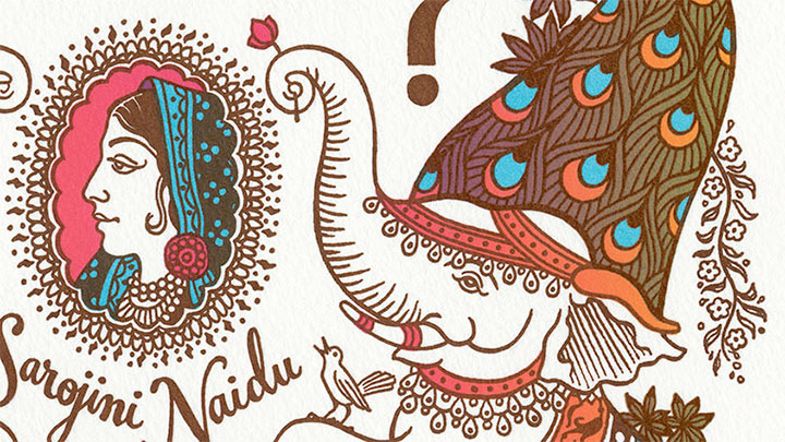
“Nightsong” honors the hopes and dreams of women and girls in every culture—in defiance of the world’s dangers. The illustration depicts a lush dream menagerie printed in bright, exotic hues. Tigers, peacocks, elephants and nightingales stand sentinel around our heroine, surrounded by detailed paisleys and florals drawn in the style of Indian mehndi designs.

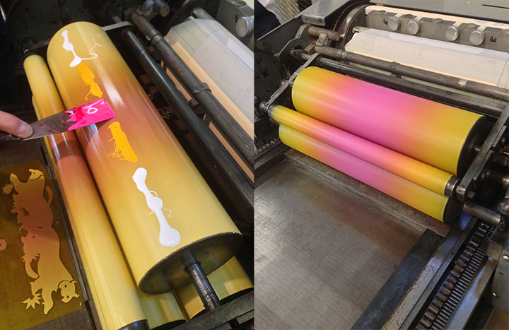
To make this print more dreamlike, we decided to throw a tricky technique called split-fountain printing into the mix—or “rainbow roll,” for short.

A split fountain is extremely difficult to control (advanced Eagle Scout printing here, folks), but the results are so lovely that it’s absolutely worth the effort. As an added bonus, we were careful to keep our inks translucent—so when we registered the second color, that mixed the colors even further, giving us an entire rainbow spectrum with just two passes on press.

I should add, though, that while we love printing with a rainbow roll, the process is completely unpredictable, and the finished prints are far from uniform. So rather than an edition of absolutely identical broadsides, we ended up with a beautiful range of yellows, oranges, pinks and even reds, that vary from print to print. So my scans here are representative of the edition in general, but no two prints are exactly alike (so if you order a print, please allow for some slight variations from what you see here).

To help restore hope to victims and in honor of our dreams for the future, a portion of our proceeds will be donated to Take Back the Night. In order to create safe communities, Take Back the Night seeks to end sexual assault, domestic violence, dating violence, sexual abuse and all other forms of sexual violence.
• • • • • • • • • • • • • • • • • • • • • • • • • • • • • • • • • • • • • • • • • • • • • • • • • • • • • • • • • • • •
Nightsong: No. 18 in the Dead Feminists series
Edition size: 147
Poster size: 10 x 18 inches
Printed on an antique Vandercook Universal One press, on archival, 100% rag (cotton) paper. Each piece is numbered and signed by both artists.
Colophon reads:
Sarojini Chattopadhyay Naidu (1879 – 1949) — also known as “The Nightingale of India” — was born in Hyderabad, the eldest of eight children. She was a gifted student, proficient in five languages, and by age 16 left the country to attend King’s College to pursue her interest in poetry. Inspired by the suffragist movement in England, she joined the struggle for Indian independence, traveling the country to lecture on social welfare, women’s rights and nationalism. Naidu played a leading role during the Civil Disobedience Movement and was jailed along with Gandhi. Naidu wrote beautiful lyrical poetry, focused on Indian themes, to inspire the nation. She was the first woman to serve as president of the Indian National Congress, and the first woman to become the Governor of the state of Uttar Pradesh. Though Naidu humbly claimed, “I am only a woman, only a poet,” her birthday is celebrated as Women’s Day throughout India.
Illustrated by Chandler O’Leary and printed by Jessica Spring, calling for an end to violence against women all over the world.
UPDATE: poster is sold out. Reproduction postcards available in the Dead Feminists shop!

August 14th, 2013

Jessica and I are hard at work on the next Dead Feminist poster—I’m inking flowers and separating colors this week, and then we’ll be on press before you know it. Look for more in the coming weeks…
June 28th, 2013

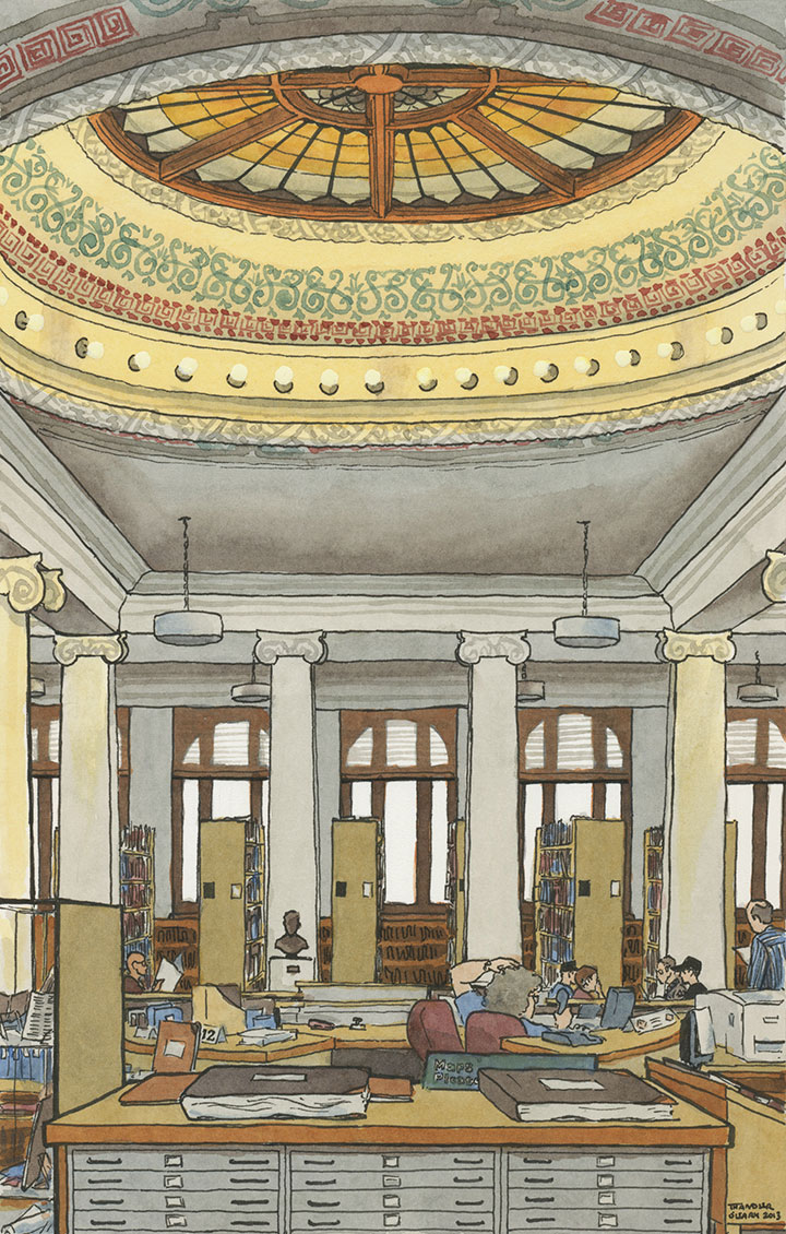
More than a thousand towns and cities in the U.S. are lucky enough to have had a Carnegie Library under their belt, and Tacoma is no exception. Today, our Carnegie Library is a wing of the expanded main campus of the Tacoma Public Library—and the rotunda now houses the fabulous Northwest Room, the ultimate resource for Tacoma and Northwest history. It’s a gorgeous space, and beloved in these here parts. So I figured it would be a perfect addition to the Red Deck of the Tacoma Playing Cards.

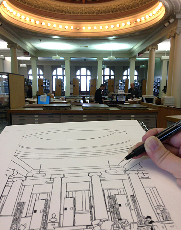
I didn’t think they’d take kindly to me breaking out the watercolors in a room full of rare books, but I was at least able to do the line drawing on-site. (‘Scuse the wobbly iPhone photo.) And that’s always a tricky prospect for me—I always do as much drawing from life possible, but I’d much rather disappear into the woodwork while doing so. My drawings are always better when I can concentrate uninterrupted. The trouble is, the only place I can consistently sketch in public without anyone noticing me is New York. Here in Tacoma—where I run into someone I know at least once a day—it’s a different story.
In the Northwest Room there was a table right in front of me, which would have made me far less conspicuous while sketching. But in order to get the point of view I wanted, I had to stand dead-center in an aisle, right in the middle of the room. Yet not once in the hour-plus I stood there, sticking out like a sore thumb and obviously not doing what people normally do in there, did anyone bother me—or ask me what the heck I was doing, or make eye contact, or even register my existence.
I think I just found my new favorite sketching spot.
June 21st, 2013

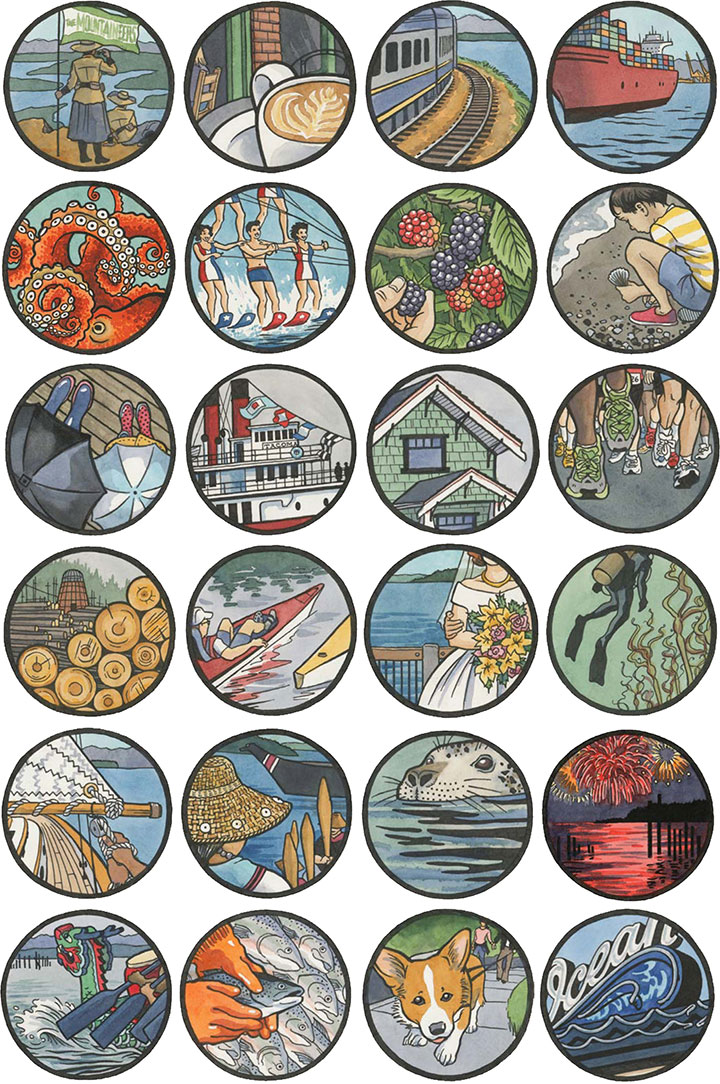
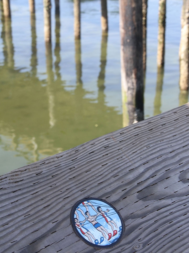
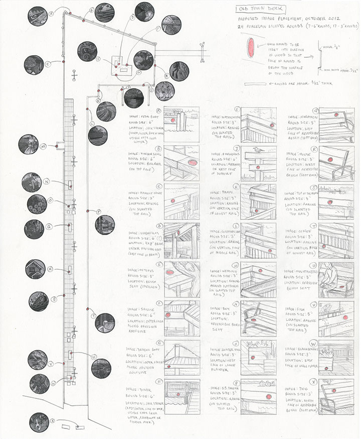
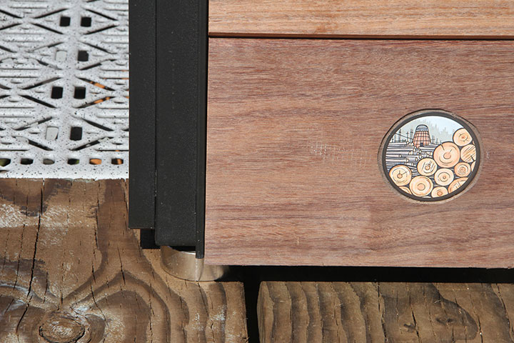
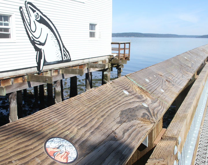
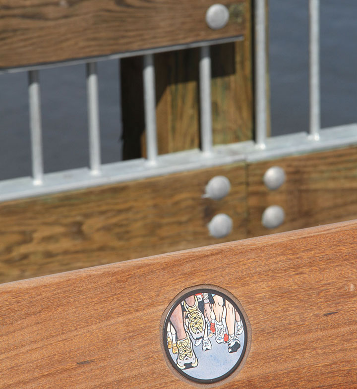
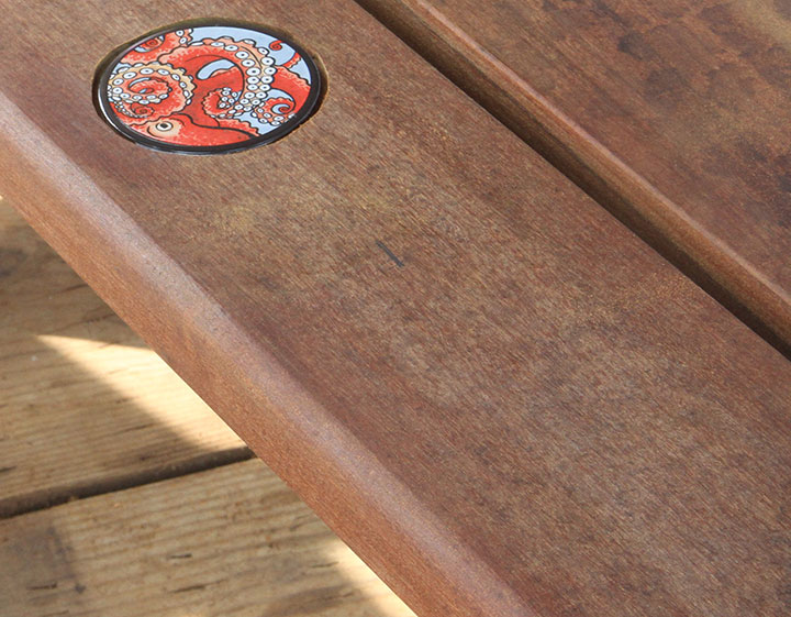
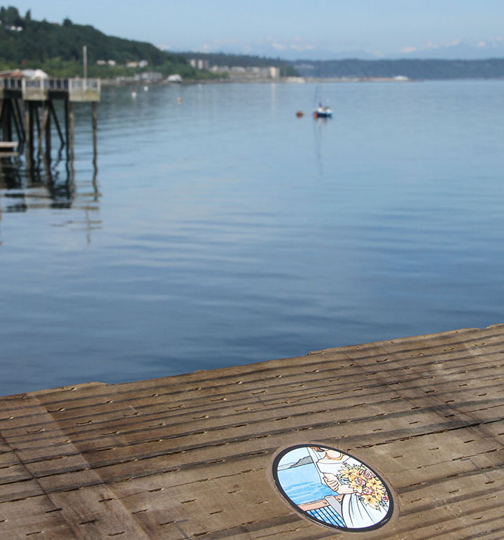
Okay. Now that Old Town Dock is officially open, I feel like I can finally give away some juicy details. Here are all 24 medallions (portholes?) in my new public art piece, Droplets. Since not everyone reading this post is local to Tacoma, I won’t go into great detail over every image. But to give you some context, Old Town Dock boasts one of the best vantage points in the South Sound, with beautiful views of land, city and sea in every direction. That’s what first drew me to the site: I wanted the chance to encourage people to look all around them, because there was something to see everywhere you look.
But when I started researching the history of the place, I was even more struck by how much had happened in Old Town over the years—and how much was still going on, every day. Because of its prominence in so many lives and livelihoods, Old Town Dock has stood witness to a staggering number of true stories since it was built in 1873. Family histories, booming industries, important events, Native traditions, beginnings, endings, drastic changes, slow growth, celebrations, tragedies, and a thousand everyday narratives—the stories we tell are as commonplace as raindrops, yet as precious as the water that defines and sustains Tacoma as a city.
Droplets references just a handful of these stories, yet hopefully hints at the diversity and richness inherent in our public spaces.

Going from a painted picture to a tangible, finished object was nearly a two-year process, and I was only one small piece of the puzzle.

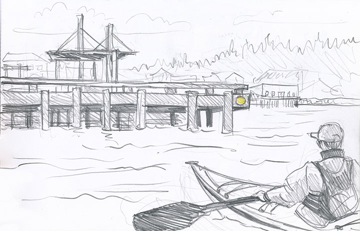
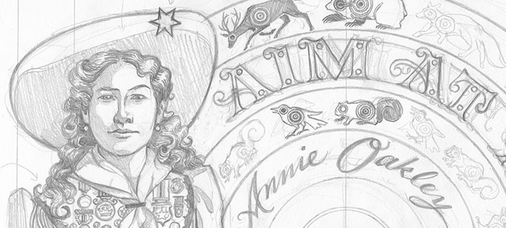
And the 24 medallions barely hint at the number of drawings I did along the way. Back when I was a finalist for the commission, I needed to demonstrate my understanding of the space, and convey how I wanted the artwork to function to the selection committee. In this area, pictures really were worth a thousand words apiece; time after time, sketching out what I meant was infinitely more effective than trying to explain it in words.
As I was working on my presentation, all this drawing and imagining every angle gave me a little epiphany. I realized that while the view from the site was spectacular, the Dock itself was part of the view, too, depending on where you stood. Since Old Town Dock is a gateway between land and sea, I wanted to engage the folks who’d be arriving from the water, as well. So I presented this drawing—and while some other things have changed along the way, the reality of this particular piece is almost exactly as it appears in this sketch.

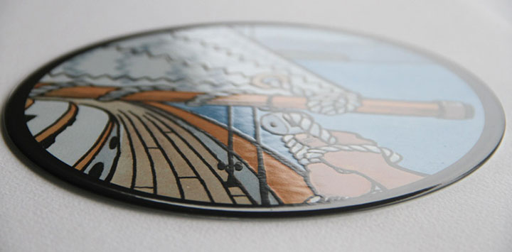
Anyway, back to the nuts and bolts. As you’re well aware, I’m an illustrator—I work in paint and pixels, not industrial components. I didn’t have the skills or tools to make outdoor pieces out of durable materials (in public art, durable materials include metal, glass, tile, stone, brick, and other permanent industrial media; a mural, for instance, is not considered “durable”). So I turned my designs over to the good folks at Winsor Fireform, a fabricator just down the road in Olympia, and they reproduced each Droplet as a small porcelain enamel disc.
Porcelain enamel is the most durable sign medium available. Each piece is made by reproducing the image in pigmented powdered glass onto a steel base. Then the piece is fired at kiln temperatures to fuse the glass to the steel, creating a permanent, totally nonreactive surface.

Porcelain enamel won’t fade in UV light, won’t react to water or salt, and is resistant to dirt and graffiti. That makes it ideal for public art, and the perfect medium for the harsh marine conditions at Old Town Dock.

Now all that was left was to install the rounds. I came armed with my scale drawing—and lots and lots of warm clothing for a long shift in the early morning rain.

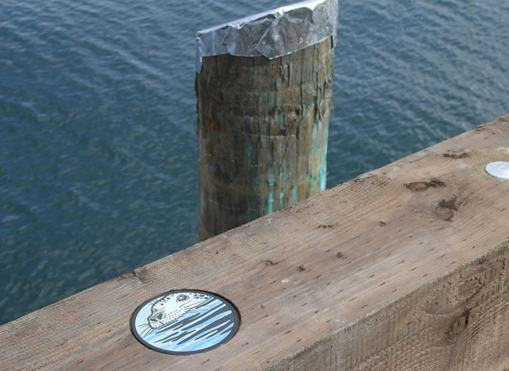
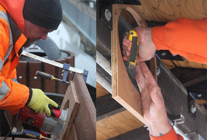
Basically, I stood and pointed, and Pat routered out 24 perfectly positioned circles.

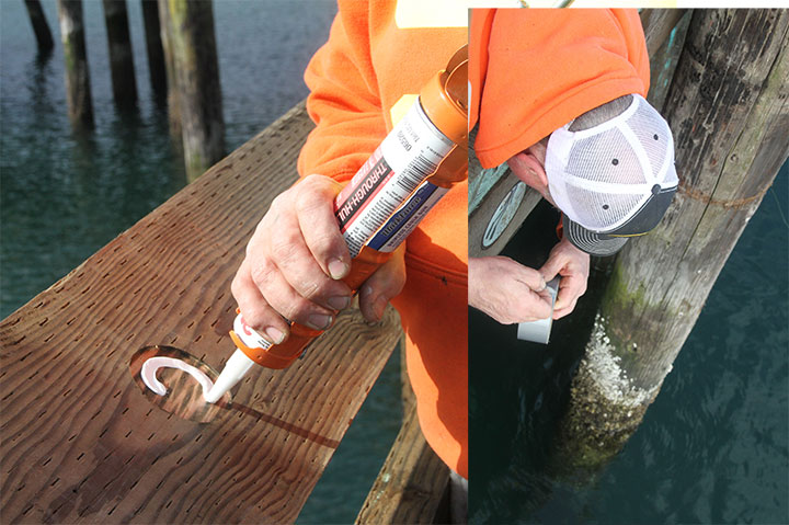
Then he inlaid each disc, affixing them to the wood with some seriously heavy-duty marine sealant, and Bob’s your uncle. Actually, it wasn’t always that easy; some of the rounds required some acrobatic feats to install. Just passing him tape measures and things gave me vertigo sometimes—but at least he didn’t have to drill while standing in a choppy rowboat (which was plan B, if hanging off the edge didn’t work).

Twenty-four hours later, the adhesive was fully cured, and I could call it done.

The day we installed, nothing on the Dock was completely finished—benches and planters were still piled up at random, and I wasn’t entirely certain that the final placement would match my scale drawing.

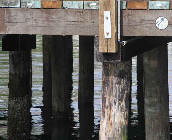
But now it sort of feels like the artwork has always been there—

and maybe you just never noticed it before.

I love being there to witness whenever a Droplet catches someone’s eye, and they stop whatever they’re doing to look more closely.
And just maybe that moment of noticing will lead to the words, “Let me tell you a story…”

April 21st, 2013

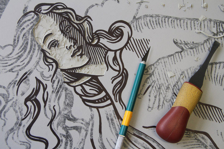
It’s that time of year again: the trees are blooming outside, and inside we’re playing with knives. The ninth (!) annual Tacoma Wayzgoose is one week from today—and if we’re really lucky, Jessica and I might just finish carving our design by then. As usual, we’ll reveal the whole design that day, but until then, this little peek might look familiar…
If you’re new to my tiny u-bend of the Intertubes, you might ask: what the heck is a Wayzgoose? It’s a festival celebrating the art of printing, a tradition that goes back hundreds of years. Here in T-town, our party mobile is a steamroller—yes, ma’am—and we churn out giant-sized linocuts in the street to mark the occasion. If you’re local, come on by and get ink on your jeans:
9th Annual Tacoma Wayzgoose
Sunday, April 28, 2013
11 am to 4 pm, Free!
King’s Books
218 St. Helens Avenue, Tacoma, WA
In the meantime, you can whet your appetite with a stroll down Amnesia Lane—take a look at the ghosts of Wayzgeese past:
• 2009 (Tacoma)
• 2010 (Tacoma)
• 2011 (Tacoma)
• 2011 (San Francisco)
• 2012 (Tacoma)
See you next week, rain or shine!
March 21st, 2013

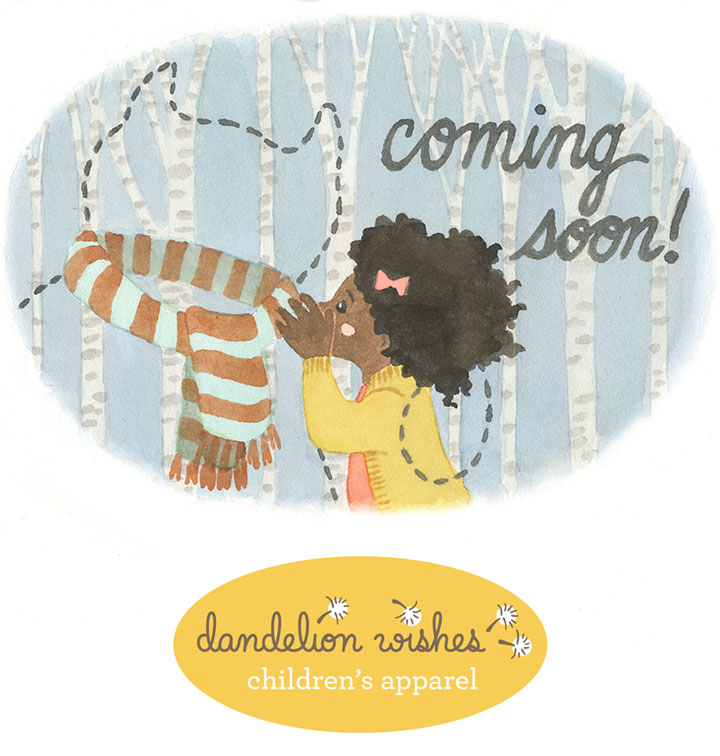
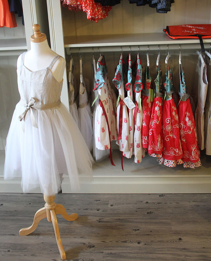
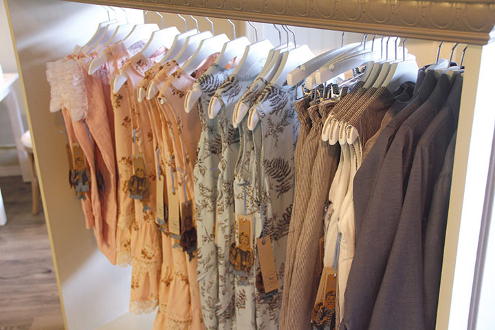
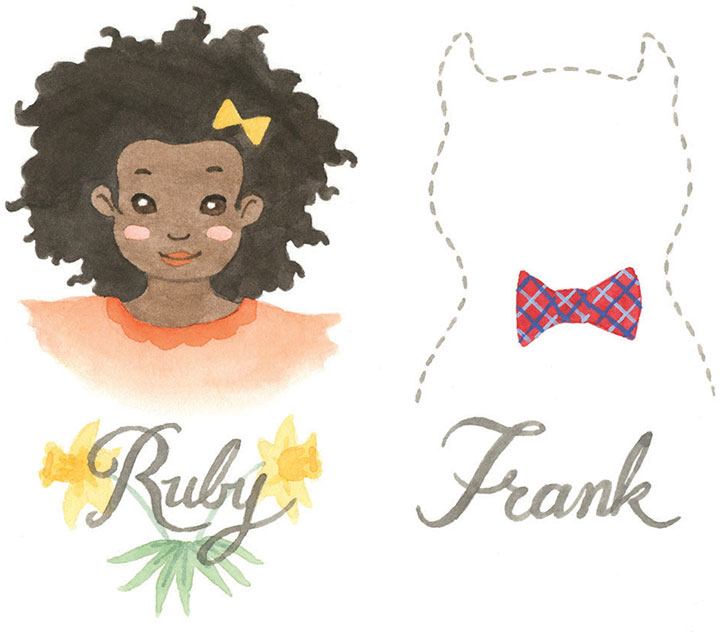
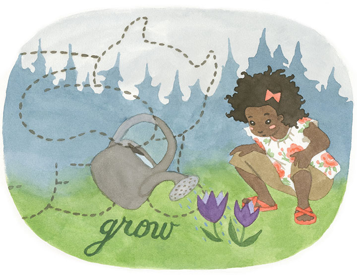
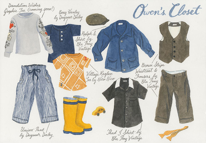
Well, I can finally let you in on the secret, because “coming soon” is about to be switched to “now open.” My friend Susan has spent years building her children’s apparel business, Dandelion Wishes, from idea to brick-and-mortar store—and I’m the lucky gal she asked to help her develop the look and brand of her shop.

Susan is putting the finishing touches on the place, and making sure everything is pitch-perfect for her grand opening this weekend—

while I’m piecing together (literally!) the final visual details.

(I’ll reveal more about that on the blog at a later date; or if you’re local, come to the grand opening and see for yourself!)

Dandelion Wishes isn’t your average kids’ store; this is something really special. Susan has curated a beautiful collection of clothing, accessories and gifts that paints a picture of what she believes in (and so do I): Support independent artisans. Buy local and domestic whenever possible. Choose natural fibers over synthetic ones. Offer the highest quality available. Bring these ideals into affordable balance and you’ll bring good design within reach.

This project was something special, too. I’ve done lots of identity and branding work for clients, but I’ve never had this much free reign before, to help develop the entire conceptual basis for a business. It was so much fun to dive in and really see what I could do.
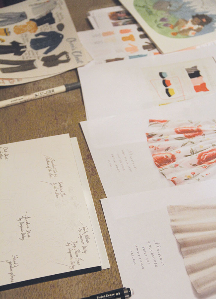
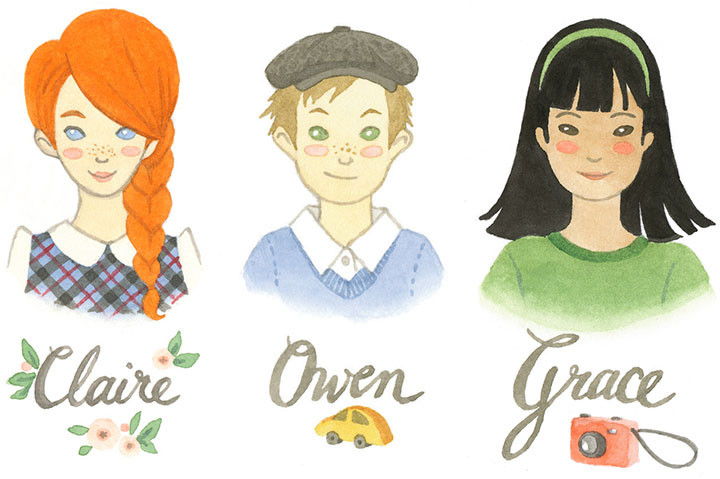
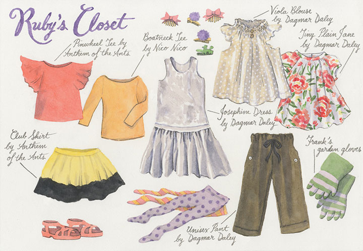
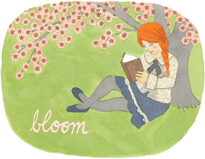
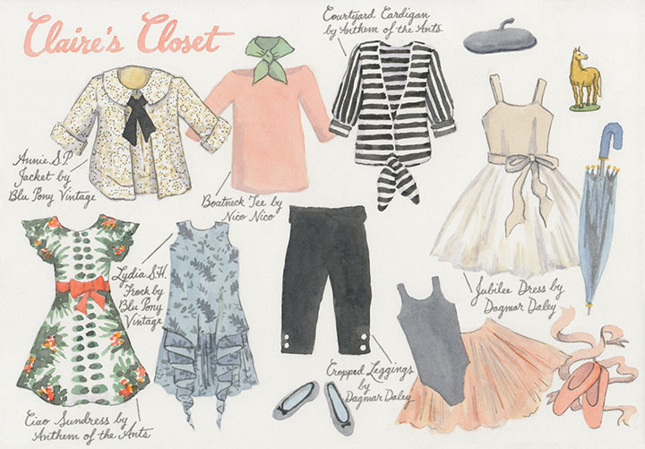
Since Susan’s shop is so invested in this story, I wanted to create a story out of the shop. Together we invented a world of characters and narratives that make stepping into the shop feel like stepping into a children’s book. Each character has a story and a secret wish, and a personality that fits the different brand stories of the clothing companies Susan carries.

You’ve already met Ruby and her imaginary friend at the start of this post.

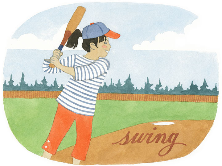
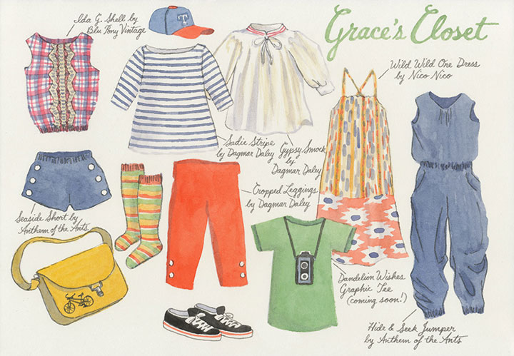
And here’s the rest of our quintet. Once we had our full cast of characters, it made building the shop’s collection of clothing much easier. All of a sudden, Susan was piecing together the wardrobes of actual people with personalities and tastes and preferences—rather than just an inventory list in her head.

I loved weaving the stories behind each character—

—and getting to mix actual clothing samples with whatever else I felt like dreaming up.

As the seasons change—

—and so do the kids’ outfits—

we’ll be creating new stories and scenes to go with them. Keep an eye on the shop’s website to watch the tale unfold.

In the meantime, I already find myself thinking of these kids as real people that I know—and wondering what they’d think of each idea I sketch out for the future.

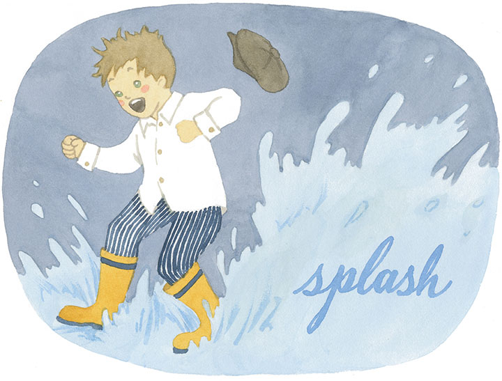
So help Susan make a splash with Dandelion Wishes—if you’re in the Tacoma area, stop by the shop this weekend. And look for an online shop to appear soon.

For now, I’m going to ask Frank what his summer plans are.
February 28th, 2013

This has not been an easy post to write—and yet in a way it’s been writing itself over and over again, for years now. To be honest, Jessica and I designed this broadside months ago, and planned to release it shortly after last year’s theater shooting in Aurora, CO. Other projects got in the way, and then the 2012 election persuaded us to table the piece for the time being.
We should have known: until there’s serious change in our society, this subject will always be hatefully relevant.
So here we are again, on the heels of yet another rash of terrible violence. But this time feels different—not only because of the sheer horror of the Newtown tragedy, but because at last, our country is having the conversation it needs to have.
At the center of the debate is the precarious balance of right and responsibility—and here’s where I need to keep from shooting my mouth off. I’ve written and deleted a hundred sentences about Jessica’s and my personal thoughts on the subject—but I have a feeling you can already guess what they are. And we also recognize that our beliefs represent just one side of our divided culture. So the thought of pontificating just wearies and saddens us; we’d much rather focus on how we might move forward, together.

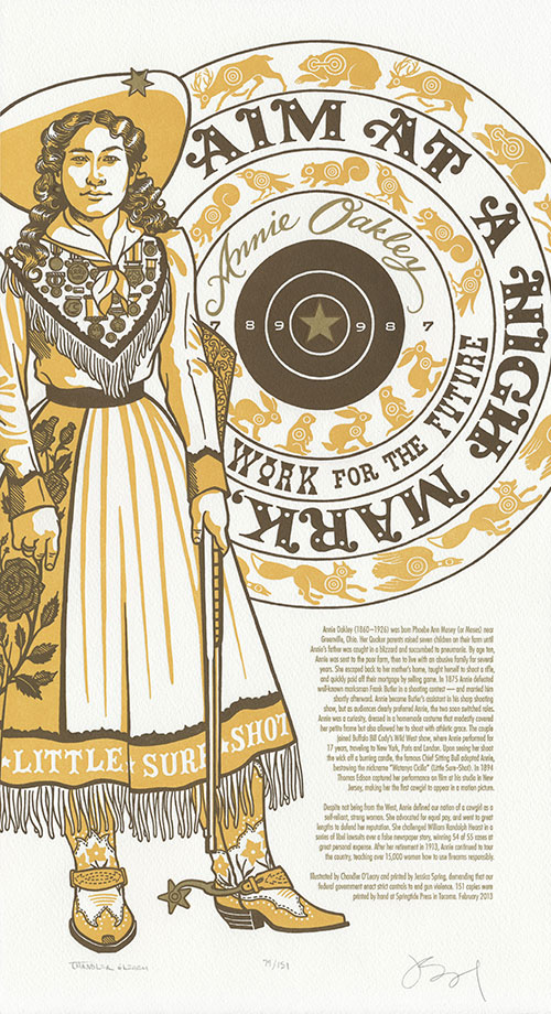
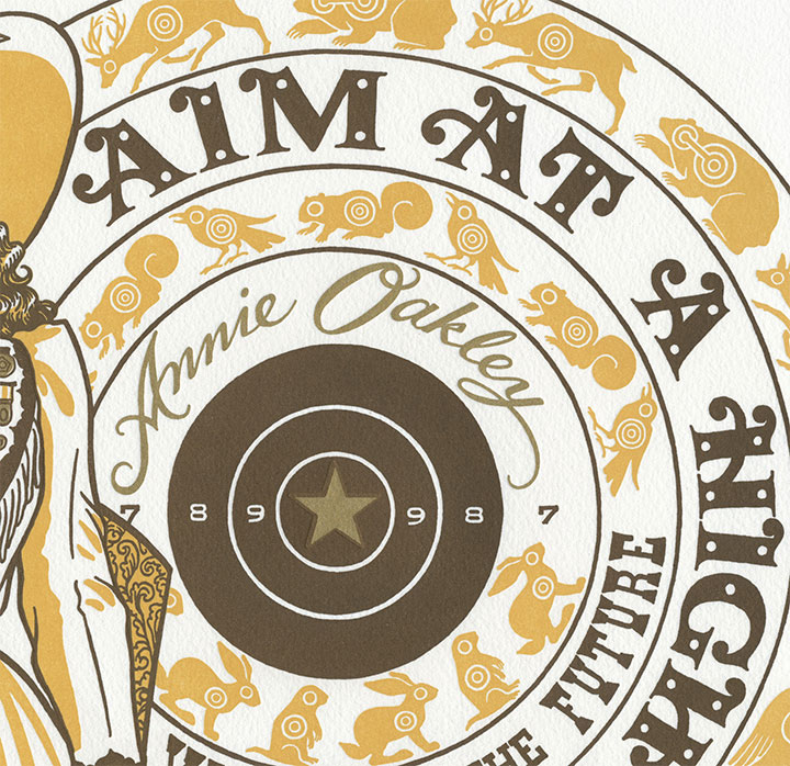
For us, that meant starting with an attempt to comprehend the other side of the debate. So in hoping to understand the love of guns many in our country share, we looked to legendary sharpshooter Annie Oakley, whose words pierce the heart of the matter:
Aim at a high mark, work for the future.

This piece is a stark, steely contrast to the bright colors and detailed embellishments of the rest of the series. Annie stands her ground beside a blazing metallic bullseye, representing the golden target of sanity amid the scatter-shot opinions and half-cocked sniping of those on the extremist fringes. And let me tell you: there’s real gold in that ink. Jessica mixes her own formula—maybe it’ll shine all the brighter, and help steady our collective aim.
• • • • • • • • • • • • • • • • • • • • • • • • • • • • • • • • • • • • • • • • • • • • • • • • • • • • • • • • • • • •
Gun Shy: No. 17 in the Dead Feminists series
Edition size: 151
Poster size: 10 x 18 inches
Printed on an antique Vandercook Universal One press, on archival, 100% rag (cotton) paper. Each piece is numbered and signed by both artists.
The edition number we choose for each print in our series is always significant in some way—whether we call attention to it or not. In the case of Gun Shy, we’ve created an edition of 151 prints to represent each person injured or killed in a shooting rampage in 2012. In light of that sobering number, we’ve chosen to donate a portion of our proceeds to Demand A Plan. A campaign of Mayors Against Illegal Guns, Demand a Plan is a national, bipartisan coalition working to make America’s communities safer by keeping illegal guns out of dangerous hands.

Colophon reads:
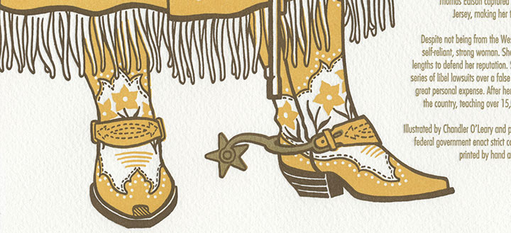
Annie Oakley (1860 – 1926) was born Phoebe Ann Mosey (or Moses) near Greenville, Ohio. Her Quaker parents raised seven children on their farm until Annie’s father was caught in a blizzard and succumbed to pneumonia. By age ten, Annie was sent to the poor farm, then to live with an abusive family for several years. She escaped back to her mother’s home, taught herself to shoot a rifle, and quickly paid off their mortgage by selling game. In 1875 Annie defeated well-known marksman Frank Butler in a shooting contest — and married him shortly afterward. Annie became Butler’s assistant in his sharp shooting show, but as audiences clearly preferred Annie, the two soon switched roles. Annie was a curiosity, dressed in a homemade costume that modestly covered her petite frame but also allowed her to shoot with athletic grace. The couple joined Buffalo Bill Cody’s Wild West show, where Annie performed for 17 years, traveling to New York, Paris and London. Upon seeing her shoot the wick off a burning candle, the famous Chief Sitting Bull adopted Annie, bestowing the nickname “Watanya Cicilla” (Little Sure-Shot). In 1894 Thomas Edison captured her performance on film at his studio in New Jersey, making her the first cowgirl to appear in a motion picture.
Despite not being from the West, Annie defined our notion of a cowgirl as a self-reliant, strong woman. She advocated for equal pay, and went to great lengths to defend her reputation. She challenged William Randolph Hearst in a series of libel lawsuits over a false newspaper story, winning 54 of 55 cases at great personal expense. After her retirement in 1913, Annie continued to tour the country, teaching over 15,000 women how to use firearms responsibly.
Illustrated by Chandler O’Leary and printed by Jessica Spring, demanding that our federal government enact strict controls to end gun violence.
Available now in the Dead Feminists shop.

![Chandler O'Leary [logo]](https://chandleroleary.com/wp-content/themes/chandleroleary/images/logo.png)
