Blog
August 21st, 2010
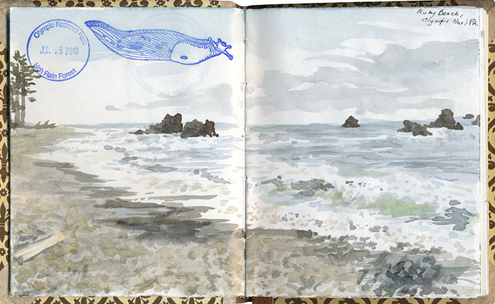
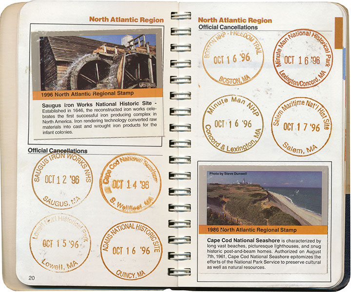
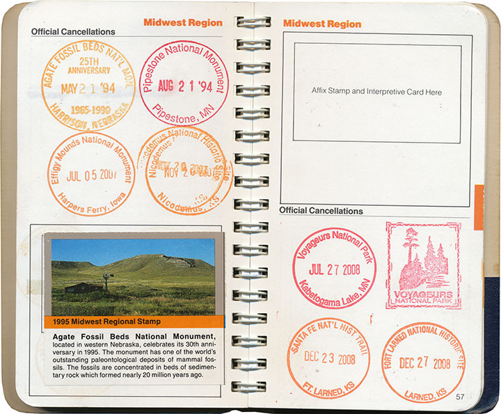
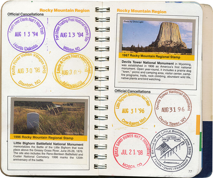
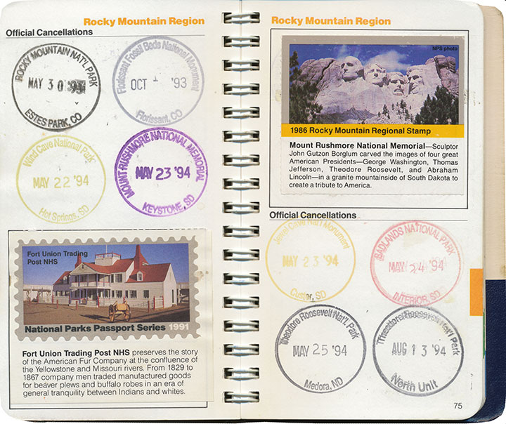
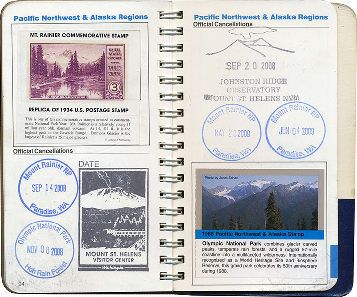
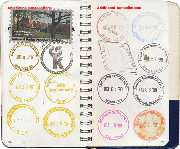
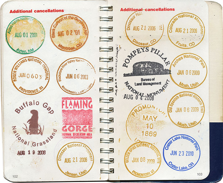
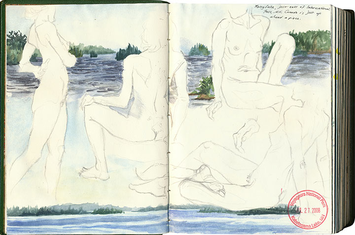
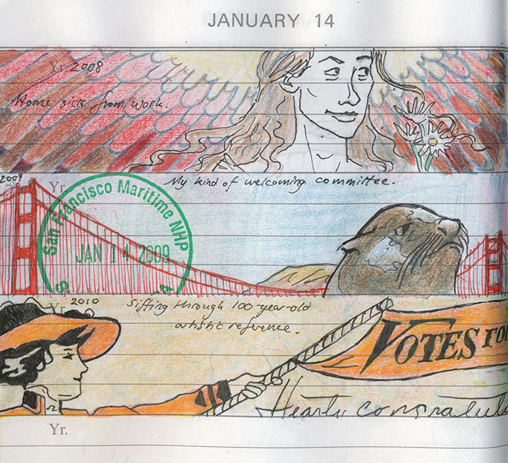
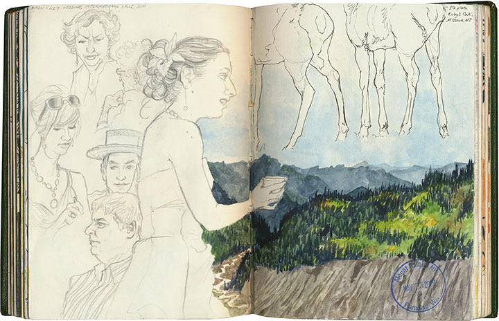
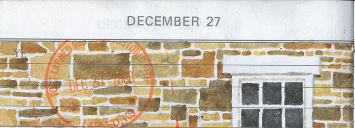
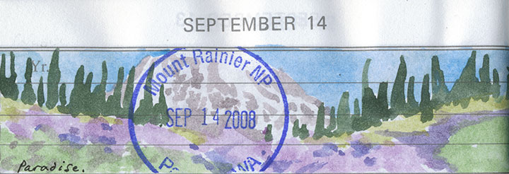
Since I posted this drawing and some others this summer, people have been asking me what’s with the stamps in my sketchbook. I guess the short answer is that each one is a little piece of personal tradition.
But you know I don’t really do short answers.

The long one, then.
I grew up in a nomadic family. Between the moves required by Dad’s job in the Air Force and a fierce wanderlust that runs in all the O’Leary veins, we had a lot of reasons to travel. Dad and I, especially, would spend hours poring over our dog-eared Rand McNally road atlas, plotting routes over the back-est of back roads (the squigglier the line on the map, the better) and stops at as many points of interests as we could cram into a journey from A to B.
When I was ten, we made a circuit of our then-home state of Colorado, and devoted our time to exploring every national park and monument we could reach along the loop. At each park’s visitor center, we noticed a rubber stamp and ink pad stationed at the front desk. When we finally asked a ranger what they were for, she handed us a small blue notebook and proceeded to explain about the National Park Service’s Passport program.

A stamp to collect at every NPS property in the country, and a tidy little book to hold them all? I was hooked.

Dad and I found ways to sneak a national monument or two into every road trip and relocation—and even took impromptu vacations just to add a new park to the list. My favorite memory is when I was in high school, and Dad popped his head into my room:
“Have any plans this weekend?”
“Uh, no…”
“Wanna go to Montana?”
So we jumped in the car and drove 600 miles just to flip General Custer the bird at Little Bighorn (I had just read Bury My Heart at Wounded Knee, so he wasn’t exactly stirring me to patriotism). I mean, if you’re going to do it, you might as well go all out, after all. And we had the stamp to commemorate the moment.

The Passport program also includes collectible paper stamps, which can be purchased from afar (as opposed to the ink cancellations, which are free but can only be obtained in person). I’m pretty lukewarm about these, though; by the time I jumped on the bandwagon they had already phased out the super-cool two-piece design pictured in the lower left corner above, in favor of the cheaper, lower-quality one-piece stamp in the upper right. Since those have been revamped yet again into a pressure-adhesive sticker—and who knows what heinously non-archival chemicals might be in the glue—I’m even less of a completist about them now.

Anyway, I’ve burned through most of the regional sections in my Passport,


and every inch of overflow space.

So I’ve branched out a bit.
What I didn’t know as a kid was that my Passport helped me develop my interest in nearly everything I love most: traveling, design, archiving, printmaking, history, typography, bookmaking, and so on.
At some point along the way, I realized that what I really mattered to me (beyond the travel itself) was the act of adding to an ongoing work—and then looking back to see what I had accomplished. That what I had been doing all along, by compiling this little individual history, is creating some form of artist book. And that my frustrations over an imperfect format were really a desire to create my own.

A page from my daily book—more on that here.
So now all of my sketchbooks are Passports, each custom-tailored—

each infinitely flexible, ready for whatever adventures wait to be documented.

Here it is, nearly twenty years later, and I’m as eager as ever. Moreover, it’s my goal to collect every last cancellation within the entire National Park System before I stamp the big passport book in the sky. I’m about a quarter of the way there.

And I’ll probably have to build a library for all the sketchbooks I’ll fill between now and then.
Save
August 11th, 2010

I’ve been sitting on this post for months now—it’s just that after spending so much time hunched over this project, I needed some time off from even thinking about it. But now I’m ready to talk birds again.

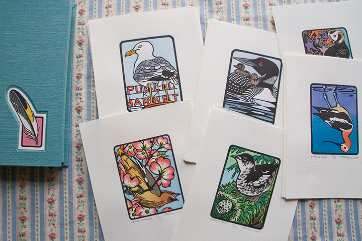
From left: Cedar Waxwing; Steller’s Jay; American Avocet; Purple Martin; Tufted Puffin
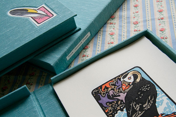
Eighteen months, twenty-five birds, six hundred twenty-five individual prints and ten box sets later, my little Flock is finished.

Mountain Quail; American Bittern; Long-billed Curlew; Hooded Merganser; Laysan Albatross

Barn Owl; American Kestrel; Eurasian Coot; Anna’s Hummingbird; Herring Gull
It’s a little crazy to see these all together, like, well, birds on a wire. Each one has been broken down into its own little assembly line for so long that I forget sometimes to see them as a set.

Western Tanager; Lazuli Bunting; Northern Flicker; Bullock’s Oriole; Belted Kingfisher

Common Loon; Marbled Murrelet; Northern Shoveler; Harlequin Duck; Brown Pelican
As you can see, what’s represented here is a pretty broad cross-section of Washington birds. There are so many bird species ’round these parts, in fact, that I almost didn’t know where to start—and narrowing the choices down to twenty-five was by far the most difficult task.

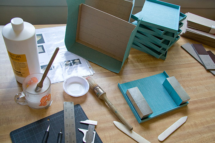
Wait. I take that back. The hardest part was keeping the glue off of the pricey imported Japanese book cloth (glue plus cloth equals death—or at least wailing, gnashing of teeth, and starting all over from the beginning).

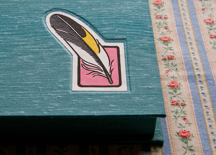
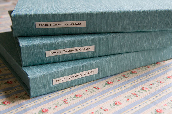
You see, it seemed silly to have a set of prints with nothing to house it. My inner book artist took over (thanks to Jessica’s tricksy enabling), and insisted on encasing the first ten sets of the edition in handmade clamshell boxes.

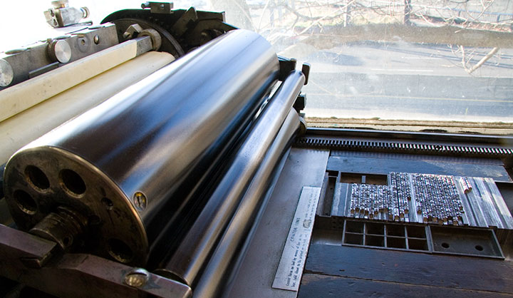
Even though the results are always worth it, I don’t have much love for making boxes—what I do love is printing the colophon. A colophon (or in today’s hardbound novels, the “note on the text”) is an essential element in any artist’s book; this is where the artist steps outside the book’s content and talks about the making of the book itself. For this I decided to go back to my letterpress roots, and hand-set the text in metal type.

While I’m rarely able to fit hand-setting into my projects these days (a drawback to all the lettering I’ve been doing), it’s still my favorite method of getting a block of text onto a page. And this beloved Bembo, cast locally at Stern & Faye, is so beautifully spaced and balanced that it’s a dream to set and a pleasure to read.


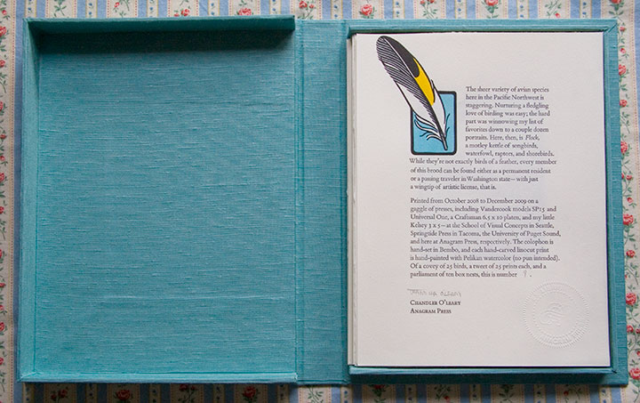
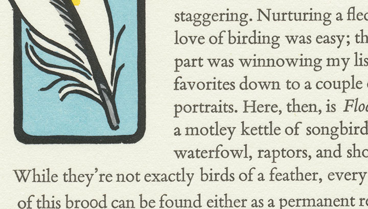
Here’s what it says:
The sheer variety of avian species here in the Pacific Northwest is staggering. Nurturing a fledgling love of birding was easy; the hard part was winnowing my list of favorites down to a couple dozen portraits. Here, then, is Flock, a motley kettle of songbirds, waterfowl, raptors, and shorebirds. While they’re not exactly birds of a feather, every member of this brood can be found either as a permanent resident or a passing traveler in Washington state—with just a wingtip of artistic license, that is.
Printed from October 2008 to December 2009 on a gaggle of presses, including Vandercook models SP15 and Universal One, a Craftsman 6.5 x 10 platen, and my little Kelsey 3 x 5—at the School of Visual Concepts in Seattle, Springtide Press in Tacoma, the University of Puget Sound, and here at Anagram Press, respectively. The colophon is hand-set in Bembo, and each hand-carved linocut print is hand-painted with Pelikan watercolor (no pun intended). Of a covey of 25 birds, a tweet of 25 prints each, and a parliament of ten box nests, this is number [2].

Okay, so maybe I went a bit overboard on the avian puns. It’s just that the thought of getting my hands dirty on type drawers again had me all twitterpated.
And I have a fluttering feeling that there might be even more birds in my future—one of these days, anyway.

August 2nd, 2010

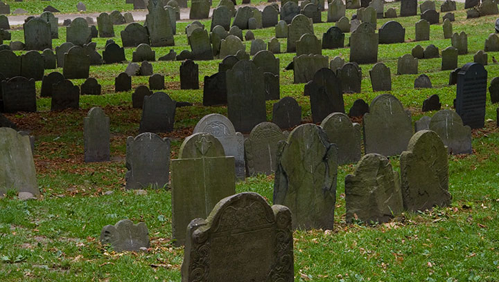
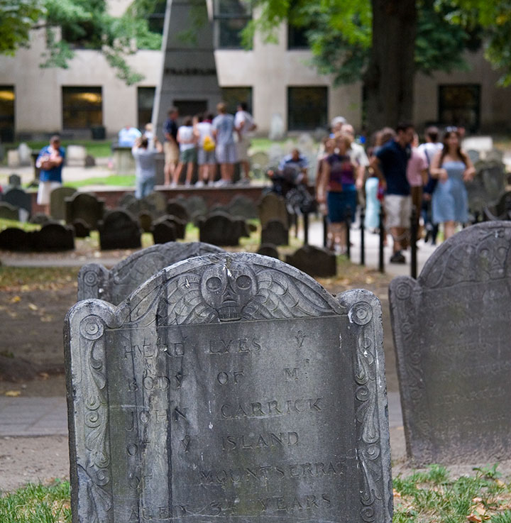
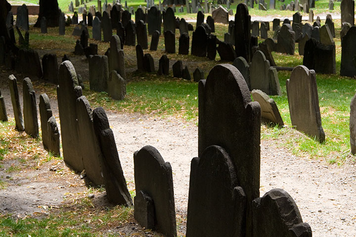
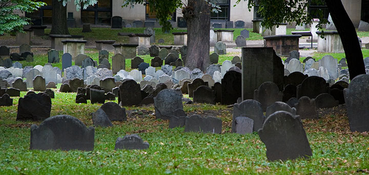
One of the things I used to do with Bampa is visit the colonial graveyards tucked away in every corner of New England. On this trip I only had time to visit a couple, so I picked my two favorites: the Old York Burial Ground in York, Maine;

and the Granary Burying Ground in Boston.

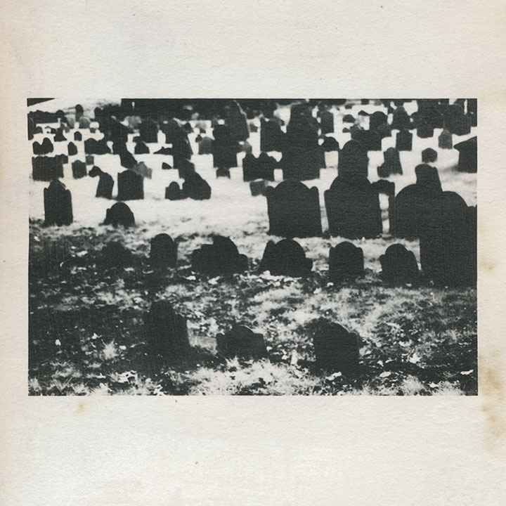
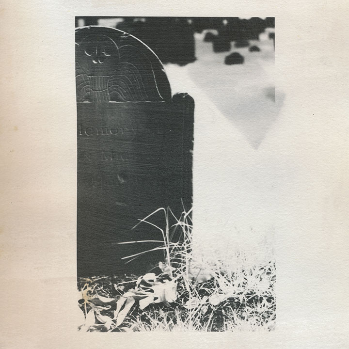
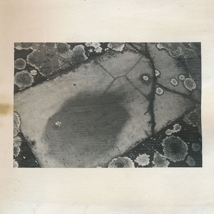
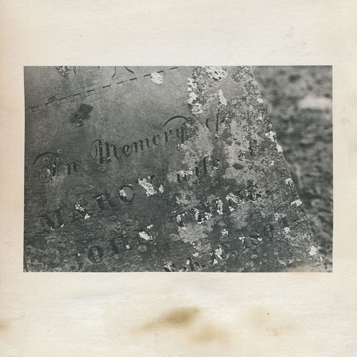
I’m quite a bit obsessed with these places; beyond my usual souvenir sketches and snapshots, these cemeteries keep popping in and out of my body of work. This is an excerpt from an artist book I made seven years ago. That’s not snow—it’s shot with infrared film, which behaves very differently from normal film when you do certain things with it. I used a dark red lens filter that blocked nearly all of the visible spectrum, so that the film was exposed mostly by ambient infrared radiation. The effect is that inanimate objects like stones read as deepest black,

and plants and flesh turn to bright white. Somehow I thought that particular quirk paired well with the subject matter—that living things behaved very differently than…well, dead ones.

Despite the near-constant crowds (in Boston, at least) and the challenge they present to photographing, each is an oasis, a tranquil island within the bustling town or city.

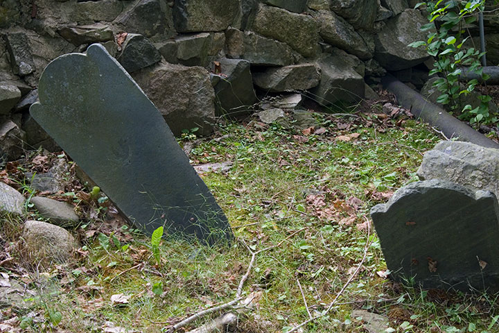
That’s not what draws me to them, though. Nor is it the haphazard scatter of wonky stones,

nor the romance of crumbling ruins.

(infrared film again)
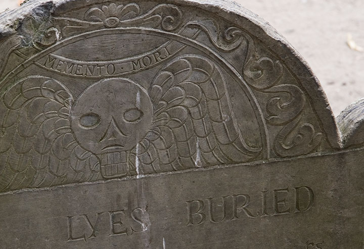
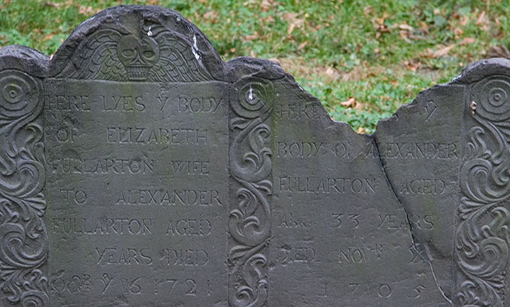
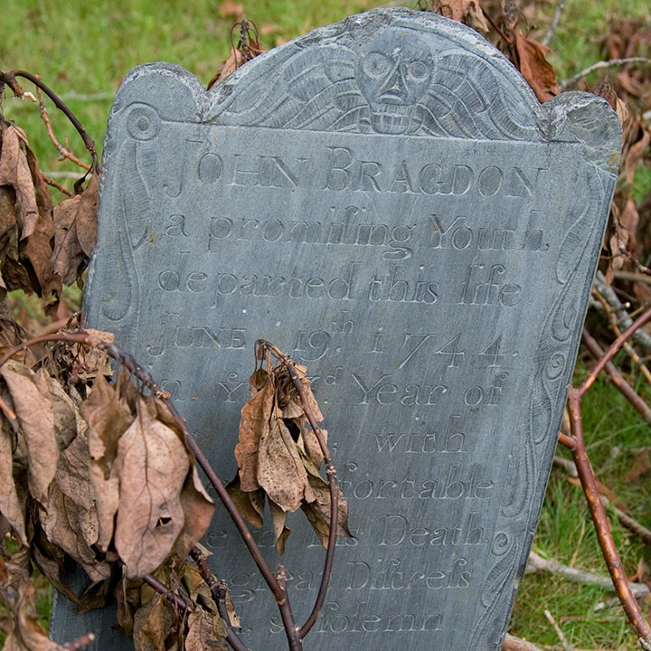
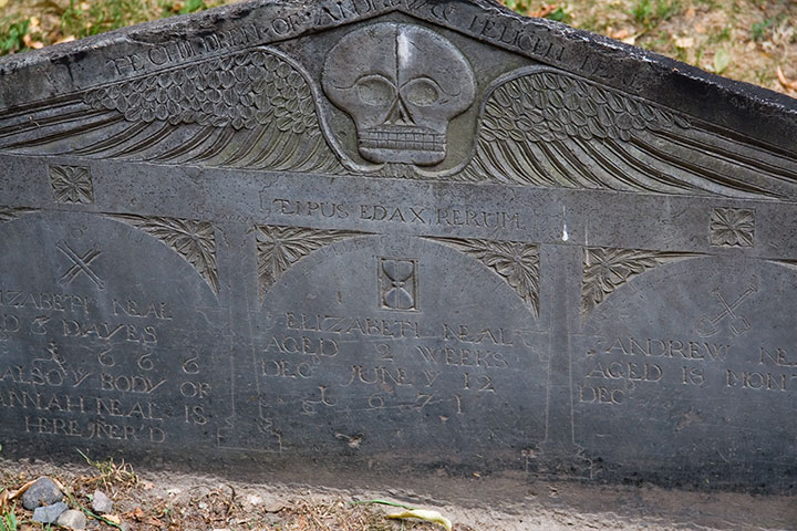
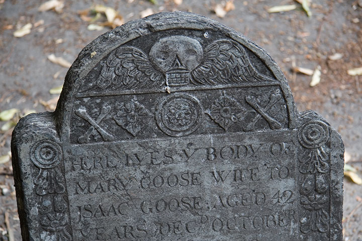
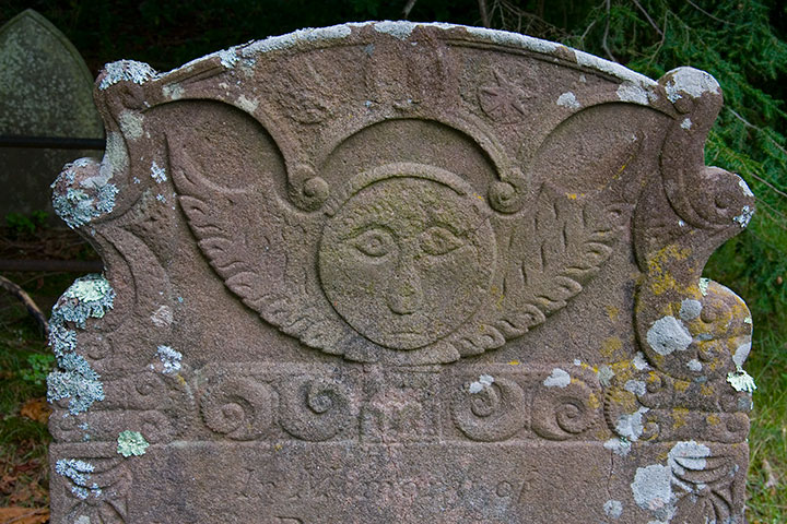
It’s that old gravestones are monumental (sorry) in the graphic design department. You can probably guess what my headstone might look like one day, because I’m completely fascinated with the design, the illustration, the typography displayed on colonial headstones. The “Death’s Head” or winged skull motif seems to be the most common,

with many variations within the theme—

Quadruple grave, dated 1666-1671, of children who lived only “dayes” or months apiece
from refined,

grave for a member of the Goose family, founders of the Mother Goose tradition
to folksy,

to somewhat disturbingly lifelike deathlike.

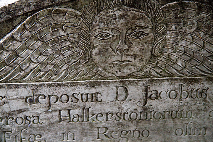
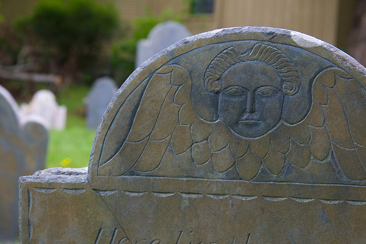
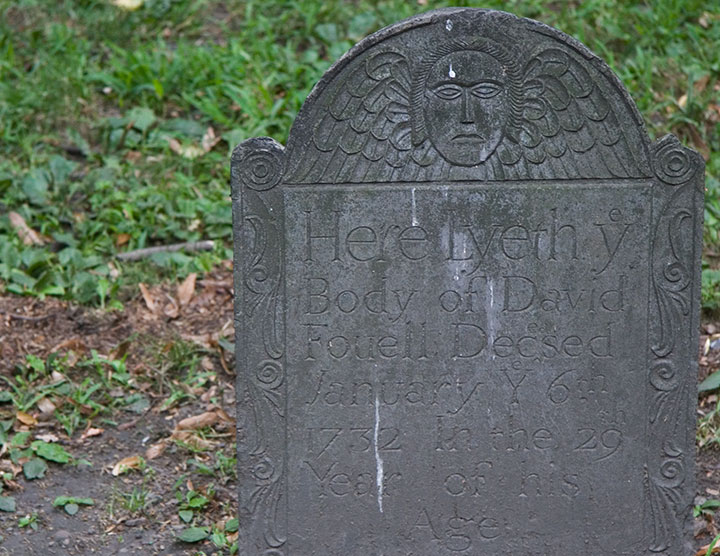
Another popular design is the “Winged Cherub,” which seems to be a more gentle alternative to the bones-n’-feathers motif.

The carvers seemed to take even more artistic license with this theme; I lost count of all the different angel designs.

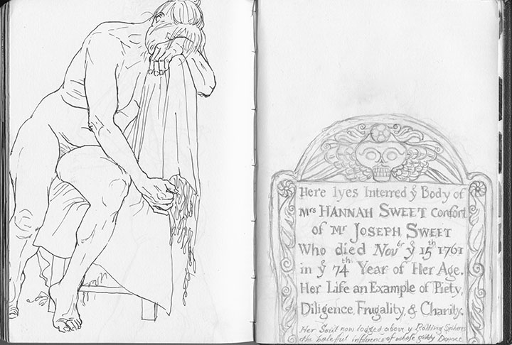
Skulls and cherubs aside, just as fun for the modern visitor is the engraved text. Typophiles will love all the script faces and lettering conventions (my favorite, below, is a mention of “November” set with “br” as superscript above a larger “Nov”),

but I’m partial to the language—the poetic phrasings, the archaic spellings. Some excerpts, verbatim:
• “Here lyes interred ye body of Mrs. Hannah Sweet, confort of Mr. Joseph Sweet, who died Nov’br ye 15th 1761 in ye 74th year of her age.”
• “On His unfailing promises rely / and all the horrors of the Grave defy”
• “… Jotham Bush of Shrewƒbury, who departed this life with the Small-Pox”
• “In memory of Mrs. Elizabeth Hurd, amiable & virtuous confort of John Hurd, Esq.”
• “Farervell Vain World, I have Enough of thee / and now I’m Careles what thou Say’st of me”

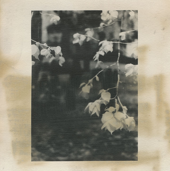
My little artist book has developed an unexpected conceptual element. I first coated the paper myself with liquid emulsion to make it light-sensitive (instead of using standard photo paper), then processed the images in a darkroom with the usual chemicals. By doing that, I was veering away from the traditional darkroom process, and adding some interesting variables, risks and imperfections into the mix. Most noticeably, the fixer reacted a little oddly with the emulsion/paper—a fact that irked me greatly at the time, since there was no way to know it had happened until the images were finished.

Over the years, however, the splotches have darkened, creating the illusion of old age and mirroring the weathering, decay and moss growth of the graves themselves.

So despite my perfectionist nature and my usual complex over making everything as archival as possible—I like the book so much better this way.

After all, it’s all the same in four hundred years anyway, isn’t it?

May 18th, 2010

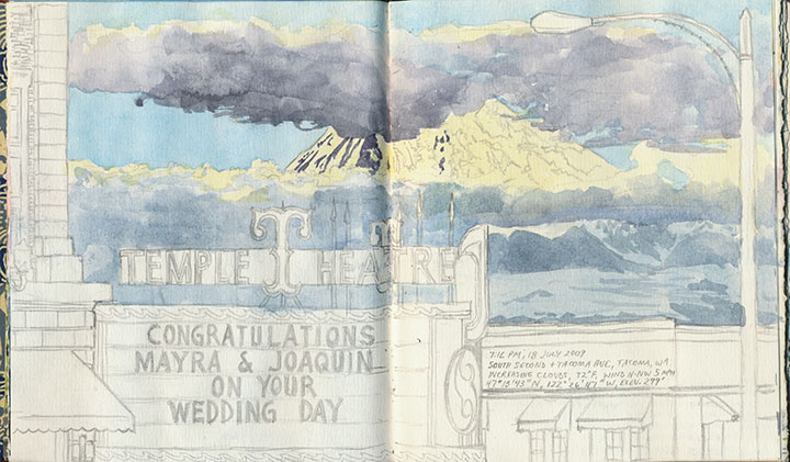
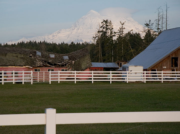
I’ve had volcanoes on the brain for nearly two years. Littering my studio are volumes of sketches, nearly 6,000 photographs, reference books, stacks of maps, and a brand new, functional prototype of the artist book about Mt. Rainier I’m working on—all evidence of my attempts at capturing a series of fleeting moments and freezing them in time and on paper. (Rainier is hiding there in the clouds, at the bottom of the above photo—but what I love most is that the cone looks like an erupting volcano! And speaking of which…)

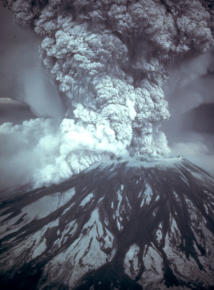
Photo by the U.S. Geological Survey
And then there’s the little corked bottle of volcanic ash on my desk, inscribed with the date of the last major eruption of Mount St. Helens: exactly thirty years ago today.
I’ve been staring at that bottle on and off, all day, reminded of why I’m doing all of this (and why I can’t wait until I have something to show you!).

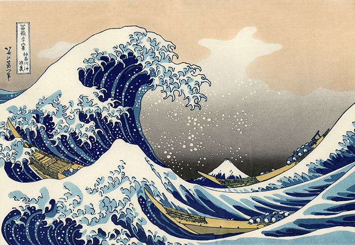
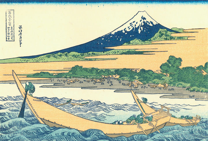
This project began as a tribute to Katsushika Hokusai, the Japanese printmaker and illustrator who created his famous Views of Mount Fuji woodblock series over 150 years ago.

Hokusai wanted to demonstrate the unchanging immortality of Fuji amidst the transient nature of everyday life. To him, Fuji was forever, an unshakable icon of Japan and one of the foundations of his culture.

The trouble is, Fuji is a volcano—just like Rainier and St. Helens—that by its very nature is constantly changing right along with the lives being lived in its shadow. That knowledge is where I found the root of my own project, and since then I’ve tried to document the fire mountain in my own back yard—to be there for every change and permutation.

Today’s date lit a bit of a fire under me, and prompted me to get on with the business of finishing this artist book. Because one day this is all going to happen again. Mount Saint Helens will be first, I’d wager; being the most active and youngest volcano in the Cascades, it may only be a matter of a few years. And some day, even if it’s a hundred or a thousand years from now, Rainier is going to have its turn, too.
For now, though, I’m just doing my best to pay attention to the present moment, because one day I may need help remembering how things used to be.
April 28th, 2010

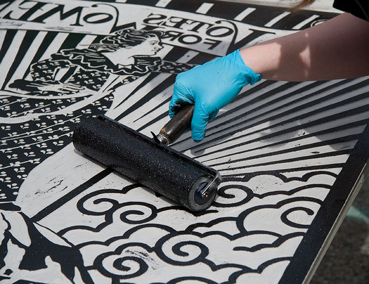
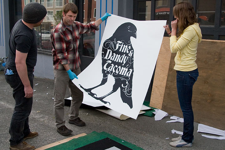
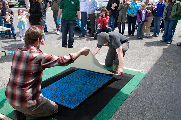
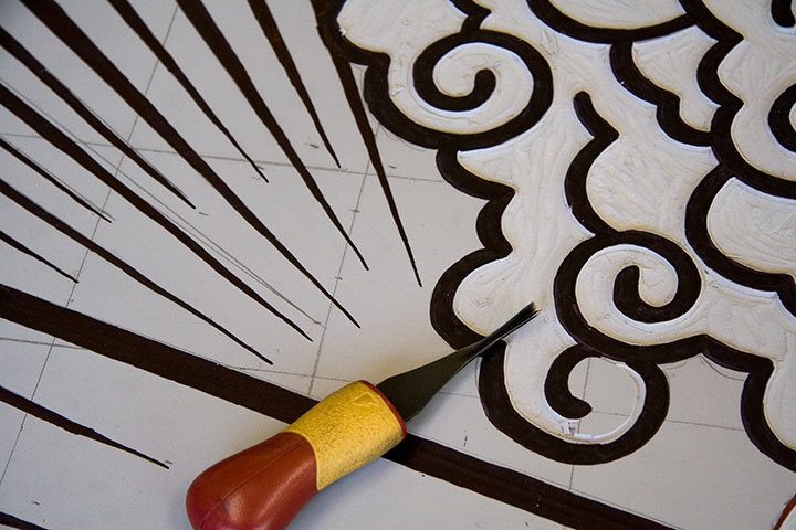
Inked up,

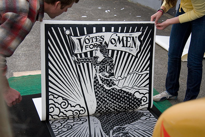
hand-pulled,

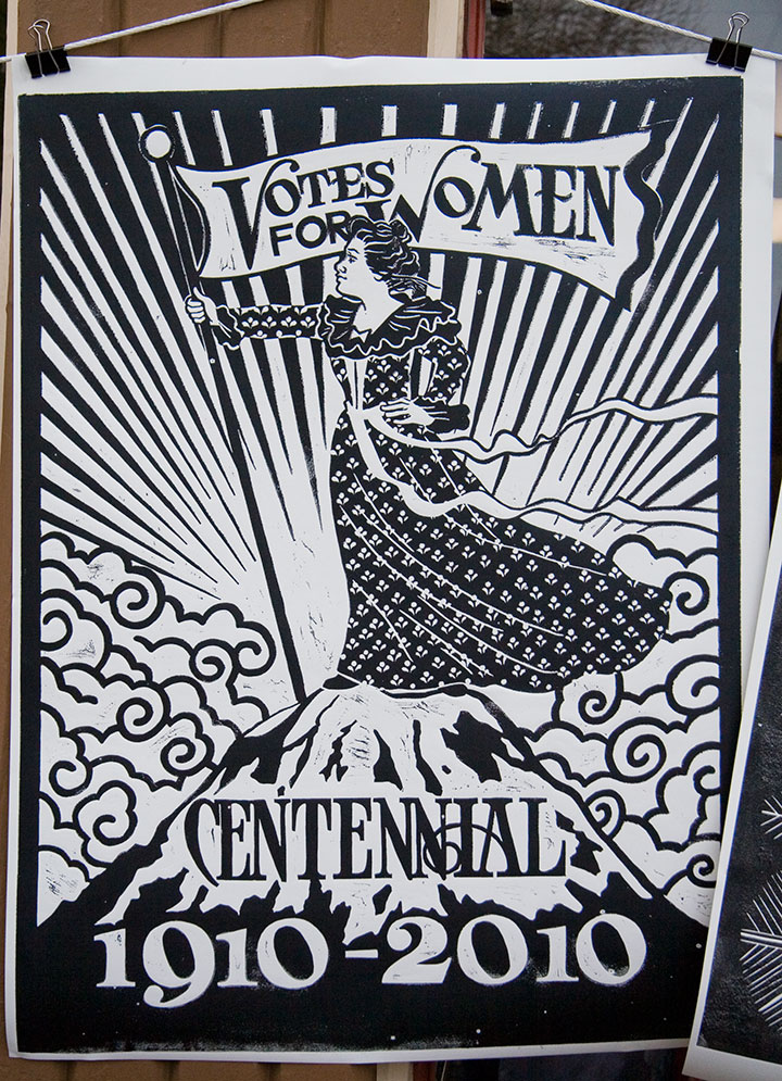
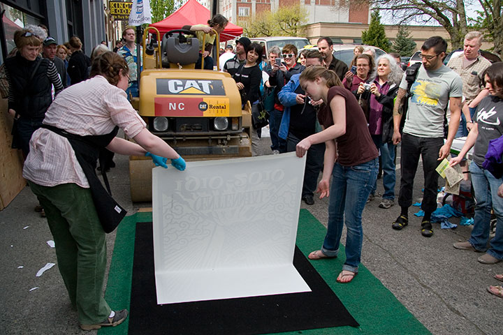
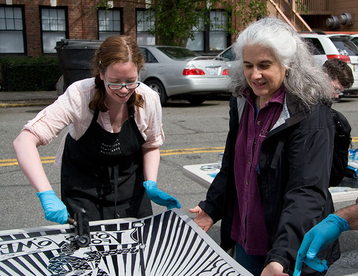
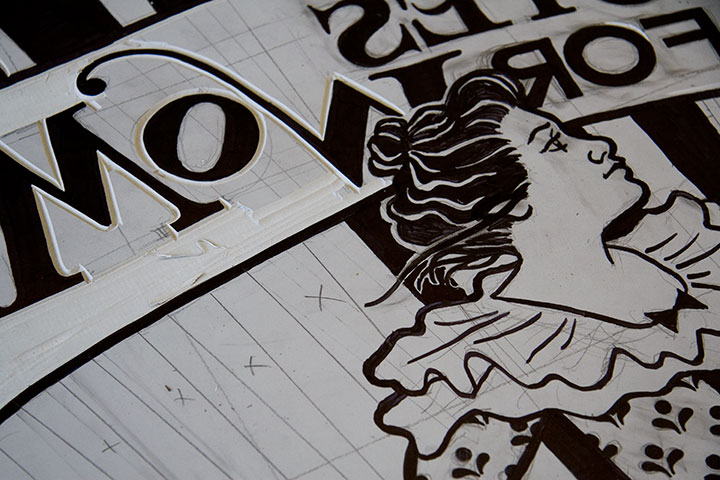
and voilà! Our second collaborative steamroller print, an unofficial Dead Feminist, inspired by Cora Smith Eaton King, who in 1909 climbed Mt. Rainier with a party of Seattle Mountaineers and placed a “Votes for Women” banner at the summit.

This year’s Wayzgoose was the biggest bash yet! We had all the regulars—

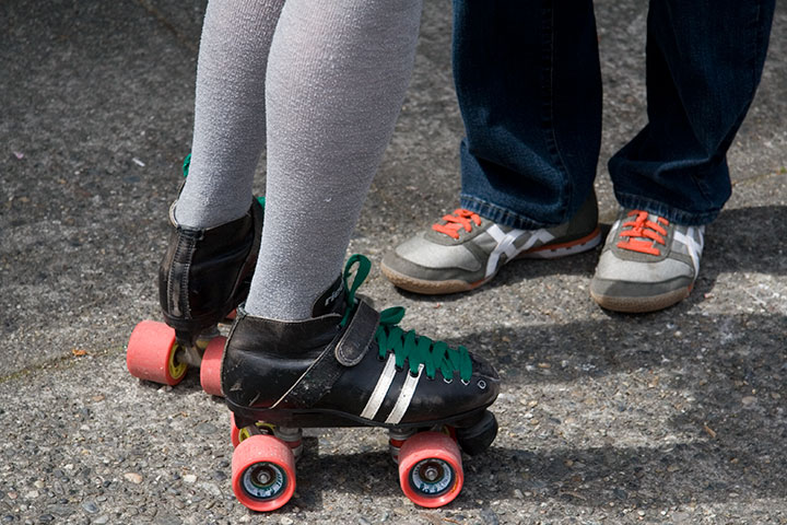
who churned out perfection under pressure (no pun intended)—

our beloved ringleader,

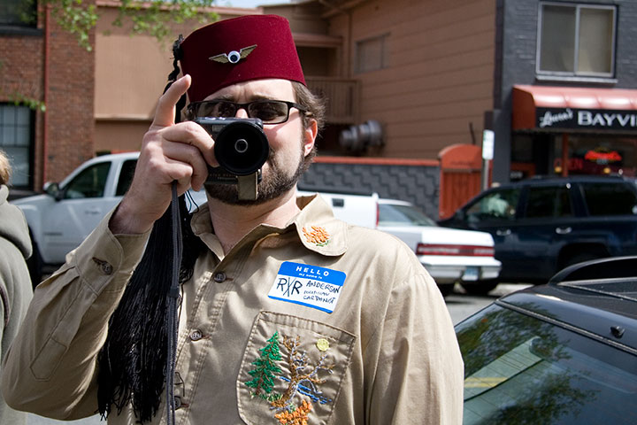
a certain befezzed flavor,

and a whole host of newcomers to round out the experience.

We had an enormous crowd (thank goodness for the good weather!),

and even a few unexpected audience members.

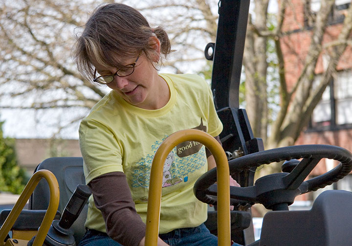
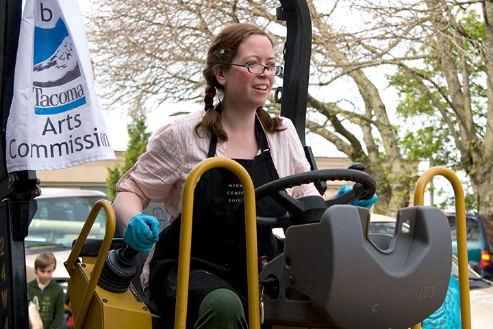
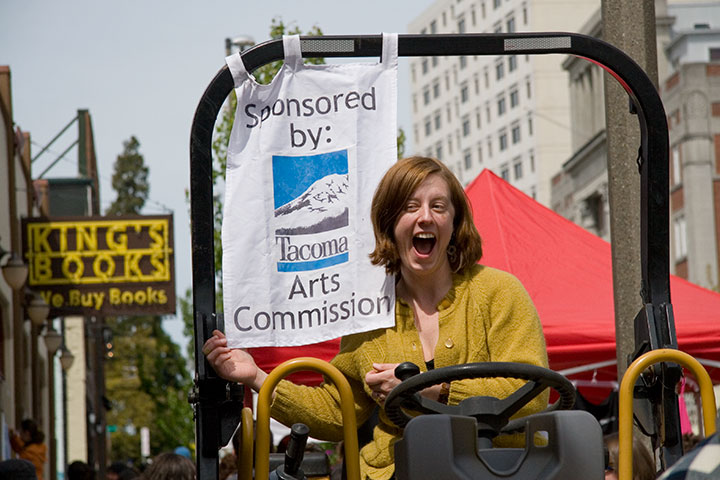
This year I got to try my hand at driving the steamroller,

but I think pretending was plenty enough for this little guy.

Thanks to everybody who stopped by to say hello, or stuck around to lend a helping hand.

And of course, a huge bucket of gratitude to the Tacoma Arts Commission for making it all happen!
One more acknowledgement: photography by Michael O’Leary. Thanks, Dad!
April 18th, 2010

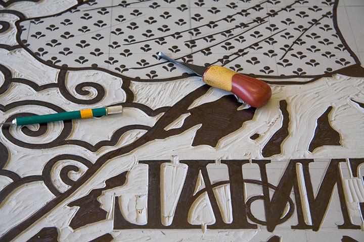
Jessica and I are carving like mad this week, getting ready for some quality steamroller time.

Next Sunday, April 25, is the sixth-annual Wayzgoose at King’s Books, right here in Tacoma. This year promises to be the biggest hullabaloo yet, with letterpress magnetic poetry, B.Y.O. t-shirt printing, papermaking demos, artist tables, and the star of the show: steamroller printing! Last year over 500 people came to check it out, despite a torrential downpour—and this year, the weather just might promise to behave, so we’re bracing for a mob. There’s a reason for the crowds: this is a heckuva lot of fun. Here’s the skinny:
6th Annual Wayzgoose!
Sunday, April 25, 2010
Noon to 4 pm
Free!
King’s Books
218 St. Helens Ave., Tacoma

Eight artists and artist-teams will be printing gigantic three-by-four-foot linocuts in the street, including Jessica and me—we’ll be adding another unofficial Dead Feminist to our roster. (Take a gander at our last steamroller print here.) This is just a sneak peek; stop by next Sunday to see this block in action.
See you there!
April 12th, 2010

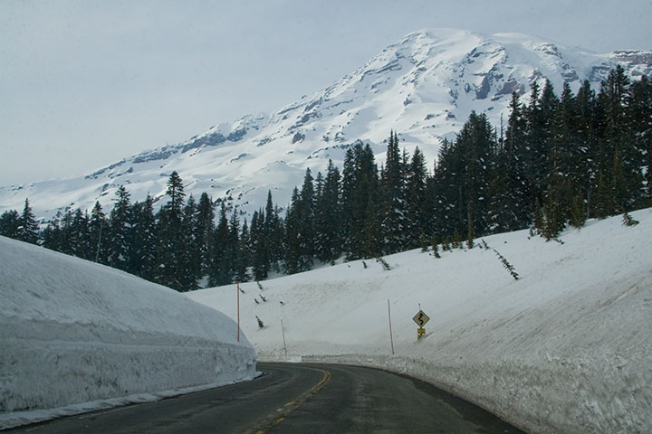
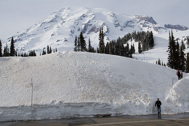
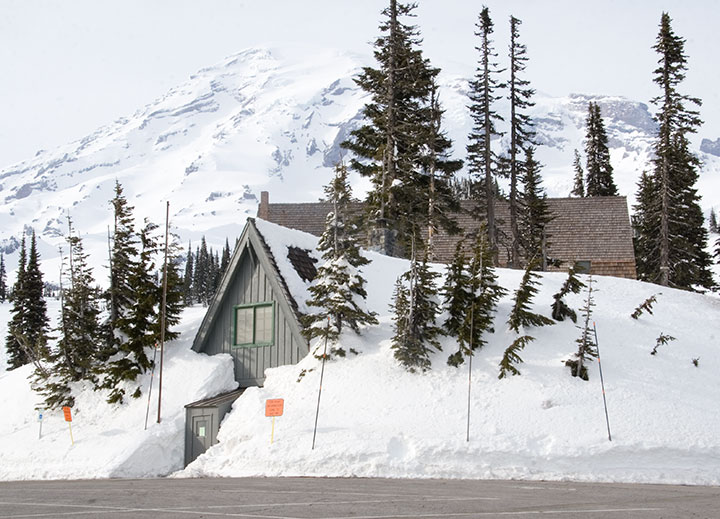
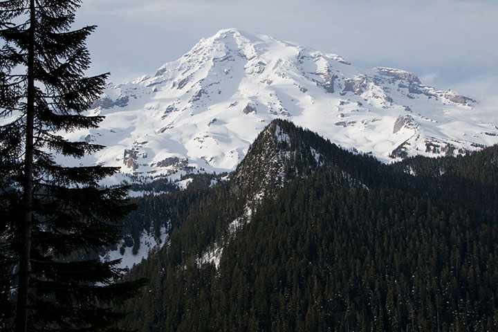
The sun came out yesterday afternoon, and Mt. Rainier peeked out from behind the clouds. On a whim I tossed my camera into the car and bolted to Paradise, where I had been hoping for one more research shot for my book: Rainier in the snow.


Well, I certainly got my wish.

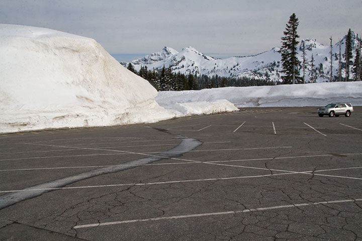
An hour and a half later I was standing in the cold, at the highest point on the southern park road, and the furthest one can go before the snow melts at the end of June and the rest of the park opens.

I looked over at one of the few cars around me, and was absurdly reminded of all those winters I spent in North Dakota (minus the mountains, of course).

It was nice to think that if I wanted snow, I could come and get it whenever I wanted—without having to shovel my way out of it.
March 8th, 2010

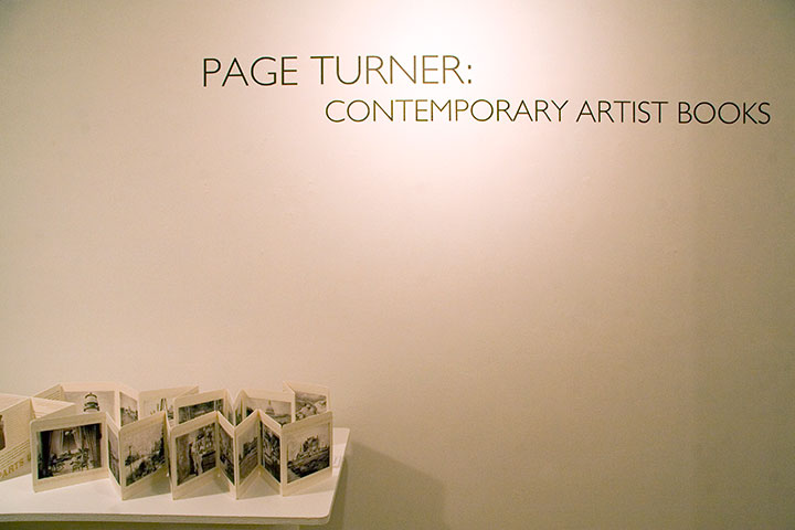
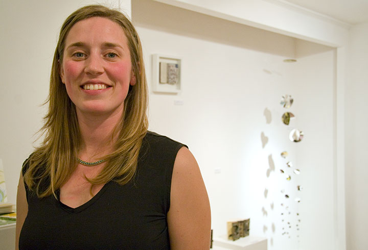
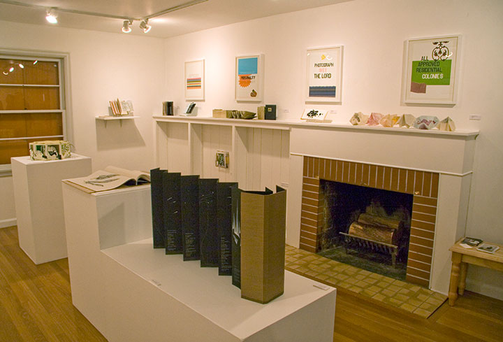
If you ever wanted to find out once and for all what the heck an artist book is, take a little field trip to Burien, WA. The group show Page Turner: Contemporary Artist Books is up this month at the Burien Arts Gallery, a tiny half-Cape house converted into a charming exhibition space.

Kelda Martensen did a stand-up job of curating the show—and artist books aren’t easy to display, believe me. She’s represented a wide variety of work, from prints to traditional bindings to kinetic sculptures, featuring the work of artists nationwide, including Inge Bruggeman, Ken Botnick, Regin Ingloria, Jana Harper, Diana Guerrero-Macía, and many others.

The gallery is open noon to four, Thursday through Sunday, and on Thursday, March 18, at 7 pm, Kelda will be giving a curator’s talk about the work in the show, sponsored by the Book Arts Guild. Free admission, always.

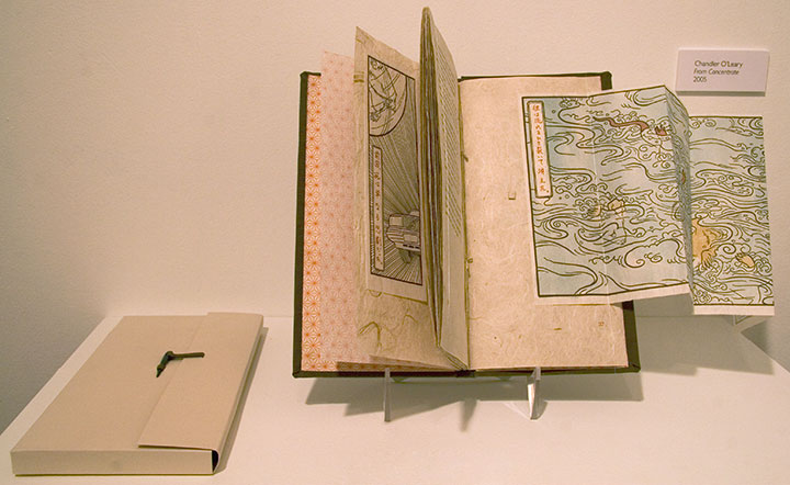
I’ve got a couple of pieces in the show, as well. Above is From Concentrate,

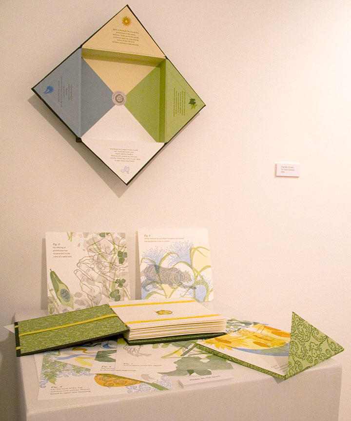
and this is The Faery Gardener.
Here’s the rub, though: the recession has hit all galleries where it hurts, but since the Burien Arts Gallery is run by the city, times have been especially tough there. This will be the last exhibit in the Cape Cod house; and possibly the last ever for Burien Arts, unless they can find public support, funding and a new space. So come check it out before they have to close their doors on March 19 (the website says they’re already closed, but you can still see the show).

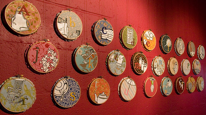
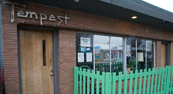
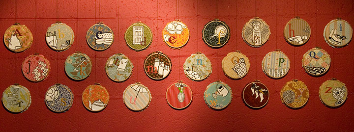
Speaking of artist books, if you missed Mnemonic Sampler at PLU, there’s another chance to catch the series in a new venue, closer to home: the Tempest Lounge, here in Tacoma.

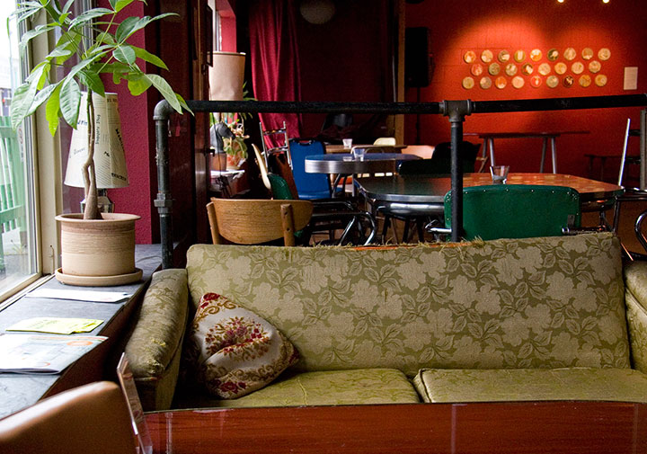
My friend Denise is the owner of the place, and when she asked if I was interested in showing there, I jumped at the chance. Although I love the clean beauty of a traditional gallery space, my favorite exhibition venues are the offbeat ones—restaurants, coffee shops, libraries, and now classy retro bars! I love these spaces because they bring art into real life, and invite folks to feast their eyes wherever they are. Most people (including myself, I must admit) are more likely to step into an eatery or a library than a gallery, and a coffee shop doesn’t have the same intimidating associations that some people have with galleries (that feeling of “If you’re not here to buy, you shouldn’t be here at all”). Plus, at the Tempest you can have a beer or cocktail while you look at the art. You can’t beat that.

If beer isn’t your thing, you can also have a cuppa tea or joe, and the food is divine—Denise runs a classy joint here. So curl up on a retro couch for happy hour, come chat by the adorable green picket fence, or just stop in to take in that fabulous red wall. Mnemonic Sampler will be up through April 30.

March 6th, 2010

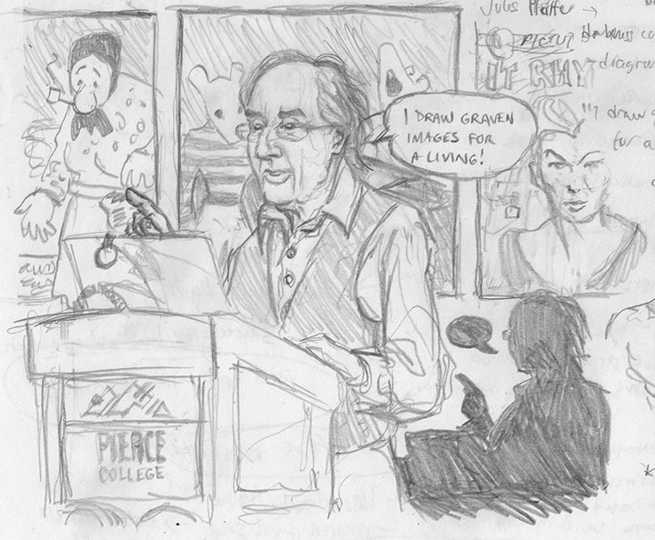
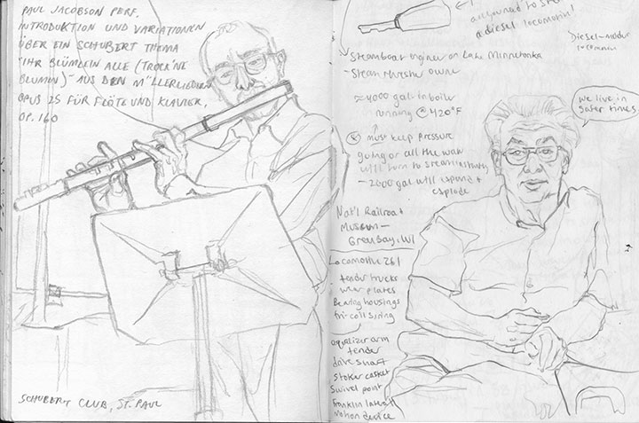
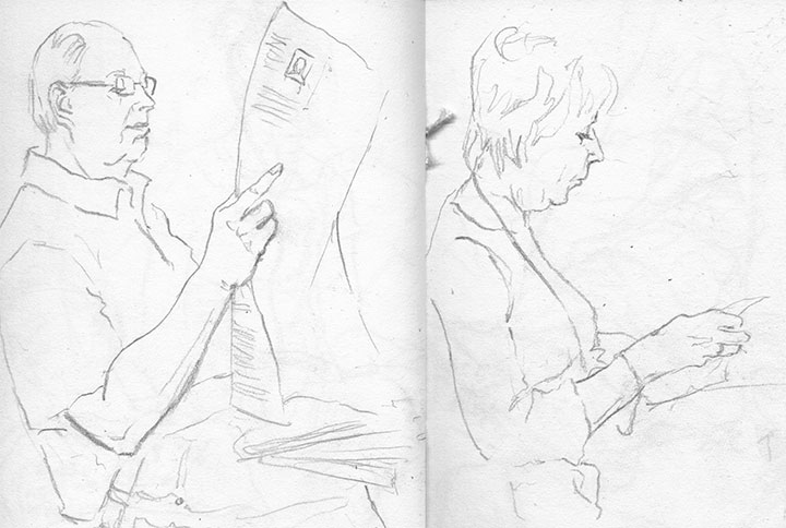
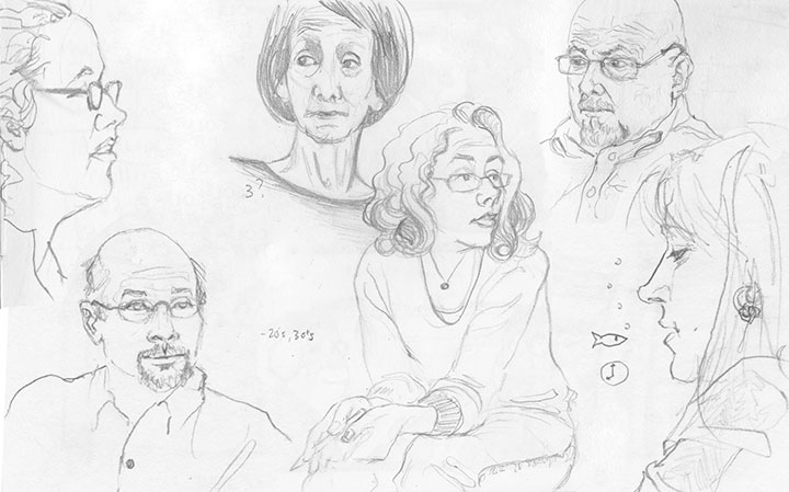
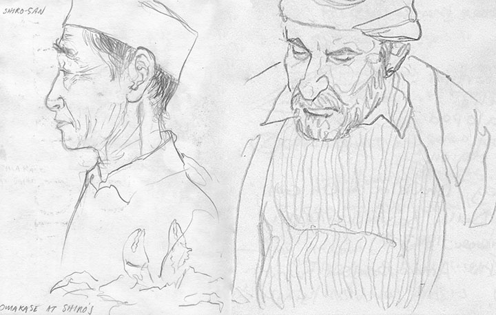
The other night I went to a talk by comics artist Art Spiegelman, and as usual, brought one of my trusty sketchbooks with me. Since comics and I go way back, and I’m a big Spiegelman fan, I think I got a little carried away with the doodles accompanying my lecture notes. I was a little abashed when the people next to me noticed and commented; all I could say was, “I do this a lot—it helps me remember.”

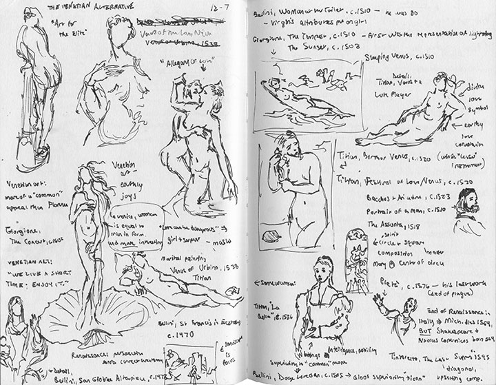
I’ve always been an obsessive note-taker, but I discovered in college that adding sketches to my notes went a long way towards my good grades in art history (this must have been the “Naked Ladies of the 15th and 16th Centuries” lecture or something).

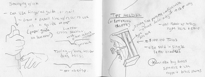
Then when I fell in with the book arts, drawn diagrams were a godsend for remembering complicated equipment and technical processes.
By the time I graduated, the habit was ingrained. I found not only that drawing was an excellent memory trigger, but also helped me focus on the moment at hand.

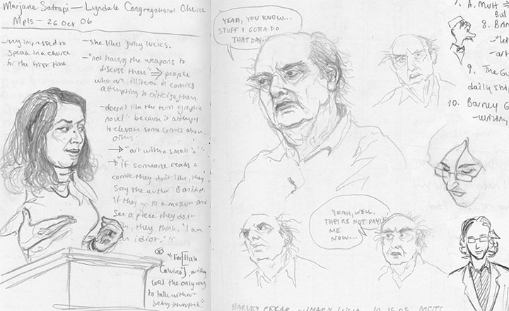
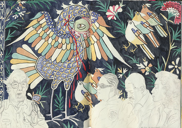
The comments on my Spiegelman doodle reminded me that I had a funny habit of drawing comic artists and writers (from the left, Marjane Satrapi, Harvey Pekar, David Mazzucchelli)—and often portraying them as comic-book characters themselves. As I dug through something on the order of fifteen sketchbooks to find my grumpy Pekar sketches, I unearthed scores of these things, from all manner of locations and events:

classes, performances and lectures;

public transit and airports—

—among other things—

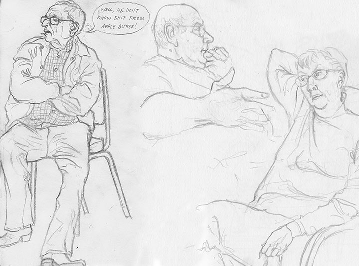
family gatherings (yes, I quoted the above verbatim; that’s the Tailor’s uncle, and he’s comedic gold);

work meetings;

restaurants, coffee shops;

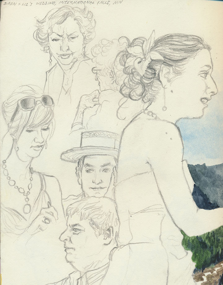
wedding receptions;

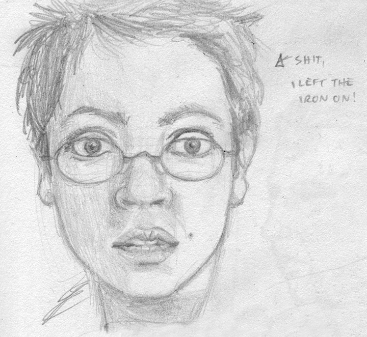
and even my own mirror, when I’m working alone (that one’s an oldie from college).
I draw when I’m trying to document an event, when I’m nervous, when I encounter a particularly unusual face, when I’m telling a story of an odd person I saw that day, when I want to preserve a loved one, and even when I’m not really aware of it—I found plenty of sketches that I had no memory of making.
Maybe there’s some psychological disorder that lists obsessive and semi-conscious sketching as a symptom, but this is one compulsion I’d like to hold on to. I know I spend more time drawing the speaker than taking actual notes, but if I remember the content just as well, I suppose it all comes out in the wash. Besides, I can’t possibly be the only one who does this, right?
Right?
December 31st, 2009

End-of-the-year summaries have never been my strong suit, not least because I tend to measure time on completely different terms than the standard calendar (like counting up from the anniversary of an important event, for instance). And since nobody seems to be able to agree on whether the decade ends this year or next (anyway, doesn’t any ten-year span count as a decade?), I think I’ll leave that one alone as well.
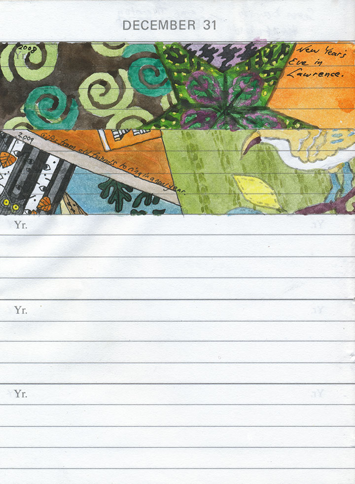
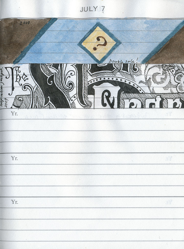
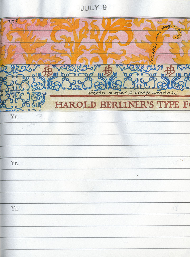
Instead, I thought I’d share my own way of marking time—an experiment that I’ve been working on for two years now.

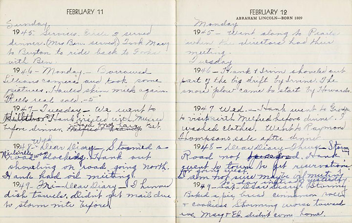
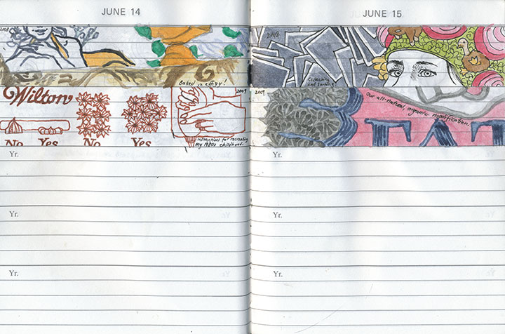
My friend Sarah Christianson has spent the last several years documenting the history of her fifth-generation family farm. Among her family artifacts are several of her great grandmother’s daily diaries, which Mrs. Anderson faithfully kept for many years. As you can see, there isn’t much space to write (so most entries say things like, “Went to the store, visited with Mildred,” etc.)—but what really interested me was how the five-year format of each page paints a larger picture of a woman’s life.

Sarah and I were both inspired to start five-year journals of our own, but I decided to turn mine into a sketchbook. I loved the idea and the challenge of documenting each day with a tiny, panoramic image.
Almost every drawing depicts something mundane, even trivial; it might be a sliver of that day’s activities, or just a snippet of an object that caught my eye. I’m almost never specific in the brief phrase written in each space—in fact, already I find myself forgetting what I was referring to when I go back to look at past entries. When I do remember what I was talking about, though, each illustration triggers my memories better and more richly than any of my photographs or writing can.
But that’s not the point of this project; this was never meant to be a detailed journal of my every thought or action. Instead, I’m trying to remind myself to really look at the world around me, and to live in my own present.

Now, exactly two years into the project, the same type of narrative I found in Claire Anderson’s diaries is already beginning to emerge. The drawings serve as a sort of flip-book; as one pages through the journal my personality, tastes and interests come to life, and the result is a more complete picture of myself than I ever could have come up with consciously. And an interesting by-product of all of this is the sometimes-unwitting documentation of the current era—this book might prove to be useful in other ways, someday.
The really curious bit is how the book is both intensely personal and completely ordinary. There isn’t a single image in there that I couldn’t share with a total stranger (no nudity, no embarrassing missives, no dirty laundry, etc.), and yet I’ve only actually shown it to a handful of people. I’m not sure why that is, but now that I’ve gone “public” about it I’m sure I’ll post occasional excerpts from here on out.
At the very least, maybe this will tighten the screws on my discipline a bit. Sarah and I learned quickly how difficult it is to keep a daily journal like this, whether in words or pictures (I doff my hat to Mrs. Anderson’s habits)—it’s all I can do to keep up with it, and I’m often playing catch-up. But now that I see how worthwhile the effort has been, I find myself excited for whatever tomorrow brings.
And isn’t that the whole point?

Wishing you a happy New Year full of wonderful events and tiny moments worth savoring—however you choose to remember them.

![Chandler O'Leary [logo]](https://chandleroleary.com/wp-content/themes/chandleroleary/images/logo.png)
