Blog
July 6th, 2009
In my (so far) limited experience, Washingtonians tend to be outdoor types—and with good reason. With so much beauty at our fingertips, it’s no wonder that with the first hint of a sunny day, we’re out in force. Add to that the near-clockwork arrival of the dry season by Independence Day, and the fact that huge swaths of the mountains are inaccessible for nine months out of the year—well, you can see where I’m going with this. Since the Fourth of July was kind enough to fall on a Saturday this year, the cities emptied and thousands headed Outward. And this year, though we’re normally Off-Season, Off-the-Beaten-Path types, the Tailor and I were no exception. Like zombies we staggered outdoors to pack our tiny Subaru sedan—must … go … camping!
We knew it was probably folly, but we had a goal in mind: find a beautiful, mountainous campsite away from the teeming hordes. We knew Mount Rainier would be out of the question, as were the Olympic Peninsula, Mount St. Helens, or any other popular tourist destinations—but even though we had a head start by leaving on Thursday afternoon, our hope faded as we saw the crush of fellow vacationers on the freeway. “Camper … camper … RV … canoe … RV … kayaks … cyclists … camper,” the Tailor droned, counting cars, “this was a dumb idea.” Yet as our route took us on smaller and smaller roads, the number of fellow travelers dwindled almost to none. It began to seem like our instincts were right after all.
Our destination? The Morrison Creek Campground, located on the southern slope of Mount Adams, Rainier’s slightly-smaller, lesser-known brother.
While we were nervous of the possibility of any volcano attracting busloads of holiday tourists, our choice had a couple of points in our favor. For one thing, one can’t reserve a campsite in a national forest; all sites are taken on a first-come, first-served basis. For another, Morrison Creek is in the middle of freakin’ nowhere.
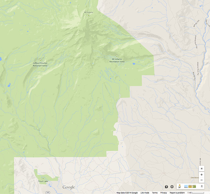
The only way to get there from the north is to use the system of Forest Service roads that wind through the Gifford-Pinchot National Forest. The paved sections are breathtakingly beautiful and super fun to drive (especially with a stick shift; I felt like I was filming a car commercial). The “unimproved” stretches, on the other hand, range from challenging to terrifying. Mindful of the consequences of puncturing an oil pan or snapping an axle on a holiday weekend in one of the most remote pockets of the state, I took my sweet time picking my way around the detritus of recent rock slides and dodging monstrous potholes.
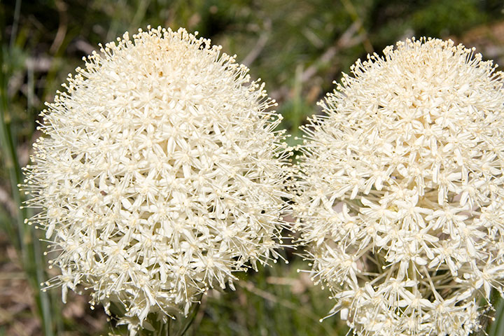
When we pitched our tent just as the last light faded, however, we knew that it was absolutely worth the trip. Our campsite was in a lovely, secluded spot, adjacent to the Creek, just below the last traces of mountain snow, and surrounded by pockets of blooming beargrass. And to our immense surprise, we had Adams almost entirely to ourselves, for the whole weekend—funny, considering that the next campground, three miles up the road, was crawling with mountain climbers.
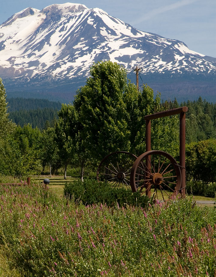
I was hoping our travels would afford us at least one view of Rainier in the distance—that way I’d have another sketch to add to my store of potential artist book imagery. FS Route 23, however, doesn’t afford such a vista, and any potential viewpoint reached by hiking trail was well out of range of our abilities. A two-mile hike from our tent did give us a spectacular, alpine-meadow view of Adams, though—and I realized that for my research purposes, I could use the peak as a sort of stunt double.
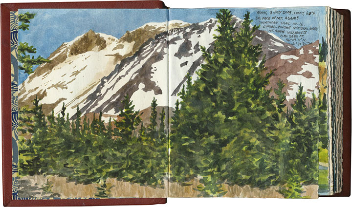
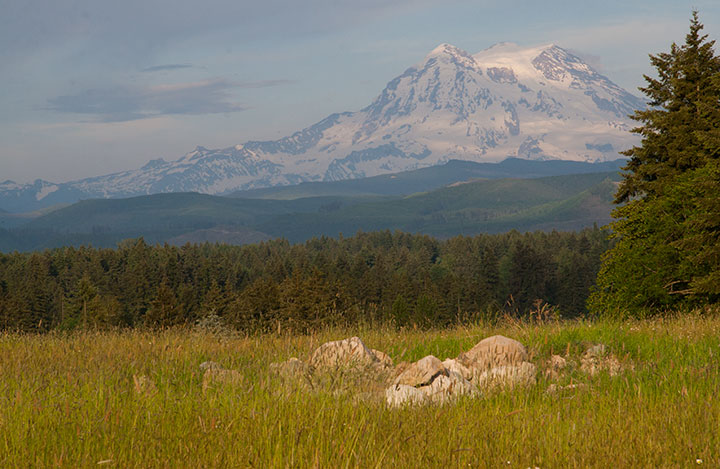
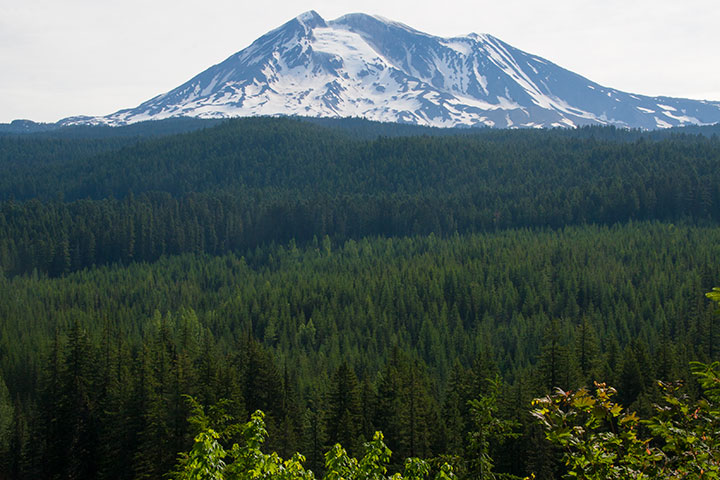
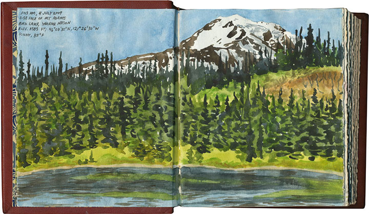
From certain angles, Adams is remarkably similar to Rainier (and people often mistake one for the another when viewed from a distance). All the more reason to use my time there for drawing. I was surprised to see, however, how drastically Adams’ appearance changed, depending on the vantage point. This is the view from Bird Lake, on Yakama Nation land, just a couple of miles (as the crow flies) east of Morrison Creek:
And though there was nowhere to sit to capture it in my sketchbook, a gap in the trees gave me the chance to glimpse another stand-in to the south: Mount Hood.
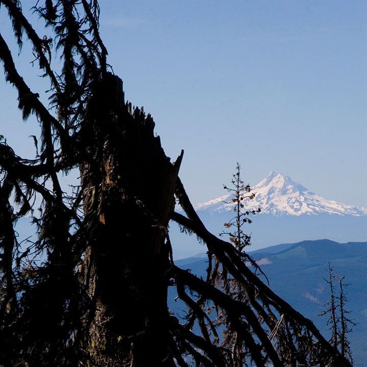
What an incredible weekend. As you can probably guess, Adams is on the short list for Best Camping Spots Ever, and I’m sure we’ll end up returning again and again. Next time, though, it might behoove us to reconsider our mode of transportation; it’s doable in a compact car (just barely), but I think I’d rather rent a pickup truck—or a mountain goat.
June 30th, 2009

A few months ago I was granted funding by the City of Tacoma Arts Commission to create my next artist book edition. Since this is the first of what will probably be a long string of posts over the next eighteen months, I’ll save the details for later. For now, I’ll just say that the book deals with the changing appearance (and intrinsic nature, since it’s an active volcano) of Mt. Rainier. At the moment I’m knee-deep in research, trying to capture the Mountain in as many different—well, attitudes, as Jane Austen would put it—as possible.
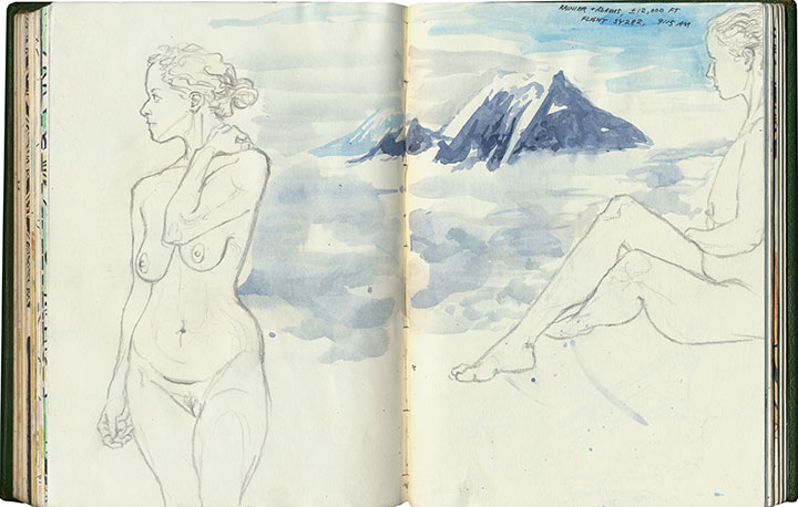
The Tailor and I spent last week visiting old friends and haunts in Minneapolis, and as luck would have it, I had the window seat on the south side of the plane on our flight out. I had my paints, brush, and film canister full of water ready as we taxied, so that when we cleared the cloud ceiling I had a solid two minutes or so for a sketchbook snapshot.

It occurred to me, though, that while a 120-second gesture painting (complete with frantic paint spatter) would be a nice addition to the sketchbook, it wouldn’t provide nearly enough reliable detail to serve as the basis for a future letterpress print. So on the way back, I requested another window seat (I think the fact that I’d sprained my ankle on our last day of the trip, and had to hobble to the counter, might have helped my case a bit) so as to document any Mountain sightings with the camera.
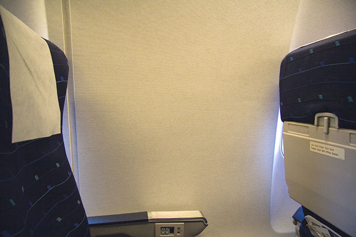
The counter attendant had been kind enough to place me on the correct side of the plane again. And the weather was crystal-clear, affording the passengers with stunning, morning-lit views of Rainier and the entire Cascade volcano chain. The cabin was filled with sounds of hushed awe and clicking shutters. There was only one snag in my research scheme—Row Nine, in which we were seated, seemed to use the term “window seat” loosely.

And the universe kept right on laughing.
June 21st, 2009

There’s some serious gear-shifting going on in the studio these days. Prop Cake and Tugboat Thea are sold out, and the Woolworth Windows murals are white walls again, ready for the next artist to transform the space. I’m preparing to teach a letterpress class at the School of Visual Concepts next month, and I’m working on a new artist book (more on that topic later). I feel like I’m in that tiny, transitional moment between exhale and inhale.

So what better way to use that breath of time than to slow down and do some carving?

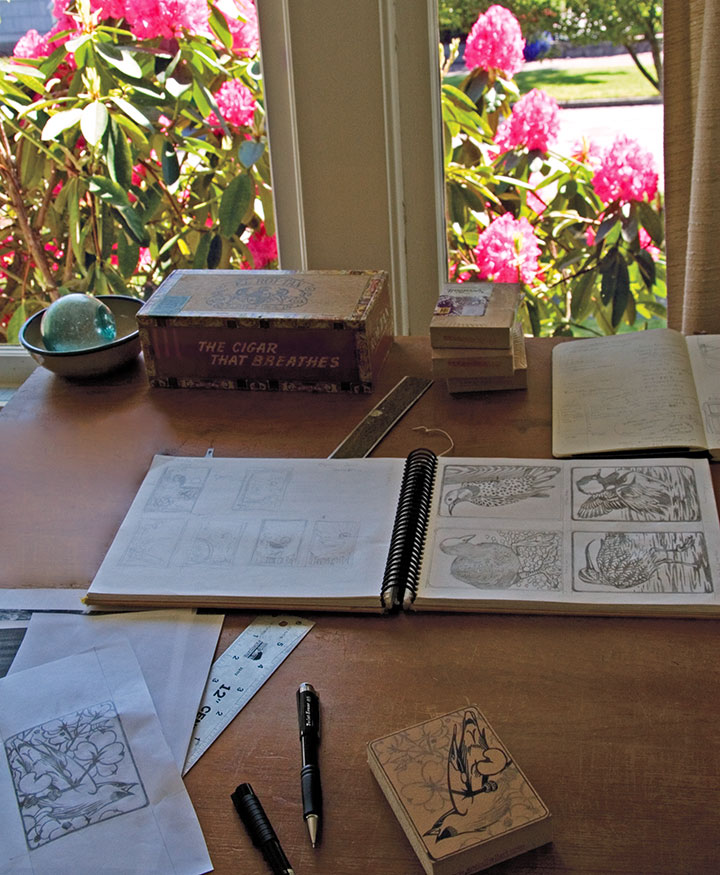
In the free moments between my other projects, I’m also working on a new print series that’s got me all a-flutter.

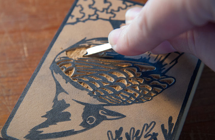
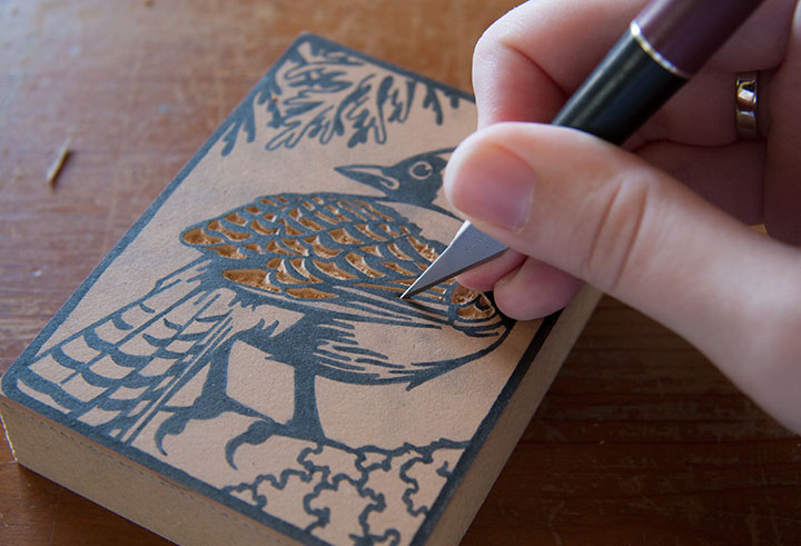
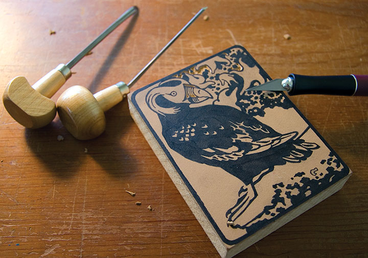
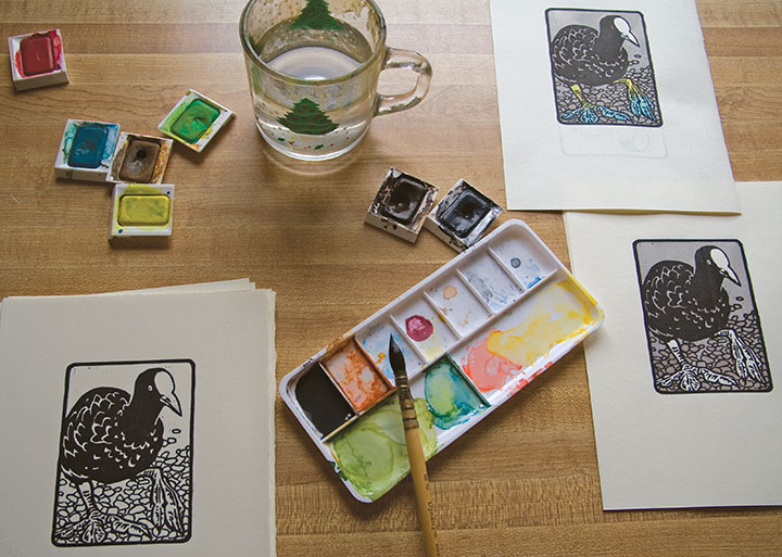
I love getting back to basics, and enjoying the simple mechanics of drawing, carving, and printing images. No fancy photopolymer plates this time—just ink, paper, watercolor, and good old-fashioned linoleum blocks.

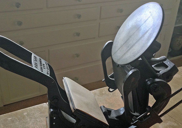
What started as an excuse to get my little Kelsey tabletop press in working order—

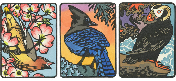
—has turned into a budding interest in birding. There is a stunning array of avian wildlife in my state, and I’m only creating a tiny illustrated cross-section of what’s out there.

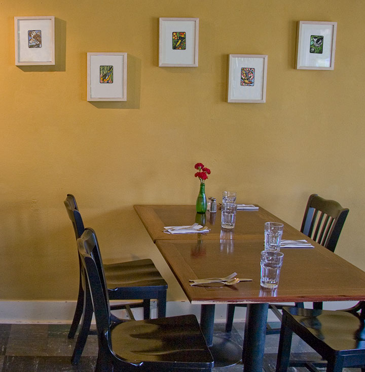
The suite tweet of prints is called Flock, and the first nine are currently on display at the Rosewood Café in Tacoma until July 31.

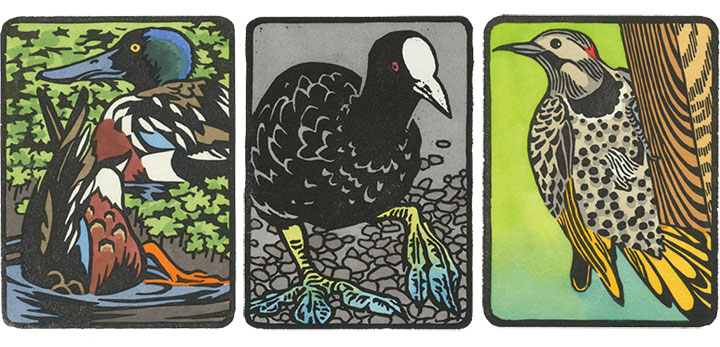
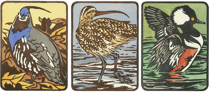
Here’s a closer look at ’em.

Each print is a hand-colored linocut, printed in an edition of 25. There will be 25 birds in all, and at the end of the series, there will be ten handmade boxed sets—each containing all 25 birds.

I’ll be printing the rest of the birds in the coming months, and the Flock box sets will be finished sometime next year—eight of the ten sets are spoken for already, but if you’re interested, feel free to drop me a line. I’ll just be here in the studio, happily chirping, cawing, quacking, and twittering away.
May 14th, 2009

Holy cannoli, everyone! I’ve only just now come up for air—I’ve been buried under invoices, subscription forms, kraft mailers, and email print-outs, and Thea’s face is repeated all around me as reserved copies are spread all over the studio. Since I posted her here on Tuesday night the orders have just poured in, and over three-quarters of the edition is spoken for already. And Prop Cake is disappearing fast, too; we’re down to our last handful. Wow—just…wow. Thank you all so, so much.
Since Thea and her fellow Dead Feminists have left T-Town to be shipped all over the country (and to lovely Canada, France, Switzerland and the UK, too!), I thought it appropriate to share some of the things Jessica and I talked about at TAM the other day with a wider audience. Now, normally my paralyzing fear slight nervousness while speaking to a crowd manifests itself by wiping my memory clean immediately after I give a talk. It’s a very annoying thing, not being able to remember what you just said, but it happens all the time. I guess I’m fortunate that my phobias don’t show up as a quavering voice or profuse sweating (so nobody ever believes me when I say I get stage fright), but selective amnesia isn’t much of a fair trade for fake confidence! But this time, weirdly, it didn’t happen—I remember almost everything, and I think it’s because I wasn’t alone. (Jessica, I reckon that means you’re doomed to be my speaking partner from now on!) So to make sure my memory stays put, I’m setting it down here for the record. (By the way, since there’s rather a lot to say on the subject, I’ve decided to break it into two posts.)
• • • • • • • • • • • • • • • • • • • • • • • • • • • • • • • • • • • • • • • • • • • • • • • • • • • • • • • • • • • •
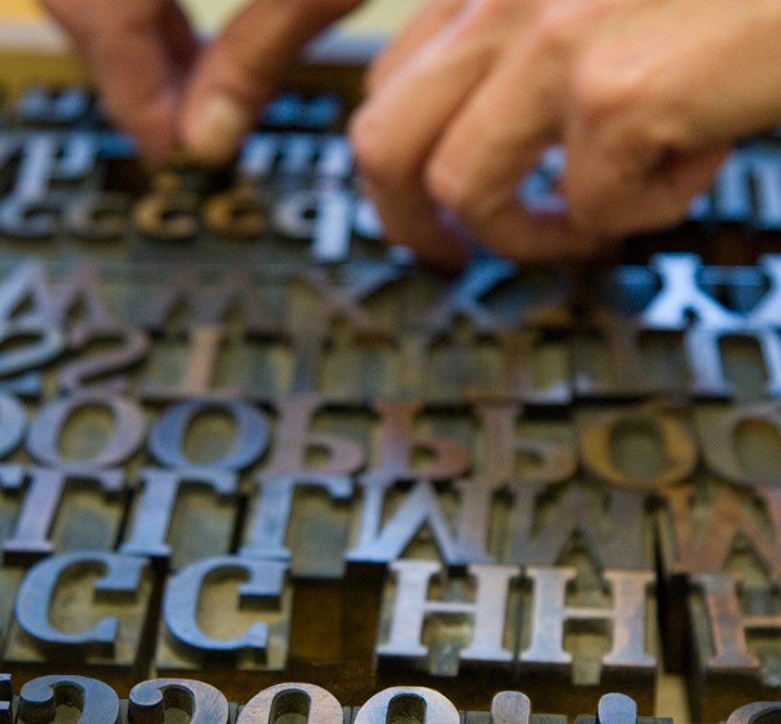
Before I get into the technical details behind our series, I should probably share a little background information on letterpress and the art of the broadside. For those of you who aren’t familiar with the process, letterpress printing refers to a type of relief printing, where pressure is applied to a piece of paper placed over a raised form that is covered with a thin layer of ink. This pressure transfers the inked image onto the paper, and can be repeated to create a batch, or edition, of prints. The form can be a carved block of wood or linoleum; a raised plate made of magnesium, photopolymer (plastic) or other materials; or as the term letterpress implies, movable type made from metal or wood.

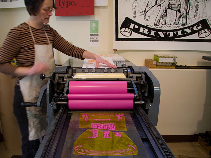
The innovation of printing words from individual letter blocks that can be rearranged and reused was actually invented by the ancient Chinese (seriously, what wasn’t originally invented in China? We owe those folks a whole heap), but the process that evolved into modern letterpress was most famously perfected over 500 years ago by Johann Gutenberg, of Gutenberg Bible fame. By the first half of the twentieth century, when more modern commercial printing came along, it was still common for printers to perfect their layouts using movable type and relief-cut images on a proof press (such as Jessica’s Vandercook below). They’d then use the resulting print to make more sophisticated plates for their more efficient and advanced commercial presses.

Jessica printing “Prop Cake” on her Vandercook Universal One press
As commercial printing became more streamlined, the cylinder and platen proof presses (see photo above) fell out of vogue, and eventually were no longer manufactured. Artists quickly saw their potential, however, and have adopted letterpress printing as an art form—using, refurbishing and maintaining this antique equipment to create original works of art.

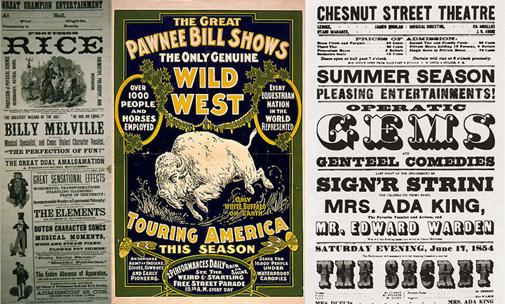
Hand-in-hand with letterpress printing, the art of the broadside has also survived and evolved into a modern format. The term broadside means any single sheet used to convey information, often of a political kind—the great-grandpappy of the modern poster. While today the words broadside and poster are sometimes used interchangeably, the broadside has remained a favorite of the letterpress community because of its emphasis on typography and content (hey, we need an excuse to use all that gorgeous metal type!).

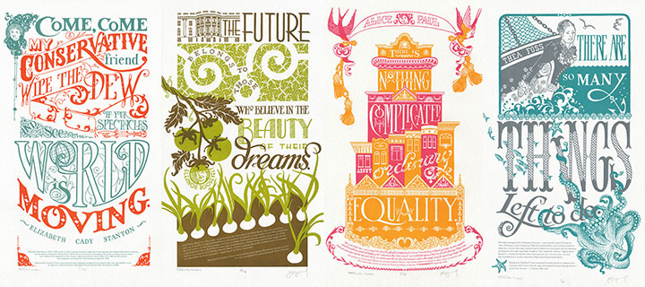
Jessica and I had this history in mind when we began the Dead Feminists series. As I said before, we never dreamed of starting down the path we’re on now; we just wanted to make a political and artistic contribution to the election. And to pay homage to the history of the broadside and the era in which each of our feminists lived, I designed each piece with historic broadsides and posters in mind. And to keep the series consistent, Jessica and I came up with a few rules of engagement:
1. Each poster has to feature a quote by a feminist. It doesn’t necessarily have to be a woman, but there are already plenty of posters highlighting the words of dudes, so we figured that one was covered already.
2. Said feminist must be deceased. (Hence the name.) You’d be surprised how many challenges that’s created for us.
3. Each quote is tied into a current sociopolitical issue or event. This is usually Jessica’s job, as she’s got a particular knack for finding relevant quotes.
4. The whole piece (except the colophon at the bottom, of course) is hand-drawn.
5. We try to stay away from well-worn tropes like “women can do anything men can do!” in favor of broader topics and concepts.
Who knows how long people will be interested in these things, or how many broadsides there’ll be in the series—all we can say is that we’re grateful for the response people have had, and we’re having way too much fun to quit now. The fun of art-making and the joy of the public response aside, the best part of creating this series has been exploring the lives and work of so many inspirational people. “Feminism” has become somewhat of a dirty word these days—mostly because of misconceptions. To us it’s a positive thing, and creating this series is our way of celebrating those who championed far more than just gender equality. Besides, we’d like to make our own contribution to our social history—and using the “power of the press” in the literal sense is the best way we know how.
• • • • • • • • • • • • • • • • • • • • • • • • • • • • • • • • • • • • • • • • • • • • • • • • • • • • • • • • • • • •
Coming in part two: the nitty gritty details behind our process.
April 24th, 2009

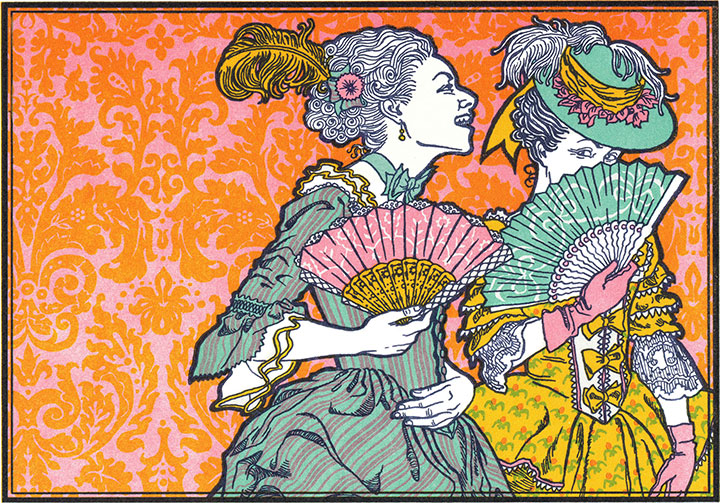
For the past eight months a stack of hand-printed postcards bearing my Versailles gals illustration has lived in the front pocket of my bag—sharing cramped quarters with my sketchbook and watercolors, ready whenever anyone asks for my business card. I’ll admit this sucker was originally designed as a promo postcard, but I kind of like the idea of a gargantuan, six-inch business card—even if you’d need a really big wallet to keep it in.
These days, the question I most often hear is “How can this be letterpress?” I’ve launched into so many long-winded explanations of the convoluted process behind this thing that sometimes I bring visual aids with me to art functions. Yes, I’m a nerd. I carry visual aids around.
Ahem. Anyway, soon I’ll be putting those visual aids to use in the classroom. If you happen to be a fellow Northwesterner, I’ll be teaching a letterpress class in Seattle next month that combines good old-fashioned line drawing with digital typography, and old-school hand printing with snazzy graphic design software.
Johann Gutenberg is probably rolling in his grave right this minute.
Hmm … well, before I get my cosmic comeuppance from the ghosts of my professional ancestors (I also know how to hand-set type, I promise!), here are the details:
Digital Design Meets Letterpress Printing
Six Mondays, May 4 – June 15, 2009, 12 – 5 p.m.
School of Visual Concepts, Seattle, WA
The class is already almost full, so hurry and claim your spot! Let’s give old Herr Gutenberg something to spin about.
April 7th, 2009

Since my gallery talk on Sunday was limited to a local audience, I thought I’d highlight a few of the pieces in my To the Letter show. (Besides, in a blog post I don’t have to worry about any public-speaking nerves, or hear myself say “Uh” or “um” twenty-nine times a minute.)
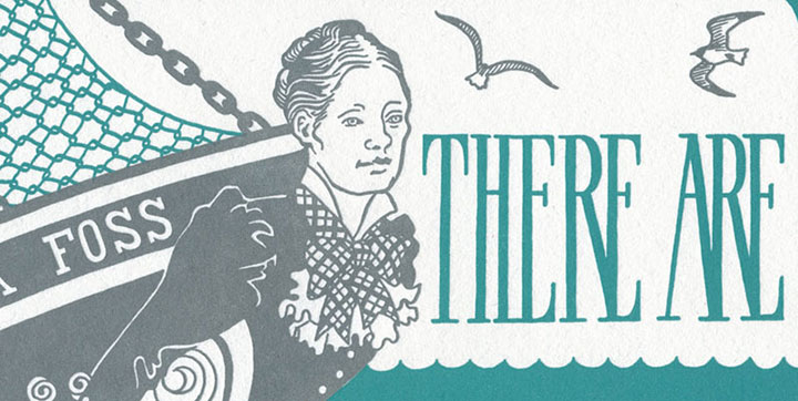
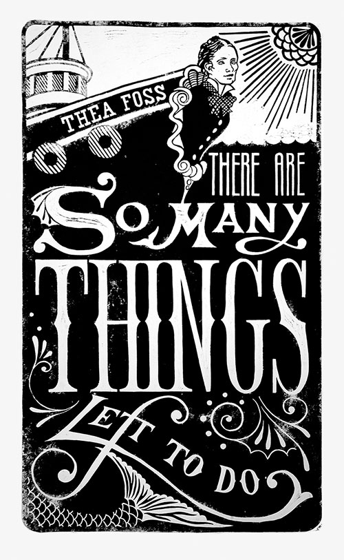
The only wall piece in the exhibit is Tugboat Thea, a piece I did with Jessica. The print is an unofficial member of our Dead Feminists series because of its size, and let me tell you, that sucker is huge. (Four feet tall!)
And why is it so enormous? Why, it was printed with a steamroller, of course!

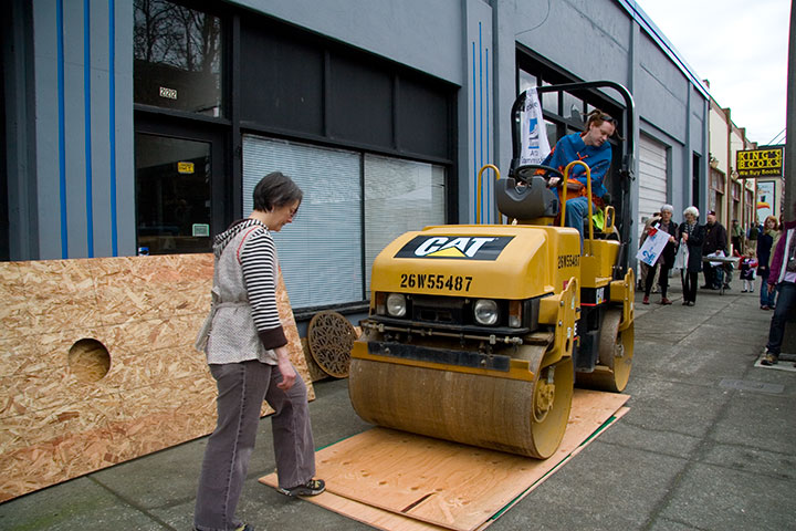
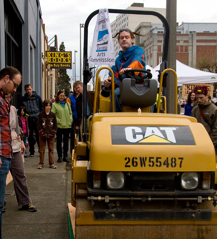
Yes, you read that right. The folks at King’s Books asked us to be a part of their fifth annual Wayzgoose* celebration on the first of March, and steamroller printing was the main event. Thanks to a grant from the Tacoma Arts Commission (seriously, thank you!), each artist or artist-team was given a four-foot slab of linoleum to carve as they saw fit. Jessica and I decided to pay tribute to Tacoma’s own Thea Foss—business pioneer, Waterway namesake, feminist extraordinaire, and inspiration for the Tugboat Annie stories and films.
The trouble was, our Feminist Broadside format relies on a quote by the subject, and we were having an awful time finding anything attributed to Thea herself. Luckily we discovered Finding Thea, the excellent documentary film by Nancy Bourne Haley and Lucy Ostrander—which, by the way, also provided great reference material for sketches.

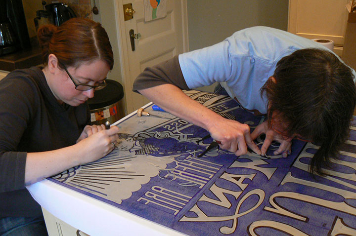
This should give a rough idea of the scale we were working with. To transfer our image onto the linoleum (backwards, so it’ll print correctly), we photocopied my design drawing at 600% size, placed the copy face-down onto the linoleum, sprinkled it with mineral spirits, and ran a hot iron over the wet paper. The heated solvent transferred the copy toner onto the linoleum exactly the way we wanted it. Then we just had to spend a week carving it!

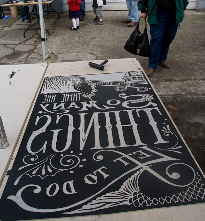
Here’s the finished block, all inked up and ready to print.

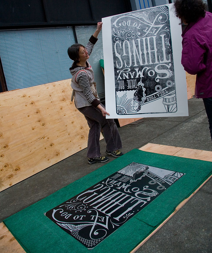
And here’s the print, hot off the press. Nancy, the director of the documentary, even jumped in to help!

Despite weather that absolutely refused to cooperate and ink turned soupy by the rain, the Wayzgoose was a huge success. We had over 500 people in attendance, and every steamroller artist knocked out at least a few prints.
Since the prints are so unwieldy, and since we can only print a handful of them at an event like Wayzgoose, we’ve decided to retool the design of Tugboat Thea. We’ll print a (smaller!) letterpress edition as the next in the Dead Feminists series. Look for it here soon!
I have to say, though, I’m grateful we were able to find a genuine Thea quote—it was either that or this nugget from the old Tugboat Annie stories:
“O.K., ye ol’ gafoozler,” she replied quietly and stood up.
Alright, I admit it: anything using the word “gafoozler” is going to be a major temptation.
• • • • • • • • • • • • • • • • • • • • • • • • • • • • • • • • • • • • • • • • • • • • • • • • • • • • • • • • • • • •
* Wayzgoose (origin obscure): a celebration given by a master printer to his workmen each year to mark the traditional end of summer and usher in the season of working by candlelight. Generally held as an annual celebration of letterpress and the book arts today.
April 4th, 2009

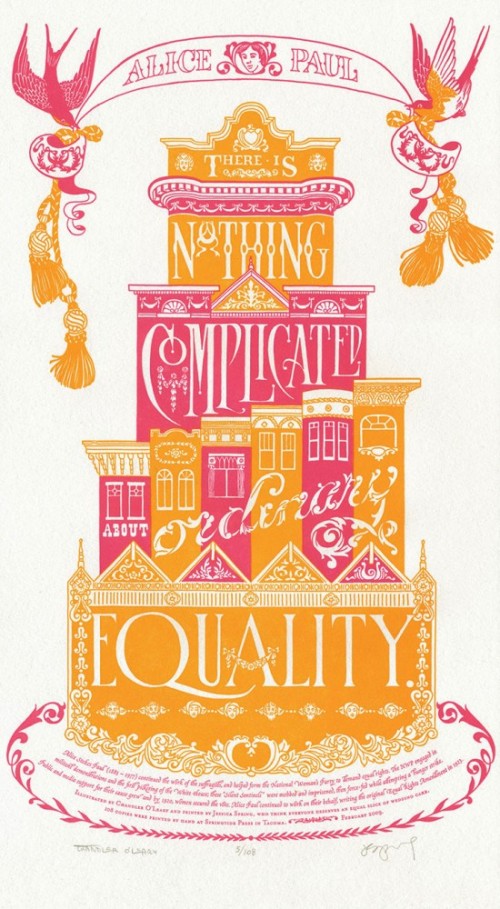
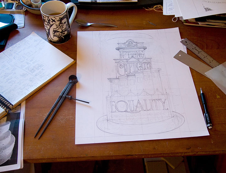
Jessica Spring and I have been having a high ol’ time with our Dead Feminists series thus far, celebrating positive changes happening around the country with the first two prints we created. At the same time, we were shocked and dismayed to learn that Proposition 8 had passed in California. Now, I know that people are extremely divided on this issue, so in the interest of respecting others I’ll try not to open any worm-cans here (this is an art blog, not a soap box). But we wanted to express our thoughts on the matter, so Prop Cake was born. The quote we chose made the issue seem like…well, a piece of cake:
There is nothing complicated about ordinary equality. —Alice Paul
The initial idea for this piece came almost immediately; Jessica looked over at me on a drive home from Seattle one day and said, “How about a big, pink wedding cake?” I grinned from ear to ear, and started sketching as soon as I got home. The design didn’t come together so easily, however. Everything I came up with looked more like an ad for Modern Bride than a political poster. Frustrated, I pushed my sketches aside and took a few days off to think.
And then I went to San Francisco.

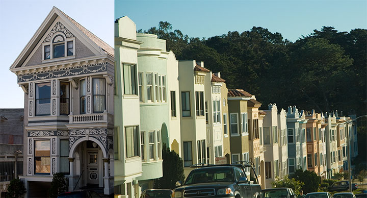
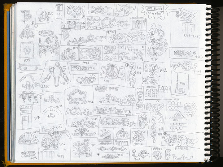
It was my first trip there, and my first thought as I passed through the residential neighborhoods, with rows and rows of candy-colored stucco houses, was “Wow, these things look like big frosted cakes!” And the lightbulb turned on, at last. I spent three days walking, driving, and riding around the neighborhoods, camera and sketchbook in hand. I made pages and pages of notes on architectural detailing.

When I arrived home, I got right to work. This time, finally, it all came together.

Alice was right—it really was a piece of cake.
• • • • • • • • • • • • • • • • • • • • • • • • • • • • • • • • • • • • • • • • • • • • • • • • • • • • • • • • • • • •
Prop Cake: No. 3 in the Dead Feminists series
Edition size: 108
Poster size: 10 x 18 inches
Printed on an antique Vandercook Universal One press, on archival, 100% rag (cotton) paper. Each piece is numbered and signed by both artists.
Colophon reads:
Alice Stokes Paul (1885 – 1977) continued the work of the suffragists, and helped form the National Woman’s Party to demand equal rights. The NWP engaged in militant demonstrations and the first picketing of the White House; these “Silent Sentinels” were mobbed and imprisoned, then force-fed while attempting a hunger strike. Public and media support for their cause grew and by 1920, women secured the vote. Alice Paul continued to work on their behalf, writing the original Equal Rights Amendment in 1923.
UPDATE: poster is sold out. Reproduction postcards available in the Dead Feminists shop!
April 3rd, 2009

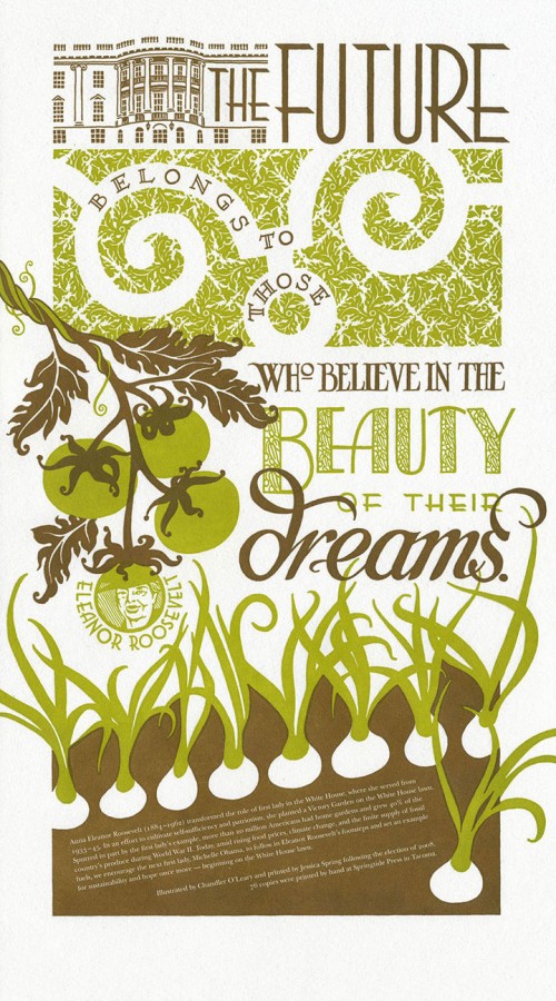
With the success of our first piece, Jessica and I wanted to continue our Dead Feminists series with something that upped the ante a bit. And to our complete shock, we were rewarded by our second broadside selling out in just 48 hours (thanks to the magic of the internets!). Our next subject was one that we both had been thinking about for some time: personal sustainability. As the Tailor and I are both hard-core seasonal foodies (more on this topic will probably come out eventually), and as Jessica is a member of a local crop share, we’d like to see a change in the American food system. So we turned to one of our favorite feminists: Eleanor Roosevelt.
The future belongs to those who believe in the beauty of their dreams.
While serving as First Lady, Roosevelt planted a White House victory garden during World War II; thanks to her inspiration and example, during the War home gardens accounted for 40% of the U.S. supply of vegetable produce. We thought, hey, if it could be done once, why not again? So the colophon at the bottom included a plea for the new First Lady, Michelle Obama, to carry on in Roosevelt’s footsteps.

My inspiration for the design of Victory Garden came from a variety of sources. For one thing, the typography is inspired by the Art Deco designs of Roosevelt’s era. For another, I thought back to my honeymoon in France last year.

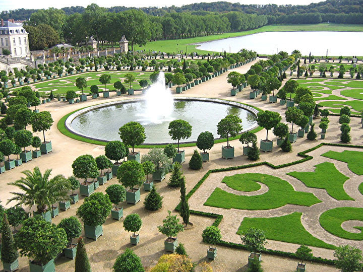
I spent a day at Versailles on that trip, and at the time was struck by the meticulous aesthetic that unified every element of the place. Everything from the wallpaper to the upholstery to the grounds themselves worked together to form a cohesive overall design. An overly ornate and despicably ostentatious design, sure (and a bit ironic, considering Marie Antoinette’s consequences for going overboard with luxury in the face of a starving populace), but it was beautiful in its own right. I especially loved the sculpted hedges and lawns of the Versailles gardens; the patterns form a stunning, living brocade at one’s feet. And I wanted to turn that design sense into something that represented the greater good, rather than the wealth of the few. So I abstracted that idea into a two-dimensional White House lawn, made up with an original brocade pattern of spiraling leaves.
When we finally arrived at the finished product, we were happily surprised to learn that many others had had similar thoughts. We discovered Michael Pollan’s editorials; learned about the “Eat the View” movement; and found many other like-minded folk along the way—including one who purchased a copy of Victory Garden for her friend, a direct descendant of Eleanor Roosevelt herself. As the icing on the cake, one of our Chicago customers had a personal connection to the Obamas, and promised to deliver a copy of the broadside to the First Lady, with our compliments. We have no idea if it actually reached her in the end, but there’s always hope. And besides, we’re taking a bit of personal pride in being part of a larger movement, as well as the fact that the new White House garden is already happening.
Victory garden, indeed.
• • • • • • • • • • • • • • • • • • • • • • • • • • • • • • • • • • • • • • • • • • • • • • • • • • • • • • • • • • • •
Victory Garden: No. 2 in the Dead Feminists series
Edition size: 76
Poster size: 10 x 18 inches
Printed on an antique Vandercook Universal One press, on archival, 100% rag (cotton) paper. Each piece is numbered and signed by both artists.
Colophon reads:
Anna Eleanor Roosevelt (1884 – 1962) transformed the role of first lady in the White House, where she served from 1933-1945. In an effort to cultivate self-sufficiency and patriotism, she planted a Victory Garden on the White House lawn. Spurred in part by the first lady’s example, more than 20 million Americans had home gardens and grew 40% of the country’s produce during World War II. Today, amid rising food prices, climate change, and the finite supply of fossil fuels, we encourage the next first lady, Michelle Obama, to follow in Eleanor Roosevelt’s footsteps and set an example for sustainability and hope once more—beginning on the White House lawn.
Poster is sold out. Reproduction postcards available in the Dead Feminists shop!
April 2nd, 2009

This blog might be brand new, but I should probably bring you up to speed on a project that isn’t. Starting last fall, right before the 2008 Presidential Election, my friend and fellow letterpress printer Jessica Spring asked me if I wanted to collaborate on a political broadside (basically, a letterpress version of a poster) together. We both felt like this was an important event, and a moment in history, and we wanted to make some sort of contribution to the artistic record. Jessica said she had a historical quote that would be fun to typeset, and asked if I could do a quick illustration of a pair of spectacles to go with it. She thought it’d be fun to make the glasses look like the famous eyewear of a certain Alaskan VP candidate (who can see Russia from her house!)—her plan was to use her impressive collection of wood and metal type to hand-set the quote into the design.
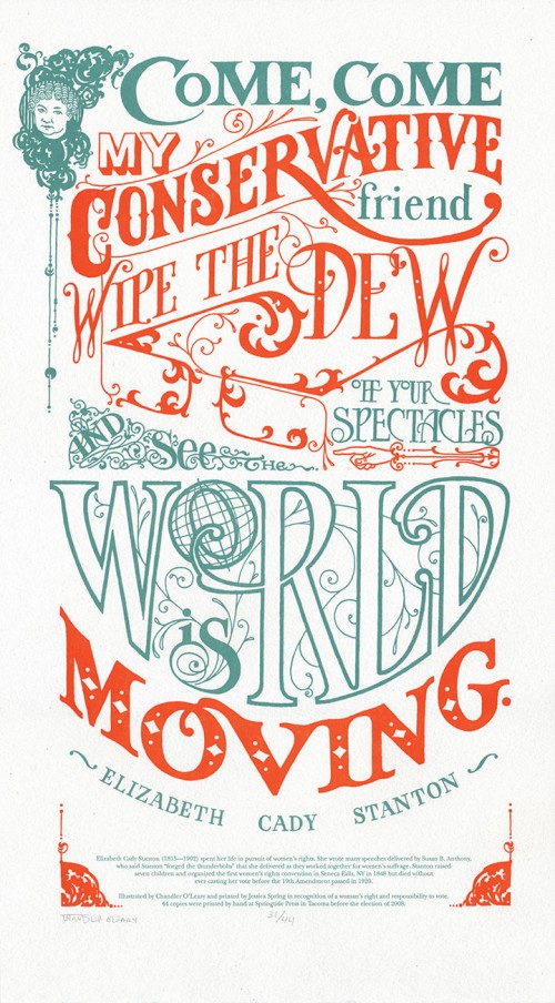
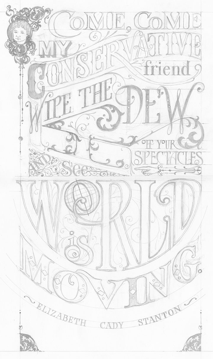
Well, she probably shouldn’t have left me alone with my pencils, because I got a little carried away, and drew not just the glasses, but the whole quote around them, too:
Come, come my conservative friend, wipe the dew off your spectacles and see the world is moving. — Elizabeth Cady Stanton
I did this because I wanted the piece to be something more than simply a jab at a political personality. I wanted it to be beautiful in its own right, something that might do justice to Stanton’s words, and that would be longer-lasting than a momentary visual pun. Besides, Stanton put up one of the most important fights in American history: women’s suffrage. In this country with with a voter turnout rate of less than two-thirds, I wanted to do my small part to get women everywhere, regardless of political stripe, to the polls. And then, as it always does, my fingers started itching to draw my own letterforms. After all, for as much as I love hand-setting type, one of the reasons I’m a letterer is because I’m continually frustrated by the finite number of typefaces available in wood and metal. Not that I’m happy with choosing among the thousands and thousands of digital font families out there, either. Let’s just say I’m picky. So I made up my mind to letter the whole thing by hand, and not to tell Jessica until the sketch was done.

Bless her heart, she went along with the idea. We scrapped the idea of setting vintage type and printed the image using a modern material called photopolymer plates (more on that another day). And then we put the broadside into our online shop, and sent out an email to our little mailing list to let them know we’d made something new.
Three days later, the entire edition of prints was sold out. We were floored! Neither of us had ever experienced this kind of clamoring for our work before—we’d both sold out editions before, but not this quickly. People started emailing us and asking if we were going to do more posters. After reading that, we kind of looked at each other and said, “Why not?”
And the Dead Feminists series was born.
(More on the series another day: first, let’s get to the details about the broadside itself:)
• • • • • • • • • • • • • • • • • • • • • • • • • • • • • • • • • • • • • • • • • • • • • • • • • • • • • • • • • • • •
Come, Come: No. 1 in the Dead Feminists series
Edition size: 44 prints
Poster size: 10 x 18 inches
Printed on an antique Vandercook Universal One press, on archival, 100% rag (cotton) paper. Each piece is numbered and signed by both artists.
Colophon reads:
Elizabeth Cady Stanton (1815 – 1902) spent her life in pursuit of women’s rights. She wrote many speeches delivered by Susan B. Anthony, who said Stanton “forged the thunderbolts” that she delivered as they worked together for women’s suffrage. Stanton raised seven children and organized the first women’s rights convention in Seneca Falls, NY in 1848 but died without ever casting her vote before the 19th Amendment passed in 1920.
Poster is sold out. Reproduction postcards available in the Dead Feminists shop!
April 1st, 2009

Well, the threads are tied, everything is installed, and I’ve scanned for typos at least six dozen times. I think we’re ready.
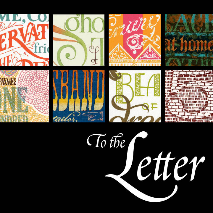
Tomorrow evening is the opening reception for To the Letter, my debut solo show. On view are a wide variety of pieces revolving around the art of the letterform: letterpress prints, textile typography, the Feminist Broadside series, artist books, sketchbooks, and more. Stop by and say howdy!
To the Letter: Works by Chandler O’Leary
April 1-30, 2009
Collins Memorial Library, University of Puget Sound
Opening reception:
Thursday, April 2, 4:30-7:00 p.m.
Since handwork is another theme of the show (hand-lettering, hand-binding, hand-stitching, etc.), some of my process materials are also on display. Weirdly, this detail is the part I’m most excited about—I’m forever encouraging my students to include sketches, supplies and other behind-the-scenes objects in their gallery shows, but this is the first chance I’ve had to do it myself. My process tends to be particularly convoluted (probably a symptom of O.C.D. or something), so I’m hoping the sight of things like tabletop platen presses and double-pointed knitting needles will spark some interesting conversation.
Speaking of which, Jessica Spring and I are doing a double-header on Sunday. I’ll be giving a guided tour of the exhibit, and Jessica will give a lecture on her newest artist book, Parts Unknown. There’ll be plenty to talk about, so come and pick our brains!
Sunday, April 5, 2009
Collins Memorial Library
1:00-1:45 p.m. To the Letter gallery talk with Chandler O’Leary
2:00-3:00 p.m. Parts Unknown presentation with Jessica Spring
Now, if you’ll excuse me, I think I’d better go check for typos one more time.


![Chandler O'Leary [logo]](https://chandleroleary.com/wp-content/themes/chandleroleary/images/logo.png)
