Blog
September 3rd, 2010
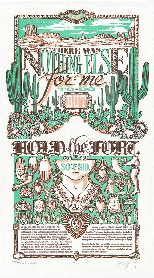
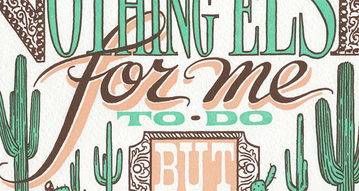
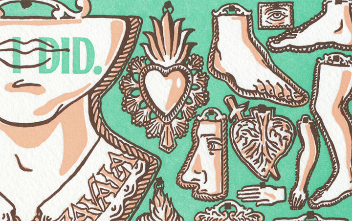
As autumn approaches and the inevitable rainy season knocks at our doors, Jessica and I are dreaming of the sunny skies of Arizona—where the not-so-sunny SB 1070, the state’s contentious new immigration reform bill, was signed into law earlier this year. At every turn, controversy pricks underfoot and looms overhead—with no easy, clear-cut answers in sight. So for our newest Dead Feminist broadside, we decided to challenge the controversy face-to-face-to-hand-to-heart with the words of Tejana activist Adina De Zavala:
There was nothing else for me to do but hold the fort. So I did.
In complete contrast with our last broadside, we had a short n’ sweet quote to work with this time—which gave me every reason and all kinds of room to go completely nuts with the imagery. I think my subconscious had a hand in steering us toward Adina and her quote, because I suddenly had the chance to explore a whole slew of filed-away themes and images that I had never been able to work into a piece before. My brain was swimming with ideas, and I found myself cackling out loud at the prospect of finally getting the chance to put so many of my favorite things into one crazy illustration. Green skies! Monument Valley! Mexican blackletter! Milagros! Cactus-spine fractal geometry! Mwa ha ha!
Ahem. I should probably back up the train a bit and give you the whole nerdy spiel.

On a Mission teems with icons of both the American Southwest and Mexican folk culture. A desert landscape—framed with metallic scrollwork and crazy-lace agate cabochons— stretches to the horizon, while saguaro sentinels tower over a tangled mess of prickly pears and barrel cacti. That was the easy part—thorny issue? Check.
The hard part was putting in all of our nebulous and conflicted feelings about the Alamo (represented here as an absence of imagery; a silhouette of negative space) and the topic at hand. So for answers I looked to Mexican folk art—so prominent on both sides of the Border, and so beautifully expressive, layered in history and meaning.

The text itself helped us get right to the point about that. The typography is influenced both by the American Old West and modern-day Mexico—particularly the latter. Mexico’s strong tradition of hand-lettering survives today, particularly in the form of hand-painted signs and advertisements. Inspiration ranged from the fluid folksiness of drop-shadowed cursive script—

—to the proud refinement of blackletter, a hold-out of the early Spanish colonial printers that has evolved to attain near-sacred importance in Mexican and Mexican-American popular culture. As we were conscious of our desire to “reclaim” some of the connotations behind the Alamo, blackletter provided the perfect weight and cultural twist to the phrase “Hold the fort.”

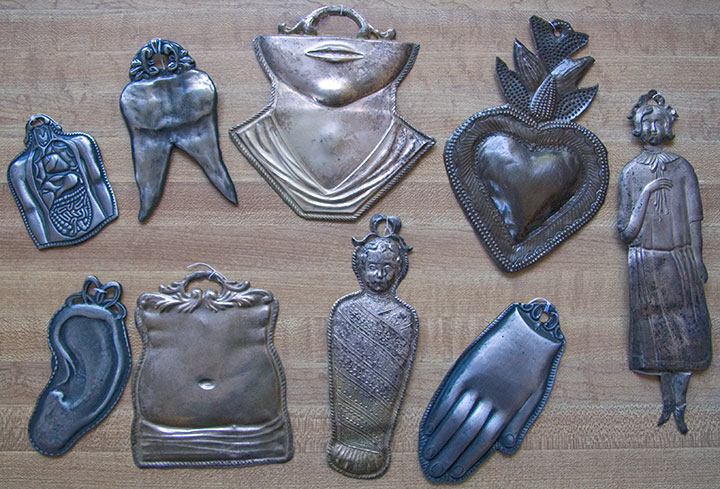
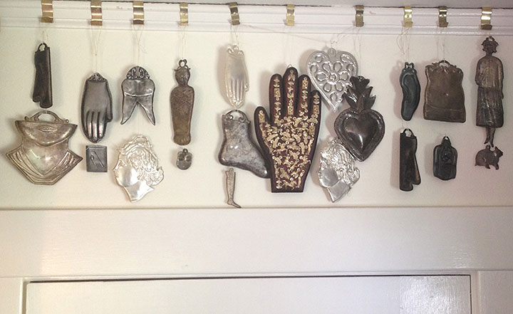
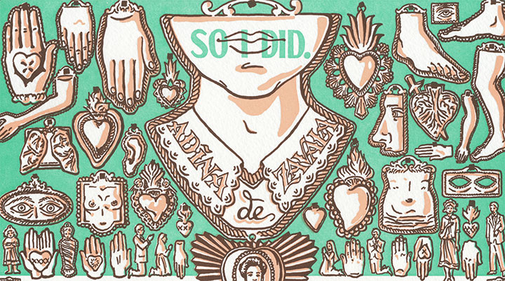
And then there’s my favorite part of the whole project: strewn all over the lower half of the illustration is a collection of milagros. Literally translated to “miracles,” milagros are small, stamped-metal votives that are typically hung in the shrines and churches of many Catholic countries—offered up in thanks for prayers answered and blessings received.

On my lifetime list of All-around Best Things Ever, milagros are very near the top—as evidenced by the growing collection in my studio. When I lived in Rome (where they are called ex votos), I used to pick them up on Sunday-mornings at the Porta Portese flea market for next to nothing. Ever since then, they’ve popped up in my work every now and then.
Well, now they get to be the stars of the show. If the Alamo were still the mission I picture in my head, the walls would be covered, floor to ceiling, with milagros. And since Adina herself has become a bit of a legend for her place in the Alamo’s history, illustrated devotionals adorn her name and portrait like pinned hopes.

It may seem strange to get so giddily excited about illustrating such a serious topic, but somewhere along the way I realized that it’s that excitement over the positive that has given me perspective on the issue at hand. That what we think of as the “American” Southwest is so iconic and so dear to us because of the peoples with whom we share it. That the Southwest wouldn’t be what it is without its link to hundreds of years of both native and newcomer culture—just as America wouldn’t be America without immigration and cultural diversity. That keeping our multicultural vibrance alive is what makes us whole.
So in that spirit, a portion of the proceeds from On a Mission will be donated to the Northwest Immigrant Rights Project, a non-profit organization dedicated to promoting justice and legal rights for immigrants and refugees from more than 100 countries around the world.
I don’t know if any of this stuff crossed Adina De Zavala’s mind while she camped out inside the Alamo. She was just an individual who fought to keep an old, rotting building standing—and the place was a controversial symbol, even then (it certainly still is today). But she knew that the controversy was part of the legend of the place, and part of our heritage. And she knew the value of preserving that heritage for everyone’s benefit, without exception—so she held the fort. I think she deserves a few milagros on our wall for that.
• • • • • • • • • • • • • • • • • • • • • • • • • • • • • • • • • • • • • • • • • • • • • • • • • • • • • • • • • • • •
On a Mission: No. 9 in the Dead Feminists series
Edition size: 175
Poster size: 10 x 18 inches
Printed on an antique Vandercook Universal One press, on archival, 100% rag paper. Each piece is signed by both artists.
Colophon reads:
As a young Tejana teacher, Adina Emilia De Zavala (1861 – 1955) shared her love of Texas history and legends in her classroom, and spent time outside of school soliciting building supplies to repair San Antonio’s missions. In honor of her Mexican grandfather, the Republic’s first Vice President, she founded the Daughters of the Republic of Texas (DRT) in order to preserve the Mission San Antonio de Valero. The compound was built in 1718 by the Spanish to evangelize local Native Americans, then later—as the Alamo—housed the Mexican Army. De Zavala was especially focused on restoring the long barracks, which she believed was the site of the 1836 Battle of the Alamo. In 1905, days before the Alamo lease would expire and rumors spread of imminent conversion to a hotel, De Zavala locked herself in the rat-infested structure without food, demanding that the entire compound be preserved. “If people—especially children—can actually see the door through which some noble man or woman passed,” she said, “they’ll be impressed; they’ll remember.” After three days, De Zavala was released as the Governor took possession, then returned control to the DRT. Thanks to De Zavala’s persistence and the DRT’s ongoing stewardship, the legendary Alamo is preserved as a museum and National Historic Landmark, open to all people.
Illustrated by Chandler O’Leary and printed by Jessica Spring, as thorny issues arise and tear at our shared history and heritage: a multicultural miracle that demands tolerance even in the most trying times. 175 copies were printed by hand, with heart, at Springtide Press in Tacoma. August 2010

UPDATE: poster is sold out. Reproduction postcards available in the Dead Feminists shop!
August 25th, 2010

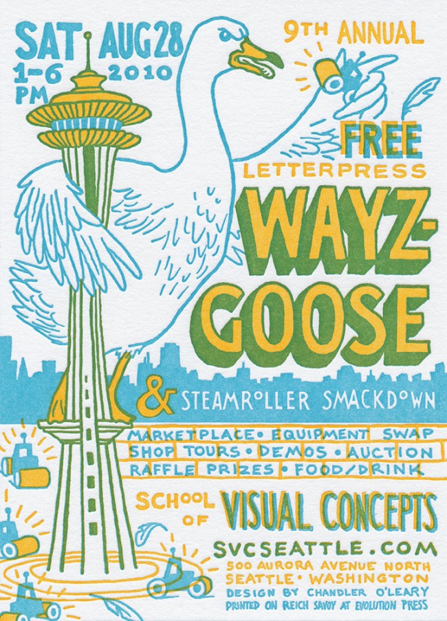
Jessica and I are waist-deep in the new Dead Feminist print (look for it here next week), so I’m just popping in to wave hello—and to warn you, in badly-dubbed English, about the giant goose climbing the Space Needle.
Just kidding … but they will be sending in the steamrollers. This Saturday, in the Needle’s mighty shadow, is Seattle’s biggest letterpress party of the year: Wayzgoose. The weather is supposed to be perfect, so come on over and say hi to scads of letterpress artists, print your very own keepsake in the studios, and referee the Steamroller Smackdown outside. Jessica and I won’t be steamrolling this time, but we will have a table in the marketplace—so don’t be a stranger!
Here’s the skinny:
9th Annual Seattle Wayzgoose
Saturday, August 28, 2010
1 to 6 pm
Free!
School of Visual Concepts
500 Aurora Avenue North, Seattle
More information and RSVP here
The lovely ‘Goose wranglers at SVC asked me to design this year’s postcard; I think I was watching too many Japanese monster movies at the time. But monsters and letterpress seem to go well together; the postcard is lovingly letterpress printed by the talented titans at Evolution Press
August 2nd, 2010

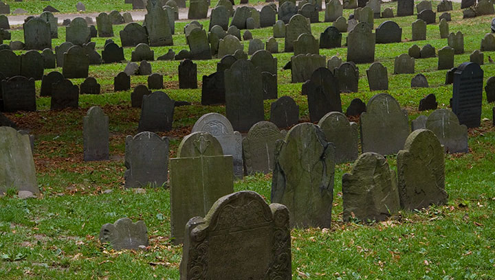
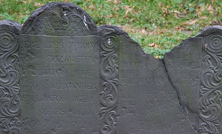
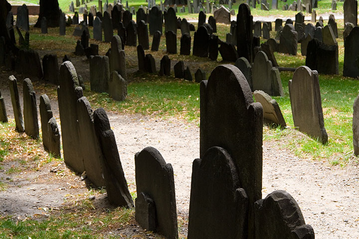
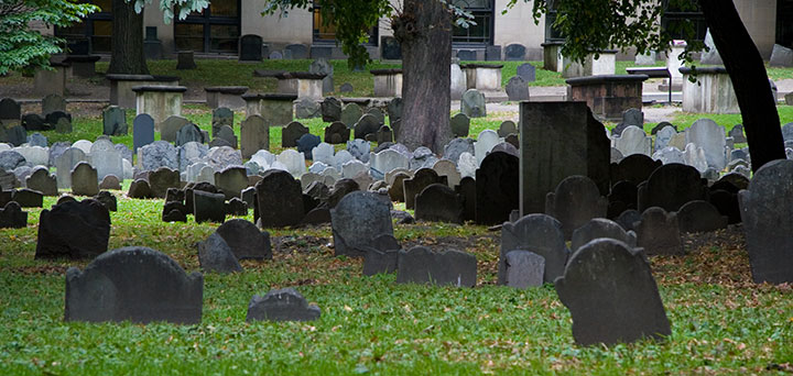
One of the things I used to do with Bampa is visit the colonial graveyards tucked away in every corner of New England. On this trip I only had time to visit a couple, so I picked my two favorites: the Old York Burial Ground in York, Maine;

and the Granary Burying Ground in Boston.

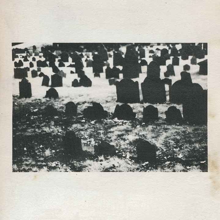
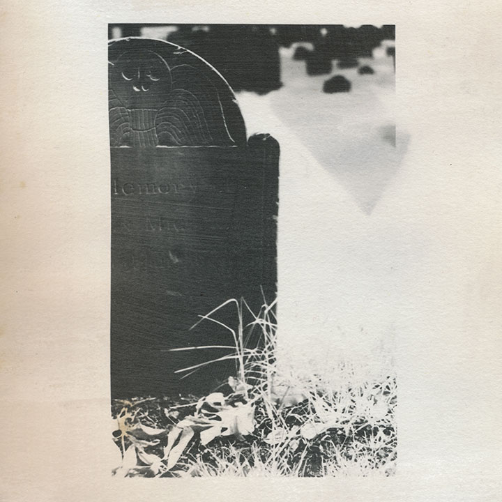
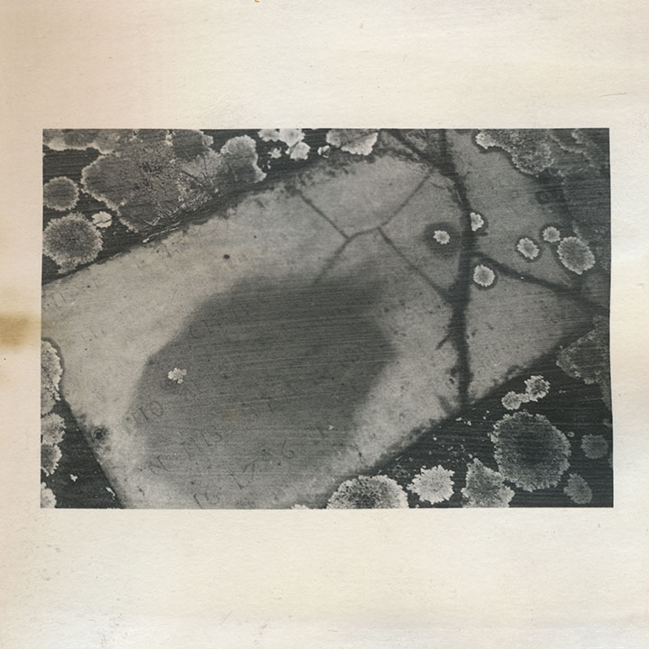
I’m quite a bit obsessed with these places; beyond my usual souvenir sketches and snapshots, these cemeteries keep popping in and out of my body of work. This is an excerpt from an artist book I made seven years ago. That’s not snow—it’s shot with infrared film, which behaves very differently from normal film when you do certain things with it. I used a dark red lens filter that blocked nearly all of the visible spectrum, so that the film was exposed mostly by ambient infrared radiation. The effect is that inanimate objects like stones read as deepest black,

and plants and flesh turn to bright white. Somehow I thought that particular quirk paired well with the subject matter—that living things behaved very differently than…well, dead ones.

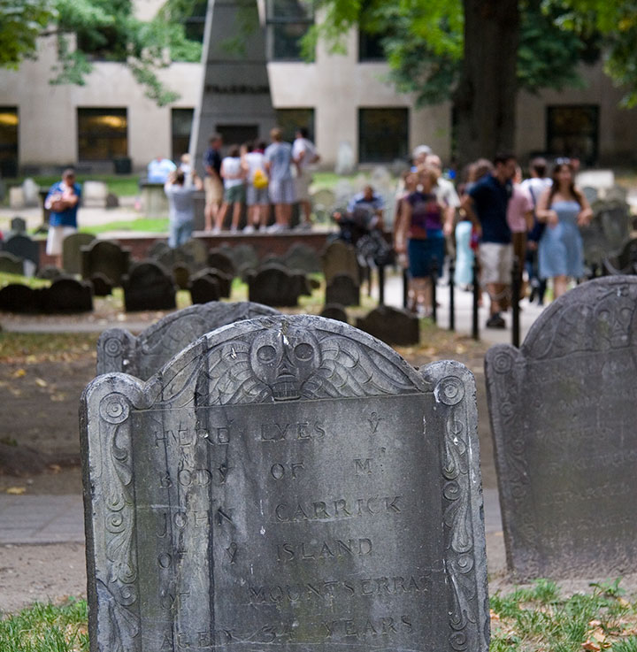
Despite the near-constant crowds (in Boston, at least) and the challenge they present to photographing, each is an oasis, a tranquil island within the bustling town or city.

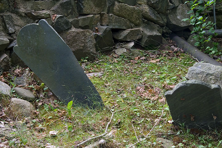
That’s not what draws me to them, though. Nor is it the haphazard scatter of wonky stones,

nor the romance of crumbling ruins.

(infrared film again)
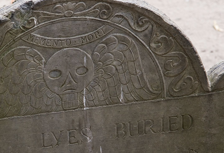
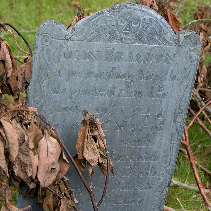
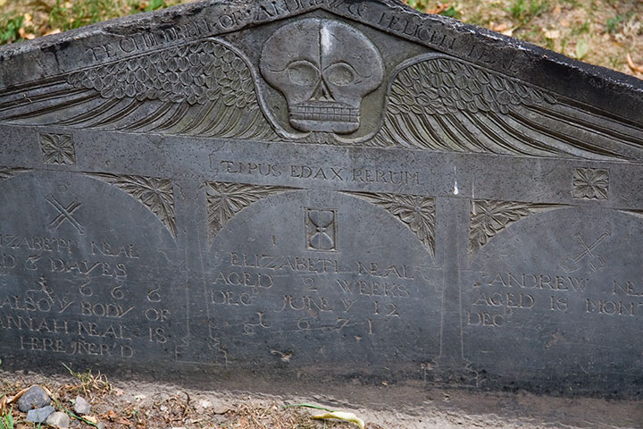
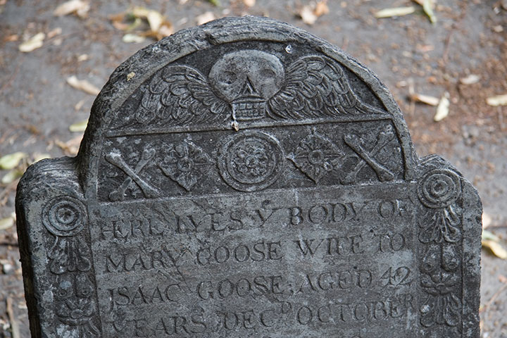
It’s that old gravestones are monumental (sorry) in the graphic design department. You can probably guess what my headstone might look like one day, because I’m completely fascinated with the design, the illustration, the typography displayed on colonial headstones. The “Death’s Head” or winged skull motif seems to be the most common,

with many variations within the theme—

Quadruple grave, dated 1666-1671, of children who lived only “dayes” or months apiece
from refined,

grave for a member of the Goose family, founders of the Mother Goose tradition
to folksy,

to somewhat disturbingly lifelike deathlike.

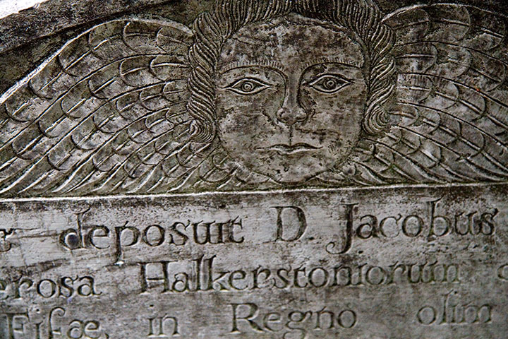
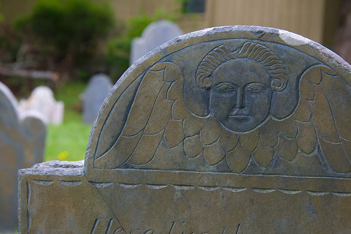
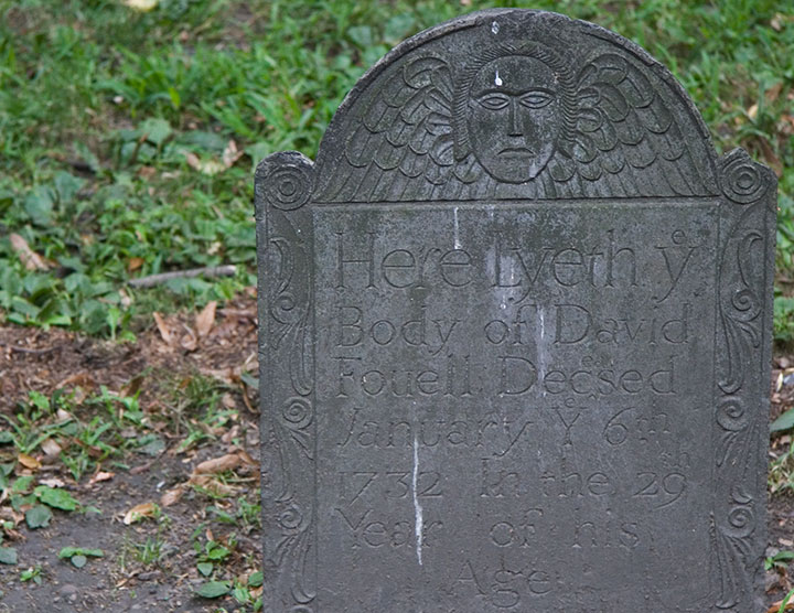
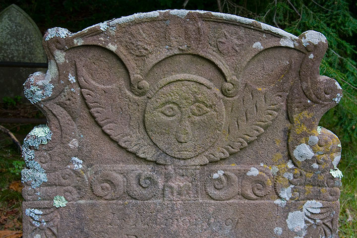
Another popular design is the “Winged Cherub,” which seems to be a more gentle alternative to the bones-n’-feathers motif.

The carvers seemed to take even more artistic license with this theme; I lost count of all the different angel designs.

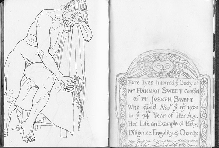
Skulls and cherubs aside, just as fun for the modern visitor is the engraved text. Typophiles will love all the script faces and lettering conventions (my favorite, below, is a mention of “November” set with “br” as superscript above a larger “Nov”),

but I’m partial to the language—the poetic phrasings, the archaic spellings. Some excerpts, verbatim:
• “Here lyes interred ye body of Mrs. Hannah Sweet, confort of Mr. Joseph Sweet, who died Nov’br ye 15th 1761 in ye 74th year of her age.”
• “On His unfailing promises rely / and all the horrors of the Grave defy”
• “… Jotham Bush of Shrewƒbury, who departed this life with the Small-Pox”
• “In memory of Mrs. Elizabeth Hurd, amiable & virtuous confort of John Hurd, Esq.”
• “Farervell Vain World, I have Enough of thee / and now I’m Careles what thou Say’st of me”

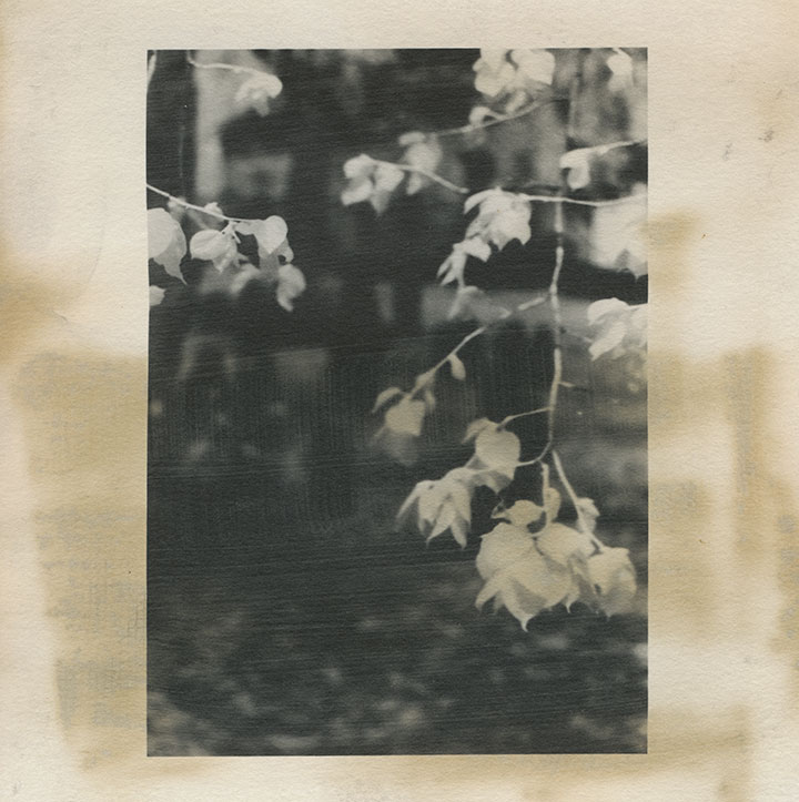
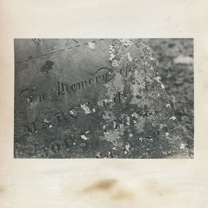
My little artist book has developed an unexpected conceptual element. I first coated the paper myself with liquid emulsion to make it light-sensitive (instead of using standard photo paper), then processed the images in a darkroom with the usual chemicals. By doing that, I was veering away from the traditional darkroom process, and adding some interesting variables, risks and imperfections into the mix. Most noticeably, the fixer reacted a little oddly with the emulsion/paper—a fact that irked me greatly at the time, since there was no way to know it had happened until the images were finished.

Over the years, however, the splotches have darkened, creating the illusion of old age and mirroring the weathering, decay and moss growth of the graves themselves.

So despite my perfectionist nature and my usual complex over making everything as archival as possible—I like the book so much better this way.

After all, it’s all the same in four hundred years anyway, isn’t it?

June 24th, 2010

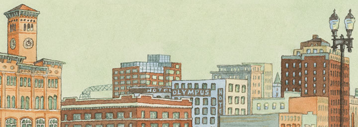
I did this little watercolor as part of a commissioned project that ended up being canceled. I’m a little sad the project won’t see the light of day, but the morning I spent sketching downtown will always be time well spent.
June 9th, 2010

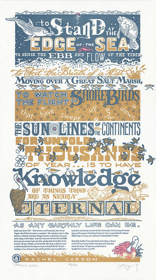
Okay, I know the title is a bit controversial. But it was either that or something laden with obscenities—Jessica and I are feeling murderous less than charitable towards the oil industry at the moment. Thus far the Deepwater Horizon/British Petroleum oil “spill” (leak? deluge? hemorrhage?) has poured tens of millions of gallons of oil into the Gulf of Mexico—a fact that stopped us in our tracks, mid-way through a different piece, and changed our course for this season’s broadside.
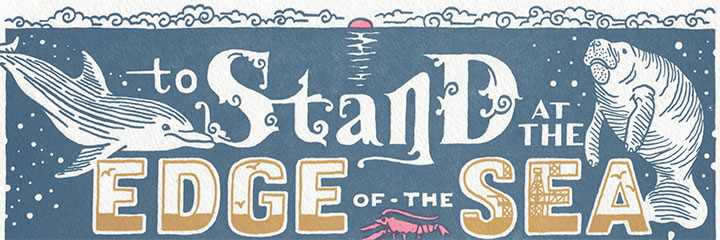
I wish I could say this was a fun piece to create; dwelling on current events and spending days poring through images of oil-soaked animals has been one of the most depressing, enraging experiences I’ve had in my career. Luckily, I could spend the rest of my energy drawing the inspiring quote by writer, scientist and environmentalist Rachel Carson:
“To stand at the edge of the sea, to sense the ebb and flow of the tides, to feel the breath of a mist moving over a great salt marsh, to watch the flight of shore birds that have swept up and down the sun lines of the continents for untold thousands of year* … is to have knowledge of things that are as nearly eternal as any earthly life can be.”
(*not a typo, I promise.)
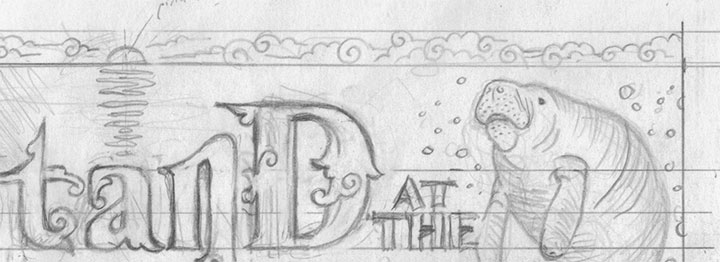
This is by far the longest quote we’ve tackled yet, and I needed convincing before I could justify the pins and needles I’d feel in my hand afterward. But along the way, it occurred to me that the quote reads like a poem—with a rhythm that opened up all kinds of image possibilities.

I couldn’t face the idea of drawing any of the oil spill’s destruction, so I chose instead to focus on the wildlife affected by the spill—including several already-endangered species—and create an image absolutely teeming with life. A manatee and dolphin play in deep ocean blue, while plovers dash by in a sandy gold that becomes the sickly tea-colored oil pouring from a hidden offshore rig (okay, so maybe a little of my anger found its way into the drawing). Baby sea turtles inch their way to the shore; a roseate spoonbill nests in a corner; a brown pelican sits, surveying the scene. How many creatures can you find?

One positive note that we can hold onto is the hope that we might make a bit of difference with our art. Our Dead Feminists have made their way to 40 states and 9 countries outside the U.S., so the word is definitely spreading. And we’ll be donating a portion of the proceeds from Drill, Baby, Drill to Oceana, an international organization focused on ocean conservation and dedicated to ending offshore drilling.
There. I said it. We want to ban offshore drilling outright. Forever.
I don’t mean to offend any readers on the other side of that particular fence (if any are left; sometimes I wonder if our series hasn’t already alienated half of the population…), but this is one issue around which I simply cannot tiptoe.
But then again, Rachel Carson wouldn’t have, either.
• • • • • • • • • • • • • • • • • • • • • • • • • • • • • • • • • • • • • • • • • • • • • • • • • • • • • • • • • • • •
Drill, Baby, Drill: No. 8 in the Dead Feminists series
Edition size: 136
Poster size: 10 x 18 inches
Printed on an antique Vandercook Universal One press, on archival, 100% rag paper. Each piece is hand-colored and signed by both artists.
Colophon reads:
Rachel Louise Carson (1907 – 1964) was born in rural Pennsylvania, where she was “happiest with wild birds and creatures as companions.” After majoring in science in college, Rachel won a fellowship at the Marine Biological Laboratory at Woods Hole and pursued marine zoology at Johns Hopkins. Carson had a long career with the US Fish and Wildlife Service and wrote numerous books and articles, including Under the Sea-Wind, The Sea Around Us, The Sense of Wonder, and the best-seller Silent Spring, in which she warned an uninformed public about the dangerous overuse of chemicals like DDT. The book—reminding us of our critical part in nature and the potential to cause irreversible harm—launched the environmental movement that led to the formation of the Environmental Protection Agency and the passage of the Endangered Species Act. Carson is memorialized with a National Wildlife Refuge in her name and a posthumous Presidential Medal of Freedom.
Illustrated by Chandler O’Leary and printed by Jessica Spring, as oil pours into the Gulf Coast, leaving tar balls on the beaches and moving inland towards salt marshes. 136 copies were printed by hand at Springtide Press in Tacoma. June 2010
UPDATE: poster is sold out. Reproduction postcards available in the Dead Feminists shop!

June 3rd, 2010

The next print in our Dead Feminists series will be making its in-person debut on Tuesday—these few snippets might give you a clue as to our latest theme. Jessica and I will be doing our dog-and-pony show at the Gig Harbor branch of the Pierce County Library; if you’ve missed our previous lectures, come check it out! If you have seen seen it, you’ll already know our schtick, but you’ll still get to see the new piece first! As always, you can also get up to speed by reading about our process here.
Pressing Matters: local letterpress artists combine craft with history
Tuesday, June 8, 2010
7:00 p.m., free!
Gig Harbor Branch, Pierce County Library
4424 Point Fosdick Drive NW, Gig Harbor, WA

We’re a month late with the new broadside for a couple of reasons. The longest (4 months!) and most annoying delay came from the fact that we’ve had to switch to a different paper. I know that sounds silly, but the paper industry is very volatile, and if you’ve ever used a type of paper that you love, only to have it be discontinued (or worse, the company goes out of business), you’ll know how frustrating it can be to find a reasonable facsimile. I guess we should have seen this one coming—the paper we’ve been using is not only extremely unusual (made from recycled clothing!), but it’s also made by a tiny, independent paper company. It’s a long story, but the short version is that the paper is now perpetually on back-order, and we had begun to notice quality issues. So! We’ve finally found a very good, high-quality replacement, and while it doesn’t quite have the Cool Factor of the other stuff, we certainly have a lot less to worry about.

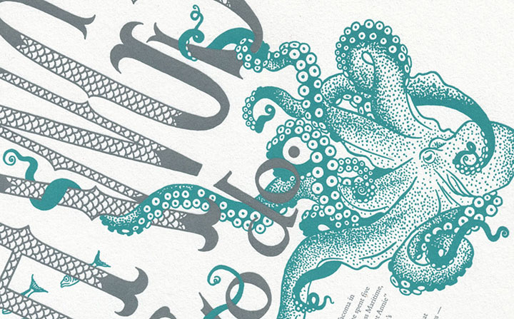
The broadside will appear online (both here and in the shop) on Wednesday, so stay tuned for more information. And in the meantime, in case you’re debating whether it’s worth the Sturdy Gertie bridge toll to attend the talk, you can say hello to the giant octopus* on the way!

*I just learned that one of the world’s largest species of octopus lives in the Tacoma Narrows, right under the bridge—a fact that completely made my week, and that I’ve obviously been dying to work in to a blog post.
May 15th, 2010

Tomorrow is the first day of the 64th annual National Stationery Show in New York City, the largest paper goods trade event in the country. Around 1300 exhibitors and 15,000 national and international retailers will be there, and my friend Allison Chapman will be showing off her Igloo Letterpress products in her own booth!
Among Allison’s impressive collection of cards and paper goods will be these newest additions to our collaborative greeting collection.

(This pun is all my fault, I’m afraid. I know, I deserve to go to a punitentiary in Punnsylvania for that.)
NSS isn’t open to the general public, but the goal of attending is to expose our cards to a wide variety of retailers, and to meet like-minded letterpress folk.

If you’ll happen to be there (either as an exhibitor or with a guest pass), say hello to Allison for me—she’ll be in booth 1550. The National Stationery Show runs from May 16 to 19, at the Javits Center on West 34th Street.

Best of luck, Allison!
May 2nd, 2010

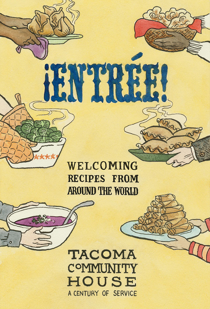
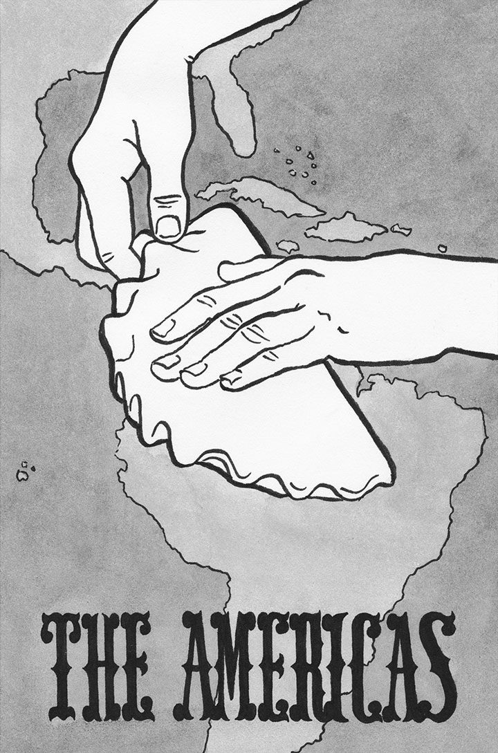
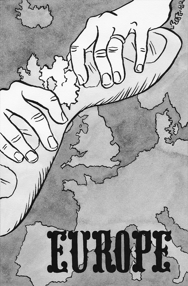
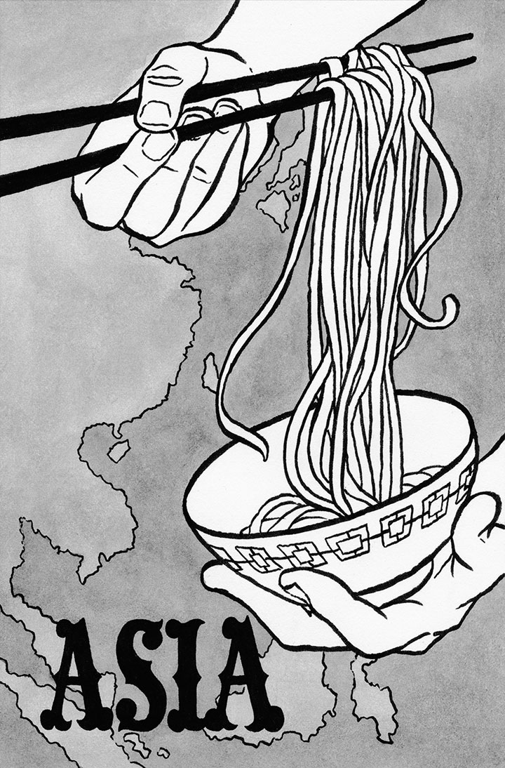
I think it’s time to get that new wok I’ve been meaning to buy, because I have a feeling it’s going to get a lot of use. The cookbook I illustrated is now available, and I can’t wait to give it a whirl.
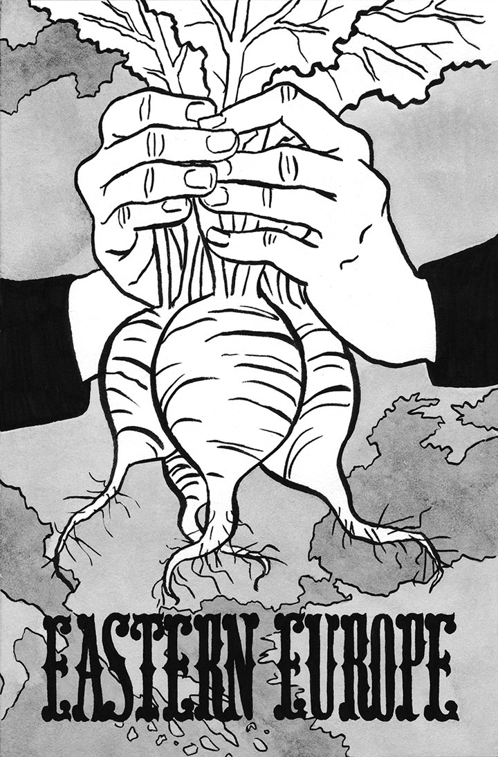
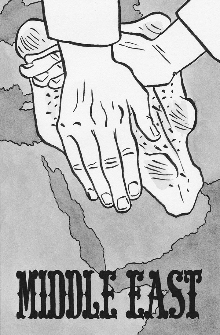
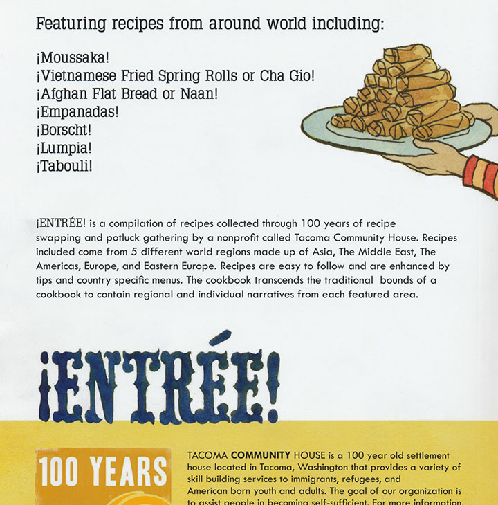
Tacoma Community House has been serving Tacoma’s immigrant community for decades, offering an enormous range of educational and social services to its clients—including language translation and interpretation, job training, citizenship assistance, and employment programs. The diversity of clients is astounding—in the last year alone, TCH served clients from fifty-four countries. To bring their clients together and welcome them to the community, TCH has a tradition of holding potluck dinners. As a result, they’ve compiled an impressive collection of international recipes over the years. In honor of their 100th anniversary this year (can you believe that?), TCH has compiled a collection of their favorites into a cookbook: ¡Entrée!

I have a feeling they had quite a job of editing; ¡Entrée! contains over 140 recipes from five world regions. Even the name is a play on this diversity, combining the inverted exclamation point from Spanish with a French term.


Dishes represented here include empanadas, tabouli, spring rolls, moussaka, samosas, gazpacho, cottage pie, a wide range of curries, and even American Indian fry bread.


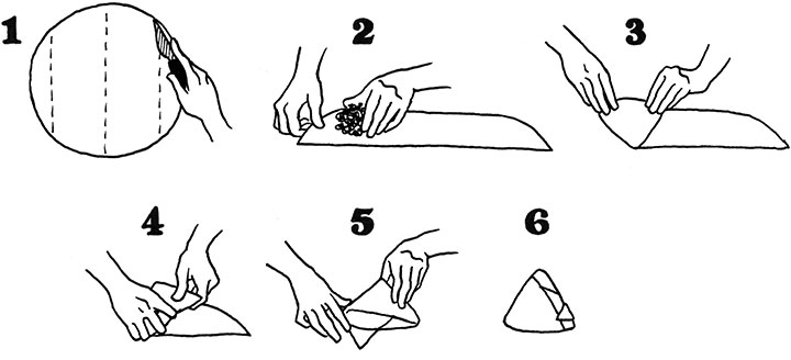
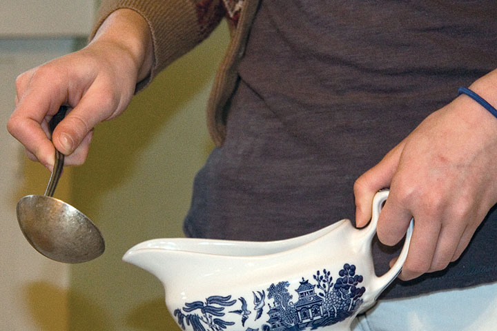
To bring all these recipes together into a cohesive theme, all the illustrations focused on hands—which came in handy for the step-by-step instructions.


(Hence all the hand-modeling by Zooey.)


Each recipe is as authentic as it gets—instead of being filtered through some chef or ethnic restaurant, these dishes come directly from the family traditions of TCH’s clients. They even passed the Tailor test (and he has high standards!)—no processed ingredients, no store-bought shortcuts, no mention of canned cream-of-mushroom soup. He even gave the English plum pudding recipe (which is one of his specialties) his stamp of approval.
I think I’ll be trying this one first:
Arroz Mexicano (Mexican Rice)
1/2 cup tomato sauce
1/2 cup water
2 green onions, chopped
2 cloves garlic, chopped
1/4 tsp salt
2 Tbsp lard or cooking oil
1 cup long grain rice
Tip: It’s important in Mexican rice to fry the rice before you add the liquids. It will make a difference in the texure and taste.
1. Mix tomato sauce and water together; add green onions, garlic and salt to the tomato sauce.
2. Heat lard or oil in a sauce pan on medium-high heat; add the rice and cook till slightly brown.
3. Add tomato sauce mixture and lower the heat; add more water of the mixture does not cover the rice. Cover and let simmer for about 20 minutes or until liquid is gone from the pan.
4. Lard is used by many Mexican families for cooking instead of cooking oils.
Oh, and about the lard: heck, yes. If you’ve ever tried refried beans at an authentic Mexican restaurant, the lard is what makes it taste so good. Don’t be afraid—a little lard won’t kill you. Go ahead and try it! Learn it, love it, lard it.

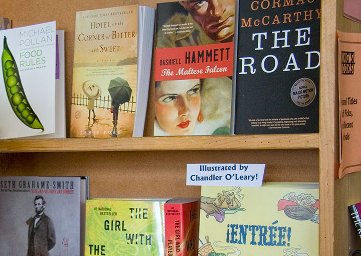
I loved working with TCH (and with Hana K., their talented designer, who treated my illustrations with such care), but even better was seeing ¡Entrée! on a bookstore shelf. You can find a copy in town at King’s Books, or you can try more sample recipes and order online here.

April 28th, 2010

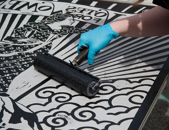
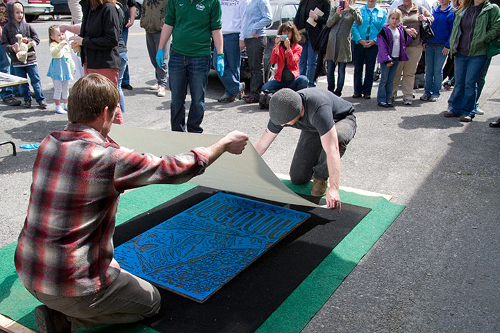
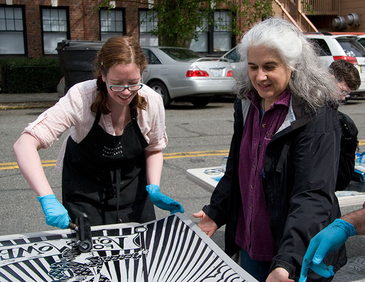
Inked up,

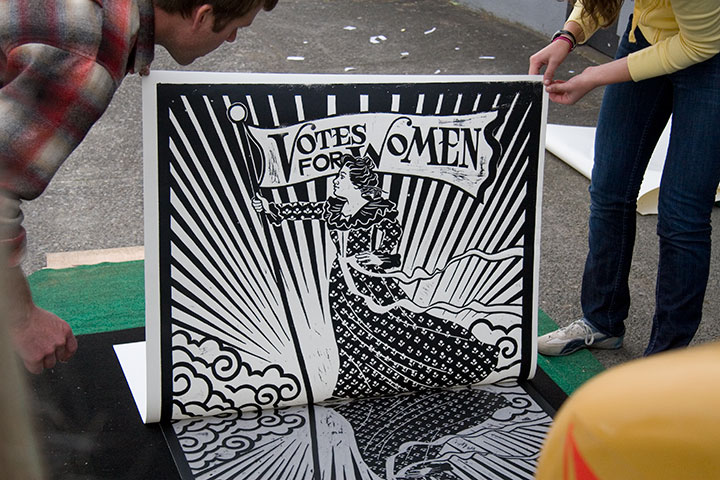
hand-pulled,

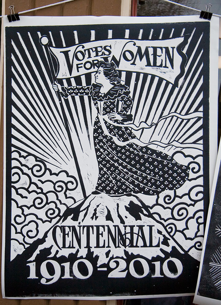
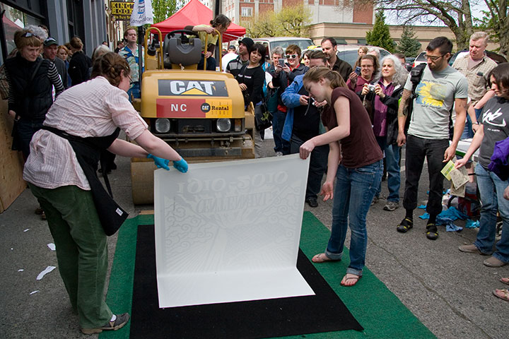
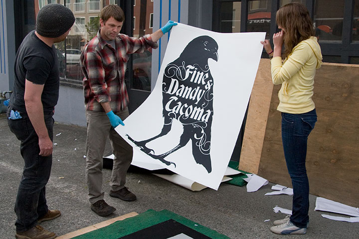
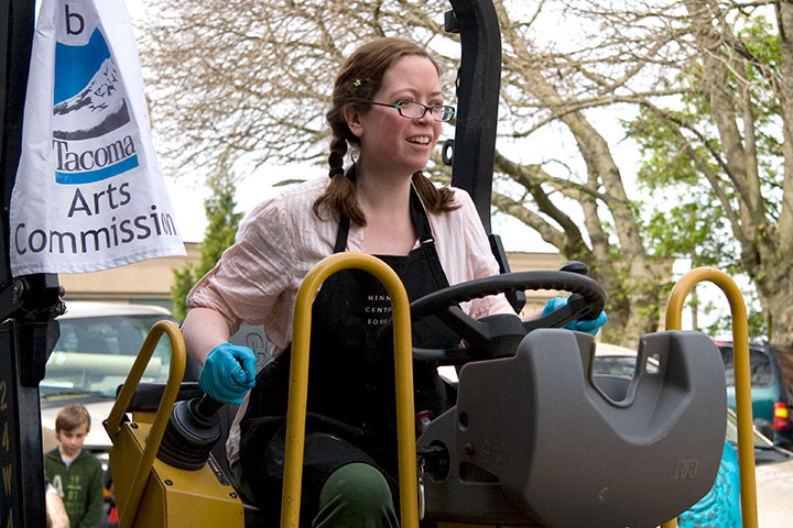
and voilà! Our second collaborative steamroller print, an unofficial Dead Feminist, inspired by Cora Smith Eaton King, who in 1909 climbed Mt. Rainier with a party of Seattle Mountaineers and placed a “Votes for Women” banner at the summit.

This year’s Wayzgoose was the biggest bash yet! We had all the regulars—

who churned out perfection under pressure (no pun intended)—

our beloved ringleader,

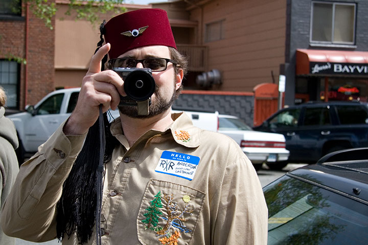
a certain befezzed flavor,

and a whole host of newcomers to round out the experience.

We had an enormous crowd (thank goodness for the good weather!),

and even a few unexpected audience members.

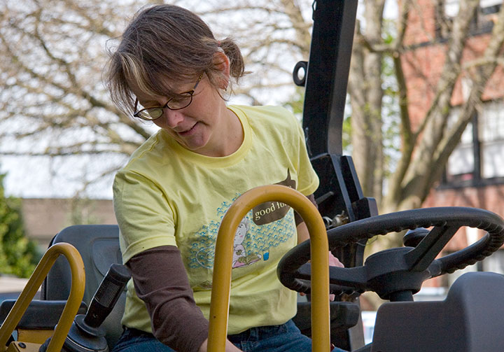
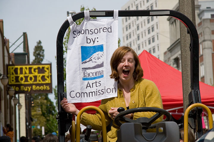
This year I got to try my hand at driving the steamroller,

but I think pretending was plenty enough for this little guy.

Thanks to everybody who stopped by to say hello, or stuck around to lend a helping hand.

And of course, a huge bucket of gratitude to the Tacoma Arts Commission for making it all happen!
One more acknowledgement: photography by Michael O’Leary. Thanks, Dad!
March 8th, 2010

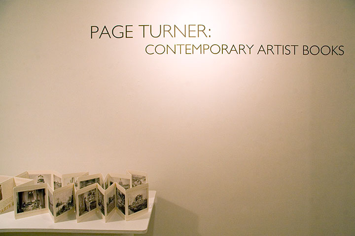
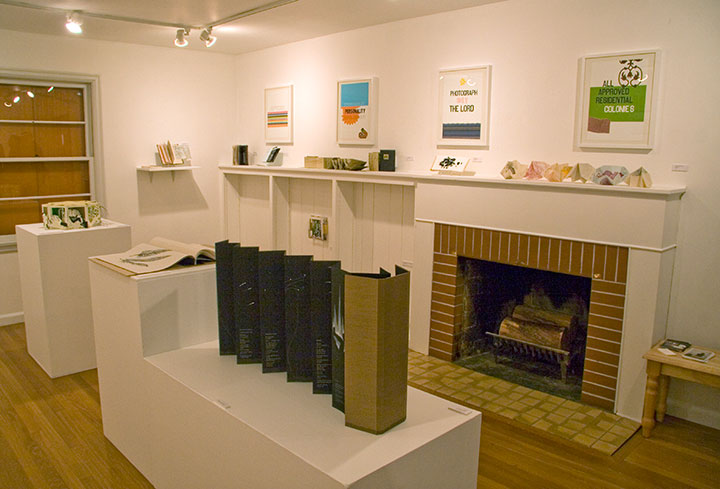
If you ever wanted to find out once and for all what the heck an artist book is, take a little field trip to Burien, WA. The group show Page Turner: Contemporary Artist Books is up this month at the Burien Arts Gallery, a tiny half-Cape house converted into a charming exhibition space.

Kelda Martensen did a stand-up job of curating the show—and artist books aren’t easy to display, believe me. She’s represented a wide variety of work, from prints to traditional bindings to kinetic sculptures, featuring the work of artists nationwide, including Inge Bruggeman, Ken Botnick, Regin Ingloria, Jana Harper, Diana Guerrero-Macía, and many others.

The gallery is open noon to four, Thursday through Sunday, and on Thursday, March 18, at 7 pm, Kelda will be giving a curator’s talk about the work in the show, sponsored by the Book Arts Guild. Free admission, always.

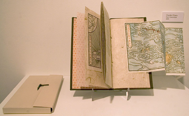
I’ve got a couple of pieces in the show, as well. Above is From Concentrate,

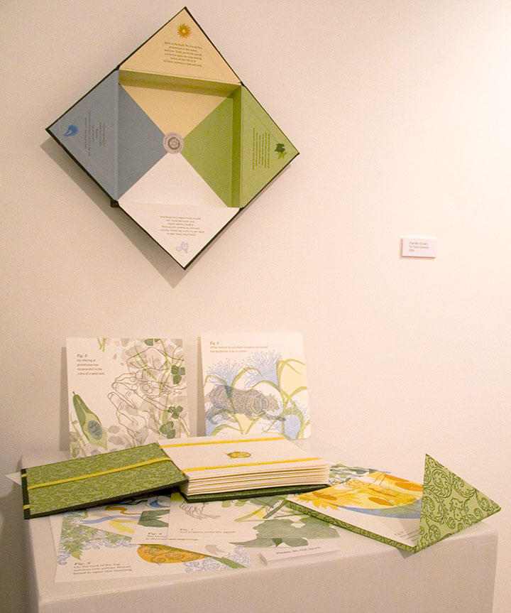
and this is The Faery Gardener.
Here’s the rub, though: the recession has hit all galleries where it hurts, but since the Burien Arts Gallery is run by the city, times have been especially tough there. This will be the last exhibit in the Cape Cod house; and possibly the last ever for Burien Arts, unless they can find public support, funding and a new space. So come check it out before they have to close their doors on March 19 (the website says they’re already closed, but you can still see the show).

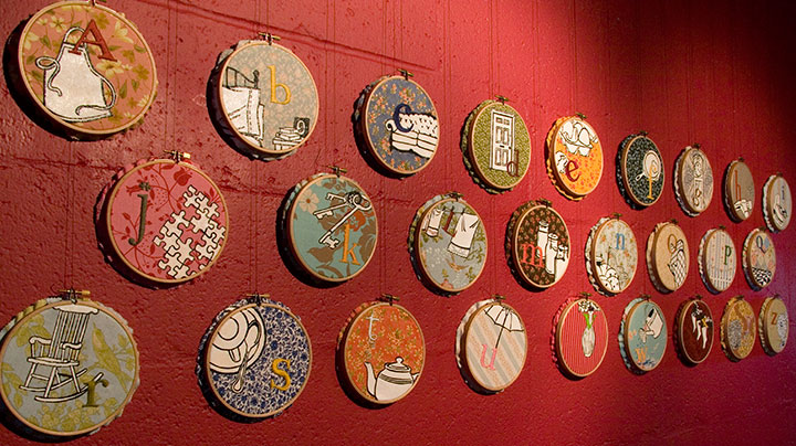
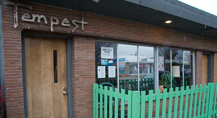
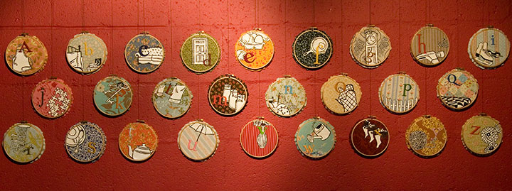
Speaking of artist books, if you missed Mnemonic Sampler at PLU, there’s another chance to catch the series in a new venue, closer to home: the Tempest Lounge, here in Tacoma.

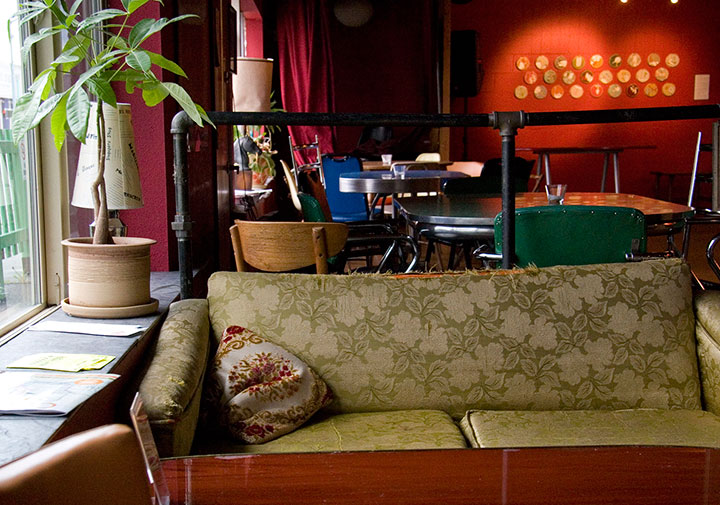
My friend Denise is the owner of the place, and when she asked if I was interested in showing there, I jumped at the chance. Although I love the clean beauty of a traditional gallery space, my favorite exhibition venues are the offbeat ones—restaurants, coffee shops, libraries, and now classy retro bars! I love these spaces because they bring art into real life, and invite folks to feast their eyes wherever they are. Most people (including myself, I must admit) are more likely to step into an eatery or a library than a gallery, and a coffee shop doesn’t have the same intimidating associations that some people have with galleries (that feeling of “If you’re not here to buy, you shouldn’t be here at all”). Plus, at the Tempest you can have a beer or cocktail while you look at the art. You can’t beat that.

If beer isn’t your thing, you can also have a cuppa tea or joe, and the food is divine—Denise runs a classy joint here. So curl up on a retro couch for happy hour, come chat by the adorable green picket fence, or just stop in to take in that fabulous red wall. Mnemonic Sampler will be up through April 30.


![Chandler O'Leary [logo]](https://chandleroleary.com/wp-content/themes/chandleroleary/images/logo.png)

