Lotus blooming
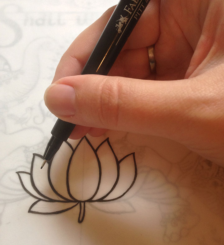
Jessica and I are hard at work on the next Dead Feminist poster—I’m inking flowers and separating colors this week, and then we’ll be on press before you know it. Look for more in the coming weeks…

Jessica and I are hard at work on the next Dead Feminist poster—I’m inking flowers and separating colors this week, and then we’ll be on press before you know it. Look for more in the coming weeks…
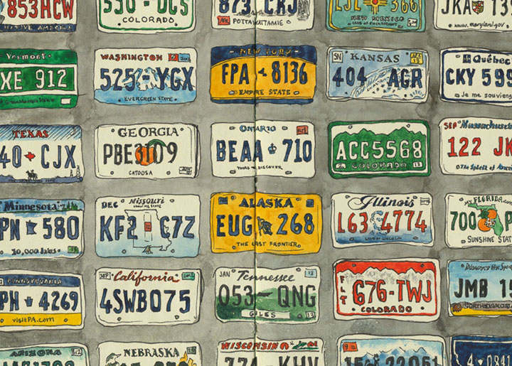
Okay, folks, the countdown is ticking away. The Big Secret Project that I’ve been working on for months is almost ready to share, and it’s going live on Monday morning! (Can you guess what it is?) So check back here for all the details—thanks for sticking with me while I’ve been so secretive.
See you soon…
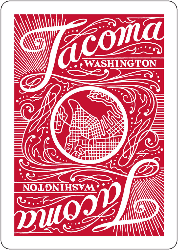
I had no idea we’d get here so quickly, but here we are. It’s been just under a year since we first launched the Tacoma Playing Cards project, and I’m happy to report that we’ve nearly sold out our initial print run of 5,000 decks! And we’ve had so many requests from Bridge players (and other folks who love multi-deck games) that we’re now working on a second deck—this time in red. (No worries if you haven’t snagged your Blue Deck yet; we’re printing a second run of those, as well.)
The overall design will be largely the same, with a few little exceptions (can you spot the difference in the box above?), and I’ll be contributing illustrations for another suite of face cards. But other than that, we’re reshuffling the deck completely—we’ve got 13 new artists on board, and a whole new batch of Tacoma icons to highlight.
Sales from the Blue Deck are funding the new Red Deck, so we won’t be doing a Kickstarter project this time. Instead, we’re taking pre-orders (at a discount!), and the Red Deck will be available in mid-October of this year. And you can already snag archival giclée prints of the Blue Deck artwork—as well as the one-of-a-kind originals.
Look for more sneak peeks later, as I finish my illustrations for the decks. In the meantime…go fish!
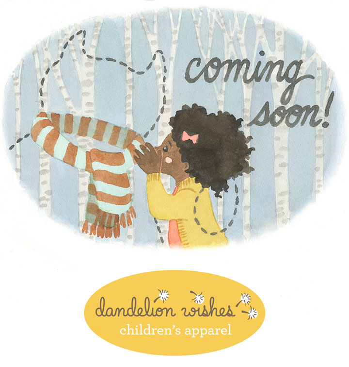
Well, I can finally let you in on the secret, because “coming soon” is about to be switched to “now open.” My friend Susan has spent years building her children’s apparel business, Dandelion Wishes, from idea to brick-and-mortar store—and I’m the lucky gal she asked to help her develop the look and brand of her shop.
Susan is putting the finishing touches on the place, and making sure everything is pitch-perfect for her grand opening this weekend—
while I’m piecing together (literally!) the final visual details.
(I’ll reveal more about that on the blog at a later date; or if you’re local, come to the grand opening and see for yourself!)
Dandelion Wishes isn’t your average kids’ store; this is something really special. Susan has curated a beautiful collection of clothing, accessories and gifts that paints a picture of what she believes in (and so do I): Support independent artisans. Buy local and domestic whenever possible. Choose natural fibers over synthetic ones. Offer the highest quality available. Bring these ideals into affordable balance and you’ll bring good design within reach.
This project was something special, too. I’ve done lots of identity and branding work for clients, but I’ve never had this much free reign before, to help develop the entire conceptual basis for a business. It was so much fun to dive in and really see what I could do.
Since Susan’s shop is so invested in this story, I wanted to create a story out of the shop. Together we invented a world of characters and narratives that make stepping into the shop feel like stepping into a children’s book. Each character has a story and a secret wish, and a personality that fits the different brand stories of the clothing companies Susan carries.
You’ve already met Ruby and her imaginary friend at the start of this post.
And here’s the rest of our quintet. Once we had our full cast of characters, it made building the shop’s collection of clothing much easier. All of a sudden, Susan was piecing together the wardrobes of actual people with personalities and tastes and preferences—rather than just an inventory list in her head.
I loved weaving the stories behind each character—
—and getting to mix actual clothing samples with whatever else I felt like dreaming up.
As the seasons change—
—and so do the kids’ outfits—
we’ll be creating new stories and scenes to go with them. Keep an eye on the shop’s website to watch the tale unfold.
In the meantime, I already find myself thinking of these kids as real people that I know—and wondering what they’d think of each idea I sketch out for the future.
So help Susan make a splash with Dandelion Wishes—if you’re in the Tacoma area, stop by the shop this weekend. And look for an online shop to appear soon.
For now, I’m going to ask Frank what his summer plans are.
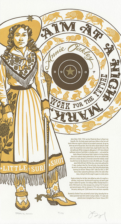
This has not been an easy post to write—and yet in a way it’s been writing itself over and over again, for years now. To be honest, Jessica and I designed this broadside months ago, and planned to release it shortly after last year’s theater shooting in Aurora, CO. Other projects got in the way, and then the 2012 election persuaded us to table the piece for the time being.
We should have known: until there’s serious change in our society, this subject will always be hatefully relevant.
So here we are again, on the heels of yet another rash of terrible violence. But this time feels different—not only because of the sheer horror of the Newtown tragedy, but because at last, our country is having the conversation it needs to have.
At the center of the debate is the precarious balance of right and responsibility—and here’s where I need to keep from shooting my mouth off. I’ve written and deleted a hundred sentences about Jessica’s and my personal thoughts on the subject—but I have a feeling you can already guess what they are. And we also recognize that our beliefs represent just one side of our divided culture. So the thought of pontificating just wearies and saddens us; we’d much rather focus on how we might move forward, together.
For us, that meant starting with an attempt to comprehend the other side of the debate. So in hoping to understand the love of guns many in our country share, we looked to legendary sharpshooter Annie Oakley, whose words pierce the heart of the matter:
Aim at a high mark, work for the future.
This piece is a stark, steely contrast to the bright colors and detailed embellishments of the rest of the series. Annie stands her ground beside a blazing metallic bullseye, representing the golden target of sanity amid the scatter-shot opinions and half-cocked sniping of those on the extremist fringes. And let me tell you: there’s real gold in that ink. Jessica mixes her own formula—maybe it’ll shine all the brighter, and help steady our collective aim.
• • • • • • • • • • • • • • • • • • • • • • • • • • • • • • • • • • • • • • • • • • • • • • • • • • • • • • • • • • • •
Gun Shy: No. 17 in the Dead Feminists series
Edition size: 151
Poster size: 10 x 18 inches
Printed on an antique Vandercook Universal One press, on archival, 100% rag (cotton) paper. Each piece is numbered and signed by both artists.
The edition number we choose for each print in our series is always significant in some way—whether we call attention to it or not. In the case of Gun Shy, we’ve created an edition of 151 prints to represent each person injured or killed in a shooting rampage in 2012. In light of that sobering number, we’ve chosen to donate a portion of our proceeds to Demand A Plan. A campaign of Mayors Against Illegal Guns, Demand a Plan is a national, bipartisan coalition working to make America’s communities safer by keeping illegal guns out of dangerous hands.
Colophon reads:
Annie Oakley (1860 – 1926) was born Phoebe Ann Mosey (or Moses) near Greenville, Ohio. Her Quaker parents raised seven children on their farm until Annie’s father was caught in a blizzard and succumbed to pneumonia. By age ten, Annie was sent to the poor farm, then to live with an abusive family for several years. She escaped back to her mother’s home, taught herself to shoot a rifle, and quickly paid off their mortgage by selling game. In 1875 Annie defeated well-known marksman Frank Butler in a shooting contest — and married him shortly afterward. Annie became Butler’s assistant in his sharp shooting show, but as audiences clearly preferred Annie, the two soon switched roles. Annie was a curiosity, dressed in a homemade costume that modestly covered her petite frame but also allowed her to shoot with athletic grace. The couple joined Buffalo Bill Cody’s Wild West show, where Annie performed for 17 years, traveling to New York, Paris and London. Upon seeing her shoot the wick off a burning candle, the famous Chief Sitting Bull adopted Annie, bestowing the nickname “Watanya Cicilla” (Little Sure-Shot). In 1894 Thomas Edison captured her performance on film at his studio in New Jersey, making her the first cowgirl to appear in a motion picture.
Despite not being from the West, Annie defined our notion of a cowgirl as a self-reliant, strong woman. She advocated for equal pay, and went to great lengths to defend her reputation. She challenged William Randolph Hearst in a series of libel lawsuits over a false newspaper story, winning 54 of 55 cases at great personal expense. After her retirement in 1913, Annie continued to tour the country, teaching over 15,000 women how to use firearms responsibly.
Illustrated by Chandler O’Leary and printed by Jessica Spring, demanding that our federal government enact strict controls to end gun violence.
Available now in the Dead Feminists shop.
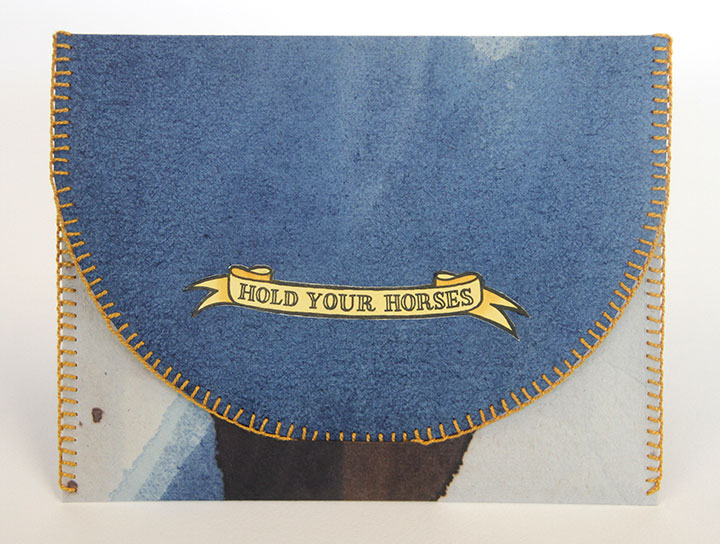
I’m pleased to present my latest artist book, Hold Your Horses.
The book consists of a hand-bound portfolio (in various one-of-a-kind colors) that…well..holds some horses.
I figured it was only a matter of time before I did another print set like I did with the birds.
This time, though, I picked my favorite equine breeds,
took the opportunity to push the envelope of what hand-coloring could do,
and even experimented with some wacky painting techniques.
I’m really happy with how these turned out, and I can’t wait to show them off at Codex in February!
Colophon reads:
I am not a member of the horsey set. I grew up far too poor for riding lessons, and I can’t claim ever to have used the phrase “saddle up” in the literal sense. Yet horses are as much a part of me as of any American who ever looked westward in wonder. They are living symbols of the wildness that still infuses our deepest desires—even if they no longer permeate our everyday culture.
I never had a pony as a child, but now I can boast a round dozen. Enclosed here is my very own horsey set, displayed in an equine rainbow of dapple grays, strawberry roans, pale palominos, skewbald bays and rich chestnuts. This assembly gathers an assortment of traits and histories to tell the story of our fascination with horses. Each mount stands surrounded by the trappings of its trade or the symbols of its origins.
These trusty steeds were letterpress printed and individually hand-painted in Tacoma, Washington—at the very end of a frontier founded on horsepower. Twelve breeds were printed in an edition of 57 impressions apiece; the entire herd is corraled in thirteen saddle-bag sets.
UPDATE (May 2014): a Hold Your Horses set is now part of the permanent collections at both the Phoenix Public Library and the University of Virginia Library! So if you’re local to either of those places, you can go check them out in person!
You’ll find individual horse prints in the shop.
Giddy up!
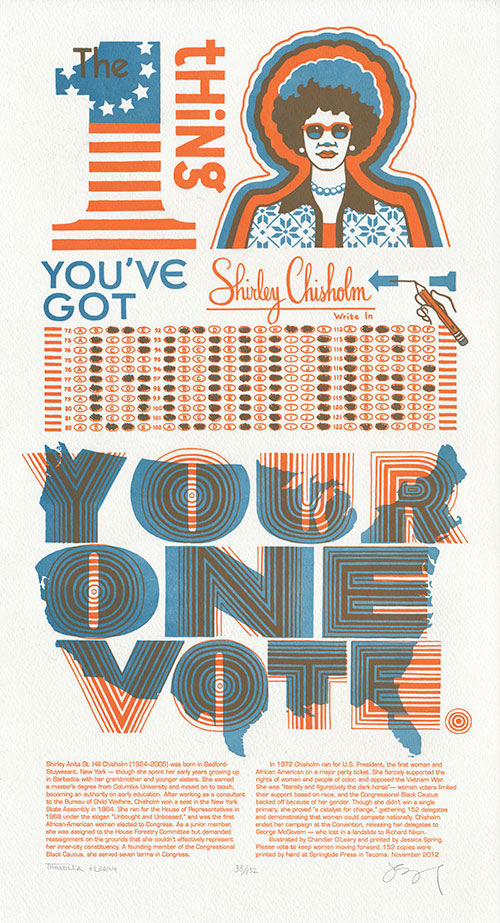
If you have any sort of link to the outside world (television, radio, internet access, newspaper, mailbox), chances are you’ve been unable to escape this year’s deluge of advertising, chatter and glossy-printed recycling fodder—all centered around this coming Tuesday. It’s enough to have even four-year-olds throwing up their hands in frustration. Jessica and I, however, have spent many hours sifting through election material—1972 election material, I mean. To remind us of what’s really important this year (and every year), we turned to the woman who help paved the way for our current President.
The one thing you’ve got going: your one vote. —Shirley Chisholm
Shirley Chisholm was one of fifteen Presidential candidates in 1972. It was a volatile time: the Vietnam War was the center of public discord; movements for civil rights and gender equality were major issues around the western world; and the race came on the heels of the 1968 race—one of the bloodiest election years in American history.
Shirley knew she was a long shot; she even referred to herself as “literally and figuratively the dark horse.” Yet she also knew that to run for President, all that was required was to be a natural-born U.S. citizen of at least 35 years of age. There was nothing in there about being male or Caucasian—and as a member of the U.S. House of Representatives, she was at least as qualified as her fellow candidates. So she ran, because it was her right, and because she knew that if she played it smart and started winning delegates, she’d have some power to leverage.
Shirley sought to create a truly representative government. Rather than a cookie-cutter set of interchangeable politicians running the country, she envisioned an America where each region, economic sector and ethnic group elected one of its own to office. She wanted to see a woman heading the Department of Education & Welfare; a Native American in charge of the Department of the Interior. And as a freshman Congresswoman she was assigned to the House Forestry Committee but refused to serve—how would forest stewardship or agricultural bills represent New York’s inner-city 12th Congressional District?
She also saw her office as an opportunity to encourage women—especially women of color—to get involved in politics. Every member of her staff was a woman, half of them African-American. To say the least, her very presence made her fellow legislators nervous—and on top of everything else, she was probably the only woman of color in the whole country who made the exact same salary as her white male colleagues. (Heck, for people like Yvette Clarke or Barbara Lee, that’s probably still true for the most part. How depressing is that?)
On the national political stage, however, her race and gender were two strikes against her. She gathered support from the National Organization for Women, but when the time came for NOW to officially endorse a candidate, their squeamishness over the possibility of a black nominee overcame their lip service. And the Black Congressional Caucus, of which Shirley was a founding member, threw her under a bus because they couldn’t bring themselves to support a female candidate. To me, that’s the most interesting thing—Shirley Chisholm always said she faced far more discrimination over her gender than the color of her skin.
Still, though she had to battle opposition and prejudice from all sides, she worked to bring people of all stripes together. When her opponent George Wallace (yes, that George Wallace—Mr. “Segregation Now, Segregation Tomorrow, Segregation Forever”) was wounded in an assassination attempt, Shirley visited him in the hospital. They were the ultimate Odd Couple: years later Wallace used his clout among Southern congressmen to help Shirley pass a bill giving domestic workers the right to a minimum wage.
In the end, though she gathered 152 delegates, she knew she’d never snag the Democratic nomination. So she conceded to George McGovern—who went on to win just one state (Massachusetts) in the 1972 Presidential election. Take a look at the electoral college map for that year:
That’s a whole lotta red.
And since this election season marks the fourth anniversary of our series, that map was the starting point for Keep the Change, our new Dead Feminist broadside. I redrew the map in blue, and from there we crafted a period homage to Shirley’s impeccable style and substance.
The 12th Congressional District was one of the areas hardest hit last week by Hurricane Sandy. While the immediate recovery efforts in the city are crucial, we also recognize the importance of serving a community long after the disaster relief efforts have ended. So to help continue Shirley’s long-term service to her home city, we’ll be donating a portion of our proceeds to Bedford Stuyvesant Restoration, the nation’s first non-profit community development corporation. Restoration partners with residents and businesses to improve the quality of life of Central Brooklyn by fostering economic self sufficiency, enhancing family stability, promoting the arts and culture and transforming the neighborhood into a safe, vibrant place to live and work.
In the meantime, let’s do what Shirley did best—cast our vote, and keep fighting the good fight.
• • • • • • • • • • • • • • • • • • • • • • • • • • • • • • • • • • • • • • • • • • • • • • • • • • • • • • • • • • • •
Keep the Change: No. 16 in the Dead Feminists series
Edition size: 152
Poster size: 10 x 18 inches
Printed on an antique Vandercook Universal One press, on archival, 100% rag (cotton) paper. Each piece is numbered and signed by both artists.
Colophon reads:
Shirley Anita St. Hill Chisholm (1924–2005) was born in Bedford-Stuyvesant, New York — though she spent her early years growing up in Barbados with her grandmother and younger sisters. She earned a master’s degree from Columbia University and moved on to teach, becoming an authority on early education. After working as a consultant to the Bureau of Child Welfare, Chisholm won a seat in the New York State Assembly in 1964. She ran for the House of Representatives in 1968 under the slogan “Unbought and Unbossed,” and was the first African-American woman elected to Congress. As a junior member, she was assigned to the House Forestry Committee but demanded reassignment on the grounds that she couldn’t effectively represent her inner-city constituency. A founding member of the Congressional Black Caucus, she served seven terms in Congress.
In 1972 Chisholm ran for U.S. President, the first woman and African American on a major party ticket. She fiercely supported the rights of women and people of color, and opposed the Vietnam War. She was “literally and figuratively the dark horse”— women voters limited their support based on race, and the Congressional Black Caucus backed off because of her gender. Though she didn’t win a single primary, she proved “a catalyst for change,” gathering 152 delegates and demonstrating that women could compete nationally. Chisholm ended her campaign at the Convention, releasing her delegates to George McGovern — who lost in a landslide to Richard Nixon.
Illustrated by Chandler O’Leary and printed by Jessica Spring. Please vote to keep women moving forward.
Available now in the Dead Feminists shop!
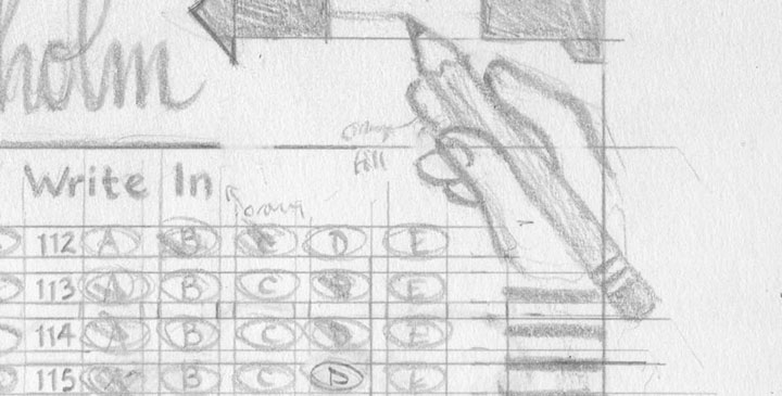
Our pencils are sharp, and our presses are fired up. Jessica and I are churning out our next candidate for Dead Feminist, and she’ll be on the ballot next week. You can catch her online then, or if you’re local, see her first at this weekend’s Studio Tour. Both Jessica and I will be open both Saturday and Sunday, as usual—more info and maps/directions here.
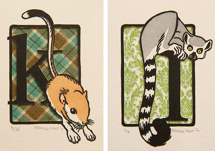
I’ve been asked to take part in another collaborative letterpress portfolio—this time, with the theme of an animal abecedary. Each of the participants gets just a couple of letters in the collection, and I’m happy to report I nabbed two of my favorites. For these prints I experimented with something a little different. They’re hand-painted linocuts, like I often make—but these are hand-cut to reveal a fabric background. I’m pretty happy with how these turned out—now to file away the idea for future use!
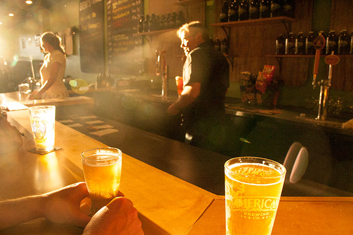
Can’t you just hear the choir of angels singing, “Ahhhhhhhhhhhhh” over a pint right now?
I think that’s how everybody around here felt last month, when my good friends (and veteran restaurateurs) Barry & Renée Watson opened the doors of their newest business, Pint Defiance Specialty Beers & Taproom. I mean, come on—look at that heavenly glow there!
Barry and I share a deep love of all things campy and kitschy—so when he asked me to design the identity for Pint Defiance (which in itself is a top-notch pun on Point Defiance, Tacoma’s famous city park), I think he knew he had me at “hello.” Within about ten seconds we were both cackling over the possibilities of things like faux woodgrain and vintage scout badges.
So I put together a hand-lettered logo based on vintage script and the kind of hand-hewn wooden signs you find at summer camps and state parks.
I knew I had hit on the right theme when I saw Barry’s collection of vintage paint-by-number pieces—which are now hanging proudly in the taproom (this, people, is the perfect illustration of why we are friends).
Because I couldn’t resist ganging up on the Point Defiance joke, I also designed a hand-lettered t-shirt for the shop (which is kind of an inside joke for Tacoma folks, sorry—if you’ve ever been to Point Defiance Park, the place is filthy with raccoons, and there are “Don’t Feed the Wildlife” signs absolutely everywhere).
photo by Barry Watson
Below the asterisk, the fine print reads: “Beer is okay, though.” For the record, Barry came up with that nugget, so don’t send PETA after me!
Whenever I stop by the shop, it still strikes me as thrilling (and a little strange) to see my logo reproduced on a hundred pieces of glassware—
—or lining the wall above the impressively massive cooler.
Best of all, though, is the fact that whenever I stop by, Barry flashes me a smile and hands me a pint of cider (my favorite), before I get a chance to ask. And then I raise a toast to Renée, knowing that their little business is going to be a smashing success. Congrats, you two!