Blog
November 13th, 2009
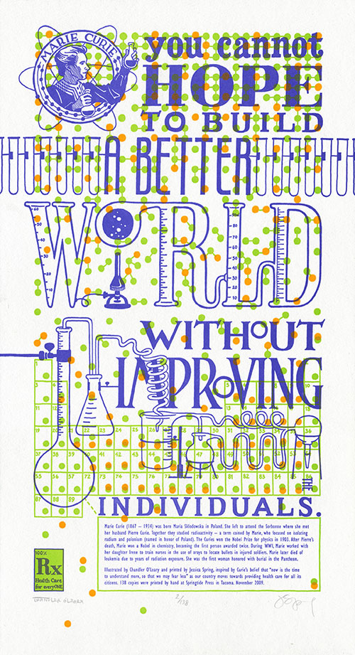
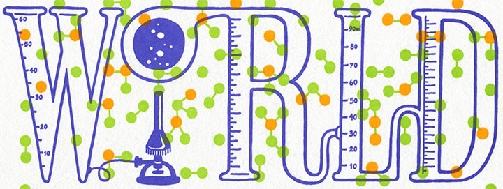
I guess it was inevitable that Jessica and I would veer back into controversial territory eventually—we’re a little ornery, after all (as if you hadn’t guessed). We’ve been sitting on this concept for several months now, and have put it off a couple of times in order to move Thea Foss and Harriet Tubman ahead in the queue. Now, though, the time feels right—or maybe we’re just so upset and keyed up by the issue at hand that we just couldn’t wait any longer. Either way, we’d like to offer our take on what a famous scientist might have had to say about health care:
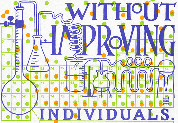
You cannot hope to build a better world without improving the individuals. —Marie Curie
I’ll spare you the ranting and raving that you can find in countless other pockets of the internet (or my house), except for one small, very personal anecdote about this topic. You see, I am self-employed, as a working artist and bona-fide small business owner. And it’s a mighty good thing that I happen to be married to someone with a full-time employer, because when I traded my graphic design day job to go full-time with my business, I also gave up access to health insurance that was anywhere near affordable. So I am on the Tailor’s health insurance, which costs us—wait for it—approximately $650 a month. That’s just to cover me, and I don’t have any “preexisting conditions” (why is it that I always want to say “preconceived notions?”) or other health problems. Since we absolutely refuse to be among the millions of uninsured, remaining able to pay for coverage is our top priority. Except that’s about to get a lot harder, because this coverage—which is provided by one of the two American “non-profit” insurance co-ops, by the way (remember the buzz about those?)—will be increasing by twenty percent come January. I don’t say this to garner attention or sympathy (don’t worry, we’re doing okay) or to ask for advice—merely to illustrate my first-hand experience of the unsustainability of the system. I won’t prolong this post by weighing in on my personal preferences for health care reform, but something, somehow, has to change.

Here’s where Marie Curie comes in. Despite being snubbed and rejected by her peers again and again, Curie devoted her life’s work (and ultimately her own health) to finding answers. And what she found not only changed our understanding of science forever, but also laid the foundation for many of the medical treatments we take for granted today.
In tribute to her tireless efforts, The Curie Cure is a miasma of small details that slide in and out of focus as they compose the “bigger picture.” Each individual atom, printed in fluorescent ink, battles the text for attention—in vivid, radioactive color. The edition size is a nod to Curie’s discovery of new elements (the half life of polonium is 138 days), while the connected scientific equipment illustrates the trickle-down effect of any political action. Above all, the dominating pattern of molecule diagrams serves as a reminder that we’re all in this together.

• • • • • • • • • • • • • • • • • • • • • • • • • • • • • • • • • • • • • • • • • • • • • • • • • • • • • • • • • • • •
The Curie Cure: No. 6 in the Dead Feminists series
Edition size: 138
Poster size: 10 x 18 inches
Printed on an antique Vandercook Universal One press, each piece is printed on archival, 100% rag, recycled paper, and signed by both artists.
Colophon reads:
Marie Curie (1867–1934) was born Maria Sklodowska in Poland. She left to attend the Sorbonne where she met her husband Pierre Curie. Together they studied radioactivity — a term coined by Marie, who focused on isolating radium and polonium (named in honor of Poland). The Curies won the Nobel Prize for physics in 1903. After Pierre’s death, Marie won a Nobel in chemistry, becoming the first person awarded twice. During WWI, Marie, worked with her daughter Irene to train nurses in the use of xrays to locate bullets in injured soldiers. Marie later died of leukemia due to years of radiation exposure. She was the first woman honored with burial in the Pantheon.
Illustrated by Chandler O’Leary and printed by Jessica Spring, inspired by Curie’s belief that “now is the time to understand more, so that we may fear less” as our country moves towards providing health care for all its citizens. 138 copies were printed by hand at Springtide Press in Tacoma. November 2009.
UPDATE: poster is sold out. Reproduction postcards available in the Dead Feminists shop!

November 10th, 2009

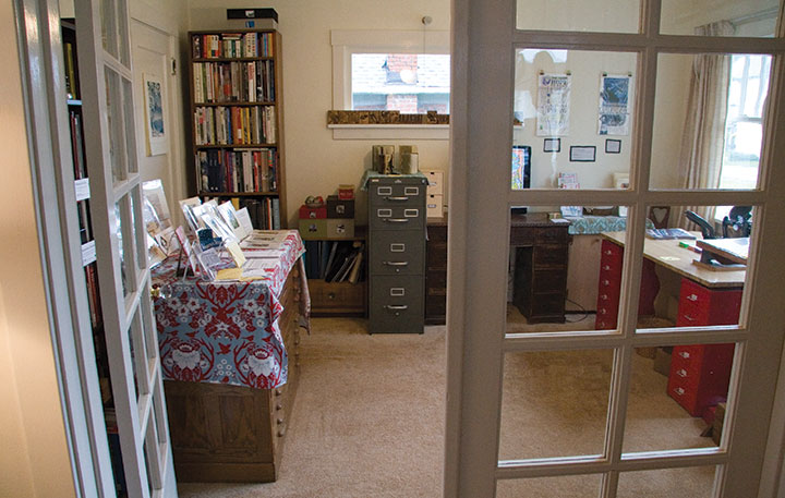
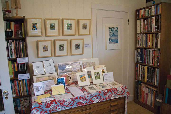
Yowsa! When Tacomans say they’re into art they’re not kidding. Despite absolutely horrendous weather, we had 130 visitors to the studio this weekend! (Hmm…which, oddly enough, is almost exactly the square footage of the space. This is how things looked before that first knock on the door Saturday.)

So a vast, colossal thank you is in order for all of you who braved the downpour and jet-propelled ice pellets to get here, and then shoehorned yourselves into the studio to order prints, start a subscription, get your hands dirty on press, or just say hello (sorry the Tailor’s fabulous cookies ran out so quickly). Friends stopped by for a quick hug, gaggles of kids discovered the joys of printing, and one person immediately ran out and bought her own Kelsey press that very same day (you know who you are!), courtesy of Tacoma’s Antique Row. Lots of people returned the second day, and I lost count of all the newcomers and fresh faces. Everybody came with intelligent questions and thoughtful insight, and I’m just overwhelmed by all the kind words of welcome and encouragement. And as if that weren’t gratifying enough, when we finally closed up shop on Sunday, everything was just as tidy as it was on Friday night—no mud tracked in, no prints out of place, no ink straying beyond the demo table. You people are amazing! Sign me up for next year.

In the meantime there’s still quite a lot of finishing-up to do before the holiday rush consumes my brain (I’m still not over the weird sensation of being on the other end of holiday retail). I’m going to hold onto Marie Curie until Thursday so I can tie up some other loose ends first, so look for it online then.

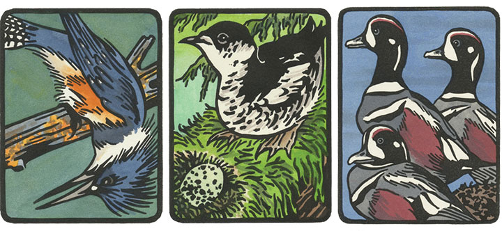
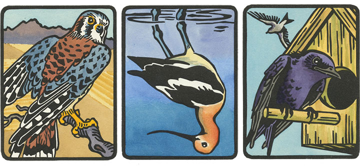
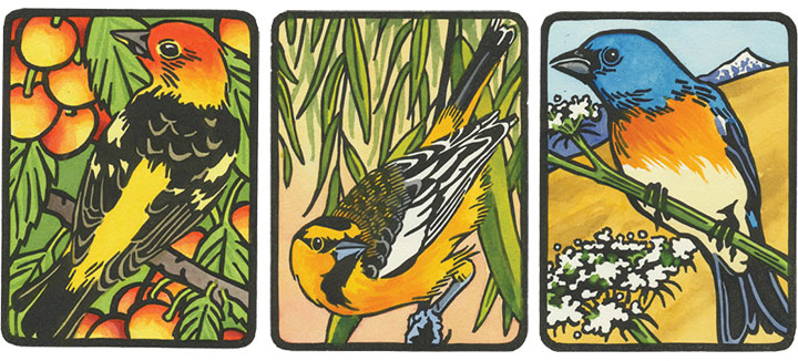
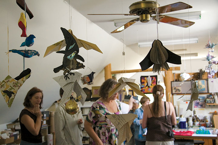
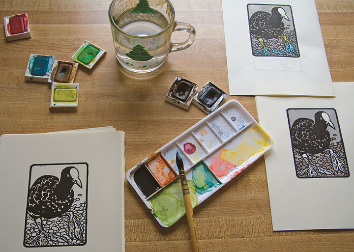
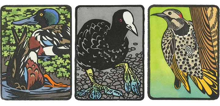
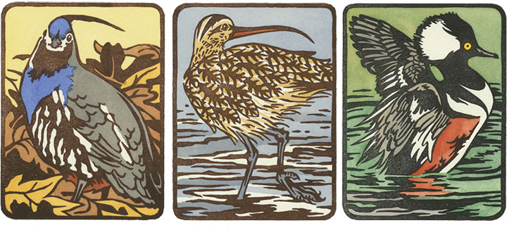
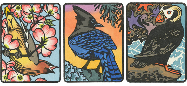
For now, here’s a quick peek of the new birds that were unveiled this weekend. I’m still finishing up the editions (you should see my little watercolor assembly line), so if you placed an order at the studio tour, I’ll be contacting you in the next couple of weeks.

If you’re local but you missed out on the tours this weekend, these little guys will be available at the next Tacoma is for Lovers Craft Fair, held at the inimitable King’s Books on Sunday, November 22, from noon to 5 pm. And for the online world, I’m posting them one-at-a-time, every couple of days in the Etsy shop—just so I don’t get too far ahead of myself!
November 5th, 2009

One of the biggest highlights of Tacoma’s annual Art At Work Month is the huge, city-wide Studio Tour circuit, when artists of all stripes (painters, sculptors, printers, photographers, dancers, weavers, jewelers, glassblowers, etc.) open their work spaces to the public and share their processes and products. This year (the eighth year of the event!) there are 39 stops on the tour, and yours truly is joining in on the fun.

I’ll be firing up the little Kelsey press, so stoppers-by can print their own keepsake and catch the letterpress bug (watch out, it’s contagious!),

and I’ll have lots of sketches, layouts, tools, and other process materials on display. This is the best part for me, since letterpress and artist books always bring up a lot of questions, and this time I’ll have plenty of visual aids at hand.

(Stuffed owlets by Mirka Hokkanen, another studio tour artist!)
And since the holidays are just around the corner (or already here, if you believe the Christmas muzak blaring at the grocery store; I proudly promise that Anagram Press will be a carol-free zone), there will be all kinds of goodies for sale, including a boatload of brand-new items. I’ll have copies of the Art At Work poster, a preview of nine (!) new bird prints and several holiday card designs to pre-order, and the unveiling of the newest Dead Feminist broadside. Jessica and I are featuring Marie Curie and the issue of health care this time—but that’s all we’ll share for now. Look for photos and details online next week, but if you want a head start and first pick, you’ll have to come to the tour!
Jessica will be on the tour circuit, too, at her magnificent studio Springtide Press—where she’ll be manning the Vandercook, churning out all kinds of surprises.

So grab an umbrella, ’cause it’s going to rain (are you surprised?), and take a walk around the neighborhood—Anagram Press and other participating studios will be open from 10 am to 4 pm, this Saturday and Sunday, November 7 and 8. And best of all, the event is free and open to everyone! This is my first time participating in the Studio Tours (Alec Clayton from the Weekly Volcano included me in his list of “must-see studios,” so now I’m officially nervous), so please bear with me while I work out the kinks of hosting a hundred or so guests in my little space—I’ll do my best not to run out of munchies or keepsakes. Come on by and say hello.
October 2nd, 2009

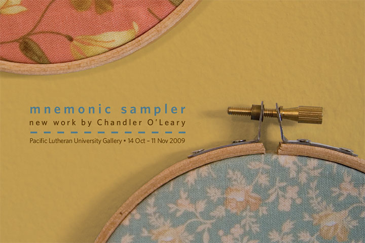
Finally, something tangible to show you! This is the point where all of the elements for my new body of work are just starting to come together. The past couple of months have been somewhat of a nail-biter—sometimes I wonder what possessed me to create twenty-six new pieces for a last-minute show. Now that the promo postcards (see above) are in hand and I can see the finish line, however, I can tell that my instincts knew what they were doing.
Mnemonic Sampler is my new solo show, opening October 14 at the PLU University Gallery. Here are the details:
Mnemonic Sampler: An Abecedary by Chandler O’Leary
October 14 to November 11
University Gallery, Ingram Hall
Pacific Lutheran University, Tacoma, WA
Opening Reception: Wednesday, October 14, 5-7 pm
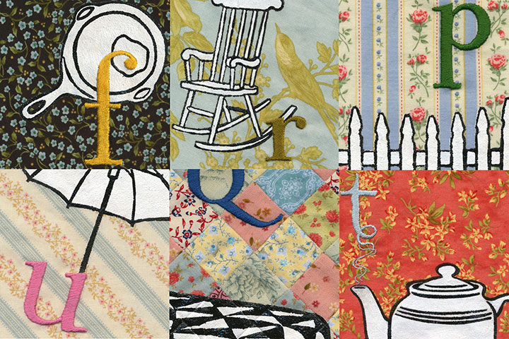
On display will be something of a room-sized artist book, consisting of twenty-six hand-embroidered monoprints on calico (a monoprint is the opposite of an edition, a one-of-a-kind piece). Together the prints form an abecedary, or alphabet, and tell the story of how our concepts and ideals of “Home” are linked to the everyday objects that surround us. More on this topic when the show opens, but for now, here’s a peek (since the work is not quite finished, a peek is all I’ve got for now):

Many, many thanks to the talented and infinitely helpful Katie S. at PLU, who took care of having show postcards printed and mailed (!), orchestrated every logistic detail, and who has made the whole process as smooth as pumpkin pie. I would have long since lost my mind if it weren’t for you, Katie!

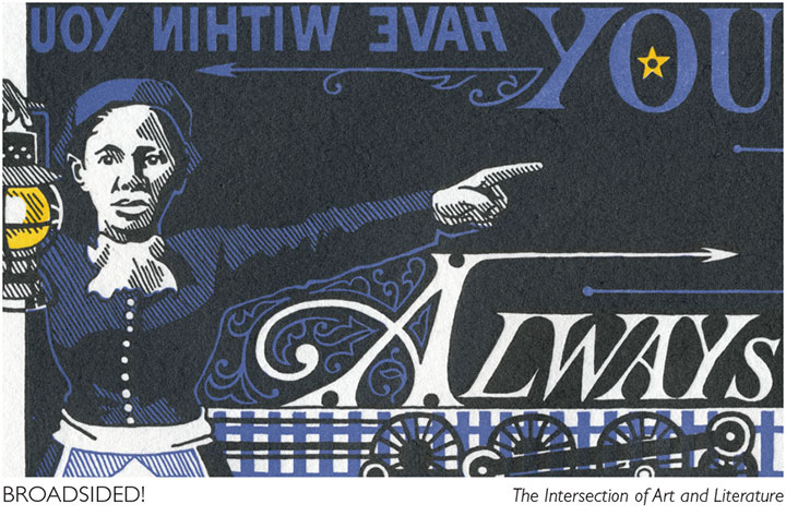
Speaking of amazing women who run galleries, another big thank-you and shout-out to Laura Russell of 23 Sandy Gallery in Portland, for featuring End of the Line on the promo materials for another new show that opens tonight. Broadsided! is national, juried exhibition of letterpress broadsides featuring the work of thirty-four artists. Here are the details from the 23 Sandy website:
Broadsided! The Intersection of Art and Literature
October 2-31, 2009
23 Sandy Gallery
623 NE 23rd Avenue
Portland, OR 97232
Opening reception: Friday, October 2, 6-9 pm
Before books, before blogs and before broadcasts, there were broadsides. Historically, single sheet broadsheet posters were ephemeral in nature. They were developed in the fifteenth century for royal proclamations, official notices and even advertisements. Today, broadsides hang at the intersection of art and literature. Letterpress printed broadsides are valued as fine art designed and printed by a true craftsperson; but also as fine literature featuring stellar poetry or prose.
The best part about the Broadsided! exhibit is that you don’t have to be local to see it! Laura has set up a fantastic online catalogue of the work in the show, with photos and the complete text from each broadside. Nothing beats seeing art in person, of course, but if you can’t make it to Portland this fall, this is a brilliant alternative.
September 25th, 2009

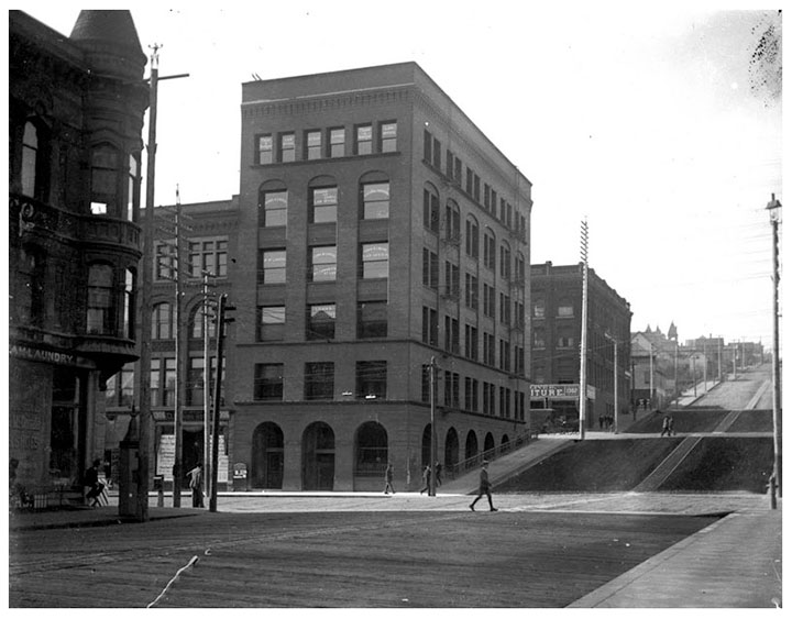
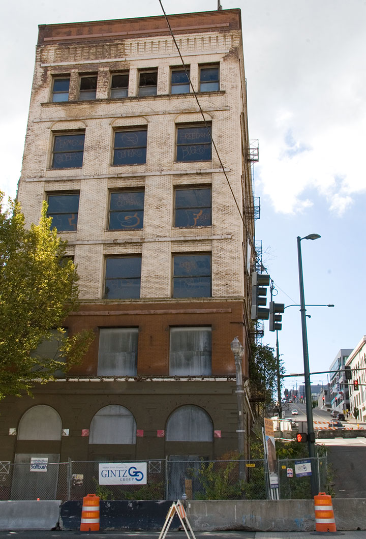
For the past several months, the buzz here in T-town has centered around the Luzon building on Pacific Avenue, a 119-year old structure that, depending on whom you ask, is either an architectural gem or a decaying eyesore. (As you can probably guess, I fall into the first category.) Above is an image of the Luzon in its infancy; this photo is printed from a turn-of-the-century glass plate negative found in Jessica Spring’s attic (and is part of her artist book, Parts Unknown). The thing about the Luzon that has made it such a sore spot around here is that it’s not just a living piece of history—at the time it was built, it was something of an engineering marvel. Co-designed by Daniel Burnham, who went on to design the Flatiron Building in New York and became one of the pioneers of modern multi-story structures, the Luzon was one of the first buildings in America to have steel columns. That makes it a direct ancestor—the great grandpappy, if you will—of the American skyscraper itself.

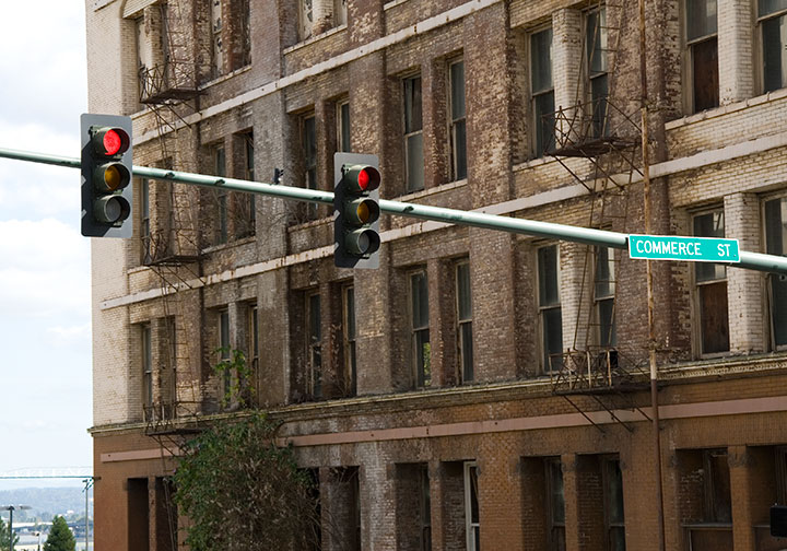
This is the sorry state of the Luzon today. Even though it is on the National Register of Historic Places, and is one of only two Burnham & Root buildings remaining on the West Coast, it has been allowed to decay, apparently beyond the point of no return. While each of many redevelopment schemes over several decades has fallen through, the building has become increasingly derelict. Now that the adjacent property—which provided structrual stability—is long gone, the Luzon is crumbling under its own weight. The City has even closed the surrounding streets in case of a collapse.

Oh, and there’s a tree growing out of it. I don’t think that was part of the original plan.
Well, whether it was a ploy to get around the Historic Register for a development scheme, or the powers that be just dragged their feet for too long (or some combination thereof), the detractors are finally getting their wish. The building is slated for demolition tomorrow morning. So now everyone (including me) has got the Luzon on the brain.
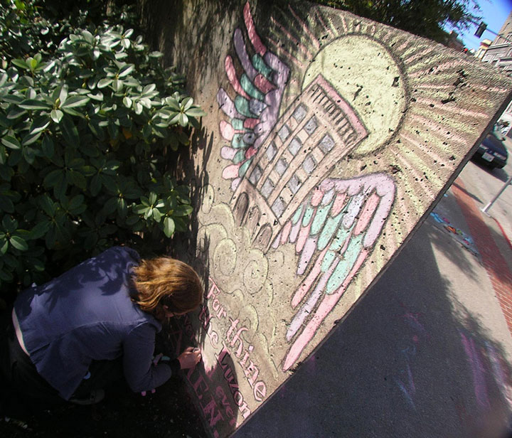
Last week the inimitable artist/cartoonist RR Anderson (who has a few choice words himself about the Luzon’s fate) challenged me to compete in his weekly sidewalk chalk contest, the Frost Park Chalk Challenge. I was looking for an outlet for my Luzon frustration, so I accepted. I grabbed a hunk of charcoal, a handful of communal Crayola chalk, and headed for a highly visible chunk of concrete wall to create a public altarpiece.

Photo by R.R. Anderson
My little Ascension doodle earned me a lot of comments from passers-by and the title of BEST ILLUSTRATOR IN THE UNIVERSE (OF TACOMA) for the week (thanks, guys!).
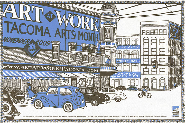
But sidewalk chalk isn’t exactly archival, and I wanted to make a somewhat more lasting statement. Here’s where letterpress comes in. Jessica and I were commissioned to design and print this year’s poster for Art At Work Month, hosted by the City. So since the theme for the overall Art At Work design this year is “ghost signs,” we decided the poster would be the perfect opportunity for a little cameo.

The original posters are letterpress printed in an edition of 100, and will be sold by the City in November, as part of the festivities. But a reproduction will also be inserted into every Art At Work brochure—over 10,000 of them. So come November Burnham’s gift to Tacoma will be long gone, but it’ll feel good to know that we did our part to make sure the Luzon is everywhere we turn—at least for a little while longer.
Edited to add: now that Art at Work month is over, you can now find the last few copies of the letterpress poster in the shop!
August 14th, 2009

For nearly a year now, the Dead Feminists series has given us an outlet for both our aspirations and frustrations. For every social and political victory, there follows a reminder of how divided we are as a culture. We were so proud to see Victory Garden become a part of a nation-wide movement toward sustainability—but a movement and a majority are not the same thing. We are delighted whenever a customer tells us that Prop Cake is meant for a wedding gift—but are heartbroken by the reminder that for many people, the gesture can only be symbolic. Yet through it all we remain optimistic that art can make a difference—that a bright future is out there, somewhere, and that we can help find the way to it.
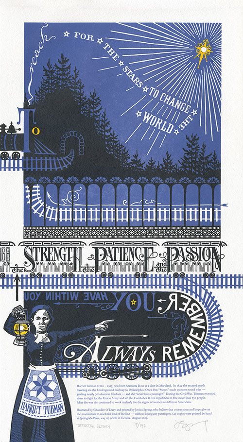
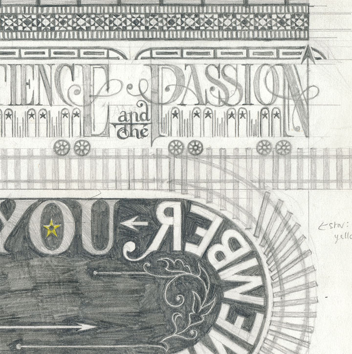
Always remember you have within you the strength, the patience and the passion to reach for the stars to change the world.
— Harriet Tubman
This is why we chose Harriet Tubman for our latest piece. There are so many pressing issues vying for our attention—war, the economy, healthcare, the environment, transit, equality, etc.—that we couldn’t choose just one. So we decided to focus on the journey itself. For all the ground we’ve gained in our country’s short history, we have a long, long way to go—and the only way we’ll get there is together. Harriet Tubman knew that when she fought for freedom and civil rights, and she devoted her entire life to the idea.
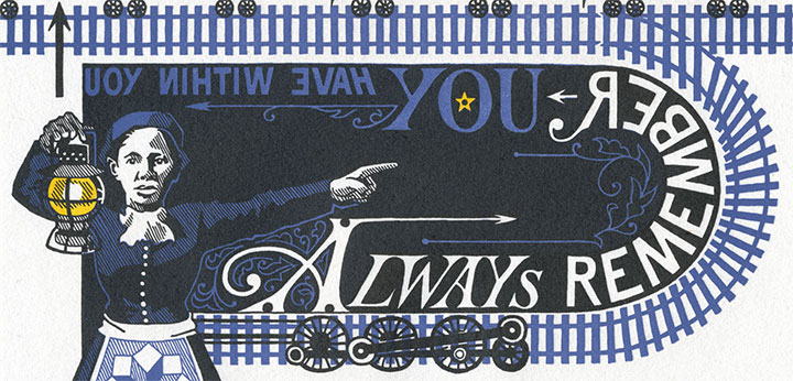
So here, submitted for your approval, is End of the Line. As always, everything—from the illustrated lettering to the letterpress printing—is done completely by hand. This time, though, we’re asking you to flex your reading muscles a bit: to symbolize the difficult journey faced by anyone with a great task, we made it somewhat of a challenge to read.

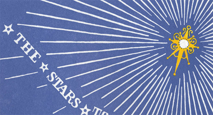
Don’t worry, though—Harriet is there to guide you. Just follow her lantern, and you’ll find the right path. If you lose your way, just look for the Drinkin’ Gourd.
• • • • • • • • • • • • • • • • • • • • • • • • • • • • • • • • • • • • • • • • • • • • • • • • • • • • • • • • • • • •
End of the Line: No. 5 in the Dead Feminists series
Edition size: 146
Poster size: 10 x 18 inches
Printed on an antique Vandercook Universal One press and hand-colored with watercolor. Each piece is printed on archival, 100% rag, recycled paper, and signed by both artists.
Colophon:
Harriet Tubman (1820 – 1913) was born Araminta Ross as a slave in Maryland. In 1849 she escaped north traveling via the Underground Railway to Philadelphia. Once free, “Moses” made 19 more round trips—guiding nearly 300 slaves to freedom—and she “never lost a passenger.” During the Civil War, Tubman recruited slaves to fight for the Union Army and led the Combahee River expedition to free more than 750 people. After the war she continued to work tirelessly for the rights of women and African Americans.
Illustrated by Chandler O’Leary and printed by Jessica Spring, who believe that cooperation and hope give us the momentum to reach the end of the line—without losing any passengers.
UPDATE: poster is sold out. Reproduction postcards available in the Dead Feminists shop!

August 12th, 2009

Jessica and I are almost ready to unveil the next Dead Feminist broadside! The ink is drying as I speak, so End of the Line will be available this Friday, August 14. For now, this is just a taste. Brush up on your mirror-reading skills, because this one is going to be a challenge. Stay tuned!

July 20th, 2009

I serve on the board of the Book Arts Guild, a group that started as little gathering place for like-minded souls in the Pacific Northwest. It has since spiraled outward to include hundreds of members in all corners of the art form and the country—and suddenly thirty years have gone by. On Saturday fifty or so of us got together to celebrate the occasion at the Stern & Faye “Printing Farm” in the Skagit Valley.

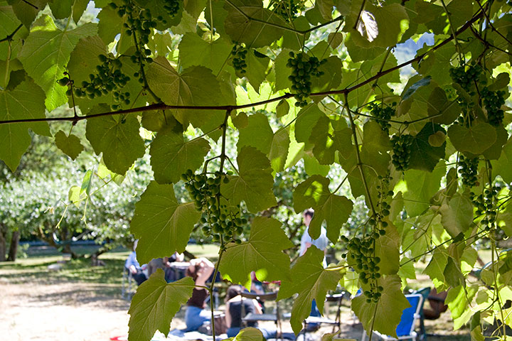
We couldn’t have asked for a better day—I could have stayed all afternoon in the orchard, chatting with kindred spirits.

I had heard so much about the studio, however—so while most of the group was drawing for prizes in the loft,

I wandered downstairs to do a bit of exploring.

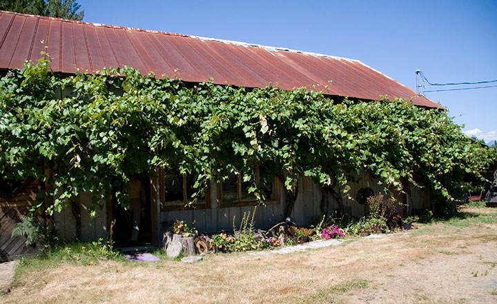
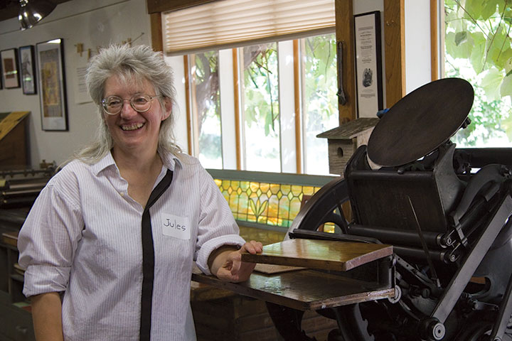
This is Jules Remedios Faye, “Proprietrix” of the Farm. She and her husband, Chris Stern, moved to the Skagit Valley fourteen years ago and turned an old barn into a letterpress printer’s dream.

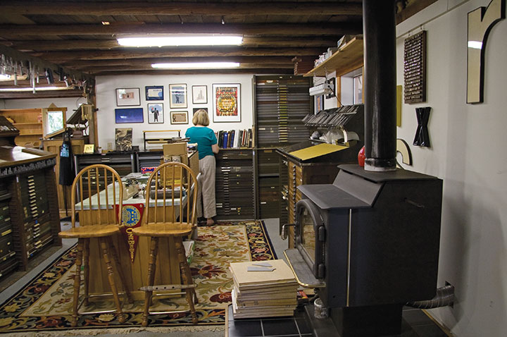
The space is at once cozy and seemingly never-ending,

serving as both a working studio and a living relic.


The place is chock-a-block with tools, type and ephemera, and functions as a type foundry as well—one of a small and dwindling number remaining in the U.S. these days.

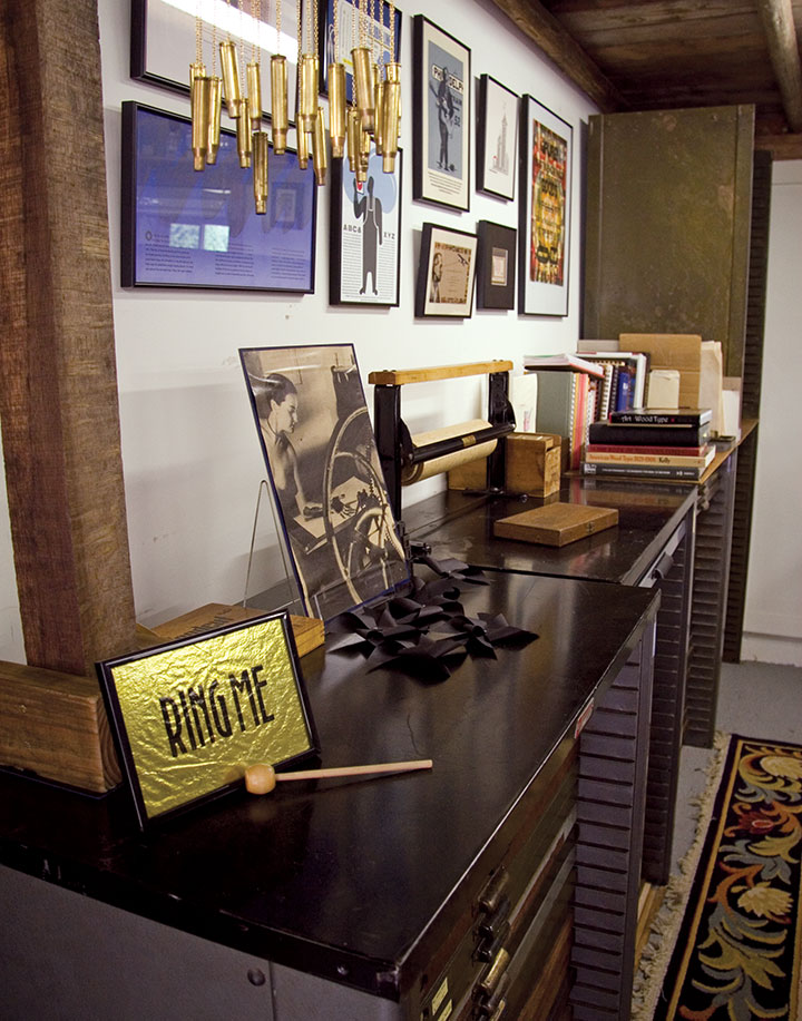
After Chris passed away in 2006, Jules was forced to scale back the studio a bit to continue managing it alone. The barn is still very much alive, though—the walls are festooned with prints, and evidence of well-loved and continuing use is all around. It feels like their space, not just hers.

His presence is everywhere—a fitting memorial.

The Printing Farm was the absolute best-possible place to celebrate the anniversary of the Book Arts Guild. It served as a touching reminder that no matter how far into the past our roots go, no matter who has gone before us or what new trends have appeared, we’re still here—still breathing, still practicing, still creating.
After all, that’s what we’re here for.
June 21st, 2009

There’s some serious gear-shifting going on in the studio these days. Prop Cake and Tugboat Thea are sold out, and the Woolworth Windows murals are white walls again, ready for the next artist to transform the space. I’m preparing to teach a letterpress class at the School of Visual Concepts next month, and I’m working on a new artist book (more on that topic later). I feel like I’m in that tiny, transitional moment between exhale and inhale.

So what better way to use that breath of time than to slow down and do some carving?

In the free moments between my other projects, I’m also working on a new print series that’s got me all a-flutter.

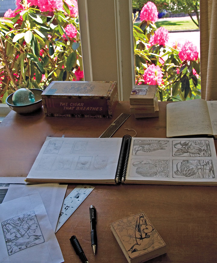
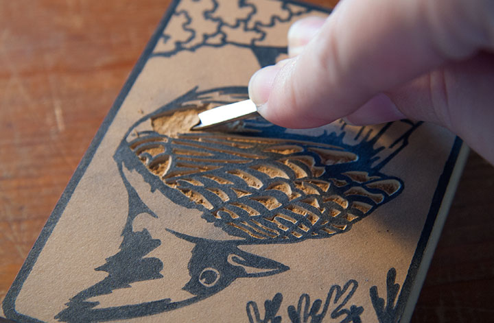
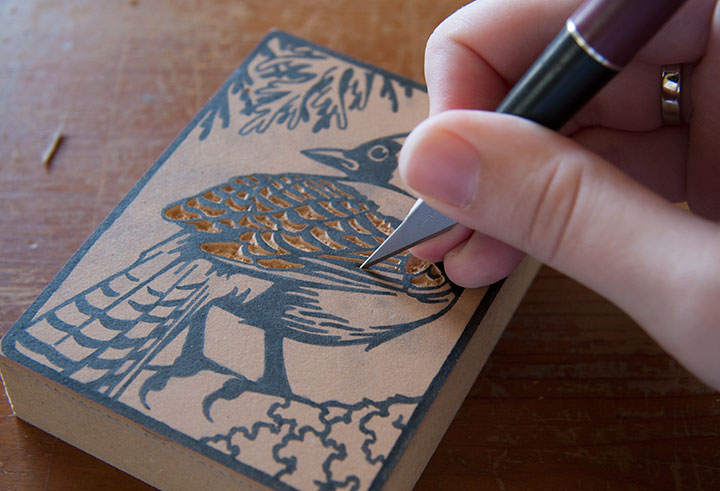
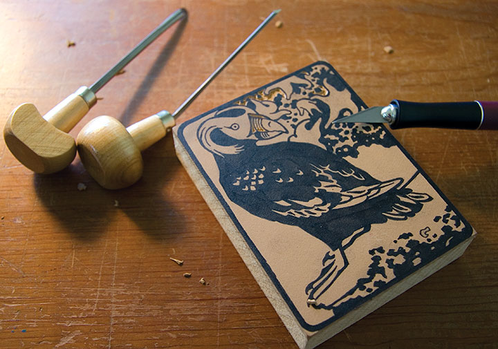
I love getting back to basics, and enjoying the simple mechanics of drawing, carving, and printing images. No fancy photopolymer plates this time—just ink, paper, watercolor, and good old-fashioned linoleum blocks.

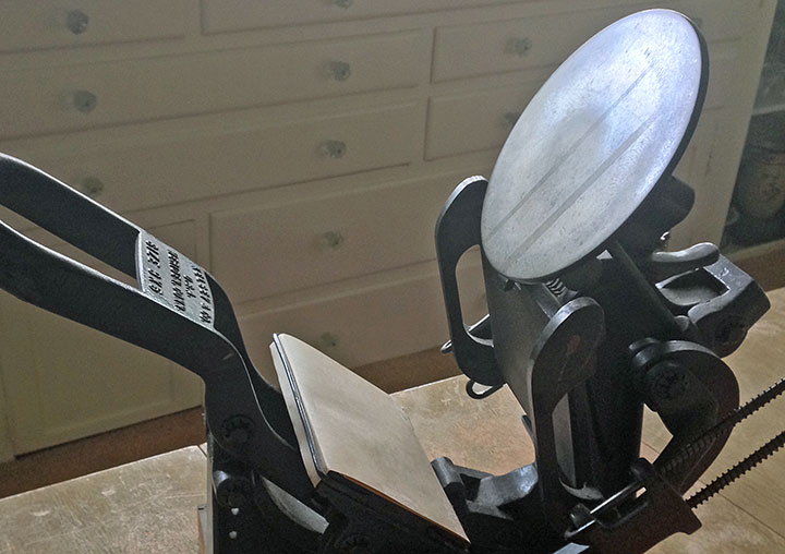
What started as an excuse to get my little Kelsey tabletop press in working order—

—has turned into a budding interest in birding. There is a stunning array of avian wildlife in my state, and I’m only creating a tiny illustrated cross-section of what’s out there.

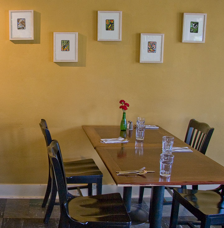
The suite tweet of prints is called Flock, and the first nine are currently on display at the Rosewood Café in Tacoma until July 31.

Here’s a closer look at ’em.

Each print is a hand-colored linocut, printed in an edition of 25. There will be 25 birds in all, and at the end of the series, there will be ten handmade boxed sets—each containing all 25 birds.

I’ll be printing the rest of the birds in the coming months, and the Flock box sets will be finished sometime next year—eight of the ten sets are spoken for already, but if you’re interested, feel free to drop me a line. I’ll just be here in the studio, happily chirping, cawing, quacking, and twittering away.
May 16th, 2009

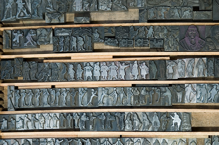
When it comes to letterpress printing, process is everything. And since that process is not always evident in the final product, I thought I’d share the technical aspects of the Dead Feminists series. Now, as I said in the last post, letterpress printing is traditionally done using metal or wooden type—or in the case of the photo above, relief images cut into type-high (.918 inches in the US and UK, in case you wondered) blocks. What Jessica and I have been doing, however, ain’t your grandpa’s letterpress. Thanks to a fairly new technology called photopolymer, we’re able to create our own relief plates right in the studio, without having to carve a block by hand or etch a plate with nasty chemicals. Photopolymer has also created a bridge between the traditional print shop and the modern digital world—as you’ll see in a moment. As far as the Dead Feminists go, Jessica and I still have both feet firmly planted in the traditional world—we just dip a toe into the digital realm now and again. Here, let me explain.

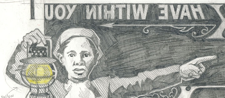
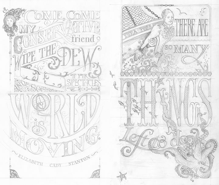
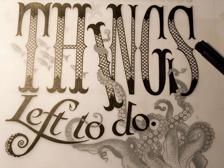
This is how it begins for each print: a pencil drawing, at full size. This is the stage where I not only design and illustrate the piece, but also start thinking about color choices: what the colors will be, what element will be which color, where the colors will overlap, how to make things work logistically. Now, this pencil layout isn’t enough to make a plate; for the photopolymer process to work properly, I have to translate the sketch into a solid black-and-white ink drawing.

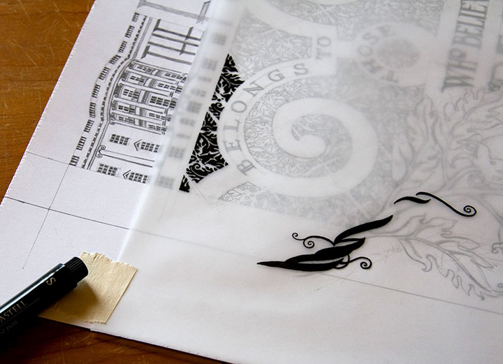
After everything is pencilled in, I lay a sheet of vellum over the drawing and trace everything in ink.

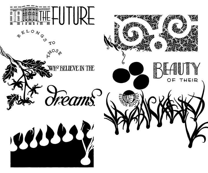
Since each broadside is printed in two colors, each color means a separate run through the press. So as a result, I had to trace each color separately—being careful to stay as true as possible to the original drawing, since the colors had to line up exactly on press. If you were to line these two color separations up, on top of one another, you’d see how the colors will interact in the final piece.


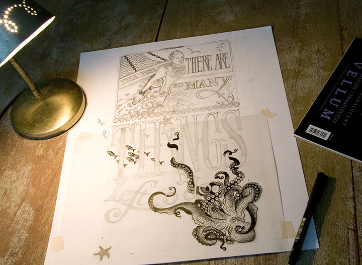
Here’s what I mean. You can see the separation that will become the grey color in Tugboat Thea here, laid directly over the inked octopus below. This is definitely the old-fashioned way of doing things; there are plenty of digital methods of color separation. I guess I just prefer the physical connection between the pen and the hand—even despite the greater risk of screw-ups (as you can see if you look closely at the word “to” above).

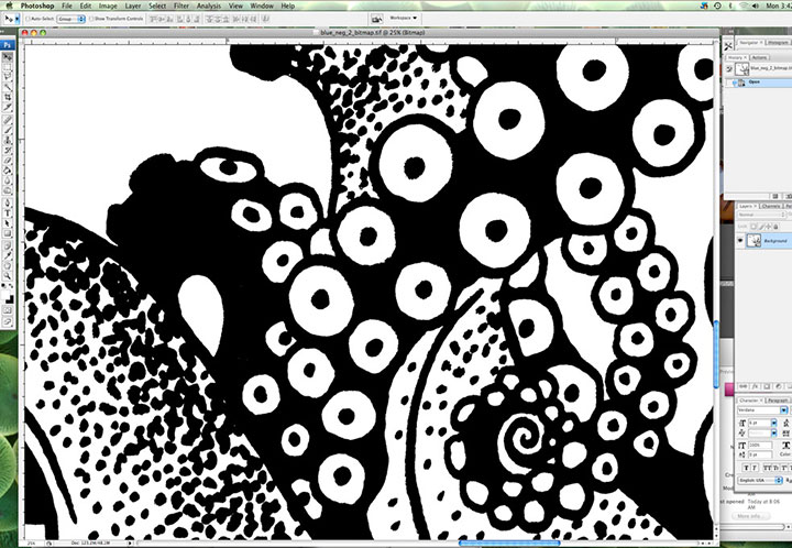
Here’s where I dip that toe into digital waters. Once I’m finished inking, I scan the finished line drawings at a super-high resolution and load them into Photoshop. This is where I clean up any mistakes (ahem) and convert the drawings into bitmap (pure black and white, with no grey) files. Jessica sends me her written colophon, and I set the text digitally. Then I export everything to the proper file type, and send the files to a local service bureau to have film negatives made. So now we’ve gone from analog to digital and back again.

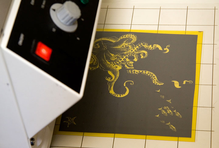
Here are the negatives for Tugboat Thea; grey separation on the top half of each one, teal on the bottom. As you can see, there aren’t any right angles in the bottom half (octopus) of the teal separation, so if you look closely you can see the little tick marks I added (above and to the right of the starfish) to aid with color registration. Those marks line up with a grid etched on the metal base we use to lock up the plates on press; once we had the plates exactly where we wanted them, I simply shaved those little tick marks off with an Xacto knife, so they’d no longer print. Real slick.

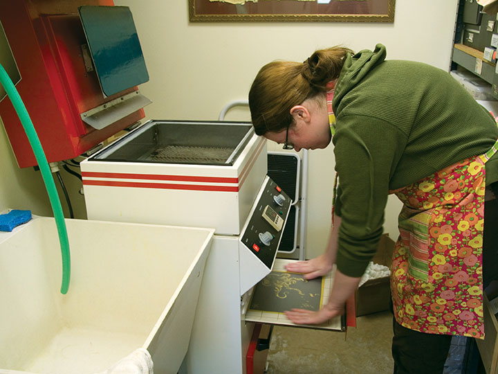
Anyway, photopolymer is a light-sensitive plastic that works just like making a contact exposure in a darkroom does. First I take a negative, place it face-down on an unexposed plate, and load both pieces onto the exposure tray of Jessica’s platemaker (which looks remarkably like an Easy-Bake Oven).

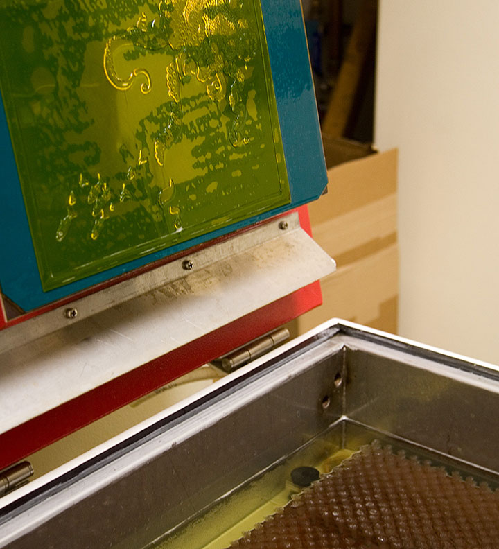
The negative is held flush with the plate by a layer of plastic and a vacuum system; the plate is exposed with UV light (some DIY enthusiasts also accomplish this using glass and a bright, sunny day, but photopolymer is awfully expensive to use in sketchy experiments in the cloudy Northwest).

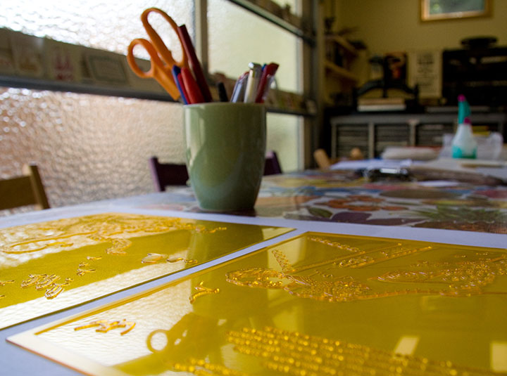
Next I place the exposed plate in the wash-out unit, where it is scrubbed gently with soft bristle brushes in a tank of cool water. Everything that is exposed is hardened enough to resist scrubbing, while everything else dissolves away. (And turns the water a sickly shade of yellow. Mmmm….plastic byproducts. Still, it’s less toxic than many other printmaking techniques.)

What we’re left with is a raised plate ideal for relief printing. The real benefit of photopolymer is that it can reproduce nearly any image, and can hold an incredible amount of detail. I can transfer my drawings directly to the plate, without adding the laborious step of carving the image into wood or linoleum (backwards!), or etching copper with acid, for example. It’s not exactly an economical option for letterpress printing, but the results can be exquisite, and the possibilities are nearly endless.

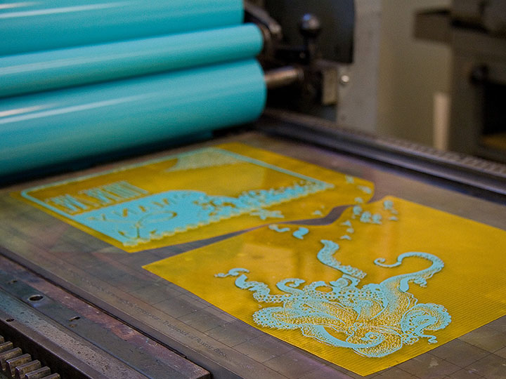
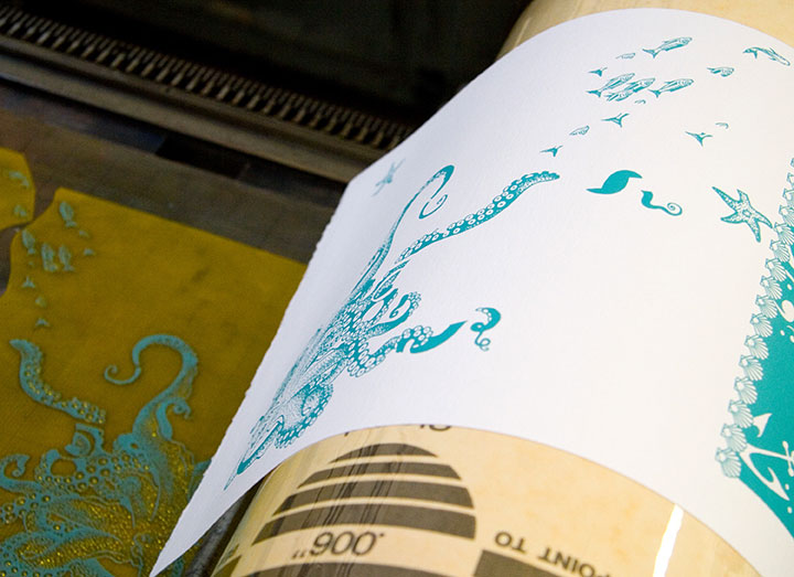
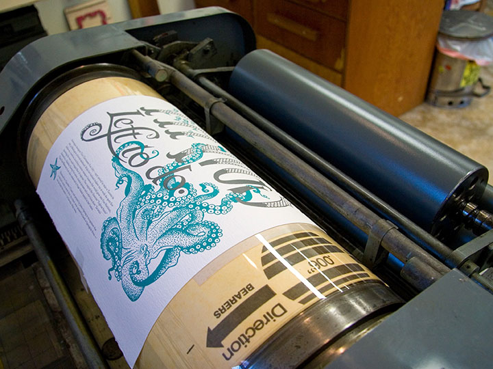
Here’s our new octopus plate on press, all inked up and ready to print—it’s stuck to that gridded base with removable adhesive. The thickness of the plate and base together add up to exactly .918 inches. Ah, precision feels good.

And here’s how it looks on paper.

Here you can see the registration between the colors. This is the hard part—I’m sure that despite my best separation efforts and useful tick marks, Jessica is ready to tear her hair out whenever she sees what insane registration issues I’ve thrown at her this time. She’s not a master printer for nothing, though—tiny, 9-point colophon type? No problem! Large, solid color blocks? Bring ’em on! Exacting registration with no margin of error? Sigh. Just get those plates locked up, will you?

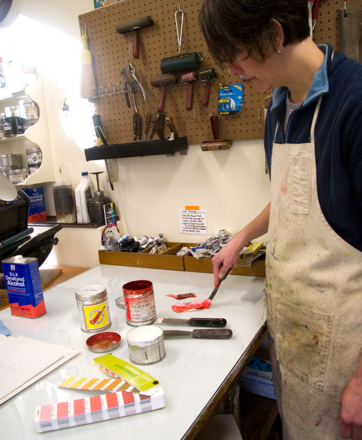
Actually printing these broadsides is where all our careful planning and preparation goes right out the window. We can sketch and plot as much as we like, but many of our artistic decisions end up being made on the fly, right on press. Here Jessica is mixing ink for Prop Cake, according to some choices I suggested in our handy-dandy color recipe book.

You can see our original draw-down (color test) in the upper left corner. So far, so good.

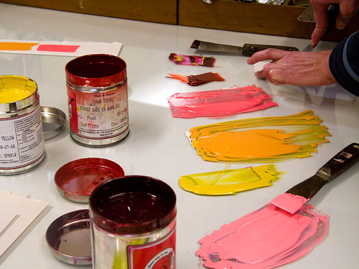
The orange turned out exactly as we’d hoped, but when we started printing the pink separation, we hated the result. What looked so good in the draw-down lost all its contrast in the print. It was awful, trust me.

So Jessica changed the color right on press, until we were happy with it.

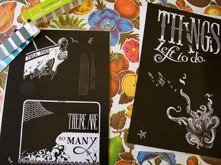
Here’s the finished product, all lined up in the drying rack.
If lining up the color areas is the hardest part of printing, keeping an eye on the ink consistency was probably the most fiddly. We’re using a very unusual paper for the series—one made from recycled clothing—that is extremely “thirsty.” Not only are there inconsistencies in the paper that can throw off the overall quality of color; but we had to add ink to the press after every fourth or fifth print. As you can see, this is a pretty organic process—lots of variables, small corrections and compromises along the way. (And a whole lot of cursing and starting over.)
All of this is par for the course for a letterpress project—it’s an exacting, sometimes frustrating process, but that’s what I love about it. And the finished product … well, it’s like nothing else. Ah, letterpress, how I love thee.
Now if only it didn’t require several metric tons worth of equipment…

![Chandler O'Leary [logo]](https://chandleroleary.com/wp-content/themes/chandleroleary/images/logo.png)
