In print

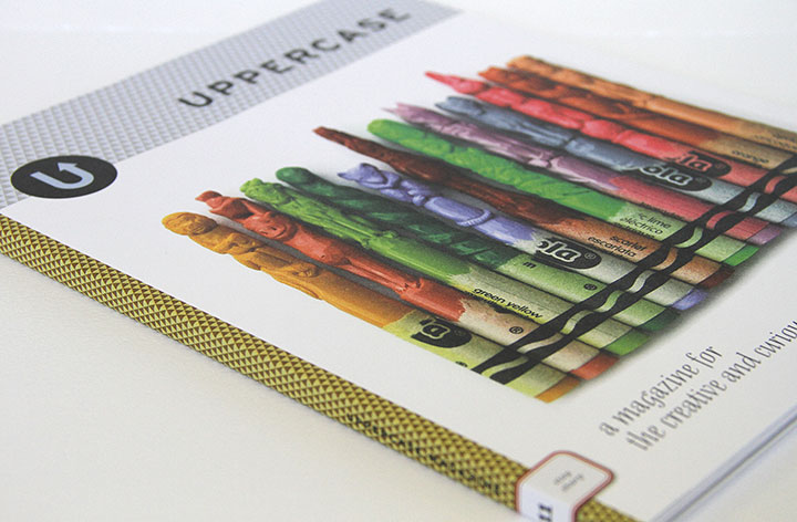
Every three months my all-time favorite magazine, Uppercase, arrives in my mailbox, and productivity in the studio comes to a screeching halt while I drool over each gorgeous page. I’ve been a subscriber since almost the very beginning (if only I could get my paws on those first two sold-out issues!), and impossibly, every new issue is even lovelier than the one before.
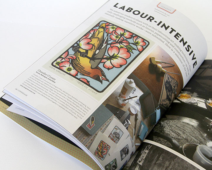
So you can imagine my giddy delight to be included in the latest installment. They had a submissions call for a feature on “labor-intensive illustration,” which was so squarely up my alley that I had to laugh at myself. But I never imagined my little birds would actually be accepted—let alone given a full page. A letterpress colleague received her copy a day or two ahead of me and tipped me off, and I swear I did a little dance around the room.
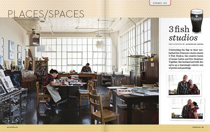
UPPERCASE is the brainchild of a gallery by the same name in Calgary, Alberta. The magazine is tailor-made for anyone with a creative soul; every page is devoted to sharing visual inspiration, shedding light on obscure or vintage art and design work, and detailing the work lives and creative spaces of people who do what they love for a living.
The whole thing is a perfect mix of vintage nostalgia and cutting-edge design, all wrapped up in a sumptuously printed package. If only everything in the world had this much thought and craft behind it.
But my favorite—I mean, favourite—parts of the magazine are the recurring features. There’s an abecedary in every issue, each with a different theme (which does my bookish heart good), as well as a series of collections of vintage objects: bottle caps, cereal boxes, even alarm clocks and fishing lures.
This magazine is truly a thing of beauty, and I hope it’s around for me to keep my subscription going for many years—and issues—to come.
![Chandler O'Leary [logo]](https://chandleroleary.com/wp-content/themes/chandleroleary/images/logo.png)


