Memento mori
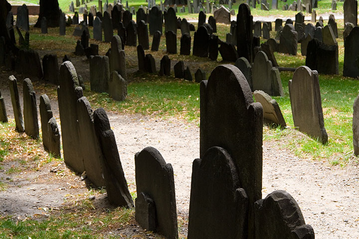
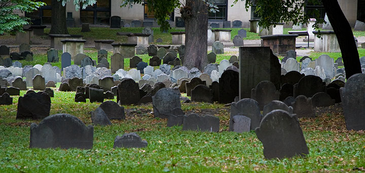
One of the things I used to do with Bampa is visit the colonial graveyards tucked away in every corner of New England. On this trip I only had time to visit a couple, so I picked my two favorites: the Old York Burial Ground in York, Maine;
and the Granary Burying Ground in Boston.
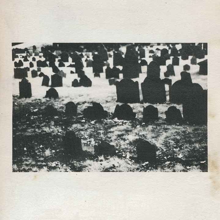
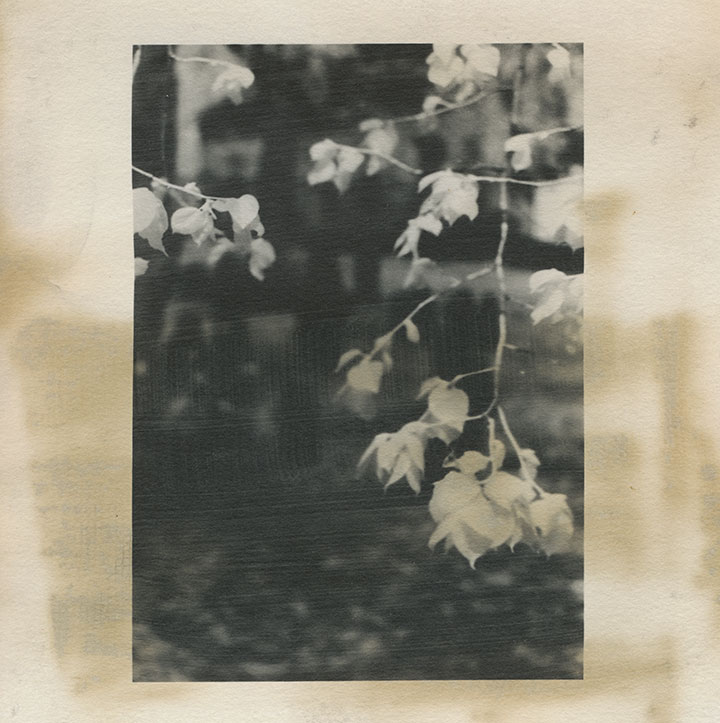
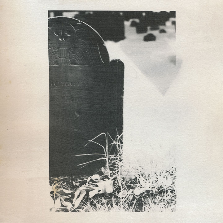
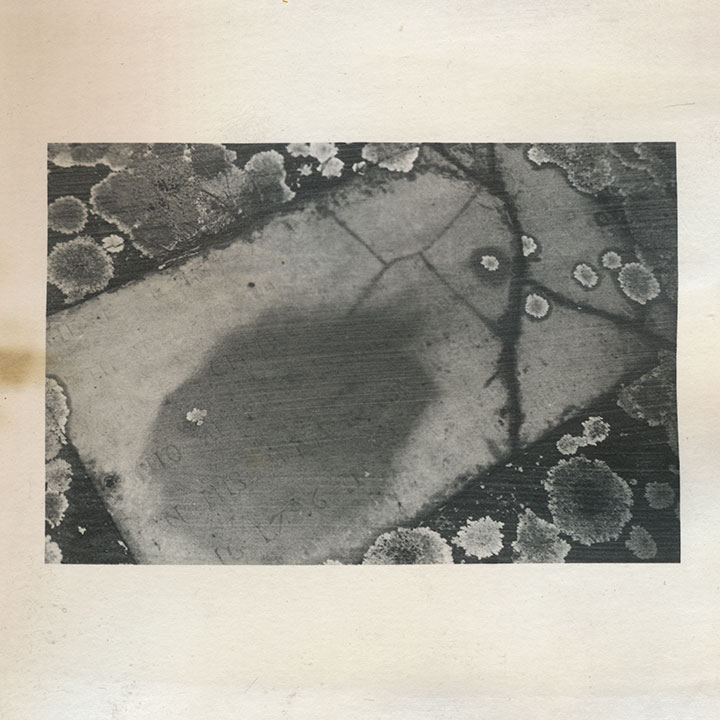
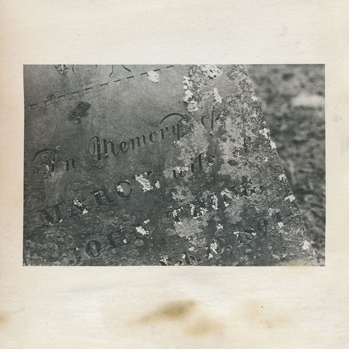
I’m quite a bit obsessed with these places; beyond my usual souvenir sketches and snapshots, these cemeteries keep popping in and out of my body of work. This is an excerpt from an artist book I made seven years ago. That’s not snow—it’s shot with infrared film, which behaves very differently from normal film when you do certain things with it. I used a dark red lens filter that blocked nearly all of the visible spectrum, so that the film was exposed mostly by ambient infrared radiation. The effect is that inanimate objects like stones read as deepest black,
and plants and flesh turn to bright white. Somehow I thought that particular quirk paired well with the subject matter—that living things behaved very differently than…well, dead ones.
Despite the near-constant crowds (in Boston, at least) and the challenge they present to photographing, each is an oasis, a tranquil island within the bustling town or city.
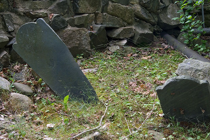
That’s not what draws me to them, though. Nor is it the haphazard scatter of wonky stones,
nor the romance of crumbling ruins.
(infrared film again)
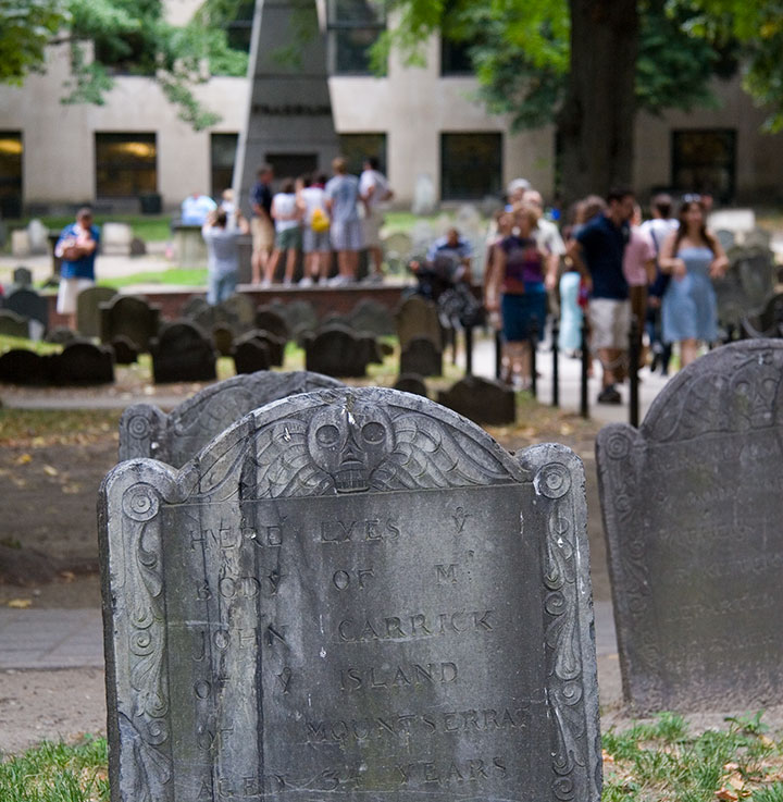
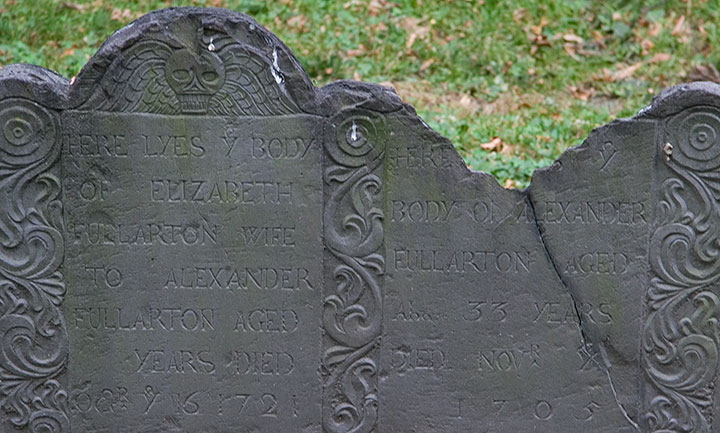
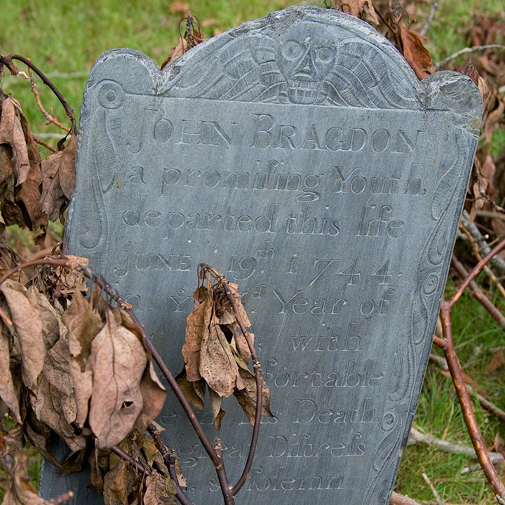
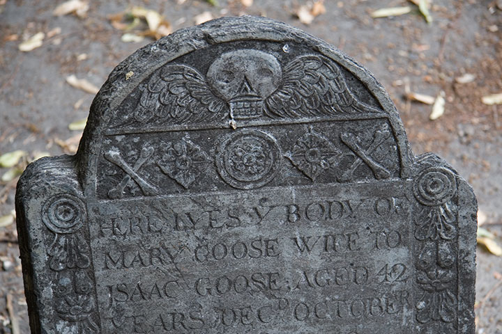
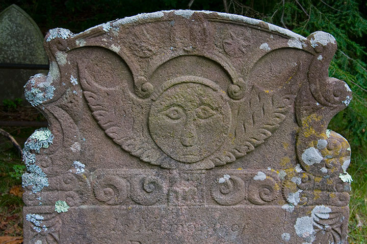
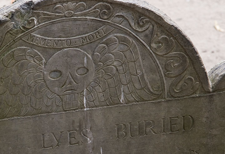
It’s that old gravestones are monumental (sorry) in the graphic design department. You can probably guess what my headstone might look like one day, because I’m completely fascinated with the design, the illustration, the typography displayed on colonial headstones. The “Death’s Head” or winged skull motif seems to be the most common,
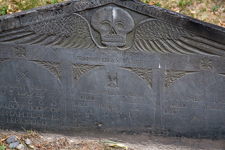
with many variations within the theme—
Quadruple grave, dated 1666-1671, of children who lived only “dayes” or months apiece
from refined,
grave for a member of the Goose family, founders of the Mother Goose tradition
to folksy,
to somewhat disturbingly lifelike deathlike.
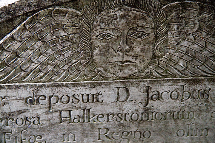
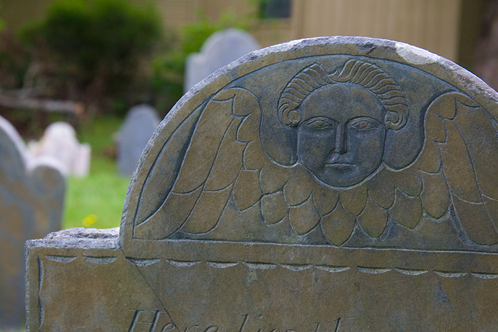
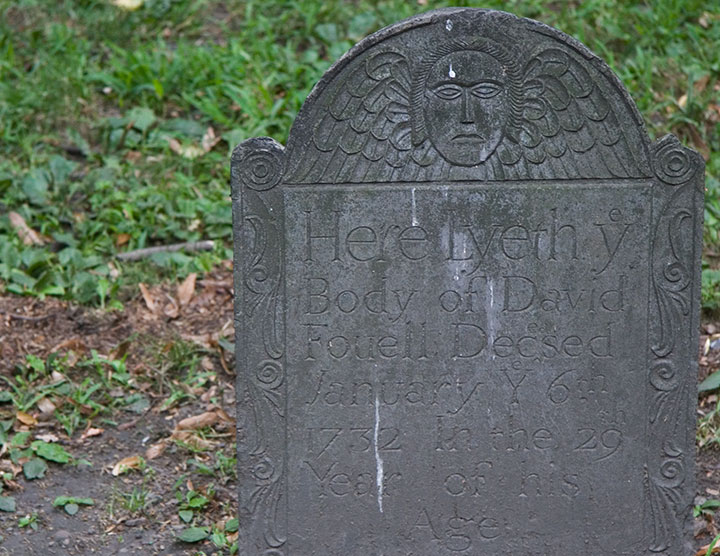
Another popular design is the “Winged Cherub,” which seems to be a more gentle alternative to the bones-n’-feathers motif.
The carvers seemed to take even more artistic license with this theme; I lost count of all the different angel designs.
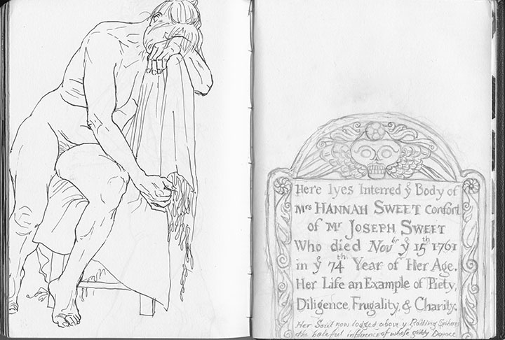
Skulls and cherubs aside, just as fun for the modern visitor is the engraved text. Typophiles will love all the script faces and lettering conventions (my favorite, below, is a mention of “November” set with “br” as superscript above a larger “Nov”),
but I’m partial to the language—the poetic phrasings, the archaic spellings. Some excerpts, verbatim:
• “Here lyes interred ye body of Mrs. Hannah Sweet, confort of Mr. Joseph Sweet, who died Nov’br ye 15th 1761 in ye 74th year of her age.”
• “On His unfailing promises rely / and all the horrors of the Grave defy”
• “… Jotham Bush of Shrewƒbury, who departed this life with the Small-Pox”
• “In memory of Mrs. Elizabeth Hurd, amiable & virtuous confort of John Hurd, Esq.”
• “Farervell Vain World, I have Enough of thee / and now I’m Careles what thou Say’st of me”
My little artist book has developed an unexpected conceptual element. I first coated the paper myself with liquid emulsion to make it light-sensitive (instead of using standard photo paper), then processed the images in a darkroom with the usual chemicals. By doing that, I was veering away from the traditional darkroom process, and adding some interesting variables, risks and imperfections into the mix. Most noticeably, the fixer reacted a little oddly with the emulsion/paper—a fact that irked me greatly at the time, since there was no way to know it had happened until the images were finished.
Over the years, however, the splotches have darkened, creating the illusion of old age and mirroring the weathering, decay and moss growth of the graves themselves.
So despite my perfectionist nature and my usual complex over making everything as archival as possible—I like the book so much better this way.
After all, it’s all the same in four hundred years anyway, isn’t it?
![Chandler O'Leary [logo]](https://chandleroleary.com/wp-content/themes/chandleroleary/images/logo.png)
