Blog
February 13th, 2010
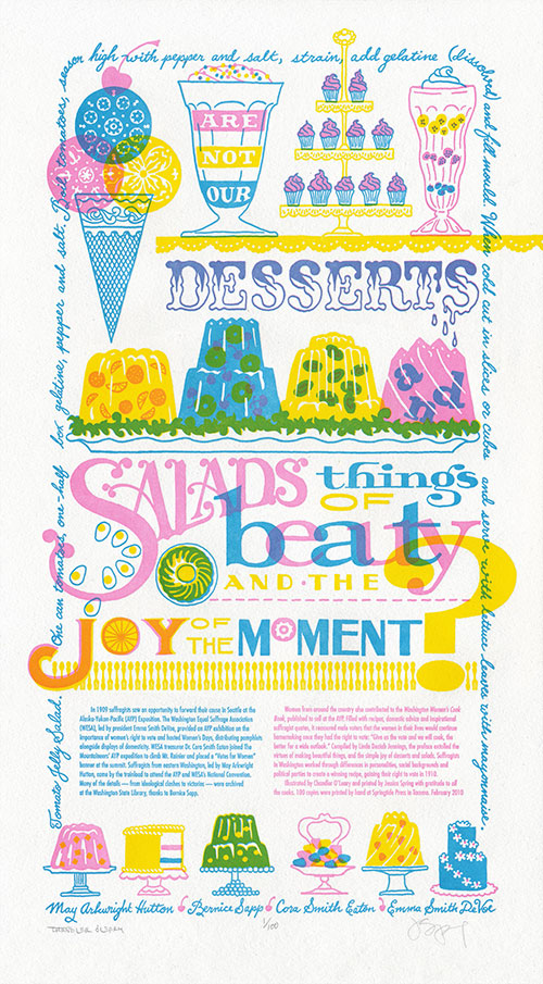

This year marks the 100th anniversary of women’s suffrage in Washington—a feat only made possible by the collaborative efforts of many dedicated people of every walk of life and political stripe. In this spirit, we present our seventh broadside in the Dead Feminists series, Just Desserts.
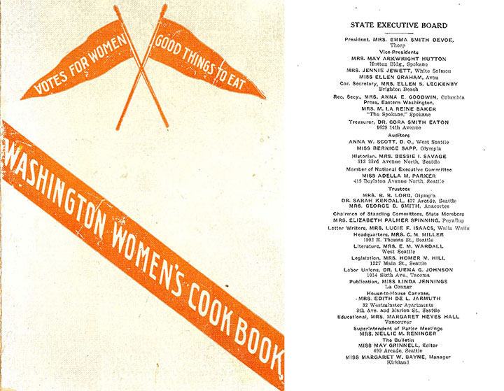
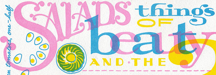
Through our research at the Washington State Library, we discovered that our state’s suffrage movement had many leaders, rather than one prominent figurehead. We also learned that there was so much head-butting, personality-clashing and partisan in-fighting going on within the organizations involved (Mesdames Hutton and DeVoe, I’m looking at you!) that it would be impossible to tell the whole story in one letterpress poster. So instead of quoting a single historical feminist, we cited a collaborative publication—the Washington Women’s Cook Book, published in 1908-1909 for the Alaska-Yukon-Pacific Exposition—and featured four women symbolic of the movement: May Arkwright Hutton, Bernice Sapp, Cora Smith Eaton, and Emma Smith DeVoe. The quote:
“Are not our desserts and salads things of beauty and the joy of the moment?”
The book was a clever piece of propaganda that operated on the principle that the way to a man’s heart—or vote—is through his stomach. All those jellied centerpieces and whimsical soufflés must have done the trick—the following year, women got the vote.
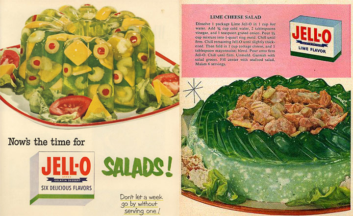
And for my part, the quote turned me into an almost-literal kid in a candy store; the design was just begging for elaborate confections and candy-coated typography. At first, though, I was turned off by the idea of having to draw salads (I wanted more ice cream!), until Jessica read off a litany of aspic salad and gelatin dessert recipes from the book. That’s when the light bulb turned on: Jell-o salad! The decade-plus I spent in the Midwest was about to serve me well.
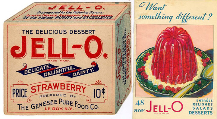
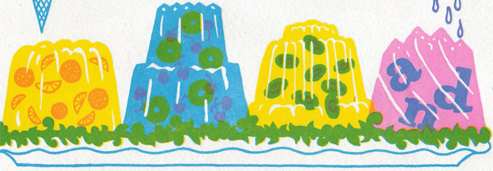
Turns out that Jell-o fit right into the turn-of-the-century theme: molded gelatin desserts were a Victorian favorite, and the name “Jell-o” was first coined in 1897 (and if you look carefully, the “J” from the original Jell-o box makes a cameo in the print). There seemed to be no end of antique recipes, advertisements and illustrations at my disposal.
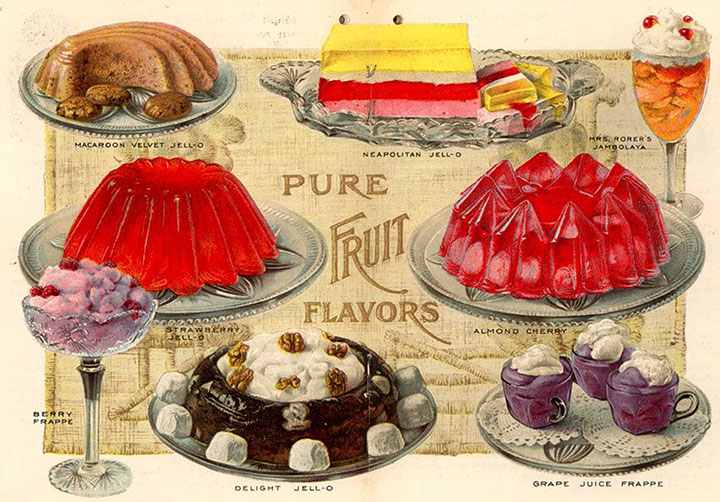
I might be horrified by the idea of eating gelatin salads, but drawing them was the most fun I’ve had in a long, long time. Zooey and I each spent hours researching vintage Jell-o molds—probably more for the pure fascination than for the value of the reference material.
For the sweets portion of our little menu, I turned to an old favorite for inspiration: Andy Warhol.
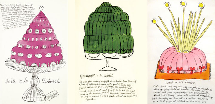
Forget what you know about Campbell’s soup cans or Elvis portraits; Andy got his start as an illustrator specializing in fashion and food. In 1959 he illustrated a spoof cookbook called Wild Raspberries (it’s been on my shelf since high school, and I finally found a direct use for it!), filled with ridiculous “gourmet” recipes for things like “A&P Surprise” (those of you in New England will get that one) and “Seared Roebuck.”
The illustrations are fantastic (and the polar opposite of my style), but the thing that really drew me in was the lettering. Andy had his mother, Julia Warhola, write all of the text of his early illustrations in her shaky, school-girl script. Mrs. Warhola spoke little to no English, and simply copied her son’s notes letter-for-letter, so the text in Wild Raspberries has charming errors and misspellings throughout.

I loved the down-to-earth quality of Mrs. Warhola’s cursive, so I wrote a recipe from the Washington Women’s Cook Book along the border of the broadside in a similar hand (though to warn you, it’s a recipe I wouldn’t recommend trying!).
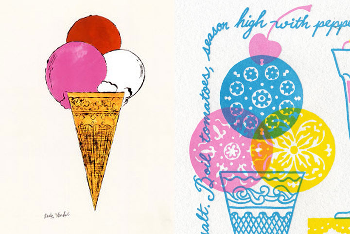
And of course, I couldn’t do without a little ice cream homage.
Like The Curie Cure, this piece is printed in three colors—although the three we chose let us create many more. Our color scheme allowed us to print in a similar fashion to commercial printing, where a minimum of colors (CMYK—cyan, magenta, yellow, black) are layered to create a full-color image. Our layering of translucent pink, blue and yellow ink allowed us to create a full rainbow and a convincing depiction of foreign objects floating in jelly.
Heaps of thanks to everyone who came to our talk at the State Library the other night, despite lousy weather and rush-hour traffic—we had a tremendous turnout, and a huge show of support for our state’s oldest cultural institution.
One more thing: three cheers for the incredible staff at the Washington State Library (many of whom are among those whose jobs have been cut and will end very soon) who made our talk and this very piece possible. Because we couldn’t have done it without them, we have donated a portion of our proceeds to support the State Library’s collections.
After all, it’s about preserving (in jelly?) that joy of the moment for everyone to share, right?
• • • • • • • • • • • • • • • • • • • • • • • • • • • • • • • • • • • • • • • • • • • • • • • • • • • • • • • • • • • •
Just Desserts: No. 7 in the Dead Feminists series
Edition size: 100
Poster size: 10 x 18 inches
Printed on an antique Vandercook Universal One press, each piece is printed on archival, 100% rag, recycled paper, and signed by both artists.
Colophon reads:
In 1909 suffragists saw an opportunity to forward their cause in Seattle at the Alaska-Yukon-Pacific (AYP) Exposition. The Washington Equal Suffrage Association (WESA), led by president Emma Smith DeVoe, provided an AYP exhibition on the importance of women’s right to vote and hosted Women’s Days, distributing pamphlets alongside displays of domesticity. WESA treasurer Dr. Cora Smith Eaton, joined The Mountaineers’ AYP expedition to climb Mt. Rainier and placed a “Votes for Women” banner at the summit. Suffragists from eastern Washington, led by May Arkwright Hutton, came by the trainload to attend the AYP and WESA’s National Convention. Many of the details—from ideological clashes to victories—were archived at the Washington State Library, thanks to Bernice Sapp.
Women from around the country also contributed to the Washington Women’s Cook Book, published to sell at the AYP. Filled with recipes, domestic advice and inspirational suffragist quotes, it reassured male voters that the women in their lives would continue homemaking once they had the right to vote: “Give us the vote and we will cook, the better for a wide outlook.” Compiled by Linda Deziah Jennings, the preface extolled the virtues of making beautiful things, and the simple joy of desserts and salads. Suffragists in Washington worked through differences in personalities, social backgrounds and political parties to create a winning recipe, gaining their right to vote in 1910.
Illustrated by Chandler O’Leary and printed by Jessica Spring with gratitude to allthe cooks. 100 copies were printed by hand at Springtide Press in Tacoma. February 2010
UPDATE: poster is sold out. Reproduction postcards available in the Dead Feminists shop!
November 13th, 2009
I guess it was inevitable that Jessica and I would veer back into controversial territory eventually—we’re a little ornery, after all (as if you hadn’t guessed). We’ve been sitting on this concept for several months now, and have put it off a couple of times in order to move Thea Foss and Harriet Tubman ahead in the queue. Now, though, the time feels right—or maybe we’re just so upset and keyed up by the issue at hand that we just couldn’t wait any longer. Either way, we’d like to offer our take on what a famous scientist might have had to say about health care:
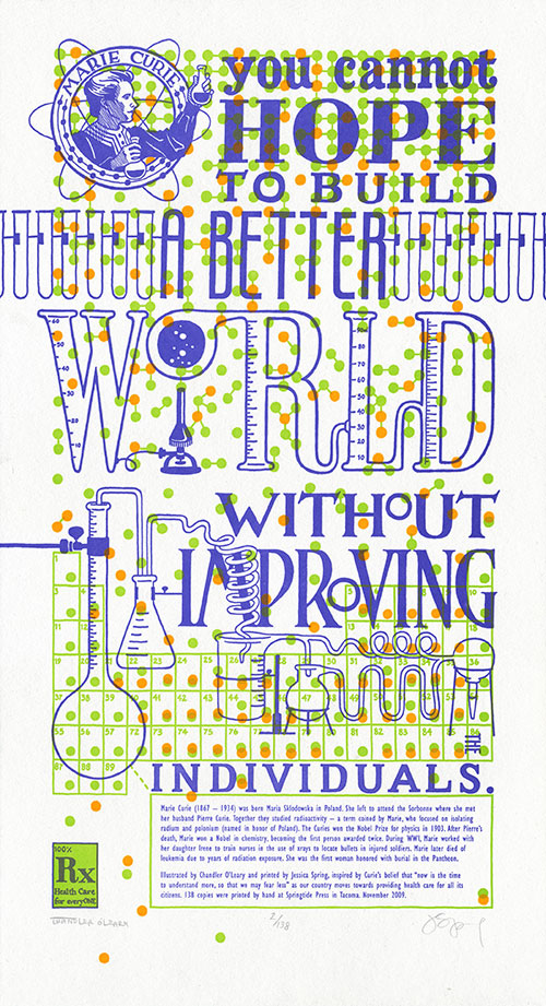
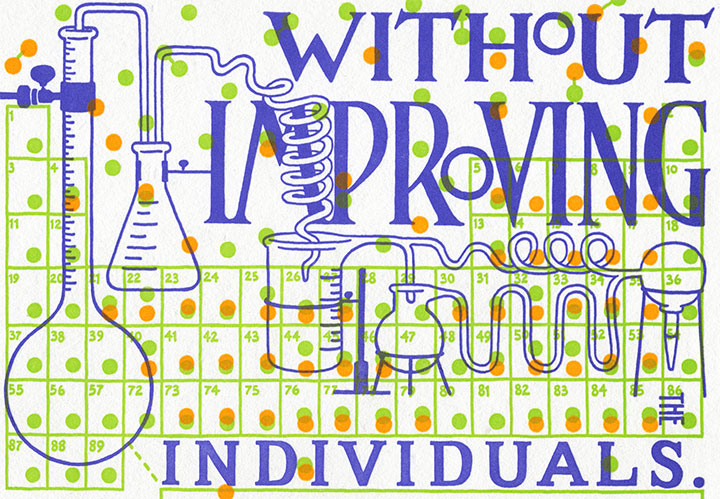
You cannot hope to build a better world without improving the individuals. —Marie Curie
I’ll spare you the ranting and raving that you can find in countless other pockets of the internet (or my house), except for one small, very personal anecdote about this topic. You see, I am self-employed, as a working artist and bona-fide small business owner. And it’s a mighty good thing that I happen to be married to someone with a full-time employer, because when I traded my graphic design day job to go full-time with my business, I also gave up access to health insurance that was anywhere near affordable. So I am on the Tailor’s health insurance, which costs us—wait for it—approximately $650 a month. That’s just to cover me, and I don’t have any “preexisting conditions” (why is it that I always want to say “preconceived notions?”) or other health problems. Since we absolutely refuse to be among the millions of uninsured, remaining able to pay for coverage is our top priority. Except that’s about to get a lot harder, because this coverage—which is provided by one of the two American “non-profit” insurance co-ops, by the way (remember the buzz about those?)—will be increasing by twenty percent come January. I don’t say this to garner attention or sympathy (don’t worry, we’re doing okay) or to ask for advice—merely to illustrate my first-hand experience of the unsustainability of the system. I won’t prolong this post by weighing in on my personal preferences for health care reform, but something, somehow, has to change.
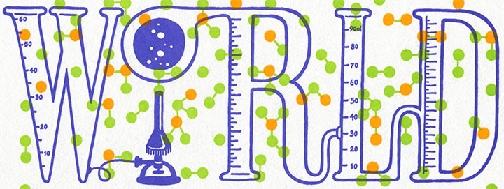
Here’s where Marie Curie comes in. Despite being snubbed and rejected by her peers again and again, Curie devoted her life’s work (and ultimately her own health) to finding answers. And what she found not only changed our understanding of science forever, but also laid the foundation for many of the medical treatments we take for granted today.
In tribute to her tireless efforts, The Curie Cure is a miasma of small details that slide in and out of focus as they compose the “bigger picture.” Each individual atom, printed in fluorescent ink, battles the text for attention—in vivid, radioactive color. The edition size is a nod to Curie’s discovery of new elements (the half life of polonium is 138 days), while the connected scientific equipment illustrates the trickle-down effect of any political action. Above all, the dominating pattern of molecule diagrams serves as a reminder that we’re all in this together.
• • • • • • • • • • • • • • • • • • • • • • • • • • • • • • • • • • • • • • • • • • • • • • • • • • • • • • • • • • • •
The Curie Cure: No. 6 in the Dead Feminists series
Edition size: 138
Poster size: 10 x 18 inches
Printed on an antique Vandercook Universal One press, each piece is printed on archival, 100% rag, recycled paper, and signed by both artists.
Colophon reads:
Marie Curie (1867–1934) was born Maria Sklodowska in Poland. She left to attend the Sorbonne where she met her husband Pierre Curie. Together they studied radioactivity — a term coined by Marie, who focused on isolating radium and polonium (named in honor of Poland). The Curies won the Nobel Prize for physics in 1903. After Pierre’s death, Marie won a Nobel in chemistry, becoming the first person awarded twice. During WWI, Marie, worked with her daughter Irene to train nurses in the use of xrays to locate bullets in injured soldiers. Marie later died of leukemia due to years of radiation exposure. She was the first woman honored with burial in the Pantheon.
Illustrated by Chandler O’Leary and printed by Jessica Spring, inspired by Curie’s belief that “now is the time to understand more, so that we may fear less” as our country moves towards providing health care for all its citizens. 138 copies were printed by hand at Springtide Press in Tacoma. November 2009.
UPDATE: poster is sold out. Reproduction postcards available in the Dead Feminists shop!

August 14th, 2009
For nearly a year now, the Dead Feminists series has given us an outlet for both our aspirations and frustrations. For every social and political victory, there follows a reminder of how divided we are as a culture. We were so proud to see Victory Garden become a part of a nation-wide movement toward sustainability—but a movement and a majority are not the same thing. We are delighted whenever a customer tells us that Prop Cake is meant for a wedding gift—but are heartbroken by the reminder that for many people, the gesture can only be symbolic. Yet through it all we remain optimistic that art can make a difference—that a bright future is out there, somewhere, and that we can help find the way to it.
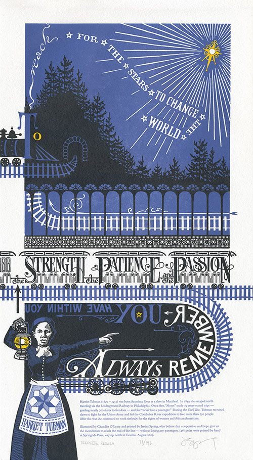
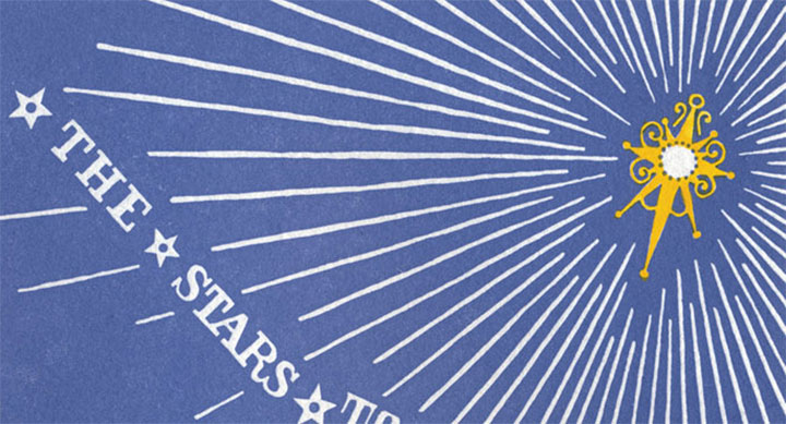
Always remember you have within you the strength, the patience and the passion to reach for the stars to change the world.
— Harriet Tubman
This is why we chose Harriet Tubman for our latest piece. There are so many pressing issues vying for our attention—war, the economy, healthcare, the environment, transit, equality, etc.—that we couldn’t choose just one. So we decided to focus on the journey itself. For all the ground we’ve gained in our country’s short history, we have a long, long way to go—and the only way we’ll get there is together. Harriet Tubman knew that when she fought for freedom and civil rights, and she devoted her entire life to the idea.
So here, submitted for your approval, is End of the Line. As always, everything—from the illustrated lettering to the letterpress printing—is done completely by hand. This time, though, we’re asking you to flex your reading muscles a bit: to symbolize the difficult journey faced by anyone with a great task, we made it somewhat of a challenge to read.
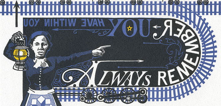
Don’t worry, though—Harriet is there to guide you. Just follow her lantern, and you’ll find the right path. If you lose your way, just look for the Drinkin’ Gourd.
• • • • • • • • • • • • • • • • • • • • • • • • • • • • • • • • • • • • • • • • • • • • • • • • • • • • • • • • • • • •
End of the Line: No. 5 in the Dead Feminists series
Edition size: 146
Poster size: 10 x 18 inches
Printed on an antique Vandercook Universal One press and hand-colored with watercolor. Each piece is printed on archival, 100% rag, recycled paper, and signed by both artists.
Colophon:
Harriet Tubman (1820 – 1913) was born Araminta Ross as a slave in Maryland. In 1849 she escaped north traveling via the Underground Railway to Philadelphia. Once free, “Moses” made 19 more round trips—guiding nearly 300 slaves to freedom—and she “never lost a passenger.” During the Civil War, Tubman recruited slaves to fight for the Union Army and led the Combahee River expedition to free more than 750 people. After the war she continued to work tirelessly for the rights of women and African Americans.
Illustrated by Chandler O’Leary and printed by Jessica Spring, who believe that cooperation and hope give us the momentum to reach the end of the line—without losing any passengers.
UPDATE: poster is sold out. Reproduction postcards available in the Dead Feminists shop!
May 12th, 2009
Well, here she be. (Or should I say, Thar she blows?)
At long last, Thea is here, barnacles and all. Jessica and I unveiled her at our Pressing Matters talk at the Tacoma Art Museum this morning. I have to say, I was nervous that with the weekday morning time slot, we’d be hoist on our own petard for the big debut. Since 10:30 on a Tuesday isn’t exactly an hour available to everybody, we were afraid we’d be lecturing a bunch of empty chairs. Boy were we wrong. Many thanks to all of you who skipped out on work, took a long (and very early) lunch, or otherwise carved out an hour of your day to spend with us—we raise our pirate flags to you. And to Allison Baer, TAM’s very own renaissance woman who made it all happen, you get the biggest Jolly Roger of them all. Thank you.
This week I’m going to post some of the things we talked about today at TAM, about the making of Tugboat Thea and our series. But for now, let’s just get down to brass tacks about the broadside. Here’s the quote that started it all:
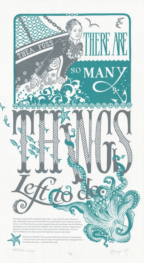
There are so many things left to do. — Thea Foss
In honor of enterprising women everywhere, the print features business pioneer and entrepreneur Thea Foss, who founded the Foss Tugboat company in Tacoma, WA—at a time in history when it was not only courageous, but nearly unheard of for a woman to do so. Here Thea is portrayed as the figurehead of her own tugboat, surrounded by crashing waves and sea life native to her home waters of Puget Sound.
• • • • • • • • • • • • • • • • • • • • • • • • • • • • • • • • • • • • • • • • • • • • • • • • • • • • • • • • • • • •
Tugboat Thea: No. 4 in the Dead Feminists series
Edition size: 89
Poster size: 10 x 18 inches
Printed on an antique Vandercook Universal One press, on archival, 100% rag (cotton) paper. Each piece is numbered and signed by both artists.
Colophon reads:
Norwegian immigrant Thea Christiansen Foss (1857 – 1927) arrived by train to Tacoma in 1889 as Washington achieved statehood. While her husband Andrew was at work she spent five dollars on a rowboat, launching a marine transport business that would grow into Foss Maritime, operating the west coast’s largest fleet of tugboats. Thea inspired the character “Tugboat Annie” featured in a Saturday Evening Post series, motion pictures and a television show. Tacoma’s Thea Foss Waterway is an inlet connected to Puget Sound named in her honor.
UPDATE: poster is sold out. Reproduction postcards available in the Dead Feminists shop!
April 4th, 2009
Jessica Spring and I have been having a high ol’ time with our Dead Feminists series thus far, celebrating positive changes happening around the country with the first two prints we created. At the same time, we were shocked and dismayed to learn that Proposition 8 had passed in California. Now, I know that people are extremely divided on this issue, so in the interest of respecting others I’ll try not to open any worm-cans here (this is an art blog, not a soap box). But we wanted to express our thoughts on the matter, so Prop Cake was born. The quote we chose made the issue seem like…well, a piece of cake:
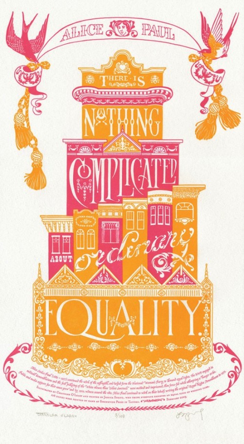
There is nothing complicated about ordinary equality. —Alice Paul
The initial idea for this piece came almost immediately; Jessica looked over at me on a drive home from Seattle one day and said, “How about a big, pink wedding cake?” I grinned from ear to ear, and started sketching as soon as I got home. The design didn’t come together so easily, however. Everything I came up with looked more like an ad for Modern Bride than a political poster. Frustrated, I pushed my sketches aside and took a few days off to think.
And then I went to San Francisco.

It was my first trip there, and my first thought as I passed through the residential neighborhoods, with rows and rows of candy-colored stucco houses, was “Wow, these things look like big frosted cakes!” And the lightbulb turned on, at last. I spent three days walking, driving, and riding around the neighborhoods, camera and sketchbook in hand. I made pages and pages of notes on architectural detailing.
When I arrived home, I got right to work. This time, finally, it all came together.
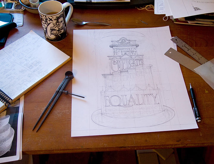
Alice was right—it really was a piece of cake.
• • • • • • • • • • • • • • • • • • • • • • • • • • • • • • • • • • • • • • • • • • • • • • • • • • • • • • • • • • • •
Prop Cake: No. 3 in the Dead Feminists series
Edition size: 108
Poster size: 10 x 18 inches
Printed on an antique Vandercook Universal One press, on archival, 100% rag (cotton) paper. Each piece is numbered and signed by both artists.
Colophon reads:
Alice Stokes Paul (1885 – 1977) continued the work of the suffragists, and helped form the National Woman’s Party to demand equal rights. The NWP engaged in militant demonstrations and the first picketing of the White House; these “Silent Sentinels” were mobbed and imprisoned, then force-fed while attempting a hunger strike. Public and media support for their cause grew and by 1920, women secured the vote. Alice Paul continued to work on their behalf, writing the original Equal Rights Amendment in 1923.
UPDATE: poster is sold out. Reproduction postcards available in the Dead Feminists shop!
April 3rd, 2009
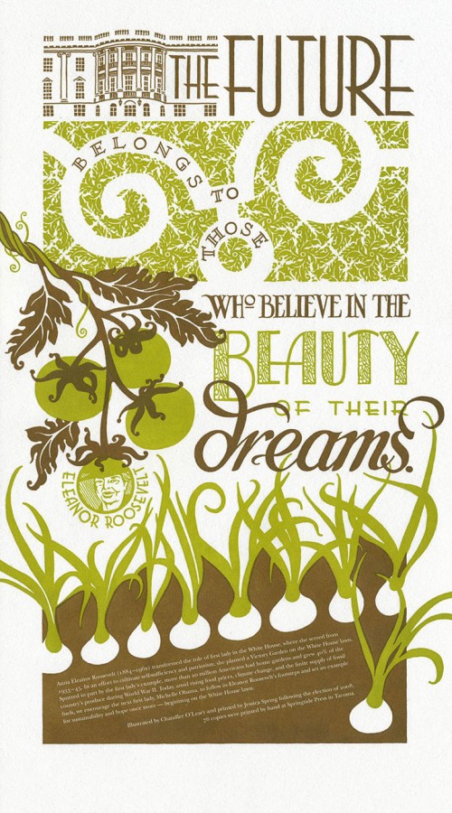
With the success of our first piece, Jessica and I wanted to continue our Dead Feminists series with something that upped the ante a bit. And to our complete shock, we were rewarded by our second broadside selling out in just 48 hours (thanks to the magic of the internets!). Our next subject was one that we both had been thinking about for some time: personal sustainability. As the Tailor and I are both hard-core seasonal foodies (more on this topic will probably come out eventually), and as Jessica is a member of a local crop share, we’d like to see a change in the American food system. So we turned to one of our favorite feminists: Eleanor Roosevelt.
The future belongs to those who believe in the beauty of their dreams.
While serving as First Lady, Roosevelt planted a White House victory garden during World War II; thanks to her inspiration and example, during the War home gardens accounted for 40% of the U.S. supply of vegetable produce. We thought, hey, if it could be done once, why not again? So the colophon at the bottom included a plea for the new First Lady, Michelle Obama, to carry on in Roosevelt’s footsteps.

My inspiration for the design of Victory Garden came from a variety of sources. For one thing, the typography is inspired by the Art Deco designs of Roosevelt’s era. For another, I thought back to my honeymoon in France last year.

I spent a day at Versailles on that trip, and at the time was struck by the meticulous aesthetic that unified every element of the place. Everything from the wallpaper to the upholstery to the grounds themselves worked together to form a cohesive overall design. An overly ornate and despicably ostentatious design, sure (and a bit ironic, considering Marie Antoinette’s consequences for going overboard with luxury in the face of a starving populace), but it was beautiful in its own right. I especially loved the sculpted hedges and lawns of the Versailles gardens; the patterns form a stunning, living brocade at one’s feet. And I wanted to turn that design sense into something that represented the greater good, rather than the wealth of the few. So I abstracted that idea into a two-dimensional White House lawn, made up with an original brocade pattern of spiraling leaves.
When we finally arrived at the finished product, we were happily surprised to learn that many others had had similar thoughts. We discovered Michael Pollan’s editorials; learned about the “Eat the View” movement; and found many other like-minded folk along the way—including one who purchased a copy of Victory Garden for her friend, a direct descendant of Eleanor Roosevelt herself. As the icing on the cake, one of our Chicago customers had a personal connection to the Obamas, and promised to deliver a copy of the broadside to the First Lady, with our compliments. We have no idea if it actually reached her in the end, but there’s always hope. And besides, we’re taking a bit of personal pride in being part of a larger movement, as well as the fact that the new White House garden is already happening.
Victory garden, indeed.
• • • • • • • • • • • • • • • • • • • • • • • • • • • • • • • • • • • • • • • • • • • • • • • • • • • • • • • • • • • •
Victory Garden: No. 2 in the Dead Feminists series
Edition size: 76
Poster size: 10 x 18 inches
Printed on an antique Vandercook Universal One press, on archival, 100% rag (cotton) paper. Each piece is numbered and signed by both artists.
Colophon reads:
Anna Eleanor Roosevelt (1884 – 1962) transformed the role of first lady in the White House, where she served from 1933-1945. In an effort to cultivate self-sufficiency and patriotism, she planted a Victory Garden on the White House lawn. Spurred in part by the first lady’s example, more than 20 million Americans had home gardens and grew 40% of the country’s produce during World War II. Today, amid rising food prices, climate change, and the finite supply of fossil fuels, we encourage the next first lady, Michelle Obama, to follow in Eleanor Roosevelt’s footsteps and set an example for sustainability and hope once more—beginning on the White House lawn.
Poster is sold out. Reproduction postcards available in the Dead Feminists shop!
April 2nd, 2009
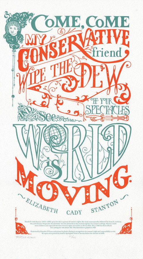
This blog might be brand new, but I should probably bring you up to speed on a project that isn’t. Starting last fall, right before the 2008 Presidential Election, my friend and fellow letterpress printer Jessica Spring asked me if I wanted to collaborate on a political broadside (basically, a letterpress version of a poster) together. We both felt like this was an important event, and a moment in history, and we wanted to make some sort of contribution to the artistic record. Jessica said she had a historical quote that would be fun to typeset, and asked if I could do a quick illustration of a pair of spectacles to go with it. She thought it’d be fun to make the glasses look like the famous eyewear of a certain Alaskan VP candidate (who can see Russia from her house!)—her plan was to use her impressive collection of wood and metal type to hand-set the quote into the design.
Well, she probably shouldn’t have left me alone with my pencils, because I got a little carried away, and drew not just the glasses, but the whole quote around them, too:
Come, come my conservative friend, wipe the dew off your spectacles and see the world is moving. — Elizabeth Cady Stanton
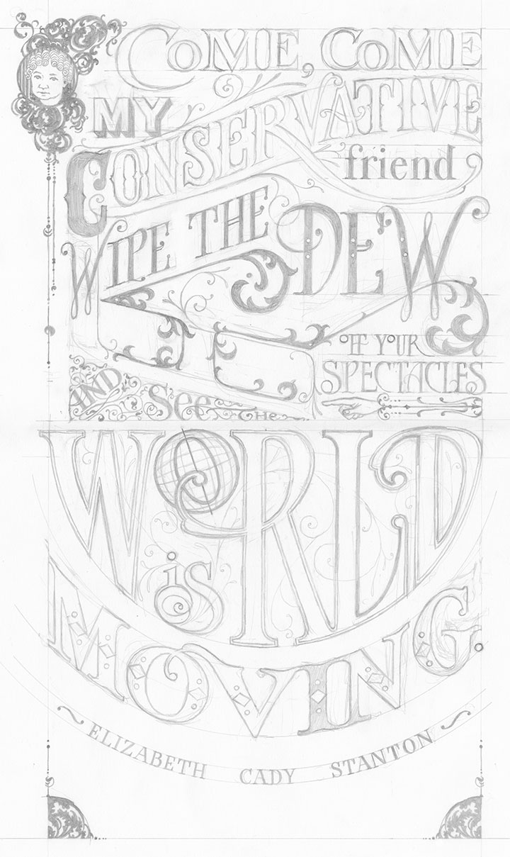
I did this because I wanted the piece to be something more than simply a jab at a political personality. I wanted it to be beautiful in its own right, something that might do justice to Stanton’s words, and that would be longer-lasting than a momentary visual pun. Besides, Stanton put up one of the most important fights in American history: women’s suffrage. In this country with with a voter turnout rate of less than two-thirds, I wanted to do my small part to get women everywhere, regardless of political stripe, to the polls. And then, as it always does, my fingers started itching to draw my own letterforms. After all, for as much as I love hand-setting type, one of the reasons I’m a letterer is because I’m continually frustrated by the finite number of typefaces available in wood and metal. Not that I’m happy with choosing among the thousands and thousands of digital font families out there, either. Let’s just say I’m picky. So I made up my mind to letter the whole thing by hand, and not to tell Jessica until the sketch was done.
Bless her heart, she went along with the idea. We scrapped the idea of setting vintage type and printed the image using a modern material called photopolymer plates (more on that another day). And then we put the broadside into our online shop, and sent out an email to our little mailing list to let them know we’d made something new.
Three days later, the entire edition of prints was sold out. We were floored! Neither of us had ever experienced this kind of clamoring for our work before—we’d both sold out editions before, but not this quickly. People started emailing us and asking if we were going to do more posters. After reading that, we kind of looked at each other and said, “Why not?”
And the Dead Feminists series was born.
(More on the series another day: first, let’s get to the details about the broadside itself:)
• • • • • • • • • • • • • • • • • • • • • • • • • • • • • • • • • • • • • • • • • • • • • • • • • • • • • • • • • • • •
Come, Come: No. 1 in the Dead Feminists series
Edition size: 44 prints
Poster size: 10 x 18 inches
Printed on an antique Vandercook Universal One press, on archival, 100% rag (cotton) paper. Each piece is numbered and signed by both artists.
Colophon reads:
Elizabeth Cady Stanton (1815 – 1902) spent her life in pursuit of women’s rights. She wrote many speeches delivered by Susan B. Anthony, who said Stanton “forged the thunderbolts” that she delivered as they worked together for women’s suffrage. Stanton raised seven children and organized the first women’s rights convention in Seneca Falls, NY in 1848 but died without ever casting her vote before the 19th Amendment passed in 1920.
Poster is sold out. Reproduction postcards available in the Dead Feminists shop!