October 16th, 2010

By now you’ve figured out that I have a thing for stitched lettering; and since I’ve already rambled on ad nauseum in the last post, I can keep this one a little shorter.
And anyway, I somehow neglected to take any process photos for two of these. Oops.

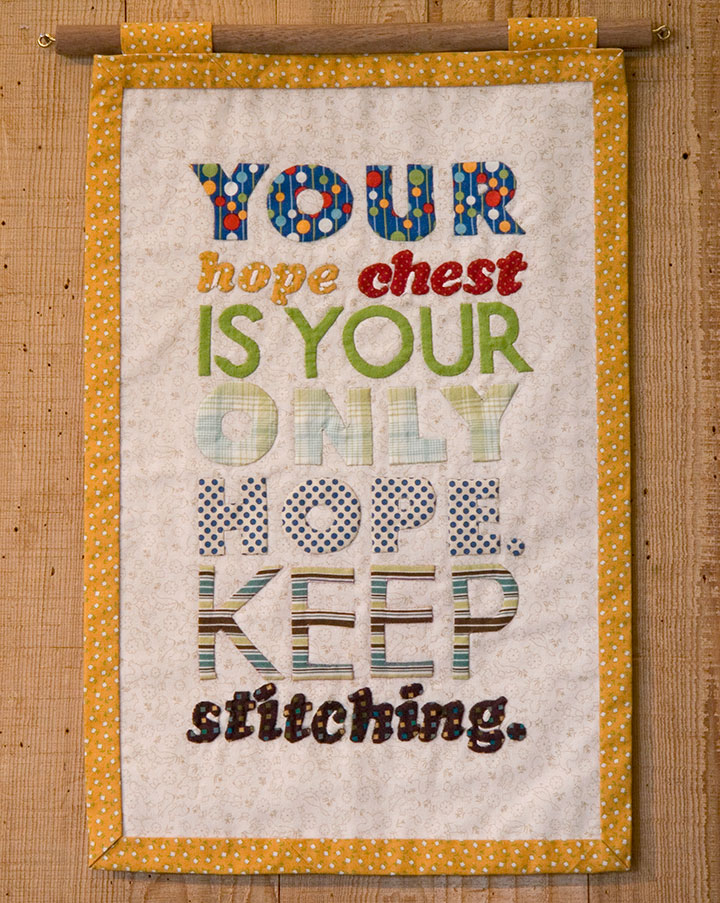
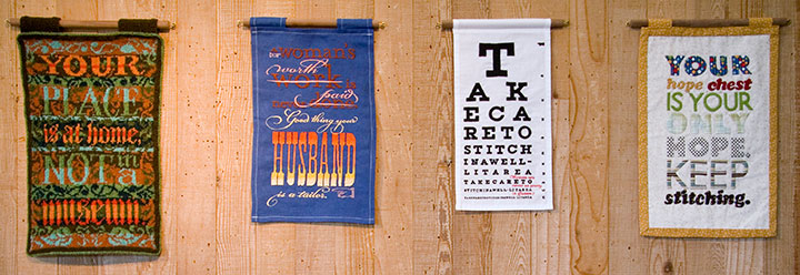
The knitted broadside was such a success that I decided to try branching out into other textile media. For Broadside No. 4, I took a shot at appliqué—something I’d never done before. Hand-sewing all those fiddly little pieces of fabric ended up being just as daunting as cutting a steek.
The hard work was oddly fitting for the concept: historically, a traditional wedding trousseau would have been sewn by a girl or young woman, in hopes of one day becoming a married woman with a home of her own. By the time she reached young adulthood, a woman would have spent years creating dozens of hand-sewn garments, household linens and other useful textiles, all gathered and stored in her “hope chest,” awaiting the day she would become a bride.

The thing is, back in the days when women couldn’t vote, or own property, or head a household, marriage was a woman’s only shot at independence or social status. (Hence the snark.)

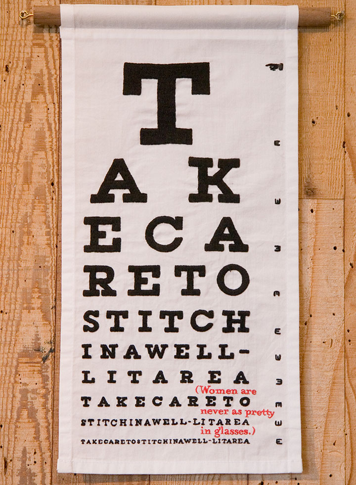
For the others, I turned to the original, old-school ancestor of fabric paint: embroidery. The method fit the madness this time, too, as I spent what seemed like a century hunched over and squinting, hand-stitching an eye chart…

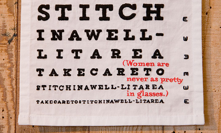
…complete with something to read between the lines.
This one gets personal. As a glasses-wearing gal myself, I happen to disagree with the statement—but I’ve actually heard these very words spoken by a woman. She wasn’t wearing glasses.

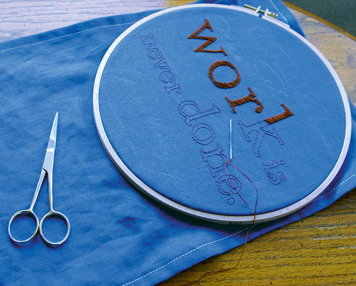
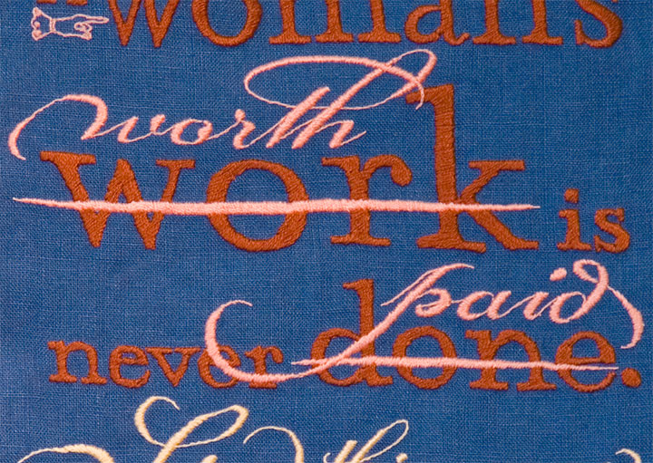
Last of all, I got to thinking about how men who sew for a living are called tailors—and women who do the same are called seamstresses. And how the two terms don’t quite add up to the same meaning.

Despite what the scornful quipping of the text might indicate, I had the most gleeful fun with this one. Unlike knitting, which confines the designer to a grid, or appliqué, which can only push the detailing so far, embroidery has almost limitless possibilities. So I went nuts with the tails and ligatures and dingbats, simply because I could. I love that about embroidery—it’s as flexible as I need it to be, and as fluid and crisp as the printed page.

All that was required was the patience to work each letter by hand. But it didn’t feel like patience—it felt like meditation.

It’s surprising how easy it is for embroidery to mimic letterpress. And watching “wood” type pop up from the fabric, rather than punch into paper, is a mighty satisfying sight.

Uppity notions aside (no pun intended), the Women’s Work broadsides are a fun way to slow down and take a break from what I normally do in the studio. But as I wrap up each one, I find myself hankering to get back into the print shop. By comparison, setting type and drawing letters suddenly seems like speedy work!
October 11th, 2010

While I’ve been hiding away, wrangling my 900-pound gorilla, Jessica has been cooking up something pretty great.

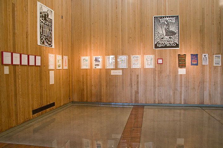
Thanks to her hard work and the wonderful Brian Hutcheson‘s invitation, we are pleased as punch to announce our first-ever dual exhibition!
Feminist Wiles: Jessica Spring and Chandler O’Leary
Now through November 5
Ted Sanford Gallery, Charles Wright Academy
7723 Chambers Creek Rd. W
Tacoma, Washington
Open 8 to 5, Monday through Friday
It seems weird that after more than two years of collaborating, giving lectures and printing in the street, we’ve never had an honest-to-goodness show together.

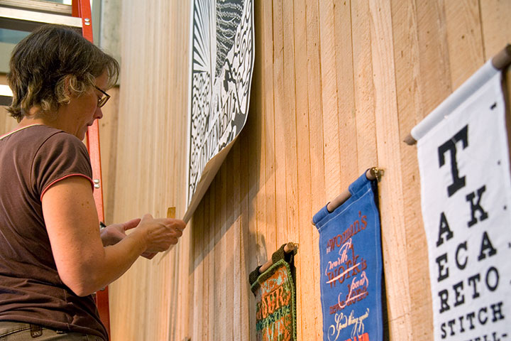
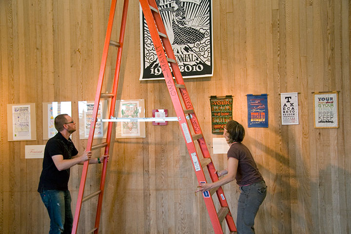
But when Brian offered us a cavernous space, his help with installation, and the chance to indoctrinate the innocent introduce our series to the kids at Charles Wright—well, we’d be nuts to pass that up.

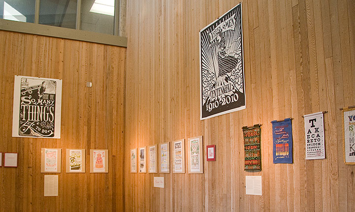
For the first time, all nine (and-a-half) Dead Feminist broadsides to date, plus our two steamroller gals, are on display together.

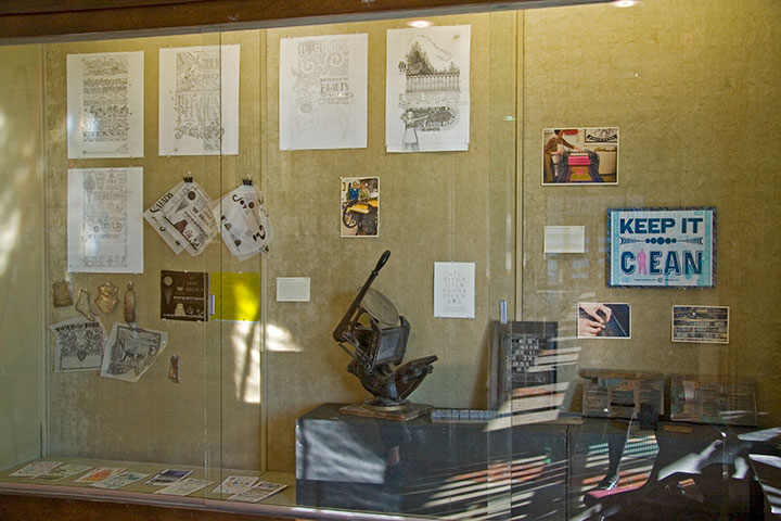
We also have a little mini-exhibit about our process,

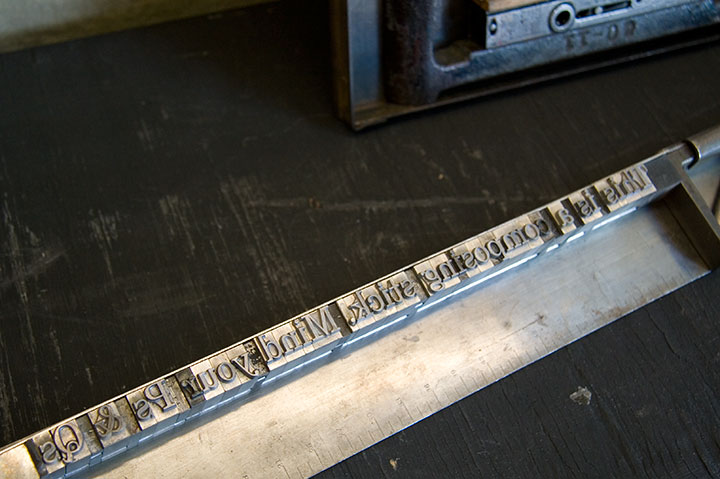
and lots of little goodies to introduce people to letterpress.

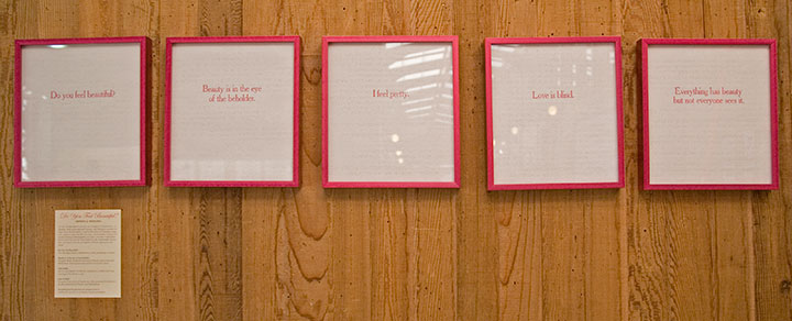
Jessica and I have rounded out the collection with solo work that complements the theme of the show. Jessica’s half consists of Do You Feel Beautiful?, a series of broadsides featuring famous aphorisms on beauty. Here’s the thing that blows my mind into tiny pieces every time I think of it: the quotes are letterpress printed on the pages of a Braille edition of Seventeen magazine. Whoa.
I contributed Women’s Work, an ongoing series of broadsides created in hand-sewn textiles rather than my usual letterpress.
Now, I get a ton of questions about these things whenever I show them, so I thought I’d outline the ideas and process behind them here.

The Tailor first sparked the idea for the series; as you know, he makes his own clothing (hence the nickname). This is a feat that never ceases to amaze me, and I’m not the only one—he gets a lot of comments, usually along the lines of “Wow, you made that?” He’s always a little surprised by these comments, because where he grew up, a lot of people (including his family) wore homemade clothing. That got me thinking, though. The people who do all that sewing in the Tailor’s hometown are women—mothers, grandmothers, sisters, daughters, wives. We’re all surrounded and preceded by generations of women who sew clothing, or knit sweaters, or draft patterns from scratch, without any rave reviews—or any comment at all. But every male knitter or quilter I’ve known, every rare and wonderful man who ever picked up a needle, is either looked at like he’s nuts, or treated with reverent awe. It strikes me as a little strange that depending on who made it, and who’s looking at it, a pair of pants can be a work of art—and an actual work of art can be completely ignored.
If you go further back, like, I dunno, throughout the entirety of human history—you’ll find that both men and women have been responsible for creating textile goods in nearly every culture on earth. Yet in almost every case, when men made textiles it was as part of some sort of guild craft or other professional setting. When women made textiles, it was as part of the home front. This is true in every part of the globe, in pretty much every era, going back to the advent of textile technology.
No matter who does the stitching, there’s an enormous amount of technical skill and design sensibility required to make a garment or textile object. So instead of creating divisions and pigeonholes—instead of separating into Art and Not Art, into Man-made and Woman-made, what if we started seeing the inherent worth in the objects themselves? And what happens when we take a handmade textile and stick it in a gallery? Does its perception change?
Based on what I’ve seen so far with these broadsides, I’d say it does. It’s been an interesting experiment, for sure.
So the Women’s Work series is a bit of an indictment of the double standard, and while the snark is aimed at a wider target, I wrote them as if I were speaking to a woman. Each one is completely made/knitted/sewn/pieced/embroidered/etc. by hand, from design to pattern to construction. The text reads in the voice of a disapproving female role model (or the insidious voice inside our own heads)—in the tone of the backhanded compliment, the cheerful put-down. Each is also designed in the style of a traditional letterpress broadside, to put the typography within the context of an art form centered around mass communication.

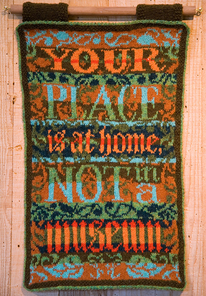
This guy requires a little more of an explanation for folks who aren’t already into wool.

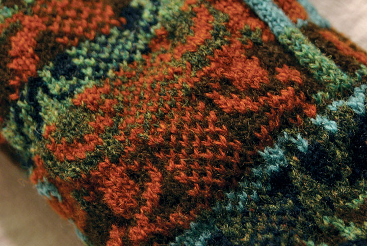
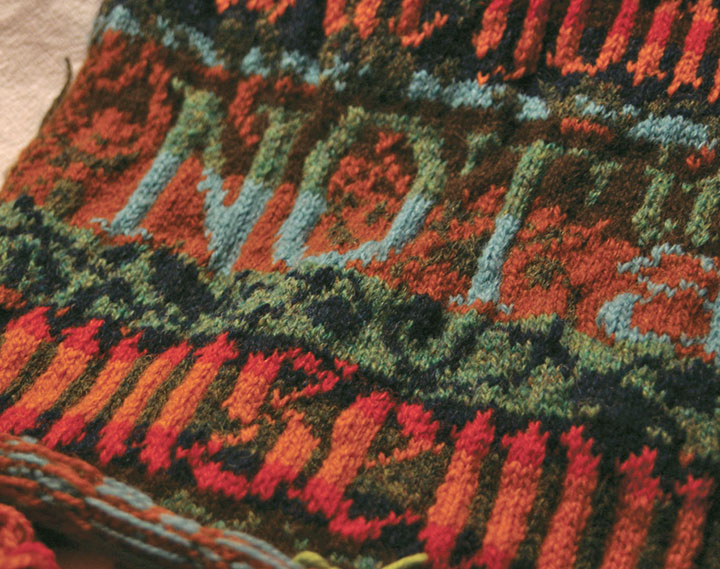
This piece, made almost three years ago now, is hand-knitted with Shetland wool, using the traditional Fair Isle knitting technique. Fair Isle—a method practiced since the nineteenth century on the tiny island of the same name, halfway between Scotland and Norway—is a tricky, rather ingenious thing. Traditional Fair Isle pieces are knit with two colors of yarn at the same time; the resulting fabric is durable, extremely warm, and great for any chilly, foggy, wet climate (like, hello, here). Beyond its über-practicality, Fair Isle knitting is simply gorgeous (take a gander at Google). By nature the double-thick fabric is dense and flat, making it an ideal ground for complex patterns and designs—it’s the perfect mix of function and fancy.

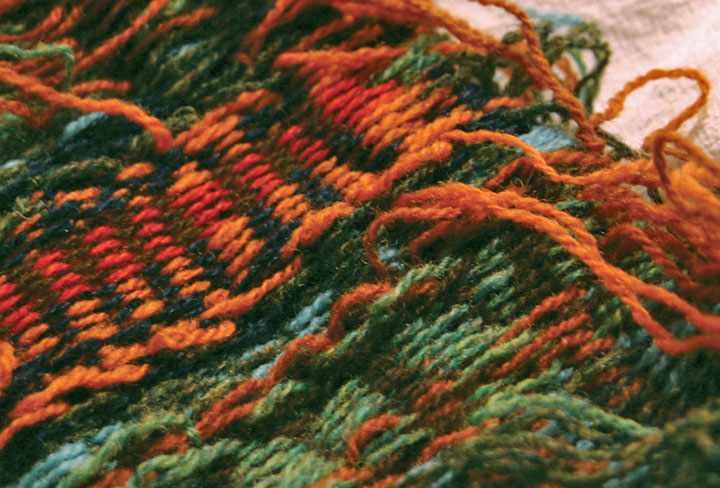
Here’s how it works: even though the piece is knitted with two different colors of yarn at once, only one strand at a time ever passes through the needles. The unused strand of yarn is carried loosely, or “floated,” behind the work—which creates a reversed-out image of the design on the back of the piece. It’s the floats that give structure to the fabric, and make it so cozy-warm.
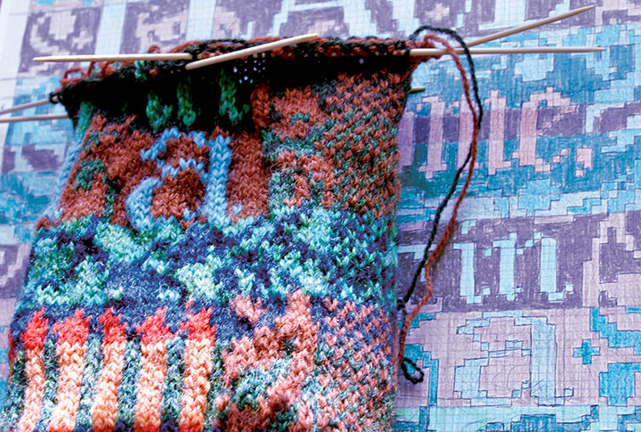
If you were to create a plain ol’ piece of ordinary knitting, you’d proceed from one end to the other of a row, flip the piece over, and work back the other direction. Rinse and repeat. If you tried that with a piece of Fair Isle knitting, working the “wrong” side would be extremely difficult, since the floats would now be facing you and covering your stitches. Now comes the tricky, smarty-pants part. Flat Fair Isle pieces are first knitted up into a big round tube, and then cut to lie flat. When you knit in the round, you never encounter the wrong side of the work. You just spiral around and around on the right side, happily knitting away and floating the unused color behind you as you go.

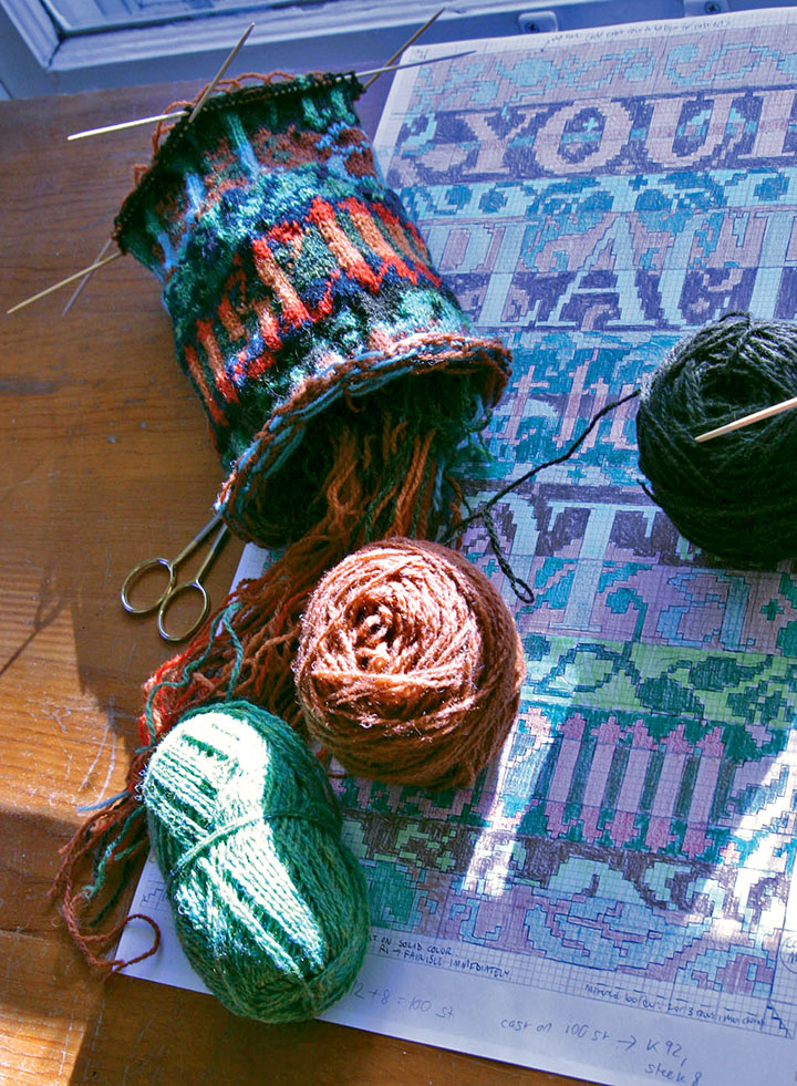
So in this case, once I had drafted my design into a gridded stitch pattern, I just pretended I was knitting one really big sleeve (or a neck warmer for a giraffe) with really teeny needles.
Ah, but remember the operative words above: you have to cut the piece to finish it. I had never done this before, and let me tell you, there’s an awful, terrifying finality to the idea. Torn sweaters unravel. Snagged socks fall apart. Who in their right mind would cut a piece of knitting on purpose? And even if you could do it, what happens if you make a mistake? Once you make that cut, you’re done.

This is where the true brilliance of the technique hit me like a ton of bricks. The Scotswomen of Fair Isle are a breed apart—and so are their sheep. Shetland wool, the material traditionally used in Fair Isle knitting, has a magical property that makes this crazy notion work: each wool fiber is covered with microscopic scales that attach to one another. Because the wool sticks to itself, the stitches become slightly matted as you knit. So following the Fair Isle method, you work a little buffer zone called a steek (see the checkerboard strip above?) into your design, and then cut right down the center of the steek. If you use trusty Shetland wool, your stitches won’t unravel when you cut them.
At least, that was the theory. I didn’t quite believe it at the time. But I’d come this far—I didn’t want to lose faith. (If you’re looking to try Fair Isle knitting yourself, I find a glass of wine helps.) So I took a steadying swig, held my breath, and cut.

And then I exhaled. And blinked. I had a flat piece. Gingerly I tested the cut edge—and was amazed. Even with a fair bit of tugging, the stitches refused to unravel.
I will never question a Scotswoman again.
My favorite thing about all of this, beyond the magic of Fair Isle itself, is that knitting really lends itself well to letterforms. Even though the pattern is drafted out on a grid, the forgiving nature of knitted stitches turns every square on the grid into a slightly curved, irregular shape. So when you zoom out and look at the piece from a distance, those grid “pixels” turn into nice little serifs, curves and curlicues.
The rest of the broadsides in the series are made using other types of needlework (more on that in the next post), but the knitted piece is still my favorite. I think I need another dose of that Fair Isle magic in my life—maybe next year you’ll find me up to my knees in wool again.
(Read about the rest of the “Women’s Work” broadsides in part two.)

March 8th, 2010

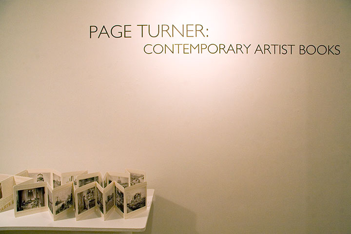
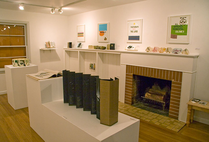
If you ever wanted to find out once and for all what the heck an artist book is, take a little field trip to Burien, WA. The group show Page Turner: Contemporary Artist Books is up this month at the Burien Arts Gallery, a tiny half-Cape house converted into a charming exhibition space.

Kelda Martensen did a stand-up job of curating the show—and artist books aren’t easy to display, believe me. She’s represented a wide variety of work, from prints to traditional bindings to kinetic sculptures, featuring the work of artists nationwide, including Inge Bruggeman, Ken Botnick, Regin Ingloria, Jana Harper, Diana Guerrero-Macía, and many others.

The gallery is open noon to four, Thursday through Sunday, and on Thursday, March 18, at 7 pm, Kelda will be giving a curator’s talk about the work in the show, sponsored by the Book Arts Guild. Free admission, always.

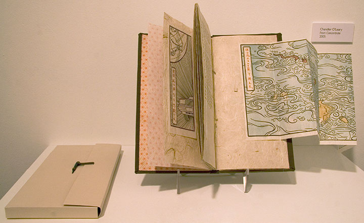
I’ve got a couple of pieces in the show, as well. Above is From Concentrate,

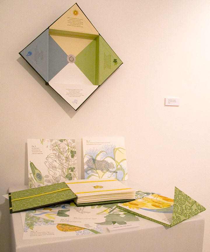
and this is The Faery Gardener.
Here’s the rub, though: the recession has hit all galleries where it hurts, but since the Burien Arts Gallery is run by the city, times have been especially tough there. This will be the last exhibit in the Cape Cod house; and possibly the last ever for Burien Arts, unless they can find public support, funding and a new space. So come check it out before they have to close their doors on March 19 (the website says they’re already closed, but you can still see the show).

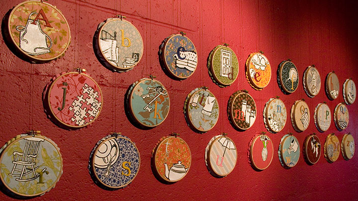
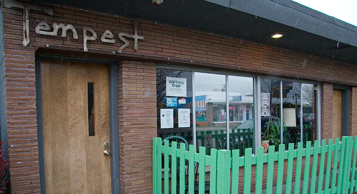
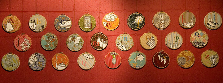
Speaking of artist books, if you missed Mnemonic Sampler at PLU, there’s another chance to catch the series in a new venue, closer to home: the Tempest Lounge, here in Tacoma.

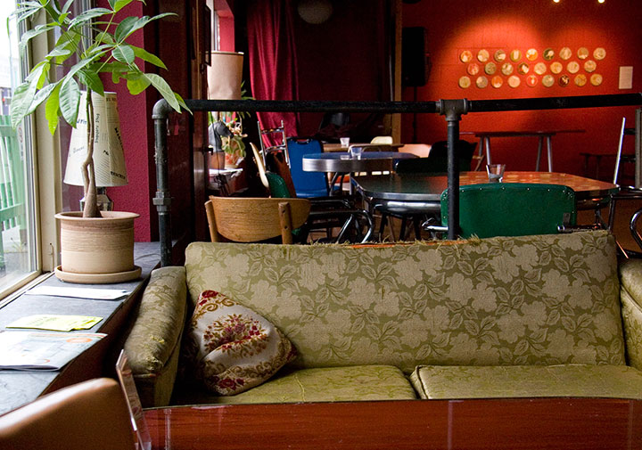
My friend Denise is the owner of the place, and when she asked if I was interested in showing there, I jumped at the chance. Although I love the clean beauty of a traditional gallery space, my favorite exhibition venues are the offbeat ones—restaurants, coffee shops, libraries, and now classy retro bars! I love these spaces because they bring art into real life, and invite folks to feast their eyes wherever they are. Most people (including myself, I must admit) are more likely to step into an eatery or a library than a gallery, and a coffee shop doesn’t have the same intimidating associations that some people have with galleries (that feeling of “If you’re not here to buy, you shouldn’t be here at all”). Plus, at the Tempest you can have a beer or cocktail while you look at the art. You can’t beat that.

If beer isn’t your thing, you can also have a cuppa tea or joe, and the food is divine—Denise runs a classy joint here. So curl up on a retro couch for happy hour, come chat by the adorable green picket fence, or just stop in to take in that fabulous red wall. Mnemonic Sampler will be up through April 30.


![Chandler O'Leary [logo]](https://chandleroleary.com/wp-content/themes/chandleroleary/images/logo.png)
