Blog
May 9th, 2015
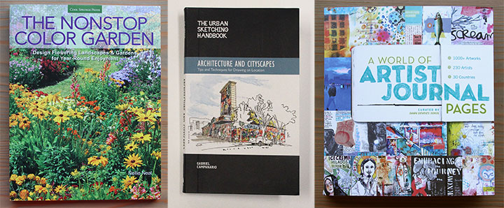
Speaking of new books, my work has appeared in a few other recent titles, and I finally had a chance to share some photos with you.

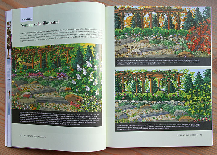
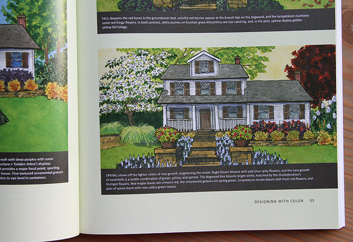
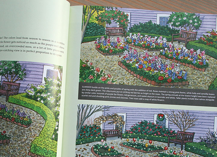
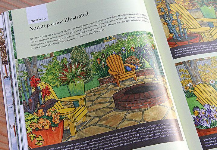
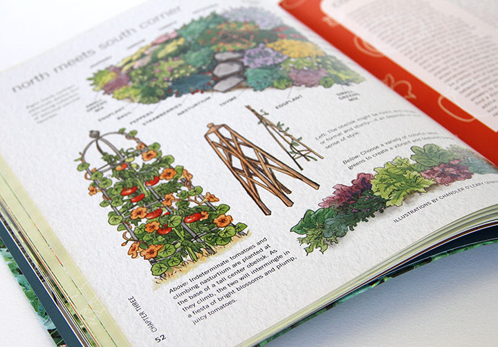
First up is another garden book, which I hinted at some months ago: The Nonstop Color Garden, published by Cool Springs Press, an imprint of Quarto Publishing Group.

This is the second garden book I’ve illustrated with Quarto, though while the first one was about centering a garden around edible plants, this one is about creating a year-round display of color.

I contributed a dozen illustrations to the book—each showing a garden plan throughout the year, with the color evolving and changing with the seasons.

The book couldn’t have arrived with more perfect timing for me—now that the Tailor and I are in the new house, we have all sorts of ideas for how we’d like build and shape a future garden. One of the things I always admire in Pacific Northwest gardens is how they’re bursting with color in nearly every month of the year. Just researching the illustrations for The Nonstop Color Garden gave me lots of new knowledge and ideas (and the book doesn’t just deal with one region, either!), and you can bet I’ll be reading the finished book carefully for even more inspiration. Big thanks to Quarto and my fantastic art director, Brad Springer, for helping turn my thumb just a shade greener!

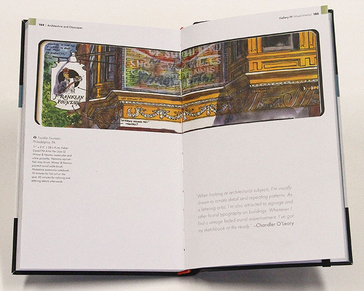
The other two books are centered around my favorite thing ever: sketching. One is the latest book written and edited by my friend Gabi Campanario, founder of the Urban Sketching movement. His newest, published by Quarry Books, is a handbook on urban sketching, focused on drawing architecture. The book includes tips and examples from artists all over the world, in a wide variety of techniques and styles. I was asked to contribute a sketch I did in Philadelphia a few years ago—it feels great to be in such good company in the book. Thanks, Gabi!

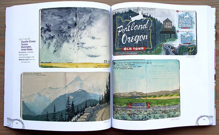
Finally, the newest book is called A World of Artist Journal Pages, by Dawn DeVries Sokol and published by Stewart, Tabori & Chang. This book is different in scope from Gabi’s sketching handbook—instead, it’s more of an anthology of journaling. There are over 1000 artworks represented in the book, and they present a broad range of journal work—everything from personal diaries to collage books to handwritten calendars to idea sketchbooks to figure studies to travel journals. Much of the work reminds me of the personal diaries of artists like Frida Kahlo, and the book is a fascinating glimpse into how the creative process works differently for everybody. If you’ve ever wanted to keep a visual journal, but didn’t know where to start, this might be a good reference book to have on hand.
Many thanks to the authors and publishers who included my work! It feels so good to have these babies on my bookshelf.
July 10th, 2014

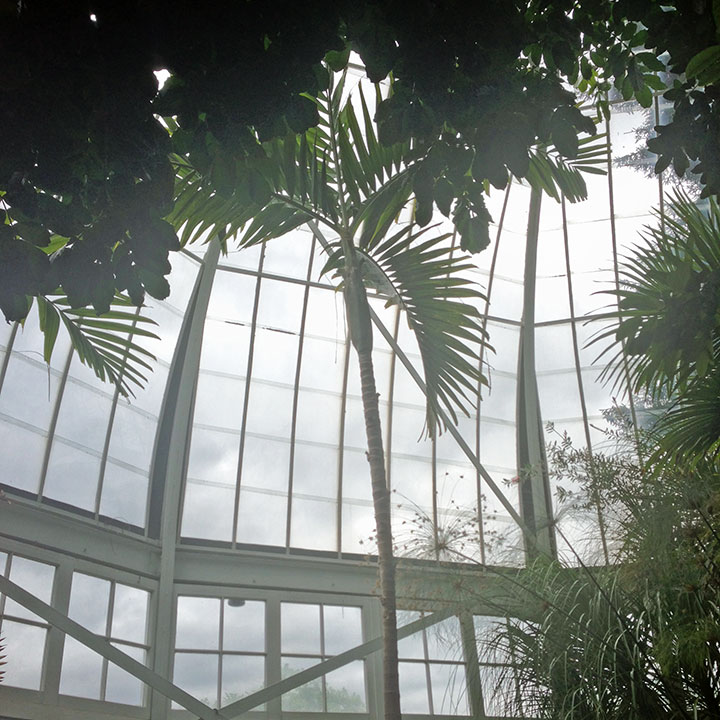
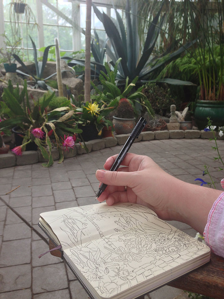
Whenever I’m looking for a change of pace, my default is to head for a coffee shop and work there. This time, though, I wanted something a little different—and besides, I needed some reference material for some additions to my Succulent! series I’m working on. So I strapped on my walking shoes and headed to another Tacoma favorite: the glass conservatory at Wright Park. The cacti are right as you walk in the door, and there’s a convenient bench nearby. So I just plopped myself down and set to work, happier than a hothouse flower.

June 5th, 2014

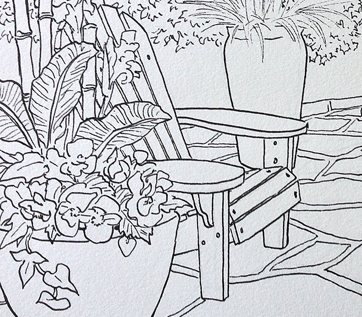
I’ve been drawing a lot of Adirondack chairs lately—which, since I adore them, is just fine with me. I’m working on illustrating another book with Quarto Publishing Group, that will be released in late fall of this year. I can’t share any salient details yet, but I thought I’d show just a wee slice. As soon as the book comes out, I’ll let you know!
March 27th, 2014

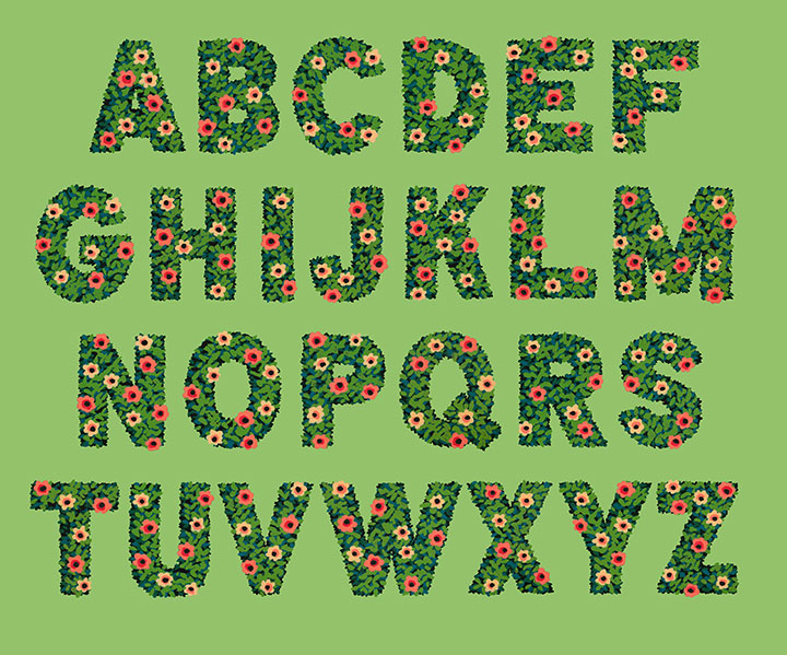
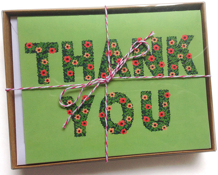
Look! I made an alphabet!
It’s funny—I almost never design an entire alphabet. In general, lettering projects just don’t really work like that. Most of the time, a letterer(erer) designs only the letterforms required for the word or phrase they’re lettering. That’s really the best way to create letter styles (which are not the same as fonts!) that really fit what the text is trying to “say.” You’re not designing an alphabet and then making it work for a bit of text—you’re taking that bit of text and giving it a voice.

But this time, I did things differently. I wanted to create some botanical lettering, but I wasn’t sure what I wanted to use it for—so I went whole hog and started with the entire alphabet.

Lately I’ve been doing a lot of work with a new (to me) medium: acrylic ink. It’s what I used to create the You’ll Like Tacoma and Love Birds series. What I love about acrylic ink is that unlike watercolor, it’s opaque—and infinitely easier to wrangle than the more traditional opaque medium of gouache.
When you work with watercolor alone, you have to start with the lightest colors first, and build up darker ones in layers. Whites are the white of your paper, and once you add pigment to an area, you can never return back to that pristine white. It teaches you to think in a subtractive sense, where you sort of “cordon off” the areas you want to stay white, and carefully build everything else up around them. I love working with watercolor, but it takes years and years of practice to feel proficient at it, and it’s not a medium that’s forgiving of mistakes.
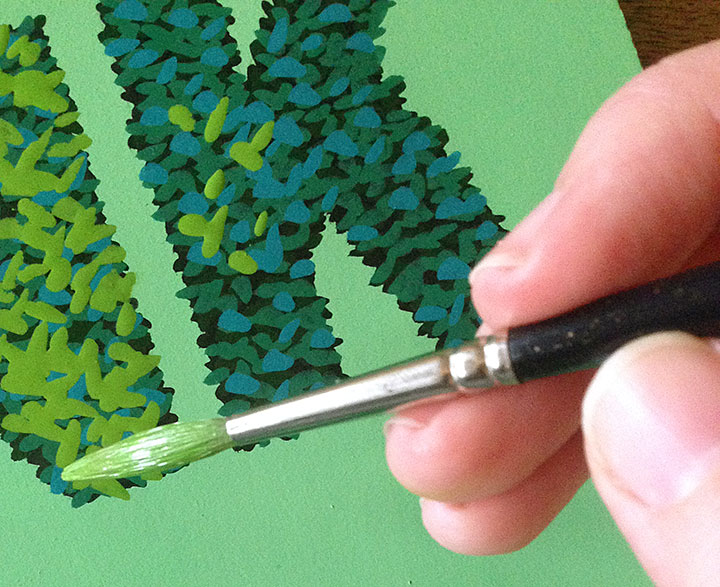
I find opaque media to be far more freeing, and the look more crisp. (I also like to combine acrylic ink with watercolor in the same painting—the best of both worlds!) But what I love best about it is that I don’t have to work from light-to-dark—I can go in reverse! Many of the mid-century illustrators I admire (Mary Blair, Eyvind Earle, Walt Peregoy, Ralph Hulett, etc.) painted with opaque media, so I looked at a lot of landscape paintings done for animation backgrounds for clues on technique. That’s when I figured it out: dark-to-light, not light-to-dark.
For my alphabet, I started with a black hedge silhouette, and added leaves (above) in increasingly lighter greens and blues. I think by the end there were 9 or 10 layers of paint in the finished lettering.

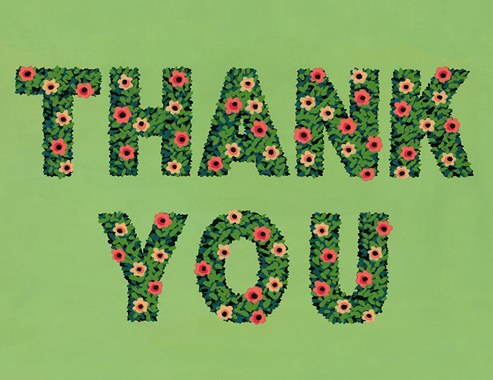
I was so grateful for the epiphanies Earle and Hulett had given me that suddenly, what I wanted to do with the alphabet became clear: thank-you cards!
To hedge my bets (sorry) I’ve packaged them up both individually and in pretty little box sets of 8. You can find yours in the shop!

December 4th, 2013

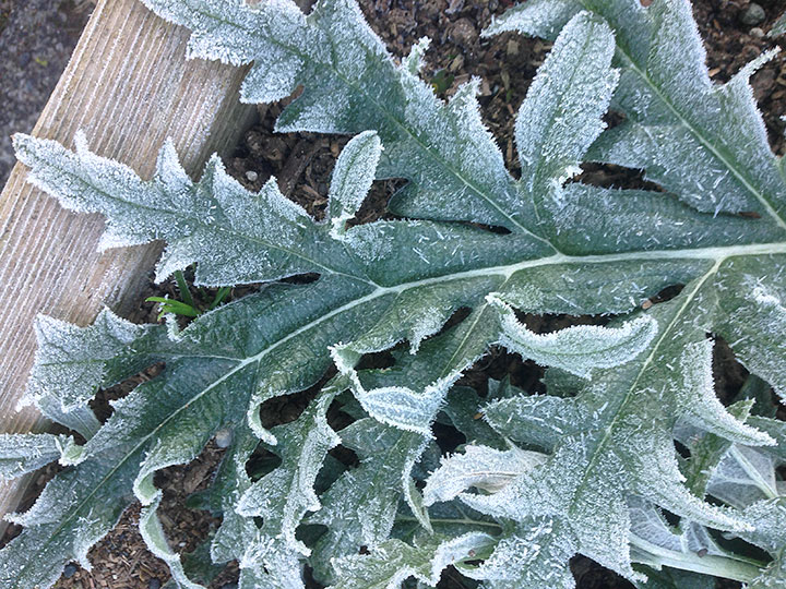
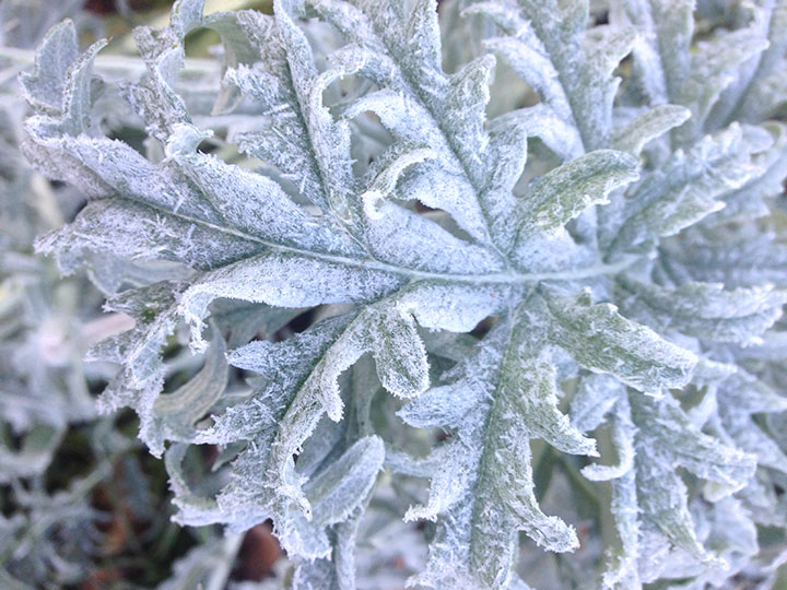
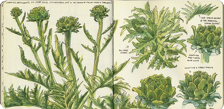
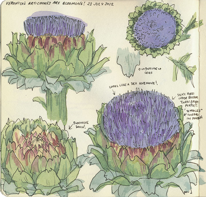
My next-door neighbor’s artichokes just can’t help but be gorgeous—in every season of the year. With no effort, nature can make a filigree that I could never hope to match in a million years.

February 20th, 2013

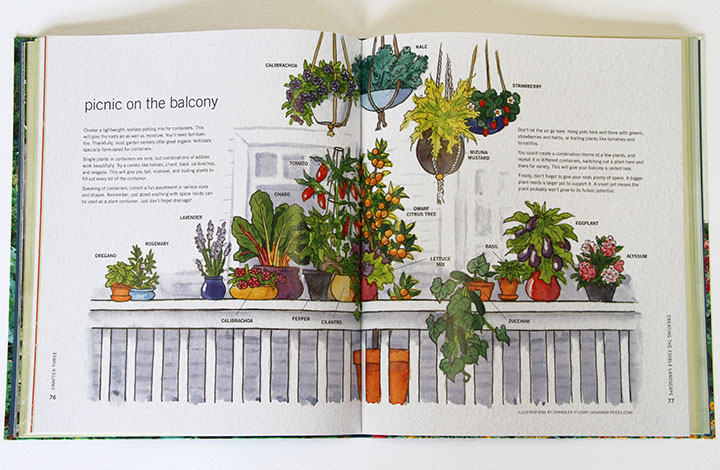
You can imagine my delight when I came home to find a book I’ve illustrated waiting in my mailbox! I’m happy to announce that The Edible Landscape by Emily Tepe, published by Voyageur Press, is now available!
The book is centered on a subject very close to my heart: urban homesteading and the slow food movement. It’s all about crafting a garden plan centered around edible plants. My drawings are sprinkled throughout the book, illustrating lots of design possibilities for gardeners. I love the idea that my watercolors might help someone dream up a plan for feeding their family and beautifying their home.
Many thanks to Voyageur Press, and most of all to my amazing art director, Cindy Laun, for bringing me onboard!

September 21st, 2012

I gotta say—even though I have loved all the traveling I’ve done in the past few months,

there is just nothing like coming home.

August 22nd, 2012

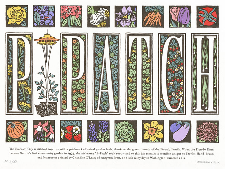
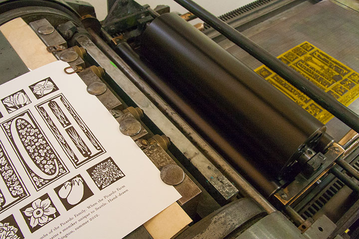
A couple of months ago I was asked to create a letterpress broadside for a collaborative print portfolio for a show in Asheville, put together by the Ladies of Letterpress. The theme was Expanding Communities—beyond that, we could do anything we wanted. So I focused on a unique element of Seattle’s community: the P-Patch.
A P-Patch is a community garden like any other—and completely unlike any other. The name comes from the Picardo family, who converted their farm into the city’s first truly communal garden in the 1970s. So to this day, if you life in Seattle, you tend your p-patch, not your garden plot. That just charmed the heck out of me, and I wanted to create a tribute to it.
P-Patch is completely hand-lettered, as well as hand-painted with watercolor, in homage to the hard work required to maintain a thriving garden. Many thanks to the Ladies of Letterpress gals for inviting me to be a part of the portfolio—I can’t wait to see what everyone else came up with!
August 6th, 2012

Today is my fourth anniversary of living in lovely T-town. And all I can think of is: A) I can’t believe it’s been four years already—

and B) I still can’t believe I live in a place where artichokes will grow happily in the front yard.
I love this place.
July 6th, 2012

I’m working on a little something in Jessica’s studio right now.
Something that’s making me downright hungry.
I’ll show you the finished product as soon as it’s done—provided I don’t go bury my head in the veggie crisper first!


![Chandler O'Leary [logo]](https://chandleroleary.com/wp-content/themes/chandleroleary/images/logo.png)
