January 7th, 2014
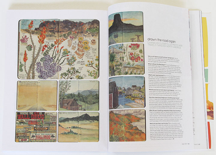
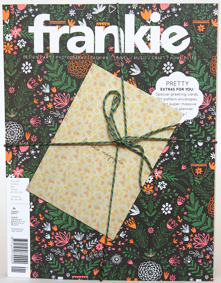
Look what was in the gigantic mailbag yesterday! The kind folks at the Australian magazine Frankie did a feature on my Drawn the Road Again blog! Not only is it an honor to be included, but this might just be the most gorgeous magazine I’ve ever seen. (And they even tied it up with pretty twine when they sent me my copy—swoon.) I know that at least a handful of stockists carry Frankie outside of Oz—so if you’re lucky enough to live near one, be sure to pick up a copy and see all the beautiful goodies inside.
Many thanks to Holly M. and Frankie Press for interviewing me!

November 30th, 2011

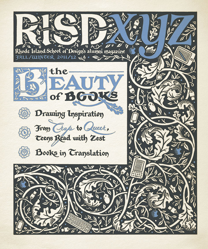
This fall my alma mater asked me to illustrate the cover of its alumni magazine. Since the issue’s theme was the spectrum that books occupy these days (from hand-bound artist books to e-readers), it was right up my alley.

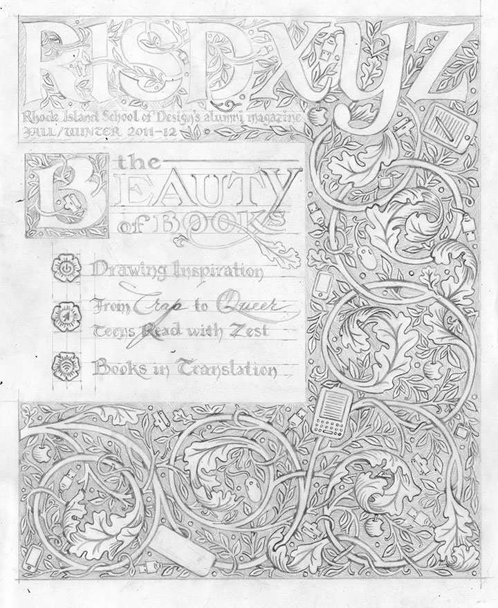
As usual (see above, I’m nuts), everything is completely hand-drawn, including the magazine’s masthead. (Major thanks to my editor at RISD for having faith in me on that one—and not sending the Brand Police after me for monkeying with the logo!) I wanted the design to be reminiscent of illuminated manuscripts and their younger printed cousins designed by William Morris. If you look closely, though, there’s a twist:

Tech gadgets, ripe on the vine.
(Sorry, William.)
February 20th, 2010

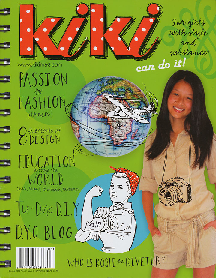
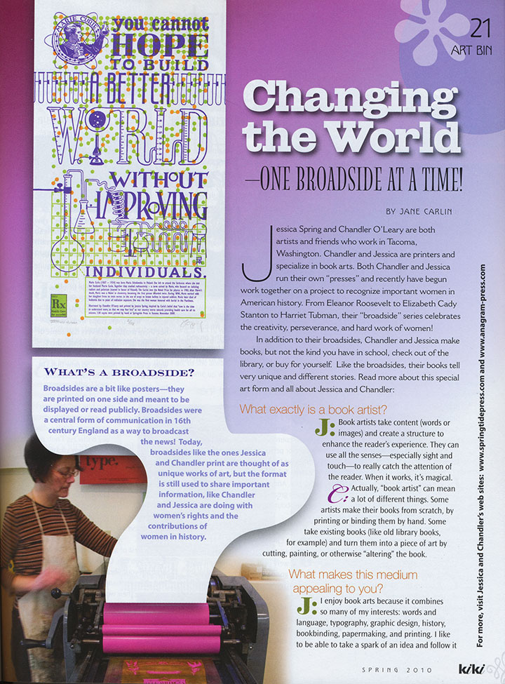
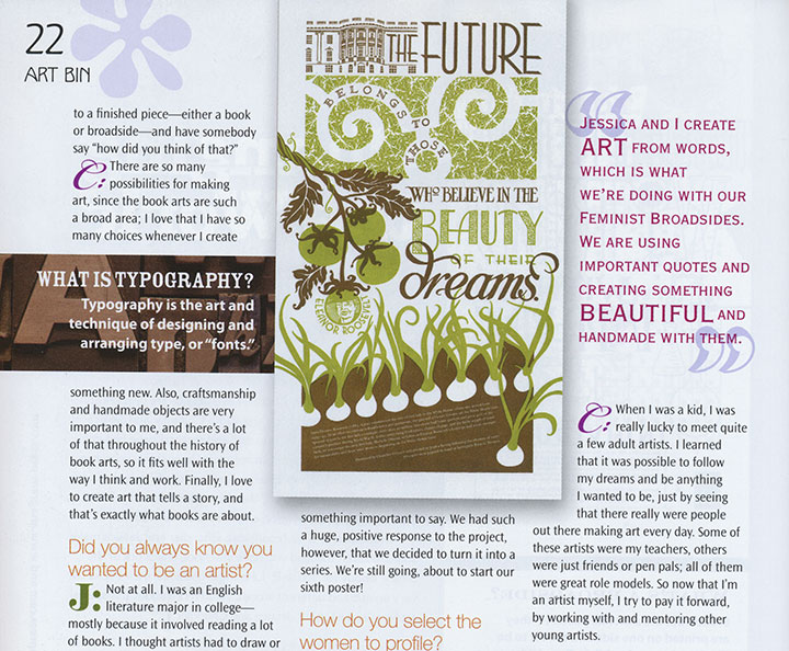
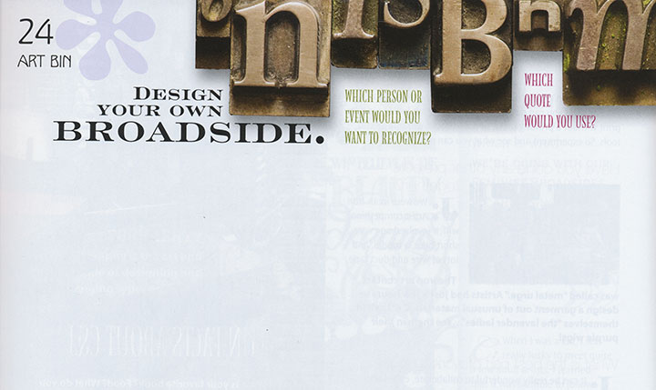
Jessica and I have had some seriously huge smiles for the past couple of days: we just received our copies of the latest issue of Kiki Magazine, which contains a feature on the Dead Feminists!
Before we were contacted for an interview, neither of us had heard of the magazine, but I can tell you that we became instant fans when we read its mission. Unlike so many other magazines written for teenage girls, which usually (even if inadvertently) tend to focus on questioning one’s body, popularity, attractiveness and overall self-worth, Kiki aims to empower girls with self-esteem, confidence, and a wide variety of knowledge and skills. As someone who is generally dismayed by the lack of respect with which our society tends to treat girls and women, and the self-loathing and doubts still being ingrained from their earliest experiences onward, Kiki seems like a breath of fresh air—and a huge relief.

And hey—who are we really creating these broadsides for, anyway? What is it that we’re trying to change in our world? It’s not just about the social issues we cover with each piece—it’s about teaching the women and girls around us that they can be heard, that what they say and do matters.

So Kiki gets an A-plus in my book, not just for the thoughtful content (no ads! No boy-crazy quizzes! All substance!), but for the fantastic design! This thing is seriously fun to read and gorgeous to look at. And look! My favorite part:

Rock on, Kiki. We’re honored to be a part of what you do.
April 9th, 2009

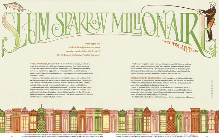
When I was growing up I used to raid my dad’s personal collection of books whenever I was looking for new reading material. We had bookcases all over the house, but I could always depend on Dad’s collection for the discovery of a new favorite. Those shelves introduced me to some of my favorite authors, and some of my most vivid memories are recalled passages from Steinbeck, Salinger, Pirsig, Robbins, etc. Dad’s bookcase also exposed me to some seriously weird stuff (which probably explains a thing or two about my tastes and personality), writing that I didn’t begin to understand until years later. One book that I went back to several times, attracted to its sheer strangeness, was Revenge of the Lawn, by Richard Brautigan—the title story was my favorite. I’m pretty sure most of the similes and imagery flew over my teenage head at the time, but I loved the fact that something could be so entertaining and emotional, and yet so bizarre. (And I fully blame Brautigan for my own rambling, tangential, parenthetical writing tendencies.)
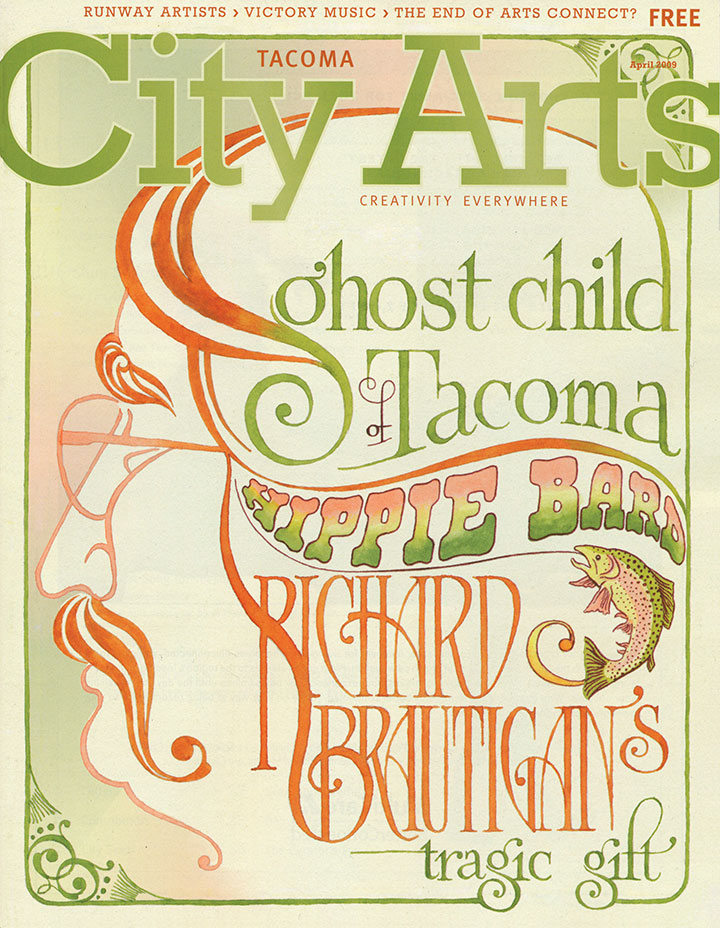
Last month I got an email from City Arts, asking if I’d create some lettering and illustrations for a feature story they were doing on Richard Brautigan’s Tacoma roots. I did a double-take—wait a minute, Brautigan lived in Tacoma?
So I re-read “Revenge of the Lawn,” and was amazed at how much my new perspective of being a Washington/Tacoma resident changed the story for me. Even the more straightforward lines like “He was selling a vision of eternal oranges and sunshine door to door in a land where people ate apples and it rained a lot” took on an almost tangible layer of meaning. (I love that “I’ve Been There!” feeling when I read. It makes me want to run and tell everyone I know: See that passage there? I know exactly what he’s talking about!)
Illustrating Brautigan, or text about Brautigan, was a whole different matter, however. What could I possibly say with a picture what such a vividly visual writer hasn’t already said with words? This is the guy who wrote, “The creek was like 12,845 telephone booths in a row with high Victorian ceilings and all the doors taken off and all the backs of the booths knocked out,” after all.

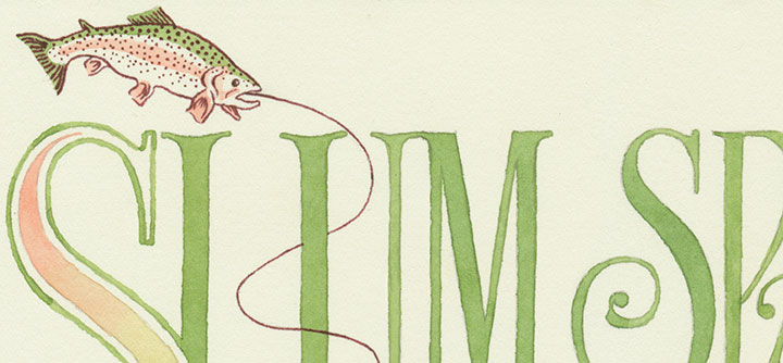
I mulled it over for awhile, and decided to take him literally. This was a pretty odd experience for me, because I was always trained to make illustrations that add to or change the meaning of a text—and to avoid didactic images like the plague. Somehow, though, for this project, I felt that actually cramming as many Victorian-style phone booths as possible onto the spread would highlight the humor and absurdity of Brautigan’s words.

Or maybe I just really wanted to draw pictures of trout.

Anyway, the text is all hand-painted with watercolor in a “trouty” palette, and references Victorian-era typography and psychedelic graphic design (which itself references Victorian-era typography … the trout swallows its tail). If you’re local, you can pick up your copy for free at a whole slew of locations in and around Tacoma this month. The original watercolors are on display in the To the Letter exhibit through April 30.

![Chandler O'Leary [logo]](https://chandleroleary.com/wp-content/themes/chandleroleary/images/logo.png)
