March 13th, 2014
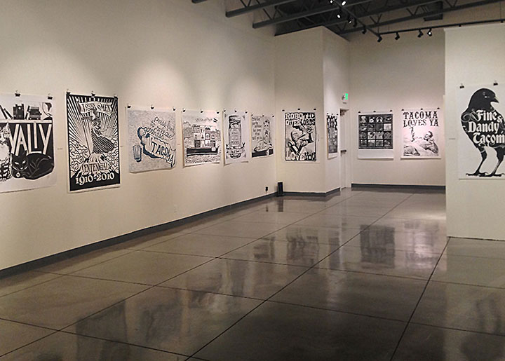
Well, I only just realized that my only photo of last night’s opening (stupid phone!) was so out of focus, but oh well. It still gives you an idea of how nicely the Wayzgoose steamroller prints look on a gallery wall!
Thanks to everybody who made the trek down to Parkland last night for the shindig—and to Jessica Spring for organizing, curating and installing these beasts!
March 10th, 2014

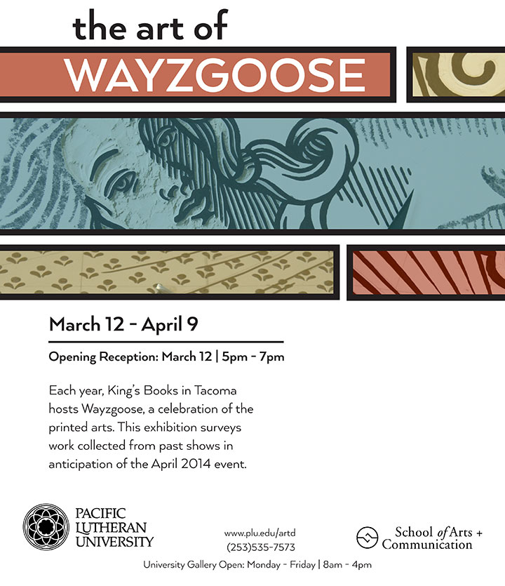
This year marks the 10th Anniversary of the Tacoma Wayzgoose! The festival isn’t until the end of April, but we’re celebrating early with an exhibit of all the giant steamroller prints created over the years at the Pacific Lutheran University Gallery. It’s going to be a doozy!
And I’m honored to see that the artwork I created with Jessica Spring is gracing all the promo materials for the exhibit! (Thanks, PLU.) If you’re in the Seattle-Tacoma area this Wednesday, stop by for the opening, won’t you?
In the meantime, we’re about to get crackin’ on this year’s steamroller print…look for a teaser soon.
October 14th, 2009

When I walked into the PLU Gallery this morning to document the Mnemonic Sampler show when it opens, my brain had somewhat of a short circuit. Since I was out of town for the past few days, all of the installation work was done for me (thank you a million times over, Heather C.!)—so this was the first time I’d laid eyes on the work since framing it up and chucking the pieces in a box. I somehow couldn’t connect the finished work on the walls with the crazy, chaotic process of the past few months. It seemed so simple, like this was somebody else’s show, and all the nail-biting and never-ending futzing I’d been doing was for some other project that would remain unfinished forever. But I did finish it—and there it is!

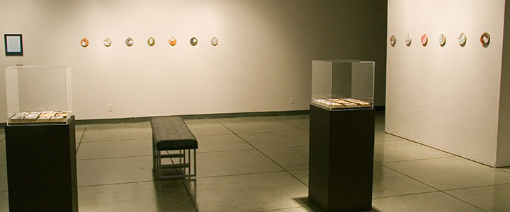
I was nervous about the possible absurdity of having twenty-six small pieces in a colossally huge space, but somehow, it works. Heather ingeniously used lighting and visual breaks to transform the gallery into a space that draws the viewer in and creates an intimate experience—which is exactly what I hoped for. Heather, I owe you big.

On to the work itself. Here is the artist statement for the exhibit:
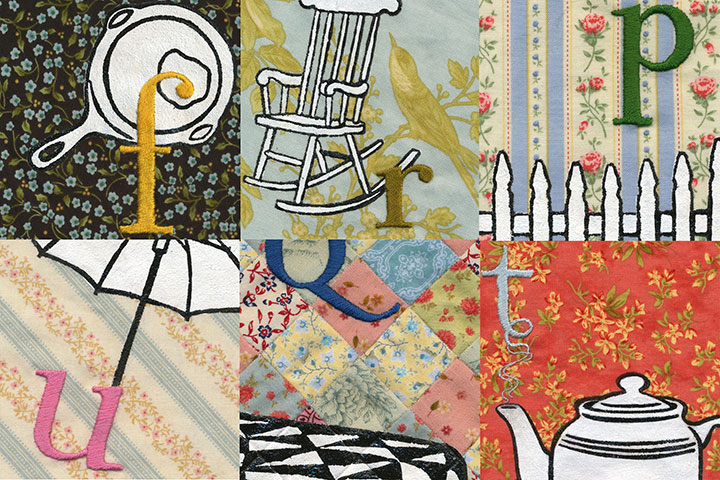
The alphabet is one of the first lessons we learn as children. From the beginning we learn to use it as a mnemonic device—just like “Roy G. Biv,” or “Every Good Boy Deserves Fudge”—assigning meaning to our world by associating symbols with each letter. Because the alphabet is one of our most basic and effective memory tools, we are drawn to it as both a visual and narrative archetype. It’s not surprising, then, that the abecedary is somewhat of a staple among book artists.
Just as we use our ABCs as a memory aid, our possessions help us create the concept of Home. No matter what our economic station, living situation, or domestic permanence, we all tend to share similar symbols of comfort and nostalgia. These ideals are embodied in the everyday objects around us—those mundane materials we take for granted, yet without which we would sense something lacking. As someone who has never had a picket fence, who grew up in a nomadic military family, and who has lived her entire life with relatively few possessions, the archetypal Home should seem foreign to me. Yet the same mnemonic triggers exist in my mind; the same objects attract me.
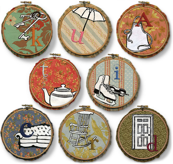
Mnemonic Sampler collects and files our household icons, gathered together like the stitched and quilted samplers of our mothers and grandmothers. The hand-stitched alphabet enumerates my, your, our trappings, shuffling our collective domestic inventory like the old card game of Memory. Each symbol is familiar; each object is Ours, whether we actually possess it or not. Together they sketch out a Home—real or imagined; longed-for or spurned; past, present, or future.

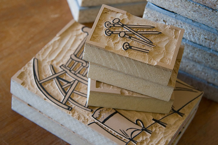
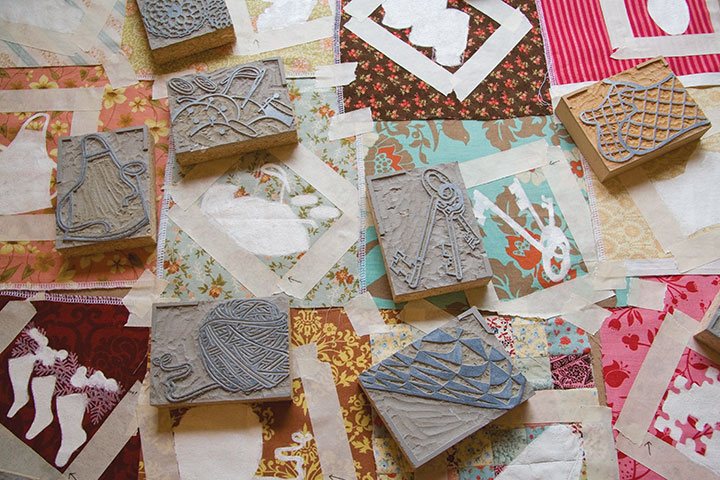
Mnemonic Sampler is a collection of monoprints, which means that instead of an edition of multiples, each print is created in such a way that it can’t exactly be reproduced. This technique results in a one-of-a-kind, totally unique piece—and is often more closely related to painting than printmaking. These pieces are printed from reduction-cut linoleum blocks—meaning both print colors are carved from the same block.

So once the second design is carved, the first color cannot be printed again.

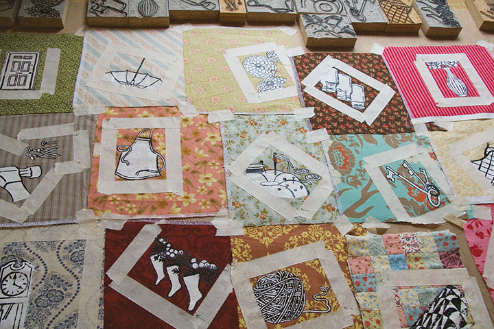
Designing these pieces was an intuitive process, consisting of both logical and intangible choices of fabric and pattern compositions. Because the design stage was so fluid (almost semi-conscious at times), it really wasn’t possible to do the printing on a press. Instead, each impression was made literally by hand, using masking tape to aid in color registration.

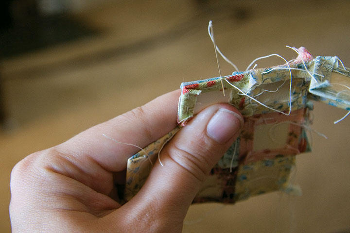
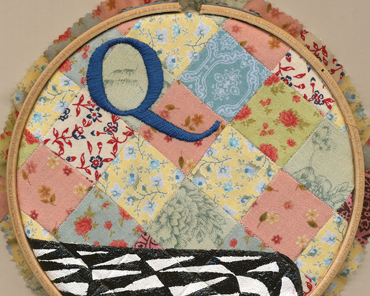
“Q” has an extra conceptual level, since the fabric background is a patchwork “quilt” in its own right. Like everything else about the series, the patchwork is sewn by hand, using the English paper piecing technique.

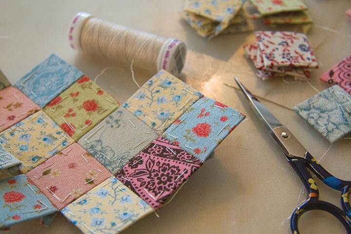
This was my first attempt at paper piecing, and I’m pleasantly surprised at how quick and accurate it is. Instead of folding and ironing every tiny piece, then wrangling a sewing machine, each patch is wrapped around a paper template and basted down, then whip-stitched together into a block.

The result is a precise little quilt—perfect for embroidery.

I can’t believe how long it took to complete every step of the process—and yet how quickly everything came together at the end. So you can bet I’m excited about celebrating at the opening tonight. And besides, I’m interested to see if the household objects I chose will resonate with viewers; it wasn’t easy to narrow things down to twenty-six letters of the alphabet, so I picked those objects that had the most meaning for me.
So how about it—what spells “Home” for you?
October 2nd, 2009

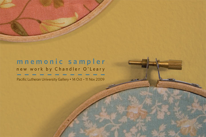
Finally, something tangible to show you! This is the point where all of the elements for my new body of work are just starting to come together. The past couple of months have been somewhat of a nail-biter—sometimes I wonder what possessed me to create twenty-six new pieces for a last-minute show. Now that the promo postcards (see above) are in hand and I can see the finish line, however, I can tell that my instincts knew what they were doing.
Mnemonic Sampler is my new solo show, opening October 14 at the PLU University Gallery. Here are the details:
Mnemonic Sampler: An Abecedary by Chandler O’Leary
October 14 to November 11
University Gallery, Ingram Hall
Pacific Lutheran University, Tacoma, WA
Opening Reception: Wednesday, October 14, 5-7 pm
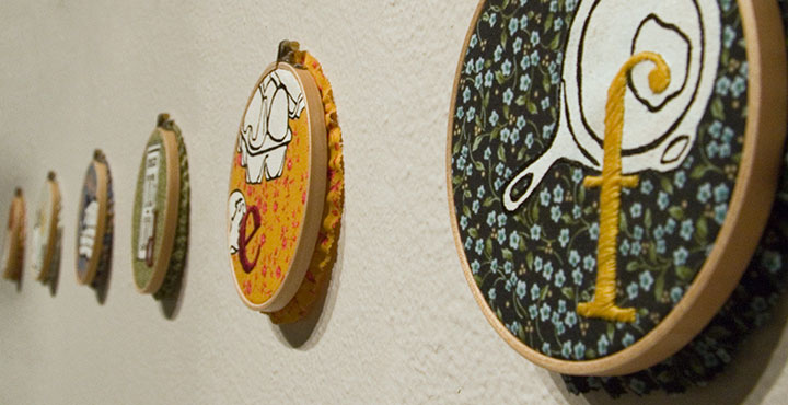
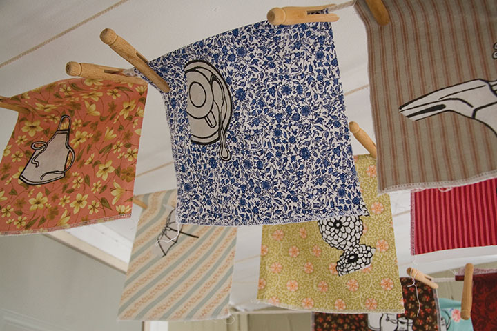
On display will be something of a room-sized artist book, consisting of twenty-six hand-embroidered monoprints on calico (a monoprint is the opposite of an edition, a one-of-a-kind piece). Together the prints form an abecedary, or alphabet, and tell the story of how our concepts and ideals of “Home” are linked to the everyday objects that surround us. More on this topic when the show opens, but for now, here’s a peek (since the work is not quite finished, a peek is all I’ve got for now):

Many, many thanks to the talented and infinitely helpful Katie S. at PLU, who took care of having show postcards printed and mailed (!), orchestrated every logistic detail, and who has made the whole process as smooth as pumpkin pie. I would have long since lost my mind if it weren’t for you, Katie!

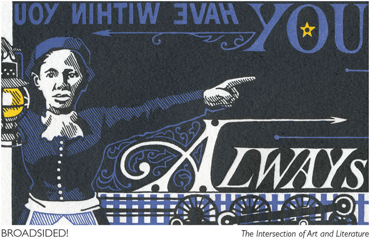
Speaking of amazing women who run galleries, another big thank-you and shout-out to Laura Russell of 23 Sandy Gallery in Portland, for featuring End of the Line on the promo materials for another new show that opens tonight. Broadsided! is national, juried exhibition of letterpress broadsides featuring the work of thirty-four artists. Here are the details from the 23 Sandy website:
Broadsided! The Intersection of Art and Literature
October 2-31, 2009
23 Sandy Gallery
623 NE 23rd Avenue
Portland, OR 97232
Opening reception: Friday, October 2, 6-9 pm
Before books, before blogs and before broadcasts, there were broadsides. Historically, single sheet broadsheet posters were ephemeral in nature. They were developed in the fifteenth century for royal proclamations, official notices and even advertisements. Today, broadsides hang at the intersection of art and literature. Letterpress printed broadsides are valued as fine art designed and printed by a true craftsperson; but also as fine literature featuring stellar poetry or prose.
The best part about the Broadsided! exhibit is that you don’t have to be local to see it! Laura has set up a fantastic online catalogue of the work in the show, with photos and the complete text from each broadside. Nothing beats seeing art in person, of course, but if you can’t make it to Portland this fall, this is a brilliant alternative.

![Chandler O'Leary [logo]](https://chandleroleary.com/wp-content/themes/chandleroleary/images/logo.png)
