Blog
October 23rd, 2014
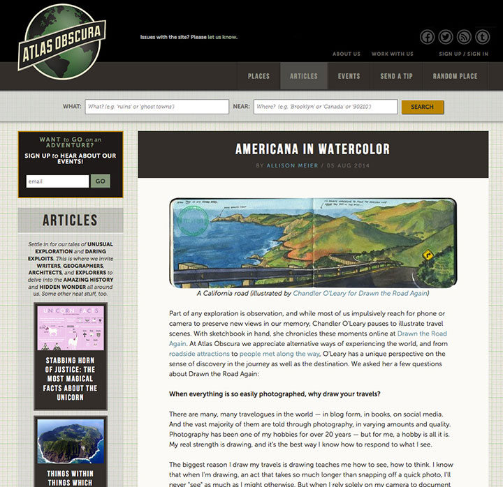
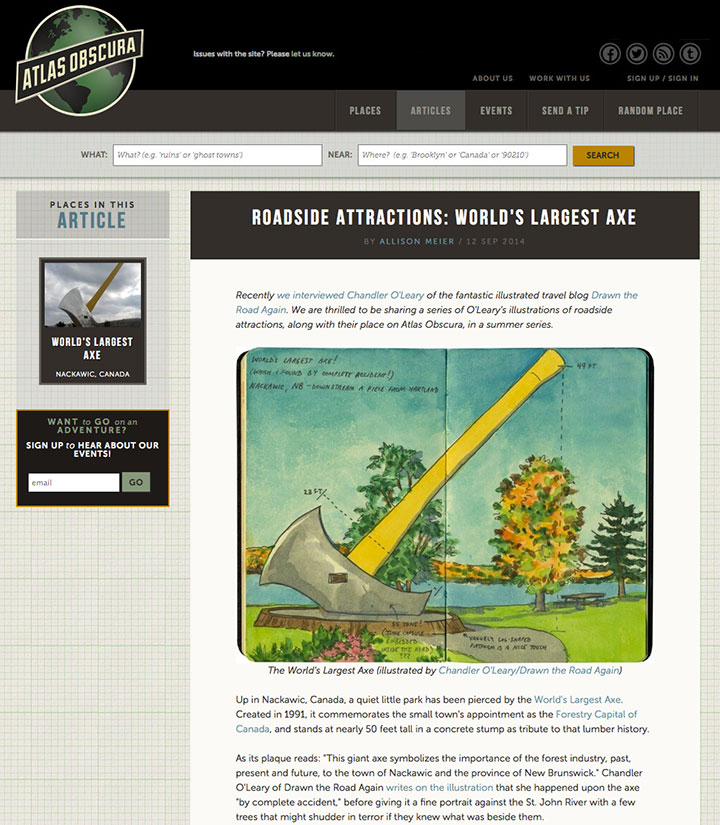
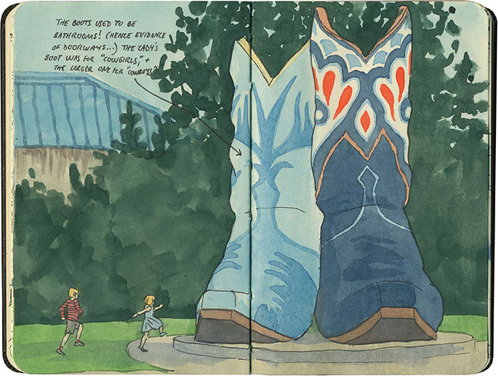
I wanted to let you know about some fun online articles I’ve been a part of lately. First up is one I’ve mentioned briefly before: the folks at one of my favorite travel websites, Atlas Obscura, have been doing a series of features on roadside attractions, featuring some of my sketchbook drawings. The series started with an interview about my Drawn the Road blog—

and has since expanded to a series of detailed features on some of my favorite roadside oddities.

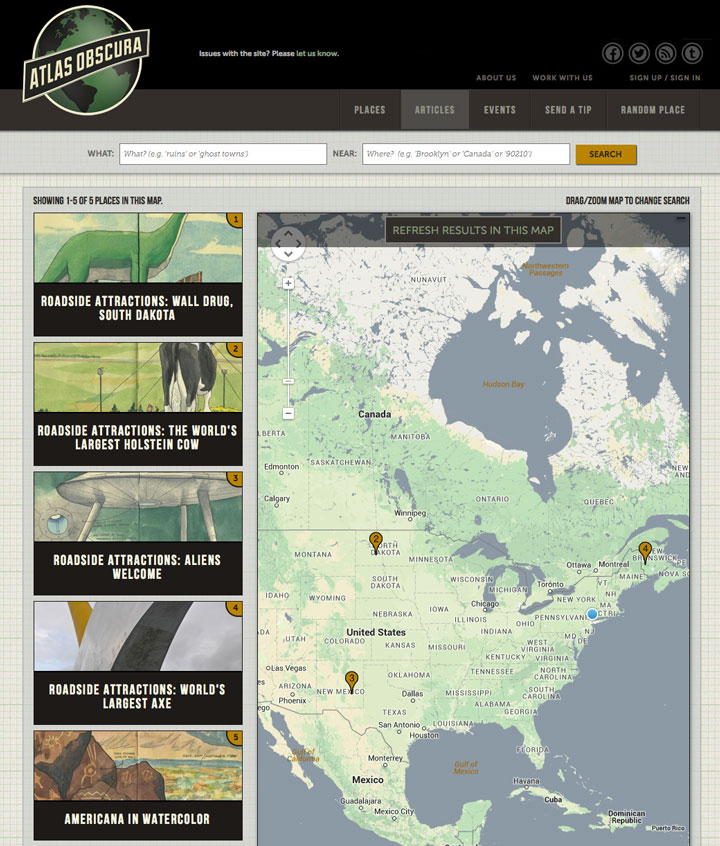
My favorite part is watching their ever-growing map dotted with pins representing where I’ve sketched things. I hope to see that thing peppered with dots before long! You can find all the features to date here. Many thanks to Allison Meier for devoting so much good ink to my sketches!

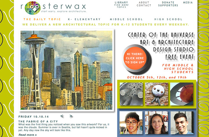
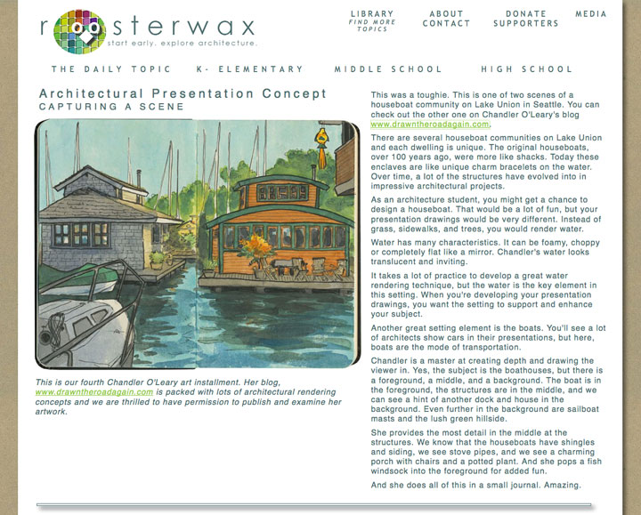
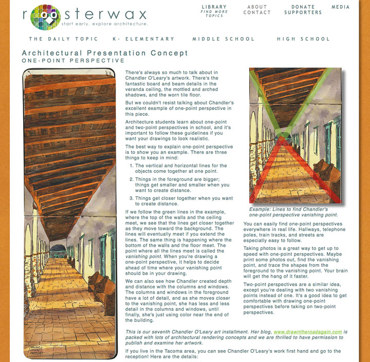
The other series I wanted to share is one on a local architectural studies site for kids and teens called Roosterwax. When their president, Lauren Hirt, asked if she could feature some of my sketches on the site, I said yes simply because I was excited about Roosterwax’s mission. But I had no idea just how wonderful a thing I was in for when I went to look at the first post.

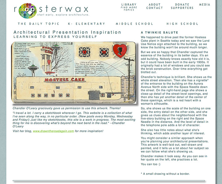
Each week Roosterwax features a different architectural sketch of mine—but the sketch is merely the starting point. Lauren writes a thoughtful and detailed post to go with each sketch, and analyzes my work the same way an art historian might—breaking each piece down into its technical and compositional details for students to investigate.

The result is both flattering and humbling for me (and maybe a little nervewracking, since my drawings always have mistakes in them!)—I’m used to analyzing the work of others that way, but I’ve never experienced it myself.

Most of all, I love reading each post because it gets me to think like a student again. After a lifetime of drawing, many of the skills and tricks I learned in school (and afterward) have become ingrained, but I always feel like my sketches could be better. Reading each Roosterwax post is like having my own little private (and super kind) critique each week, giving me lots of ideas for improving as an artist. I can only hope that together we can inspire some aspiring architects, as well!
You can follow along each Friday, on the Roosterwax site. Thanks so much, Lauren—looking forward to the next installment!
August 18th, 2014

Life around here is pretty frantic this week, while I finish up a bunch of projects and get ready for new ones appearing over the horizon. Since the thought of telling you about them in coherent paragraph format gives me hives (as I can’t even wrap my own brain around them all yet!), here’s what’s going on this week, in a simple, handy-dandy list:

1. Jessica and I have (finally) finished printing the new Dead Feminist broadside! All the prints are signed, numbered, bagged and ready to go. All I have to do is finish writing all the things that go with it (shop copy, blog post, email newsletter, etc.)—so look for it here in the next couple of days.

2. If you’re local, this Thursday I’ll be doing a little demo of my Local Conditions artist book at the Tacoma Art Museum. The book is currently in the Ink This! exhibit at TAM, but as it’s in a glass case, it’s not possible to actually interact with the book. So as part of the free Third Thursday activities, I’ll have my prototype copy of the book to demonstrate with, as well as a sampling of my process materials. I’ll be there from 5 to 8 on Thursday (though I’d suggest getting there closer to 5 so you don’t miss stuff!); TAM is located at 1701 Pacific Avenue in downtown Tacoma.

3. The lovely guys over at The Artist Rolls have featured me in a podcast! Jamie and Sean have a little different way of doing things for their interviews—they have each guest roll dice before each question, like you might in a role-playing game, and the results determine the course of the interview. We had a great conversation about process, the roles artists play (get it?), and the Whale of Preparedness—and they even let me draw pictures all over my data sheet. I hope you’ll have as much fun listening as we did chatting—you can stream it here, or you can download it for free from the iTunes Store. Thanks, Sean and Jamie!

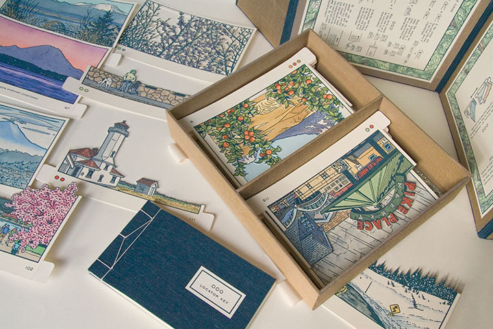
4. I’ve got a new solo exhibit opening in mid-September, at the Tacoma Public Library’s Handforth Gallery. It’s a show of my sketchbook drawings from Drawn the Road Again, with a special emphasis on roadside attractions (can you hear me cackling already?!). Look for more info here soon, but for now you can get your feet wet by reading a new series of features on the travel site Atlas Obscura. They started with an interview about Drawn the Road, and last Friday began a series of weekly features on my roadside attractions posts. Each post will go into more depth about each attraction, using my sketch(es) as a starting point. It’ll be the perfect companion to my exhibit—and a great alternative for everyone who can’t see the show in person.
Whew! That’s it for the moment…back with more soon.
June 16th, 2014

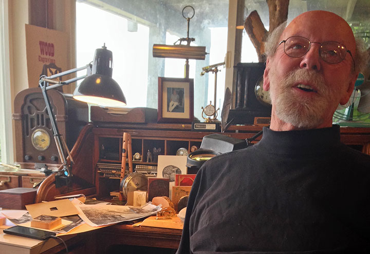
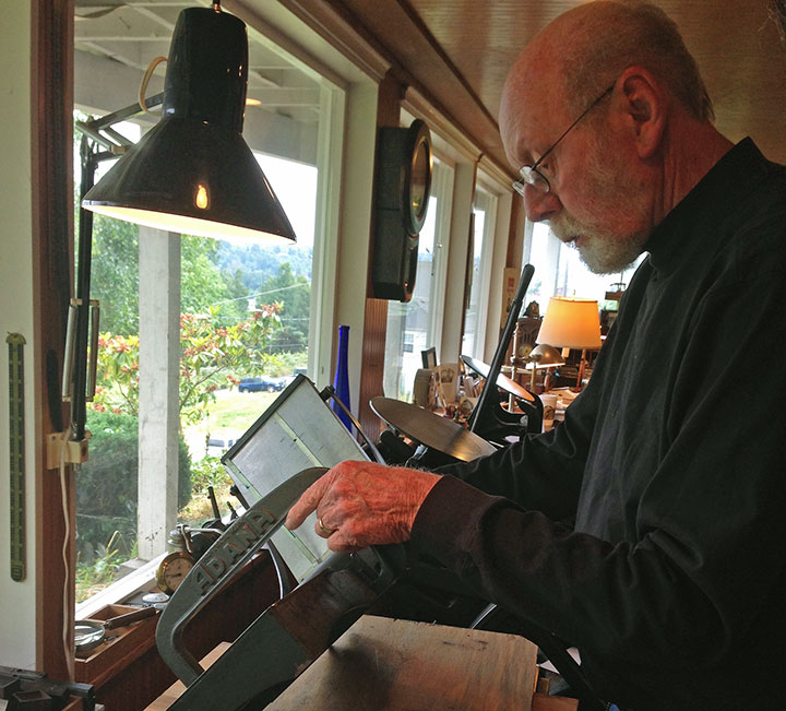
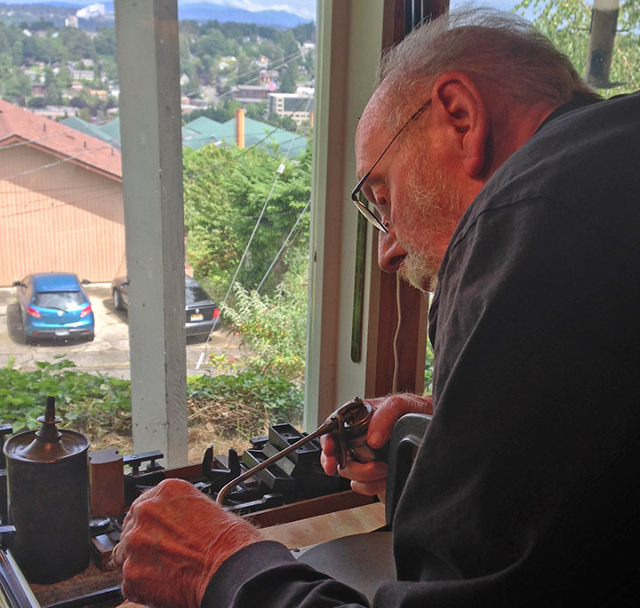
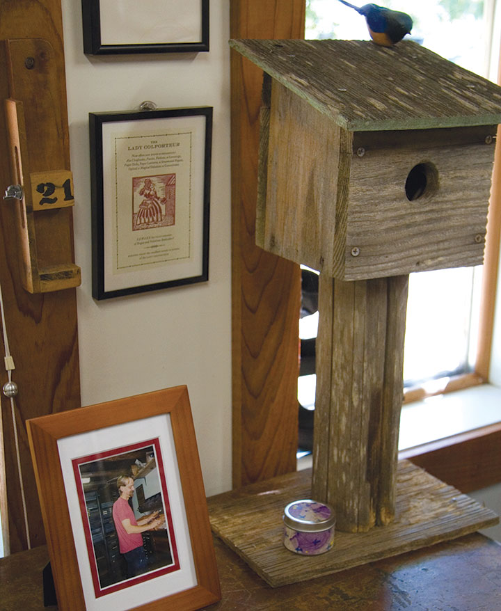
This is my friend Carl.

He’s a wood engraver extraordinaire—

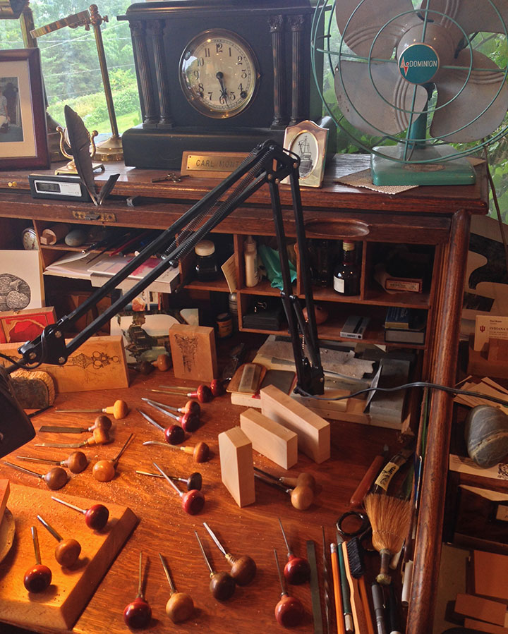
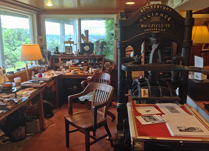
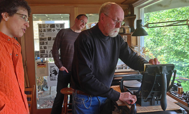
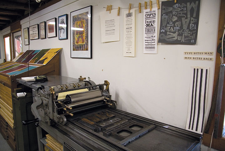
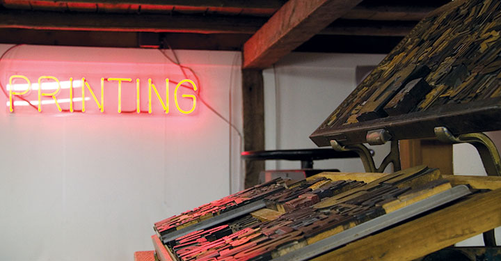
—and his West Seattle letterpress studio is a thing of beauty.

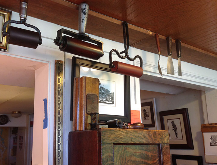
He does lovely, painstaking work (those are his engravings on the wall there), and he runs a tight ship at that studio of his.

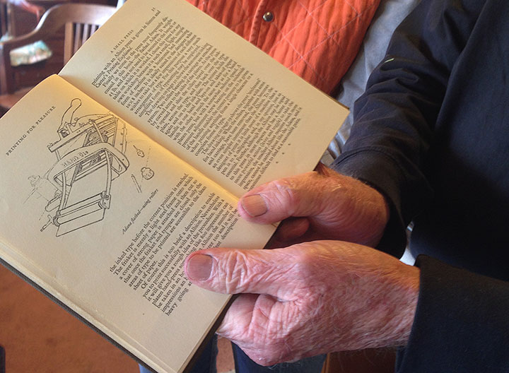
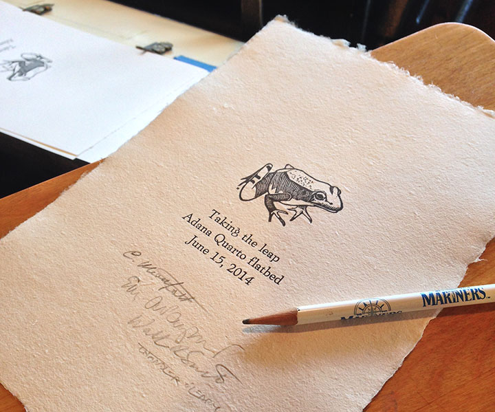
Which is why my friend Mary-Alice called on Carl when she picked up a vintage Adana flatbed press, and wanted help whipping it into shape. She and her husband were planning to bring the press to West Seattle yesterday. I’d never seen an Adana in action before (I’m more of a Vandercook gal myself), so I asked to tag along.

Carl was more than ready for us.

He gave the press a quick once-over. “I think you’re getting off too easy, Mary-Alice,” he said. “There aren’t even any spiders under here!”

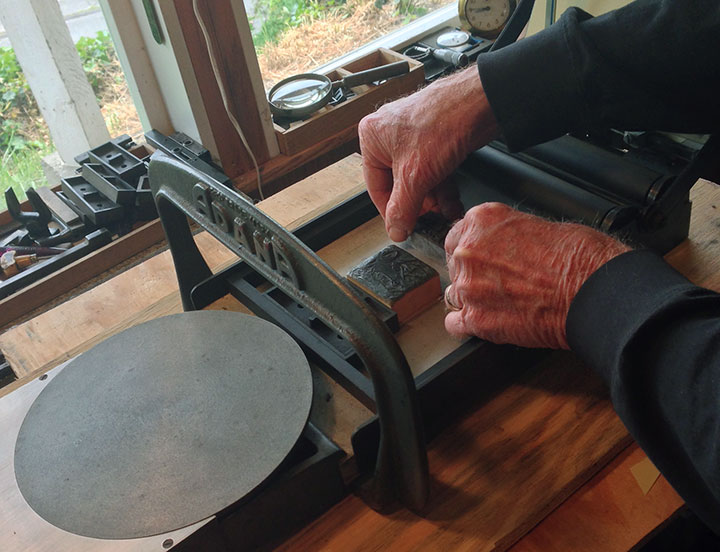
A few drops of oil,

some careful adjustments,

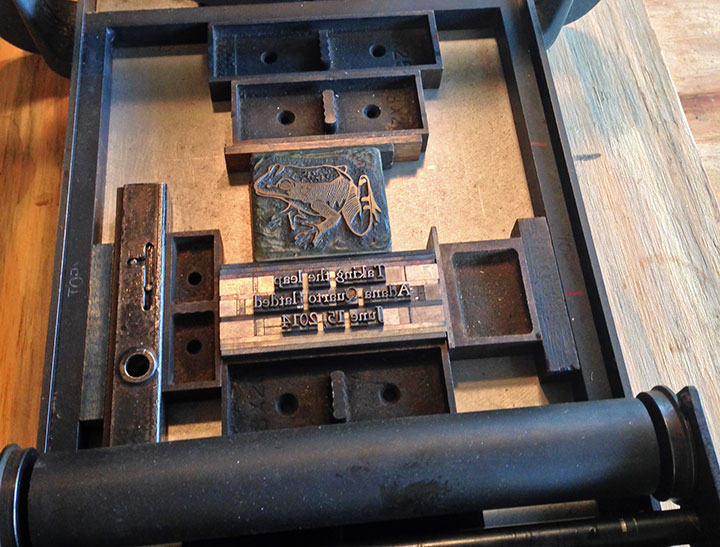
one of Carl’s own engravings to use as a test,

and a little text M-A set from his massive collection of type—and all of a sudden the Adana was print-ready.

Carl even broke out the fancy handmade paper—”This is an important occasion!” he said.

Pretty darn good results, if you ask me. Carl made us all sign the finished broadside. (Mariners pencil for the win!)
“How come I get to sign?” I asked, confused.
Carl chuckled and said, “You documented the occasion. Sign it!”
Aye, aye, Captain!
January 24th, 2014

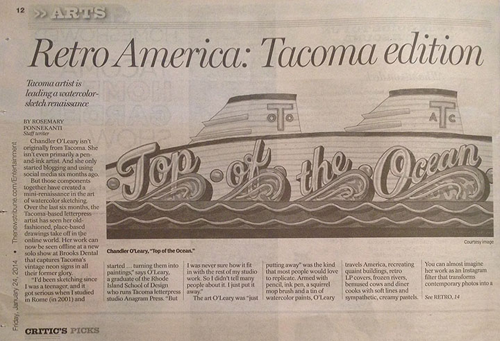
I woke up this morning to find a big article about my You’ll Like Tacoma exhibit in the News Tribune! Huge thanks to Rosemary Ponnekanti for interviewing me and for the kind review of my show!
January 7th, 2014

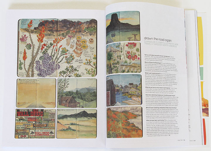
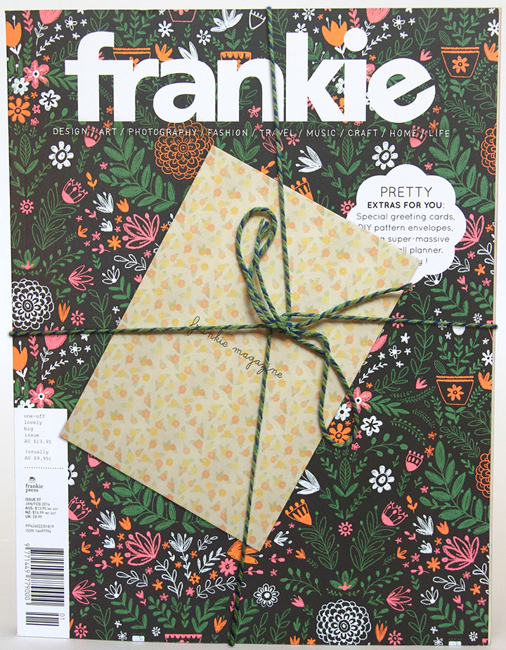
Look what was in the gigantic mailbag yesterday! The kind folks at the Australian magazine Frankie did a feature on my Drawn the Road Again blog! Not only is it an honor to be included, but this might just be the most gorgeous magazine I’ve ever seen. (And they even tied it up with pretty twine when they sent me my copy—swoon.) I know that at least a handful of stockists carry Frankie outside of Oz—so if you’re lucky enough to live near one, be sure to pick up a copy and see all the beautiful goodies inside.
Many thanks to Holly M. and Frankie Press for interviewing me!

November 7th, 2011

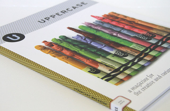
Every three months my all-time favorite magazine, Uppercase, arrives in my mailbox, and productivity in the studio comes to a screeching halt while I drool over each gorgeous page. I’ve been a subscriber since almost the very beginning (if only I could get my paws on those first two sold-out issues!), and impossibly, every new issue is even lovelier than the one before.

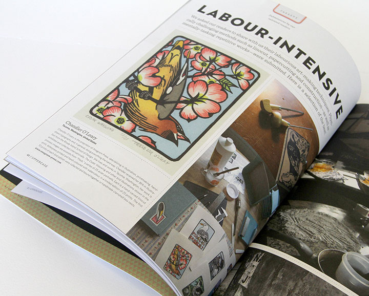
So you can imagine my giddy delight to be included in the latest installment. They had a submissions call for a feature on “labor-intensive illustration,” which was so squarely up my alley that I had to laugh at myself. But I never imagined my little birds would actually be accepted—let alone given a full page. A letterpress colleague received her copy a day or two ahead of me and tipped me off, and I swear I did a little dance around the room.

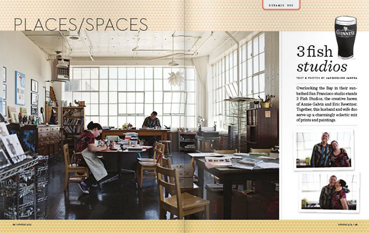
UPPERCASE is the brainchild of a gallery by the same name in Calgary, Alberta. The magazine is tailor-made for anyone with a creative soul; every page is devoted to sharing visual inspiration, shedding light on obscure or vintage art and design work, and detailing the work lives and creative spaces of people who do what they love for a living.
The whole thing is a perfect mix of vintage nostalgia and cutting-edge design, all wrapped up in a sumptuously printed package. If only everything in the world had this much thought and craft behind it.

But my favorite—I mean, favourite—parts of the magazine are the recurring features. There’s an abecedary in every issue, each with a different theme (which does my bookish heart good), as well as a series of collections of vintage objects: bottle caps, cereal boxes, even alarm clocks and fishing lures.
This magazine is truly a thing of beauty, and I hope it’s around for me to keep my subscription going for many years—and issues—to come.
December 25th, 2010

I was afraid I wasn’t going to have any holiday photos to show you—when I was in Portland the other week, my camera took a nosedive after being bumped off my shoulder in a crowded room.

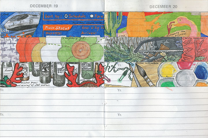
Snippets from my daily journal
So I shipped the lens off to the good folks at Canon for repair, and switched to paper for awhile.

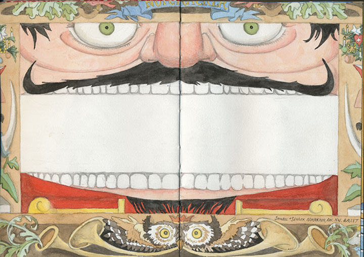
One of Maurice Sendak’s eye-candy stage sets for the Pacific NW Ballet’s Nutcracker
My favorite thing about sketchbooks is that I can take them anywhere—including places where cameras, functioning or not, are strictly verboten.

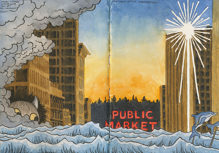
More Nutcracker scenery, plus Christmas on Pine Street in Seattle
The downside, though, is that it takes me a lot longer to draw a picture than to shoot one—so my output is always smaller than I’d like.

But then the Fedex guy showed up with my lens, good as new and just in time for Christmas.

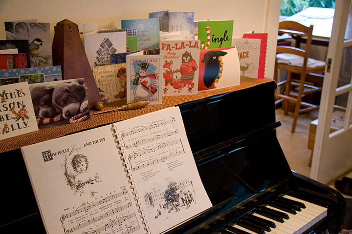
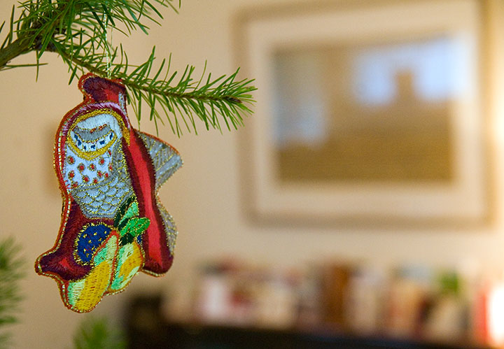
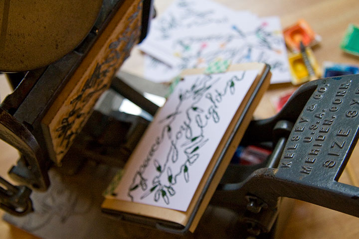
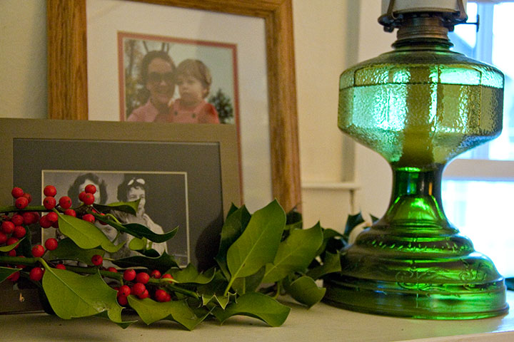
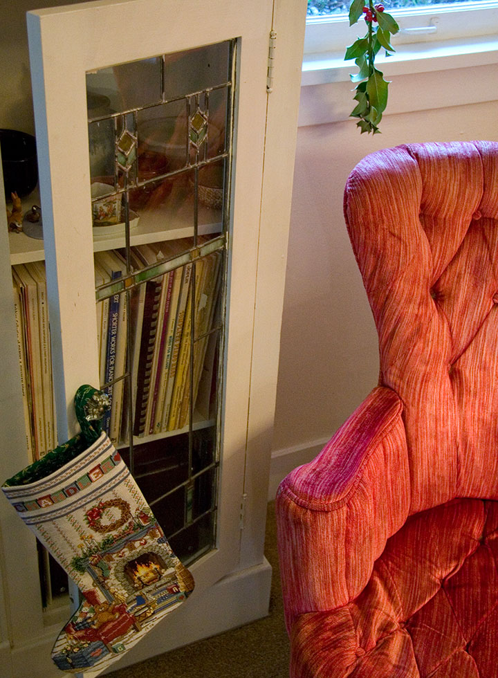
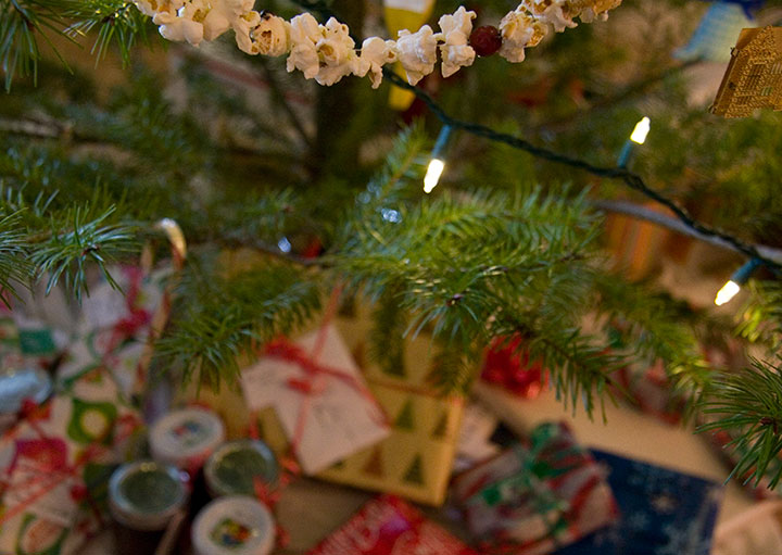
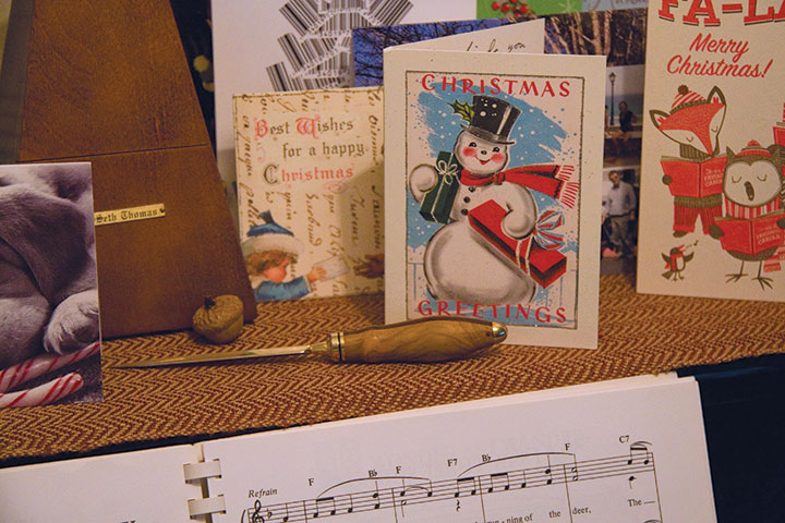
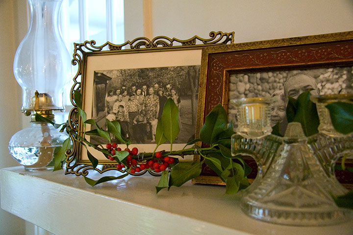
I managed to refrain from hugging him, and then hopped around the house in manic glee, documenting the holiday the Tailor and I have spent all week creating.

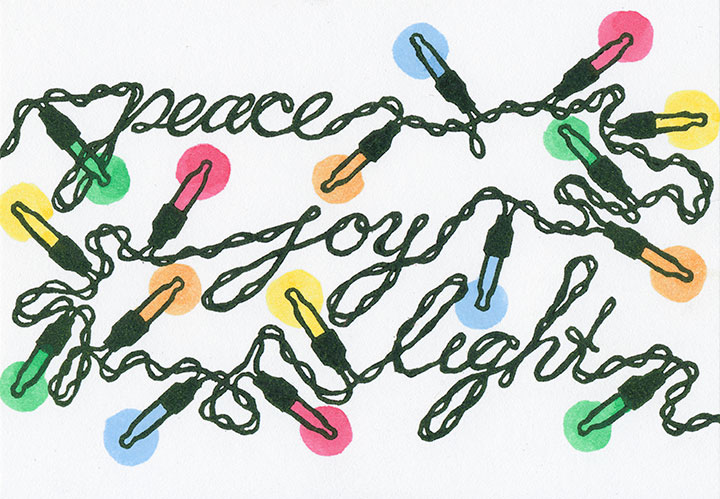
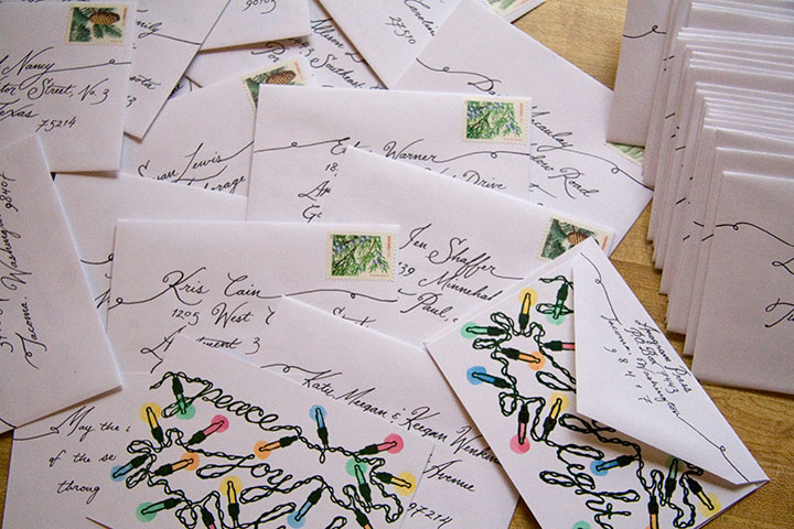
(We finally broke down and bought twinkle lights for the tree; which provided the perfect inspiration for this year’s card!)


Wherever today finds you, have a warm, cozy, abundant, and very merry Christmas.

February 20th, 2010

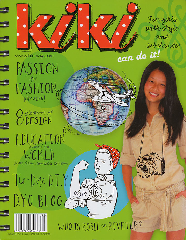
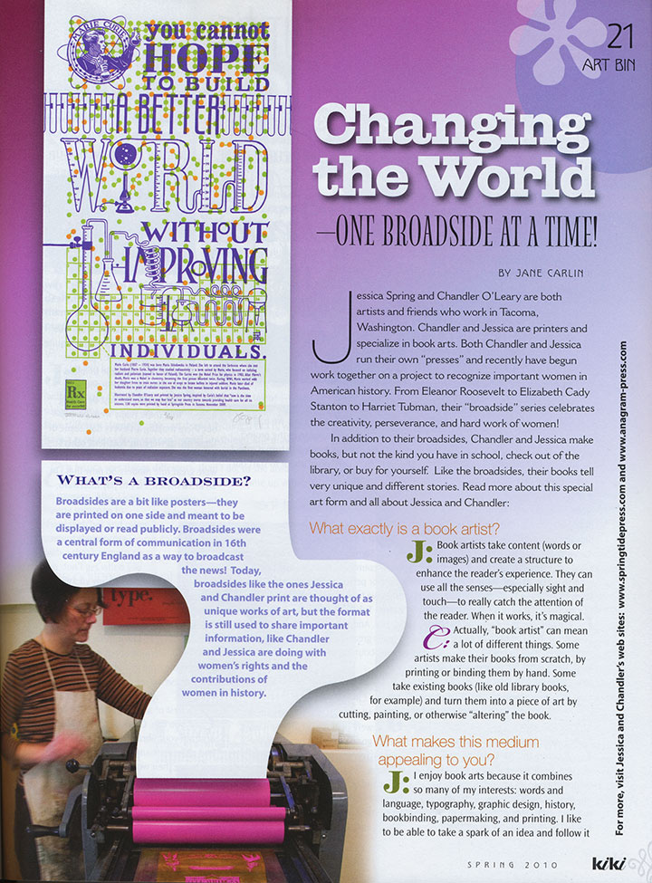
Jessica and I have had some seriously huge smiles for the past couple of days: we just received our copies of the latest issue of Kiki Magazine, which contains a feature on the Dead Feminists!
Before we were contacted for an interview, neither of us had heard of the magazine, but I can tell you that we became instant fans when we read its mission. Unlike so many other magazines written for teenage girls, which usually (even if inadvertently) tend to focus on questioning one’s body, popularity, attractiveness and overall self-worth, Kiki aims to empower girls with self-esteem, confidence, and a wide variety of knowledge and skills. As someone who is generally dismayed by the lack of respect with which our society tends to treat girls and women, and the self-loathing and doubts still being ingrained from their earliest experiences onward, Kiki seems like a breath of fresh air—and a huge relief.

And hey—who are we really creating these broadsides for, anyway? What is it that we’re trying to change in our world? It’s not just about the social issues we cover with each piece—it’s about teaching the women and girls around us that they can be heard, that what they say and do matters.

So Kiki gets an A-plus in my book, not just for the thoughtful content (no ads! No boy-crazy quizzes! All substance!), but for the fantastic design! This thing is seriously fun to read and gorgeous to look at. And look! My favorite part:

Rock on, Kiki. We’re honored to be a part of what you do.
July 20th, 2009

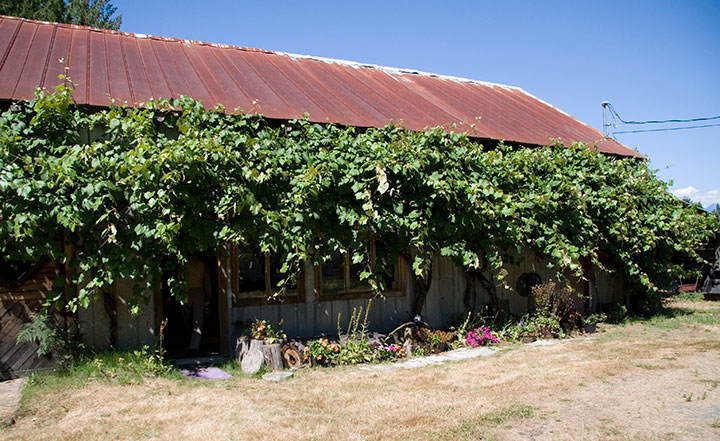
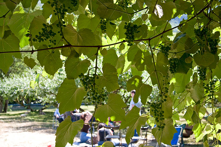
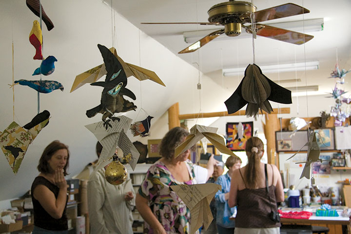
I serve on the board of the Book Arts Guild, a group that started as little gathering place for like-minded souls in the Pacific Northwest. It has since spiraled outward to include hundreds of members in all corners of the art form and the country—and suddenly thirty years have gone by. On Saturday fifty or so of us got together to celebrate the occasion at the Stern & Faye “Printing Farm” in the Skagit Valley.

We couldn’t have asked for a better day—I could have stayed all afternoon in the orchard, chatting with kindred spirits.

I had heard so much about the studio, however—so while most of the group was drawing for prizes in the loft,

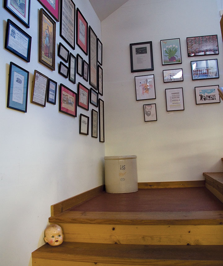
I wandered downstairs to do a bit of exploring.

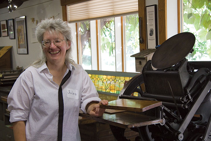
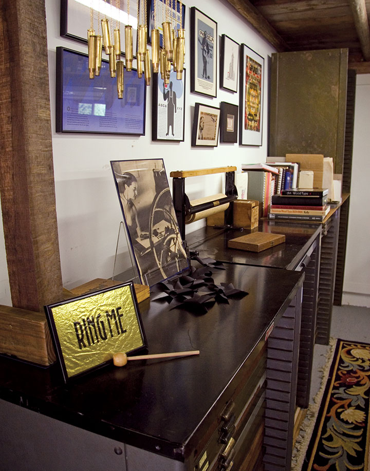
This is Jules Remedios Faye, “Proprietrix” of the Farm. She and her husband, Chris Stern, moved to the Skagit Valley fourteen years ago and turned an old barn into a letterpress printer’s dream.

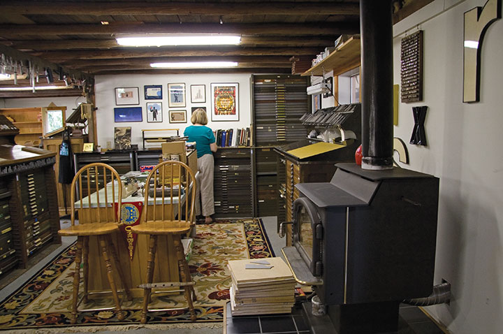
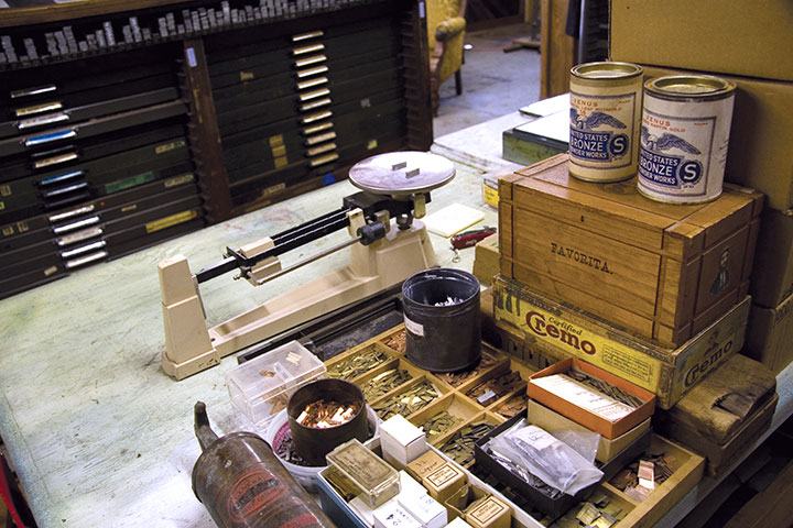
The space is at once cozy and seemingly never-ending,

serving as both a working studio and a living relic.


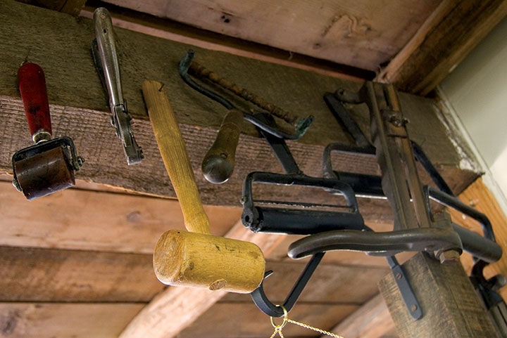
The place is chock-a-block with tools, type and ephemera, and functions as a type foundry as well—one of a small and dwindling number remaining in the U.S. these days.

After Chris passed away in 2006, Jules was forced to scale back the studio a bit to continue managing it alone. The barn is still very much alive, though—the walls are festooned with prints, and evidence of well-loved and continuing use is all around. It feels like their space, not just hers.

His presence is everywhere—a fitting memorial.

The Printing Farm was the absolute best-possible place to celebrate the anniversary of the Book Arts Guild. It served as a touching reminder that no matter how far into the past our roots go, no matter who has gone before us or what new trends have appeared, we’re still here—still breathing, still practicing, still creating.
After all, that’s what we’re here for.

![Chandler O'Leary [logo]](https://chandleroleary.com/wp-content/themes/chandleroleary/images/logo.png)
