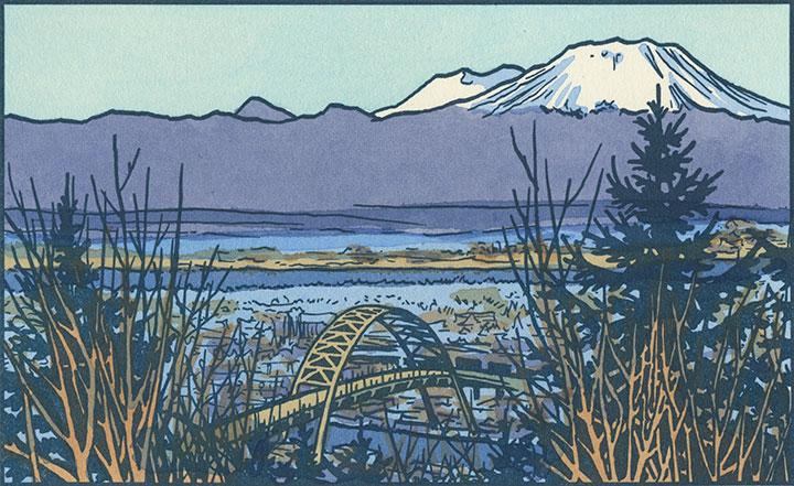
Scenes from a weekend
May 25th, 2015


Hope yours was glorious!
Hope yours was glorious!
This image has had a bit of a resurgence on social media lately, thanks to a recent TED talk about flag design. All of a sudden I was getting pinged by Twitter notifications by folks holding up my flag as an example of “good” design (thanks, guys!)—and it made me realize that not only had I never gotten around to blogging about this project, but I also should probably do a little primer on the basics of flag design.
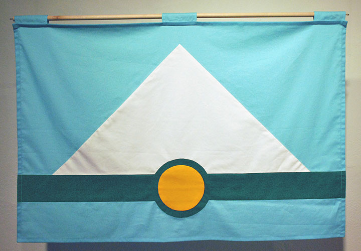
In a nutshell, I developed this flag design for a 2012 exhibition about vexillology (the study of flags) that I was invited to be a part of. It was held at Tacoma’s Fulcrum Gallery, and was titled Union Tac. Basically, the exhibit invited a group of local artists to propose a new city flag, and display their designs at the gallery. After I designed my flag, I hand-sewed this prototype (Betsy Ross-style!) for the exhibition.
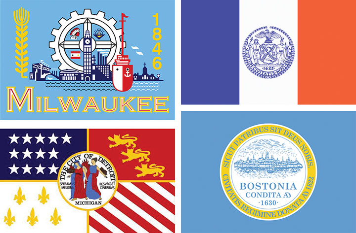
The thing about flag design is that it’s much more difficult than it seems to be at first glance—and at least in the case of city flags, most people are doing it wrong. When it comes to city flags, mostly what you see are complex designs that contain a city’s official seal, or some sort of text paired with an image, or some weird combination of color fields and complex graphics that are unreadable at a small scale or large distance. These are all examples of real city flags (clockwise from top left: Milwaukee, New York City, Boston, Detroit), designs that might work under other circumstances (the city seals, for instance), but as flags that are just a mess.
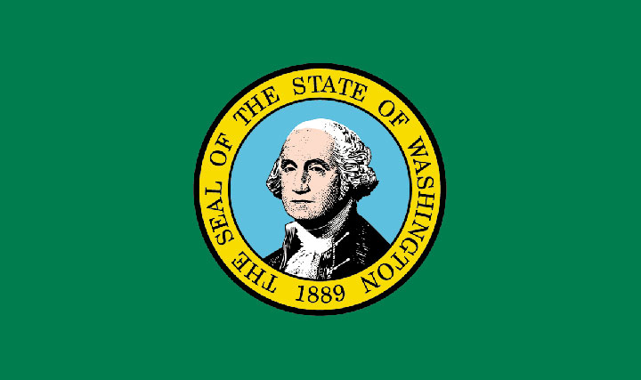
The state flag for my own state of Washington commits the same cardinal sin as the Boston flag and so many others: whoever designed it just plonked the Great Seal onto a colored field and called it good. But look at all that detail in Washington’s portrait—there’s no way that thing is going to be readable at a distance. And one of the biggest mistakes here is the use of type (and as a lettering artist who loves type more than anything, this is hard for me to say!). One of the biggest rules of vexillology: no text. None. The flag should be readable and recognizable by anybody, regardless of literacy level or native language. Even a two-year old can recognize their country’s flag (or for that matter, a famous logo or an illustrated icon); they shouldn’t have to be able to read text to do so.
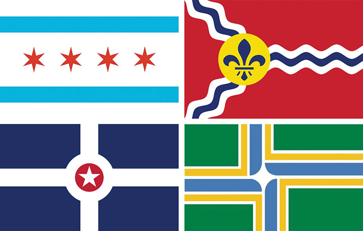
Take a look at these flags instead (clockwise from top left: Chicago, St. Louis, Portland, OR and Indianapolis)—this is how it’s done. Each of these flags is incredibly simple, readable and recognizable at any size or distance, and beautifully eye-catching. Each flag uses just a few colors (at most 3 colors, plus white), and each tells some sort of story that links to the city in question. The blue stripes in the Chicago flag, for instance, represent the bodies of water that define the city (Lake Michigan and the Chicago River). The fleur de lis in the St. Louis flag is a nod to the city’s French heritage. Indianapolis’s flag is basically a map of the city (how cool is that?), while Portland’s highlights the city’s location at the confluence of two rivers. These flags are all vastly different from one another, but they all use the same simple language.

So this is what was running through my head when I set about imagining Tacoma’s flag. I wanted to tell the story of our city and its place in the Northwest—but do so as minimally as possible. As you can see, there was a lot of rearranging and redrafting and re-simplifying—again and again. I’m normally the type of artist who refines a piece by adding to it—so you can imagine how difficult it was for me to keep stripping away at this one.
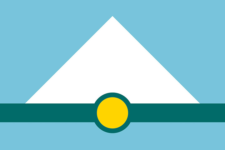
Here’s my finished flag design. The white triangle represents Mt. Rainier, against a blue field of sky above and a matching blue stripe below that stands for the waters of Puget Sound and Commencement Bay. The dark green stripe represents two things: the natural landforms of islands and trees that are such iconic parts of our landscape; and the continuum of industry upon which our city was founded. The gold circle represents both Tacoma’s location at the base of Mt. Rainier, and its origins as the terminus of the Northern Pacific Railroad (the circle resembles the symbol for a railroad stop). Finally, the colors were chosen not only for their correspondence to their real-world counterparts (trees, snow, sky, etc.), but also because they echo the colors used on the Washington state flag.
So that’s it. I still have my hand-sewn prototype carefully folded and tucked away, but I had kind of forgotten about the project after the exhibition ended. Many thanks to everyone on Twitter who helped revive the design and give it new life online. Who knows—maybe we’ll actually get to see it on a city flagpole some day.
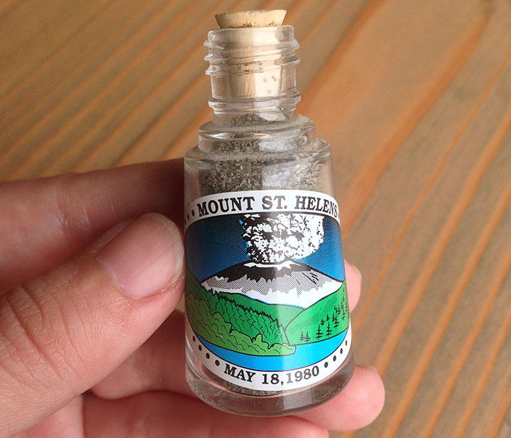
I have my tiny souvenir bottle of Mount Saint Helens ash sitting on my desk right now, as a reminder that it was thirty-five years ago today that the mountain erupted.
The event happened a year before I was born, so it’s not like I have personal memories of it—but Mt. St. Helens still crops up in my work now and again. It also shows up on the horizon from time to time—
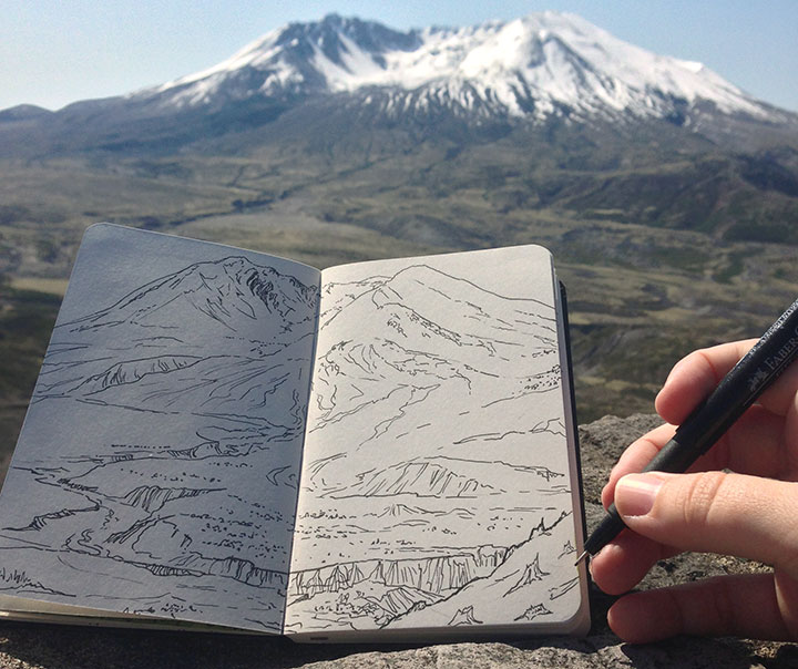
—but not as frequently as you might think. It’s often in its own bank of clouds, so it’s not visible much, even when Mt. Rainier and the other volcanoes are out. In fact, I had never seen Mt. St. Helens up close (despite a few attempts) until ten days ago. With the anniversary of the eruption looming, I figured it was high time I remedied the situation. It just didn’t seem right that so far the only thing I’d seen in any detail was the gift shop.
Speaking of which… Normally I’d say that my sketchbook drawings are my best souvenirs, but I think in this case, there might be an exception:
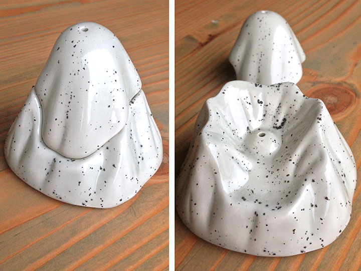
Our “before and after” salt and pepper shakers, given to us by a geologist friend. I’m not gonna lie: there’s no way I could ever top these (er, no pun intended).
As another “souvenir” of today’s anniversary, I’ve got sketches of Mt. St. Helens from the past few years over on Drawn the Road Again. So go take a look—but head for high ground if you hear any rumbling!
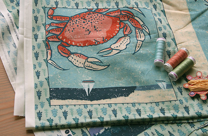
I’ve been sitting on this announcement for a little while, because I wanted to wait until the project went “live” for my client and their customers, too. Now that it has, I can show you the new fabric I designed. That’s right, fabric! This has been a bit of an illustration dream-come-true for me; I’ve always wanted to design for fabric, and it feels so good to feel the finished product in hand.
This all started when Pacific Fabrics contacted me to ask if they could license the Washington illustration from my (still in-progress) 50 States Series for use on a fabric panel. They wanted to create a Block of the Month pattern for their stores, and design a quilt pattern around my illustration. Both the Tailor and I have been customers of Pacific Fabrics since we moved here, so they got a big fat “yes” from me.
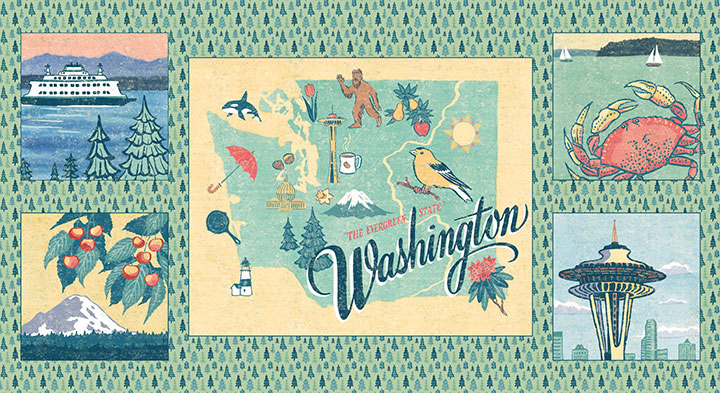
To round out the quilt design, I created four more illustrations of local highlights, done in the same style as the state map. Then I finished off the fabric panel with a “ditsy” (tiny) tree pattern repeat.
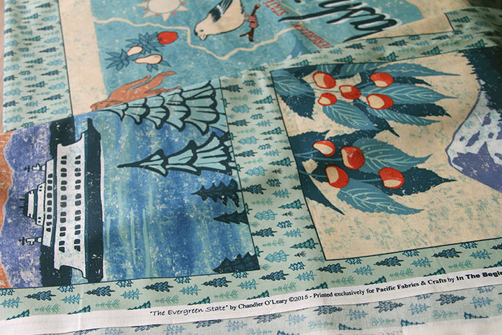
Then Pacific Fabrics had the panel manufactured at In the Beginning Fabrics. What I love best about all of this is how hyper local it is. Pacific Fabrics has been a small Seattle business for over a hundred years (they actually began as an ironworking company), and In the Beginning is also a Seattle company. Add me to the mix, and the whole project has taken place over about a thirty-mile radius.
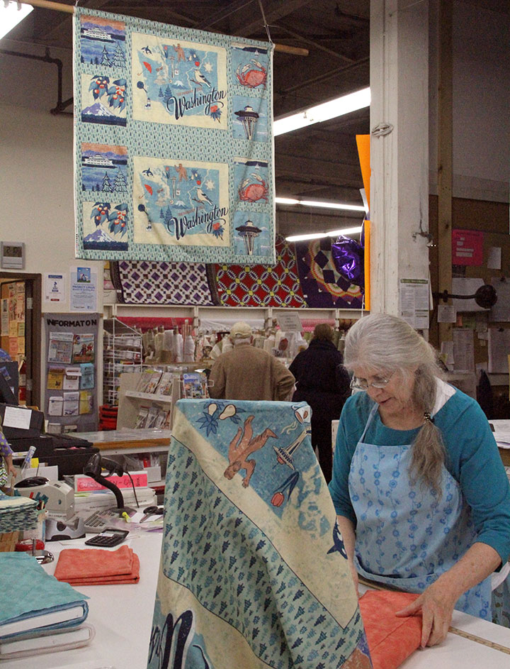
I popped by the Pacific Fabrics store in Seattle to snap a couple of photos (and drop off some prints and cards, which they’ll also be carrying in their stores!), and it felt good to see that everyone in the cutting line was buying fabric for the Washington quilt.
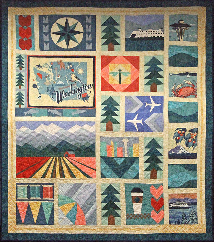
And here’s the quilt block that the lovely Anna-Beth at Pacific Fabrics designed for the Block of the Month program. I love how she created so many Washington icons from geometric shapes, and incorporated my illustrations into the design. I also loved being able to help develop the color scheme of the quilt blocks, based on the palette of my illustrations. I have never made a quilt myself (though I have dabbled a bit…), but I think I just found a good reason to start.
If you’re a quilter, or you’d like to try your hand at a Block of the Month program, you can find everything you need at the Pacific Fabrics website. You can have the patterns and materials mailed to you if you’re far from the Evergreen State, or if you’re local, club meetings centered around each block are starting this month at store locations.
To Anna-Beth and Debbie T. at Pacific Fabrics: thank you so much for bringing me on board, and for giving me such a great crash course in the quilting industry. To everyone else: happy sewing!
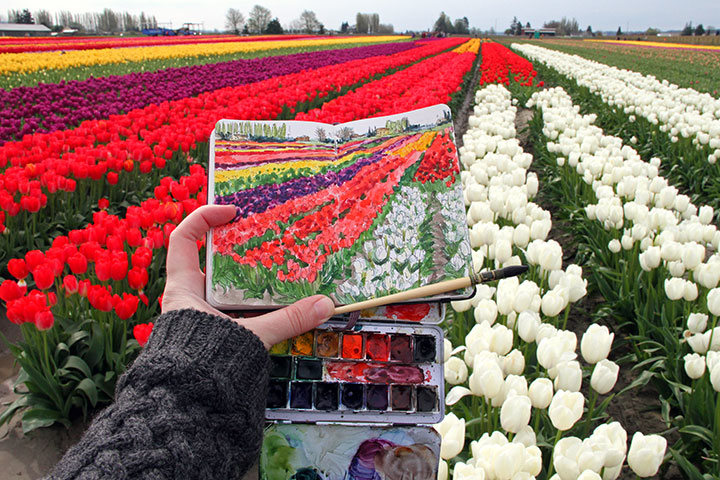
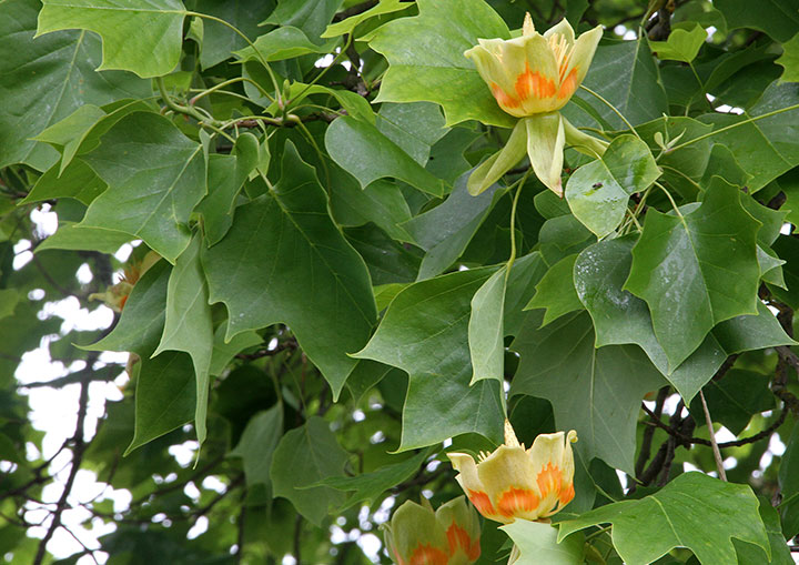
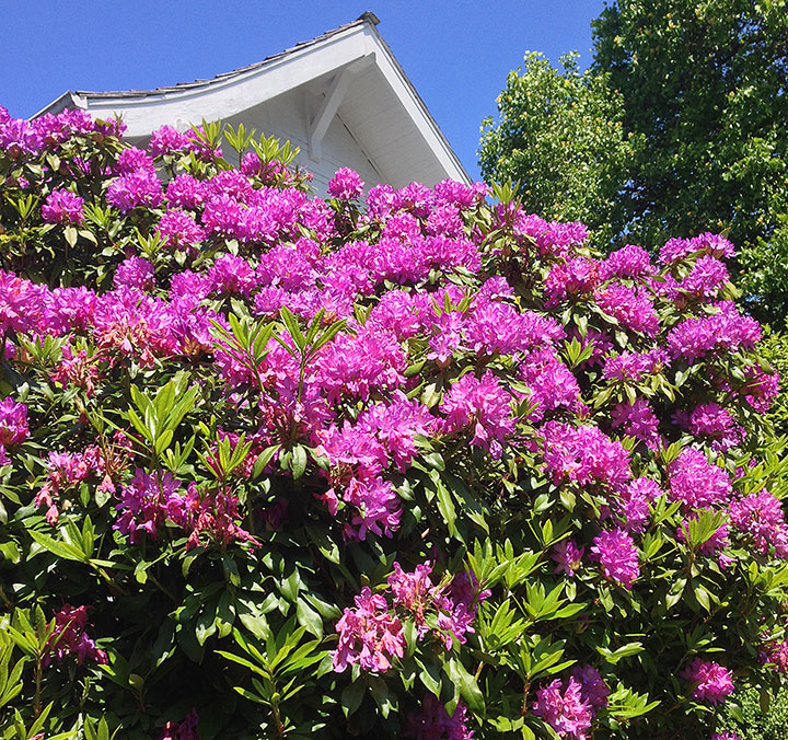
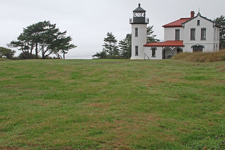
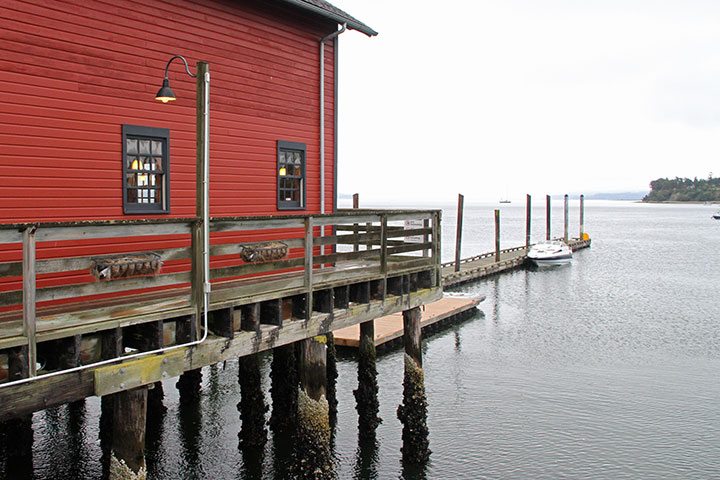
I took a rare day off on Friday, to get out of the studio and gather some inspiration in the…um..field.


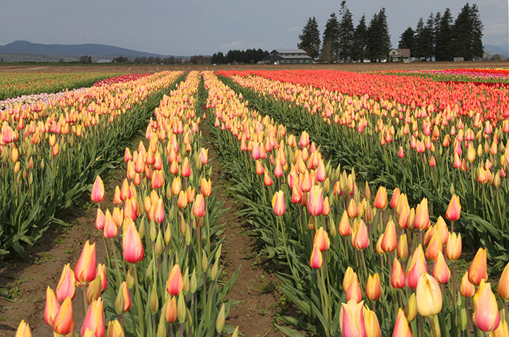
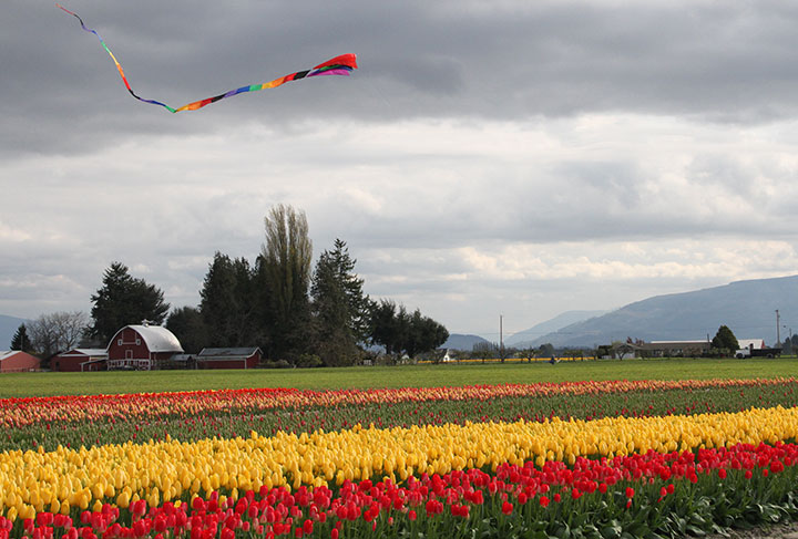

My trip turned into a mini-adventure,
full of Washington wonders.

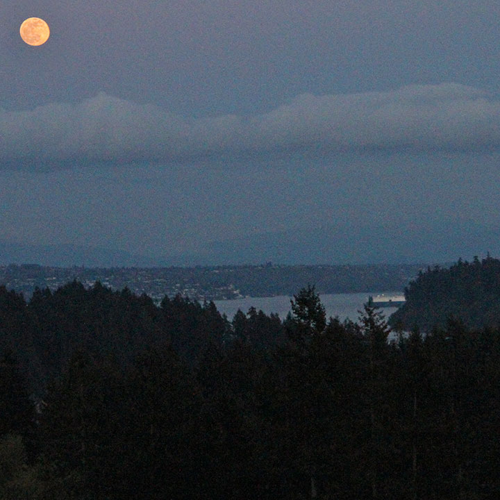
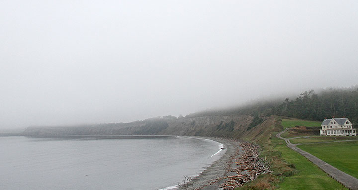
Catching the moonrise on my way home was an extra-special bonus, because it reminded me to set an alarm—
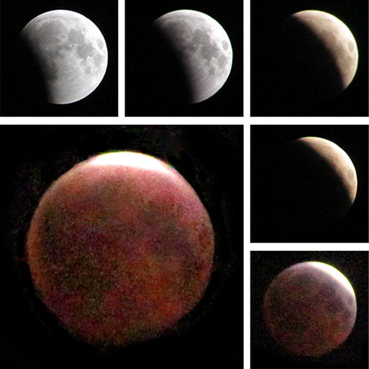
—so that I could catch a nice postscript to the day’s excitement.