Trout fishing in Tacoma

When I was growing up I used to raid my dad’s personal collection of books whenever I was looking for new reading material. We had bookcases all over the house, but I could always depend on Dad’s collection for the discovery of a new favorite. Those shelves introduced me to some of my favorite authors, and some of my most vivid memories are recalled passages from Steinbeck, Salinger, Pirsig, Robbins, etc. Dad’s bookcase also exposed me to some seriously weird stuff (which probably explains a thing or two about my tastes and personality), writing that I didn’t begin to understand until years later. One book that I went back to several times, attracted to its sheer strangeness, was Revenge of the Lawn, by Richard Brautigan—the title story was my favorite. I’m pretty sure most of the similes and imagery flew over my teenage head at the time, but I loved the fact that something could be so entertaining and emotional, and yet so bizarre. (And I fully blame Brautigan for my own rambling, tangential, parenthetical writing tendencies.)
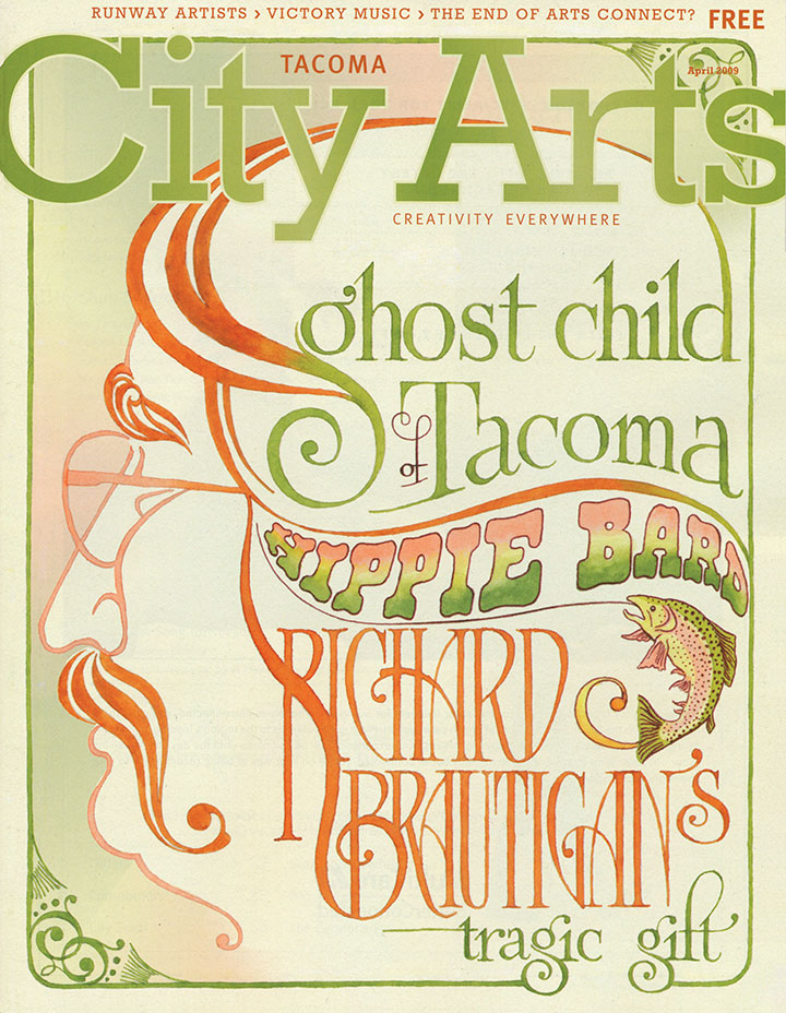
Last month I got an email from City Arts, asking if I’d create some lettering and illustrations for a feature story they were doing on Richard Brautigan’s Tacoma roots. I did a double-take—wait a minute, Brautigan lived in Tacoma?
So I re-read “Revenge of the Lawn,” and was amazed at how much my new perspective of being a Washington/Tacoma resident changed the story for me. Even the more straightforward lines like “He was selling a vision of eternal oranges and sunshine door to door in a land where people ate apples and it rained a lot” took on an almost tangible layer of meaning. (I love that “I’ve Been There!” feeling when I read. It makes me want to run and tell everyone I know: See that passage there? I know exactly what he’s talking about!)
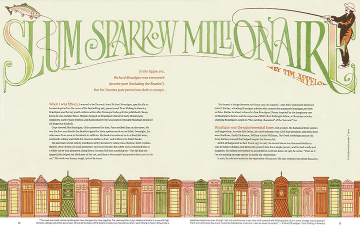
Illustrating Brautigan, or text about Brautigan, was a whole different matter, however. What could I possibly say with a picture what such a vividly visual writer hasn’t already said with words? This is the guy who wrote, “The creek was like 12,845 telephone booths in a row with high Victorian ceilings and all the doors taken off and all the backs of the booths knocked out,” after all.

I mulled it over for awhile, and decided to take him literally. This was a pretty odd experience for me, because I was always trained to make illustrations that add to or change the meaning of a text—and to avoid didactic images like the plague. Somehow, though, for this project, I felt that actually cramming as many Victorian-style phone booths as possible onto the spread would highlight the humor and absurdity of Brautigan’s words.
Or maybe I just really wanted to draw pictures of trout.

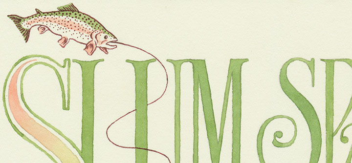
Anyway, the text is all hand-painted with watercolor in a “trouty” palette, and references Victorian-era typography and psychedelic graphic design (which itself references Victorian-era typography … the trout swallows its tail). If you’re local, you can pick up your copy for free at a whole slew of locations in and around Tacoma this month. The original watercolors are on display in the To the Letter exhibit through April 30.
![Chandler O'Leary [logo]](https://chandleroleary.com/wp-content/themes/chandleroleary/images/logo.png)

one of the best city arts in a long while. Your cover is SMOOOKIN !
I remember feeling like that reading Sometimes A Great Notion, where the rain and dampness are central characters in the story.
Beautiful work.
I totally relate to diving into the parents’ bookcases as a child. My parents didn’t have nearly as refined taste in literature as your dad, but I do remember reading a few books just for the sheer joy of reading and not understanding anything really. :)
Your artwork for the piece is amazing! I absolutely love it, and it makes me want to go learn more about Brautigan!