A book by its cover
Since today is #WorldBookDay, I thought I’d share a behind-the-scenes look at the process behind the cover design of my new book. And just like any part of bringing a book to life, creating the cover is a careful, detailed, and often lengthy process.
Designing a book cover is more of a science than an art—because the design has to be extremely hard-working, every part of the design has to be well thought out and carefully considered. Since it has to be eye-catching in every setting (at thumbnail size in a catalog, on a bookstore shelf amongst a slew of other titles, etc.) everything from subject matter to typography/legibility to color scheme is important. That’s a lot of responsibility to place on one image!
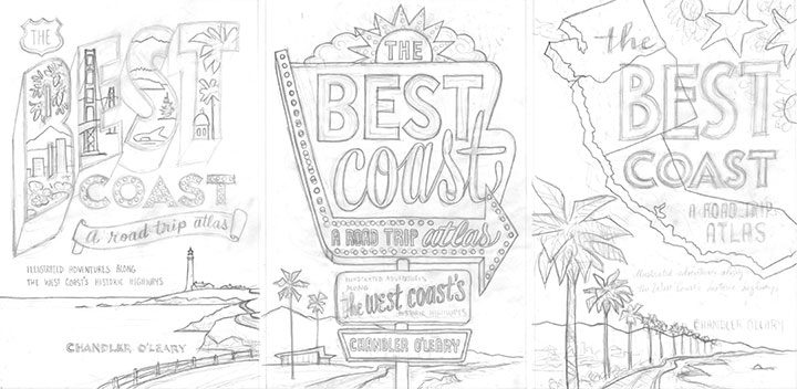
Thankfully, I had a lot of vintage inspiration to…well, draw from, as a starting point. Because the book encompasses many vintage roadside attractions and other historic icons, it made sense to reference vintage travel ephemera, at least in one of the three sketch concepts I developed for the editorial and design team at Sasquatch.
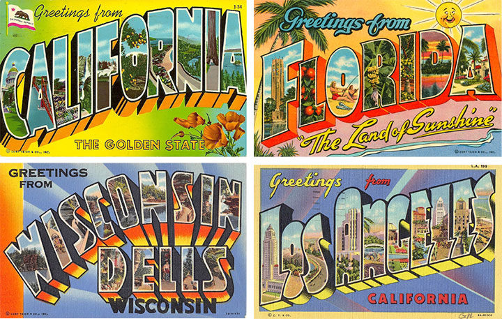
For the first concept (the one on the left in the above trio of sketches), I used vintage travel postcards as a starting point. We’ve all seen these things—they were absolutely ubiquitous for decades, and it’s easy to see why they’re so iconic.
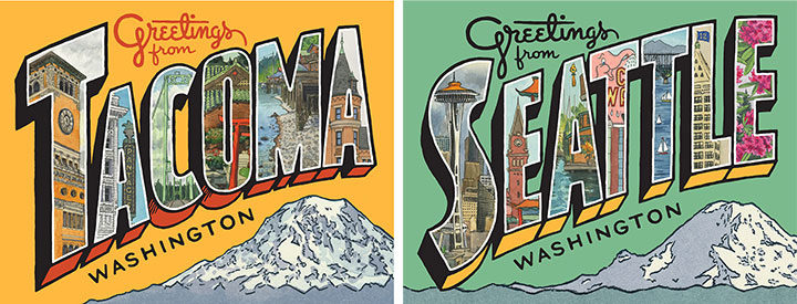
I’ve even referenced them in my own work in the past—these are some greeting cards I created recently, combining original lettering with a mish-mash of some of my older sketchbook drawings.
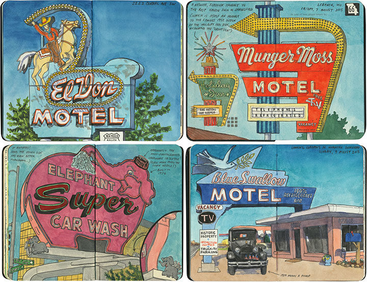
For the second cover concept, I created a faux neon sign, based on the many, many examples I’ve seen and sketched on my road trips over the years. Thankfully, so many of these old signs are still around today that their unique “Googie” design style is still instantly recognizable to viewers of all ages.
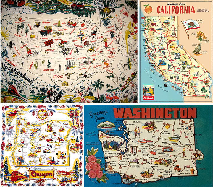
And finally, I wanted to create a cover concept that at least gave a passing nod to another staple of vintage travel ephemera: the souvenir map. I have a major soft spot for these things (as well as a big personal collection of map postcards and even midcentury map tablecloths—as anyone who has ever attended Studio Tour will have seen!), and have referenced them over and over again in my work. And after all, this book is an atlas—there are nearly a hundred maps inside, so it made sense to at least try one on the cover. In the end, I kept the map part of my third cover sketch super simple, but the thought process behind it was still there.
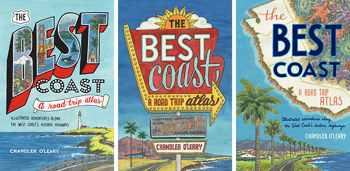
Here are the three full-color cover concepts I sent to Sasquatch. And the winner was chosen pretty unanimously—everyone was drawn to the neon sign concept (including me!). The weird thing, though, was that unlike the cover process for Dead Feminists, this book cover went from zero to finished in record time. I was bracing myself for an endless number of revisions, color tweaks and do-overs, because that’s what it took last time to arrive at the right cover. So imagine my surprise when the Sasquatch team got back to me and said that they’d shown it to everyone from design to marketing to sales, and they’d all agreed that we’d pretty much hit it out of the park on the first try!
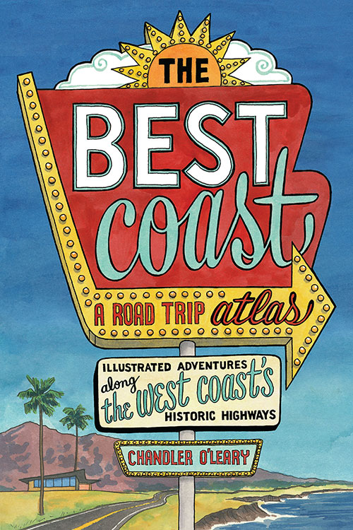
So that was it—I made a few tiny tweaks to the lettering of the subhead, and a few subtle color changes, and Bob’s your uncle. With Dead Feminists, we were still revising the cover right up until the book went to press. This time it was the other way around: the cover was done months ahead of time, and the book itself was being tweaked and edited until the last possible second. But that’s another story for another day…