Blog
July 20th, 2011
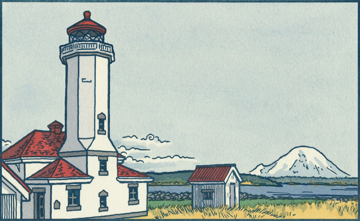
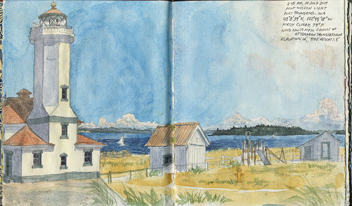
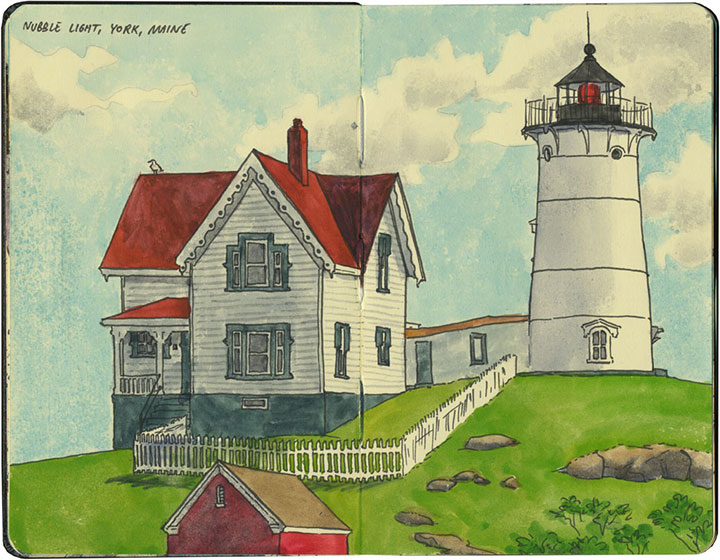
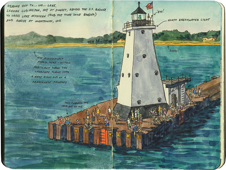
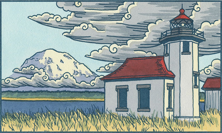
As you may have already noticed, I kind of have a thing for lighthouses.

It’s probably no surprise they’ve cropped up in my work lately, since my corner of the world is fair teeming with them.

But I even find myself sneaking them into other projects, even when it’s not strictly necessary.

So you can imagine my excitement on my trip back East,

when there seemed to be a beacon

around every corner.
Best keep a sharp eye out—

I have a feeling there’ll be more lighthouses popping up here in future.
May 30th, 2011

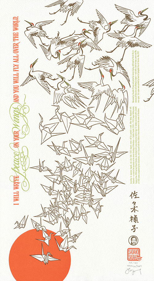
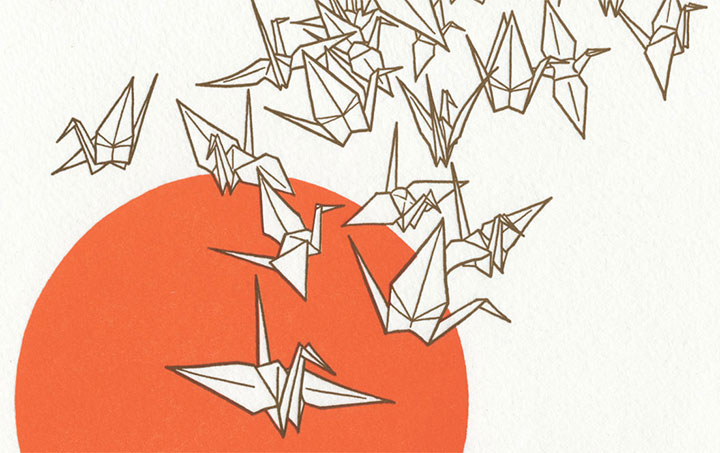
Today is Memorial Day in the United States, a holiday designated for the remembrance of those lost in time of war. But on this day, Jessica and I can’t help but extend our thoughts to others as well, in the spirit of peace. Today our eyes and hearts are trained on the far shores of the Pacific, where the people of Japan are still reeling from the March 11 earthquake, tsunami and nuclear disaster. So for our twelfth Dead Feminist broadside, we remember them by giving wings to the words of our youngest-ever feminist:
I will write peace on your wings and you will fly all over the world. — Sadako Sasaki
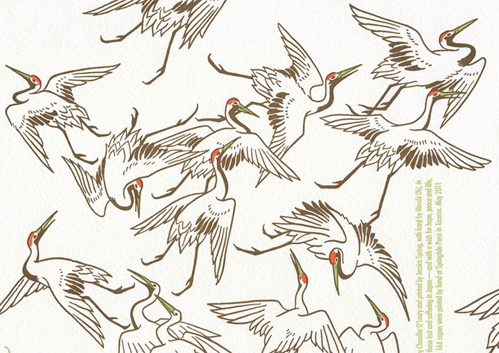
As you can probably tell, this piece is a bit of a departure from our usual way of doing things. This time it just didn’t feel right to let the typography run amok, or to fill every inch of real estate with illustrated goodies. So instead, we simply opened the door and let our imaginations take flight. The quote stands quietly apart, running parallel to a flock of origami cranes rising upward from a persimmon sun. As they follow Sadako’s words and wishes, they transform into red-crowned tancho cranes, disappearing off the page.

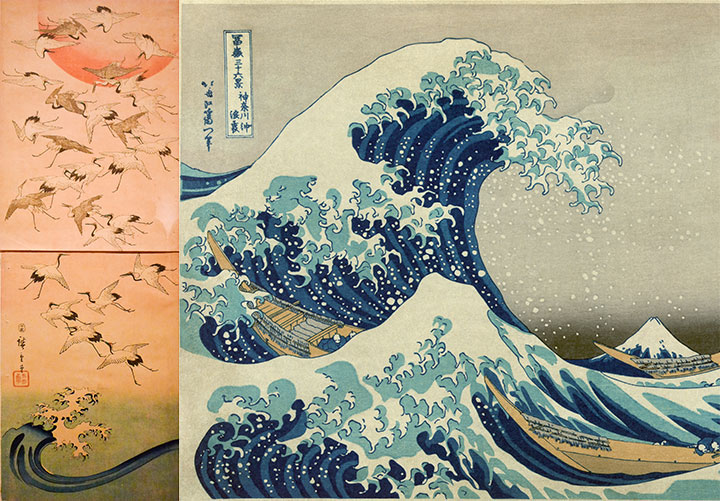
Since the traditions and history of Japanese printmaking are a veritable goldmine, the sky was literally the limit when it came to inspiration. But I had something particular in mind:

On the left is is Cranes and New Year Sun by Utagawa Hiroshige; on the right is Katsushika Hokusai’s famous Great Wave Off Kanagawa. You can see a reference to Great Wave at the bottom of Cranes—making references to both other artists and one’s own older work is a common convention in Japanese art.
I had the good fortune of seeing Cranes and New Year Sun in person earlier this year at the Tacoma Art Museum. Not only is it a beautiful image, it has an interesting quirk that sort of stuck in my craw. See that line running halfway through the composition on the left? The piece is made up of two sheets of paper; it was originally designed to function as the front and rear endsheets of a book. As far as I know, the original viewer never would have seen the image as a whole—and maybe never would have given it a second thought. But together, the two halves of the image form a stunning vertical composition that I wanted to reference for our piece.
There’s also a bit of a practical homage for us here: just as Hiroshige’s illustration is made up of two parts, each one of our Dead Feminist broadsides is also comprised of two halves. For us it’s purely a technical limitation—Jessica’s platemaker can only make plates that are about 8 x 10 inches in size. So since each of our prints is 10 x 18 inches, we have to break the illustration up and print it in two sections: one set of plates for the top, and another for the bottom. So that means that somewhere in every one of our broadsides, there’s a little break running horizontally through the composition. We usually try to hide it as cleverly as possible, or at least blend it in with the overall design, but it’s always there. Take a look at some of our previous prints and see if you can find it. (Mind the gap!)
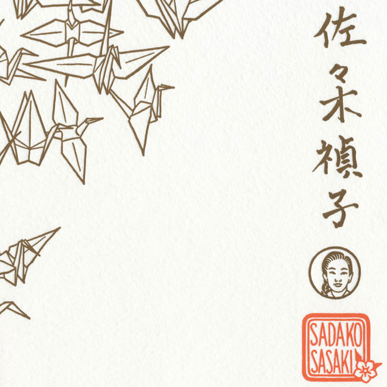
Anyway, Hiroshige is not the only person we have to thank for all of this. I’d also like to send out a special, winged bit of gratitude to Hiroshi Oki for providing us with his exquisite kanji (Japanese calligraphy) rendition of Sadako’s name—and to his daughter Shiori for introducing us.

The thing that has just enchanted us both about this project is the very idea of imbuing paper with a wish—of creating something so labor-intensive and time consuming, and then sending it out into the world for a greater purpose. Sadako wasn’t the only person to fold cranes for a wish, but she might be the most well-known. Every year, on the anniversary of the atomic bombing, Sadako’s monument in Hiroshima is festooned with thousands upon thousands of cranes—so many that permanent shelters have been erected there to house and protect them. And even in Western countries, it’s become somewhat of a tradition to give senbazuru (a set of 1000 paper cranes) as a gift to cancer patients. Talk about a ripple becoming a tidal wave.
In that spirit, we’ll be donating a portion of our proceeds to Peace Winds America, a non-profit organization based in Seattle and dedicated to disaster response worldwide. The donation will be directed to the Japan Relief & Recovery Fund, used to rebuild local infrastructure and restore the livelihoods and communities of those affected by the earthquake and tsunami. We’d like to think of this as a little senbazuru of our own.
• • • • • • • • • • • • • • • • • • • • • • • • • • • • • • • • • • • • • • • • • • • • • • • • • • • • • • • • • • • •
Peace Unfolds: No. 12 in the Dead Feminists series
Edition size: 166
Poster size: 10 x 18 inches
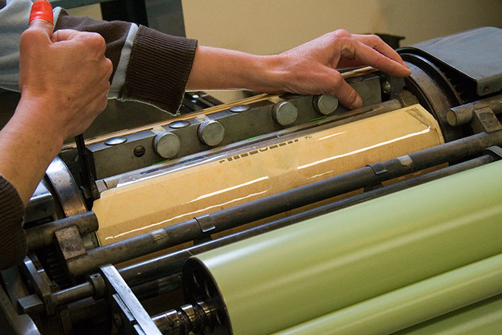
Printed on an antique Vandercook Universal One press, on archival, 100% rag paper. Each piece is numbered and signed by both artists.
Colophon reads:
According to Japanese legend, one who folds 1000 origami cranes will be granted a wish. After being diagnosed with leukemia—a result of her proximity to the atomic bombing of Hiroshima—Sadako Sasaki (1943 – 1955) began folding paper, hoping to live. With her best friend Chizuko, she finished 644 cranes before her death at age 12. Sadako was buried with a wreath of 1000 cranes completed by her schoolmates, and is honored with the Children’s Peace Monument in the center of Hiroshima.
Illustrated by Chandler O’Leary and printed by Jessica Spring, with kanji by Hiroshi Oki, in memory of those lost and suffering in Japan—and with a wish for hope, peace and life, once again.
UPDATE: poster is sold out. Reproduction postcards available in the Dead Feminists shop!

May 28th, 2011

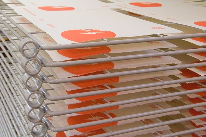
I’m still not sure how it happened, but it’s May already—and that means Jessica and I are due for another broadside. This weekend, while everyone else is grilling hot dogs, we’re cooking up something entirely different. Now, if only print racks left behind those tasty-looking grill marks…

Memorial Day has a little bit of a part to play in the new piece, so we’ll be unveiling it here on Monday.
In the meantime, have a safe and happy holiday weekend (and to all our friends outside the U.S., a safe and happy regular weekend!). See you soon.

April 19th, 2011

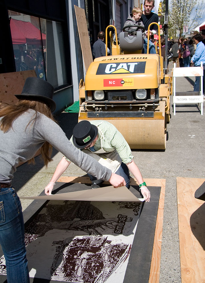
Holy flying gaggles, but we upped the ante this year!

I don’t know if it was the gorgeous sunshine that graced us after literally months of dreary rain—

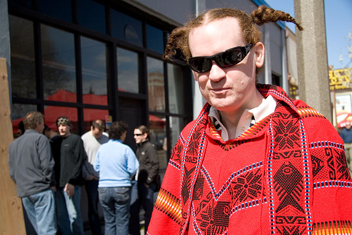
—or Sweet Pea’s extra-awesome 2011 poncho—

but this year’s Wayzgoose was larger than life.
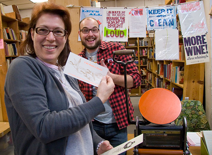
(In case you’re curious, that little Sigwalt press is inked up to print “I got goosed in Tacoma!” in an eye-frying safety orange that would make any Ducks Geese Unlimited hunter proud. I mean, come on—we have standards. This is some high-brow entertainment here.)
Anyway, speaking of geese…

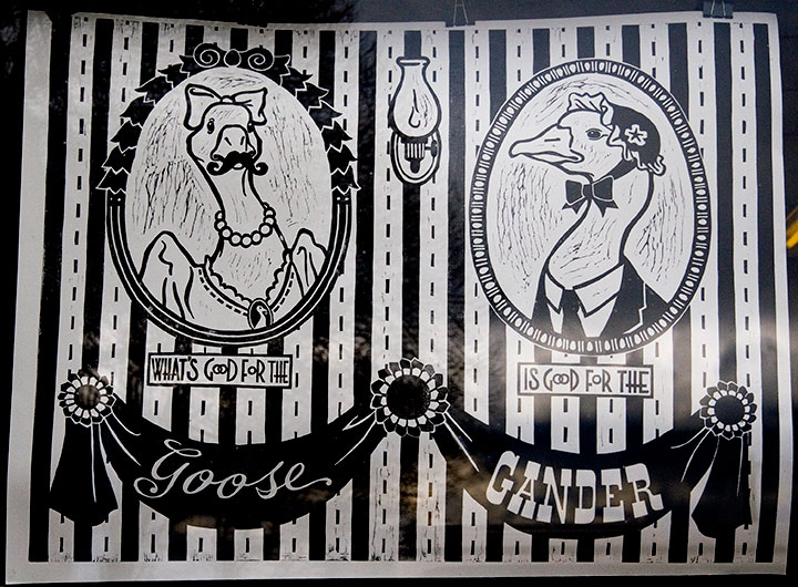
Ta-daaaa!
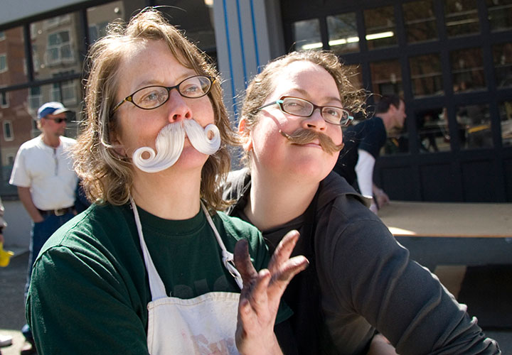
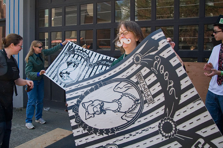
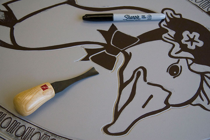
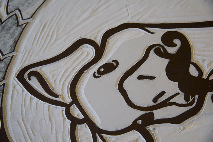
As you can see, we took our little Dead Feminists theme somewhat loosely this time. And in fact, we’ve dubbed our print Lucy Goosey, so there! There is a bit of a story behind this one, though. We’ve been equal parts amused and annoyed by the recent crafty and pop-cultural trends involving moustaches and putting birds on things—and for months I’ve been threatening to put a moustache on a bird on something, just to prove a point. I don’t know what that point is, exactly, but I figured it was time to put my moustache where my mouth is.
Which reminds me:

we weren’t kidding about the ‘stache wax. Hey, if you’re going to go, go all out.

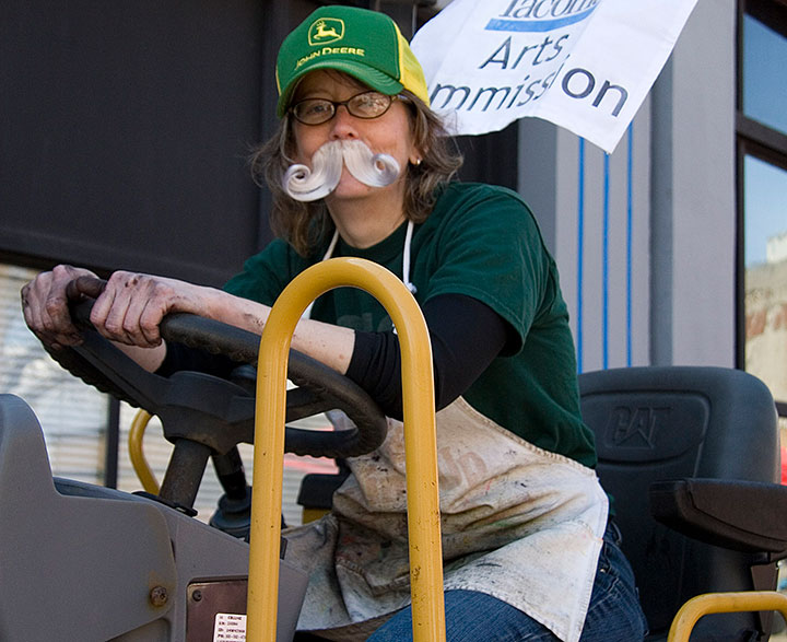
Jessica seemed perfectly at home while operating heavy machinery and sporting a full-on Wilford Brimley look—

I mostly just looked like Ned Flanders. Good God, but that mustache looks real on me. Sheesh!

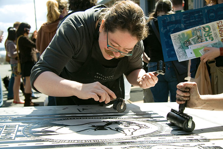
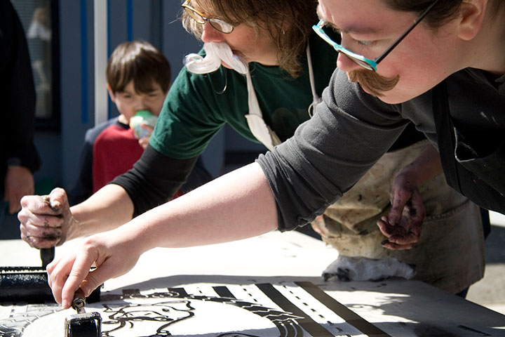
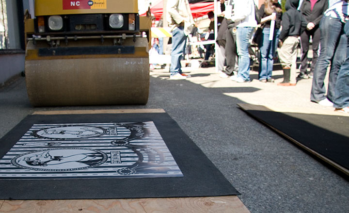
That’s okay, though—synchronized inking is serious business, and we don’t mess around.

Many, many thanks to all the supporters, enthusiasts and volunteers who turned out in droves;

to Katy Meegan and Mary Holste for snapping ‘stache shots for us;

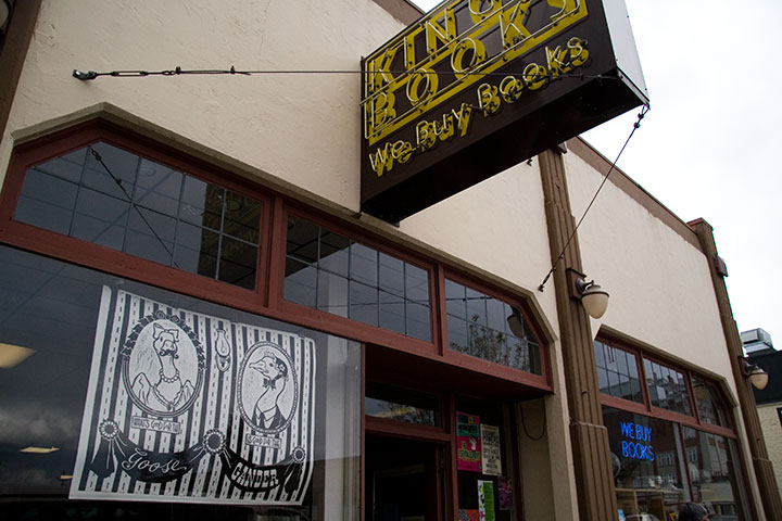
to King’s for being the host with the most;

and to the Tacoma Arts Commission for sponsoring our steamroller shenanigans.
So … tell me.
Is it too soon to start cookin’ up next year’s ‘goose?
April 12th, 2011

Jessica and I have locked ourselves in her studio with an armful of Talking Heads records (go, portable turntable!) and some very sharp knives. Don’t worry about us, though—it’s just an annual tradition here in T-town.
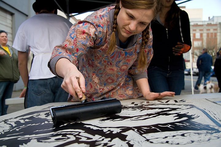
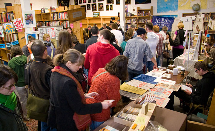
That’s because this Sunday is the seventh annual Wayzgoose, that crazy letterpress block party that draws hordes, flocks, gaggles of people to King’s Books for some seriously huge fun. And we’ll be polishing up our street cred with the main event—steamroller printing. We’ll be pounding that pavement come rain or shine (please, pray for shine), so stop by and check it out!
7th Annual Wayzgoose
Sunday, April 17, 2011
11 am to 4 pm, Free!
King’s Books
218 St. Helens Ave., Tacoma, WA
Near the top of a very long list of things I love about Tacoma is the sheer number of people here who know what the heck a Wayzgoose is. If you haven’t experienced ours yet for yourself, you’re in for a treat. Meet a whole host of local and regional artists; shop a huge array of letterpress art and gifts; make your own books and posters; and don’t forget to bring a t-shirt! The D.I.Y. screen printing booth will back by popular demand, and this year, some of the street-printing artists (including yours truly) are going to have bite-sized versions of their steamroller designs ready to be made into t-shirts. I know what I’ll be wearing this weekend.
Speaking of which … Jessica and I don’t want to ruin the surprise, so we’re keeping our design under wraps for now. But let’s just say that this year we’ll be getting our feathers ruffled—

—and breaking out the ‘stache wax.
See you Sunday!
March 5th, 2011

You know, I spent the whole time I was at Codex just trying to process everything around me. I thought the few weeks since that I’ve been telling stories and rehashing memories would make it easier to sort it out in my mind, but I still just can’t seem to articulate the impressions bouncing around the inside of my skull.
It was just too big … too rich … too much.
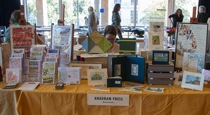
Which probably explains why I never managed to get any decent photos. I was too busy standing there goggling at the enormity of it all to document the experience properly. It was all I could do just to man my own table and keep track of all the folks who stopped by to talk to me.

Let me backtrack a bit, and explain what all of this was about. For every discipline, subculture or interest group out there, there’s some sort of club, or society, or conference, or symposium, or bee, or knitting night, or comicon, or hot-dog-eating contest, or what-have-you—some organized gathering for like-minded people to get together and share what they do. If you can think of it, there’s probably a group of people meeting about it somewhere.
The trouble with the book arts is that our world is small and spread out. There aren’t too many of us who do this sort of thing in the first place, at least when compared to photographers, or children’s book writers, or web developers. And then within our little group, everybody follows such a different path that getting us together is like herding cats. We’re hard to pin down because there’s a whole universe in our little speck of dust. Printing, bookbinding, papermaking and typesetting are just the tip of the iceberg. Within each of those disciplines is an incredibly broad spectrum of different and often contradictory artists and art forms. And yet each of those fits comfortably, easily, infinitely under the same, paradoxically small umbrella of the book arts. (Now you know why I’m not great at elevator speeches.) If you tried to graph it out, you’d end up with either the world’s best or worst Venn Diagram—I can’t decide.
So because we run such a crazy gamut, we can’t be shoehorned in neatly with some other event, even though the “average” book artist can and probably does moonlight quite easily as a dozen other things. There’s no “book arts corner” at SXSW, or BlogHer, or the Venice Biennale. Exhibitions and summits dedicated entirely to the book arts are few and far between—large international events are rare, indeed. So for our lot, Codex is a big deal.
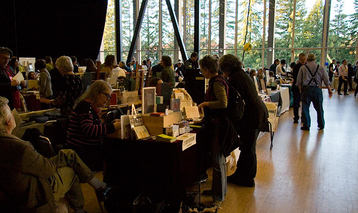
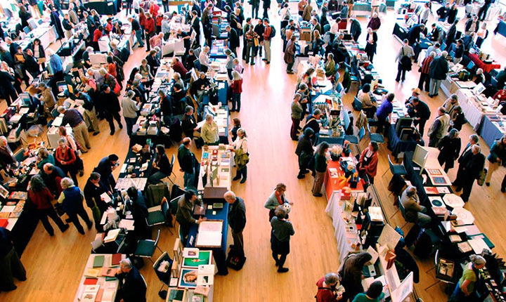
This year there were over 140 exhibitors at the book fair, representing artists in every conceivable discipline and style, and every corner of the globe. The exhibitors hailed from 20 states and over a dozen countries outside the U.S., including Russia, Germany, France, Israel, Colombia, Japan, Mexico and Canada.
And it isn’t just for artists: students, educators, private collectors, librarians, museum curators, conservators and archivists, hobbyists, publishers, supply vendors, gallery reps and dealers, bookstore owners, clubs and organizations, and every stripe of enthusiast were in attendance.

Photo courtesy of the Codex Foundation.
So yeah. Codex is huge.
It was both intimidating and inspiring. I was immediately and constantly confronted with my own insignificance (I kept imagining that at any moment, some cartoon alarm would go off—woop! woop! woop!—alerting everyone to the fact that I didn’t belong there)—yet at the same time, everyone I met was warm and welcoming.

I had the chance to catch up with old friends, meet many of my long-admired art-heroes, and be introduced to a whole host of new faces.
But most of all, Codex was completely, utterly overwhelming. I had my brain cranked up into overdrive for four solid days. After meeting literally hundreds of people, answering thousands of questions, asking another thousand myself, handling many dozens of handmade books and artworks, absorbing new information and taking copious notes, and just being exposed to the ultimate sensory overload of it all—well, by the end, I was a deer in the headlights.
And I feel like I barely scratched the surface of what was there. Imagine that you’re visiting the Louvre, or the Smithsonian, or some other enormous museum. Only instead of picking and choosing which galleries and pieces to see, and making your way through room by room, you discover that every painting, every sculpture, every piece of art in the whole place is crammed into one huge hall—each with the artist who made it standing to the side, waiting to meet you and hear what you think. I’d go mad—I think I did go mad!
Everything I saw was phenomenal—it was hard not to just stand there, slack-jawed, struck dumb by the realization that there I was, in close proximity to some of the best work being done by anyone, anywhere.

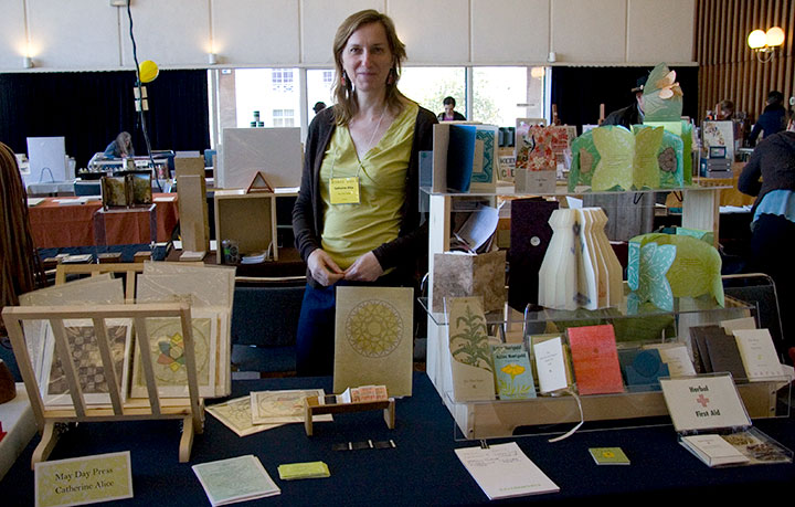
I could go on and on. And I’m sure there were a thousand other great things I never had a chance to see, because I also had a table to man. Jessica and I made the trip together (that’s her showing one of her books), and as we had adjacent tables—

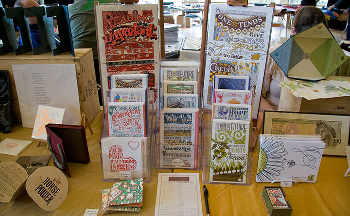
—we met in the middle with our Dead Feminists stuff between us.
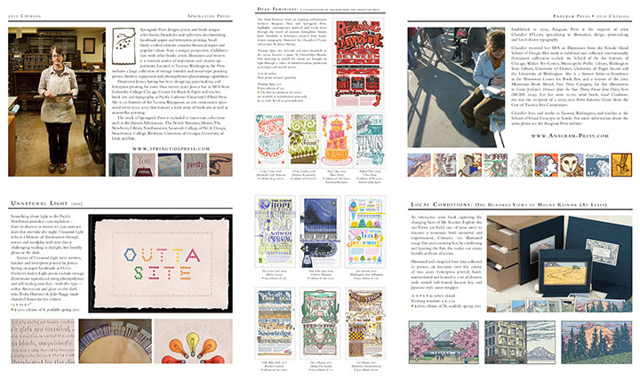
Jessica’s done Codex once before, so she was prepared for the overwhelming onslaught of people. She suggested that we put together a letterpress-printed take-away catalog of our work so that after the fair, when everyone was just as dazed as I was, they’d have something to remember us by. (And that ended up being a great idea, and a big hit—we had tons of follow-up messages afterward, and we didn’t see anything like the catalog at the book fair.)

Since we collaborate on so many things, we decided to combine our efforts into one joint catalog—with a twist.

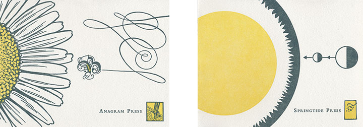
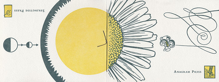
We figured we had an opportunity to clear up a little of the confusion over who does what around here, so we had fun playing with the design possibilities. Jessica came up with a flip-flop format, and I designed two covers that would come together at the spine to form a single image if laid flat.

Held one way, you’d read her half of the catalog; flip it over and read from the back, and it becomes my half. We converged in the middle with a Dead Feminist “centerfold” (ha!).

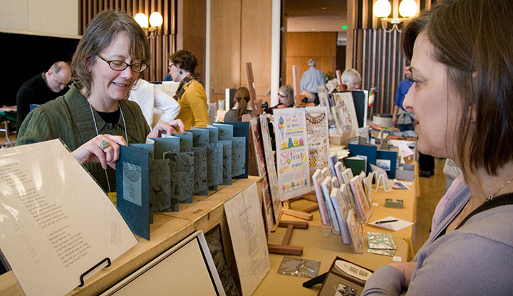
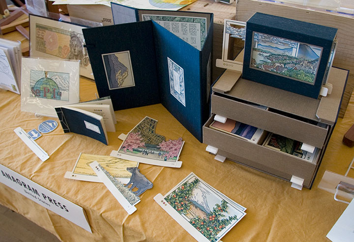
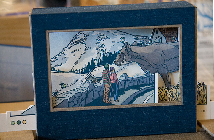
For my part, the most gratifying part of Codex was watching a steady crowd playing with Local Conditions. The response people had to the book was both intensely gratifying and humbling—and it was wonderful to see that students, fellow artists, dealers, curators, professors and collectors were equally excited about it. But my favorite bit was being a bystander to all the different scenes people designed with the image flats.

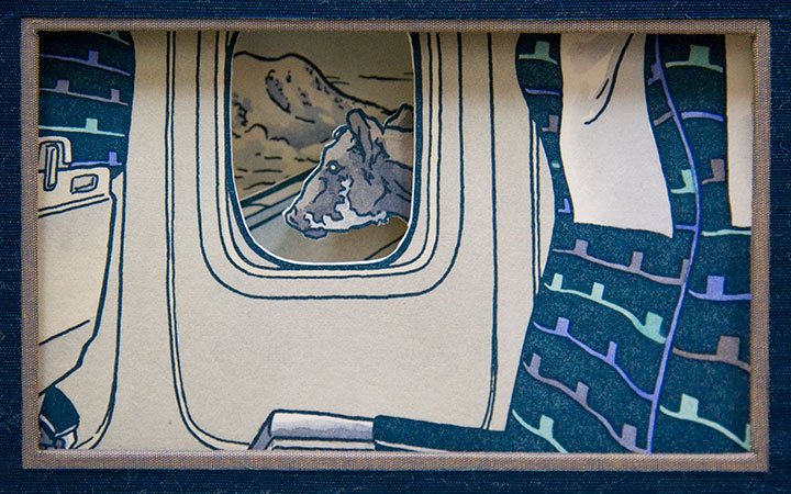
The cow completely stole the show there. It was hilarious to see how many times it turned up in a scene, either a fitting addition I hadn’t thought of—or as an absurdly out-of-place monster.
(Best of all was the cow that stood on the airplane wing and pretended to be a gremlin.)

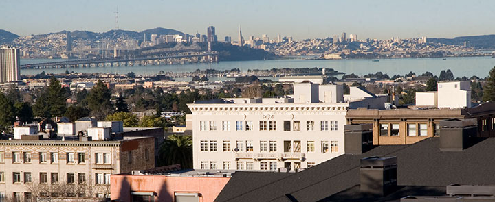
It’s hard to remember that we were in a city as fabulous as Berkeley—the folks at Codex had created a complete world just in that one room. (Though we did get out enough to discover that when the overstimulation had us in a daze, a hot-cookie ice cream sandwich down the street was just the ticket. Thank you, Berkeley!) The next fair is two years away, but I came home with what seemed like a decade’s worth of inspiration. And I find I’m already looking forward to Codex 2013—sensory overload and all.
Bring it on. I’ll be there.

February 18th, 2011

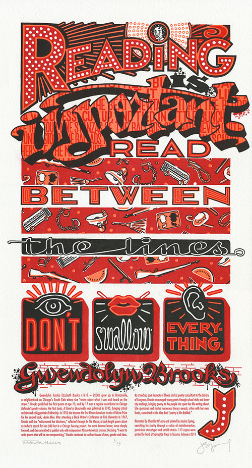
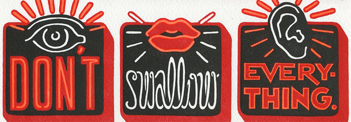
In honor of Black History Month, and of the might of the written word, our newest Dead Feminist is powerhouse poet Gwendolyn Brooks. Without further ado, I’ll hand over my pen to her:
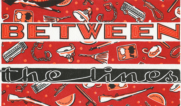
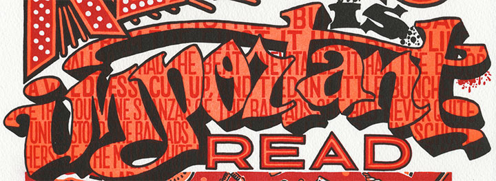
Reading is important. Read between the lines. Don’t swallow everything.
I guess we’re done with the knitting needles and home canning for now; time to don the boxing gloves. This was a tough one, and we almost didn’t have the gall to go through with it. But Gwendolyn Brooks was never one to pull a punch; she faced and shed light on the most uncomfortable truths with bravery and eloquence. And there seem to be an awful lot of uncomfortable truths floating around lately; like a certain congressperson’s assertion that our nation’s founding fathers ended slavery, or the fact that no matter how many African American Presidents we elect, racism isn’t dead. (Don’t believe me? Even my most cursory historical research brought up all sorts of fresh, modern hatred. Try it for yourself and do an online image search for “watermelon stereotype”—if you can stomach it. Just keep an airsick bag handy, because it ain’t pretty.)

So in tribute to Brooks’s courage, Warning Signs is a riot of color and fluorescent ink, glowing like an urban beacon. Flashing neon and spattered graffiti confront us, sounding the alarm with every word. Beneath the fluorescent current runs a blood-red repeating calico pattern of violence and cruelty—a tapestry that forms the unfortunate warp to the weft of our past and present.

And as an undercurrent to the undercurrent, behind the graffiti reads the first stanza of Brooks’s poem, “A Bronzeville Mother Loiters in Mississippi. Meanwhile, a Mississippi Mother Burns Bacon.” The poem grapples with the brutal 1955 murder of 14-year-old Emmett Till, and weaves a tale of remorse and confusion from the perspective of Carolyn Bryant, the white woman whose accusations that Till flirted with her provoked her husband to abduct and kill the boy. But we didn’t choose the poem for its subject matter, per se—we chose it for the articulate beauty with which Brooks tells the story. It’s still a punch to the gut, but when she knocks you flat you see some awfully pretty stars.

A portion of the proceeds from Warning Signs will be donated to 826CHI, a non-profit Chicago writing and tutoring center. 826CHI is dedicated to supporting the writing skills of students ages 6 to 18, and to helping teachers inspire their students to write—their mission is to “strengthen each student’s power to express ideas effectively, creatively, confidently, and in his or her individual voice.” We think Ms. Brooks would approve.
• • • • • • • • • • • • • • • • • • • • • • • • • • • • • • • • • • • • • • • • • • • • • • • • • • • • • • • • • • • •
Warning Signs: No. 11 in the Dead Feminists series
Edition size: 113
Poster size: 10 x 18 inches
Printed on an antique Vandercook Universal One press, on archival, 100% rag paper. Each piece is numbered and signed by both artists.
Colophon reads:
Gwendolyn Tamika Elizabeth Brooks (1917 – 2000) grew up in Bronzeville, a neighborhood on Chicago’s South Side where she “wrote about what I saw and heard on the street.” Brooks published her first poem at age 13, and by 17 was a regular contributor to Chicago Defender’s poetry column. Her first book, A Street in Bronzeville, was published in 1945, bringing critical acclaim and a Guggenheim Fellowship. In 1950 she became the first African American to win a Pulitzer Prize for her second book, Annie Allen. After attending a Black Writer’s Conference at Fisk University in 1967, Brooks said she “rediscovered her blackness,” reflected through In The Mecca, a book-length poem about a mother’s search for her child lost in a Chicago housing project. Her work became leaner, more sharply focused, and she committed to publish only with independent African-American presses. Declaring “I want to write poems that will be non-compromising,” Brooks continued to confront issues of race, gender and class.
As a teacher, poet laureate of Illinois and as poetry consultant to the Library of Congress, Brooks encouraged young poets through school visits and inner-city readings, bringing poetry to the people she spent her life writing about. She sponsored and hosted numerous literary awards, often with her own funds, committed to the idea that “poetry is life distilled.”
UPDATE: poster is sold out. Reproduction postcards available in the Dead Feminists shop!

January 20th, 2011

A composite of two image flats from the book.
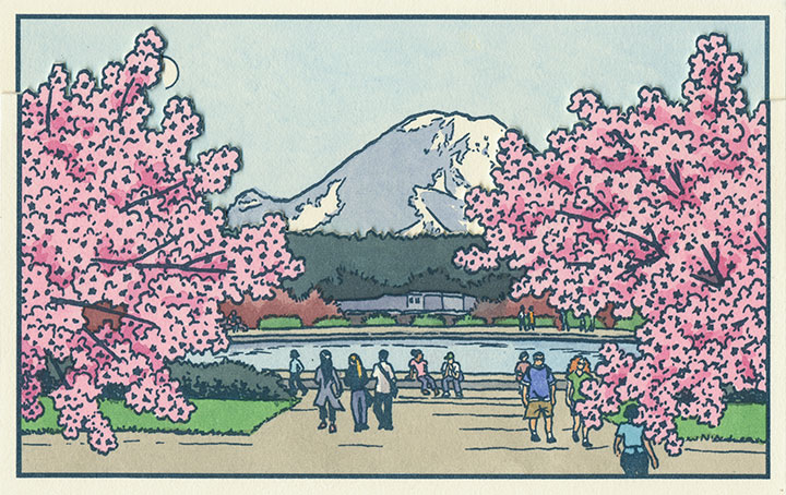
Anyway, after a good, long run, my Local Conditions exhibit is closing tomorrow afternoon, and this week I’ve been revisiting some of my favorite images from the book. This one always gets me thinking about how much a city can change over the course of a century, and how for a newcomer like me, that change isn’t always apparent. There aren’t always little plaques or signposts to tell you what used to exist where you’re standing now—or even any evidence at all of how things used to be.
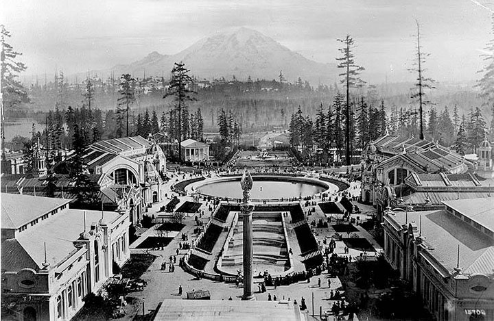
This scene depicts the Drumheller Fountain (also known as Frosh Pond), located on the University of Washington campus in Seattle. Incidentally, on my first trip to the Northwest almost exactly four years ago, I was standing on this very spot when I saw Mt. Rainier for the first time. This is where the idea for the book first struck me—although at the time it was a very different, and much simpler concept. And at that moment, I had no idea that the view itself had a history all its own.

AYP and Camp Harmony images courtesy of the University of Washington Library
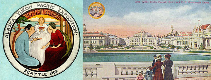
This is Frosh Pond in 1909, when it was called Geyser Basin (part of the so-called “Arctic Circle”), and when it was not a part of campus, but the centerpiece of the University’s predecessor, the Alaska-Yukon-Pacific Exposition.
An event similar to a World’s Fair, the A-Y-P showcased the natural and economic resources of the Pacific Northwest with pomp and splendor. To mirror the purpose of the exposition, the fairgrounds (designed by the famous Olmsted Brothers) brought the region’s greatest symbol into stunning focus. This so-called “Rainier Vista,” culminating in the Arctic Circle, helped draw in 3.7 million visitors over the fair’s four-month duration.

Very little evidence remains of the A-Y-P fairgrounds today (much to my chagrin); the vast majority of the fair’s buildings were temporary, and even the landscape design of the modern University has all but obscured the original layout of the A-Y-P grounds. But the Arctic Circle is still there, and when you step out from behind a row of blooming cherry trees in the spring, the Rainier Vista still hits you with full force.
Speaking of fairgrounds, closer to T-Town is another historical remnant—this time, however, instead of a long-past event with only a marker left behind to hint at what was, these fairgrounds still hold to their original purpose today.

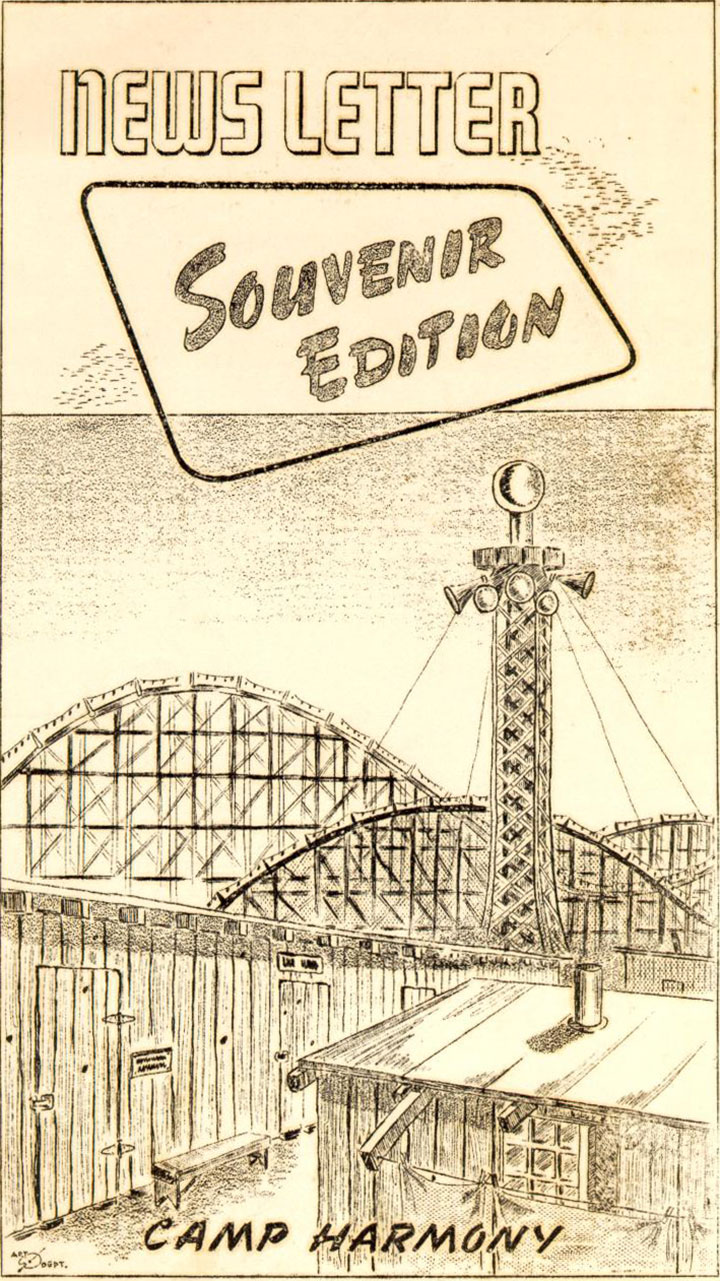
Illustration by Eddie Sato, Camp Harmony inmate and “staff” artist.
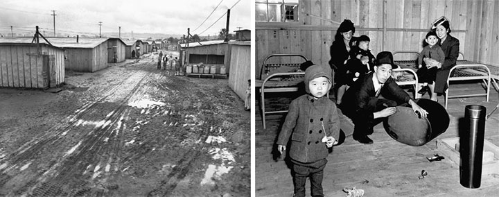
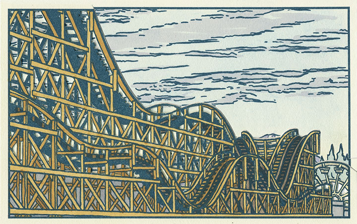
I’m talking about the Western Washington Fairgrounds in Puyallup, which are still in operation (though the event is now called the Puyallup Fair—that’s pronounced “Pew-AL-up”). In 1942, the U.S. government evicted, rounded up and imprisoned over 100,000 Japanese Americans living on the West Coast; the internment began with the forced migration of families living on Bainbridge Island, across the Sound from Seattle.

While they awaited the construction of permanent internment camps further inland, many Japanese Americans were sent to temporary “assembly centers” to coexist in cramped barracks with other families, often in substandard living conditions. Thousands of Washington’s interred residents were sent to the assembly center nicknamed “Camp Harmony,” hastily constructed on the fairgrounds in Puyallup, right alongside the fair’s permanent buildings and rides.

Three image flats; the mountain is almost completely hidden here.
Camp Harmony was torn down after just seven months, but the Fair continues to this day. (To my everlasting horror, the Fair’s website mentions Camp Harmony only obliquely on its “History” page—it states only that “the fairgrounds were used as a temporary shelter“—emphasis mine—during World War II. Right. A shelter where the “refugees” were imprisoned under armed guard.) And the wooden roller coaster that overshadowed Eddie Sato’s scene of the camp still stands. Now that I’ve learned the history of the place, I’ve lost my appetite for rollercoasters, funnel cakes and blue-ribbon vegetables. But the fairgrounds made for an image that dovetails eerily well with the homage to Japanese art upon which Local Conditions is founded.

Photo courtesy of Jessica Spring
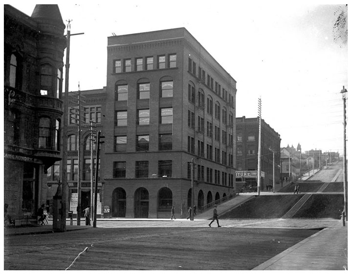
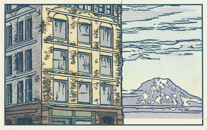
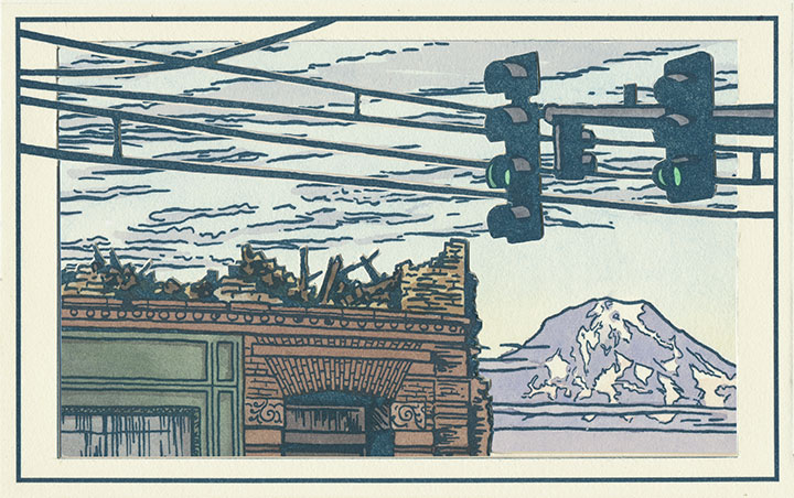
And then there’s the kind of history that unfolds right before your very eyes. Remember the Luzon building?

Two image flats; recognize the sky in the background?
Well, it was slated to be a part of the book from the very beginning—just by virtue of being a structure that caught my eye and that came with a good view of the mountain.

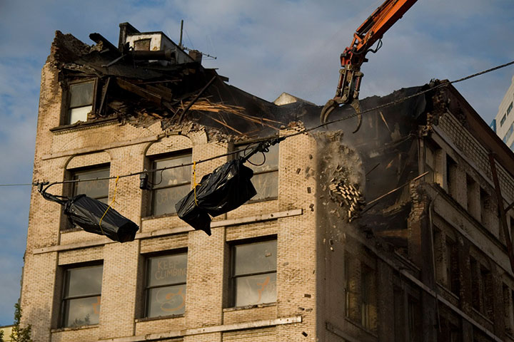
But then they knocked it down in September 2009, and suddenly I became an eye-witness, with an opportunity to document history as it happened.

Three image flats; same mountain, drastically different view.
I wish this were an imaginary scene, but it’s moments like this that the book is all about. Now you see it, now you don’t.

Postcards circa 1910. Courtesy of the Tacoma Public Library
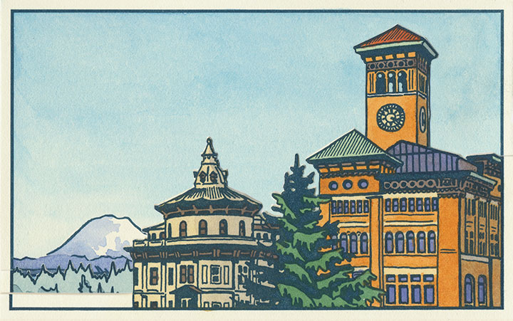
And to top it all off, it’s looking like Tacoma’s history is in danger of repeating itself. This is a postcard dated 1905, depicting what was an iconic view even then—the “Gateway to the City of Destiny.” The building on the left is the former Northern Pacific Railroad Office; on the right is Old City Hall.
Tacoma built a new city hall a few blocks away in the 1930s, but both the Northern Pacific building and Old City Hall still stand—the addition of a freeway the only major change to the site pictured. But on November 24, 2010, after an unusual cold snap, a pipe burst in Old City Hall—soaking the walls, ceilings and floors with 30,000 gallons of water. With extensive flood damage and the building owner entering foreclosure, the building faces an uncertain future. I only hope it doesn’t go the way of the Luzon.

Three image flats; there’s an individual print version in the shop.
When I started this project, I had no idea of what I was getting into. I knew that I would stumble upon some pretty fascinating history, but I never would have guessed that a fountain, some fairgrounds and a pile of bricks would draw me in so completely. But now I’m hooked—and the best part is that after all this work, I no longer feel like an outsider looking in.
This is my history now, too. For better or worse, I want to see how it all plays out.
January 1st, 2011

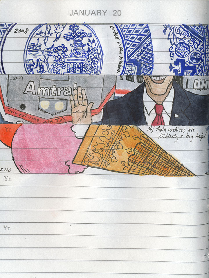
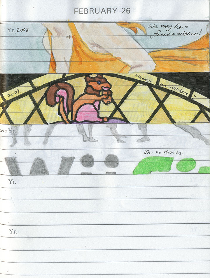
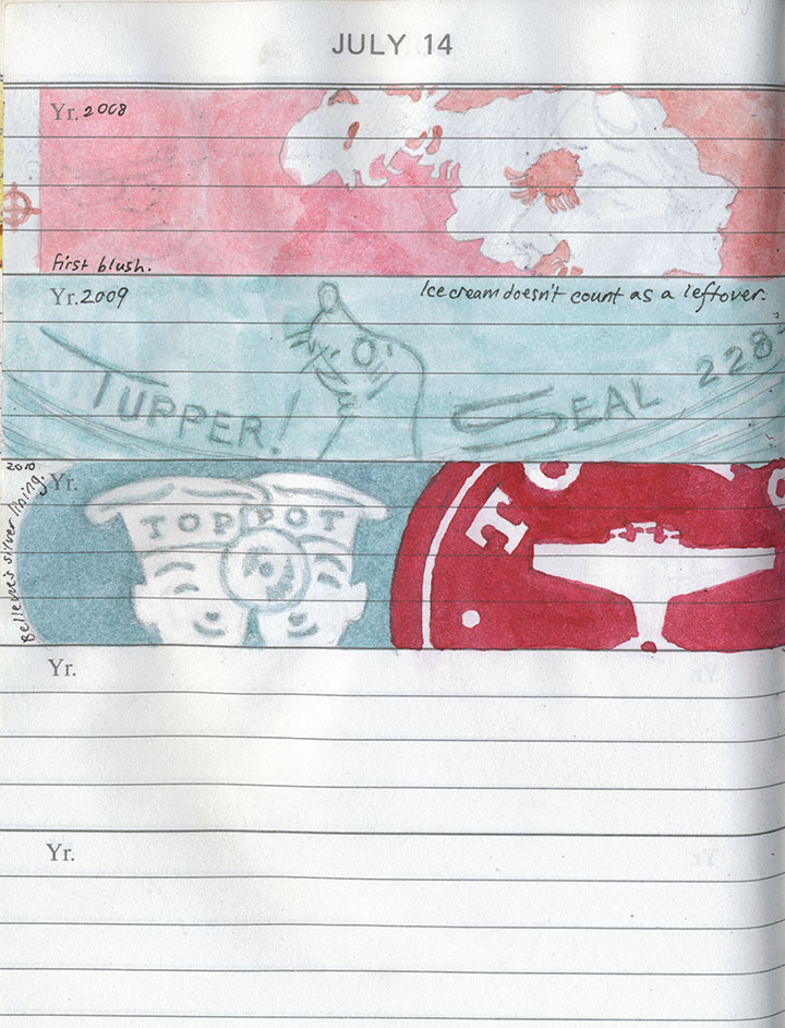
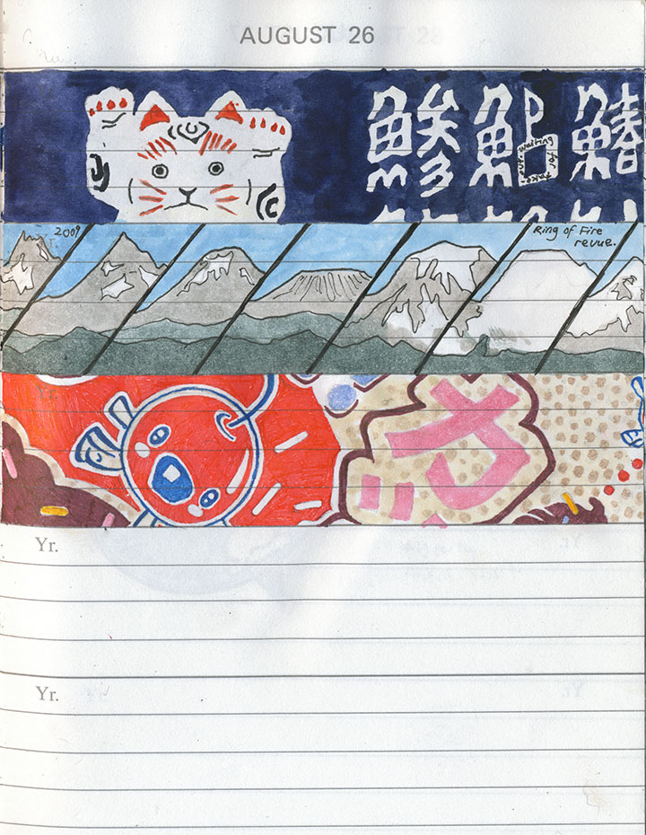
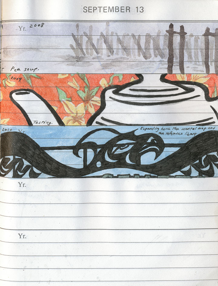
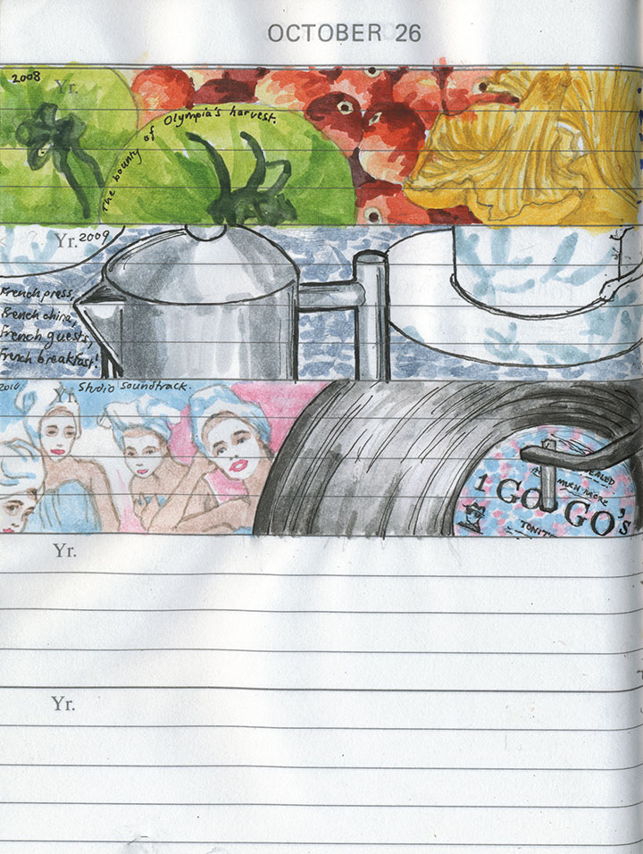
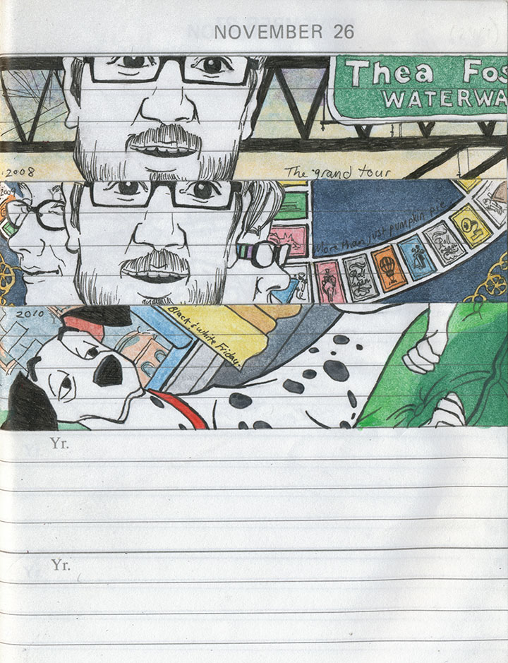
This might seem a little strange, coming from me, but the New Year’s resolution at the top of my “art” category is to draw more.

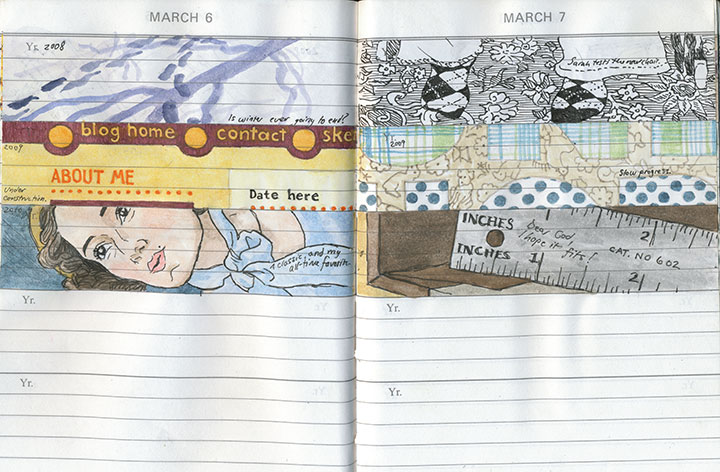
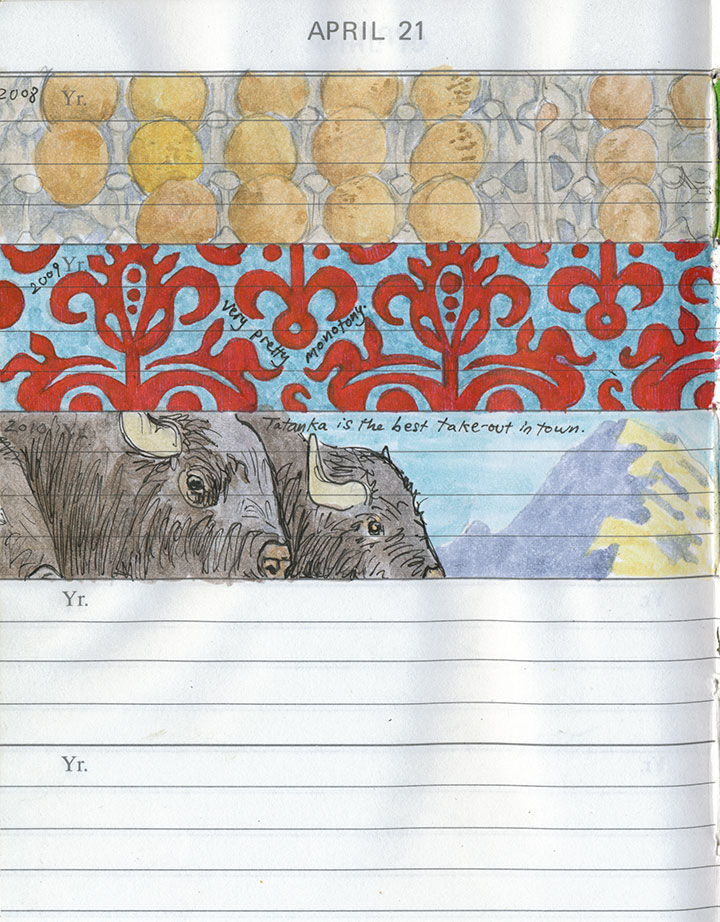
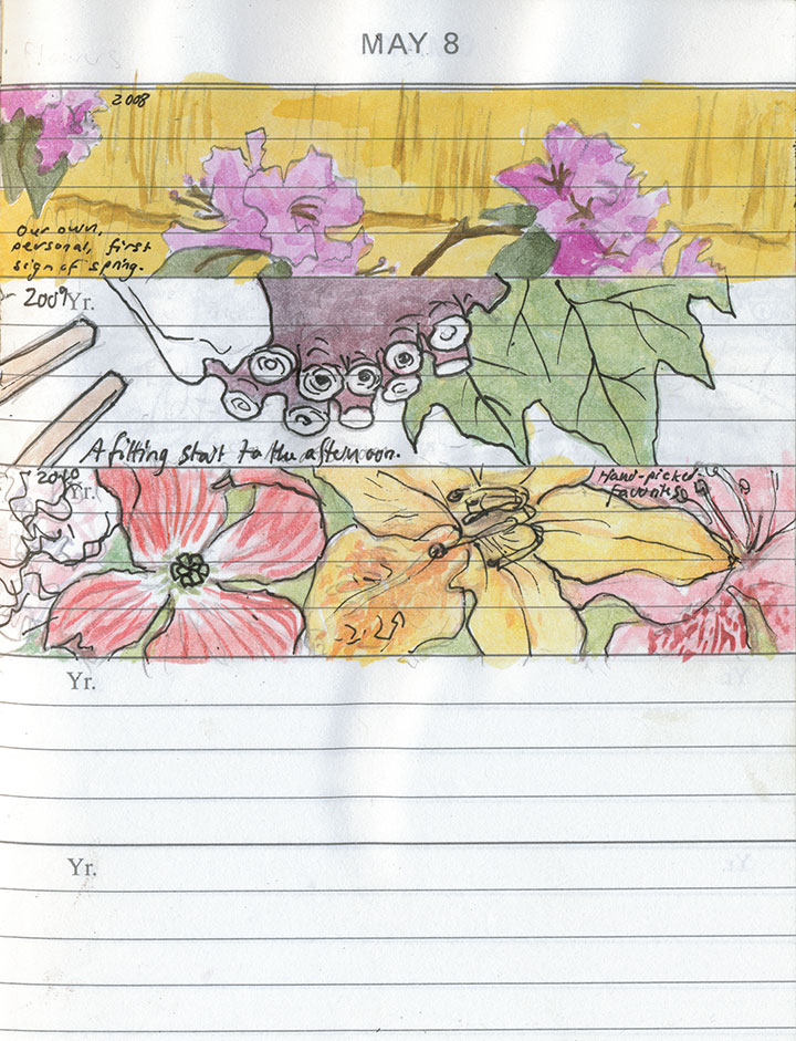
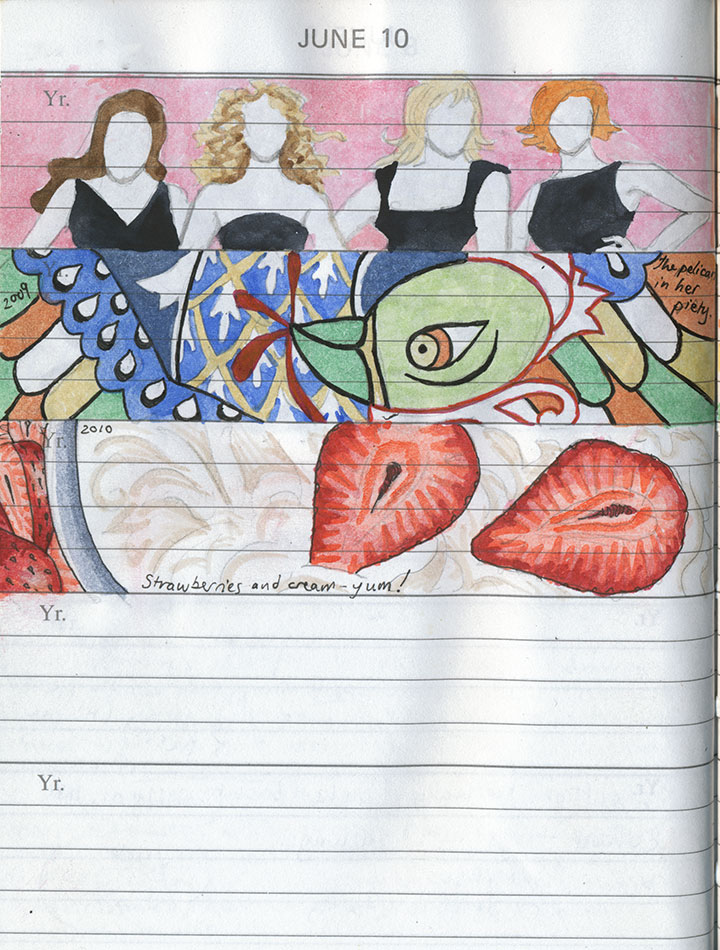
I mean that I’d like to spend more time with my sketchbooks—with everything else that happened last year, there just didn’t seem to be a spare second for observing the moment and jotting it down.

The daily book was about the only thing that received any attention, and even it spent the entire year on the back-back-back burner.

I still have quite a bit of catching up to do there, though—

so that’s where I’m going to start.

It’s a daunting prospect; even just filling in half-finished sketches (maybe I should have shown you those instead!) amounts to a huge time investment, and a mountain of work.

But I’ll get there. And besides, it’s those last two blank slots on every page that interest me the most.

They stand for the future that’s unwritten, and I find I can’t imagine what could possibly complete the picture—nor could I ever have predicted what has ended up here thus far.

When I first started this project, it seemed like a painfully slow undertaking.

But now I’m surprised at how quickly the book is filling up,

and I’m anxious to find out what will fill out this page—and the next, and the next.

Well, today I flip the book back to the beginning, pencil in hand—and so I’ll find out soon enough.
Happy New Year!
December 25th, 2010

I was afraid I wasn’t going to have any holiday photos to show you—when I was in Portland the other week, my camera took a nosedive after being bumped off my shoulder in a crowded room.

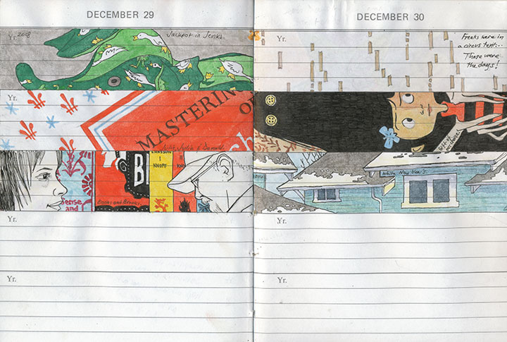
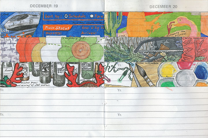
Snippets from my daily journal
So I shipped the lens off to the good folks at Canon for repair, and switched to paper for awhile.

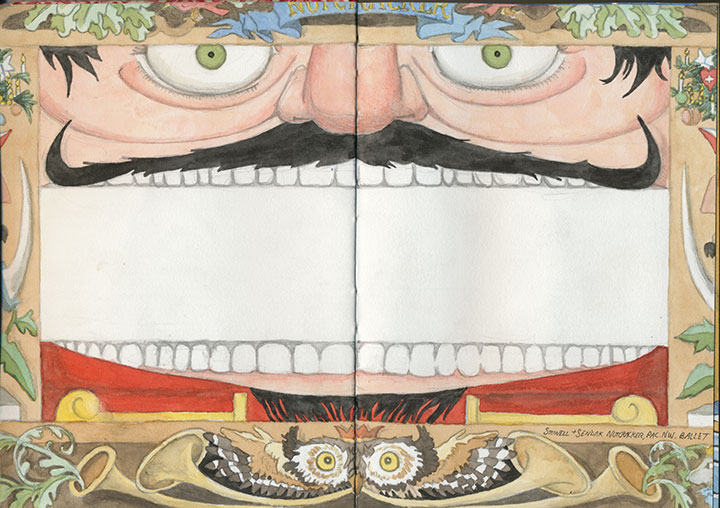
One of Maurice Sendak’s eye-candy stage sets for the Pacific NW Ballet’s Nutcracker
My favorite thing about sketchbooks is that I can take them anywhere—including places where cameras, functioning or not, are strictly verboten.

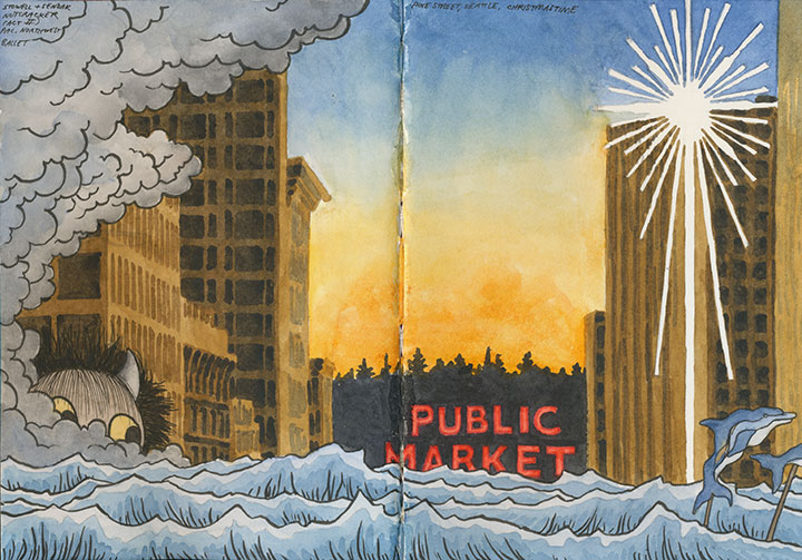
More Nutcracker scenery, plus Christmas on Pine Street in Seattle
The downside, though, is that it takes me a lot longer to draw a picture than to shoot one—so my output is always smaller than I’d like.

But then the Fedex guy showed up with my lens, good as new and just in time for Christmas.

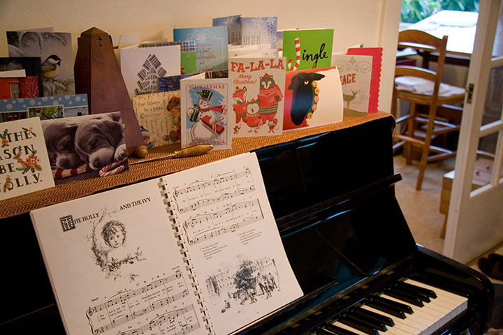
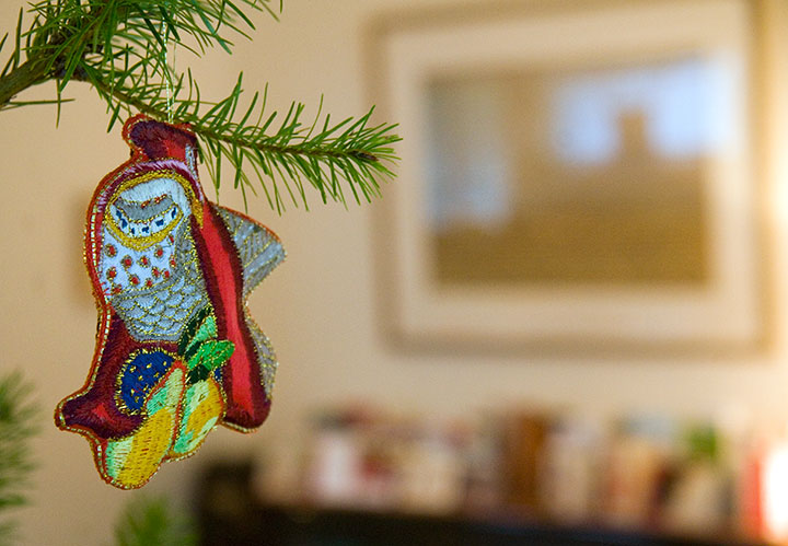
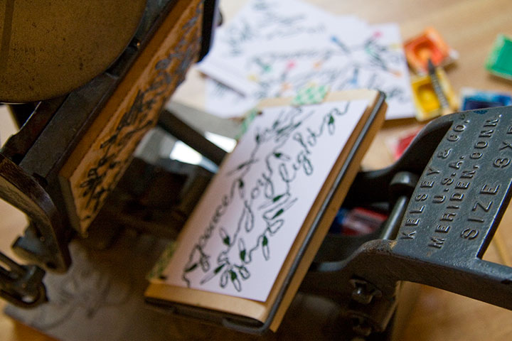
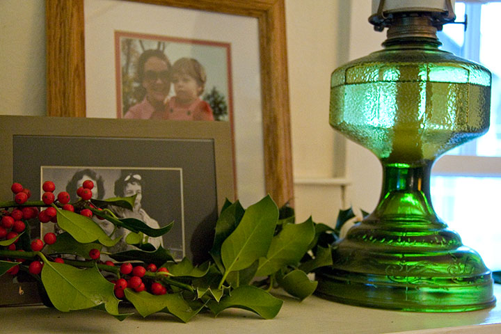
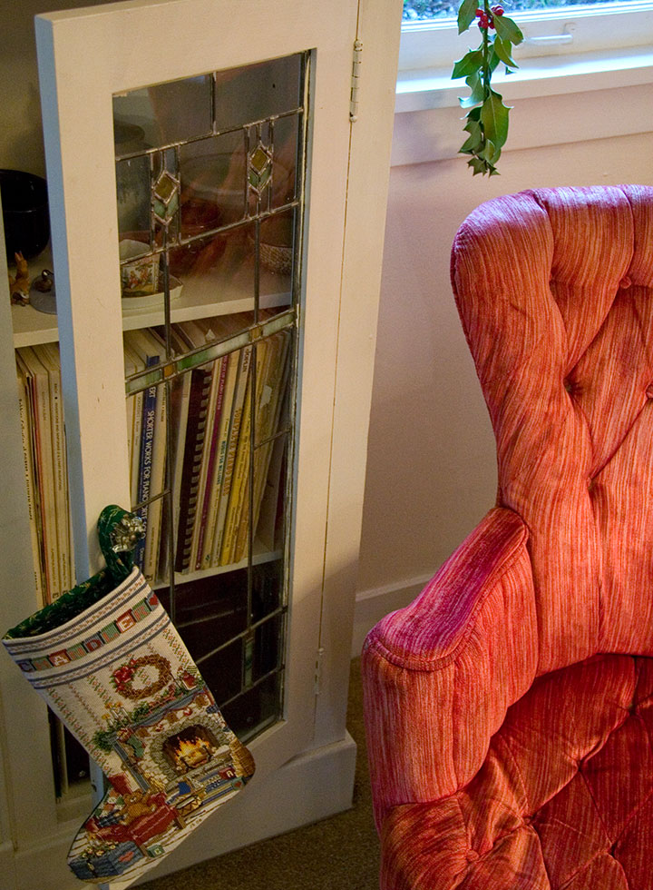
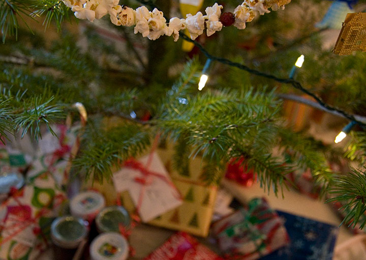
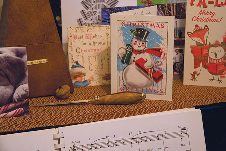
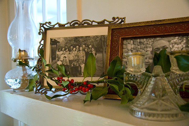
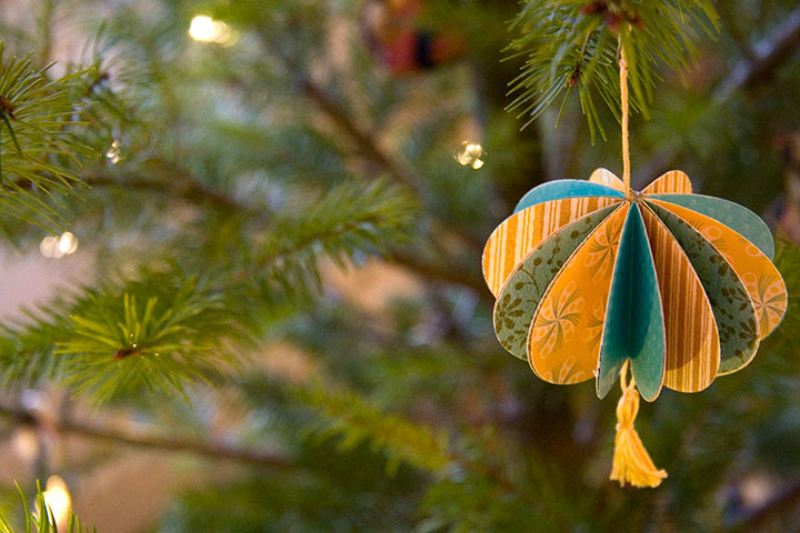
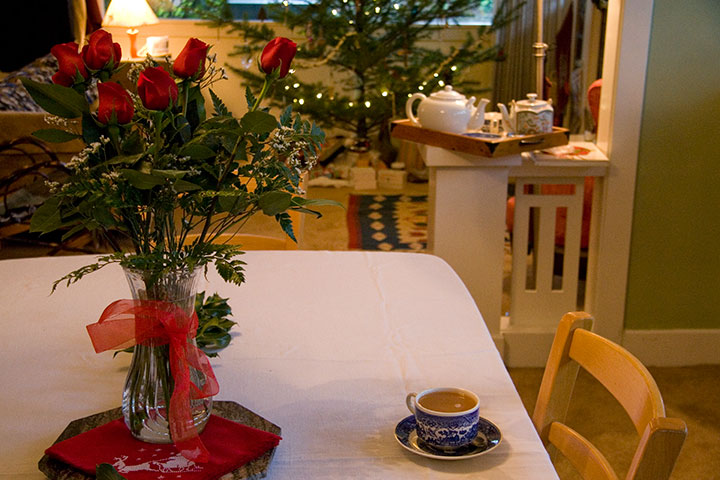
I managed to refrain from hugging him, and then hopped around the house in manic glee, documenting the holiday the Tailor and I have spent all week creating.

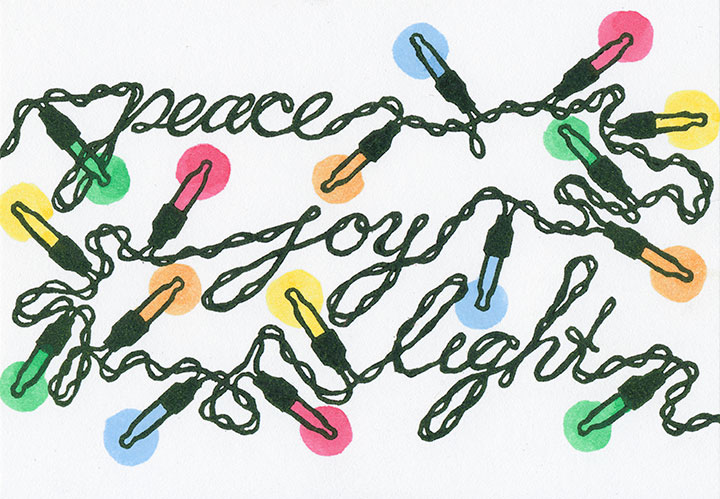
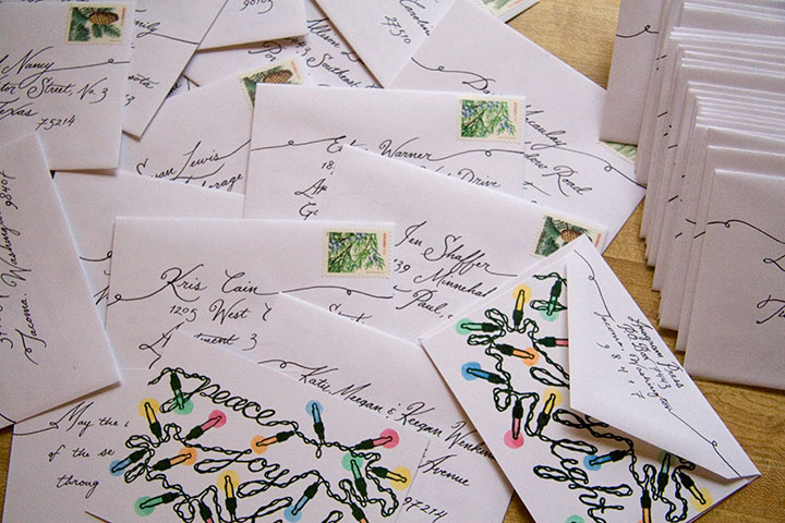
(We finally broke down and bought twinkle lights for the tree; which provided the perfect inspiration for this year’s card!)


Wherever today finds you, have a warm, cozy, abundant, and very merry Christmas.


![Chandler O'Leary [logo]](https://chandleroleary.com/wp-content/themes/chandleroleary/images/logo.png)
