Rereading the map
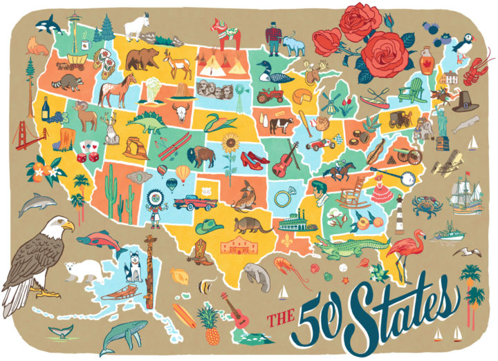

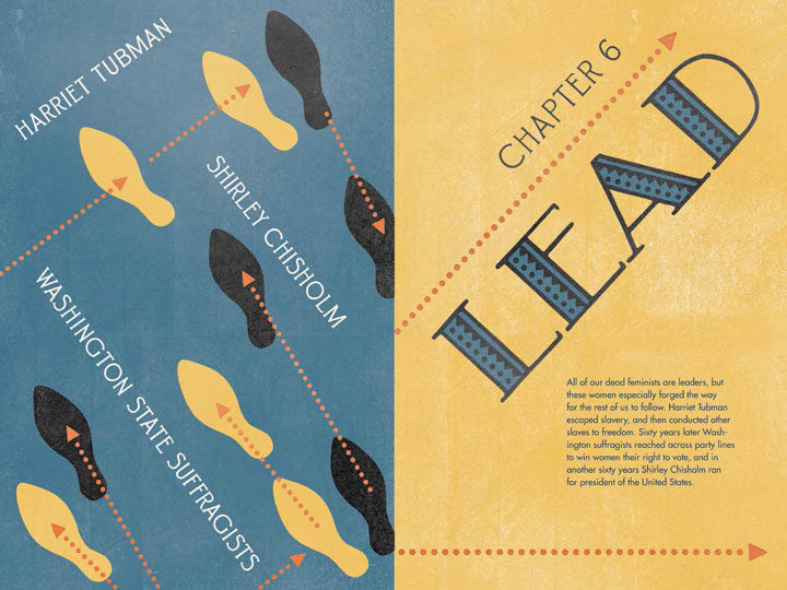
When we were coming up with the action-word titles for each chapter in our book, some words came to mind easily, while others were a challenge. Since we had to include three different feminists under each umbrella term, we had to think outside the box of each word’s literal meaning. “Lead,” though, was a no-brainer, and one of the first words that sprung to mind.
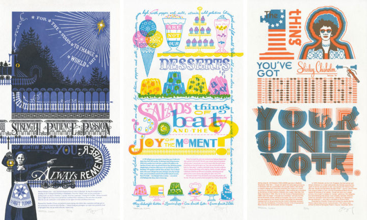
The women we featured in that chapter were all natural leaders, both literally and figuratively. Harriet Tubman, of course, literally led people to freedom in the North. The four members of the Washington suffrage movement led the way to gaining women in their state the vote. And Shirley Chisholm was elected to lead her constituents in the U.S. House of Representatives—then led the way as the first woman candidate on a major-party Presidential ticket.
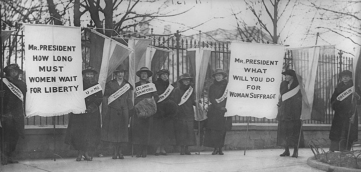
So since today is Election Day in the U.S., Jessica and I have our minds occupied with the women who came before us, who forged the path that led us to where we are today. And we’ll be focusing on this topic in our talk today at the University of Puget Sound:
Pressing Matters: Election Day
Artist talk, book signing and pop-up shop
Today, November 8, at 4 pm, in room 020
Collins Memorial Library
University of Puget Sound, Tacoma, WA
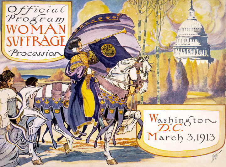
First came the seemingly endless fight to win women the vote—
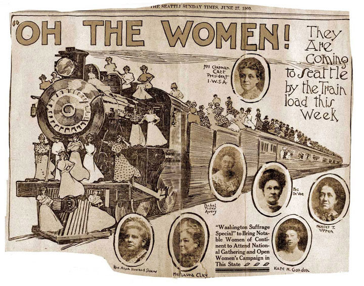
—not just nationally but also within their individual states. The amount of campaigning, organizing, writing, publishing, and picketing done by Emma Smith DeVoe and her colleagues was staggering, but their cumulative efforts built momentum that turned the campaign into an unstoppable train of force.
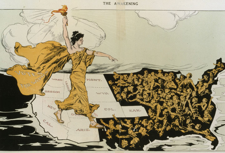
Since women in Washington gained the vote in 1910, a full decade before women could vote in national elections, the suffrage movement saw our region as progressive leaders, trailblazing the path to political equality.
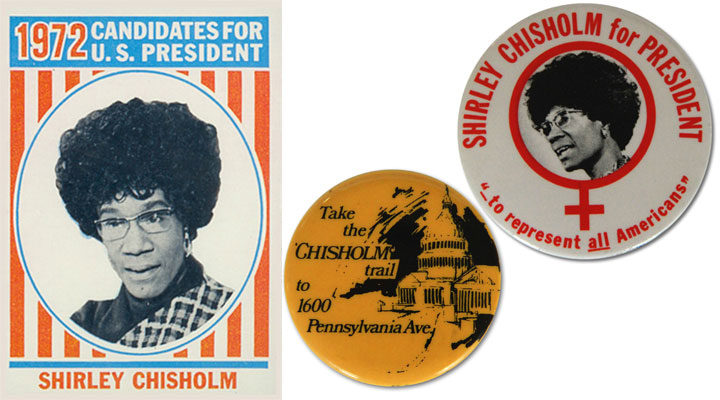
More than sixty years later, Shirley Chisholm took the lead by running for President, which made her, in her own words, “literally and figuratively the dark horse.” Though she lost the 1972 Democratic primaries in the end, she fought hard to make the path a little easier for any women who came after her.
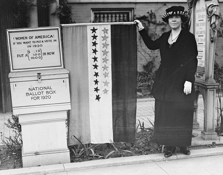
Today we stand on another historic threshold, where at long last, American women have the chance to vote for the first woman President—not just in the primaries, but in the main event. When we cast our ballots today, we’ll feel the presence of all the women who led the way.
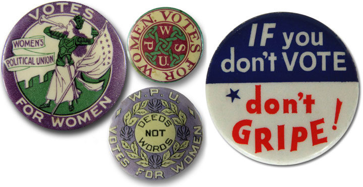
A century’s worth of campaign buttons has got it right: your vote counts, especially if you are a woman. Please get out and vote today, and help us make history, not just write about it.
When we wrote and illustrated our new book, Dead Feminists: Historical Heroines in Living Color, it was important both to us and the publisher that we fill the pages with new content, rather than simply rehash the story of our previous broadsides. So it came to us that one great way to do that would be to have a new broadside appear in the book and in the world simultaneously. One of the biggest challenges of doing this (other than having to print the broadside ahead of publication and then keep the secret for months) was choosing who to feature, considering the fact that we’d be introducing the broadside to a brand new and much larger audience. We wanted to feature a woman who touched the world, and who reflected the world we had become.
We live in a global society, with different cultures mingling—and at times clashing—with a regularity we now take for granted. It is easy to forget the imperialist origins of globalization, where Western cultures sought to dominate and even extinguish the societies they encountered. Colonization of the Indigenous world has had far-reaching effects on both people and the environment, the consequences of which we are only beginning to understand. And who better to understand the ripple effects of colonialism than the queen of a colonized nation?
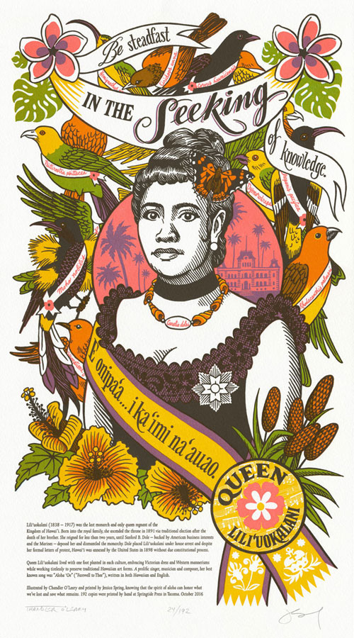
“E onipai’a . . . i ka ‘imi na’auao.” (“Be steadfast in the seeking of knowledge.”)
— Queen Lili’uokalani
Queen Lili’uokalani was the last monarch—and only queen regnant—of the Kingdom of Hawai’i. Raised by traditional Hawaiian custom and a resident of a post-colonial country, she was fluent in the ways of both Hawaiian and Western cultures. Her reign was sadly brief—thanks to powerful foreign interests who refused to share the nation they had claimed for their own. Yet she devoted much of her life to preserving traditional art forms and recording them for others to study. Hers was the middle road—the road of survival.
For Indigenous women like Queen Lili’uokalani, there is no going back to life before Euro-American contact. Yet Lili’uokalani led a life that included and celebrated both the culture of her birth and the one imposed upon her later in life. Her example of sharing both traditions with future generations helps us all create a path forward. We are especially thankful to Alison Milham, a Hawaiian book artist who has extensively researched the Queen and who helped us fine tune our message.
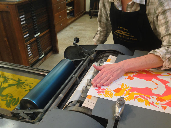
Jessica and I have our own paths to walk when it comes to creating each new broadside in our series. In my case, I’m always eager to explore different historical eras and design styles. And Jessica is constantly looking to push the envelope of what’s possible with letterpress printing—she loves to experiment with different techniques, like the split-fountain inking on our Nightsong broadside, or the crazy metallics of Focal Point, or the large floods and knocked-out shapes of Title Nine Iron. This time we wanted to create a tropical rainbow, but rather than printing every letter in ROYGBIV separately, we puzzled out how to create an illusion of a full-color design with translucent, overlapping colors, which Jessica would print in just four passes on press.
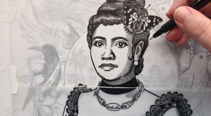
Jessica’s job was extra tricky, since the different plates had to line up perfectly to make the illusion work. But my end of the process was confusing, too: since I do the original drawing in black and separate the colors by hand, I had to keep checking and re-checking to make sure I didn’t assign some blob of color on the design to the wrong plate.
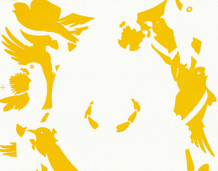
Generally speaking, we usually print our colors from lightest to darkest. So this time we started with a deep saffron yellow—the color of royalty in the Kingdom of Hawai’i, and one symbolic of Queen Lili’uokalani’s reign.
Then we overlaid a hot-hot pink on top of the yellow, one that stood in both for tropical flowers and the blazing color of the sun setting on Hawai’i’s Indigenous rulers. Wherever the pink overlapped the gold, the ink mixed to create a fiery orange.
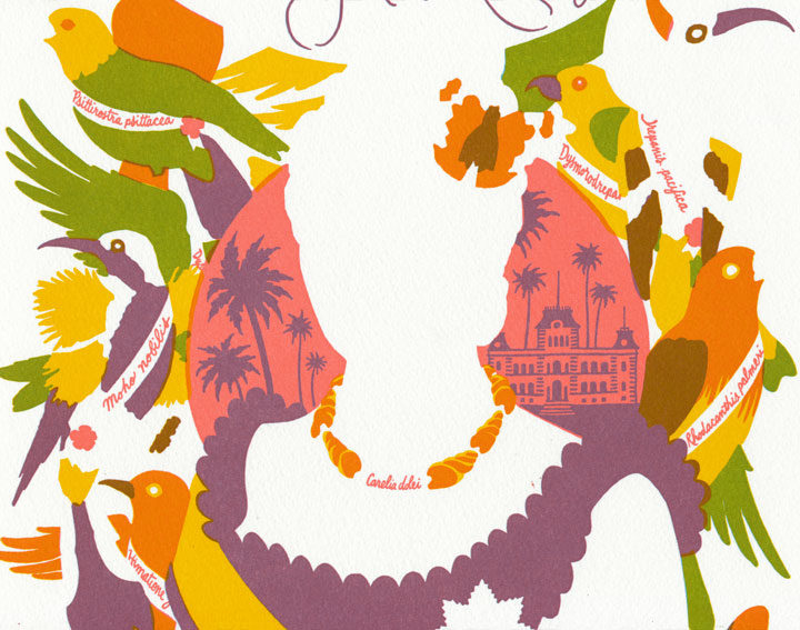
Next came a pass of cerulean blue. This part might seem confusing, because you can’t actually see any blue in the finished piece (though you can see it on press on the photo of Jessica above), but it’s an essential ingredient of our color scheme. Wherever the blue overlaid yellow, we got green. Where it hit that hot pink, a royal purple resulted. And where it touched any orange areas that resulted from the previous pass, a russet brown appeared.
Finally, we were ready for our last color, a rich black (actually, Jessica ran that last pass twice—the double hit of black made the ink nice and opaque) that brought everything together into harmony:
Our 24th broadside, Song of Aloha, depicts the lush flora and unique fauna of Hawai’i. Plumeria and hibiscus bloom, while leaves and fronds stand in silhouette in homage to traditional Hawaiian quilt motifs. At the center of the design is Queen Lili’uokalani herself, wearing a sash in royal colors, her signature brooch, a necklace of shells (from the extinct species Carelia dolei) and a Kamehameha butterfly in her hair. As a symbol of the vanished Hawaiian monarchy, every bird pictured is an extinct Hawaiian species—including the greater koa finch, the Hawai’i mamo, the Lana’i hookbill, the Hawaiian crow, and several species of endemic honeycreeper that now only exist as museum specimens.
Oh, and hidden in the design are ‘Iolani Palace and a line of music from Lili’uokalani’s famous composition, “Aloha ‘Oe.”
This piece marks the inauguration of the Dead Feminists Fund, to which a portion of our proceeds (and those of our new book!) will be donated. In honor of the power of women’s work, the Fund supports nonprofits that empower girls and women to create change in their own communities.
• • • • • • • • • • • • • • • • • • • • • • • • • • • • • • • • • • • • • • • • • • • • • • • • • • • • • • • •
Song of Aloha: No. 24 in the Dead Feminists series
Edition size: 192 prints
Poster size: 10 x 18 inches
Printed on an antique Vandercook Universal One press, on archival, 100% rag (cotton) paper. Each piece is numbered and signed by both artists.
Colophon reads:
Lili’uokalani (1838 – 1917) was the last monarch and only queen regnant of the Kingdom of Hawai’i. Born into the royal family, she ascended the throne in 1891 via traditional election after the death of her brother. She reigned for less than two years, until Sanford B. Dole—backed by American business interests and the Marines—deposed her and dismantled the monarchy. Dole placed Lili’uokalani under house arrest and despite her formal letters of protest, Hawai’i was annexed by the United States in 1898 without due constitutional process.
Queen Lili’uokalani lived with one foot planted in each culture, embracing Victorian dress and Western mannerisms while working tirelessly to preserve traditional Hawaiian art forms. A prolific singer, musician and composer, her best known song was “Aloha ‘Oe” (“Farewell to Thee”), written in both Hawaiian and English.
Illustrated by Chandler O’Leary and printed by Jessica Spring, knowing that the spirit of aloha can honor what we’ve lost and save what remains.
Now available in the shop! Or for local folks, you’ll find it at Studio Tour this weekend!
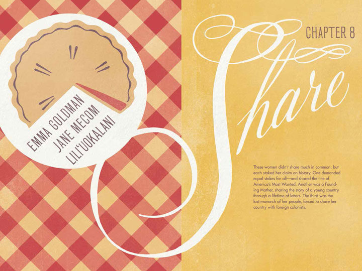
Earlier we shared some sneak peeks of the chapter spreads, but now that our book is out we can tell you a bit more about how the book is structured.
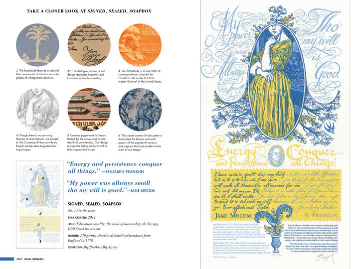
Of course, we go into detail about the process and stories behind each of our broadsides, including a “director’s cut” of each print.
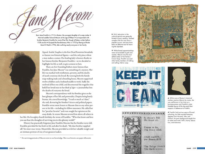
The great thing about the book format, though, is the ability to expand beyond the short colophons we include on each broadside. So each chapter goes in-depth about the women we featured and the social issues we highlighted with each broadside. Each story is anchored with archival photos and vintage ephemera to paint a more complete picture of these 27 women and their lives.
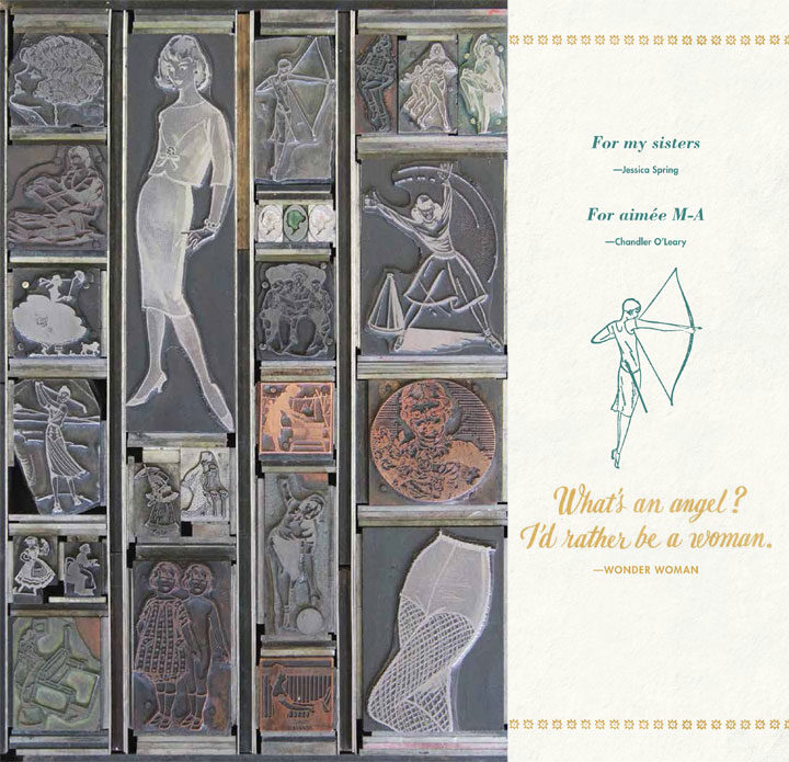
To tie everything together and reinforce our letterpress roots, the pages are peppered with vintage hand-set metal and wood cuts from Jessica’s incredible collection. Each one appears like an easter egg, linking our content to our process and bringing the past to life in the present.
Major thanks to our amazing editorial and marketing team at Sasquatch Books—every member of which is a fellow woman—for getting us to this point, and for continuing to support the Dead Feminists Fund through a portion of every book sale. And last but not least, thank you for supporting our series and our book. We hope that reading the book will be as rewarding for you as it was for us to write it.
See you tomorrow with more information about our 24th broadside!
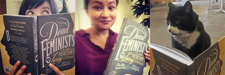
People everywhere can finally read our book, because today is the official release date! You can find your copy wherever books are sold—you’ll find all the major retailers on our book page.
If you’re in the Seattle-Tacoma area, just a reminder that you can pick up your copy tonight (and see Jessica and me in costume) at our official release party at King’s Books!
Official Book Release Costume Party
Tuesday, October 11, 7 pm
Hosted by King’s Books
218 St. Helens Avenue, Tacoma, WA
Event is free, all ages welcome; more info here
Come in costume, dressed as your favorite historical feminist!
We’d also love to see you at Tacoma’s Studio Tours, happening this Saturday and Sunday. This is our biggest event of the year, where we join more than 50 Tacoma artists for a city-wide free event. We’ll be selling (and signing) copies of our book at the event, as well our new Dead Feminists broadside and a special new mini letterpress print. We’ll also have a host of new gifts and stationery for sale, plus free hands-on activities: print your own keepsakes at Jessica’s studio, and create a die-cut greeting card at my place. Sstamp your Studio Tour Passport at at least 8 stops on the tour, you can enter a drawing for a variety of artist-made prizes. Here’s the scoop:
If you’ll excuse us, we have some costumes to get into… See you tonight!
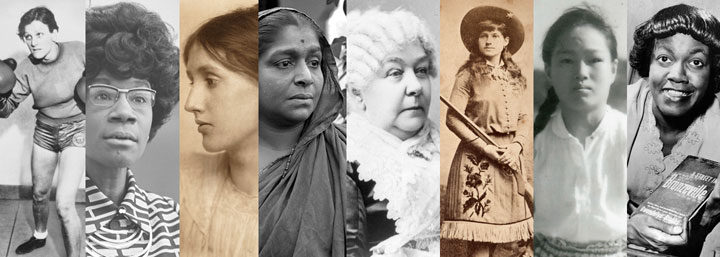
Tuesday is the day! Our book will be released worldwide on October 11, and we’re celebrating with a costume party! This is where you can be the first to get your hands on the book—and extra worth the effort if you want to see Jessica and me wearing ridiculous wigs. We don’t want to be the only ones celebrating Halloween early, so come on down and join the party. We’ll have prizes for the best outfits, Dead Feminists cake and punch, and a printing press ready to make your own keepsake. We’d love to sign a book for you, too. If you’re looking for costume ideas, you might dress up as one of the ladies in our book…
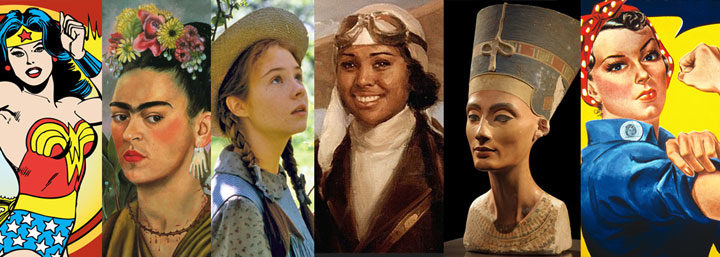
…or you might choose another favorite historical heroine, or a beloved fictional character, or even an historic feminist dude! Anything goes, and we can’t wait to see what you come up with. Here’s the skinny on the event:
Official Book Release Costume Party
Tuesday, October 11, 7 pm
Hosted by King’s Books
218 St. Helens Avenue, Tacoma, WA
Event is free, all ages welcome; more info here
Come in costume, dressed as your favorite historical feminist!
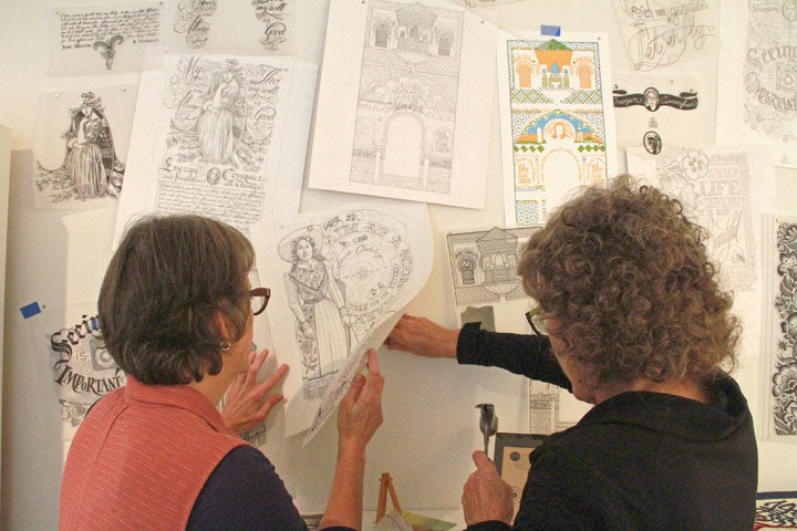
In addition to finally sharing the book with you next week, we also wanted the chance to share some of our original artwork. So for the past two years we’ve been planning a big retrospective exhibit with the 23Sandy Gallery in Portland, OR. Laura Russell, the owner and curator of the gallery, has been a major supporter of our series since the beginning—and this week it was no different, as she jumped right in and helped us install our artwork in her space!
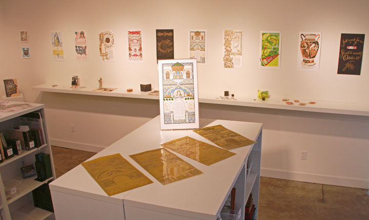
The show features 10 original letterpress broadsides from our series, two mini-broadsides, original process materials, plus vintage ephemera from our book. This is the first time we’ve done a show like this, and 23Sandy is the only place you’ll still find some of our older, out-of-print broadsides available for sale.
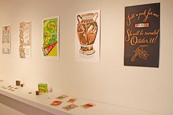
The exhibit also includes our 24th and newest broadside, but since she comes out on October 11, alongside the book, we have her hidden under a black veil for now. But you can see her—and all the other artwork—unveiled at our reception and book signing later this month. Here are the details:
Make-Ready: Dead Feminists from Print to Page
A Dead Feminists retrospective exhibit
on display through October 29
Reception & book signing Saturday, October 22
4 to 6 pm, free!
23Sandy Gallery
623 NE 23rd Ave, Portland, OR
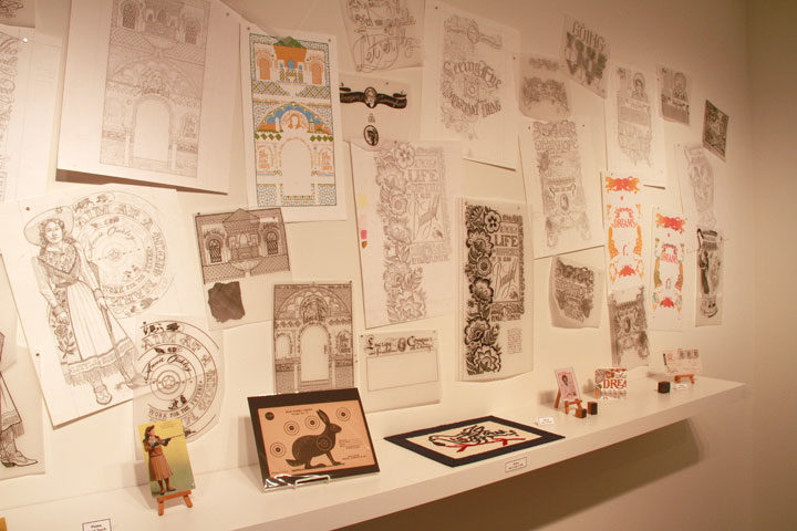
If you can’t make it to Portland, you can also learn more about the exhibit and view an online catalog on the 23Sandy website.
Make-Ready is just one of many different exhibits in the works this fall—we’ve got the Dead Feminists coming to galleries around the country for both solo and group shows. We’ll be sharing more info here on the blog soon, but as always, you can find all our events, shows, book signings and talks listed on the events page.
See you Tuesday—in costume!
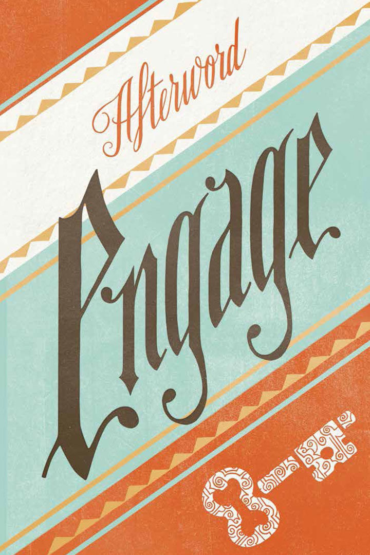
One of the biggest challenges of turning the Dead Feminists into a book was figuring out a way to tie all our broadsides together in a way that was engaging for the reader. Aside from the size and format of each broadside, our prints had little in common with one another. Our feminists were a diverse group without much of an underlying thread—even the style of illustration was different for each one.
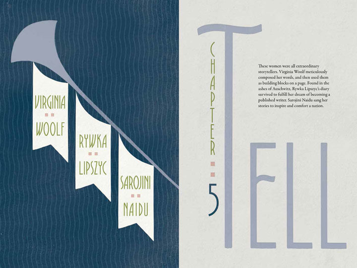
Jessica came up with the solution: using action verbs to tell our story. After all, our aim with the series was to use the literal and figurative power of the press to change the world around us. The women we featured had also created change—they were active, not passive. So we divided our 24 feminists among eight action words, choosing for each chapter a trio of women who shared qualities or deeds with that particular verb. And since we’re so close to the release of the book (just two weeks!), we thought we’d share a few of those words with you.
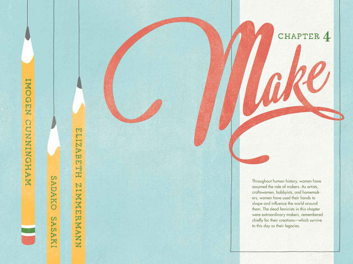
The best part for me, of course, was being able to make more hand-lettered illustrations! Each chapter’s verb is done in a different style, and elements of that illustration are carried throughout the rest of the chapter.

Of course, shoe-horning each feminist into one of the eight action themes was sometimes a convoluted business, but we got there in the end. We’re super pleased with how it all turned out—and hopeful that it might inspire more women and girls to take the lead with some action of their own.

Our book is not the only thing coming out on October 11—we’ll also be releasing our 24th broadside. We can’t spill the coffee beans yet, but here’s a step-by-step glimpse of the process. As you can see, there were a lot of steps involved, from detailed illustration to some tricky acrobatics on press. We think the finished product will be well worth the wait!
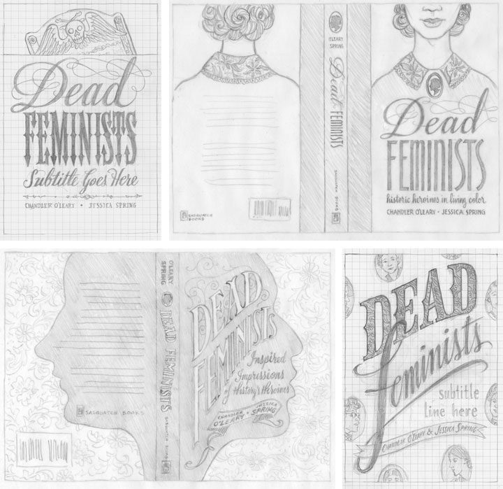
It’s hard to believe we’re only five weeks out from the release of our book! A few advance reader copies are making their way around to media outlets already, and several people have asked us how we came up with the cover design. Since getting to the finished cover was quite a process, we thought we’d show you a bit of the winding path that got us here.
When Sasquatch Books first signed us as authors, they offered us the chance to design, illustrate and hand-letter the cover. Needless to say we jumped at it. But designing a book cover can be very different than designing other things—the stakes are higher, for one thing. In some ways, it’s more of a science than an art: a good cover can have a lot of sway in terms of book sales, so it has to be as eye-catching, informative and readable as possible. So to make sure we got it right, it was a hugely collaborative process—not just between Jessica and me, but also with the publisher, the art director, our editors, the sales team, and lots of other people we never even met in person.
Jessica and I started brainstorming and sketching cover ideas way back in November of last year; above are a few of the concepts we sent along. We had a lot of feedback that large, legible type was key, so that was a good starting point. We also had to be really careful about the hierarchy of type. We had to make sure “Feminists” caught the eye first, followed by “Dead,” then the subhead, then the byline, etc. Later, when we got the happy news that Jill Lepore would be writing the foreword to our book, that added another level to our type hierarchy. In addition to all of this, we wanted to give the Sasquatch team plenty of options, so we tried to make each concept distinct from the others. Right away the clear favorite was the one in the lower right corner, so that was the concept we took to the next level.
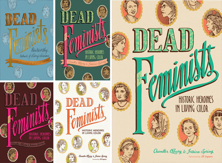
Then came a long parade of versions in color. We worked closely with Sasquatch’s art director and lead designer, Anna Goldstein, to try to catch that elusive unicorn that is a cover that works. I’d mock something up and send it to Anna; she’d mock something else up and send it back to us; rinse and repeat. Each time it felt like we were getting closer, but every time it felt like something subtle was missing. So we made a million little tweaks, to color, to lettering, to texture, to contrast, to composition, to kerning, etc. Each time one of us would have what seemed like a great idea, and each time the result was lacking somehow. I don’t even remember how long we stayed in this holding pattern. (Normally I keep all the iterations of a design carefully numbered in chronological order, but at some point I just lost track. I gave up and labeled that file “VERSION WHATEVER.” It makes me laugh every time I see it.) Everybody was frustrated: the elusive unicorn had transformed into the Holy Grail.
And then I think we all finally conceded that small tweaks were never going to get us there. We needed something to change in a big way, and we needed to scrap much of the work we’d done thus far. This is a really hard thing to admit to oneself—that maybe one’s brilliant idea wasn’t so brilliant after all. But the finished product is more important than anybody’s ego, and no matter how good a kernal of an idea might be, it’s not worth bringing down the whole design over it.
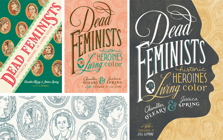
So we quite literally went back to the drawing board. I knocked together a few more pencil sketches, and we asked the whole team again what elements they thought were essential. A lot of people responded to the little cameo portraits of the various historical figures, so we came up with the idea to use them as more of an overall pattern (that’s the green cover on the left, above). Then our editors gave us the feedback that maybe the cover should be more like the style of our broadsides, with bold lettering in many different styles. Anna added the suggestion of making those cameo portraits more of a faint pattern than a major focal point, and then the lightbulb seemed to go on at last. That peach version in the center, I think, was what I put together next. Jessica and I could see that the most recent advice was on the right track, but we were still worried it wouldn’t stand out when seen on a display shelf with a hundred other books. Our editor asked us if we had any ideas for how to make it pop, and in wild desperation I fished out one of our earliest pencil sketches (above), the one with the face in silhouette, and gave it another look. What didn’t seem to work in sketch form suddenly felt like the missing ingredient when paired with the cameo pattern and the bold lettering. We sent a version back to Anna, and she gave it that antique texture and the gold-grey-and-teal color scheme you see here. And that was it—it was like she’d flipped a switch, and voilà: finished cover.
Over the course of eight years of printing our broadsides, Jessica and I had grown accustomed to just doing whatever we want in terms of design and content. With small editions to print, and nobody to please but ourselves, the stakes were low—and there was always plenty of room for experimentation. This book has been an entirely different animal, and I think designing the cover has been a perfect metaphor for the whole process. Writing a 40,000-word manuscript about history and feminism was never something we thought we could do, but with the incredible help of our editors, we got there. Likewise, designing the container for that content was a massive group effort—so major props and big thanks to Anna for sticking with us. Getting to the finish line required stepping way beyond our comfort zone—and more importantly, it took the whole team. We couldn’t have done it alone, and that’s a good thing, because both book and cover are the better for it.
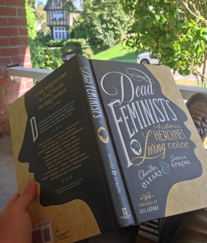
It’s weird. Jessica and I have been working on this thing for two years now—imagining, planning, dreaming, drawing, writing, drafting, rewriting, editing, designing, redesigning, lettering, illustrating, editing again, photographing, curating, gathering, fact-checking, editing some more. But even though we did all of that, and for so long, only now does it actually feel like it’s really happening. Because now I’m sitting here with the actual book in my hands. We just received our advance copies, and for quite a while all I could think was, “It’s real.”
There are still two months to go before the book is real to everybody else, as well, but in the meantime we have a whole lot of snippets, sneak peeks and behind-the-scenes stuff to share. But if you’re champing at the bit like we are, you can pre-order your copy now.