Blog
October 14th, 2009
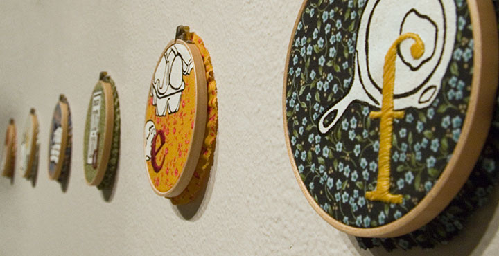
When I walked into the PLU Gallery this morning to document the Mnemonic Sampler show when it opens, my brain had somewhat of a short circuit. Since I was out of town for the past few days, all of the installation work was done for me (thank you a million times over, Heather C.!)—so this was the first time I’d laid eyes on the work since framing it up and chucking the pieces in a box. I somehow couldn’t connect the finished work on the walls with the crazy, chaotic process of the past few months. It seemed so simple, like this was somebody else’s show, and all the nail-biting and never-ending futzing I’d been doing was for some other project that would remain unfinished forever. But I did finish it—and there it is!
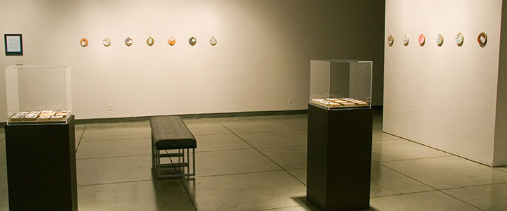
I was nervous about the possible absurdity of having twenty-six small pieces in a colossally huge space, but somehow, it works. Heather ingeniously used lighting and visual breaks to transform the gallery into a space that draws the viewer in and creates an intimate experience—which is exactly what I hoped for. Heather, I owe you big.
On to the work itself. Here is the artist statement for the exhibit:
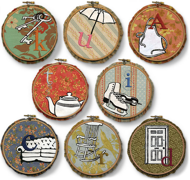
The alphabet is one of the first lessons we learn as children. From the beginning we learn to use it as a mnemonic device—just like “Roy G. Biv,” or “Every Good Boy Deserves Fudge”—assigning meaning to our world by associating symbols with each letter. Because the alphabet is one of our most basic and effective memory tools, we are drawn to it as both a visual and narrative archetype. It’s not surprising, then, that the abecedary is somewhat of a staple among book artists.
Just as we use our ABCs as a memory aid, our possessions help us create the concept of Home. No matter what our economic station, living situation, or domestic permanence, we all tend to share similar symbols of comfort and nostalgia. These ideals are embodied in the everyday objects around us—those mundane materials we take for granted, yet without which we would sense something lacking. As someone who has never had a picket fence, who grew up in a nomadic military family, and who has lived her entire life with relatively few possessions, the archetypal Home should seem foreign to me. Yet the same mnemonic triggers exist in my mind; the same objects attract me.
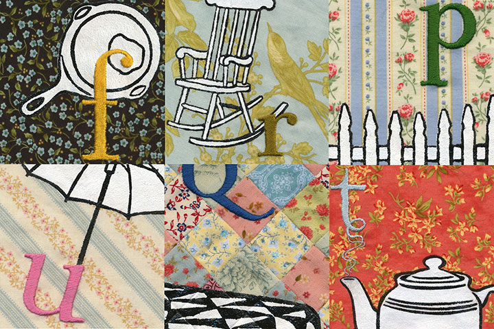
Mnemonic Sampler collects and files our household icons, gathered together like the stitched and quilted samplers of our mothers and grandmothers. The hand-stitched alphabet enumerates my, your, our trappings, shuffling our collective domestic inventory like the old card game of Memory. Each symbol is familiar; each object is Ours, whether we actually possess it or not. Together they sketch out a Home—real or imagined; longed-for or spurned; past, present, or future.
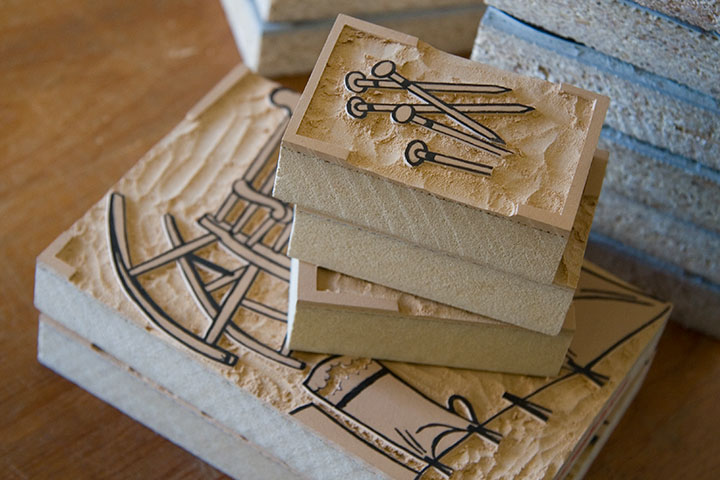
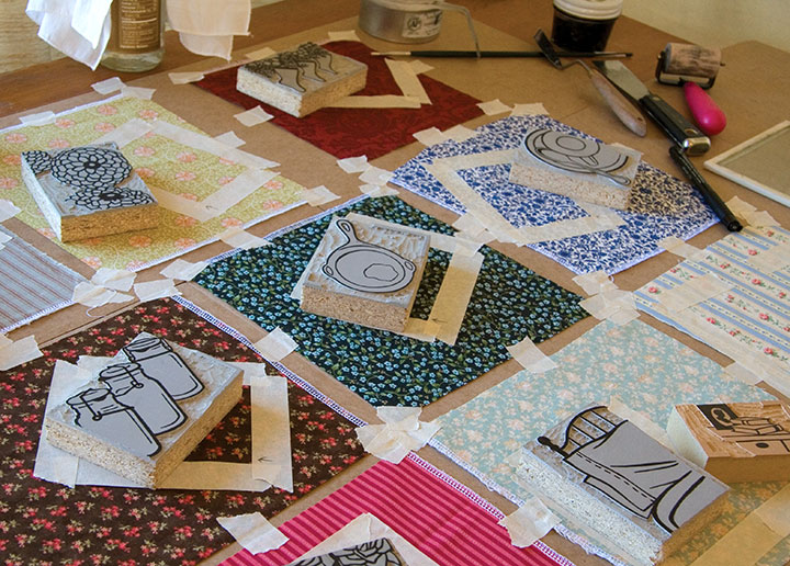
Mnemonic Sampler is a collection of monoprints, which means that instead of an edition of multiples, each print is created in such a way that it can’t exactly be reproduced. This technique results in a one-of-a-kind, totally unique piece—and is often more closely related to painting than printmaking. These pieces are printed from reduction-cut linoleum blocks—meaning both print colors are carved from the same block.
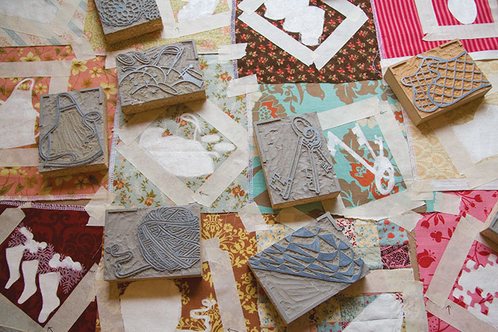
So once the second design is carved, the first color cannot be printed again.
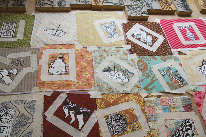
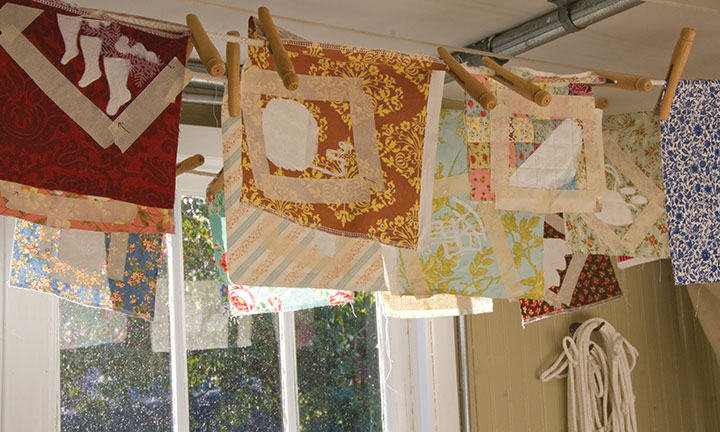
Designing these pieces was an intuitive process, consisting of both logical and intangible choices of fabric and pattern compositions. Because the design stage was so fluid (almost semi-conscious at times), it really wasn’t possible to do the printing on a press. Instead, each impression was made literally by hand, using masking tape to aid in color registration.
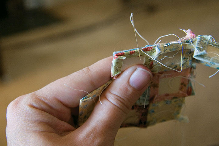
“Q” has an extra conceptual level, since the fabric background is a patchwork “quilt” in its own right. Like everything else about the series, the patchwork is sewn by hand, using the English paper piecing technique.
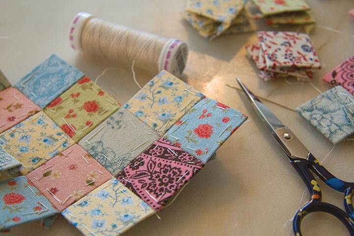
This was my first attempt at paper piecing, and I’m pleasantly surprised at how quick and accurate it is. Instead of folding and ironing every tiny piece, then wrangling a sewing machine, each patch is wrapped around a paper template and basted down, then whip-stitched together into a block.
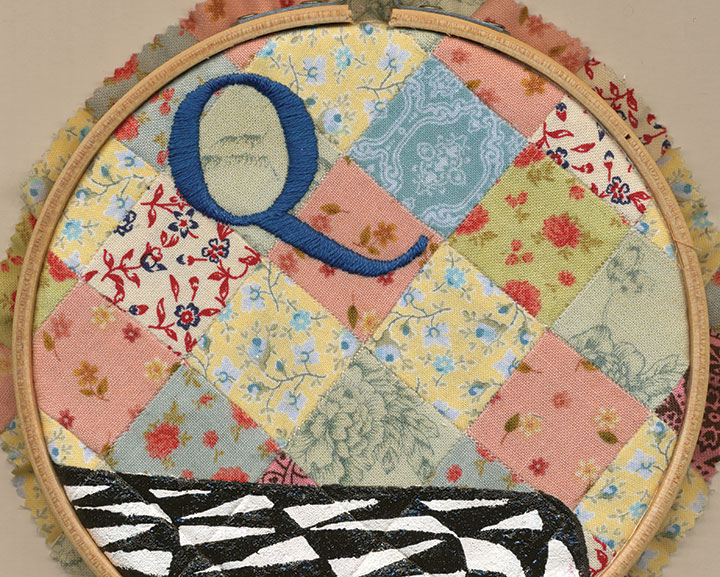
The result is a precise little quilt—perfect for embroidery.
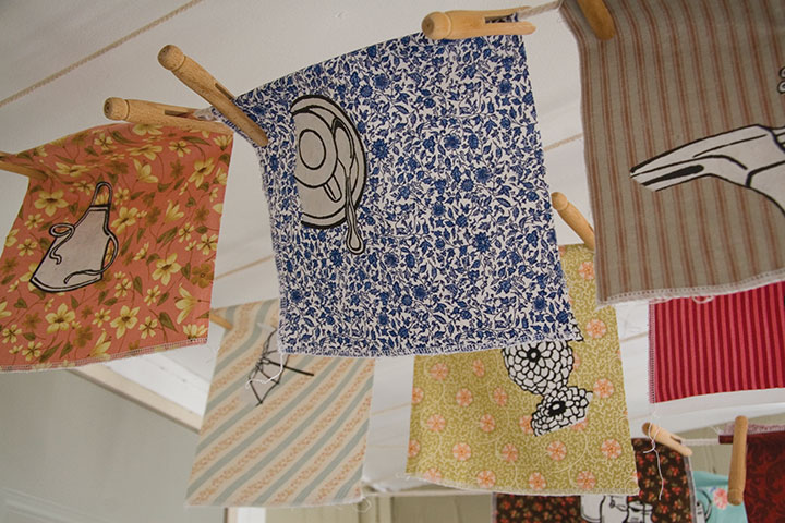
I can’t believe how long it took to complete every step of the process—and yet how quickly everything came together at the end. So you can bet I’m excited about celebrating at the opening tonight. And besides, I’m interested to see if the household objects I chose will resonate with viewers; it wasn’t easy to narrow things down to twenty-six letters of the alphabet, so I picked those objects that had the most meaning for me.
So how about it—what spells “Home” for you?
October 2nd, 2009

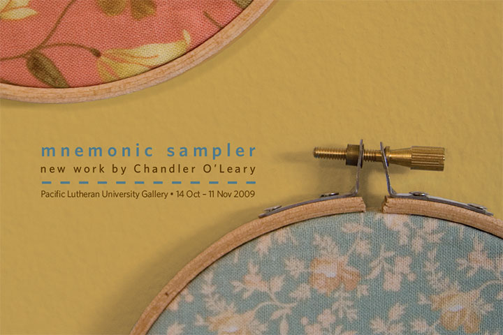
Finally, something tangible to show you! This is the point where all of the elements for my new body of work are just starting to come together. The past couple of months have been somewhat of a nail-biter—sometimes I wonder what possessed me to create twenty-six new pieces for a last-minute show. Now that the promo postcards (see above) are in hand and I can see the finish line, however, I can tell that my instincts knew what they were doing.
Mnemonic Sampler is my new solo show, opening October 14 at the PLU University Gallery. Here are the details:
Mnemonic Sampler: An Abecedary by Chandler O’Leary
October 14 to November 11
University Gallery, Ingram Hall
Pacific Lutheran University, Tacoma, WA
Opening Reception: Wednesday, October 14, 5-7 pm
On display will be something of a room-sized artist book, consisting of twenty-six hand-embroidered monoprints on calico (a monoprint is the opposite of an edition, a one-of-a-kind piece). Together the prints form an abecedary, or alphabet, and tell the story of how our concepts and ideals of “Home” are linked to the everyday objects that surround us. More on this topic when the show opens, but for now, here’s a peek (since the work is not quite finished, a peek is all I’ve got for now):

Many, many thanks to the talented and infinitely helpful Katie S. at PLU, who took care of having show postcards printed and mailed (!), orchestrated every logistic detail, and who has made the whole process as smooth as pumpkin pie. I would have long since lost my mind if it weren’t for you, Katie!

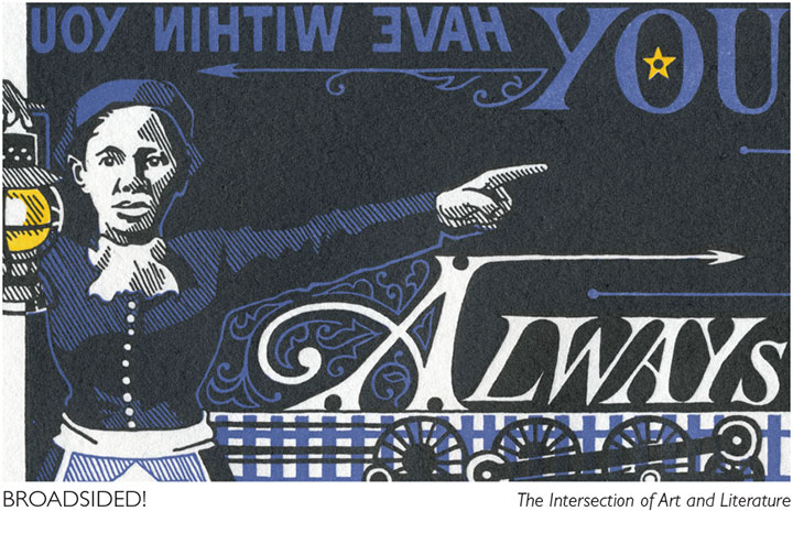
Speaking of amazing women who run galleries, another big thank-you and shout-out to Laura Russell of 23 Sandy Gallery in Portland, for featuring End of the Line on the promo materials for another new show that opens tonight. Broadsided! is national, juried exhibition of letterpress broadsides featuring the work of thirty-four artists. Here are the details from the 23 Sandy website:
Broadsided! The Intersection of Art and Literature
October 2-31, 2009
23 Sandy Gallery
623 NE 23rd Avenue
Portland, OR 97232
Opening reception: Friday, October 2, 6-9 pm
Before books, before blogs and before broadcasts, there were broadsides. Historically, single sheet broadsheet posters were ephemeral in nature. They were developed in the fifteenth century for royal proclamations, official notices and even advertisements. Today, broadsides hang at the intersection of art and literature. Letterpress printed broadsides are valued as fine art designed and printed by a true craftsperson; but also as fine literature featuring stellar poetry or prose.
The best part about the Broadsided! exhibit is that you don’t have to be local to see it! Laura has set up a fantastic online catalogue of the work in the show, with photos and the complete text from each broadside. Nothing beats seeing art in person, of course, but if you can’t make it to Portland this fall, this is a brilliant alternative.
September 25th, 2009

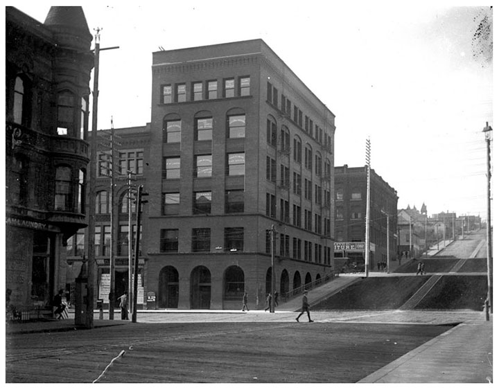
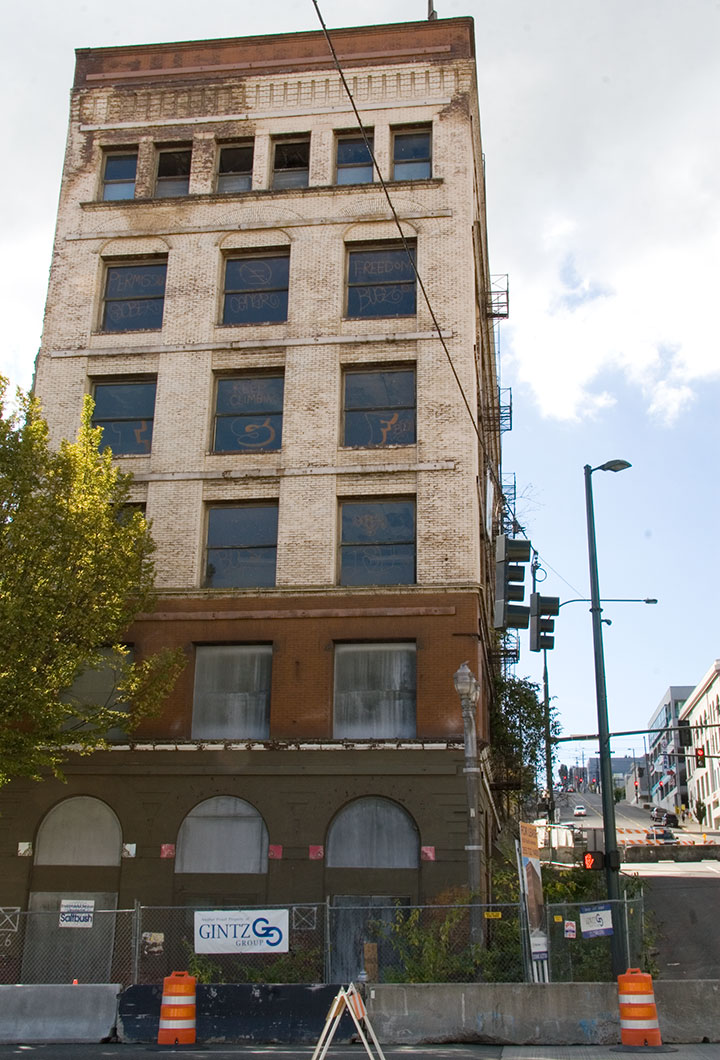
For the past several months, the buzz here in T-town has centered around the Luzon building on Pacific Avenue, a 119-year old structure that, depending on whom you ask, is either an architectural gem or a decaying eyesore. (As you can probably guess, I fall into the first category.) Above is an image of the Luzon in its infancy; this photo is printed from a turn-of-the-century glass plate negative found in Jessica Spring’s attic (and is part of her artist book, Parts Unknown). The thing about the Luzon that has made it such a sore spot around here is that it’s not just a living piece of history—at the time it was built, it was something of an engineering marvel. Co-designed by Daniel Burnham, who went on to design the Flatiron Building in New York and became one of the pioneers of modern multi-story structures, the Luzon was one of the first buildings in America to have steel columns. That makes it a direct ancestor—the great grandpappy, if you will—of the American skyscraper itself.

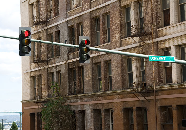
This is the sorry state of the Luzon today. Even though it is on the National Register of Historic Places, and is one of only two Burnham & Root buildings remaining on the West Coast, it has been allowed to decay, apparently beyond the point of no return. While each of many redevelopment schemes over several decades has fallen through, the building has become increasingly derelict. Now that the adjacent property—which provided structrual stability—is long gone, the Luzon is crumbling under its own weight. The City has even closed the surrounding streets in case of a collapse.

Oh, and there’s a tree growing out of it. I don’t think that was part of the original plan.
Well, whether it was a ploy to get around the Historic Register for a development scheme, or the powers that be just dragged their feet for too long (or some combination thereof), the detractors are finally getting their wish. The building is slated for demolition tomorrow morning. So now everyone (including me) has got the Luzon on the brain.
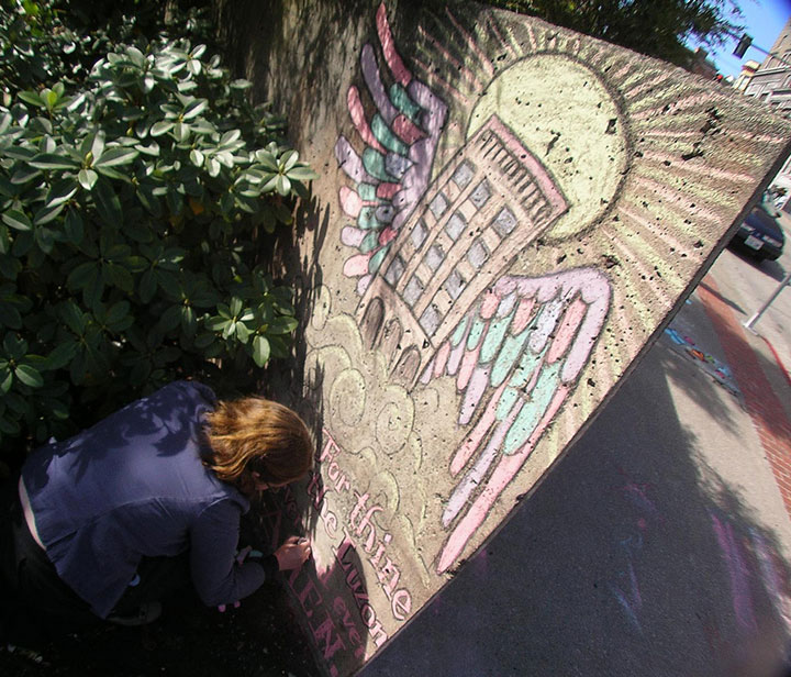
Last week the inimitable artist/cartoonist RR Anderson (who has a few choice words himself about the Luzon’s fate) challenged me to compete in his weekly sidewalk chalk contest, the Frost Park Chalk Challenge. I was looking for an outlet for my Luzon frustration, so I accepted. I grabbed a hunk of charcoal, a handful of communal Crayola chalk, and headed for a highly visible chunk of concrete wall to create a public altarpiece.

Photo by R.R. Anderson
My little Ascension doodle earned me a lot of comments from passers-by and the title of BEST ILLUSTRATOR IN THE UNIVERSE (OF TACOMA) for the week (thanks, guys!).
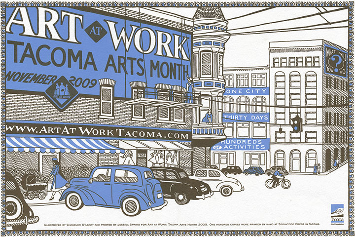
But sidewalk chalk isn’t exactly archival, and I wanted to make a somewhat more lasting statement. Here’s where letterpress comes in. Jessica and I were commissioned to design and print this year’s poster for Art At Work Month, hosted by the City. So since the theme for the overall Art At Work design this year is “ghost signs,” we decided the poster would be the perfect opportunity for a little cameo.

The original posters are letterpress printed in an edition of 100, and will be sold by the City in November, as part of the festivities. But a reproduction will also be inserted into every Art At Work brochure—over 10,000 of them. So come November Burnham’s gift to Tacoma will be long gone, but it’ll feel good to know that we did our part to make sure the Luzon is everywhere we turn—at least for a little while longer.
Edited to add: now that Art at Work month is over, you can now find the last few copies of the letterpress poster in the shop!
September 22nd, 2009

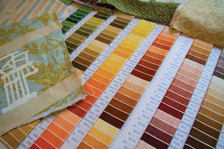
Swatch books are very near the top of my list of Favorite Things Ever. There is something so satisfying about having every color, pattern, texture, or finish right at your fingertips. I love sitting at my table, with a cup of tea in hand and six hundred sample chips spread out before me, ready for some serious color theory. (In case you’re wondering, this is the amaze-a-crazy DMC embroidery floss über color card. Well-made swatch books like this tend to be expensive to produce, and impossible to find once they go out of print. So if you’re into this sort of thing, I’d suggest snagging your copy before they decide to quit selling them.)

These days the studio has been an explosion of choices. Snippets of fabric and open dictionaries have taken over my life as I get ready for a new solo show, which opens October 14 at the Pacific Lutheran University Gallery. Stay tuned for more details in the next few weeks.

I wish I had something more concrete to show you, but this is one of those projects where everything comes together at once, right at the end (which can be as nerve-wracking as it is rewarding). I’ve got to say, though, that calico—finished or not—sure makes for pretty pictures.
September 8th, 2009

As I’ve mentioned before, I’m currently in the process of researching Mt. Rainier for my next artist book. This involves drawing and photographing the Mountain over and over (and over and over) again, in as many different conditions and from as many different vantage points as possible. I’ll get into the whys and hows some other time, but for now, suffice to say this is a huge challenge. Not only do we have incredibly unpredictable weather here, but Rainier also tends to play by his own rules, appearing and disappearing regardless of any logical connection to the forecast (which, somewhat ironically, is the entire point of my book…).
I’ve done my best to even the odds by doing the bulk of my research during the summer and early fall—traditionally the dry season here. This summer, however, has proven to be about as nontraditional as possible, and has thrown a whole lot of monkey wrenches into the works. For weeks I had planned a long trip to various points east, where the landscape is drastically different than here in the west. But here’s the rub: not only did I require a flawlessly sunny day to view the Mountain from so far away, but the best time to view Rainier from the east is in the morning—I’d have to leave too early to see that day’s weather report. So I waited, and stalked the National Weather Service, and packed and unpacked my gear. During our ridiculous heatwave we had day after day of beautiful sun, but hot weather makes the atmosphere so hazy that even from here, just forty miles away, Rainier was just a faint silhouette. And then it was one excuse after another; either I had an appointment or deadline I couldn’t change, or it was raining, or it was hot and hazy east of the Cascades, or there was a forest fire blocking my path (no joke!). Over a month went by like this, and I could feel my window of opportunity shrinking—many of the roads included in my plans are closed from October through June.
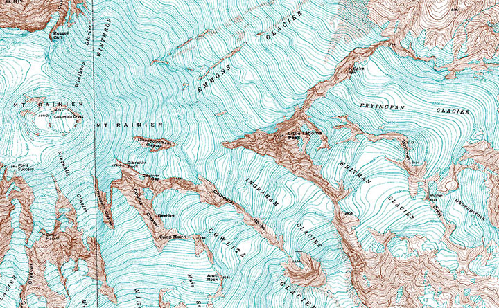
And then, a couple of weeks ago now, it seemed I’d finally get my chance. Every weather report promised dry, cool, sunny weather, for one lovely day, before the gloom closed in again. I packed my drawing paraphernalia, both cold and hot weather gear, a picnic lunch, a pile of atlases and topographic maps (you didn’t think I’d be using GPS, did you? When a letterpress printer marries a geologist, topo maps become a permanent fixture of both studio and science lab!), my camera, and plenty of music in the car, set the alarm for 3:15 am, and went to bed early with my fingers crossed.
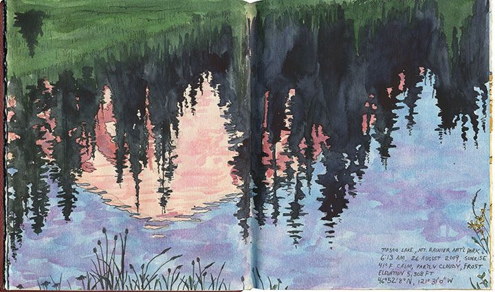
By 3:30 I was ready to go. I poked my head outdoors, saw stars overhead, and decided to make a break for it. Two hours later I arrived at my first stop: Tipsoo Lake, just off the road in an alpine meadow. To my immense surprise I wasn’t alone, even at that absurd pre-dawn, Wednesday hour, with the entire meadow blanketed with frost. A pair of photographers arrived just minutes after me and set up tripods nearby, and a friendly Slovak couple emerged from their tent to introduce themselves while we waited for the sun to rise. The biting cold made me question the sanity of this trip, but when the light finally spilled over the ridge to dye the Mountain pink, all my doubts disappeared.

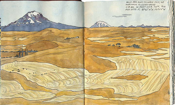
I stayed just long enough to block in a composition and shoot a few reference photos before the light changed and I lost the moment (I was on a tight timetable all day, so I finished all of these sketches back in the studio). I checked my watch and hit the road again (and waved to the Slovaks as I passed them again, thirty miles later).
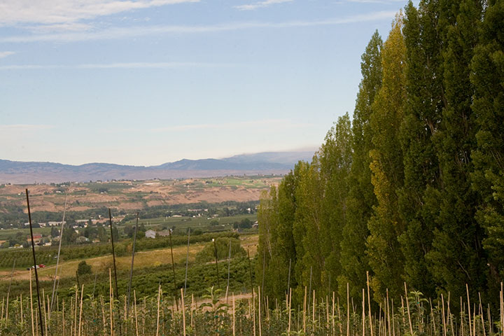
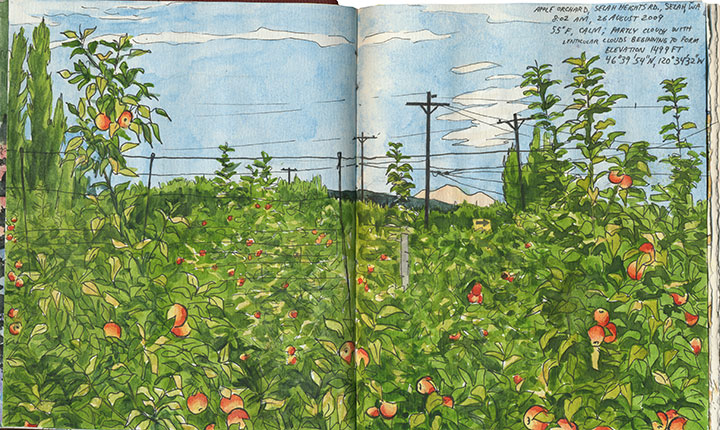
From here onward I had to work entirely on conjecture. Tipsoo Lake is a famous, oft-photographed spot, so I knew what sort of composition I wanted. But I had no photo reference for the rest of my guesses that day, only an idea of what I was looking for and a lot of half-memorized topographic maps. I was hoping to capture a scene of Rainier through the iconic apple orchards of Yakima, but I knew (from all the neck-craning I’ve done on previous drives through the region) that for the most part Rainier isn’t visible from the Yakima Valley, where most of the fruit trees are. According to my maps, though, there were some flat, gridded regions at the top of the bluffs overlooking Yakima—I hoped the grid meant farms, and that the extra 600 feet in elevation would be enough for a glimpse of the Mountain. So I made for Selah Heights Road—a hairline even on my most detailed map.

The road climbed past rows of poplars, trees laden with fruit and sweeping views of the valley; so far, so good.

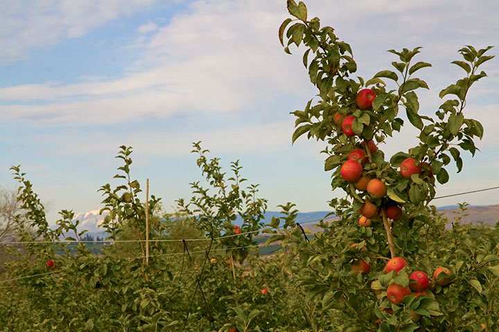
And then I found it: just the tip of Mt. Rainier visible between the apple trees. I couldn’t believe my luck. And just as I finished roughing out my drawing (I still had a lot of miles to cover before my next destination, so I worked fast and loose), I glanced to my left and discovered another treat:

Mt. Adams, for a little extra credit.
After a quick, desperate and delicious coffee in Yakima, I turned south. My next stop was a place I’d never been: the Centerville Valley, a high-plains agricultural area just beyond Goldendale.

I knew that Adams would be prominently visible from here, but I could only hope that Rainier was as well—it sure would make a pretty picture if it were, I thought.

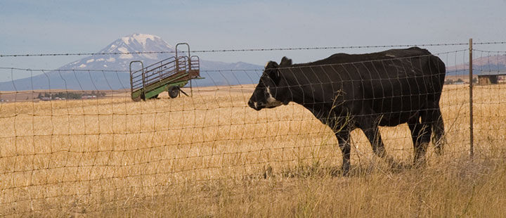
Nope, still Adams—although from this angle it tends to fool people (and cows).

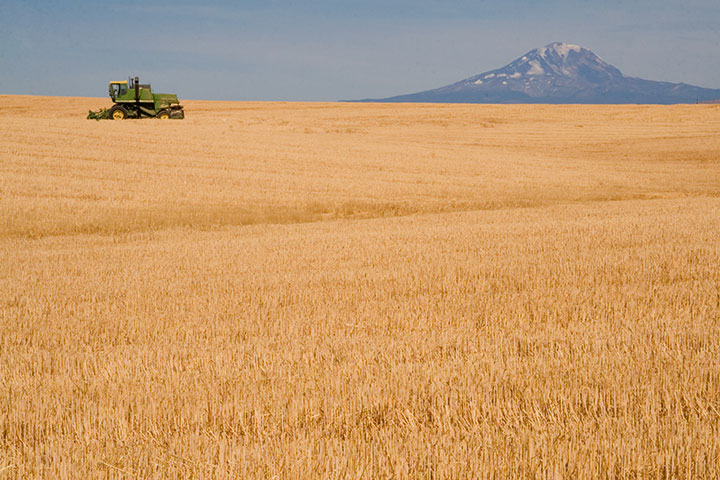
I looked behind me, and saw that the farmland sloped upward a bit, before giving way to the Columbia Hills. So I headed south along a dirt road for about a half mile, parked, and trudged a few yards into a field of wheat stubble.

Bingo.
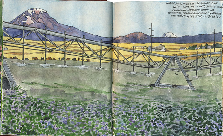
The alfalfa blossoms were sheer luck, just like so many other things that day. And that irrigation rig was moving—so I was never more thankful for digital photo technology than that moment (as a die-hard darkroom enthusiast, I never though I’d say that!).
Only one item remained on the itinerary: a narrow, winding goat track called the Dalles Mountain Road.


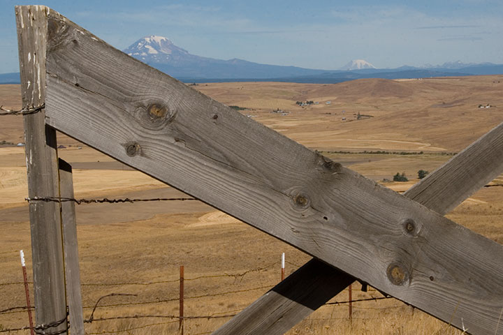
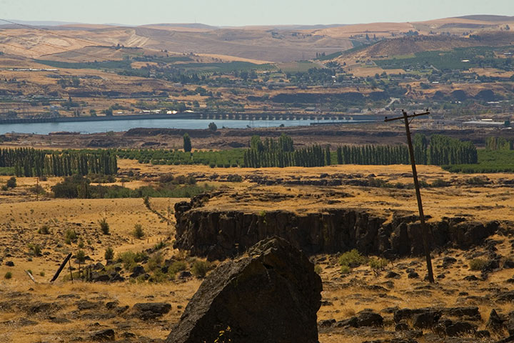
The spectacular vista of Adams, Rainier and the valley was just the beginning.

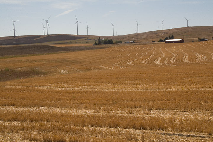
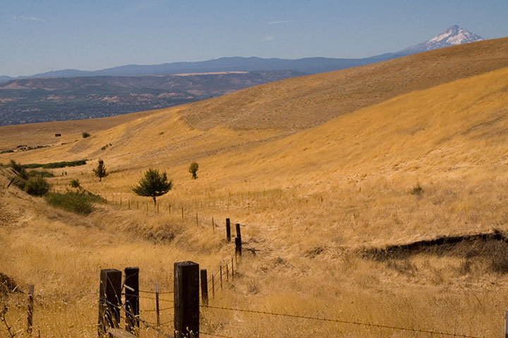
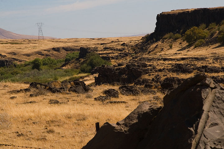
The road snakes over the top of the Columbia Hills, providing views of five volcanoes (that’s Hood there)…

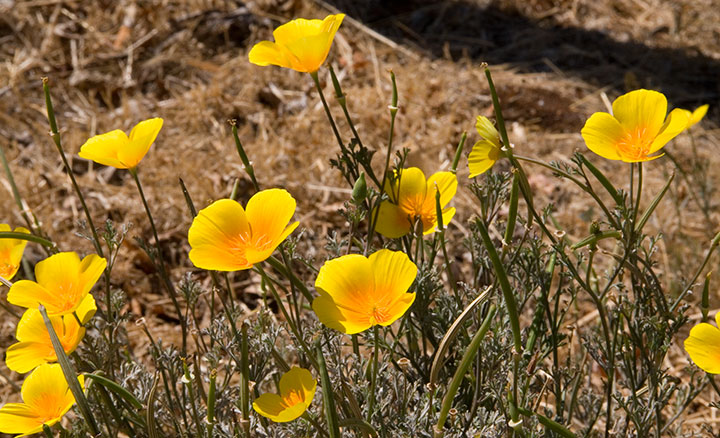
pockets of stunning wildflowers…

and plenty of road-side snacks.

On the southern slope of the Hills the landscape turns suddenly rocky,

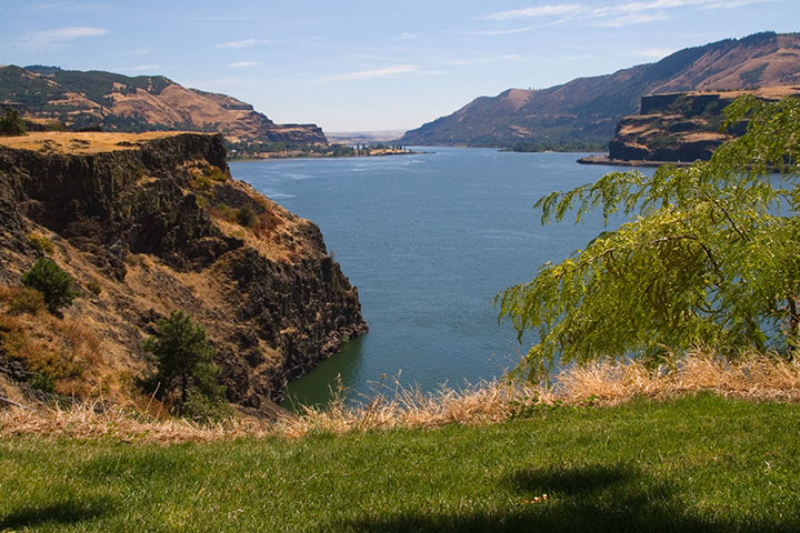
and the mighty Columbia River bursts into view.

My research had gone off without a hitch, and right on schedule. It was only just noon: mission accomplished. So to celebrate I stopped for lunch at one of the most stunning picnic spots I’ve ever seen.
From that little patch of grass I could have chosen to go home the way I came, or finish the loop and return along the western side of the Cascades—it was almost perfectly equidistant. So as usual I chose the unknown road, and zipped home via the historic Columbia River Highway.

Fifteen hours, 515 miles roundtrip. And perfect conditions every step of the way. I think that after a summer of total frustration (remember the airplane incident?), maybe the universe decided to give me a break.
I’ll be sure to send a thank-you note.
August 14th, 2009

For nearly a year now, the Dead Feminists series has given us an outlet for both our aspirations and frustrations. For every social and political victory, there follows a reminder of how divided we are as a culture. We were so proud to see Victory Garden become a part of a nation-wide movement toward sustainability—but a movement and a majority are not the same thing. We are delighted whenever a customer tells us that Prop Cake is meant for a wedding gift—but are heartbroken by the reminder that for many people, the gesture can only be symbolic. Yet through it all we remain optimistic that art can make a difference—that a bright future is out there, somewhere, and that we can help find the way to it.
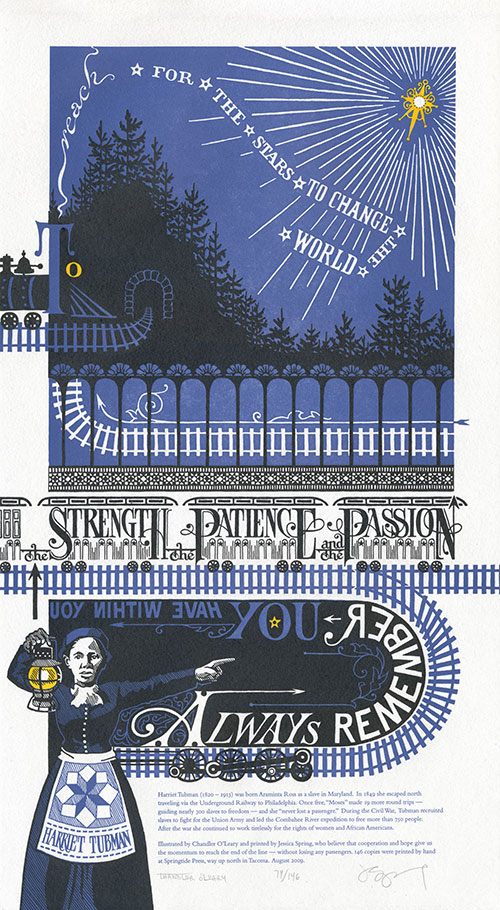
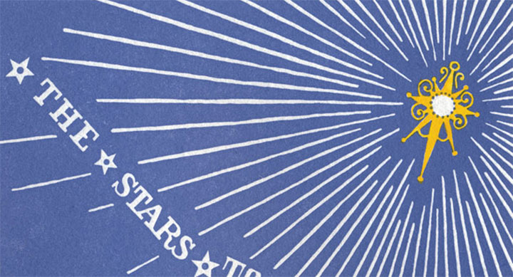
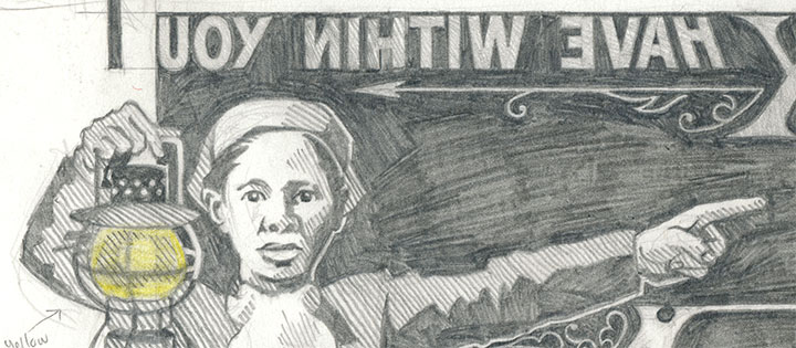
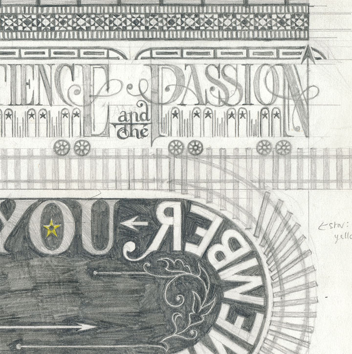
Always remember you have within you the strength, the patience and the passion to reach for the stars to change the world.
— Harriet Tubman
This is why we chose Harriet Tubman for our latest piece. There are so many pressing issues vying for our attention—war, the economy, healthcare, the environment, transit, equality, etc.—that we couldn’t choose just one. So we decided to focus on the journey itself. For all the ground we’ve gained in our country’s short history, we have a long, long way to go—and the only way we’ll get there is together. Harriet Tubman knew that when she fought for freedom and civil rights, and she devoted her entire life to the idea.
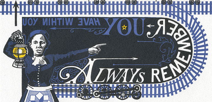
So here, submitted for your approval, is End of the Line. As always, everything—from the illustrated lettering to the letterpress printing—is done completely by hand. This time, though, we’re asking you to flex your reading muscles a bit: to symbolize the difficult journey faced by anyone with a great task, we made it somewhat of a challenge to read.

Don’t worry, though—Harriet is there to guide you. Just follow her lantern, and you’ll find the right path. If you lose your way, just look for the Drinkin’ Gourd.
• • • • • • • • • • • • • • • • • • • • • • • • • • • • • • • • • • • • • • • • • • • • • • • • • • • • • • • • • • • •
End of the Line: No. 5 in the Dead Feminists series
Edition size: 146
Poster size: 10 x 18 inches
Printed on an antique Vandercook Universal One press and hand-colored with watercolor. Each piece is printed on archival, 100% rag, recycled paper, and signed by both artists.
Colophon:
Harriet Tubman (1820 – 1913) was born Araminta Ross as a slave in Maryland. In 1849 she escaped north traveling via the Underground Railway to Philadelphia. Once free, “Moses” made 19 more round trips—guiding nearly 300 slaves to freedom—and she “never lost a passenger.” During the Civil War, Tubman recruited slaves to fight for the Union Army and led the Combahee River expedition to free more than 750 people. After the war she continued to work tirelessly for the rights of women and African Americans.
Illustrated by Chandler O’Leary and printed by Jessica Spring, who believe that cooperation and hope give us the momentum to reach the end of the line—without losing any passengers.
UPDATE: poster is sold out. Reproduction postcards available in the Dead Feminists shop!

August 12th, 2009

Jessica and I are almost ready to unveil the next Dead Feminist broadside! The ink is drying as I speak, so End of the Line will be available this Friday, August 14. For now, this is just a taste. Brush up on your mirror-reading skills, because this one is going to be a challenge. Stay tuned!

August 3rd, 2009

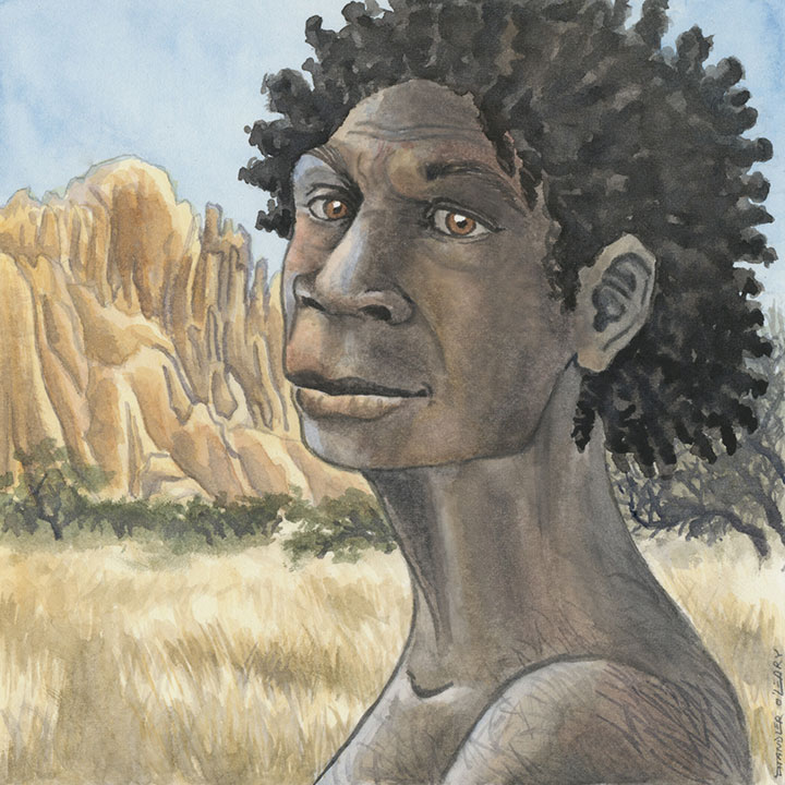
Lately I’ve been doing some things that fall a little outside of what you might normally find in my studio. See figure A, above. Daughter of Kura, the debut novel by Debra Austin, is being released tomorrow, so Debra and the folks at Side x Side Creative put together an in-depth website to promote the book and give background information about the book. They asked me to contribute some illustrations to the project. (Full disclosure: I’m not the book jacket illustrator. Edited to add: the above illustration did become the jacket illustration for the book’s sequel, Mother of Asili.)
This was no ordinary illustration gig; in fact, I’d say this project was one of the biggest creative challenges I’ve faced yet. You see, Daughter of Kura is a novel about a pre-human culture—not merely prehistoric, but pre- homo sapiens. The only reference materials available were the fossil record and educated conjecture. It took a lot of research on everybody’s part to bring all of this together, and we hope you’ll be as pleased with the final product as we are. You can learn more about the book and see all of the illustrations here.
June 21st, 2009

There’s some serious gear-shifting going on in the studio these days. Prop Cake and Tugboat Thea are sold out, and the Woolworth Windows murals are white walls again, ready for the next artist to transform the space. I’m preparing to teach a letterpress class at the School of Visual Concepts next month, and I’m working on a new artist book (more on that topic later). I feel like I’m in that tiny, transitional moment between exhale and inhale.

So what better way to use that breath of time than to slow down and do some carving?

In the free moments between my other projects, I’m also working on a new print series that’s got me all a-flutter.

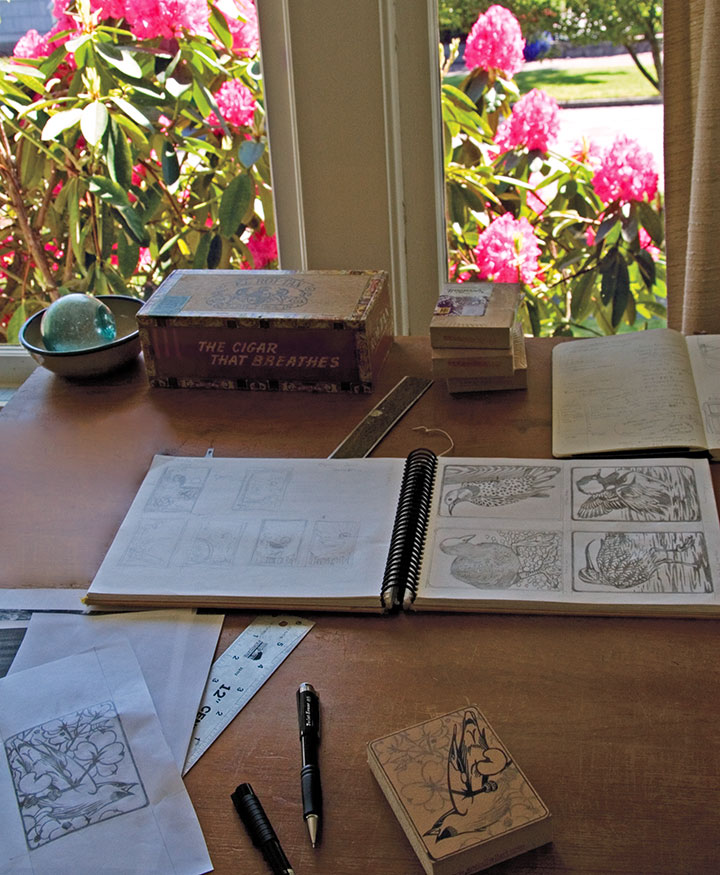
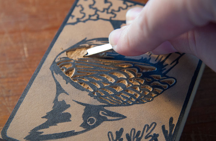
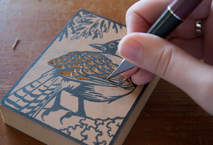
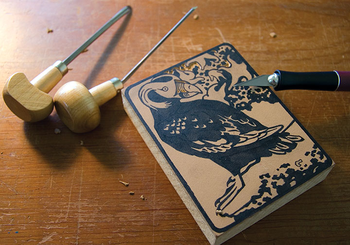
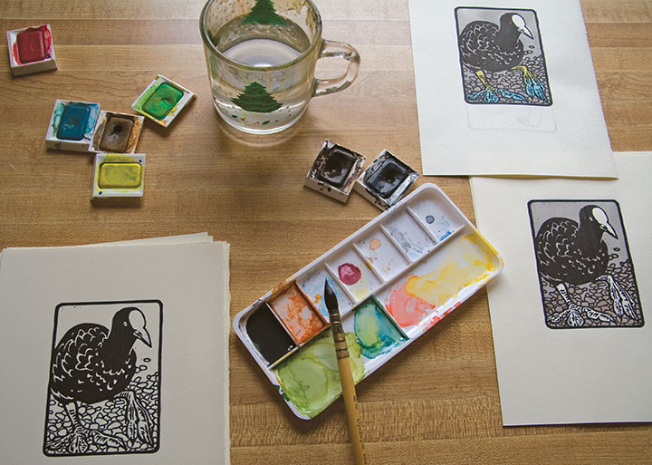
I love getting back to basics, and enjoying the simple mechanics of drawing, carving, and printing images. No fancy photopolymer plates this time—just ink, paper, watercolor, and good old-fashioned linoleum blocks.

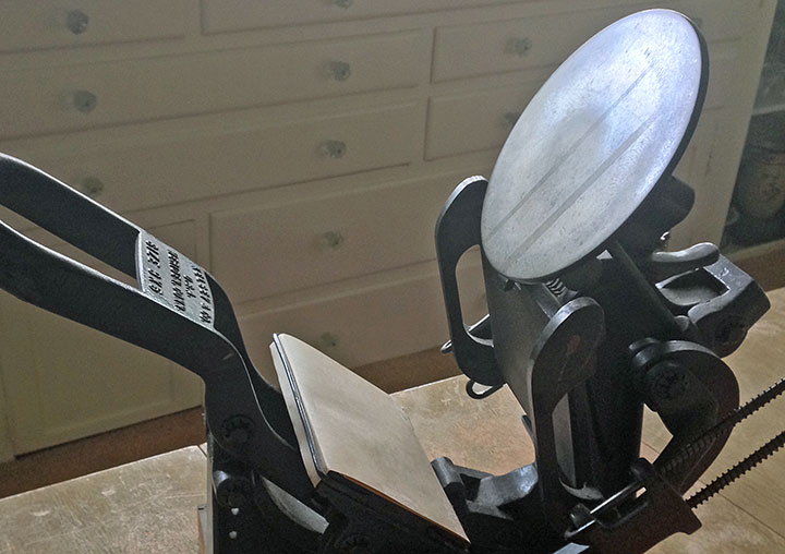
What started as an excuse to get my little Kelsey tabletop press in working order—

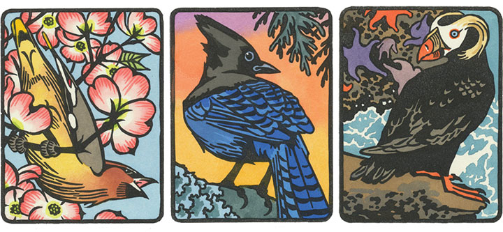
—has turned into a budding interest in birding. There is a stunning array of avian wildlife in my state, and I’m only creating a tiny illustrated cross-section of what’s out there.

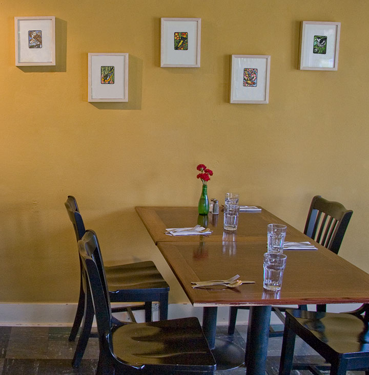
The suite tweet of prints is called Flock, and the first nine are currently on display at the Rosewood Café in Tacoma until July 31.

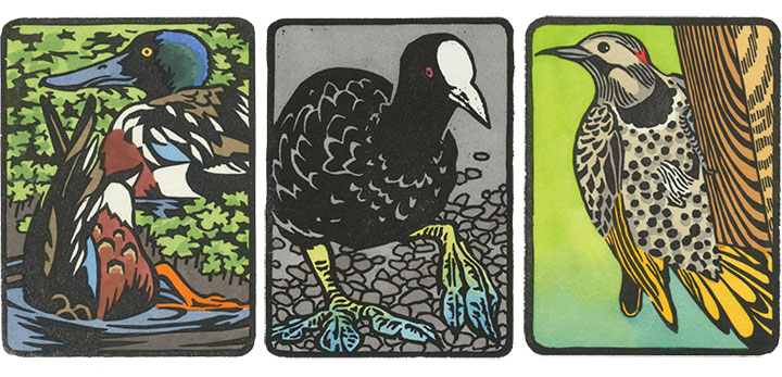
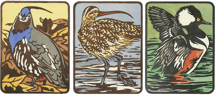
Here’s a closer look at ’em.

Each print is a hand-colored linocut, printed in an edition of 25. There will be 25 birds in all, and at the end of the series, there will be ten handmade boxed sets—each containing all 25 birds.

I’ll be printing the rest of the birds in the coming months, and the Flock box sets will be finished sometime next year—eight of the ten sets are spoken for already, but if you’re interested, feel free to drop me a line. I’ll just be here in the studio, happily chirping, cawing, quacking, and twittering away.
May 30th, 2009

Oh, I’m probably asking for it with this post title. (To anyone who might have found this post by Googling naughty things, I’m afraid you’re about to be disappointed.)
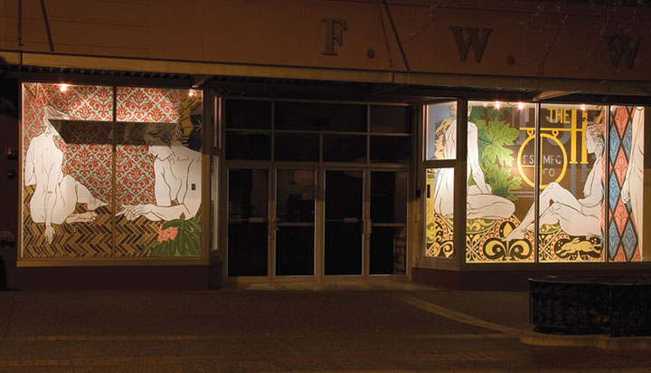
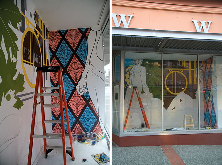
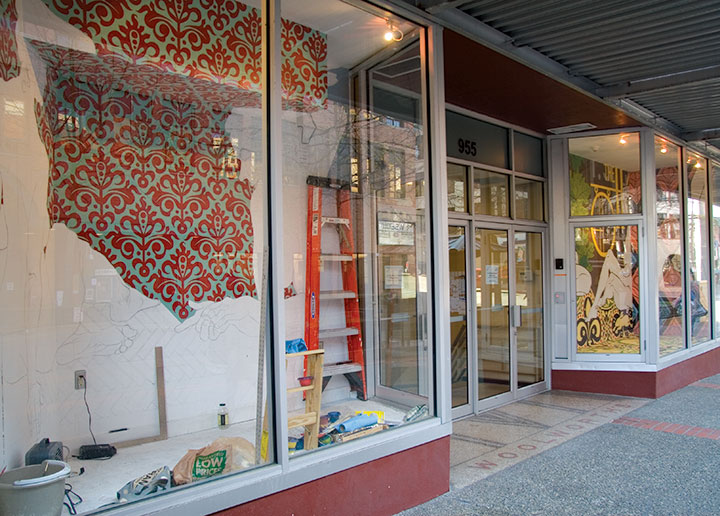
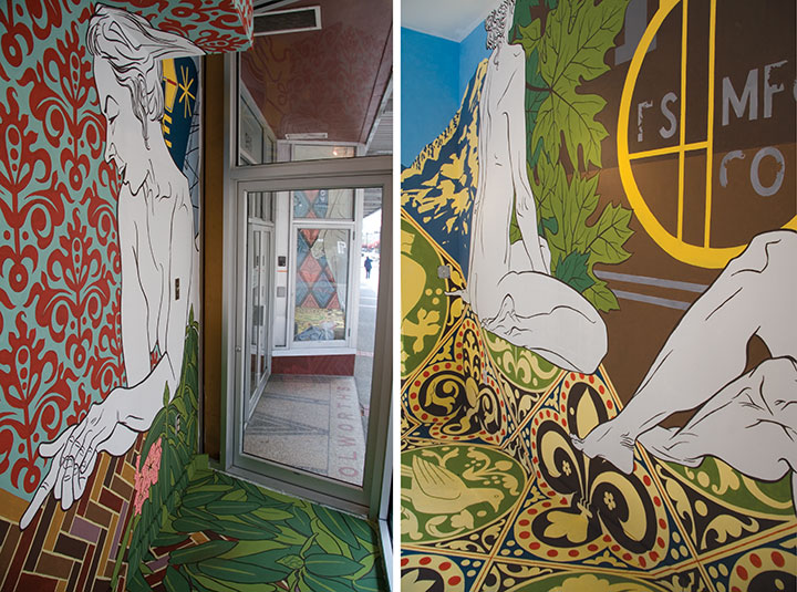
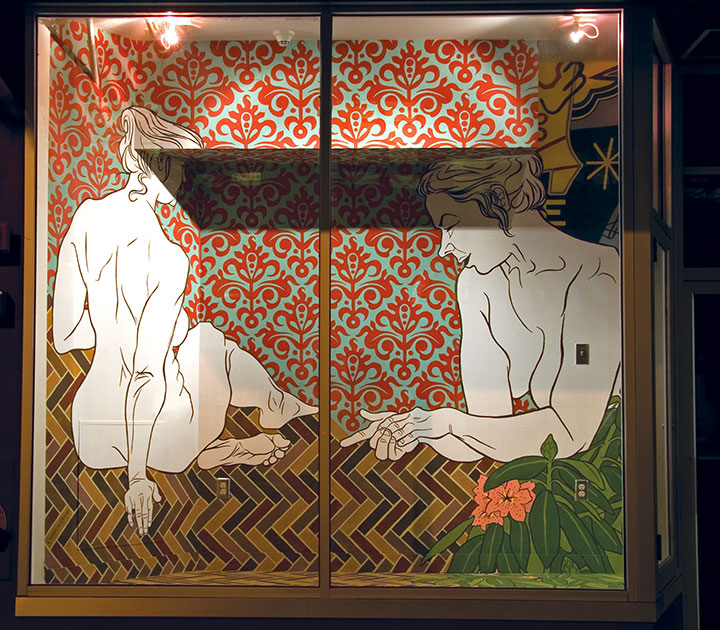
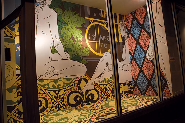
The window displays in the old Woolworth’s store downtown have been converted into a twenty-four-hour gallery, with artist exhibitions and installations rotating quarterly. Shortly after I moved to Tacoma, I found out that they were accepting applications for the 2009 gallery slots. I thought it might be a good opportunity to try out a crazy idea I’d been playing around with, so I decided to give it a go.

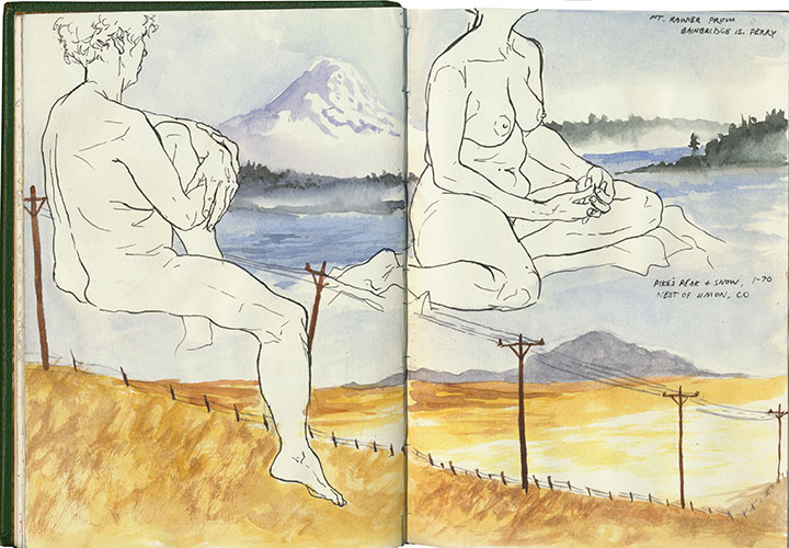
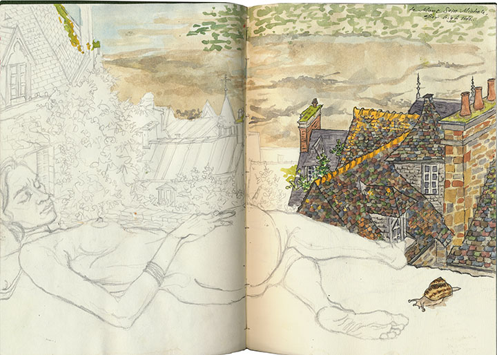
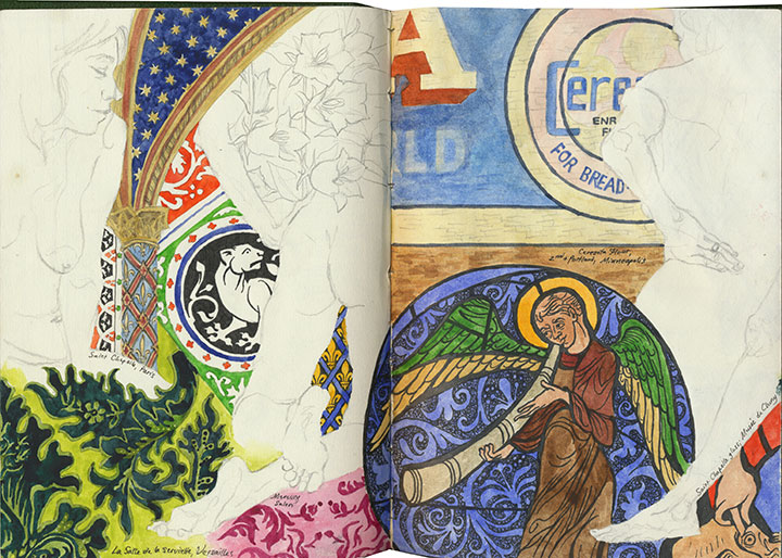
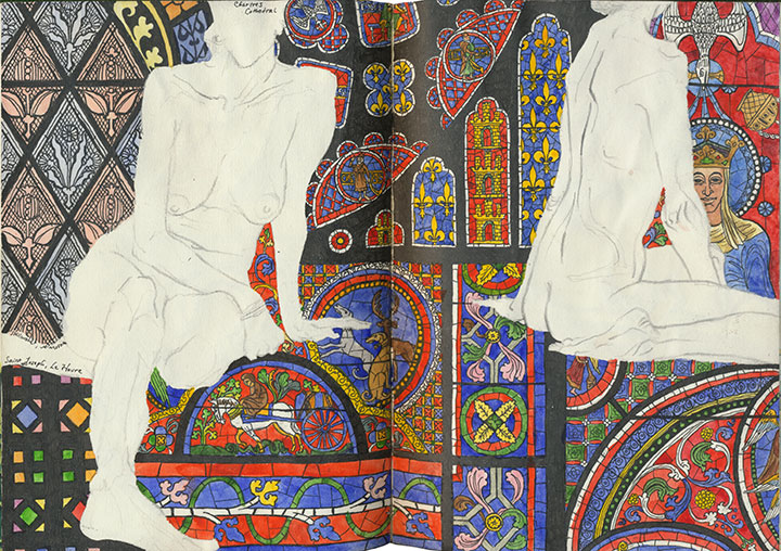
For many years I’ve carried a sketchbook everywhere I go, but for the last couple I’ve been experimenting with something a little different. One day I was in a hurry, and knew I wouldn’t have time to fill an entire spread with the watercolor sketch I wanted to make. So I chose a page that already had some figure drawings on it, and just painted within the negative space around the figures.

And from then on I couldn’t stop. Once the number of watercolor paintings began to catch up with my stock of line drawings, I started attending model sessions again. This time, though, I used the figure drawings to compose the page, with the expectation that eventually I’d go back in with another sketch later.
Several people told me they’d like to see these drawings on canvas or framed on a wall—and more than one suggested a wall mural version. Besides, the conceptual link between nude figure drawings and mannequins in a store windows was too tempting to resist. So I applied for a Woolworth Windows show, but I guess I never expected that my proposal would be accepted. I was talking about gigantic nudes on a busy street, after all. When the notification date came and went without a word, I assumed the project had been rejected and moved on. And then, three months later, I received an email that said, “Congratulations! By the way, your show begins next weekend.”

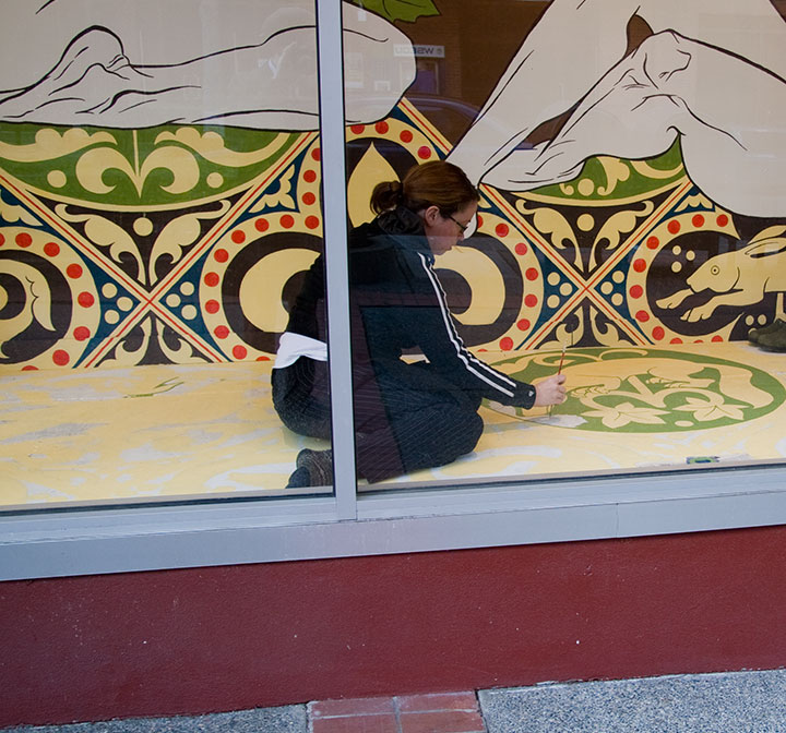
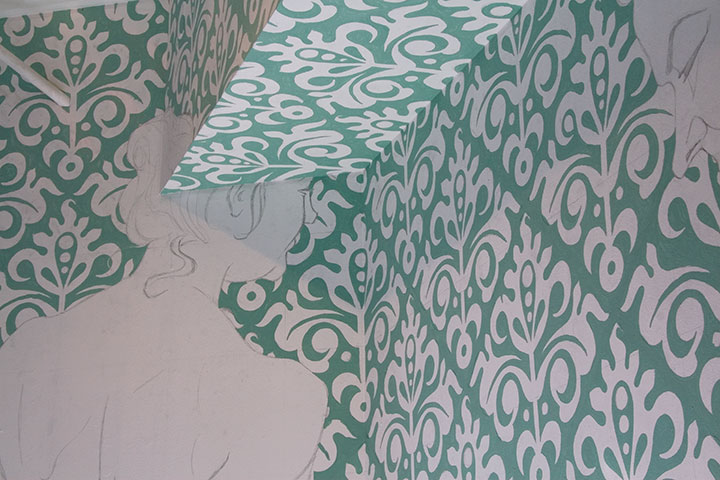
Now, I’m not normally an installation artist, but I do have six years of technical theatre and several large-scale murals under my belt. Still, there was something rather daunting about being thrown in the deep end of a double installation project, which involved attempting to paint proportionally accurate, ten-foot-tall nudes inside a narrow, very public glass box. A very monkey-cage-at-the-zoo glass box. To be fair, every mural I’ve ever painted has begun with a ripple of fear, and thoughts ranging from “Oh, right, I forgot how big walls are,” to “For the love of Pete, how did I ever convince these people that I was capable of painting something that actual humans would be able to see?” Depending on the scale of the project, of course—hey, if blank pages can be intimidating, blank walls (and tall ladders) are pretty terrifying. So this time, what with the many passers-by glancing in at me, I needed a few extra deep breaths. It’s funny that I still get that little moment of panic—because once I finally start in with either pencil or brush, I feel right at home, and even the ladder becomes an old friend. There’s just something so satisfying about slathering paint on a wall.

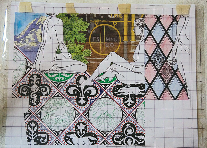
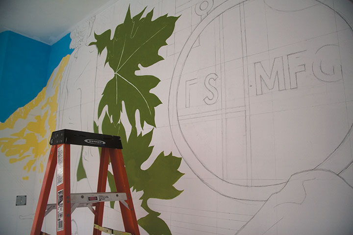
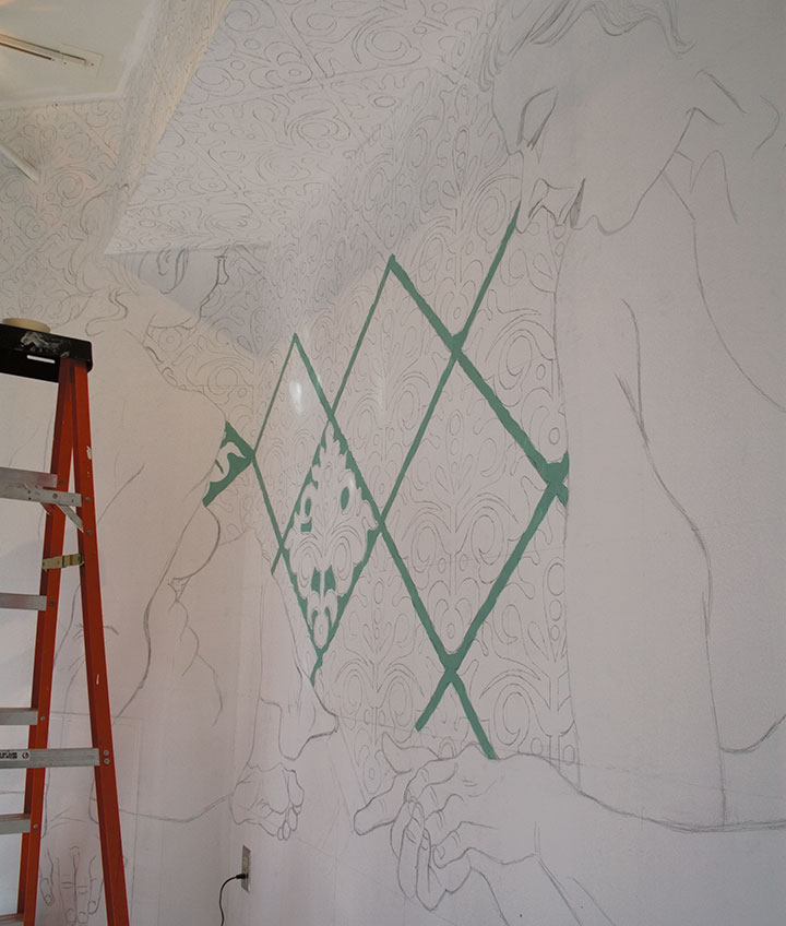
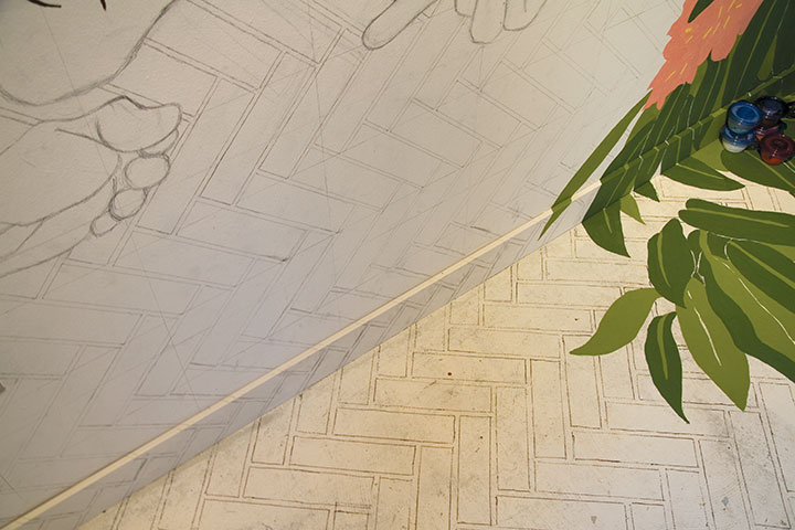
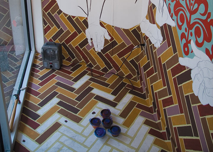
One of the challenges of the Woolworth Windows was getting my design up on the wall, at the correct size, without distorting anything. If I were painting a scenic flat for the theatre, I’d just photocopy my design onto a transparency, hook up a projector, and blow up the drawing to whatever size I needed. In a window display, however, there simply isn’t room to put a projecter far enough away from the wall. So I did it the old fashioned way: made my rendering to scale, laid a grid over it, and drew the same grid at the larger size on the wall.


You can see a little of the pencil grid in the top photo; in the left-hand window the pattern repeats did most of the work for me.

Like the drawings in my sketchbook, the inspiration came from a variety of sources. This pattern was an original design, but I was heavily influenced by the patterned brocades I saw at Versailles (see below).

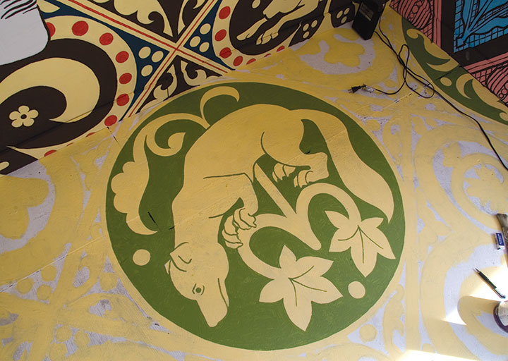
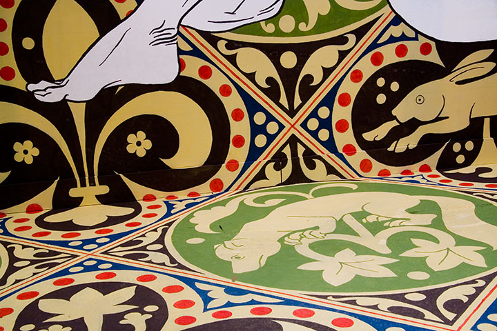
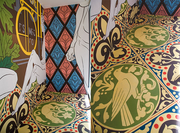
Another element from this sketchbook page found their way into the design—my drawings of the inlaid floor of Saint Chapelle in Paris became the basis for the floor of the right-hand window.


The windows also contain elements found closer to home: bits of historic Tacoma signage,

and a stained-glass window in the home of my friend Christina, who lives in a former church.

Since I had a lot of equipment to stash in such a small space, I had to paint in a piecemeal fashion,


moving my supplies closer to the door as I painted myself into a corner.


Despite the challenges of the installation, this has been one of the most interesting and fun mural projects I’ve ever done. For one thing, I fulfilled a secret childhood wish to be “one of those people” who designed and created window displays (I was a big fan of Mannequin). For another, the best part about painting in public is that you get to meet all kinds of wonderful people. Everyone I’ve seen has been incredibly supportive, curious, and thoughtful. Mothers wheeled their strollers right up to the window so their toddlers could press up against the glass and watch. School kids on a field trip gathered around my rendering and recognized the Harmon sign immediately. Street-smart teenagers stopped to ask insightful and challenging questions about gender roles in art. Friends brought me coffee on a chilly day, or kept me company when I started to get tired. Business people flashed me a thumbs-up on their way to work, and neighborhood regulars shouted their encouragement through the glass. I guess I didn’t have to worry about the public reaction to a bunch of naked ladies after all.

There’s a catch to all of this, however: the installation is temporary. The last day of my show is June 13, and then I have to paint everything white once more. So stop by while you can—you’ll find these ladies on Broadway, close to the corner of South Eleventh Street (on the same block as the Thursday farmer’s market).

I guess that’s another thing all those years of theatre taught me: how to practice a little detachment when you have to dismantle what you built.
Even if it were only up for a day, though, it would have been worth it.


![Chandler O'Leary [logo]](https://chandleroleary.com/wp-content/themes/chandleroleary/images/logo.png)
