Blog
February 20th, 2010
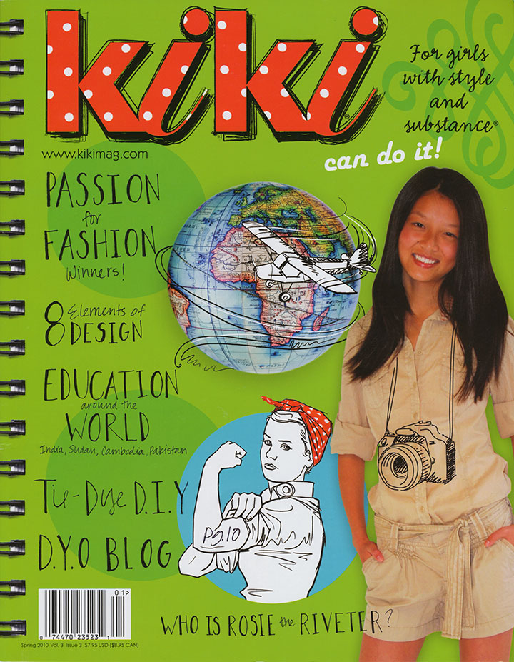
Jessica and I have had some seriously huge smiles for the past couple of days: we just received our copies of the latest issue of Kiki Magazine, which contains a feature on the Dead Feminists!
Before we were contacted for an interview, neither of us had heard of the magazine, but I can tell you that we became instant fans when we read its mission. Unlike so many other magazines written for teenage girls, which usually (even if inadvertently) tend to focus on questioning one’s body, popularity, attractiveness and overall self-worth, Kiki aims to empower girls with self-esteem, confidence, and a wide variety of knowledge and skills. As someone who is generally dismayed by the lack of respect with which our society tends to treat girls and women, and the self-loathing and doubts still being ingrained from their earliest experiences onward, Kiki seems like a breath of fresh air—and a huge relief.
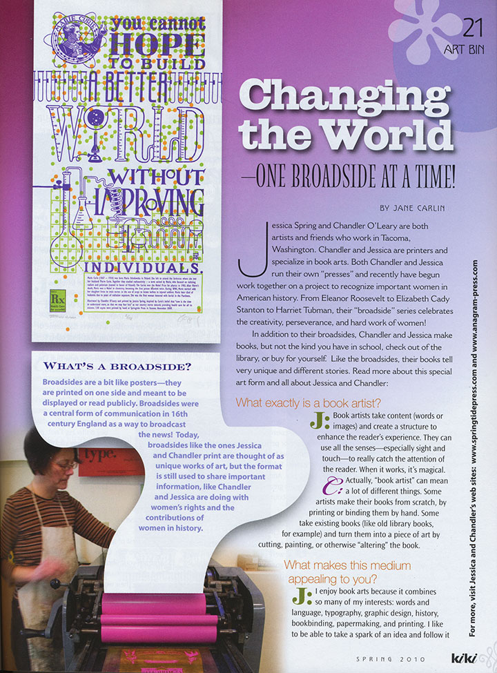
And hey—who are we really creating these broadsides for, anyway? What is it that we’re trying to change in our world? It’s not just about the social issues we cover with each piece—it’s about teaching the women and girls around us that they can be heard, that what they say and do matters.
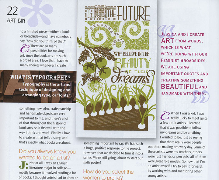
So Kiki gets an A-plus in my book, not just for the thoughtful content (no ads! No boy-crazy quizzes! All substance!), but for the fantastic design! This thing is seriously fun to read and gorgeous to look at. And look! My favorite part:
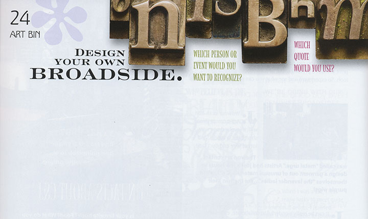
Rock on, Kiki. We’re honored to be a part of what you do.
February 13th, 2010


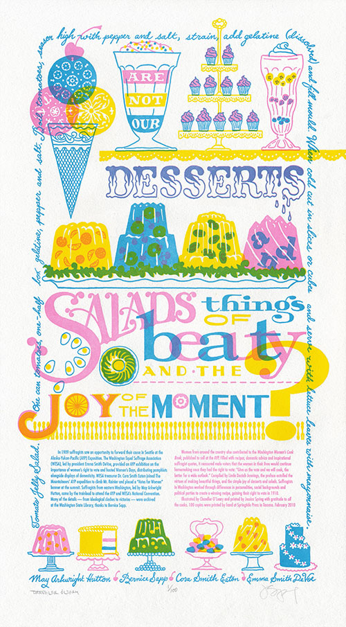
This year marks the 100th anniversary of women’s suffrage in Washington—a feat only made possible by the collaborative efforts of many dedicated people of every walk of life and political stripe. In this spirit, we present our seventh broadside in the Dead Feminists series, Just Desserts.

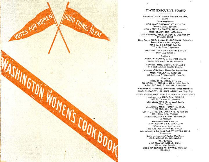
Through our research at the Washington State Library, we discovered that our state’s suffrage movement had many leaders, rather than one prominent figurehead. We also learned that there was so much head-butting, personality-clashing and partisan in-fighting going on within the organizations involved (Mesdames Hutton and DeVoe, I’m looking at you!) that it would be impossible to tell the whole story in one letterpress poster. So instead of quoting a single historical feminist, we cited a collaborative publication—the Washington Women’s Cook Book, published in 1908-1909 for the Alaska-Yukon-Pacific Exposition—and featured four women symbolic of the movement: May Arkwright Hutton, Bernice Sapp, Cora Smith Eaton, and Emma Smith DeVoe. The quote:
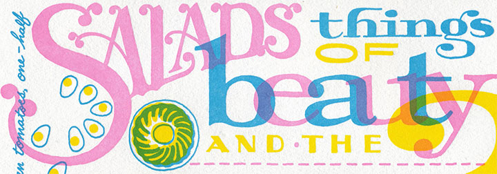
“Are not our desserts and salads things of beauty and the joy of the moment?”
The book was a clever piece of propaganda that operated on the principle that the way to a man’s heart—or vote—is through his stomach. All those jellied centerpieces and whimsical soufflés must have done the trick—the following year, women got the vote.

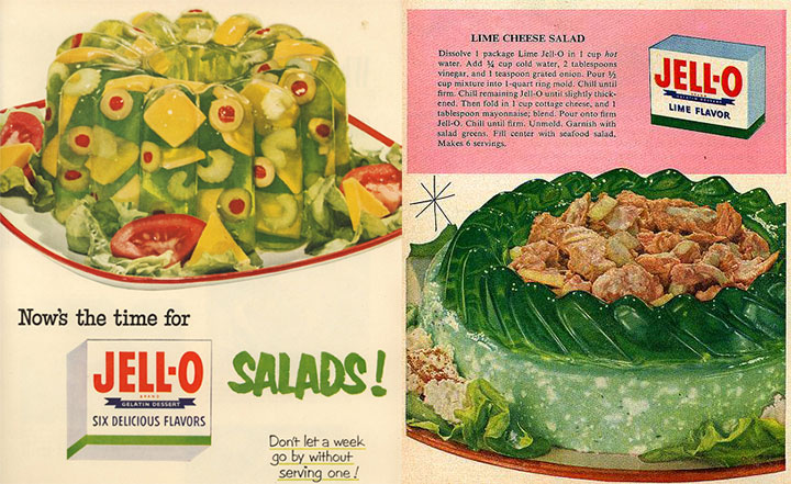
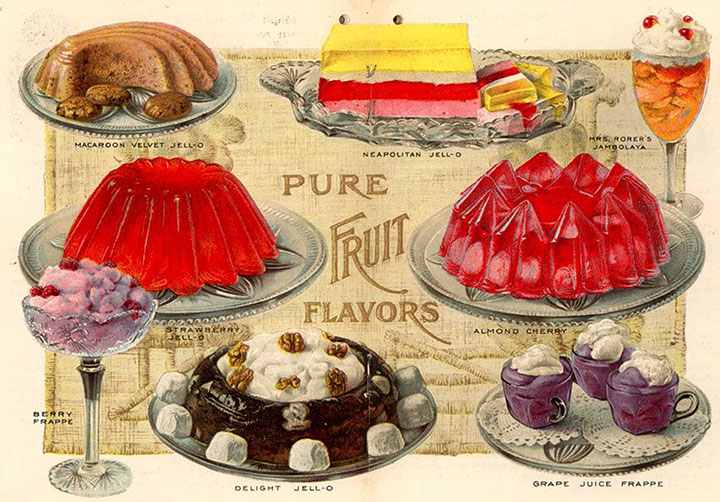
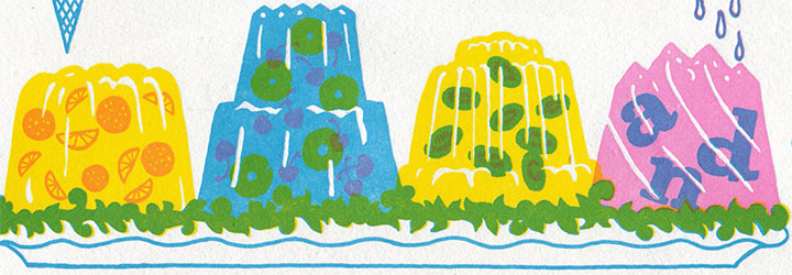
And for my part, the quote turned me into an almost-literal kid in a candy store; the design was just begging for elaborate confections and candy-coated typography. At first, though, I was turned off by the idea of having to draw salads (I wanted more ice cream!), until Jessica read off a litany of aspic salad and gelatin dessert recipes from the book. That’s when the light bulb turned on: Jell-o salad! The decade-plus I spent in the Midwest was about to serve me well.

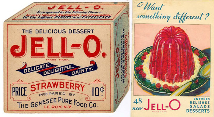
Turns out that Jell-o fit right into the turn-of-the-century theme: molded gelatin desserts were a Victorian favorite, and the name “Jell-o” was first coined in 1897 (and if you look carefully, the “J” from the original Jell-o box makes a cameo in the print). There seemed to be no end of antique recipes, advertisements and illustrations at my disposal.

I might be horrified by the idea of eating gelatin salads, but drawing them was the most fun I’ve had in a long, long time. Zooey and I each spent hours researching vintage Jell-o molds—probably more for the pure fascination than for the value of the reference material.
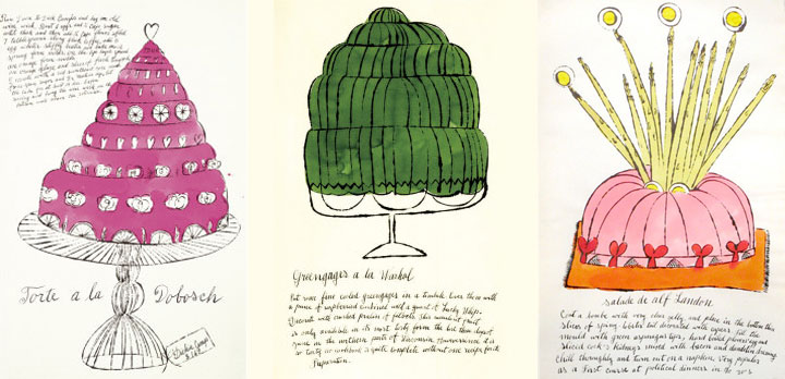
For the sweets portion of our little menu, I turned to an old favorite for inspiration: Andy Warhol.

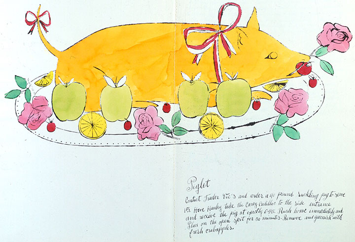
Forget what you know about Campbell’s soup cans or Elvis portraits; Andy got his start as an illustrator specializing in fashion and food. In 1959 he illustrated a spoof cookbook called Wild Raspberries (it’s been on my shelf since high school, and I finally found a direct use for it!), filled with ridiculous “gourmet” recipes for things like “A&P Surprise” (those of you in New England will get that one) and “Seared Roebuck.”

The illustrations are fantastic (and the polar opposite of my style), but the thing that really drew me in was the lettering. Andy had his mother, Julia Warhola, write all of the text of his early illustrations in her shaky, school-girl script. Mrs. Warhola spoke little to no English, and simply copied her son’s notes letter-for-letter, so the text in Wild Raspberries has charming errors and misspellings throughout.

I loved the down-to-earth quality of Mrs. Warhola’s cursive, so I wrote a recipe from the Washington Women’s Cook Book along the border of the broadside in a similar hand (though to warn you, it’s a recipe I wouldn’t recommend trying!).

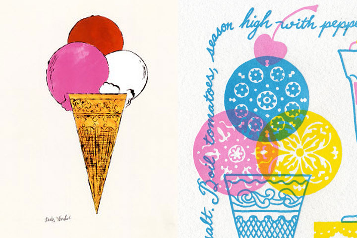
And of course, I couldn’t do without a little ice cream homage.

Like The Curie Cure, this piece is printed in three colors—although the three we chose let us create many more. Our color scheme allowed us to print in a similar fashion to commercial printing, where a minimum of colors (CMYK—cyan, magenta, yellow, black) are layered to create a full-color image. Our layering of translucent pink, blue and yellow ink allowed us to create a full rainbow and a convincing depiction of foreign objects floating in jelly.

Heaps of thanks to everyone who came to our talk at the State Library the other night, despite lousy weather and rush-hour traffic—we had a tremendous turnout, and a huge show of support for our state’s oldest cultural institution.
One more thing: three cheers for the incredible staff at the Washington State Library (many of whom are among those whose jobs have been cut and will end very soon) who made our talk and this very piece possible. Because we couldn’t have done it without them, we have donated a portion of our proceeds to support the State Library’s collections.
After all, it’s about preserving (in jelly?) that joy of the moment for everyone to share, right?
• • • • • • • • • • • • • • • • • • • • • • • • • • • • • • • • • • • • • • • • • • • • • • • • • • • • • • • • • • • •
Just Desserts: No. 7 in the Dead Feminists series
Edition size: 100
Poster size: 10 x 18 inches
Printed on an antique Vandercook Universal One press, each piece is printed on archival, 100% rag, recycled paper, and signed by both artists.
Colophon reads:
In 1909 suffragists saw an opportunity to forward their cause in Seattle at the Alaska-Yukon-Pacific (AYP) Exposition. The Washington Equal Suffrage Association (WESA), led by president Emma Smith DeVoe, provided an AYP exhibition on the importance of women’s right to vote and hosted Women’s Days, distributing pamphlets alongside displays of domesticity. WESA treasurer Dr. Cora Smith Eaton, joined The Mountaineers’ AYP expedition to climb Mt. Rainier and placed a “Votes for Women” banner at the summit. Suffragists from eastern Washington, led by May Arkwright Hutton, came by the trainload to attend the AYP and WESA’s National Convention. Many of the details—from ideological clashes to victories—were archived at the Washington State Library, thanks to Bernice Sapp.
Women from around the country also contributed to the Washington Women’s Cook Book, published to sell at the AYP. Filled with recipes, domestic advice and inspirational suffragist quotes, it reassured male voters that the women in their lives would continue homemaking once they had the right to vote: “Give us the vote and we will cook, the better for a wide outlook.” Compiled by Linda Deziah Jennings, the preface extolled the virtues of making beautiful things, and the simple joy of desserts and salads. Suffragists in Washington worked through differences in personalities, social backgrounds and political parties to create a winning recipe, gaining their right to vote in 1910.
Illustrated by Chandler O’Leary and printed by Jessica Spring with gratitude to allthe cooks. 100 copies were printed by hand at Springtide Press in Tacoma. February 2010
UPDATE: poster is sold out. Reproduction postcards available in the Dead Feminists shop!

January 26th, 2010

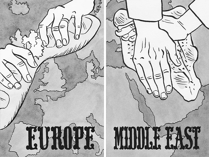
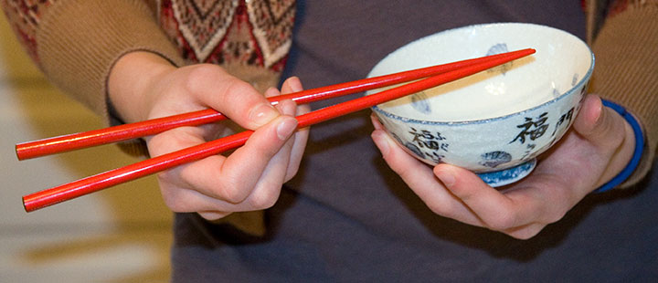
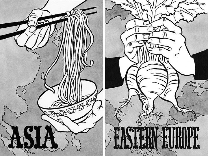
I’m currently working on the illustrations for a cookbook being published this year, so I’m drawing a whole lot of hands lately. Hands carrying dishes, maneuvering chopsticks, folding samosas, kneading dough, etc.

Since I usually work by myself, I often have to be my own model. For the most part, this works out fine, but hands are a tricky business—especially when you need to draw both hands at once, and you need one to operate a pencil.

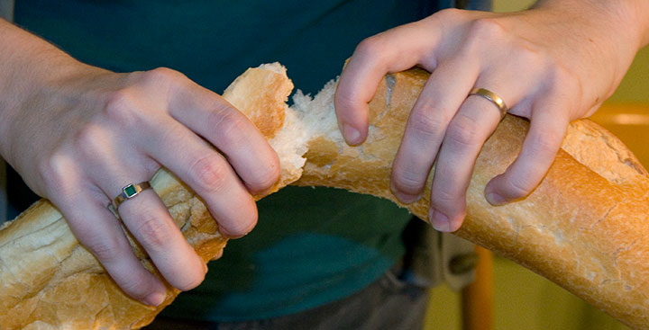
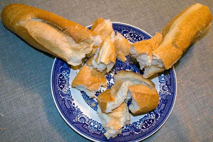
Enter the lovely Zooey—who could both photograph my hands for me and be hand model herself. We took turns ripping a baguette to shreds for the camera (to mix up the hand anatomy), and mimed with nearly every dish in the house, just in case.

I can’t tell you how helpful it’s been to have her here while I’ve been doing these illustrations. Whenever something wasn’t quite right, I could say, “Hey, Zooey, can you pick up those chopsticks again? I need to sketch a different angle.” And Bob’s your uncle, I’d get what I needed.

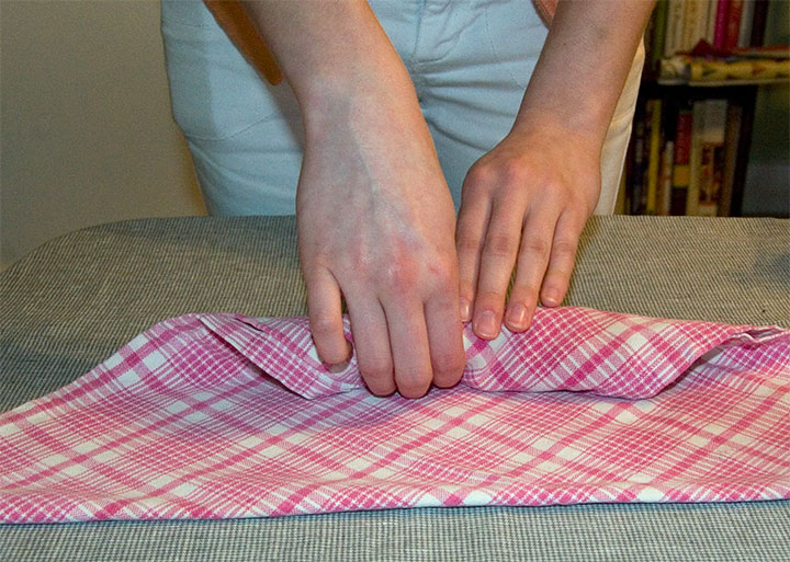
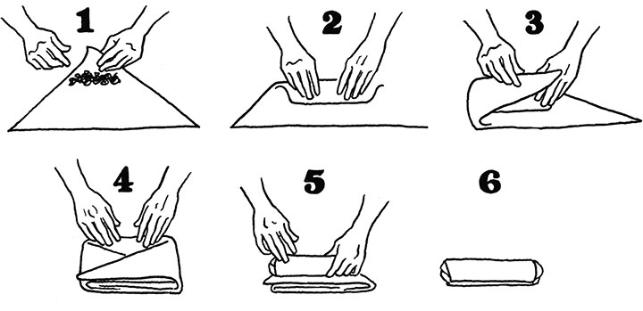
This week we spent a couple of afternoons shooting reference photos. Zooey rolled and unrolled pretend spring rolls made of fabric and made “samosas” with a scrap of denim.

It was probably tedious for her, but the end result was a bunch of instructional illustrations that actually made sense!

And we made a mess of the bread (doesn’t make it taste any less good!), but Zooey can say she has some pretty, uh, unique on-the-job training under her belt.
• • • • • • • • • • • • • • • • • • • • • • • • • • • • • • • • • • • • • • • • • • • • • • • • • • • • • • • • • • • •
In other news, I did a little website tweaking over the weekend, and added an F.A.Q. (it makes me giggle to pronounce it “Fack.”) If you ever wondered what I mean about half the things I say around here (and judging by the volume of questions I get on a nearly daily basis, you might), go and check it out here—it’s a whopper.
It ended up being a lot of fun to write, because I got to play the part of the snarky interrogator (not that I get many of those, but it’s fun to write like one). I did practice some restraint, however; I was tempted to include a question I get more often than I’d like to admit: “Wait, aren’t you a guy?” True story. Sigh.
Also in the running was “Will you print 1000 coffee mugs with ‘World’s Number One Dad’ for me?” Because I really did get that email once, along with quite a few others mistaking my business for something entirely different. Maybe this will clear things up just a bit…
December 31st, 2009

End-of-the-year summaries have never been my strong suit, not least because I tend to measure time on completely different terms than the standard calendar (like counting up from the anniversary of an important event, for instance). And since nobody seems to be able to agree on whether the decade ends this year or next (anyway, doesn’t any ten-year span count as a decade?), I think I’ll leave that one alone as well.
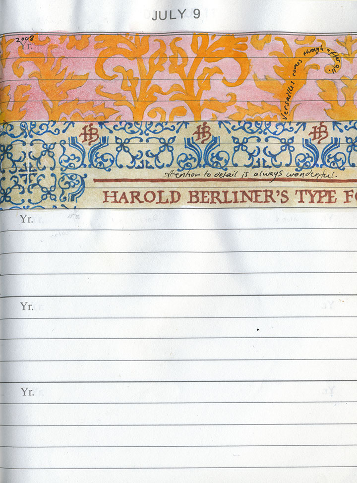
Instead, I thought I’d share my own way of marking time—an experiment that I’ve been working on for two years now.

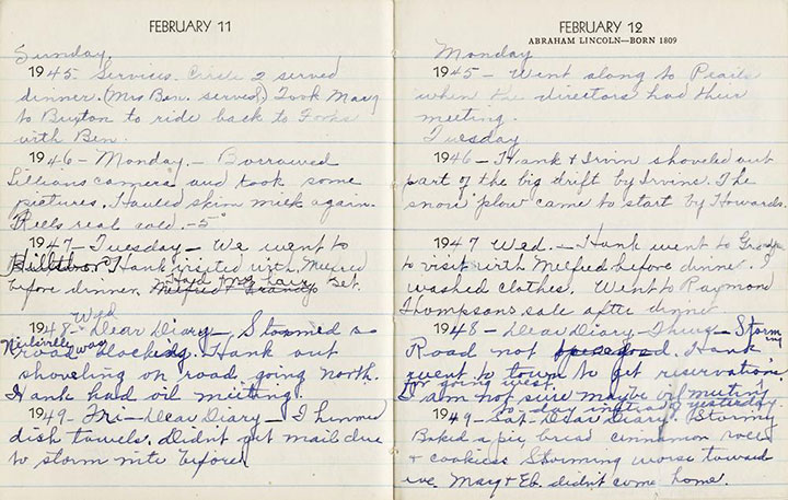
My friend Sarah Christianson has spent the last several years documenting the history of her fifth-generation family farm. Among her family artifacts are several of her great grandmother’s daily diaries, which Mrs. Anderson faithfully kept for many years. As you can see, there isn’t much space to write (so most entries say things like, “Went to the store, visited with Mildred,” etc.)—but what really interested me was how the five-year format of each page paints a larger picture of a woman’s life.

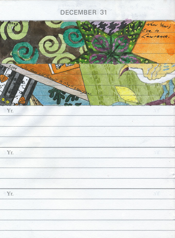
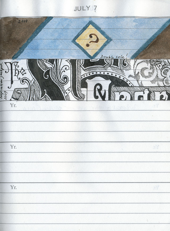
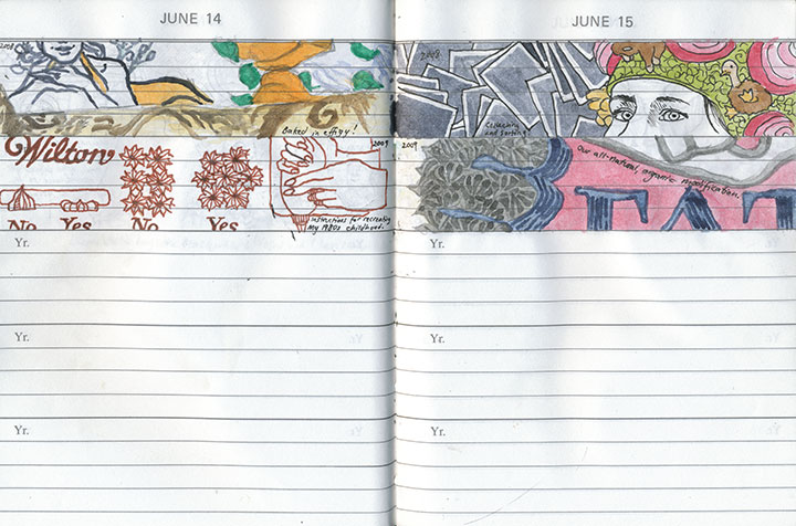
Sarah and I were both inspired to start five-year journals of our own, but I decided to turn mine into a sketchbook. I loved the idea and the challenge of documenting each day with a tiny, panoramic image.
Almost every drawing depicts something mundane, even trivial; it might be a sliver of that day’s activities, or just a snippet of an object that caught my eye. I’m almost never specific in the brief phrase written in each space—in fact, already I find myself forgetting what I was referring to when I go back to look at past entries. When I do remember what I was talking about, though, each illustration triggers my memories better and more richly than any of my photographs or writing can.
But that’s not the point of this project; this was never meant to be a detailed journal of my every thought or action. Instead, I’m trying to remind myself to really look at the world around me, and to live in my own present.

Now, exactly two years into the project, the same type of narrative I found in Claire Anderson’s diaries is already beginning to emerge. The drawings serve as a sort of flip-book; as one pages through the journal my personality, tastes and interests come to life, and the result is a more complete picture of myself than I ever could have come up with consciously. And an interesting by-product of all of this is the sometimes-unwitting documentation of the current era—this book might prove to be useful in other ways, someday.
The really curious bit is how the book is both intensely personal and completely ordinary. There isn’t a single image in there that I couldn’t share with a total stranger (no nudity, no embarrassing missives, no dirty laundry, etc.), and yet I’ve only actually shown it to a handful of people. I’m not sure why that is, but now that I’ve gone “public” about it I’m sure I’ll post occasional excerpts from here on out.
At the very least, maybe this will tighten the screws on my discipline a bit. Sarah and I learned quickly how difficult it is to keep a daily journal like this, whether in words or pictures (I doff my hat to Mrs. Anderson’s habits)—it’s all I can do to keep up with it, and I’m often playing catch-up. But now that I see how worthwhile the effort has been, I find myself excited for whatever tomorrow brings.
And isn’t that the whole point?

Wishing you a happy New Year full of wonderful events and tiny moments worth savoring—however you choose to remember them.
December 25th, 2009

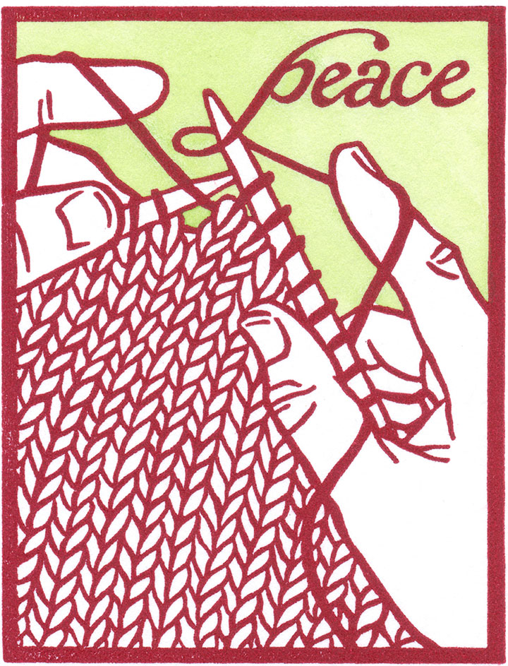
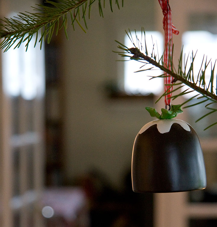
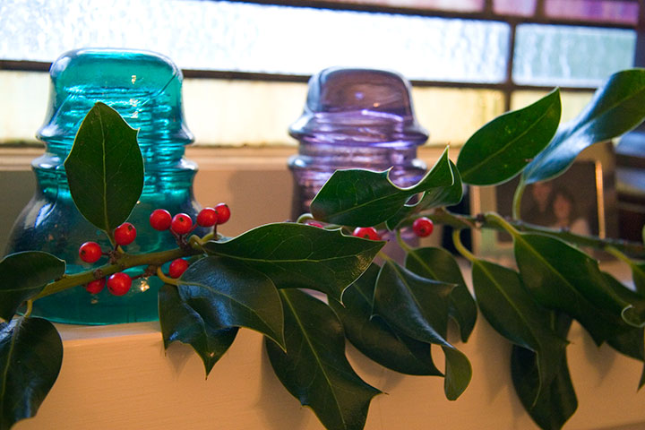
Every year I whip up a little holiday postcard and send it winging to far-flung friends and family. It’s a long-standing tradition of mine, and an important constant when many other holiday plans change from year to year. This year’s card reflects my own personal plans for Christmas this year—I fully intend to spend some serious quality time with needles and wool.

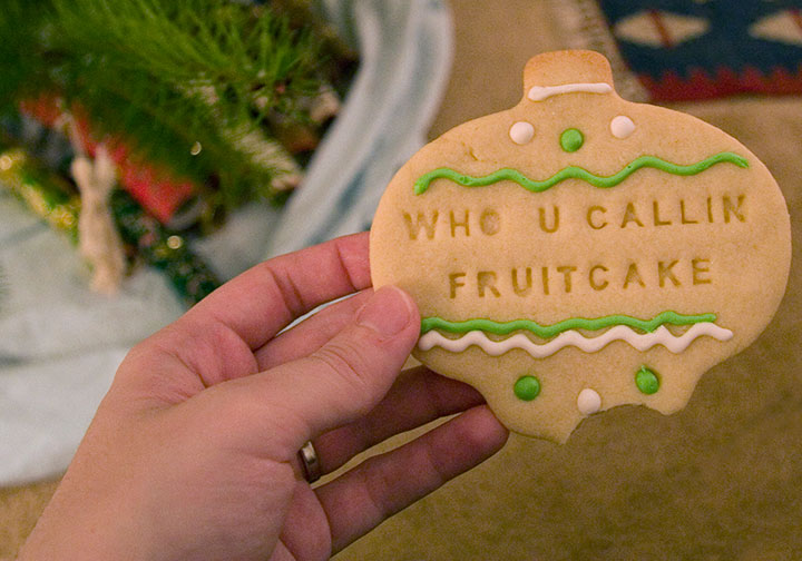
We’re staying home and having our own Christmas this year, and along with rare treats like time for knitting and the luxury of jigsaw puzzles, the celebrations come complete with seasonal goodies (like these saucy sugar cookies made by my friend Maggie)…

…cozy surroundings…

…and all the comforts of home. So this is my Christmas card to you. Wishing you the merriest of holidays, and a new year filled with peace, love, and joy.
November 27th, 2009

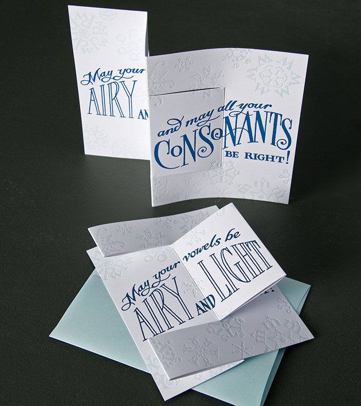
Every year I make a resolution to create a whole slew of greeting cards for the holidays, and every year I’m lucky if I can scrape together one postcard design to send to my own friends and family. Maybe it’s because I’m not really capable of getting in the mood for Christmas or Hanukkah in July, but by the time November rolls around and I finally think of it, there never seems to be enough time. Good thing I have my friend Allison to think of these things.

Allison Chapman runs Igloo Letterpress, a lovely little shop in Worthington, Ohio. She called me up this summer and asked me if I’d like to start a line of letterpress cards with her—since neither of us had time to do both the design and the printing, it was a match made in heaven.

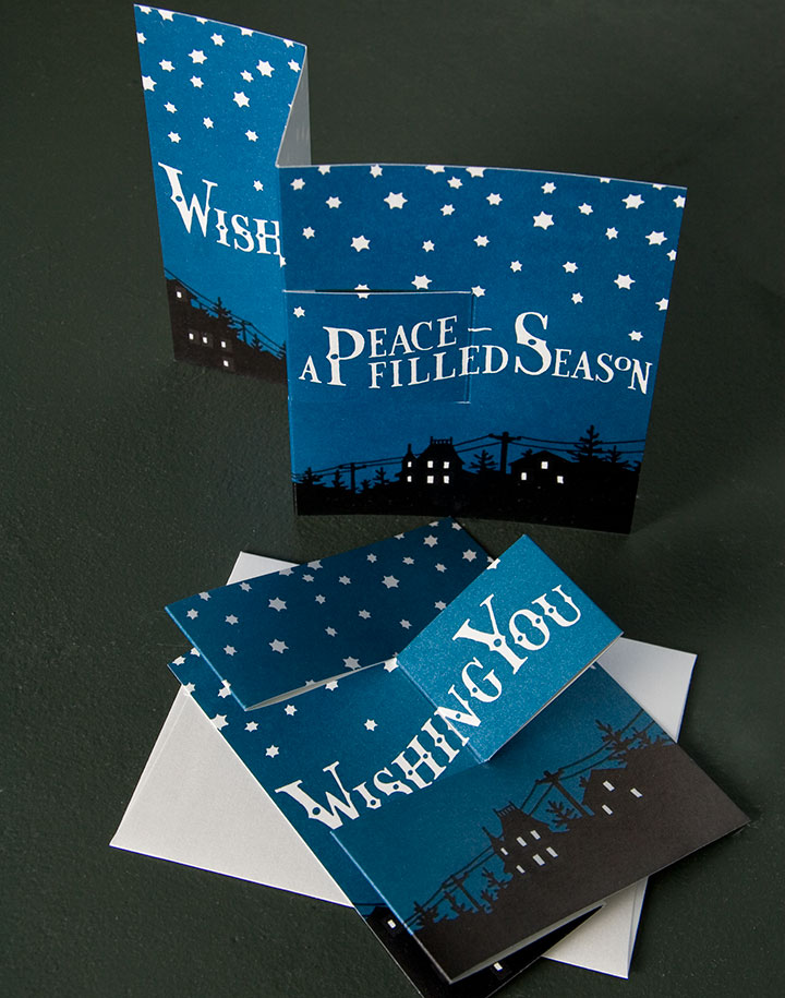
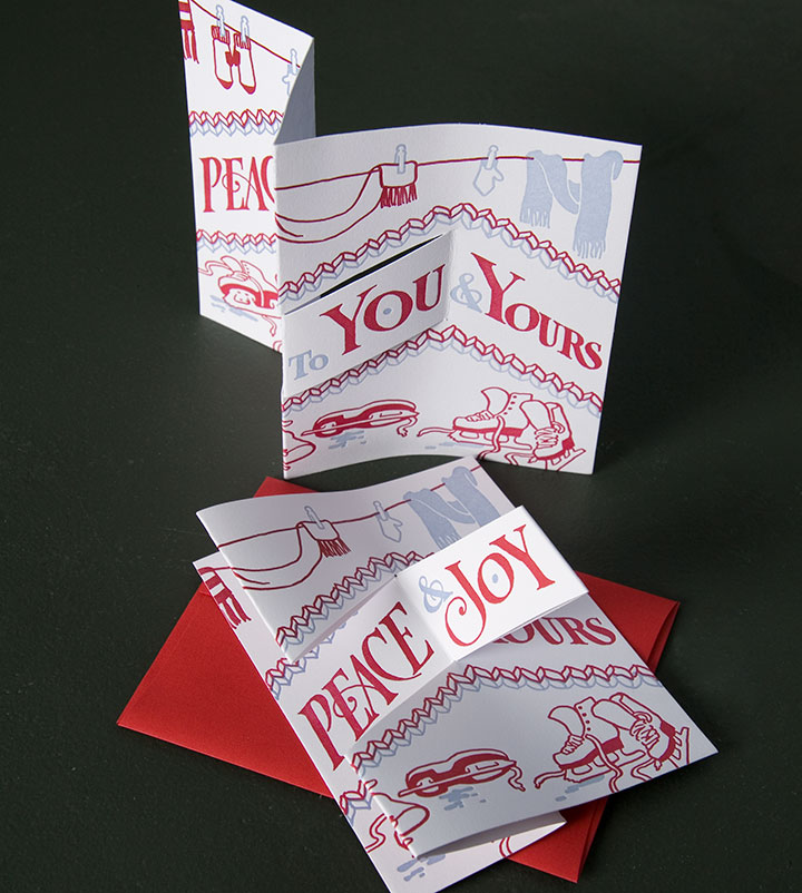
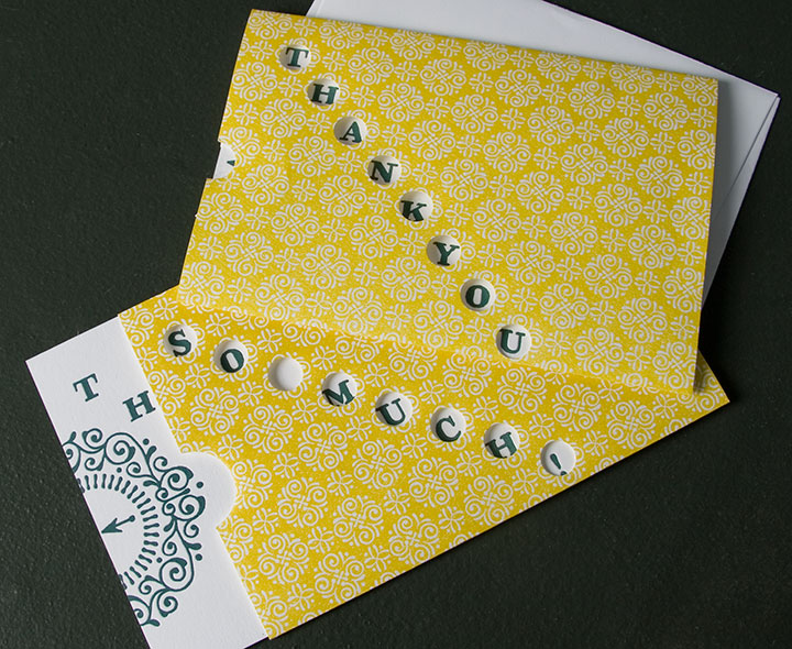
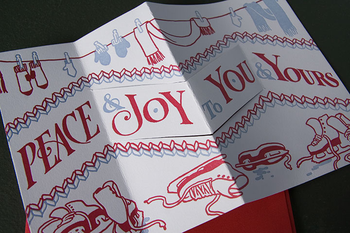
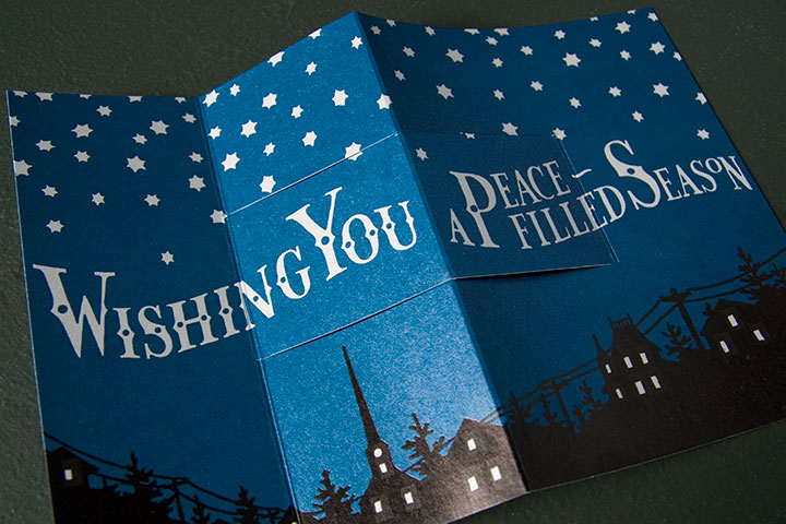
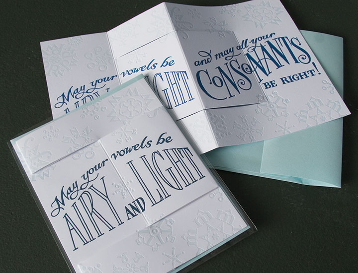
Collaborating when you have a couple thousand miles between you can be quite a challenge—especially when you’re trying to reinvent the wheel a bit. But Allison and I were on the same wavelength from the first moment, and it was so easy to leave the printing in her capable hands. Besides, her ideas for 3D pop-up cards turned out to be perfect for letterpress. Each of these cards is a kinetic greeting, with a unique folding structure that delivers the message in an unexpected way. And as always, the illustrations are created from hand-lettered type and hand-drawn patterns and imagery (as if you hadn’t guessed).

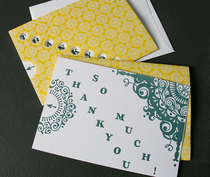
And for after the holiday gifts are opened, we threw a thank-you card into the mix as well. Instead of a pop-up piece, this card slides out of a die-cut sleeve to reveal the whole story.

All of these cards come with a standard A2 envelope, and are available either individually or in packs of six.


For more images and ordering information, visit the shop.
One last thing: many thanks to the wonderful Sarah Christianson for sweeping in with her professional lighting and photographing the cards for me! Happy holidays!
November 26th, 2009

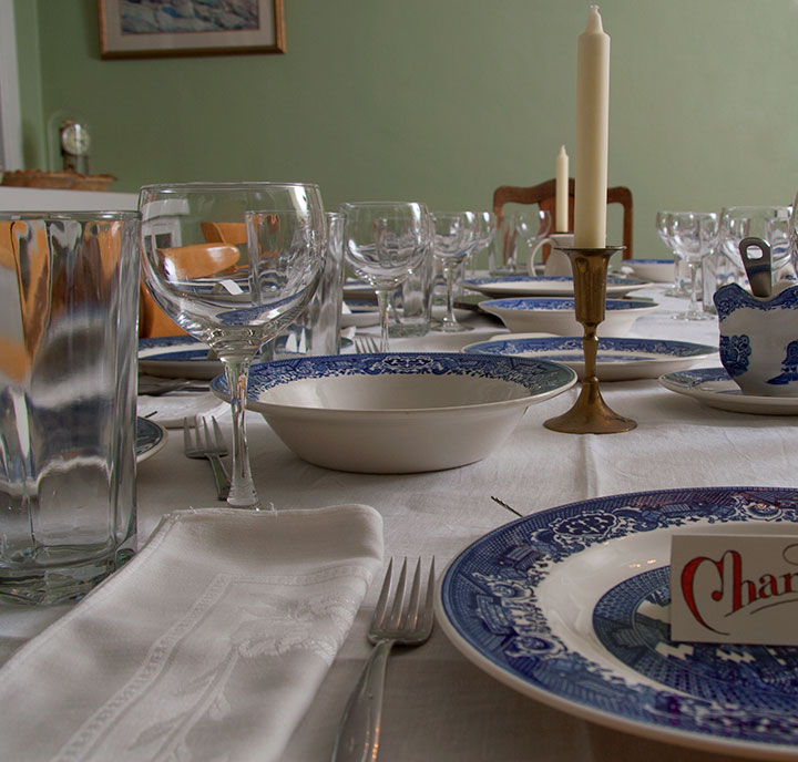
Today I am thankful for the new and old friends who surround me today; for the contrast between the wet Northwestern chill outside and the cozy warmth inside; for the beauty that is so easy to find ’round these parts; and for you. Thank you for joining me here in my little virtual space.
Happy Thanksgiving.
November 20th, 2009

People who stop by the house for the first time must really think I’m strange. Never mind our own personal farmers market residing in the attic and root cellar—these days the place looks like the the visual-art equivalent of Willy Wonka’s Chocolate Factory, with snips of paper, rows of identical bird portraits, bright watercolor cakes, brushes and pencils, boxes of envelopes, shipments waiting to go out, and stacks of prints covering every horizontal surface. It certainly gives new meaning to the term “cottage industry.” I guess that’s what happens when you decide to double your inventory right before the holidays.
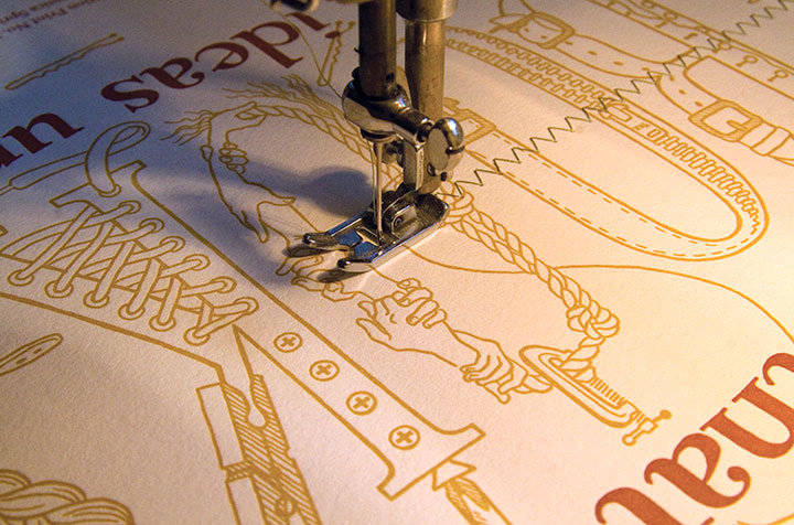
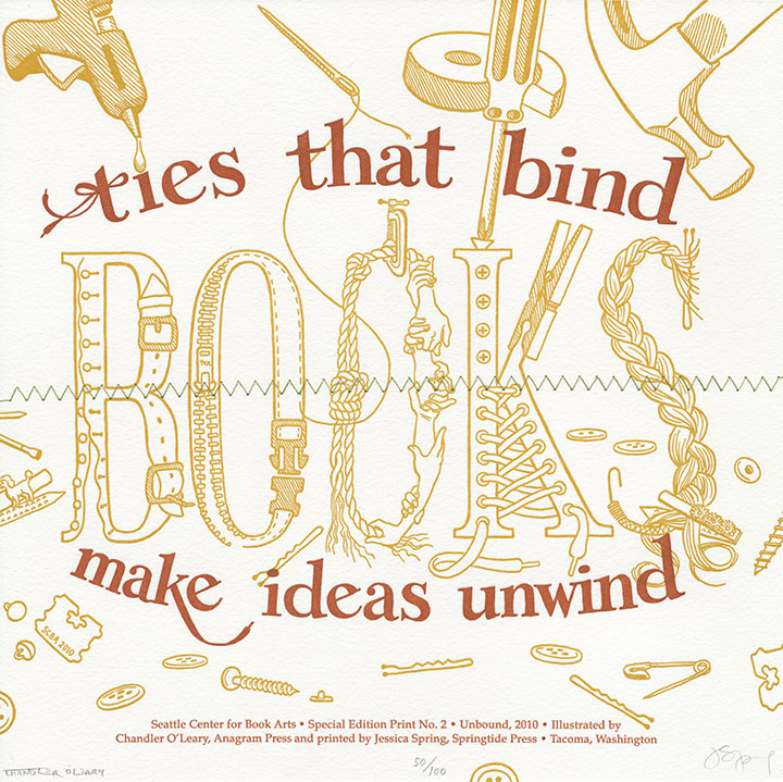
This week, though, there was a new element to the chaos: the drone of the sewing machine. And now that all the threads are tied off, Jessica and I are finally ready to unveil a little secret we’ve been sitting on for a few months. Seattle Center for Book Arts (SCBA) asked us to create their second-annual Special Edition Print, and I’m happy to report that they’re now available for sale.

Each year the Special Edition Print has the theme of “Unbound,” and the folks at SCBA challenged us to interpret it how we liked. So instead of our customary work with famous quotes, Jessica whipped up a little gem of her own. We started thinking about all the ways something (not just a book!) might be bound or unbound, which led us to visions of lacing, pinching, tying, zipping, braiding, taping, clamping, buttoning, stitching, buckling, hammering, gluing, clipping, lashing and pinning. Which then, of course, gave me free reign to make an absolute, giddy mess of things, and scatter fasteners and notions all over the page. My favorite additions to the drawing, though, are the bread tags. My grandmother had a whole drawer full of them in her kitchen (did she ever use them, or did I just discover the source of my pack-rat tendencies?), and I loved the way they rattled around in there. So Nana, this one is for you.
Everything is hand-drawn and lettered (as per usual), then letterpress printed in copper ink and an ochre color that is precisely the shade of those little Bit o’Honey candies (remember those?). This time, though, we’ve added a little extra goodie: a line of zig-zag stitching in cotton thread, in exactly the green of copper patina. SCBA is the only place to get these prints, so if you’d like to play a little game of Button, Button, Who’s Got the Button, you can get your copy here.
November 13th, 2009

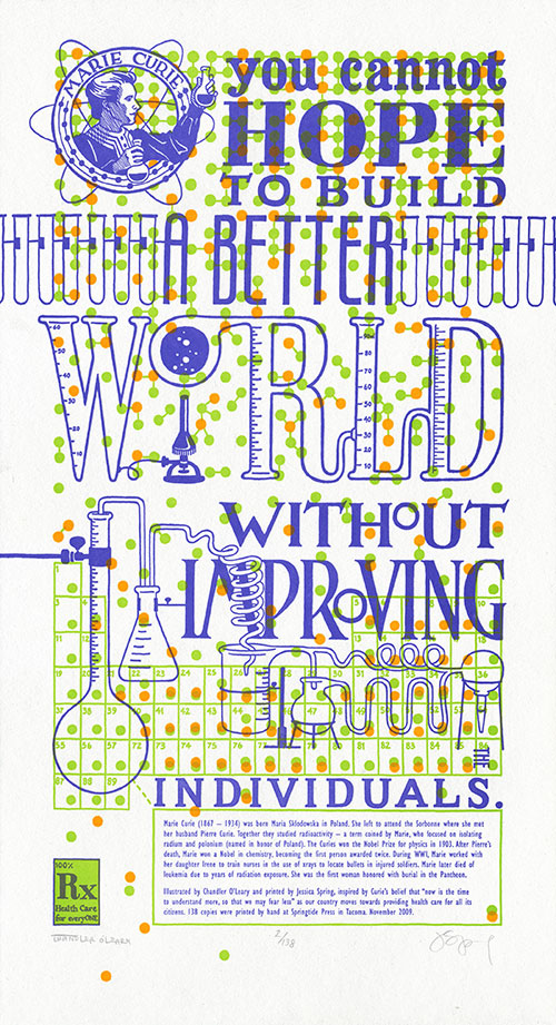
I guess it was inevitable that Jessica and I would veer back into controversial territory eventually—we’re a little ornery, after all (as if you hadn’t guessed). We’ve been sitting on this concept for several months now, and have put it off a couple of times in order to move Thea Foss and Harriet Tubman ahead in the queue. Now, though, the time feels right—or maybe we’re just so upset and keyed up by the issue at hand that we just couldn’t wait any longer. Either way, we’d like to offer our take on what a famous scientist might have had to say about health care:
You cannot hope to build a better world without improving the individuals. —Marie Curie
I’ll spare you the ranting and raving that you can find in countless other pockets of the internet (or my house), except for one small, very personal anecdote about this topic. You see, I am self-employed, as a working artist and bona-fide small business owner. And it’s a mighty good thing that I happen to be married to someone with a full-time employer, because when I traded my graphic design day job to go full-time with my business, I also gave up access to health insurance that was anywhere near affordable. So I am on the Tailor’s health insurance, which costs us—wait for it—approximately $650 a month. That’s just to cover me, and I don’t have any “preexisting conditions” (why is it that I always want to say “preconceived notions?”) or other health problems. Since we absolutely refuse to be among the millions of uninsured, remaining able to pay for coverage is our top priority. Except that’s about to get a lot harder, because this coverage—which is provided by one of the two American “non-profit” insurance co-ops, by the way (remember the buzz about those?)—will be increasing by twenty percent come January. I don’t say this to garner attention or sympathy (don’t worry, we’re doing okay) or to ask for advice—merely to illustrate my first-hand experience of the unsustainability of the system. I won’t prolong this post by weighing in on my personal preferences for health care reform, but something, somehow, has to change.

Here’s where Marie Curie comes in. Despite being snubbed and rejected by her peers again and again, Curie devoted her life’s work (and ultimately her own health) to finding answers. And what she found not only changed our understanding of science forever, but also laid the foundation for many of the medical treatments we take for granted today.
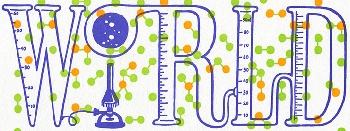
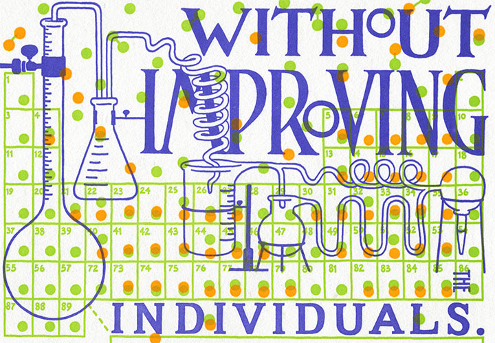
In tribute to her tireless efforts, The Curie Cure is a miasma of small details that slide in and out of focus as they compose the “bigger picture.” Each individual atom, printed in fluorescent ink, battles the text for attention—in vivid, radioactive color. The edition size is a nod to Curie’s discovery of new elements (the half life of polonium is 138 days), while the connected scientific equipment illustrates the trickle-down effect of any political action. Above all, the dominating pattern of molecule diagrams serves as a reminder that we’re all in this together.

• • • • • • • • • • • • • • • • • • • • • • • • • • • • • • • • • • • • • • • • • • • • • • • • • • • • • • • • • • • •
The Curie Cure: No. 6 in the Dead Feminists series
Edition size: 138
Poster size: 10 x 18 inches
Printed on an antique Vandercook Universal One press, each piece is printed on archival, 100% rag, recycled paper, and signed by both artists.
Colophon reads:
Marie Curie (1867–1934) was born Maria Sklodowska in Poland. She left to attend the Sorbonne where she met her husband Pierre Curie. Together they studied radioactivity — a term coined by Marie, who focused on isolating radium and polonium (named in honor of Poland). The Curies won the Nobel Prize for physics in 1903. After Pierre’s death, Marie won a Nobel in chemistry, becoming the first person awarded twice. During WWI, Marie, worked with her daughter Irene to train nurses in the use of xrays to locate bullets in injured soldiers. Marie later died of leukemia due to years of radiation exposure. She was the first woman honored with burial in the Pantheon.
Illustrated by Chandler O’Leary and printed by Jessica Spring, inspired by Curie’s belief that “now is the time to understand more, so that we may fear less” as our country moves towards providing health care for all its citizens. 138 copies were printed by hand at Springtide Press in Tacoma. November 2009.
UPDATE: poster is sold out. Reproduction postcards available in the Dead Feminists shop!

October 14th, 2009

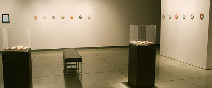
When I walked into the PLU Gallery this morning to document the Mnemonic Sampler show when it opens, my brain had somewhat of a short circuit. Since I was out of town for the past few days, all of the installation work was done for me (thank you a million times over, Heather C.!)—so this was the first time I’d laid eyes on the work since framing it up and chucking the pieces in a box. I somehow couldn’t connect the finished work on the walls with the crazy, chaotic process of the past few months. It seemed so simple, like this was somebody else’s show, and all the nail-biting and never-ending futzing I’d been doing was for some other project that would remain unfinished forever. But I did finish it—and there it is!

I was nervous about the possible absurdity of having twenty-six small pieces in a colossally huge space, but somehow, it works. Heather ingeniously used lighting and visual breaks to transform the gallery into a space that draws the viewer in and creates an intimate experience—which is exactly what I hoped for. Heather, I owe you big.

On to the work itself. Here is the artist statement for the exhibit:
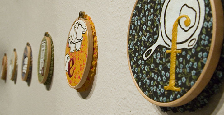
The alphabet is one of the first lessons we learn as children. From the beginning we learn to use it as a mnemonic device—just like “Roy G. Biv,” or “Every Good Boy Deserves Fudge”—assigning meaning to our world by associating symbols with each letter. Because the alphabet is one of our most basic and effective memory tools, we are drawn to it as both a visual and narrative archetype. It’s not surprising, then, that the abecedary is somewhat of a staple among book artists.
Just as we use our ABCs as a memory aid, our possessions help us create the concept of Home. No matter what our economic station, living situation, or domestic permanence, we all tend to share similar symbols of comfort and nostalgia. These ideals are embodied in the everyday objects around us—those mundane materials we take for granted, yet without which we would sense something lacking. As someone who has never had a picket fence, who grew up in a nomadic military family, and who has lived her entire life with relatively few possessions, the archetypal Home should seem foreign to me. Yet the same mnemonic triggers exist in my mind; the same objects attract me.
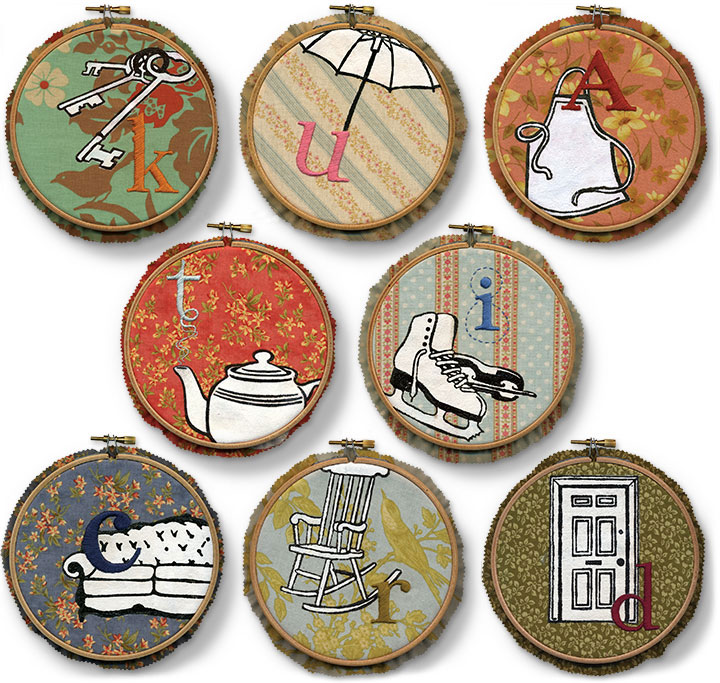
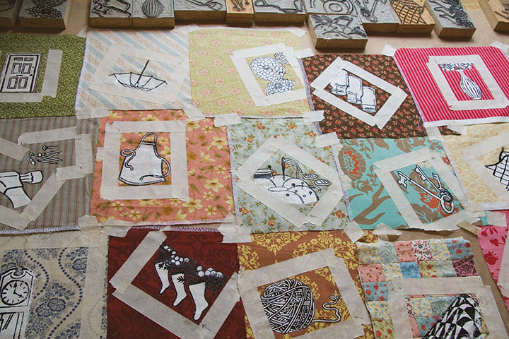
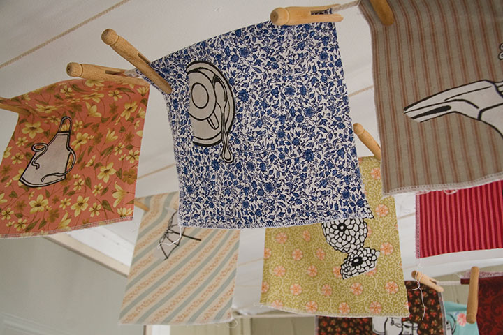
Mnemonic Sampler collects and files our household icons, gathered together like the stitched and quilted samplers of our mothers and grandmothers. The hand-stitched alphabet enumerates my, your, our trappings, shuffling our collective domestic inventory like the old card game of Memory. Each symbol is familiar; each object is Ours, whether we actually possess it or not. Together they sketch out a Home—real or imagined; longed-for or spurned; past, present, or future.

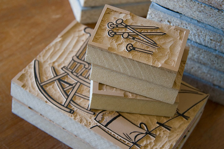
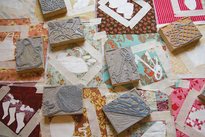
Mnemonic Sampler is a collection of monoprints, which means that instead of an edition of multiples, each print is created in such a way that it can’t exactly be reproduced. This technique results in a one-of-a-kind, totally unique piece—and is often more closely related to painting than printmaking. These pieces are printed from reduction-cut linoleum blocks—meaning both print colors are carved from the same block.

So once the second design is carved, the first color cannot be printed again.

Designing these pieces was an intuitive process, consisting of both logical and intangible choices of fabric and pattern compositions. Because the design stage was so fluid (almost semi-conscious at times), it really wasn’t possible to do the printing on a press. Instead, each impression was made literally by hand, using masking tape to aid in color registration.

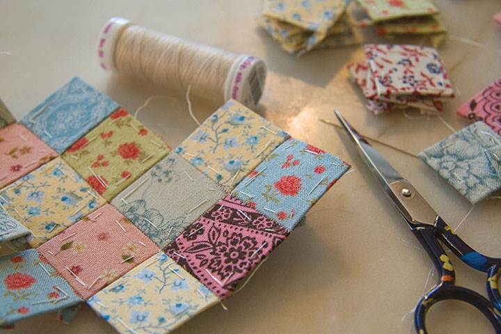
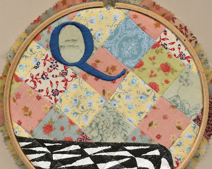
“Q” has an extra conceptual level, since the fabric background is a patchwork “quilt” in its own right. Like everything else about the series, the patchwork is sewn by hand, using the English paper piecing technique.

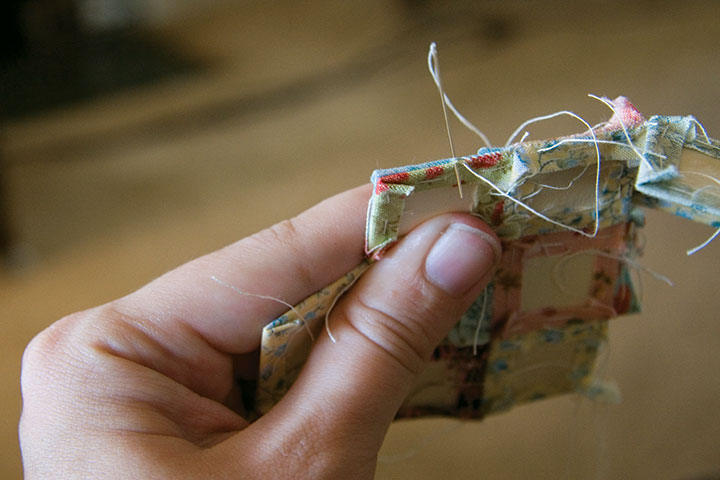
This was my first attempt at paper piecing, and I’m pleasantly surprised at how quick and accurate it is. Instead of folding and ironing every tiny piece, then wrangling a sewing machine, each patch is wrapped around a paper template and basted down, then whip-stitched together into a block.

The result is a precise little quilt—perfect for embroidery.

I can’t believe how long it took to complete every step of the process—and yet how quickly everything came together at the end. So you can bet I’m excited about celebrating at the opening tonight. And besides, I’m interested to see if the household objects I chose will resonate with viewers; it wasn’t easy to narrow things down to twenty-six letters of the alphabet, so I picked those objects that had the most meaning for me.
So how about it—what spells “Home” for you?


![Chandler O'Leary [logo]](https://chandleroleary.com/wp-content/themes/chandleroleary/images/logo.png)
