Blog
June 4th, 2015
UPDATE as of June 12: Just four days left, and we have less than $2000 to go! We’re almost there!
UPDATE as of June 8: One week left, and just over $6000 to go! We can do it!
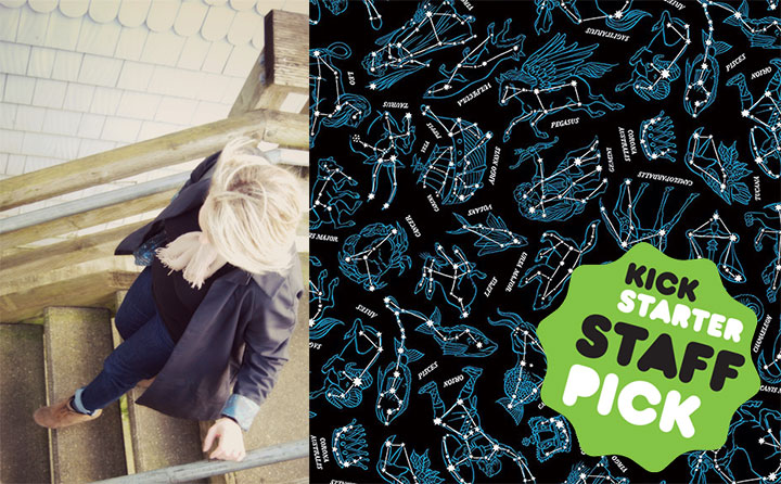
Thanks to you, we’ve blown past the halfway point of the funding goal on the Constellation coat! And we’ve been named a Kickstarter staff pick! Our Kickstarter campaign is winding down, though, and we’re not yet at our goal. This is our big chance to make the coat (as well as the Constellation scarf) a reality—if we don’t make our full goal, we get zero of the funding already pledged and we are back to the drawing board. So if you haven’t yet made your pledge, now is the time. So head on over to Kickstarter and help us get to the finish line!
May 28th, 2015

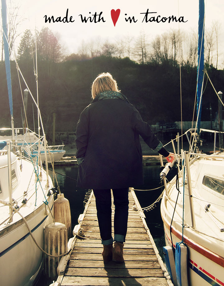
Photo by Emilie Firn.
Wowsa! Thank you so much for your overwhelming response to the raincoat! Thanks to you, our Kickstarter campaign is already closing in on the halfway point, and we are that much closer to making the project a reality. Thank you so, so much. Please keep spreading the word—it’s working!

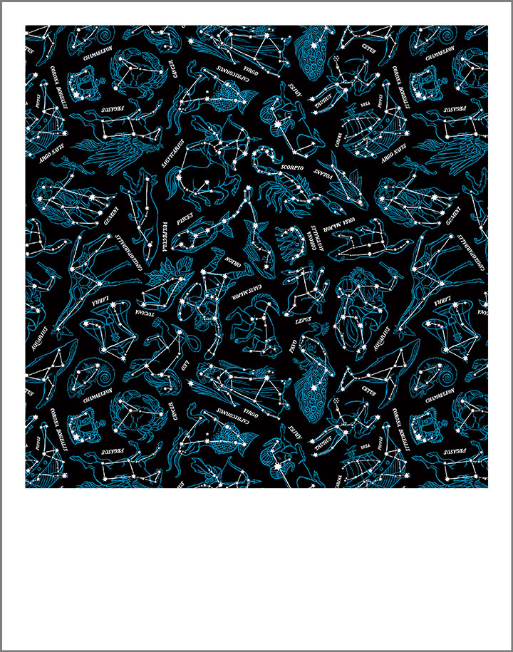
If you haven’t already made your pledge, or you’re looking for a way to support the project but the coat itself isn’t for you, there are lots of other rewards to choose from. Each features my Constellations design in a different format, and each is an affordable piece of art in itself. First up is an 11 x 14″ archival art print of the Constellation pattern. The print is set up like a giant Polaroid—square on a white bordered background—and can fit in a standard size frame for easy display. This print is done the same way as my 50 States and sketchbook prints—digitally printed with museum-quality inks on 100% cotton paper, and signed with my insignia. The difference is that this print is only available as part of the Kickstarter campaign—I won’t be offering it in my shop afterward. This print is available at the $40 reward level.

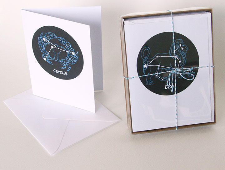
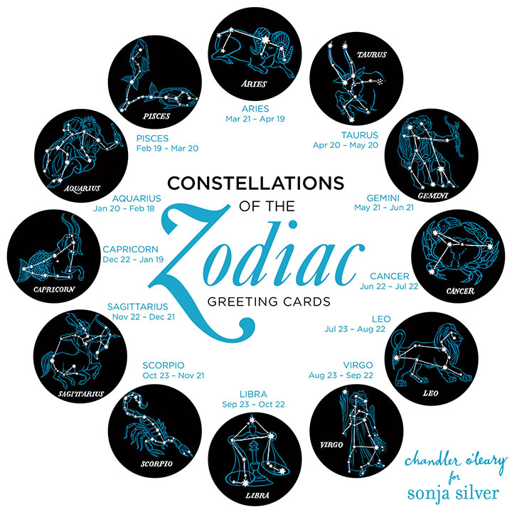
Next are my brand new Constellations of the Zodiac greeting cards! I singled out each of the 12 zodiac signs from the pattern, and turned them into individual cards—each card is blank inside, and comes with a matching envelope. I’ve been offering these cards in my online shop and at craft fairs as a “teaser” for the coat project, and they’ve already been a big hit.

Here are all 12 designs, and how they look on the cards themselves. Each card makes a great and unique form of “personalized” stationery (I recently had a Leo buy a whole box of them to use as her “from the desk of” cards)—or you can get a box of all 12 designs to use as birthday cards for the people in your life. At the $10 reward level on Kickstarter, you can take your pick of a single card; or at the $50 pledge level you get the whole box of 12.

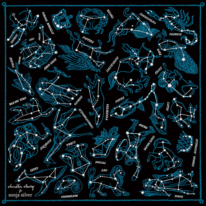
Last but not least, Sonja and I are offering the Constellations design in the form of a wearable scarf! We haven’t had it produced yet, so I don’t have an “action shot” to show you, but you can see the finished design here. Every constellation in the pattern is featured, along with our logo/insignia and a hand-painted border that’s unique to the scarf. The finished scarf will measure 20 x 20 inches. To be honest, I am just as excited about the scarf as I am about the coat, and you can bet I’ll be wearing mine constantly! You can snag one of these babies at the $70 reward level on Kickstarter.

Photo by Summer Hess Briggs.
And of course, there’s the coat itself, at the $240 reward level. When pricing the coat, Sonja did her best to make a product that is both designer-quality and competitive with what else is out there on the market. Since many of your average made-in-China, plain-jane jackets are $300 and up at department stores, I think she did pretty darn well. Also, as I said the other day, Sonja is limiting her first production run to 200 coats. If she offers this coat again in future, or releases other colors or lining designs, the price will very likely increase. So in exchange for putting their faith in us and helping get Sonja’s new apparel line out into the world, our Kickstarter backers are getting the coat at the lowest price.
So there you have it! Thank you so much again for all your support—and keep it coming! We can’t wait to get these things into production and into your hands—the finish line is ahead, and we’ll all get there together.
May 26th, 2015

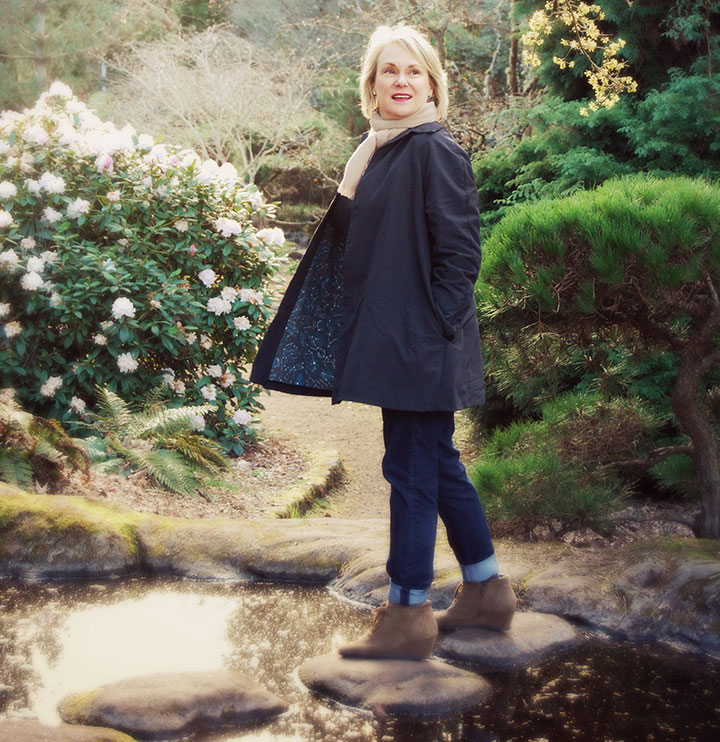
I tell you what, this has been the year of long-term projects coming to fruition. There have been so many things I’ve had to sit on for months, and it feels so good to finally be able to share them with you! And the one pictured above might just be my favorite of all.

Photo by Summer Hess Briggs
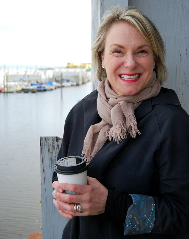
This is my friend Sonja Silver. She’s a dyed-in-the-wool Tacoman, and has owned a women’s clothing boutique here for nearly two decades. Over the years, she’s watched women of all shapes and sizes come through her shop, and has developed a keen eye for clothing that’s both well-made and well-designed. But she had a gap in her business: for years, her customers had been asking for coats and jackets, and Sonja had never been happy with what was available in the marketplace.
So she has spent the last year designing her own.

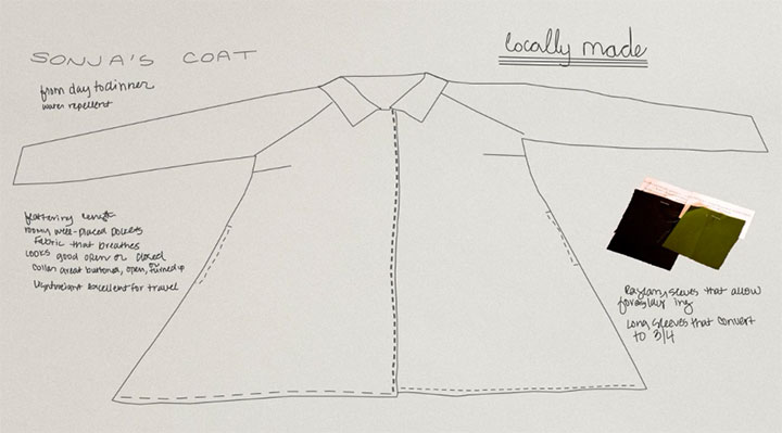
It turned out to be quite the challenge—Sonja was inspired by the classic swing coats and car coats of the 1950s, but wanted the hard-wearing functionality of an outdoorsy shell. Basically, her goal was to make something that was both a workhorse—and a thoroughbred. After all, we live in the Pacific Northwest—we wear jackets pretty much all the time here, in all weather.

Here’s where I come in. Sonja called me up one day last spring, and told me about her coat project. She said she wanted the coat to be lined with fabric that was as unique as the design of the coat itself, and asked me if I’d be interested in illustrating a pattern repeat for her.

Needless to say, I didn’t so much say yes as squeal it.

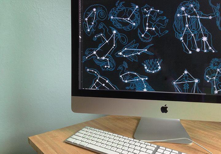
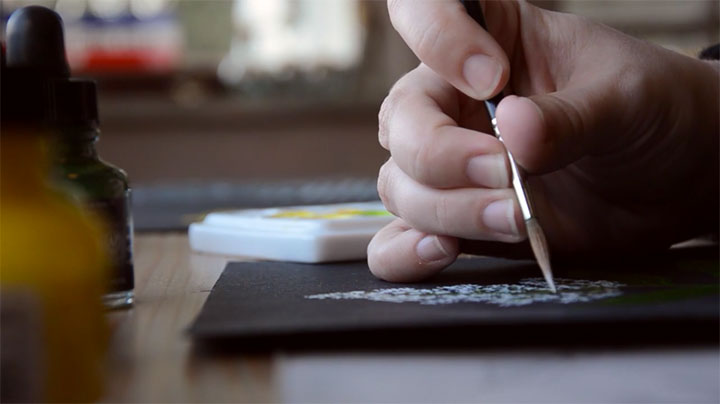
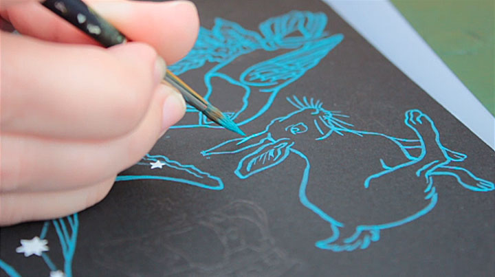
Sonja had the idea for a constellation pattern—something that could be both playful and sophisticated at the same time. We both wanted the pattern to be hand-painted, to help transform the coat into a piece of wearable art.

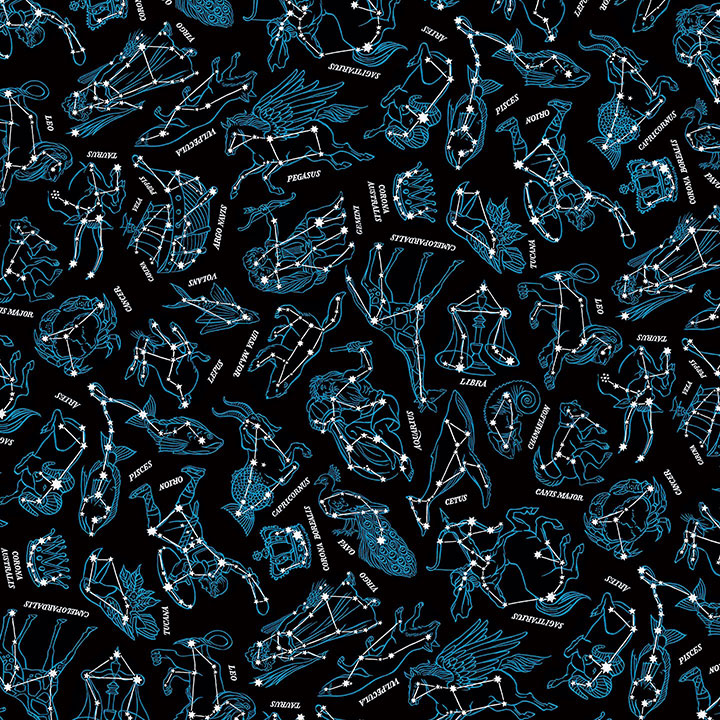
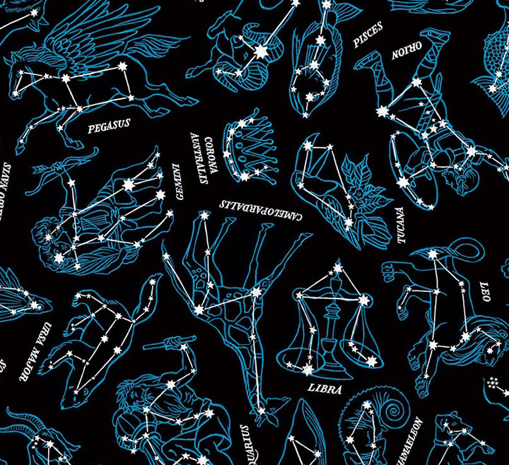
Here’s the finished pattern. There are 27 different constellations represented, including all 12 signs of the zodiac and some perennial favorites from the skies in both the northern and southern hemispheres.

Photo by Summer Hess Briggs
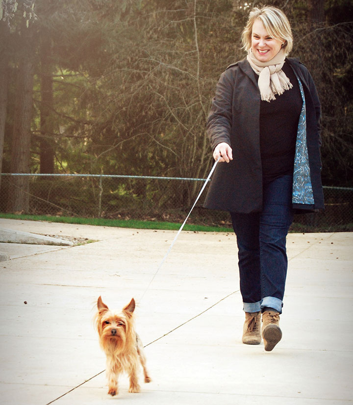
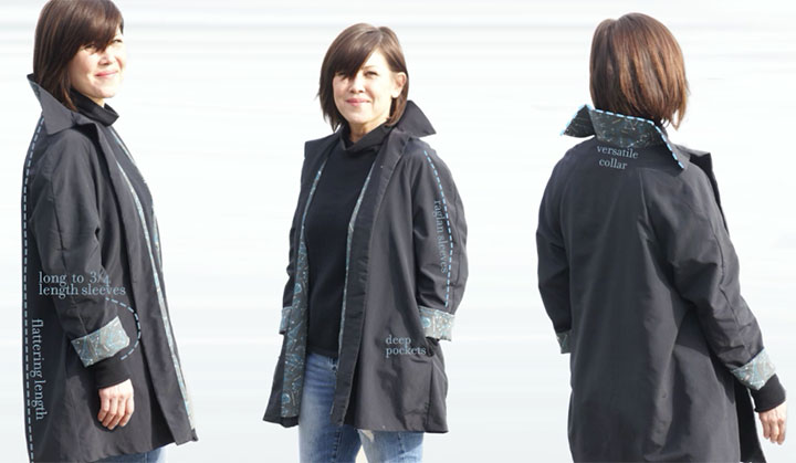
What I love best, though, is seeing the pattern “in action,” doing its job as part of the garment. While I was painting fish and birds and Greek gods, Sonja was hard at work on creating a working prototype of the coat. She went through many different test fabrics and design changes, trying the fit on women of all shapes and sizes to make the design as universal and versatile as possible.

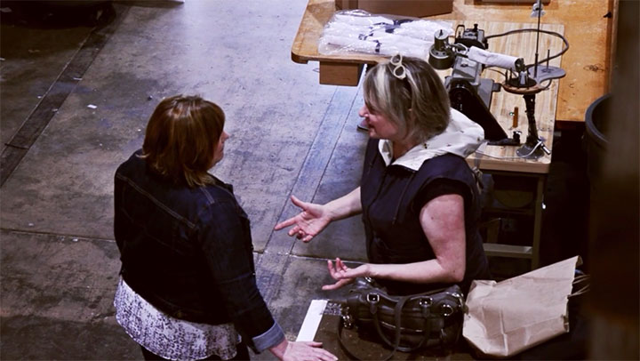
Photos by Kathy Chakerian
And now, at long last, it’s ready for production!
Sonja has launched a Kickstarter campaign to raise the necessary funds to produce the coat, and it’s officially live and up and running. The campaign will run until June 16, and we’re already 1/4 of the way there!
This is the third Kickstarter campaign I’ve been a part of (you can read about the other two successful projects here and here)—for those of you who might not know how it works, a campaign is run like an NPR pledge drive, with tangible rewards offered in exchange for each funding level. So this is not a donation platform—it’s an exchange of goods for capital. We must make our funding goal by the time the clock runs out, or we don’t get any of the funding already pledged. It’s an all-or-nothing thing, and that ensures that the project will be done right, with enough capital to get the job done. And to make sure she doesn’t get overwhelmed by too many orders all at once, Sonja has limited this first production run to 200 coats.

That reminds me: a note about the prototype featured in the Kickstarter campaign. The fabric used for the lining was just a test fabric we had made in a small quantity when we were looking for manufacturers. We weren’t happy with the black background of that fabric, as it turned out a little on the light side. So while you’ll see it in the Kickstarter video, we ended up going with a different manufacturer for the final lining fabric.

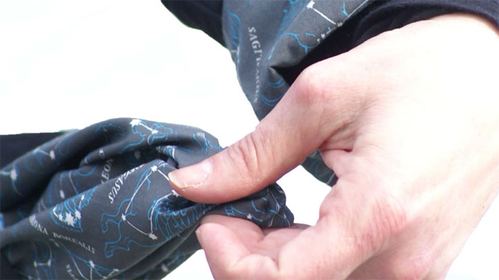
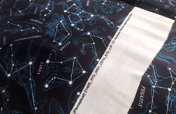
Here’s the real thing—the actual lining fabric that will be used in the finished run of coats. As you can see, the black is a true black, and the pattern pops from the background the way it’s intended to.

The best part of Sonja’s vision here is that this project has been brought about almost entirely by local women. From apparel design to illustration to construction to marketing, it’s local women who have made this thing happen. In an age where the vast majority of all garments are made overseas, in sweatshop conditions, that’s really saying something. Sonja’s coat is made with fabric sourced and printed in the United States, and the garment itself is pieced and sewn right here in Tacoma. I love being able to say that—I love being able to put our beliefs into action in this way.

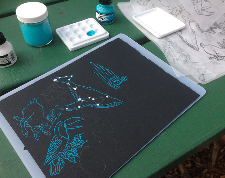
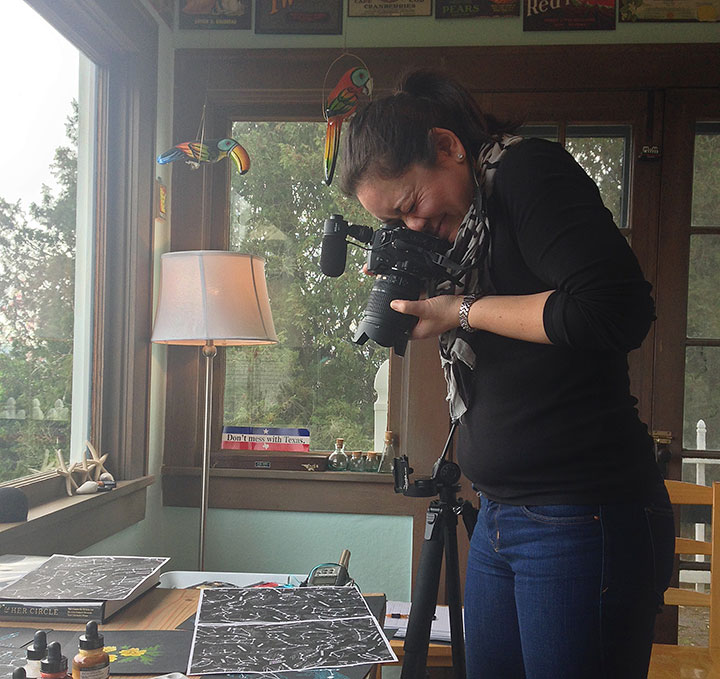
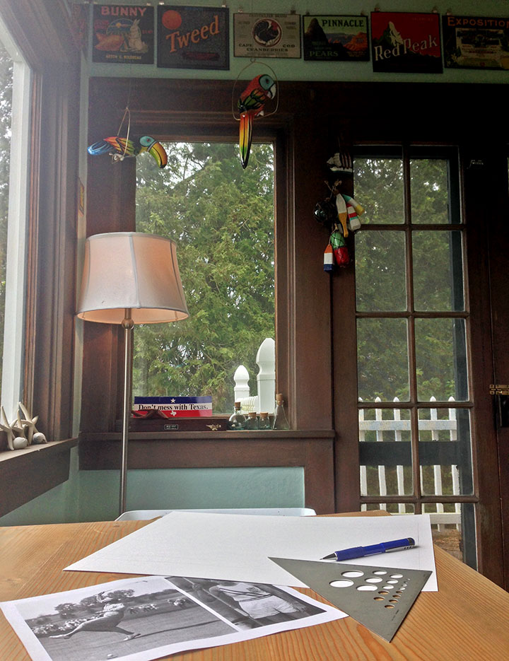
The Kickstarter campaign even has a fantastic video made by a local gal—the lovely Emilie Firn (shown here snapping photos of my process materials in my studio).

Photo by Summer Hess Briggs
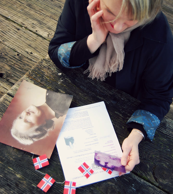
And last but not least, one other local gal has had a “hand” in the project: Sonja’s grandmother Lena, who was the inspiration for the coat. Sonja says her goal was to make a coat that had the same attributes Lena had: she’s hardworking, she’s beautiful, and she’s got your back.

So if you’re looking for your next go-to jacket, or you have a woman in your life who is, visit our Kickstarter campaign and make a pledge! And if a coat isn’t your thing, there are many other pledge levels and reward goodies to choose from. Even a pledge of $1 helps move the project forward and gives us better exposure online (if all my social media followers and email newsletter subscribers pledged $1, we’d instantly reach the halfway point of our goal!)—and of course, helping spread the word through your social media platforms will also help us meet our goal. But most of all, we just can’t wait to see women wearing the coat, out there in the real world. So take a gander at the campaign and snag your coat here!
Thank you for your support!

May 14th, 2015

Jessica and I are working on the next Dead Feminist broadside right now—our process begins with choosing a quote and hammering out a rough concept, and then I do a bunch of thumbnail sketches to puzzle out the design. Usually, by the time I start lettering in pencil, I have a really clear picture in my head of what the finished product should look like. Even so—even 22 broadsides later—I’m still intimidated by the proverbial blank page. That’s why all those thumbnail sketches come in handy: they help illuminate the next step, and the next, and the next. And if I’m really lucky, I’ll be so wrapped up in blocking out the composition that I’ll forget to worry about whether or not the design will be any good.
Fingers crossed…time to start in.
May 9th, 2015

Speaking of new books, my work has appeared in a few other recent titles, and I finally had a chance to share some photos with you.

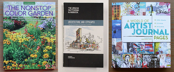
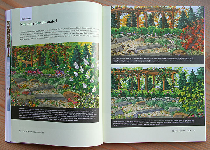
First up is another garden book, which I hinted at some months ago: The Nonstop Color Garden, published by Cool Springs Press, an imprint of Quarto Publishing Group.

This is the second garden book I’ve illustrated with Quarto, though while the first one was about centering a garden around edible plants, this one is about creating a year-round display of color.

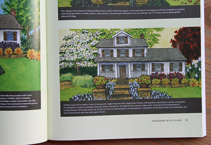
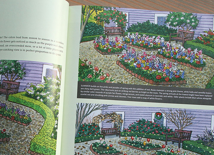
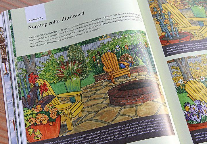
I contributed a dozen illustrations to the book—each showing a garden plan throughout the year, with the color evolving and changing with the seasons.

The book couldn’t have arrived with more perfect timing for me—now that the Tailor and I are in the new house, we have all sorts of ideas for how we’d like build and shape a future garden. One of the things I always admire in Pacific Northwest gardens is how they’re bursting with color in nearly every month of the year. Just researching the illustrations for The Nonstop Color Garden gave me lots of new knowledge and ideas (and the book doesn’t just deal with one region, either!), and you can bet I’ll be reading the finished book carefully for even more inspiration. Big thanks to Quarto and my fantastic art director, Brad Springer, for helping turn my thumb just a shade greener!

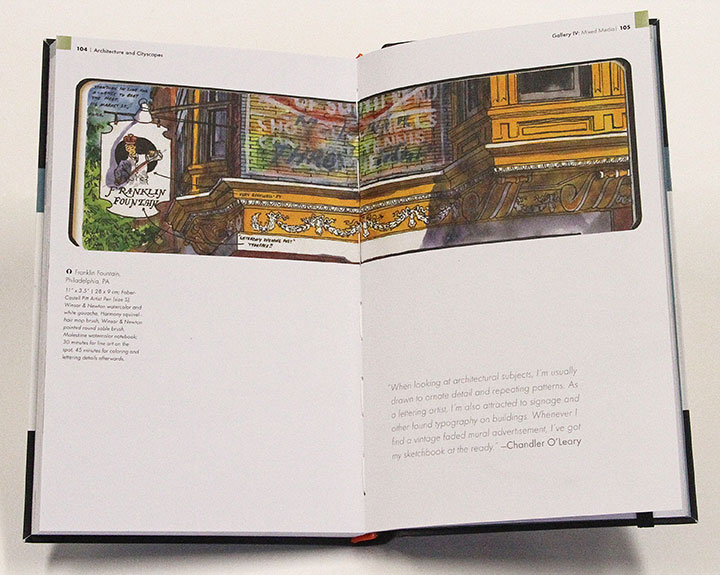
The other two books are centered around my favorite thing ever: sketching. One is the latest book written and edited by my friend Gabi Campanario, founder of the Urban Sketching movement. His newest, published by Quarry Books, is a handbook on urban sketching, focused on drawing architecture. The book includes tips and examples from artists all over the world, in a wide variety of techniques and styles. I was asked to contribute a sketch I did in Philadelphia a few years ago—it feels great to be in such good company in the book. Thanks, Gabi!

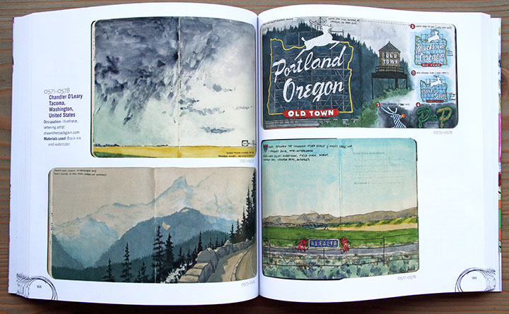
Finally, the newest book is called A World of Artist Journal Pages, by Dawn DeVries Sokol and published by Stewart, Tabori & Chang. This book is different in scope from Gabi’s sketching handbook—instead, it’s more of an anthology of journaling. There are over 1000 artworks represented in the book, and they present a broad range of journal work—everything from personal diaries to collage books to handwritten calendars to idea sketchbooks to figure studies to travel journals. Much of the work reminds me of the personal diaries of artists like Frida Kahlo, and the book is a fascinating glimpse into how the creative process works differently for everybody. If you’ve ever wanted to keep a visual journal, but didn’t know where to start, this might be a good reference book to have on hand.
Many thanks to the authors and publishers who included my work! It feels so good to have these babies on my bookshelf.
May 1st, 2015

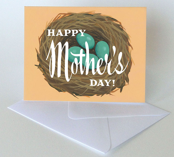
Thanks to all the prep and planning required for last week’s Wayzgoose, I’m all set up with a boatload of new inventory for spring. First on the list: something to send for Mother’s Day! If you’re looking for the perfect last-minute card for Mom, look no further than the shop.
Or if you’re local, there’s one more chance to stock up on Mother’s Day cards and gifts: tomorrow’s Tacoma is for Lovers craft fair.
Tacoma is for Lovers craft fair
Saturday, May 2, 2015
11 am to 4 pm
King’s Books
218 St. Helens Ave., Tacoma, WA

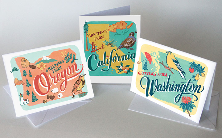
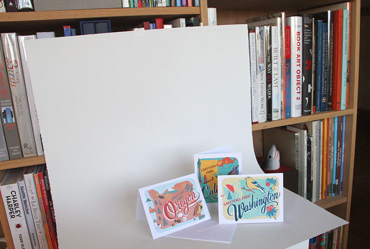
I’ll have more than just Mother’s Day cards at the craft fair, though—like these new greeting cards based on the 50 States series. Oregon and California are the newest, and they’re already flying off the shelf. West Coast represent!

Also, just so you know, I have an extremely high-tech setup for photographing my cards. Masking tape and a big ol’ sheet of paper: photo studio of champions.

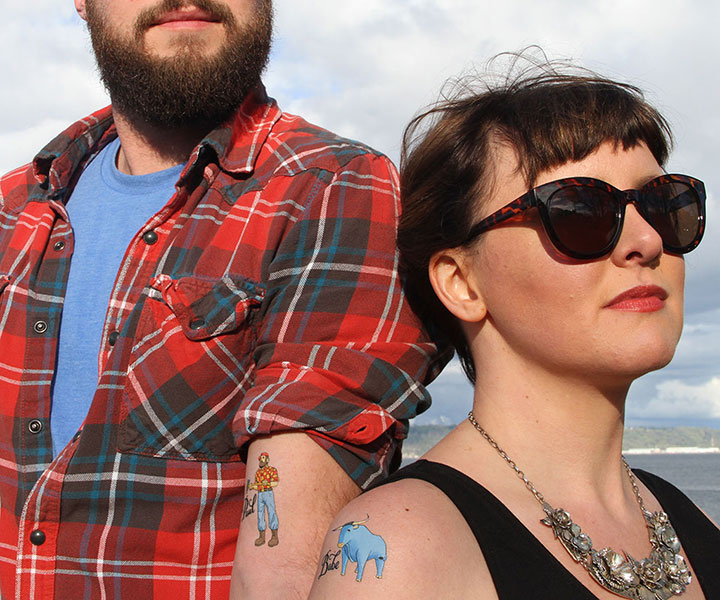
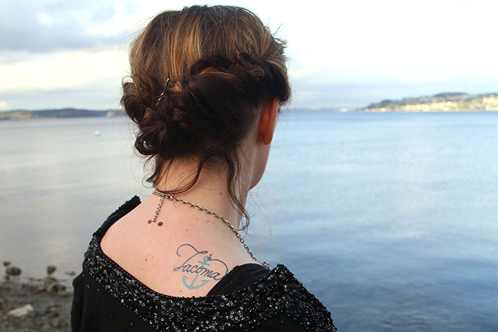
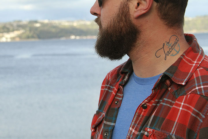
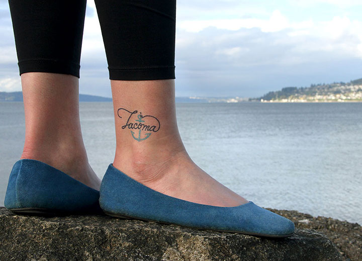
I did go slightly fancier when it came to photographing my temporary tattoos, thanks to my fancy friends Mariesa and RJ. The tattoos are my favorite product to develop these days, and it’s fun to see how people react to them at craft fairs—turns out it’s just as fun to take pictures of them as it is to design them.

I forgot to tell RJ that I wanted him to wear plaid to complete the whole lumberjack look he generally has going on—but I needn’t have worried. The guy read my mind, and came through like a boss.

And Mariesa’s outfit and gorgeous poise made my illustrations look super classy.

By the end of the day they were both saying they wanted to get the Tacoma tatt for real—

—and I can’t think of a higher compliment than that.
See you tomorrow at the craft fair!
April 24th, 2015

We’re ready for the Wayzgoose tomorrow—are you?

I’ve got a whole host of new paper goods ready to show you (look for some of them online next week), and you’ll find them at my Wayzgoose table this weekend. So if you’re local, strap on your printing apron and come on by for the biggest print event of the year.
See you there!
March 16th, 2015

It’s been more than four years since my last artist book (which, incidentally, I’m still working on)—I guess it’s been that long since I had something to say that warranted a multi-page art format. I suppose when it rains, it pours, though—because with this new project, there’s so much to say that an artist book can’t quite contain it all. This project has got words and images spilling out of me every which way. So fair warning: this is going to be a long post. There’s a lot to show you, and a lot to explain; there’s really no way to tell you this story without telling you all of it.
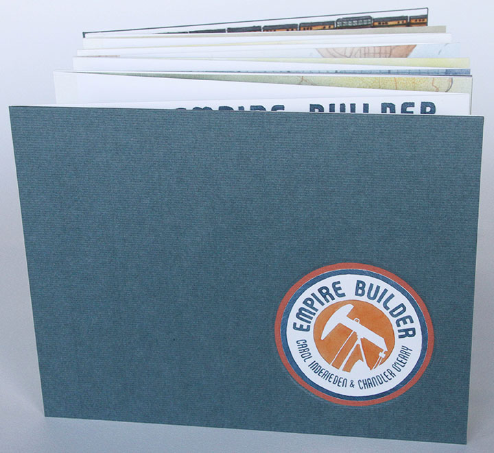
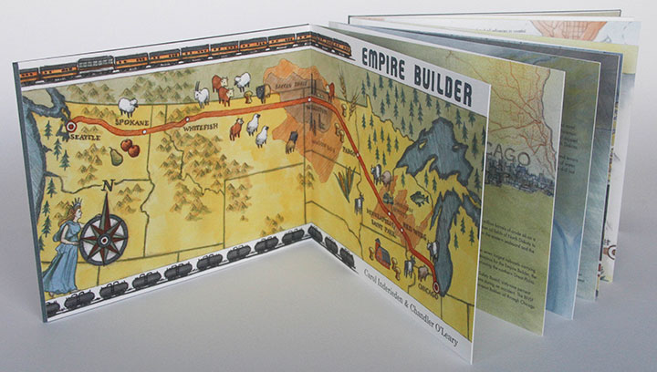
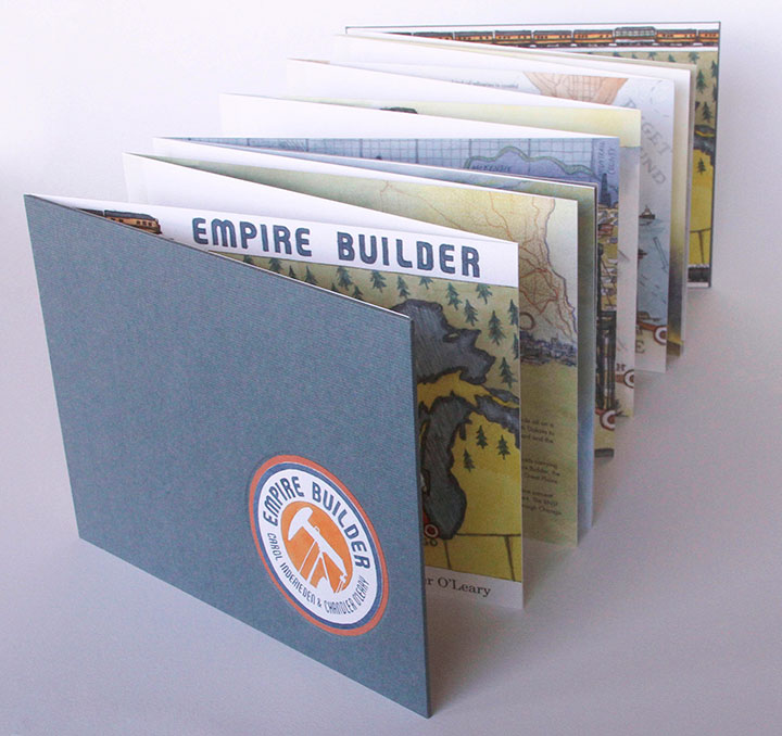
Before I get too far into it, though, I’ll give you the short version. Pictured above is my new artist book, entitled Empire Builder. It’s a collaboration with my friend Carol Inderieden, who is also a writer and illustrator. The book is about oil—that controversial new hydraulic fracturing (“fracking”) process, to be precise.
(If you want to stop reading now, I’ll understand. But if you’re stouthearted enough for a lot of backstory, let’s dive in.)

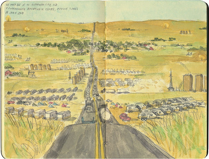
For me, it all started with this sketch.
The Tailor and I were in the middle of a cross-country road trip in 2011. One of our planned stops was Theodore Roosevelt National Park in western North Dakota. That part of the state was an old haunt of mine (I lived in North Dakota for several years), and I was excited to show my spouse a place I knew so well—or at least, I once knew. When we got there, I was utterly unprepared for how quickly and drastically the place had changed. I knew the oil boom had begun there, but I had no idea I’d find the landscape almost unrecognizable.
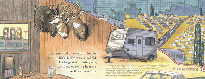
The once desolate highway was nearly at a standstill with traffic. Every hillside was occupied with RV camps and oil platforms, all built around the process of extracting crude from the Bakken Shale below ground. It was the end of the work day, so there were people everywhere—and we felt conspicuous with our out-of-state plates and tree-hugger-model car. Needless to say, I didn’t feel comfortable taking photos with my giant (and not at all discreet) camera. So instead I pulled out my sketchbook and jotted down the scene, right there in the moving vehicle, while the Tailor drove. It’s the only image I captured of the oil fields, but I still look at this and remember every detail of that afternoon.

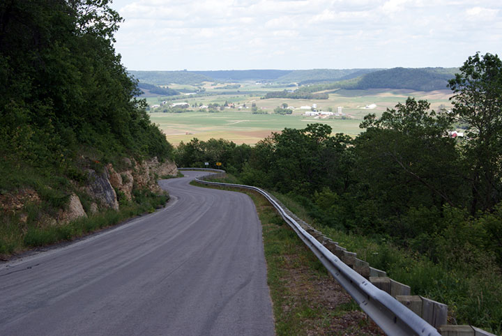
A little later I was relating the story to Carol, and she knew all too well what that day felt like for me. Carol lives in western Wisconsin, in an area called the Driftless Region—so named because unlike the lands surrounding it, the area was never glaciated during the last ice age. So Carol’s neck of the woods has a dramatic beauty to it, with deep valleys, swift rivers and sheer cliffs—a landscape very different from the rest of the state (this is her photo, by the way). The Driftless Region is also unique in that the bedrock there is rich in silica—something that has suddenly become extremely valuable to the new oil industry. Carol explained to me that in the past few years, oil companies have been buying up farmland in her area for strip mining, and excavating huge quantities of silica-rich sand for use in the frac drilling process in the Bakken oil fields. What I glimpsed in one afternoon in North Dakota, my friend has watched unfold on a daily basis, right in her back yard.

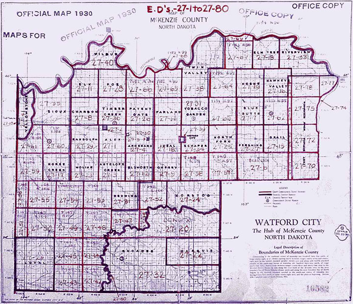
Her story, and what I saw in North Dakota, reminded me of what I’d read about the pioneer days—of dramatic land grabs, of politicians carving up maps of regions they’d never see in person, of arbitrary grids imposed on wild landscapes.
Anyway, fast forward a few months more, and I start seeing local newspaper stories about Bakken crude oil trains arriving in Seattle and Tacoma in huge numbers, and how devastating a derailment, spill or explosion here could be. All of a sudden, the fracking industry was in my back yard as well—not just some faraway place I happened to have personal memories about.
So I did what I always do: I started thinking about how I might turn my thoughts into an art piece. I called Carol and asked her if she might want to collaborate on a project about all of this. It wasn’t long before we decided on an artist book—which would end up taking us on a two-year odyssey before it was finished.

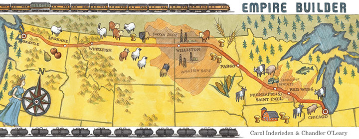
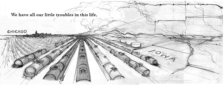
We wanted to link these three regions (the Driftless Area, the Bakken Shale, and the Pacific Northwest) together somehow for our book, and we had a perfect, ready-made means by which to do so: the railroad. Not only was there a train that stopped in all three places (and both Carol and I have traveled on that train), but we soon learned that the entire supply chain for the frac industry followed the path of the Empire Builder railroad line, from Chicago to Seattle. We couldn’t believe how perfect it was.

The railroad ended up becoming the backbone of every part of our book: concept, historical framework, even physical structure.

Whenever we weren’t sure what to do, the railroad brought us back to center, and kept our sequence in order.

What proved to be more difficult was just which story to tell within the pages. As you can see by this already out-of-hand blog post, we had a lot to say, and we couldn’t possibly say everything. We didn’t just want the book to be a 20-page rant on our feelings about the environment, nor a didactic explanation of how the frac process works. We wanted to show, rather than tell. We wanted to make our readers fall in love with these landscapes as we have. We wanted to provide evidence of the consequences of the oil boom. And we wanted to create a tangible link to history, because all of this has happened before. But our text and images were coming up short; we needed something extra to tie everything together.
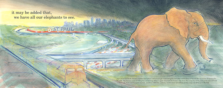
Carol came to the rescue, by finding a short quote that embodied the mood we wanted to get across. It added an air of foreboding to the piece, and it worked perfectly with all the allegorical images we were throwing around. And here’s the wacky thing: the quote is from the New York Times. In 1861. And it fits so well with what’s happening now that it easily could have been written yesterday. Here’s the quote:
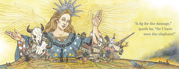
We have all our little troubles in this life, and for those who are not too proud, to use a popular phrase, it may be added that we have all our elephants to see. It is narrated of a certain farmer that his life’s desire was to behold this largest of quadrupeds, until the yearning became well nigh a mania. He finally met one of the largest size traveling in the van of a menagerie. His horse was frightened, his wagon smashed, his eggs and poultry ruined. But he rose from the wreck radiant and in triumph. “A fig for the damage,” quoth he, “for I have seen the elephant!”

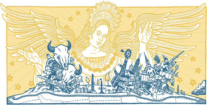
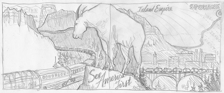
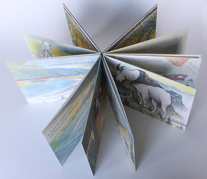
In the end, we ran the quote in pieces throughout the length of the book—and paired it with illustrations chock full of historical allegory (as well as allusions to old train advertisements, wartime propaganda, and current events). Explaining it all would make this even longer a post than the novel it already is, so I’ll just present our essay at the end of the book to give you the full context behind the quote.
• • • • • • • • • • • • • • • • • • • • • • • • • • • • • • • • • • • • • • • • • • • • • • • • • • • • • • • • • • • •
The preceding quote, from an 1861 New York Times editorial, highlights a phrase popular in America during the latter half of the nineteenth century. “Seeing the Elephant” was a figure of speech that came to embody the pioneer experience during the era of westward expansion. To see the elephant was to embark on a quest for riches and prosperity. It alluded to the danger and excitement associated with seeking one’s fortune in an unknown land. The elephant is an illusion, an impossible promise like a desert mirage that disappears as one moves closer. “Seeing the Elephant” later became synonymous with the bitterness and disappointment settlers experienced as they watched their dreams turn to ashes. During this time, the idea of Manifest Destiny — the 19th century notion that Americans possessed the divine right to claim all of North America, by virtue of their moral superiority — was also born and sometimes depicted as the mythical goddess Columbia, leading brave settlers westward.
“Seeing the Elephant” gradually fell out of the vernacular, yet the sentiment endured as the double-edged sword of the American Dream. Evidence of this can still be found in every corner of the West. Prairie homesteaders planted tree claims as a winning bet against Uncle Sam and lost. Tenement families in the East sold everything to migrate westward and buy into the myth of dry-land farming. Wildcat prospectors gambled their lives for oil, silver and gold. Families in the roaring twenties bought on credit, stacking the deck with status symbols before losing it all in the Great Depression. Suburban subdivisions, once symbols of postwar prosperity, have now become outposts of the working poor. The cycle of boom and bust has been resurrected so many times that the Elephant has grown in size from a distant vision to an omnipresent burden, stretching from sea to shining sea.
If the American map were the Elephant writ large, it is the railroad that breathes life into the creature. Throughout the last century of rail development, the anatomical structure of a complex organism has evolved. Today spurs and trunk lines follow a vascular system that carries a lifeblood of raw materials across the nation in a never-ending stream of freight. While the Elephant’s lungs fill with natural gas, its veins run gold with domestic oil and its heart beats ever faster in the Bakken Formation of western North Dakota.
Even in today’s age of dwindling resources and dire environmental warnings, Americans still see the land as a bottomless well to be tapped. In the Bakken, a new frontier has opened and is flooded once again with a new generation of fortune-seekers. “Man camps” dot once-empty hillsides and roughnecks push the region’s infrastructure to the breaking point. Remote rural highways and railroad lines are now choked with traffic. Flames from gas flares and oil slicks bathe the grassland in an eerie, unnatural glow. Yet while the land flows with modern milk and honey, only a few actually taste its richness. Companies grow fat while laborers vie for just a few drops. Communities swell to accommodate the boom, yet risk collapsing as soon as the inevitable bust occurs. All the while, the Elephant still waits beyond the next horizon and Columbia still beckons, just out of reach.
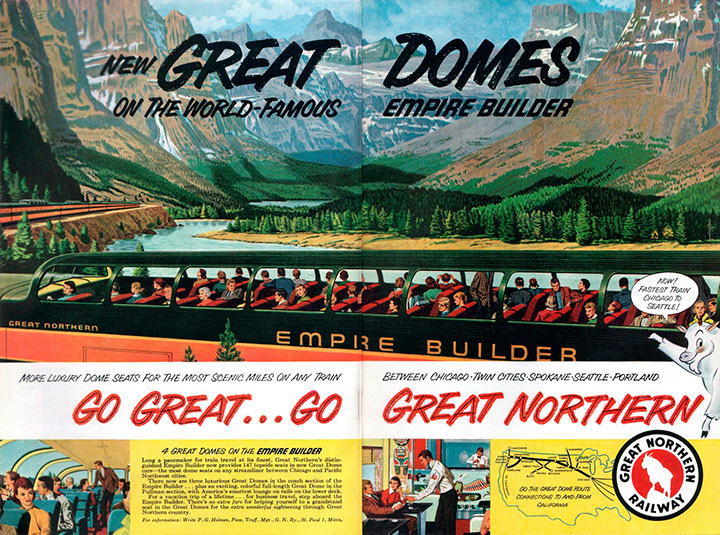
The backbone of the modern Elephant is the railroad line from Chicago to Seattle — incidentally, the same line that carries the Empire Builder passenger train. This train is aptly named for the exploits of James J. Hill, the railroad lumber baron who grew rich transporting timber and other raw materials from the Pacific Northwest to the cities and industries of the Midwest. Today one can ride the Empire Builder from one end of Hill’s domain to the other, and witness every element of the fracking process along the way. In the early 20th century, the Empire Builder encouraged travelers to “See America First” and marvel at the wonders of the natural world speeding past their windows. Today’s rail passengers watch the new Industrial Revolution rolling by.
This book is an attempt to articulate our dismay at the rapid transformation of a West we know and remember. We live and work at opposite ends of the Empire Builder railroad line: Carol in the Driftless Region of Wisconsin, where the bluffs and hillsides are being strip mined for frac sand; and Chandler in the Puget Sound area of western Washington, where Bakken oil is refined and shipped to other ports by tanker vessel. We both have personal ties to the northern Plains, though recent events render the region unrecognizable when compared to our memories. Still, the railroad connects us to each other and the landscapes we love. For the pioneers of the new era, the rhythm of the railroad is the marching song of progress — but for us, it is a lament.
• • • • • • • • • • • • • • • • • • • • • • • • • • • • • • • • • • • • • • • • • • • • • • • • • • • • • • • • • • • •

One of the best things about working with Carol on this project is that we both draw—and our aesthetics are not dissimilar. So we could match each other’s style to keep the book consistent throughout—without it being obvious who did which illustration. But that wasn’t the problem.

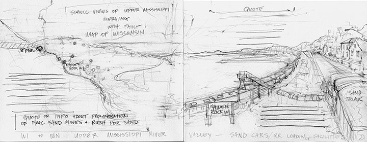
The problem was that we were originally thinking this book would be letterpress-printed. That would have meant our final illustrations would have to be extremely flat and graphic in style, to accommodate the limitations of hand-printing. This is a mockup I did at an early stage of our “Manifest Destiny” image. I hated it, and I didn’t know why at first. But then Carol and I figured out that what we really responded to was the loose, quick style of the sketch I did in North Dakota four years ago—which mirrored all our process pencil sketches for the book. The letterpress mockup I did above felt too slick, too…”set in stone.” It felt like the wrong medium to convey a phenomenon that is happening so rapidly that even the news media can’t keep up with it.

Sketching felt like the right medium—so we changed tack, and made our book a sort of Sketch Storybook instead. We let go of letterpress printing, and decided to digitally print the book—which freed us from all limitations when it came to the imagery.

This way, we could preserve the immediacy of our sketch drawings—

—and we could paint in watercolor right on top of our sketches, and reproduce each image in full color (another thing letterpress printing doesn’t allow).

The finished product is an accordion-bound book that reads like a map—tracing both the route of the Empire Builder train and the path of industry and destruction, in one long, unbroken line. When fully open, the book is fifteen feet long.

We printed a limited edition of just 50 books; each one is digitally printed on archival, 100% cotton paper, and hand-bound in hardcover with a paper slip case. Price is $600, plus shipping; we’re taking pre-orders on a first-come, first-served basis, and we’ll begin shipping finished books in April.
If you’d like to reserve a copy, drop me a line at chandler [at] anagram-press [dot] com .

And if you’d like to see the book in person, it’s already making its way around the country to various shows, including a groundbreaking national exhibition on the Bakken oil boom at the Plains Art Museum in North Dakota. Here’s the scoop on where it’s been and where it’s going, so far:
Fifth CODEX International Bookfair
February 8-11, 2015
Craneway Pavilion, Richmond, CA
Bakken Boom: Artists Respond to the North Dakota Oil Rush
Group Exhibition
On display through August 15, 2015
Plains Art Museum, Fargo, ND
CODEX Finds
Group Exhibition
March 24 – April 25, 2015
23Sandy Gallery, Portland, OR
Carpe Librum
Group Exhibition
April 3-26, 2015
Bainbridge Arts & Crafts Gallery, Bainbridge Island, WA
2015 New York Antiquarian Book Fair
Empire Builder represented by the Kelmscott Bookshop
April 9-12, 2015
Park Avenue Armory, New York, NY
5th Annual Puget Sound Book Artists Member Exhibition
Group Exhibition
June 4 through July 31, 2015
Opening reception: Thursday, June 4, 2015, 5:30 to 7:30 pm
Collins Memorial Library, University of Puget Sound, Tacoma, WA
EDITED TO ADD: more shows featuring Empire Builder:
Beyond Brand
Group exhibition
July 30 through September 5, 2015
Opening reception: Saturday, August 1, 2015, 7 to 9 pm
Form + Content Gallery, Minneapolis, MN
The Art of the Book
Group exhibition
June 17 through July 27, 2016
Sebastopol Center for the Arts, Sebastopol, CA
Bridging the Waters
Group exhibition
July 1 through August 21, 2016
Center for Fine Print Research
University of West England, Bristol, United Kingdom
Heavy Metal
Group exhibition
August 31 through October 1, 2016
Berkeley Art Works
Martinsburg, WV
Local Heroes: Book Artists of Washington State
Group exhibition
October 15, 2016 through May 2, 2017
Bainbridge Island Museum of Art
Bainbridge Island, WA
The Illustrated Accordion
Group exhibition
May 5 – 26, 2017
Kalamazoo Book Arts Center Gallery
Kalamazoo, MI
Re-Sisters: Books & Broadsides by Chandler O’Leary & Jessica Spring
Two-person exhibition
February 6 through March 23, 2018
Bryan Oliver Gallery, Whitworth University
Spokane, WA
conTEXT: Broadsides & Artwork by Chandler O’Leary & Jessica Spring
Two-person exhibition
March 3 through April 29, 2018
Antenna Gallery
New Orleans, LA
Rising Together: Artists’ Books and Prints with a Social Conscience
Traveling group exhibition
On view from 2018 through 2021
Fall/Winter 2018: University of Utah Marriott Library, Salt Lake City, UT
Spring 2019: Center for Book Arts, New York, NY
Fall 2019: University of Iowa Center for the Book, Iowa City, IA
Spring 2020: Hoffmitz Milken Center for Typography, ArtCenter College of Design, Pasadena, CA
Fall 2020: University of Puget Sound Collins Library, Tacoma, WA (see above)
Spring 2021: San Francisco Center for the Book (in conjunction with Mills College), San Francisco, CA
Frozen Warnings
Group exhibition on the climate crisis
February 1 through May 3, 2020
Bushel Collective Gallery
Delhi, NY
Empire Builder is also now housed in several permanent public collections, including:
– Library of Congress (Rare Book & Special Collections Division), Washington, DC
– Bainbridge Island Museum of Art, Bainbridge Island, WA
– Harvard University (Widener Library), Cambridge, MA
– Miami University Library (Havighurst Special Collections), Oxford, OH
– Minnesota Historical Society Library (Special Collections), Saint Paul, MN
– Newberry Library (Americana Collection), Chicago, IL
– Scripps College (Ella Strong Denison Library), Claremont, CA
– Stanford University (Green Library American History Collection), Palo Alto, CA
– University of Chicago (Special Collections Research Center), Chicago, IL
– University of Connecticut (Dodd Research Center), Storrs, CT
– University of Puget Sound (Collins Memorial Library), Tacoma, WA
– University of Utah (Marriott Library), Salt Lake City, UT
– University of Vermont (Billings Library), Burlington, VT
– University of Washington Libraries (Book Arts Collection), Seattle, WA
– Washington State Library, Tumwater, WA
Save
Save
March 15th, 2015

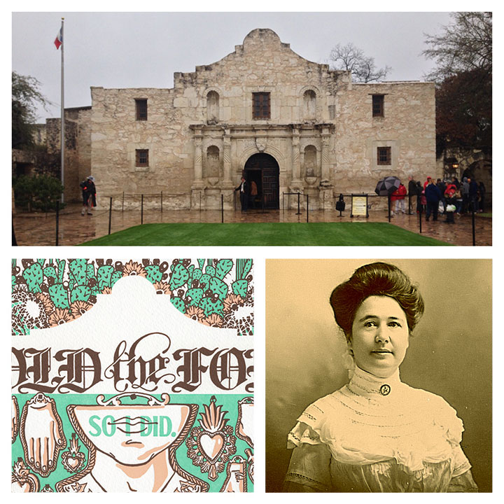
One of the highlights of my recent trip was finally getting to see an illustration subject in person. Back when Jessica and I created our On a Mission Dead Feminist broadside a few years ago, we did a ton of research about San Antonio and the Alamo—but neither of us had ever actually been there in person. So you can imagine how much I geeked out when I visited the place—especially when I saw a plaque explaining how our girl Adina De Zavala is responsible for saving and preserving the place.
Here’s hoping there are many more Dead Feminist field trips in the future!
February 20th, 2015

For our last broadside, we focused on a woman from the Islamic world; now we’re back with an homage to Judaica. The juxtaposition of the two pieces was no accident on our part. Yet the timing of world events was something we could never have planned. We originally meant to tie our new piece in with the 70th anniversary of the liberation of Auschwitz—last month, the anti-Semitic terrorist attacks in Paris gave us a terrible new perspective for our piece.
What really bowled us over is that the young woman we chose to highlight for the new piece underscores the relationship between the two events, the two time periods in history. You see, our gal is a historical figure, yet the world has only just discovered her. So here we present to you the words of a young writer, whose diary, along with her faith, carried her through one of the darkest times in human history:
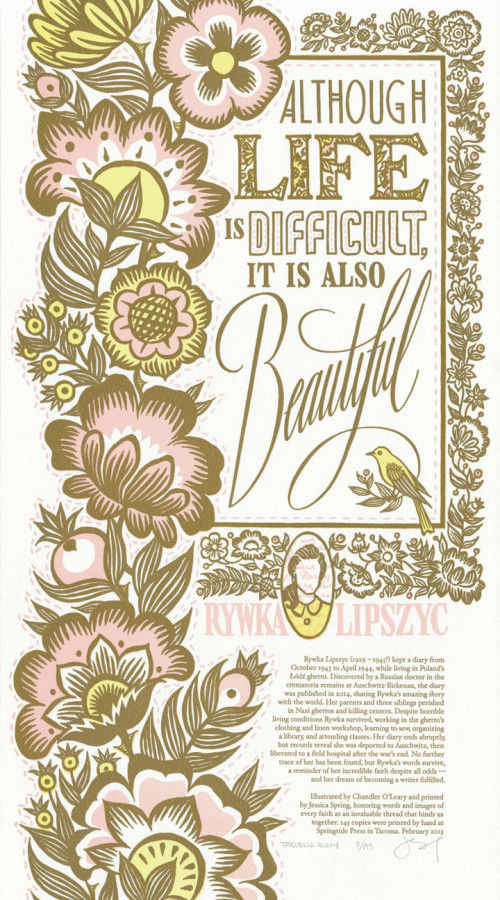
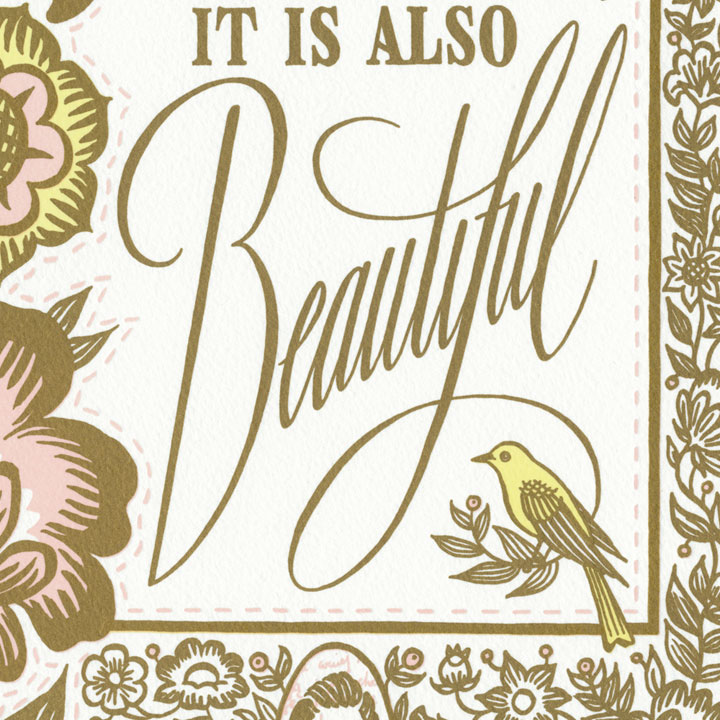
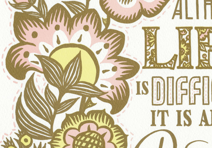
Although life is difficult, it is also beautiful. — Rywka Lipszyc (pronounced “Rivka Lipschitz”)

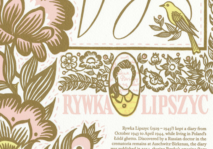
Rywka’s story is astonishing, if only for the fact that it can be told at all. Rywka was a teenager living in one of the worst Jewish ghettos of Nazi-occupied Poland during World War II. By the time she started her diary at age fourteen, she had already lost all but one of her family members. While working as a factory seamstress and caring for her younger sister, she poured her heart and faith into the pages of her notebook. At times the diary is a harrowing account of wartime hardship; at others, it reads like the missives of any normal, modern teenage girl. The pages are dense but not numerous: just a few months after it begins, the diary ends abruptly—and with it most of our knowledge of Rywka’s life. We know she was deported to Auschwitz a few months later; and that her sister was murdered upon arrival at the camp. We know she was liberated from Auschwitz by allied troops 70 years ago—but then her trail goes cold, like that of so many other victims of the Holocaust. Historians are sure she did not survive for long after the liberation, but that’s all they’re sure of: no further details of Rywka’s fate have been uncovered. No photo of her exists, nor any other trace of her life beyond the diary, a few registration records, and the memories of a trio of surviving cousins living in Israel.
What is truly remarkable is that the diary survived the war, the camps and the intervening decades. A Russian army doctor allegedly found the diary in the ashes of the Auschwitz crematorium. The doctor made a few notes in the margins, and then put it away in her closet at home—for the rest of her life. Upon her death, her son found the diary, and then he stashed it away for several more decades. When he died, his daughter—the granddaughter of the army doctor—traveled back to Russia from the U.S., and found the diary among his effects. This time, however, she knew just what to do with it. She took it back with her to the States, and turned it over to the JFCS Holocaust Center in San Francisco. They then authenticated and translated the diary—and published it in book form less than a year ago.

Jessica and I were able to get a hold of the new publication at the Pacific Lutheran University library (many thanks to Holly Senn for tracking the book down for us!). In reading the text, we were struck by Rywka’s use of metaphor—particularly her mentions of flowers growing among thorns. So we took Rywka’s imagery and wove the broadside’s design and theme around it.
Common Threads is a winter garden of pale pastels and subtle metallic golds. The delicate colors and shining metallic ink (which includes real gold in the formula) represent the fragility and preciousness of life among the thorns of war and persecution. The floral motif echoes themes from Rywka’s diary, and stands for the resilience of the Jewish people—whose culture has flourished beautifully despite some of the worst trials endured by humankind.
The overall design of the broadside is based on Rywka’s dual cultural heritage. The border is reminiscent of Jewish embroidered challah covers and sabbath cloths, while the style of floral illustration is derived from Polish folk florals. The stitched lines are a nod to Rywka’s trade as seamstress, which she viewed optimistically as a way to move forward and make a living in a future beyond wartime.

To help fight anti-Semitism worldwide and defend civil rights for all, we are donating a portion of our proceeds to the Anti-Defamation League — one of the nation’s top human and civil rights organizations for over 100 years.
• • • • • • • • • • • • • • • • • • • • • • • • • • • • • • • • • • • • • • • • • • • • • • • • • • • • • • • • • • • •
Common Threads: No. 21 in the Dead Feminists series
Edition size: 145 prints
Poster size: 10 x 18 inches
Printed on an antique Vandercook Universal One press, on archival, 100% rag (cotton) paper. Each piece is numbered and signed by both artists.
Colophon reads:
Rywka Lipszyc (1929 – 1945?) kept a diary from October 1943 to April 1944, while living in Poland’s Łódź ghetto. Discovered by a Russian doctor in the crematoria remains at Auschwitz-Birkenau, the diary was published in 2014, sharing Rywka’s amazing story with the world. Her parents and three siblings perished in Nazi ghettos and killing centers. Despite horrible living conditions Rywka survived, working in the ghetto’s clothing and linen workshop, learning to sew, organizing a library, and attending classes. Her diary ends abruptly, but records reveal she was deported to Auschwitz, then liberated to a field hospital after the war’s end. No further trace of her has been found, but Rywka’s words survive, a reminder of her incredible faith despite all odds — and her dream of becoming a writer fulfilled.
Illustrated by Chandler O’Leary and printed by Jessica Spring, honoring words and images of every faith as an invaluable thread that binds us together.
Now available in our new web shop!
• • • • • • • • • • • • • • • • • • • • • • • • • • • • • • • • • • • • • • • • • • • • • • • • • • • • • • • • • • • •

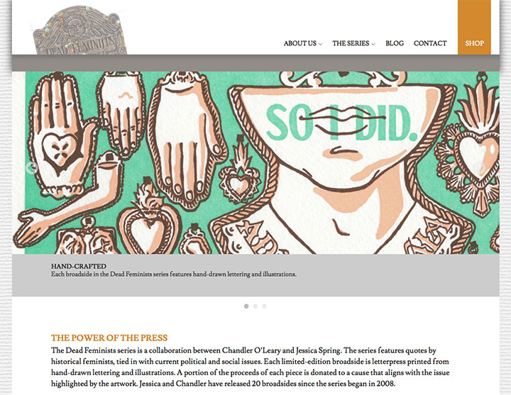
Speaking of which, we finally have a website dedicated to the Dead Feminists series. It has been years in the making, and while we haven’t quite worked out all the kinks yet (bear with us on that), we’re thrilled to be up and running at last. Many thanks to our amazing web designers, Elizabeth Anderson and Paul Ferguson, for making it all happen!
On the new site you’ll find the stories behind each broadside in the series, glimpses into our process, information about our live events, and of course the new web shop (which contains all our broadsides and postcards). So head on over and take a gander!

![Chandler O'Leary [logo]](https://chandleroleary.com/wp-content/themes/chandleroleary/images/logo.png)
