Blog
January 31st, 2016
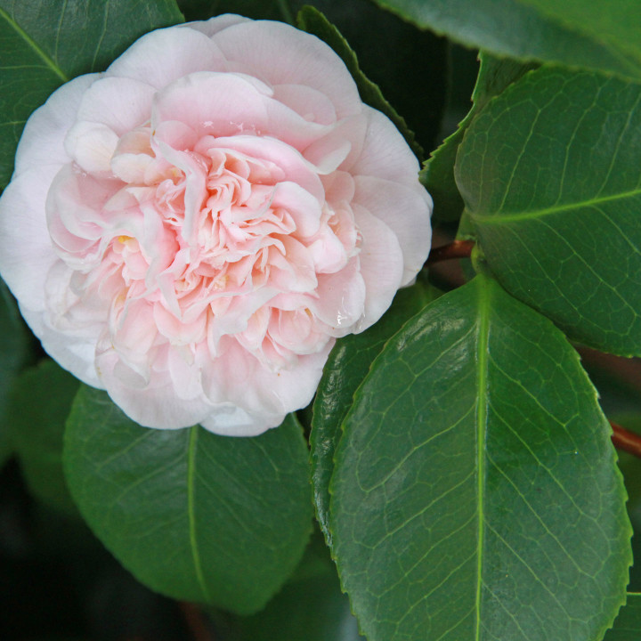
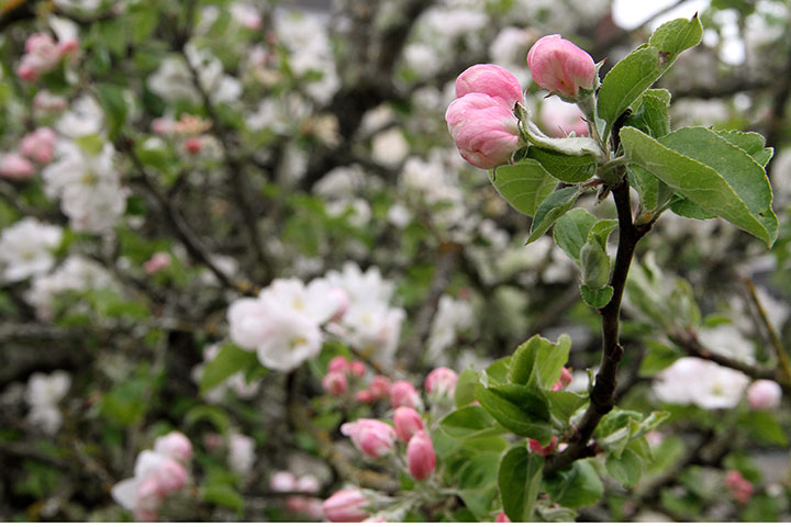
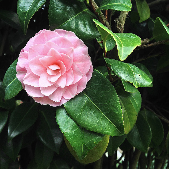
It’s been a tough couple of weeks around here, and it’s the time of year when the Northwest is shrouded in a dark silver cloud most days. But just out my studio window is an early-blooming camellia, giving me a pop of spring color just when I need it most.
May 25th, 2015


Hope yours was glorious!
May 16th, 2015

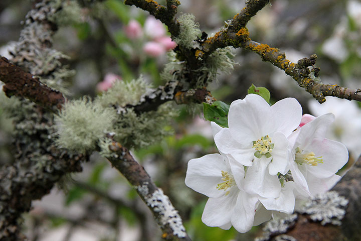
I took this photo of one of our apple trees a couple of weeks ago, when the blossoms were at their peak.

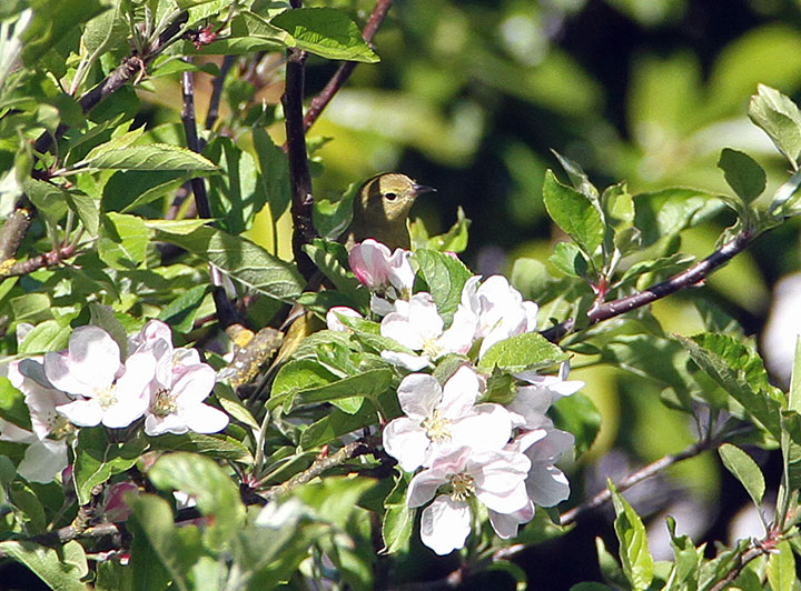
Now the tree just has a couple of blooms still hanging on—

—but if you look closely, it has other surprises in store.
May 4th, 2015

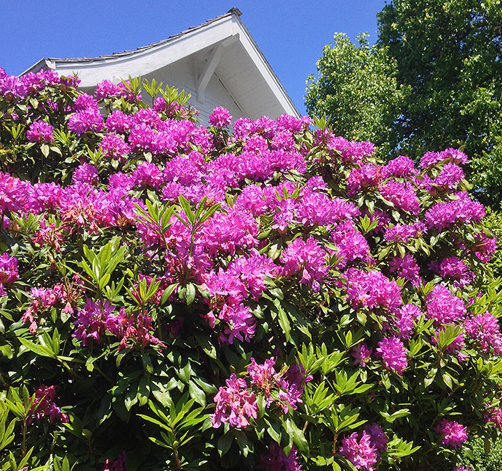
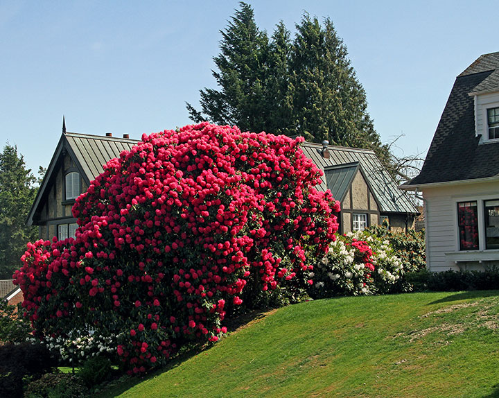
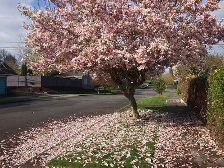
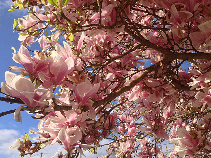
The rhododendroon is the state flower of Washington, so it’s not like I’m not used to seeing them around town. But this pink monster, which practically dwarfs our neighbor’s house, is something else again.
Spring was never my favorite season before we moved to the Northwest (I’m more of an autumn gal in general), but what we lack here compared to the spectacular fall foliage of the East, we more than make up for with our spring color. I’m a convert—and reveling in all this gorgeous pink.
March 21st, 2015

I might have a personal preference for autumn, but spring really is the Northwest’s best season. The days are rapidly getting longer, everywhere you look is just bursting with color, and—my favorite part—the season lasts and lasts, for months on end.

I have acres of work before me in the studio, but I can’t help spending part of my days on long walks around my neighborhood—I don’t want to miss a second of all this gorgeous pink.

Today, though, I’m indoors at the Flea Market. So if you’re out on the town today and taking in the blossoms, stroll on down to the Fieldhouse and say hello, won’t you? You’ll bring a breath of spring in the door with you.
March 27th, 2014

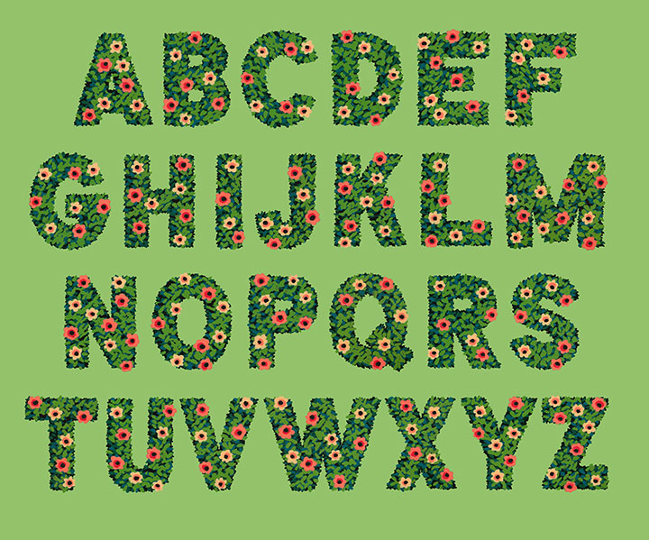
Look! I made an alphabet!
It’s funny—I almost never design an entire alphabet. In general, lettering projects just don’t really work like that. Most of the time, a letterer(erer) designs only the letterforms required for the word or phrase they’re lettering. That’s really the best way to create letter styles (which are not the same as fonts!) that really fit what the text is trying to “say.” You’re not designing an alphabet and then making it work for a bit of text—you’re taking that bit of text and giving it a voice.

But this time, I did things differently. I wanted to create some botanical lettering, but I wasn’t sure what I wanted to use it for—so I went whole hog and started with the entire alphabet.

Lately I’ve been doing a lot of work with a new (to me) medium: acrylic ink. It’s what I used to create the You’ll Like Tacoma and Love Birds series. What I love about acrylic ink is that unlike watercolor, it’s opaque—and infinitely easier to wrangle than the more traditional opaque medium of gouache.
When you work with watercolor alone, you have to start with the lightest colors first, and build up darker ones in layers. Whites are the white of your paper, and once you add pigment to an area, you can never return back to that pristine white. It teaches you to think in a subtractive sense, where you sort of “cordon off” the areas you want to stay white, and carefully build everything else up around them. I love working with watercolor, but it takes years and years of practice to feel proficient at it, and it’s not a medium that’s forgiving of mistakes.
I find opaque media to be far more freeing, and the look more crisp. (I also like to combine acrylic ink with watercolor in the same painting—the best of both worlds!) But what I love best about it is that I don’t have to work from light-to-dark—I can go in reverse! Many of the mid-century illustrators I admire (Mary Blair, Eyvind Earle, Walt Peregoy, Ralph Hulett, etc.) painted with opaque media, so I looked at a lot of landscape paintings done for animation backgrounds for clues on technique. That’s when I figured it out: dark-to-light, not light-to-dark.
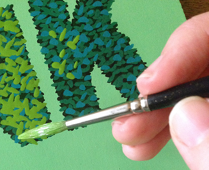
For my alphabet, I started with a black hedge silhouette, and added leaves (above) in increasingly lighter greens and blues. I think by the end there were 9 or 10 layers of paint in the finished lettering.

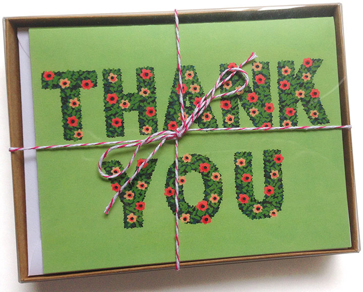
I was so grateful for the epiphanies Earle and Hulett had given me that suddenly, what I wanted to do with the alphabet became clear: thank-you cards!
To hedge my bets (sorry) I’ve packaged them up both individually and in pretty little box sets of 8. You can find yours in the shop!

August 2nd, 2013

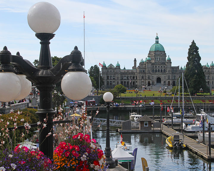
I just got back from a return trip to Victoria—this time with the Tailor in tow.


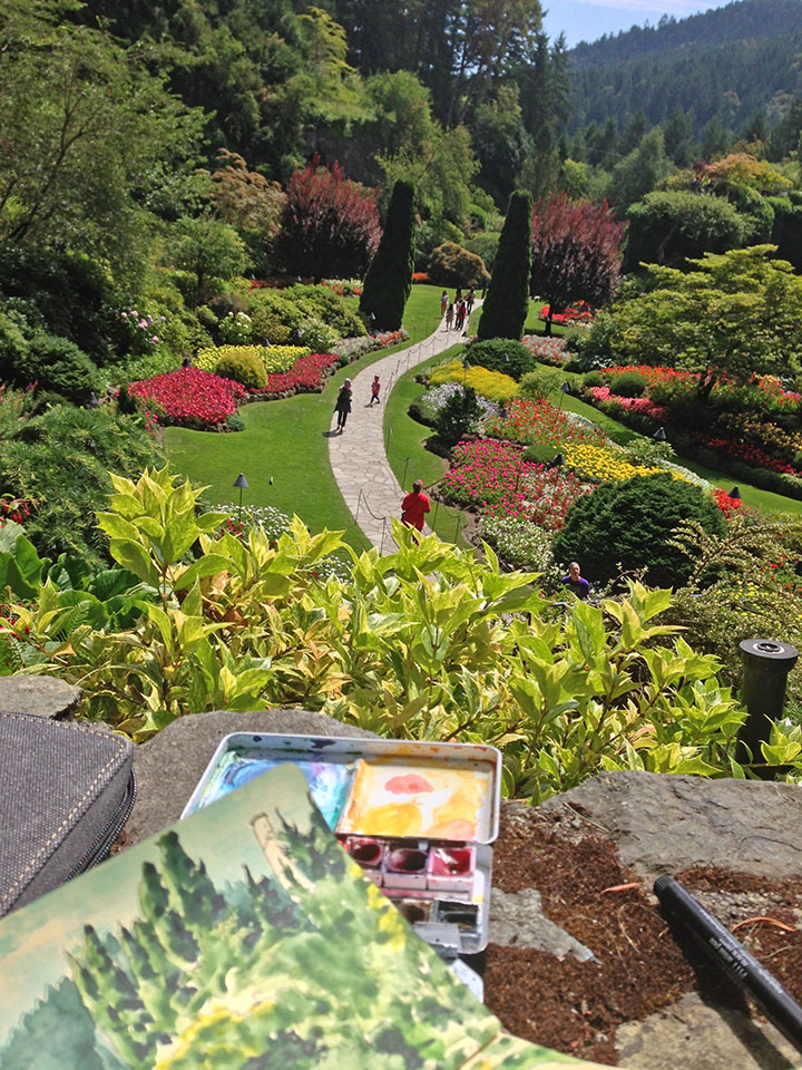
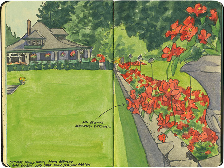
We were only there for a couple of days, but long enough for me to see the Gardens—and sketch them—

—in their summer colors.

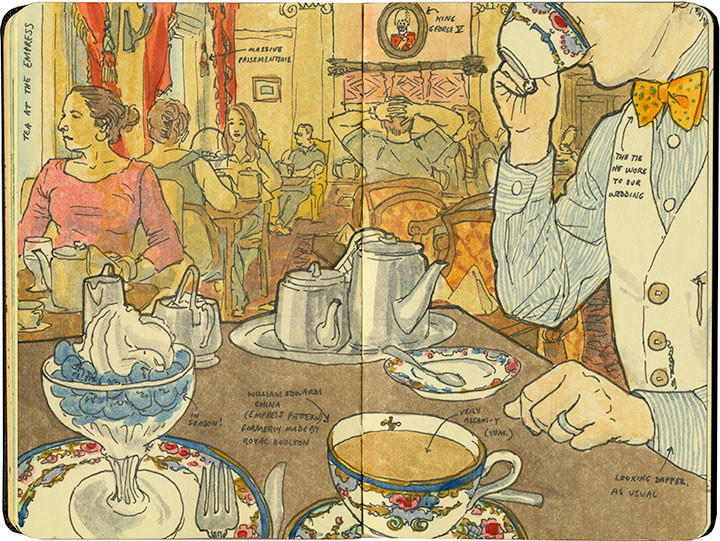
This was the Tailor’s first trip to Victoria, so I got to relive some favorite experiences with him.

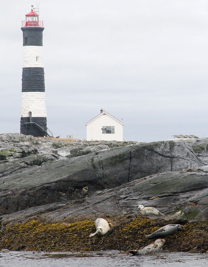
Others, on the other hand, were new to both of us—

—and some were complete surprises.

Best of all, I think we had a chance to see the city in its best light.
August 22nd, 2012

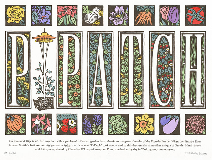
A couple of months ago I was asked to create a letterpress broadside for a collaborative print portfolio for a show in Asheville, put together by the Ladies of Letterpress. The theme was Expanding Communities—beyond that, we could do anything we wanted. So I focused on a unique element of Seattle’s community: the P-Patch.
A P-Patch is a community garden like any other—and completely unlike any other. The name comes from the Picardo family, who converted their farm into the city’s first truly communal garden in the 1970s. So to this day, if you life in Seattle, you tend your p-patch, not your garden plot. That just charmed the heck out of me, and I wanted to create a tribute to it.
P-Patch is completely hand-lettered, as well as hand-painted with watercolor, in homage to the hard work required to maintain a thriving garden. Many thanks to the Ladies of Letterpress gals for inviting me to be a part of the portfolio—I can’t wait to see what everyone else came up with!
February 4th, 2012

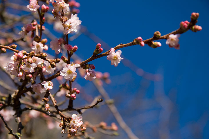
And just like that, the season turns. I don’t know what that Punxsutawney Phil guy thinks he knows, but his predictions rarely apply here. Spring comes early in the Northwest, and yesterday I spied this little harbinger of good things to come. I’ll take the predictions of the trees over any prognosticating rodent.
The sun’s returning in earnest now, too—not just with this batch of unexpected blue skies we’ve had lately, but with noticeably longer days. Everyone here is just a little more cheerful as a result. Suddenly, everywhere are smiles and open windows, as we all breathe in that first hint of fresh spring air.
December 23rd, 2011

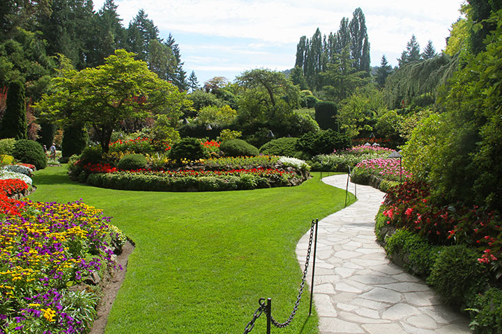
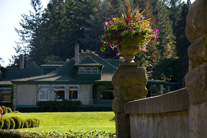
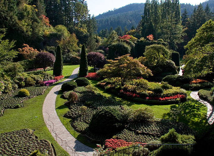
The three days Nicole and I spent in Victoria were star-studded with beauty and color, but nothing was quite so breathtaking as the Butchart Gardens, just a few minutes north of the city.
Now a Canadian National Historic Site, the Gardens were the private grounds surrounding the home of Robert and Jennie Butchart. So the place didn’t feel like your average botanical garden or arboretum. There were no exhibit signs, no identifying plaques next to the different flower types, nothing that created the feel of a museum—instead there was the perfect illusion of taking a stroll around the grounds of a palace, or traveling back in time to the days of manor houses and perfectly-maintained estates. Yet this was no exclusive world; the estate is named “Benvenuto” (Italian for “welcome”). The Butcharts welcomed to their home any visitor who wanted to see it, and they were famous for their hospitality. Jennie had reportedly served 18,000 cups of tea to friendly strangers before her family convinced her to charge a nominal admission fee.

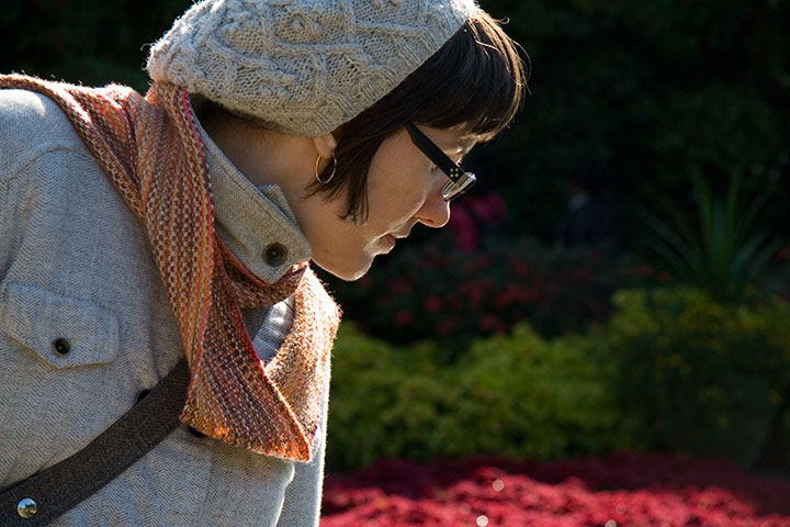
It wasn’t hard to see why the visitors came in droves. Nicole wandered off to admire the variety of blooms, but I stood mesmerized by the light.

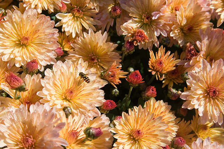
Usually gardens in the Northwest have a somewhat otherworldly glow, what with our silver skies and rainy mists. But in full sunshine, the place was an absolute riot of color.

I could have spent the whole day just losing myself in the jewel tones all around me.

But Jennie Butchart’s garden is so much more than a flashy display of color: it’s also a staggering feat of environmental design and land reclamation. Jennie was way ahead of her time.
You see, the Butcharts’ land began as a turn-of-the-century limestone quarry, which supplied Robert’s cement company with raw material. When the quarry was exhausted, all that was left was a barren pit. It was Jennie who had the idea to transform an industrial wasteland into a thing of beauty. She had many tons of topsoil brought in by horse and cart, and over the course of several years, she gradually, patiently reclaimed the land and shaped it into a thriving garden.
The result is the stunning Sunken Garden, a masterpiece of earthworks and living sculpture. I was expecting the Queen of Hearts to appear around a bend in the path, a flamingo tucked under each arm. The perfect English garden.

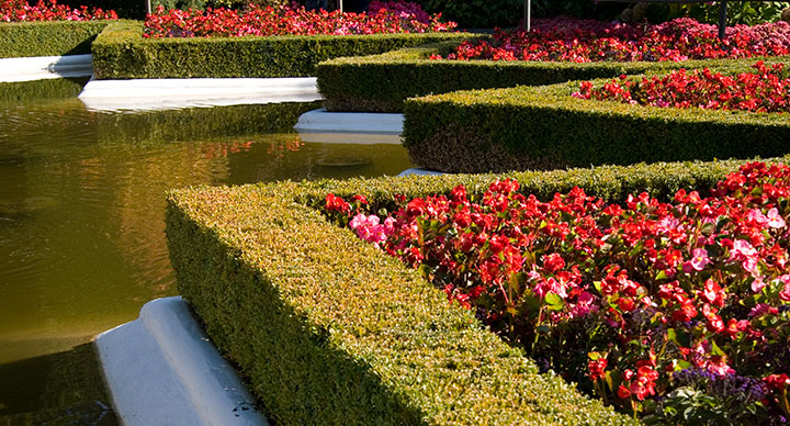
As I continued along the path, suddenly I found myself transported to Versailles—

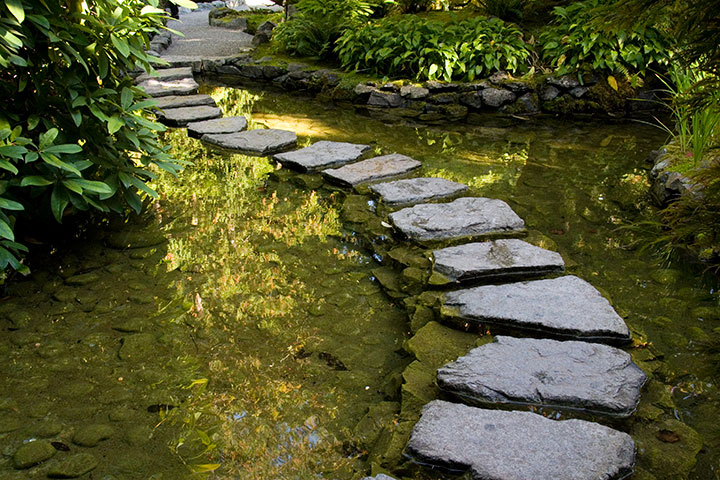
—and then to Japan.

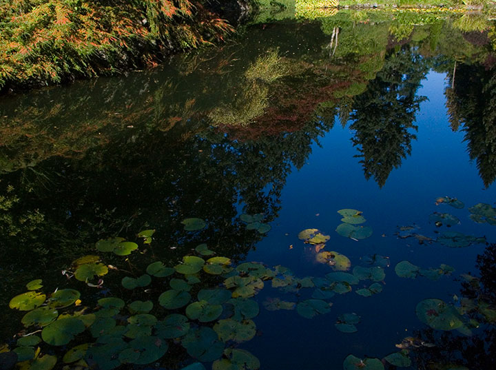
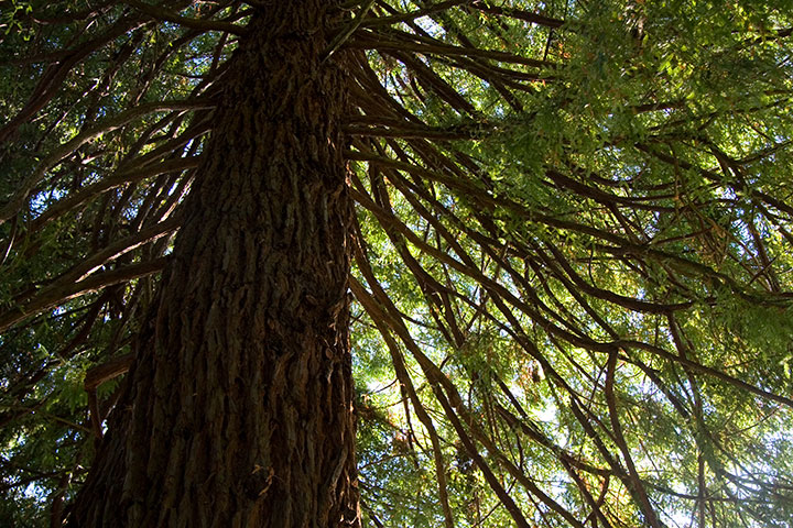
Lest I lose my bearings, though, reminders that this is the Northwest were ever-present.

Jennie’s garden has evolved far beyond a labor of love. It’s truly a national treasure, and an international curiosity—we heard well over a dozen different languages spoken that day, and struck up conversations with people from five different continents.
Yet despite the flocks of travelers, it was never difficult to find a moment of peaceful, contemplative solitude. I can’t wait to return, and eventually visit Jennie’s garden in every season of the year.


![Chandler O'Leary [logo]](https://chandleroleary.com/wp-content/themes/chandleroleary/images/logo.png)
