October 7th, 2011

To hear the ancient Mayans tell it, I’d best hurry up with my unfinished projects—because time is running out.
Putting the veracity of such tales aside, this prophecy stuff sounds like a fun illustration topic. So my good friend and old-tyme RISD buddy Thomas Quinn had the ingenious idea to count down our remaining days in style by designing and curating a 2012 Apocalypse Calendar, featuring a different artist for each month. The result of all his hard work (read: herding cats) is a fabulous collection of artwork, a beautifully designed finished product (great job, T.Q.!)—and possibly a niggling sense of dread as the days count down.

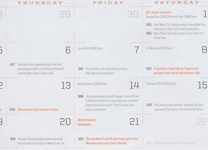
Oh, and here’s a sneak peek of the December page in the calendar—look closely and you’ll see the End Times already conveniently marked for you. Thanks for the heads-up, Mayans!
Besides the added bonus of working alongside both old friends and rock-star artists I’ve admired for years, I loved the fact that Tommy let me interpret the theme however I pleased. Rather than going down the illustrated path of mass carnage or Biblical archetypes (I figured those topics would be well covered by the other folks), I decided to time-travel back to my favorite mass-hysterical era, the 1950s.

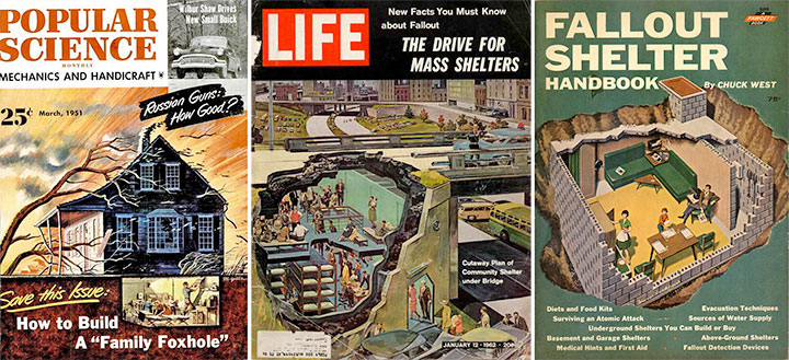
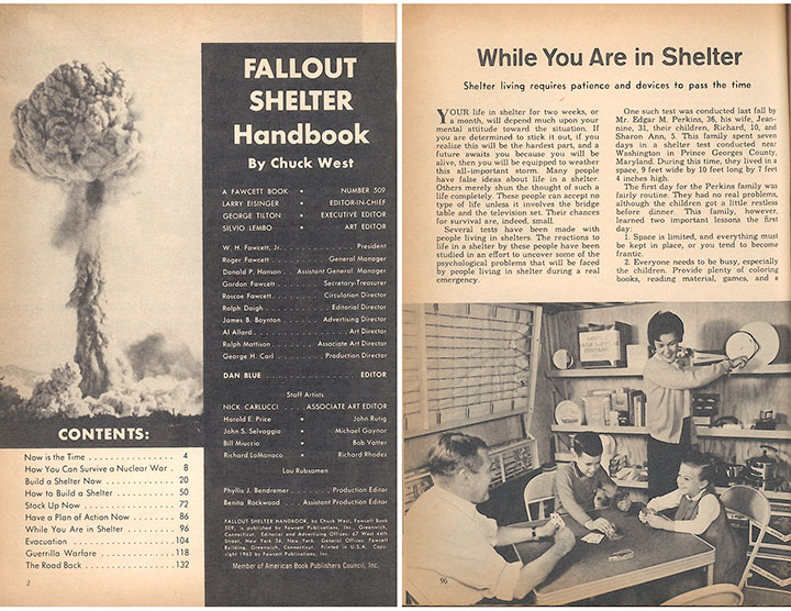
I did a little research, and dug up a whole bunch of vintage advice on how to survive the end of the world—including a handbook on how to build a fallout shelter, and how to keep yourself amused once you’re in there.

This thing just cracked me up. It has all kinds of “expert” wisdom (like how to fend off the roving bands of contaminated neighbors who will inevitably stop by to borrow a cup of sugar) and cheery photos of housewives preparing dinner with a can opener while dear ol’ Dad bonds with the kids.

Which, of course, reminded me of my other favorite relic from the 50s: illustrated cookbooks. Talk about a goldmine! Everybody from uncredited production interns to the late, great Charley Harper did a cookbook back in the day. The fact that these illustrators were often limited to cheap, two-color printing actually made for surprisingly innovative and beautiful results.
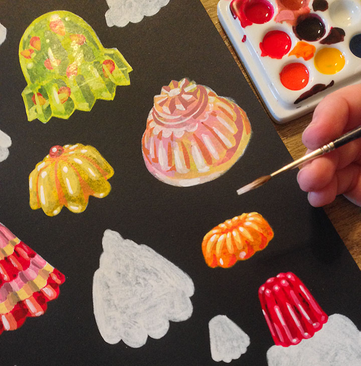
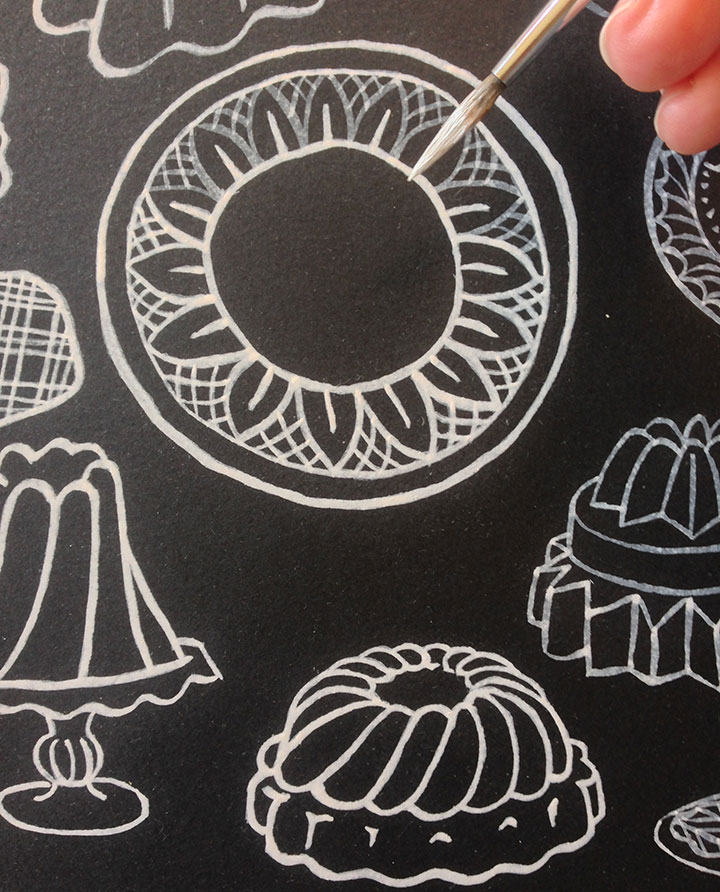
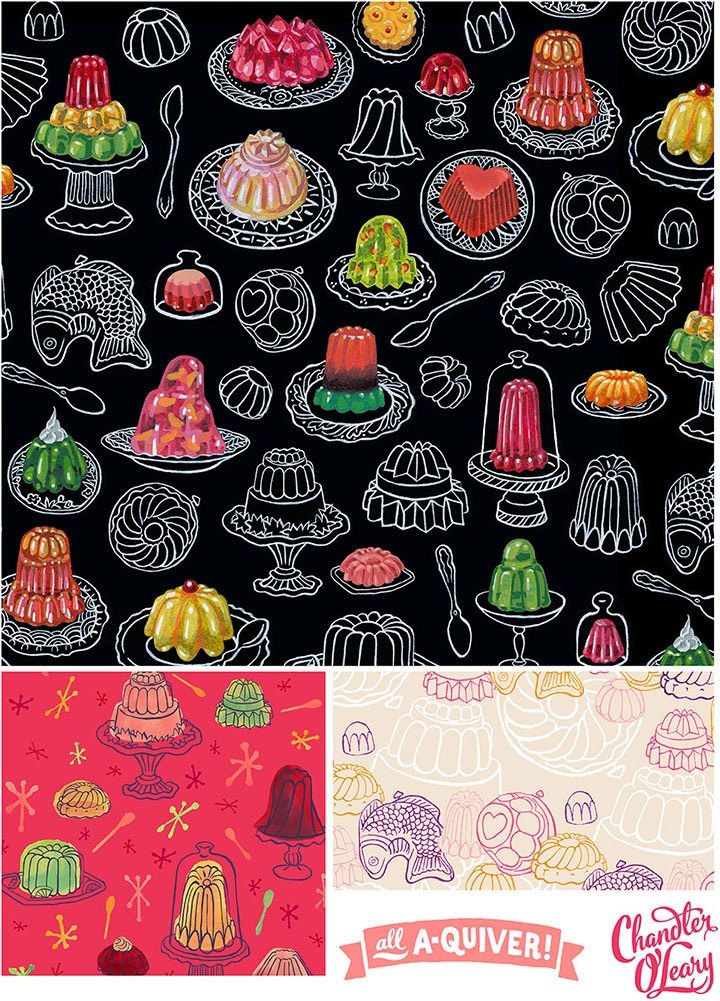
And of course, as you already know, I am completely fascinated by the sheer number of terrifying Jell-o recipes and ill-advised casseroles that crop up in old cookbooks. And since that got me thinking all sorts of wonderfully twisted things about housewives at the End Times, and how Jell-o can probably survive a nuclear holocaust, I decided to combine the two.

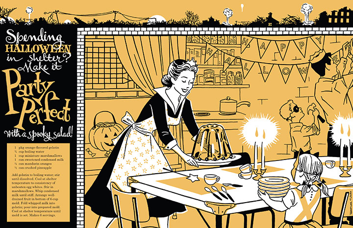
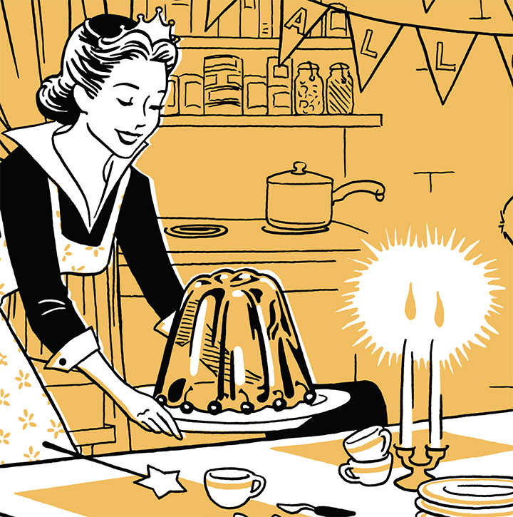
So here’s my contribution to the calendar: how to bury your head in the sand, in style. I asked Tommy for October, since it’s my birthday month, and he was kind enough to oblige. So I went nuts with the pumpkin orange and threw a Halloween party.

Complete with absurd salad recipe (that you could actually make, but I wouldn’t advise it), shelter decorating hints—

—and just a little untold destruction, for garnish.

Illustration by Jay Ryan
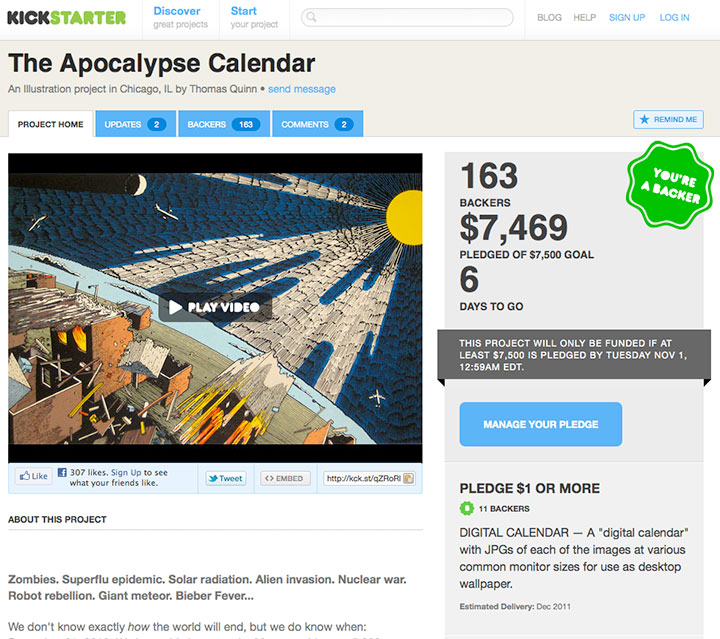
We decided that spiffy, large-format, high-quality offset printing is the best way to show off the artwork, so we’ve set up a Kickstarter project to fund the thing. (We even put together a nifty and hilarious video!) Kickstarter is a fairly new phenomenon, and it’s proven to be a wonderful resource for artists, especially—and since the Kickstarter logo uses the same font as the Dunkin Donuts logo, it makes my designer’s lizard brain happy.
Kickstarter works the way an NPR pledge drive does—you get various gifts in return for your support amount. Twenty bucks will buy you a calendar, and there are a bunch of goodies available at other pledge levels, like signed calendars, original art, and even the ability to make the artist of your choice do your bidding and draw your apocalyptic portrait. (Yes, you read that right.) If we meet our goal, we’ll be shipping calendars in December.
Now, the tricky thing about Kickstarter is that it’s an all-or-nothing kind of thing. If we don’t make our set funding goal by the time the clock runs out, the apocalypse will come early we don’t get any of the moolah pledged so far. So pretty please, do us a huge favor by doing your annual calendar shopping a wee bit early—you can make your pledge here.
After all, if the Mayans have their facts straight, this is the last calendar you’ll ever need to buy, right?
February 13th, 2010


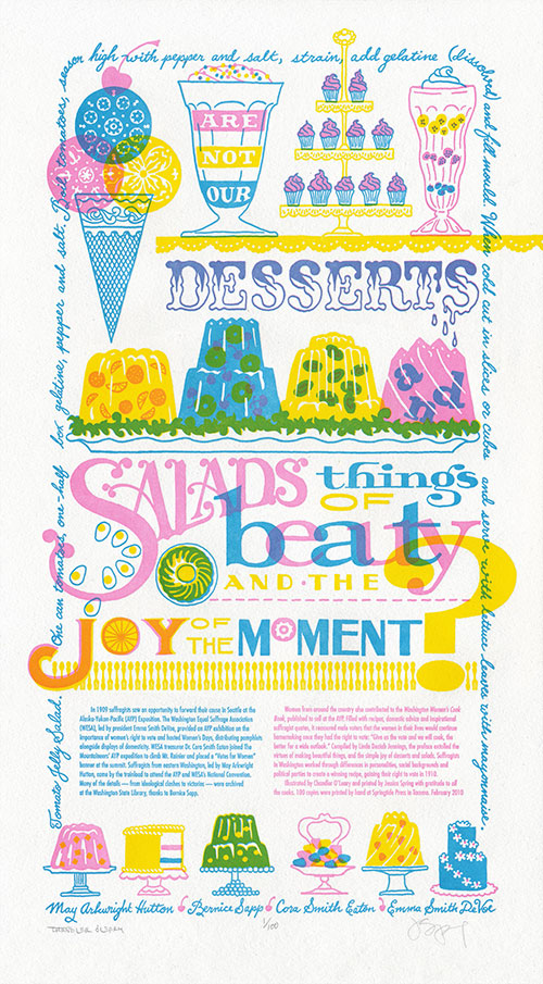
This year marks the 100th anniversary of women’s suffrage in Washington—a feat only made possible by the collaborative efforts of many dedicated people of every walk of life and political stripe. In this spirit, we present our seventh broadside in the Dead Feminists series, Just Desserts.

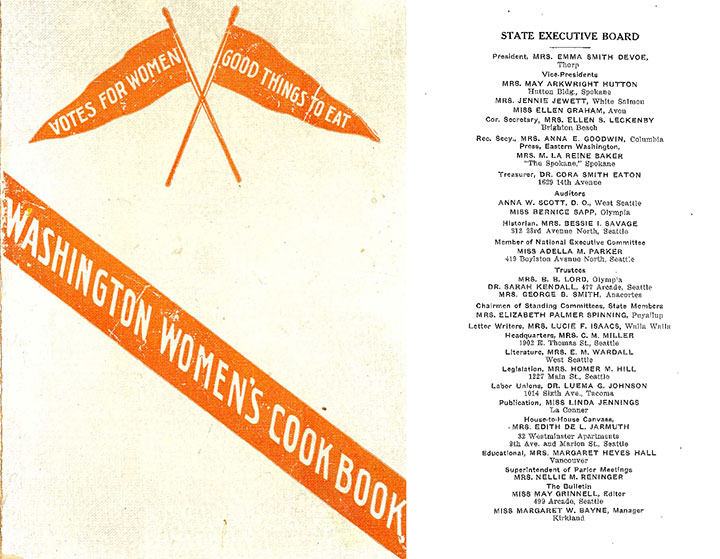
Through our research at the Washington State Library, we discovered that our state’s suffrage movement had many leaders, rather than one prominent figurehead. We also learned that there was so much head-butting, personality-clashing and partisan in-fighting going on within the organizations involved (Mesdames Hutton and DeVoe, I’m looking at you!) that it would be impossible to tell the whole story in one letterpress poster. So instead of quoting a single historical feminist, we cited a collaborative publication—the Washington Women’s Cook Book, published in 1908-1909 for the Alaska-Yukon-Pacific Exposition—and featured four women symbolic of the movement: May Arkwright Hutton, Bernice Sapp, Cora Smith Eaton, and Emma Smith DeVoe. The quote:
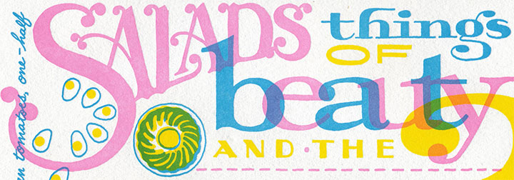
“Are not our desserts and salads things of beauty and the joy of the moment?”
The book was a clever piece of propaganda that operated on the principle that the way to a man’s heart—or vote—is through his stomach. All those jellied centerpieces and whimsical soufflés must have done the trick—the following year, women got the vote.

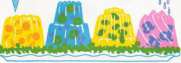
And for my part, the quote turned me into an almost-literal kid in a candy store; the design was just begging for elaborate confections and candy-coated typography. At first, though, I was turned off by the idea of having to draw salads (I wanted more ice cream!), until Jessica read off a litany of aspic salad and gelatin dessert recipes from the book. That’s when the light bulb turned on: Jell-o salad! The decade-plus I spent in the Midwest was about to serve me well.

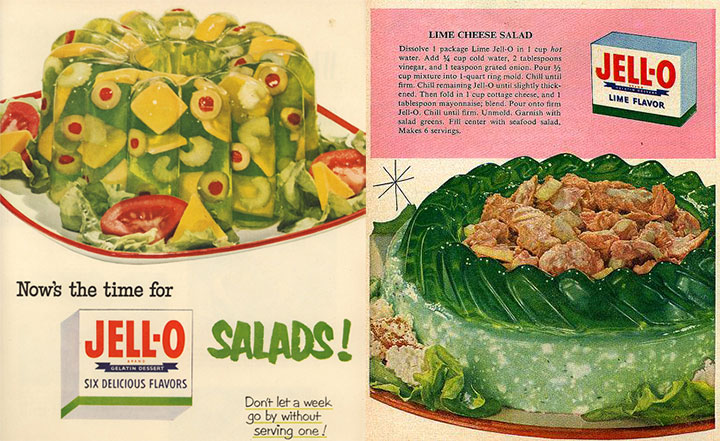
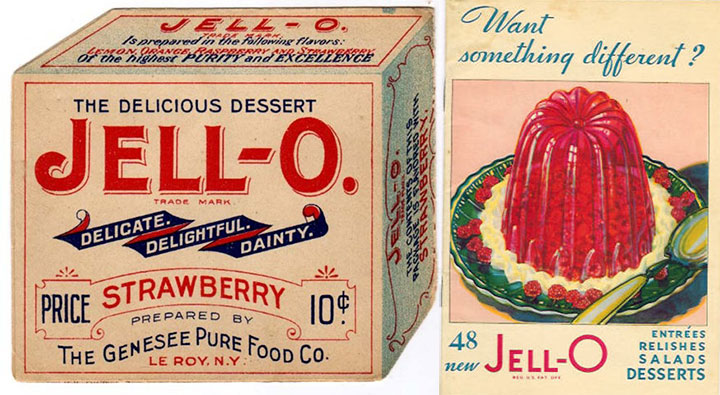
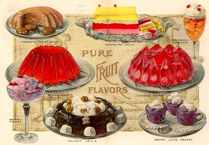
Turns out that Jell-o fit right into the turn-of-the-century theme: molded gelatin desserts were a Victorian favorite, and the name “Jell-o” was first coined in 1897 (and if you look carefully, the “J” from the original Jell-o box makes a cameo in the print). There seemed to be no end of antique recipes, advertisements and illustrations at my disposal.

I might be horrified by the idea of eating gelatin salads, but drawing them was the most fun I’ve had in a long, long time. Zooey and I each spent hours researching vintage Jell-o molds—probably more for the pure fascination than for the value of the reference material.
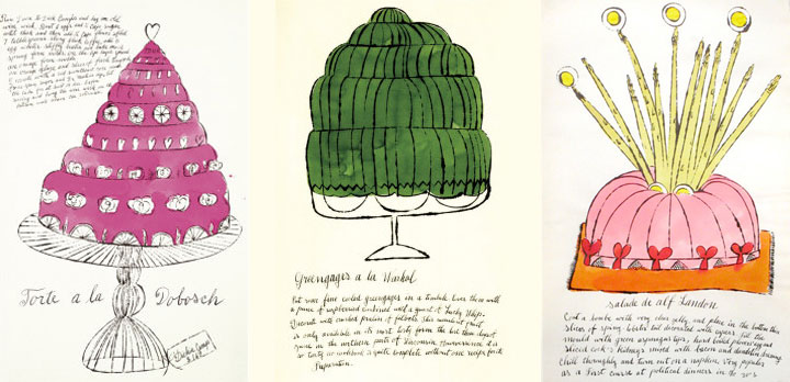
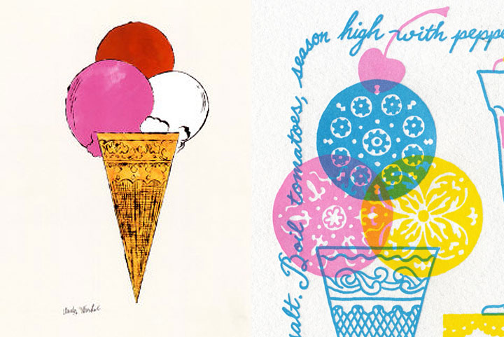
For the sweets portion of our little menu, I turned to an old favorite for inspiration: Andy Warhol.

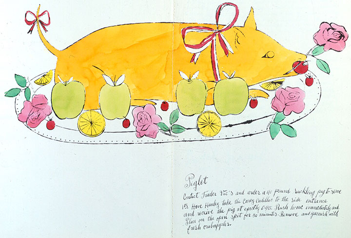
Forget what you know about Campbell’s soup cans or Elvis portraits; Andy got his start as an illustrator specializing in fashion and food. In 1959 he illustrated a spoof cookbook called Wild Raspberries (it’s been on my shelf since high school, and I finally found a direct use for it!), filled with ridiculous “gourmet” recipes for things like “A&P Surprise” (those of you in New England will get that one) and “Seared Roebuck.”

The illustrations are fantastic (and the polar opposite of my style), but the thing that really drew me in was the lettering. Andy had his mother, Julia Warhola, write all of the text of his early illustrations in her shaky, school-girl script. Mrs. Warhola spoke little to no English, and simply copied her son’s notes letter-for-letter, so the text in Wild Raspberries has charming errors and misspellings throughout.

I loved the down-to-earth quality of Mrs. Warhola’s cursive, so I wrote a recipe from the Washington Women’s Cook Book along the border of the broadside in a similar hand (though to warn you, it’s a recipe I wouldn’t recommend trying!).

And of course, I couldn’t do without a little ice cream homage.

Like The Curie Cure, this piece is printed in three colors—although the three we chose let us create many more. Our color scheme allowed us to print in a similar fashion to commercial printing, where a minimum of colors (CMYK—cyan, magenta, yellow, black) are layered to create a full-color image. Our layering of translucent pink, blue and yellow ink allowed us to create a full rainbow and a convincing depiction of foreign objects floating in jelly.

Heaps of thanks to everyone who came to our talk at the State Library the other night, despite lousy weather and rush-hour traffic—we had a tremendous turnout, and a huge show of support for our state’s oldest cultural institution.
One more thing: three cheers for the incredible staff at the Washington State Library (many of whom are among those whose jobs have been cut and will end very soon) who made our talk and this very piece possible. Because we couldn’t have done it without them, we have donated a portion of our proceeds to support the State Library’s collections.
After all, it’s about preserving (in jelly?) that joy of the moment for everyone to share, right?
• • • • • • • • • • • • • • • • • • • • • • • • • • • • • • • • • • • • • • • • • • • • • • • • • • • • • • • • • • • •
Just Desserts: No. 7 in the Dead Feminists series
Edition size: 100
Poster size: 10 x 18 inches
Printed on an antique Vandercook Universal One press, each piece is printed on archival, 100% rag, recycled paper, and signed by both artists.
Colophon reads:
In 1909 suffragists saw an opportunity to forward their cause in Seattle at the Alaska-Yukon-Pacific (AYP) Exposition. The Washington Equal Suffrage Association (WESA), led by president Emma Smith DeVoe, provided an AYP exhibition on the importance of women’s right to vote and hosted Women’s Days, distributing pamphlets alongside displays of domesticity. WESA treasurer Dr. Cora Smith Eaton, joined The Mountaineers’ AYP expedition to climb Mt. Rainier and placed a “Votes for Women” banner at the summit. Suffragists from eastern Washington, led by May Arkwright Hutton, came by the trainload to attend the AYP and WESA’s National Convention. Many of the details—from ideological clashes to victories—were archived at the Washington State Library, thanks to Bernice Sapp.
Women from around the country also contributed to the Washington Women’s Cook Book, published to sell at the AYP. Filled with recipes, domestic advice and inspirational suffragist quotes, it reassured male voters that the women in their lives would continue homemaking once they had the right to vote: “Give us the vote and we will cook, the better for a wide outlook.” Compiled by Linda Deziah Jennings, the preface extolled the virtues of making beautiful things, and the simple joy of desserts and salads. Suffragists in Washington worked through differences in personalities, social backgrounds and political parties to create a winning recipe, gaining their right to vote in 1910.
Illustrated by Chandler O’Leary and printed by Jessica Spring with gratitude to allthe cooks. 100 copies were printed by hand at Springtide Press in Tacoma. February 2010
UPDATE: poster is sold out. Reproduction postcards available in the Dead Feminists shop!

![Chandler O'Leary [logo]](https://chandleroleary.com/wp-content/themes/chandleroleary/images/logo.png)
