Blog
April 4th, 2012
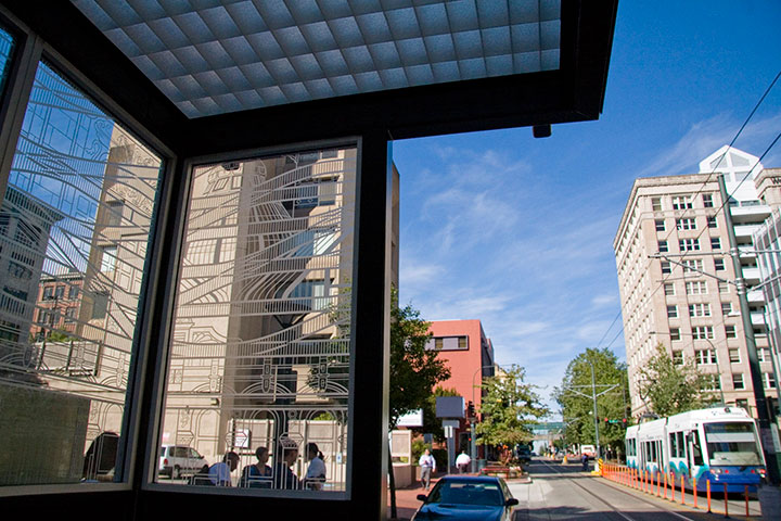
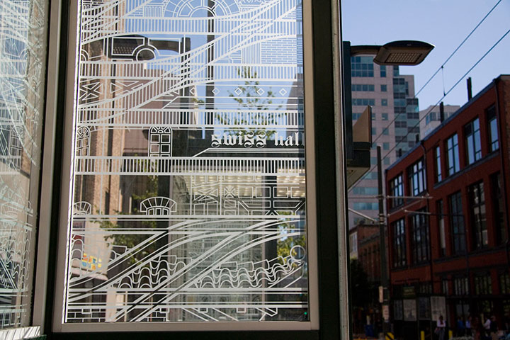
This is rather old news now, but as it took such a long time to complete, and as it isn’t exactly going anywhere, being hot off the press doesn’t matter so much. Last year I was commissioned to do a piece of public artwork here in Tacoma, and as of a few months ago, the Commerce Street light rail station is up and running.
I’ve done several temporary and permanent public pieces before, but this was my first commission for a durable materials project—and by that I mean materials that can be expected to last many decades with minimal maintenance (metal, stone, concrete, ceramics, glass, etc.). Interestingly, painted murals are not considered durable; they require all kinds of upkeep, and have an average life expectancy of only five to ten years.
The Commerce Street Station project called for a design for etched glass. Now, as you’re well aware, I’m no glass artist—it’s a little weird to think of a letterpress printer doing glass work. But that’s the beauty of the public art realm: instead of one artist tackling every aspect of a project, there’s a whole team of people involved, each focused on his or her particular strengths. I was responsible for the design, and industrial fabricators took care of the actual glass-etching part. So what my part boiled down to was a process nearly identical to what I do for any letterpress print: a hand-drawn illustration, converted into a computer file for production. Realizing that created a huge mental shift for me, and suddenly made the prospect of wearing a Public Artist hat way less intimidating.

If you’ve ever stood in a shelter waiting for a bus or train, you’ve probably seen an etched glass design. Usually it’s an abstract pattern to discourage graffiti, or in the Pacific Northwest, often something outdoorsy or salmon-themed. So I figured that territory was well covered. Instead, I focused on the rails themselves. The railroad is possibly the single most significant aspect of Tacoma’s history; it is truly the backbone of our city. In 1873, Tacoma was chosen over Seattle as the terminus of the Northern Pacific Railroad. Without the resultant growth and industry that resulted from the railroad hub, Tacoma might still be a tiny fishing hamlet, rather than a bustling port.
For decades, industrial and passenger rail travel was our pride and joy. Along with the goods and people moving along the NP Railroad line, Tacoma was also criss-crossed with streetcar lines, providing efficient and comprehensive public transportation. During the Great Depression, however, the cost of maintaining the streetcar lines became too heavy a burden. The system was dismantled in 1938, and private automobiles became the dominant mode of transportation. This story is by no means unique — passenger rail fell out of favor all over the country, and today, public rail transit is only the norm in our largest cities.

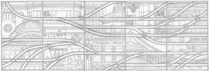
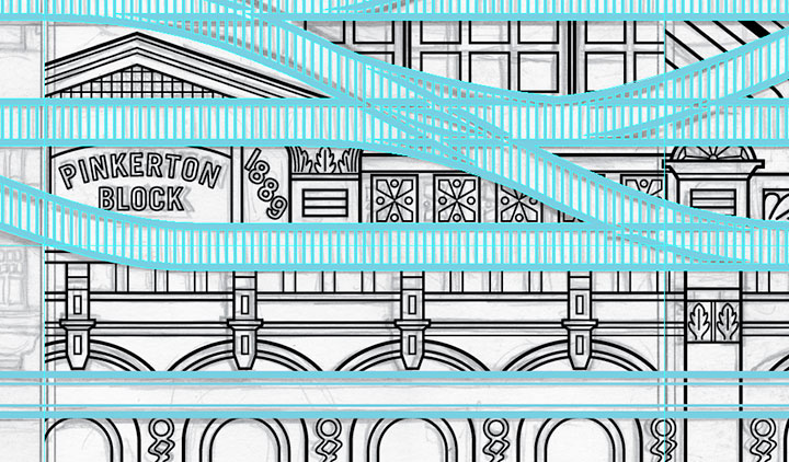
To me, our small (but expanding) light rail line is a ray of hope for a progressive future, a return to a more sustainable system, and a chance to highlight Tacoma’s history. So for Continuum, I designed a brace of parallel rail lines. The top line is a set of traditional railroad tracks, beginning as a single thread and branching outward—symbolizing Tacoma’s beginnings and expansion. The bottom tracks are grooved-rail embedded tram tracks—exactly the type you see in both old streetcar lines and modern light rail paths. As the traditional tracks branch outward, the tram tracks converge into a single path, just as our lone light rail line is the last vestige of the old streetcar network.
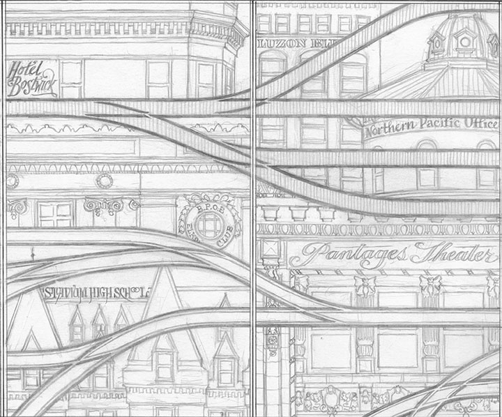
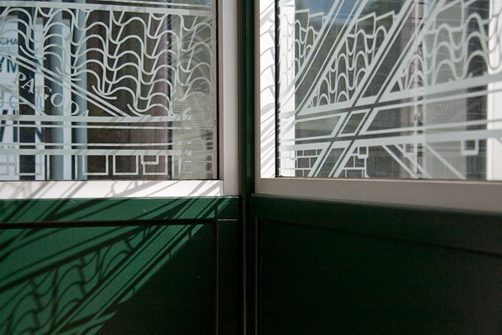
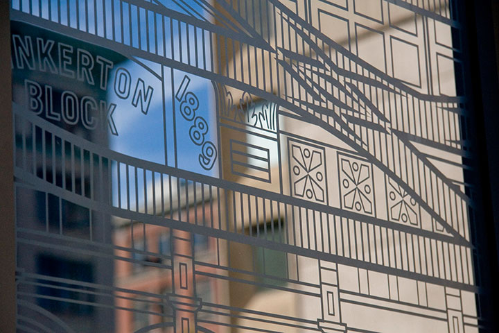
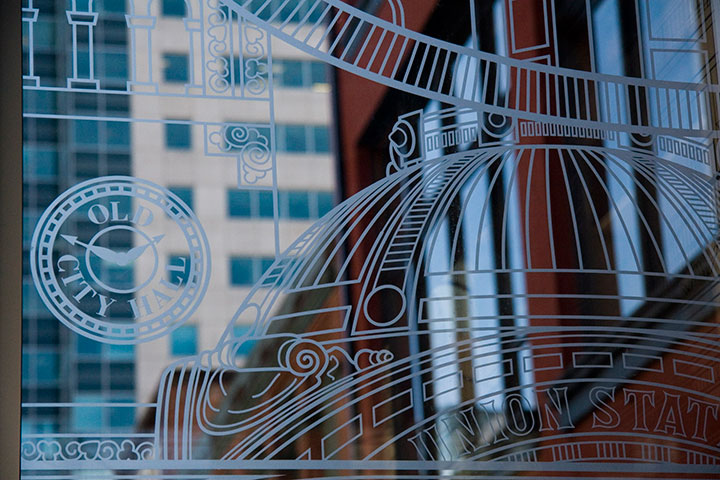
Tacoma’s architecture sprouted and developed right alongside the railroad, as a result of our industrial growth. So instead of surrounding the tracks with a white-noise pattern of ballast, like you’d see around real tracks, I designed an illustrated amalgam of our most iconic buildings. Some are still with us; others are long gone (can you spot the Luzon Building above?). Every structure represented exists either along a historic streetcar or other track line, or has some connection with the railroad.

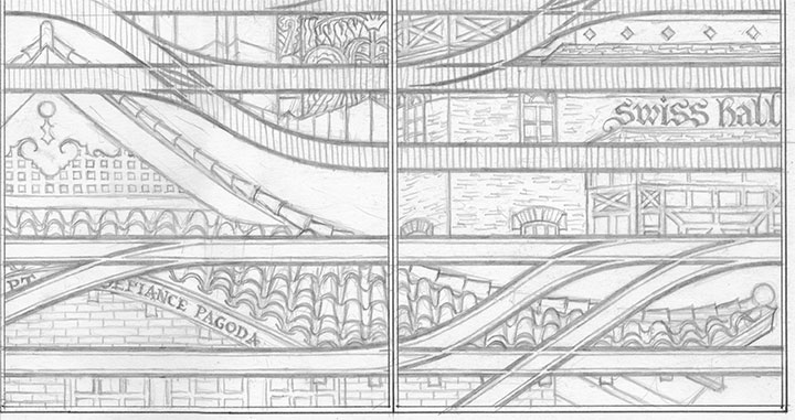
While I was working on the initial design, a teenage arsonist set fire to the historic Pt. Defiance Pagoda. Suddenly it didn’t seem to be enough for the city merely to preserve the architecture—I felt the need to create my own record of as many buildings as I could.

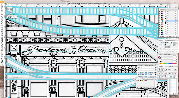
My pencil drawings weren’t finished enough to send to the fabricator—I needed to bridge the gap between my pencil and their equipment. To get the artwork to the point where it could be etched into glass, I needed to convert it to a specific file format called vector graphics. Now, digital photos are made up of pixels: a grid of tiny dots that determine how large a size an image can be blown up to be. The more pixels per square inch, the larger you can make the photo. Vector art doesn’t work like that. Without getting in over my head in explaining this, vector graphics are made of math.
(Which is super cool, really.)
The shapes are determined by geometric points, lines and proportions, rather than pixels. So that means you can blow the artwork up to any mammoth size, or shrink it as small as you please, and you’ll never lose detail or image quality. This makes the vector format A) awesome; and B) ideal for translating extremely intricate work into industrial materials. All I had to do was fire up Adobe Illustrator, and get to work converting the artwork.
This took days. And days. And days.

It’s funny that people tend to see computer programs as shortcuts or “cheats,” but in the end, any good piece of digital artwork requires a level of craftsmanship—exactly the way a handmade object does. Illustrator has lots of labor-saving tools if you know where to look, but the ones that are designed to fully automate the conversion from a scanned drawing to a vector file aren’t always ideal. For this particular project, the only way to do it right was to suck it up and spend ungodly hours redrawing the thing “manually” within the program. I had to rely on all my artist chops just as much for file production as I do for any artist book or watercolor painting. I easily spent as much time converting the design to vector format as I did drawing it by hand, but it’s important to have a flawless file—lots of expensive production steps are dependent upon that file being free of glitches or stray marks.
As an aside, one night that I stayed up (very) late working on the file happened to be the night of the Royal Wedding. To provide some background noise (in order to stay sane), I streamed the event in a little window on the corner of my screen while I worked. So now, whenever I see the finished glass panels I think of ridiculously ornate English hats, and the Queen in her vanilla Jello pudding-colored suit. Pavlov would have a field day with me.

Right-hand photo courtesy of City of Tacoma
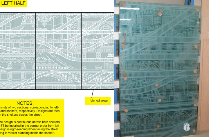
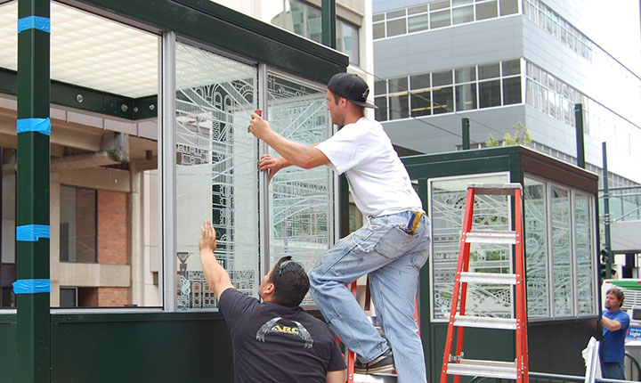
Anyway, next I sent the finished files to the fabricator. Using the points plotted in the file, and a digital mockup I threw together with my production notes, they were able to cut the design out of a masking material, which they attached to the glass. Then the sand-blasted the glass panels. Where there were holes cut through, the sand made contact and etched the glass; everything protected by the mask stayed shiny and transparent. The finished result is a clean, precise replica of my design.

Photo courtesy of City of Tacoma
The tricky part was making sure they installed all ten panels in the correct order; otherwise the connecting track lines wouldn’t make sense. Thanks to the big fat numbers they stuck to each panel, though, everything worked out just fine.

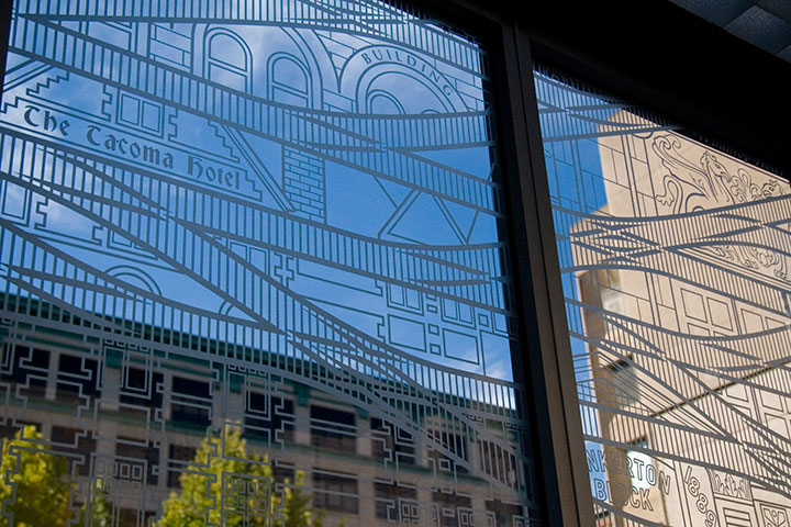
It’s fun to stand inside the finished shelter, and see the stylized buildings contrast with real ones. And when you’re not paying close attention to the details, the illustrations recede into a sort of geometric pattern.

For those who are paying attention, my hope is that this little illustrated city will encourage viewers to notice the real city around them—preferably with an eye toward preservation and innovation.

Attentiveness has its own little reward, too. If you happen to be there when direct sunlight hits the glass, the etched lines project onto every surface. (Tacoma looks good on you.)

In the end, I just wanted to take the dull routine of waiting for a train, and turn it into something beautiful—even if only for a moment.
I’m always saying things like, “If I ran the world…”, usually followed by some crazy idea for transforming every mundane thing in life into something a little more meaningful. I love the thought that on one tiny patch of real estate, I really did get to run the world, and make things exactly the way I imagined they could be. Many thanks to Amy McBride and the City of Tacoma for giving me free rein.

January 20th, 2011

A composite of two image flats from the book.
Anyway, after a good, long run, my Local Conditions exhibit is closing tomorrow afternoon, and this week I’ve been revisiting some of my favorite images from the book. This one always gets me thinking about how much a city can change over the course of a century, and how for a newcomer like me, that change isn’t always apparent. There aren’t always little plaques or signposts to tell you what used to exist where you’re standing now—or even any evidence at all of how things used to be.
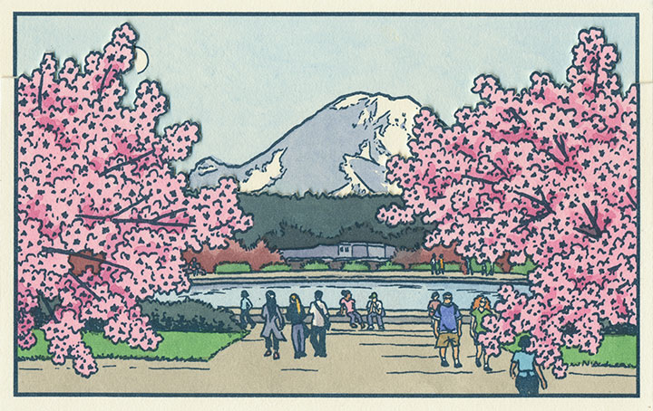
This scene depicts the Drumheller Fountain (also known as Frosh Pond), located on the University of Washington campus in Seattle. Incidentally, on my first trip to the Northwest almost exactly four years ago, I was standing on this very spot when I saw Mt. Rainier for the first time. This is where the idea for the book first struck me—although at the time it was a very different, and much simpler concept. And at that moment, I had no idea that the view itself had a history all its own.

AYP and Camp Harmony images courtesy of the University of Washington Library
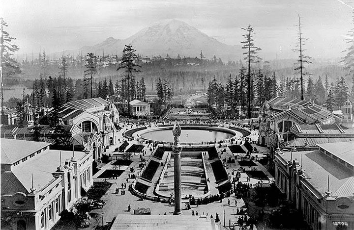
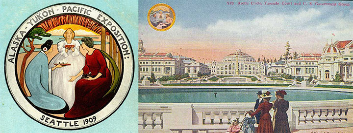
This is Frosh Pond in 1909, when it was called Geyser Basin (part of the so-called “Arctic Circle”), and when it was not a part of campus, but the centerpiece of the University’s predecessor, the Alaska-Yukon-Pacific Exposition.
An event similar to a World’s Fair, the A-Y-P showcased the natural and economic resources of the Pacific Northwest with pomp and splendor. To mirror the purpose of the exposition, the fairgrounds (designed by the famous Olmsted Brothers) brought the region’s greatest symbol into stunning focus. This so-called “Rainier Vista,” culminating in the Arctic Circle, helped draw in 3.7 million visitors over the fair’s four-month duration.

Very little evidence remains of the A-Y-P fairgrounds today (much to my chagrin); the vast majority of the fair’s buildings were temporary, and even the landscape design of the modern University has all but obscured the original layout of the A-Y-P grounds. But the Arctic Circle is still there, and when you step out from behind a row of blooming cherry trees in the spring, the Rainier Vista still hits you with full force.
Speaking of fairgrounds, closer to T-Town is another historical remnant—this time, however, instead of a long-past event with only a marker left behind to hint at what was, these fairgrounds still hold to their original purpose today.

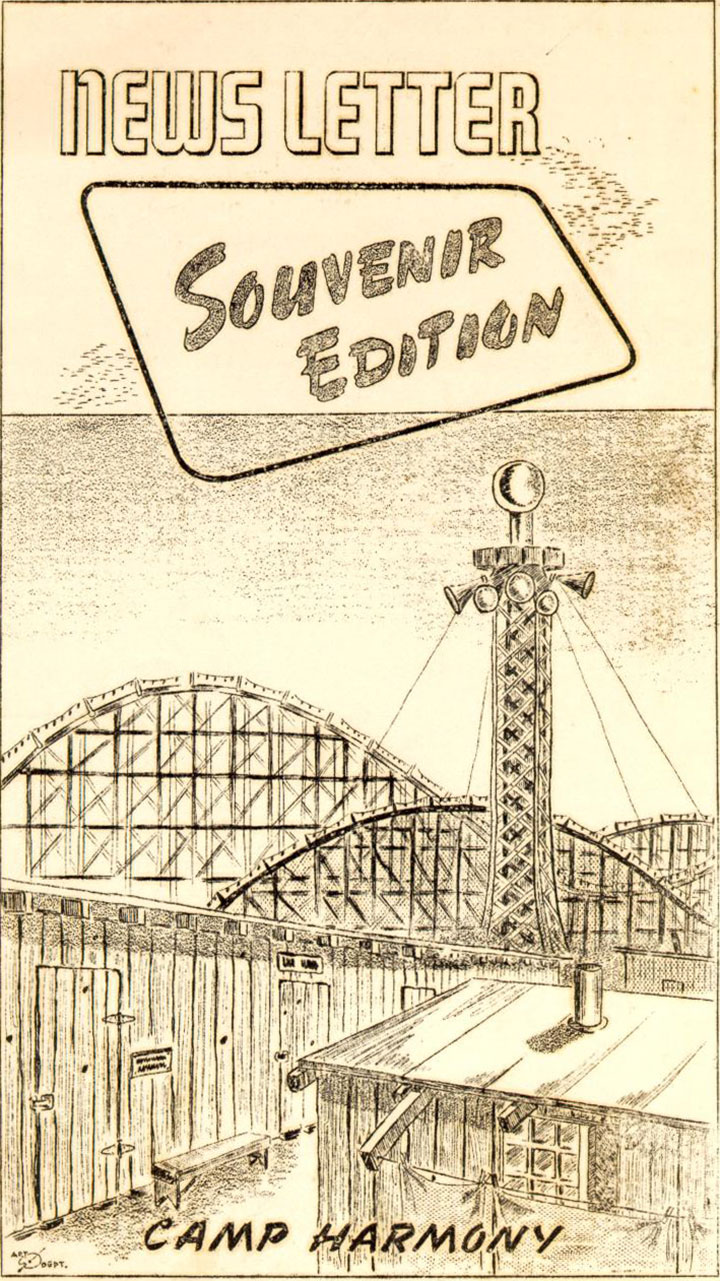
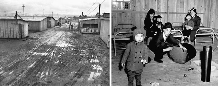
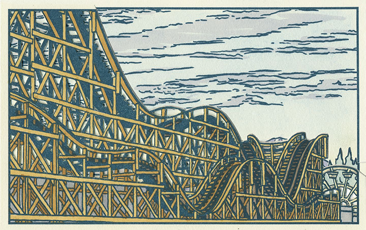
Illustration by Eddie Sato, Camp Harmony inmate and “staff” artist.
I’m talking about the Western Washington Fairgrounds in Puyallup, which are still in operation (though the event is now called the Puyallup Fair—that’s pronounced “Pew-AL-up”). In 1942, the U.S. government evicted, rounded up and imprisoned over 100,000 Japanese Americans living on the West Coast; the internment began with the forced migration of families living on Bainbridge Island, across the Sound from Seattle.

While they awaited the construction of permanent internment camps further inland, many Japanese Americans were sent to temporary “assembly centers” to coexist in cramped barracks with other families, often in substandard living conditions. Thousands of Washington’s interred residents were sent to the assembly center nicknamed “Camp Harmony,” hastily constructed on the fairgrounds in Puyallup, right alongside the fair’s permanent buildings and rides.

Three image flats; the mountain is almost completely hidden here.
Camp Harmony was torn down after just seven months, but the Fair continues to this day. (To my everlasting horror, the Fair’s website mentions Camp Harmony only obliquely on its “History” page—it states only that “the fairgrounds were used as a temporary shelter“—emphasis mine—during World War II. Right. A shelter where the “refugees” were imprisoned under armed guard.) And the wooden roller coaster that overshadowed Eddie Sato’s scene of the camp still stands. Now that I’ve learned the history of the place, I’ve lost my appetite for rollercoasters, funnel cakes and blue-ribbon vegetables. But the fairgrounds made for an image that dovetails eerily well with the homage to Japanese art upon which Local Conditions is founded.

Photo courtesy of Jessica Spring
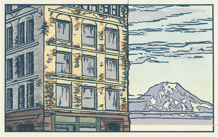
And then there’s the kind of history that unfolds right before your very eyes. Remember the Luzon building?

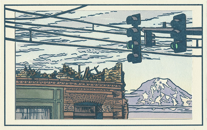
Two image flats; recognize the sky in the background?
Well, it was slated to be a part of the book from the very beginning—just by virtue of being a structure that caught my eye and that came with a good view of the mountain.

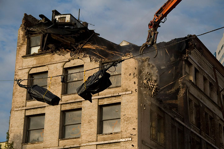
But then they knocked it down in September 2009, and suddenly I became an eye-witness, with an opportunity to document history as it happened.

Three image flats; same mountain, drastically different view.
I wish this were an imaginary scene, but it’s moments like this that the book is all about. Now you see it, now you don’t.

Postcards circa 1910. Courtesy of the Tacoma Public Library
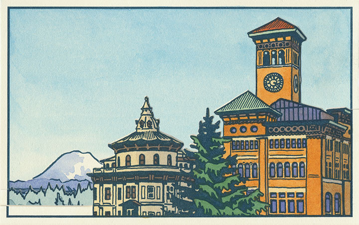
And to top it all off, it’s looking like Tacoma’s history is in danger of repeating itself. This is a postcard dated 1905, depicting what was an iconic view even then—the “Gateway to the City of Destiny.” The building on the left is the former Northern Pacific Railroad Office; on the right is Old City Hall.
Tacoma built a new city hall a few blocks away in the 1930s, but both the Northern Pacific building and Old City Hall still stand—the addition of a freeway the only major change to the site pictured. But on November 24, 2010, after an unusual cold snap, a pipe burst in Old City Hall—soaking the walls, ceilings and floors with 30,000 gallons of water. With extensive flood damage and the building owner entering foreclosure, the building faces an uncertain future. I only hope it doesn’t go the way of the Luzon.

Three image flats; there’s an individual print version in the shop.
When I started this project, I had no idea of what I was getting into. I knew that I would stumble upon some pretty fascinating history, but I never would have guessed that a fountain, some fairgrounds and a pile of bricks would draw me in so completely. But now I’m hooked—and the best part is that after all this work, I no longer feel like an outsider looking in.
This is my history now, too. For better or worse, I want to see how it all plays out.
September 25th, 2009

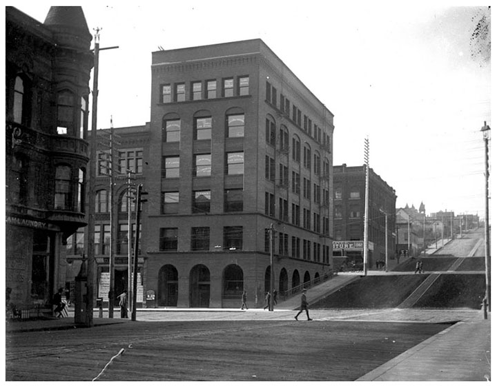
For the past several months, the buzz here in T-town has centered around the Luzon building on Pacific Avenue, a 119-year old structure that, depending on whom you ask, is either an architectural gem or a decaying eyesore. (As you can probably guess, I fall into the first category.) Above is an image of the Luzon in its infancy; this photo is printed from a turn-of-the-century glass plate negative found in Jessica Spring’s attic (and is part of her artist book, Parts Unknown). The thing about the Luzon that has made it such a sore spot around here is that it’s not just a living piece of history—at the time it was built, it was something of an engineering marvel. Co-designed by Daniel Burnham, who went on to design the Flatiron Building in New York and became one of the pioneers of modern multi-story structures, the Luzon was one of the first buildings in America to have steel columns. That makes it a direct ancestor—the great grandpappy, if you will—of the American skyscraper itself.

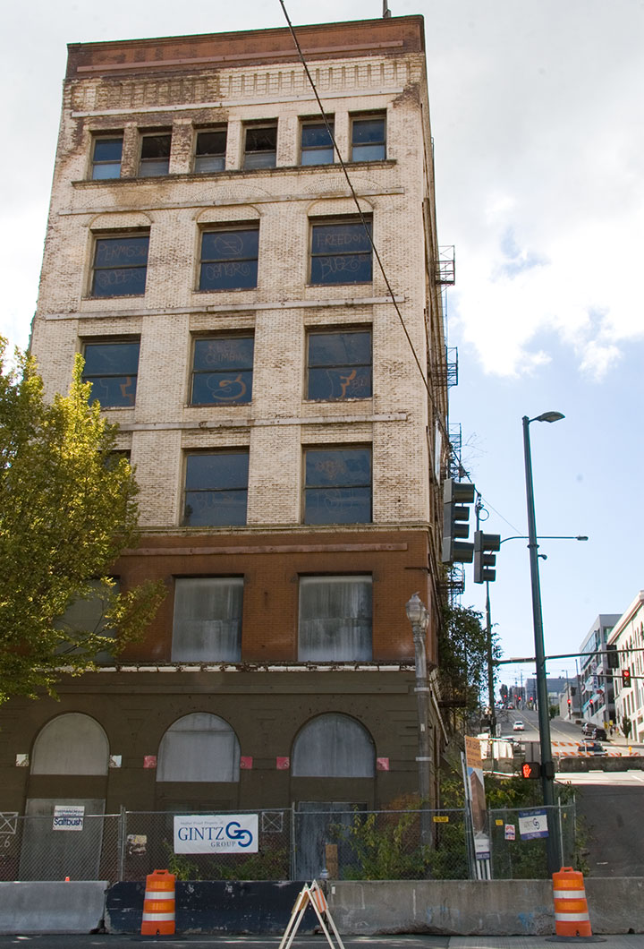
This is the sorry state of the Luzon today. Even though it is on the National Register of Historic Places, and is one of only two Burnham & Root buildings remaining on the West Coast, it has been allowed to decay, apparently beyond the point of no return. While each of many redevelopment schemes over several decades has fallen through, the building has become increasingly derelict. Now that the adjacent property—which provided structrual stability—is long gone, the Luzon is crumbling under its own weight. The City has even closed the surrounding streets in case of a collapse.

Oh, and there’s a tree growing out of it. I don’t think that was part of the original plan.
Well, whether it was a ploy to get around the Historic Register for a development scheme, or the powers that be just dragged their feet for too long (or some combination thereof), the detractors are finally getting their wish. The building is slated for demolition tomorrow morning. So now everyone (including me) has got the Luzon on the brain.
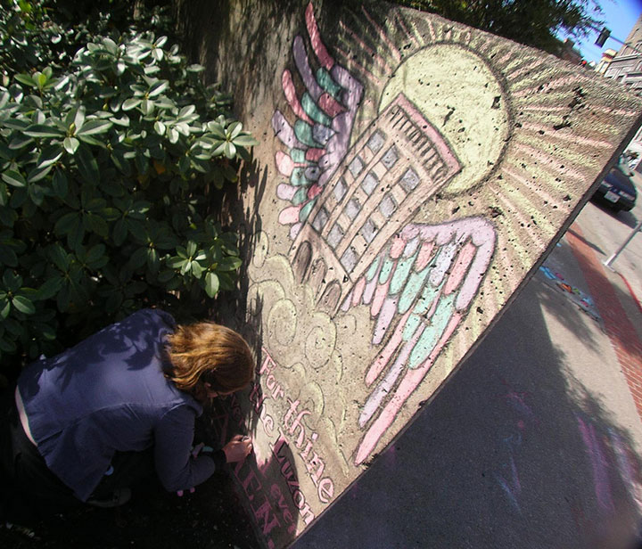
Last week the inimitable artist/cartoonist RR Anderson (who has a few choice words himself about the Luzon’s fate) challenged me to compete in his weekly sidewalk chalk contest, the Frost Park Chalk Challenge. I was looking for an outlet for my Luzon frustration, so I accepted. I grabbed a hunk of charcoal, a handful of communal Crayola chalk, and headed for a highly visible chunk of concrete wall to create a public altarpiece.

Photo by R.R. Anderson
My little Ascension doodle earned me a lot of comments from passers-by and the title of BEST ILLUSTRATOR IN THE UNIVERSE (OF TACOMA) for the week (thanks, guys!).
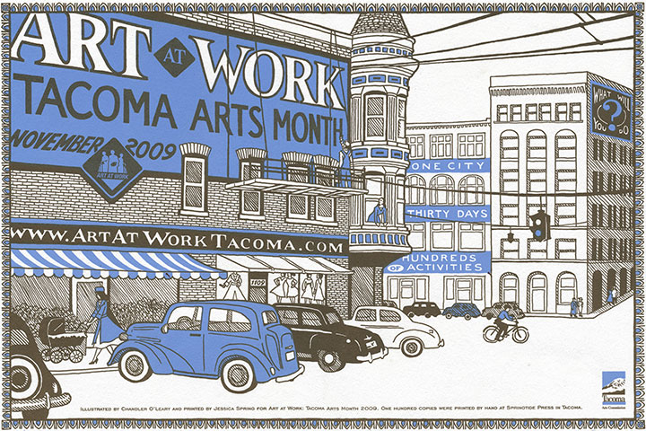
But sidewalk chalk isn’t exactly archival, and I wanted to make a somewhat more lasting statement. Here’s where letterpress comes in. Jessica and I were commissioned to design and print this year’s poster for Art At Work Month, hosted by the City. So since the theme for the overall Art At Work design this year is “ghost signs,” we decided the poster would be the perfect opportunity for a little cameo.

The original posters are letterpress printed in an edition of 100, and will be sold by the City in November, as part of the festivities. But a reproduction will also be inserted into every Art At Work brochure—over 10,000 of them. So come November Burnham’s gift to Tacoma will be long gone, but it’ll feel good to know that we did our part to make sure the Luzon is everywhere we turn—at least for a little while longer.
Edited to add: now that Art at Work month is over, you can now find the last few copies of the letterpress poster in the shop!

![Chandler O'Leary [logo]](https://chandleroleary.com/wp-content/themes/chandleroleary/images/logo.png)
