March 16th, 2015
It’s been more than four years since my last artist book (which, incidentally, I’m still working on)—I guess it’s been that long since I had something to say that warranted a multi-page art format. I suppose when it rains, it pours, though—because with this new project, there’s so much to say that an artist book can’t quite contain it all. This project has got words and images spilling out of me every which way. So fair warning: this is going to be a long post. There’s a lot to show you, and a lot to explain; there’s really no way to tell you this story without telling you all of it.
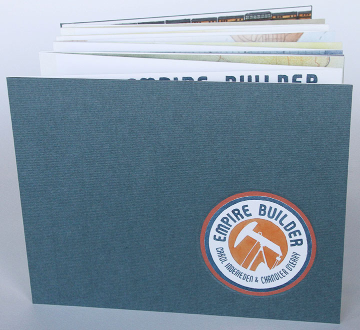
Before I get too far into it, though, I’ll give you the short version. Pictured above is my new artist book, entitled Empire Builder. It’s a collaboration with my friend Carol Inderieden, who is also a writer and illustrator. The book is about oil—that controversial new hydraulic fracturing (“fracking”) process, to be precise.
(If you want to stop reading now, I’ll understand. But if you’re stouthearted enough for a lot of backstory, let’s dive in.)
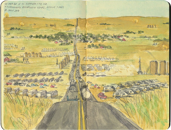
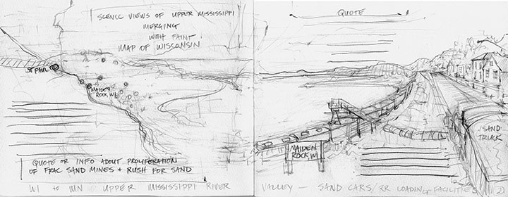
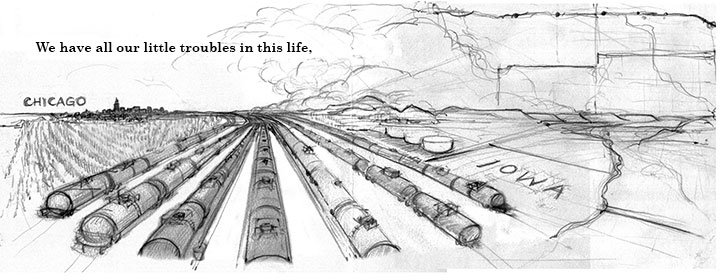
For me, it all started with this sketch.
The Tailor and I were in the middle of a cross-country road trip in 2011. One of our planned stops was Theodore Roosevelt National Park in western North Dakota. That part of the state was an old haunt of mine (I lived in North Dakota for several years), and I was excited to show my spouse a place I knew so well—or at least, I once knew. When we got there, I was utterly unprepared for how quickly and drastically the place had changed. I knew the oil boom had begun there, but I had no idea I’d find the landscape almost unrecognizable.
The once desolate highway was nearly at a standstill with traffic. Every hillside was occupied with RV camps and oil platforms, all built around the process of extracting crude from the Bakken Shale below ground. It was the end of the work day, so there were people everywhere—and we felt conspicuous with our out-of-state plates and tree-hugger-model car. Needless to say, I didn’t feel comfortable taking photos with my giant (and not at all discreet) camera. So instead I pulled out my sketchbook and jotted down the scene, right there in the moving vehicle, while the Tailor drove. It’s the only image I captured of the oil fields, but I still look at this and remember every detail of that afternoon.
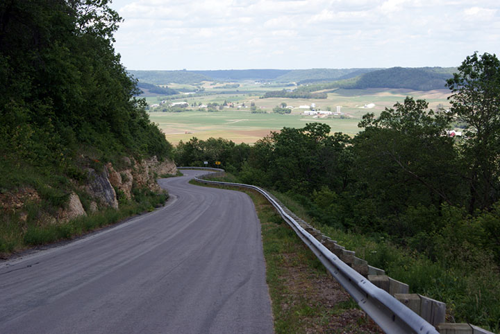
A little later I was relating the story to Carol, and she knew all too well what that day felt like for me. Carol lives in western Wisconsin, in an area called the Driftless Region—so named because unlike the lands surrounding it, the area was never glaciated during the last ice age. So Carol’s neck of the woods has a dramatic beauty to it, with deep valleys, swift rivers and sheer cliffs—a landscape very different from the rest of the state (this is her photo, by the way). The Driftless Region is also unique in that the bedrock there is rich in silica—something that has suddenly become extremely valuable to the new oil industry. Carol explained to me that in the past few years, oil companies have been buying up farmland in her area for strip mining, and excavating huge quantities of silica-rich sand for use in the frac drilling process in the Bakken oil fields. What I glimpsed in one afternoon in North Dakota, my friend has watched unfold on a daily basis, right in her back yard.
Her story, and what I saw in North Dakota, reminded me of what I’d read about the pioneer days—of dramatic land grabs, of politicians carving up maps of regions they’d never see in person, of arbitrary grids imposed on wild landscapes.
Anyway, fast forward a few months more, and I start seeing local newspaper stories about Bakken crude oil trains arriving in Seattle and Tacoma in huge numbers, and how devastating a derailment, spill or explosion here could be. All of a sudden, the fracking industry was in my back yard as well—not just some faraway place I happened to have personal memories about.
So I did what I always do: I started thinking about how I might turn my thoughts into an art piece. I called Carol and asked her if she might want to collaborate on a project about all of this. It wasn’t long before we decided on an artist book—which would end up taking us on a two-year odyssey before it was finished.
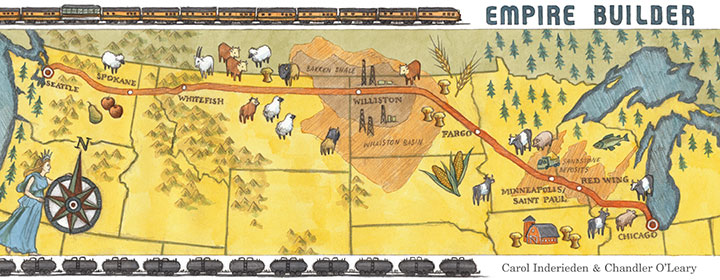
We wanted to link these three regions (the Driftless Area, the Bakken Shale, and the Pacific Northwest) together somehow for our book, and we had a perfect, ready-made means by which to do so: the railroad. Not only was there a train that stopped in all three places (and both Carol and I have traveled on that train), but we soon learned that the entire supply chain for the frac industry followed the path of the Empire Builder railroad line, from Chicago to Seattle. We couldn’t believe how perfect it was.
The railroad ended up becoming the backbone of every part of our book: concept, historical framework, even physical structure.
Whenever we weren’t sure what to do, the railroad brought us back to center, and kept our sequence in order.
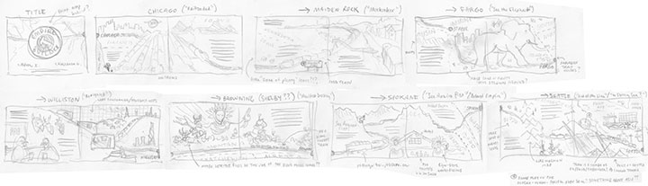
What proved to be more difficult was just which story to tell within the pages. As you can see by this already out-of-hand blog post, we had a lot to say, and we couldn’t possibly say everything. We didn’t just want the book to be a 20-page rant on our feelings about the environment, nor a didactic explanation of how the frac process works. We wanted to show, rather than tell. We wanted to make our readers fall in love with these landscapes as we have. We wanted to provide evidence of the consequences of the oil boom. And we wanted to create a tangible link to history, because all of this has happened before. But our text and images were coming up short; we needed something extra to tie everything together.
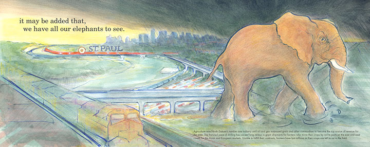
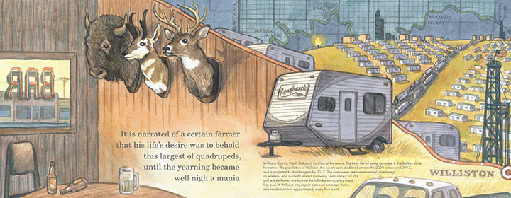
Carol came to the rescue, by finding a short quote that embodied the mood we wanted to get across. It added an air of foreboding to the piece, and it worked perfectly with all the allegorical images we were throwing around. And here’s the wacky thing: the quote is from the New York Times. In 1861. And it fits so well with what’s happening now that it easily could have been written yesterday. Here’s the quote:
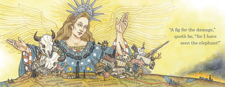
We have all our little troubles in this life, and for those who are not too proud, to use a popular phrase, it may be added that we have all our elephants to see. It is narrated of a certain farmer that his life’s desire was to behold this largest of quadrupeds, until the yearning became well nigh a mania. He finally met one of the largest size traveling in the van of a menagerie. His horse was frightened, his wagon smashed, his eggs and poultry ruined. But he rose from the wreck radiant and in triumph. “A fig for the damage,” quoth he, “for I have seen the elephant!”
In the end, we ran the quote in pieces throughout the length of the book—and paired it with illustrations chock full of historical allegory (as well as allusions to old train advertisements, wartime propaganda, and current events). Explaining it all would make this even longer a post than the novel it already is, so I’ll just present our essay at the end of the book to give you the full context behind the quote.
• • • • • • • • • • • • • • • • • • • • • • • • • • • • • • • • • • • • • • • • • • • • • • • • • • • • • • • • • • • •
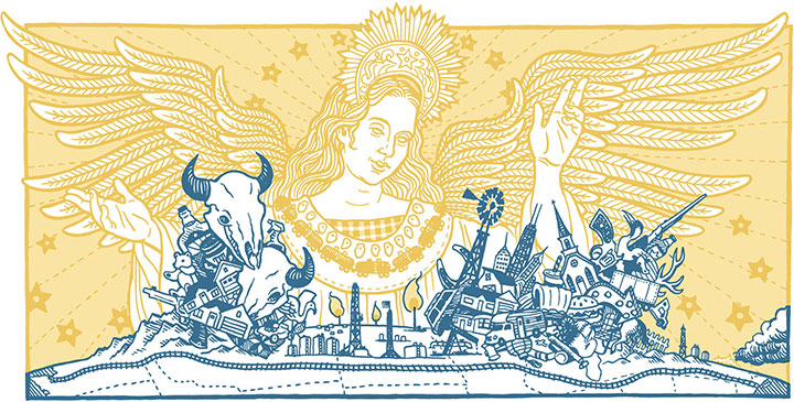
The preceding quote, from an 1861 New York Times editorial, highlights a phrase popular in America during the latter half of the nineteenth century. “Seeing the Elephant” was a figure of speech that came to embody the pioneer experience during the era of westward expansion. To see the elephant was to embark on a quest for riches and prosperity. It alluded to the danger and excitement associated with seeking one’s fortune in an unknown land. The elephant is an illusion, an impossible promise like a desert mirage that disappears as one moves closer. “Seeing the Elephant” later became synonymous with the bitterness and disappointment settlers experienced as they watched their dreams turn to ashes. During this time, the idea of Manifest Destiny — the 19th century notion that Americans possessed the divine right to claim all of North America, by virtue of their moral superiority — was also born and sometimes depicted as the mythical goddess Columbia, leading brave settlers westward.
“Seeing the Elephant” gradually fell out of the vernacular, yet the sentiment endured as the double-edged sword of the American Dream. Evidence of this can still be found in every corner of the West. Prairie homesteaders planted tree claims as a winning bet against Uncle Sam and lost. Tenement families in the East sold everything to migrate westward and buy into the myth of dry-land farming. Wildcat prospectors gambled their lives for oil, silver and gold. Families in the roaring twenties bought on credit, stacking the deck with status symbols before losing it all in the Great Depression. Suburban subdivisions, once symbols of postwar prosperity, have now become outposts of the working poor. The cycle of boom and bust has been resurrected so many times that the Elephant has grown in size from a distant vision to an omnipresent burden, stretching from sea to shining sea.
If the American map were the Elephant writ large, it is the railroad that breathes life into the creature. Throughout the last century of rail development, the anatomical structure of a complex organism has evolved. Today spurs and trunk lines follow a vascular system that carries a lifeblood of raw materials across the nation in a never-ending stream of freight. While the Elephant’s lungs fill with natural gas, its veins run gold with domestic oil and its heart beats ever faster in the Bakken Formation of western North Dakota.
Even in today’s age of dwindling resources and dire environmental warnings, Americans still see the land as a bottomless well to be tapped. In the Bakken, a new frontier has opened and is flooded once again with a new generation of fortune-seekers. “Man camps” dot once-empty hillsides and roughnecks push the region’s infrastructure to the breaking point. Remote rural highways and railroad lines are now choked with traffic. Flames from gas flares and oil slicks bathe the grassland in an eerie, unnatural glow. Yet while the land flows with modern milk and honey, only a few actually taste its richness. Companies grow fat while laborers vie for just a few drops. Communities swell to accommodate the boom, yet risk collapsing as soon as the inevitable bust occurs. All the while, the Elephant still waits beyond the next horizon and Columbia still beckons, just out of reach.
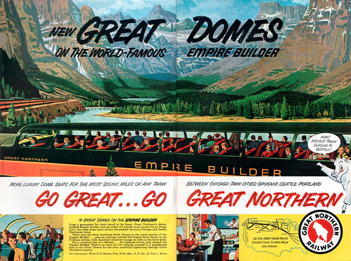
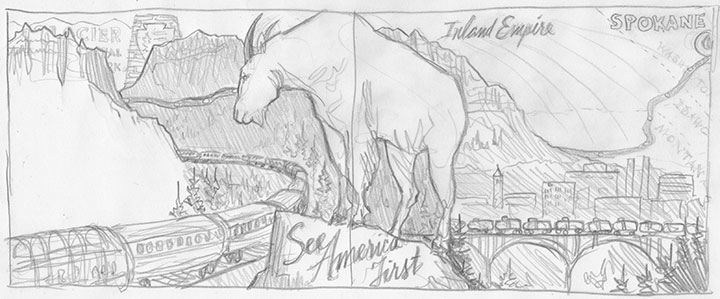
The backbone of the modern Elephant is the railroad line from Chicago to Seattle — incidentally, the same line that carries the Empire Builder passenger train. This train is aptly named for the exploits of James J. Hill, the railroad lumber baron who grew rich transporting timber and other raw materials from the Pacific Northwest to the cities and industries of the Midwest. Today one can ride the Empire Builder from one end of Hill’s domain to the other, and witness every element of the fracking process along the way. In the early 20th century, the Empire Builder encouraged travelers to “See America First” and marvel at the wonders of the natural world speeding past their windows. Today’s rail passengers watch the new Industrial Revolution rolling by.
This book is an attempt to articulate our dismay at the rapid transformation of a West we know and remember. We live and work at opposite ends of the Empire Builder railroad line: Carol in the Driftless Region of Wisconsin, where the bluffs and hillsides are being strip mined for frac sand; and Chandler in the Puget Sound area of western Washington, where Bakken oil is refined and shipped to other ports by tanker vessel. We both have personal ties to the northern Plains, though recent events render the region unrecognizable when compared to our memories. Still, the railroad connects us to each other and the landscapes we love. For the pioneers of the new era, the rhythm of the railroad is the marching song of progress — but for us, it is a lament.
• • • • • • • • • • • • • • • • • • • • • • • • • • • • • • • • • • • • • • • • • • • • • • • • • • • • • • • • • • • •
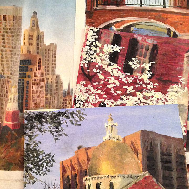
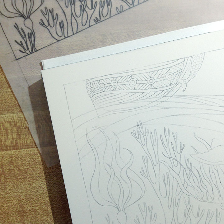
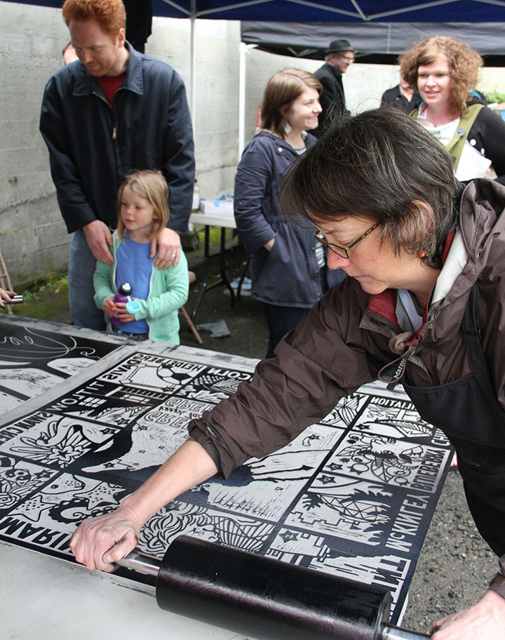
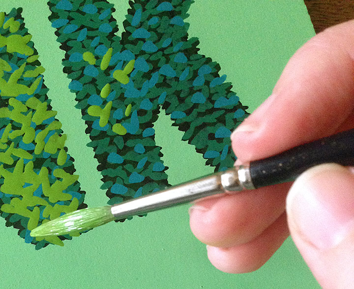
One of the best things about working with Carol on this project is that we both draw—and our aesthetics are not dissimilar. So we could match each other’s style to keep the book consistent throughout—without it being obvious who did which illustration. But that wasn’t the problem.
The problem was that we were originally thinking this book would be letterpress-printed. That would have meant our final illustrations would have to be extremely flat and graphic in style, to accommodate the limitations of hand-printing. This is a mockup I did at an early stage of our “Manifest Destiny” image. I hated it, and I didn’t know why at first. But then Carol and I figured out that what we really responded to was the loose, quick style of the sketch I did in North Dakota four years ago—which mirrored all our process pencil sketches for the book. The letterpress mockup I did above felt too slick, too…”set in stone.” It felt like the wrong medium to convey a phenomenon that is happening so rapidly that even the news media can’t keep up with it.
Sketching felt like the right medium—so we changed tack, and made our book a sort of Sketch Storybook instead. We let go of letterpress printing, and decided to digitally print the book—which freed us from all limitations when it came to the imagery.
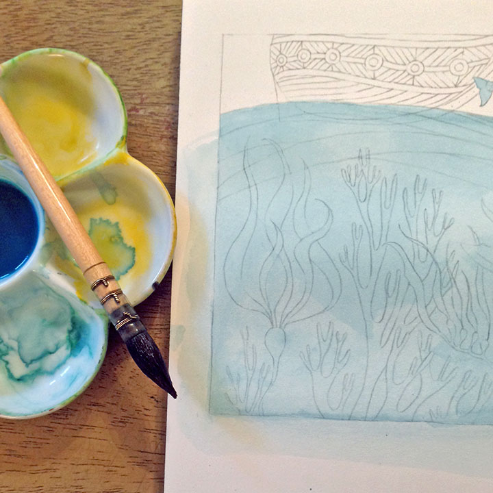
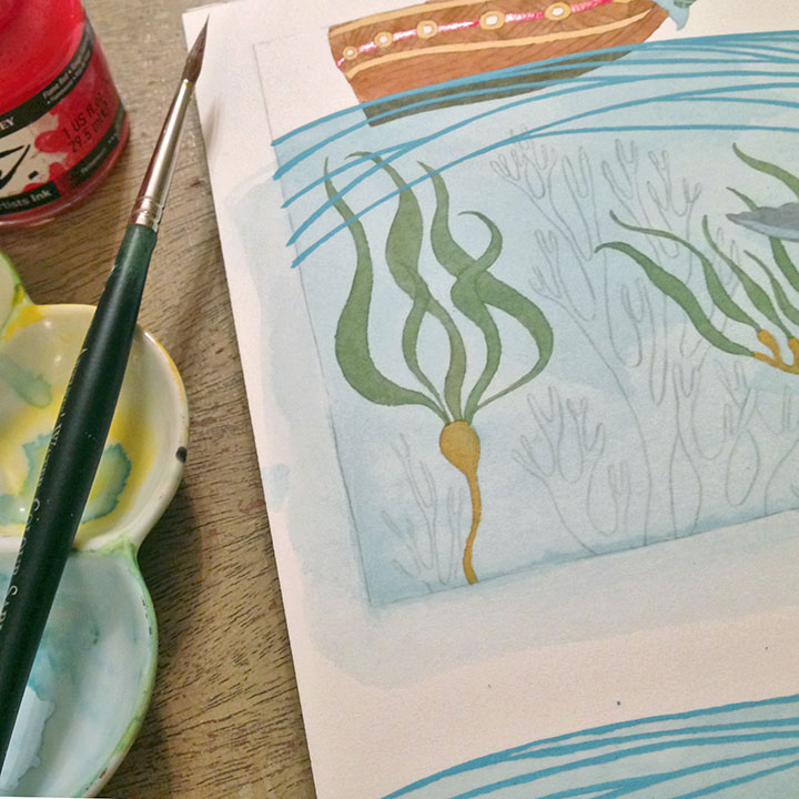
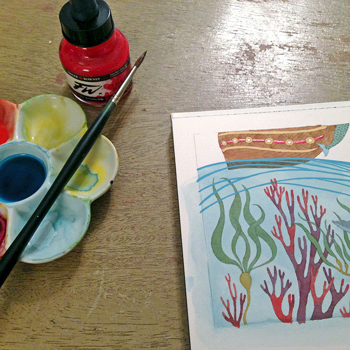
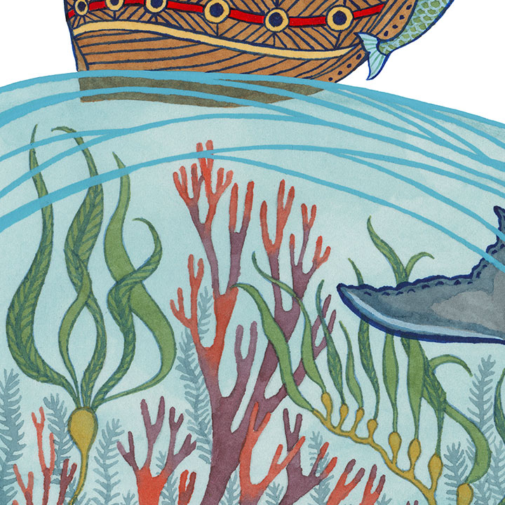
This way, we could preserve the immediacy of our sketch drawings—
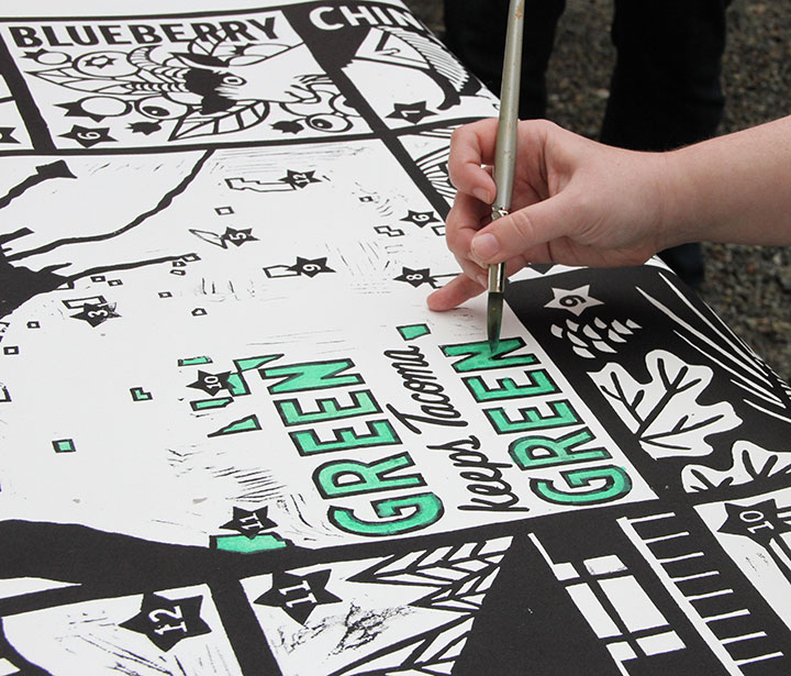
—and we could paint in watercolor right on top of our sketches, and reproduce each image in full color (another thing letterpress printing doesn’t allow).
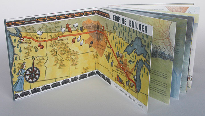
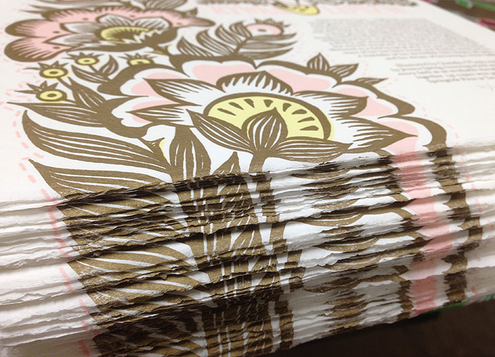
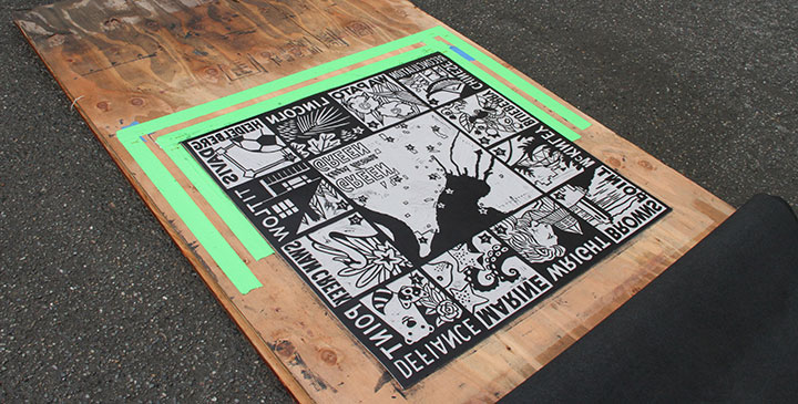
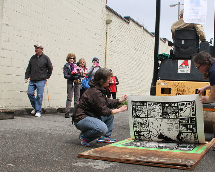
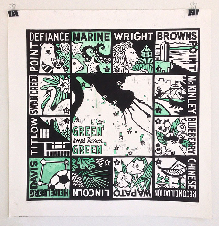
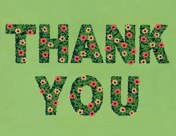
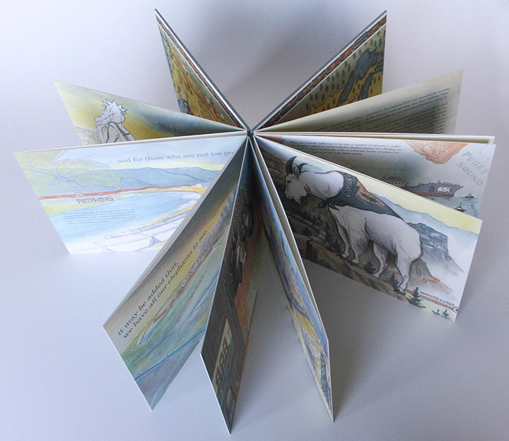
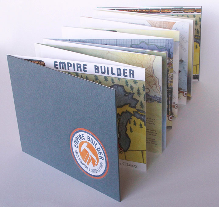
The finished product is an accordion-bound book that reads like a map—tracing both the route of the Empire Builder train and the path of industry and destruction, in one long, unbroken line. When fully open, the book is fifteen feet long.
We printed a limited edition of just 50 books; each one is digitally printed on archival, 100% cotton paper, and hand-bound in hardcover with a paper slip case. Price is $600, plus shipping; we’re taking pre-orders on a first-come, first-served basis, and we’ll begin shipping finished books in April.
If you’d like to reserve a copy, drop me a line at chandler [at] anagram-press [dot] com .
And if you’d like to see the book in person, it’s already making its way around the country to various shows, including a groundbreaking national exhibition on the Bakken oil boom at the Plains Art Museum in North Dakota. Here’s the scoop on where it’s been and where it’s going, so far:
Fifth CODEX International Bookfair
February 8-11, 2015
Craneway Pavilion, Richmond, CA
Bakken Boom: Artists Respond to the North Dakota Oil Rush
Group Exhibition
On display through August 15, 2015
Plains Art Museum, Fargo, ND
CODEX Finds
Group Exhibition
March 24 – April 25, 2015
23Sandy Gallery, Portland, OR
Carpe Librum
Group Exhibition
April 3-26, 2015
Bainbridge Arts & Crafts Gallery, Bainbridge Island, WA
2015 New York Antiquarian Book Fair
Empire Builder represented by the Kelmscott Bookshop
April 9-12, 2015
Park Avenue Armory, New York, NY
5th Annual Puget Sound Book Artists Member Exhibition
Group Exhibition
June 4 through July 31, 2015
Opening reception: Thursday, June 4, 2015, 5:30 to 7:30 pm
Collins Memorial Library, University of Puget Sound, Tacoma, WA
EDITED TO ADD: more shows featuring Empire Builder:
Beyond Brand
Group exhibition
July 30 through September 5, 2015
Opening reception: Saturday, August 1, 2015, 7 to 9 pm
Form + Content Gallery, Minneapolis, MN
The Art of the Book
Group exhibition
June 17 through July 27, 2016
Sebastopol Center for the Arts, Sebastopol, CA
Bridging the Waters
Group exhibition
July 1 through August 21, 2016
Center for Fine Print Research
University of West England, Bristol, United Kingdom
Heavy Metal
Group exhibition
August 31 through October 1, 2016
Berkeley Art Works
Martinsburg, WV
Local Heroes: Book Artists of Washington State
Group exhibition
October 15, 2016 through May 2, 2017
Bainbridge Island Museum of Art
Bainbridge Island, WA
The Illustrated Accordion
Group exhibition
May 5 – 26, 2017
Kalamazoo Book Arts Center Gallery
Kalamazoo, MI
Re-Sisters: Books & Broadsides by Chandler O’Leary & Jessica Spring
Two-person exhibition
February 6 through March 23, 2018
Bryan Oliver Gallery, Whitworth University
Spokane, WA
conTEXT: Broadsides & Artwork by Chandler O’Leary & Jessica Spring
Two-person exhibition
March 3 through April 29, 2018
Antenna Gallery
New Orleans, LA
Rising Together: Artists’ Books and Prints with a Social Conscience
Traveling group exhibition
On view from 2018 through 2021
Fall/Winter 2018: University of Utah Marriott Library, Salt Lake City, UT
Spring 2019: Center for Book Arts, New York, NY
Fall 2019: University of Iowa Center for the Book, Iowa City, IA
Spring 2020: Hoffmitz Milken Center for Typography, ArtCenter College of Design, Pasadena, CA
Fall 2020: University of Puget Sound Collins Library, Tacoma, WA (see above)
Spring 2021: San Francisco Center for the Book (in conjunction with Mills College), San Francisco, CA
Frozen Warnings
Group exhibition on the climate crisis
February 1 through May 3, 2020
Bushel Collective Gallery
Delhi, NY
Empire Builder is also now housed in several permanent public collections, including:
– Library of Congress (Rare Book & Special Collections Division), Washington, DC
– Bainbridge Island Museum of Art, Bainbridge Island, WA
– Harvard University (Widener Library), Cambridge, MA
– Miami University Library (Havighurst Special Collections), Oxford, OH
– Minnesota Historical Society Library (Special Collections), Saint Paul, MN
– Newberry Library (Americana Collection), Chicago, IL
– Scripps College (Ella Strong Denison Library), Claremont, CA
– Stanford University (Green Library American History Collection), Palo Alto, CA
– University of Chicago (Special Collections Research Center), Chicago, IL
– University of Connecticut (Dodd Research Center), Storrs, CT
– University of Puget Sound (Collins Memorial Library), Tacoma, WA
– University of Utah (Marriott Library), Salt Lake City, UT
– University of Vermont (Billings Library), Burlington, VT
– University of Washington Libraries (Book Arts Collection), Seattle, WA
– Washington State Library, Tumwater, WA
Save
Save
August 26th, 2014
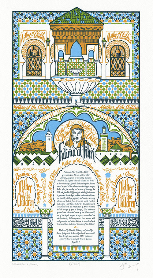
At long last, Jessica and I are ready to unveil our newest Dead Feminist broadside—a piece that has been weighing heavily on our hearts and minds. Our journey began in April, when over 200 girls were kidnapped from their school in Chibok, Nigeria. Since then the media has been filled with accusations leveled at Islam—a culture we know to have a long history of valuing education, innovation and knowledge. We also know that the danger of extremism knows no cultural boundary—and that it would benefit us all to build a world where every girl has the opportunity and security to obtain an education.
So after months of exhaustive research, we decided to go back in time to some of the earliest days of higher education, and to the life and work of Fatima al-Fihri—the woman who founded Al-Qarawiyyin, the oldest university still in operation today. Because Fatima lived in the 9th century, no direct quotes have made it to the present era. Instead, the piece highlights Fatima’s honorific title: Oum al Banine, or “Mother of the Children.”
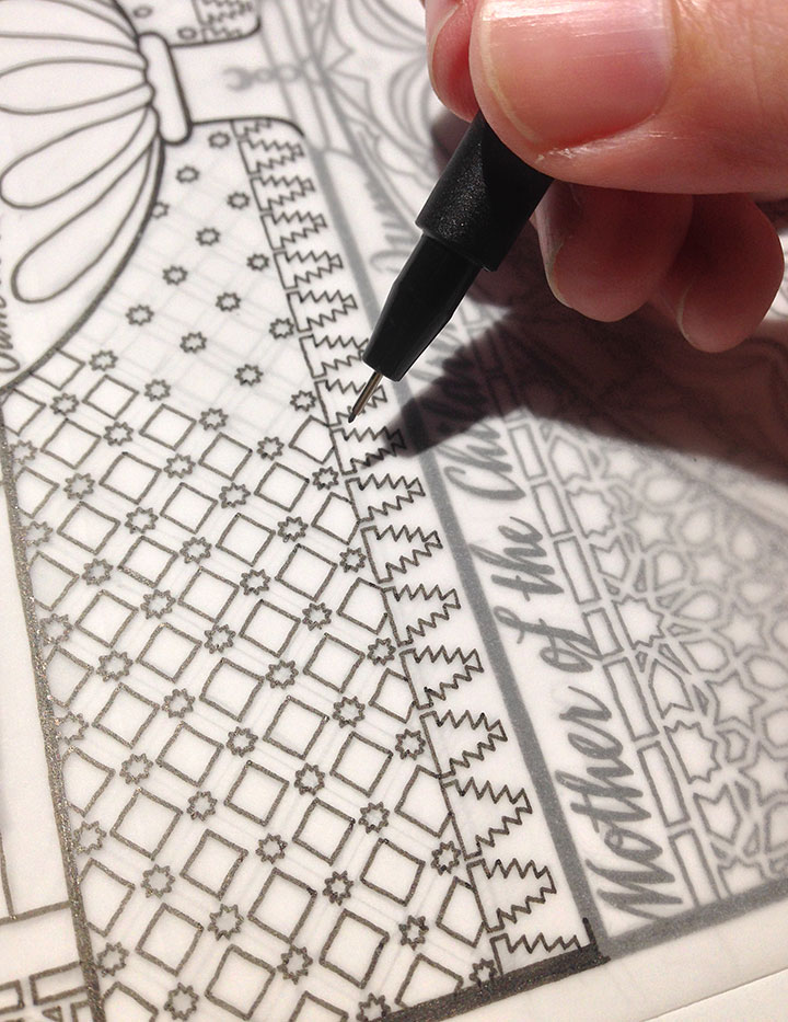
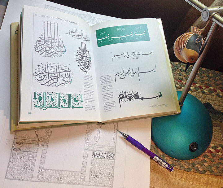
The phrase weaves through the piece like the mortar between stones, repeating again and again like a mantra. The design mirrors the Arabesque decorative style, as well as the common practice of decorating Muslim houses of worship with text (often phrases from the Qur’an). Because it is forbidden to depict the Prophet in Islam, architecture is usually adorned with text and geometric patterns instead.
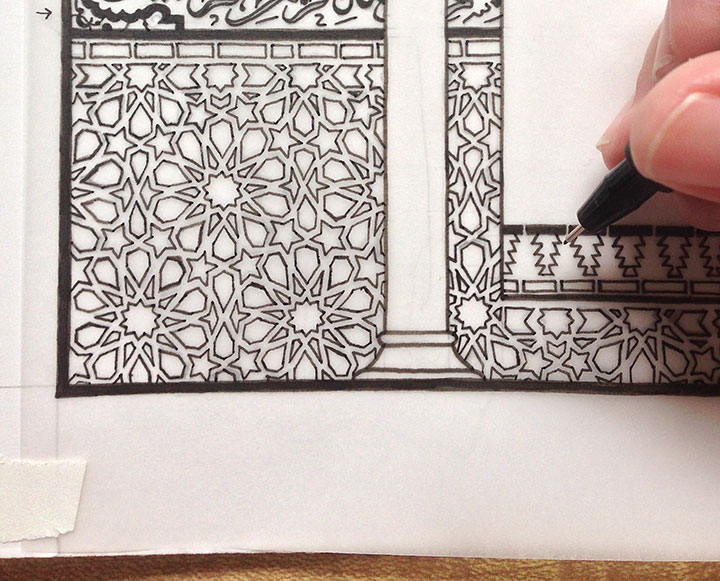
I spent a long, long time creating this illustration—not only because of all the ornate patterning, or the carefully-researched Arabic script. Not just the time I spent trying to find images of Al-Qarawiyyin, or information about Fatima’s life. Somehow, the act of creating this illustration became something of a mantra in itself. All the time required to draft these patterns and compose the page became a form of meditation—and I needed that with this piece. Because much more than that, this became an exercise in trying to understand.
I was trying to understand why we had so much trouble finding a voice for this piece. Why we had to go back 1200 years to find a woman like Fatima, who had made a lasting contribution and who was remembered. Why we could not find a relevant, direct quote at all, despite months of research and consulting scholars on this topic. Why it is so difficult and dangerous for a girl to obtain an education in so many parts of the world. Why there is so much violence and hatred and fear surrounding a belief system with so much beauty inherent within it. Why we are still asking these basic questions after so many centuries have passed.
The answers did not come with the completion of the drawing. They did not come off the press with the finished prints. They will not come through my fingers as I type this. If they cannot come as a result of war, or negotiation between heads of state, or elected office, or royal birthright, or the swell of the mob—they won’t come from me.
But I do know this: every human life is worth the same, and deserves the same chance in life. And more than anything else, I know that education, even at its most basic, is the best chance anyone can have to make a good life—for themselves, and for the rest of us. Education is the best defence we know against extremism, poverty, and violence. So this is where we begin. Where we should always begin.
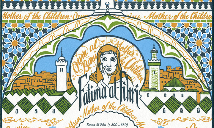
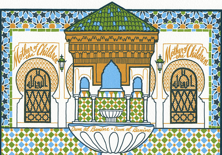
Our 20th Dead Feminist broadside is an ornate tribute to Fatima’s world and the institution she founded. The composition, structured like a Persian manuscript page, features an illustration based on the architecture of Al-Qarawiyyin, with its angular rooflines and sweeping curved arches. Interspersed thoughout the piece is a hand-drawn geometric pattern that mirrors the tilework throughout the university and mosque. Wrapping around the “walls” behind a pair of columns is the Basmala (the phrase that begins every sura or chapter of the Qur’an), lettered in Arabic script.
To help ensure the safety and quality of girls’ education worldwide, we are donating a portion of our proceeds to Girl Up — a nonprofit campaign of the United Nations Foundation that assists some of the world’s hardest-to-reach adolescent girls.
• • • • • • • • • • • • • • • • • • • • • • • • • • • • • • • • • • • • • • • • • • • • • • • • • • • • • • • • • • • •
The Veil of Knowledge: No. 20 in the Dead Feminists series
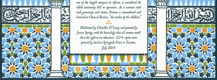
Edition size: 125.4***
Poster size: 10 x 18 inches
Printed on an antique Vandercook Universal One press, on archival, 100% rag (cotton) paper. Each piece is numbered and signed by both artists.
Colophon reads:
Fatima Al-Fihri (c. 800 – 880) grew up in Fez, Morocco with her sister Miriam, daughters of a wealthy Tunisian merchant. The daughters were well-educated and devoted to their community. After the death of their father, Fatima vowed to spend all her inheritance in building a mosque, both a place for worship and a center of learning. In 859, she founded Al-Qarawiyyin, which offered courses in grammar, rhetoric, logic, medicine, mathematics, astronomy, chemistry, history, geography and music — drawing scholars and students from all over the world. (Gerbert of Auverge — later Pope Sylvester II — studied there, and was credited with the introduction of Arabic numbers and the concept of zero to Europe.) This important spiritual and educational center of the Islamic world, one of the largest mosques in Africa, is considered the oldest university still in operation. As a woman with such generosity and vision, Fatima is remembered and honored as Oum al Banine, “the mother of the children.”
Illustrated by Chandler O’Leary and printed by Jessica Spring, with the knowledge that all women must have the right to an education.
Available now in the Dead Feminists shop!
*** The edition size needs a little explanation—every broadside has a symbolic edition number, but this piece is extra special. This number is the solution to an equation we devised out of numbers that are highly symbolic in Islam. Arabic culture is credited with the invention of algebra—a term derived from an Arabic word meaning “the reunion of broken parts.” We arrived at our edition number by multiplying 66 (the number that represents Allah in Islamic numerology) by 19 (considered by some mystics to be the “Key to the Q’uran”), and then dividing the result by 10 (ten-pointed stars are common elements in Arabesque patterning, as well as our broadside design). The “.4” in our edition number represents four artist proofs that exist outside the numbered edition, and set aside as gifts for four important women in our lives. These four women mirror the four “Women of the First Rank in Islam” (Khadijah, first wife of the Prophet; Fatimah, the fourth daughter of Khadijah and the Prophet, and the wife of the Fourth Caliph; the Virgin Mary; and Asiya, wife of the pharaoh and stepmother to Moses).