Blog
March 18th, 2014
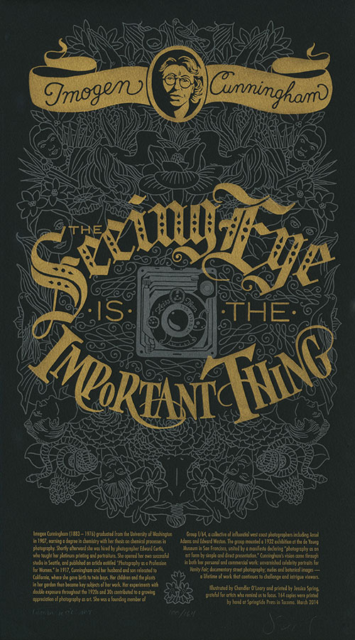
If you earn your living by drawing pictures, you have to spend a lot of time with your head down and your eyes on your paper. Yet at this time of year, with spring coming along fast (at least in the Northwest…), life hurries by at a frantic pace. I hate the idea of missing any of it—so I’m always happy for any reminder to stop and really look around me. So for our newest Dead Feminist broadside, we’re heeding the words of one of America’s greatest photographers:
The seeing eye is the important thing. — Imogen Cunningham
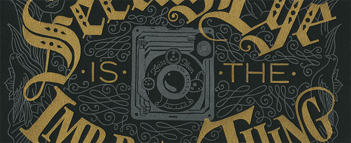
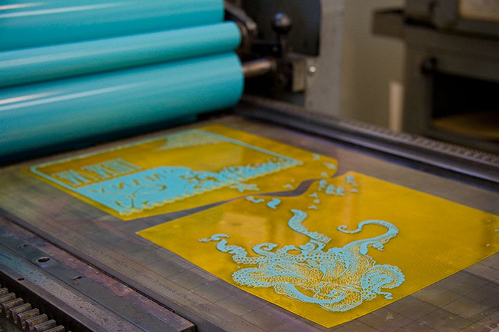
This piece is a major departure from what we’ve done in the past—as you can plainly see. For the first time ever we’ve printed the broadside on black paper—which helped us “pull the focus” (if you will) onto the quote. It also provided a beautiful backdrop for a tribute to someone who spent her life creating black-and-white images.
Surrounding the quote is an intricate metallic silver filigree of spring botanicals and portraiture, creating a pastiche of the subjects of some of Imogen Cunningham’s most iconic photographs—while the color choice references the traditional silver-gelatin photographic process. In the eye of the storm of imagery is the all-seeing camera lens, looking out onto the world.
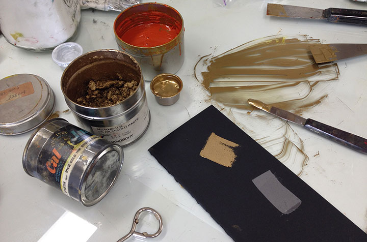
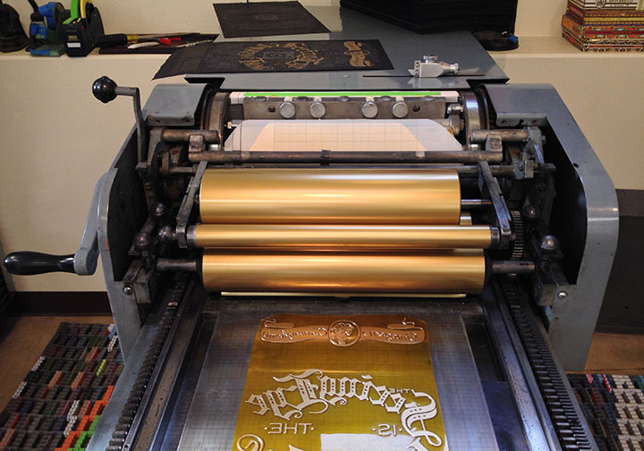
Jessica has her own secret-sauce recipe for gold ink, and while we’ve used it before in our series (like in Gun Shy), nothing makes it look so fabulous as a dark background. The gold ink looked amazing on press—we kind of wished we could just leave the ink on there permanently, because that’s some serious bling. (It almost made the Vandercook feel like some sort of super-cool Bond gadget.)
As always, we donate a portion of the proceeds of the series to a nonprofit that aligns with the message of each piece. To help sharpen the seeing eyes of the artists of tomorrow, this time we’ve chosen Youth in Focus — a nonprofit that puts cameras in the hands of at-risk youth to “teach them how to develop negatives into positives.”
• • • • • • • • • • • • • • • • • • • • • • • • • • • • • • • • • • • • • • • • • • • • • • • • • • • • • • • • • • • •
Focal Point: No. 19 in the Dead Feminists series
Edition size: 164
Poster size: 10 x 18 inches
Printed on an antique Vandercook Universal One press, on archival, 100% rag (cotton) paper. Each piece is numbered and signed by both artists.
Colophon reads:
Imogen Cunningham (1883 – 1976) graduated from the University of Washington in 1907, earning a degree in chemistry with her thesis on chemical processes in photography. Shortly afterward she was hired by photographer Edward Curtis, who taught her platinum printing and portraiture. She opened her own successful studio in Seattle, and published an article entitled “Photography as a Profession for Women.” In 1917, Cunningham and her husband and son relocated to California, where she gave birth to twin boys. Her children and the plants in her garden then became key subjects of her work. Her experiments with double exposure throughout the 1920s and 30s contributed to a growing appreciation of photography as art. She was a founding member of Group f/64, a collective of influential west coast photographers including Ansel Adams and Edward Weston. The group mounted a 1932 exhibition at the de Young Museum in San Francisco, united by a manifesto declaring “photography as an art form by simple and direct presentation.” Cunningham’s vision came through in both her personal and commercial work: unvarnished celebrity portraits for Vanity Fair; documentary street photography; nudes and botanical images — a lifetime of work that continues to challenge and intrigue viewers.
Illustrated by Chandler O’Leary and printed by Jessica Spring, grateful for artists who remind us to focus.
Available now in the Dead Feminists shop!
September 10th, 2013
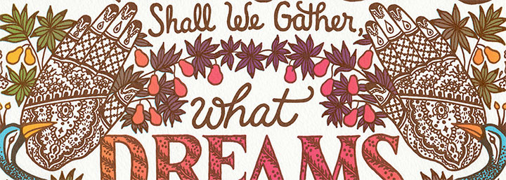
As the school year begins again and the pace of life quickens, the easy pace of summer has made way for a season of bustling, planning, and dreaming of times ahead. Yet worldwide, over and over again, the plans and dreams of so many women and girls are cut short by violence. In light of recent high-profile crimes halfway around the world, Jessica and I though it was high time we spoke up. This time we drew inspiration from the Nightingale of India:
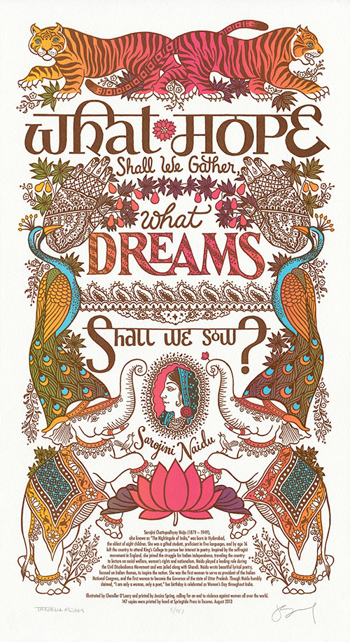
What hope shall we gather, what dreams shall we sow? — Sarojini Naidu
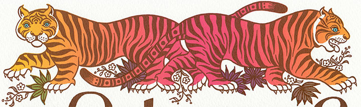
“Nightsong” honors the hopes and dreams of women and girls in every culture—in defiance of the world’s dangers. The illustration depicts a lush dream menagerie printed in bright, exotic hues. Tigers, peacocks, elephants and nightingales stand sentinel around our heroine, surrounded by detailed paisleys and florals drawn in the style of Indian mehndi designs.
To make this print more dreamlike, we decided to throw a tricky technique called split-fountain printing into the mix—or “rainbow roll,” for short.
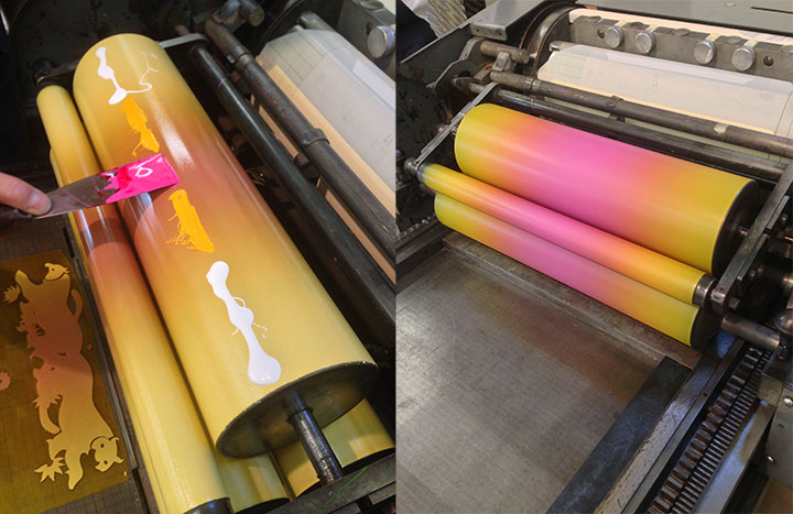
A split fountain is extremely difficult to control (advanced Eagle Scout printing here, folks), but the results are so lovely that it’s absolutely worth the effort. As an added bonus, we were careful to keep our inks translucent—so when we registered the second color, that mixed the colors even further, giving us an entire rainbow spectrum with just two passes on press.
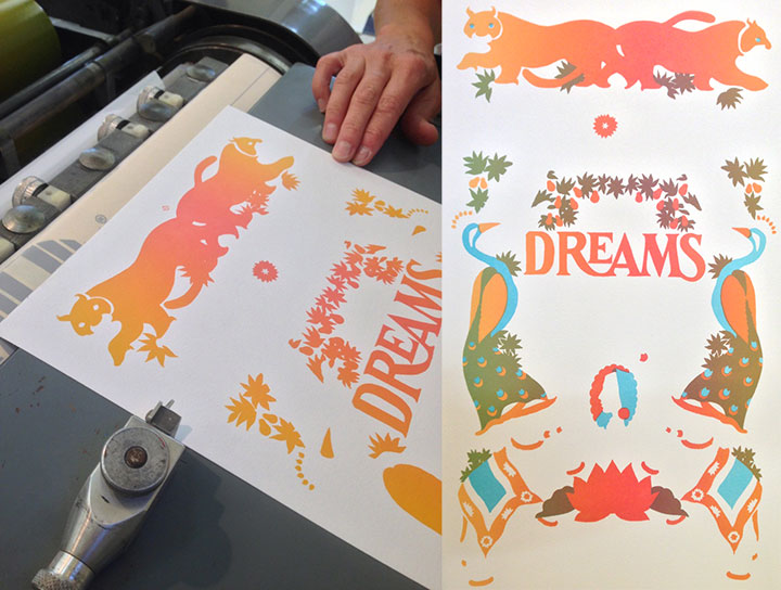
I should add, though, that while we love printing with a rainbow roll, the process is completely unpredictable, and the finished prints are far from uniform. So rather than an edition of absolutely identical broadsides, we ended up with a beautiful range of yellows, oranges, pinks and even reds, that vary from print to print. So my scans here are representative of the edition in general, but no two prints are exactly alike (so if you order a print, please allow for some slight variations from what you see here).
To help restore hope to victims and in honor of our dreams for the future, a portion of our proceeds will be donated to Take Back the Night. In order to create safe communities, Take Back the Night seeks to end sexual assault, domestic violence, dating violence, sexual abuse and all other forms of sexual violence.
• • • • • • • • • • • • • • • • • • • • • • • • • • • • • • • • • • • • • • • • • • • • • • • • • • • • • • • • • • • •
Nightsong: No. 18 in the Dead Feminists series
Edition size: 147
Poster size: 10 x 18 inches
Printed on an antique Vandercook Universal One press, on archival, 100% rag (cotton) paper. Each piece is numbered and signed by both artists.
Colophon reads:
Sarojini Chattopadhyay Naidu (1879 – 1949) — also known as “The Nightingale of India” — was born in Hyderabad, the eldest of eight children. She was a gifted student, proficient in five languages, and by age 16 left the country to attend King’s College to pursue her interest in poetry. Inspired by the suffragist movement in England, she joined the struggle for Indian independence, traveling the country to lecture on social welfare, women’s rights and nationalism. Naidu played a leading role during the Civil Disobedience Movement and was jailed along with Gandhi. Naidu wrote beautiful lyrical poetry, focused on Indian themes, to inspire the nation. She was the first woman to serve as president of the Indian National Congress, and the first woman to become the Governor of the state of Uttar Pradesh. Though Naidu humbly claimed, “I am only a woman, only a poet,” her birthday is celebrated as Women’s Day throughout India.
Illustrated by Chandler O’Leary and printed by Jessica Spring, calling for an end to violence against women all over the world.
UPDATE: poster is sold out. Reproduction postcards available in the Dead Feminists shop!

June 21st, 2013
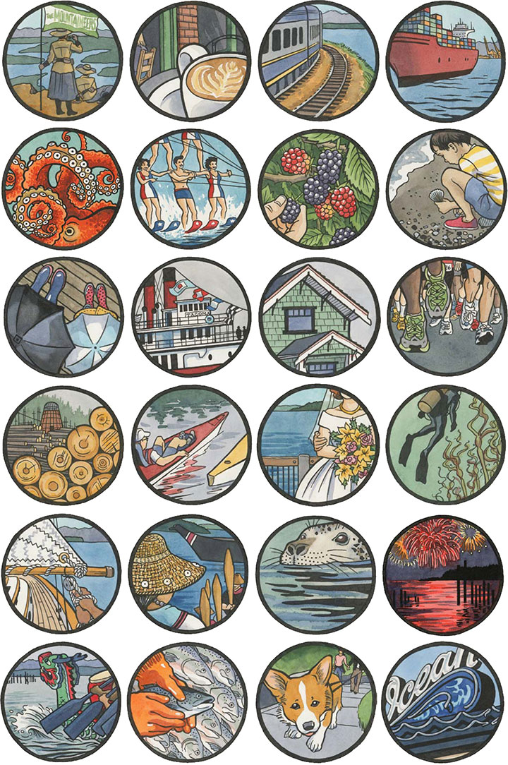
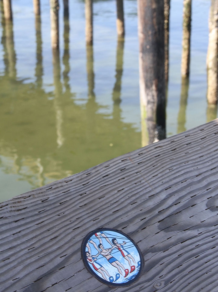
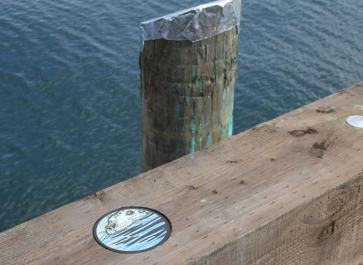
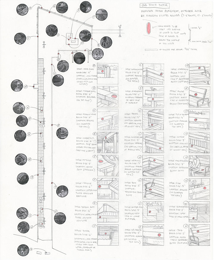
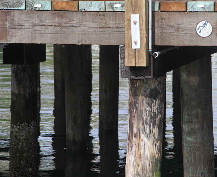
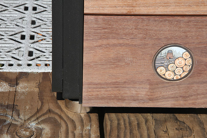
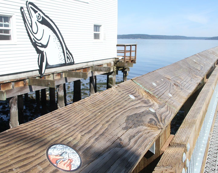
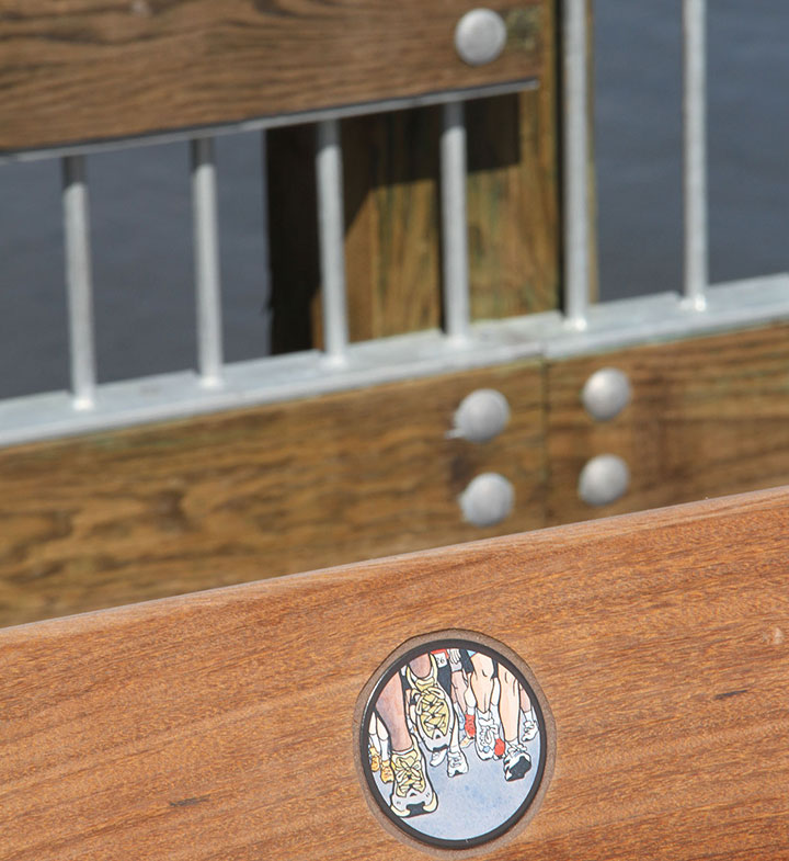
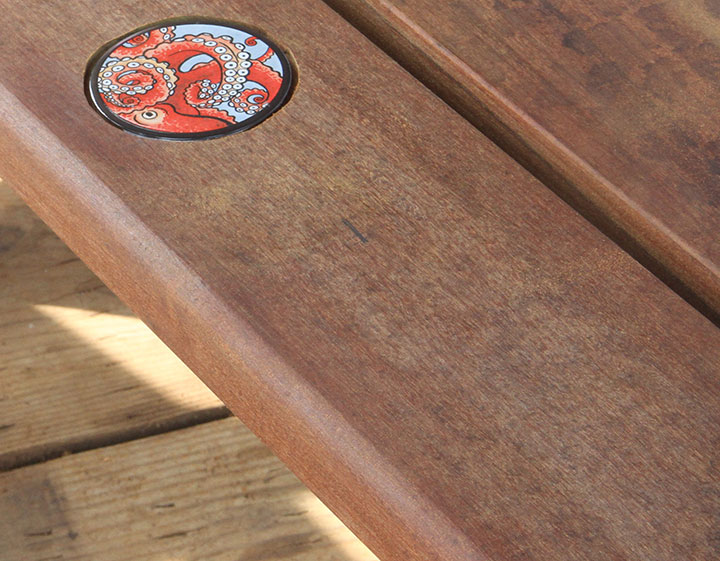
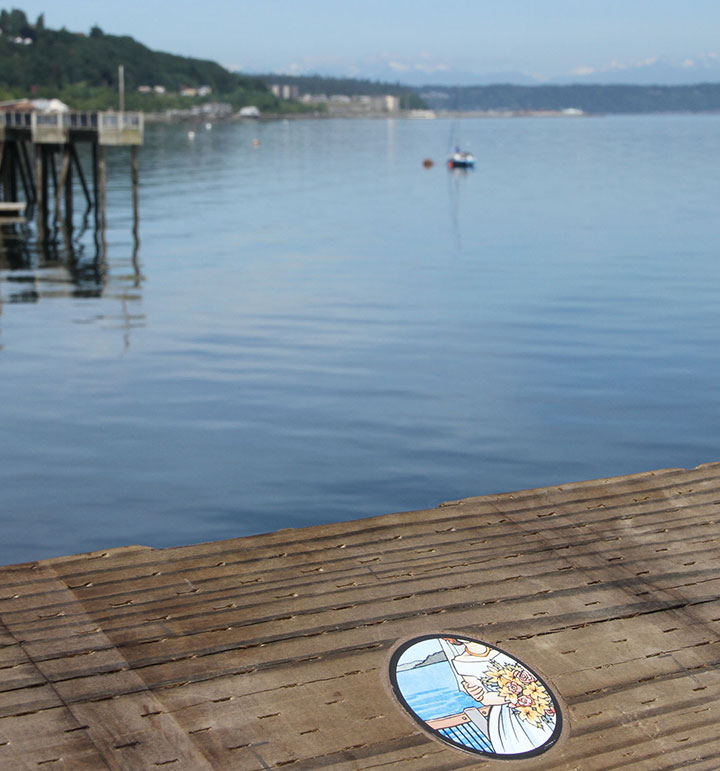
Okay. Now that Old Town Dock is officially open, I feel like I can finally give away some juicy details. Here are all 24 medallions (portholes?) in my new public art piece, Droplets. Since not everyone reading this post is local to Tacoma, I won’t go into great detail over every image. But to give you some context, Old Town Dock boasts one of the best vantage points in the South Sound, with beautiful views of land, city and sea in every direction. That’s what first drew me to the site: I wanted the chance to encourage people to look all around them, because there was something to see everywhere you look.
But when I started researching the history of the place, I was even more struck by how much had happened in Old Town over the years—and how much was still going on, every day. Because of its prominence in so many lives and livelihoods, Old Town Dock has stood witness to a staggering number of true stories since it was built in 1873. Family histories, booming industries, important events, Native traditions, beginnings, endings, drastic changes, slow growth, celebrations, tragedies, and a thousand everyday narratives—the stories we tell are as commonplace as raindrops, yet as precious as the water that defines and sustains Tacoma as a city.
Droplets references just a handful of these stories, yet hopefully hints at the diversity and richness inherent in our public spaces.
Going from a painted picture to a tangible, finished object was nearly a two-year process, and I was only one small piece of the puzzle.
And the 24 medallions barely hint at the number of drawings I did along the way. Back when I was a finalist for the commission, I needed to demonstrate my understanding of the space, and convey how I wanted the artwork to function to the selection committee. In this area, pictures really were worth a thousand words apiece; time after time, sketching out what I meant was infinitely more effective than trying to explain it in words.
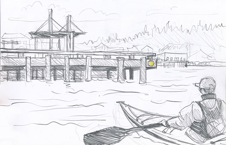
As I was working on my presentation, all this drawing and imagining every angle gave me a little epiphany. I realized that while the view from the site was spectacular, the Dock itself was part of the view, too, depending on where you stood. Since Old Town Dock is a gateway between land and sea, I wanted to engage the folks who’d be arriving from the water, as well. So I presented this drawing—and while some other things have changed along the way, the reality of this particular piece is almost exactly as it appears in this sketch.
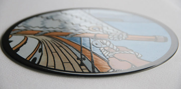
Anyway, back to the nuts and bolts. As you’re well aware, I’m an illustrator—I work in paint and pixels, not industrial components. I didn’t have the skills or tools to make outdoor pieces out of durable materials (in public art, durable materials include metal, glass, tile, stone, brick, and other permanent industrial media; a mural, for instance, is not considered “durable”). So I turned my designs over to the good folks at Winsor Fireform, a fabricator just down the road in Olympia, and they reproduced each Droplet as a small porcelain enamel disc.
Porcelain enamel is the most durable sign medium available. Each piece is made by reproducing the image in pigmented powdered glass onto a steel base. Then the piece is fired at kiln temperatures to fuse the glass to the steel, creating a permanent, totally nonreactive surface.
Porcelain enamel won’t fade in UV light, won’t react to water or salt, and is resistant to dirt and graffiti. That makes it ideal for public art, and the perfect medium for the harsh marine conditions at Old Town Dock.
Now all that was left was to install the rounds. I came armed with my scale drawing—and lots and lots of warm clothing for a long shift in the early morning rain.
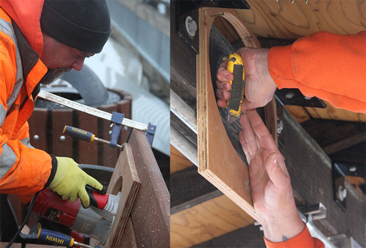
Basically, I stood and pointed, and Pat routered out 24 perfectly positioned circles.
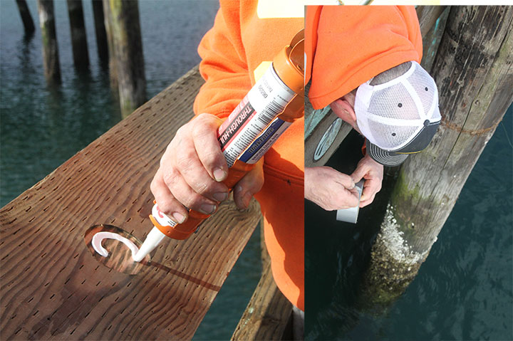
Then he inlaid each disc, affixing them to the wood with some seriously heavy-duty marine sealant, and Bob’s your uncle. Actually, it wasn’t always that easy; some of the rounds required some acrobatic feats to install. Just passing him tape measures and things gave me vertigo sometimes—but at least he didn’t have to drill while standing in a choppy rowboat (which was plan B, if hanging off the edge didn’t work).
Twenty-four hours later, the adhesive was fully cured, and I could call it done.
The day we installed, nothing on the Dock was completely finished—benches and planters were still piled up at random, and I wasn’t entirely certain that the final placement would match my scale drawing.
But now it sort of feels like the artwork has always been there—
and maybe you just never noticed it before.
I love being there to witness whenever a Droplet catches someone’s eye, and they stop whatever they’re doing to look more closely.
And just maybe that moment of noticing will lead to the words, “Let me tell you a story…”
April 21st, 2013
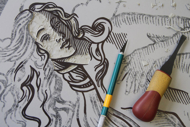
It’s that time of year again: the trees are blooming outside, and inside we’re playing with knives. The ninth (!) annual Tacoma Wayzgoose is one week from today—and if we’re really lucky, Jessica and I might just finish carving our design by then. As usual, we’ll reveal the whole design that day, but until then, this little peek might look familiar…
If you’re new to my tiny u-bend of the Intertubes, you might ask: what the heck is a Wayzgoose? It’s a festival celebrating the art of printing, a tradition that goes back hundreds of years. Here in T-town, our party mobile is a steamroller—yes, ma’am—and we churn out giant-sized linocuts in the street to mark the occasion. If you’re local, come on by and get ink on your jeans:
9th Annual Tacoma Wayzgoose
Sunday, April 28, 2013
11 am to 4 pm, Free!
King’s Books
218 St. Helens Avenue, Tacoma, WA
In the meantime, you can whet your appetite with a stroll down Amnesia Lane—take a look at the ghosts of Wayzgeese past:
• 2009 (Tacoma)
• 2010 (Tacoma)
• 2011 (Tacoma)
• 2011 (San Francisco)
• 2012 (Tacoma)
See you next week, rain or shine!
December 4th, 2012
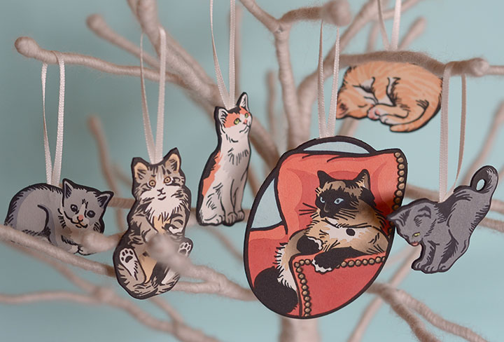
Photo by Laurie Cinotto
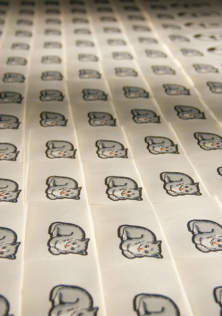
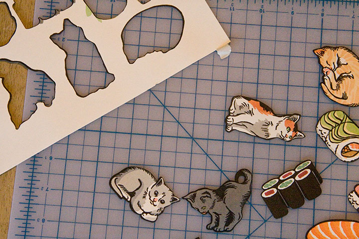
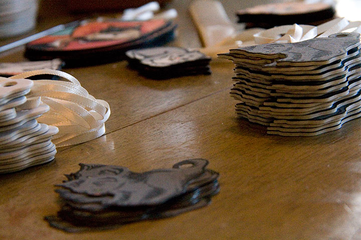
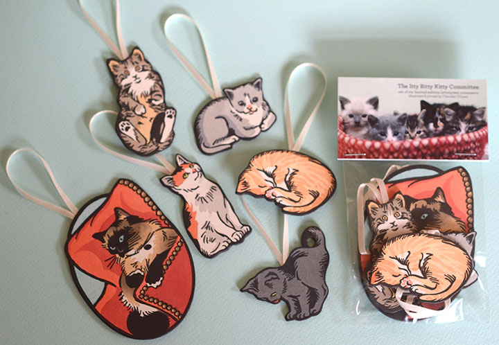
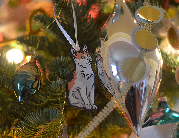
Right now my little cottage-industry factory is churning out Christmas—starting with this year’s letterpress ornament collection. This is the second year I’ve made letterpress ornaments, and I have been dying to show you this year’s crop.
Thankfully, I can finally let the…ahem…cat out of the bag.
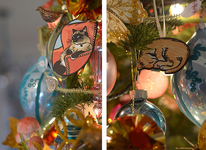
Look at Laurie’s amazing tree! She is the queen of holiday decorating.
There are two sets of ornaments this year, and for one of them I collaborated with my friend Laurie Cinotto, the fabulous fine-craft genius and kitty wrangler behind the insanely wonderful Itty Bitty Kitty Committee. A year ago I asked her if she’d be interested in doing a set of kitty ornaments, and for months now we’ve been positively chortling over these things. (Curious fact: we make nearly identical chortle sounds.)
The really hard part was picking which kittens from Laurie’s nearly endless alumni and gorgeous photographs to illustrate. In the end, I settled on a few of my all-time favorites: Clovis Ashby, who is a bit of a Tacoma celebrity. Extra-pretty Victoria Anne McGillicuddy in all her calico glory. Aloysius Petrie for his “Who, me?” look. My particular friend Baxter Lamm, who now makes mischief full-time at Jessica’s house. And Pearla Dearborn, to whom my secret heart belongs forever (even though she doesn’t live with me). And watching over the flock is Laurie’s own Empress Mama cat, Charlene Butterbean.
These kitties (and Laurie’s photographs) are T-town legends, as I found out this weekend. We did a little ornament test-drive at a local craft fair, and people kept saying things like, “Hey, that’s Clovis on that tree!” and “Wait a minute—what is Charlene Butterbean doing at your table?” But whether these guys are old hat for you, or you’re a dog person who’s never heard of such a thing as kitten blogs on the Internet—well, I just dare you to tear your eyes away from Laurie’s world.
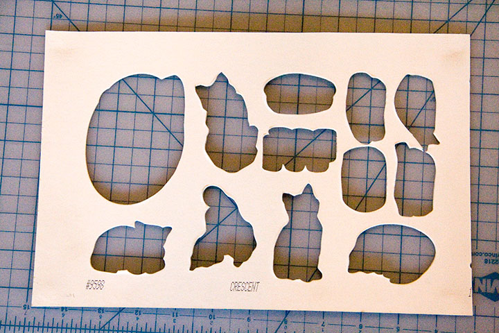
There are just 200 sets of these ornaments to go around, and each one is ridiculously handmade. To give you an idea of just how ridiculous, I thought I’d walk you through part of the process.
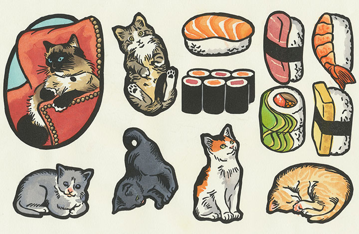
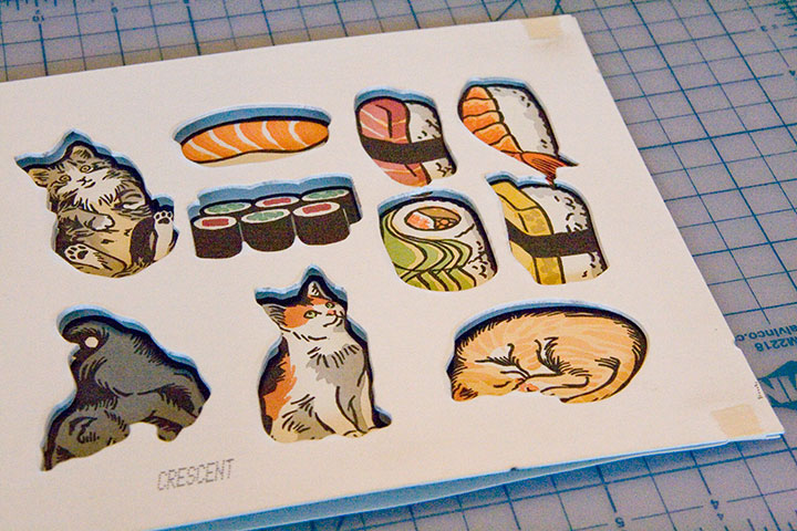
Yes, there’s sushi on that press sheet. That’s the other ornament set this year…
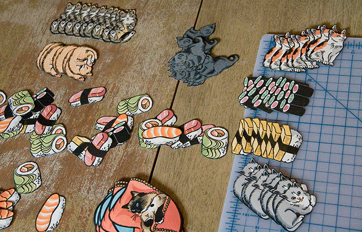
Y’all know my printing process pretty well by now, so I’m going to skip ahead a bit. Just FYI, these are linocuts; check out my bird prints if you’re curious about that process. But as you can see, I printed both ornament sets all at once, on one press sheet.
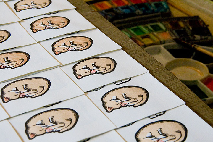
Then I went ahead with my usual hand-coloring assembly line.
No, wait a minute. I said 200 prints, right? Well, that’s a small edition for retail goods, but when you’re hand-painting each one, 200 feels more like eleventy billion.
There, that’s more of an accurate picture.
Still, if the work stretching endlessly ahead of you to the horizon is a bunch of drawings of kittens, it’s impossible not to be happy about it, despite yourself. I know—I tested the hypothesis, and I’m still grinning like a fool.
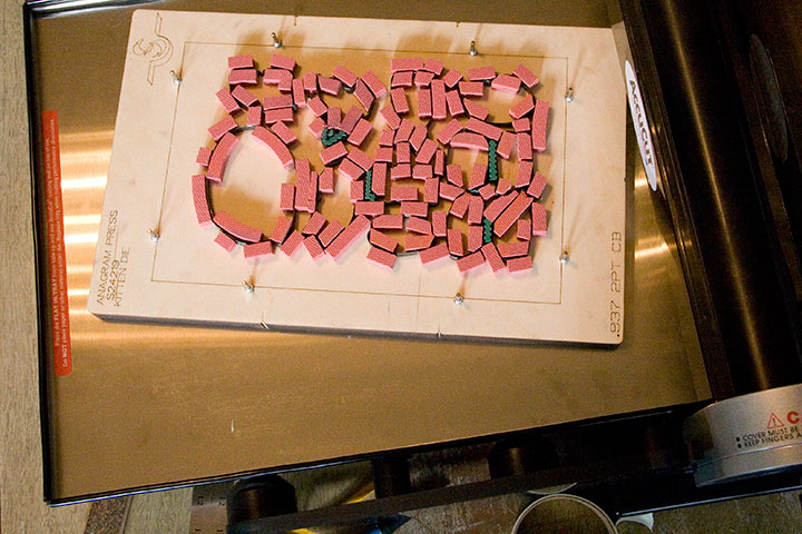
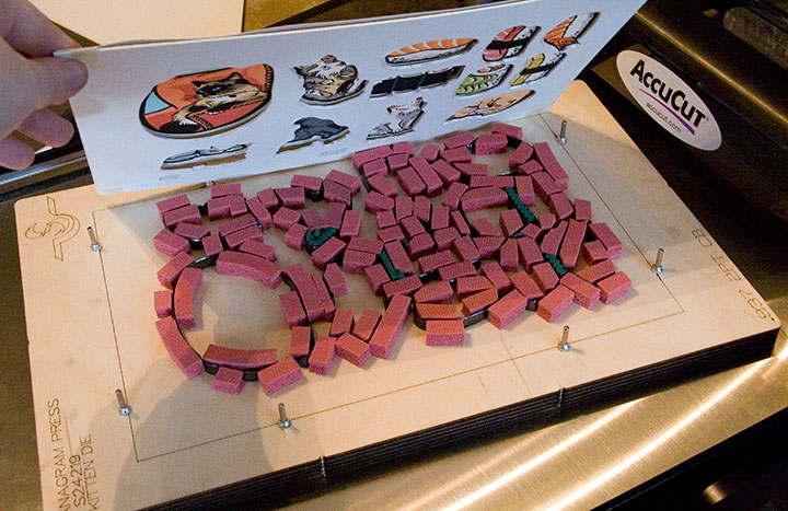
This year I added a new step to the process: rather than hand-cutting all 1200 kitties in the set by hand (ahem, Local Conditions, I’m looking at you!), I made the design simple enough that I could semi-automate part of the assembly line. I bought a hand-crank die-cutting machine, created a digital dieline (basically an industrial pattern) of my design, and sent it off to a friendly steel rule manufacturer in Kent.
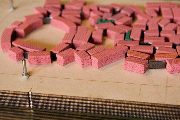
I know that plank with all those pink foam bits doesn’t look anything like an ornament set, so let me zoom in. A die consists of steel blades embedded in a piece of wood. The blades are bent and arranged in precisely the configuration specified by the dieline. Those pink foam bits cushion the blades, hold the paper in place and help with cutting accuracy. When the die is run through the cutting machine (which works much like a Vandercook press), those pink bits squish down under pressure, exposing the blades and gripping the paper to be cut. Those metal pins sticking up are for lining up the press sheet—they’re spring-mounted, so they retract when the blade goes through the cutting machine.
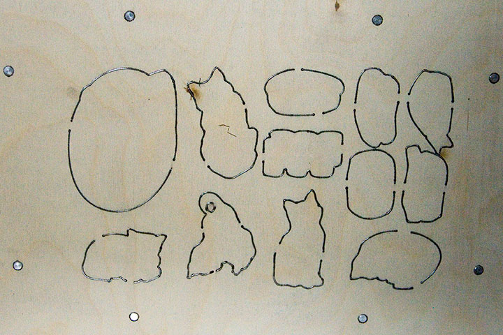
Here’s the underside of the die—now you can see how the blades fit the press sheet.
Still, while the die is a total lifesaver in terms of cutting time, the lightweight paper I was cutting made for some wiggle room—even with the extra line tolerance I built into the design. After all that hand-coloring I didn’t want to lose a third of my prints by cutting them in the wrong place. So I still had to do some puzzling and figure out how to outsmart the limitations here.
Since the lightweight prints are mounted to a heavier board to complete the ornaments (the ribbon loops are sandwiched in between), I was basically using the die twice. I realized that the leftover blanks of board would make a good template, and wouldn’t wiggle under pressure.
A little masking tape,
some quick eyeballing,
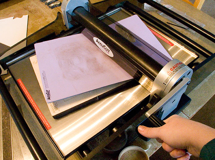
and slow-and-steady cranking in the press—
—and Bob, as they say, is your uncle.
Individually taping down all eleventy billion 200 press sheets was a little mind-numbing, but still, the “finished” pile added up fast.
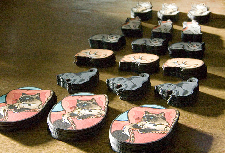
And it was awfully satisfying to see the whole edition completed in days rather than weeks or months.
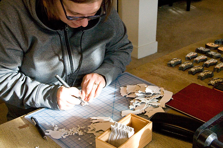
Laurie stepped in and saved my sanity by doing a lot of the grunt work—rough-cutting boards, snipping lengths of ribbon, and cutting insets into the board-kitties so that the ribbon loops lie flush and disappear.
A quick coat of black around the edges,
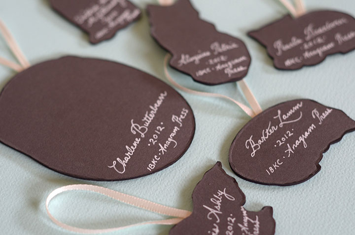
and just a wee bit of cursive script on the back,
—and we have a litter of Christmas kittens. Laurie contributed one of my favorite photos for the packaging, and I basically have been unable to stop squealing ever since. Now the Tailor and I just need to hurry up and chop down our Christmas tree, so I can display these guys in the living room!
If you’d like a set, they’re up in the shop. To answer the foreseeable question, we’re just offering these in full sets—they were printed in sets, so we don’t really have any oddball solo pieces this time. And last year almost everyone wanted the full set of bird ornaments, rather than just one, so I let those votes carry the motion. Actually, there are still some bird sets left, so feel free to snag ’em if you missed out last year. As usual, these are limited-edition—I won’t be reprinting them, so once they’re gone, they’re gone for good.
One last thing: to make sure that Tacoma pets also have a happy holiday season this year, Laurie and I will be donating a portion of our proceeds to help stock the Tacoma Humane Society’s emergency pet food bank. We want to make sure that while we’re all having a kitty-themed Christmas, the kittens who inspire us get to enjoy Christmas dinner, too.
Happy tree-trimming!
June 29th, 2012
My brain is chock full of useless information—I could sing you about 35,000 ad jingles on key, or recite Jurassic Park or Trading Places or a hundred other movies line-for-line. But don’t challenge me to a game of Poker, because I have a terrible head for card games. I love playing them, and am always up for learning when friends come over a suggest a rubber of something or other. The trouble is, I forget the rules right away—so whenever I sit down to a rematch, it’s like starting at square one.
As an example, I used to do summer stock theatre, and we techies had a tradition of playing Hearts backstage during the sound check. So I played Hearts every night for two months straight, three summers in a row, and I still can’t remember the rules now. (Something about being saddled with the Queen of Spades, and lots of half-joking shouted epithets surrounding that card, but that’s about it.)
Over the years I have learned and forgotten dozens of card games—including Snap, President, Pitch, Five Card Draw, Seven Card Stud, Crazy Eights, Kings Corners, Egyptian Ratscrew, Spades, Slapjack, Pig, Cheat, Five Hundred, Hand & Foot, Whist—and probably plenty of others that I’ve even forgotten the name for.
About the only games I can ever keep in my head are the embarrassingly simple ones like War, Go Fish, Old Maid and Blackjack. Oh, and I can play Cribbage like a fiend, because my dad and his Scottish friend Alex taught me when I was nine or ten. We used to have hilariously cutthroat wee-lass-vs.-grown-man Cribbage tournaments on a regular basis, so how could I ever forget that?
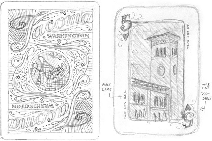
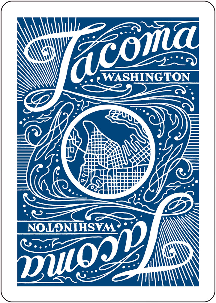
Being lousy at remembering any card games, however, hasn’t stopped me from wanting to design a card game. Or collecting interesting or unusual decks (the Tailor and I have a good dozen in regular rotation). So when my friends Maija and Amy asked me to be the designer on the poker deck they were dreaming up, I think must have freaked them out by shouting, “YES!” before they’d even finished their sentence.
(And as an added bonus, I got first dibs on my favorite Tacoma haunts.)
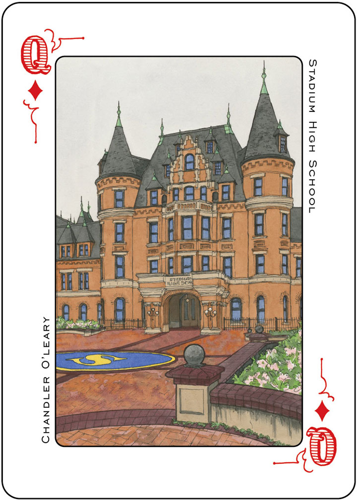
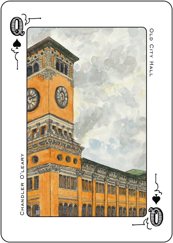
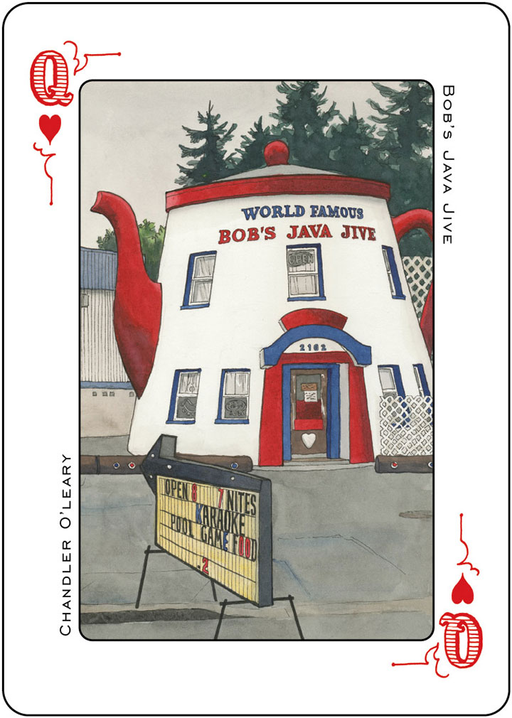
These gals weren’t looking for any old run-of-the-mill card deck, either. They wanted to show off Tacoma in all her architectural splendor. And since we’re blessed with a veritable boatload of fabulously talented artists in this town, they decided to divvy up the deck by ranks—with fourteen artists, each tackling a list of locations in four-of-a-kind fashion. I loved being the first to see the collection of incredible artwork come down the pike from these folks. Everybody involved in the project has gone above and beyond our wildest imagination—I can’t wait to see the finished deck.
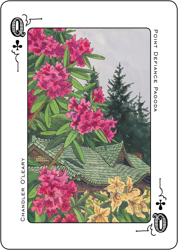
Beyond just creating something beautiful and fun, Amy and Maija have their eyes on a bigger prize. They want to create a real, no-kidding Tacoma souvenir. We get a lot of visitors and tourists around here, what with the Sound and the Mountain and the Universities and what-have-you—but you’d be hard-pressed to find Tacoma-specific tchotchkes (or even postcards!) that aren’t sarcastic. And I know I’m not the only one around here who’s a little tired of folks knockin’ T-town, based solely on a stereotype and a thirty-year-old reputation. So we’re upping the ante a little, and offering a bit of hard evidence that Tacoma is pretty dern great.
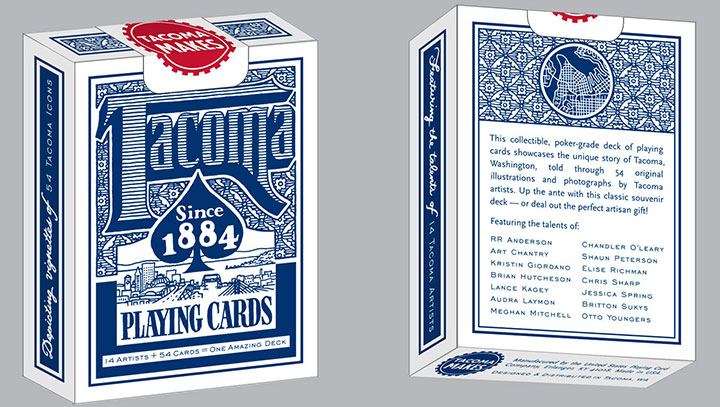
You know my schtick by now, so you can guess that all the lettering and pattern doo-dads are hand-drawn. I had the pleasure of designing the suits, rank typography, card face template, card backs and box.
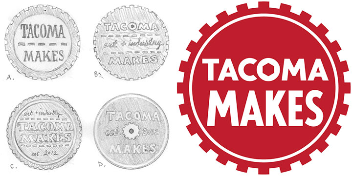
I even got to design the logo for Maija and Amy’s company, Tacoma Makes. Basically, it was the kind of project I’m always on the lookout for, but which rarely lands in my lap. So I spent about half of the time grinning my fool head off, and the other half pinching myself in disbelief.
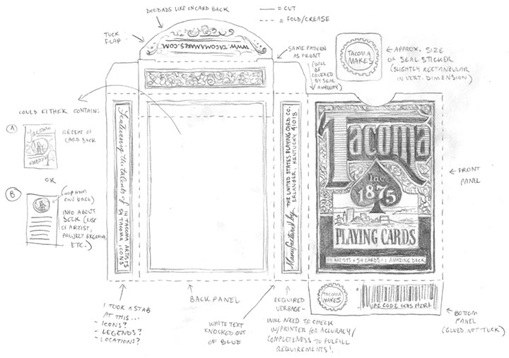
I also got to flex my file-production muscles. I love to geek out over the technical side of design, but since I started my business, much of my production work has centered around letterpress printing. So playing with dielines and spot color swatches again was a nice little challenge.
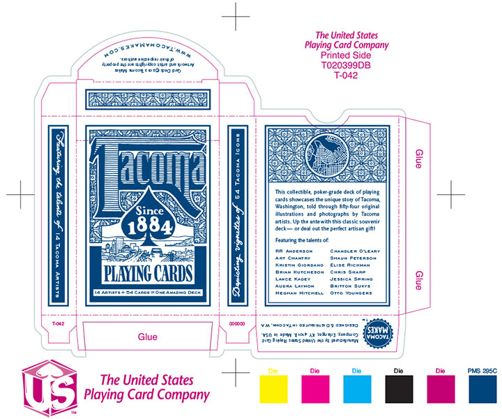
We’re taking all these extra steps because this is a real, bona fide, professional-grade poker deck. The kind folks at the U.S. Playing Card Company are manufacturing the cards for us—they’re the people behind the Bicycle, Bee, Hoyle and other card brands. So you won’t have to hedge your bets that this deck will be extra tasty.
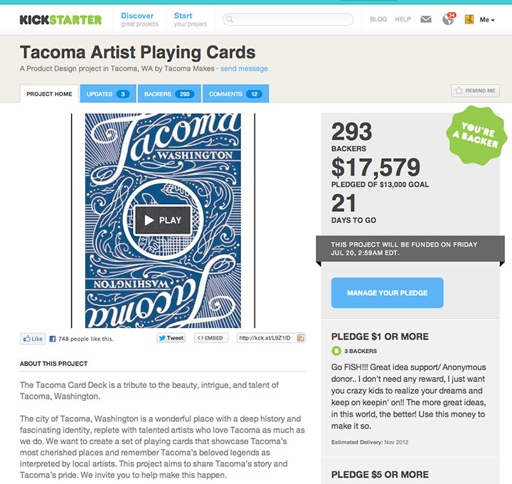
To raise funds for the card printing, and even pay for modest artist contracts, we set up a Kickstarter project (much like the Apocalypse Calendar that you all so graciously funded last year). Now normally this would be where I explain that Kickstarter projects are only funded if they reach their entire monetary goal by the deadline—but I don’t have to! I left town for a few days, just after the project launch, with the intention of spreading the word when I got home. So imagine how floored I was to come back and discover that we’d met our goal in just six days!
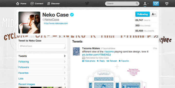
The response to this has been staggering. And it’s not only the lovely legions of fellow Tacomans who have supported us—we’re seeing pledges come in from all over the country. And as a nerdy fan-girl aside, I just have to squeal and tell you that Neko Freaking Case (a hometown Tacoma gal) has been retweeting my designs in the Twitterverse. Dorky internet hero fantasy: fulfilled, folks.
The Kickstarter project will run through July 19, so you can still contribute if you want to get in on rewards and goodies that are only available to backers. Otherwise, the cards will be in hand and dealt out this November—along with an exhibition of all the original artwork.
There’s even a rumor of an artist game night in the works, so cut the cards! I’m up for any game you’re willing to teach me—as long as you don’t mind that I’ll probably forget the rules before the night is through.
In the meantime, thank you so much for all your support for our crazy card deck! I’ve said it before, and I’ll say it again—Tacomans (and honorary Tacomans!) are the best folks on earth.
• • • • • • • • • • • • • • • • • • • • • • • • • • • • • • • • • • • • • • • • • • • • • • • • • • • • • • • • • • • •
Edited to add (fall 2013): The blue deck has been so popular that we have done a red deck as a sequel! The new deck features all new artwork and artists—you can read more about it here.
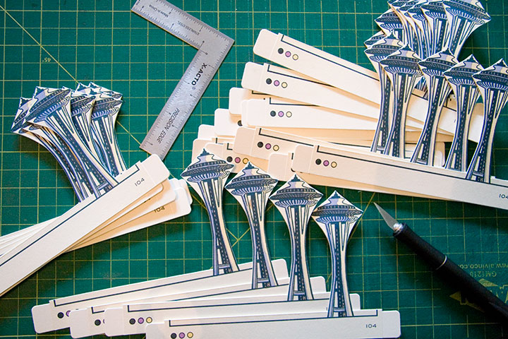
May 20th, 2012
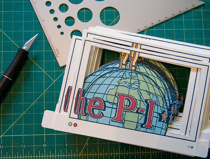
Now that I’m back in town, I’ve got deadlines. Lots of them.
Like, hundreds and hundreds. Each one shaped like a little P-I Globe, a little Space Needle, or any number of things.
You get the idea.
April 9th, 2012

When Jessica and I were in North Carolina last summer, we had just enough sightseeing time to squeeze in a short trip along the aptly-named Blue Ridge Parkway.

Between the dappled sunlight,

the lush Southern greenery,

and the unexpected splashes of color,

we were enchanted in an instant.
(I, for one, was tempted to do a little Katniss Everdeen impression—just run away from it all and head for the hills.)
It wasn’t hard to imagine sitting down and breaking out the paper and paints, with all that blue haze as inspiration.

The folks at the nearby Penland School of Craft certainly agree. Since Lucy Morgan founded it in 1929, Penland has become a national center for craft education. Widely respected for its preservation of handcraft traditions, Penland is centered on total-immersion study and both traditional and experimental techniques. Settled in a quiet pocket of the Blue Ridge Mountains, it’s an inspiring setting for focused work. Thanks to its reputation and location, the school attracts some of the country’s best artists and fine craftspeople to study and teach in the Penland studios.
So you can imagine how thrilled and honored Jessica and I were when they asked us to come and teach a letterpress workshop there this summer.
We’ll be teaching a one-week printing intensive, and doing our very best to turn the printshop upside down. This ain’t your grandpa’s letterpress. Here are the details:
Letterpress: Old Dog, New Tricks
A printmaking intensive with Chandler O’Leary and Jessica Spring
Penland School of Crafts, Penland, NC
Summer Session 7: Aug. 26 to Sept. 1, 2012
In the class, we’ll work with both hand-set type (don’t worry, we won’t monkey with any linotype machines…) and photopolymer plates to produce editioned prints that combine the two techniques.
We’re going to get pretty technical, pretty fast, but don’t worry—the workshop is open to all levels of experience. That way we can bring letterpress newbies up to speed quickly, and give more experienced printers the chance to go nuts and geek out with us.
“Unnatural Light” by Jessica Spring
You’ll be doing some death-defying typesetting by hand, using Jessica’s acrobatic techniques,
On a Mission Dead Feminist print
and I’ll teach you the ropes of designing for photopolymer, so you can throw a three-ring hand-drawn circus into the mix.

So get thee to the mountains and join us! Registration is open now, but don’t wait too long—the class is capped at 12 students.
See you in North Carolina! Save me some grits, will you?
April 4th, 2012
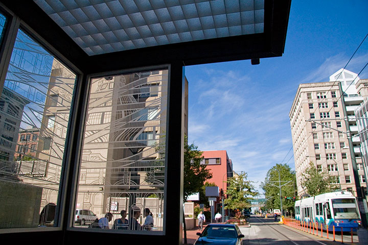
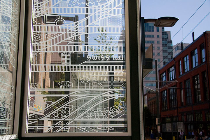
This is rather old news now, but as it took such a long time to complete, and as it isn’t exactly going anywhere, being hot off the press doesn’t matter so much. Last year I was commissioned to do a piece of public artwork here in Tacoma, and as of a few months ago, the Commerce Street light rail station is up and running.
I’ve done several temporary and permanent public pieces before, but this was my first commission for a durable materials project—and by that I mean materials that can be expected to last many decades with minimal maintenance (metal, stone, concrete, ceramics, glass, etc.). Interestingly, painted murals are not considered durable; they require all kinds of upkeep, and have an average life expectancy of only five to ten years.
The Commerce Street Station project called for a design for etched glass. Now, as you’re well aware, I’m no glass artist—it’s a little weird to think of a letterpress printer doing glass work. But that’s the beauty of the public art realm: instead of one artist tackling every aspect of a project, there’s a whole team of people involved, each focused on his or her particular strengths. I was responsible for the design, and industrial fabricators took care of the actual glass-etching part. So what my part boiled down to was a process nearly identical to what I do for any letterpress print: a hand-drawn illustration, converted into a computer file for production. Realizing that created a huge mental shift for me, and suddenly made the prospect of wearing a Public Artist hat way less intimidating.
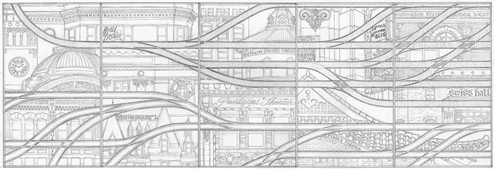
If you’ve ever stood in a shelter waiting for a bus or train, you’ve probably seen an etched glass design. Usually it’s an abstract pattern to discourage graffiti, or in the Pacific Northwest, often something outdoorsy or salmon-themed. So I figured that territory was well covered. Instead, I focused on the rails themselves. The railroad is possibly the single most significant aspect of Tacoma’s history; it is truly the backbone of our city. In 1873, Tacoma was chosen over Seattle as the terminus of the Northern Pacific Railroad. Without the resultant growth and industry that resulted from the railroad hub, Tacoma might still be a tiny fishing hamlet, rather than a bustling port.
For decades, industrial and passenger rail travel was our pride and joy. Along with the goods and people moving along the NP Railroad line, Tacoma was also criss-crossed with streetcar lines, providing efficient and comprehensive public transportation. During the Great Depression, however, the cost of maintaining the streetcar lines became too heavy a burden. The system was dismantled in 1938, and private automobiles became the dominant mode of transportation. This story is by no means unique — passenger rail fell out of favor all over the country, and today, public rail transit is only the norm in our largest cities.
To me, our small (but expanding) light rail line is a ray of hope for a progressive future, a return to a more sustainable system, and a chance to highlight Tacoma’s history. So for Continuum, I designed a brace of parallel rail lines. The top line is a set of traditional railroad tracks, beginning as a single thread and branching outward—symbolizing Tacoma’s beginnings and expansion. The bottom tracks are grooved-rail embedded tram tracks—exactly the type you see in both old streetcar lines and modern light rail paths. As the traditional tracks branch outward, the tram tracks converge into a single path, just as our lone light rail line is the last vestige of the old streetcar network.
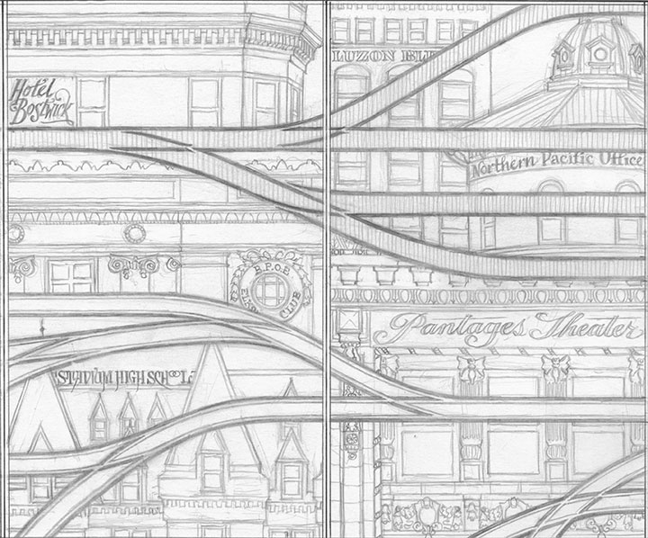
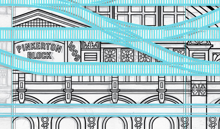
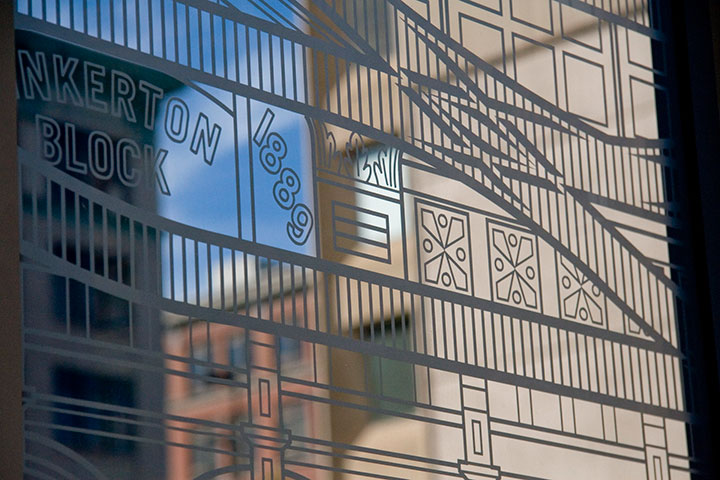
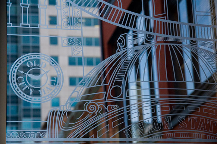
Tacoma’s architecture sprouted and developed right alongside the railroad, as a result of our industrial growth. So instead of surrounding the tracks with a white-noise pattern of ballast, like you’d see around real tracks, I designed an illustrated amalgam of our most iconic buildings. Some are still with us; others are long gone (can you spot the Luzon Building above?). Every structure represented exists either along a historic streetcar or other track line, or has some connection with the railroad.
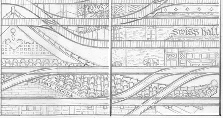
While I was working on the initial design, a teenage arsonist set fire to the historic Pt. Defiance Pagoda. Suddenly it didn’t seem to be enough for the city merely to preserve the architecture—I felt the need to create my own record of as many buildings as I could.
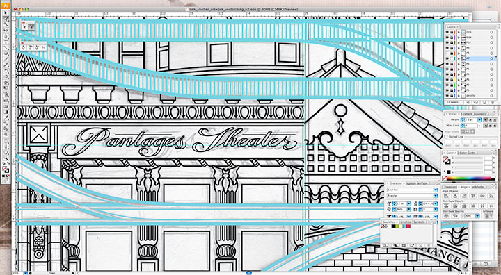
My pencil drawings weren’t finished enough to send to the fabricator—I needed to bridge the gap between my pencil and their equipment. To get the artwork to the point where it could be etched into glass, I needed to convert it to a specific file format called vector graphics. Now, digital photos are made up of pixels: a grid of tiny dots that determine how large a size an image can be blown up to be. The more pixels per square inch, the larger you can make the photo. Vector art doesn’t work like that. Without getting in over my head in explaining this, vector graphics are made of math.
(Which is super cool, really.)
The shapes are determined by geometric points, lines and proportions, rather than pixels. So that means you can blow the artwork up to any mammoth size, or shrink it as small as you please, and you’ll never lose detail or image quality. This makes the vector format A) awesome; and B) ideal for translating extremely intricate work into industrial materials. All I had to do was fire up Adobe Illustrator, and get to work converting the artwork.
This took days. And days. And days.
It’s funny that people tend to see computer programs as shortcuts or “cheats,” but in the end, any good piece of digital artwork requires a level of craftsmanship—exactly the way a handmade object does. Illustrator has lots of labor-saving tools if you know where to look, but the ones that are designed to fully automate the conversion from a scanned drawing to a vector file aren’t always ideal. For this particular project, the only way to do it right was to suck it up and spend ungodly hours redrawing the thing “manually” within the program. I had to rely on all my artist chops just as much for file production as I do for any artist book or watercolor painting. I easily spent as much time converting the design to vector format as I did drawing it by hand, but it’s important to have a flawless file—lots of expensive production steps are dependent upon that file being free of glitches or stray marks.
As an aside, one night that I stayed up (very) late working on the file happened to be the night of the Royal Wedding. To provide some background noise (in order to stay sane), I streamed the event in a little window on the corner of my screen while I worked. So now, whenever I see the finished glass panels I think of ridiculously ornate English hats, and the Queen in her vanilla Jello pudding-colored suit. Pavlov would have a field day with me.
Right-hand photo courtesy of City of Tacoma
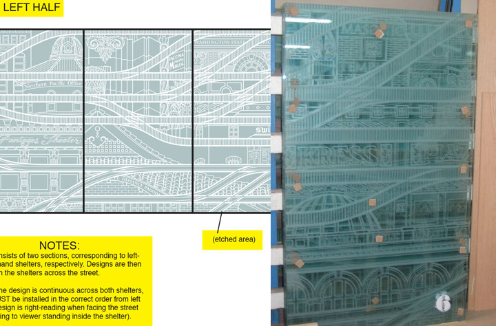
Anyway, next I sent the finished files to the fabricator. Using the points plotted in the file, and a digital mockup I threw together with my production notes, they were able to cut the design out of a masking material, which they attached to the glass. Then the sand-blasted the glass panels. Where there were holes cut through, the sand made contact and etched the glass; everything protected by the mask stayed shiny and transparent. The finished result is a clean, precise replica of my design.
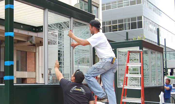
Photo courtesy of City of Tacoma
The tricky part was making sure they installed all ten panels in the correct order; otherwise the connecting track lines wouldn’t make sense. Thanks to the big fat numbers they stuck to each panel, though, everything worked out just fine.
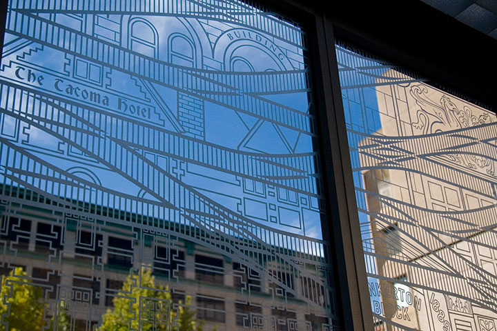
It’s fun to stand inside the finished shelter, and see the stylized buildings contrast with real ones. And when you’re not paying close attention to the details, the illustrations recede into a sort of geometric pattern.
For those who are paying attention, my hope is that this little illustrated city will encourage viewers to notice the real city around them—preferably with an eye toward preservation and innovation.
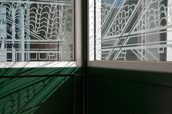
Attentiveness has its own little reward, too. If you happen to be there when direct sunlight hits the glass, the etched lines project onto every surface. (Tacoma looks good on you.)
In the end, I just wanted to take the dull routine of waiting for a train, and turn it into something beautiful—even if only for a moment.
I’m always saying things like, “If I ran the world…”, usually followed by some crazy idea for transforming every mundane thing in life into something a little more meaningful. I love the thought that on one tiny patch of real estate, I really did get to run the world, and make things exactly the way I imagined they could be. Many thanks to Amy McBride and the City of Tacoma for giving me free rein.
November 30th, 2011
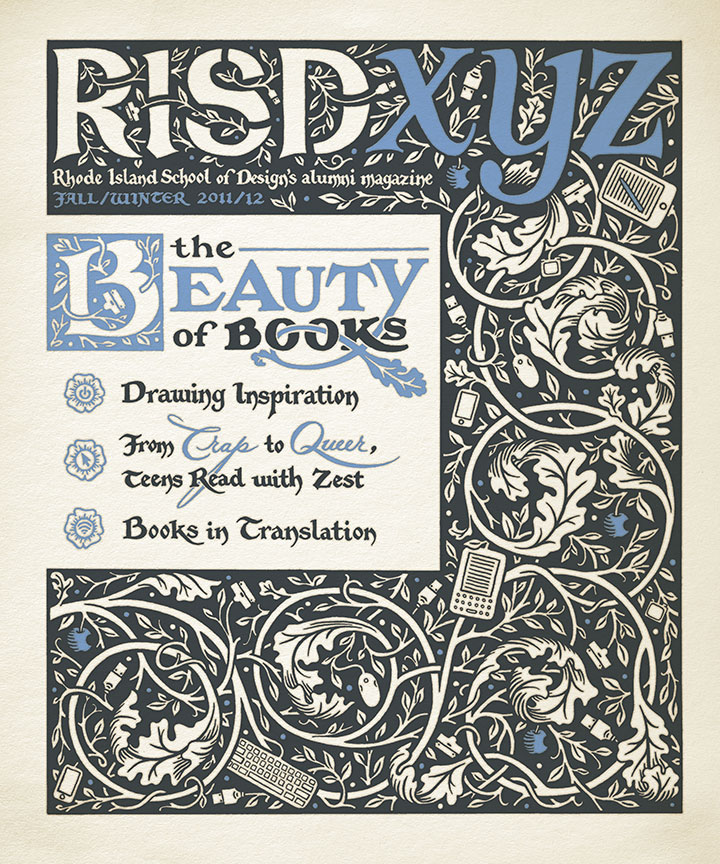
This fall my alma mater asked me to illustrate the cover of its alumni magazine. Since the issue’s theme was the spectrum that books occupy these days (from hand-bound artist books to e-readers), it was right up my alley.
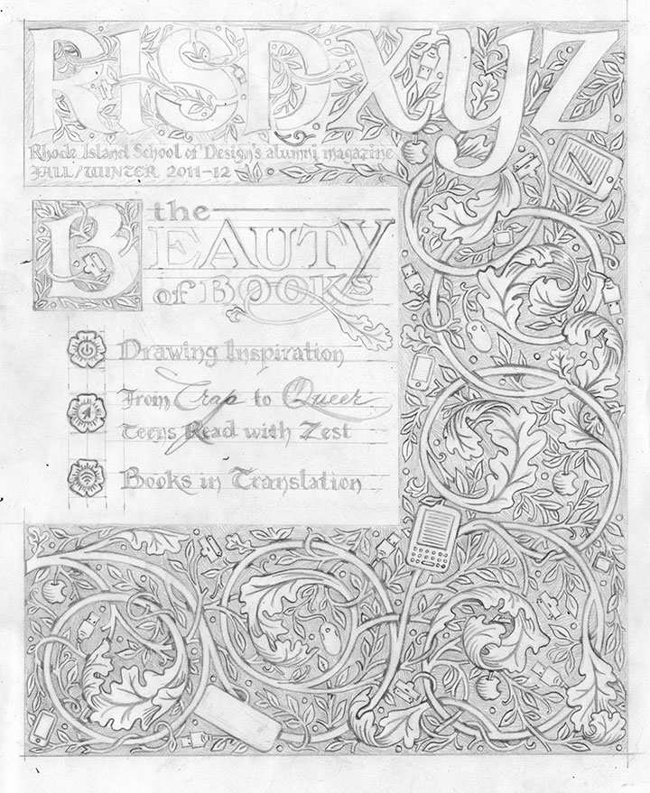
As usual (see above, I’m nuts), everything is completely hand-drawn, including the magazine’s masthead. (Major thanks to my editor at RISD for having faith in me on that one—and not sending the Brand Police after me for monkeying with the logo!) I wanted the design to be reminiscent of illuminated manuscripts and their younger printed cousins designed by William Morris. If you look closely, though, there’s a twist:
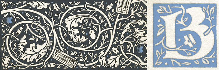
Tech gadgets, ripe on the vine.
(Sorry, William.)