Quite a handful
April 7th, 2014
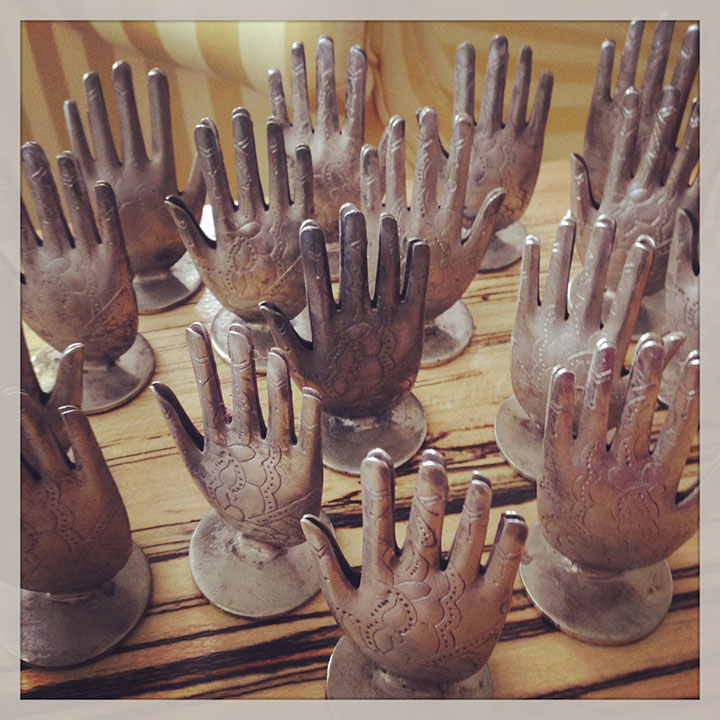
I picked up a whole passel of display fixtures this week—just in case I need a helping hand (or 12) at my next craft fair table…
I picked up a whole passel of display fixtures this week—just in case I need a helping hand (or 12) at my next craft fair table…
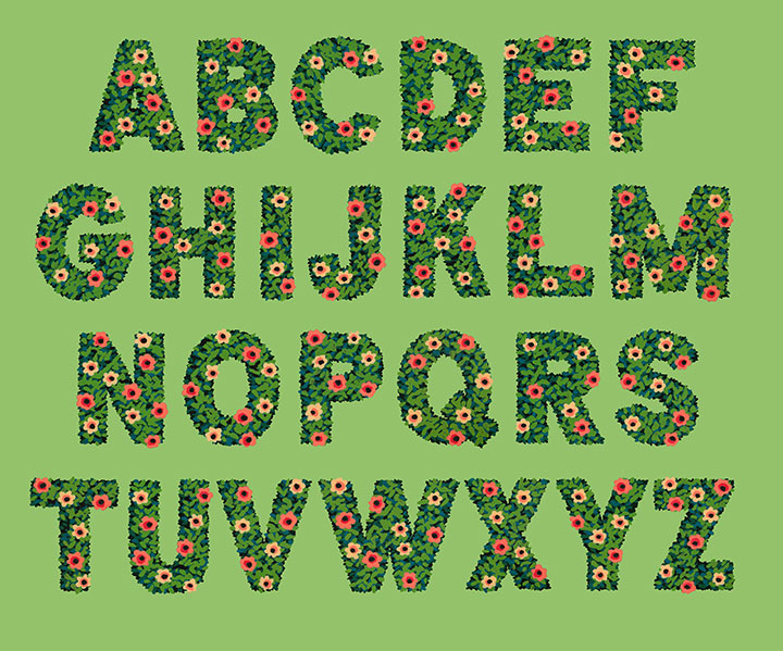
Look! I made an alphabet!
It’s funny—I almost never design an entire alphabet. In general, lettering projects just don’t really work like that. Most of the time, a letterer(erer) designs only the letterforms required for the word or phrase they’re lettering. That’s really the best way to create letter styles (which are not the same as fonts!) that really fit what the text is trying to “say.” You’re not designing an alphabet and then making it work for a bit of text—you’re taking that bit of text and giving it a voice.
But this time, I did things differently. I wanted to create some botanical lettering, but I wasn’t sure what I wanted to use it for—so I went whole hog and started with the entire alphabet.
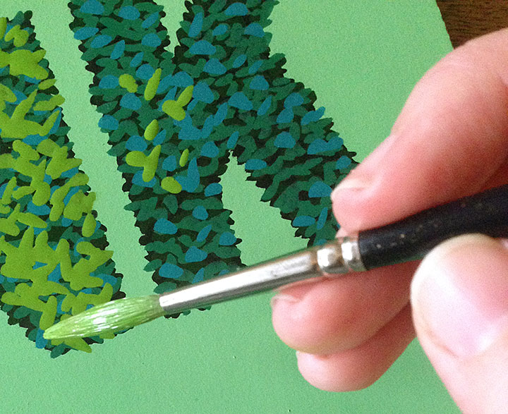
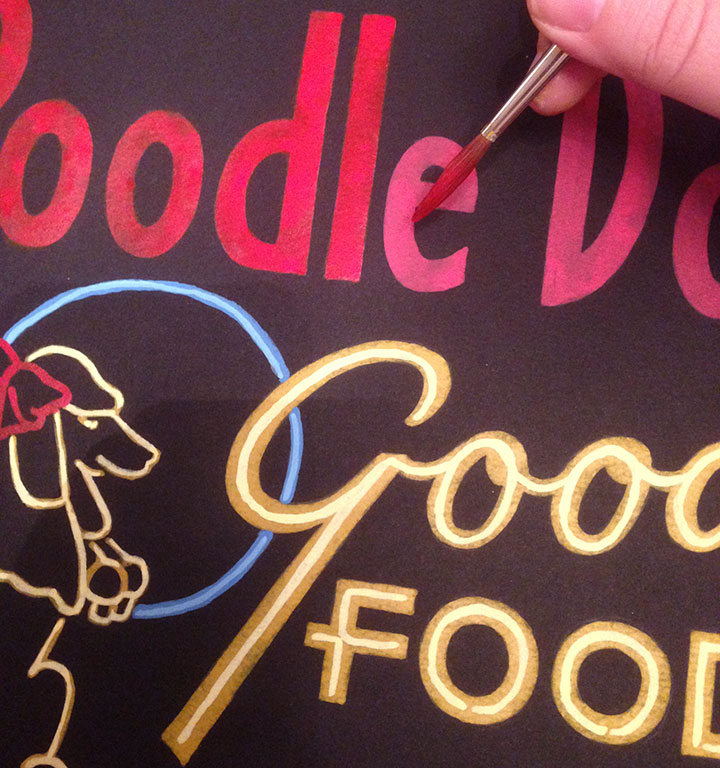
Lately I’ve been doing a lot of work with a new (to me) medium: acrylic ink. It’s what I used to create the You’ll Like Tacoma and Love Birds series. What I love about acrylic ink is that unlike watercolor, it’s opaque—and infinitely easier to wrangle than the more traditional opaque medium of gouache.
When you work with watercolor alone, you have to start with the lightest colors first, and build up darker ones in layers. Whites are the white of your paper, and once you add pigment to an area, you can never return back to that pristine white. It teaches you to think in a subtractive sense, where you sort of “cordon off” the areas you want to stay white, and carefully build everything else up around them. I love working with watercolor, but it takes years and years of practice to feel proficient at it, and it’s not a medium that’s forgiving of mistakes.
I find opaque media to be far more freeing, and the look more crisp. (I also like to combine acrylic ink with watercolor in the same painting—the best of both worlds!) But what I love best about it is that I don’t have to work from light-to-dark—I can go in reverse! Many of the mid-century illustrators I admire (Mary Blair, Eyvind Earle, Walt Peregoy, Ralph Hulett, etc.) painted with opaque media, so I looked at a lot of landscape paintings done for animation backgrounds for clues on technique. That’s when I figured it out: dark-to-light, not light-to-dark.
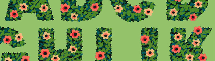
For my alphabet, I started with a black hedge silhouette, and added leaves (above) in increasingly lighter greens and blues. I think by the end there were 9 or 10 layers of paint in the finished lettering.
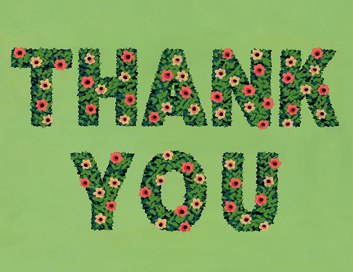
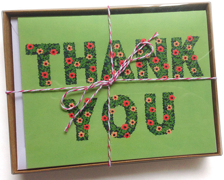
I was so grateful for the epiphanies Earle and Hulett had given me that suddenly, what I wanted to do with the alphabet became clear: thank-you cards!
To hedge my bets (sorry) I’ve packaged them up both individually and in pretty little box sets of 8. You can find yours in the shop!
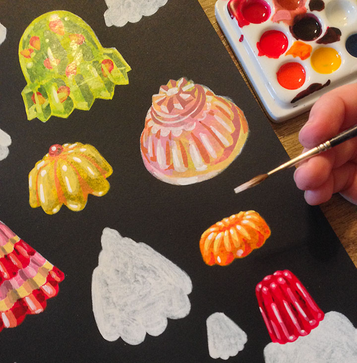
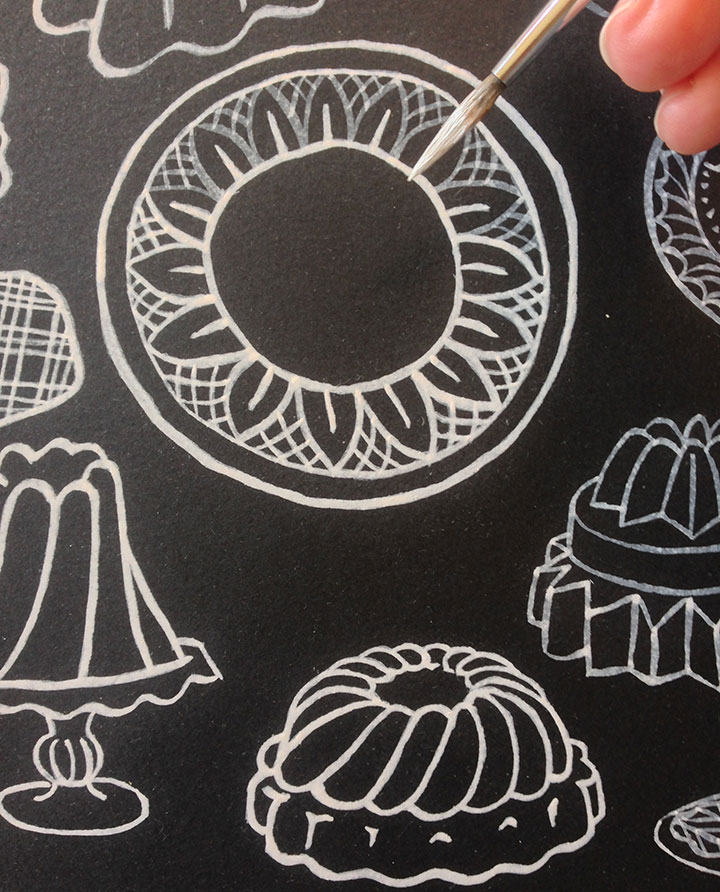
You already know I have a thing for absurd, elaborate, apocalypse-resistant desserts. I took an afternoon “off” from my normal studio work to play around with various silly things, and this ended up being the theme.
I think it’s sort of an illustrator’s version of happy hour, I suppose…
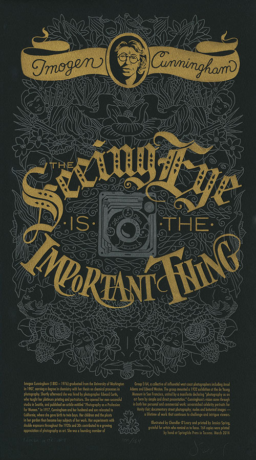
If you earn your living by drawing pictures, you have to spend a lot of time with your head down and your eyes on your paper. Yet at this time of year, with spring coming along fast (at least in the Northwest…), life hurries by at a frantic pace. I hate the idea of missing any of it—so I’m always happy for any reminder to stop and really look around me. So for our newest Dead Feminist broadside, we’re heeding the words of one of America’s greatest photographers:
The seeing eye is the important thing. — Imogen Cunningham
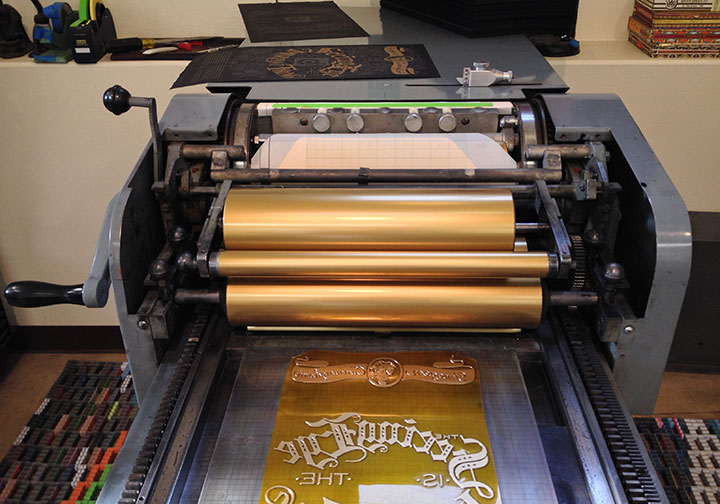
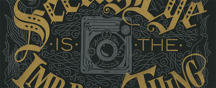
This piece is a major departure from what we’ve done in the past—as you can plainly see. For the first time ever we’ve printed the broadside on black paper—which helped us “pull the focus” (if you will) onto the quote. It also provided a beautiful backdrop for a tribute to someone who spent her life creating black-and-white images.
Surrounding the quote is an intricate metallic silver filigree of spring botanicals and portraiture, creating a pastiche of the subjects of some of Imogen Cunningham’s most iconic photographs—while the color choice references the traditional silver-gelatin photographic process. In the eye of the storm of imagery is the all-seeing camera lens, looking out onto the world.
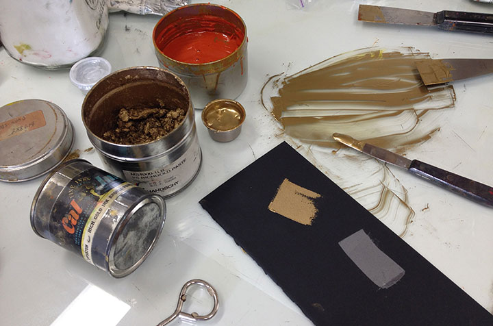
Jessica has her own secret-sauce recipe for gold ink, and while we’ve used it before in our series (like in Gun Shy), nothing makes it look so fabulous as a dark background. The gold ink looked amazing on press—we kind of wished we could just leave the ink on there permanently, because that’s some serious bling. (It almost made the Vandercook feel like some sort of super-cool Bond gadget.)
As always, we donate a portion of the proceeds of the series to a nonprofit that aligns with the message of each piece. To help sharpen the seeing eyes of the artists of tomorrow, this time we’ve chosen Youth in Focus — a nonprofit that puts cameras in the hands of at-risk youth to “teach them how to develop negatives into positives.”
• • • • • • • • • • • • • • • • • • • • • • • • • • • • • • • • • • • • • • • • • • • • • • • • • • • • • • • • • • • •
Focal Point: No. 19 in the Dead Feminists series
Edition size: 164
Poster size: 10 x 18 inches
Printed on an antique Vandercook Universal One press, on archival, 100% rag (cotton) paper. Each piece is numbered and signed by both artists.
Colophon reads:
Imogen Cunningham (1883 – 1976) graduated from the University of Washington in 1907, earning a degree in chemistry with her thesis on chemical processes in photography. Shortly afterward she was hired by photographer Edward Curtis, who taught her platinum printing and portraiture. She opened her own successful studio in Seattle, and published an article entitled “Photography as a Profession for Women.” In 1917, Cunningham and her husband and son relocated to California, where she gave birth to twin boys. Her children and the plants in her garden then became key subjects of her work. Her experiments with double exposure throughout the 1920s and 30s contributed to a growing appreciation of photography as art. She was a founding member of Group f/64, a collective of influential west coast photographers including Ansel Adams and Edward Weston. The group mounted a 1932 exhibition at the de Young Museum in San Francisco, united by a manifesto declaring “photography as an art form by simple and direct presentation.” Cunningham’s vision came through in both her personal and commercial work: unvarnished celebrity portraits for Vanity Fair; documentary street photography; nudes and botanical images — a lifetime of work that continues to challenge and intrigue viewers.
Illustrated by Chandler O’Leary and printed by Jessica Spring, grateful for artists who remind us to focus.
Available now in the Dead Feminists shop!
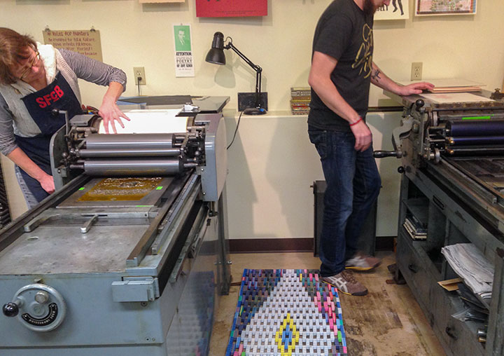
Jessica’s studio is hopping lately. She and I are working on the next Dead Feminist broadside, and our friend R.J. joined us on the adjacent press. There’s just something so satisfying about a room filled with the sound of Vandercook motors humming…
I’m working on several new things this week, including some new cards and another Dead Feminist broadside. Stay tuned!
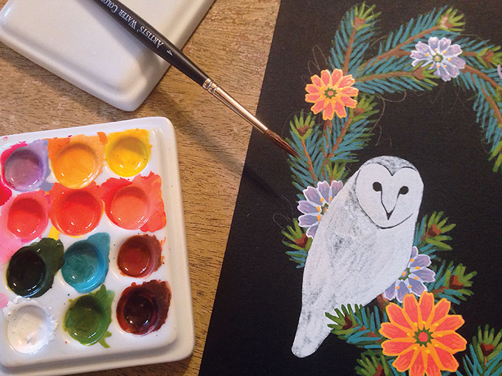
My acrylic inks and black paper are getting a lot of use these days. This guy is part of a new series that’ll be leaving the nest in the next few days.
More soon…
It’s the new year—time to hang some new artwork. I’m pleased to announce that I’ve got a new solo exhibit opening this Thursday!
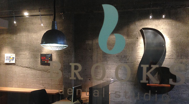
The show is in the most unlikely of places: a dentist’s office. I kid you not. But Dr. Jamie Brooks (we all call her Dr. Jamie) is no ordinary dentist, and her space is no ordinary clinic—it’s an absolutely stunning piece of modern interior architecture, and twice a year she adorns it with new work by regional artists. Dr. Jamie really understands the value of adding art to the mix of our everyday lives, and has turned a utilitarian space into something really special—and supporting local artists while she’s at it.
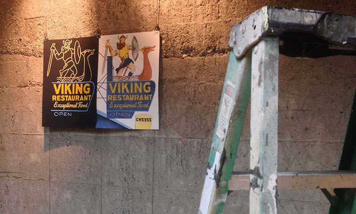
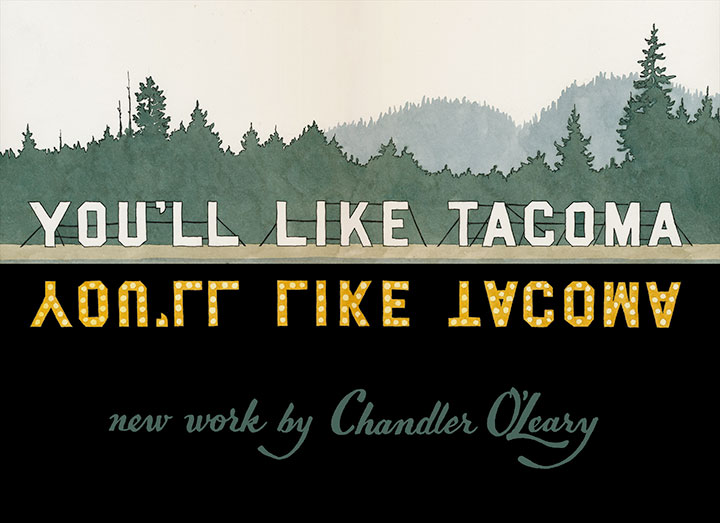
Once the show opens and local folks get the chance to see it first, I’ll post all the images here—but for now, here’s a little taste. Each of the 16 illustrations in the exhibit is a hand-lettered homage to Tacoma’s blazing neon history, told through iconic signage of days past. The images are arranged as day-and-night diptychs, painted on white and black paper, respectively.
So if you find yourself in the Northwest in the coming months, be sure to stop by!
You’ll Like Tacoma: a solo exhibit
On display through June 30, 2014
Opening reception Thursday, January 16, 5 to 7 pm
Brooks Dental Studio
732 Broadway, Tacoma, WA 98402
The holidays are done, and January is here—and that means it’s time to get back to work.
I don’t know about you, but I’m ready.
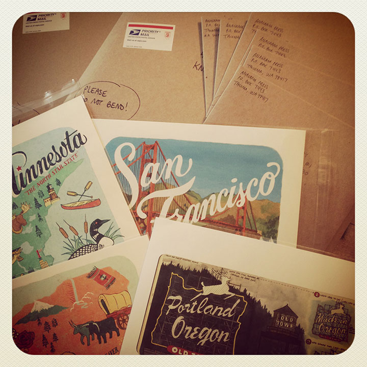
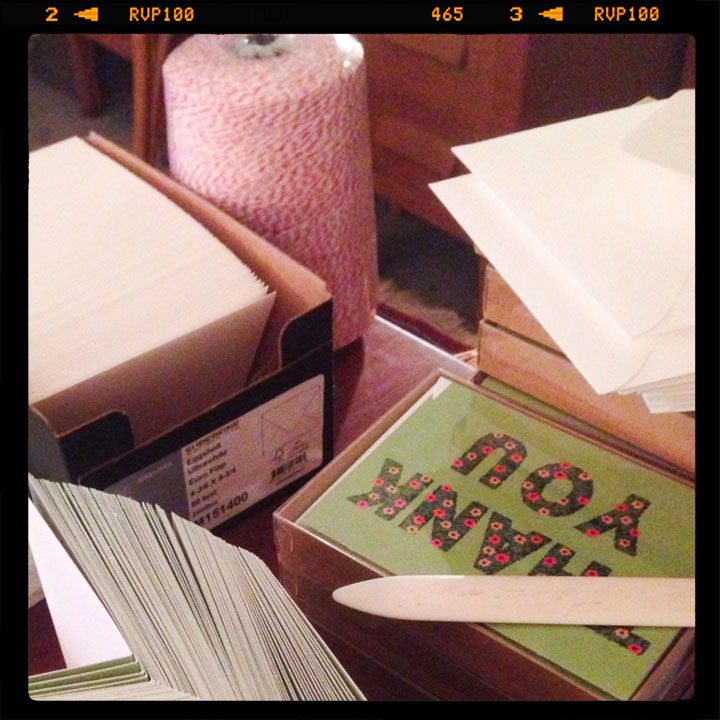
I’m packaging up a huge stack of prints and cards today—tomorrow is the holiday shipping deadline, so get your orders in quick! The shop closes tomorrow, December 17 at 4 pm PST.