Blog
February 11th, 2011
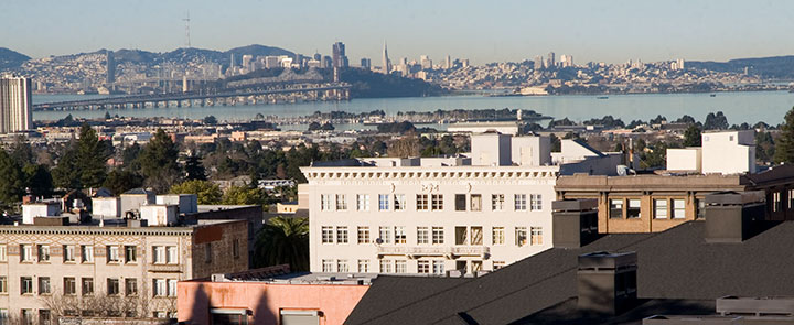
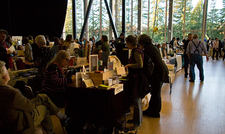
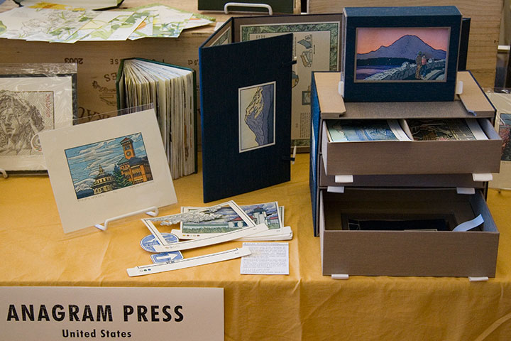
Going A.W.O.L. from the studio can be a very good thing—especially when this is the destination.

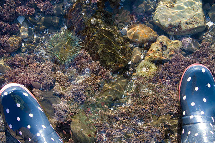
I’m here to spend some time with these folks,

for the sake of this.

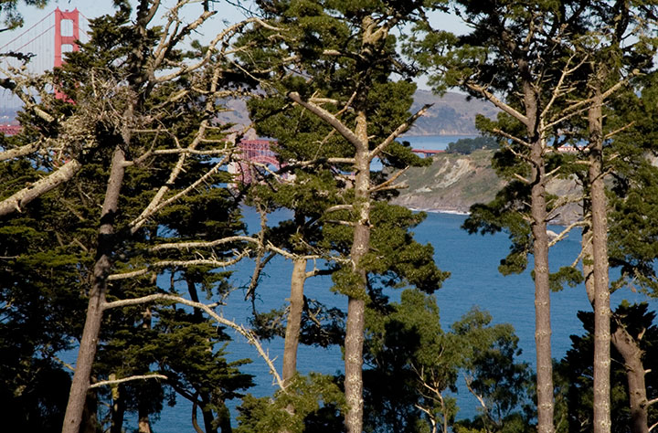
But the “work” part of my trip is done now, so I spent today up here.

And tomorrow I’m leaving for home, but I’ll be taking the long road, by way of this.

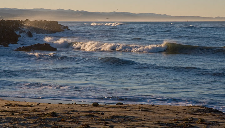
The goal is to take as much time as possible for things like these,

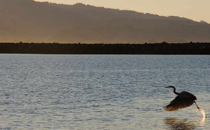
and for moments like this.
I promise to share when I get home and have access to a computer again. See you on the other end of the trail.
January 20th, 2011

A composite of two image flats from the book.
Anyway, after a good, long run, my Local Conditions exhibit is closing tomorrow afternoon, and this week I’ve been revisiting some of my favorite images from the book. This one always gets me thinking about how much a city can change over the course of a century, and how for a newcomer like me, that change isn’t always apparent. There aren’t always little plaques or signposts to tell you what used to exist where you’re standing now—or even any evidence at all of how things used to be.
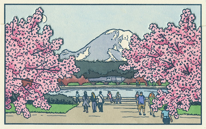
This scene depicts the Drumheller Fountain (also known as Frosh Pond), located on the University of Washington campus in Seattle. Incidentally, on my first trip to the Northwest almost exactly four years ago, I was standing on this very spot when I saw Mt. Rainier for the first time. This is where the idea for the book first struck me—although at the time it was a very different, and much simpler concept. And at that moment, I had no idea that the view itself had a history all its own.

AYP and Camp Harmony images courtesy of the University of Washington Library
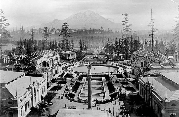
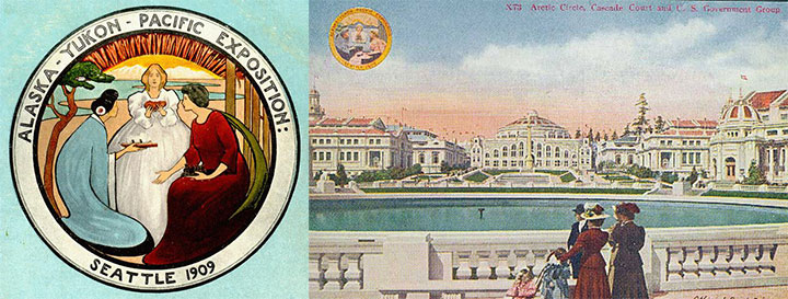
This is Frosh Pond in 1909, when it was called Geyser Basin (part of the so-called “Arctic Circle”), and when it was not a part of campus, but the centerpiece of the University’s predecessor, the Alaska-Yukon-Pacific Exposition.
An event similar to a World’s Fair, the A-Y-P showcased the natural and economic resources of the Pacific Northwest with pomp and splendor. To mirror the purpose of the exposition, the fairgrounds (designed by the famous Olmsted Brothers) brought the region’s greatest symbol into stunning focus. This so-called “Rainier Vista,” culminating in the Arctic Circle, helped draw in 3.7 million visitors over the fair’s four-month duration.

Very little evidence remains of the A-Y-P fairgrounds today (much to my chagrin); the vast majority of the fair’s buildings were temporary, and even the landscape design of the modern University has all but obscured the original layout of the A-Y-P grounds. But the Arctic Circle is still there, and when you step out from behind a row of blooming cherry trees in the spring, the Rainier Vista still hits you with full force.
Speaking of fairgrounds, closer to T-Town is another historical remnant—this time, however, instead of a long-past event with only a marker left behind to hint at what was, these fairgrounds still hold to their original purpose today.

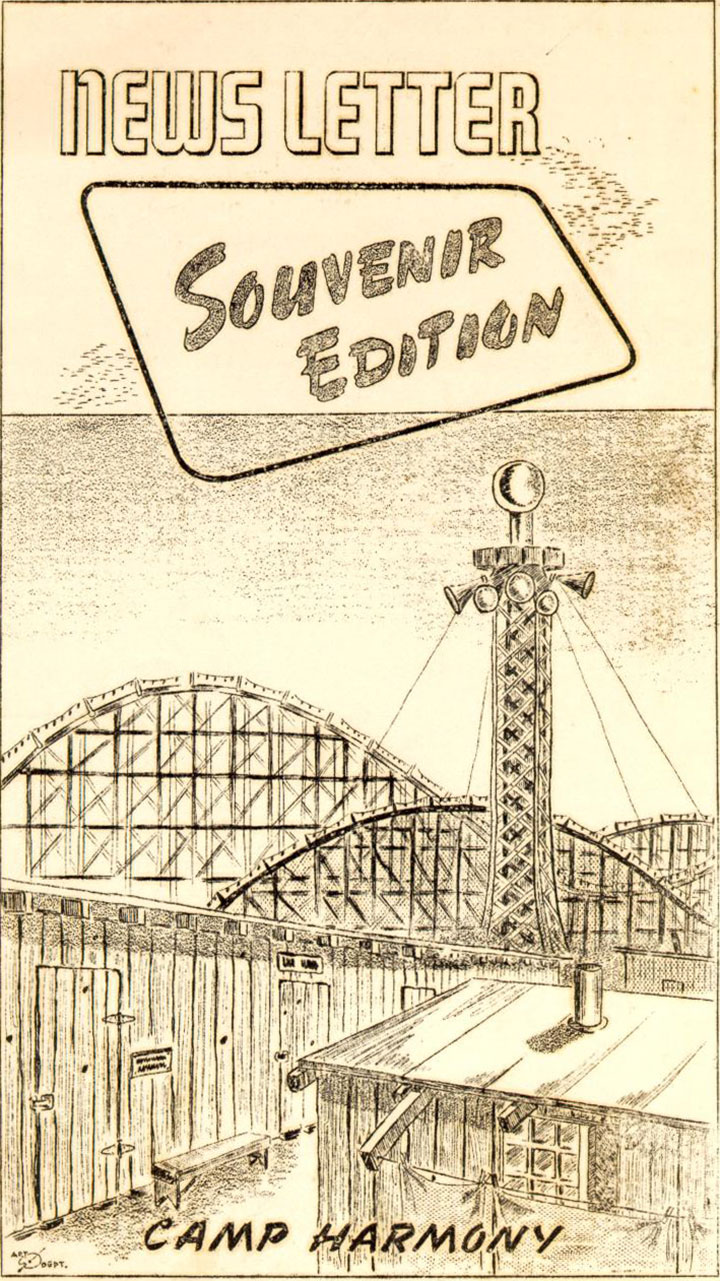
Illustration by Eddie Sato, Camp Harmony inmate and “staff” artist.
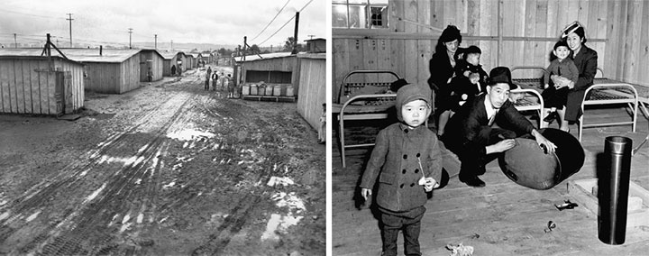
I’m talking about the Western Washington Fairgrounds in Puyallup, which are still in operation (though the event is now called the Puyallup Fair—that’s pronounced “Pew-AL-up”). In 1942, the U.S. government evicted, rounded up and imprisoned over 100,000 Japanese Americans living on the West Coast; the internment began with the forced migration of families living on Bainbridge Island, across the Sound from Seattle.

While they awaited the construction of permanent internment camps further inland, many Japanese Americans were sent to temporary “assembly centers” to coexist in cramped barracks with other families, often in substandard living conditions. Thousands of Washington’s interred residents were sent to the assembly center nicknamed “Camp Harmony,” hastily constructed on the fairgrounds in Puyallup, right alongside the fair’s permanent buildings and rides.

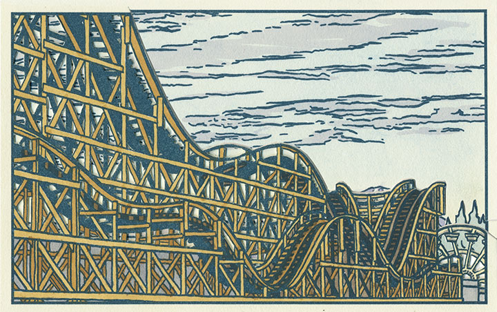
Three image flats; the mountain is almost completely hidden here.
Camp Harmony was torn down after just seven months, but the Fair continues to this day. (To my everlasting horror, the Fair’s website mentions Camp Harmony only obliquely on its “History” page—it states only that “the fairgrounds were used as a temporary shelter“—emphasis mine—during World War II. Right. A shelter where the “refugees” were imprisoned under armed guard.) And the wooden roller coaster that overshadowed Eddie Sato’s scene of the camp still stands. Now that I’ve learned the history of the place, I’ve lost my appetite for rollercoasters, funnel cakes and blue-ribbon vegetables. But the fairgrounds made for an image that dovetails eerily well with the homage to Japanese art upon which Local Conditions is founded.

Photo courtesy of Jessica Spring
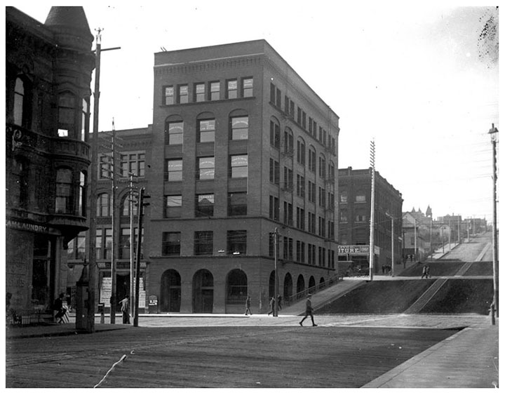
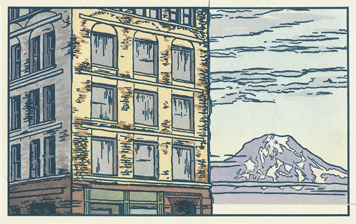
And then there’s the kind of history that unfolds right before your very eyes. Remember the Luzon building?

Two image flats; recognize the sky in the background?
Well, it was slated to be a part of the book from the very beginning—just by virtue of being a structure that caught my eye and that came with a good view of the mountain.

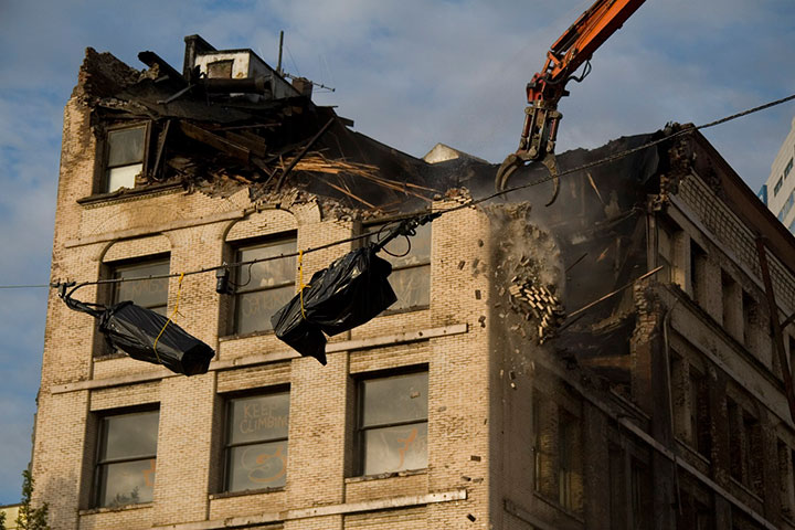
But then they knocked it down in September 2009, and suddenly I became an eye-witness, with an opportunity to document history as it happened.

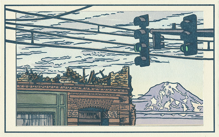
Three image flats; same mountain, drastically different view.
I wish this were an imaginary scene, but it’s moments like this that the book is all about. Now you see it, now you don’t.

Postcards circa 1910. Courtesy of the Tacoma Public Library
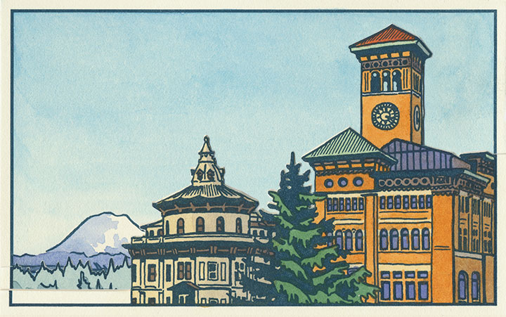
And to top it all off, it’s looking like Tacoma’s history is in danger of repeating itself. This is a postcard dated 1905, depicting what was an iconic view even then—the “Gateway to the City of Destiny.” The building on the left is the former Northern Pacific Railroad Office; on the right is Old City Hall.
Tacoma built a new city hall a few blocks away in the 1930s, but both the Northern Pacific building and Old City Hall still stand—the addition of a freeway the only major change to the site pictured. But on November 24, 2010, after an unusual cold snap, a pipe burst in Old City Hall—soaking the walls, ceilings and floors with 30,000 gallons of water. With extensive flood damage and the building owner entering foreclosure, the building faces an uncertain future. I only hope it doesn’t go the way of the Luzon.

Three image flats; there’s an individual print version in the shop.
When I started this project, I had no idea of what I was getting into. I knew that I would stumble upon some pretty fascinating history, but I never would have guessed that a fountain, some fairgrounds and a pile of bricks would draw me in so completely. But now I’m hooked—and the best part is that after all this work, I no longer feel like an outsider looking in.
This is my history now, too. For better or worse, I want to see how it all plays out.
January 1st, 2011

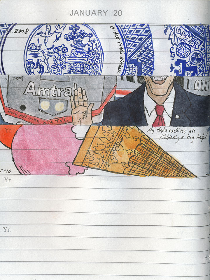
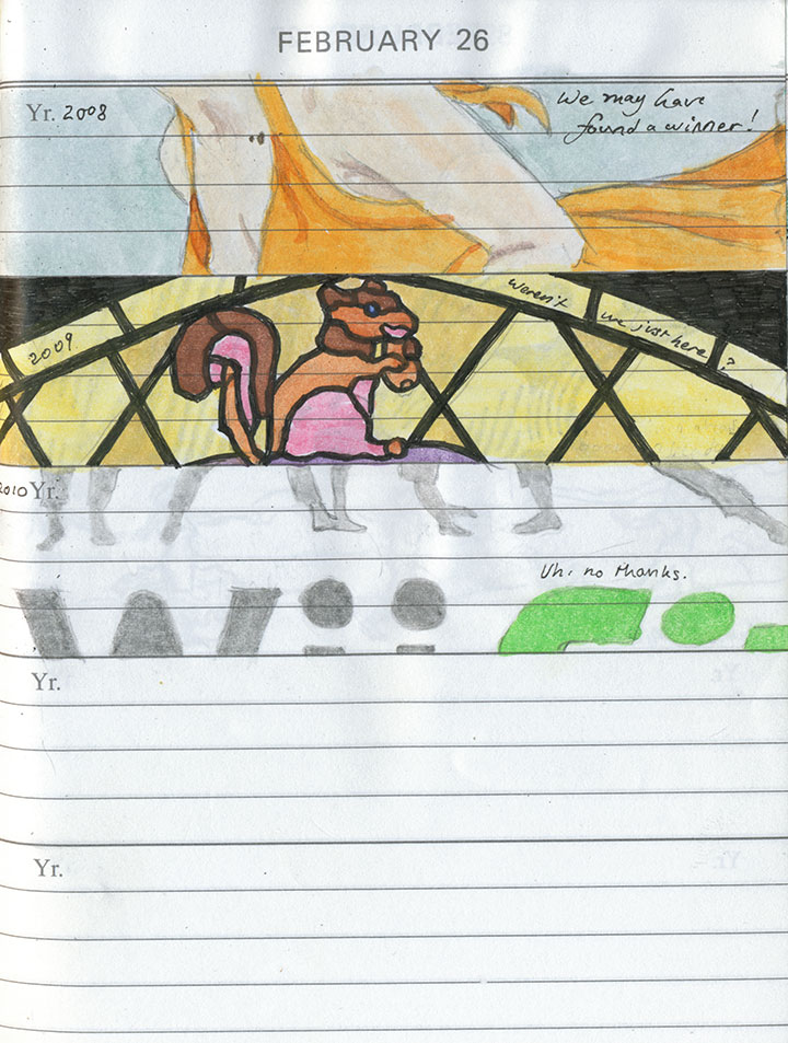
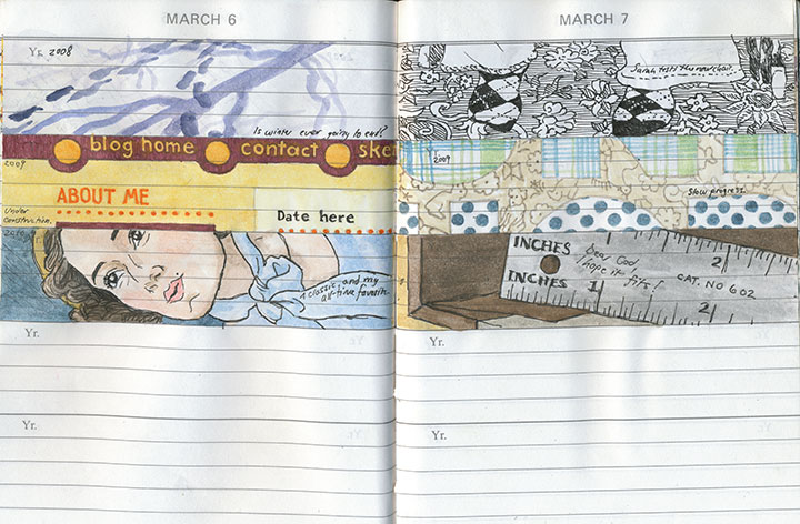
This might seem a little strange, coming from me, but the New Year’s resolution at the top of my “art” category is to draw more.

I mean that I’d like to spend more time with my sketchbooks—with everything else that happened last year, there just didn’t seem to be a spare second for observing the moment and jotting it down.

The daily book was about the only thing that received any attention, and even it spent the entire year on the back-back-back burner.

I still have quite a bit of catching up to do there, though—

so that’s where I’m going to start.

It’s a daunting prospect; even just filling in half-finished sketches (maybe I should have shown you those instead!) amounts to a huge time investment, and a mountain of work.

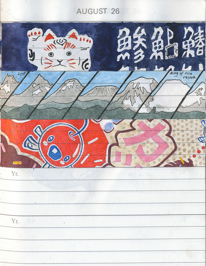
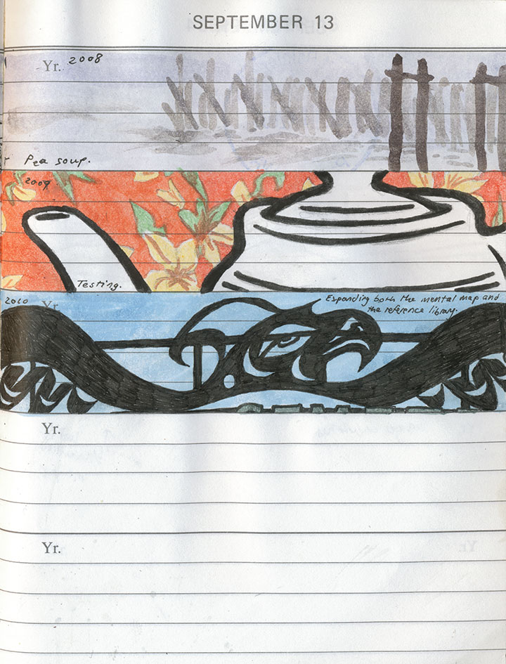
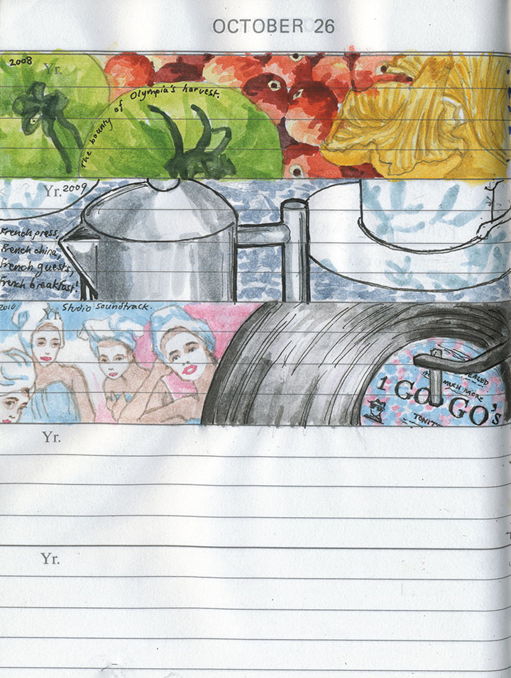
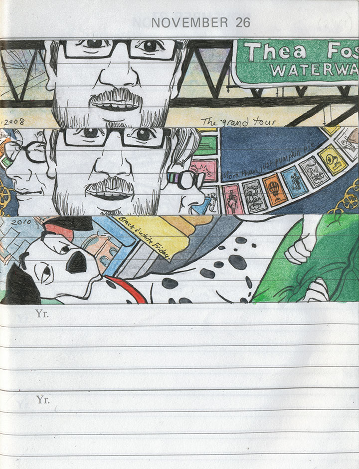
But I’ll get there. And besides, it’s those last two blank slots on every page that interest me the most.

They stand for the future that’s unwritten, and I find I can’t imagine what could possibly complete the picture—nor could I ever have predicted what has ended up here thus far.

When I first started this project, it seemed like a painfully slow undertaking.

But now I’m surprised at how quickly the book is filling up,

and I’m anxious to find out what will fill out this page—and the next, and the next.

Well, today I flip the book back to the beginning, pencil in hand—and so I’ll find out soon enough.
Happy New Year!
November 17th, 2010

I’ve been hemming and hawing about how best to share this thing with you. Even with Sarah’s excellent photography, it’s just a lot more difficult to explain how it works when I can’t hold the book out into space and demonstrate in real time. It’s a problem with every artist book out there—an interactive sculpture, complete with moving parts, that also happens to tell a story is just dern hard to document.
So for now, I’m going to go through the mechanics of the thing, step by step, and go into the whys and wherefores in other posts. And for those of you who might not be familiar with the term artist book, you’re going to find out really quickly that this isn’t your basic hardcover book. The definition of “artist book” is way too broad to go into within this post (click the above link to go to what I wrote on my F.A.Q. about it), but I’m hoping that by the time you get to the bottom of this post, you’ll have an idea of just how broad the term can be—and what crazy things can happily fall into the category.

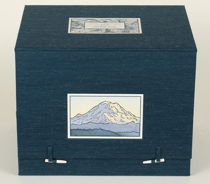
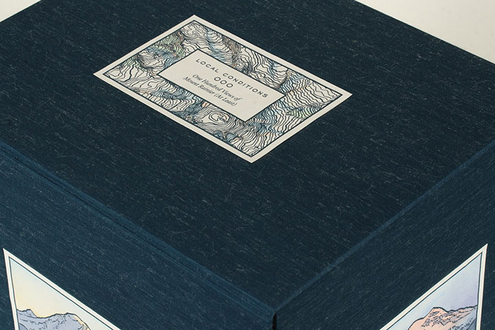
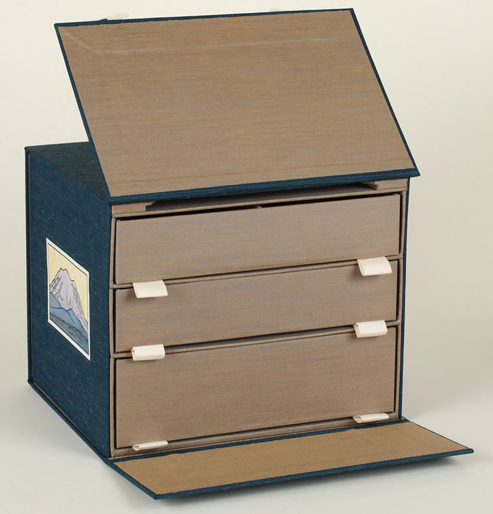
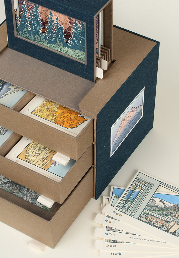
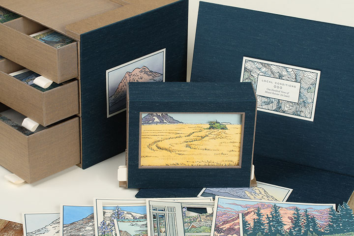
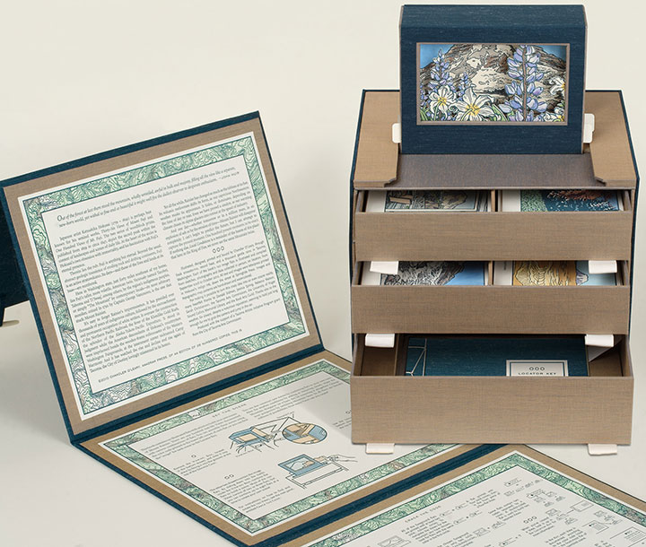
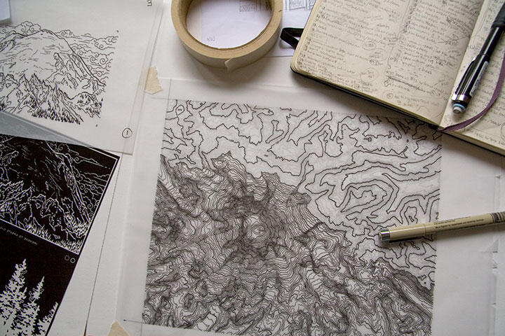
Okay, let’s start with the box. When it’s all closed up, Local Conditions is almost a cube (a 10-inch cube that’s heavy enough to be hiding a sack or two of flour inside). On the topmost face of the box is the frontispiece, containing the title and a topographic map illustration of the summit of Mt. Rainier.

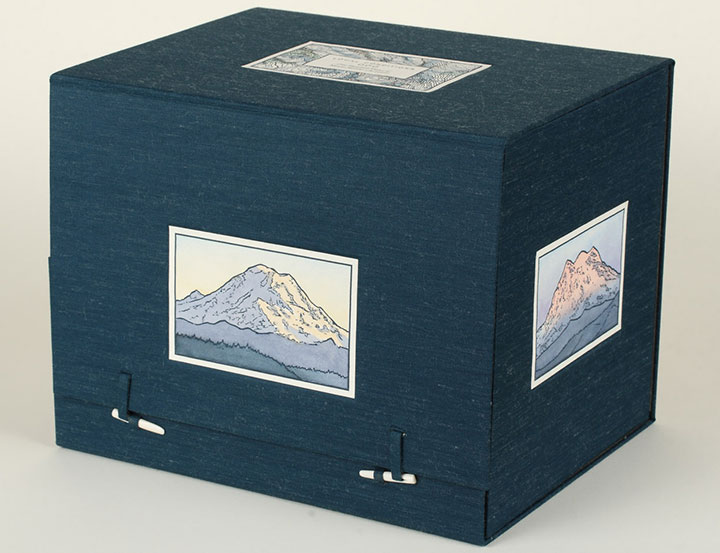
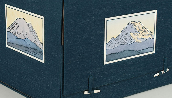
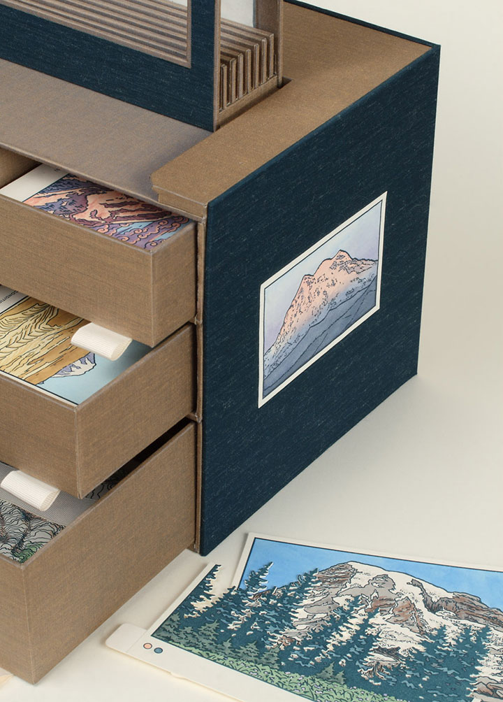
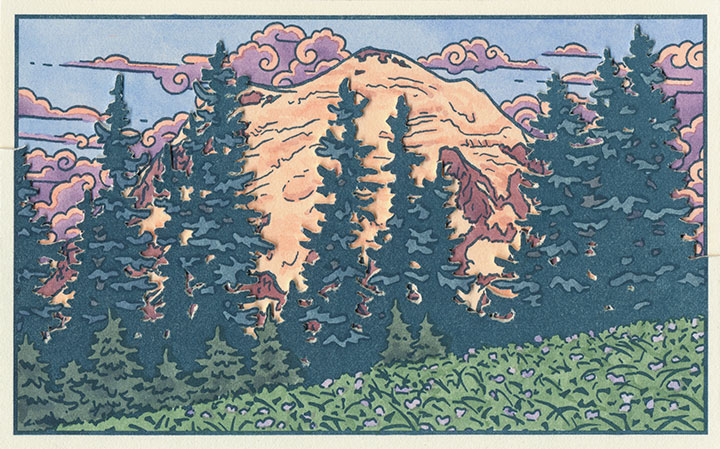
The north, south, east and west sides of the box are faced with illustrations of the corresponding faces of Rainier, each depicting the mountain at sunset.

(That’s the eastern face on the left, and the north face beside it.)
Now, those two little bone clasps hold the thing together, and when you flick them out of their loops,

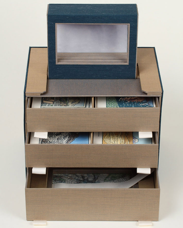
the book opens up, revealing a chest of drawers. Keep pulling on the flap you just raised,

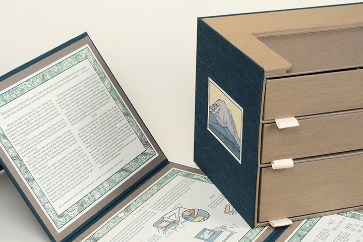
and you’ll find that you can take the whole outer wrapper off and read the colophon (see below) printed on the inside.

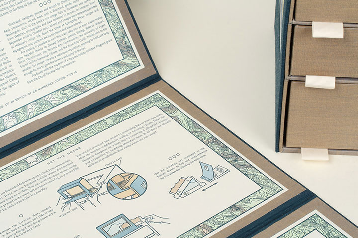
The other panels on the wrapper include detailed instructions on everything the book does.

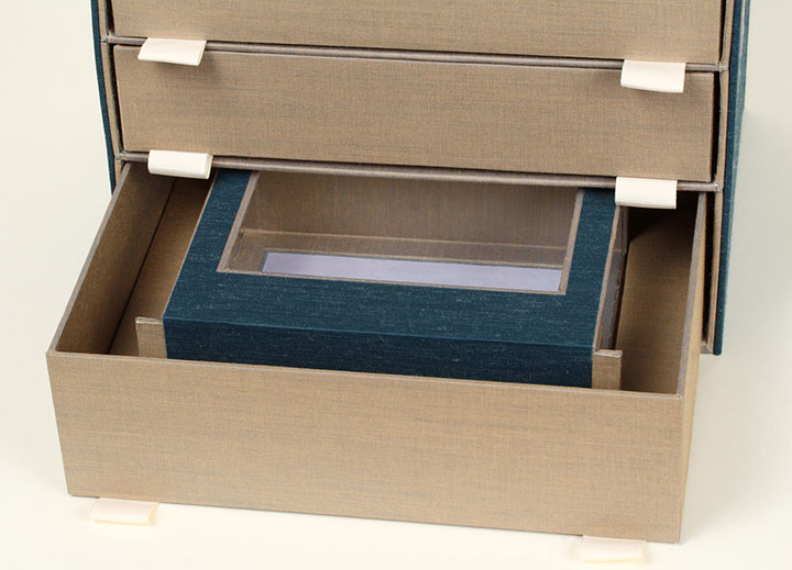
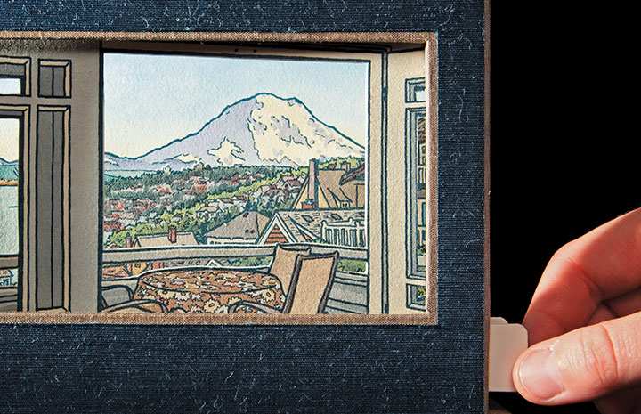
Next, let’s open the drawers—nested in the bottom one you’ll find a Viewing Box (yeah, I know … a box, within a box, within a box … sorry.) that consists of a window, a background panel, and two tabs that stick out from either side.

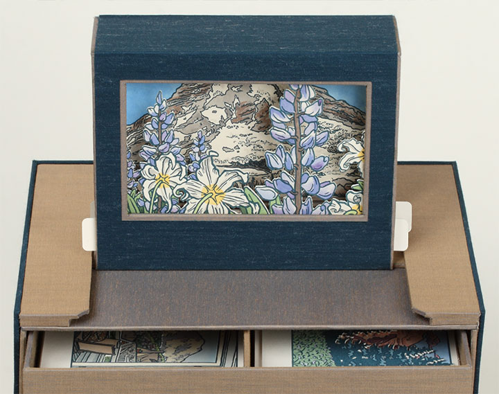
The tabs match up with the grooved unit at the top of the chest of drawers, and the Viewing Box slides into place.

So now the box is fully expanded, and the book is assembled for use. Now comes the fun part.
Take a closer look at the Viewing Box, and open the top two drawers.

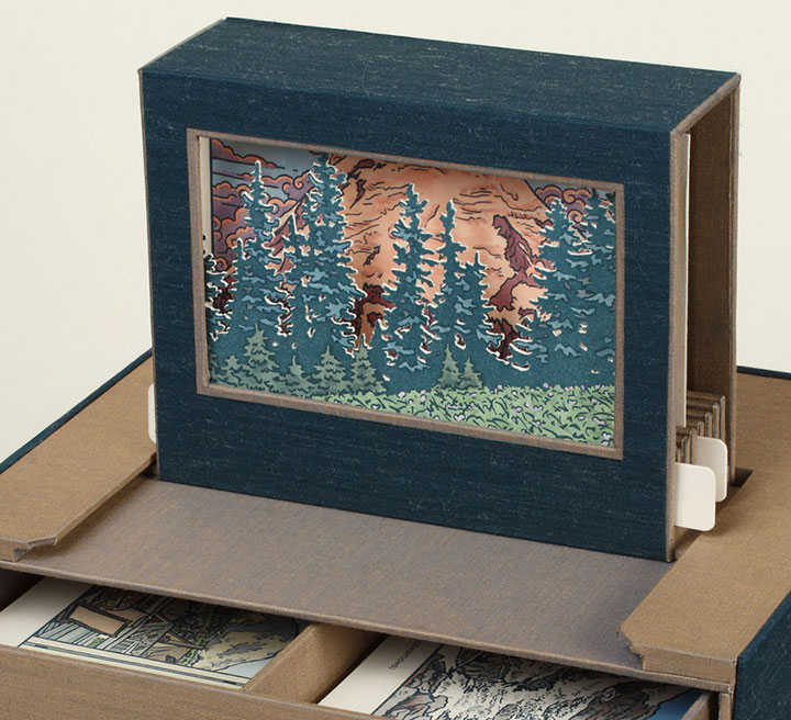
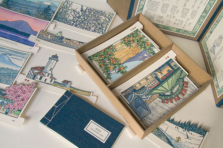
Inside the drawers you’ll find a series of cut-out cards, each printed with a different image. These little image flats slide right into the slots of the Viewing Box,

and face out the window to form an instant picture—kind of like an old-fashioned stage set.

Now here’s the thing:

There are 120 flats to choose from. One hundred and twenty. Each one hand-printed, hand-painted, hand-cut.

By combining, layering and switching the flats in and out of the Viewing Box, you can create seemingly endless scenes of Mt Rainier. I came up with one hundred, and documented them as part of the book (again, I’ll elaborate later), but I’m more interested in how many you can dream up.

(Hint: a lot. Thousands. Millions. To be precise, 1.4 x 10¹⁵, or 1.4 quintillion, if you really wanted to push the envelope.)
• • • • • • • • • • • • • • • • • • • • • • • • • • • • • • • • • • • • • • • • • • • • • • • • • • • • • • • • • • • •
Local Conditions: One Hundred Views of Mt. Rainier (At Least)
Edition size: 26 numbered books and 5 roman-numeraled artist proofs
Book size: 10 x 8 x 8 inches when closed
Viewing window: 3 x 5 inches
Artist book consisting of viewing box and 120 image flats, illustrated and compiled from data collected in person, on location, over the course of two years. Housed in a set of drawers with nested stab-bound book and Japanese-style outer wrapper. Images and maps are hand-drawn, letterpress printed and individually hand-painted with watercolor. All image flats are hand-cut.
For price/purchase info, please contact me.
Edited to add (November 2011): As a supplement to the artist book, I also created a suite of 15 limited-edition letterpress prints, featuring some of my favorite scenes from the book. Just like the flats in the book, each print is letterpress printed and hand-painted with watercolor. You can find all 15 prints in the shop.
Colophon reads:
Japanese artist Katsushika Hokusai (1759 – 1849) is perhaps best known for his seminal works, Thirty-Six Views of Mount Fuji and One Hundred Views of Mt. Fuji. The two series of woodblock prints, published from 1829 to circa 1847, depict the sacred peak within the context of landscapes and scenes of daily life. At the heart of the series is Hokusai’s own obsession with immortality, and his fascination with Fuji’s eternal presence.
Therein lies the rub: Fuji is anything but eternal. Beyond the usual, abstract geologic transience of eroding rock and drifting continents, Fuji is an active stratovolcano. Its days—and those of the lives and lands at its base—are numbered.
Here in Washington state, just forty miles southeast of my home, lies Fuji’s taller, more volatile, American twin. Variously named Tacobet, Tahoma and Ti’Swaq’, among others, by the region’s indigenous peoples, or simply “The Mountain” by contemporary locals—its most arbitrary moniker, coined in 1792 by Captain George Vancouver, is the one that stuck: Mount Rainier.
It’s easy to forget Rainier’s impermanence. It has presided over thousands of years of indigenous culture, followed by the encroachment and permanent occupation of white settlers. It oversaw the construction of the Northern Pacific Railroad, the fever of the Klondike Gold Rush, the splendor of the Alaska-Yukon-Pacific Exposition. It stood in judgment while the American descendants of Hokusai’s countrymen were imprisoned beside the wooden-frame rollercoaster of the Western Washington Fairgrounds, at the internment center nicknamed Camp Harmony. And it has watched the rise and decline and rise again of Tacoma, the City of Destiny lovingly misnamed in its honor.
Yet all the while, Rainier has changed as much as the tableau at its feet. Its volcanic restlessness shifts its form, as our capricious Northwestern weather masks its appearance. It hides, or dominates, depending on the time of day or year. Even we have proved a catalyst, as our warming climate chases its alpine glaciers into retreat at the speed of industry.
And one day—whether tomorrow or in a million years, in an explosion of ash or by the erosion of time—Mount Rainier will disappear completely. I can’t begin to predict the future, but I can attempt to capture the present moment. One hundred present moments, to be exact. If nothing else, Local Conditions is a reminder of the lesson of this place: that here in the Ring of Fire, we never see the same Mountain twice.
* * *
Illustrated, designed, printed and bound by Chandler O’Leary, through freak snowstorms, record heat, and a thousand gentle rains in Tacoma, Washington. Each of the book’s 120 image flats is illustrated and compiled from sketches, photographs and data collected in person, on location, from September 2008 to October 2010. All text and images were letterpress printed in Hokusai’s indigo ink, down the street at Springtide Press. Images and topographic map patterns are hand-drawn and watercolored.
For making it possible to turn this crazy idea into an even crazier reality, many heartfelt thanks to Jessica Spring, Sarah Christianson, the Tacoma Arts Commission, the University of Puget Sound Collins Memorial Library, and the Book Arts Guild. Thanks also to the weather, for always, despite a notorious reputation, seeming to hold just long enough for me to grab the camera and jump in the car.
Produced with the support of a Tacoma Artists Initiative Program grant from the City of Tacoma Arts Commission.

November 14th, 2010

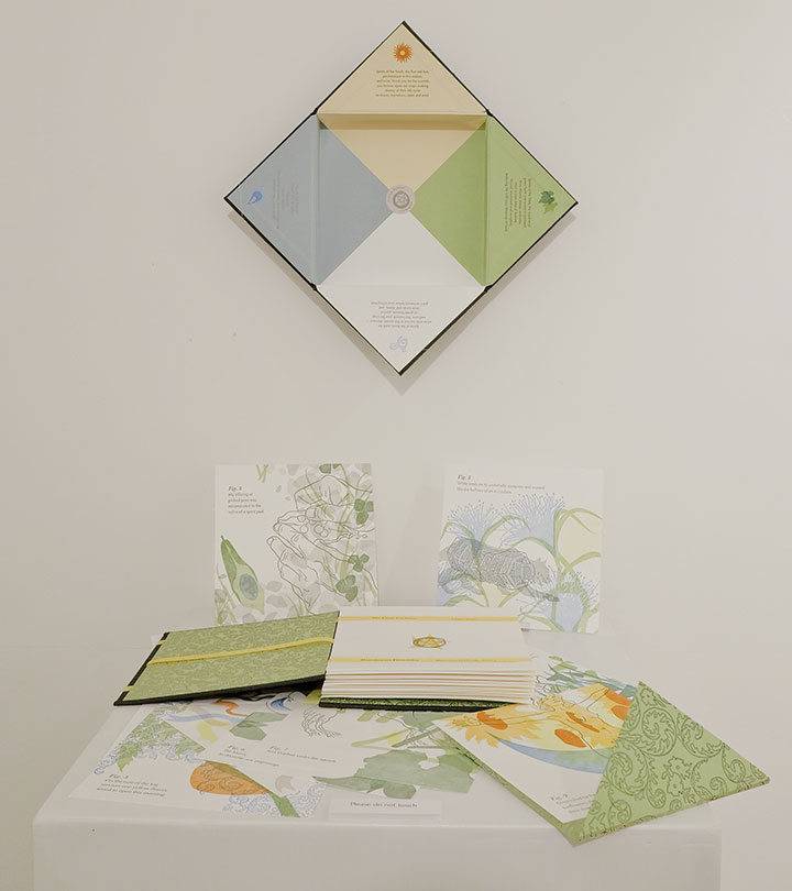
I know I’ve made quite a fuss over my new artist book, but while all my energy has gone into putting that one out into the world, one of my older books is also getting some more time in the limelight.

Photo by Nathaniel Willson
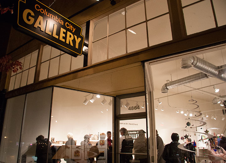
This fall you can find The Faery Gardener on display in Seattle, along with many other contemporary artist books by Northwestern printmakers, designers, illustrators and binders.
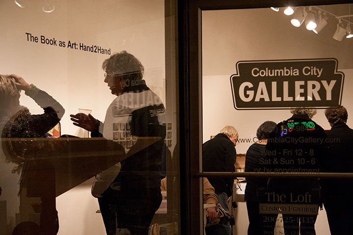
Hand2Hand: The Book as Art
Exhibit runs through January 9
Columbia City Gallery
4864 Rainier Ave. South, Seattle
When I first started making artist books, you would have been hard-pressed to find a gallery show centered on the subject. Now this sort of exhibit is everywhere—I mean, I’m just one artist, and I’ve been in several this year alone! It seems like the book arts are just another, well-accepted part of the fine arts—and that’s what I’ve been hoping for, all along.

November 5th, 2010

Photos by Sarah Christianson
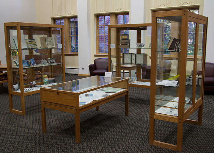
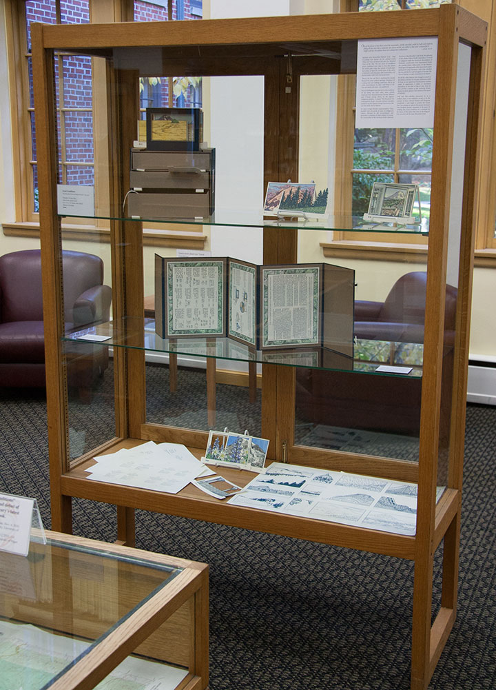
The show is all set up,

and the book is officially out in the world.

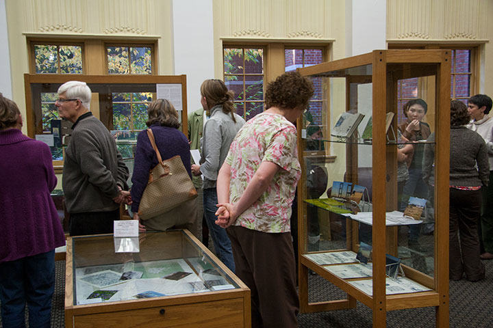
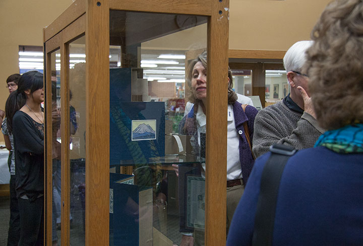
Many thanks to the enormous crowd of folks who descended upon the opening last night—and to my amazing friend Sarah Christianson for providing every kind of emotional and practical support I can think of.

October 22nd, 2010

It’s getting harder and harder to keep the secret these days—the Rainier book is almost done, and I’m just dying to show you. But I don’t want to ruin the surprise for T-town, so I’m going to keep it under my hat for just a little longer. But after over two years of being under wraps, the book is gussying it up and stepping out for a solo exhibition. Here’s a brief description of what you’ll see:
Local Conditions, an interactive artist book, captures the changing faces of Mt. Rainier. Explore the 100 Views—or create one of your own—to discover a mountain both immortal and impermanent.
The book contains 120 image flats and a viewing box; by combining and layering the flats, the reader can create literally millions of scenes. Images are illustrated and compiled from data collected in person, on location, over the course of two years. Letterpress printed, watercolored, and hand-bound in an edition of 26 books. Sponsored by the Tacoma Arts Commission.
Exhibit runs November 4 through January 21
Collins Memorial Library, University of Puget Sound, Tacoma, WA
Opening reception: Thursday, November 4, 4:30 to 6:30 p.m.
Artist talk (sponsored by the Book Arts Guild): Thursday, November 11, 7 p.m., Room 020

Photo by Sarah Christianson
If you miss the exhibition opening, I’ll have some of the process materials from the book out for perusal at this year’s Studio Tour—as well as the brand new Dead Feminist broadside! (Look for it online in early November.) So be sure to stop by!
Saturday and Sunday, November 6 and 7
Open 10 am to 4 pm.
More information, maps, addresses and directions can be found here.
See you then!
September 15th, 2010

Lately I’ve spent nearly every waking minute of each day with my face an inch away from the drafting table.
Let’s step back, and stretch out a bit.

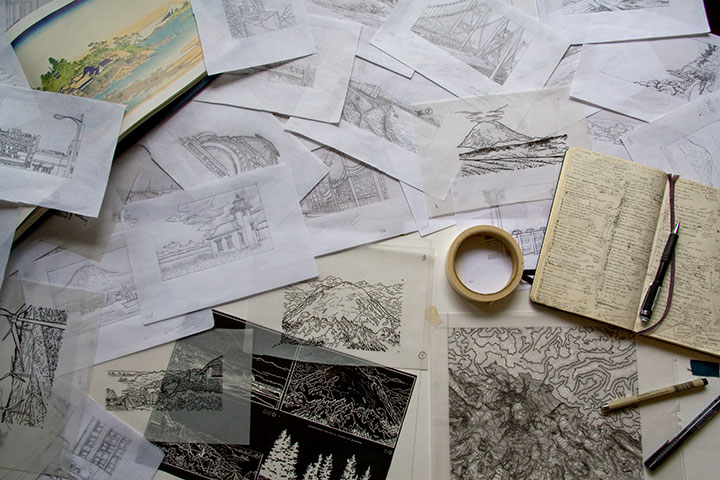
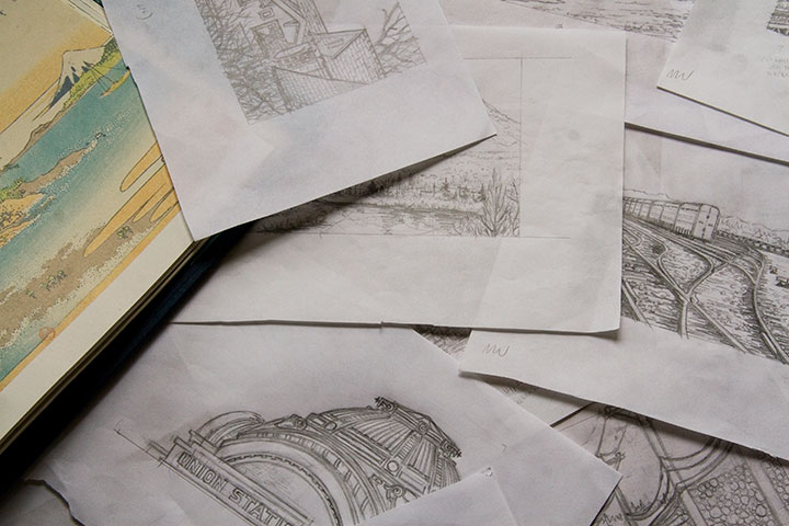
My studio is often a sea of papers—an occupational hazard—but these days the swells have consisted of pencil snapshots for my Mt. Rainier book. Dozens, and dozens, and dozens of them.
Time is ticking down, counting closer and closer to zero, and there are still many miles to cover before the clock strikes deadline. Yet suddenly, things are starting to come together. It won’t be long until I can share something that makes sense—something that looks more like a book, and less like a pile of drawings. I promise that you’ll be among the first to see it when I do.

But if I go missing for long stretches at a time—well, you know where to find me.
August 11th, 2010

I’ve been sitting on this post for months now—it’s just that after spending so much time hunched over this project, I needed some time off from even thinking about it. But now I’m ready to talk birds again.

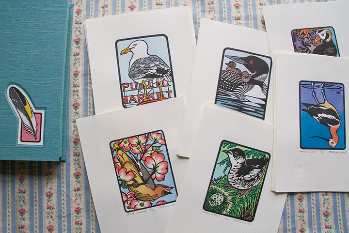
From left: Cedar Waxwing; Steller’s Jay; American Avocet; Purple Martin; Tufted Puffin
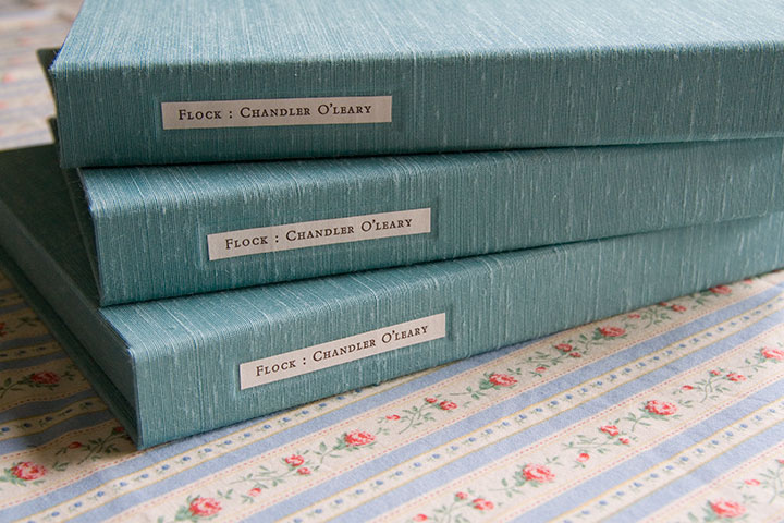
Eighteen months, twenty-five birds, six hundred twenty-five individual prints and ten box sets later, my little Flock is finished.

Mountain Quail; American Bittern; Long-billed Curlew; Hooded Merganser; Laysan Albatross

Barn Owl; American Kestrel; Eurasian Coot; Anna’s Hummingbird; Herring Gull
It’s a little crazy to see these all together, like, well, birds on a wire. Each one has been broken down into its own little assembly line for so long that I forget sometimes to see them as a set.

Western Tanager; Lazuli Bunting; Northern Flicker; Bullock’s Oriole; Belted Kingfisher

Common Loon; Marbled Murrelet; Northern Shoveler; Harlequin Duck; Brown Pelican
As you can see, what’s represented here is a pretty broad cross-section of Washington birds. There are so many bird species ’round these parts, in fact, that I almost didn’t know where to start—and narrowing the choices down to twenty-five was by far the most difficult task.

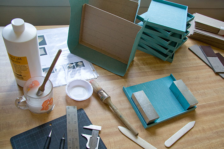
Wait. I take that back. The hardest part was keeping the glue off of the pricey imported Japanese book cloth (glue plus cloth equals death—or at least wailing, gnashing of teeth, and starting all over from the beginning).

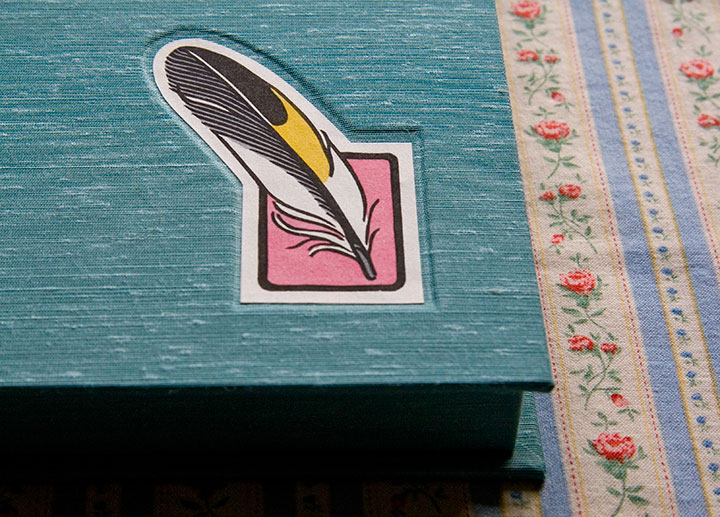
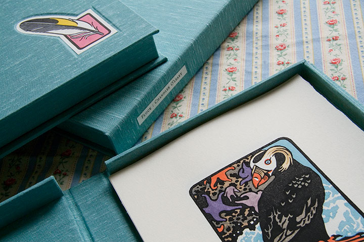
You see, it seemed silly to have a set of prints with nothing to house it. My inner book artist took over (thanks to Jessica’s tricksy enabling), and insisted on encasing the first ten sets of the edition in handmade clamshell boxes.

Even though the results are always worth it, I don’t have much love for making boxes—what I do love is printing the colophon. A colophon (or in today’s hardbound novels, the “note on the text”) is an essential element in any artist’s book; this is where the artist steps outside the book’s content and talks about the making of the book itself. For this I decided to go back to my letterpress roots, and hand-set the text in metal type.

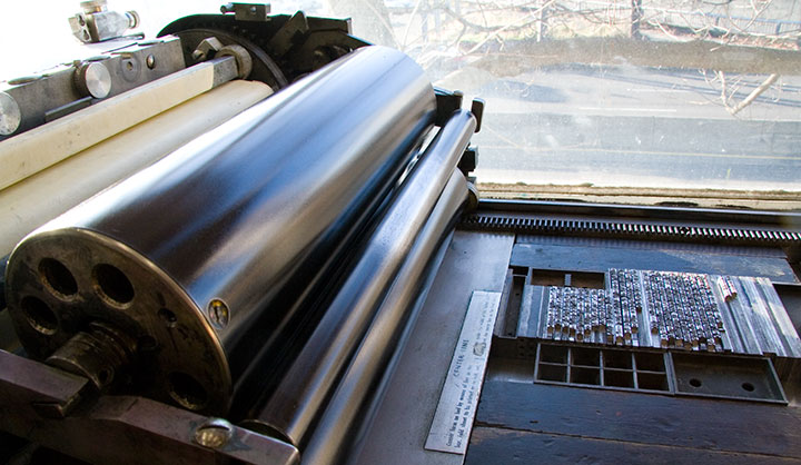
While I’m rarely able to fit hand-setting into my projects these days (a drawback to all the lettering I’ve been doing), it’s still my favorite method of getting a block of text onto a page. And this beloved Bembo, cast locally at Stern & Faye, is so beautifully spaced and balanced that it’s a dream to set and a pleasure to read.


Here’s what it says:
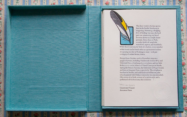
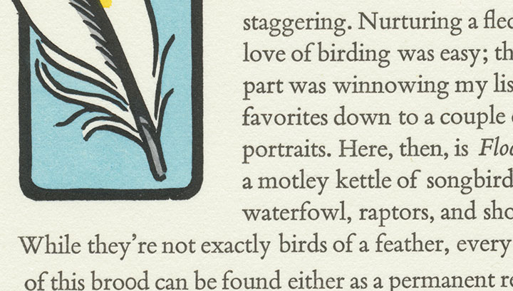
The sheer variety of avian species here in the Pacific Northwest is staggering. Nurturing a fledgling love of birding was easy; the hard part was winnowing my list of favorites down to a couple dozen portraits. Here, then, is Flock, a motley kettle of songbirds, waterfowl, raptors, and shorebirds. While they’re not exactly birds of a feather, every member of this brood can be found either as a permanent resident or a passing traveler in Washington state—with just a wingtip of artistic license, that is.
Printed from October 2008 to December 2009 on a gaggle of presses, including Vandercook models SP15 and Universal One, a Craftsman 6.5 x 10 platen, and my little Kelsey 3 x 5—at the School of Visual Concepts in Seattle, Springtide Press in Tacoma, the University of Puget Sound, and here at Anagram Press, respectively. The colophon is hand-set in Bembo, and each hand-carved linocut print is hand-painted with Pelikan watercolor (no pun intended). Of a covey of 25 birds, a tweet of 25 prints each, and a parliament of ten box nests, this is number [2].

Okay, so maybe I went a bit overboard on the avian puns. It’s just that the thought of getting my hands dirty on type drawers again had me all twitterpated.
And I have a fluttering feeling that there might be even more birds in my future—one of these days, anyway.

August 2nd, 2010

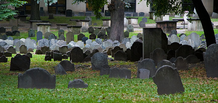
One of the things I used to do with Bampa is visit the colonial graveyards tucked away in every corner of New England. On this trip I only had time to visit a couple, so I picked my two favorites: the Old York Burial Ground in York, Maine;

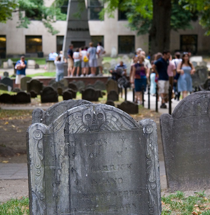
and the Granary Burying Ground in Boston.

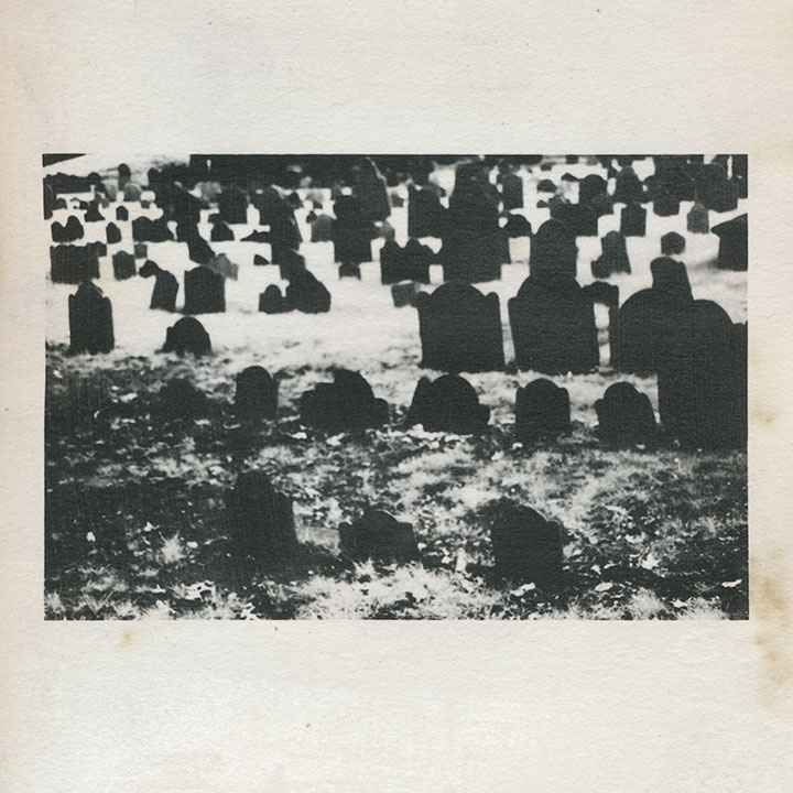
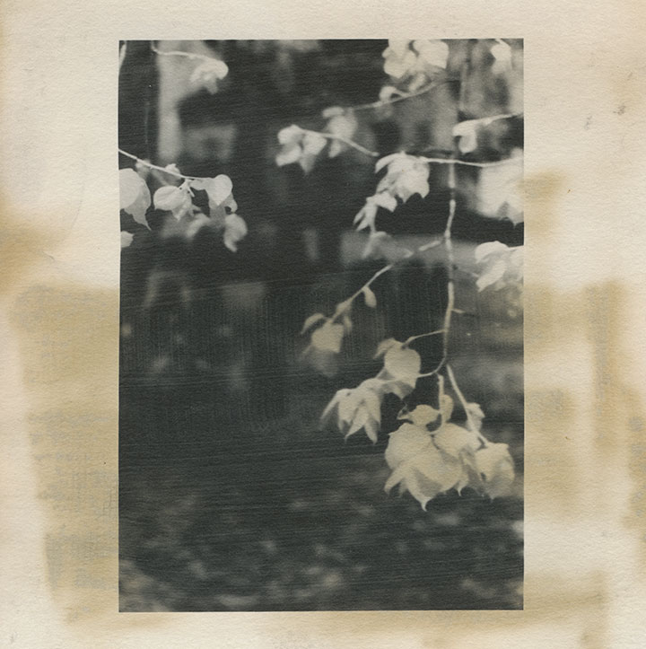
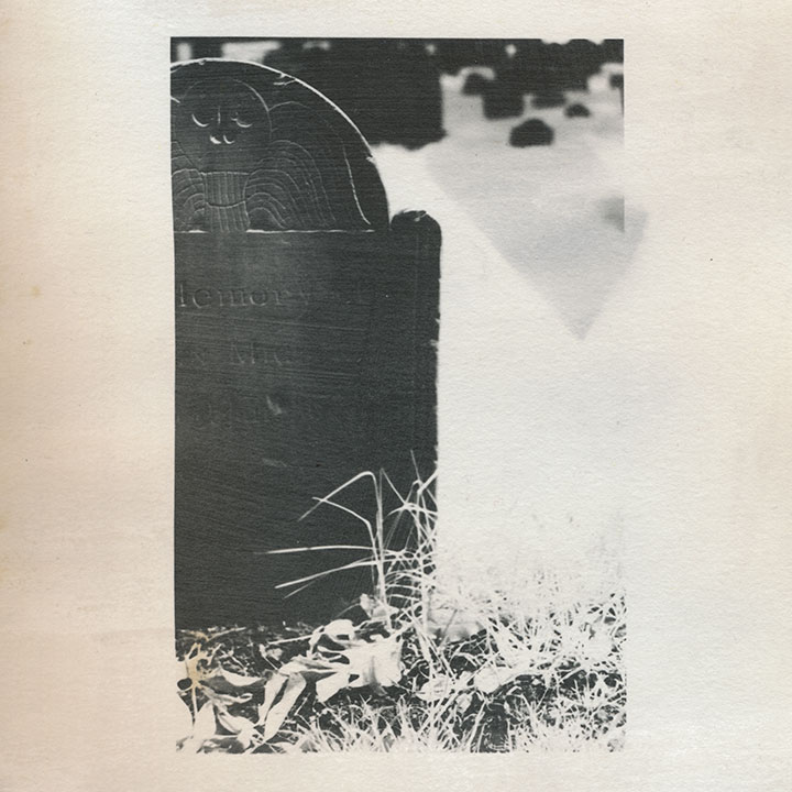
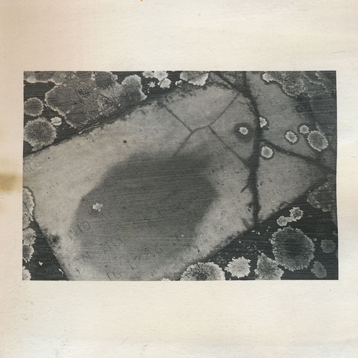
I’m quite a bit obsessed with these places; beyond my usual souvenir sketches and snapshots, these cemeteries keep popping in and out of my body of work. This is an excerpt from an artist book I made seven years ago. That’s not snow—it’s shot with infrared film, which behaves very differently from normal film when you do certain things with it. I used a dark red lens filter that blocked nearly all of the visible spectrum, so that the film was exposed mostly by ambient infrared radiation. The effect is that inanimate objects like stones read as deepest black,

and plants and flesh turn to bright white. Somehow I thought that particular quirk paired well with the subject matter—that living things behaved very differently than…well, dead ones.

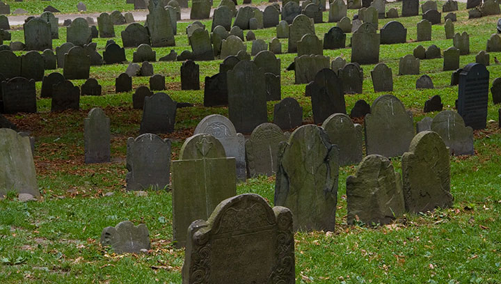
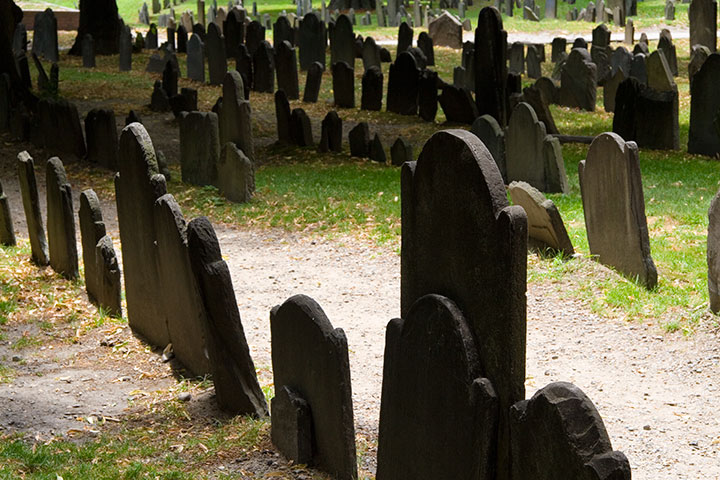
Despite the near-constant crowds (in Boston, at least) and the challenge they present to photographing, each is an oasis, a tranquil island within the bustling town or city.

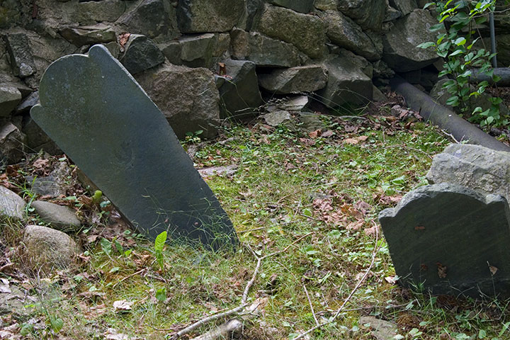
That’s not what draws me to them, though. Nor is it the haphazard scatter of wonky stones,

nor the romance of crumbling ruins.

(infrared film again)
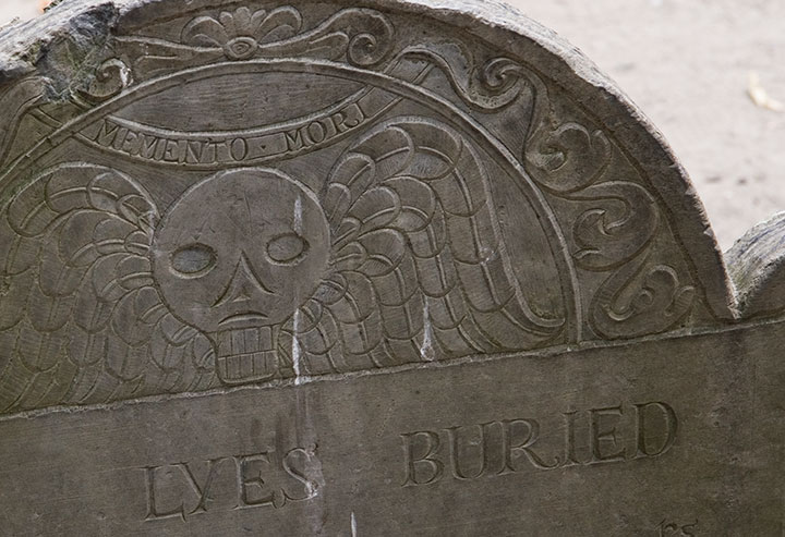
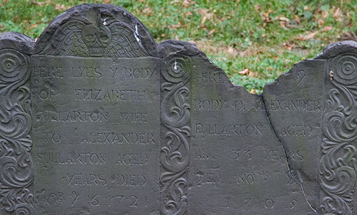
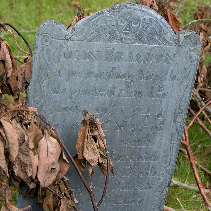
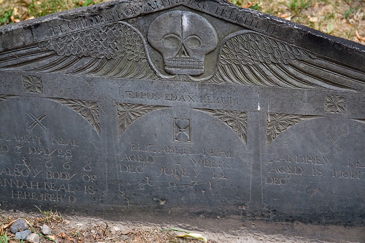
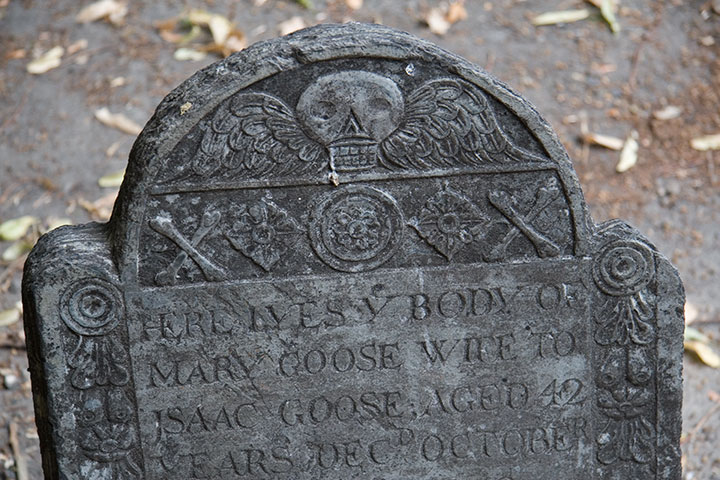
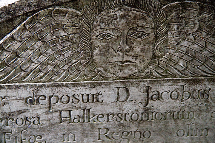
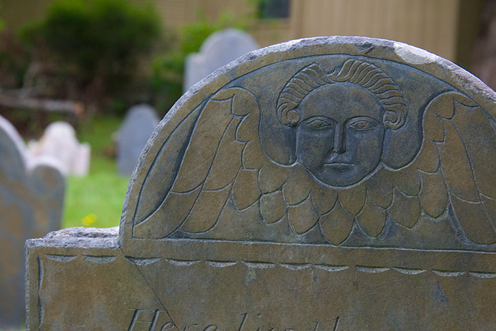
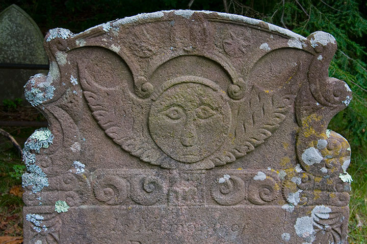
It’s that old gravestones are monumental (sorry) in the graphic design department. You can probably guess what my headstone might look like one day, because I’m completely fascinated with the design, the illustration, the typography displayed on colonial headstones. The “Death’s Head” or winged skull motif seems to be the most common,

with many variations within the theme—

Quadruple grave, dated 1666-1671, of children who lived only “dayes” or months apiece
from refined,

grave for a member of the Goose family, founders of the Mother Goose tradition
to folksy,

to somewhat disturbingly lifelike deathlike.

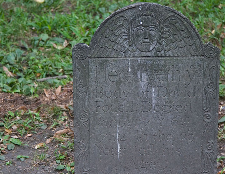
Another popular design is the “Winged Cherub,” which seems to be a more gentle alternative to the bones-n’-feathers motif.

The carvers seemed to take even more artistic license with this theme; I lost count of all the different angel designs.

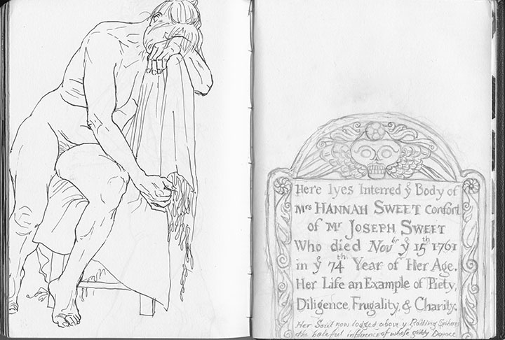
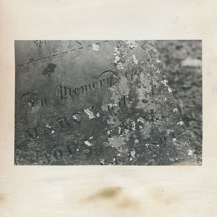
Skulls and cherubs aside, just as fun for the modern visitor is the engraved text. Typophiles will love all the script faces and lettering conventions (my favorite, below, is a mention of “November” set with “br” as superscript above a larger “Nov”),

but I’m partial to the language—the poetic phrasings, the archaic spellings. Some excerpts, verbatim:
• “Here lyes interred ye body of Mrs. Hannah Sweet, confort of Mr. Joseph Sweet, who died Nov’br ye 15th 1761 in ye 74th year of her age.”
• “On His unfailing promises rely / and all the horrors of the Grave defy”
• “… Jotham Bush of Shrewƒbury, who departed this life with the Small-Pox”
• “In memory of Mrs. Elizabeth Hurd, amiable & virtuous confort of John Hurd, Esq.”
• “Farervell Vain World, I have Enough of thee / and now I’m Careles what thou Say’st of me”

My little artist book has developed an unexpected conceptual element. I first coated the paper myself with liquid emulsion to make it light-sensitive (instead of using standard photo paper), then processed the images in a darkroom with the usual chemicals. By doing that, I was veering away from the traditional darkroom process, and adding some interesting variables, risks and imperfections into the mix. Most noticeably, the fixer reacted a little oddly with the emulsion/paper—a fact that irked me greatly at the time, since there was no way to know it had happened until the images were finished.

Over the years, however, the splotches have darkened, creating the illusion of old age and mirroring the weathering, decay and moss growth of the graves themselves.

So despite my perfectionist nature and my usual complex over making everything as archival as possible—I like the book so much better this way.

After all, it’s all the same in four hundred years anyway, isn’t it?


![Chandler O'Leary [logo]](https://chandleroleary.com/wp-content/themes/chandleroleary/images/logo.png)
