Blog
October 5th, 2011
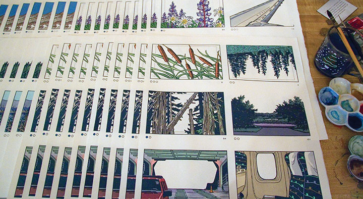
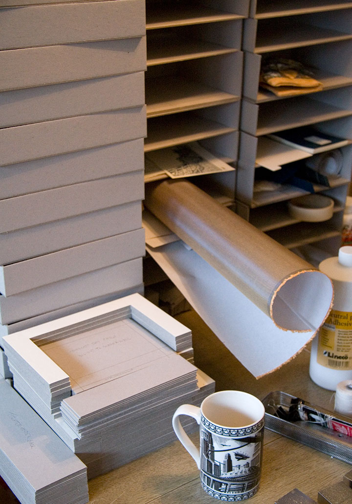
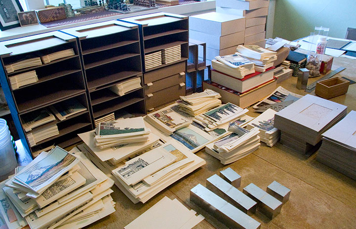
Just wanted to give you a peek at what the studio looks like these days. I try not to think about it too hard, because I officially unveiled the thing almost a year ago, but I’m still working on my book.

Big dang pile of box parts; coffee cup for scale.
You see, it’s one thing to get the prototype done for the exhibition, but when you’re making an edition of books, that means you have to finish all the rest of the copies, too.

Obviously, I have my work cut out for me.

August 17th, 2011

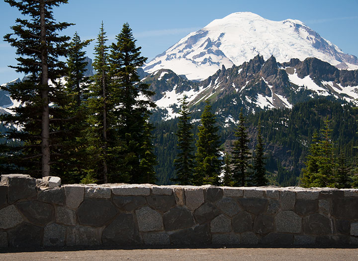
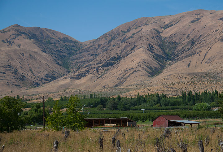
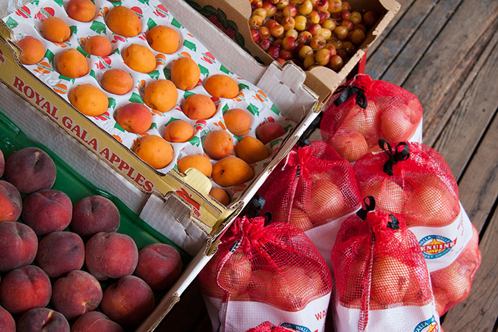
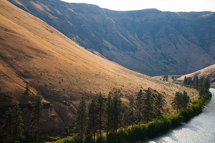
Whenever the Tailor and I do our annual peach haul from the other side of the Cascades, we like to take the back road. That way, we get to take in the mountain air,

visit every orchard along the way,

Have our pick of the best farmstands,

and take the time to find out what’s beyond the next bend in the road.
July 20th, 2011

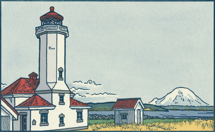
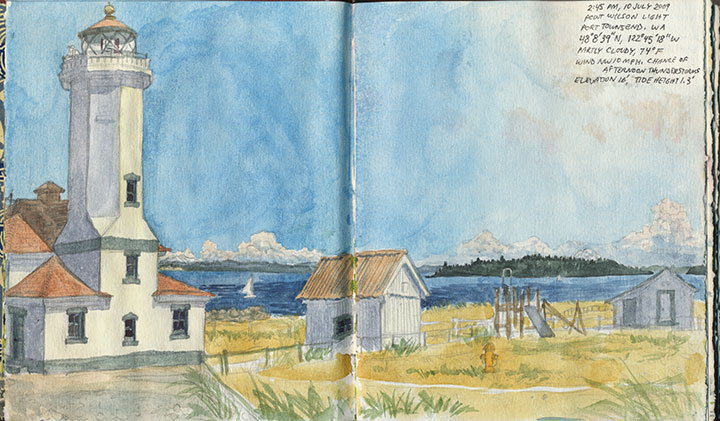
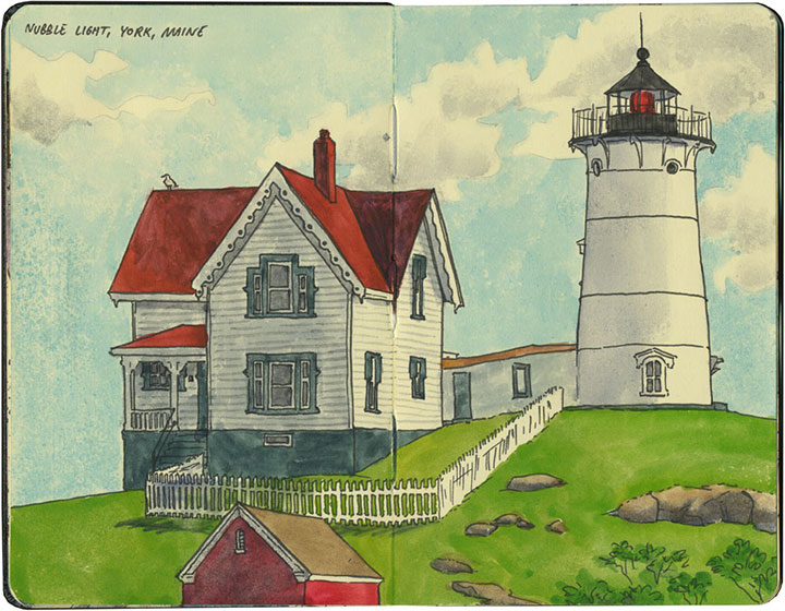
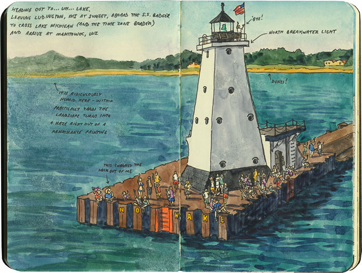
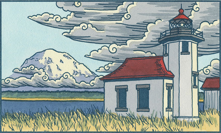
As you may have already noticed, I kind of have a thing for lighthouses.

It’s probably no surprise they’ve cropped up in my work lately, since my corner of the world is fair teeming with them.

But I even find myself sneaking them into other projects, even when it’s not strictly necessary.

So you can imagine my excitement on my trip back East,

when there seemed to be a beacon

around every corner.
Best keep a sharp eye out—

I have a feeling there’ll be more lighthouses popping up here in future.
March 5th, 2011

You know, I spent the whole time I was at Codex just trying to process everything around me. I thought the few weeks since that I’ve been telling stories and rehashing memories would make it easier to sort it out in my mind, but I still just can’t seem to articulate the impressions bouncing around the inside of my skull.
It was just too big … too rich … too much.
Which probably explains why I never managed to get any decent photos. I was too busy standing there goggling at the enormity of it all to document the experience properly. It was all I could do just to man my own table and keep track of all the folks who stopped by to talk to me.

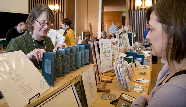
Let me backtrack a bit, and explain what all of this was about. For every discipline, subculture or interest group out there, there’s some sort of club, or society, or conference, or symposium, or bee, or knitting night, or comicon, or hot-dog-eating contest, or what-have-you—some organized gathering for like-minded people to get together and share what they do. If you can think of it, there’s probably a group of people meeting about it somewhere.
The trouble with the book arts is that our world is small and spread out. There aren’t too many of us who do this sort of thing in the first place, at least when compared to photographers, or children’s book writers, or web developers. And then within our little group, everybody follows such a different path that getting us together is like herding cats. We’re hard to pin down because there’s a whole universe in our little speck of dust. Printing, bookbinding, papermaking and typesetting are just the tip of the iceberg. Within each of those disciplines is an incredibly broad spectrum of different and often contradictory artists and art forms. And yet each of those fits comfortably, easily, infinitely under the same, paradoxically small umbrella of the book arts. (Now you know why I’m not great at elevator speeches.) If you tried to graph it out, you’d end up with either the world’s best or worst Venn Diagram—I can’t decide.
So because we run such a crazy gamut, we can’t be shoehorned in neatly with some other event, even though the “average” book artist can and probably does moonlight quite easily as a dozen other things. There’s no “book arts corner” at SXSW, or BlogHer, or the Venice Biennale. Exhibitions and summits dedicated entirely to the book arts are few and far between—large international events are rare, indeed. So for our lot, Codex is a big deal.
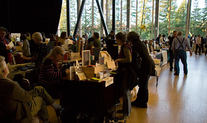
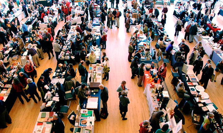
This year there were over 140 exhibitors at the book fair, representing artists in every conceivable discipline and style, and every corner of the globe. The exhibitors hailed from 20 states and over a dozen countries outside the U.S., including Russia, Germany, France, Israel, Colombia, Japan, Mexico and Canada.
And it isn’t just for artists: students, educators, private collectors, librarians, museum curators, conservators and archivists, hobbyists, publishers, supply vendors, gallery reps and dealers, bookstore owners, clubs and organizations, and every stripe of enthusiast were in attendance.

Photo courtesy of the Codex Foundation.
So yeah. Codex is huge.
It was both intimidating and inspiring. I was immediately and constantly confronted with my own insignificance (I kept imagining that at any moment, some cartoon alarm would go off—woop! woop! woop!—alerting everyone to the fact that I didn’t belong there)—yet at the same time, everyone I met was warm and welcoming.

I had the chance to catch up with old friends, meet many of my long-admired art-heroes, and be introduced to a whole host of new faces.
But most of all, Codex was completely, utterly overwhelming. I had my brain cranked up into overdrive for four solid days. After meeting literally hundreds of people, answering thousands of questions, asking another thousand myself, handling many dozens of handmade books and artworks, absorbing new information and taking copious notes, and just being exposed to the ultimate sensory overload of it all—well, by the end, I was a deer in the headlights.
And I feel like I barely scratched the surface of what was there. Imagine that you’re visiting the Louvre, or the Smithsonian, or some other enormous museum. Only instead of picking and choosing which galleries and pieces to see, and making your way through room by room, you discover that every painting, every sculpture, every piece of art in the whole place is crammed into one huge hall—each with the artist who made it standing to the side, waiting to meet you and hear what you think. I’d go mad—I think I did go mad!
Everything I saw was phenomenal—it was hard not to just stand there, slack-jawed, struck dumb by the realization that there I was, in close proximity to some of the best work being done by anyone, anywhere.

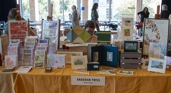
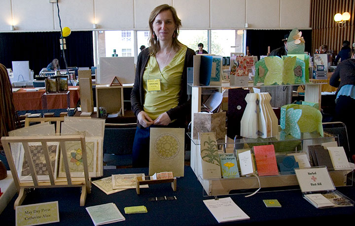
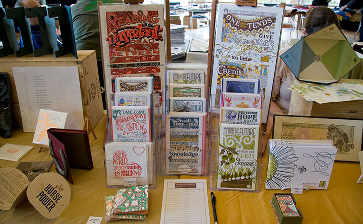
I could go on and on. And I’m sure there were a thousand other great things I never had a chance to see, because I also had a table to man. Jessica and I made the trip together (that’s her showing one of her books), and as we had adjacent tables—

—we met in the middle with our Dead Feminists stuff between us.
Jessica’s done Codex once before, so she was prepared for the overwhelming onslaught of people. She suggested that we put together a letterpress-printed take-away catalog of our work so that after the fair, when everyone was just as dazed as I was, they’d have something to remember us by. (And that ended up being a great idea, and a big hit—we had tons of follow-up messages afterward, and we didn’t see anything like the catalog at the book fair.)

Since we collaborate on so many things, we decided to combine our efforts into one joint catalog—with a twist.

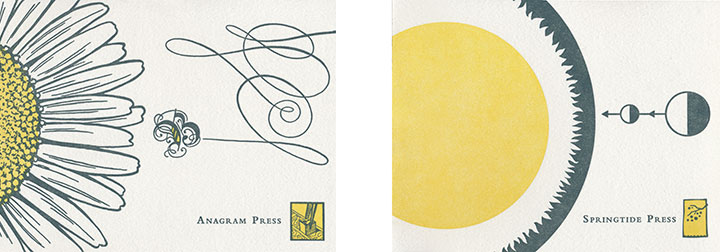
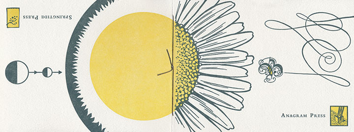
We figured we had an opportunity to clear up a little of the confusion over who does what around here, so we had fun playing with the design possibilities. Jessica came up with a flip-flop format, and I designed two covers that would come together at the spine to form a single image if laid flat.

Held one way, you’d read her half of the catalog; flip it over and read from the back, and it becomes my half. We converged in the middle with a Dead Feminist “centerfold” (ha!).

For my part, the most gratifying part of Codex was watching a steady crowd playing with Local Conditions. The response people had to the book was both intensely gratifying and humbling—and it was wonderful to see that students, fellow artists, dealers, curators, professors and collectors were equally excited about it. But my favorite bit was being a bystander to all the different scenes people designed with the image flats.

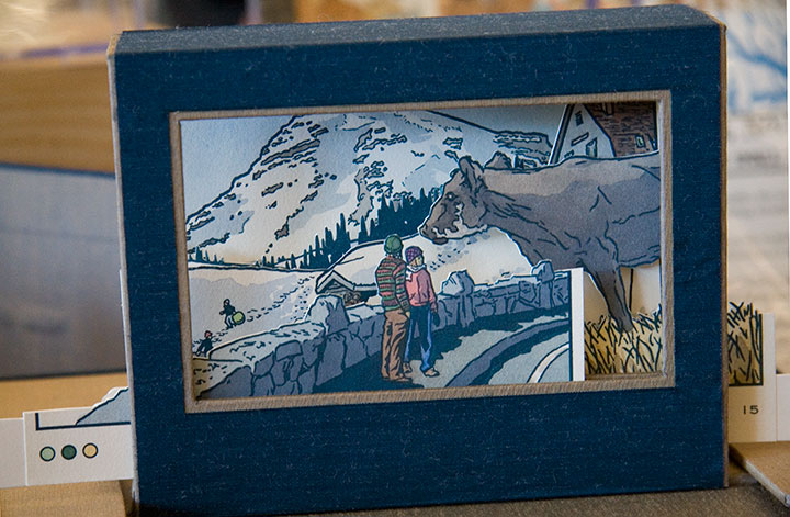
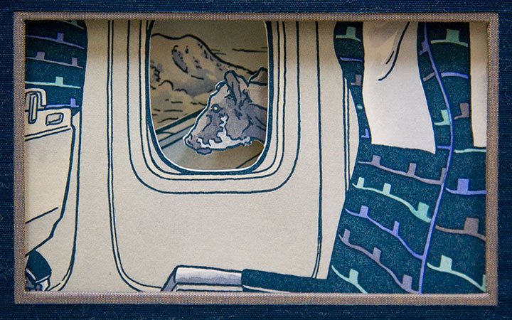
The cow completely stole the show there. It was hilarious to see how many times it turned up in a scene, either a fitting addition I hadn’t thought of—or as an absurdly out-of-place monster.
(Best of all was the cow that stood on the airplane wing and pretended to be a gremlin.)

It’s hard to remember that we were in a city as fabulous as Berkeley—the folks at Codex had created a complete world just in that one room. (Though we did get out enough to discover that when the overstimulation had us in a daze, a hot-cookie ice cream sandwich down the street was just the ticket. Thank you, Berkeley!) The next fair is two years away, but I came home with what seemed like a decade’s worth of inspiration. And I find I’m already looking forward to Codex 2013—sensory overload and all.
Bring it on. I’ll be there.

January 20th, 2011

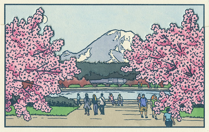
A composite of two image flats from the book.
Anyway, after a good, long run, my Local Conditions exhibit is closing tomorrow afternoon, and this week I’ve been revisiting some of my favorite images from the book. This one always gets me thinking about how much a city can change over the course of a century, and how for a newcomer like me, that change isn’t always apparent. There aren’t always little plaques or signposts to tell you what used to exist where you’re standing now—or even any evidence at all of how things used to be.
This scene depicts the Drumheller Fountain (also known as Frosh Pond), located on the University of Washington campus in Seattle. Incidentally, on my first trip to the Northwest almost exactly four years ago, I was standing on this very spot when I saw Mt. Rainier for the first time. This is where the idea for the book first struck me—although at the time it was a very different, and much simpler concept. And at that moment, I had no idea that the view itself had a history all its own.

AYP and Camp Harmony images courtesy of the University of Washington Library
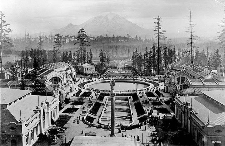
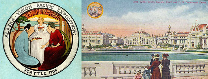
This is Frosh Pond in 1909, when it was called Geyser Basin (part of the so-called “Arctic Circle”), and when it was not a part of campus, but the centerpiece of the University’s predecessor, the Alaska-Yukon-Pacific Exposition.
An event similar to a World’s Fair, the A-Y-P showcased the natural and economic resources of the Pacific Northwest with pomp and splendor. To mirror the purpose of the exposition, the fairgrounds (designed by the famous Olmsted Brothers) brought the region’s greatest symbol into stunning focus. This so-called “Rainier Vista,” culminating in the Arctic Circle, helped draw in 3.7 million visitors over the fair’s four-month duration.

Very little evidence remains of the A-Y-P fairgrounds today (much to my chagrin); the vast majority of the fair’s buildings were temporary, and even the landscape design of the modern University has all but obscured the original layout of the A-Y-P grounds. But the Arctic Circle is still there, and when you step out from behind a row of blooming cherry trees in the spring, the Rainier Vista still hits you with full force.
Speaking of fairgrounds, closer to T-Town is another historical remnant—this time, however, instead of a long-past event with only a marker left behind to hint at what was, these fairgrounds still hold to their original purpose today.

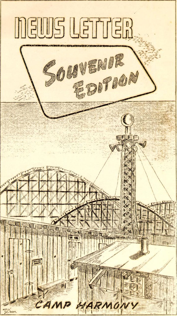
Illustration by Eddie Sato, Camp Harmony inmate and “staff” artist.
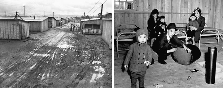
I’m talking about the Western Washington Fairgrounds in Puyallup, which are still in operation (though the event is now called the Puyallup Fair—that’s pronounced “Pew-AL-up”). In 1942, the U.S. government evicted, rounded up and imprisoned over 100,000 Japanese Americans living on the West Coast; the internment began with the forced migration of families living on Bainbridge Island, across the Sound from Seattle.

While they awaited the construction of permanent internment camps further inland, many Japanese Americans were sent to temporary “assembly centers” to coexist in cramped barracks with other families, often in substandard living conditions. Thousands of Washington’s interred residents were sent to the assembly center nicknamed “Camp Harmony,” hastily constructed on the fairgrounds in Puyallup, right alongside the fair’s permanent buildings and rides.

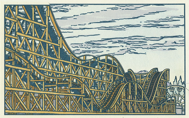
Three image flats; the mountain is almost completely hidden here.
Camp Harmony was torn down after just seven months, but the Fair continues to this day. (To my everlasting horror, the Fair’s website mentions Camp Harmony only obliquely on its “History” page—it states only that “the fairgrounds were used as a temporary shelter“—emphasis mine—during World War II. Right. A shelter where the “refugees” were imprisoned under armed guard.) And the wooden roller coaster that overshadowed Eddie Sato’s scene of the camp still stands. Now that I’ve learned the history of the place, I’ve lost my appetite for rollercoasters, funnel cakes and blue-ribbon vegetables. But the fairgrounds made for an image that dovetails eerily well with the homage to Japanese art upon which Local Conditions is founded.

Photo courtesy of Jessica Spring
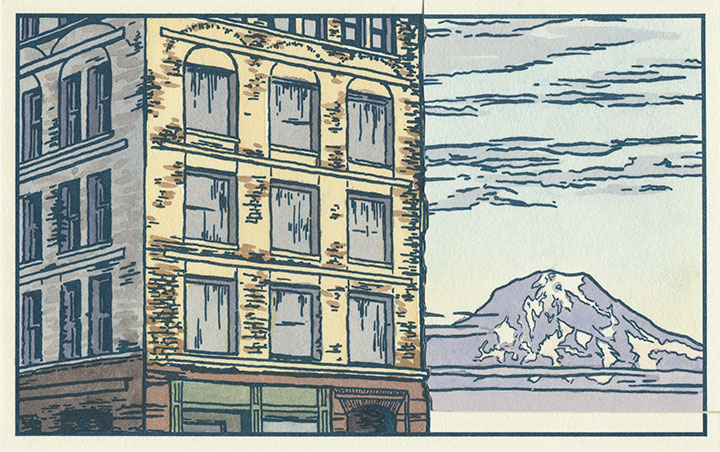
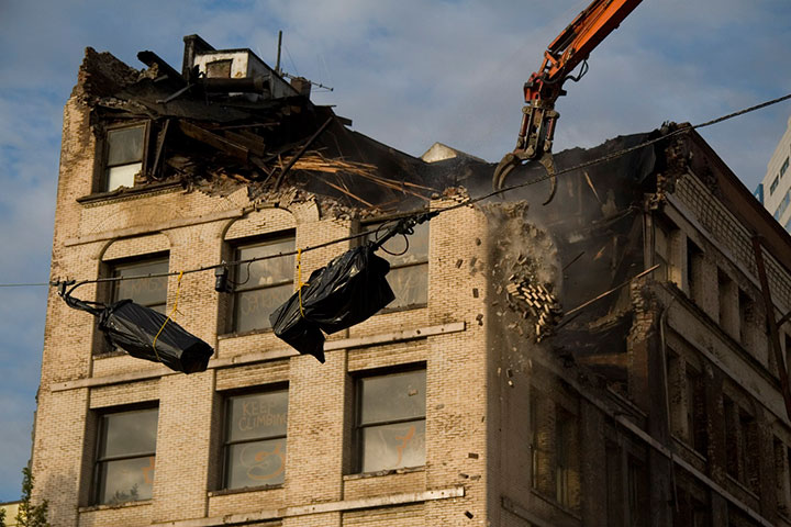
And then there’s the kind of history that unfolds right before your very eyes. Remember the Luzon building?

Two image flats; recognize the sky in the background?
Well, it was slated to be a part of the book from the very beginning—just by virtue of being a structure that caught my eye and that came with a good view of the mountain.

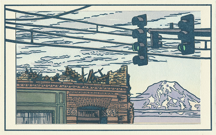
But then they knocked it down in September 2009, and suddenly I became an eye-witness, with an opportunity to document history as it happened.

Three image flats; same mountain, drastically different view.
I wish this were an imaginary scene, but it’s moments like this that the book is all about. Now you see it, now you don’t.

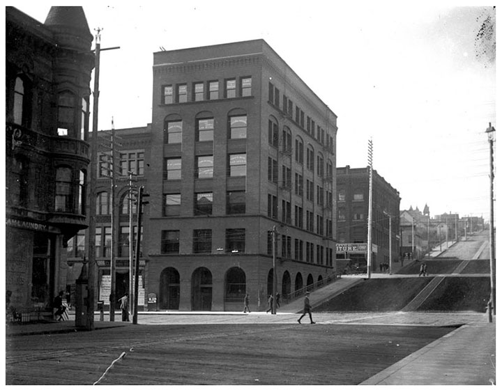
Postcards circa 1910. Courtesy of the Tacoma Public Library
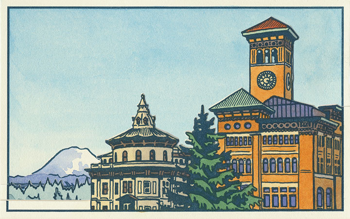
And to top it all off, it’s looking like Tacoma’s history is in danger of repeating itself. This is a postcard dated 1905, depicting what was an iconic view even then—the “Gateway to the City of Destiny.” The building on the left is the former Northern Pacific Railroad Office; on the right is Old City Hall.
Tacoma built a new city hall a few blocks away in the 1930s, but both the Northern Pacific building and Old City Hall still stand—the addition of a freeway the only major change to the site pictured. But on November 24, 2010, after an unusual cold snap, a pipe burst in Old City Hall—soaking the walls, ceilings and floors with 30,000 gallons of water. With extensive flood damage and the building owner entering foreclosure, the building faces an uncertain future. I only hope it doesn’t go the way of the Luzon.

Three image flats; there’s an individual print version in the shop.
When I started this project, I had no idea of what I was getting into. I knew that I would stumble upon some pretty fascinating history, but I never would have guessed that a fountain, some fairgrounds and a pile of bricks would draw me in so completely. But now I’m hooked—and the best part is that after all this work, I no longer feel like an outsider looking in.
This is my history now, too. For better or worse, I want to see how it all plays out.
November 17th, 2010

I’ve been hemming and hawing about how best to share this thing with you. Even with Sarah’s excellent photography, it’s just a lot more difficult to explain how it works when I can’t hold the book out into space and demonstrate in real time. It’s a problem with every artist book out there—an interactive sculpture, complete with moving parts, that also happens to tell a story is just dern hard to document.
So for now, I’m going to go through the mechanics of the thing, step by step, and go into the whys and wherefores in other posts. And for those of you who might not be familiar with the term artist book, you’re going to find out really quickly that this isn’t your basic hardcover book. The definition of “artist book” is way too broad to go into within this post (click the above link to go to what I wrote on my F.A.Q. about it), but I’m hoping that by the time you get to the bottom of this post, you’ll have an idea of just how broad the term can be—and what crazy things can happily fall into the category.

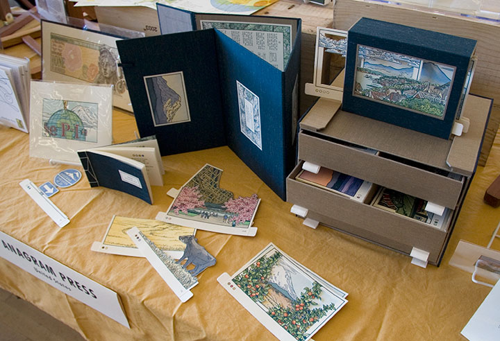
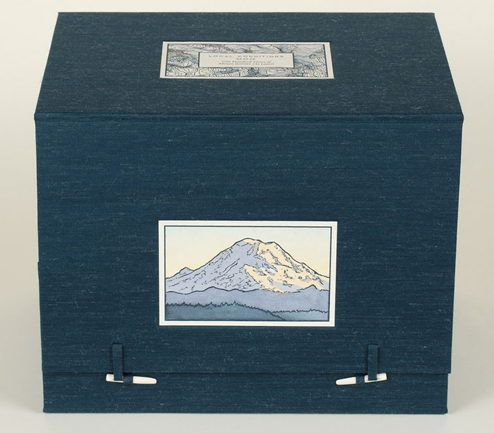
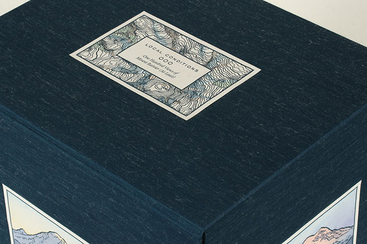
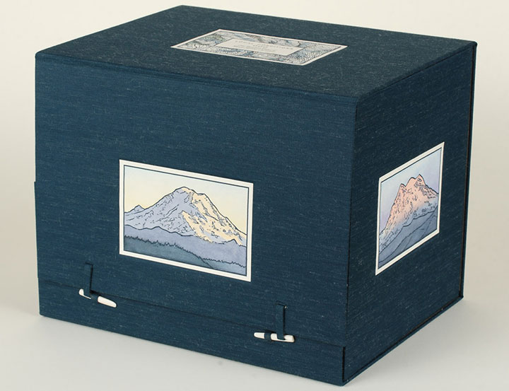
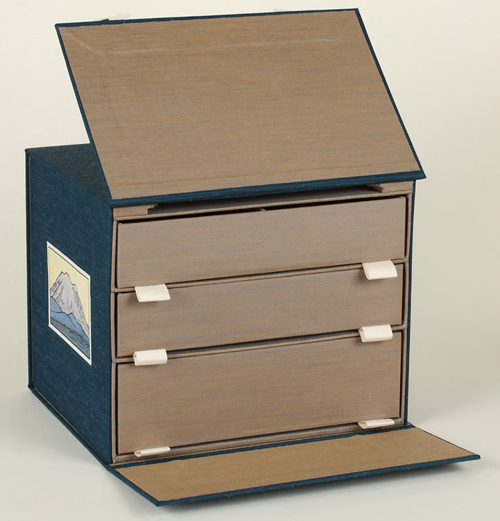
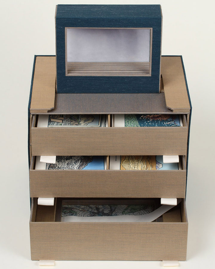
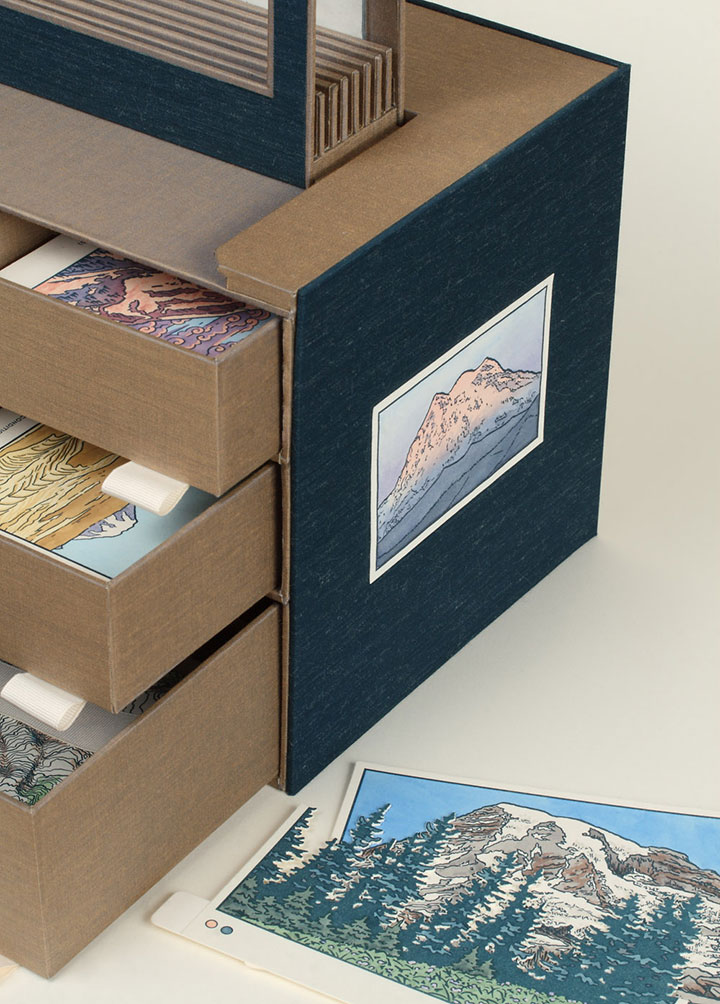
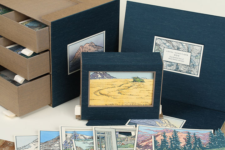
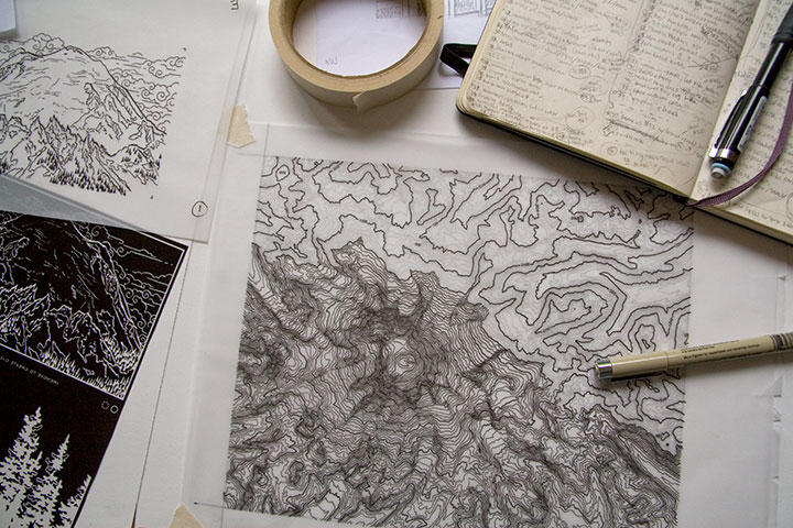
Okay, let’s start with the box. When it’s all closed up, Local Conditions is almost a cube (a 10-inch cube that’s heavy enough to be hiding a sack or two of flour inside). On the topmost face of the box is the frontispiece, containing the title and a topographic map illustration of the summit of Mt. Rainier.

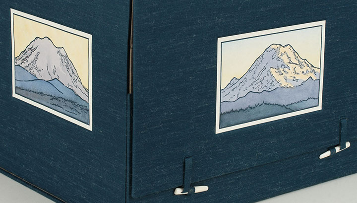
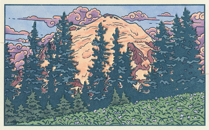
The north, south, east and west sides of the box are faced with illustrations of the corresponding faces of Rainier, each depicting the mountain at sunset.

(That’s the eastern face on the left, and the north face beside it.)
Now, those two little bone clasps hold the thing together, and when you flick them out of their loops,

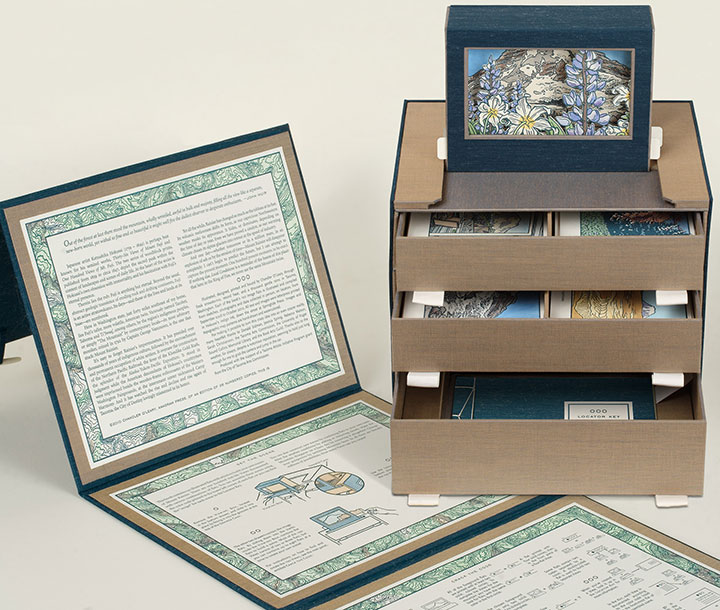
the book opens up, revealing a chest of drawers. Keep pulling on the flap you just raised,

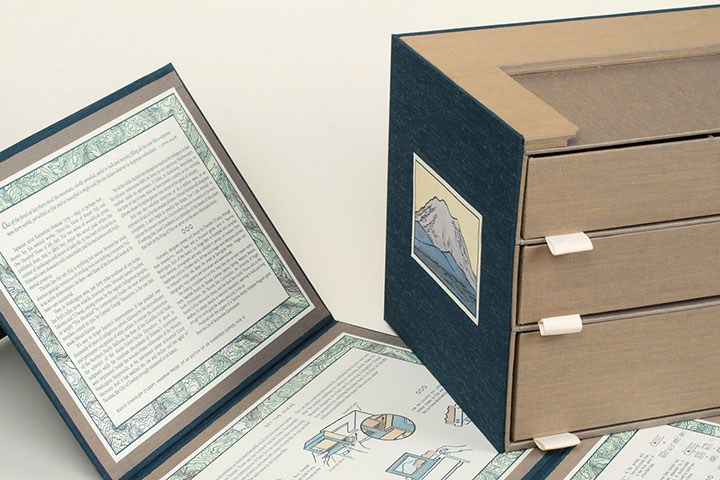
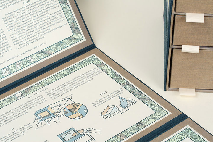
and you’ll find that you can take the whole outer wrapper off and read the colophon (see below) printed on the inside.

The other panels on the wrapper include detailed instructions on everything the book does.

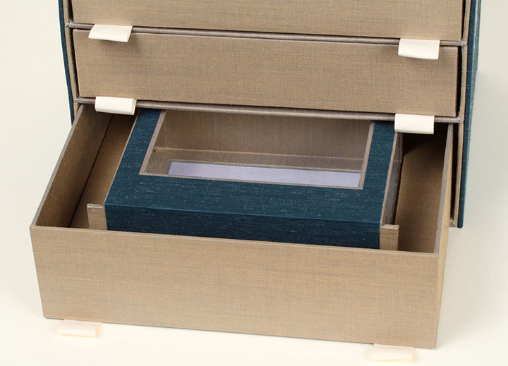
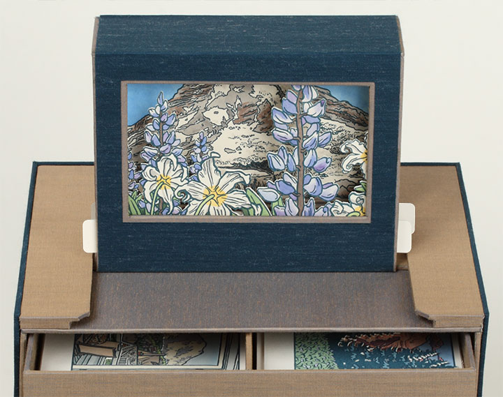
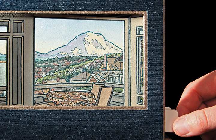
Next, let’s open the drawers—nested in the bottom one you’ll find a Viewing Box (yeah, I know … a box, within a box, within a box … sorry.) that consists of a window, a background panel, and two tabs that stick out from either side.

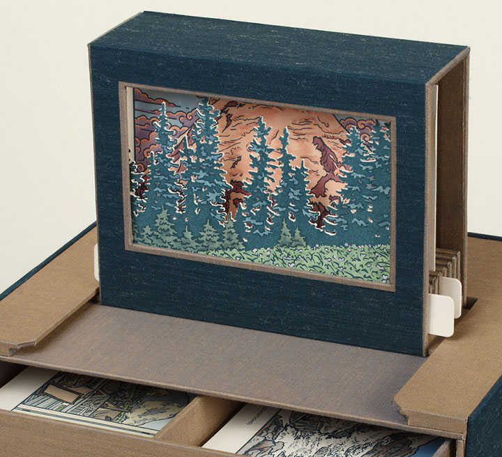
The tabs match up with the grooved unit at the top of the chest of drawers, and the Viewing Box slides into place.

So now the box is fully expanded, and the book is assembled for use. Now comes the fun part.
Take a closer look at the Viewing Box, and open the top two drawers.

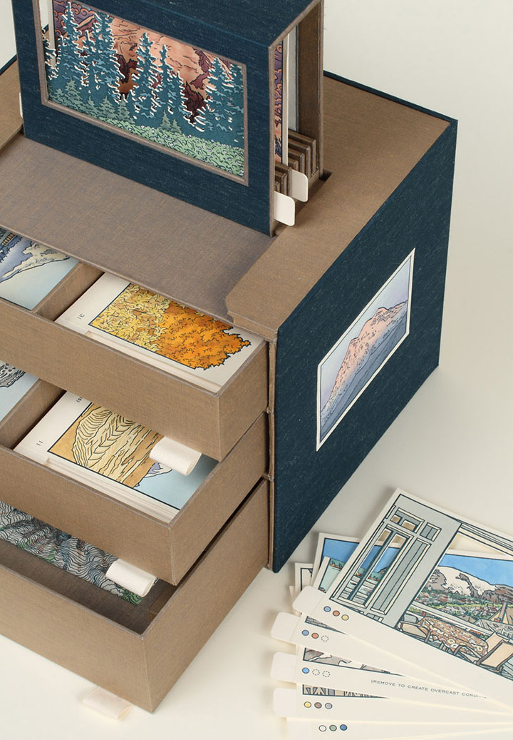
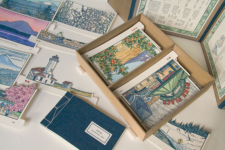
Inside the drawers you’ll find a series of cut-out cards, each printed with a different image. These little image flats slide right into the slots of the Viewing Box,

and face out the window to form an instant picture—kind of like an old-fashioned stage set.

Now here’s the thing:

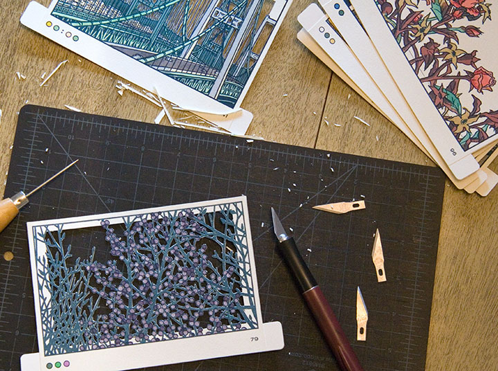
There are 120 flats to choose from. One hundred and twenty. Each one hand-printed, hand-painted, hand-cut.

By combining, layering and switching the flats in and out of the Viewing Box, you can create seemingly endless scenes of Mt Rainier. I came up with one hundred, and documented them as part of the book (again, I’ll elaborate later), but I’m more interested in how many you can dream up.

(Hint: a lot. Thousands. Millions. To be precise, 1.4 x 10¹⁵, or 1.4 quintillion, if you really wanted to push the envelope.)
• • • • • • • • • • • • • • • • • • • • • • • • • • • • • • • • • • • • • • • • • • • • • • • • • • • • • • • • • • • •
Local Conditions: One Hundred Views of Mt. Rainier (At Least)
Edition size: 26 numbered books and 5 roman-numeraled artist proofs
Book size: 10 x 8 x 8 inches when closed
Viewing window: 3 x 5 inches
Artist book consisting of viewing box and 120 image flats, illustrated and compiled from data collected in person, on location, over the course of two years. Housed in a set of drawers with nested stab-bound book and Japanese-style outer wrapper. Images and maps are hand-drawn, letterpress printed and individually hand-painted with watercolor. All image flats are hand-cut.
For price/purchase info, please contact me.
Edited to add (November 2011): As a supplement to the artist book, I also created a suite of 15 limited-edition letterpress prints, featuring some of my favorite scenes from the book. Just like the flats in the book, each print is letterpress printed and hand-painted with watercolor. You can find all 15 prints in the shop.
Colophon reads:
Japanese artist Katsushika Hokusai (1759 – 1849) is perhaps best known for his seminal works, Thirty-Six Views of Mount Fuji and One Hundred Views of Mt. Fuji. The two series of woodblock prints, published from 1829 to circa 1847, depict the sacred peak within the context of landscapes and scenes of daily life. At the heart of the series is Hokusai’s own obsession with immortality, and his fascination with Fuji’s eternal presence.
Therein lies the rub: Fuji is anything but eternal. Beyond the usual, abstract geologic transience of eroding rock and drifting continents, Fuji is an active stratovolcano. Its days—and those of the lives and lands at its base—are numbered.
Here in Washington state, just forty miles southeast of my home, lies Fuji’s taller, more volatile, American twin. Variously named Tacobet, Tahoma and Ti’Swaq’, among others, by the region’s indigenous peoples, or simply “The Mountain” by contemporary locals—its most arbitrary moniker, coined in 1792 by Captain George Vancouver, is the one that stuck: Mount Rainier.
It’s easy to forget Rainier’s impermanence. It has presided over thousands of years of indigenous culture, followed by the encroachment and permanent occupation of white settlers. It oversaw the construction of the Northern Pacific Railroad, the fever of the Klondike Gold Rush, the splendor of the Alaska-Yukon-Pacific Exposition. It stood in judgment while the American descendants of Hokusai’s countrymen were imprisoned beside the wooden-frame rollercoaster of the Western Washington Fairgrounds, at the internment center nicknamed Camp Harmony. And it has watched the rise and decline and rise again of Tacoma, the City of Destiny lovingly misnamed in its honor.
Yet all the while, Rainier has changed as much as the tableau at its feet. Its volcanic restlessness shifts its form, as our capricious Northwestern weather masks its appearance. It hides, or dominates, depending on the time of day or year. Even we have proved a catalyst, as our warming climate chases its alpine glaciers into retreat at the speed of industry.
And one day—whether tomorrow or in a million years, in an explosion of ash or by the erosion of time—Mount Rainier will disappear completely. I can’t begin to predict the future, but I can attempt to capture the present moment. One hundred present moments, to be exact. If nothing else, Local Conditions is a reminder of the lesson of this place: that here in the Ring of Fire, we never see the same Mountain twice.
* * *
Illustrated, designed, printed and bound by Chandler O’Leary, through freak snowstorms, record heat, and a thousand gentle rains in Tacoma, Washington. Each of the book’s 120 image flats is illustrated and compiled from sketches, photographs and data collected in person, on location, from September 2008 to October 2010. All text and images were letterpress printed in Hokusai’s indigo ink, down the street at Springtide Press. Images and topographic map patterns are hand-drawn and watercolored.
For making it possible to turn this crazy idea into an even crazier reality, many heartfelt thanks to Jessica Spring, Sarah Christianson, the Tacoma Arts Commission, the University of Puget Sound Collins Memorial Library, and the Book Arts Guild. Thanks also to the weather, for always, despite a notorious reputation, seeming to hold just long enough for me to grab the camera and jump in the car.
Produced with the support of a Tacoma Artists Initiative Program grant from the City of Tacoma Arts Commission.

November 5th, 2010

Photos by Sarah Christianson
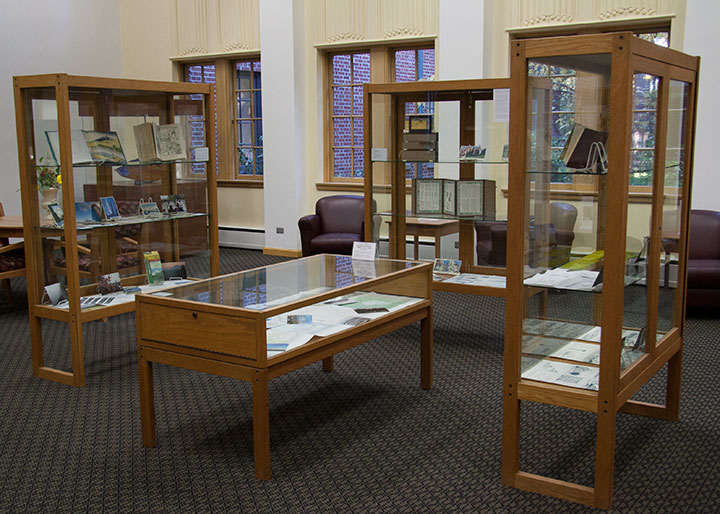
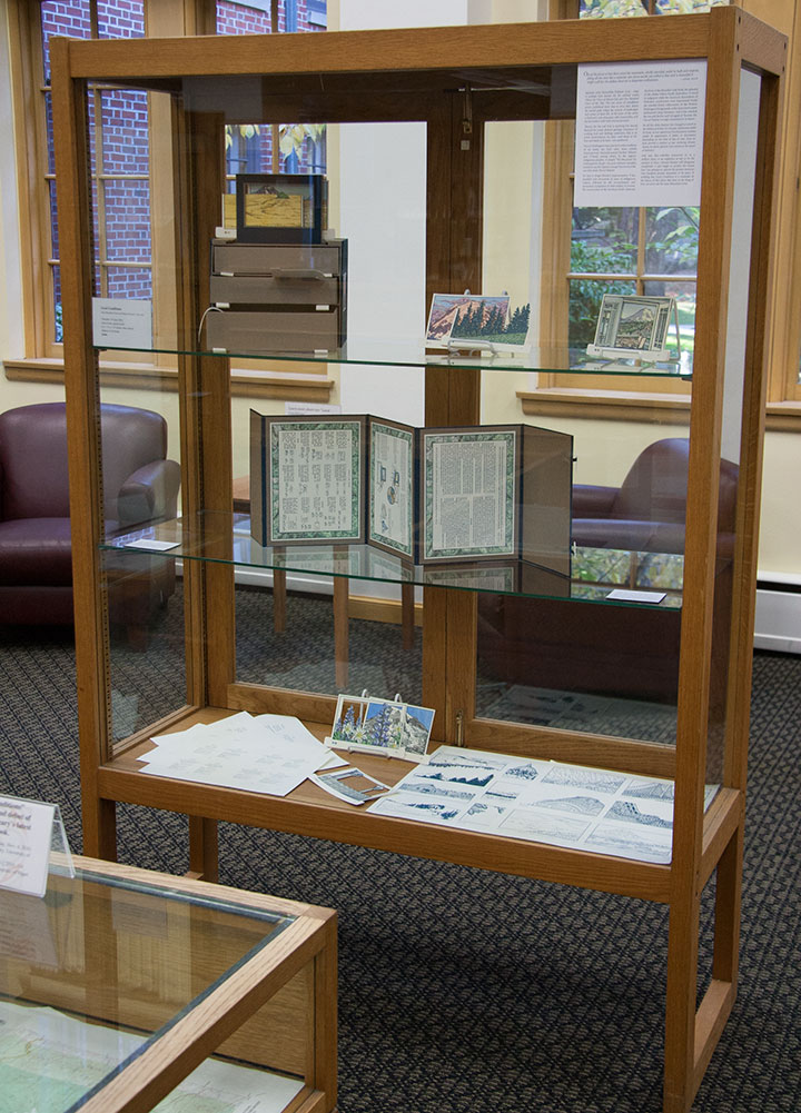
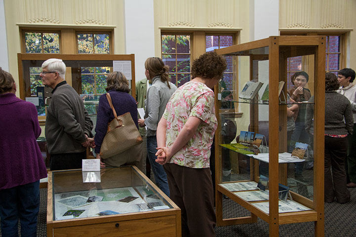
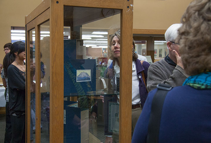
The show is all set up,

and the book is officially out in the world.

Many thanks to the enormous crowd of folks who descended upon the opening last night—and to my amazing friend Sarah Christianson for providing every kind of emotional and practical support I can think of.

October 22nd, 2010

It’s getting harder and harder to keep the secret these days—the Rainier book is almost done, and I’m just dying to show you. But I don’t want to ruin the surprise for T-town, so I’m going to keep it under my hat for just a little longer. But after over two years of being under wraps, the book is gussying it up and stepping out for a solo exhibition. Here’s a brief description of what you’ll see:
Local Conditions, an interactive artist book, captures the changing faces of Mt. Rainier. Explore the 100 Views—or create one of your own—to discover a mountain both immortal and impermanent.
The book contains 120 image flats and a viewing box; by combining and layering the flats, the reader can create literally millions of scenes. Images are illustrated and compiled from data collected in person, on location, over the course of two years. Letterpress printed, watercolored, and hand-bound in an edition of 26 books. Sponsored by the Tacoma Arts Commission.
Exhibit runs November 4 through January 21
Collins Memorial Library, University of Puget Sound, Tacoma, WA
Opening reception: Thursday, November 4, 4:30 to 6:30 p.m.
Artist talk (sponsored by the Book Arts Guild): Thursday, November 11, 7 p.m., Room 020

Photo by Sarah Christianson
If you miss the exhibition opening, I’ll have some of the process materials from the book out for perusal at this year’s Studio Tour—as well as the brand new Dead Feminist broadside! (Look for it online in early November.) So be sure to stop by!
Saturday and Sunday, November 6 and 7
Open 10 am to 4 pm.
More information, maps, addresses and directions can be found here.
See you then!
September 15th, 2010

Lately I’ve spent nearly every waking minute of each day with my face an inch away from the drafting table.
Let’s step back, and stretch out a bit.

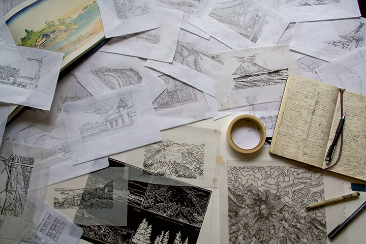
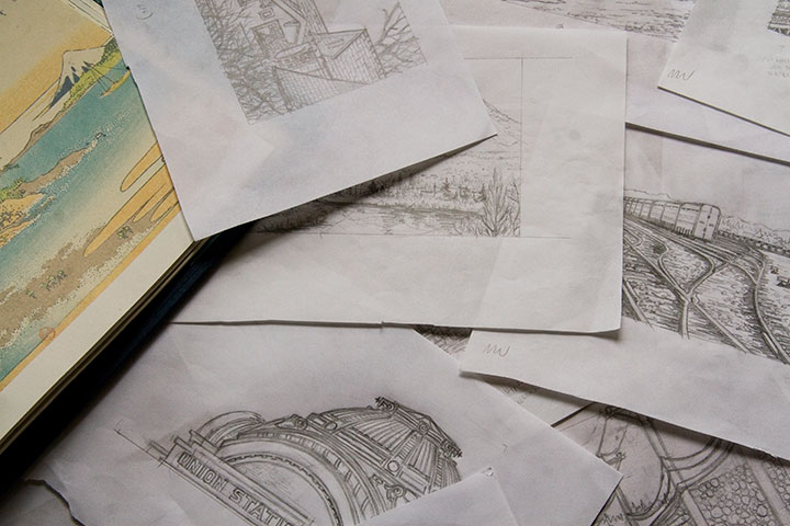
My studio is often a sea of papers—an occupational hazard—but these days the swells have consisted of pencil snapshots for my Mt. Rainier book. Dozens, and dozens, and dozens of them.
Time is ticking down, counting closer and closer to zero, and there are still many miles to cover before the clock strikes deadline. Yet suddenly, things are starting to come together. It won’t be long until I can share something that makes sense—something that looks more like a book, and less like a pile of drawings. I promise that you’ll be among the first to see it when I do.

But if I go missing for long stretches at a time—well, you know where to find me.
August 6th, 2010

My goodness, how time flies.
As of this moment, I’ve been a Tacoman for exactly two years. Twenty-four months. Seven hundred thirty days. Seventeen thousand five hundred twenty hours.
And counting.
I’m hoping for several million more, because I’ve loved every one—thanks to you T-town folks. Guys, you’re awesome. And generous, to boot—I think I had a stroke or something when I picked up my copy of this week’s Weekly Volcano and found my name printed next to “Best Visual Artist.” Holy moley. Thank you for the vote of confidence—you’re inspiring me to git to work!

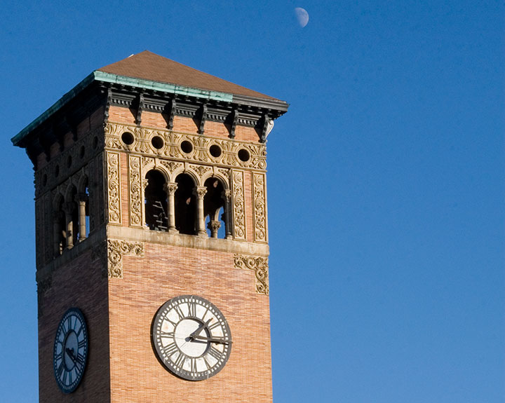
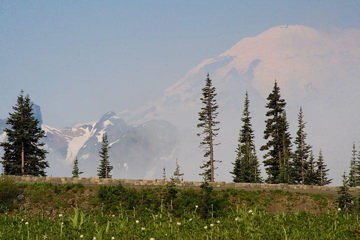
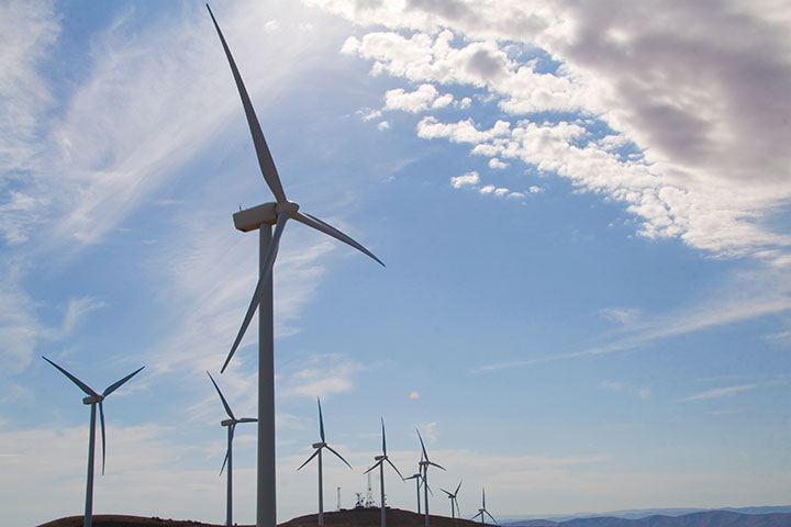
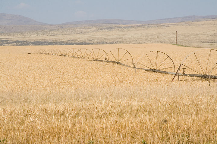
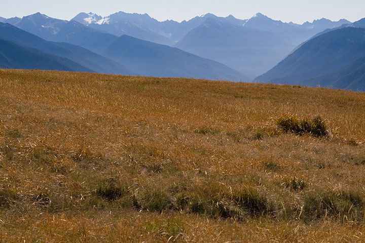
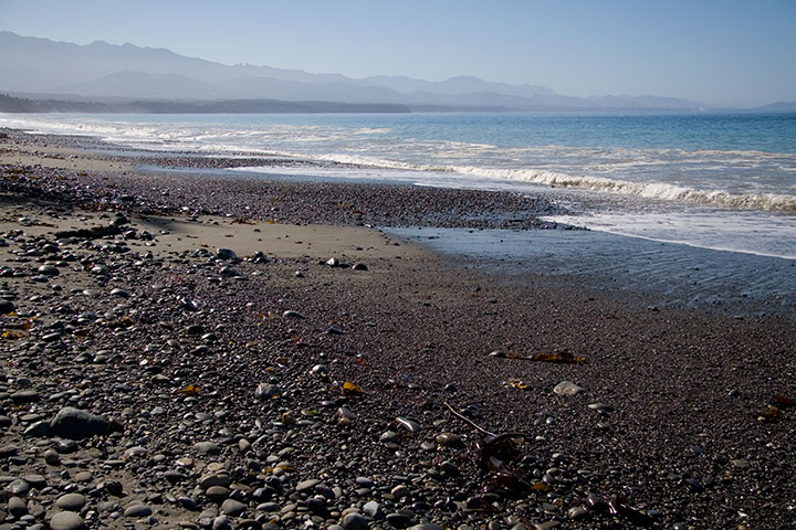
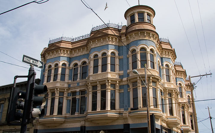
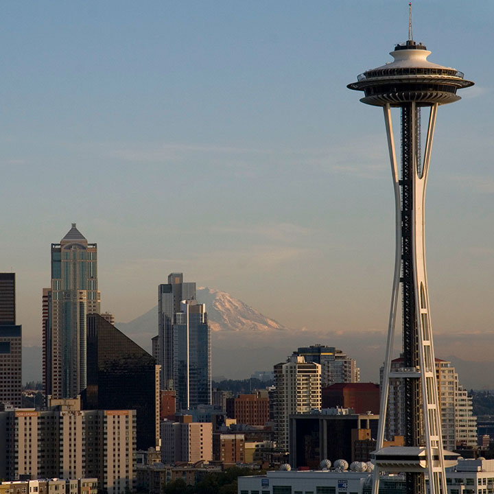
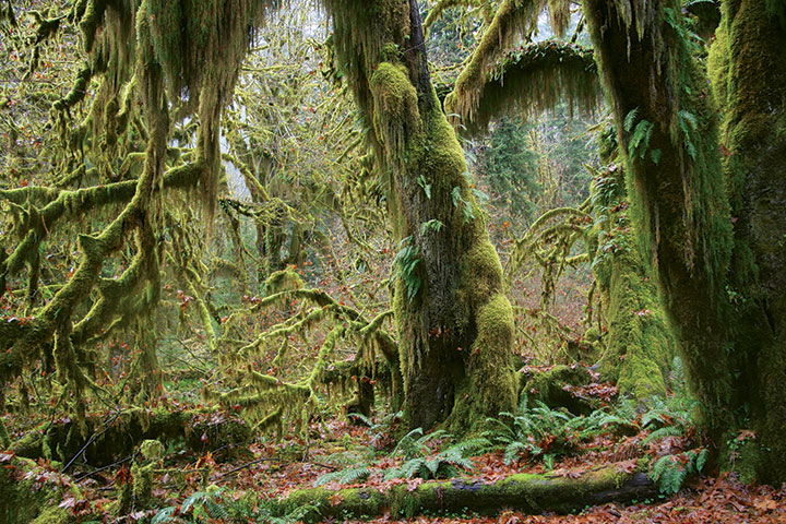
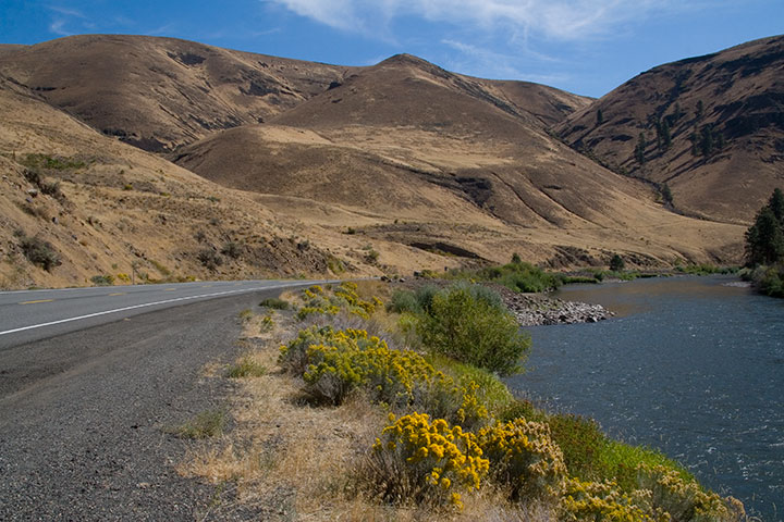
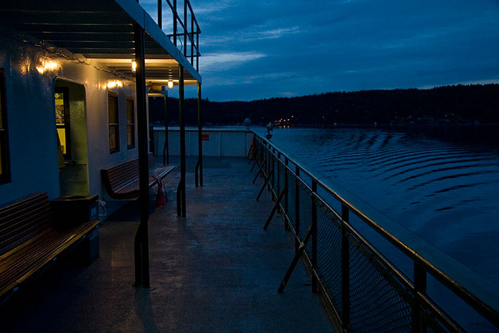
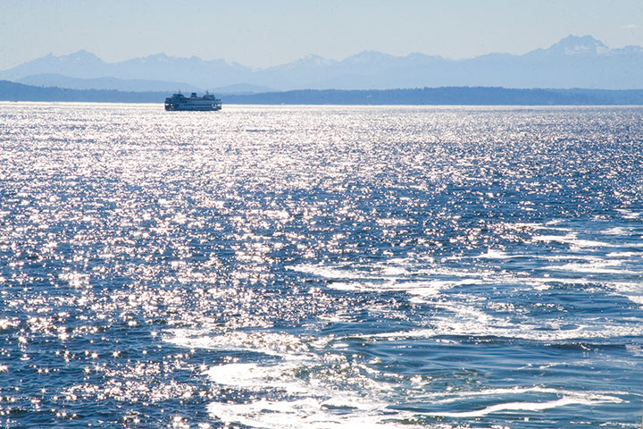
Speaking of work, which I’m not quite ready to show you yet, evidence of the past two years has been on the front burner lately. Since I first came up with the concept for my Mt. Rainier book, I’ve covered a lot of miles in our fair state. And above all else, what I love about the Pacific Northwest are the contrasts. From oceans to mountains, rain forests to deserts, farm fields to bustling cities—it’s hard sometimes to remember that all of this is close to home.
So before I get back to a little picture-drawin’ next week, I’ve compiled a smattering of photos taken since my last anniversary post to illustrate what I’m talking about.


In two years I’ve amassed nearly thirty thousand digital photos of the Northwest—and that’s just of the relatively small hunk of territory I’ve managed to cover in that time.
Here’s to the next thirty thousand photos, and the next seventeen thousand five hundred twenty hours—I wonder what they’ll bring.

![Chandler O'Leary [logo]](https://chandleroleary.com/wp-content/themes/chandleroleary/images/logo.png)
