Blog
November 15th, 2011
It’s hard to ignore the news of protests, ahem, occupying the attention of cities around the world—of the many and diverse thousands of people unified under one simple, yet infinitely faceted mantra. As members of the, well, vast majority of folks without any real political or financial clout in the world, Jessica and I can get behind their message—but that’s not so much the point. What really amazes us is that with a little tenacity and strength in numbers, the powerless can suddenly become very powerful, indeed.
It made us think of a woman who, despite having a famous sibling, would have disappeared into obscurity but for the simple act of picking up a pen.
My power was allways small tho my will is good. —Jane Mecom
Jane’s eminent brother, on the other hand, had a little more faith:
Energy and persistence conquer all things. —Benjamin Franklin
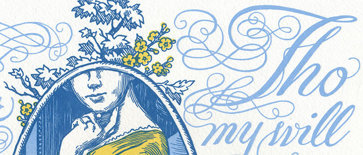
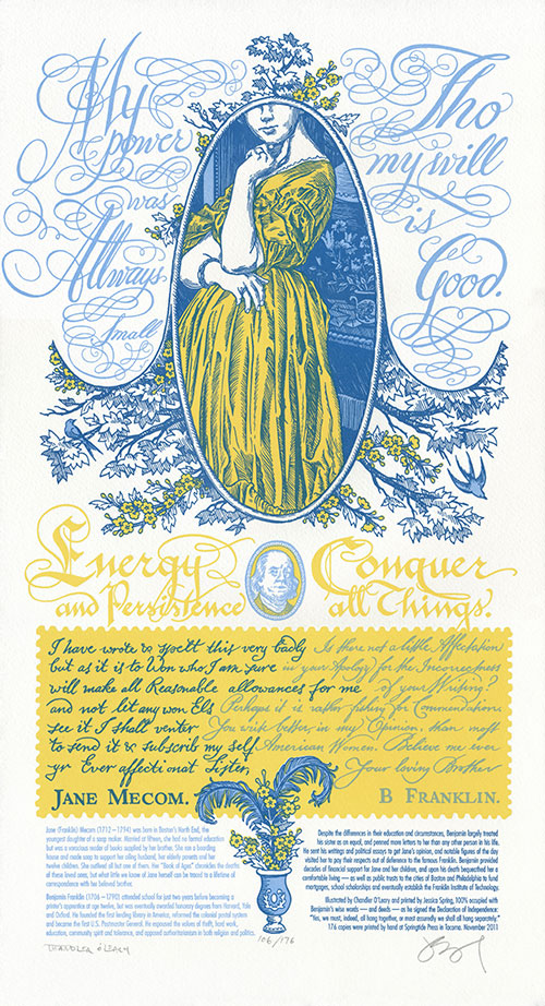
Jane had both energy and persistence in spades—although we marvel at how she managed it, with twelve kids, a family business and a house perpetually full of boarders to occupy her attention. Yet of Benjamin’s sixteen siblings, Jane is the only one whose story has survived the 200+ years since her death—and all because she committed her thoughts to paper. So in honor of Ben and Jane’s relationship, and in solidarity with those who find the strength to speak up, we present our first dual Dead Feminist broadside, Signed, Sealed, Soapbox.
Since this is also our first print that features a cameo from a male Dead Feminist (nope, you don’t have to be female to be a feminist), we thought it deserved a little something extra. So we set it up like a conversation—or in this case, a written correspondence. Besides, there was just so much historical ground to cover—even condensing the information to a blog post is a challenge, let alone plucking two sentences from a lifetime of dialogue. (If you haven’t already guessed, this post is a long one. Grab a cuppa if you dare to settle in!)

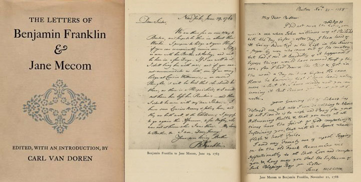
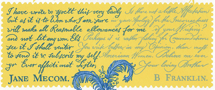
What first sent us down the Jane Mecom rabbit hole was an article about her in the New York Times, written by Jill Lepore. Lepore’s words sent me searching for more information, and I found it buried in the stacks of my local public library. I uncovered an obscure tome: The Letters of Benjamin Franklin and Jane Mecom, by Carl van Doren. The book chronicles their entire surviving correspondence—98 letters in all, printed in full. I was a little worried that the writing style of the day would make even skimming for quotes a chore—but in truth, I couldn’t put it down. It was like peering into the lives of any two ordinary people who happened to care for each other very much. There’s humor, and worried advice, and gossip, and gentle sarcasm, and the occasional scolding (usually on Jane’s part) when one or the other let too much time pass between letters. Most of all, there’s love—it’s there on every page. After all of that, we couldn’t just limit the broadside to a couple of one-liners. So the quotes are accompanied by excerpts from their actual letters, each calligraphed as closely as possible to Ben and Jane’s actual handwriting. Even the spelling errors and colonial-era grammar are intact; we figured it was better not to mess with history.

Jane’s excerpted letter:
I have wrote & spelt this very badly but as it is to Won who I am sure will make all Reasonable allowances for me and will not let any won Els see it I shall venter to send it & subscrib my Self yr Ever affectionat Sister, Jane Mecom.
Ben’s reply:
Is there not a little Affectation in your Apology for the Incorrectness of your Writing? Perhaps it is rather fishing for Commendation. You write better, in my Opinion, than most American Women. Believe me ever Your loving Brother, B. Franklin.
There are few Founding Fathers more famous than Ben Franklin, but Jane was somewhat of a mystery. What we do know is that she had a very different life than her illustrious brother. Thanks to the simple fact of having been born female, her youth was spent having babies rather than obtaining an education. Her life was marked with misfortune, poverty and the deaths of nearly everyone she loved. Yet through it all she craved knowledge, and read everything she could get her hands on. She was a skilled craftsperson, making the famed Franklin Crown Soap and teaching the trade to others. And she followed her brother’s career with pride—and he supported her in return, both financially and emotionally.

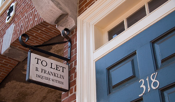
The Tailor and I spent time in both Boston and Philadelphia this summer—ye olde stomping grounds for Doctor Franklin. I had the library book of letters with me on the trip, so their words lent an interesting depth to our wanderings.

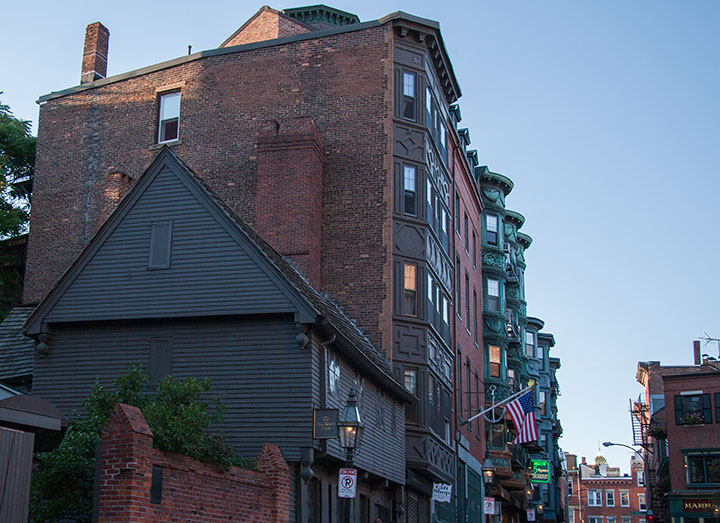
Boston is one of my hometowns, so it was there that I did the most digging. And it turned out that digging was necessary. Ben’s presence is everywhere in Philly, but in Boston, with so many Revolutionary War heroes to honor there, the Franklin family’s presence is far more subtle. And Jane? Well, she’s almost nowhere to be found.
Almost.

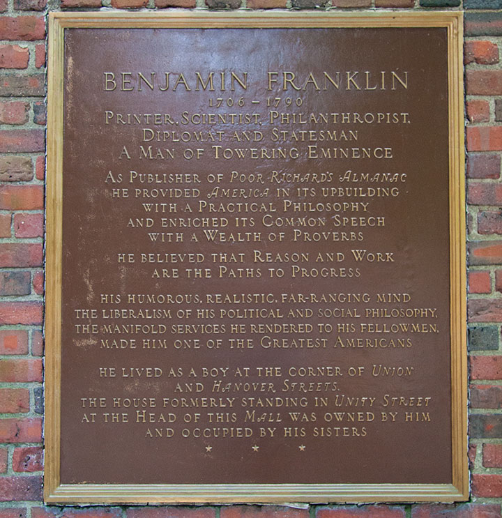
This plaque is all that’s left of the house where Jane spent all her life. It was knocked down to make room for a memorial to Paul Revere. The plaque does mention her briefly, but not by name. Another hazard of being female in the eighteenth century, I suppose.
But Jane lived through the Revolutionary war—in fact, as a resident of the North End, her home was right in the thick of it. In 1775 she fled the British-occupied city and took refuge with friends near Providence, Rhode Island. There, Ben came to rescue her. He took her to Philadelphia, where she spent a year with him before returning to a liberated Boston. While that year was full of turmoil and uncertainty for the citizens of the new United States, 1776 was quite possibly the best year of Jane’s life. For the first time in ages, she could bask in her beloved brother’s company—and he made time for her despite being busy with other things (you know, like founding our country)—and as the honored guest she was largely free from work and family duty.
As far as I can tell, it was also the last time she ever laid eyes on him. Visiting at all was a rare treat—between Ben’s high-profile career and the then-formidable distance between Boston and Philadelphia, it was impossible for them to visit one another more than a handful of times in their entire lives. And since it would have taken weeks for a letter to cross five colonies, and months to traverse the ocean to reach Ben in France, it’s a wonder they remained as close as they did all their lives. Lends a whole new meaning to “snail mail,” doesn’t it?

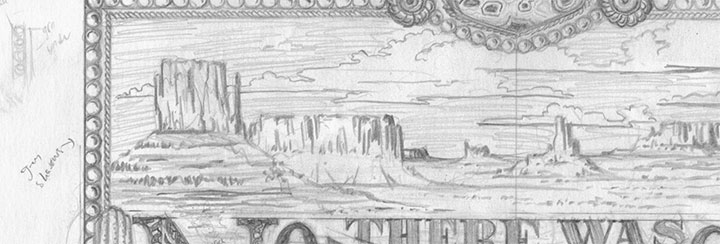
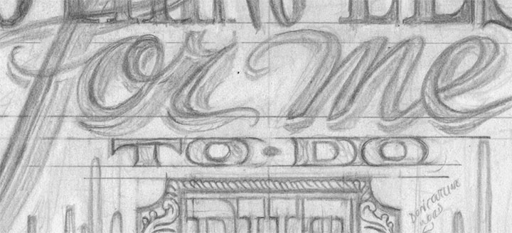
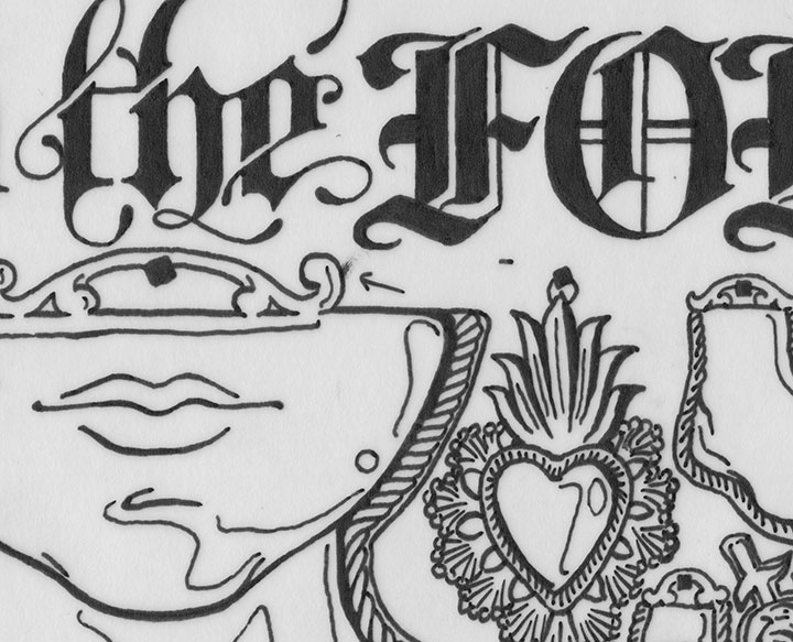
Signed, Sealed, Soapbox is illustrated with the sweeping curves of ornate penmanship and the detailed linework of colonial engravings. A faux-bois forest of branches and flowers resembles the printed toile fabrics of the day. The swoops and swirls of the calligraphy rest in stately Wedgwood blue (complimented by a telltale vase at the bottom!), while Ben and Jane’s correspondence occupies a buttery yellow letter edged like a vintage postage stamp.
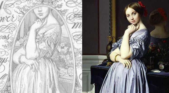
And though there is no surviving likeness of Jane Mecom, she deserves so much more than the portrait of a Jane Doe. Instead, she is made in the image of The Comtesse d’Haussonville by French painter Jean-Auguste-Dominique Ingres.

Ben was the best big brother Jane could have asked for. So in honor of his positive influence, we’ll be donating a portion of our proceeds to the Puget Sound chapter of Big Brothers, Big Sisters—an organization dedicated to providing children facing adversity with mentor relationships that change their lives for the better, forever.
• • • • • • • • • • • • • • • • • • • • • • • • • • • • • • • • • • • • • • • • • • • • • • • • • • • • • • • • • • • •
Signed, Sealed, Soapbox: No. 14 in the Dead Feminists series
Edition size: 176
Poster size: 10 x 18 inches
Printed on an antique Vandercook Universal One press, on archival, 100% rag (cotton) paper. Each piece is numbered and signed by both artists.
Colophon reads:
Jane (Franklin) Mecom (1712 – 1794) was born in Boston’s North End, the youngest daughter of a soap maker. Married at fifteen, she had no formal education but was a voracious reader of books supplied by her brother. She ran a boarding house and made soap to support her ailing husband, her elderly parents and her twelve children. She outlived all but one of them. Her “Book of Ages” chronicles the deaths of these loved ones, but what little we know of Jane herself can be traced to a lifetime of correspondence with her beloved brother.
Benjamin Franklin (1706 – 1790) attended school for just two years before becoming a printer’s apprentice at age twelve, but was eventually awarded honorary degrees from Harvard, Yale and Oxford. He founded the first lending library in America, reformed the colonial postal system and became the first U.S. Postmaster General. He espoused the values of thrift, hard work, education, community spirit and tolerance, and opposed authoritarianism in both religion and politics.
Despite the differences in their education and circumstances, Benjamin largely treated his sister as an equal, and penned more letters to her than any other person in his life. He sent his writings and political essays to get Jane’s opinion, and notable figures of the day visited her to pay their respects out of deference to the famous Franklin. Benjamin provided decades of financial support for Jane and her children, and upon his death bequeathed her a comfortable living — as well as public trusts to the cities of Boston and Philadelphia to fund mortgages, school scholarships and eventually establish the Franklin Institute of Technology.
Illustrated by Chandler O’Leary and printed by Jessica Spring, 100% occupied with Benjamin’s wise words — and deeds — as he signed the Declaration of Independence: “Yes, we must, indeed, all hang together, or most assuredly we shall all hang separately.”
Available now in our new Dead Feminists shop!

October 5th, 2011

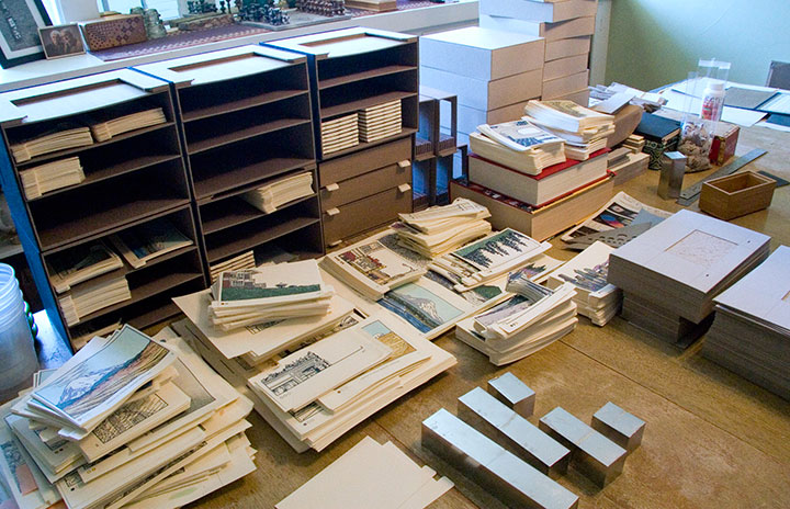
Just wanted to give you a peek at what the studio looks like these days. I try not to think about it too hard, because I officially unveiled the thing almost a year ago, but I’m still working on my book.

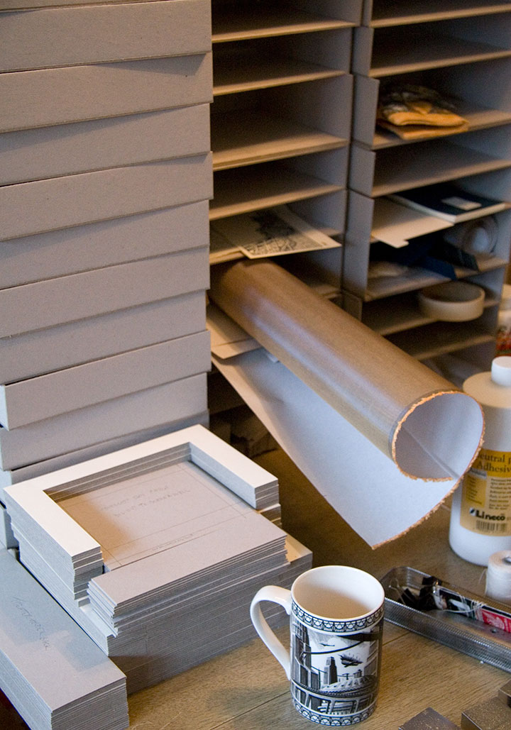
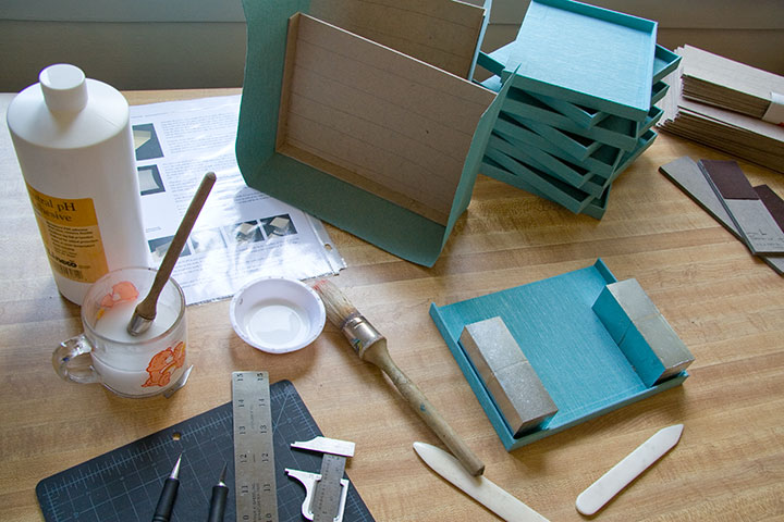
Big dang pile of box parts; coffee cup for scale.
You see, it’s one thing to get the prototype done for the exhibition, but when you’re making an edition of books, that means you have to finish all the rest of the copies, too.

Obviously, I have my work cut out for me.

October 1st, 2011

It’s hard to think of a better weekend activity than taking a quick trip to San Francisco.

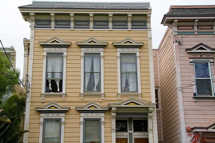
First of all, Jessica and I got to visit the lovely Sarah and Jesse, who live here—

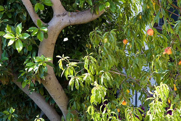
and whose back yard contains this.

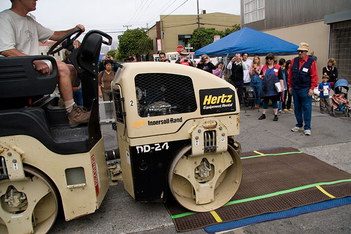
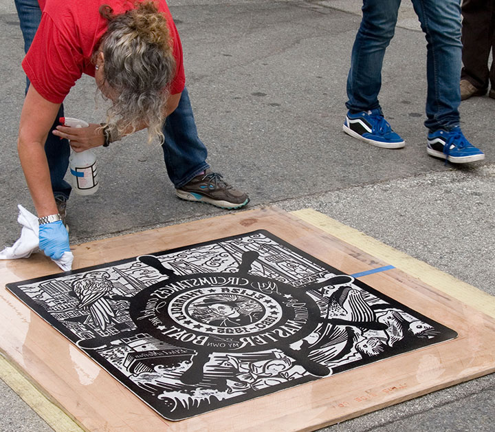
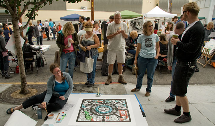
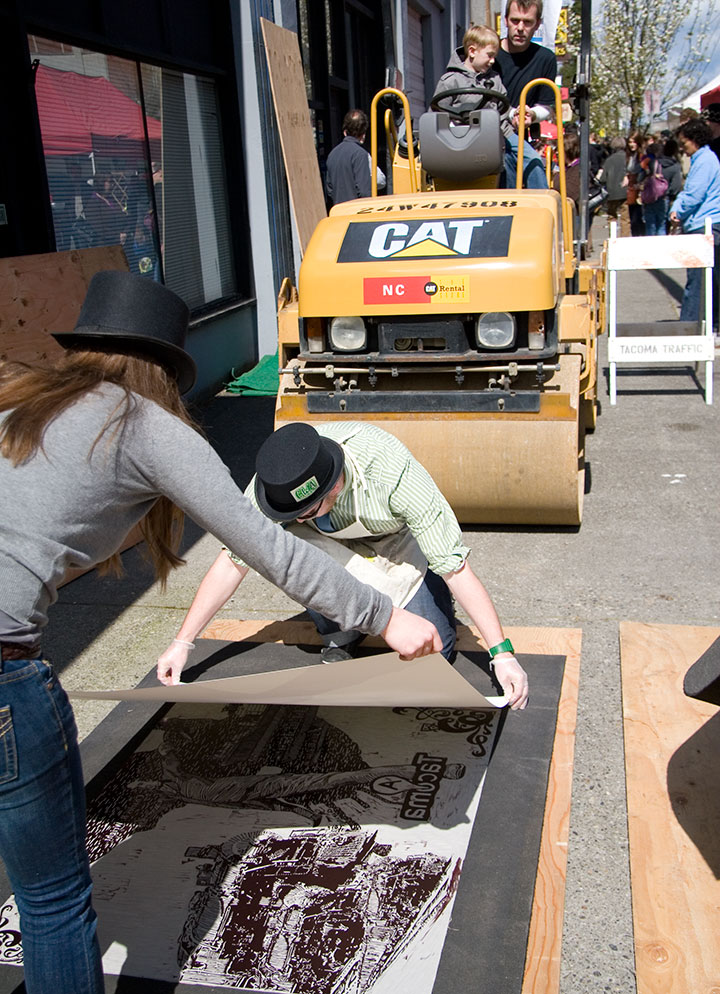
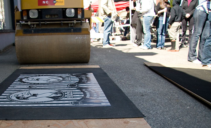
And then we got to raise a fantastic ruckus and make guerrilla street art with a whole bunch of people looking on.

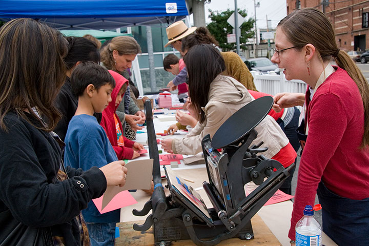
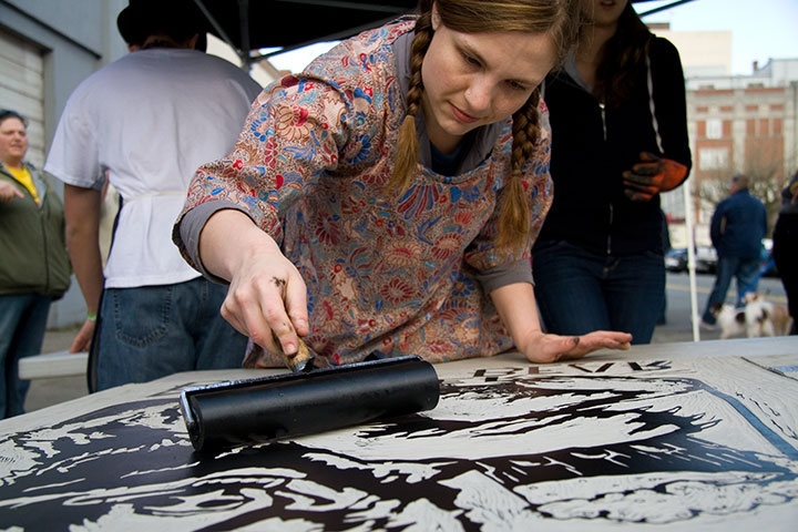
SFCB’s got this thing down to a science. Between the small army of volunteers who took care of the inking and registration (line-up),

and their probably-patented methods for keeping street schmutz off the prints, the results were impressive. In fact, this is my fourth steamroller print (and Jessica’s fifth), and I’ve never seen one turn out this well before.

Photos of us by Jesse Mullan
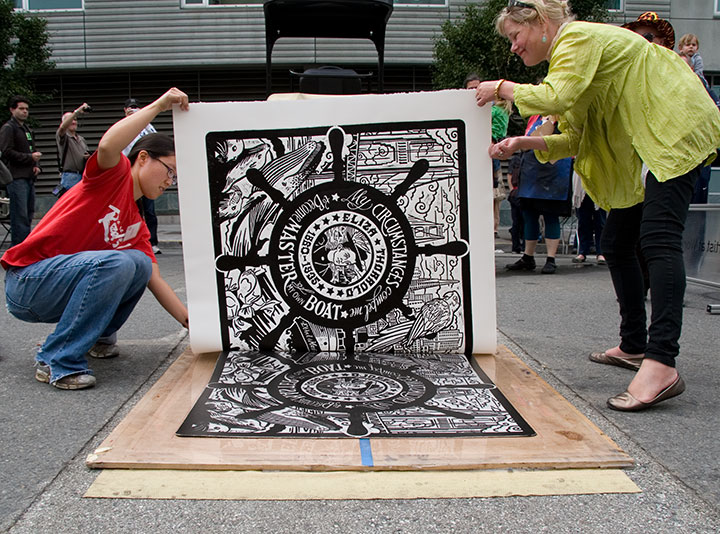
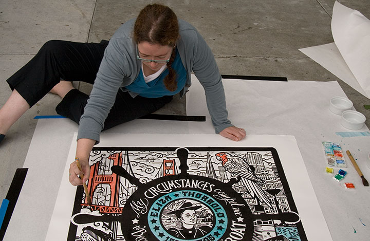
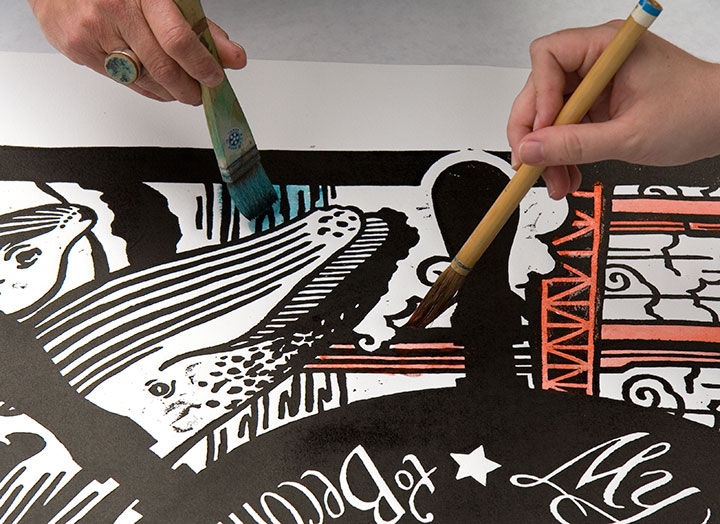
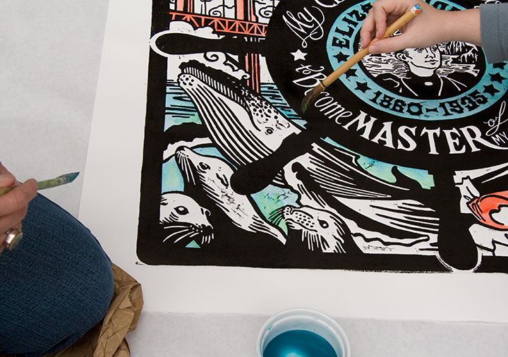
Besides, we really needed to keep our hands clean this time, because we upped our personal ante and just plunked ourselves down on the sidewalk for a bit of on-the-fly hand-coloring (though avoiding the very wet ink felt kind of like playing Twister).

That turned out to be the perfect tag-team job, actually. I do a lot of hand-coloring when I print, as you know, but never anything this big—

having two sets of hands to blend colors and two sets of eyes to look for missed spots was definitely the way to go.

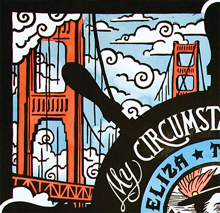
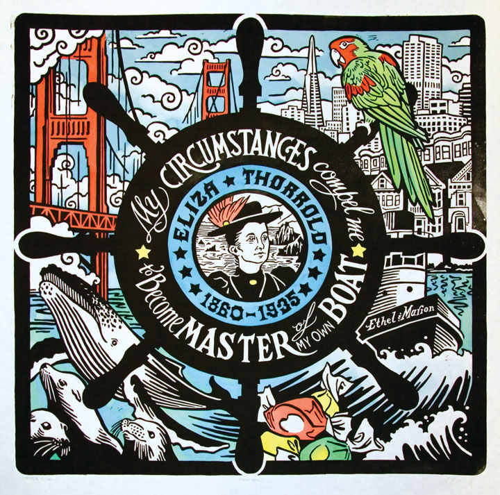
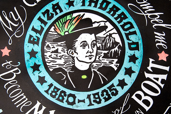
So thar she blows. Let me introduce you to Eliza Thorrold, and our latest honorary Dead Feminist print, Even Keel. Eliza was the first licensed female tugboat master on San Francisco Bay. After Charles, her husband who piloted the Ethel & Marion before her, died an untimely death, she fought for and received her operator’s license to continue their tug business in his stead and provide for her family. Her quote says it all: “My circumstances compel me to become master of my own boat.” Hear, hear, Eliza.
After she left the high seas and entered retirement as a landlubber, she became master of her own taffy pull by opening a successful ice cream and candy shop with her son. Hence all that salt water taffy. And as if the nautical sweet-shop theme weren’t enough, we couldn’t resist throwing in all our favorite things about San Francisco. So go hunting around the image, and see what you turn up. Then, on your next trip to the City by the Bay, learn more about Eliza’s life (and those of other women mariners) at San Francisco Maritime National Historical Park.

So, yeah. It might not fit the traditional idea of a productive weekend, but it’ll do. We came away with new friends, blue fingertips and a whole lot of ideas to make our own humble little steamroller party better.

Many thanks to all the staff and volunteers of the San Francisco Center for the Book, who made the day a smashing success—

and to all the kindred spirits who lent a whole bunch of helping hands. Like the super-nice TSA employee who took such great care of our linoleum block and didn’t bat an eye that we had to bring something so huge and bizarre onto an airplane. Like Sarah, who manned our table; and Jesse, who shot most of the photos; and the huge, huggable posse of Jessica’s extended family, who helped schlep things and kept us company and bought us beignets. And especially Jessica’s ten-year-old niece, Luciana, who basically designed our table arrangement. ‘Ciani, you’re one awesome ragazza.
And of course, to Eliza—thanks for standing proud at the helm.

April 19th, 2011

Holy flying gaggles, but we upped the ante this year!

I don’t know if it was the gorgeous sunshine that graced us after literally months of dreary rain—

—or Sweet Pea’s extra-awesome 2011 poncho—

but this year’s Wayzgoose was larger than life.
(In case you’re curious, that little Sigwalt press is inked up to print “I got goosed in Tacoma!” in an eye-frying safety orange that would make any Ducks Geese Unlimited hunter proud. I mean, come on—we have standards. This is some high-brow entertainment here.)
Anyway, speaking of geese…

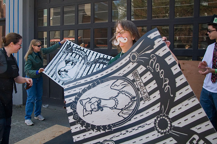
Ta-daaaa!
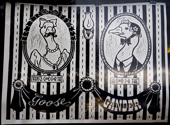
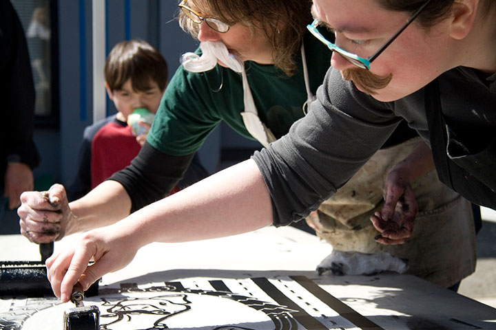
As you can see, we took our little Dead Feminists theme somewhat loosely this time. And in fact, we’ve dubbed our print Lucy Goosey, so there! There is a bit of a story behind this one, though. We’ve been equal parts amused and annoyed by the recent crafty and pop-cultural trends involving moustaches and putting birds on things—and for months I’ve been threatening to put a moustache on a bird on something, just to prove a point. I don’t know what that point is, exactly, but I figured it was time to put my moustache where my mouth is.
Which reminds me:

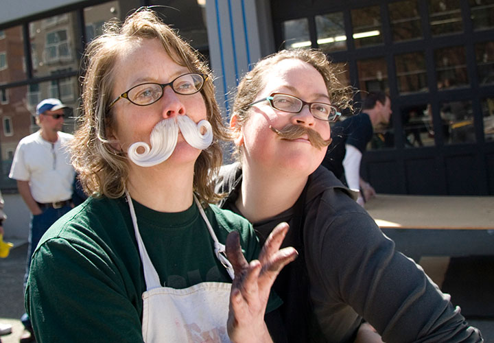
we weren’t kidding about the ‘stache wax. Hey, if you’re going to go, go all out.

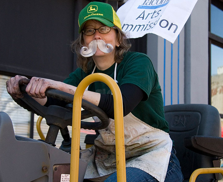
Jessica seemed perfectly at home while operating heavy machinery and sporting a full-on Wilford Brimley look—

I mostly just looked like Ned Flanders. Good God, but that mustache looks real on me. Sheesh!

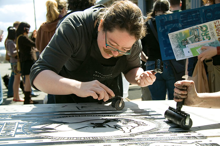
That’s okay, though—synchronized inking is serious business, and we don’t mess around.

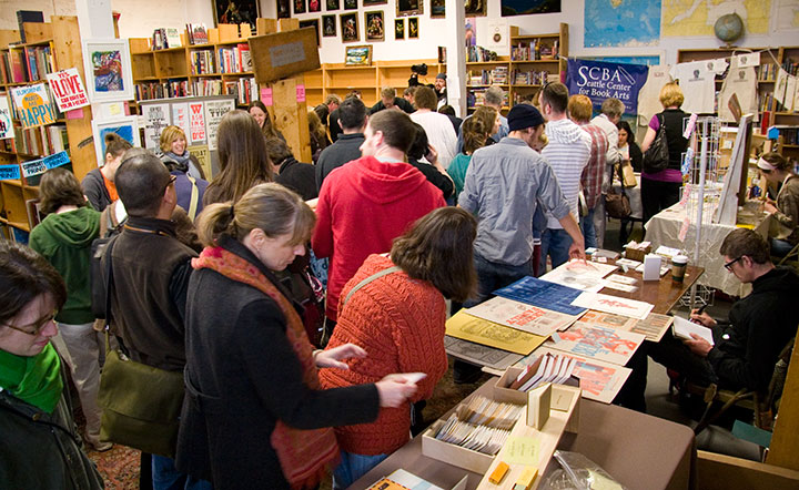
Many, many thanks to all the supporters, enthusiasts and volunteers who turned out in droves;

to Katy Meegan and Mary Holste for snapping ‘stache shots for us;

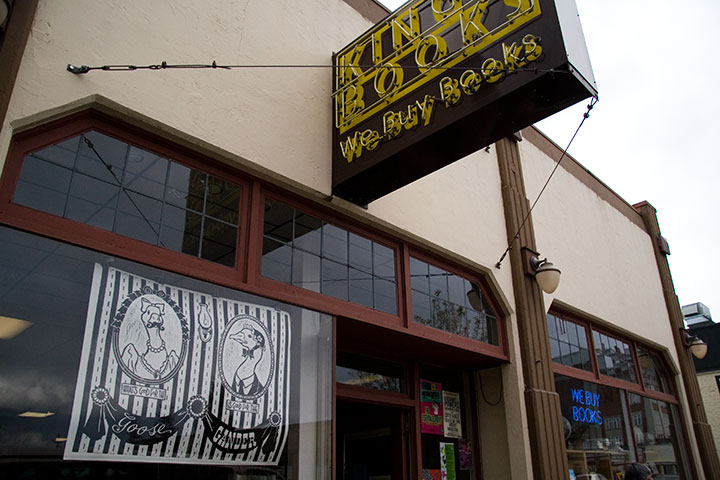
to King’s for being the host with the most;

and to the Tacoma Arts Commission for sponsoring our steamroller shenanigans.
So … tell me.
Is it too soon to start cookin’ up next year’s ‘goose?
November 17th, 2010

I’ve been hemming and hawing about how best to share this thing with you. Even with Sarah’s excellent photography, it’s just a lot more difficult to explain how it works when I can’t hold the book out into space and demonstrate in real time. It’s a problem with every artist book out there—an interactive sculpture, complete with moving parts, that also happens to tell a story is just dern hard to document.
So for now, I’m going to go through the mechanics of the thing, step by step, and go into the whys and wherefores in other posts. And for those of you who might not be familiar with the term artist book, you’re going to find out really quickly that this isn’t your basic hardcover book. The definition of “artist book” is way too broad to go into within this post (click the above link to go to what I wrote on my F.A.Q. about it), but I’m hoping that by the time you get to the bottom of this post, you’ll have an idea of just how broad the term can be—and what crazy things can happily fall into the category.

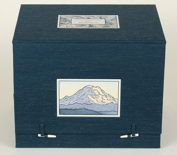
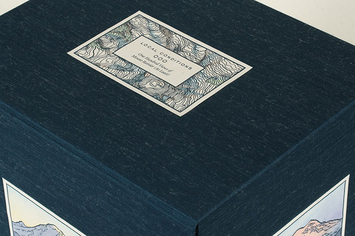
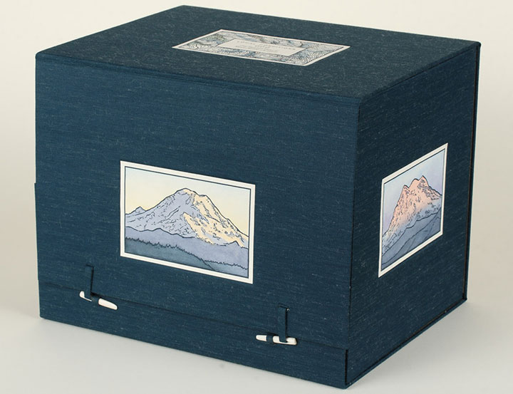
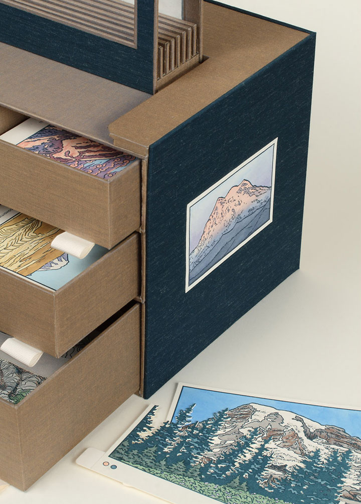
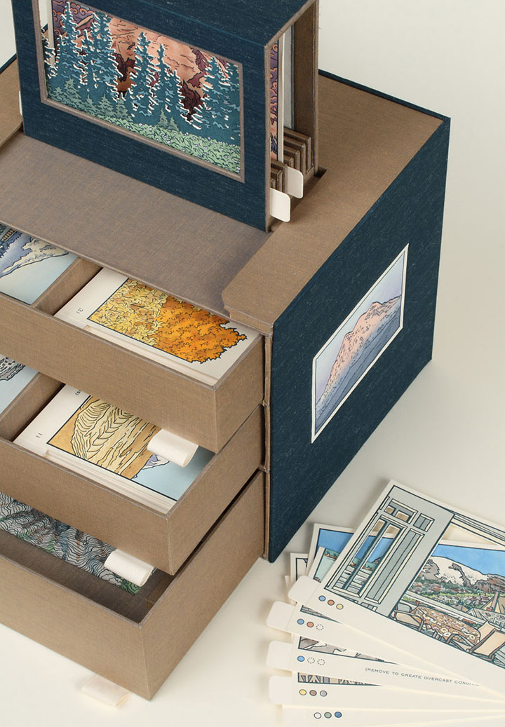
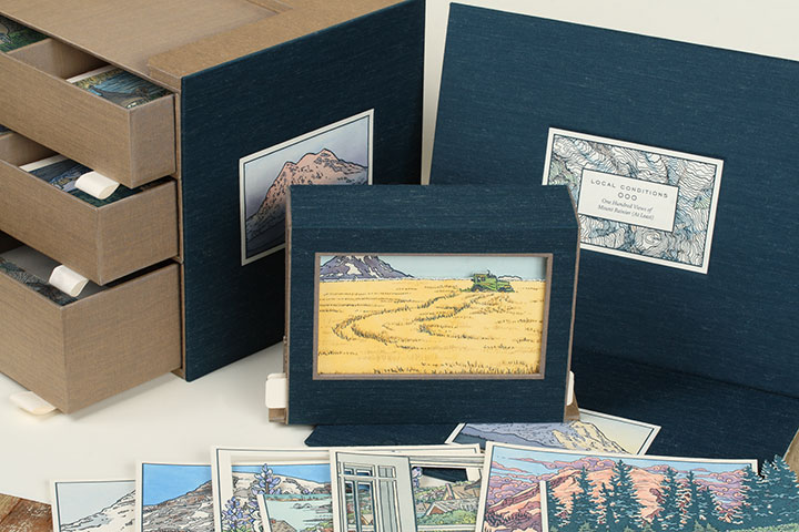
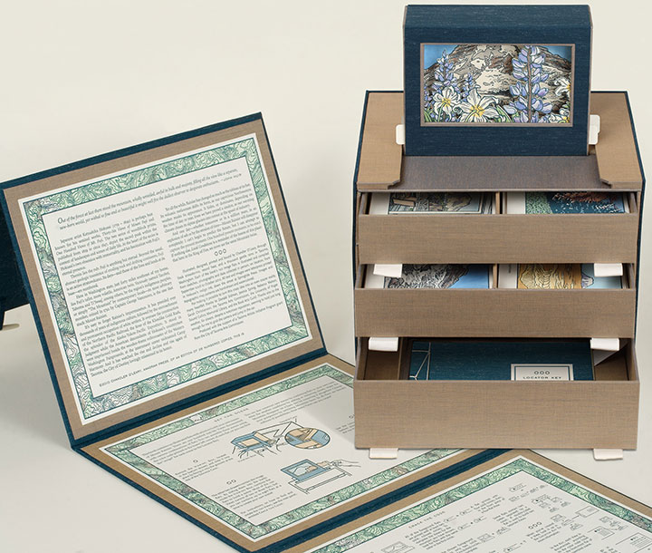
Okay, let’s start with the box. When it’s all closed up, Local Conditions is almost a cube (a 10-inch cube that’s heavy enough to be hiding a sack or two of flour inside). On the topmost face of the box is the frontispiece, containing the title and a topographic map illustration of the summit of Mt. Rainier.

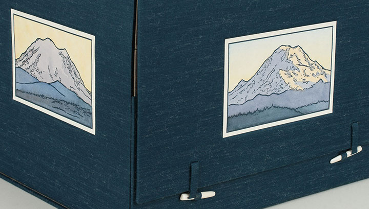
The north, south, east and west sides of the box are faced with illustrations of the corresponding faces of Rainier, each depicting the mountain at sunset.

(That’s the eastern face on the left, and the north face beside it.)
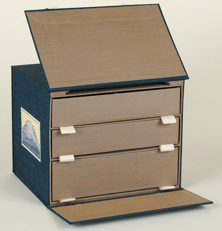
Now, those two little bone clasps hold the thing together, and when you flick them out of their loops,

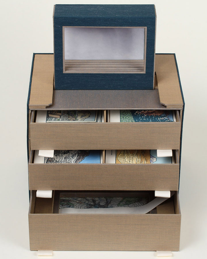
the book opens up, revealing a chest of drawers. Keep pulling on the flap you just raised,

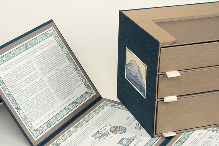
and you’ll find that you can take the whole outer wrapper off and read the colophon (see below) printed on the inside.

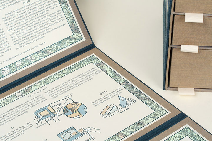
The other panels on the wrapper include detailed instructions on everything the book does.

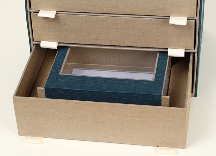
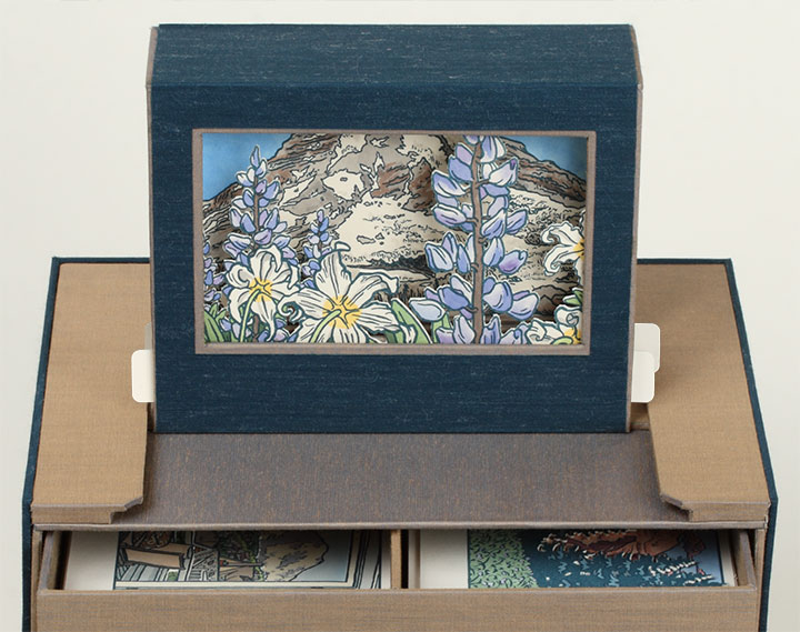
Next, let’s open the drawers—nested in the bottom one you’ll find a Viewing Box (yeah, I know … a box, within a box, within a box … sorry.) that consists of a window, a background panel, and two tabs that stick out from either side.

The tabs match up with the grooved unit at the top of the chest of drawers, and the Viewing Box slides into place.

So now the box is fully expanded, and the book is assembled for use. Now comes the fun part.
Take a closer look at the Viewing Box, and open the top two drawers.

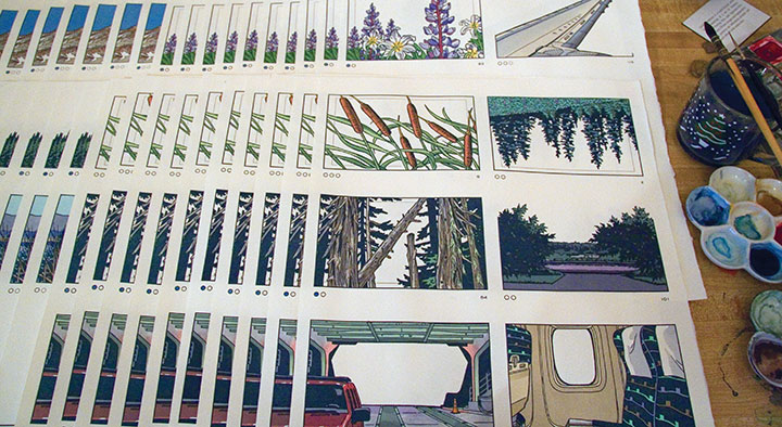
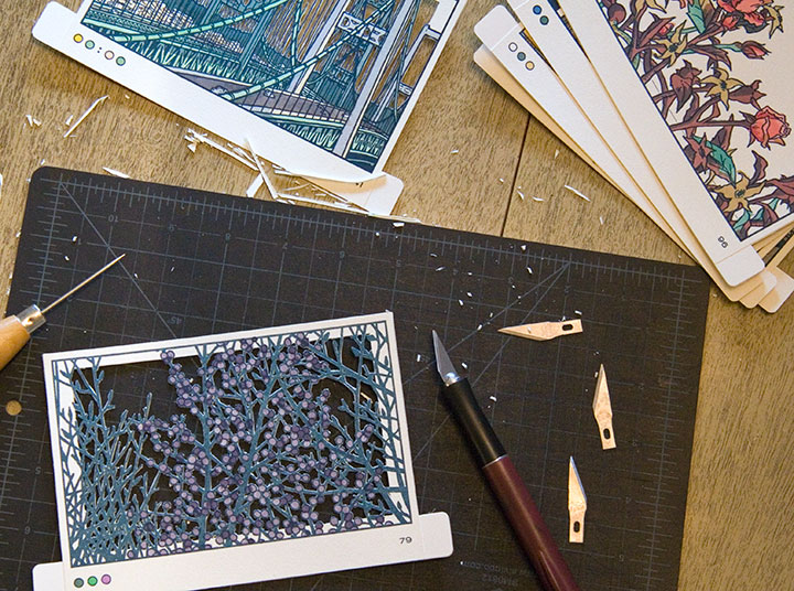
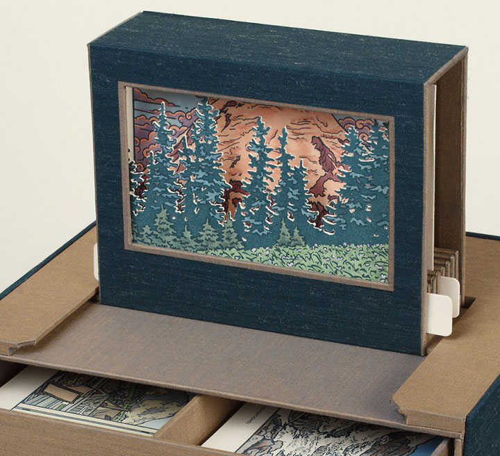
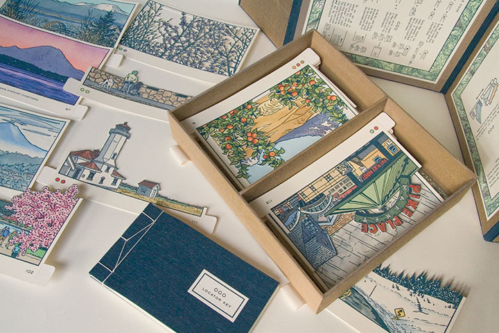
Inside the drawers you’ll find a series of cut-out cards, each printed with a different image. These little image flats slide right into the slots of the Viewing Box,

and face out the window to form an instant picture—kind of like an old-fashioned stage set.

Now here’s the thing:

There are 120 flats to choose from. One hundred and twenty. Each one hand-printed, hand-painted, hand-cut.

By combining, layering and switching the flats in and out of the Viewing Box, you can create seemingly endless scenes of Mt Rainier. I came up with one hundred, and documented them as part of the book (again, I’ll elaborate later), but I’m more interested in how many you can dream up.

(Hint: a lot. Thousands. Millions. To be precise, 1.4 x 10¹⁵, or 1.4 quintillion, if you really wanted to push the envelope.)
• • • • • • • • • • • • • • • • • • • • • • • • • • • • • • • • • • • • • • • • • • • • • • • • • • • • • • • • • • • •
Local Conditions: One Hundred Views of Mt. Rainier (At Least)
Edition size: 26 numbered books and 5 roman-numeraled artist proofs
Book size: 10 x 8 x 8 inches when closed
Viewing window: 3 x 5 inches
Artist book consisting of viewing box and 120 image flats, illustrated and compiled from data collected in person, on location, over the course of two years. Housed in a set of drawers with nested stab-bound book and Japanese-style outer wrapper. Images and maps are hand-drawn, letterpress printed and individually hand-painted with watercolor. All image flats are hand-cut.
For price/purchase info, please contact me.
Edited to add (November 2011): As a supplement to the artist book, I also created a suite of 15 limited-edition letterpress prints, featuring some of my favorite scenes from the book. Just like the flats in the book, each print is letterpress printed and hand-painted with watercolor. You can find all 15 prints in the shop.
Colophon reads:
Japanese artist Katsushika Hokusai (1759 – 1849) is perhaps best known for his seminal works, Thirty-Six Views of Mount Fuji and One Hundred Views of Mt. Fuji. The two series of woodblock prints, published from 1829 to circa 1847, depict the sacred peak within the context of landscapes and scenes of daily life. At the heart of the series is Hokusai’s own obsession with immortality, and his fascination with Fuji’s eternal presence.
Therein lies the rub: Fuji is anything but eternal. Beyond the usual, abstract geologic transience of eroding rock and drifting continents, Fuji is an active stratovolcano. Its days—and those of the lives and lands at its base—are numbered.
Here in Washington state, just forty miles southeast of my home, lies Fuji’s taller, more volatile, American twin. Variously named Tacobet, Tahoma and Ti’Swaq’, among others, by the region’s indigenous peoples, or simply “The Mountain” by contemporary locals—its most arbitrary moniker, coined in 1792 by Captain George Vancouver, is the one that stuck: Mount Rainier.
It’s easy to forget Rainier’s impermanence. It has presided over thousands of years of indigenous culture, followed by the encroachment and permanent occupation of white settlers. It oversaw the construction of the Northern Pacific Railroad, the fever of the Klondike Gold Rush, the splendor of the Alaska-Yukon-Pacific Exposition. It stood in judgment while the American descendants of Hokusai’s countrymen were imprisoned beside the wooden-frame rollercoaster of the Western Washington Fairgrounds, at the internment center nicknamed Camp Harmony. And it has watched the rise and decline and rise again of Tacoma, the City of Destiny lovingly misnamed in its honor.
Yet all the while, Rainier has changed as much as the tableau at its feet. Its volcanic restlessness shifts its form, as our capricious Northwestern weather masks its appearance. It hides, or dominates, depending on the time of day or year. Even we have proved a catalyst, as our warming climate chases its alpine glaciers into retreat at the speed of industry.
And one day—whether tomorrow or in a million years, in an explosion of ash or by the erosion of time—Mount Rainier will disappear completely. I can’t begin to predict the future, but I can attempt to capture the present moment. One hundred present moments, to be exact. If nothing else, Local Conditions is a reminder of the lesson of this place: that here in the Ring of Fire, we never see the same Mountain twice.
* * *
Illustrated, designed, printed and bound by Chandler O’Leary, through freak snowstorms, record heat, and a thousand gentle rains in Tacoma, Washington. Each of the book’s 120 image flats is illustrated and compiled from sketches, photographs and data collected in person, on location, from September 2008 to October 2010. All text and images were letterpress printed in Hokusai’s indigo ink, down the street at Springtide Press. Images and topographic map patterns are hand-drawn and watercolored.
For making it possible to turn this crazy idea into an even crazier reality, many heartfelt thanks to Jessica Spring, Sarah Christianson, the Tacoma Arts Commission, the University of Puget Sound Collins Memorial Library, and the Book Arts Guild. Thanks also to the weather, for always, despite a notorious reputation, seeming to hold just long enough for me to grab the camera and jump in the car.
Produced with the support of a Tacoma Artists Initiative Program grant from the City of Tacoma Arts Commission.

October 16th, 2010

By now you’ve figured out that I have a thing for stitched lettering; and since I’ve already rambled on ad nauseum in the last post, I can keep this one a little shorter.
And anyway, I somehow neglected to take any process photos for two of these. Oops.

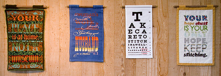
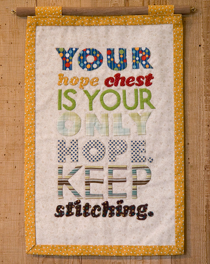
The knitted broadside was such a success that I decided to try branching out into other textile media. For Broadside No. 4, I took a shot at appliqué—something I’d never done before. Hand-sewing all those fiddly little pieces of fabric ended up being just as daunting as cutting a steek.
The hard work was oddly fitting for the concept: historically, a traditional wedding trousseau would have been sewn by a girl or young woman, in hopes of one day becoming a married woman with a home of her own. By the time she reached young adulthood, a woman would have spent years creating dozens of hand-sewn garments, household linens and other useful textiles, all gathered and stored in her “hope chest,” awaiting the day she would become a bride.

The thing is, back in the days when women couldn’t vote, or own property, or head a household, marriage was a woman’s only shot at independence or social status. (Hence the snark.)

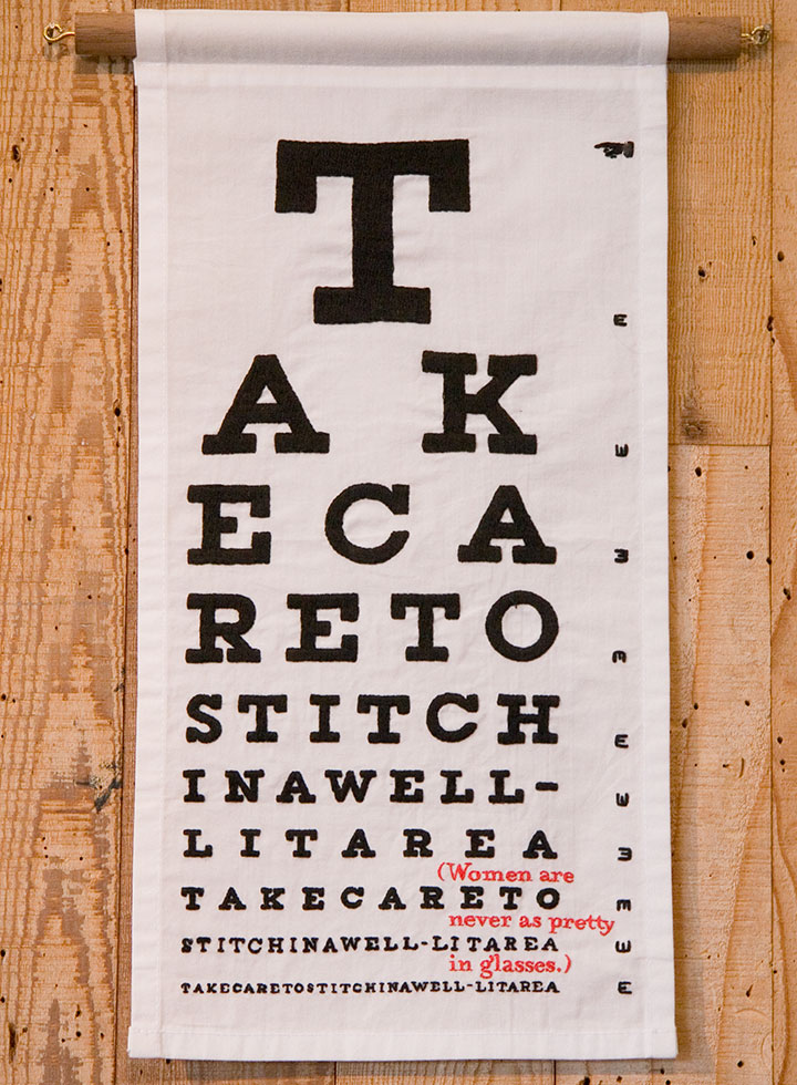
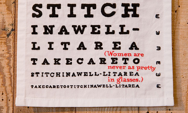
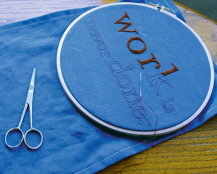
For the others, I turned to the original, old-school ancestor of fabric paint: embroidery. The method fit the madness this time, too, as I spent what seemed like a century hunched over and squinting, hand-stitching an eye chart…

…complete with something to read between the lines.
This one gets personal. As a glasses-wearing gal myself, I happen to disagree with the statement—but I’ve actually heard these very words spoken by a woman. She wasn’t wearing glasses.

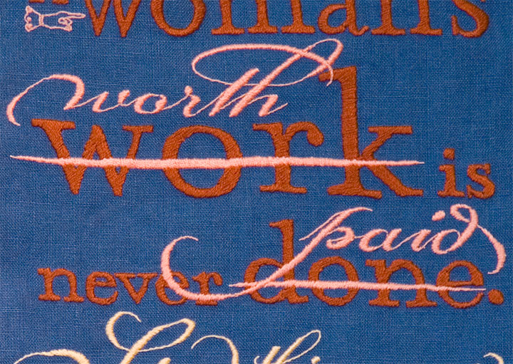
Last of all, I got to thinking about how men who sew for a living are called tailors—and women who do the same are called seamstresses. And how the two terms don’t quite add up to the same meaning.

Despite what the scornful quipping of the text might indicate, I had the most gleeful fun with this one. Unlike knitting, which confines the designer to a grid, or appliqué, which can only push the detailing so far, embroidery has almost limitless possibilities. So I went nuts with the tails and ligatures and dingbats, simply because I could. I love that about embroidery—it’s as flexible as I need it to be, and as fluid and crisp as the printed page.

All that was required was the patience to work each letter by hand. But it didn’t feel like patience—it felt like meditation.

It’s surprising how easy it is for embroidery to mimic letterpress. And watching “wood” type pop up from the fabric, rather than punch into paper, is a mighty satisfying sight.

Uppity notions aside (no pun intended), the Women’s Work broadsides are a fun way to slow down and take a break from what I normally do in the studio. But as I wrap up each one, I find myself hankering to get back into the print shop. By comparison, setting type and drawing letters suddenly seems like speedy work!
October 11th, 2010

While I’ve been hiding away, wrangling my 900-pound gorilla, Jessica has been cooking up something pretty great.

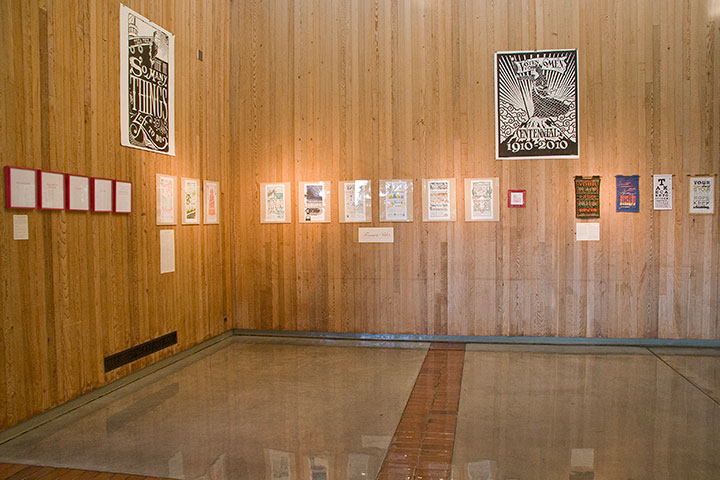
Thanks to her hard work and the wonderful Brian Hutcheson‘s invitation, we are pleased as punch to announce our first-ever dual exhibition!
Feminist Wiles: Jessica Spring and Chandler O’Leary
Now through November 5
Ted Sanford Gallery, Charles Wright Academy
7723 Chambers Creek Rd. W
Tacoma, Washington
Open 8 to 5, Monday through Friday
It seems weird that after more than two years of collaborating, giving lectures and printing in the street, we’ve never had an honest-to-goodness show together.

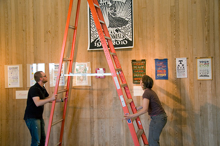
But when Brian offered us a cavernous space, his help with installation, and the chance to indoctrinate the innocent introduce our series to the kids at Charles Wright—well, we’d be nuts to pass that up.

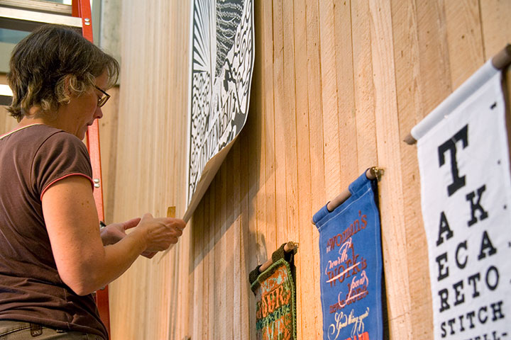
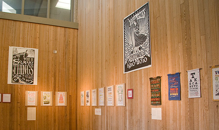
For the first time, all nine (and-a-half) Dead Feminist broadsides to date, plus our two steamroller gals, are on display together.

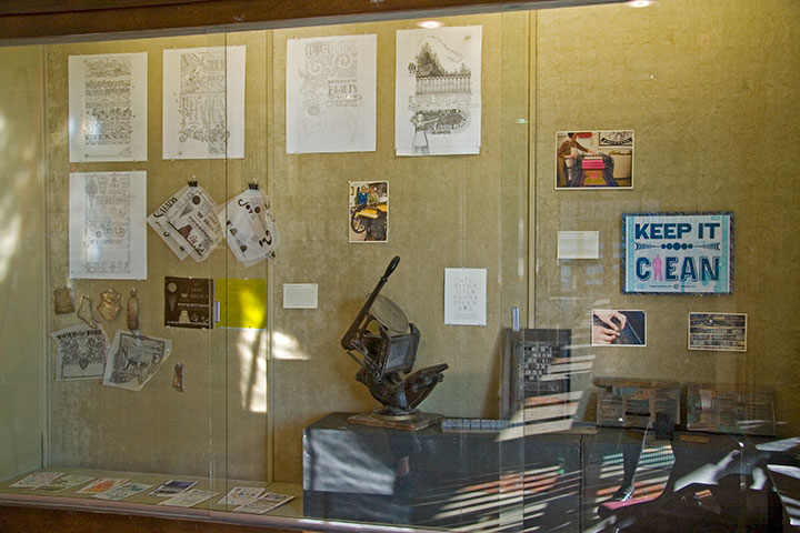
We also have a little mini-exhibit about our process,

and lots of little goodies to introduce people to letterpress.

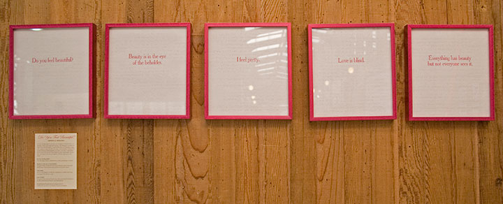
Jessica and I have rounded out the collection with solo work that complements the theme of the show. Jessica’s half consists of Do You Feel Beautiful?, a series of broadsides featuring famous aphorisms on beauty. Here’s the thing that blows my mind into tiny pieces every time I think of it: the quotes are letterpress printed on the pages of a Braille edition of Seventeen magazine. Whoa.
I contributed Women’s Work, an ongoing series of broadsides created in hand-sewn textiles rather than my usual letterpress.
Now, I get a ton of questions about these things whenever I show them, so I thought I’d outline the ideas and process behind them here.

The Tailor first sparked the idea for the series; as you know, he makes his own clothing (hence the nickname). This is a feat that never ceases to amaze me, and I’m not the only one—he gets a lot of comments, usually along the lines of “Wow, you made that?” He’s always a little surprised by these comments, because where he grew up, a lot of people (including his family) wore homemade clothing. That got me thinking, though. The people who do all that sewing in the Tailor’s hometown are women—mothers, grandmothers, sisters, daughters, wives. We’re all surrounded and preceded by generations of women who sew clothing, or knit sweaters, or draft patterns from scratch, without any rave reviews—or any comment at all. But every male knitter or quilter I’ve known, every rare and wonderful man who ever picked up a needle, is either looked at like he’s nuts, or treated with reverent awe. It strikes me as a little strange that depending on who made it, and who’s looking at it, a pair of pants can be a work of art—and an actual work of art can be completely ignored.
If you go further back, like, I dunno, throughout the entirety of human history—you’ll find that both men and women have been responsible for creating textile goods in nearly every culture on earth. Yet in almost every case, when men made textiles it was as part of some sort of guild craft or other professional setting. When women made textiles, it was as part of the home front. This is true in every part of the globe, in pretty much every era, going back to the advent of textile technology.
No matter who does the stitching, there’s an enormous amount of technical skill and design sensibility required to make a garment or textile object. So instead of creating divisions and pigeonholes—instead of separating into Art and Not Art, into Man-made and Woman-made, what if we started seeing the inherent worth in the objects themselves? And what happens when we take a handmade textile and stick it in a gallery? Does its perception change?
Based on what I’ve seen so far with these broadsides, I’d say it does. It’s been an interesting experiment, for sure.
So the Women’s Work series is a bit of an indictment of the double standard, and while the snark is aimed at a wider target, I wrote them as if I were speaking to a woman. Each one is completely made/knitted/sewn/pieced/embroidered/etc. by hand, from design to pattern to construction. The text reads in the voice of a disapproving female role model (or the insidious voice inside our own heads)—in the tone of the backhanded compliment, the cheerful put-down. Each is also designed in the style of a traditional letterpress broadside, to put the typography within the context of an art form centered around mass communication.

This guy requires a little more of an explanation for folks who aren’t already into wool.

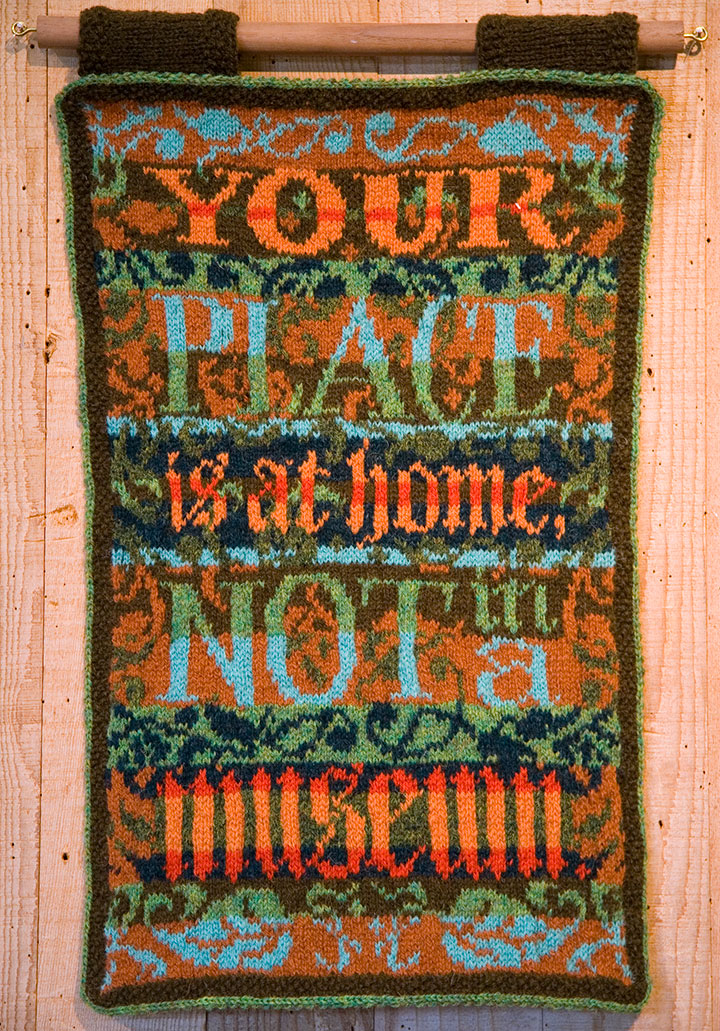
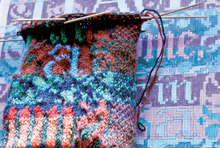
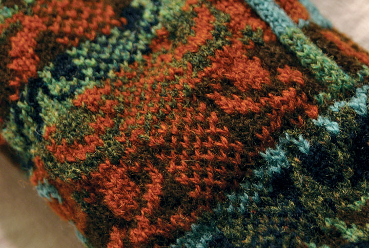
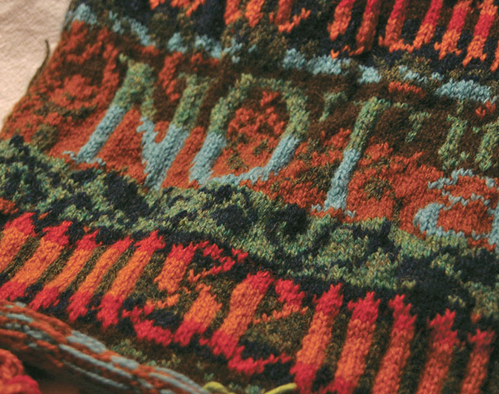
This piece, made almost three years ago now, is hand-knitted with Shetland wool, using the traditional Fair Isle knitting technique. Fair Isle—a method practiced since the nineteenth century on the tiny island of the same name, halfway between Scotland and Norway—is a tricky, rather ingenious thing. Traditional Fair Isle pieces are knit with two colors of yarn at the same time; the resulting fabric is durable, extremely warm, and great for any chilly, foggy, wet climate (like, hello, here). Beyond its über-practicality, Fair Isle knitting is simply gorgeous (take a gander at Google). By nature the double-thick fabric is dense and flat, making it an ideal ground for complex patterns and designs—it’s the perfect mix of function and fancy.

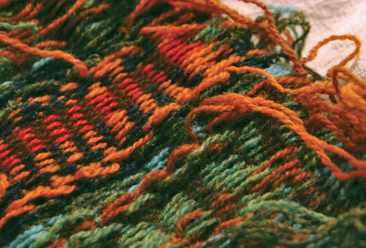
Here’s how it works: even though the piece is knitted with two different colors of yarn at once, only one strand at a time ever passes through the needles. The unused strand of yarn is carried loosely, or “floated,” behind the work—which creates a reversed-out image of the design on the back of the piece. It’s the floats that give structure to the fabric, and make it so cozy-warm.
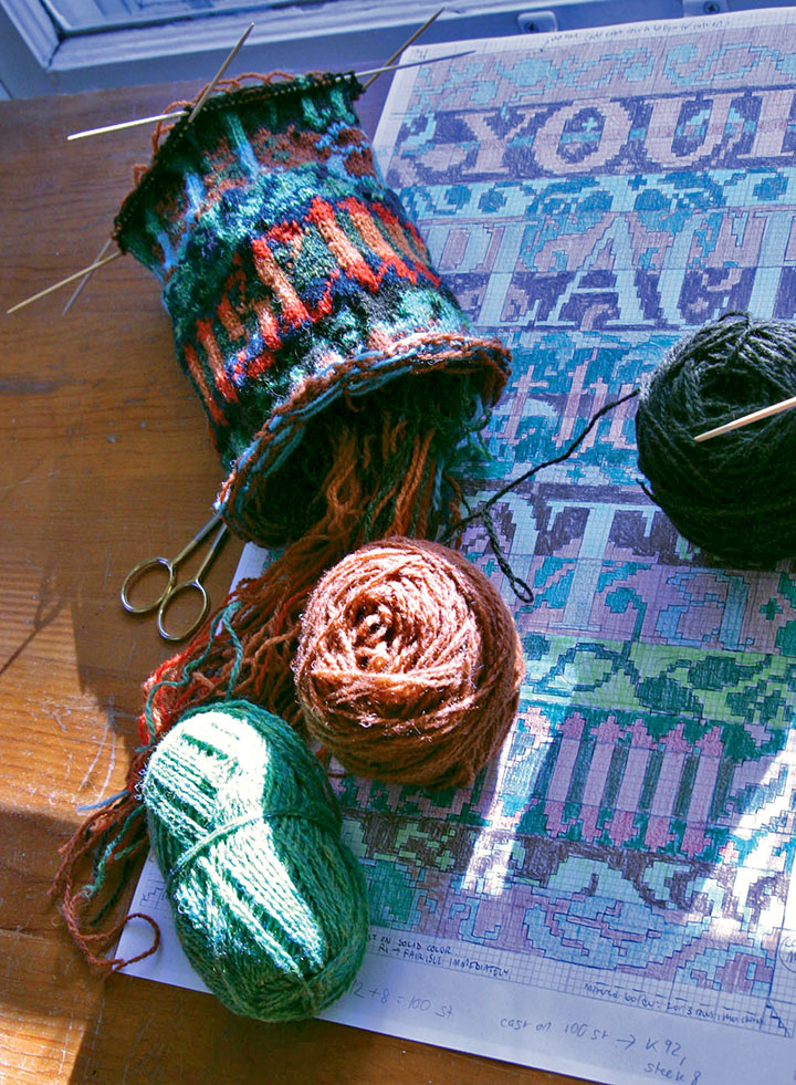
If you were to create a plain ol’ piece of ordinary knitting, you’d proceed from one end to the other of a row, flip the piece over, and work back the other direction. Rinse and repeat. If you tried that with a piece of Fair Isle knitting, working the “wrong” side would be extremely difficult, since the floats would now be facing you and covering your stitches. Now comes the tricky, smarty-pants part. Flat Fair Isle pieces are first knitted up into a big round tube, and then cut to lie flat. When you knit in the round, you never encounter the wrong side of the work. You just spiral around and around on the right side, happily knitting away and floating the unused color behind you as you go.

So in this case, once I had drafted my design into a gridded stitch pattern, I just pretended I was knitting one really big sleeve (or a neck warmer for a giraffe) with really teeny needles.
Ah, but remember the operative words above: you have to cut the piece to finish it. I had never done this before, and let me tell you, there’s an awful, terrifying finality to the idea. Torn sweaters unravel. Snagged socks fall apart. Who in their right mind would cut a piece of knitting on purpose? And even if you could do it, what happens if you make a mistake? Once you make that cut, you’re done.

This is where the true brilliance of the technique hit me like a ton of bricks. The Scotswomen of Fair Isle are a breed apart—and so are their sheep. Shetland wool, the material traditionally used in Fair Isle knitting, has a magical property that makes this crazy notion work: each wool fiber is covered with microscopic scales that attach to one another. Because the wool sticks to itself, the stitches become slightly matted as you knit. So following the Fair Isle method, you work a little buffer zone called a steek (see the checkerboard strip above?) into your design, and then cut right down the center of the steek. If you use trusty Shetland wool, your stitches won’t unravel when you cut them.
At least, that was the theory. I didn’t quite believe it at the time. But I’d come this far—I didn’t want to lose faith. (If you’re looking to try Fair Isle knitting yourself, I find a glass of wine helps.) So I took a steadying swig, held my breath, and cut.

And then I exhaled. And blinked. I had a flat piece. Gingerly I tested the cut edge—and was amazed. Even with a fair bit of tugging, the stitches refused to unravel.
I will never question a Scotswoman again.
My favorite thing about all of this, beyond the magic of Fair Isle itself, is that knitting really lends itself well to letterforms. Even though the pattern is drafted out on a grid, the forgiving nature of knitted stitches turns every square on the grid into a slightly curved, irregular shape. So when you zoom out and look at the piece from a distance, those grid “pixels” turn into nice little serifs, curves and curlicues.
The rest of the broadsides in the series are made using other types of needlework (more on that in the next post), but the knitted piece is still my favorite. I think I need another dose of that Fair Isle magic in my life—maybe next year you’ll find me up to my knees in wool again.
(Read about the rest of the “Women’s Work” broadsides in part two.)

September 15th, 2010

Lately I’ve spent nearly every waking minute of each day with my face an inch away from the drafting table.
Let’s step back, and stretch out a bit.

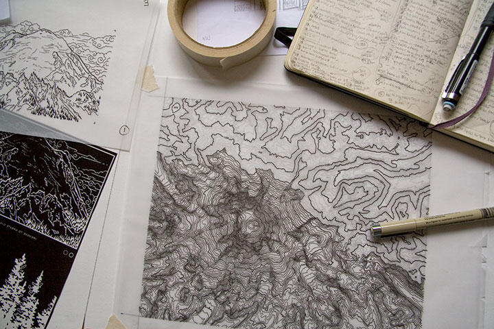
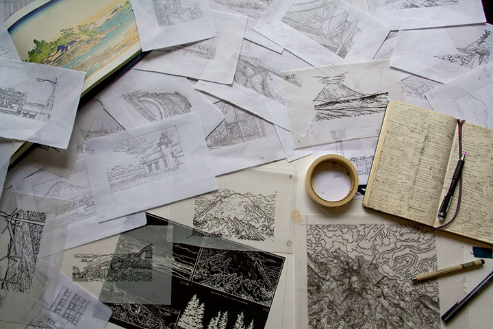
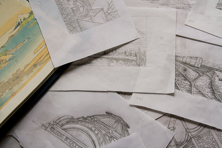
My studio is often a sea of papers—an occupational hazard—but these days the swells have consisted of pencil snapshots for my Mt. Rainier book. Dozens, and dozens, and dozens of them.
Time is ticking down, counting closer and closer to zero, and there are still many miles to cover before the clock strikes deadline. Yet suddenly, things are starting to come together. It won’t be long until I can share something that makes sense—something that looks more like a book, and less like a pile of drawings. I promise that you’ll be among the first to see it when I do.

But if I go missing for long stretches at a time—well, you know where to find me.
August 31st, 2010

At the Wayzgoose on Saturday (thanks to the hundreds of folks who showed up!), Jessica and I had a little teaser for the next Dead Feminist print set up at our table—I figured it wouldn’t be fair if I didn’t also share it online.

I’m not going to say much, so as not to spoil the surprise, but I thought I’d drop a few clues by way of my messy drawings—

warts and all. As you can see by all the smudges and arrows, doin’ it by hand is hardly a perfect process,

but I wouldn’t have it any other way.
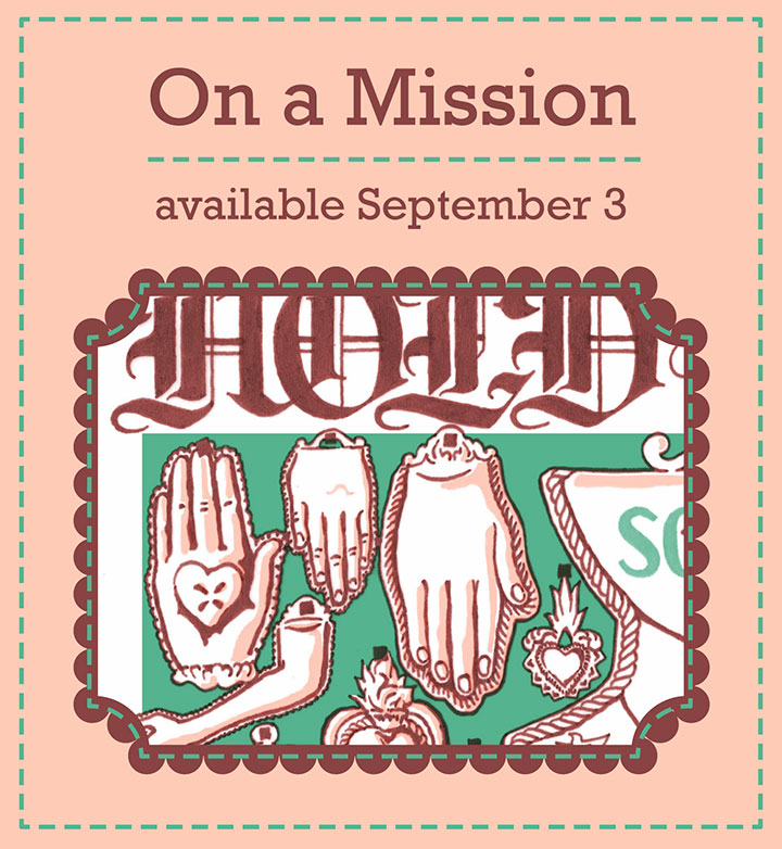
On a Mission is on press as I speak, inching closer to the finish line every moment. Look for it here on Friday—see you then!
August 11th, 2010

I’ve been sitting on this post for months now—it’s just that after spending so much time hunched over this project, I needed some time off from even thinking about it. But now I’m ready to talk birds again.

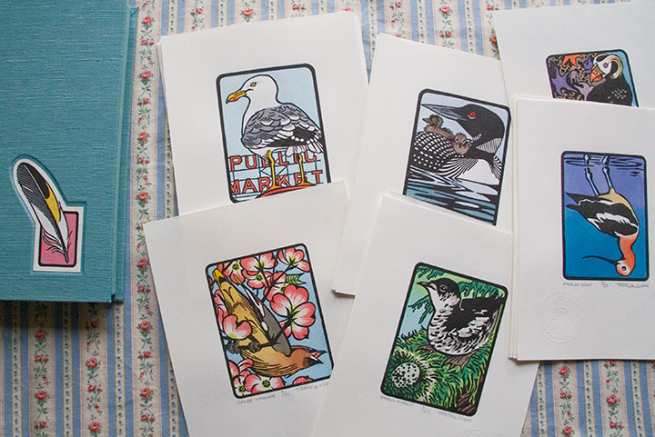
From left: Cedar Waxwing; Steller’s Jay; American Avocet; Purple Martin; Tufted Puffin
Eighteen months, twenty-five birds, six hundred twenty-five individual prints and ten box sets later, my little Flock is finished.

Mountain Quail; American Bittern; Long-billed Curlew; Hooded Merganser; Laysan Albatross

Barn Owl; American Kestrel; Eurasian Coot; Anna’s Hummingbird; Herring Gull
It’s a little crazy to see these all together, like, well, birds on a wire. Each one has been broken down into its own little assembly line for so long that I forget sometimes to see them as a set.

Western Tanager; Lazuli Bunting; Northern Flicker; Bullock’s Oriole; Belted Kingfisher

Common Loon; Marbled Murrelet; Northern Shoveler; Harlequin Duck; Brown Pelican
As you can see, what’s represented here is a pretty broad cross-section of Washington birds. There are so many bird species ’round these parts, in fact, that I almost didn’t know where to start—and narrowing the choices down to twenty-five was by far the most difficult task.

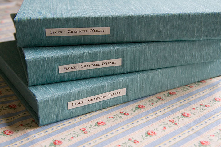
Wait. I take that back. The hardest part was keeping the glue off of the pricey imported Japanese book cloth (glue plus cloth equals death—or at least wailing, gnashing of teeth, and starting all over from the beginning).

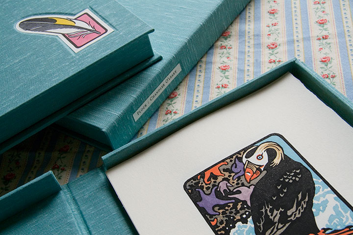
You see, it seemed silly to have a set of prints with nothing to house it. My inner book artist took over (thanks to Jessica’s tricksy enabling), and insisted on encasing the first ten sets of the edition in handmade clamshell boxes.

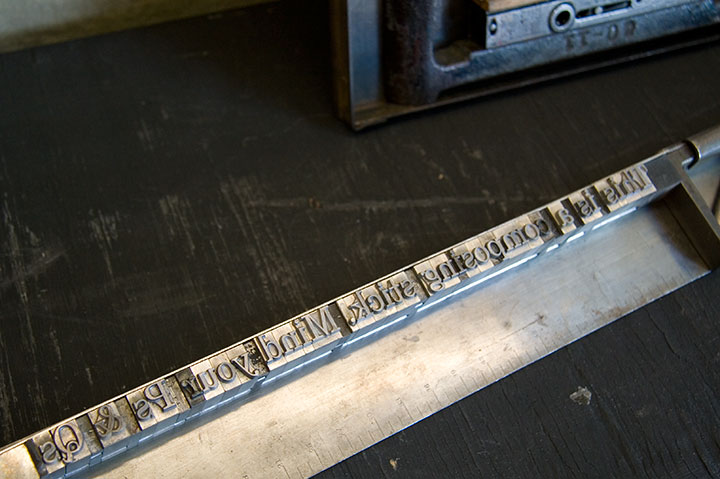
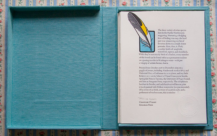
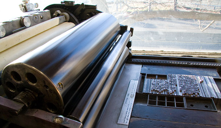
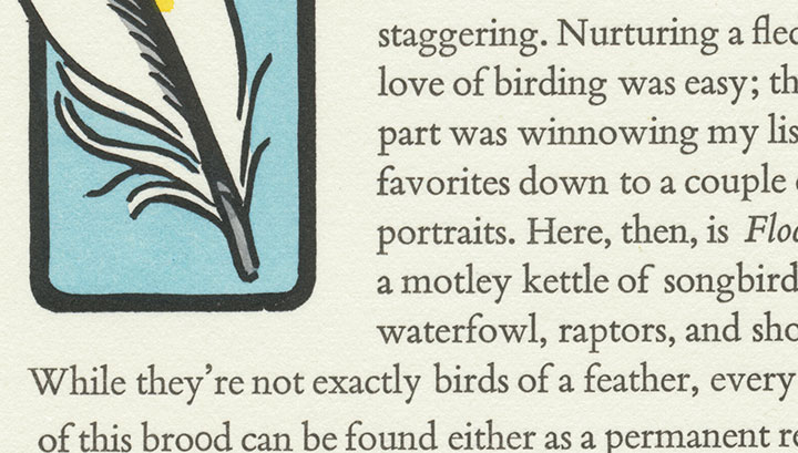
Even though the results are always worth it, I don’t have much love for making boxes—what I do love is printing the colophon. A colophon (or in today’s hardbound novels, the “note on the text”) is an essential element in any artist’s book; this is where the artist steps outside the book’s content and talks about the making of the book itself. For this I decided to go back to my letterpress roots, and hand-set the text in metal type.

While I’m rarely able to fit hand-setting into my projects these days (a drawback to all the lettering I’ve been doing), it’s still my favorite method of getting a block of text onto a page. And this beloved Bembo, cast locally at Stern & Faye, is so beautifully spaced and balanced that it’s a dream to set and a pleasure to read.


Here’s what it says:
The sheer variety of avian species here in the Pacific Northwest is staggering. Nurturing a fledgling love of birding was easy; the hard part was winnowing my list of favorites down to a couple dozen portraits. Here, then, is Flock, a motley kettle of songbirds, waterfowl, raptors, and shorebirds. While they’re not exactly birds of a feather, every member of this brood can be found either as a permanent resident or a passing traveler in Washington state—with just a wingtip of artistic license, that is.
Printed from October 2008 to December 2009 on a gaggle of presses, including Vandercook models SP15 and Universal One, a Craftsman 6.5 x 10 platen, and my little Kelsey 3 x 5—at the School of Visual Concepts in Seattle, Springtide Press in Tacoma, the University of Puget Sound, and here at Anagram Press, respectively. The colophon is hand-set in Bembo, and each hand-carved linocut print is hand-painted with Pelikan watercolor (no pun intended). Of a covey of 25 birds, a tweet of 25 prints each, and a parliament of ten box nests, this is number [2].

Okay, so maybe I went a bit overboard on the avian puns. It’s just that the thought of getting my hands dirty on type drawers again had me all twitterpated.
And I have a fluttering feeling that there might be even more birds in my future—one of these days, anyway.


![Chandler O'Leary [logo]](https://chandleroleary.com/wp-content/themes/chandleroleary/images/logo.png)
