Blog
July 7th, 2014
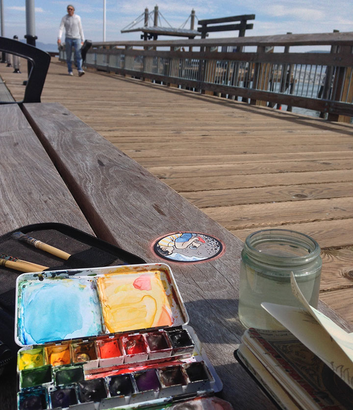
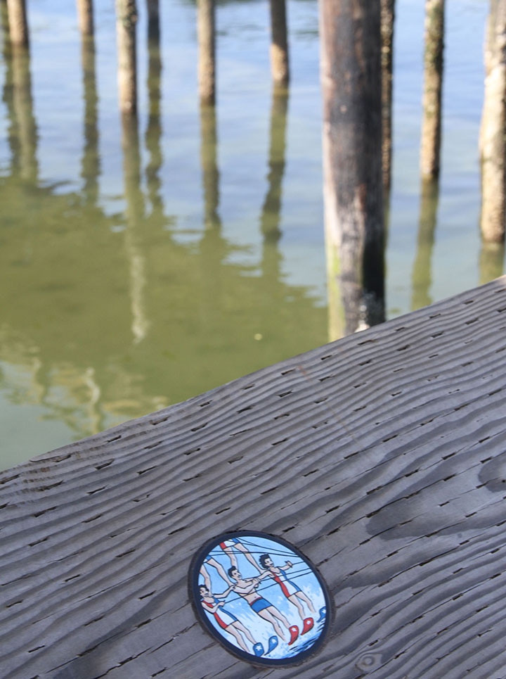
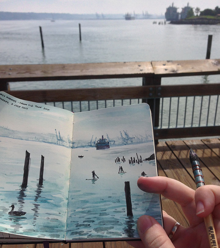
On Saturday morning the weather was so perfect that I headed down to the waterfront for a little sketching—not to mention a little quality time with one of my Droplets!
I guess you could count this as working over a holiday, but it sure doesn’t feel like that. To me, it feels like the best way to enjoy a summer day.
June 21st, 2013

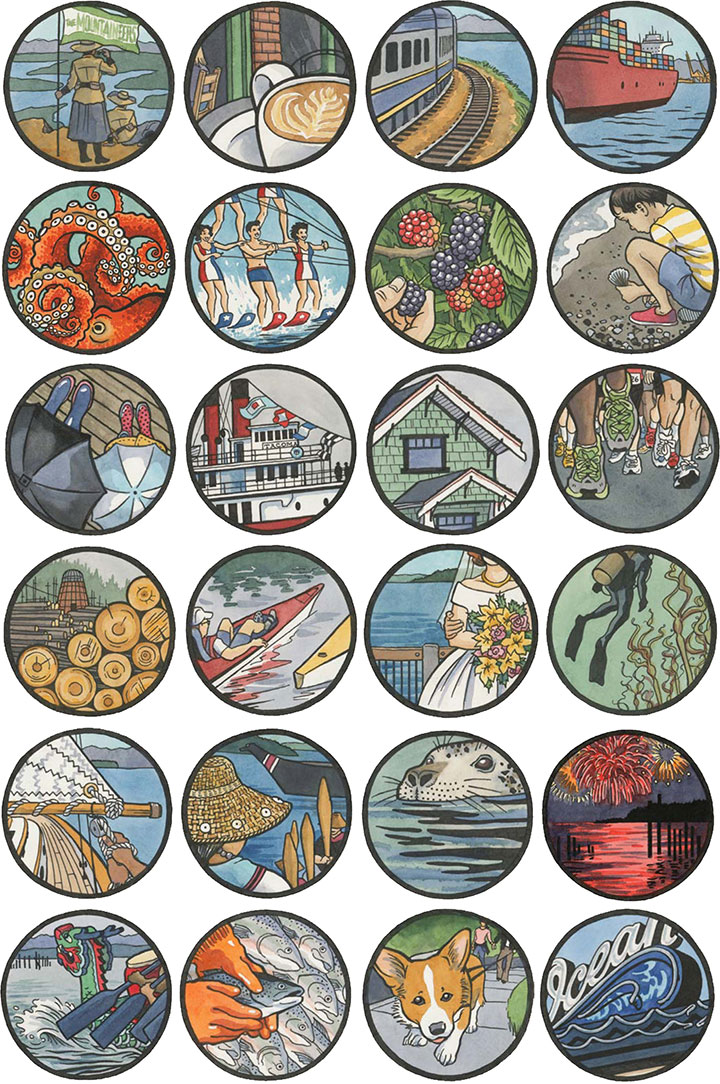
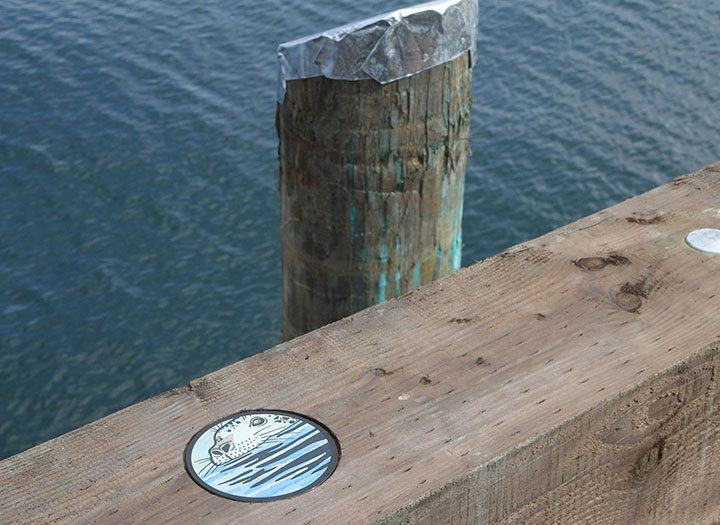
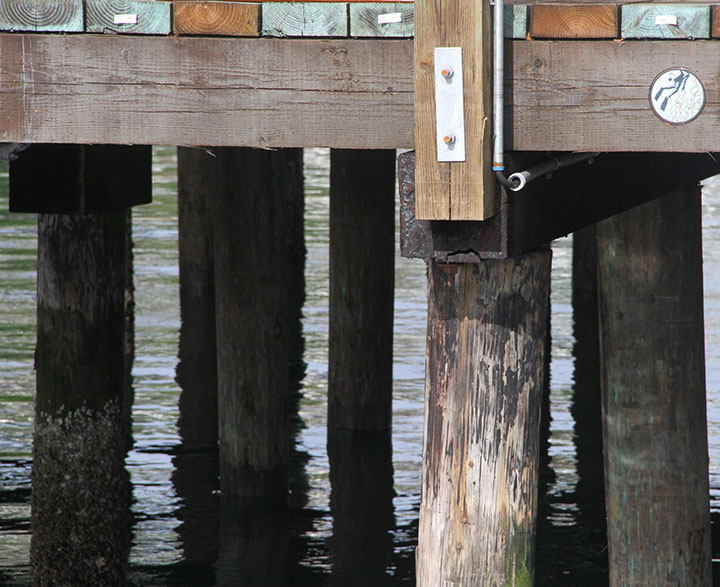
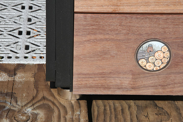
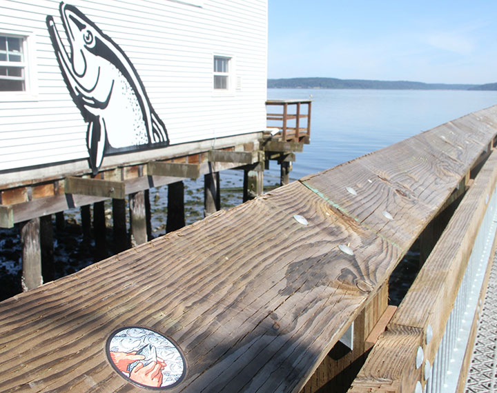
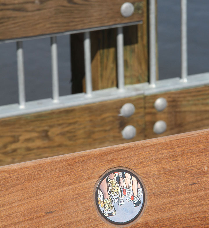
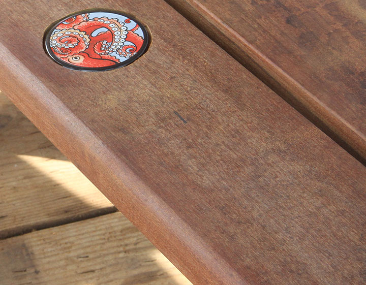
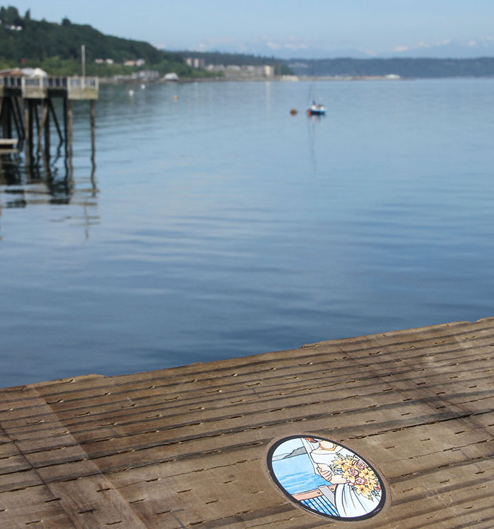
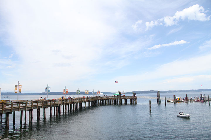
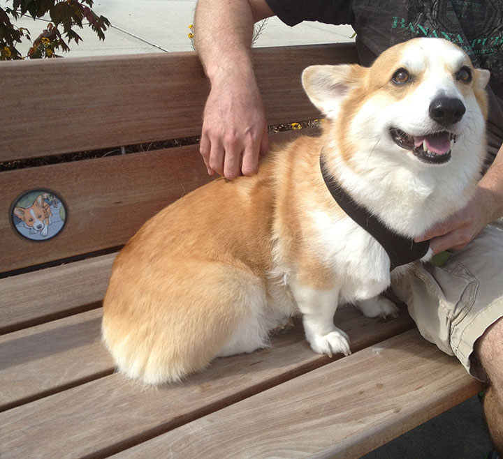
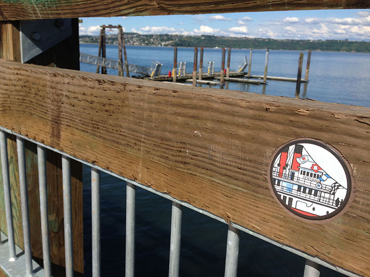
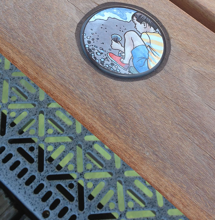
Okay. Now that Old Town Dock is officially open, I feel like I can finally give away some juicy details. Here are all 24 medallions (portholes?) in my new public art piece, Droplets. Since not everyone reading this post is local to Tacoma, I won’t go into great detail over every image. But to give you some context, Old Town Dock boasts one of the best vantage points in the South Sound, with beautiful views of land, city and sea in every direction. That’s what first drew me to the site: I wanted the chance to encourage people to look all around them, because there was something to see everywhere you look.
But when I started researching the history of the place, I was even more struck by how much had happened in Old Town over the years—and how much was still going on, every day. Because of its prominence in so many lives and livelihoods, Old Town Dock has stood witness to a staggering number of true stories since it was built in 1873. Family histories, booming industries, important events, Native traditions, beginnings, endings, drastic changes, slow growth, celebrations, tragedies, and a thousand everyday narratives—the stories we tell are as commonplace as raindrops, yet as precious as the water that defines and sustains Tacoma as a city.
Droplets references just a handful of these stories, yet hopefully hints at the diversity and richness inherent in our public spaces.

Going from a painted picture to a tangible, finished object was nearly a two-year process, and I was only one small piece of the puzzle.

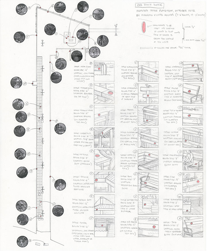
And the 24 medallions barely hint at the number of drawings I did along the way. Back when I was a finalist for the commission, I needed to demonstrate my understanding of the space, and convey how I wanted the artwork to function to the selection committee. In this area, pictures really were worth a thousand words apiece; time after time, sketching out what I meant was infinitely more effective than trying to explain it in words.
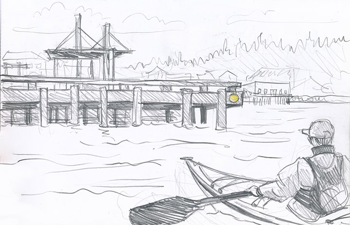
As I was working on my presentation, all this drawing and imagining every angle gave me a little epiphany. I realized that while the view from the site was spectacular, the Dock itself was part of the view, too, depending on where you stood. Since Old Town Dock is a gateway between land and sea, I wanted to engage the folks who’d be arriving from the water, as well. So I presented this drawing—and while some other things have changed along the way, the reality of this particular piece is almost exactly as it appears in this sketch.

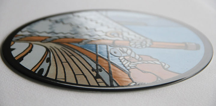
Anyway, back to the nuts and bolts. As you’re well aware, I’m an illustrator—I work in paint and pixels, not industrial components. I didn’t have the skills or tools to make outdoor pieces out of durable materials (in public art, durable materials include metal, glass, tile, stone, brick, and other permanent industrial media; a mural, for instance, is not considered “durable”). So I turned my designs over to the good folks at Winsor Fireform, a fabricator just down the road in Olympia, and they reproduced each Droplet as a small porcelain enamel disc.
Porcelain enamel is the most durable sign medium available. Each piece is made by reproducing the image in pigmented powdered glass onto a steel base. Then the piece is fired at kiln temperatures to fuse the glass to the steel, creating a permanent, totally nonreactive surface.

Porcelain enamel won’t fade in UV light, won’t react to water or salt, and is resistant to dirt and graffiti. That makes it ideal for public art, and the perfect medium for the harsh marine conditions at Old Town Dock.

Now all that was left was to install the rounds. I came armed with my scale drawing—and lots and lots of warm clothing for a long shift in the early morning rain.

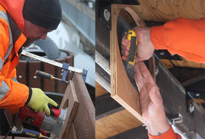
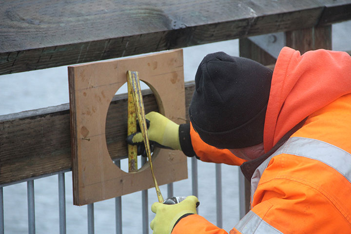
Basically, I stood and pointed, and Pat routered out 24 perfectly positioned circles.

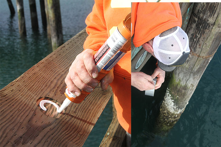
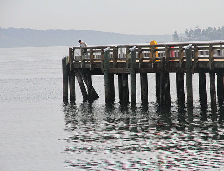
Then he inlaid each disc, affixing them to the wood with some seriously heavy-duty marine sealant, and Bob’s your uncle. Actually, it wasn’t always that easy; some of the rounds required some acrobatic feats to install. Just passing him tape measures and things gave me vertigo sometimes—but at least he didn’t have to drill while standing in a choppy rowboat (which was plan B, if hanging off the edge didn’t work).

Twenty-four hours later, the adhesive was fully cured, and I could call it done.

The day we installed, nothing on the Dock was completely finished—benches and planters were still piled up at random, and I wasn’t entirely certain that the final placement would match my scale drawing.

But now it sort of feels like the artwork has always been there—

and maybe you just never noticed it before.

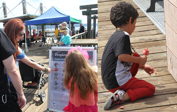
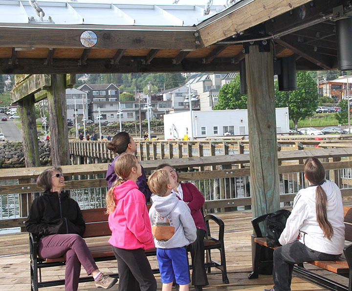
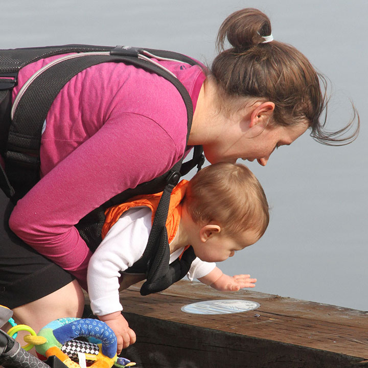
I love being there to witness whenever a Droplet catches someone’s eye, and they stop whatever they’re doing to look more closely.
And just maybe that moment of noticing will lead to the words, “Let me tell you a story…”

June 19th, 2013

It’s a little hard to believe that Old Town Dock is finally open, and up-and-running for good.

Photo by Naomi Strom-Avila
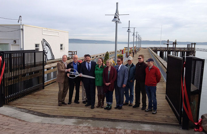
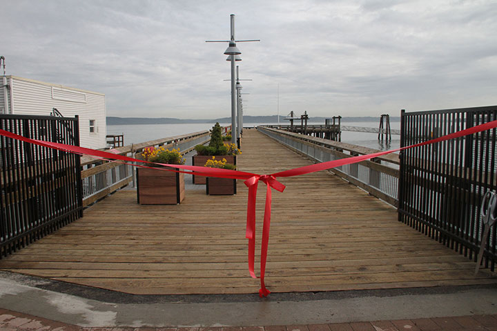
Technically, we had a little ribbon-cutting and “soft opening” (in which Deputy Mayor Campbell hilariously appeared to be attacking me with the giant ceremonial scissors—oh, heck yes, we used giant ceremonial scissors!)—

—but Sunday was the big party for everybody.

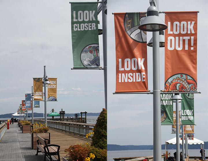
The Dock is still technically a work in progress, as Phase II of the project (including a restroom and permanent wayfinding signage) won’t be completed until late fall. So for the next few months we’ve got snazzy banners up instead—big thanks to the City and Metro Parks for letting me be a total control freak and design the banners and signage.

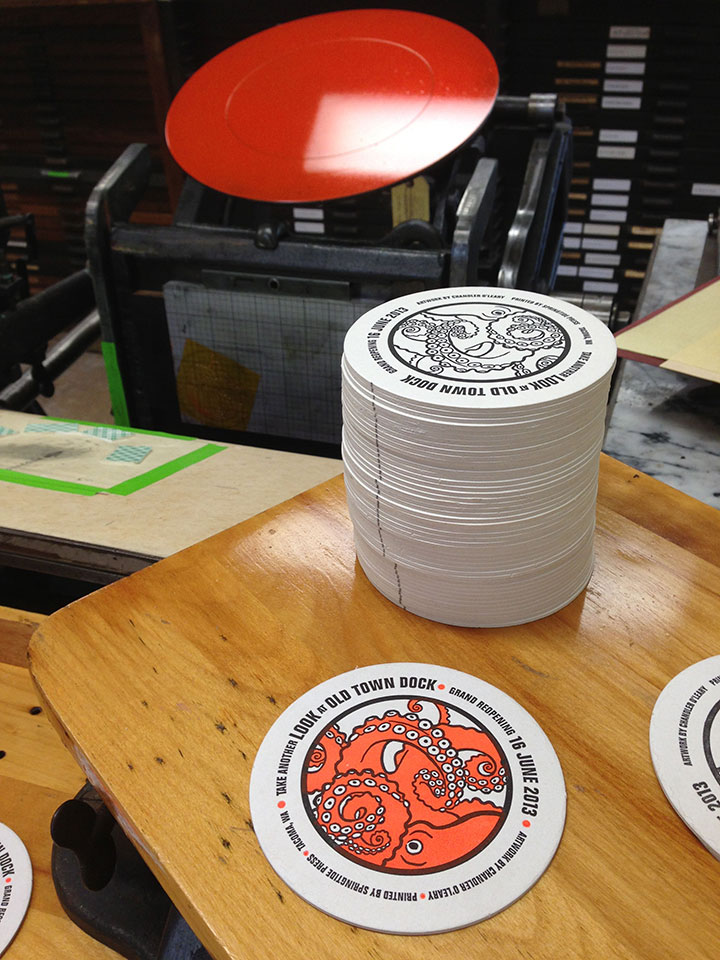
And even more big thanks to Jessica, who whipped up these fabulous fluorescent letterpress coasters to give out at the event. It was fun to see a hundred people walking around carrying neon octopi with them.

Photos by Walter Smith
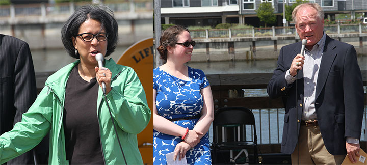
And even though I had to speak right after our lovely Mayor (left), having the audience packed with hollering friends made me forget how nervous I was. Thanks, guys.

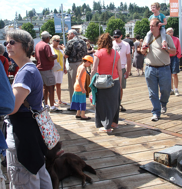
The best part, though, was the people-watching. I can’t tell you how good it feels to see people responding to and interacting with your own artwork—

—and looking excited to do so.

In the two months since we installed the work, I’ve already lost count of the number of people (including the construction guys!) who have told me their own memories about Old Town Dock. Knowing that my little illustrations are triggering these stories is an incredible feeling.

I especially love catching folks in quiet moments, just exploring the Dock and discovering each Droplet for themselves.

Photo by Sheree Trefry
It’s all I can do not to run up to total strangers and say, “I made that!”
Thank you to everyone to came to the dedication on Sunday; to everyone who’s spent a lunch hour or coffee break counting medallions (Ric, I’m looking at you; a bucket of gold stars for finding all 24 first!); to everyone who’s got a story to share about Old Town Dock. I’m still listening.

June 13th, 2013

See you this Sunday at Old Town Dock!
June 4th, 2013

Public art is a funny thing. If I learned anything from my last public art project, it was that time moves differently in the public art realm. It takes so long for a project to go from blueprint to grand opening that the artwork can’t be considered “done” until months or sometimes years after the artist finishes the design. In this case, I’ve been sitting on this one for quite some time—so I’m pleased as punch that I can finally reveal a glimpse or two!
This is just one part of my new piece, Droplets, which is now a permanent part of the newly-restored Old Town Dock in Tacoma. Originally built in 1873, Old Town Dock is one of the city’s oldest properties, and was an important part of Tacoma’s shipping history. It served as a public walkway until 2008, just before I moved to town, when it was closed to the public due to structural concerns.

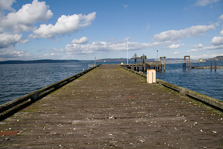
This is how the Dock looked two years ago, when I first toured the site as a finalist for the public art commission. The place was a mess, with rotting planks, makeshift barriers and caution tape roping off unstable (or even missing!) sections of the pier, and about forty frillion dead crabs, seashell fragments, and other seafood snacks the gulls would drop on the wood. You couldn’t walk a single step without hearing/feeling a disconcerting crunch underfoot.

And here she is today, all shiny and new again. The City and Metro Parks Tacoma split the job of refurbishing the pier on its original footprint, adding benches and lampposts, and turning the place into a city park. And thanks to the One Percent for Art program, the project included funds for a public art commission.

The artwork comes with a hitch, though: you have to find it first.
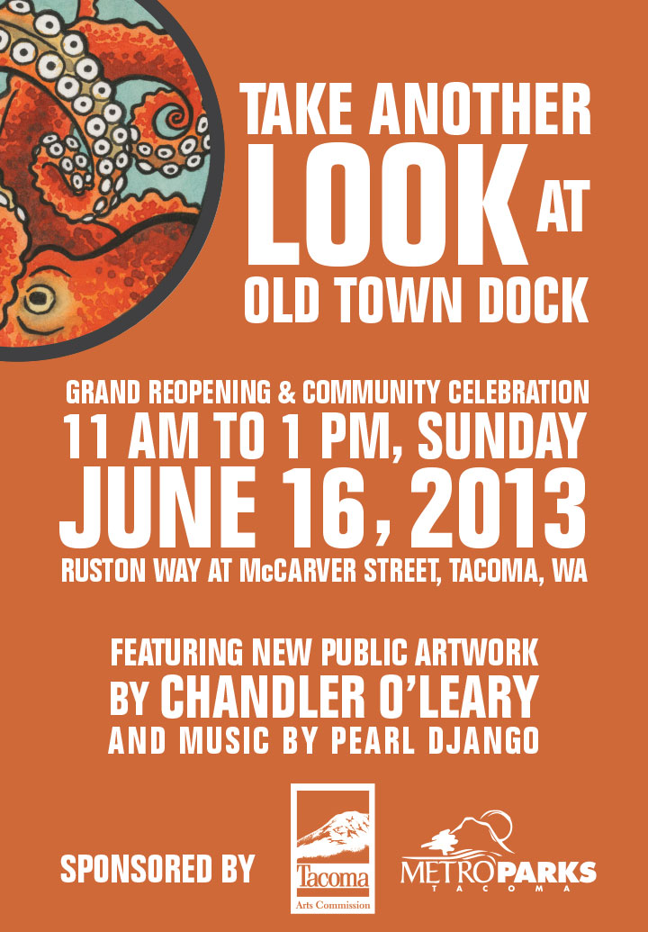
I’ll be sharing more about the project in the coming days, but I want to wait until after the public unveiling to do so. In the meantime, if you’re in the area, the Dock is actually open to the public already (we had a “soft opening” and ribbon-cutting a couple of weeks ago). But I’d recommend the main event, which is a week from Sunday (bring your dad!). Here’s the skinny:
Dad’s Day at Old Town Dock
Grand Reopening & Dedication of Public Artwork
Featuring music by Pearl Django
Sunday, June 16, 2013
11 am to 1 pm, free!
Ruston Way at McCarver Street, Tacoma, WA
Be there or be … er … round?
April 30th, 2013


Wayzgoose worked like a well-oiled machine this year—and that’s the way we like it.

(Even if we were just a little extra tired afterward.)
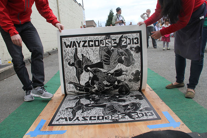
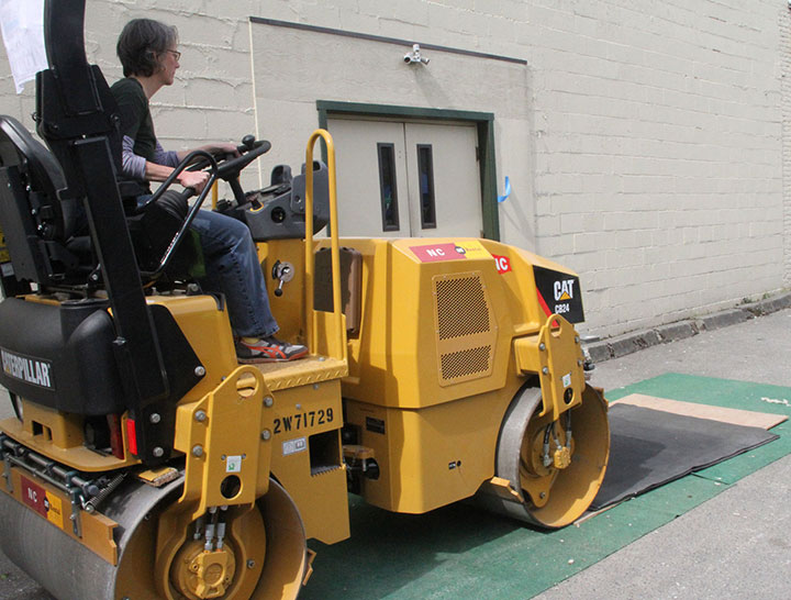
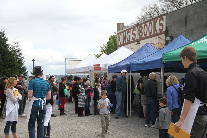
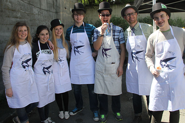
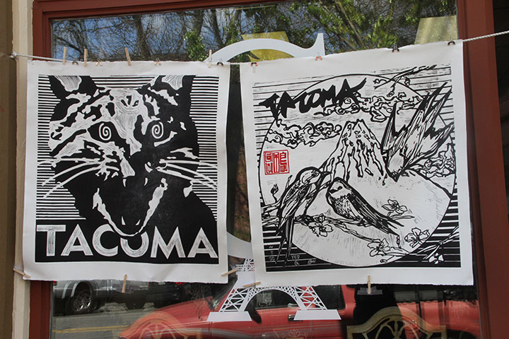
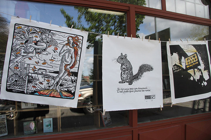
We were finally able to have the event in the parking lot next door, which allowed way more people to gather ’round the steamroller—and gave the artists more elbow room for spreading ink and chatting it up.

Steamroller prints by Ric Matthies (left) and Charles Wright Academy students (right)
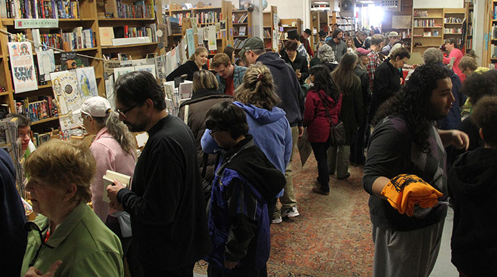
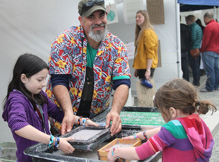
The usual suspects were up to all kindsa good on Sunday—

Our print (left), Beautiful Angle (center), Maggie Roberts (right)
—and it was fun for Jessica and me to come back after a year off.

Photo by Victoria Bjorklund
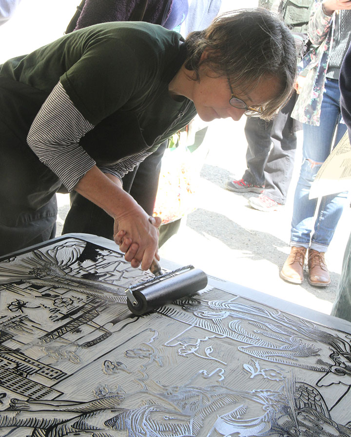
This year, we added something a little different to the mix—just like we did in 2011 in San Francisco. After Jessica inked up the block…

Photo by Victoria Bjorklund
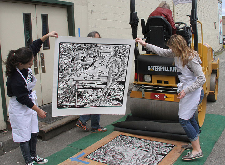
…and the steamroller packed its punch…

Photo by Victoria Bjorklund
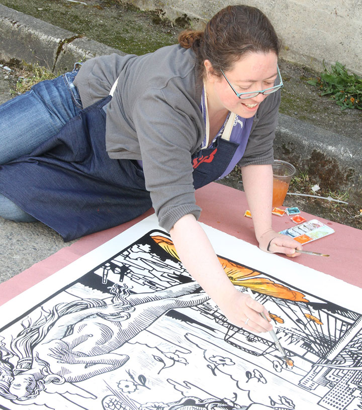
…I set up shop across the parking lot, adding a few hand-colored touches to the piece.

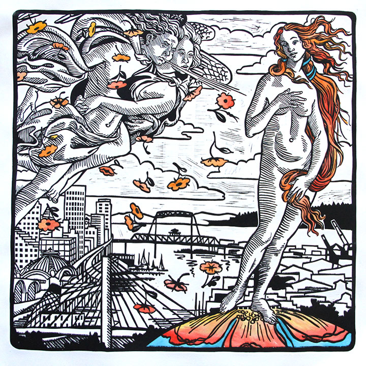
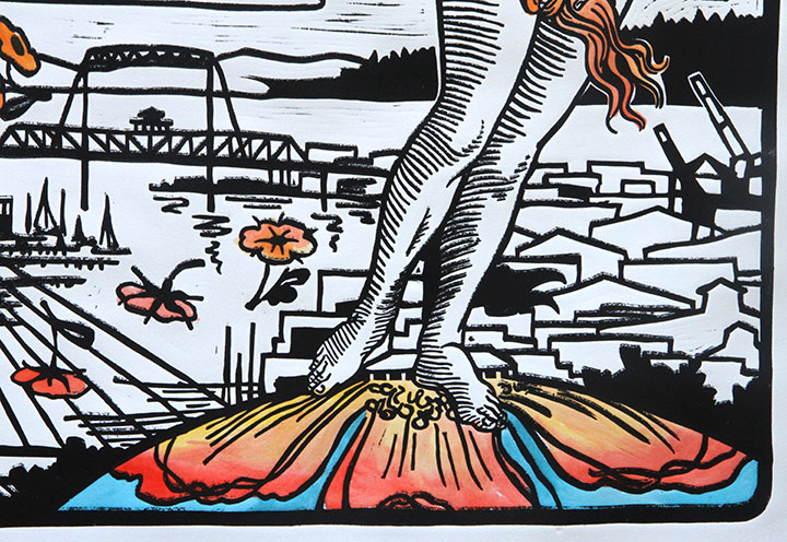
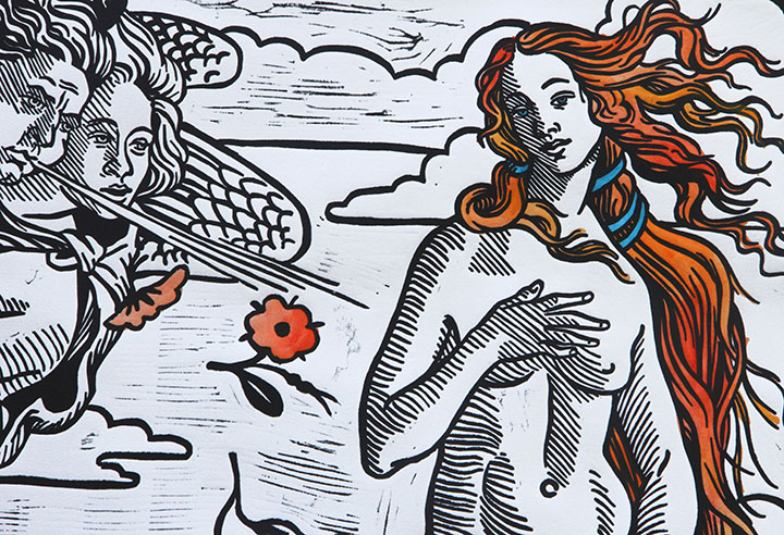
Here’s the finished product—and for those of you who don’t happen to live in T-town, I’ll need to provide a little back-story. You probably recognize the reference to Botticelli’s Birth of Venus, but there’s a second tribute to pop artist Andy Warhol, as well. And I’m not just talking about Venus herself—to whom Warhol did pay homage in 1984.

You see, over thirty years ago now, Warhol was one of several artists to propose a permanent public artwork to adorn the roof of the Tacoma Dome. Not only was his proposal rejected at the time, but the whole project resulted in an enormous backlash of public opinion, insurance nightmares and political in-fighting—which literally derailed the city’s entire public art program for nearly two decades afterward. Fast-forward to today: not only is our public art program back in the saddle and going strong, but now there’s a growing movement to put Warhol’s flower on the Dome after all—which, in fact, would be the world’s largest Warhol original.
Whom do we have to thank for both the…uh…Renaissance of our public art program, and the push to bring Warhol back? Our wonderful City Arts Administrator, Amy McBride (click to see her talk about the Warhol story)—who, incidentally, drove the steamroller that printed our Venus linocut on Sunday.

How’s that for coming full-circle, huh?
Many thanks to everyone who stopped by on Sunday, and to Amy and the Tacoma Arts Commission for continuing to make art happen—both for Wayzgoose and for Tacoma.
April 4th, 2012

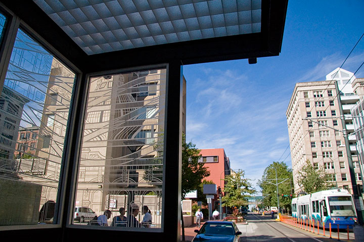
This is rather old news now, but as it took such a long time to complete, and as it isn’t exactly going anywhere, being hot off the press doesn’t matter so much. Last year I was commissioned to do a piece of public artwork here in Tacoma, and as of a few months ago, the Commerce Street light rail station is up and running.
I’ve done several temporary and permanent public pieces before, but this was my first commission for a durable materials project—and by that I mean materials that can be expected to last many decades with minimal maintenance (metal, stone, concrete, ceramics, glass, etc.). Interestingly, painted murals are not considered durable; they require all kinds of upkeep, and have an average life expectancy of only five to ten years.
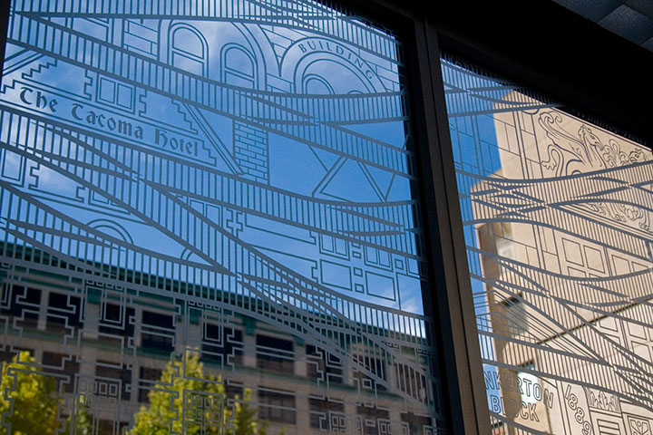
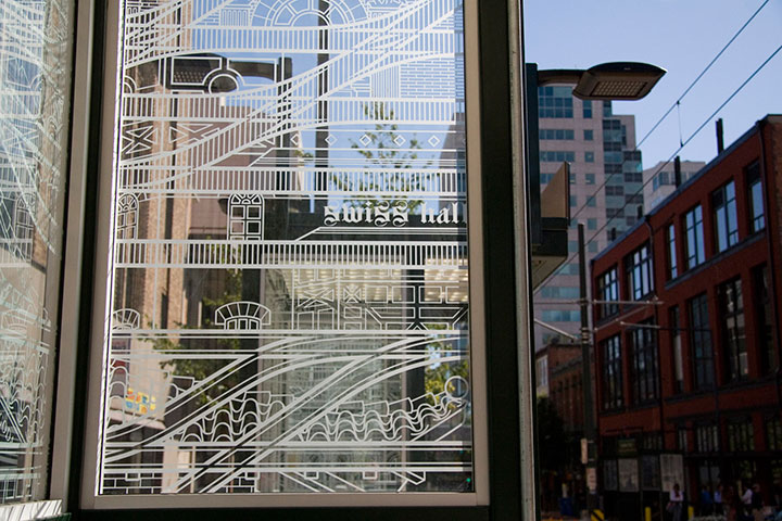
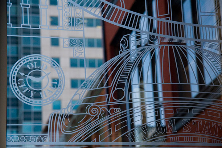
The Commerce Street Station project called for a design for etched glass. Now, as you’re well aware, I’m no glass artist—it’s a little weird to think of a letterpress printer doing glass work. But that’s the beauty of the public art realm: instead of one artist tackling every aspect of a project, there’s a whole team of people involved, each focused on his or her particular strengths. I was responsible for the design, and industrial fabricators took care of the actual glass-etching part. So what my part boiled down to was a process nearly identical to what I do for any letterpress print: a hand-drawn illustration, converted into a computer file for production. Realizing that created a huge mental shift for me, and suddenly made the prospect of wearing a Public Artist hat way less intimidating.

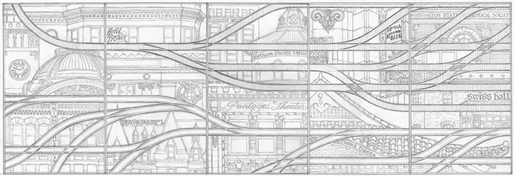
If you’ve ever stood in a shelter waiting for a bus or train, you’ve probably seen an etched glass design. Usually it’s an abstract pattern to discourage graffiti, or in the Pacific Northwest, often something outdoorsy or salmon-themed. So I figured that territory was well covered. Instead, I focused on the rails themselves. The railroad is possibly the single most significant aspect of Tacoma’s history; it is truly the backbone of our city. In 1873, Tacoma was chosen over Seattle as the terminus of the Northern Pacific Railroad. Without the resultant growth and industry that resulted from the railroad hub, Tacoma might still be a tiny fishing hamlet, rather than a bustling port.
For decades, industrial and passenger rail travel was our pride and joy. Along with the goods and people moving along the NP Railroad line, Tacoma was also criss-crossed with streetcar lines, providing efficient and comprehensive public transportation. During the Great Depression, however, the cost of maintaining the streetcar lines became too heavy a burden. The system was dismantled in 1938, and private automobiles became the dominant mode of transportation. This story is by no means unique — passenger rail fell out of favor all over the country, and today, public rail transit is only the norm in our largest cities.

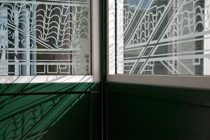
To me, our small (but expanding) light rail line is a ray of hope for a progressive future, a return to a more sustainable system, and a chance to highlight Tacoma’s history. So for Continuum, I designed a brace of parallel rail lines. The top line is a set of traditional railroad tracks, beginning as a single thread and branching outward—symbolizing Tacoma’s beginnings and expansion. The bottom tracks are grooved-rail embedded tram tracks—exactly the type you see in both old streetcar lines and modern light rail paths. As the traditional tracks branch outward, the tram tracks converge into a single path, just as our lone light rail line is the last vestige of the old streetcar network.
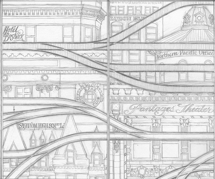
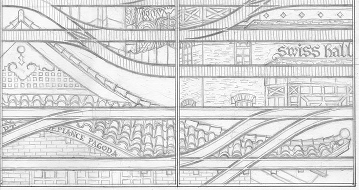
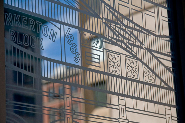
Tacoma’s architecture sprouted and developed right alongside the railroad, as a result of our industrial growth. So instead of surrounding the tracks with a white-noise pattern of ballast, like you’d see around real tracks, I designed an illustrated amalgam of our most iconic buildings. Some are still with us; others are long gone (can you spot the Luzon Building above?). Every structure represented exists either along a historic streetcar or other track line, or has some connection with the railroad.

While I was working on the initial design, a teenage arsonist set fire to the historic Pt. Defiance Pagoda. Suddenly it didn’t seem to be enough for the city merely to preserve the architecture—I felt the need to create my own record of as many buildings as I could.

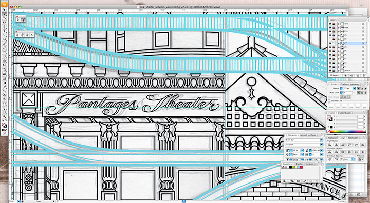
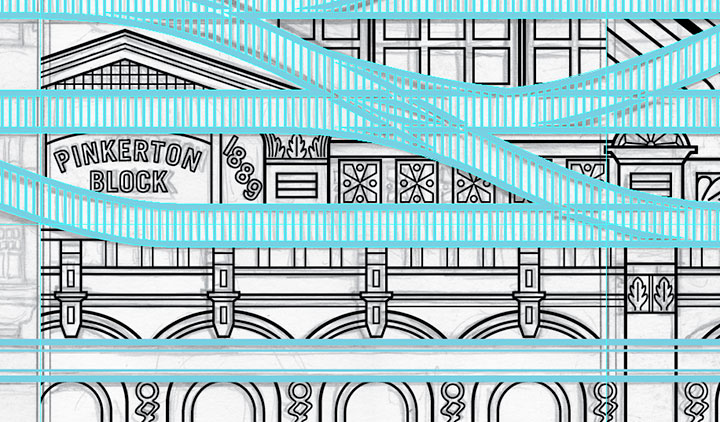
My pencil drawings weren’t finished enough to send to the fabricator—I needed to bridge the gap between my pencil and their equipment. To get the artwork to the point where it could be etched into glass, I needed to convert it to a specific file format called vector graphics. Now, digital photos are made up of pixels: a grid of tiny dots that determine how large a size an image can be blown up to be. The more pixels per square inch, the larger you can make the photo. Vector art doesn’t work like that. Without getting in over my head in explaining this, vector graphics are made of math.
(Which is super cool, really.)
The shapes are determined by geometric points, lines and proportions, rather than pixels. So that means you can blow the artwork up to any mammoth size, or shrink it as small as you please, and you’ll never lose detail or image quality. This makes the vector format A) awesome; and B) ideal for translating extremely intricate work into industrial materials. All I had to do was fire up Adobe Illustrator, and get to work converting the artwork.
This took days. And days. And days.

It’s funny that people tend to see computer programs as shortcuts or “cheats,” but in the end, any good piece of digital artwork requires a level of craftsmanship—exactly the way a handmade object does. Illustrator has lots of labor-saving tools if you know where to look, but the ones that are designed to fully automate the conversion from a scanned drawing to a vector file aren’t always ideal. For this particular project, the only way to do it right was to suck it up and spend ungodly hours redrawing the thing “manually” within the program. I had to rely on all my artist chops just as much for file production as I do for any artist book or watercolor painting. I easily spent as much time converting the design to vector format as I did drawing it by hand, but it’s important to have a flawless file—lots of expensive production steps are dependent upon that file being free of glitches or stray marks.
As an aside, one night that I stayed up (very) late working on the file happened to be the night of the Royal Wedding. To provide some background noise (in order to stay sane), I streamed the event in a little window on the corner of my screen while I worked. So now, whenever I see the finished glass panels I think of ridiculously ornate English hats, and the Queen in her vanilla Jello pudding-colored suit. Pavlov would have a field day with me.

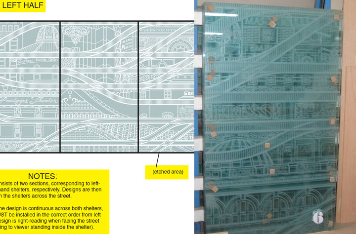
Right-hand photo courtesy of City of Tacoma
Anyway, next I sent the finished files to the fabricator. Using the points plotted in the file, and a digital mockup I threw together with my production notes, they were able to cut the design out of a masking material, which they attached to the glass. Then the sand-blasted the glass panels. Where there were holes cut through, the sand made contact and etched the glass; everything protected by the mask stayed shiny and transparent. The finished result is a clean, precise replica of my design.

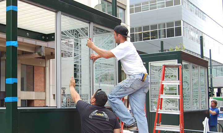
Photo courtesy of City of Tacoma
The tricky part was making sure they installed all ten panels in the correct order; otherwise the connecting track lines wouldn’t make sense. Thanks to the big fat numbers they stuck to each panel, though, everything worked out just fine.

It’s fun to stand inside the finished shelter, and see the stylized buildings contrast with real ones. And when you’re not paying close attention to the details, the illustrations recede into a sort of geometric pattern.

For those who are paying attention, my hope is that this little illustrated city will encourage viewers to notice the real city around them—preferably with an eye toward preservation and innovation.

Attentiveness has its own little reward, too. If you happen to be there when direct sunlight hits the glass, the etched lines project onto every surface. (Tacoma looks good on you.)

In the end, I just wanted to take the dull routine of waiting for a train, and turn it into something beautiful—even if only for a moment.
I’m always saying things like, “If I ran the world…”, usually followed by some crazy idea for transforming every mundane thing in life into something a little more meaningful. I love the thought that on one tiny patch of real estate, I really did get to run the world, and make things exactly the way I imagined they could be. Many thanks to Amy McBride and the City of Tacoma for giving me free rein.

May 30th, 2009

Oh, I’m probably asking for it with this post title. (To anyone who might have found this post by Googling naughty things, I’m afraid you’re about to be disappointed.)
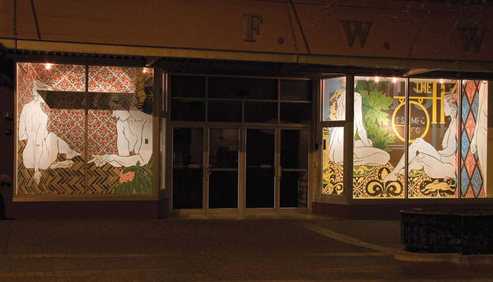
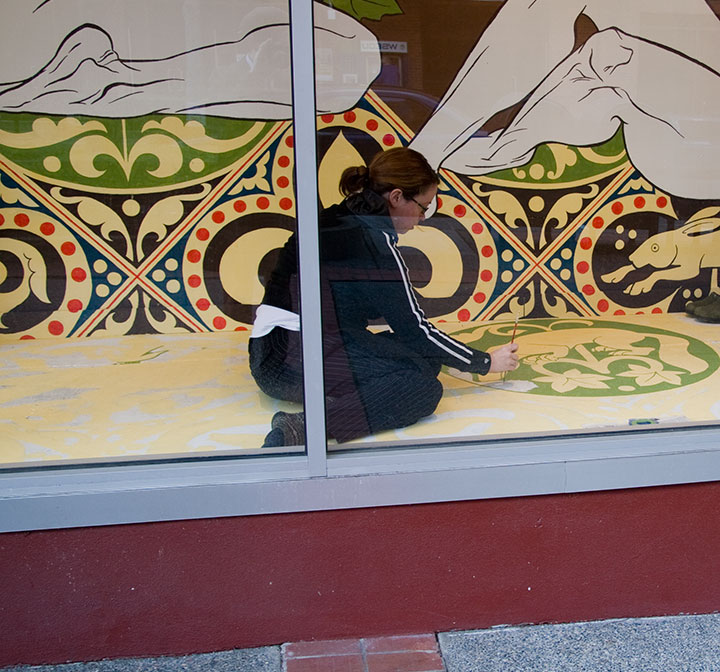
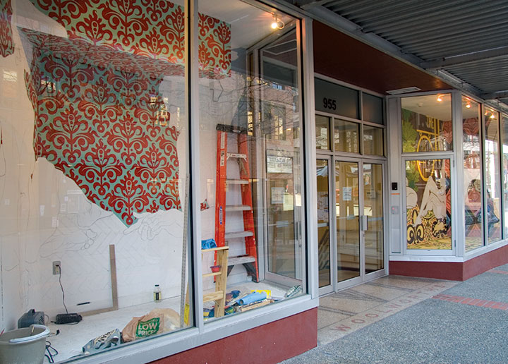
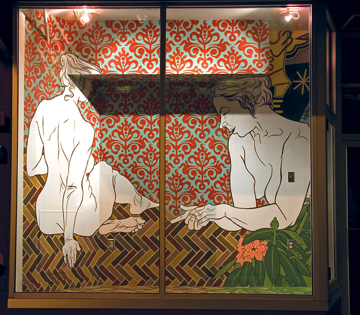
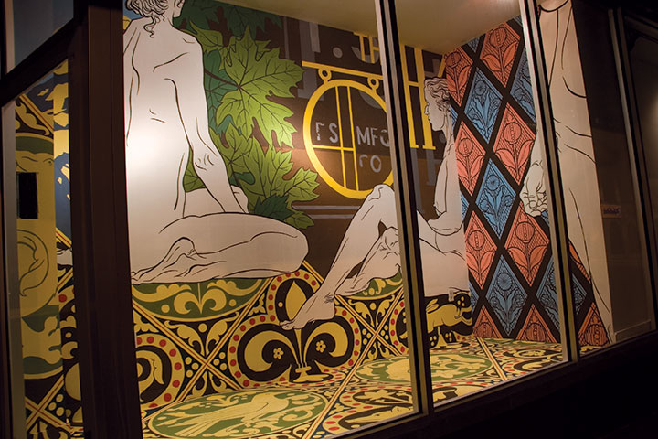
The window displays in the old Woolworth’s store downtown have been converted into a twenty-four-hour gallery, with artist exhibitions and installations rotating quarterly. Shortly after I moved to Tacoma, I found out that they were accepting applications for the 2009 gallery slots. I thought it might be a good opportunity to try out a crazy idea I’d been playing around with, so I decided to give it a go.

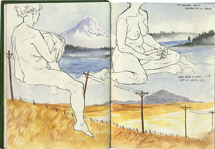
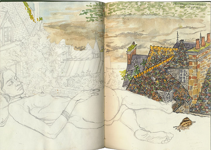
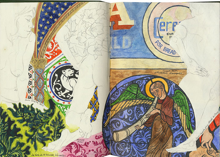
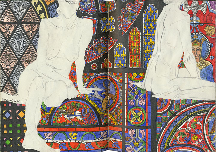
For many years I’ve carried a sketchbook everywhere I go, but for the last couple I’ve been experimenting with something a little different. One day I was in a hurry, and knew I wouldn’t have time to fill an entire spread with the watercolor sketch I wanted to make. So I chose a page that already had some figure drawings on it, and just painted within the negative space around the figures.

And from then on I couldn’t stop. Once the number of watercolor paintings began to catch up with my stock of line drawings, I started attending model sessions again. This time, though, I used the figure drawings to compose the page, with the expectation that eventually I’d go back in with another sketch later.
Several people told me they’d like to see these drawings on canvas or framed on a wall—and more than one suggested a wall mural version. Besides, the conceptual link between nude figure drawings and mannequins in a store windows was too tempting to resist. So I applied for a Woolworth Windows show, but I guess I never expected that my proposal would be accepted. I was talking about gigantic nudes on a busy street, after all. When the notification date came and went without a word, I assumed the project had been rejected and moved on. And then, three months later, I received an email that said, “Congratulations! By the way, your show begins next weekend.”

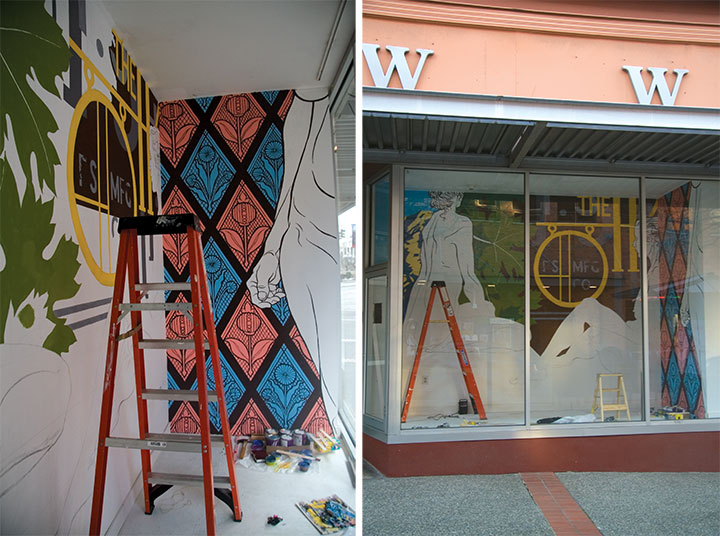
Now, I’m not normally an installation artist, but I do have six years of technical theatre and several large-scale murals under my belt. Still, there was something rather daunting about being thrown in the deep end of a double installation project, which involved attempting to paint proportionally accurate, ten-foot-tall nudes inside a narrow, very public glass box. A very monkey-cage-at-the-zoo glass box. To be fair, every mural I’ve ever painted has begun with a ripple of fear, and thoughts ranging from “Oh, right, I forgot how big walls are,” to “For the love of Pete, how did I ever convince these people that I was capable of painting something that actual humans would be able to see?” Depending on the scale of the project, of course—hey, if blank pages can be intimidating, blank walls (and tall ladders) are pretty terrifying. So this time, what with the many passers-by glancing in at me, I needed a few extra deep breaths. It’s funny that I still get that little moment of panic—because once I finally start in with either pencil or brush, I feel right at home, and even the ladder becomes an old friend. There’s just something so satisfying about slathering paint on a wall.

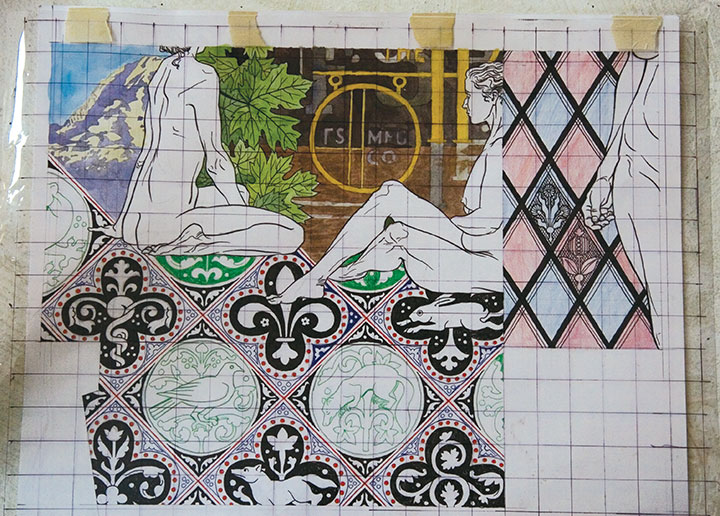
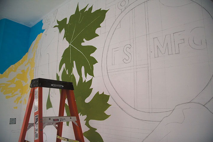
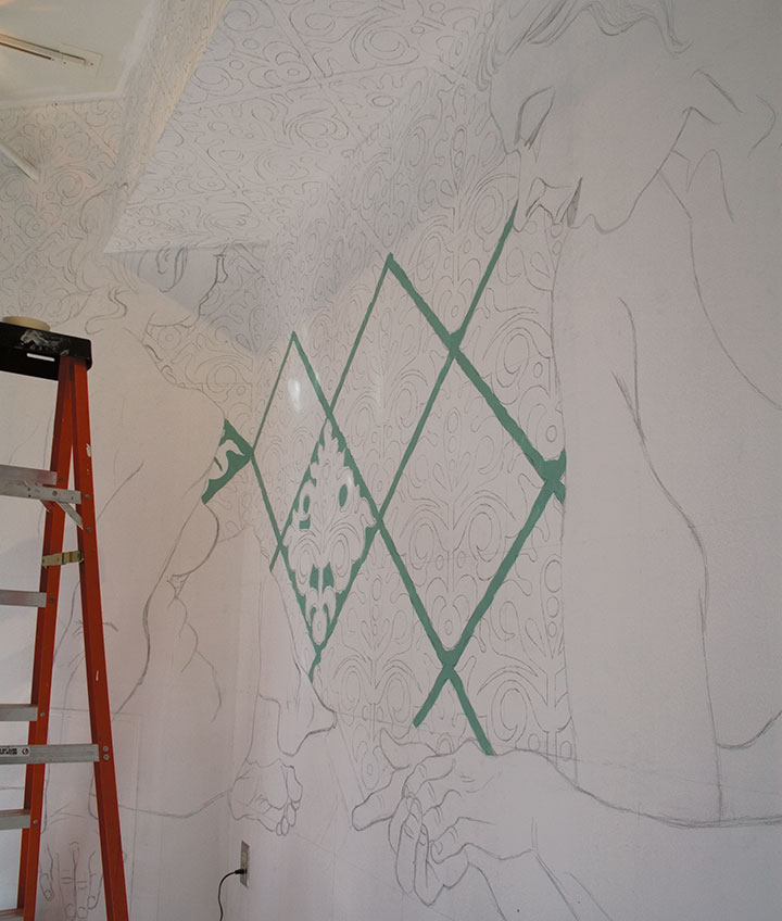
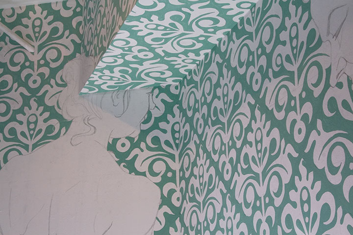
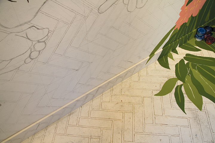
One of the challenges of the Woolworth Windows was getting my design up on the wall, at the correct size, without distorting anything. If I were painting a scenic flat for the theatre, I’d just photocopy my design onto a transparency, hook up a projector, and blow up the drawing to whatever size I needed. In a window display, however, there simply isn’t room to put a projecter far enough away from the wall. So I did it the old fashioned way: made my rendering to scale, laid a grid over it, and drew the same grid at the larger size on the wall.


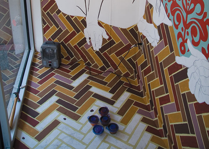
You can see a little of the pencil grid in the top photo; in the left-hand window the pattern repeats did most of the work for me.

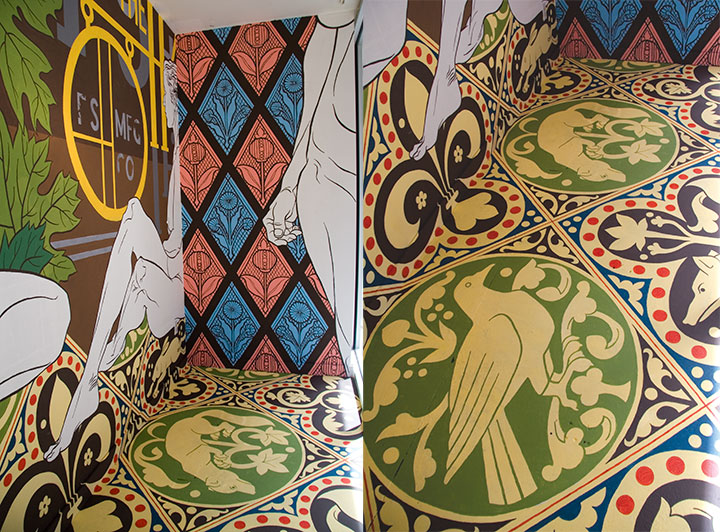
Like the drawings in my sketchbook, the inspiration came from a variety of sources. This pattern was an original design, but I was heavily influenced by the patterned brocades I saw at Versailles (see below).

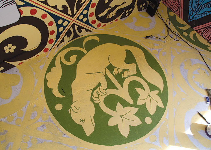
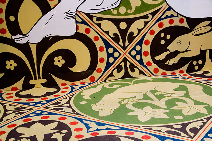
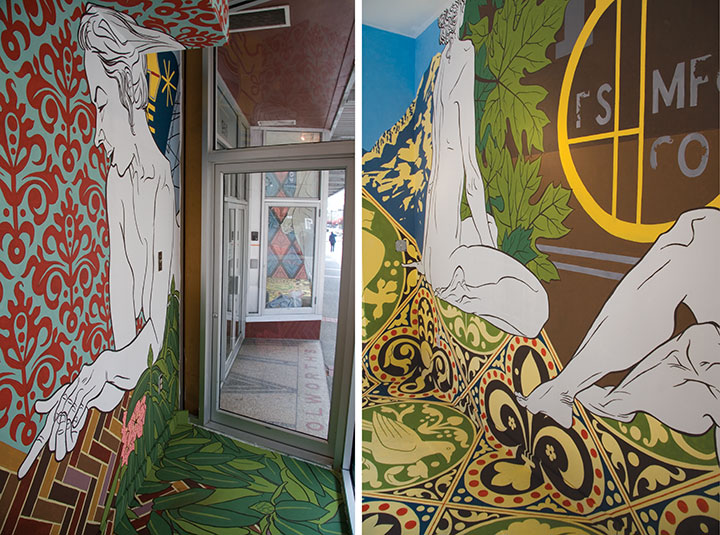
Another element from this sketchbook page found their way into the design—my drawings of the inlaid floor of Saint Chapelle in Paris became the basis for the floor of the right-hand window.


The windows also contain elements found closer to home: bits of historic Tacoma signage,

and a stained-glass window in the home of my friend Christina, who lives in a former church.

Since I had a lot of equipment to stash in such a small space, I had to paint in a piecemeal fashion,


moving my supplies closer to the door as I painted myself into a corner.


Despite the challenges of the installation, this has been one of the most interesting and fun mural projects I’ve ever done. For one thing, I fulfilled a secret childhood wish to be “one of those people” who designed and created window displays (I was a big fan of Mannequin). For another, the best part about painting in public is that you get to meet all kinds of wonderful people. Everyone I’ve seen has been incredibly supportive, curious, and thoughtful. Mothers wheeled their strollers right up to the window so their toddlers could press up against the glass and watch. School kids on a field trip gathered around my rendering and recognized the Harmon sign immediately. Street-smart teenagers stopped to ask insightful and challenging questions about gender roles in art. Friends brought me coffee on a chilly day, or kept me company when I started to get tired. Business people flashed me a thumbs-up on their way to work, and neighborhood regulars shouted their encouragement through the glass. I guess I didn’t have to worry about the public reaction to a bunch of naked ladies after all.

There’s a catch to all of this, however: the installation is temporary. The last day of my show is June 13, and then I have to paint everything white once more. So stop by while you can—you’ll find these ladies on Broadway, close to the corner of South Eleventh Street (on the same block as the Thursday farmer’s market).

I guess that’s another thing all those years of theatre taught me: how to practice a little detachment when you have to dismantle what you built.
Even if it were only up for a day, though, it would have been worth it.


![Chandler O'Leary [logo]](https://chandleroleary.com/wp-content/themes/chandleroleary/images/logo.png)
