Blog
June 11th, 2015
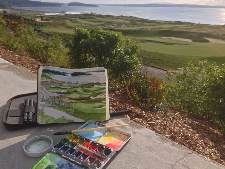
There’s a very big sporting event coming to my town next week—and even though I’m not a ticketholder (or even all that interested in the sport itself), the spectacle is already proving to be a big source of inspiration.
So here’s another piece of what Jessica and I are working on—look for more next week!
June 7th, 2015
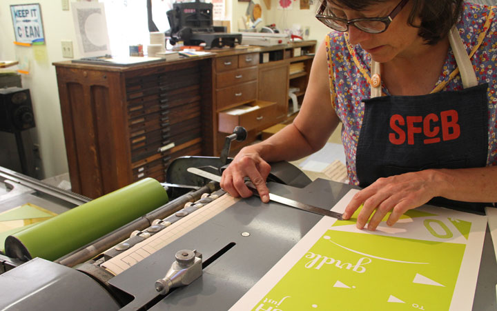
Amidst all the Kickstarter hubbub, I have another deadline to attend to: Jessica and I are releasing a new Dead Feminist broadside in a week or so. Normally I would have postponed that for a bit, at least until the Kickstarter was behind me, but we’re timing the new broadside to align with a big event. So, yeah. It’s not ideal, but the timing is out of our hands for this one.
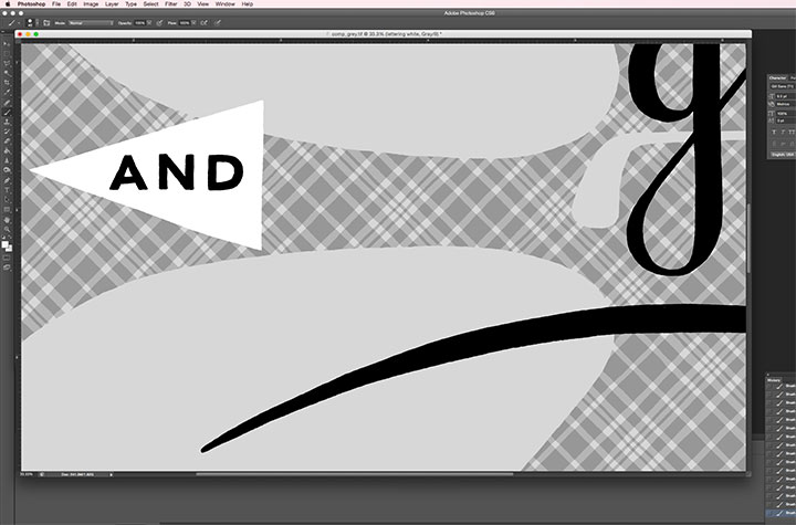
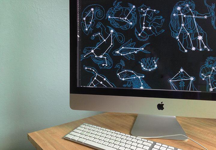
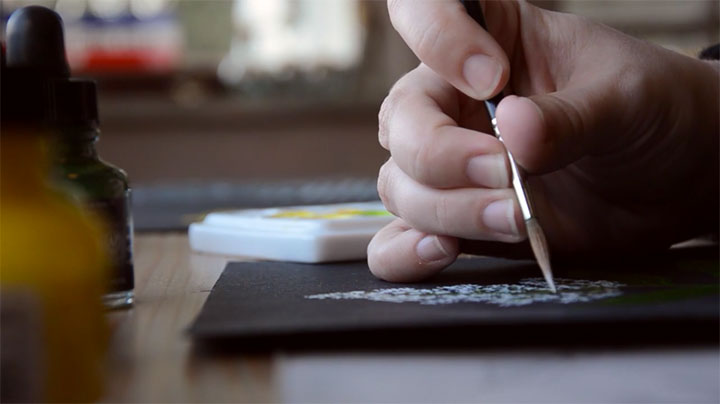
Anyway, I thought I’d show you a snippet of what we’re working on. No, the broadside won’t be in black-and-white, but every design goes through a black-and-white phase before it goes on press in living color. It’s actually a good thing to do, even if it weren’t necessary to the production process: viewing a design in shades of grey is a lot like showing it to a pair of fresh eyes. Without color to distract me, I can look at the design objectively and make one last call to make sure it’s working as a whole. And besides, the color separations for the new piece are really, really complicated (as you’ll soon see). I’ve spent two days staring at this greyscale version of the design in Photoshop, checking and rechecking that I did it right and all the layers line up correctly. I don’t want Jessica to be in for any nasty surprises when this thing goes on press tomorrow.
Wish us luck! More soon.
June 4th, 2015
UPDATE as of June 12: Just four days left, and we have less than $2000 to go! We’re almost there!
UPDATE as of June 8: One week left, and just over $6000 to go! We can do it!
Thanks to you, we’ve blown past the halfway point of the funding goal on the Constellation coat! And we’ve been named a Kickstarter staff pick! Our Kickstarter campaign is winding down, though, and we’re not yet at our goal. This is our big chance to make the coat (as well as the Constellation scarf) a reality—if we don’t make our full goal, we get zero of the funding already pledged and we are back to the drawing board. So if you haven’t yet made your pledge, now is the time. So head on over to Kickstarter and help us get to the finish line!
May 28th, 2015
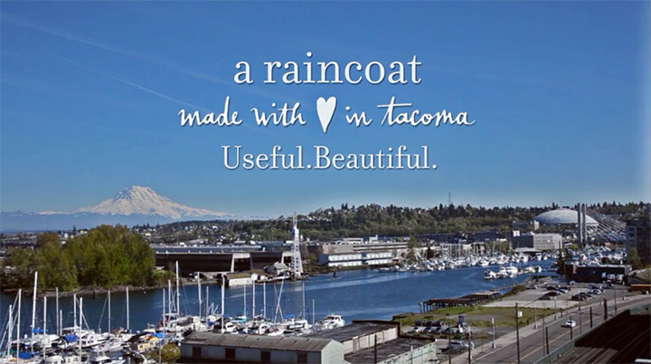
Photo by Emilie Firn.
Wowsa! Thank you so much for your overwhelming response to the raincoat! Thanks to you, our Kickstarter campaign is already closing in on the halfway point, and we are that much closer to making the project a reality. Thank you so, so much. Please keep spreading the word—it’s working!
If you haven’t already made your pledge, or you’re looking for a way to support the project but the coat itself isn’t for you, there are lots of other rewards to choose from. Each features my Constellations design in a different format, and each is an affordable piece of art in itself. First up is an 11 x 14″ archival art print of the Constellation pattern. The print is set up like a giant Polaroid—square on a white bordered background—and can fit in a standard size frame for easy display. This print is done the same way as my 50 States and sketchbook prints—digitally printed with museum-quality inks on 100% cotton paper, and signed with my insignia. The difference is that this print is only available as part of the Kickstarter campaign—I won’t be offering it in my shop afterward. This print is available at the $40 reward level.
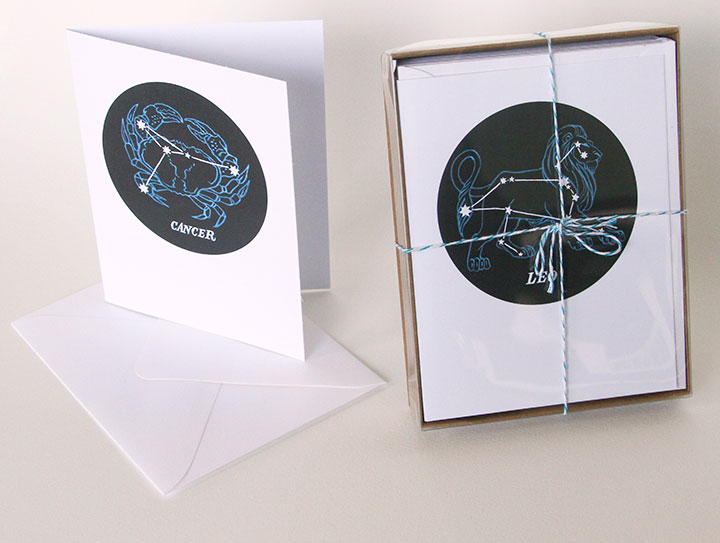
Next are my brand new Constellations of the Zodiac greeting cards! I singled out each of the 12 zodiac signs from the pattern, and turned them into individual cards—each card is blank inside, and comes with a matching envelope. I’ve been offering these cards in my online shop and at craft fairs as a “teaser” for the coat project, and they’ve already been a big hit.
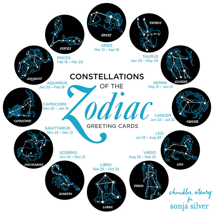
Here are all 12 designs, and how they look on the cards themselves. Each card makes a great and unique form of “personalized” stationery (I recently had a Leo buy a whole box of them to use as her “from the desk of” cards)—or you can get a box of all 12 designs to use as birthday cards for the people in your life. At the $10 reward level on Kickstarter, you can take your pick of a single card; or at the $50 pledge level you get the whole box of 12.
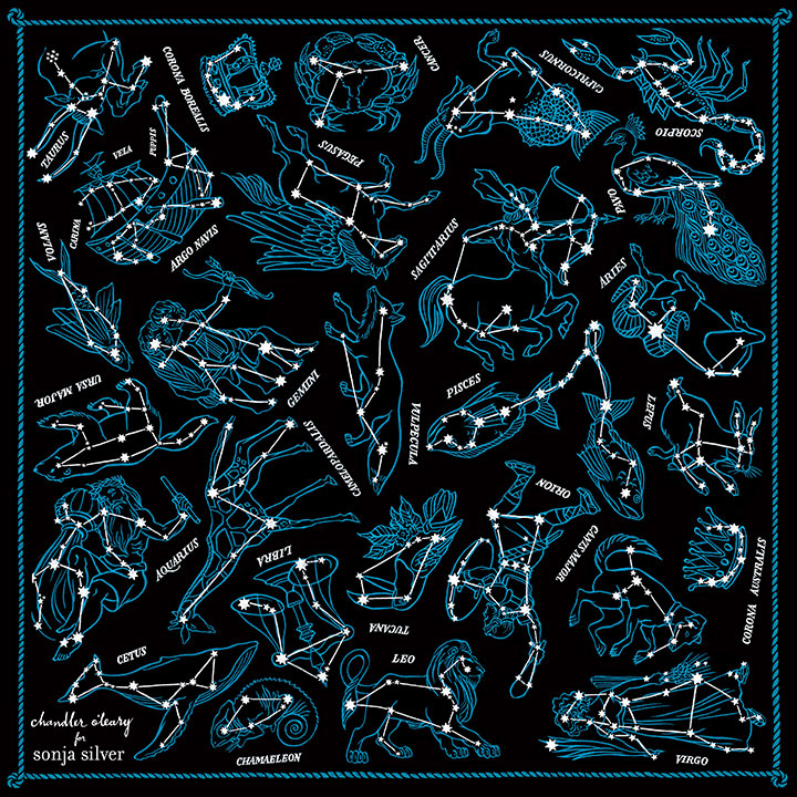
Last but not least, Sonja and I are offering the Constellations design in the form of a wearable scarf! We haven’t had it produced yet, so I don’t have an “action shot” to show you, but you can see the finished design here. Every constellation in the pattern is featured, along with our logo/insignia and a hand-painted border that’s unique to the scarf. The finished scarf will measure 20 x 20 inches. To be honest, I am just as excited about the scarf as I am about the coat, and you can bet I’ll be wearing mine constantly! You can snag one of these babies at the $70 reward level on Kickstarter.
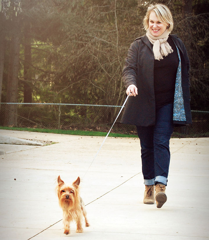
Photo by Summer Hess Briggs.
And of course, there’s the coat itself, at the $240 reward level. When pricing the coat, Sonja did her best to make a product that is both designer-quality and competitive with what else is out there on the market. Since many of your average made-in-China, plain-jane jackets are $300 and up at department stores, I think she did pretty darn well. Also, as I said the other day, Sonja is limiting her first production run to 200 coats. If she offers this coat again in future, or releases other colors or lining designs, the price will very likely increase. So in exchange for putting their faith in us and helping get Sonja’s new apparel line out into the world, our Kickstarter backers are getting the coat at the lowest price.
So there you have it! Thank you so much again for all your support—and keep it coming! We can’t wait to get these things into production and into your hands—the finish line is ahead, and we’ll all get there together.
May 26th, 2015
I tell you what, this has been the year of long-term projects coming to fruition. There have been so many things I’ve had to sit on for months, and it feels so good to finally be able to share them with you! And the one pictured above might just be my favorite of all.

Photo by Summer Hess Briggs
This is my friend Sonja Silver. She’s a dyed-in-the-wool Tacoman, and has owned a women’s clothing boutique here for nearly two decades. Over the years, she’s watched women of all shapes and sizes come through her shop, and has developed a keen eye for clothing that’s both well-made and well-designed. But she had a gap in her business: for years, her customers had been asking for coats and jackets, and Sonja had never been happy with what was available in the marketplace.
So she has spent the last year designing her own.
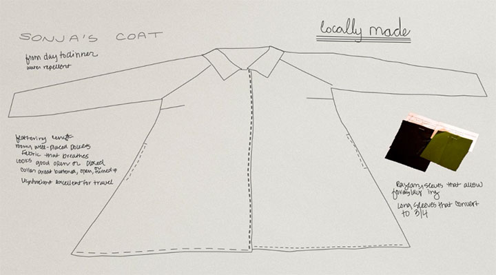
It turned out to be quite the challenge—Sonja was inspired by the classic swing coats and car coats of the 1950s, but wanted the hard-wearing functionality of an outdoorsy shell. Basically, her goal was to make something that was both a workhorse—and a thoroughbred. After all, we live in the Pacific Northwest—we wear jackets pretty much all the time here, in all weather.
Here’s where I come in. Sonja called me up one day last spring, and told me about her coat project. She said she wanted the coat to be lined with fabric that was as unique as the design of the coat itself, and asked me if I’d be interested in illustrating a pattern repeat for her.
Needless to say, I didn’t so much say yes as squeal it.
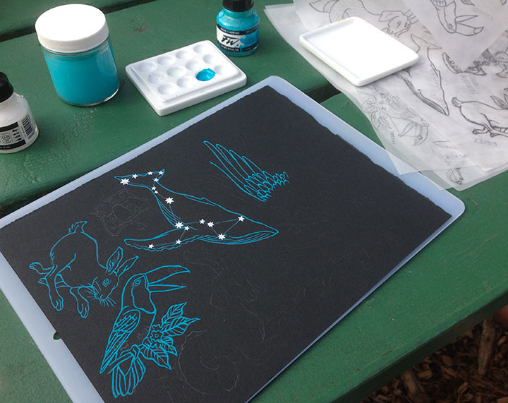
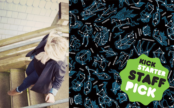
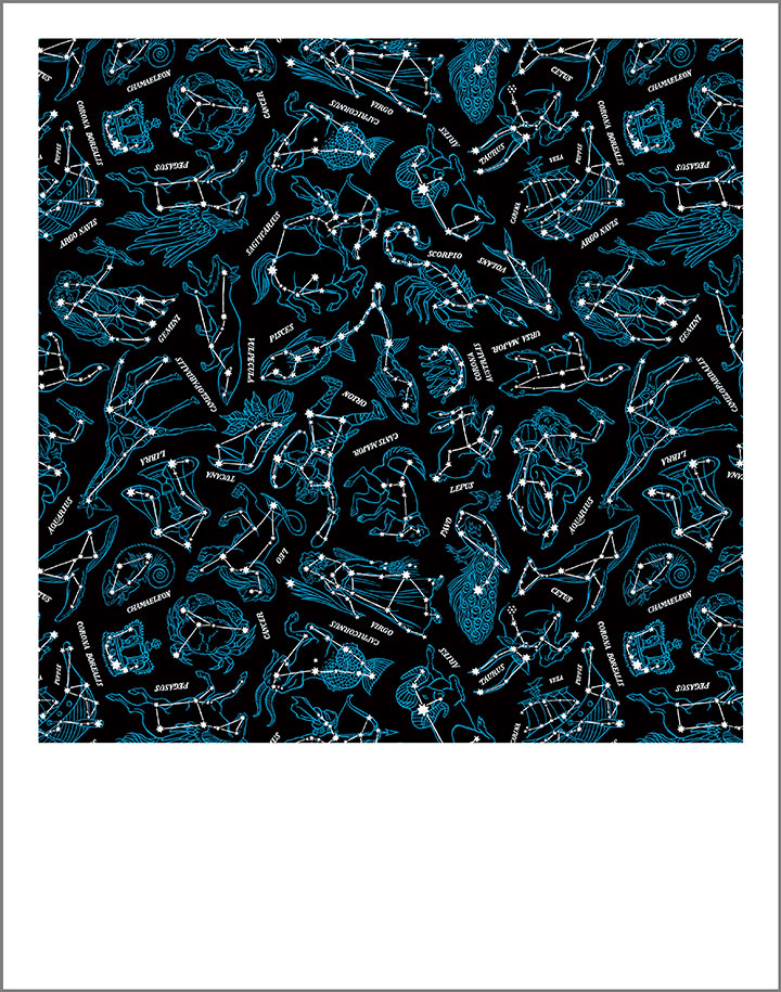
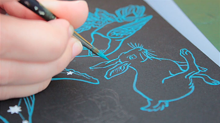
Sonja had the idea for a constellation pattern—something that could be both playful and sophisticated at the same time. We both wanted the pattern to be hand-painted, to help transform the coat into a piece of wearable art.
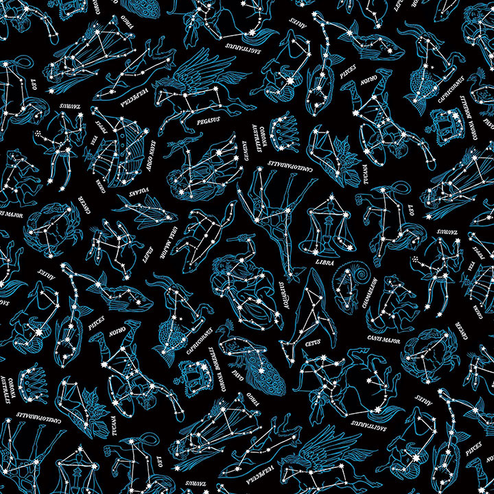
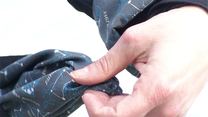
Here’s the finished pattern. There are 27 different constellations represented, including all 12 signs of the zodiac and some perennial favorites from the skies in both the northern and southern hemispheres.
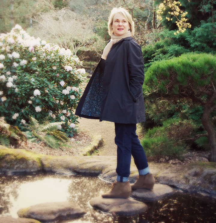
Photo by Summer Hess Briggs
What I love best, though, is seeing the pattern “in action,” doing its job as part of the garment. While I was painting fish and birds and Greek gods, Sonja was hard at work on creating a working prototype of the coat. She went through many different test fabrics and design changes, trying the fit on women of all shapes and sizes to make the design as universal and versatile as possible.
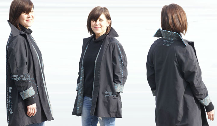
Photos by Kathy Chakerian
And now, at long last, it’s ready for production!
Sonja has launched a Kickstarter campaign to raise the necessary funds to produce the coat, and it’s officially live and up and running. The campaign will run until June 16, and we’re already 1/4 of the way there!
This is the third Kickstarter campaign I’ve been a part of (you can read about the other two successful projects here and here)—for those of you who might not know how it works, a campaign is run like an NPR pledge drive, with tangible rewards offered in exchange for each funding level. So this is not a donation platform—it’s an exchange of goods for capital. We must make our funding goal by the time the clock runs out, or we don’t get any of the funding already pledged. It’s an all-or-nothing thing, and that ensures that the project will be done right, with enough capital to get the job done. And to make sure she doesn’t get overwhelmed by too many orders all at once, Sonja has limited this first production run to 200 coats.
That reminds me: a note about the prototype featured in the Kickstarter campaign. The fabric used for the lining was just a test fabric we had made in a small quantity when we were looking for manufacturers. We weren’t happy with the black background of that fabric, as it turned out a little on the light side. So while you’ll see it in the Kickstarter video, we ended up going with a different manufacturer for the final lining fabric.
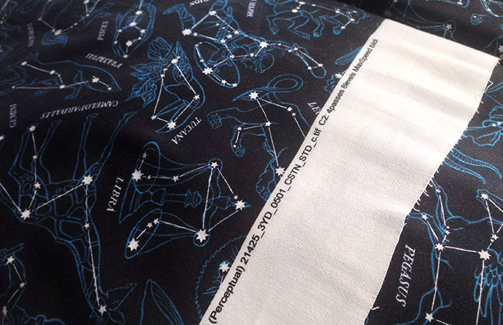
Here’s the real thing—the actual lining fabric that will be used in the finished run of coats. As you can see, the black is a true black, and the pattern pops from the background the way it’s intended to.
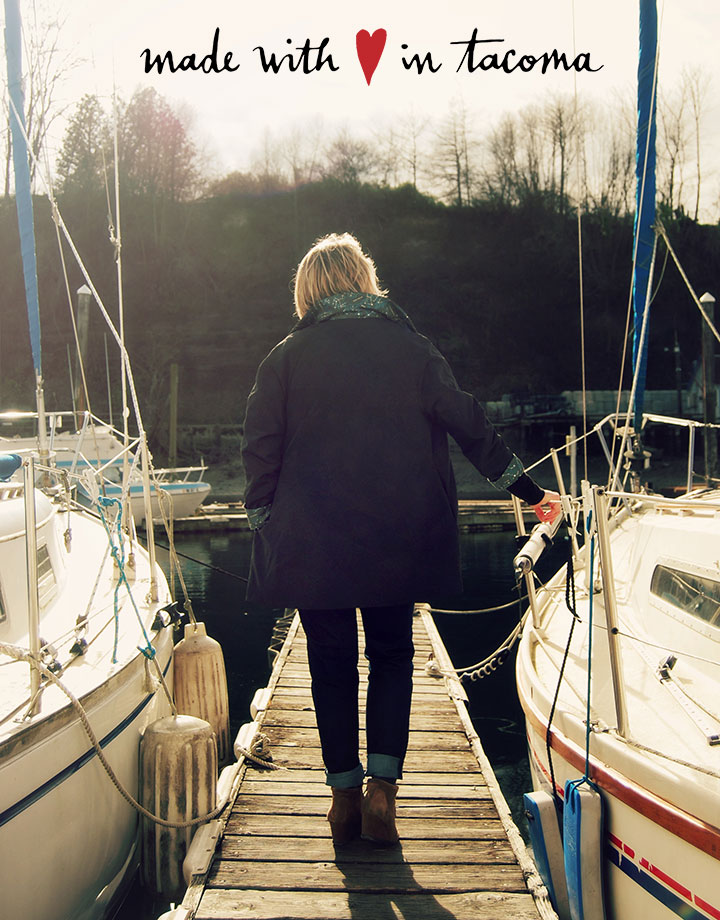
The best part of Sonja’s vision here is that this project has been brought about almost entirely by local women. From apparel design to illustration to construction to marketing, it’s local women who have made this thing happen. In an age where the vast majority of all garments are made overseas, in sweatshop conditions, that’s really saying something. Sonja’s coat is made with fabric sourced and printed in the United States, and the garment itself is pieced and sewn right here in Tacoma. I love being able to say that—I love being able to put our beliefs into action in this way.
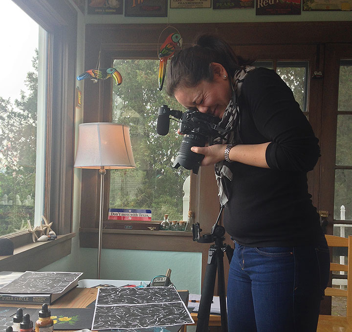
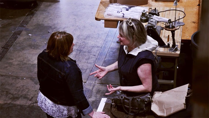
The Kickstarter campaign even has a fantastic video made by a local gal—the lovely Emilie Firn (shown here snapping photos of my process materials in my studio).
Photo by Summer Hess Briggs
And last but not least, one other local gal has had a “hand” in the project: Sonja’s grandmother Lena, who was the inspiration for the coat. Sonja says her goal was to make a coat that had the same attributes Lena had: she’s hardworking, she’s beautiful, and she’s got your back.

So if you’re looking for your next go-to jacket, or you have a woman in your life who is, visit our Kickstarter campaign and make a pledge! And if a coat isn’t your thing, there are many other pledge levels and reward goodies to choose from. Even a pledge of $1 helps move the project forward and gives us better exposure online (if all my social media followers and email newsletter subscribers pledged $1, we’d instantly reach the halfway point of our goal!)—and of course, helping spread the word through your social media platforms will also help us meet our goal. But most of all, we just can’t wait to see women wearing the coat, out there in the real world. So take a gander at the campaign and snag your coat here!
Thank you for your support!
May 25th, 2015


Hope yours was glorious!
May 21st, 2015
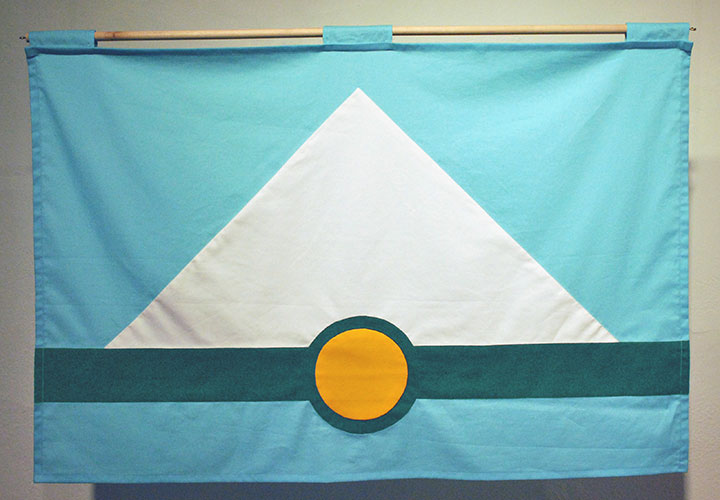
This image has had a bit of a resurgence on social media lately, thanks to a recent TED talk about flag design. All of a sudden I was getting pinged by Twitter notifications by folks holding up my flag as an example of “good” design (thanks, guys!)—and it made me realize that not only had I never gotten around to blogging about this project, but I also should probably do a little primer on the basics of flag design.
In a nutshell, I developed this flag design for a 2012 exhibition about vexillology (the study of flags) that I was invited to be a part of. It was held at Tacoma’s Fulcrum Gallery, and was titled Union Tac. Basically, the exhibit invited a group of local artists to propose a new city flag, and display their designs at the gallery. After I designed my flag, I hand-sewed this prototype (Betsy Ross-style!) for the exhibition.
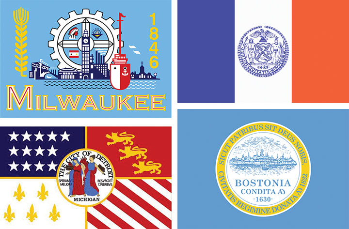
The thing about flag design is that it’s much more difficult than it seems to be at first glance—and at least in the case of city flags, most people are doing it wrong. When it comes to city flags, mostly what you see are complex designs that contain a city’s official seal, or some sort of text paired with an image, or some weird combination of color fields and complex graphics that are unreadable at a small scale or large distance. These are all examples of real city flags (clockwise from top left: Milwaukee, New York City, Boston, Detroit), designs that might work under other circumstances (the city seals, for instance), but as flags that are just a mess.
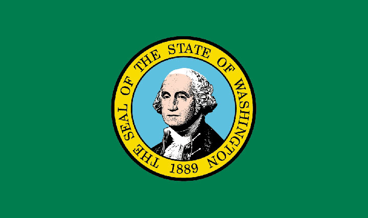
The state flag for my own state of Washington commits the same cardinal sin as the Boston flag and so many others: whoever designed it just plonked the Great Seal onto a colored field and called it good. But look at all that detail in Washington’s portrait—there’s no way that thing is going to be readable at a distance. And one of the biggest mistakes here is the use of type (and as a lettering artist who loves type more than anything, this is hard for me to say!). One of the biggest rules of vexillology: no text. None. The flag should be readable and recognizable by anybody, regardless of literacy level or native language. Even a two-year old can recognize their country’s flag (or for that matter, a famous logo or an illustrated icon); they shouldn’t have to be able to read text to do so.
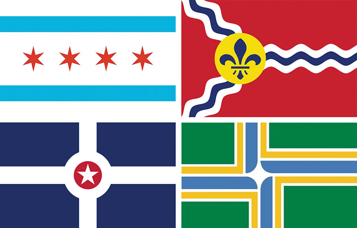
Take a look at these flags instead (clockwise from top left: Chicago, St. Louis, Portland, OR and Indianapolis)—this is how it’s done. Each of these flags is incredibly simple, readable and recognizable at any size or distance, and beautifully eye-catching. Each flag uses just a few colors (at most 3 colors, plus white), and each tells some sort of story that links to the city in question. The blue stripes in the Chicago flag, for instance, represent the bodies of water that define the city (Lake Michigan and the Chicago River). The fleur de lis in the St. Louis flag is a nod to the city’s French heritage. Indianapolis’s flag is basically a map of the city (how cool is that?), while Portland’s highlights the city’s location at the confluence of two rivers. These flags are all vastly different from one another, but they all use the same simple language.

So this is what was running through my head when I set about imagining Tacoma’s flag. I wanted to tell the story of our city and its place in the Northwest—but do so as minimally as possible. As you can see, there was a lot of rearranging and redrafting and re-simplifying—again and again. I’m normally the type of artist who refines a piece by adding to it—so you can imagine how difficult it was for me to keep stripping away at this one.
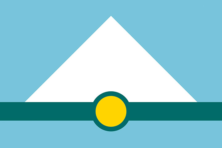
Here’s my finished flag design. The white triangle represents Mt. Rainier, against a blue field of sky above and a matching blue stripe below that stands for the waters of Puget Sound and Commencement Bay. The dark green stripe represents two things: the natural landforms of islands and trees that are such iconic parts of our landscape; and the continuum of industry upon which our city was founded. The gold circle represents both Tacoma’s location at the base of Mt. Rainier, and its origins as the terminus of the Northern Pacific Railroad (the circle resembles the symbol for a railroad stop). Finally, the colors were chosen not only for their correspondence to their real-world counterparts (trees, snow, sky, etc.), but also because they echo the colors used on the Washington state flag.
So that’s it. I still have my hand-sewn prototype carefully folded and tucked away, but I had kind of forgotten about the project after the exhibition ended. Many thanks to everyone on Twitter who helped revive the design and give it new life online. Who knows—maybe we’ll actually get to see it on a city flagpole some day.
May 12th, 2015
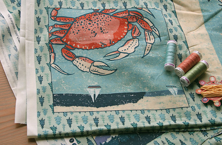
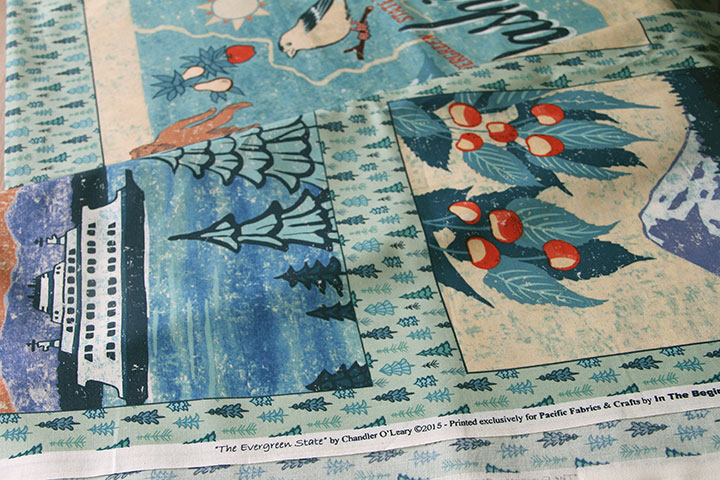
I’ve been sitting on this announcement for a little while, because I wanted to wait until the project went “live” for my client and their customers, too. Now that it has, I can show you the new fabric I designed. That’s right, fabric! This has been a bit of an illustration dream-come-true for me; I’ve always wanted to design for fabric, and it feels so good to feel the finished product in hand.
This all started when Pacific Fabrics contacted me to ask if they could license the Washington illustration from my (still in-progress) 50 States Series for use on a fabric panel. They wanted to create a Block of the Month pattern for their stores, and design a quilt pattern around my illustration. Both the Tailor and I have been customers of Pacific Fabrics since we moved here, so they got a big fat “yes” from me.
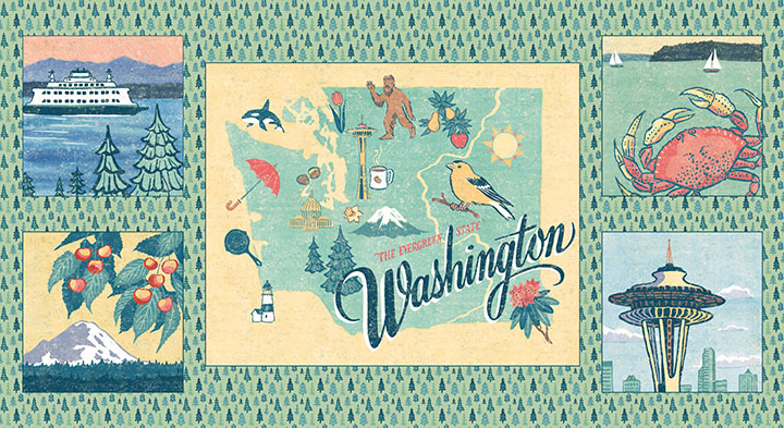
To round out the quilt design, I created four more illustrations of local highlights, done in the same style as the state map. Then I finished off the fabric panel with a “ditsy” (tiny) tree pattern repeat.
Then Pacific Fabrics had the panel manufactured at In the Beginning Fabrics. What I love best about all of this is how hyper local it is. Pacific Fabrics has been a small Seattle business for over a hundred years (they actually began as an ironworking company), and In the Beginning is also a Seattle company. Add me to the mix, and the whole project has taken place over about a thirty-mile radius.
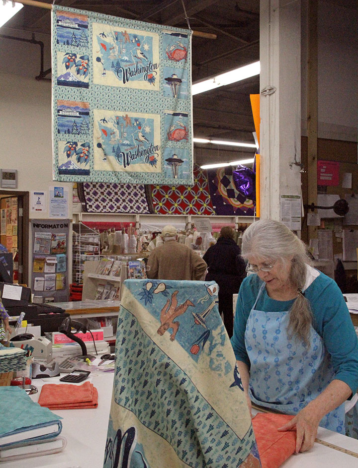
I popped by the Pacific Fabrics store in Seattle to snap a couple of photos (and drop off some prints and cards, which they’ll also be carrying in their stores!), and it felt good to see that everyone in the cutting line was buying fabric for the Washington quilt.
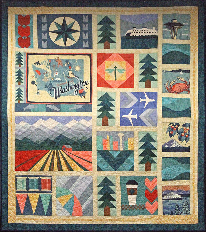
And here’s the quilt block that the lovely Anna-Beth at Pacific Fabrics designed for the Block of the Month program. I love how she created so many Washington icons from geometric shapes, and incorporated my illustrations into the design. I also loved being able to help develop the color scheme of the quilt blocks, based on the palette of my illustrations. I have never made a quilt myself (though I have dabbled a bit…), but I think I just found a good reason to start.
If you’re a quilter, or you’d like to try your hand at a Block of the Month program, you can find everything you need at the Pacific Fabrics website. You can have the patterns and materials mailed to you if you’re far from the Evergreen State, or if you’re local, club meetings centered around each block are starting this month at store locations.
To Anna-Beth and Debbie T. at Pacific Fabrics: thank you so much for bringing me on board, and for giving me such a great crash course in the quilting industry. To everyone else: happy sewing!
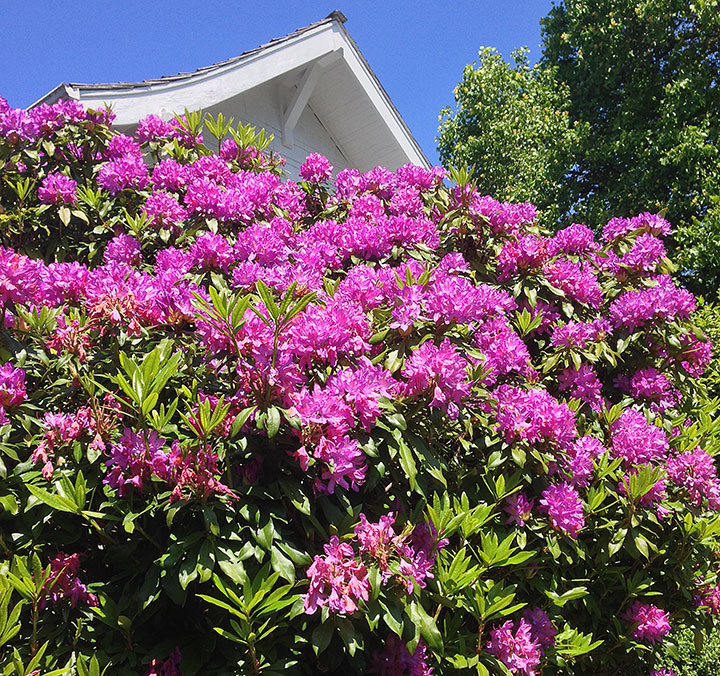
May 4th, 2015
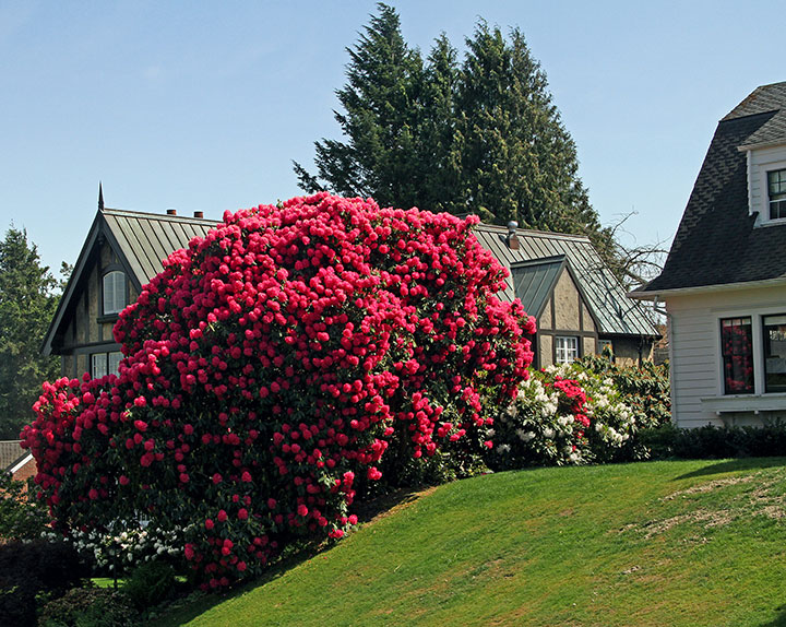
The rhododendroon is the state flower of Washington, so it’s not like I’m not used to seeing them around town. But this pink monster, which practically dwarfs our neighbor’s house, is something else again.
Spring was never my favorite season before we moved to the Northwest (I’m more of an autumn gal in general), but what we lack here compared to the spectacular fall foliage of the East, we more than make up for with our spring color. I’m a convert—and reveling in all this gorgeous pink.
May 1st, 2015
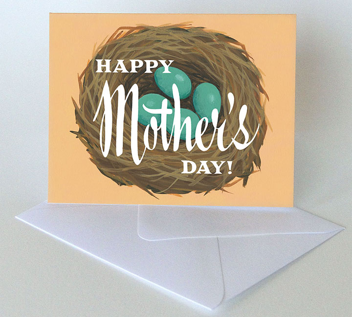
Thanks to all the prep and planning required for last week’s Wayzgoose, I’m all set up with a boatload of new inventory for spring. First on the list: something to send for Mother’s Day! If you’re looking for the perfect last-minute card for Mom, look no further than the shop.
Or if you’re local, there’s one more chance to stock up on Mother’s Day cards and gifts: tomorrow’s Tacoma is for Lovers craft fair.
Tacoma is for Lovers craft fair
Saturday, May 2, 2015
11 am to 4 pm
King’s Books
218 St. Helens Ave., Tacoma, WA
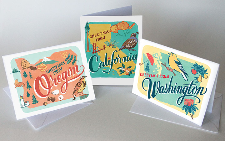
I’ll have more than just Mother’s Day cards at the craft fair, though—like these new greeting cards based on the 50 States series. Oregon and California are the newest, and they’re already flying off the shelf. West Coast represent!
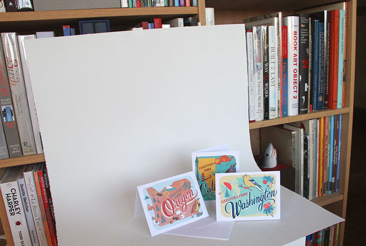
Also, just so you know, I have an extremely high-tech setup for photographing my cards. Masking tape and a big ol’ sheet of paper: photo studio of champions.
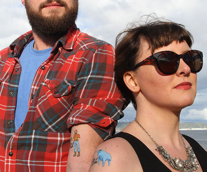
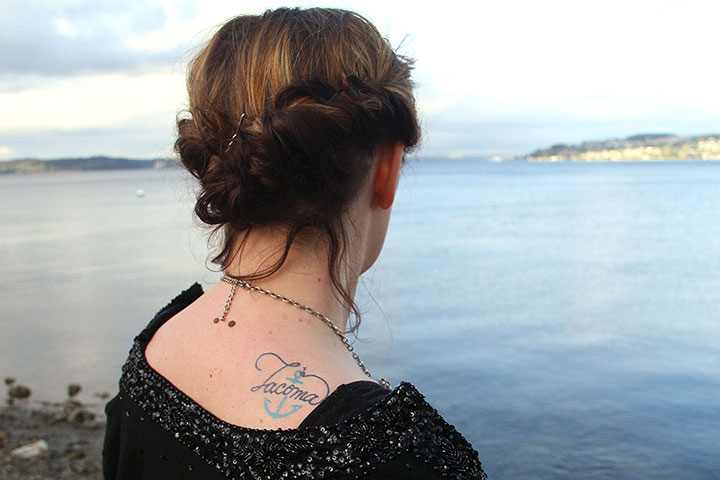
I did go slightly fancier when it came to photographing my temporary tattoos, thanks to my fancy friends Mariesa and RJ. The tattoos are my favorite product to develop these days, and it’s fun to see how people react to them at craft fairs—turns out it’s just as fun to take pictures of them as it is to design them.

I forgot to tell RJ that I wanted him to wear plaid to complete the whole lumberjack look he generally has going on—but I needn’t have worried. The guy read my mind, and came through like a boss.
And Mariesa’s outfit and gorgeous poise made my illustrations look super classy.
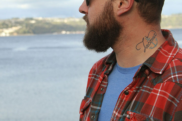
By the end of the day they were both saying they wanted to get the Tacoma tatt for real—
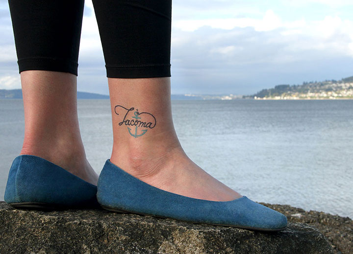
—and I can’t think of a higher compliment than that.
See you tomorrow at the craft fair!