Blog
September 7th, 2016
It’s hard to believe we’re only five weeks out from the release of our book! A few advance reader copies are making their way around to media outlets already, and several people have asked us how we came up with the cover design. Since getting to the finished cover was quite a process, we thought we’d show you a bit of the winding path that got us here.
When Sasquatch Books first signed us as authors, they offered us the chance to design, illustrate and hand-letter the cover. Needless to say we jumped at it. But designing a book cover can be very different than designing other things—the stakes are higher, for one thing. In some ways, it’s more of a science than an art: a good cover can have a lot of sway in terms of book sales, so it has to be as eye-catching, informative and readable as possible. So to make sure we got it right, it was a hugely collaborative process—not just between Jessica and me, but also with the publisher, the art director, our editors, the sales team, and lots of other people we never even met in person.
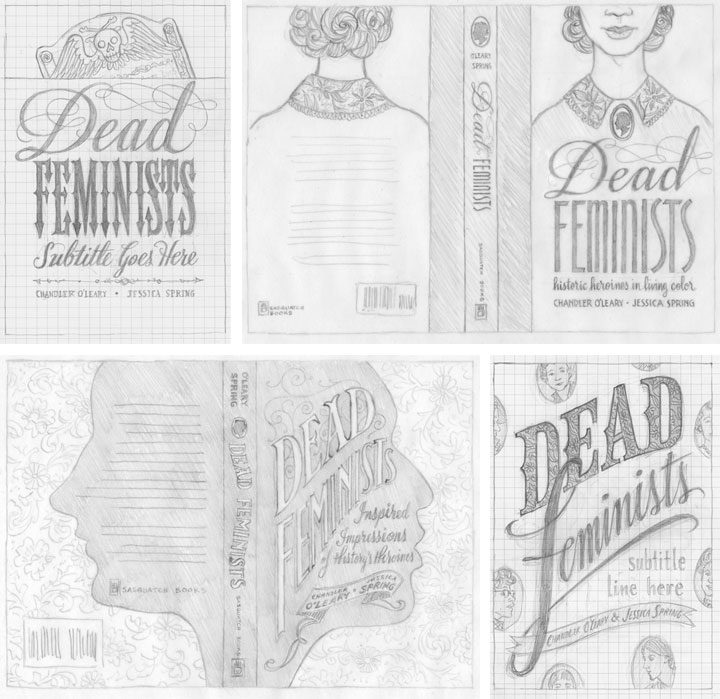
Jessica and I started brainstorming and sketching cover ideas way back in November of last year; above are a few of the concepts we sent along. We had a lot of feedback that large, legible type was key, so that was a good starting point. We also had to be really careful about the hierarchy of type. We had to make sure “Feminists” caught the eye first, followed by “Dead,” then the subhead, then the byline, etc. Later, when we got the happy news that Jill Lepore would be writing the foreword to our book, that added another level to our type hierarchy. In addition to all of this, we wanted to give the Sasquatch team plenty of options, so we tried to make each concept distinct from the others. Right away the clear favorite was the one in the lower right corner, so that was the concept we took to the next level.
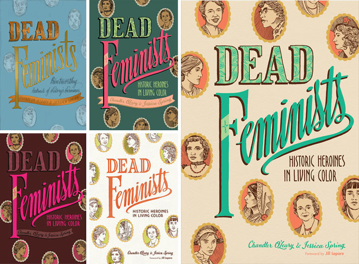
Then came a long parade of versions in color. We worked closely with Sasquatch’s art director and lead designer, Anna Goldstein, to try to catch that elusive unicorn that is a cover that works. I’d mock something up and send it to Anna; she’d mock something else up and send it back to us; rinse and repeat. Each time it felt like we were getting closer, but every time it felt like something subtle was missing. So we made a million little tweaks, to color, to lettering, to texture, to contrast, to composition, to kerning, etc. Each time one of us would have what seemed like a great idea, and each time the result was lacking somehow. I don’t even remember how long we stayed in this holding pattern. (Normally I keep all the iterations of a design carefully numbered in chronological order, but at some point I just lost track. I gave up and labeled that file “VERSION WHATEVER.” It makes me laugh every time I see it.) Everybody was frustrated: the elusive unicorn had transformed into the Holy Grail.
And then I think we all finally conceded that small tweaks were never going to get us there. We needed something to change in a big way, and we needed to scrap much of the work we’d done thus far. This is a really hard thing to admit to oneself—that maybe one’s brilliant idea wasn’t so brilliant after all. But the finished product is more important than anybody’s ego, and no matter how good a kernal of an idea might be, it’s not worth bringing down the whole design over it.
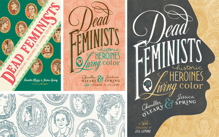
So we quite literally went back to the drawing board. I knocked together a few more pencil sketches, and we asked the whole team again what elements they thought were essential. A lot of people responded to the little cameo portraits of the various historical figures, so we came up with the idea to use them as more of an overall pattern (that’s the green cover on the left, above). Then our editors gave us the feedback that maybe the cover should be more like the style of our broadsides, with bold lettering in many different styles. Anna added the suggestion of making those cameo portraits more of a faint pattern than a major focal point, and then the lightbulb seemed to go on at last. That peach version in the center, I think, was what I put together next. Jessica and I could see that the most recent advice was on the right track, but we were still worried it wouldn’t stand out when seen on a display shelf with a hundred other books. Our editor asked us if we had any ideas for how to make it pop, and in wild desperation I fished out one of our earliest pencil sketches (above), the one with the face in silhouette, and gave it another look. What didn’t seem to work in sketch form suddenly felt like the missing ingredient when paired with the cameo pattern and the bold lettering. We sent a version back to Anna, and she gave it that antique texture and the gold-grey-and-teal color scheme you see here. And that was it—it was like she’d flipped a switch, and voilà: finished cover.
Over the course of eight years of printing our broadsides, Jessica and I had grown accustomed to just doing whatever we want in terms of design and content. With small editions to print, and nobody to please but ourselves, the stakes were low—and there was always plenty of room for experimentation. This book has been an entirely different animal, and I think designing the cover has been a perfect metaphor for the whole process. Writing a 40,000-word manuscript about history and feminism was never something we thought we could do, but with the incredible help of our editors, we got there. Likewise, designing the container for that content was a massive group effort—so major props and big thanks to Anna for sticking with us. Getting to the finish line required stepping way beyond our comfort zone—and more importantly, it took the whole team. We couldn’t have done it alone, and that’s a good thing, because both book and cover are the better for it.
Save
February 22nd, 2016
When it came time for us to find our next Dead Feminist, our thoughts turned to our own mirrors. Like every woman in our pop-culture-driven world, Jessica and I are bombarded with imagery and messages that urge us to scrutinize and criticize our own appearance. Unsurprisingly, we are taught to find ourselves lacking in one way or many, and to compare ourselves with an impossible ideal.
We were a little surprised to find courage and consolation in Ancient Greece, where they were all about the impossible ideal. Yet if you sift through the lofty architectural theory, stylized scenes and tales of the immortals, you’ll find a honey-tongued poet who speaks the plain truth: Sappho.
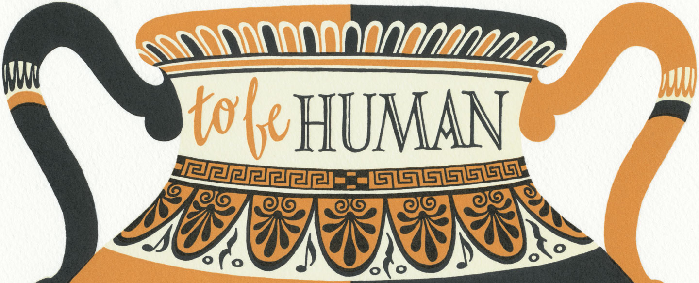
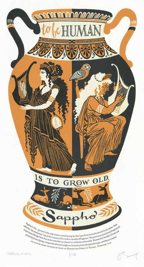
To be human is to grow old.

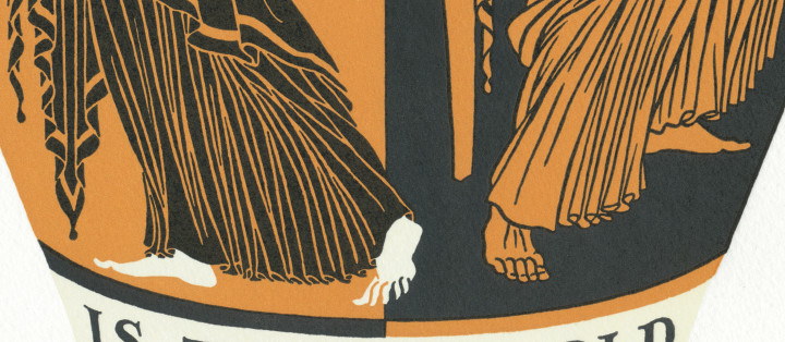
Our 23rd broadside, Age Before Beauty, reaches further back in time than we ever have before—to the 6th century BCE. As you can clearly see, the illustration is styled after the designs and motifs of ancient Greek pottery, right down to the amphora handles.
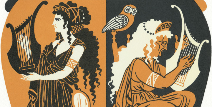
Yet even though she lived and worked thousands of years ago, Sappho’s words ring true as if they were written yesterday. We especially loved her self-reflection in the poem we chose, and the way she managed to view her aging body with kindness. It brought to mind, for me, an image of dual goddesses who are really two faces of the same woman—like the Maiden and Crone archetypes so common in other pre-Christian cultures.
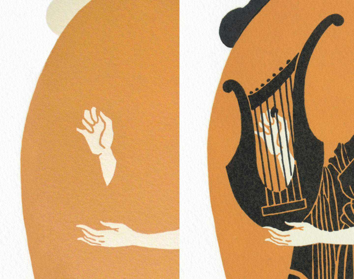
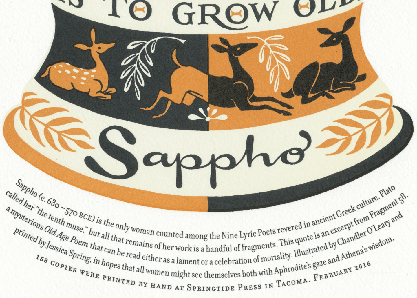
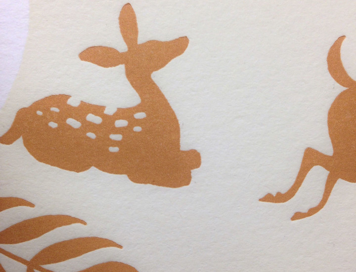
Like the art of ancient Greece, the illustration is chock full of allegorical imagery. For instance, young Sappho carries Aphrodite’s mirror, while Athena’s wise owl looks over her aged self. Both figures play a seven-stringed lyre: Sappho was a lyrical poet, which means her poetry was designed to be performed to music. (Incidentally, some scholars also credit Sappho with the invention of the plectrum, a tool similar to a guitar pick that was used to pluck the lyre’s strings.) Finally, the band of dancing deer at the base references Josephine Balmer’s recent translation of Sappho’s Old Age Poem.
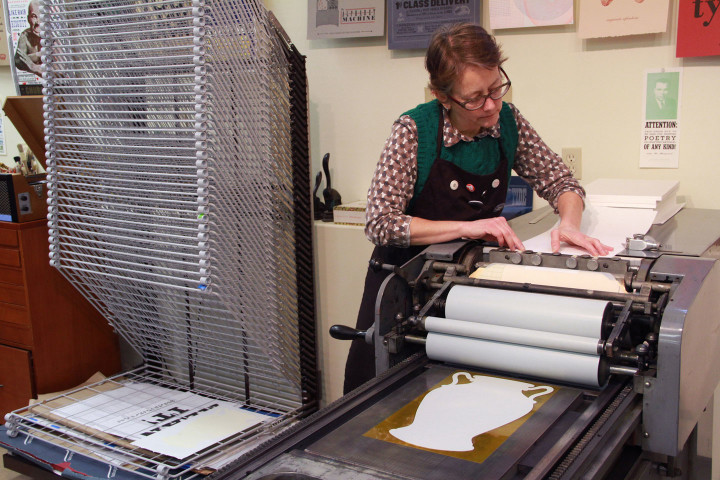
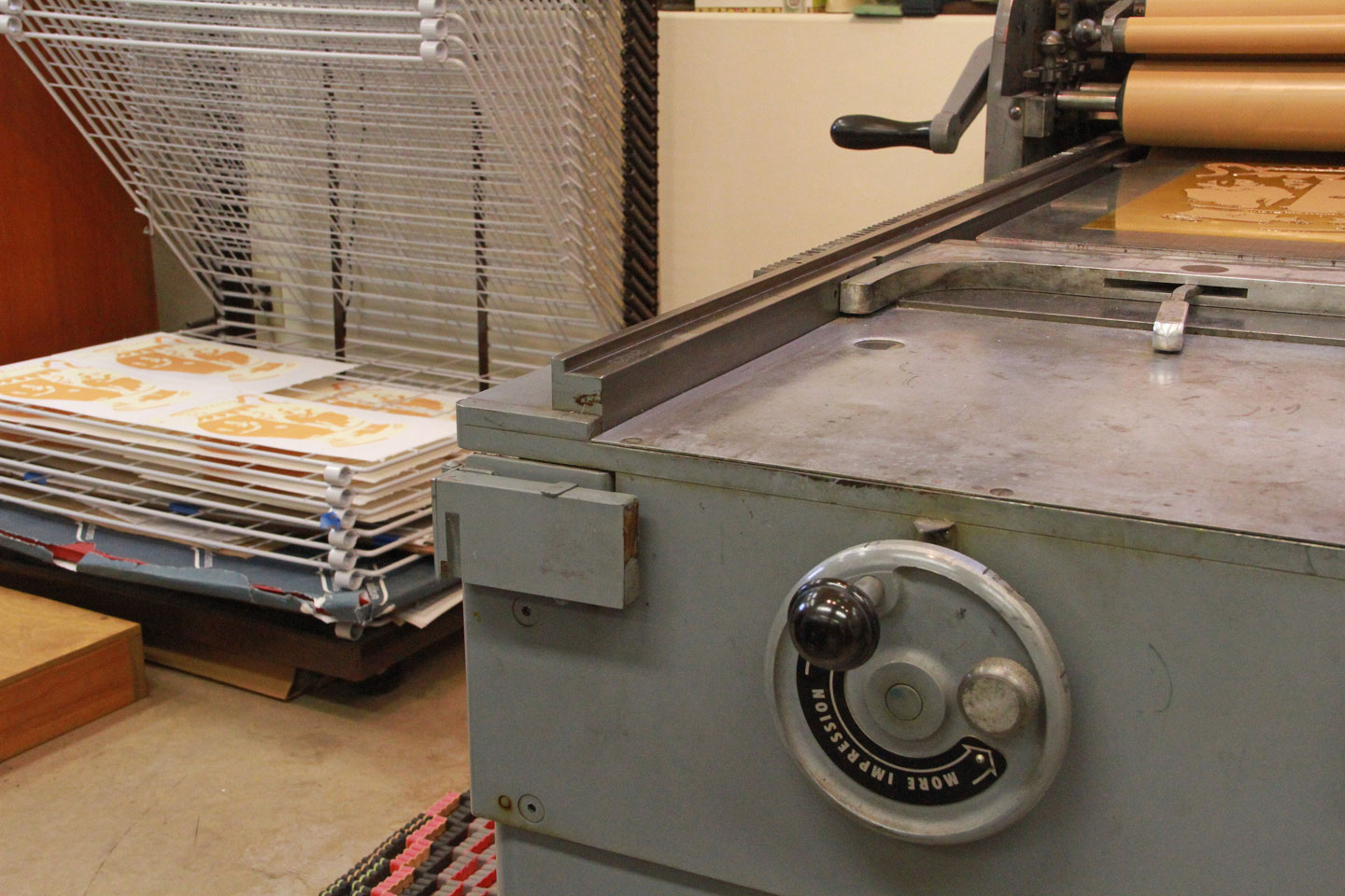
Compared to our previous broadsides, the composition and color scheme of this piece are fairly simple. The printing, on the other hand, was not. All those curves made it hard to line up the plates, and we had huge floods of color paired with delicate lines and text. To help her with the ink coverage and add just a tiny bit more pop to the color, Jessica ran the vase shape in a run of subtle cream first.

The cream pass helped with the super-tricky registration of the black and terracotta, as well.
All that fiddly and difficult technical stuff made the finished product that much sweeter. We’re pleased as punch about the results—we hope you will be, too.

To help all women and girls see themselves in a more positive light, we are donating a portion of our proceeds to About Face. Founded in 1995, About Face works to improve girls’ and women’s self-esteem and body image by helping them understand and resist harmful media messages.
• • • • • • • • • • • • • • • • • • • • • • • • • • • • • • • • • • • • • • • • • • • • • • • • • • • • • • • • • • • •
Age Before Beauty: No. 23 in the Dead Feminists series
Edition size: 158 prints
Poster size: 10 x 18 inches
Printed on an antique Vandercook Universal One press, on archival, 100% rag (cotton) paper. Each piece is numbered and signed by both artists.
Colophon reads:
Sappho (c. 630 – 570 BCE) is the only woman counted among the Nine Lyric Poets revered in ancient Greek culture. Plato called her “the tenth muse,” but all that remains of her work is a handful of fragments. This quote is an excerpt from Fragment 58, a mysterious Old Age Poem that can be read either as a lament or a celebration of mortality. Illustrated by Chandler O’Leary and printed by Jessica Spring, in hopes that all women might see themselves both with Aphrodite’s gaze and Athena’s wisdom.
Now available in our Dead Feminists web shop!
February 16th, 2016
It’s that time again—we’re inking and printing up a storm right now, because we’re just about ready to introduce you to our newest Dead Feminist!
We hope you’ll like her as much as we do—after getting to know her history, we feel like she’s become something of a deer friend.
(Sorry, I can never resist a terrible pun.)

She’s already made her first (and second, and third) impression with us, and oh so soon she’ll do the same for you. Stay tuned!
February 8th, 2016
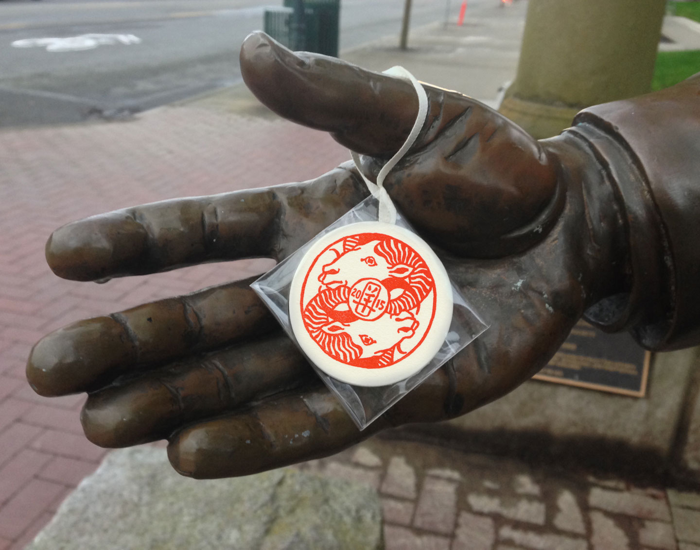
Well, now that it’s been a whole year since I first showed you these, and the secret no longer needs keeping, I can tell you about what I did today. Today is the start of the lunar new year, and here in Tacoma we have a tradition that proves how wonderful this town is, year after year. The tradition is called “Monkeyshines,” a public treasure hunt through the city that falls on (or around) the first day of Chinese new year each year. The name comes from the Year of the Monkey on the Chinese zodiac cycle, exactly twelve years ago, when an anonymous artist going by the name “Ms. Monkey” created a few hundred colorful hand-blown glass floats, each one stamped with a monkey design, and hid them all over the city. Anyone who found one could take it home with them, and since only Ms. Monkey’s inner circle knew about it, it came as a complete surprise to those lucky few who found treasure that year. Over the years the tradition has grown and the secret has spread like wildfire, with more and more beautiful pieces of glass art being hidden around Tacoma with each cycle of the zodiac. Since the only rule is “take only one,” many people have taken to rehiding the ones they find, or contributing their own handmade treasures to the hunt. Not that it’s easy to find multiple Monkeyshines—or even one! Even now that there are thousands of treasures hidden each year, it’s still like finding the proverbial needle in the haystack. I’d never been lucky myself, coming up empty-handed year after year.
2015, the Year of the Ram, completed the 12-year zodiac cycle that started with that first treasure hunt. Ms. Monkey approached me (no, I won’t tell you who she is!) and asked if I would contribute some “Monkeyshines” of my own to the cause. I jumped at the chance: even though I’d never found a glass float myself, I loved the hunt, and by then I’d amassed a mental database of potential hidey-holes. By then I was more excited about the prospect of hiding treasure than of finding it. Besides, even though my work has been moving away from letterpress printing in recent years, it was fun to do a printing project again.
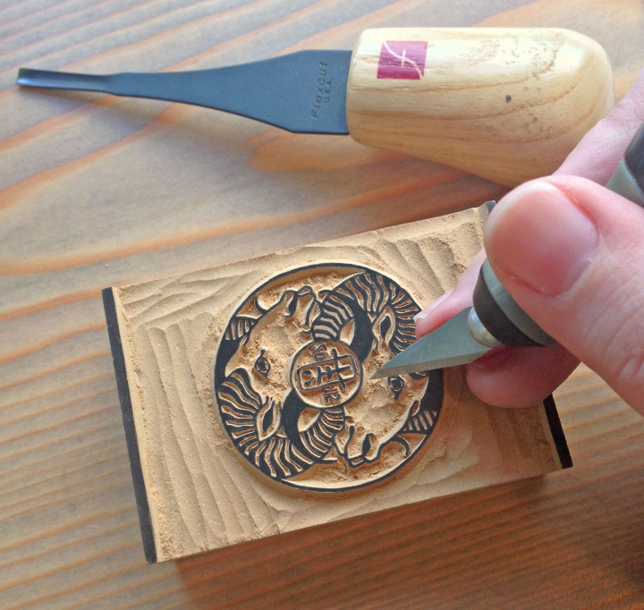
So I whipped up a little medallion design, and hand-carved it in linoleum.
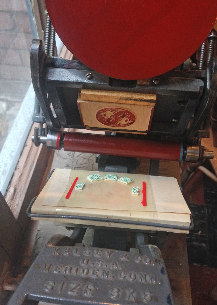
Then I threw it onto my tiny tabletop press, and set to work.
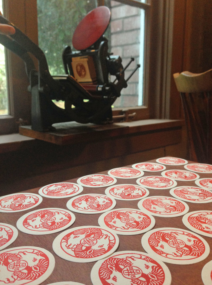
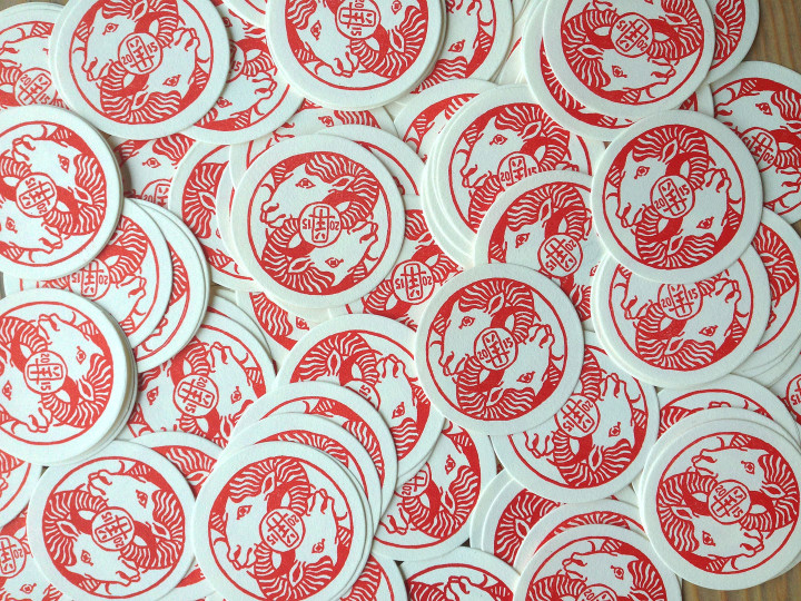
I printed close to 500 medallions (until I ran out of paper and the block started to break down!), and then hand-assembled them in the style of my other letterpress ornaments.

And then came the fun part: hiding them all over Tacoma.
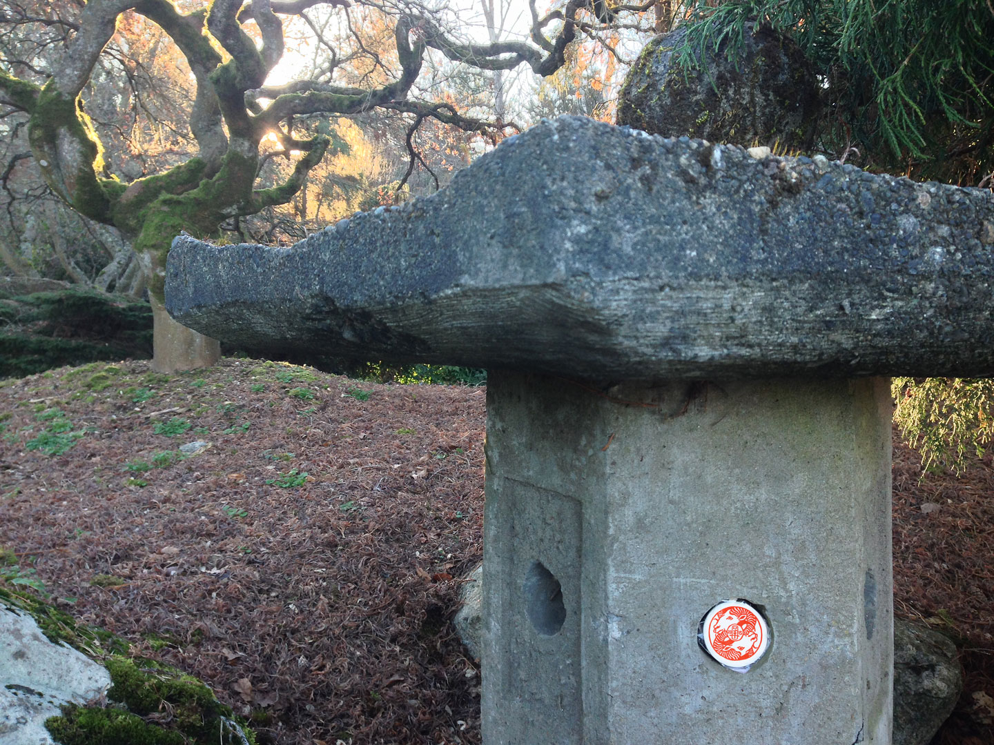
Since there were so many medallions, and I had to go out of town over Chinese new year, I enlisted friends to help, and staggered my own distribution over several weeks. Together we managed to canvass almost the entire city map, hitting both well-traveled areas and less-visited neighborhoods.
The hiding was, indeed, the best part. I loved walking inconspicuously at weird hours, my hands stuffed in my pockets and posing as a searcher, waiting until the coast was clear to pop another medallion into one of Tacoma’s nooks and crannies. Sometimes I’d hang around and wait nearby until someone came by and discovered what I’d left behind. It was a thrill every time.
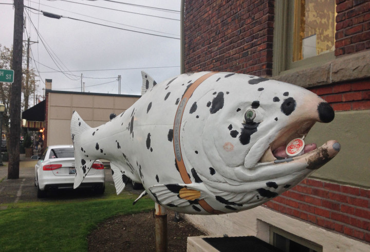
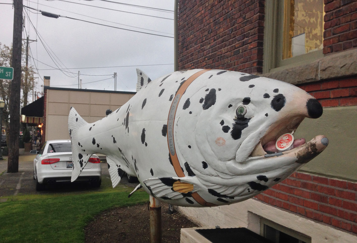
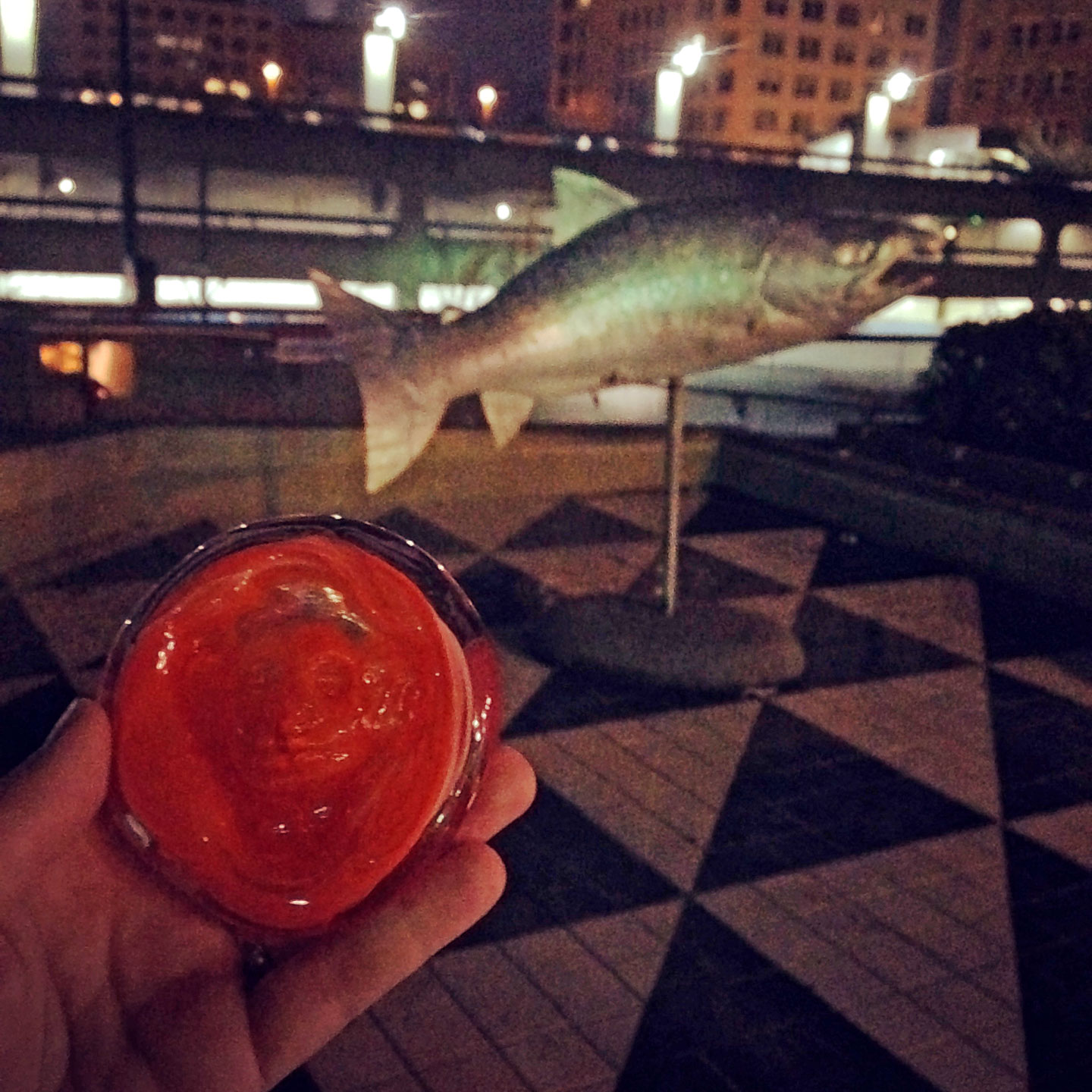
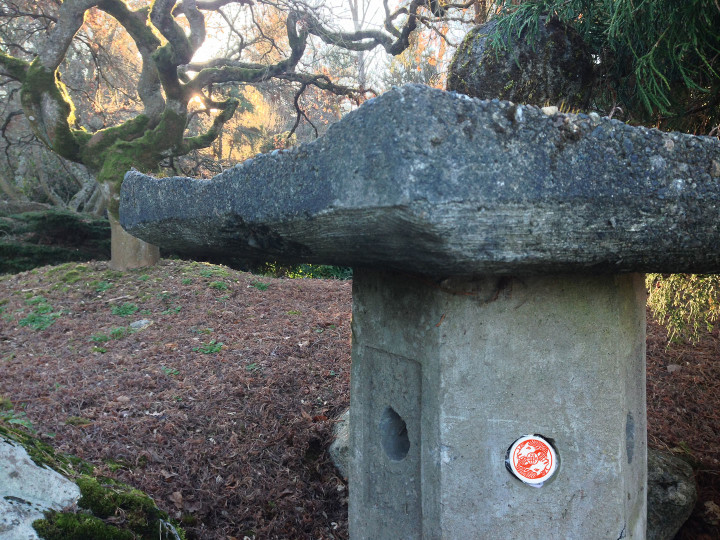
I saved this pictured for last because it echoes this year’s odyssey, when my chance finally came. Fast forward to this morning, and it’s the Year of the Monkey all over again. Since it’s now become a tradition as ingrained as Christmas, there was no question that I’d resume the hunt. A friend came to pick me up at 4:30 am, and after a quick swig of coffee, we set out.

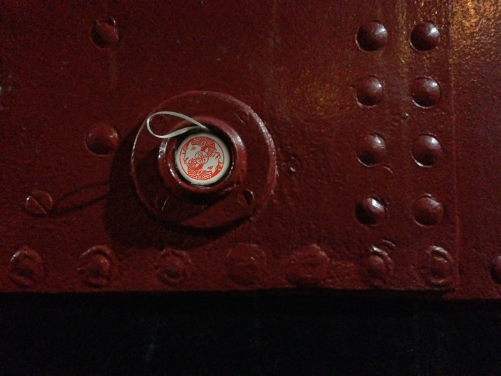
And in less than an hour, in my eighth year of searching, I finally found my first glass Monkeyshine! Just like the previous picture, it was in the mouth of a fish sculpture—this one in the middle of a fountain downtown. Luckily for me, there was only about an inch of water in the fountain, so all I had to do was climb in and step right up. And yes, if the fountain had been full of water, I would have gone in anyway, 35-degree weather be darned. I wouldn’t have been the only one—tales of people braving murky koi ponds and polar-plunging into the Bay have become the stuff of legend around here. For some things it’s worth getting soaked and dirty!
My friend is still searching for his Monkeyshine—we spent the rest of the morning hunting on his behalf, but even if he doesn’t find one this year, we made sure to pay it forward by hiding a few small monkey-themed treasures ourselves.

So now I’m back home, refreshed after a nap and a hot cuppa tea, admiring the Monkeyshine that’s serendipitously in my favorite color. SO many thanks to Ms. Monkey, all her fellow ‘Shiners, all the friends and friendly strangers I hunted with this morning, and my art-loving city. Thank you for making this happen year after year, for making my year so far, and for bringing us all together for a chance to play explorer in our own hometown. Gung hay fat choy!
February 4th, 2016
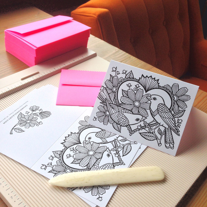
Today I am surrounded by piles of bird illustrations and hot pink envelopes, because it’s time once again for my local Valentine craft fair! My newest goodies this year are these color-your-own love notes, inspired by those adult coloring books that have been all the rage lately. I did a trial run with a little Tacoma coloring card last fall, and then you people nearly cleaned me out of them in one fell swoop! So this time I’ve done something with a slightly wider appeal, in case you don’t happen to live in my lovely town (and if you don’t, you can find these cards online in the shop).
If you are local, stop by this Saturday and see them in person. Here are the details:
Tacoma is for Lovers Valentine craft fair
Saturday, February 6, 2016
11 am to 4 pm, free!
King’s Books, 218 St. Helens Ave., Tacoma, WA
See you there!
June 11th, 2015
There’s a very big sporting event coming to my town next week—and even though I’m not a ticketholder (or even all that interested in the sport itself), the spectacle is already proving to be a big source of inspiration.
So here’s another piece of what Jessica and I are working on—look for more next week!
June 7th, 2015
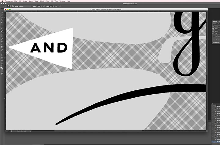
Amidst all the Kickstarter hubbub, I have another deadline to attend to: Jessica and I are releasing a new Dead Feminist broadside in a week or so. Normally I would have postponed that for a bit, at least until the Kickstarter was behind me, but we’re timing the new broadside to align with a big event. So, yeah. It’s not ideal, but the timing is out of our hands for this one.
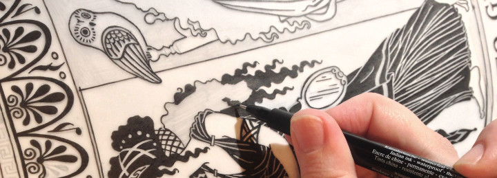
Anyway, I thought I’d show you a snippet of what we’re working on. No, the broadside won’t be in black-and-white, but every design goes through a black-and-white phase before it goes on press in living color. It’s actually a good thing to do, even if it weren’t necessary to the production process: viewing a design in shades of grey is a lot like showing it to a pair of fresh eyes. Without color to distract me, I can look at the design objectively and make one last call to make sure it’s working as a whole. And besides, the color separations for the new piece are really, really complicated (as you’ll soon see). I’ve spent two days staring at this greyscale version of the design in Photoshop, checking and rechecking that I did it right and all the layers line up correctly. I don’t want Jessica to be in for any nasty surprises when this thing goes on press tomorrow.
Wish us luck! More soon.
May 26th, 2015
I tell you what, this has been the year of long-term projects coming to fruition. There have been so many things I’ve had to sit on for months, and it feels so good to finally be able to share them with you! And the one pictured above might just be my favorite of all.
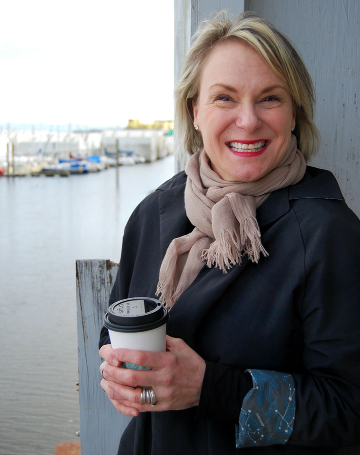
Photo by Summer Hess Briggs
This is my friend Sonja Silver. She’s a dyed-in-the-wool Tacoman, and has owned a women’s clothing boutique here for nearly two decades. Over the years, she’s watched women of all shapes and sizes come through her shop, and has developed a keen eye for clothing that’s both well-made and well-designed. But she had a gap in her business: for years, her customers had been asking for coats and jackets, and Sonja had never been happy with what was available in the marketplace.
So she has spent the last year designing her own.
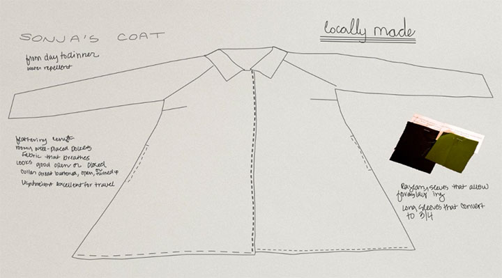
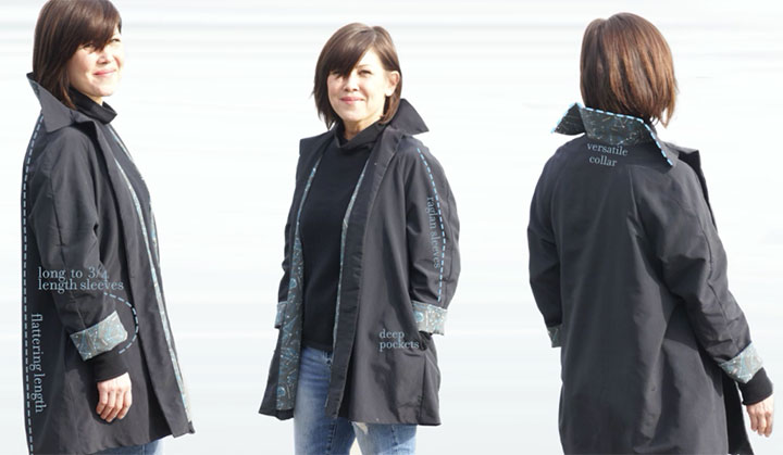
It turned out to be quite the challenge—Sonja was inspired by the classic swing coats and car coats of the 1950s, but wanted the hard-wearing functionality of an outdoorsy shell. Basically, her goal was to make something that was both a workhorse—and a thoroughbred. After all, we live in the Pacific Northwest—we wear jackets pretty much all the time here, in all weather.
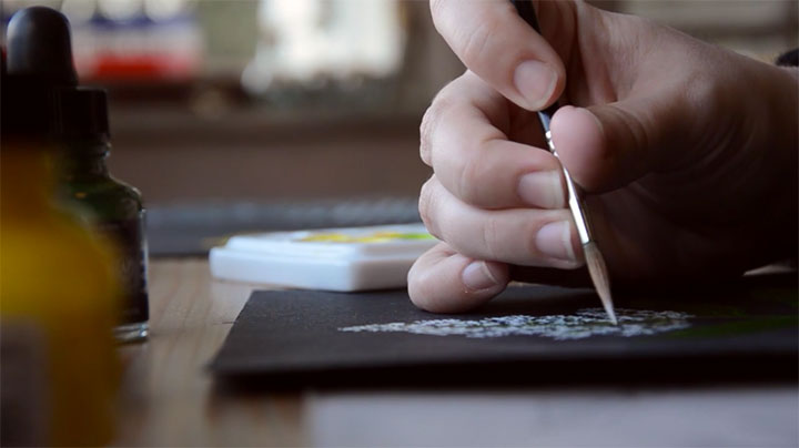
Here’s where I come in. Sonja called me up one day last spring, and told me about her coat project. She said she wanted the coat to be lined with fabric that was as unique as the design of the coat itself, and asked me if I’d be interested in illustrating a pattern repeat for her.
Needless to say, I didn’t so much say yes as squeal it.
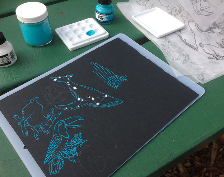
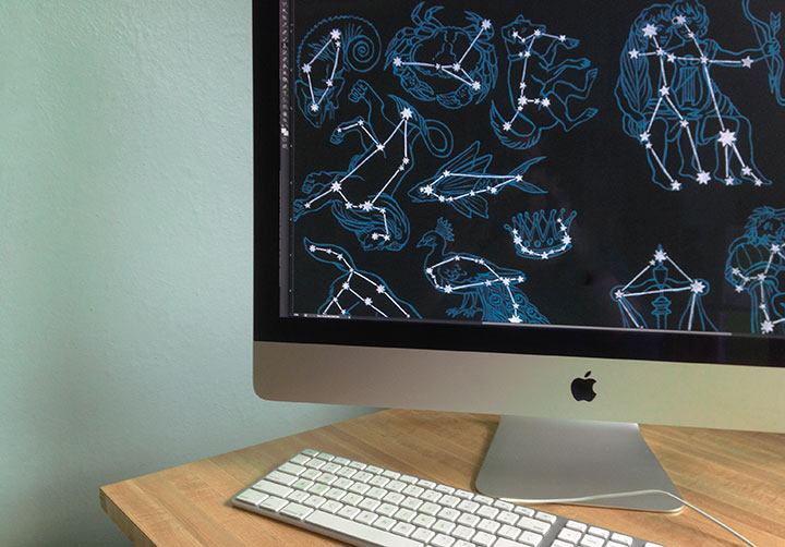
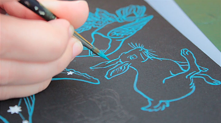
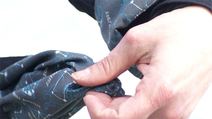
Sonja had the idea for a constellation pattern—something that could be both playful and sophisticated at the same time. We both wanted the pattern to be hand-painted, to help transform the coat into a piece of wearable art.
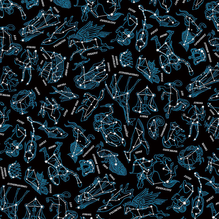
Here’s the finished pattern. There are 27 different constellations represented, including all 12 signs of the zodiac and some perennial favorites from the skies in both the northern and southern hemispheres.
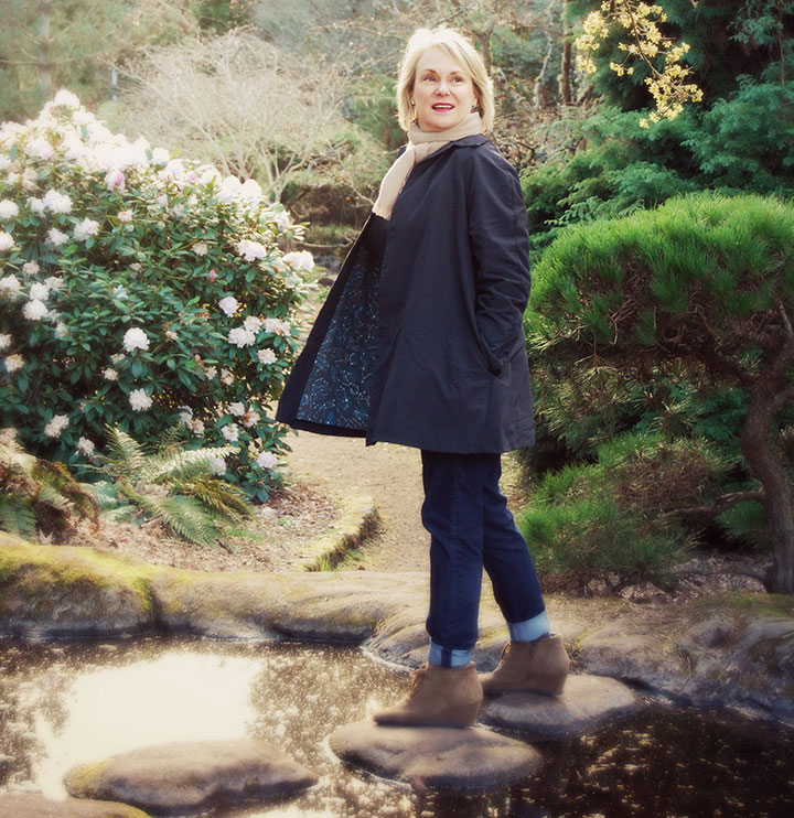
Photo by Summer Hess Briggs
What I love best, though, is seeing the pattern “in action,” doing its job as part of the garment. While I was painting fish and birds and Greek gods, Sonja was hard at work on creating a working prototype of the coat. She went through many different test fabrics and design changes, trying the fit on women of all shapes and sizes to make the design as universal and versatile as possible.
Photos by Kathy Chakerian
And now, at long last, it’s ready for production!
Sonja has launched a Kickstarter campaign to raise the necessary funds to produce the coat, and it’s officially live and up and running. The campaign will run until June 16, and we’re already 1/4 of the way there!
This is the third Kickstarter campaign I’ve been a part of (you can read about the other two successful projects here and here)—for those of you who might not know how it works, a campaign is run like an NPR pledge drive, with tangible rewards offered in exchange for each funding level. So this is not a donation platform—it’s an exchange of goods for capital. We must make our funding goal by the time the clock runs out, or we don’t get any of the funding already pledged. It’s an all-or-nothing thing, and that ensures that the project will be done right, with enough capital to get the job done. And to make sure she doesn’t get overwhelmed by too many orders all at once, Sonja has limited this first production run to 200 coats.
That reminds me: a note about the prototype featured in the Kickstarter campaign. The fabric used for the lining was just a test fabric we had made in a small quantity when we were looking for manufacturers. We weren’t happy with the black background of that fabric, as it turned out a little on the light side. So while you’ll see it in the Kickstarter video, we ended up going with a different manufacturer for the final lining fabric.
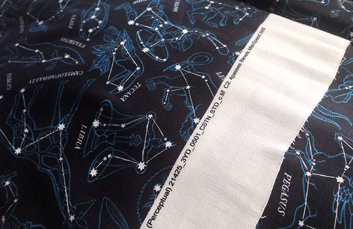
Here’s the real thing—the actual lining fabric that will be used in the finished run of coats. As you can see, the black is a true black, and the pattern pops from the background the way it’s intended to.
The best part of Sonja’s vision here is that this project has been brought about almost entirely by local women. From apparel design to illustration to construction to marketing, it’s local women who have made this thing happen. In an age where the vast majority of all garments are made overseas, in sweatshop conditions, that’s really saying something. Sonja’s coat is made with fabric sourced and printed in the United States, and the garment itself is pieced and sewn right here in Tacoma. I love being able to say that—I love being able to put our beliefs into action in this way.
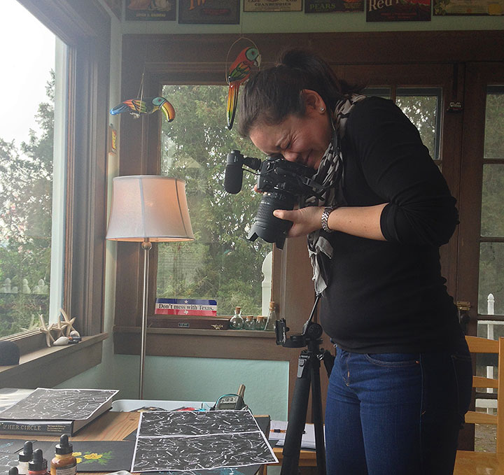
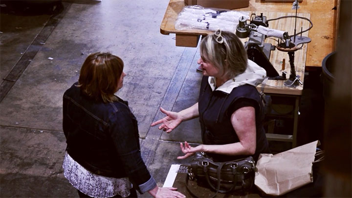
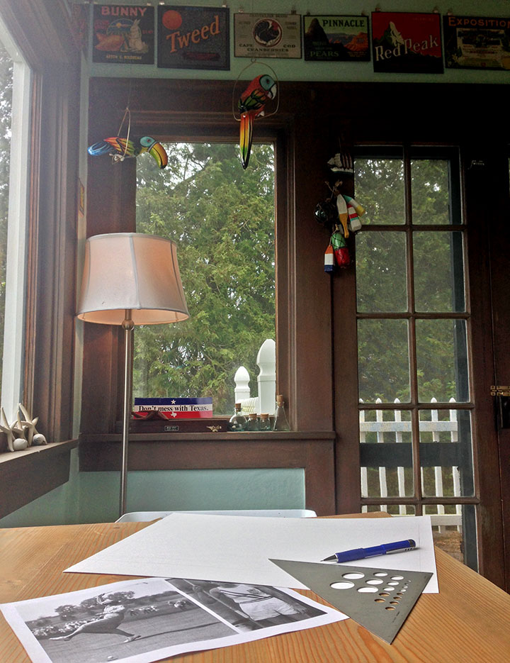
The Kickstarter campaign even has a fantastic video made by a local gal—the lovely Emilie Firn (shown here snapping photos of my process materials in my studio).
Photo by Summer Hess Briggs
And last but not least, one other local gal has had a “hand” in the project: Sonja’s grandmother Lena, who was the inspiration for the coat. Sonja says her goal was to make a coat that had the same attributes Lena had: she’s hardworking, she’s beautiful, and she’s got your back.

So if you’re looking for your next go-to jacket, or you have a woman in your life who is, visit our Kickstarter campaign and make a pledge! And if a coat isn’t your thing, there are many other pledge levels and reward goodies to choose from. Even a pledge of $1 helps move the project forward and gives us better exposure online (if all my social media followers and email newsletter subscribers pledged $1, we’d instantly reach the halfway point of our goal!)—and of course, helping spread the word through your social media platforms will also help us meet our goal. But most of all, we just can’t wait to see women wearing the coat, out there in the real world. So take a gander at the campaign and snag your coat here!
Thank you for your support!
May 21st, 2015
This image has had a bit of a resurgence on social media lately, thanks to a recent TED talk about flag design. All of a sudden I was getting pinged by Twitter notifications by folks holding up my flag as an example of “good” design (thanks, guys!)—and it made me realize that not only had I never gotten around to blogging about this project, but I also should probably do a little primer on the basics of flag design.
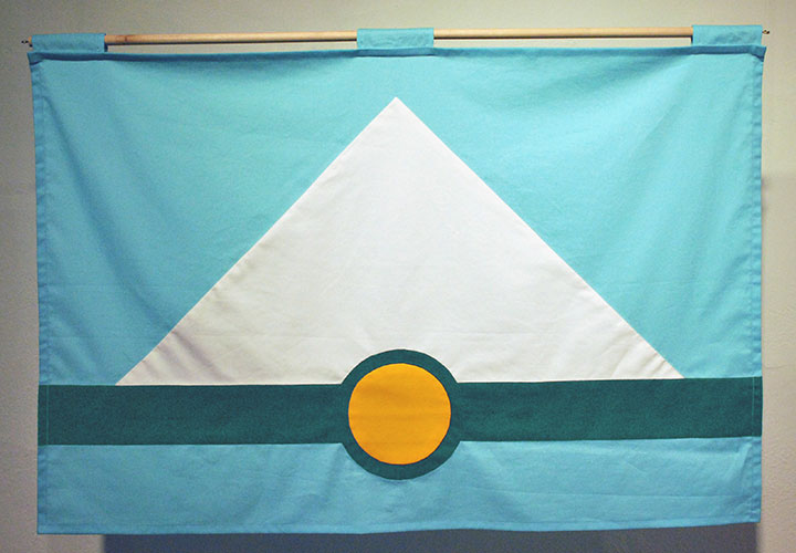
In a nutshell, I developed this flag design for a 2012 exhibition about vexillology (the study of flags) that I was invited to be a part of. It was held at Tacoma’s Fulcrum Gallery, and was titled Union Tac. Basically, the exhibit invited a group of local artists to propose a new city flag, and display their designs at the gallery. After I designed my flag, I hand-sewed this prototype (Betsy Ross-style!) for the exhibition.
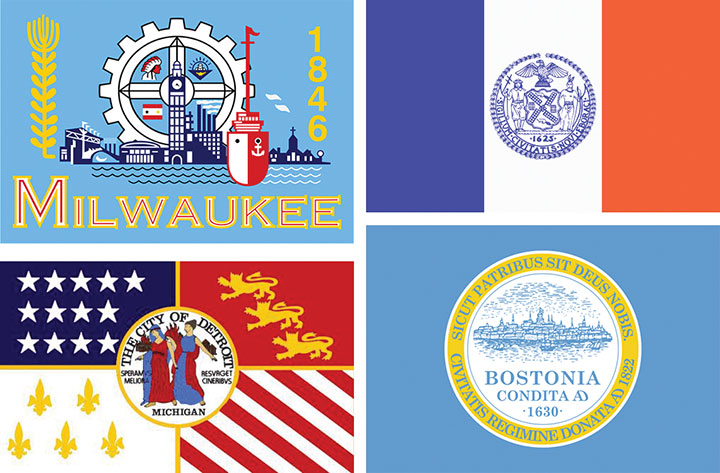
The thing about flag design is that it’s much more difficult than it seems to be at first glance—and at least in the case of city flags, most people are doing it wrong. When it comes to city flags, mostly what you see are complex designs that contain a city’s official seal, or some sort of text paired with an image, or some weird combination of color fields and complex graphics that are unreadable at a small scale or large distance. These are all examples of real city flags (clockwise from top left: Milwaukee, New York City, Boston, Detroit), designs that might work under other circumstances (the city seals, for instance), but as flags that are just a mess.
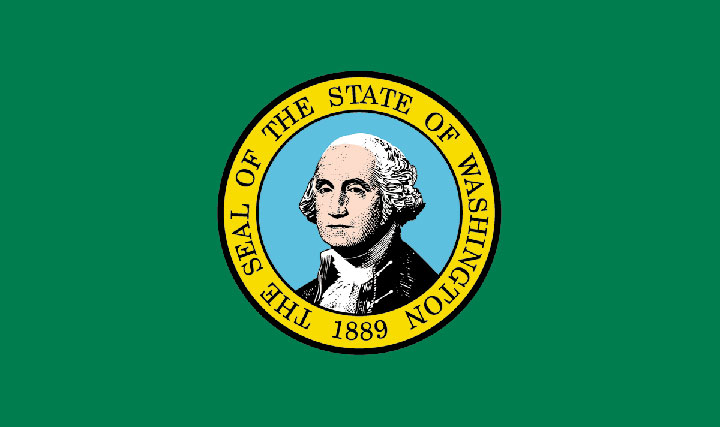
The state flag for my own state of Washington commits the same cardinal sin as the Boston flag and so many others: whoever designed it just plonked the Great Seal onto a colored field and called it good. But look at all that detail in Washington’s portrait—there’s no way that thing is going to be readable at a distance. And one of the biggest mistakes here is the use of type (and as a lettering artist who loves type more than anything, this is hard for me to say!). One of the biggest rules of vexillology: no text. None. The flag should be readable and recognizable by anybody, regardless of literacy level or native language. Even a two-year old can recognize their country’s flag (or for that matter, a famous logo or an illustrated icon); they shouldn’t have to be able to read text to do so.
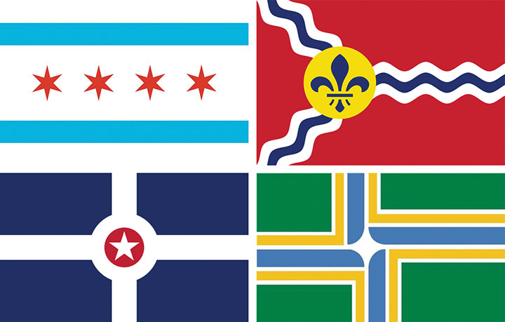
Take a look at these flags instead (clockwise from top left: Chicago, St. Louis, Portland, OR and Indianapolis)—this is how it’s done. Each of these flags is incredibly simple, readable and recognizable at any size or distance, and beautifully eye-catching. Each flag uses just a few colors (at most 3 colors, plus white), and each tells some sort of story that links to the city in question. The blue stripes in the Chicago flag, for instance, represent the bodies of water that define the city (Lake Michigan and the Chicago River). The fleur de lis in the St. Louis flag is a nod to the city’s French heritage. Indianapolis’s flag is basically a map of the city (how cool is that?), while Portland’s highlights the city’s location at the confluence of two rivers. These flags are all vastly different from one another, but they all use the same simple language.

So this is what was running through my head when I set about imagining Tacoma’s flag. I wanted to tell the story of our city and its place in the Northwest—but do so as minimally as possible. As you can see, there was a lot of rearranging and redrafting and re-simplifying—again and again. I’m normally the type of artist who refines a piece by adding to it—so you can imagine how difficult it was for me to keep stripping away at this one.
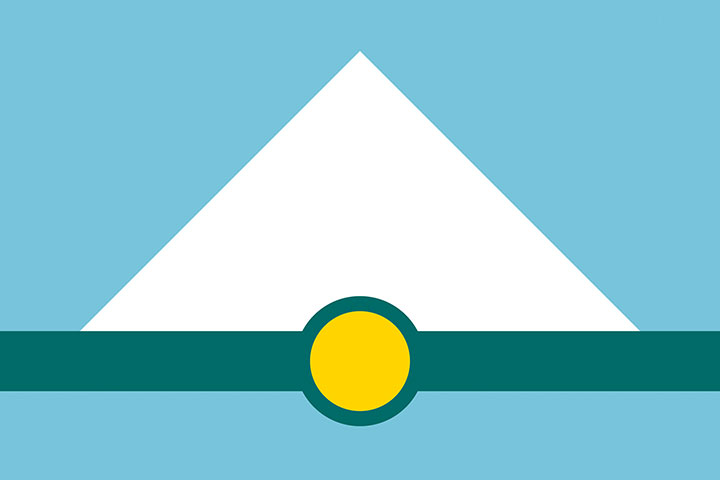
Here’s my finished flag design. The white triangle represents Mt. Rainier, against a blue field of sky above and a matching blue stripe below that stands for the waters of Puget Sound and Commencement Bay. The dark green stripe represents two things: the natural landforms of islands and trees that are such iconic parts of our landscape; and the continuum of industry upon which our city was founded. The gold circle represents both Tacoma’s location at the base of Mt. Rainier, and its origins as the terminus of the Northern Pacific Railroad (the circle resembles the symbol for a railroad stop). Finally, the colors were chosen not only for their correspondence to their real-world counterparts (trees, snow, sky, etc.), but also because they echo the colors used on the Washington state flag.
So that’s it. I still have my hand-sewn prototype carefully folded and tucked away, but I had kind of forgotten about the project after the exhibition ended. Many thanks to everyone on Twitter who helped revive the design and give it new life online. Who knows—maybe we’ll actually get to see it on a city flagpole some day.
May 14th, 2015
Jessica and I are working on the next Dead Feminist broadside right now—our process begins with choosing a quote and hammering out a rough concept, and then I do a bunch of thumbnail sketches to puzzle out the design. Usually, by the time I start lettering in pencil, I have a really clear picture in my head of what the finished product should look like. Even so—even 22 broadsides later—I’m still intimidated by the proverbial blank page. That’s why all those thumbnail sketches come in handy: they help illuminate the next step, and the next, and the next. And if I’m really lucky, I’ll be so wrapped up in blocking out the composition that I’ll forget to worry about whether or not the design will be any good.
Fingers crossed…time to start in.