Blog
February 12th, 2013
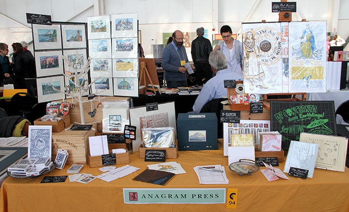
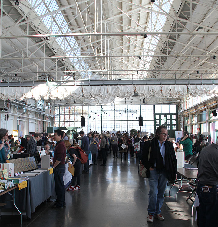
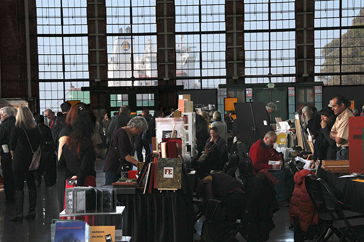
Right now I’m in California, manning my table at the Codex Book Fair. But I have to say, it’s a little hard to concentrate.

I mean, not only am I surrounded by incredible work by a couple hundred artists—but just look at this space! We’re in a new venue this year, and it is absolutely spectacular.

Plus, we’re literally right on the water (really—the pavilion sits right on a pier), so as if all the artwork here weren’t distraction enough, all anyone has to do is just gaze out the window.
Now, it’s a good thing my studio isn’t in a place like this—I don’t think I’d ever get any work done!
January 12th, 2013

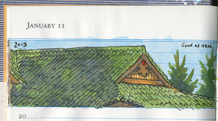
This weekend has given us that rarest of Northwest treats: winter sunshine. When that happens it’s also usually too cold to stand outside and draw, but this time it was worth the frozen fingertips to mark the occasion in my new daily book. That’s because the restoration of one of my favorite Tacoma landmarks is finally complete.

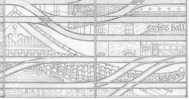
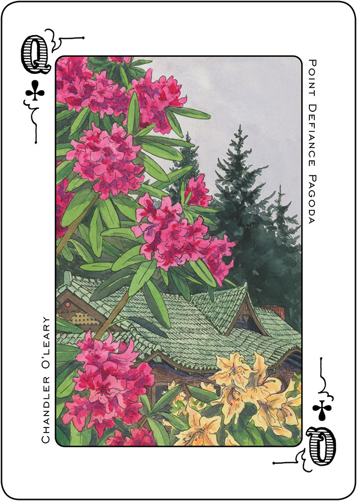
The Point Defiance Pagoda is one of the jewels in Tacoma’s crown. Built ninety-nine years ago, it began as a streetcar station and now stands as the centerpiece of our largest city park. It’s also a recurring character in my work—besides being iconic, it’s awfully fun to draw.

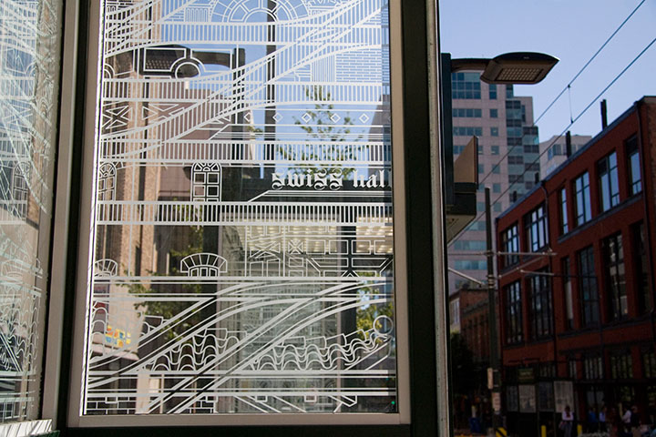
Detail of Continuum
It’s easy to forget how delicate our historic structures are, however. While I was working on this very portion of my Link Light Rail station design, I got word that the building was suddenly on the verge of ruin. Some kid had intentionally set fire to the pagoda—a few minutes of destructive boredom, and a hundred years went up in flames.
It was heartbreaking to hear the tales of Metro Parks officials, who had to watch firefighters toss the century-old ceramic roof tiles to the concrete ground to reach the burning beams inside.

In a way, though, maybe it’s a good thing it was the pagoda that burned, versus a lesser-known historic building. The public rallied, and restoration began almost immediately. Seven thousand roof tiles were hand-cleaned and reattached, and all fourteen of the original windows were salvaged. The restoration also allowed for the reintroduction or improvement of elements that had been remodeled away over the years—like the planting circle out front, or lighting that highlights the ornate roof beams inside (replacing the 1960s-era sconces that had been glommed on).

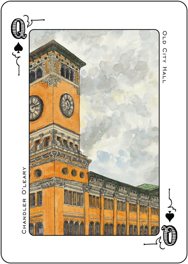
One of my illustrations for the Tacoma Playing Cards—you can find the original painting here
And now it’s as if the fire never happened. More than that—at today’s grand reopening celebration I got a good glimpse of its original glory. Somehow I couldn’t quite repress the feeling that a streetcar might come around the corner at any moment.
My favorite part is that I no longer have to rely solely on a deck of cards for good memories of the pagoda. Now I can resume my visits to the real thing—sketchbook in hand, as always.
December 4th, 2012

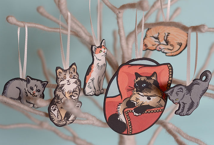
Photo by Laurie Cinotto
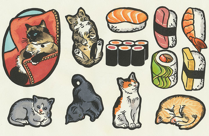
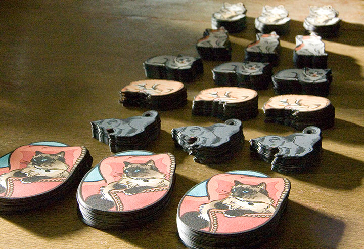
Right now my little cottage-industry factory is churning out Christmas—starting with this year’s letterpress ornament collection. This is the second year I’ve made letterpress ornaments, and I have been dying to show you this year’s crop.
Thankfully, I can finally let the…ahem…cat out of the bag.

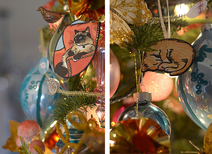
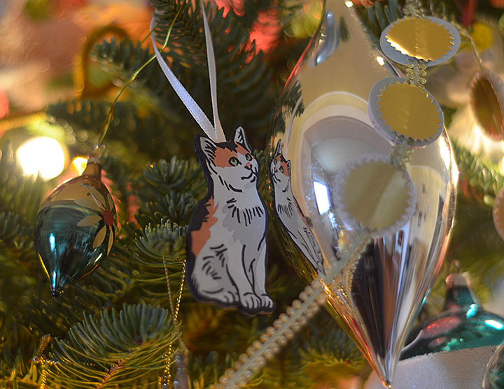
Look at Laurie’s amazing tree! She is the queen of holiday decorating.
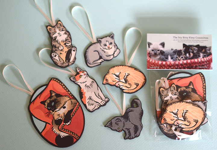
There are two sets of ornaments this year, and for one of them I collaborated with my friend Laurie Cinotto, the fabulous fine-craft genius and kitty wrangler behind the insanely wonderful Itty Bitty Kitty Committee. A year ago I asked her if she’d be interested in doing a set of kitty ornaments, and for months now we’ve been positively chortling over these things. (Curious fact: we make nearly identical chortle sounds.)
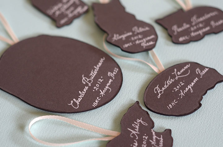
The really hard part was picking which kittens from Laurie’s nearly endless alumni and gorgeous photographs to illustrate. In the end, I settled on a few of my all-time favorites: Clovis Ashby, who is a bit of a Tacoma celebrity. Extra-pretty Victoria Anne McGillicuddy in all her calico glory. Aloysius Petrie for his “Who, me?” look. My particular friend Baxter Lamm, who now makes mischief full-time at Jessica’s house. And Pearla Dearborn, to whom my secret heart belongs forever (even though she doesn’t live with me). And watching over the flock is Laurie’s own Empress Mama cat, Charlene Butterbean.
These kitties (and Laurie’s photographs) are T-town legends, as I found out this weekend. We did a little ornament test-drive at a local craft fair, and people kept saying things like, “Hey, that’s Clovis on that tree!” and “Wait a minute—what is Charlene Butterbean doing at your table?” But whether these guys are old hat for you, or you’re a dog person who’s never heard of such a thing as kitten blogs on the Internet—well, I just dare you to tear your eyes away from Laurie’s world.
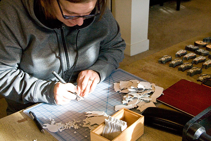
There are just 200 sets of these ornaments to go around, and each one is ridiculously handmade. To give you an idea of just how ridiculous, I thought I’d walk you through part of the process.

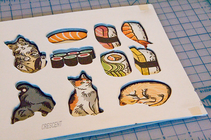
Yes, there’s sushi on that press sheet. That’s the other ornament set this year…
Y’all know my printing process pretty well by now, so I’m going to skip ahead a bit. Just FYI, these are linocuts; check out my bird prints if you’re curious about that process. But as you can see, I printed both ornament sets all at once, on one press sheet.

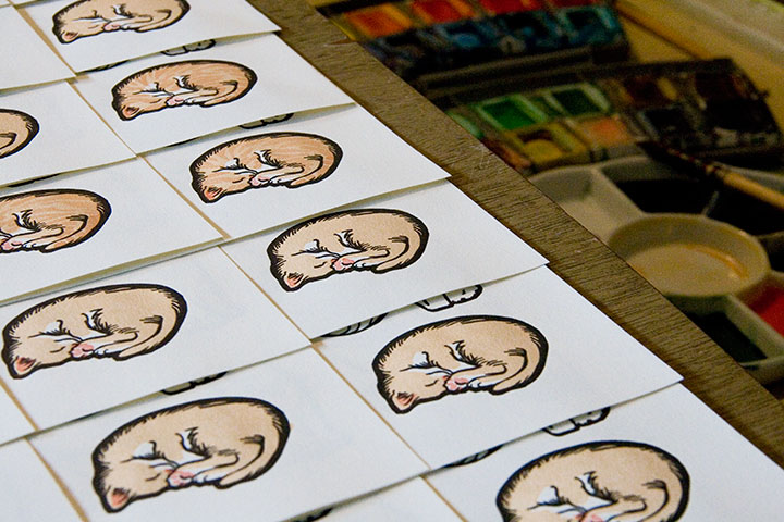
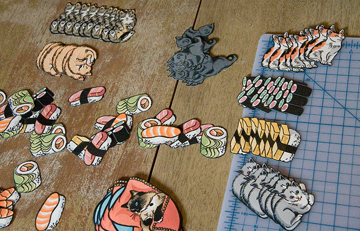
Then I went ahead with my usual hand-coloring assembly line.
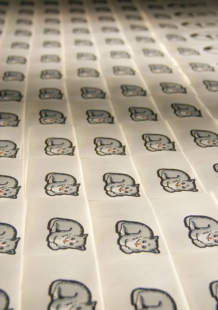
No, wait a minute. I said 200 prints, right? Well, that’s a small edition for retail goods, but when you’re hand-painting each one, 200 feels more like eleventy billion.

There, that’s more of an accurate picture.
Still, if the work stretching endlessly ahead of you to the horizon is a bunch of drawings of kittens, it’s impossible not to be happy about it, despite yourself. I know—I tested the hypothesis, and I’m still grinning like a fool.

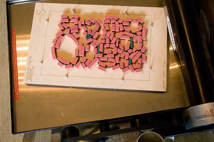
This year I added a new step to the process: rather than hand-cutting all 1200 kitties in the set by hand (ahem, Local Conditions, I’m looking at you!), I made the design simple enough that I could semi-automate part of the assembly line. I bought a hand-crank die-cutting machine, created a digital dieline (basically an industrial pattern) of my design, and sent it off to a friendly steel rule manufacturer in Kent.

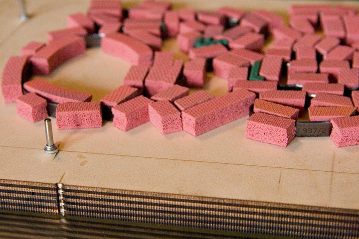
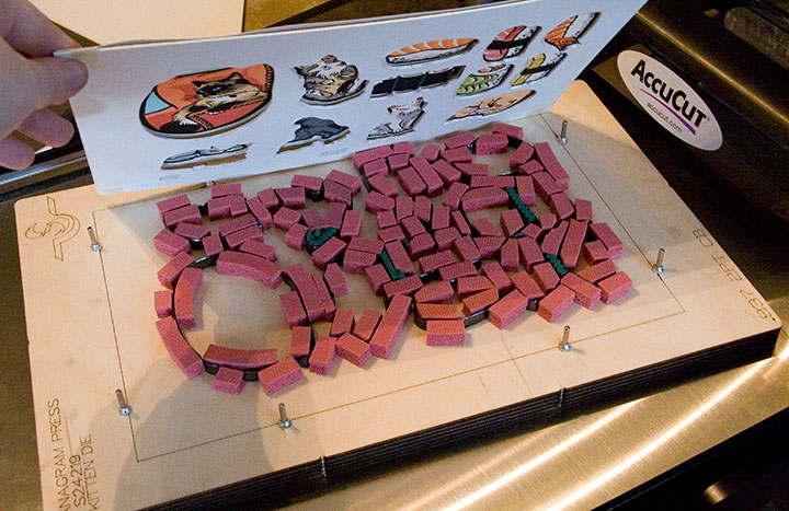
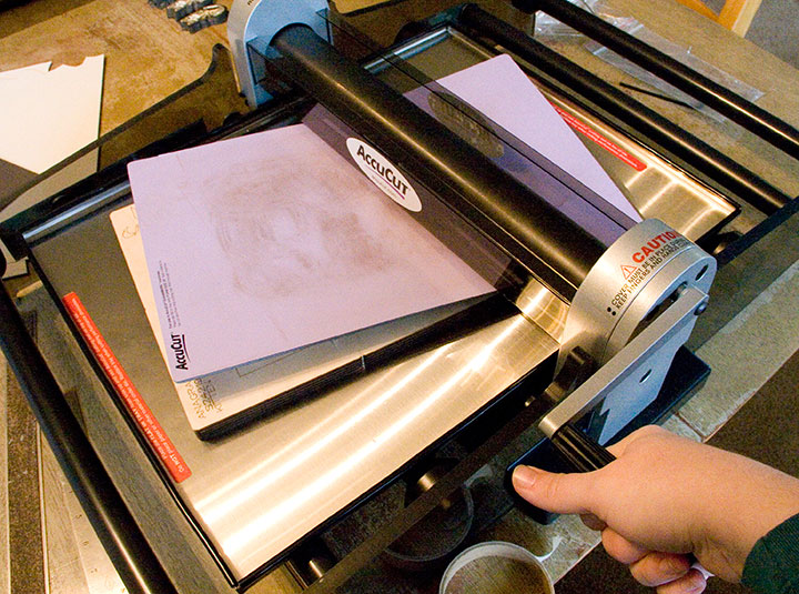
I know that plank with all those pink foam bits doesn’t look anything like an ornament set, so let me zoom in. A die consists of steel blades embedded in a piece of wood. The blades are bent and arranged in precisely the configuration specified by the dieline. Those pink foam bits cushion the blades, hold the paper in place and help with cutting accuracy. When the die is run through the cutting machine (which works much like a Vandercook press), those pink bits squish down under pressure, exposing the blades and gripping the paper to be cut. Those metal pins sticking up are for lining up the press sheet—they’re spring-mounted, so they retract when the blade goes through the cutting machine.

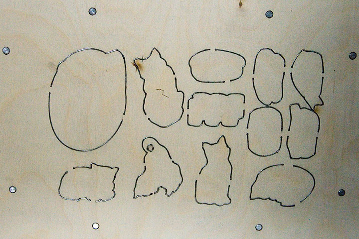
Here’s the underside of the die—now you can see how the blades fit the press sheet.
Still, while the die is a total lifesaver in terms of cutting time, the lightweight paper I was cutting made for some wiggle room—even with the extra line tolerance I built into the design. After all that hand-coloring I didn’t want to lose a third of my prints by cutting them in the wrong place. So I still had to do some puzzling and figure out how to outsmart the limitations here.

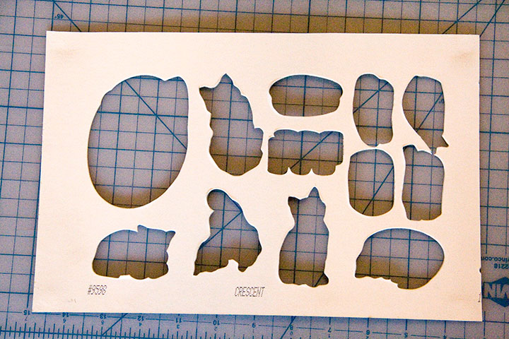
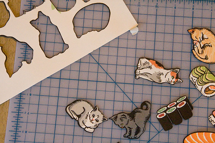
Since the lightweight prints are mounted to a heavier board to complete the ornaments (the ribbon loops are sandwiched in between), I was basically using the die twice. I realized that the leftover blanks of board would make a good template, and wouldn’t wiggle under pressure.

A little masking tape,

some quick eyeballing,

and slow-and-steady cranking in the press—

—and Bob, as they say, is your uncle.

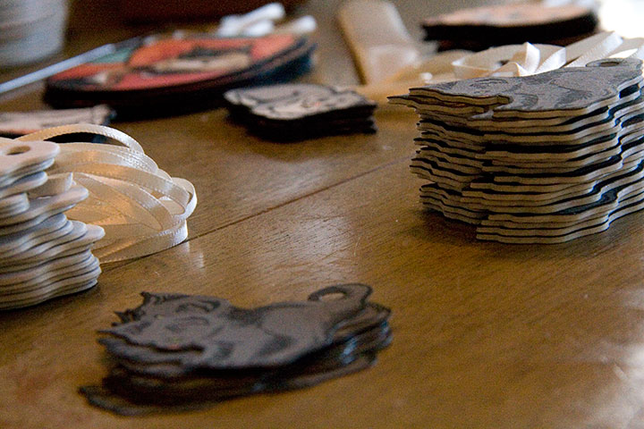
Individually taping down all eleventy billion 200 press sheets was a little mind-numbing, but still, the “finished” pile added up fast.

And it was awfully satisfying to see the whole edition completed in days rather than weeks or months.

Laurie stepped in and saved my sanity by doing a lot of the grunt work—rough-cutting boards, snipping lengths of ribbon, and cutting insets into the board-kitties so that the ribbon loops lie flush and disappear.

A quick coat of black around the edges,

and just a wee bit of cursive script on the back,

—and we have a litter of Christmas kittens. Laurie contributed one of my favorite photos for the packaging, and I basically have been unable to stop squealing ever since. Now the Tailor and I just need to hurry up and chop down our Christmas tree, so I can display these guys in the living room!
If you’d like a set, they’re up in the shop. To answer the foreseeable question, we’re just offering these in full sets—they were printed in sets, so we don’t really have any oddball solo pieces this time. And last year almost everyone wanted the full set of bird ornaments, rather than just one, so I let those votes carry the motion. Actually, there are still some bird sets left, so feel free to snag ’em if you missed out last year. As usual, these are limited-edition—I won’t be reprinting them, so once they’re gone, they’re gone for good.

One last thing: to make sure that Tacoma pets also have a happy holiday season this year, Laurie and I will be donating a portion of our proceeds to help stock the Tacoma Humane Society’s emergency pet food bank. We want to make sure that while we’re all having a kitty-themed Christmas, the kittens who inspire us get to enjoy Christmas dinner, too.
Happy tree-trimming!

November 1st, 2012

Our pencils are sharp, and our presses are fired up. Jessica and I are churning out our next candidate for Dead Feminist, and she’ll be on the ballot next week. You can catch her online then, or if you’re local, see her first at this weekend’s Studio Tour. Both Jessica and I will be open both Saturday and Sunday, as usual—more info and maps/directions here.
October 2nd, 2012

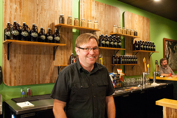
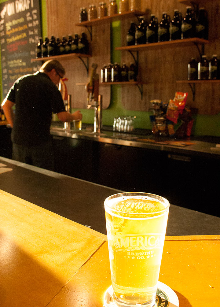
Can’t you just hear the choir of angels singing, “Ahhhhhhhhhhhhh” over a pint right now?
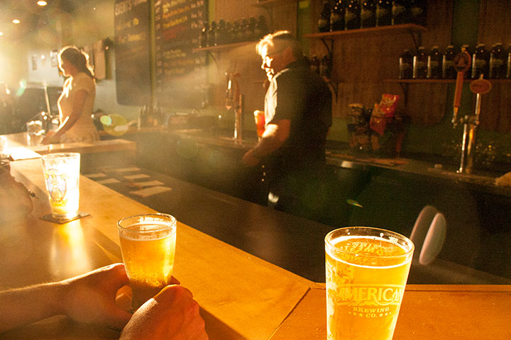
I think that’s how everybody around here felt last month, when my good friends (and veteran restaurateurs) Barry & Renée Watson opened the doors of their newest business, Pint Defiance Specialty Beers & Taproom. I mean, come on—look at that heavenly glow there!

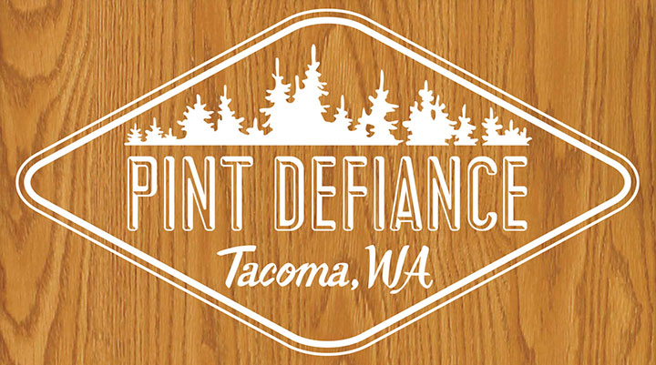
Barry and I share a deep love of all things campy and kitschy—so when he asked me to design the identity for Pint Defiance (which in itself is a top-notch pun on Point Defiance, Tacoma’s famous city park), I think he knew he had me at “hello.” Within about ten seconds we were both cackling over the possibilities of things like faux woodgrain and vintage scout badges.

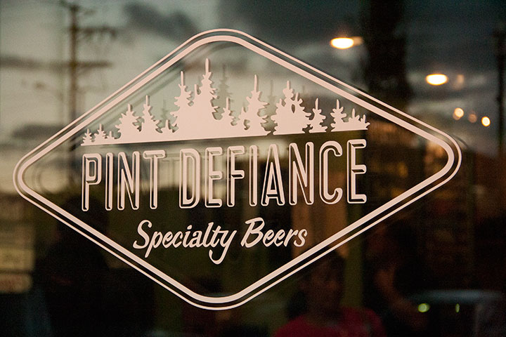
So I put together a hand-lettered logo based on vintage script and the kind of hand-hewn wooden signs you find at summer camps and state parks.

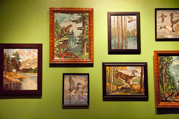
I knew I had hit on the right theme when I saw Barry’s collection of vintage paint-by-number pieces—which are now hanging proudly in the taproom (this, people, is the perfect illustration of why we are friends).

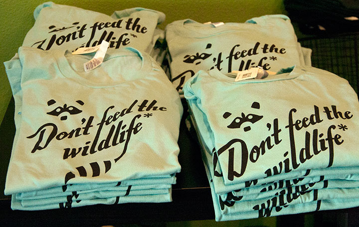
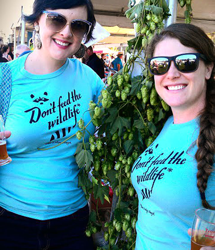
Because I couldn’t resist ganging up on the Point Defiance joke, I also designed a hand-lettered t-shirt for the shop (which is kind of an inside joke for Tacoma folks, sorry—if you’ve ever been to Point Defiance Park, the place is filthy with raccoons, and there are “Don’t Feed the Wildlife” signs absolutely everywhere).

photo by Barry Watson
Below the asterisk, the fine print reads: “Beer is okay, though.” For the record, Barry came up with that nugget, so don’t send PETA after me!

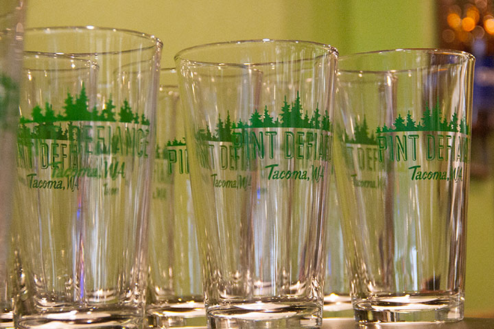
Whenever I stop by the shop, it still strikes me as thrilling (and a little strange) to see my logo reproduced on a hundred pieces of glassware—

—or lining the wall above the impressively massive cooler.

Best of all, though, is the fact that whenever I stop by, Barry flashes me a smile and hands me a pint of cider (my favorite), before I get a chance to ask. And then I raise a toast to Renée, knowing that their little business is going to be a smashing success. Congrats, you two!

August 29th, 2012

All I can manage is a quick note today—because this is where I am right now … and this place has got me pretty speechless.

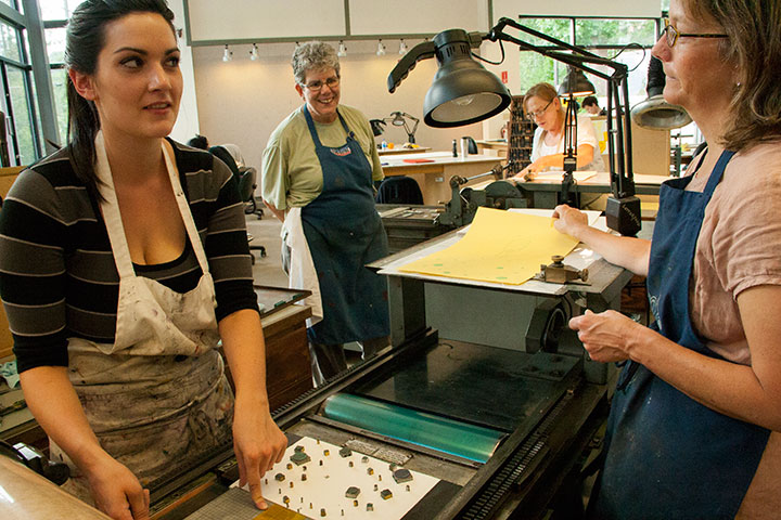
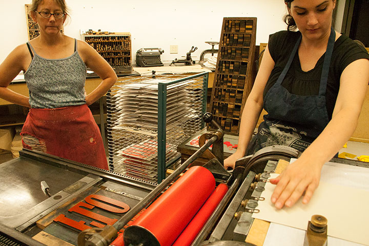
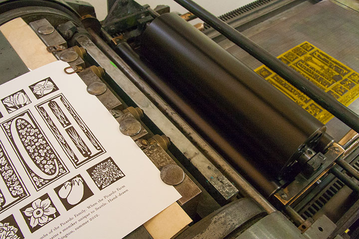
I’m here teaching with Jessica this week, with a studio full of smart, sassy, and seriously talented women.

The class has got us inspired to stay up late printing every night, but it’s hard to feel tired—

—when you’ve got this view waiting for you when you return to work every morning.
July 6th, 2012

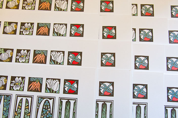
I’m working on a little something in Jessica’s studio right now.
Something that’s making me downright hungry.
I’ll show you the finished product as soon as it’s done—provided I don’t go bury my head in the veggie crisper first!

June 29th, 2012

My brain is chock full of useless information—I could sing you about 35,000 ad jingles on key, or recite Jurassic Park or Trading Places or a hundred other movies line-for-line. But don’t challenge me to a game of Poker, because I have a terrible head for card games. I love playing them, and am always up for learning when friends come over a suggest a rubber of something or other. The trouble is, I forget the rules right away—so whenever I sit down to a rematch, it’s like starting at square one.
As an example, I used to do summer stock theatre, and we techies had a tradition of playing Hearts backstage during the sound check. So I played Hearts every night for two months straight, three summers in a row, and I still can’t remember the rules now. (Something about being saddled with the Queen of Spades, and lots of half-joking shouted epithets surrounding that card, but that’s about it.)
Over the years I have learned and forgotten dozens of card games—including Snap, President, Pitch, Five Card Draw, Seven Card Stud, Crazy Eights, Kings Corners, Egyptian Ratscrew, Spades, Slapjack, Pig, Cheat, Five Hundred, Hand & Foot, Whist—and probably plenty of others that I’ve even forgotten the name for.
About the only games I can ever keep in my head are the embarrassingly simple ones like War, Go Fish, Old Maid and Blackjack. Oh, and I can play Cribbage like a fiend, because my dad and his Scottish friend Alex taught me when I was nine or ten. We used to have hilariously cutthroat wee-lass-vs.-grown-man Cribbage tournaments on a regular basis, so how could I ever forget that?

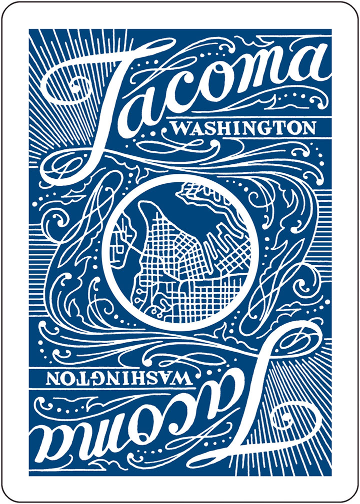
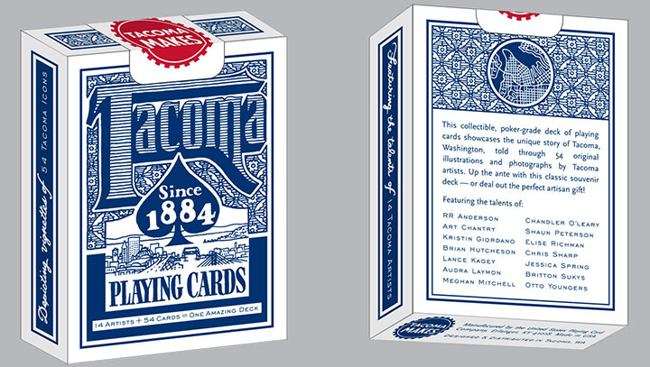
Being lousy at remembering any card games, however, hasn’t stopped me from wanting to design a card game. Or collecting interesting or unusual decks (the Tailor and I have a good dozen in regular rotation). So when my friends Maija and Amy asked me to be the designer on the poker deck they were dreaming up, I think must have freaked them out by shouting, “YES!” before they’d even finished their sentence.
(And as an added bonus, I got first dibs on my favorite Tacoma haunts.)

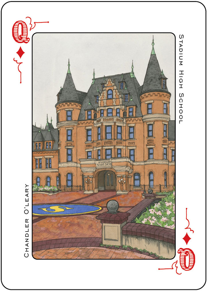
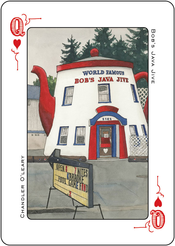
These gals weren’t looking for any old run-of-the-mill card deck, either. They wanted to show off Tacoma in all her architectural splendor. And since we’re blessed with a veritable boatload of fabulously talented artists in this town, they decided to divvy up the deck by ranks—with fourteen artists, each tackling a list of locations in four-of-a-kind fashion. I loved being the first to see the collection of incredible artwork come down the pike from these folks. Everybody involved in the project has gone above and beyond our wildest imagination—I can’t wait to see the finished deck.

Beyond just creating something beautiful and fun, Amy and Maija have their eyes on a bigger prize. They want to create a real, no-kidding Tacoma souvenir. We get a lot of visitors and tourists around here, what with the Sound and the Mountain and the Universities and what-have-you—but you’d be hard-pressed to find Tacoma-specific tchotchkes (or even postcards!) that aren’t sarcastic. And I know I’m not the only one around here who’s a little tired of folks knockin’ T-town, based solely on a stereotype and a thirty-year-old reputation. So we’re upping the ante a little, and offering a bit of hard evidence that Tacoma is pretty dern great.

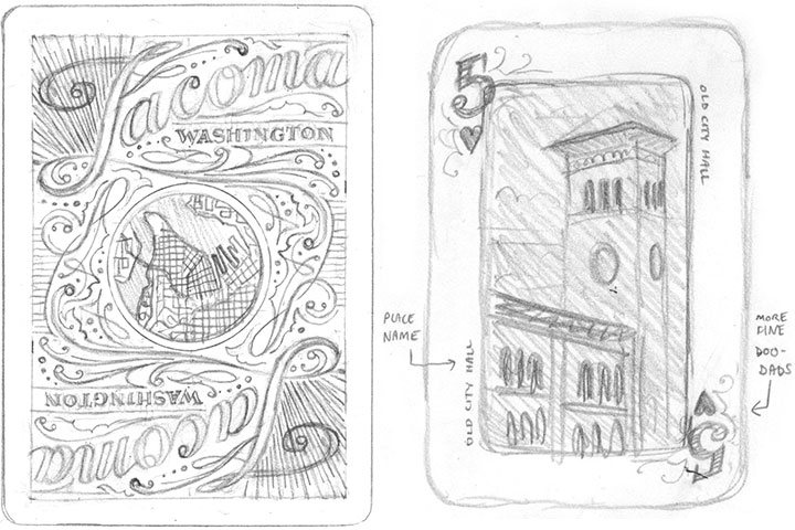
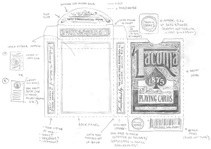
You know my schtick by now, so you can guess that all the lettering and pattern doo-dads are hand-drawn. I had the pleasure of designing the suits, rank typography, card face template, card backs and box.

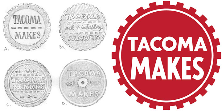
I even got to design the logo for Maija and Amy’s company, Tacoma Makes. Basically, it was the kind of project I’m always on the lookout for, but which rarely lands in my lap. So I spent about half of the time grinning my fool head off, and the other half pinching myself in disbelief.

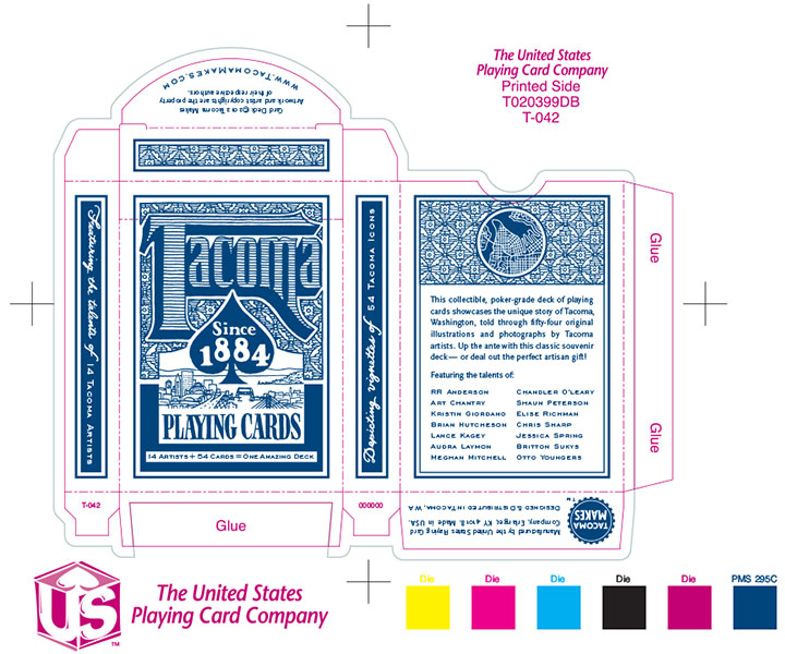
I also got to flex my file-production muscles. I love to geek out over the technical side of design, but since I started my business, much of my production work has centered around letterpress printing. So playing with dielines and spot color swatches again was a nice little challenge.

We’re taking all these extra steps because this is a real, bona fide, professional-grade poker deck. The kind folks at the U.S. Playing Card Company are manufacturing the cards for us—they’re the people behind the Bicycle, Bee, Hoyle and other card brands. So you won’t have to hedge your bets that this deck will be extra tasty.

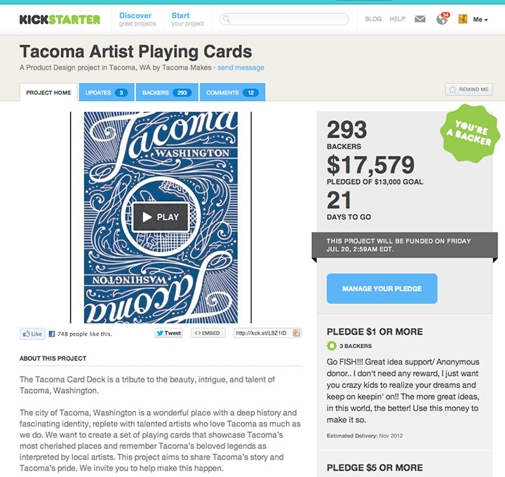
To raise funds for the card printing, and even pay for modest artist contracts, we set up a Kickstarter project (much like the Apocalypse Calendar that you all so graciously funded last year). Now normally this would be where I explain that Kickstarter projects are only funded if they reach their entire monetary goal by the deadline—but I don’t have to! I left town for a few days, just after the project launch, with the intention of spreading the word when I got home. So imagine how floored I was to come back and discover that we’d met our goal in just six days!

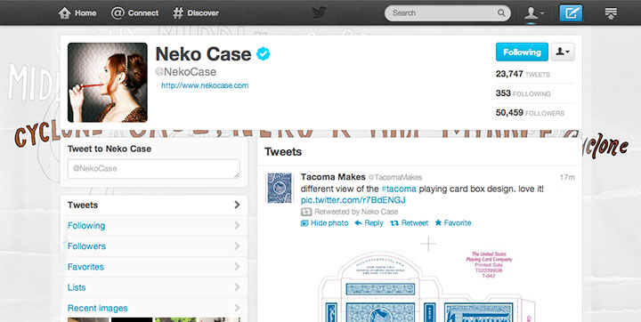
The response to this has been staggering. And it’s not only the lovely legions of fellow Tacomans who have supported us—we’re seeing pledges come in from all over the country. And as a nerdy fan-girl aside, I just have to squeal and tell you that Neko Freaking Case (a hometown Tacoma gal) has been retweeting my designs in the Twitterverse. Dorky internet hero fantasy: fulfilled, folks.

The Kickstarter project will run through July 19, so you can still contribute if you want to get in on rewards and goodies that are only available to backers. Otherwise, the cards will be in hand and dealt out this November—along with an exhibition of all the original artwork.
There’s even a rumor of an artist game night in the works, so cut the cards! I’m up for any game you’re willing to teach me—as long as you don’t mind that I’ll probably forget the rules before the night is through.
In the meantime, thank you so much for all your support for our crazy card deck! I’ve said it before, and I’ll say it again—Tacomans (and honorary Tacomans!) are the best folks on earth.
• • • • • • • • • • • • • • • • • • • • • • • • • • • • • • • • • • • • • • • • • • • • • • • • • • • • • • • • • • • •
Edited to add (fall 2013): The blue deck has been so popular that we have done a red deck as a sequel! The new deck features all new artwork and artists—you can read more about it here.

June 13th, 2012

If you happen to live in Washington state, you can’t help but notice that love is in the air. It’s not quite what you think, though—rather than turtledoves and cupids flying around, the breeze is carrying ballot petitions and angry voices.
Though Washington became the seventh U.S. state to legalize same-sex marriage earlier this year, opponents forced a voter referendum to decide the issue this November. So while we’d rather just toast our friends and their families, we’ve got to put up our dukes first.
Already tempers are running high, and everyone seems to be up in arms—it’s total anarchy out there. So we thought, who better to talk to than an anarchist?
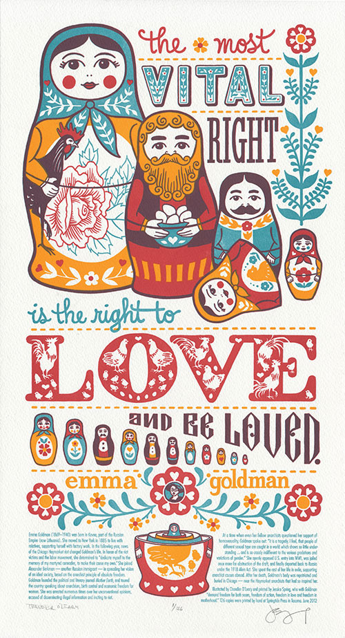
The most vital right is the right to love and be loved. —Emma Goldman

Huh. Pretty down-to-earth for an anarchist, actually. Especially if you consider some of the other things Emma’s said in the past.
I think that if we could somehow put all the ladies we’ve featured previously into a room together, they might end up killing each other (good thing they’re already dead, eh?). They all had such different ideologies and passions that I can’t imagine all fourteen of them agreeing on any one thing. But I’m fairly sure they’d be united over Emma—in thinking she was a complete weirdo, that is. (Sorry, Emma.)
Yet for all her outlandish creeds and fierce opinions, her thoughts on families, love and motherhood cut straight to the heart of the matter. And that’s what drew us to her.

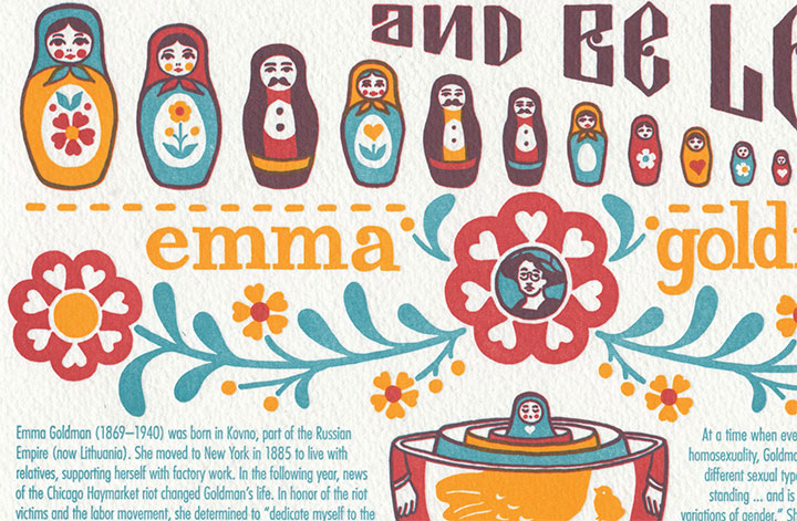
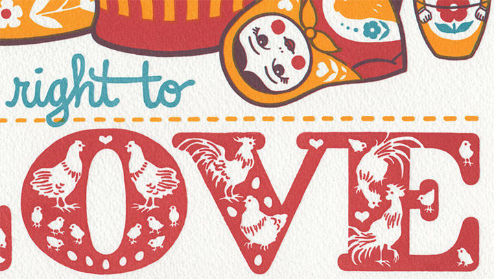
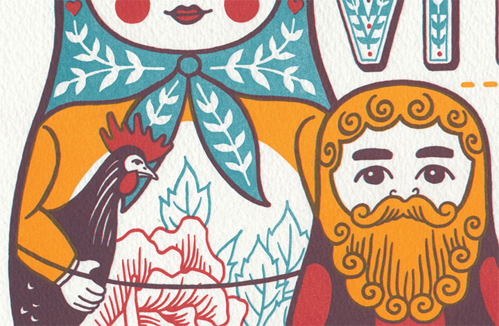
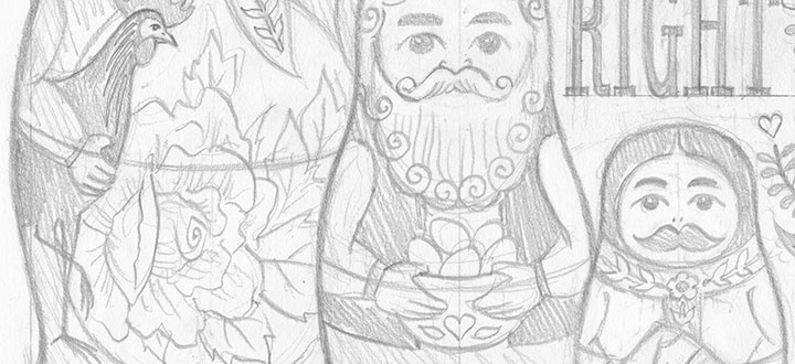
To pay homage to Emma’s folksy words, we turned to folk art for inspiration. (Get out your grandma’s Pyrex and raise a glass!) Love Nest is dominated by a lively brood of nesting matryoshka dolls. Each individual is different, but together they complete the picture of a nurtured, multicolor family. Roosters, hens and chicks complete the flock waiting for the next generation to hatch as Emma’s words stitch the family together.
To support the diversity nested within every family, we’ll be donating a portion of the proceeds to both the Rainbow Center and Oasis Youth Center, right here in T-town. The Rainbow Center is dedicated to eliminating discrimination based on sexual orientation and gender. Oasis is a drop-in support center dedicated to the needs of GLBTQ youth ages 14-24.

Speaking of chickens, there’s another tribute hiding in here—a nod to the very first matryoshka doll ever made.
This might well be the most difficult piece we’ve tackled yet. Beyond the challenges of marrying (no pun intended) the views of a 19th-century fringe activist to modern-day social issues, we also had some seriously precarious business on the technical side. Those of you who are into the nitty gritty details of letterpress may know that each print color requires a separate plate, a separate pass on press. We’ve got four colors in the final result, but because of the tricky magic of translucent inks, there’s actually only three plates/three passes here. The red and teal mix to make brown—which means that the registration (alignment) of each plate had to match up just right.
I was expecting Jessica to throttle me when I showed her the color separations, but as usual, she barely even batted an eye: “Yeah, we can do that.”
Or maybe she just knows me so well now that she’s expecting the crazy.
• • • • • • • • • • • • • • • • • • • • • • • • • • • • • • • • • • • • • • • • • • • • • • • • • • • • • • • • • • • •
Love Nest: No. 15 in the Dead Feminists series
Edition size: 126
Poster size: 10 x 18 inches
Printed on an antique Vandercook Universal One press, on archival, 100% rag (cotton) paper. Each piece is numbered and signed by both artists.
Colophon reads:
Emma Goldman (1869 – 1940) was born in Kovno, part of the Russian Empire (now Lithuania). She moved to New York in 1885 to live with relatives, supporting herself with factory work. In the following year, news of the Chicago Haymarket riot changed Goldman’s life. In honor of the riot victims and the labor movement, she determined to “dedicate myself to the memory of my martyred comrades, to make their cause my own.” She joined Alexander Berkman—another Russian immigrant—in spreading her vision of an ideal society, based on the anarchist principle of absolute freedom. Goldman founded the political and literary journal “Mother Earth,” and toured the country speaking about anarchism, birth control and economic freedom for women. She was arrested numerous times over her unconventional opinions, accused of disseminating illegal information and inciting to riot.
At a time when even her fellow anarchists questioned her support of homosexuality, Goldman spoke out: “It is a tragedy, I feel, that people of different sexual type are caught in a world which shows so little understanding … and is so crassly indifferent to the various gradations and variations of gender.” She openly opposed U.S. entry into WWI, was jailed once more for obstruction of the draft, and finally deported back to Russia under the 1918 Alien Act. She spent the rest of her life in exile, supporting anarchist causes abroad. After her death, Goldman’s body was repatriated and buried in Chicago—near the Haymarket anarchists that had so inspired her.
Illustrated by Chandler O’Leary and printed by Jessica Spring, who with Goldman “demand freedom for both sexes, freedom of action, freedom in love and freedom in motherhood.”
UPDATE: poster is sold out. Reproduction postcards available in the Dead Feminists shop!

June 6th, 2012

Our new Dead Feminists broadside is coming next week! We’re still printing, which is proving to be a bit of a sticky wicket (as you’ll see), but here’s a snippet for now. Any guesses?

![Chandler O'Leary [logo]](https://chandleroleary.com/wp-content/themes/chandleroleary/images/logo.png)
